Art is filled with specialized language that can often puzzle the lay reader. Many terms used by artists, historians, and critics carry meanings that differ significantly from their everyday use, while others are so particular to the field that they remain virtually unknown outside it. This online glossary aims to clarify these distinctions, offering clear definitions enriched by historical and visual context.
Each entry begins by examining the term within the broader history of art—tracing its development, significance, and changing interpretations across time and cultures. When relevant, the discussion shifts to the term’s role in the Dutch Golden Age, a period of extraordinary artistic innovation, technical refinement, and market-driven production. Here, the glossary highlights how concepts were understood and applied by Dutch painters, collectors, and theorists, situating them within the intellectual and social fabric of the seventeenth century.
Given the focus of this website, many entries also include a dedicated section marked with Vermeer’s distinctive monogram. These sections examine how each concept relates specifically to Vermeer’s work—his use of perspective, light, and material texture, or his place within broader Dutch artistic practices. In doing so, the glossary functions not only as a reference tool, but as a framework for understanding Vermeer’s enduring contribution to the history of art.
With more than 700 carefully curated terms and a network of over 30,000 internal links, the glossary allows users to navigate across multiple facets of art, revealing unexpected connections and deeper layers of meaning. Designed to function as both a structured reference and an open-ended journey, it encourages readers to move beyond isolated definitions—tracing the evolution of artistic ideas across disciplines and centuries. Whether used by scholars or by curious enthusiasts, this glossary offers an extensive, interconnected resource for anyone wishing to deepen their understanding of visual art.
- Quill
- Raking Light
- Rapen
- Ras schilderen
- Ratio / Matematical Proportion
- Realism
- Realistic
- Receding and Advancing Colors
- Reception
- Reddering
- Refinement
- Reflection
- Reflections in Water
- Religious and Secular Painting
- Relining
- Renaissance
- Rendering
- Repoussoir
- Representation
- Reproduction (of artworks)
- Reputation
- Reserve
- Resin
- Restoration (vs conservation)
- Retouching
- Retrospective
- Rhetoric
- Rhythm
- Rigger Brush
- Rococo
- Romanticism
- Rough and Smooth Styles
- Rounding / Relief
- Saint Luke
- Satin
- Satire
- Saturation
- Scale
- Schema / Schemata
- Schematic
- Schilderachtig
- Schikking / Ordinantie / Koppelin
- School (of painting)
- Schoon
- Schuilkerken
- Sculpture
- Scumbles / Scumbling
- Seascape
- Seccative
- Seeing
- Self-Conscious Address/ Fictional Narrator
- Self-Contained
- Self Portrait
- Sprezzatura
- Staffage
- Stand Oil
- Stelsel
- Still Life
- Stofuitdrukking
- Stoof
- Stretcher / Strainer
- Strong Color
- Structural Drawing
- Structure
- Studio / Workshop
- Studio Assistant / Assistant
- Studio Light
- Studio Prop
- Study
- Style
- Stylized / Stylization
- Sub-Frame
- Subject Matter
- Sublime
- Suggestion
- Sunday Painter
- Sunlight
- Timelessness
- Tint
- Title
- Tonal Transition
- Tone / Tonal Value / Value
- Top and Bottom
- Topos
- Tradition vs. Innovation in the Arts
- Transcendence
- Tracing / Squaring Method / Spolvero
- Transience
- Translucency
- Transparency
- Transparent vs. Opaque Paint
- Trial and Error Experimentation
- Trompe-l'Oeil
- Trompe-l'Oeil Curtain
- Tronie
- Turbid Medium Effect
- Turkish Carpet
- Turpentine
Quill
Quills were traditionally made from the flight feathers of large birds, with the best ones coming from the primary wing feathers—usually the five outermost ones—on the left wing. These feathers curve away from a right-handed writer's hand, allowing better visibility and control. Goose feathers were most commonly used in Europe, but swan, turkey, and crow feathers were also prized. For very fine lines, such as in manuscript illumination or delicate drawings, crow and raven quills were preferred, while swan feathers were favored for large, sweeping writing.
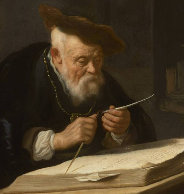
Salomon Koninck
1639
Oil on panel, 66.8 x 51.1 cm.
Johnny van Haeften, London
Fresh feathers were first hardened by aging or by plunging them into hot sand, which dried the interior of the shaft (calamus) and made it less flexible. Some scribes or artists also tempered the quill in warm ashes or bake ovens. After hardening, the outer membrane and any remaining soft tissue were scraped off, and the quill was then shaped using a penknife—hence the term. The nib was carefully split with a fine cut down the center to allow ink flow, and the tip was shaped to a point or chisel according to the desired thickness of the line.
Quills needed regular maintenance. The tips wore down quickly, so artists and writers often kept a knife at hand to recut the point. Because quills could fray or splay after repeated use, they were frequently replaced. Still, for centuries, they remained the favored tool for ink drawing and writing, valued for their responsiveness and subtlety.
In the hands of 17th-century Dutch artists, a well-prepared quill could produce everything from the delicate hatching lines of a portrait study to the quick, expressive flourishes of a landscape sketch. The medium's physical demands—requiring lightness, confidence, and careful handling—shaped the very character of the drawings made with it.
In six of Vermeer's women-only pictures, letters are being written or read, delivered or readied for sending. In A Lady Writing the woman we may imagine to be Catharina Bolnes (1631–c.1687), Vermeer's wife, holds a quill pen in her right hand; her pearl necklace with ribbons to join its ends lies next to the writing paper on the blue velvet tablecloth, and beyond the paper is the inkwell. The letter's creased folds and lines of writing, and the horizontal angle at which the woman holds her quill (rather than the vertical position more customary for writing), suggest that she is reviewing or revising a letter already written. After the letter has been completed, she will fold it to make its own envelope and then seal it with wax or lacquer.
X-radiography and infrared reflectography indicate that Vermeer made an alteration to the angle of the quill and to some of the fingers holding it. He first painted the quill pen in an upright position—his writer was actively engaged in writing—but he later altered the quill so it would rest at an angle as the writer pauses, lost in thought.
In Mistress and Maid, a quill pen appears in the seated woman's hand, paused momentarily above the letter resting on the table below. The composition suggests she is midway through writing, as the upper half of the sheet shows faintly inscribed lines. The tip of the quill is stained with black ink, a detail that confirms its recent use. The feathered shaft—the very part that once gave the bird flight—is concealed by the woman's hand, its organic elegance subsumed in the act of writing. ration of a quill was a careful process.
Raking Light
Raking light is the illumination of objects from a light source at a strongly oblique angle almost parallel to the object's surface (between 5º and 30º with respect to the examined surface). Under raking light, tool marks, paint handling, canvas weave, surface imperfections and restorations can be visualized better than with light coming from different angles. In some instances raking light may help reveal pentimenti or changes in an artist's intention. In the case of wall paintings, raking light helps show preparatory techniques such as incisions in the plaster support.
The term "raking light" may also be used to describe a strongly angled light represented in illusionist painting, although not strictly between 5º and 30º. Raking light gives volume to objects and accentuates texture. It is best used to create dramatic or moody images.
Painters instinctively avoid the lowest angles of raking light because they divided solid objects into two essentially equal parts: a face would be half in light and half in shadow, which tends to have a flattening effect. Moreover, raking light create cast shadows that run parallel to the picture plane, so they do not suggest spatial recession as well as shadows that are cast backward by light originating from a higher angle. Since it is easier to evaluate an object's form, color and texture when it is illuminated rather than when it is in shadow, a wider angle of light is generally preferable. Often, painters use three-quarters lighting which reveals the great part of an object's surface but creates at the same time a strong sense of volume.
Rapen
Rapen, which means "stealing" or "borrowing," is a Dutch term widely used in the 17th century when discussing artistic competition and emulation. Rapen was approved by Dutch art theorists of borrowings provided that they were integrated into painting and might appear unrecognizable. Using a play on words—in Dutch rapen is the plural of raap, or "turnip"—the Dutch painter and art writer Arnold Houbraken (1660–1719) recommended that "stolen" fragments should be "welded, molded in the mind as though it were stewed in a pot, and prepared and served with the sauce of ingenuity if it is to prove flavorful." While rapen could be seen as a practical way of building upon artistic tradition, it also bordered on imitation when overused. Some critics in the period regarded excessive borrowing as a lack of invention, while others saw it as a natural part of artistic development.
Ras schilderen
Ras schilderen is the Dutch term for alla prima painting.
Ratio / Matematical Proportion
Mathematical ratios have long played a role in artistic composition, shaping the way artists structure their works to create balance, movement, and harmony. From antiquity to the Renaissance, theorists and practitioners sought ideal proportions that would appeal to the human eye, often turning to geometry and numerical relationships to guide their designs. Euclid explored the mathematical principles underlying proportion, and later, Renaissance thinkers such as Luca Pacioli (c. 1447—1517) formalized these ideas in treatises on aesthetics and design. The study of ratios extended beyond painting into architecture, music, and even philosophy, reinforcing the belief that numerical harmony reflected a deeper order in nature.
In 17th-century Dutch painting, compositional balance was achieved through empirical practice rather than strict adherence to theoretical ratios. Dutch artists, deeply attuned to the effects of light, space, and perspective, organized their works using structures that felt natural and visually engaging. Painters such as Vermeer, Pieter de Hooch (1629—c. 1684), and Emanuel de Witte (1617—1692) arranged their domestic interiors with a careful distribution of visual weight, often using architectural elements to guide the eye through the scene. Still-life painters, including Willem Claesz. Heda (1594—1680) and Pieter Claesz (1597—1660), positioned objects with an intuitive sense of proportion, creating compositions that felt both structured and organic. Landscape painters, notably Jacob van Ruisdael (1628—1682), developed spatial depth through compositional divisions that echoed naturalistic observation. While Dutch artists may not have explicitly applied mathematical formulas, their work reflects a refined understanding of proportion that contributed to the extraordinary realism and harmony characteristic of their paintings.
Divine Proportion — This name was popularized during the Renaissance, particularly by Luca Pacioli in his 1509 book De divina proportione.
- Extreme and Mean Ratio – A more technical, older mathematical term used by Euclid.
- Golden Mean – Another variant often used in discussions of art and philosophy.
- Golden Section – A common term used in classical mathematics and aesthetics.
- Phi (Φ) – Named after the Greek letter ϕ (phi), which represents the numerical value of approximately 1.6180339887.
- Fibonacci Ratio – Though technically not the same, the golden ratio is closely related to the Fibonacci sequence, as the ratio of consecutive Fibonacci numbers approaches Φ. The ratio of one-third to two-thirds is commonly associated with the Rule of Thirds in composition and design. While not a strict mathematical ratio like the golden ratio, it is widely used in art, photography, and design for balance and visual harmony. Some related terms and concepts include:
- Dynamic Symmetry – A compositional system that sometimes incorporates the Rule of Thirds, as well as other mathematical and geometric principles.
- Harmonic Proportions – A broader term that encompasses aesthetically pleasing divisions of space, including one-third/two-thirds ratios.
- Rule of Thirds – A guideline in composition where an image is divided into nine equal parts using two horizontal and two vertical lines, with key elements placed along these lines or their intersections.
- Simple Ratio Composition – In painting, this can refer to any intentional division of space that avoids symmetry and creates visual interest.
Unlike the golden ratio, which has a mathematical foundation in Φ (1.618), the 1:2 ratio is more of a practical visual tool based on human perception.
Realism
Realism in the visual arts refers to the faithful representation of objects, people, and scenes as they appear in the natural world, emphasizing accuracy in proportion, perspective, lighting, and texture. The pursuit of realism is tied to the desire to convey visual truth, communicate stories effectively, and assert mastery over the visible world. However, this goal has been interpreted differently across cultures and eras, shaped by spiritual beliefs, social functions of art, and evolving technical abilities.
Cave art, such as the paintings in Lascaux and Chauvet, created between 30,000 and 15,000 BC, demonstrates an early form of realism that is striking in its anatomical accuracy and the sense of movement conveyed in the depiction of animals. This realism was not aimed at mere imitation of nature but was likely intertwined with ritualistic or symbolic functions, perhaps serving as a means to exert control over the animals or to invoke success in hunting. The use of shading, overlapping forms, and implied motion suggests a sophisticated observational skill, indicating that realism was already valued as a way to capture the essence and power of the natural world.
In ancient Egypt, by contrast, realism was subordinated to symbolic and hierarchical purposes. Egyptian art did not adhere to a strict canon of proportion and perspective. Hierarchical proportions were crucial for conveying the social and spiritual order, with size and positioning used to emphasize the importance of gods, pharaohs, and nobility over commoners and enemies rather than any observed reality. This approach ensured that the visual language of art reinforced the divine authority and eternal status of rulers, aligning with the Egyptians' belief in the afterlife and cosmic order.Figures were depicted in composite view—heads in profile but torsos facing forward—to communicate the most recognizable aspects of each part. This stylized approach was not due to a lack of technical skill; Egyptian artists were highly adept at carving and painting. Rather, the goal was to convey timelessness, divine order, and the status of individuals within a structured society. Realism was sacrificed to ensure that the representation aligned with spiritual and societal conventions.
Ancient Greece marked a significant shift towards realism, driven by a philosophical pursuit of ideal beauty and truth. Greek sculptors such as Polykleitos (c. 5th century BC) and Praxiteles (c. 395–c. 330 BC) developed naturalistic forms based on careful study of human anatomy and proportion. The use of contrapposto in sculpture, creating lifelike stances, reflects a quest to capture the ideal human form realistically while adhering to mathematical proportions. However, this realism was not an end in itself but a means of approaching an idealized vision of humanity, balanced between naturalism and perfection.
During the Renaissance, realism reached a new level of sophistication through the rediscovery of linear perspective, anatomical study, and the application of light and shadow (chiaroscuro). Artists like Leonardo da Vinci (1452–1519) and Michelangelo (1475–1564) explored realism not only as a technique but as a way to express complex emotions, spirituality, and the humanity of their subjects. The scientific curiosity of the Renaissance expanded the technical vocabulary available to artists, enabling them to depict depth, volume, and atmospheric effects with unprecedented accuracy.
In 17th-century Netherlands, realism achieved its apogee in the works of artists who elevated the ordinary to the extraordinary. Dutch painters embraced realism as a means to reflect the material wealth, domestic virtues, and moral complexities of their society. This realism was often microscopic in detail, capturing textures, light effects, and the minutiae of everyday objects with astonishing precision. The popularity of genre scenes, landscapes, and still lifes, as seen in the works of Pieter de Hooch (1629–c.1684), Willem Claesz. Heda (1594–1680), and Vermeer, reflects a culture deeply invested in the truthful representation of its world. Unlike Italian Baroque, which pursued dramatic and emotional realism, Dutch realism was characterized by restraint, clarity, and a focus on the observable.
Tracing the development of realism in art involves examining how various components—outline, form, shadows, volume, relief, overlap, perspective, and atmosphere—emerged and evolved. Each of these elements contributed incrementally to the pursuit of a more accurate depiction of the natural world. Understanding the chronological order in which they appeared helps to clarify how realism was gradually constructed. Howeverm the development of key components of realism in art did not follow a uniform chronological order but was instead marked by localized advancements shaped by social and religious needs. Different cultures prioritized aspects such as outline, form, or perspective based on their symbolic, spiritual, or societal functions for art, leading to uneven but contextually significant progress in achieving realism. Forexample, cave art, such as that found at Lascaux and Chauvet, often conveys a remarkable sense of movement through techniques like overlapping limbs, dynamic poses, and the careful placement of lines to suggest motion, especially in depictions of animals. This emphasis on movement likely served both ritualistic and practical purposes, perhaps aiming to capture the vitality of prey or to evoke success in hunting. In contrast, ancient Egyptian art presents figures in a rigid, timeless stance, using composite views that combine profile heads with frontal torsos and legs.
The first component to emerge was the outline. Early examples of this can be seen in cave paintings at sites like Chauvet and Lascaux, dating back about 30,000 years. These artists used simple yet effective outlines to define the contours of animals, capturing recognizable shapes with remarkable accuracy. The use of outline was not only a way to delineate forms but also an essential tool for making sense of the complex natural world. The clean, unbroken lines provided clarity, helping to isolate subjects from their backgrounds. Ancient Egyptian art, too, emphasized the outline, creating distinct profiles of figures and objects with a high degree of precision.
Next came form—the depiction of three-dimensionality within a two-dimensional space. Even in prehistoric times, cave artists attempted to convey form by subtly varying line thickness and using rudimentary shading techniques. The emergence of form became more pronounced in ancient Greece, where sculptors developed a nuanced understanding of human anatomy, as seen in the kouros figures and, later, the contrapposto stance. This focus on form was not limited to sculpture; Greek vase painting also demonstrated an increasing sophistication in rendering the human body with volume and a sense of weight.
Closely related to form was the introduction of shadows to convey depth and spatial relationships. The term skiagraphia, meaning "shadow painting," was used to describe a technique attributed to Apollodoros of Athens (c. 5th century BC). This method involved the use of light and shadow to modeling figures more convincingly, adding a sense of depth and three-dimensionality to flat surfaces. Skiagraphia marked a significant step forward in the pursuit of realism, as it allowed Greek artists to depict how light interacts with form, creating lifelike representations that bridged the gap between two-dimensional painting and three-dimensional sculpture. This technique not only improved the illusion of volume but also contributed to a more dynamic interaction between figures and their settings, laying the groundwork for the chiaroscuro effects that would later be refined during the Renaissance.The development in shadow painting is clearly evident in the frescoes of Pompeii (c. 1st century AD), where artists used shading to suggest the curvature of objects and figures. Shadows allowed for a more convincing portrayal of light sources and contributed to the illusion of three-dimensionality. However, these shadows were often more symbolic than realistic, lacking the nuanced gradations seen in later works.
Relief and overlap were other early advancements. Ancient Egyptian art employed low relief to create a sense of depth on temple walls and tombs, while Greek sculptors perfected high relief in friezes, providing a more lifelike appearance. Overlap, used to suggest which figures or objects were in front of others, was a simple but effective technique for indicating spatial relationships. Examples of this can be found in Assyrian reliefs and Roman mosaics, where layers of figures and objects helped to convey a sense of crowding and depth.
The significant leap towards realism came with the development of perspective. Ancient Romans, as evidenced by the frescoes in Pompeii, began experimenting with linear perspective to create the illusion of depth. However, it was during the Renaissance that perspective was formalized into a system. Filippo Brunelleschi (1377–1446) demonstrated the principles of linear perspective, which Leon Battista Alberti (1404–1472) codified in his treatise De pictura. This breakthrough allowed artists to construct convincingly deep spaces on flat surfaces, positioning viewers within the scene. The use of vanishing points and orthogonal lines became a hallmark of Renaissance realism, evident in works like Raphael's The School of Athens.
Following perspective, the use of volume became more sophisticated, particularly through the technique of chiaroscuro—contrasting light and dark to model forms convincingly. Leonardo da Vinci's sfumato technique, which blurred edges and transitions between light and shadow, further enhanced the sense of volume. This focus on volume extended to Northern European artists like Jan van Eyck (c.1390–1441), whose oil painting techniques allowed for subtle gradations and a tactile realism in the rendering of skin, fabric, and metal.
The final component to develop was atmosphere, or atmospheric perspective, which involves the portrayal of depth through the softening of colors and reduction of detail in distant objects. This technique was mastered by Leonardo da Vinci and later adopted by landscape painters in the 17th-century Netherlands. Artists like Jacob van Ruisdael (c.1629–1682) used atmospheric perspective to convey the vastness of skies and landscapes, enhancing the realism of their scenes. Vermeer also applied subtle atmospheric effects, using the blurring of distant objects and a soft light to create a convincing sense of space and depth in his interiors.
By the 17th century, Dutch painters had synthesized these components—outline, form, shadows, relief, overlap, perspective, volume, and atmosphere—into a cohesive approach to realism. The result was an unprecedented level of naturalism that not only depicted the world with accuracy but also imbued ordinary scenes with meaning and emotion. This synthesis represents the apogee of realism in Western art, where technical mastery was matched by a philosophical commitment to portraying the truth of everyday life.
In any case, Realism did not become a dominant pursuit in Muslim art primarily due to religious beliefs that discouraged the depiction of living beings, particularly in a naturalistic manner. The concern stemmed from Islamic teachings that warned against idolatry, with the Hadith containing passages that condemned lifelike images, suggrsting they could lead to the worship of created forms rather than the Creator. This theological stance shifted artistic focus away from realism and towards aniconism—the avoidance of figural imagery in religious contexts.
Instead of pursuing realistic representation, Islamic art developed a distinctive visual language characterized by intricate geometric patterns, arabesques, and calligraphy, emphasizing the infinite and divine nature of God through abstract forms and symmetry. In secular contexts, such as in Persian miniatures or the art of the Mughal Empire, figural representation did occur but was stylized rather than realistic. These images, often flattened and devoid of naturalistic perspective or shadows, prioritized storytelling and decorative qualities over the accurate depiction of space and anatomy. This approach was not due to a lack of technical skill; Muslim artists were highly proficient in using color, pattern, and detailed craftsmanship. However, the philosophical and spiritual priorities of Islamic culture viewed abstraction as a purer means of conveying the divine order and complexity of creation, making realism less relevant to its artistic and spiritual goals.
Vermeer's use of the camera obscura, a device that projected images onto a surface, suggests an almost scientific approach to realism. His manipulation of light and attention to optical effects created scenes that, while idealized in their serenity and order, appeared convincingly real. Similarly, the detailed still lifes of artists like Jan Davidsz. de Heem (1606–1684) not only showcased technical prowess but also conveyed vanitas themes, using realism to remind viewers of life's transience.
The reason some cultures with high technical ability, like ancient Egypt or the Byzantine Empire, did not prioritize realism lies in their distinct functions for art. For these cultures, art was a vehicle for spiritual truths, power, and continuity rather than a mirror of the natural world. Realism, in these contexts, was seen as insufficient to convey the eternal and the divine, which demanded stylization, symbolism, and adherence to established conventions.
Realism arguably reached its apogee in the 17th-century Netherlands, where the synthesis of observational skill, technical mastery, and a cultural appetite for truth-telling through art created a body of work unmatched in its attention to the visible world. This apogee was not merely technical but philosophical, reflecting a Protestant ethos that valued the moral and spiritual lessons found in the ordinary. The fall from this peak came with the rise of Romanticism and Impressionism in the 19th century, movements that, while not dismissing realism entirely, sought to transcend it by exploring subjective perception, emotion, and the fleeting nature of reality.
Many mid-17th century Dutch genre paintings, including those of Vermeer, depicted elegant interiors of the upper middle-class. These pictures reflect concepts that were important in Dutch culture such as the family, privacy and intimacy. However, it is likely that the world of exquisite refinery of Vermeer's compositions did not accurately portray the world he actually observed.
C. Willemijn Fock, a historian of the decorative arts, has demonstrated that floors paved with marble tiles, one of the most ubiquitous features of Dutch interior paintings, were extremely rare in the Dutch 17th-century houses. Only in the houses of the very wealthy were floors of this type were occasionally found, although they were usually confined to smaller spaces such as voorhuis (the entrance or corridor) where they would be most likely to be admired by incoming guests. Fock reasons that the abundant representations of these floors in Dutch genre painting may be explained by the fact that "artists were attracted by the challenge involved in representing the difficult perspective of receding multicolored marble tiling."
Vermeer should not be considered a realist painter in the strictest sense of the word. He frequently modified the scale, the shape of objects and even the fall of shadows for compositional or thematic reasons. His scenes, moreover, appear highly staged. One of the most striking examples of this modified reality is a so-called picture-within-a-picture, The Finding of Moses, which appears on the back wall of two of his compositions. In The Astronomer it appears as a small cabinet size picture whereas in the later Lady Writing a Letter with her Maid it appears as an enormous, ebony-framed picture-within-picture. Which one, if either, was true?
Realistic
Realistic, in the context of art, refers to a manner of representation that appears lifelike or true to the observer's sense of the visible world. This term, however, is far more complex than simply denoting mechanical accuracy or photographic imitation. Historical and cross-cultural evidence has shown that what one group of viewers considers realistic may appear stylized or even abstract to another. The perception of realism depends heavily on shared visual conventions and the prevailing norms of representation within a given time and culture.
Rather than judging an image by its fidelity to nature alone, dettached from circumstance, we must understand that realism operates relative to what viewers expect and are accustomed to seeing. This principle, now supported by psychological theories such as Harry Helson's adaptation-level theory, suggests that people evaluate realism not directly against the natural world, but in relation to the visual language they know. A representation can seem vividly lifelike to one viewer while appearing artificial to another if their respective adaptation levels—shaped by prior exposure to certain styles—differ.
In historical accounts, there are stories of ancient Greek and Chinese paintings that fooled animals or people into believing the images were real. These anecdotes likely reflect how viewers, accustomed to specific styles, found certain works astonishingly convincing—not because they imitated nature exactly, but because they surpassed what was previously possible within the stylistic norms of their culture. Giotto (c.1267–1337), for instance, was celebrated in his own time for rendering figures and settings with such vitality that viewers were said to mistake his paintings for reality. Boccaccio tells in the Decamerone that the painter Giotto "was a genius of such excellence that there was no thing of nature . . . that he did not depict with the pencil or the pen or the brush in a manner so similar to the object that it seemed to be the thing itself rather than merely resembling it; so much so that many times the visual sense· of men was misled by the things he made, believing to be true what was only painted." From a modern standpoint, Giotto's images are clearly stylized, but for his contemporaries, they marked a striking departure from the flatter, more symbolic representations that had come before. His depiction of depth, gesture, and spatial coherence was experienced as intensely realistic.
In 17th-century Dutch painting, realism acquired a distinctive form. Artists such as Gerrit Dou (1613–1675), Pieter de Hooch (1629–c.1684), and Vermeer did not aim for mechanical verisimilitude, but for a realism grounded in perceptual sensitivity and carefully constructed illusion. Their paintings show an acute attention to the behavior of light, the optical texture of surfaces, and the coherence of space. In Vermeer's interiors, realism is not the result of replicating every detail, but of creating a balanced impression that accords with the viewer's lived experience of light and form. When Dou painted the gleam of metal or the fuzz of peach skin, he was not reproducing reality piece by piece, but composing a persuasive fiction based on carefully modulated observation.
Realism in Dutch art also responded to the rise of lens-based devices such as the camera obscura, which influenced how painters visualized space and atmosphere. Yet even as Dutch artists employed novel techniques to evoke the look of life, their works remained shaped by the expectations of their audience. A viewer accustomed to the carefully staged clarity of genre scenes would not find them any less realistic for their compositional invention. Indeed, Dutch realism often functioned not by imitating the chaos of actual life, but by presenting a distilled, purified version of it—lifelike because it aligned with shared ideals of order, propriety, and optical truth.
Although it is ultimately impossible to determine how Vermeer's paintings were perceived by his contemporaries, certain aspects of his later work may well have seemed perplexing—even subversive—in the context of the dominant expectations of realism in Dutch genre painting. While leading painters such as Gerard Dou (1613–1675) and Eglon van der Neer (1635–1703) aimed to refine and perfect the descriptive illusion of visible reality down to the minimum details of reality, Vermeer, particularly in his final decade, appeared increasingly willing to loosen the grip of surface detail in favor of broader visual effects that privileged perception over replication.
Some features of these late paintings suggest an almost self-conscious departure from the meticulously rendered textures and fabrics that characterized much of Dutch fijnschilder style. In The Lacemaker, for instance, the objects at the edge of the table—particularly the tangled threads and sewing implements—are rendered in such a soft focus that they verge on abstraction. Seen outside the logic of the composition, they might scarcely be identifiable—the curious feather-like object that seems to issue from the yellow vellum book has been described in various ways. The young woman's activity, though carefully composed, becomes almostb secondary with the artist constantly calling attention to the pure to the interplay of light, shape, brushwork, and pigment. The same can be said of the extraordinary treatment of fabric in Lady Seated at the Virginals and Lady Standing at the Virginals. The puffy white sleeves, with their thick impasto and luminous highlights, seem less concerned with the accurate rendering of linen folds than with the tactile pleasure of paint itself. Their volumetric presence is established not through careful contouring but through bold modulation, which from a short distance coalesces into form but resists analytical dissection.
In The Guitar Player, the situation is even more striking. The ornate gilt picture frame behind the figure and the shimmering satin of the musician's gown dissolve, upon closer inspection, into a series of calligraphic strokes and color blocks. These painterly liberties—the painter's sense of touch—convey the sensation of gleam and texture, but they deny the kind of close-up clarity found in contemporaries like Dou. Vermeer's aim was not to outdo his peers in precision but to probe a different kind of realism—one that engages the eye's interpretive capacity, rather than its appetite for inventory.
Whether Vermeer's style was seen as less realistic than that of his contemporaries is a question we cannot definitively answer. He may have struck some viewers as unconventional or even unfinished, while others might have accepted his manner as a novel, highly personal solution to pictorial problems—just as the broken brushwork of Frans Hals (c.1582–1666) or the expressive surfaces of late Rembrandt (1606–1669) came to be understood less as lapses in technique than as signatures of artistic vision. Vermeer's realism, especially in his later paintings, does not rest on descriptive exactitude, but on the optical coherence and psychological unity of the scene as experienced by the viewer. It is a realism of perception rather than enumeration—one that anticipates, in some respects, the selective and interpretive nature of modern vision.
Receding and Advancing Colors
Receding and advancing colors refer to the optical effects certain hues create in a composition. Warm colors, such as red, orange, and yellow, tend to appear closer to the viewer, creating a sense of immediacy and prominence—these are known as advancing colors. Cool colors, like blue, green, and violet, tend to recede, giving the illusion of distance and depth. This phenomenon is rooted in human perception and has been widely used by painters to manipulate spatial relationships, enhance realism, and guide the viewer's eye through a composition.
In 17th-century Dutch painting, the interplay between receding and advancing colors was a crucial element in creating depth and atmosphere, particularly in interior scenes, still lifes, and landscapes. Many Dutch artists, including Vermeer, exploited this principle to structure their compositions with remarkable subtlety. In his paintings, warm tones often define foreground elements—a red chair or jacket—while cooler blues and grays are used to suggest deeper space, leading the viewer's eye into the scene. This technique is particularly evident in paintings such as The Music Lesson and The Art of Painting, where warm ochres and deep reds anchor the foreground, while cooler tones create a gradual sense of recession.
The same principle was applied in Dutch landscape painting, where artists like Aelbert Cuyp (1620–1691) and Jacob van Ruisdael (1628–1682) used aerial perspective to enhance the sensation of spatial depth. In their works, the foreground often features warm earth tones, while the background fades into cooler blues and grays, mimicking the way colors shift in natural light and air. This effect, sometimes called aerial perspective, was a key device in constructing expansive views of the Dutch countryside.
Still-life painters also took advantage of receding and advancing colors to create a convincing illusion of depth. Artists such as Willem Claesz. Heda (1594–1680) and Pieter Claesz (1597–1660) used contrasting warm and cool tones to differentiate objects in their meticulously arranged compositions. A golden lemon peel might spiral forward against a dark, cool-toned pewter dish, emphasizing its form and texture while reinforcing the spatial relationship between objects.
The sophisticated use of receding and advancing colors in 17th-century Dutch art was not just a matter of technique but also a means of enhancing realism, visual harmony, and narrative effect. Whether in the quiet luminosity of a Vermeer domestic interior, the vast openness of a Ruisdael sky, or the delicate contrasts of a Claesz still life, Dutch painters demonstrated an acute awareness of how color could be manipulated to shape space and perception.
Reception
In general terms, reception refers to the way a work of art is received, interpreted, valued, and circulated by audiences, both in its original historical context and across time. It encompasses the immediate response of an artist's contemporaries as well as the evolving assessments by later viewers, critics, scholars, and collectors. Reception is not static; it is shaped by changes in taste, cultural values, artistic norms, and even political or economic conditions. The term can also refer more narrowly to the scholarly field of "reception studies," which investigates how artworks are perceived and reinterpreted in different historical periods and social settings. Philosophically, it challenges the notion of fixed meaning and emphasizes the role of the viewer in generating significance.
In the context of 17th-century Dutch painting, reception varied greatly depending on medium, subject matter, and the clientele. Genre scenes, landscapes, and still lifes were widely popular and commercially successful, often admired for their technical skill and engaging familiarity. Artists such as Pieter de Hooch (1629–c.1679), Jacob van Ruisdael (c.1629–1682), and Willem Kalf (1619–1693) enjoyed favorable reception during their lifetimes among middle-class patrons who valued visual refinement and recognizable subjects. Conversely, more intellectually ambitious or idiosyncratic painters might have faced limited audiences and slower recognition.
Vermeer's own reception during his lifetime appears to have been modest but respectable. He was known within the Delft painters' guild and was collected by discerning patrons such as Pieter van Ruijven (1624–1674). However, after his death, his name faded almost entirely from view, and many of his paintings were attributed to others, including de Hooch and even artists from different regions. His reception was essentially dormant for nearly two centuries. It was only in the 19th century that scholars and connoisseurs, such as Théophile Thoré-Bürger, began to identify and reattribute his work, initiating a gradual reevaluation that eventually transformed him into one of the most admired painters of his era.
This delayed reception is not unique in art history, but in Vermeer's case it has contributed to the mythologizing of his image, often casting him as a "forgotten genius" rediscovered by a more sensitive age. The modern reception of his paintings, especially from the 20th century onward, has been deeply shaped by photographic and cinematic aesthetics, with viewers drawn to his controlled compositions, luminous stillness, and ambiguous narratives. In this way, reception becomes not just a matter of historical record, but a lens through which we understand how the meaning and value of a painting are continuously formed, undone, and reshaped by the shifting perspectives of time.
Vermeer's reception has undergone remarkable shifts since the 17th century, shaped by changing cultural priorities, critical frameworks, and social questions. During his lifetime, he was known and respected locally in Delft, particularly among fellow guild members and a small group of patrons, most notably Pieter van Ruijven (1624–1674). However, his reputation never extended much beyond the city, and after his death in 1675, his name quickly faded from view. His paintings were often misattributed to more prominent contemporaries such as Metsu or de Hooch, and he was left out of major early art historical accounts, including Arnold Houbraken's influential biographical work from 1718.
It was not until the mid-19th century that Vermeer began to re-emerge. In 1842, the German scholar Gustav Friedrich Waagen (1794–1868) recognized The Art of Painting as something exceptional, and later, the French critic Théophile Thoré-Bürger (1807–1869) played a decisive role in reviving interest in Vermeer. Thoré-Bürger's 1866 catalogue raisonné attributed more than sixty paintings to the artist—far more than are accepted today—but his enthusiasm helped restore Vermeer to scholarly and public attention. In this period, Vermeer began to be perceived as a refined and poetic painter, distinct from the more didactic or theatrical tone of many of his peers. His paintings, with their stillness, clarity, and subtle play of light, seemed to resonate with the refined sensibility of a modern bourgeois viewer.
In the early twentieth century, national perspectives played a defining role in shaping his reception. In Germany, critics under the influence of Hegelian aesthetics viewed Vermeer's quiet domestic scenes as troubled idylls—pictures in which surface calm concealed psychological or social tension. French critics, by contrast, often approached his works through the lens of atmosphere and light, reading them as painterly analogues to poetry or music, sometimes even exoticizing their serenity as something "oriental." These readings reflect the broader concerns of the time: the German taste for inwardness and moral inquiry, the French fascination with surface, refinement, and sensuous experience.
By the mid-twentieth century, art historians began to analyze Vermeer using more systematic and varied methods. Technical research on his materials and processes, iconological readings that searched for hidden allegories, and new attention to the Catholic context of his life (especially following Valerie Hedquist's work) opened up new interpretations. Scholars asked whether Vermeer's paintings contained theological symbolism, particularly in works such as the Allegory of Faith, which had previously puzzled or disappointed modern viewers. Others probed how his compositions related to ideas of optics, measurement, and the camera obscura—introducing a scientific dimension to his artistic reputation.
In more recent decades, feminist art historians have contributed a crucial recontextualization. Instead of viewing Vermeer's women as passive objects of the male gaze, feminist critiques have examined how these figures are framed, empowered, or constrained by the domestic spaces they inhabit. Scholars have explored how Vermeer's scenes reflect the gender roles and expectations of seventeenth-century Dutch society, and how his images might encode tensions between privacy and surveillance, education and confinement, virtue and desire. Some readings suggest that his careful compositions participate in constructing an ideal of feminine orderliness and virtue, while others question whether the very silence of his scenes leaves room for ambiguity and resistance.
Gregor Weber's recent interpretation of Vermeer emphasizes the painter's close ties to Catholicism and the likely influence of Jesuit thought on both his worldview and artistic direction. After marrying Catharina Bolnes in 1653, Vermeer moved into the Papenhoek quarter of Delft, a Catholic enclave adjacent to a Jesuit mission. Weber argues that this environment shaped Vermeer's imagination, pointing to the presence of overtly devotional imagery in the household and to paintings such as Woman Holding a Balance and Allegory of Faith, which incorporate iconography aligned with Jesuit emblematic traditions. He also highlights the Jesuit fascination with optics and light as more than scientific: it was also theological, intended to reveal divine order. Vermeer's interest in light, Weber suggests, may be read in this devotional framework.
This argument marks a shift in Vermeer's reception, moving away from secular or purely optical interpretations and placing the painter within a distinctly Catholic cultural and spiritual context. It enriches our understanding of works that had previously been viewed as serene or enigmatic but not explicitly religious. While Weber's reading is not without its critics—especially regarding whether Vermeer's largely Protestant patrons would have supported such symbolism—it provides a coherent explanation for the theological depth in certain paintings and offers a new lens through which to consider Vermeer's light not simply as a technical or atmospheric element, but as an expression of inward, even mystical, illumination.
At the same time, contemporary global exhibitions and critical literature have sought to reposition Vermeer not just as an isolated master of intimacy and light, but as part of broader artistic networks—interacting with the dynamics of Delft, with the visual culture of the Republic, and with the currents of religious, economic, and scientific life. Recent projects have also emphasized his material technique and workshop practices, dismantling earlier notions of him as a solitary genius. As digital technologies and high-resolution imaging allow new kinds of close looking, the reception of Vermeer continues to evolve, balancing the poetic ideal with the physical, historical, and social textures of his art.
Reddering
Reddering is a 17th-century Dutch art-theoretical term that refers to the distribution of light and dark within a painting in order to create visual coherence, spatial clarity, and a sense of unity. The concept was introduced by Willem Goeree (1635–1711) in his Inleyding tot de Teekenkonst (1668) and later appears in Gerard de Lairesse's Groot Schilderboek (1707), where it is treated as a significant, though difficult to define, aspect of painting practice. While the term never became widespread in art literature and does not appear in the writings of Samuel van Hoogstraten (1627–1678), Inleyding tot de Hooge Schoole der Schilderkonst (1678), it plays a noteworthy role in de Lairesse's theory.
The word itself comes from the old Dutch redderen, meaning to steer, rule, or bring into order. Its modern echo is most apparent in the term ontreddering, meaning disorder or loss of direction. In art, reddering can thus be understood as the visual ordering of a composition through a balanced interplay of light and shadow. According to one interpretation, reddering concerns the gradual modulation of light values between objects, especially those situated one behind another. This ensures that each object maintains its proper relation to the surrounding forms, contributing to the intelligibility of the whole. Another writer describes it as a luministic logic that helps distinguish foreground from background and supports spatial recession, although this reading may stretch beyond the more pragmatic meaning likely intended by 17th-century artists.
De Lairesse, whose theories were grounded in studio practice, did not strictly separate the concepts of light, color, and composition. In his view, reddering was a component of the painting's larger structure—closely tied to both tonal and chromatic distribution. It is the arrangement of light and dark that gives form and clarity to the overall design. When effective, it results in a unified and natural impression, with the components of the painting appearing well joined. Reddering is not just the shading of individual objects, but a structuring principle that operates across the entire picture plane, provided that composition and coloring also function in harmony.
While the term rarely appears in art discourse and has no clear equivalent in other European traditions, its meaning for de Lairesse was distinctive. His translator, Arnold Fritsch, had difficulty finding an English equivalent and usually rendered it descriptively, using phrases like "Harmony of Light and Shade" or simply "Harmony," depending on the context. A visual demonstration of this principle might be seen in the landscape The Avenue at Middelharnis by Meindert Hobbema (1638–1709), where the tonal relationships between the tree-lined road, receding background, and illuminated foreground create a spatial depth that likely reflects the kind of reddering de Lairesse had in mind.
Though the term may seem obscure today, reddering reflects a deeply rooted concern in Dutch painting: that the orderly and proportionate treatment of light is essential not only to atmosphere, but to the intelligibility and harmony of the entire composition.
Reflections on Water
One particular effect of light that drew increasing interest from painters was the reflection on water. This phenomenon, in which the surface of a pond, canal, or river mirrors the surrounding world with surprising clarity, offered artists a powerful tool for doubling visual information, creating compositional harmony, and conveying atmosphere. Unlike turbulent or rippling water, which fractures and scatters reflected forms, still water behaves almost like a horizontal mirror. Trees, buildings, boats, and even the sky can appear inverted and softened, their tones slightly darkened or blued by the water's depth and particulate matter. The reflection does not merely repeat the visible world—it transforms it.
The rendering of reflections on water—especially accurate reflections that obey optical principles—was a gradual development in Western painting. In early medieval and Gothic art, water was often stylized or symbolic, with little attempt to show mirrored imagery. The first sustained attempts to imitate the natural appearance of water reflections appear in the early Netherlandish tradition, particularly in the work of Jan van Eyck (c. 1390–1441). In the Madonna of Chancellor Rolin, for instance, the river seen from the loggia reflects buildings and sky with a delicacy that suggests real observation. Though not mathematically exact, the reflection offers a clear departure from schematic representation and gestures toward naturalistic optics.
In the 16th century, Venetian painters such as Giovanni Bellini (c. 1430–1516) and later Titian (c. 1488–1576) further explored the luminous surface of water, especially in lagoons and coastal scenes. But it was in the 17th century, especially in the Netherlands, that the depiction of water reflections became a subject in itself. Artists like Jan van Goyen (1596–1656), Aert van der Neer (1603–1677), and Jan van de Cappelle (1626–1679) mastered the look of canals, rivers, and still ponds, often painting the sky and clouds reflected in the water with astonishing fidelity. Their techniques involved delicate glazing and a wet-into-wet handling of paint to preserve softness and movement. These artists understood not only the color and diffusion of light on the water's surface but also the basic geometric relationships between object and reflection.
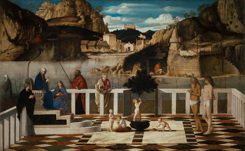
Giovanni Bellini (c. 1438/1440–1516)
c. 1490–1500
Oil on wood panel, 73 × 119 cm.
Uffizi Gallery, Florence
From a geometrical point of view, reflections on calm water act like those on a horizontal mirror. For an observer standing upright, the reflection of an object appears directly below the object itself, mirrored vertically along the horizon line or the surface of the water. This is due to the law of reflection: the angle of incidence equals the angle of reflection. So if a tree stands upright at the edge of a lake, its reflection will drop downward in perfect alignment. For tilted or receding surfaces—like a sloping riverbank—the reflection is similarly angled. Ripples or moving water distort these mirrorings, and Dutch painters were especially alert to these distortions: a shimmering mast on a breeze-ruffled canal, or the elongation and breakup of a church tower in moving water.
Capturing these subtleties required a combination of observation, experience, and painterly instinct, but the geometric underpinnings—mirror symmetry and spatial orientation—were quietly at work. By the 17th century, rendering reflections was not only a test of skill but a sign of a painter's engagement with the natural world as it was actually seen.
The use of reflection on water is one of the principal means of expression in Vermeer's masterful View of Delft. In the quiet expanse of water before the quay, the background edifices are mirrored with remarkable delicacy, their forms softened by a barely perceptible breeze. This faint disturbance causes small ripples that subtly blur the outlines of the broader silhouettes cast in reflection, breaking them here and there with thin, wavering strokes of light paint that suggest a sudden puff of wind ruffling the otherwise still surface. The effect is extraordinary, not only for its technical refinement but for the emotional resonance it generates: the softened reflections seem to hover between presence and disappearance, contrasting with the firm, solid mass of the buildings themselves. The sensation it evokes—that of reality being registered with a sensitivity almost beyond human effort—is one that would be difficult to achieve even with the precision of photography.
Yet this poetic solution was not arrived at effortlessly. X-radiographic analysis of the painting has revealed that Vermeer originally attempted to depict the reflections with perfectly calm water, rendering the mirrored silhouettes with hard, clearly defined outlines. In this earlier version, the water mirrored the city more precisely but less evocatively, lacking the quiet dynamism that now defines the finished work. Vermeer's decision to revise the water's surface—transforming it from a static mirror to a living element responsive to the faintest movement of air—was key to the painting's extraordinary atmosphere. It demonstrates not only his technical command of the oil medium, but also his capacity to observe, reconsider, and refine his perception of nature in order to convey something more truthful than a direct, literal replication.
Refinement
Refinement in art refers to a process of subtle adjustment, polish, and the deliberate elimination of the unnecessary in order to achieve clarity, elegance, or a heightened sense of order and beauty. The term can describe both a visual quality—such as delicacy of touch, smoothness of execution, or restraint in composition—and an intellectual or moral sensibility, implying cultivation and selectivity. Throughout history, refinement has been associated with the classical tradition, in which artists sought not excess or spontaneity, but measured control and an ideal balance of elements. In the 16th and 17th centuries, refinement came to signal not only technical skill but also an artist's ability to convey grace, dignity, or subtle emotion without exaggeration.
Although essential to how we experience many works of art—the concept of refinement rarely appears as a central theoretical topic in historical writings. It often operates in the background of discussions about taste, style, or finish, rather than as a distinct category. However, there are related threads in early modern thought that touch directly or indirectly on refinement as a concept or practice.
One of the most relevant areas is the 17th-century discourse around "taste" and "judgment" particularly in French and Dutch circles. Nicolas Poussin (1594–1665), for example, emphasized restraint, clarity, and harmony in painting, and although he did not use the word "refinement" per se, his letters and the writings of his supporters highlight the value of moderation and intellectual control—qualities closely tied to refinement. Similarly, French theorists like Roger de Piles (1635–1709) wrote about "la belle manière" (the beautiful manner), which entailed not only skill but also discernment in execution—essentially a kind of refined painting that avoided vulgarity or excessive passion.
In the Dutch context, refinement appears more as an observable value than as a theorized one. Karel van Mander (1548–1606), in his Schilder-boeck, discusses net schilderen (neat or clean painting), particularly in his praise of Jan van Eyck and other early masters. The fijnschilders of Leiden in the mid-17th century, such as Gerrit Dou and Frans van Mieris, practiced a form of refinement rooted in minute technique and polished finish. While van Mander died before this school arose, his emphasis on elegance and finish found new life in their work, even if they were noy operating under a formal doctrine.
A somewhat more abstract but related concept can be found in discussions of sprezzatura, a term coined by Baldassare Castiglione (1478–1529) in Il Cortegiano (1528), which refers to effortless grace or studied nonchalance. While not visual in origin, this idea influenced many areas of courtly and artistic behavior, including portraiture and manners. Refinement, in this context, becomes a matter of concealing the labor behind art, suggesting an ideal of control so complete that it feels natural.
There are also art-theoretical reflections that indirectly touch on refinement through the concept of "finish". The long-standing debate between "disegno" and "colore", for example, involved questions about whether a refined, well-planned underdrawing (as in Florentine art) or a more painterly, sensuous finish (as in Venetian art) constituted the superior form. While this doesn't map directly onto Dutch art, it resonates with Dutch painters' careful modulation of surfaces and light.
In short, while no major 17th-century treatise is titled On Refinement, the idea pervades early modern artistic theory through adjacent terms—taste, polish, clarity, harmony, and finish. It was often more a shared value than a debated subject, but one can trace it in both the literature of the period and the way certain paintings were praised or dismissed. Your instinct is correct: refinement was rarely foregrounded, but it was deeply felt and frequently rewarded.
In the context of 17th-century Dutch painting, refinement often took the form of careful craftsmanship, polished surfaces, and a meticulous attention to detail that avoided theatricality. This quality is especially present in the work of artists like Gerrit ter Borch (1617–1681), whose restrained interiors and portraits reveal a refined sensibility in the depiction of fabrics, gestures, and facial expressions. The smoothness of his paint surface and the subdued emotional atmosphere of his scenes show an artist consciously avoiding the coarse or sensational. Frans van Mieris the Elder (1635–1681), another leading fijnschilder or "fine painter," brought refinement to the smallest objects—be it a wine glass or a pearl earring—rendering them with such precision that their realism becomes a kind of elegance. In his paintings, refinement also implies social polish: figures are well-dressed, settings immaculate, and interactions quietly formal.
Vermeer, too, embodies a deep sense of refinement, not only in the technical execution of his paintings—where light, color, and form are resolved with serene precision—but also in his choice of subject matter. His interior scenes are stripped of clutter, his figures composed and inward. The restraint in his palette, the exactitude of the architectural elements, and the soft modulation of light all contribute to a feeling that nothing has been left to chance, and nothing has been allowed to disturb the harmony of the image. In this sense, refinement in Dutch art is not an embellishment but a discipline: a way of seeing and representing the world that seeks order, clarity, and quiet dignity.
Reflection
Reflection, in its most basic sense, is the phenomenon where light waves bounce off a surface rather than being absorbed or transmitted. This is governed by the Law of Reflection, which states that the angle at which light strikes a surface is equal to the angle at which it is reflected. The clarity and nature of the reflected image depend on the type of surface. Smooth, polished materials such as mirrors or still water produce specular reflections, where light rays remain parallel, creating a clear and undistorted image. Rougher surfaces, like a wooden tabletop or unpolished stone, cause diffuse reflection, scattering light in multiple directions and preventing the formation of a coherent image. In materials like glass or water, internal reflection can occur, leading to more complex optical effects.
(detail)
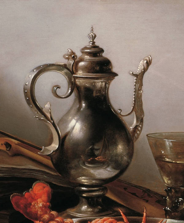
Pieter Claesz
1641, Oil on panel
64 x 88.5 cm., Private collection
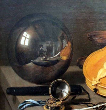
Pieter Claesz.
c. 1628
Oil on oak, 35.9 x 59 cm.
Germanisches Nationalmuseum, Nuremberg
Seventeenth-century Dutch painters demonstrated an extraordinary ability to render reflections, drawing on their acute observation of light's behavior on different materials. The artists of the Dutch Golden Age had no formal scientific understanding of optics in the modern sense, but their meticulous study of the world around them allowed them to depict reflections with remarkable accuracy. Painters such as Vermeer and Rembrandt Harmenszoon van Rijn (1606–1669) captured the way light interacts with metal, glass, and polished wood, creating compositions that feel almost photographic in their precision. Vermeer, in particular, was known for his subtle handling of reflected light, whether in the pearlescent glow of a necklace, the reflections on a wine glass, or the soft gleam of a silver pitcher. His painting Woman with a Pearl Necklace includes a mirror on the wall that reflects the young woman in front of it, adding depth and realism to the scene. Similarly, Pieter de Hooch (1629–1684) often depicted silver-stained glass windows that not only allowed light to enter but also cast delicate reflections onto walls and floors.
Mirrors played a special role in Dutch interiors and, by extension, in Dutch painting. Artists depicted convex mirrors that subtly distorted reflections, demonstrating an awareness of how curved surfaces alter light paths. A precursor to this tradition can be seen in Jan van Eyck's (c. 1390–1441) The Arnolfini Portrait where the small convex mirror behind the figures reflects the room with slight warping. This fascination with optical effects carried into the 17th century, where painters used mirrors both as compositional devices and as proof of their technical skill. Metal objects, such as the polished brass candlesticks and silver platters seen in still-life paintings, provided another challenge, reflecting distorted views of their surroundings depending on their shape and surface quality.
Water, a central feature of the Dutch landscape, also became an important subject for painters seeking to capture its reflective properties. The many canals and waterways of the Netherlands provided ample opportunity to study the way rippling water distorts reflections. Maritime painters like Willem van de Velde the Younger (1633–1707) captured shimmering reflections of ships on calm waters, while artists like Aelbert Cuyp (1620–1691) painted pastoral scenes where reflections in rivers subtly reinforced the tranquil atmosphere.
It has been suggested that Dutch painters surpassed Italians in their ability to render reflections, though locating a definitive historical source for this claim remains difficult. The Dutch emphasis on realism and the depiction of light set them apart from their Italian counterparts, who were often more concerned with idealized forms and dramatic chiaroscuro. The Dutch tradition, with its focus on capturing everyday life in minute detail, naturally led to a heightened awareness of the most refined effects of light, including reflections. This sensitivity to light and materiality remains one of the defining characteristics of Dutch Golden Age painting, making their works feel both scientifically precise and visually poetic.
Religious and Secular Subject Matter
In European painting, the distinction between religious and secular subject matter has long shaped the themes and purposes of art. In earlier centuries, particularly during the Middle Ages and the Renaissance, religious imagery dominated. Artists were often commissioned by the Church or pious patrons to depict scenes from the Bible, lives of saints, and other spiritual subjects intended to instruct, inspire, or serve devotional purposes. These paintings were usually filled with symbolism, strict iconography, and references to theological ideas that would have been familiar to their intended audience. The shift toward secular themes developed gradually, encouraged by humanist thought during the Renaissance, which emphasized the dignity of the individual and the observation of the natural world. Over time, subjects such as portraits, mythological scenes, still lifes, landscapes, and genre scenes gained prominence alongside religious works, especially as patronage diversified and markets for private collectors expanded.
By the 17th century in the Dutch Republic, the boundary between religious and secular subjects became especially pronounced. After the Protestant Reformation, the Dutch Reformed Church discouraged religious imagery in public churches. This had a major effect on art production, since painters could no longer rely on large ecclesiastical commissions. Instead, a growing number of artists turned to secular themes that appealed to the tastes and values of private buyers. This led to an unprecedented flourishing of genre scenes, portraits, landscapes, marine views, still lifes, and depictions of everyday life. Religious themes were not entirely absent, but they were often treated in a more subdued or symbolic manner, or confined to private domestic settings.
In the Dutch context, the secularization of subject matter does not imply a loss of moral or spiritual content. Many apparently mundane scenes carried moral or allegorical meanings that would have been understood by contemporary viewers. A painting of a disorderly tavern might serve as a warning against vice, while a quiet domestic interior might evoke ideas of virtue and harmony. Even still lifes—compositions of flowers, fruit, or luxury objects—could function as vanitas images, reminding viewers of the transience of earthly pleasures and the inevitability of death.
Artists like Pieter de Hooch (1629–c. 1684) and Gerard ter Borch (1617–1681) created refined interiors that, while lacking overt religious imagery, communicated ideals about domestic piety, social order, and feminine virtue. Meanwhile, painters such as Jan Steen (c. 1626–1679) used humor and chaos in his genre scenes to depict moral lessons in an accessible, entertaining way. Still others, like Jacob van Ruisdael (1628/29–1682), conveyed a sense of the sublime through landscapes that, though not explicitly religious, could evoke divine presence through nature's grandeur. In contrast to these secular works, religious subjects persisted in more private or Catholic households, especially in cities like Utrecht, where painters such as Abraham Bloemaert (1566–1651) continued to produce biblical scenes.
The influence of the Catholic faith on Vermeer's work, as documented by the Vermeer specialist Gregor J.M. Weber (Johannes Vermeer: Faith, Light and Reflection, 2023), is deep and multifaceted, touching both his personal life and artistic choices. Vermeer was born into a Protestant family and baptized in the Reformed Church, but his marriage to Catharina Bolnes, daughter of the devout Catholic Maria Thins (c. 1593–1680), marked a decisive turn in his religious and social world. The Bolnes-Thins household lived in Delft's Papenhoek, a quarter densely inhabited by Catholics, directly adjacent to a Jesuit station and house church. The family's daily life was steeped in Catholic culture: their children were named after saints, many with Jesuit associations, and they were raised in the Catholic tradition, most likely baptized and educated under the guidance of the Jesuits. Although no formal record confirms Vermeer's conversion, the marriage arrangements—likely sanctioned by a Jesuit priest in nearby Schipluiden—strongly suggest that he embraced the faith of his wife's family and participated in its rituals and worldview.
Inside the Vermeer household, Catholic devotional art was not only present but integrated into the rhythms of domestic life. An inventory taken shortly after Vermeer's death reveals the presence of multiple religious works, including paintings of the Crucifixion, a Veronica image (linked to the relic of Christ's face), and objects such as an ebony cross. These items were placed not in formal receiving rooms but in the more intimate interior spaces like the binnekeucken (inner kitchen), where the family gathered. Significantly, these sacred images were arranged in a way that echoed Jesuit meditative practice, pairing the Veronica with another picture described as showing "all kinds of women's things"—possibly a still life or symbolic arrangement—suggesting a contrast between worldly vanity and divine contemplation, as encouraged by Jesuit devotional literature. This setting reveals that the family did not merely display their faith but lived it, turning parts of their home into informal sanctuaries for spiritual reflection.
The Jesuit presence in Delft was especially meaningful. Their church, school, and residence just steps from Vermeer's home created a neighborhood saturated in Catholic ideas, rituals, and pedagogy. Jesuit theology emphasized divine light, visual contemplation, and the power of sacred images to move the soul—values that found striking resonance in Vermeer's mature painting. The Jesuits were known for employing optical metaphors and instruments, such as the camera obscura, to explore spiritual insight and inner transformation. Vermeer's celebrated attention to light, clarity, and stillness aligns remarkably with this worldview. The Allegory of the Catholic Faith, one of his few explicitly religious works, incorporates imagery and composition that reflect Jesuit influences: a glass orb representing the celestial sphere, a snake crushed underfoot as a symbol of heresy, and a depiction of Christ's crucifixion that matches a painting by Jacques Jordaens—a work found in the family's own collection.
While most of Vermeer's paintings depict secular interiors, they are not void of spiritual content. His figures are often engaged in solitary, contemplative acts—reading, writing, making music, or gazing out a window. These seemingly mundane moments invite a quiet introspection that resonates with Jesuit meditative practices. Scholars have noted that his art embodies a Catholic aesthetic of stillness and inwardness, offering scenes that are emotionally restrained but spiritually suggestive. His ability to transform ordinary domestic settings into spaces of luminous depth and mystery echoes the Jesuit ideal of finding the divine in daily life.
Taken together, the evidence gathered by Weber supports the conclusion that Vermeer was not only surrounded by Catholicism but participated in its devotional culture to a degree that left lasting traces in his painting. His choice of themes, his handling of light, and the symbolic layering of his compositions suggest a vision shaped by the Catholic imagination, particularly the Jesuit synthesis of theology, optics, and visual art. Whether or not he formally converted, Vermeer's work stands as a rare and eloquent testament to the Catholic spirit within the Protestant Dutch Republic.
Relining
From: Wikipedia.
The relining, or lining as it is also called, of a painting is a process of restoration used to strengthen, flatten or consolidate oil or tempera paintings on canvas by attaching a new canvas to the back of the existing one. In cases of extreme decay, the original canvas may be completely removed and replaced. Lining has been very widely practiced, and during the 19th century, some painters had their works lined immediately after, or sometimes even before, completion. There have been some doubts concerning its benefits more recently, especially since the Greenwich Comparative Lining Conference of 1974.
The procedure as carried out in the 19th century is described by Theodore Henry Fielding in his Knowledge and Restoration of Old Paintings (1847). The picture was removed from the stretcher and laid on a flat surface. The edges of the canvas were trimmed, leaving the original support smaller than the new lining. A sheet of paper covered in thin paste was laid on the surface of the painting, which was then placed face-down on a board or table. The back of the picture was then coated with paste, copal varnish, or a glue made from cheese. The new lining canvas was pressed down onto the back of the picture by hand; then the outer edges of the lining cloth were fastened to the table by means of a large number of tacks, and a piece of wood with a rounded edge was passed over the back of the cloth, to ensure perfect adhesion. When the glue had dried sufficiently, the lining was smoothed with a moderately hot iron. Fielding cautions that "the greatest care must be taken that the hand does not stop for an instant, or the mark of the iron will be so impressed on the painting, that nothing can obliterate it." The picture was then nailed to a new stretcher, and the paper was washed off with a sponge and cold water.
Fielding also describes the process for the complete removal and replacement of the canvas. In this, the picture was covered with paper, as if for lining, then fastened to a board or table, after which the old cloth was rubbed away with a small rasp with very fine teeth; when the restorer had gone "as far as may be prudent," the remainder of the cloth could be taken off with a pumice stone, until the ground on which the picture was painted became visible. It was then ready to receive its new cloth, which had previously been covered with copal varnish, glue, or paste. In this procedure, the hot iron was not used.
The use of hand-ironing is liable to produce a flattening of impasto, referred to as crushed impasto. This problem was mitigated by the introduction in the 1950s of vacuum hot-table processes, designed for use with wax-resin adhesives, which exerted a more even pressure on the paint surface; however the longer periods of heating and high temperatures involved often led to other types of textural alteration.
Wax-based adhesives seem to have been in use for lining from the 18th century, although the earliest well-documented case of their employment is in the lining of Rembrandt's Night Watch in 1851. Although, initially, pure beeswax was used, mixtures incorporating resins such as dammar and mastic, or balsams such as Venice turpentine, were soon found preferable. During the twentieth century, it came to be realized that the impregnation of the paint layer with wax could have deleterious effects, including darkening of the picture, especially where canvas or ground were exposed.
Although experiments with synthetic fabrics were carried out during the 1960s and 1970s, traditional linen cloths are still usually used for lining. However polyester canvas is often used for strip-lining, where only the edges of the painting are backed, and for loose-lining, in which no adhesive is used. This latter technique helps protect the painting from atmospheric pollution, but does not flatten or consolidate the paint surface.
All of Vermeer's canvases, except for The Guitar Player, have been relined, and one, The Lacemaker, mounted on panel. Not only has The Guitar Player never been relined, it is still mounted on its original wood stretcher with wooden pegs, making it an extraordinary rarity among paintings of the age.
Renaissance
The French word from which Renaissance is derived is renaissance itself, meaning "rebirth" or "revival." It comes from the verb renaître (to be reborn), which is formed from naître (to be born). The term was popularized by 19th-century French historians such as Jules Michelet (1798–1874), who used it to describe the revival of art, science, and culture in Europe following the Middle Ages. In both French and English, Renaissance is 3rd when referring to the historical period. For Italy the period is popularly accepted as running from the second generation of the 14th century to the 2nd or third generation of the 16th century.
Characteristic of the Renaissance is the steady rise of painting and of the other visual arts that began in Italy with Cimabue (c. 1240–1302), and Giotto (1266–1337) and reached its climax in the 16th century. An early expression of the increasing prestige of the visual arts is found on the Campanie of Florence, where painting, sculpture and architecture appear as a separate group between the liberal and the mechanical arts. What characterizes the period is not only the quality of the works of art but also the close links that were festablished between the literature, visual arts, and the sciences. Artists moved away from the rigid, hieratic styles of the Middle Ages and developed techniques that emphasized depth, proportion, and the accurate depiction of the human figure and the natural world. While the Renaissance is often considered a unified movement, it evolved in distinct phases, each with its own artistic characteristics and regional developments.
The Early Renaissance, spanning roughly from the late 14th to the early 15th century, saw the foundational innovations that defined the period. Florence, under the patronage of families like the Medici, became the center of artistic experimentation. Artists such as Giotto di Bondone (c. 1267–1337) pioneered a more naturalistic approach to space and form, while later figures like Masaccio (1401–1428) developed linear perspective, giving paintings a convincing sense of depth. Filippo Brunelleschi (1377–1446) applied mathematical precision to architecture, as seen in the dome of Florence Cathedral, while sculptors such as Donatello (c. 1386–1466) revived classical ideals in their treatment of the human form.
Andrea del Verrocchio (c. 1435–1488) holds a crucial place in the development of the Italian Renaissance, especially in Florence during the second half of the 15th century. Though not always granted the same level of fame as some of his contemporaries, his significance lies in his role as both a masterful artist and a profoundly influential teacher. His workshop was one of the most important artistic centers of its time and served as a formative training ground for some of the greatest figures of the High Renaissance, most notably Leonardo da Vinci.
Verrocchio’s own style represents a transitional moment between the Early Renaissance, characterized by clarity, balance, and careful observation, and the emerging interest in expressive dynamism and psychological complexity. His work in sculpture—such as the bronze David or the Equestrian Monument to Bartolomeo Colleoni in Venice—shows a technical sophistication and understanding of anatomy and movement that strongly influenced later artists. His David, for instance, reflects a more lifelike and introspective approach compared to Donatello’s earlier version, suggesting a shift toward the Renaissance’s growing emphasis on the individual.

Andrea del Verrocchio and Lorenzo di Credi
c. 1475–1486
Oil on panel, 196 x 196 cm
Cathedral of San Zeno, Pistoia
The High Renaissance, flourishing in the late 15th and early 16th centuries, marked the peak of Renaissance artistic achievement. Artists perfected techniques of linear perspective, composition, and anatomical accuracy, producing works of harmony and idealized beauty. Leonardo da Vinci (1452–1519) embodied the Renaissance Man, mastering painting, anatomy, engineering, and scientific observation. His Mona Lisa and The Last Supper demonstrate his skill in sfumato, a technique that created soft, atmospheric transitions of light and shadow. Michelangelo (1475–1564) sculpted the monumental David and painted the Sistine Chapel ceiling, showcasing his deep understanding of the human body and dynamic composition. Raphael (1483–1520) excelled in balanced, balanced compositions, as seen in The School of Athens, where he harmonized Classical themes with Renaissance ideals of knowledge and artistic mastery.
The Late Renaissance, or Mannerism, emerged in the mid-16th century as a reaction to the balance and clarity of the High Renaissance. Artists such as Jacopo Pontormo (1494–1557) and Parmigianino (1503–1540) experimented with elongated figures, unnatural spatial arrangements, and intense colors. Mannerist painters moved away from strict naturalism, emphasizing expressive distortion and complex compositions. This period also saw the expansion of Renaissance ideas into northern Europe, where artists such as Albrecht Dürer (1471–1528) and Hans Holbein the Younger (c. 1497–1543) combined Italian techniques with the meticulous detail characteristic of Northern traditions.
The Northern Renaissance developed concurrently but with distinct characteristics, particularly in the Low Countries and Germany. While Italian artists focused on idealized human forms and Classical references, Northern artists emphasized intricate detail, precise textures, and a deep interest in everyday life. Jan van Eyck (c. 1390–1441) mastered oil painting, achieving an unprecedented level of realism, as seen in the Arnolfini Portrait. Hieronymus Bosch (c. 1450–1516) created fantastical, allegorical scenes filled with moral and religious symbolism, while Pieter Bruegel the Elder (c. 1525–1569) explored peasant life with remarkable observational skill. Unlike the monumental frescoes of Italy, Northern artists often worked on smaller, highly detailed panels that catered to a growing middle-class market.
The divergence between Northern and Italian High Renaissance painting is rooted in profound differences of culture, theology, and artistic aims. Michelangelo is known to have disparaged Northern painting in pointed terms. According to a remark preserved by Francisco de Hollanda (c. 1517–1585), a Portuguese painter and humanist who interviewed him in the 1530s, Michelangelo said that Northern painting "will please the devout better than the intelligent" and that it was fit only "for women and for old men and for children." He added that Northern painters knew "how to paint a tree, a landscape, or an animal," but not how to paint a man. This reflects the Florentine belief that the nude male figure was the highest test of artistic skill—central to Michelangelo's own art—and that true art required invention, intellectual rigor, and mastery of the human form in motion.
The quote encapsulates a broader Renaissance hierarchy that placed Italy, and particularly Florence and Rome, at the center of intellectual and artistic excellence, while viewing the Northern tradition as skilled but lacking in conceptual ambition. This judgment, though influential for centuries, has since been reassessed: today, the innovations of the Northern artists in oil painting technique, naturalism, and symbolic depth are regarded as no less sophisticated, just differently oriented. The two traditions ultimately enriched each other, as seen in the cross-fertilizations of the later 16th and 17th centuries.
By the late 16th and early 17th centuries, Renaissance ideals gave way to the Baroque, a period of heightened drama, movement, and emotional intensity. While the transition was gradual, the shift from harmonious balance to theatrical dynamism is evident in the works of Caravaggio (1571–1610) and Peter Paul Rubens (1577–1640). In the Netherlands, the Renaissance had a more muted impact than in Italy, largely due to the pragmatic and Protestant culture of the Dutch Republic. However, early Dutch painters such as Jan Gossaert (c. 1478–1532) and Maarten van Heemskerck (1498–1574) introduced Italianate influences, paving the way for later developments in Dutch art.
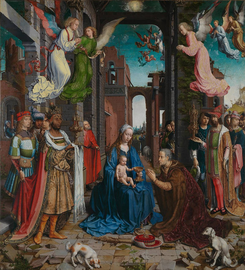
Jan Gossaert
1510–1515
Oil on oak, 177.2 x 161.8 cm
National Gallery, London
In 17th-century Dutch painting, Renaissance principles persisted but were adapted to suit the tastes and intellectual climate of the Dutch Republic. The emphasis on perspective, naturalism, and Classical themes can be seen in history painting and architectural studies, while the empirical realism of Dutch artists reflected a departure from the idealized forms of the High Renaissance. Vermeer's mastery of perspective and light suggests an awareness of Renaissance spatial construction, yet his intimate, meticulously detailed interiors represent a distinctly Dutch evolution of these principles. The Renaissance thus laid the foundation for the innovations of the Dutch Golden Age, demonstrating how artistic ideas were continually reinterpreted to align with changing cultural and intellectual contexts.
The period of the Renaissance brought with it fundamental changes in the social and cultural position of the artist. Over the course of the period there is a steady rise in the status of the painter, sculptor and architect and a growing sympathy expressed for the visual arts. Painters and sculptors made a concerted effort to extricate themselves from their medieval heritage and to distinguish themselves from mere craftsmen. At the beginning of the Renaissance, painters and sculptors were still regarded as members of the artisan class, and occupied a low rung on the social ladder. A shift begins to occur in the fourteenth century when painting, sculpture and architecture began to form a group separate from the mechanical arts. In the fifteenth century, the training of a painter was expected to include knowledge of mathematical perspective, optics, geometry and anatomy.
Although the influence of the Italian Renaissance was felt throughout Europe and in the Netherlands as well, it is interesting to note that none of the great masters of Dutch painting felt the necessity to go to Italy to adsorb its lessons first hand. Jacob van Ruisdael (c. 1629–1682), Frans Hals (c. 1582–1666), Vermeer and Rembrandt (1606–1669) all stayed in the Holland, close to their own culture.
Modern critics suggest that the influence of Italian Renaissance painting on Vermeer was subtle but meaningful, filtered not through direct contact with Italy but through northern intermediaries and artistic crosscurrents. Unlike a number of Duth painters who had traveled to study the ruins of Rome or the grand frescoes of Florence, Vermeer absorbed Italian ideas largely through the eyes and brushes of others. Chief among these were the Utrecht Caravaggists, who had returned from Rome with a dramatic new approach to light and realism, and artists like Carel Fabritius (1622–1654), whose refined handling of space and tone offered an alternative to both academic classicism and local traditions.
Of particular relevance is the Venetian school, especially the works of Titian (c. 1488–1576) and Veronese (1528–1588), which emphasized light, color, and atmospheric unity over linear design. In Vermeer's Diana and Her Companions, the influence of Venetian colorito—the emphasis on color, tone, and painterly surface rather than linear design—is subtly but distinctly present. While Vermeer never traveled to Italy like a number of Dutch painters, and likely did not see the works of Titian or Veronese firsthand, the painting demonstrates a tonal richness and softness of modeling that echo, the opinion of a various Vermeer experts the Venetian tradition. The figures are enveloped in warm, subdued colors and gentle transitions of light, creating a contemplative atmosphere rather than a narrative emphasis. Flesh tones are rendered with a luminous delicacy, and the fabrics of the robes display a harmonious interplay of ochres, subdued blues, and browns, reminiscent of the Venetian preference for organizing the composition through chromatic relationships rather than precise outlines. These qualities suggest that Vermeer, perhaps through the mediation of Northern artists influenced by Italy, absorbed aspects of colorito and transformed them into a restrained, introspective visual language that would later define his mature style.
While Vermeer was likely not familiar with Titian's paintings firsthand, the atmospheric sensibility and the tonal richness of Diana and Her Companions indicate that the legacy of colorito had filtered into his work, perhaps via Peter Paul Rubens (1577–1640), the Caravaggists, or prints, or the Italian paintings or myriad copies of them circulating in the Netherlands.
Render
Rendering in art and technical drawing means the process of formulating, adding color, shading and texturing of an image. It can also be used to describe the quality of execution of that process. When used as a means of expression, it is synonymous with illustrating. The alternative method to rendering an image is capturing an image such as photography or image scanning. Both rendered and captured images can be mixed, edited, or both.
Repoussoir
Repoussoir, is an art-realted term rom the French verb meaning to "push back," which is one of the pictorial means of achieving perspective or spatial contrasts by the use of illusionistic devices such as the placement of a large figure or object in the immediate foreground of a painting to increase the illusion of depth in the rest of the picture. Caravaggio (1571–1610) had become famous for his paintings of ordinary people or even religious subjects in compositions. Repoussoir figures appear frequently in Dutch figure painting where they function as a major force in establishing the spatial depth that is characteristic of painting of the 17th century. Landscapists too learned to exploit the dramatic effect of repoussoir to enliven their depictions of the flat uneventful Dutch countryside. Repoussoir formulae is still used in landscape painting and is influential in photography as well.
Vermeer adapted various examples of repoussoir to his own compositions that he had derived from other Dutch paintings. The looming figure of the officer in Officer and Laughing Girl is very similar in color and shape to the repoussoir figure in The Procuress by Gerrit Van Honthorst (1592–1656).
The most spectacular example of repoussoir in Vermeer's oeuvre may be found in The Art of Painting. The large foreground curtain on the left-hand side of the painting seems to have been just drawn back to let the viewer enter the pictorial space. Both the curtain's warm tone and the heavy impasto paint application makes it appear even nearer to the viewer.
This kind of repoussoir was generally placed on the left-hand side of the composition because we tend to rapidly scan images darting from the left to the right as when reading. By consequence, Vermeer's repoussoir is suited to be looked at by the reading eye, which, after a brief moment's delay at the repoussoir, is directed toward the key moment of the representation of the painter and his model and explores the rest of the painting thereafter.
Representation
In art, representation refers to the depiction of subjects in a way that conveys their appearance, meaning, or essence, whether through direct imitation or symbolic abstraction. It is one of the fundamental modes of artistic expression, encompassing a wide range of approaches from naturalistic portraiture to highly stylized or conceptual interpretations. Unlike purely abstract art, which does not attempt to depict recognizable forms, representation engages with the visible world, human figures, objects, landscapes, or narratives, often reflecting the cultural, historical, and philosophical context in which it was created.
Throughout history, representation in art has evolved significantly. In ancient civilizations, artistic representation was often governed by strict conventions. Egyptian art, for example, used a hierarchical scale to indicate social status, depicting pharaohs larger than other figures, while Greek sculpture sought to capture the idealized human form, progressing from the rigid Archaic kouros figures to the dynamic realism of Classical and Hellenistic statues.
During the Renaissance, representation became increasingly grounded in scientific observation and perspective, with artists such as Leonardo da Vinci (1452–1519) and Raphael (1483–1520) employing techniques like linear perspective, foreshortening, and chiaroscuro to create the illusion of three-dimensional space. This period saw a deep engagement with human anatomy, proportion, and the natural world, as artists sought to render figures with heightened realism and psychological depth.
In the Baroque era, representation became more theatrical and emotionally charged, with artists like Caravaggio (1571–1610) using dramatic lighting and intense realism to enhance narrative impact. Rembrandt (1606–1669), through his penetrating self-portraits and biblical scenes, captured psychological complexity, demonstrating that representation could go beyond physical likeness to convey inner emotion and meaning.
Reproduction (of artworks)
In painting and art history, the term reproduction refers to copies of original artworks created through various medium, ranging from hand-painted replicas to mechanical or digital printing. The concept of reproduction has been central to the dissemination, study, and commercialization of art for centuries, influencing how people engage with masterpieces beyond their original locations.
Historically, reproductions were often made by workshop assistants or followers of a master, sometimes under direct supervision, as a means of training or spreading an artist's distinctive style. With the advent of printmaking techniques such as engraving, etching, and lithography, reproductions allowed wider audiences to experience and study famous works that would otherwise be inaccessible. These prints played a significant role in shaping art appreciation and scholarship, particularly before the advent of photography.
In modern times, printed reproductions can take many forms, from high-quality museum-sanctioned facsimiles to inexpensive posters. Digital technologies now allow for astonishingly precise reproductions, capturing even the subtlest textures and color nuances. Some contemporary reproductions, such as giclée prints, use fine-art inkjet printing on canvas or paper, mimicking the original's txetural qualities.
While reproductions make art more accessible, they also raise questions about authenticity and value. Unlike original works, which bear the artist's hand and historical presence, reproductions lack provenance and uniqueness. However, some reproductions, such as those created for conservation purposes, play a crucial role in preserving cultural heritage. For instance, in cases where an artwork is at risk of deterioration, an exact reproduction can allow museums to display a faithful likeness while protecting the original.
Reproductions, therefore, occupy a complex space in art history, bridging the gap between accessibility and authenticity, scholarship and commerce, preservation and originality.
Reputation
Reputation, in the context of artists, refers to the perception of their skill, innovation, and character within the artistic community and among patrons, collectors, and critics. It is shaped by a combination of factors, including the artist's technical ability, subject matter, association with influential figures, and market demand for their work. Reputation could be carefully cultivated, rise or fall due to external circumstances, or be reassessed long after an artist's death.
In the 17th-century Dutch Republic, an artist's reputation played a crucial role in securing commissions, maintaining a steady income, and influencing the reception of their work. Unlike in Italy or France, where patronage was often tied to the court or the church, Dutch artists operated in a relatively open market where reputation was built through skill, networking, and sometimes strategic self-promotion. Guild membership, particularly in the Guild of St. Luke, helped establish professional credibility, while the endorsement of prominent collectors or connoisseurs could elevate an artist's status.
For many painters, reputation was tied to specialization. The Dutch art market favored artists who excelled in specific genres—whether portraiture, landscape, still life, or history painting. Painters such as Frans Hals (1582–1666) gained a reputation for lively and expressive portraiture, while Jacob van Ruisdael (c. 1628–1682) was admired for his evocative landscapes. Specialization was not only an artistic choice but also a marketing strategy, helping artists distinguish themselves in a highly competitive environment.
Reputation was also affected by associations with prominent figures. Artists linked to influential patrons, such as Constantijn Huygens (1596–1687), could gain recognition beyond their immediate circle. Rembrandt van Rijn (1606–1669), for example, initially built his reputation in Leiden but achieved greater renown after moving to Amsterdam and receiving commissions from wealthy burghers and civic institutions. However, reputation was volatile, and Rembrandt's financial struggles and changing tastes later led to a decline in his standing.
Art manuals and biographies played a role in shaping reputation, both during an artist's lifetime and posthumously. Karel van Mander (1548–1606) in Het Schilder-Boeck (1604) helped construct the reputations of past and contemporary painters by emphasizing their artistic lineage and personal virtues. Later, Arnold Houbraken (1660–1719) in De groote schouburgh der Nederlantsche konstschilders en schilderessen (1718–1721) created a hierarchy of Dutch painters, reinforcing certain reputations while diminishing others.
The international reception of Dutch painters further influenced reputation. Artists whose works were collected by foreign courts, such as Gerrit Dou (1613–1675) and Jan Steen (1626–1679), gained prestige beyond the Netherlands, often commanding higher prices abroad than at home. In contrast, artists who remained within the domestic art market might have a strong regional reputation but limited international recognition.
Reputation could also be shaped by scandal or personal conduct. Artists known for extravagant lifestyles or unorthodox behavior, such as Steen, were sometimes viewed with skepticism despite their technical skill. Conversely, painters like Gerrit ter Borch (1617–1681), known for refinement and diplomatic engagements, maintained a more dignified reputation, reinforcing their appeal to elite patrons.
Over time, reputation was subject to historical reevaluation. Some painters who were immensely successful in their lifetime, such as Bartholomeus van der Helst (1613–1670), later fell into relative obscurity, while others, like Vermeer, who was relatively unknown in his time, were rediscovered and gained posthumous acclaim.
Reserve
A reserve is a temporarily unfinished or blank area of a painting which is surrounded by painted areas that are either partially or fully completed. A reserve generally corresponds to the area within the outer-most contour of a single object such as a figure, a tree or an architectural feature. Once painters of the Renaissance and Baroque had established the composition through a thin outline drawing on a monochrome ground, it was then underpainted with a dull monochrome tint. Successively, each area of the composition was worked up in a piecemeal fashion with full color, creating reserves of unpainted objects.
Period art manuals recommended that the background areas, usually the least important from a thematic point of view, be painted first, leaving reserves for the important foreground elements. This sequential system would allow to the painter to softly blend the outer contours of the foreground figures into the colors of the background, slightly overlapping them and creating a more convincing sensation of roundness. However, this system was not applied dogmatically and one can find examples of unfinished paintings which show the figures worked up in color with the background left relatively unfinished. Portrait painters routinely completed the face before working up the background or the figure's body.
Resin
A resin is a solid or highly viscous substance of plant or synthetic origin. Many plants, particularly woody plants, produce resin in response to injury. Resin acts as a bandage protecting the plant from invading insects and pathogens. Plant resins are valued for the production of varnishes, adhesives and food glazing and paint mediums. The hard transparent resins, such as the copals, dammars, mastic and sandarac, are principally used for varnishes and adhesives, while the softer odoriferous oleo-resins (frankincense, elemi, turpentine, copaiba), and gum resins are more used for therapeutic purposes and incense.
Resins are used to increase the gloss of oil paint, reduce the color and drying time of a medium, and add body to drying oils. The most commonly used is a natural resin known as dammar, which should be mixed with turpentine as it will not thoroughly dissolve when mixed with mineral spirits. Dammar can also be used as a varnish. Exudations from conifer resins used in painting are Strasbourg turpentine, Venice turpentine, sandarac and various kinds of copals.
Restorations vs Conservation)
Restoration and conservation are two distinct approaches to preserving artworks, buildings, and cultural artifacts, differing in both philosophy and method. Restoration aims to return an object to a previous state, often attempting to recreate its original appearance by removing later additions, repainting missing areas, or reconstructing damaged elements. This approach prioritizes aesthetic unity and historical accuracy, sometimes requiring significant intervention that alters the object's current state. Conservation, in contrast, focuses on preserving an artifact as it exists today, preventing further deterioration while maintaining as much of the original material as possible. Conservation methods typically include cleaning, stabilizing structures, and applying protective treatments, always with the principle of minimal intervention in mind. While restoration seeks to recover a lost past, conservation prioritizes long-term preservation, often leaving signs of age and history intact. In modern museum and heritage practices, conservation is generally preferred, as it respects an object's authenticity and avoids irreversible changes.
Retouch
Retouching describes the work done by a restorer to replace areas of loss or damage in a painting. Retouchings are done in a soluble medium that differs from the original so that they can be removed easily. Retouching is usually intended to be invisible to the naked eye, but there may be reasons for it to be distinguishable when the painting is viewed at close range.
On 23 September 1971
a 21-year-old idealistic thief stole Vermeer’s Love Letter (c. 1669) which was on loan at the Palais des Beaux-Arts in Brussels. To transport it under his sweater the thief roughly cut the canvas from its stretcher
folded it once, and tucked it into his trousers. When the painting was recovered two weeks later
it was badly damaged and in need of both conservation and retouching in large areas where the original paint had become detached.
Over the period of 250 years after Vermeer's paintings left the artist's studio, a number have been retouched, some only to repair paint damage or fading, while at least one, features a compositional addition that does not reflect the artist's original intentions. On the background wall of Girl Interrupted in her Music a small birdcage, a common prop in Dutch interior painting, was added by a later hand. A violin once hung on the background of same picture, most likely itself another later addition.
Retrospective
A retrospective, in the broadest sense, refers to a reflective look back at past events, works, or achievements, often to assess their significance or development over time. It is commonly used in various fields, including literature, film, and history, but in art, a retrospective specifically refers to an exhibition or study that presents a comprehensive overview of an artist's body of work, often spanning their entire career.
Retrospectives are typically organized by museums, galleries, or academic institutions to showcase how an artist's style, technique, and thematic concerns evolved over time. Unlike standard exhibitions, which may focus on a particular theme, movement, or period, a retrospective aims to provide a deeper understanding of an artist's artistic progression, influences, and impact. Major retrospectives often coincide with key anniversaries, such as the centenary of an artist's birth or after their passing, serving both as an honor and a scholarly examination.
The concept of the retrospective became more formalized in the 19th and 20th centuries, particularly with the rise of public museums and art institutions that sought to document and historicize artistic achievements. The Salon des Refusés (1863), which showcased rejected works from the official French Salon, can be seen as an early precursor to the idea of looking back at artists who were overlooked in their time. By the late 19th century, retrospectives of figures such as Francisco Goya (1746–1828) and Jean-Auguste-Dominique Ingres (1780–1867) helped redefine their legacies.
In the 17th-century Netherlands, there was no institutionalized retrospective tradition as we understand it today. However, artists were sometimes honored with collections of their prints or drawings, and art dealers or collectors might organize posthumous sales or exhibitions of an artist's works. For instance, after Rembrandt van Rijn (1606–1669) died in relative obscurity, interest in his work revived in later decades, leading collectors to seek out and reassess his paintings and etchings. Though not "retrospectives" in the modern sense, these sales and re-evaluations played a similar role in shaping an artist's posthumous reputation.
Today, retrospectives serve both academic and public audiences, offering insight into an artist's creative evolution, historical significance, and ongoing influence. They often recontextualize overlooked or misunderstood works, sometimes challenging previous interpretations of an artist's career. In some cases, they even lead to new discoveries, such as reattributions, conservation findings, or fresh scholarly perspectives that alter how an artist is viewed within the borader perspective ofm art history.
In 2023, the Rijksmuseum in Amsterdam hosted a landmark retrospective of Vermeer, marking the most comprehensive exhibition of the Dutch master's work to date. Running from February 10 to June 4, the exhibition featured 28 of Vermeer's approximately 35 known paintings, an unprecedented assembly that drew art enthusiasts from around the globe. Notably, it included works never before displayed in the Netherlands, like the newly restored Girl Reading a Letter at an Open Window from the Gemäldegalerie Alte Meister in Dresden.
The retrospective was organized in collaboration with the Mauritshuis and involved extensive research into Vermeer's artistry, techniques, and creative process. This scholarly effort provided fresh insights into his work, enhancing the exhibition's depth and educational value.
The exhibition attracted approximately 650,000 visitors, setting a new attendance record for the Rijksmuseum. To accommodate the overwhelming demand, the museum extended its opening hours and offered additional tickets, underscoring Vermeer's enduring appeal and the exhibition's significance in the art world.
Rhetoric
The term rhetoric appears frequently in art-historical discussions of 17th-century Dutch art, and it can be elusive because it can be employed in both literal and metaphorical ways. The connection lies in how painters, like writers or orators, were seen to persuade, instruct, or move the viewer—not with words, but with images. Today, however, the word "rhetoric" and even more so "rhetorical" often carries a negative connotation, suggesting empty persuasion, superficial eloquence, or speech that lacks sincerity. But in its original and early modern use, the term described a respected system of communication and argument, grounded in philosophy and education. In this earlier sense, rhetoric was understood as the art of persuasive expression, and it could just as easily apply to visual images as to spoken or written words.
Pieter Isaacsz or Reinhold Timm
1620s
Oil on canvas, Rosenborg Castle
Copenhagen
In its Classical origin, rhetoric is the art of persuasive communication, as theorized by figures like Aristotle (384–322 BCE), Cicero (106–43 BCE), and Quintilian (c. 35–c. 100 CE). It traditionally applies to spoken or written language and involves organizing arguments, appealing to emotions or reason, and crafting speech with elegance and clarity. However, from the Renaissance onward, these rhetorical principles were extended to the visual arts. Painters were expected to do more than represent the visible world; they were to move the spectator, stir the soul, and provoke reflection—especially on moral, religious, or civic virtues.
In the Dutch context, this took a distinctive form. Unlike Italian or French courtly culture, where grand historical or mythological paintings dominated, Dutch painters often relied on smaller, more intimate scenes filled with moral, humorous, or observational content. Yet these images, too, were seen as rhetorical. A genre painting by Jan Steen (c. 1626–1679) might be packed with visual cues that guided the viewer toward a moral interpretation. A still life by Pieter Claesz (1597–1660) could carry a vanitas message meant to persuade the viewer of life's transience. Even Vermeer, though reserved in narrative terms, constructed scenes that gently directed attention and contemplation through composition, gesture, and light—what could be called a silent rhetoric.
The rhetoricians' guilds—rederijkerskamers in Dutch—were associations of amateur poets, dramatists, and performers that flourished in the Low Countries from the late medieval period into the early modern era. They functioned as cultural and civic institutions, organizing plays, poetry contests, public celebrations, and literary debates. Each chamber had its own emblem, motto, and hierarchical structure, often including a prince or dean, as well as designated poets. Their heyday was in the 16th century, but some chambers continued into the 17th century, particularly in cities with strong civic traditions. The chambers were closely connected to urban life and civic pride, and their performances were often allegorical or moralizing, blending religious, satirical, and popular elements. Though originally literary in nature, these groups had a pronounced performative aspect and often collaborated with visual artists for stage decorations, banners, and festive pageantry.Some artists had direct connections to them. For example, Karel van Mander (1548–1606), an important painter and art theorist, wrote extensively about art's power to teach and persuade in his Schilder-Boeck (1604), blending rhetorical and pictorial concerns.
By the 17th century, the influence of the rederijkerskamers had waned, and their cultural role shifted from literary innovation to a more carnivalesque association with conviviality and disorder. Their festivals and public performances came to be seen as indulgent and chaotic—part of the topsy-turvy world of the kermis, or village fair. This late-stage image of the rhetoricians is what Jan Steen (c. 1626–1679) captured in A Rhetoricians' Feast, a painting last recorded on the London art market in 1979. In it, Steen shows a gathering beneath the headquarters of a rhetoricians' chamber, with participants smoking, drinking, laughing, and enjoying each other's company. Some figures lean out of windows, pipes in hand; others toast below, as the chaos of the kermis spills in through the gateway. A verse inscribed on a beam playfully urges, "When everyone has eaten and drunk heartily, don't forget the friendly pipes." Steen's painting reflects both a nostalgic and mocking view of the rederijkers—a nod to their civic past, but also a comic portrait of their decline into merrymaking and disorder.
As for painters who were actual members of rhetoricians' chambers, there are a few notable examples, particularly from the earlier period. Pieter Coecke van Aelst (1502–1550), active in Antwerp and Brussels, was connected to the rhetorician world through his allegorical prints and theatre designs. More directly, Dirck Volckertszoon Coornhert (1522–1590), though better known as a writer and moralist, was also a practicing engraver and had strong ties to rhetorician circles. While by Steen's time artists were more often outsiders portraying the rhetoricians rather than participants, earlier in the 16th century there was much more crossover between painters and these civic-literary guilds.
So when scholars refer to rhetoric in Dutch art, they are pointing to this blend of visual persuasion, moral content, and careful structure. The artist, like an orator, organizes the image to capture attention (captatio benevolentiae), guides the viewer through a narrative or symbolic arc, and ends with a kind of visual conclusion. The brush replaces the tongue, but the goal is the same: to influence thought and feeling.
Rhythm
In art, rhythm refers to the visual flow and movement created by repeating elements, patterns, or structures within a composition. Just as rhythm in music organizes sound through repetition and variation, visual rhythm in painting, sculpture, and design guides the viewer's eye across a work of art , creating a sense of harmony, energy, or dynamism. Artists achieve rhythm through the strategic use of line, shape, color, light, and spatial arrangement, often balancing repetition with variation to maintain both unity and interest.
Throughout history, rhythm has played a fundamental role in artistic composition. In classical and Renaissance art, rhythm was often tied to mathematical proportions and symmetry, creating a sense of balance and idealized beauty. Artists like Leonardo da Vinci (1452–1519) and Raphael (1483–1520) used rhythmic arrangements of figures and architectural elements to structure their compositions. The repetition of curved forms, balanced poses, and draped garments in works such as Raphael's The School of Athens (1509–1511) establishes a flowing, harmonious movement that directs the viewer's gaze through the scene.
In Baroque painting, rhythm took on a more dynamic and dramatic quality. Artists like Peter Paul Rubens (1577–1640) and Caravaggio (1571–1610) used diagonal compositions, sweeping gestures, and contrasts of light and shadow to create a sense of movement and tension. Rubens, in particular, excelled at rhythmic compositions in his large-scale history paintings, where twisting figures and billowing drapery generate an almost musical interplay of motion.
In Impressionism, rhythm became less about structured repetition and more about the pulsation of light and color. Claude Monet (1840–1926) and Edgar Degas (1834–1917) applied rhythmic brushstrokes and fragmented light to evoke the fleeting nature of time and movement. In Monet's Water Lilies series, the repetition of soft, rippling brushstrokes across the surface of the pond creates a rhythmic, meditative effect, while Degas' ballet dancers, often shown in staggered, repeated poses, suggest a rhythmic unfolding of motion.
Modernist movements took rhythm in new directions, emphasizing abstraction and non-representational structures. Piet Mondrian (1872–1944), in his grid-based De Stijl compositions, used rhythmic placement of colors and lines to create a visual equivalent of musical harmony, inspired by jazz and Theosophical ideas of balance. Jackson Pollock (1912–1956), in his drip paintings, developed a highly energetic, all-over rhythm where lines of paint seem to pulse and vibrate across the canvas, creating a chaotic yet cohesive motion.
In contemporary and digital art, rhythm continues to be a defining compositional element, often interacting with technology and motion-based media. Digital animation, kinetic sculptures, and even interactive installations rely on rhythm to structure the viewer's experience, reinforcing the timeless role of repetition, pattern, and movement in visual storytelling.
Whether creating a sense of calm and order through measured repetition or conveying energy and chaos through irregular patterns, rhythm remains a fundamental principle in artistic composition. It directs the viewer's eye, establishes unity, and enhances the emotional impact of an artwork, making it one of the essential tools in the visual language of art.
Rigger Brush
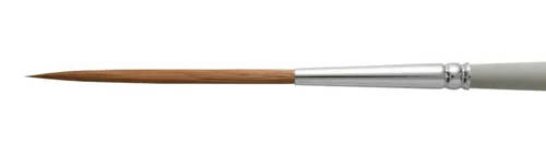
A rigger brush is a specialized type of paintbrush characterized by long, thin bristles tapering to a fine point. Its distinctive shape allows it to hold a generous amount of fluid paint while producing continuous, precise lines without frequent reloading.
This brush received its name from its original purpose in marine painting, where it was commonly employed to depict the intricate rigging of sailing vessels. The rigger's thin, elongated bristles facilitate drawing consistent, delicate, and extended strokes, ideal for rendering the numerous fine ropes and cables seen in ship scenes. When used together with a mahlstick—which supported and guided the painter's hand—the rigger brush allowed artists to accurately and steadily paint the detailed rigging characteristic of maritime imagery.
Rococo
Rococo was an artistic movement that emerged in France in the early 18th century, around the 1730s, and spread throughout much of Europe, particularly in courtly and aristocratic settings. It developed as a response to the grandeur and seriousness of Baroque art, favoring instead a lighter, more decorative style. Rococo painting is marked by its soft, pastel palette, playful subject matter, and asymmetrical compositions. It often depicted scenes of flirtation, leisure, and idyllic nature, set in ornate interiors or lush, idealized landscapes. Artists like Jean-Honoré Fragonard (1732–1806), François Boucher (1703–1770), and Giovanni Battista Tiepolo (1696–1770) were central figures in the movement. Rococo extended beyond painting into architecture, interior design, furniture, and fashion, creating a unified aesthetic characterized by elegance, fluidity, and ornamental exuberance.
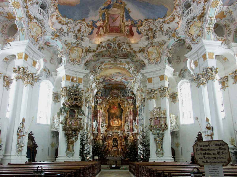
Dominikus Zimmermann and Johann Baptist Zimmermann
1745–1754
Stucco and fresco decoration, Wallfahrtskirche zum Gegeißelten Heiland auf der Wies near Steingaden
Bavaria
The term "rococo" itself derives from the French word "rocaille," which refers to the shell-covered rockwork used to decorate artificial grottoes. This decorative quality permeated every aspect of Rococo art, reflecting the tastes of the aristocracy during the waning years of the ancien régime. While the style was sometimes criticized for its frivolity, it also marked a shift toward intimacy and sensuality in art, emphasizing individual experience, charm, and the ephemeral pleasures of life.
In the Dutch Republic, which by the mid-18th century had begun to decline economically and artistically relative to earlier periods, Rococo never achieved the same widespread presence that it did in France, Austria, or southern Germany. Nonetheless, its influence was felt in certain areas, particularly in decorative arts, portraiture, and interior design. Some Dutch painters adapted aspects of the Rococo aesthetic into their work, producing images with softer contours, refined palettes, and more ornamental compositions. Cornelis Troost (1696–1750), for example, incorporated a lively elegance and theatricality into his scenes of contemporary Dutch life, which aligns with Rococo's interest in social play and bourgeois amusement.
Though far removed from the austere Calvinism of the 17th century, some later Dutch works retained a taste for refined detail and emotional subtlety that may be seen as parallel, if not fully aligned, with Rococo ideals. The shift in cultural values—away from civic virtue and toward private enjoyment—also mirrored a larger transformation in European sensibility. While Vermeer and his 17th-century contemporaries were more concerned with balance, clarity, and symbolic resonance, Rococo introduced an emphasis on ornamental grace and erotic suggestion. The two sensibilities differ profoundly, yet both explore, in their own ways, the beauty of domestic life and the intimacy of carefully observed human moments.
Romanticism
Romanticism was an artistic, literary, and intellectual movement that developed in Europe during the late 18th century, gaining momentum in the early 19th century as a response to the rationalism of the Enlightenment and the formal restraint of Neoclassicism. Where Neoclassicism emphasized order, logic, and universal ideals, Romanticism favored emotion, imagination, and individual experience. Romantic artists sought to express the sublime, the mysterious, the tragic, and the spiritual dimensions of human life. Nature was often portrayed not as orderly or benign, but as vast, overwhelming, and sometimes violent—reflecting the inner emotional states of the artist or viewer.
In painting, Romanticism manifested in dramatic compositions, turbulent landscapes, heroic or melancholic figures, and an emphasis on color and atmosphere over line and proportion. Artists like Caspar David Friedrich (1774–1840), Eugène Delacroix (1798–1863), and Francisco Goya (1746–1828) explored themes of death, revolution, and personal isolation, often challenging academic norms in the process. The movement paralleled developments in literature and music, where writers and composers also began to celebrate subjective emotion and the untamed power of the human spirit.
In the Netherlands, Romanticism arrived somewhat later and had a more muted impact than in France or Germany, but it nonetheless shaped the work of several painters. Dutch Romanticism was often nostalgic and conservative in tone, focusing on idealized views of the national landscape, historic cityscapes, and imagined scenes from the country's golden past. Artists like Barend Cornelis Koekkoek (1803–1862) created detailed and picturesque views of the countryside that emphasized peace, grandeur, and a poetic sense of time. Andreas Schelfhout (1787–1870), another leading figure, specialized in winter landscapes that evoked both national pride and a gentle sense of melancholy.
While Romanticism came well after the 17th-century Dutch Golden Age, there are thematic threads that link them. Painters such as Aert van der Neer (c. 1603–1677) and Jacob van Ruisdael (1628–1682) had already explored dramatic skies and the emotive potential of landscape, though with a more observational and less overtly expressive style. Rembrandt, too, with his probing self-portraits and deeply human biblical scenes, was sometimes seen by later Romantic thinkers as a precursor to their own ideals—an artist whose empathy and psychological depth transcended formal constraints.
Vermeer, by contrast, represents a different sensibility. His art is rooted in equilibrium, contemplation, and the clarity of everyday life. Yet even his work, in its serenity and intimate stillness, was rediscovered by 19th-century Romantic writers and collectors who found in it a quiet emotional intensity and an almost metaphysical poetry. Romanticism, with its inward gaze and reverence for the ineffable, reawakened interest in many older painters, recasting their works through the lens of modern feeling. In this way, the Romantic movement helped lay the groundwork for the reevaluation of Vermeer himself, whose fame was largely posthumous and shaped in part by Romantic ideals.
Rough and Smooth Styles
The rough and smooth styles, codified in Dutch art theory, refers to two contrasting approaches to painting texture and detail. The rough style, exemplified by artists like Frans Hals (c.1582–1666), used loose, visible brushstrokes to convey a sense of spontaneity and life, often prioritizing the overall impression over meticulous detail. In contrast, the smooth style involved finely blended, almost invisible brushwork to achieve a polished, detailed surface, as seen in the works of Gerrit Dou (1613–1675) and other fijnschilders, creating an illusion of reality through precise textures and subtle lighting.
Years before Frans Hals (c. 1582–1666) developed his characteristic free handling of paint, Gerrit Dou (1613–1675) specialized incredibly meticulous brushwork, Dutch artists and art lovers already distinguished between two main painting styles: ruwe or rauw, ("rough") and nette, fijn, or gladde ("clean," "fine" or "smooth"). The rough style was also associated with the loss'e style ("loose").
Dou, Rembrandt's first pupil, developed, or rather, brought the fine style to full fruition in the 1630s. Smooth painters went to incredible lengths to achieve the perfect, polished illusion of reality. The time Dou spent on his minutely detailed works is legendary: according to some of his contemporaries it took him days to paint a tiny broom the size of a fingernail. It is said that by sitting down quietly in his studio an hour before he began to paint, Dou was able to defeat one of the mortal natural enemies of the smooth style; dust.
Fine painting, which gave rise to the modern term fijnschilder (Dutch: fine painter) was a practiced in Leiden. In their own time, however, a fijnschilder, or "fine painter," was simply someone who could make a living through art and was distinguished from a kladscilder ("house painter"), both of whom were enrolled in the Saint Luke Guild. Today, art historians adopt the term fijnschilder to define a group of painters who worked in Leiden: Gerrit Dou, Gabriel Metsu (1629–1667), Pieter Cornelisz. van Slingelandt (1640–1691), Frans van Mieris (1635–1681) and Adriaen van der Werff (1659–722). However, the school only came into its own after Gabriel Metsu's (1629–1667), one of the best practitioners of the smooth style, had moved. It is most likely that fijnschilders worked at least partially naer het leven (from life).
In 1604, Karel van Mander (1548–1606), the Dutch painter and art theoretician who first codified the rough and smooth manners in his Schilder-Boeck (1604), advised artists always to start by learning the smooth manner, which was considered easier, and only subsequently choose between smooth and rough painting. A later Dutch art theoretician, Gérard de Lairesse (1641–1711) wrote:
…he who practices the former [smooth] manner, has this advantage above the other, that being accustomed to neatness, he can easily execute the bold and light manner, it being the other way difficult to bring the hand to neat painting; the reason of which is, that, not being used to consider and imitate the details of small objects, he must therefore be a stranger to it; besides, it is more easy to leave out some things which we are masters of than to add others which we have not studied, and therefore it must be the artist's care to learn to finish his work as much as possible.
"The smooth manner of painting had been associated with descriptive tasks, for example flower painting or animal painting, well before the successes of the Leiden school, and in many parts of Europe. But the Dutch had made a specialty of it. Karl van Mander… linked the modern smooth manner of the legendary mysteries of Jan van Eyck's (before c. 1390–1441) technique. Even Van Eyck's underpainting was 'cleaner and sharper' [suyverder en scherper] than the finished work of other painters.'"Christopher S. Wood, "'Curious Pictures' and the art of description," Word & Image 11, no. 4 (1995): 332.
The question remains whether the smooth manner is truly more suited to evoke the illusion of reality than the rough manner is difficult to answer. While it is true that the smooth manner captures texture, form and detail with incredible efficacy, the rough manner, practiced by great artists like Diego Velázquez (1599–1660), Rembrandt (1606–1669) or Titian (c. 1488/1490–1576), is capable of evoking a sense of lifelikeness and naturalness that makes even the reality represented in the best smooth painting look frozen and artificial. To best appreciate the two styles, it was recommended that art lovers adjust their viewing distance: farther away for a roughly painted work, close up for a finely executed one.
It is believed that the rough manner stimulates the activity of the eye far more powerfully than painting with a smooth surface. The unequivocally completed, clear and polished work of art tends to exclude the spectator from participating in the picture. The roughly finished painting demands an intellectual response from the beholder because the painter of the rough manner deliberately exposes the working processes to the spectator making him party to the artifice by which the illusion is achieved. The smooth painter, instead, deliberately conceals his manner and isolates the viewer from the picture making process, which may, is some subjects give rise to a sensation of deception. The rough painter, instead, hides nothing, and is registered as more sincere, or at least to modern sensibilities.
Both of these great artists "were working against the prevailing norms of smooth or fine painting, and, for both, the example of late Titian was cited as authorization of their increasingly broken and irregular handling of paint. In a remarkable trajectory that echoed Titian's, Rembrandt moved through his career from being a founding father of the Leiden fijnschilders...—those painters who, with invisible brushstrokes and 'the patience of saints and the industry of ants' (as one contemporary author described it), took the illusionistic depiction of objects to a new level—to his culmination as the undisputed extreme exponent of the rough manner. In his late works, the paint surfaces have the density of rock faces. It is thought that Rembrandt's rough manner may have been a factor contributing to his personal financial troubles in later life.
"The rough manner in Dutch painting was a conscious aesthetic choice and was described in Rembrandt's day as lossigheydt, 'looseness'—the equivalent of the sprezzatura of the Italian writer Baldesar Castiglione (1478–1529), who drew parallels between the effortless nonchalance of courtly behavior and the loose, seemingly careless touches that the artist applied with his brush. The epitome of lossigheydt or sprezzatura in Rembrandt's art is his masterpiece, the Portrait of Jan Six, in which the paint seems to have massed spontaneously into the gorgeous fabric of the sitter's clothes and the powerful passages of his face and hands. Seventeenth-century Spanish art theory, similarly, had terminology for loose, expressive brushstrokes: they were referred to as borrones or manchas, words loaded with the same significance as 'sprezzatura.'"David Bomford, "Rough Manners: Reflections on Courbet and Seventeenth-Century Painting," in papers from the Symposium Looking at the Landscapes: Courbet and Modernism, J. Paul Getty Museum, March 18, 2006, 10, https://www.getty.edu/publications/resources/virtuallibrary/0892369272.pdf.
"Seventeenth-century painters and art lovers had terms to describe the notable changes in painterly technique and compositional method that accompanied the 'gentrification' of Vermeer's work in the 1660s. Whereas the relatively grainy texture of bread, carpets and bricks in the early words would have been seen as rouw or rough, the even, polished facture of the Girl with a Wine Glass or Woman Holding a Balance was explicitly net, neat or smooth. By his increasing commitment to the smooth style, Vermeer essentially sided with the manner that was gaining market and connoisseur favor after mid-century. However different his paintings look from the miniaturist neatness of Dou, Frans van Mieris (1635–1681), and Gerrit ter Borch (1617–1681), they, too, must have been admired especially in the decade that saw a lesser interest in the rough painting associated with Rembrandt and his students and followers. The smooth manner typically went along with more genteel and elegant themes. The rough brothel scenes of the 1620s and 1630s, so often painted with Caravaggesque uncouthness, now became sublimated in more slyly humorous paintings in the neat style."Mariët Westermann, "Vermeer and the Interior Imagination," in Vermeer and the Dutch Interior, ed. Alejandro Vergara (Madrid: Museo Nacional de Prado, 2003), 231.
Rounding / Relief
Pietro Lorenzetti
c. 14th century
Tempera on panel, Dimension unknown
Diocesan Museum, Pienza
Rounding is the creation of relief of solid, opaque and convex objects. Rounding was one of the cardinal concerns of Renaissance and Baroque easel painting. Rounding was not only achieved by the use of light and shade, or more crudely in former times, by shading, but by the proper management of contour. Paramount was to make the edges of objects appear to gradually wrap around to their backside rather than terminate abruptly. Painters were advised to soften their contours of solid objects so they might subtly "melt" into the background, avoid placing the highest light outer edges of the illuminated sides of objects and to avoid outlining the outer edges with sharp black lines. Many painters introduced lines aound objects to accentuate certain of their qualities but they were generally variable in application, colored and never too hard.
Leonardo da Vinci (1452–1519) was the first to codify the depiction of edges writing "the true outlines of opaque objects are never seen with great precision." Another method for producing rounding was to introduce light (i.e., a reflection) along the inner edges of an object's outermost shadowed edge. If the large mass shadow of an objects is dark along its edges as it is the innermost parts, the mass shadow will appear flat.
Relief, instead, refers to a sculptural technique in which figures or designs are carved or modeled to project from a flat background, creating a three-dimensional effect while remaining attached to the underlying surface. Reliefs can vary in depth and complexity, with three primary types recognized: bas-relief (low relief), where the projection is slight and the figures seem almost like drawings etched into the surface; high relief, where elements are deeply undercut and can project significantly from the background; and sunken relief, often seen in Egyptian art, where the design is carved into the surface rather than emerging from it. The purpose of relief was not just dcorative but often narrative, allowing artists to tell complex stories in stone, metal, or wood, especially on the walls of temples, sarcophagi, and civic buildings.
Relief can also be associated with painting through techniques that create the illusion of depth and projection on a flat surface, making elements appear to emerge towards the viewer much like they do in sculptural relief.
Saint Luke
Saint Luke, known in Christian tradition as the author of both the Gospel of Luke and the Acts of the Apostles, was widely regarded during the Middle Ages and the early modern period as the patron saint of artists. Though the historical facts of his life remain uncertain, he is believed to have lived in the first century and to have been a companion of Saint Paul. By the late medieval period, a legend had taken hold that Saint Luke was the first person to paint the Virgin Mary from life, and that he had created a number of portraits of her. While this legend is apocryphal, it played a powerful role in Christian art history, providing artists with a sacred lineage that connected their work with divine inspiration. Throughout Europe, Saint Luke became a symbolic figure for painters, sculptors, and illuminators, who often organized themselves into confraternities or guilds named in his honor.
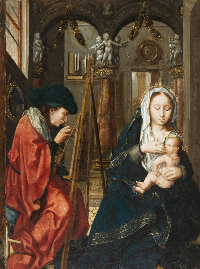
Master of the Holy Blood (formerly attributed to Quentin Metsys)
c. 1520
Oil on oak panel, 43.6 × 32.4 cm.
Harvard Art Museums/Fogg Museum, Cambridge
The figure of Saint Luke gained importance in the early Renaissance when artists began to assert the dignity and intellectual seriousness of their work. Painting had long been considered a craft, rather than a liberal art, but the association with Saint Luke lent it spiritual legitimacy. In this context, scenes of Saint Luke painting the Virgin became a favored subject for altarpieces commissioned by painters' guilds or religious communities. These images typically depicted Luke seated before an easel, capturing the Virgin and Child who appear before him, often accompanied by angelic figures or symbols of his evangelist identity, such as the winged ox.
In the context of 17th-century Dutch culture, Saint Luke maintained his position as the patron of painters, even though the religious landscape had shifted dramatically with the Protestant Reformation. In the largely Calvinist northern provinces, traditional saints were no longer venerated in churches, and religious painting took on a different character. However, the professional associations of painters—especially the guilds—continued to invoke Saint Luke as their symbolic protector. The Guild of Saint Luke was the most important professional body for painters in many Dutch cities, including Delft, Haarlem, Leiden, Utrecht, and Amsterdam. Membership in a Guild of Saint Luke was typically required in order to sell paintings publicly or to take on apprentices.
In Delft, the guild played a key role in regulating the artistic profession and maintaining standards. Vermeer was a member of the Delft Guild of Saint Luke and eventually served as one of its headmen, an indication of his status within the local artistic community. The guild building in Delft, located near the marketplace, would have served as a hub for artists to gather, register their works, and conduct official business. Although iconographic depictions of Saint Luke painting the Virgin became rarer in Dutch Protestant regions, the legacy of the saint remained embedded in the institutional structures and professional identity of artists.
Other Dutch painters also took part in this tradition. Maerten van Heemskerck (1498–1574) and Frans Floris (c.1519–1570), who worked primarily in the Southern Netherlands before the split between north and south, painted devotional works dedicated to Saint Luke. Later, in the north, painters like Jan Gossaert (c.1478–1532) and later Jan de Bray (c.1627–c.1697) continued to reference Saint Luke, often depicting him as a serious and learned artist, suggesting a continuity of artistic lineage stretching from the Evangelist to their own time.
By the mid-17th century, as the art market expanded and secular painting genres flourished in the Dutch Republic, Saint Luke's symbolic importance as patron saint of painters was retained more through guild identity than through frequent artistic representation. Still, his image lingered as a quiet but foundational part of the culture of Dutch art and its historical self-understanding.
Numerous paintings of Saint Luke depict him in the act of painting the Virgin Mary, reinforcing the legend that he was the first Christian artist. These works were often commissioned by artists' guilds and sometimes featured a subtle or overt self-portrait of the painter in the role of Saint Luke, blurring the line between sacred tradition and artistic identity. Here are a few notable examples:
Rogier van der Weyden (c.1399–1464), Saint Luke Drawing the Virgin, c.1435–1440
This work is among the earliest and most famous depictions of the subject. It shows Saint Luke carefully drawing the Virgin and Child, seated before him in a garden setting. Many scholars believe Rogier used his own features for the figure of Saint Luke, suggesting a personal connection to the saint and an assertion of the dignity of the painter's craft. The painting likely served as an altarpiece for the Brussels Guild of Saint Luke.
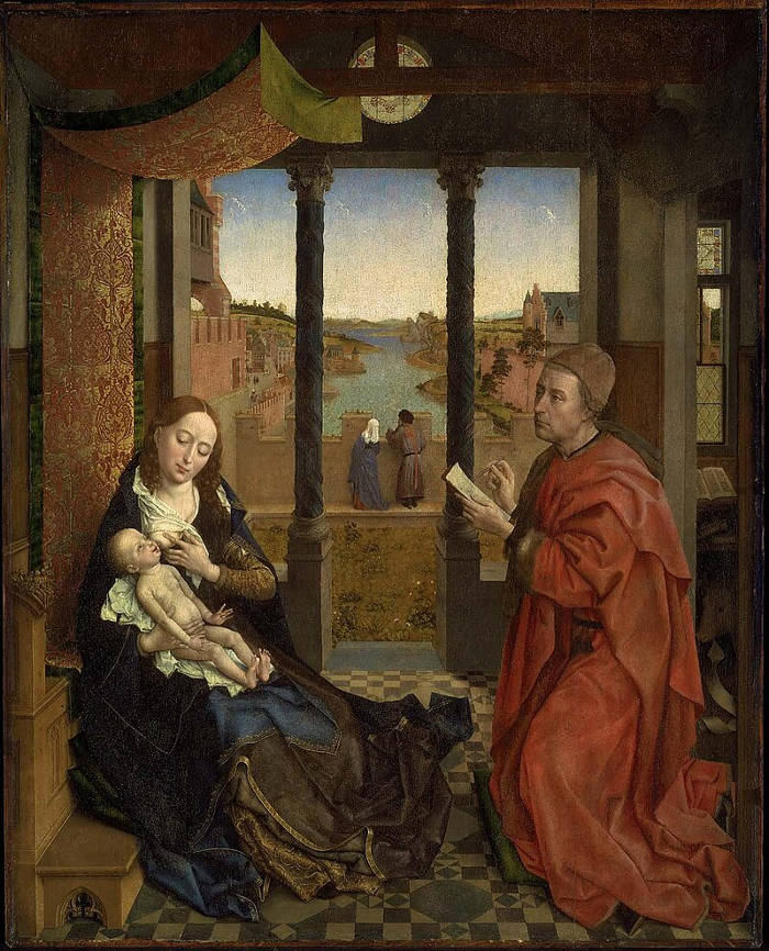
Rogier van der Weyden
c.1435–1440
Oil on panel, 137.5 x 110.8 cm.
Museum of Fine Arts, Boston
Maarten van Heemskerck (1498–1574), Saint Luke Painting the Virgin, 1532
This work presents Luke with brush and palette, clearly positioning him as a Renaissance artist. The Virgin and Child appear in a softly lit interior, while the ox—Luke's traditional attribute—is visible in the background. Heemskerck aligns the saint with the humanist values of learning and observation, and again, the facial features are thought to resemble the artist himself.
Giorgio Vasari (1511–1574), Saint Luke Painting the Virgin, c.1565
Although Vasari was an Italian, his interpretation reflects the broader European tradition of painters identifying with Luke. Painted for the Accademia del Disegno in Florence, the image celebrates the elevation of painting to the level of intellectual pursuit. Vasari's Saint Luke is reverent but also clearly learned, mirroring the ideals Vasari promoted in his Lives of the Artists.
El Greco (1541–1614), Saint Luke Painting the Virgin, c.1600
El Greco's expressive handling of paint and twisting forms are evident in his version of the subject. The spiritual intensity of the moment is heightened through dramatic lighting and abstracted figures. Saint Luke appears almost visionary, an inspired conduit between divine vision and artistic expression.
Hendrick Goltzius (1558–1617), Saint Luke Painting the Virgin, engraving, 1593
Though not a painting, Goltzius's engraving reflects Dutch involvement in this tradition during the late 16th century. The composition shows the Virgin on a throne and Luke intently working at an easel, suggesting the continued importance of the motif in the Low Countries even as Calvinist restrictions were reshaping religious imagery.
Jan de Bray (c.1627–c.1697), The Guild of Saint Luke in Haarlem Paying Homage to Saint Luke, 1675
In this group portrait, De Bray brings together contemporary Haarlem painters and models them as figures in a biblical scene, including himself as Saint Luke. It is both a celebration of the guild's history and a statement of the painter's elevated status. The painting illustrates how 17th-century Dutch artists could still invoke Saint Luke, not in devotional altarpieces but in imaginative reworkings of tradition that linked the past to the present.
Satin
Painting satin is a challenging task even for the most talented and experienced painter. It requires not only exacting manipulative skill and a thorough knowledge of the artist's materials, but a comprehension of its peculiar optical and physical properties. Unlike common fabrics, satin does not absorb and diffuse light rays in a more or less predictable manner, because more like a mirror it reflects the great part of the light which strikes its surface. The difficulty of painting satin was vastly exacerbated when rendering the restless patterns of light and dark created by the elaborate cut of contemporary fashion, which behave more like pieces fractured glass rather than a flat mirror.
It is not known exactly how satin was painted, although the relatively uniform success of its rendering among a significant number of Dutch painters suggests that there must have existed a common procedure. A few Dutch interior paintings with satin garments seem to indicate that the highlights were worked up with wet paint over a dark brown underpainting (see the barely finished background figure of Two Men playing Tric-trac, with a WomanWilliam Duyster (1599–1635) or over a barely modeled layer of dark paint tinted roughly with the color of the garment, with the untouched base tone functioning as the garment's deepest shadows (see the ochre gown of the left-hand figure of The Card Party (c. 1665) by Caspar Netscher (1639–1684). When the light-colored paint of the highlight is feathered into the surround dark to represents the gradual falloff of light this technique automatically produces the cool, shimmering halftones (via the turbid medium effect this) typical of satin. The lighter shadows and their inner reflections would have been successively rendered with medium tones of paint, somewhere in between the deepest shadows and the highlights. Strongly colored satin was probably worked up in monochrome or lightly colored shades of paint and then glazed with more richly colored paint producing an attractive gem-like quality.
Willem Duyster
c. 1625-1630
Oil on panel, 41 x 67.6 cm.
National Gallery, London
In general, the maximum lights of light-colored satin must be rendered with very light tones of thick impasto paint while the darks must be rendered translucently with somewhat lighter tones than those used for similarly colored but non-reflective fabrics. The deepest shadows are full of complicated reflections, especially when the fabric is tightly bunched. These reflections sometimes take on shades of the color of nearby objects. The half-tones of satin—half-tones are those crucial transitional tones that lie between the illuminated and shadowed sides of opaque, illuminated objects—must be drastically minimized; otherwise the fabric will not glimmer. The depiction of satin is further complicated by the fact that its stiffness makes folds break at more or less sharp angles instead of bending predictably like more pliable fabrics. These angular folds of satin were much appreciated by Vermeer (see The Concert) in his years of maturity and were exaggerated to almost exasperated level in the gowns of the late The Love Letter and The Guitar Player. Owing to its capricious behavior, the slightest wrinkles and creases on its surface sends off glitters of light that, if rendered convincingly, charm even the most jaded art goer, making the painter appear more like a sorcerer than a craftsman. Given the difficulties of representing the unique actions of satin, art historians have assumed that garments made with this fabric were depicted from life.
The satin gowns of Vermeer's mature works are immediately distinguishable from those of his contemporaries for their crisp, angular folds that convey strength and structure, while theirs abound with rhythmically swerving curves and finicky detail. The gown of A Lady Standing at a Virginal appears as a perfect luminous bell while in The Love Letter it is transformed into a cube-like box with flaring sides. In the latter picture the long, unbroken fold that plunges from the figure's left-hand knee to the floor appears wonderfully, but perhaps impossibly, straight.
The "in-your-face" silver gown of The Guitar Player is one of the most criticized and praised motifs—at least by painters—in the artist's oeuvre. Its folds and creases are not inventoried literally but imaginatively reconstituted into abstract shapes of differently toned patches gray paint. Surprisingly, although pattern is largely victorious over chiaroscural modeling, neither the feel of the fabric nor the underlying anatomical forms which determine the its outer appearance are lost. To the left, an oval-shaped plane of light gray, from which spider-like tendrils spread out in all directions, clearly informs us of the musician's propped up knee. To the right, a large, flat shape of light gray adjacent to the strip of fur trim signals the location of the knee of the extended leg.
Satire
Satire in art refers to the use of humor, irony, exaggeration, or ridicule to expose human vice, folly, or social absurdity. Historically, satire has deep roots in Classical Antiquity, where Roman authors like Horace (65–8 BCE) and Juvenal (c.55–c.138 CE) shaped literary traditions that would influence visual art for centuries. In visual culture, satire often takes the form of caricature, parody, or symbolic narrative in which the viewer is invited to laugh at, or critically reflect on, the subject being depicted. During the Renaissance and later in the Enlightenment, artists increasingly used satire not only to mock individuals or groups but to comment on broader political, moral, or cultural issues. This type of imagery could be either overtly critical or subtly layered, depending on the audience and the intentions of the artist.
One of the clearest examples of satire in the visual arts of antiquity is the so-called "Apes as Artisans" motif found in Roman wall paintings and mosaics. These images depict monkeys performing human tasks—painting, sculpting, acting as doctors or barbers—with comic exaggeration. The humor comes from the absurdity of animals mimicking refined or learned human behavior, a visual joke that reflects Roman tastes for parody and inversion. These scenes, often found in domestic settings like villas in Pompeii and Herculaneum, were not merely decorative but conveyed social commentary—mocking pretension, vanity, or misplaced ambition.
Another strong example is the "Drunken Heracles" type, where the heroic figure of Heracles (Hercules) is portrayed stumbling, bloated, or passed out from too much wine. This image inverts the usual ideal of heroic virtue and instead presents the demigod as a figure of ridicule. Versions of this theme appear in Hellenistic terracotta figurines and Roman sculpture, sometimes accompanied by mocking satyrs or servants.
These works suggest that visual satire in antiquity often relied on contrast—between ideal and reality, human and animal, high culture and base behavior—to provoke both laughter and reflection.
In 17th-century Dutch painting, satire found fertile ground, particularly in genre scenes and moralizing narratives. Dutch society was prosperous, highly literate, and deeply engaged with questions of behavior, civility, and social order. Painters responded with works that entertained but also instructed. Jan Steen (c.1626–1679), whose paintings are often brimming with chaotic domestic scenes and humorous mishaps, is perhaps the most celebrated Dutch artist associated with visual satire. In works like The Dissolute Household or The Doctor's Visit, he presents scenes of drunkenness, disorder, or self-delusion that mirror common proverbs or moral lessons. The humor is pointed but not cruel, and often self-reflective, suggesting that viewers recognize aspects of themselves in the folly on display.
Adriaen Brouwer (c.1605–1638) also employed satire, particularly in his small tavern interiors populated with coarse peasants engaged in brawling, smoking, and gambling. These scenes do more than depict rustic life; they often exaggerate behavior for comic effect and implicitly contrast rural ignorance with urban refinement. David Teniers the Younger (1610–1690), though working in the Southern Netherlands, also influenced Dutch taste with his satirical portrayals of alchemists and charlatans, figures who embodied irrationality and deceit.
Satirical elements could also appear in the margins of more refined compositions. For instance, a supposedly genteel interior might feature a monkey wearing human clothes or an overturned wine glass—visual symbols that hinted at excess or foolishness without disturbing the formal beauty of the scene. Even in the work of an artist like Vermeer, who avoided overt satire, one might find subtle ironies or ambiguous gestures that complicate the narrative and invite speculation.
The motif of monkeys engaging in human activities, particularly in the act of painting or pretending to be artists, became a rich vein of satire in early modern European art, and it has roots that stretch back to antiquity. In classical Roman art, monkeys were sometimes depicted humorously performing human roles, as in mosaics where they appear as doctors, musicians, or wine servers. These images played with the idea of mimicry and the absurdity of social pretensions.
Jean Siméon Chardin
1735
Oil on canvas, 27.5 x 21.7 cm.
Musée des Beaux-Arts de Chartres, Chartres
In the 16th and especially the 17th century, this tradition was revived and developed into a distinct genre known as "singerie", from the French word singe, meaning monkey. These scenes depict monkeys dressed in human clothing, imitating the behaviors, professions, and vanities of people. Originating in Flemish and French art, and deeply satirical in tone, these images lampooned everything from academic painting to bourgeois manners. The monkeys were not just comic—they symbolized folly, imitation, and pretension.
Dutch satire of the Golden Age was deeply tied to moral instruction and social commentary. It relied on visual literacy and cultural knowledge, often drawing on emblem books, popular proverbs, or religious teachings to convey layered meanings. Rather than simply mocking its subjects, satire in this period encouraged viewers to reflect on their own conduct and the expectations of the world they lived in. Its strength lay in its ability to entertain while at the same time revealing the incongruities and vanities of everyday life.
Satire often underpins the depiction of relationships between maids, mistresses, and male household members in 17th-century Dutch painting, revealing complex social dynamics and moral anxieties through visual cues that would have been readily understood by contemporary viewers. These images frequently blur the line between comedy and criticism, inviting reflection on gender roles, class boundaries, and domestic virtue.
Maids were common figures in Dutch household paintings, and their presence often carried layered implications. On one hand, they represented diligence and service; on the other, they were associated with disorder, temptation, and sexual impropriety. Artists used this ambiguity to satirical effect, especially when portraying suggestive relationships between maids and the men of the house, or rivalries between maids and their mistresses. Paintings in this genre often allude to scandal or infidelity through symbolic objects—an unmade bed, a foot warmer, a broken jug, or a letter being passed discreetly—all of which carried connotations that would have been immediately apparent to a 17th-century audience.
Jan Steen frequently mined these tensions for comic and moralizing effect. In several of his domestic scenes, a maid might be shown encouraging or manipulating a household's male figure, sometimes behind the mistress's back. These compositions expose the vulnerabilities of the family structure and poke fun at male desire, female rivalry, and household instability. The humor in such images is sharp but often accompanied by visual cues—such as a painting within the painting or an included proverb—that point to a moral lesson.
Gabriel Metsu (1629–1667) and Pieter de Hooch (1629–c.1684) offer subtler variations on the theme. Metsu occasionally introduced an element of tension between a maid and her mistress, while de Hooch placed women in domestic spaces where their roles are ambiguous—perhaps hinting at power dynamics without stating them outright. Even Vermeer, whose maids often appear serene or contemplative, was not immune to the layered meanings that such figures carried. In paintings like The Love Letter or The Mistress and Maid, the body language and exchange of glances imply that the maid is more than a passive observer—she may be a confidante, a conspirator, or a rival.
Satire thus served not only to entertain but to comment on the perceived instability of the household when its boundaries—sexual, social, or moral—were threatened. Through humor and ambiguity, Dutch painters exposed the fragility of domestic order and the roles that desire, deception, and class played in its daily negotiation.
In 17th-century Dutch painting, while the relationship between maids, mistresses, and the man of the house was frequently treated satirically—highlighting themes of seduction, moral decay, or household disorder—Vermeer approached such subjects with unusual empathy. Unlike his contemporaries who often portrayed maids as cunning or flirtatious agents of chaos, Vermeer's depictions are marked by restraint and psychological nuance. In works like The Love Letter or Mistress and Maid, the interactions are intimate but ambiguous, the emotional tone subdued rather than comedic. That said, in his early painting A Maid Asleep, some art historians have proposed a more critical reading. The richly dressed maid, appearing somewhat tipsy and possibly inattentive to her duties, may reflect contemporary concerns about servant behavior. In the Dutch Republic, it was not uncommon for maids to emulate their mistresses' attire and comportment, sometimes earning public criticism for doing so. The subtle implication of social transgression in this painting suggests that Vermeer, at least early in his career, may have engaged with such themes more pointedly. A further layer of satire may be found in The Procuress, where a figure thought to be Vermeer himself holds a cittern in one hand and a beer in the other, smiling knowingly over a transaction in which money is exchanged for sex. This self-insertion has been interpreted as a wry commentary on the pleasures and hypocrisies that surround such exchanges, placing Vermeer momentarily within the tradition of humorous moralizing painting before turning fully toward his more contemplative mature works.
Saturation
Saturation refers to the purity of color and measures the amount of gray in a particular color. A color with more gray is considered less saturated, while a bright color, one with very little gray in it, is considered highly saturated. The amount of saturation does not affect the basic hue of a color but it does alter the color's intensity. Saturated colors are considered bolder and tied to emotions, while unsaturated ones are softer and less striking. Vermeer carefully balanced a few areas of strongly saturated colors with larger areas of soft grays and browns.
Scale
Scale in an works of art refers to the relative size of objects, figures, or architectural elements within a composition, as well as the overall dimensions of the artwork itself. It plays a crucial role in conveying spatial relationships, hierarchy, and emotional impact, affecting both the psychological impact and the physical interaction with the piece. Large-scale works, such as monumental paintings, frescoes, or oversized sculptures, tend to command attention and create an immersive experience, often evoking a sense of awe or even sublimity. Their sheer size can dominate the viewer's field of vision, making the scene or subject seem more immediate and powerful. In religious and historical contexts, large dimensions have been used deliberately to convey authority, transcendence, and the significance of the depicted narrative. The physical necessity to step back to take in the whole composition also means that the spectator is constantly adjusting their perspective, which can enhance a sense of depth and realism.
Paolo Veronese
1563
Oil on canvas, 677 x 994 cm
Louvre, Paris
In contrast, smaller artworks invite an intimate, close-up engagement, encouraging viewers to focus on fine details and subtle aspects of the composition. This scale often fosters a personal connection, drawing the viewer into a more reflective or contemplative state. For example, the finely detailed cabinet paintings of the 17th-century Dutch fijnschilders, such as those by Gerrit Dou (1613–1675), reward close inspection with meticulous textures and delicate effects of light and shadow, turning the act of viewing into a private, almost meditative experience.
The aspect ratio and proportions of an artwork also guide the viewer's gaze, influencing how they move through the composition. Vertical formats can emphasize height and spirituality, as seen in Gothic altarpieces, while horizontal formats, often used in landscapes or historical scenes, convey expansiveness and a sense of unfolding narrative. In Vermeer's work, the controlled dimensions of his canvases create a sense of order and balance, enhancing the tranquility and intimacy of his domestic scenes.
In essence, the dimensions of an artwork are not merely a technical choice but a powerful tool for shaping the viewer's physical and emotional engagement, directing how they see, move, and feel in relation to the piece.
In 17th-century Dutch painting, scale was used with remarkable sophistication across different genres. History painters such as Gerard de Lairesse (1641–1711) adhered to Classical conventions in his Het Groot Schilderboek (1707-1711), often employing grand figures in large compositions that reflected their aspiration toward the noble ideals of antiquity. By contrast, genre painters, including Pieter de Hooch (1629–1684) and Vermeer, worked on a more modest scale, mirroring the domestic settings they depicted. Vermeer's compositions, though small in size, achieve an extraordinary sense of spatial depth by carefully calibrating the scale of figures and objects within interiors. He often positioned his subjects in proportionally accurate rooms, with diminishing scale reinforcing the recession in space.
Still-life painters, such as Willem Kalf (1619–1693) and Jan Davidsz. de Heem (1606–1684), manipulated scale for dramatic effect, sometimes enlarging individual objects or fruits to enhance their presence. Trompe-l'oeil painters took this even further, playing with scale to deceive the viewer into mistaking painted forms for real objects. In landscape painting, artists such as Jacob van Ruisdael (c. 1628–1682) often used dramatic shifts in scale to create a sense of vastness, placing tiny figures against towering trees or expansive skies. The Dutch approach to scale reflected not only technical precision but also a sensitivity to human experience, reinforcing the balance between realism and artistic intention.
Schema / Schemata
See: Pictorial Convention.
Schematic
The term schematic refers to a simplified, structured, or systematic representation of something, often used to clarify complex ideas or relationships. In the visual arts and painting, schematic can have multiple meanings depending on the context, ranging from compositional frameworks to the way artists approach form, perspective, and abstraction. The difference between schematic and schemata lies in their function and usage. Schematic is an adjective that describes something structured, formulaic, or simplified according to a system. On the other hand, schemata is the plural form of schema, a noun referring to underlying frameworks or structured patterns. In art history, schemata can describe recurring compositional arrangements, perspective systems, or even conceptual models that artists use to create a sense of order within their works. Dutch genre painters, for example, developed schemata for interior scenes, often organizing figures within architectural spaces in a way that guided the viewer's eye and reinforced narrative coherence. While a schematic approach suggests a methodical or rigid quality, schemata refer to the broader systems or structures that shape artistic composition and meaning.
However, when the term schematic is used in a derogatory sense to describe a work of art, it generally implies that the work is overly rigid, formulaic, or lacking in vitality and spontaneity. A painting that is "too schematic" may follow a predetermined structure so rigidly that it feels lifeless, contrived, or devoid of expressive nuance.This criticism is often leveled at works that appear to rely excessively on compositional formulas or predetermined systems without sufficient engagement with the subject's individuality. In portraiture, for example, a painter who adheres too strictly to a set of conventional facial types or standard poses might be accused of producing schematic, rather than lifelike, images. Similarly, in history painting, a composition that follows an established academic model too rigidly—without fresh interpretation or emotional depth—can feel overly calculated.
The accusation of excessive schematization has been particularly relevant in discussions of late academic painting, especially in the 19th century, when rigorous training in the École des Beaux-Arts and other institutions often led to works that, while technically proficient, lacked a sense of immediacy or personal vision. Artists who adhered too closely to compositional templates or anatomical studies without injecting a sense of natural observation were sometimes criticized for producing cold, mechanical works.
In Classical Antiquity, schematic approaches to representation were essential in artistic traditions that relied on formulaic compositions. Early Greek and Egyptian art, for example, often followed strict conventions for depicting the human figure, where proportions and poses adhered to established systems rather than individual observation. Egyptian wall paintings and reliefs maintained a highly schematic approach, using composite views—heads in profile, eyes in frontal view, and torsos squared to the viewer. Similarly, early Greek vase painting followed rigid conventions that gradually became more naturalistic over time, particularly in the transition from the black-figure to red-figure techniques.
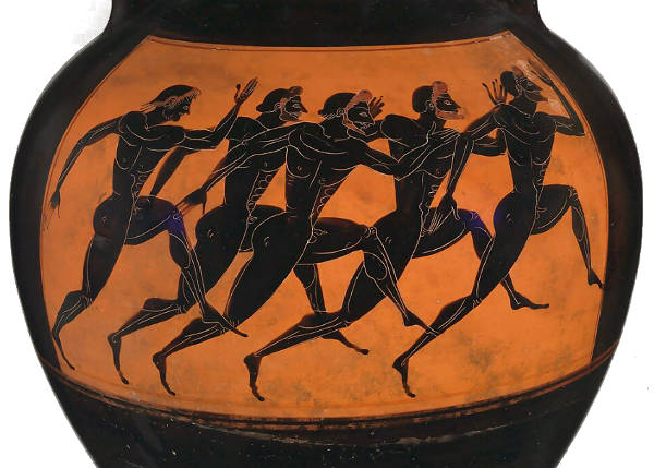
Attributed to the Euphiletos Painter
c. 530 BCE
Terracotta; black-figure, 62.2 cm
The Metropolitan Museums of Art, New York
By the High Classical Period in Greece, artists such as Polykleitos (5th century BCE) sought to codify ideal proportions in sculpture through mathematical formulas, as seen in his lost treatise, the Canon. While this approach applied primarily to sculpture, it influenced the way painters structured compositions, particularly in frescoes and panel painting. Though most Greek paintings are lost, Roman copies of Greek works—such as the Alexander Mosaic from Pompeii—suggest a systematic approach to depth and movement, likely influenced by schematic underdrawing techniques.
In the Renaissance, the rediscovery of perspective brought a new kind of schematic thinking to painting. Artists such as Piero della Francesca (c. 1415–1492) and Leonardo da Vinci (1452–1519) used geometric principles to construct depth, often beginning their compositions with linear frameworks before adding figures and detail. The introduction of underdrawings, or cartoons, allowed artists to structure their compositions schematically before applying paint, ensuring correct proportions and spatial coherence.
During the Dutch Golden Age, many painters developed their own compositional schemata to organize complex scenes, particularly in genre painting. Artists such as Pieter de Hooch (1629–1684) and Vermeer often used architectural elements—doors, windows, and tiled floors—to create structured, layered spaces. Some of these schemata were derived from perspective studies, while others emerged from practical studio methods that enabled artists to replicate successful compositions with variations.
In later periods, particularly in modern and contemporary art, schematic approaches often became a means of abstraction. The early 20th century saw movements like Cubism, where artists such as Pablo Picasso (1881–1973) and Georges Braque (1882–1963) broke down forms into geometric schemata, reducing naturalistic representation in favor of structural analysis. Similarly, De Stijl painters like Piet Mondrian (1872–1944) developed rigid compositional schemata based on vertical and horizontal lines, aiming for an idealized visual language.
Ultimately, the use of schematic structures in painting reflects both practical artistic concerns and broader philosophical ideas about representation, order, and perception. Whether in classical systems of proportion, Renaissance perspective grids, or modernist abstraction, schemata serve as underlying frameworks that help artists organize space, form, and meaning within their works.
Schikking / Ordinantie / Koppelin
In 17th-century Dutch art theory, terms like schikking (arrangement) and ordinantie referred to what we now call composition—the structured placement of figures and objects (voorwerpen) and parts (partijen or stukken) within a painting. Koppeling (joining) or binding described the visual cohesion that linked these parts together, achieved through careful placement, color distribution, and the handling of light. Accessories could help unify the composition but were to be used sparingly, avoiding both overcrowding and overly empty spaces.
Although considered a classicist, Gerard de Lairesse (1640–1711) did not advocate rigid outlines or symmetrical structures; instead, he emphasized tonal gradation and balanced lighting to create depth and coherence. He consistently stressed the primacy of good composition over surface detail, criticizing young artists who focused too heavily on color and shadow while neglecting the overall structure. De Lairesse favored large, clearly presented figures over small ones scattered in spacious settings and advised that the main subject should be prominently placed, typically in the center.
Symmetry (regulierheid) was appropriate only for certain print designs, and excessive uniformity, even in pendant paintings, was to be avoided. For De Lairesse, the vitality of a composition came from the artful variation and interaction of its elements—not from strict regularity. His goal was to guide painters toward a balanced welstand, where diversity served unity and the main subject held visual dominance without sacrificing liveliness.
Schilderachtig
In 1604, the term schilderachtig, which corresponds approximately to "painterly" or "picture worthy," was used first in theSchilder-Boeck (1604) by Karel van Mander (1548–1606). However, schilderachtig refers to two separate qualities: on one hand the image that best demonstrates an artist's painterly ability and at the other hand to describe those subjects fit for an artist, allowing for free imagination and invention. Schilderachtig implied values close to the Dutch such as rustic simplicity, naturalness and a love for the unadorned. The idyllic world of the past as well as curious unusual or even ugly had become worthy of the painter's attention. Rembrandt (1606–1669) could find an audience for the old run-down farm houses outside of Amsterdam and Vermeer an old house along a secluded Delft canal. However, "whether or not the painterly was used to describe an artist's activities or his pictures, it was always used as a concept in connection with the artistic ambition to take one's point of departure in reality, or at least portray the motif as it could appear in nature. 'I have followed the schilderachtig saying (a saying common among painters) that 'the best painters are those who get closest to reality' wrote the painter and poet Gerbrand Bredero (1585–1618) wrote in 1618."David Burmeister Kaaring, "Reality as Icon–The cottage motif in Dutch landscape painting 1600–1650," SMK Art Journal (2007): 99. After the middle of the 17th century the term shifted in meaning and was used to denote painting of buildings, cottages and people marked by aging and weathering, subjects that did not fit in well with the tenets of the upcoming classicist painting.
Around the end of the 17th century, de Lairesse made a passionate plea that art lovers stop applying this word to pictures of old people with very wrinkled faces or dilapidated and overgrown cottages, and reserve it for well-proportioned young people and idealized landscapes.
Schilder-boeck (Karel van Mander, 1604)
Karel van Mander (1548–1606), a painter, poet, and writer, played a foundational role in early Dutch art theory through his Het Schilder-boeck, published in 1604. This wide-ranging work, written in Dutch verse and prose, combined the biographies of northern and Italian painters with treatises on the origins of painting, its spiritual and moral purpose, and advice for young artists. Drawing heavily from Classical literature and Renaissance sources, Van Mander framed painting within a humanist tradition that traced its lineage to Antiquity and emphasized the artist as a cultivated and virtuous figure. He adapted stories and ideals from authors such as Pliny the Elder and Ovid, creating a framework in which the painter was not merely an artisan but a learned interpreter of nature and history. His emphasis on allegory, poetry, and invention reflected a desire to elevate painting to the status of a liberal art, governed by reason and guided by moral insight.
The biographies in the Schilder-Boeck are similar in style and format to Vasari's Le Vite de' piu' eccellenti pittori, scultori, e architettori (1550). Karel van Mander digresses only rarely from the format: starting per painter with an overview of the childhood years and a list of teachers, followed by some career information and concluding with a list of notable works. The second edition includes a biography of van Mander himself that Miedema believes was written by his brother, who may have been with him on his deathbed. Other candidates have been proposed as authors of the biography.
Het Schilder-Boeck is divided into six parts that have separate title pages and are indexed. The parts are:
- The foundations of the noble and free art of painting (Den Grondt der Edel vry Schilder-const: Waer in haer ghestalt, aerdt ende wesen, de leer-lustighe Jeught in verscheyden Deelen in Rijm-dicht wort voor ghedraghen).
- Lives of the illustrious ancient painters including Egyptians, Greek and Romans (Het Leven Der oude Antijcke doorluchtighe Schilders, soo wel Egyptenaren, Griecken als Romeynen).
- Lives of the modern or contemporary illustrious Italian painters (Het Leven Der Moderne, oft dees-tijtsche doorluchtighe Italiaensche Schilders).
- Lives of the illustrious Netherlandish and German painters (Het Leven der Doorluchtighe Nederlandtsche, en Hooghduytsche Schilder).
- Commentary on the Metamorphoses of Publius Ovidius Nasso (Wtlegghingh op den Metamorphosis Pub. Ouidij Nasonis).
- Depiction of figures (Uvtbeeldinge der Figueren).
In the context of 17th-century Dutch painting, Van Mander's influence was most evident in the generation that followed, particularly among history painters and those engaged in allegorical or biblical themes. Although the dominant market in the Dutch Republic shifted toward genre scenes, landscapes, and portraits, the intellectual scaffolding Van Mander provided continued to shape how artists were trained and how art was discussed. Even painters not directly engaged with his ideals, such as Frans Hals (c. 1582–1666), operated within a cultural field that had absorbed his teachings. His biographies, although sometimes shaped by idealization or secondhand knowledge, offered a northern counterpart to Vasari's Lives and helped establish a sense of regional pride in Netherlandish art. For artists working outside the grand historical mode, such as Pieter de Hooch (1629–c. 1679) or Vermeer, the Het Schilder-boeck may not have served as a direct model, but it contributed to a climate in which the act of painting was increasingly understood as a form of intellectual engagement and a bearer of cultural memory.
In the development of Dutch art historiography, two important successors to Van Mander were Gérard de Lairesse (1641–1711) and Arnold Houbraken (1660–1719), both of whom published influential texts—that helped shape artistic ideals and critical standards well into the 18th century. De Lairesse's Het Groot Schilderboek (1707) presented a comprehensive guide to painting, heavily informed by classical ideals, French academic theory, and the concept of decorum. He emphasized the supremacy of history painting, the necessity of learned subjects, and the careful control of expression and composition. De Lairesse, who had been a successful painter before turning blind, argued that a truly noble painting required the same moral and intellectual refinement as a classical tragedy. His views were often critical of painters who focused on daily life or naturalistic detail at the expense of ideal beauty, and his influence pushed many late Dutch painters toward more academic and theatrical styles.
Houbraken, in contrast, took a more biographical and anecdotal approach in his De Groote Schouburgh der Nederlantsche Konstschilders en Schilderessen (1718–1721), which extended Van Mander's model into the 17th century. His work contains hundreds of artist biographies, including stories, character judgments, and observations on style and reputation. Houbraken drew from personal experience and oral accounts but also inherited many rhetorical conventions from classical literature, portraying artists in terms of virtues and vices, with moral lessons embedded in their careers. He favored artists who exhibited precision, invention, and discipline, often praising painters such as Gerard Dou (1613–1675) and Jan van der Heyden (1637–1712), while undervaluing others who are more celebrated today, including Vermeer, whom he mentioned only in passing. Together, the writings of de Lairesse and Houbraken provide a view into how Dutch art was codified, moralized, and judged by later generations, revealing not only changing tastes but also the tension between naturalistic observation and idealist doctrine within Dutch artistic culture.
Art Scholars (as opposed to Art Historians or Critics)
A scholar, as opposed to an art historian or art critic, is a broad term that refers to someone engaged in serious academic study and research, typically within a specific discipline. Unlike an art critic, who evaluates and interprets contemporary artworks for public discourse, or an art historian, who focuses on the study of art within its historical and cultural context, a scholar is primarily concerned with producing original research, advancing knowledge, and contributing to academic discourse.
An art historian is a type of scholar specializing in the history, development, and contextual analysis of art. They investigate how artworks reflect historical events, cultural movements, and social structures, often relying on archival research, stylistic analysis, and theoretical frameworks. Their work contributes to museum curation, cataloging, and the broader understanding of art history.
An art critic, on the other hand, engages in the interpretation and evaluation of art, often responding to contemporary works. Critics write reviews, essays, and articles for general audiences, shaping public perception and discourse about art. Their analysis may be subjective, focusing on personal interpretation, aesthetic value, and cultural relevance rather than strictly historical context.
A scholar, in contrast, is a more general term that applies to individuals conducting rigorous academic research across disciplines, including art history, philosophy, and science. In the context of art, a scholar might specialize in iconography, technical studies, provenance research, or theoretical aspects of visual culture. Their work is typically published in academic journals, monographs, and critical editions, contributing to the foundation of knowledge upon which art historians and critics build.
While these roles overlap, the primary distinction is that an art historian focuses on historical analysis, an art critic engages with contemporary artistic discourse, and a scholar—whether in art history or another field—contributes to knowledge through academic inquiry and research.
The figure of the scholar, seated in quiet concentration amidst books, papers, and scientific instruments, occupied a recurring place in the visual imagination of 17th-century Europe. Rooted in earlier depictions of the learned man—such as Saint Jerome or the Renaissance humanist—the image evolved into a secular type by the 17th century, especially in the Protestant North. No longer defined strictly by ecclesiastical or classical associations, the scholar became a reflection of personal study, the value of knowledge, and the pursuit of individual understanding of the world. The representation often intertwined with themes of time, transience, and vanity, especially when globes, hourglasses, or extinguished candles appear alongside the books and tools.
In Dutch painting of the 17th century, the scholar's study became a subject not only of intellectual admiration but of intimate domestic depiction. Artists rendered it with both grandeur and familiarity: richly appointed interiors often doubled as real working spaces, suggesting the proximity of intellectual activity to daily life. The northern interest in precision and observation found expression not just in what the scholar read, but in how he was painted. While Rembrandt van Rijn (1606–1669) famously explored this type, he was far from alone in doing so. Thomas Wyck (c. 1616–1677), whose A Scholar in His Study now hangs in the Hallwyl Museum in Stockholm, created a version of the theme that is both atmospheric and modest in scale. The scholar sits amid accumulated evidence of inquiry—a globe, loose sheets, a magnifying lens—and is absorbed in the act of contemplation. The room is not ostentatious; it is personal, dusty, perhaps a little chaotic, but altogether devoted to study. Light enters from an unseen source and rests gently on the man's head and hands, emphasizing the solitary moment of thought and its quiet dignity.
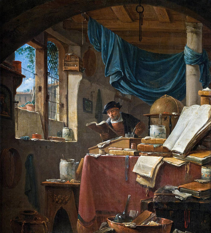
Thomas Wyck
c. 1660s
Oil on canvas, 33.5 x 31 cm.
Hallwyl Museum, Stockholm
School (of painting)
In reference to painting the word school is used with various meanings. In its widest sense a school may include the painters of a single country, regardless of date such as "the Dutch School." In its narrowest sense, it denotes a group of painters who worked under the influence of a single artist as in, the "School of Raphael." In a third sense, it applies to the painters of one city or province who worked under some common local influence, and with some general similarity of design, color, or technique, such as the "Florentine School."
Painters of a specific geographical area were once bound together more closely than in modern times. In order to sign and sell their works, they were required to belong to the Guild of Saint Luke, the corporation of artists and artisans which regulated the local art commerce and assisted painters in illness and old age. Each guild had a clearly defined set of rules, traditions and a system of apprenticeship that compelled young painters to work for a term of four to six years with a recognized guild master. Thus, an important master might stamp his manner of working on a large number of pupils, some of whom would be more than willing to acquiesce to the tastes of local collectors who had guaranteed their master's prosperity.
The "School of Delft," or the "Delft School," belongs to the third type of school, although its "members" would probably not have been aware that they belonged to any school at all. They were, however, bound by their obligatory guild membership and could not have avoided contact with each other is such a small town as Delft.
Schoon
In Gerard de Lairesse's (1640–1711) Het Groot Schilderboek (1707-1711) , the concept of schoon—translated variably as beautiful, pure, or clean—is closely tied to the use of color in painting. De Lairesse argued that painters should not imitate other artists' coloring but instead follow nature, especially its most harmonious and elegant aspects, the welgestelde natuur. He criticized the standard training of young painters, which focused heavily on copying, and emphasized that true artistry meant selecting and arranging colors according to their function within the whole composition, not just for their visual appeal. He warned against the common mistake of using the most saturated or glowing colors—what he called op zyn schoonst—simply because they were considered beautiful. While such colors might impress at first glance, they could disrupt compositional balance and weaken the illusion of depth, especially in ceiling paintings where figures might dissolve into a bright, color-saturated sky. He urged that color be subordinated to welstand, the overall harmony and unity of the painting.
In this context, schoon colors were often created using unmixed pigments and were linked to terms like gloeiend (glowing), krachtig (strong), and bruyn (brown or dark). De Lairesse associated bruyn not only with hue but also with saturation and darkness, contrasting his preference for naturalistic light and color with what he saw as the overly warm, brownish palettes used in Italian painting. This national contrast was noted by his translator, Fritsch, who argued that de Lairesse's ideas suited English taste, which favored the "fresh and fair" over the brown and heavy coloring of artists from southern Europe.
The passage also mentions painters like Jusepe de Ribera (1591–1652) and Johann Loth (1632–1698), whose "bruyne Coloriet" de Lairesse viewed as emblematic of the darker, more theatrical southern style he wished to move away from.
Jusepe de Ribera
c. 1621
Oil on canvas, 180.3 × 231.6 cm.
Museo de Bellas Artes, Bilbao
Schuilkerken
Although the founding father of the United Provinces, William the Silent, had championed religious and cultural tolerance, in practice, Calvinists were openly hostile towards people of different faith and attitude. Only foreigners, like Jews emigrated from other countries, were able to practice their religion freely, without significant restrictions. But Catholics, Remonstrants and Mennonites were explicitly forbidden to practice their faith in the public. They were violently deprived of their churches, cloisters, grounds and were forced to take refuge within domestic walls, warehouses, cellars, attics and even barns. These environments were then rebuilt and decorated for the purposes of celebrating the Holy Masses and holding other religious meetings evolving into so-called schuilkerken (hidden churches). In the rural areas they were called schuilkerken (Dutch schuur = barn) since barns were frequently used for the purpose. Initially, Calvinistic authorities reacted harshly against these hidden churches. In Zwolle, for instance, Catholic families were forbidden to live in houses side by side in order to impede them from tearing down the walls to create a room large enough for a church.
But in the course of the time, the schuilkerken gradually became tolerated by officials. However, it was strictly prohibited that their entrances could be accessed directly from the street and no sign (crucifixes or other Christian symbols) could be placed above the entrances. Even bell towers were banned because they could have pointed to the existence of a building of religious use other than the Reformed one. Bell-ringing was completely forbidden. Furthermore, no congregational singing was permitted to be heard from outside. Nevertheless, hidden churches quickly spread all over the country, particularly in the protestant Seven United Provinces.
The Jesuits, who had established their first Dutch mission in 1592, moved to a permanent location in Delft in 1612. In 1650, Catholic inhabitants of Delft had the "choice" between three schuilkerken: two (dated from 1630–1650) in the Bagijnhof at the Oude Delft canal, dedicated to Saint Hippolytus and Saint Ursula and attended by secular priests, and the third one, established 1617 in an old warehouse at Oude Langendijk, dedicated to Saint Josef and supervised by the Jesuits.
Sculpture
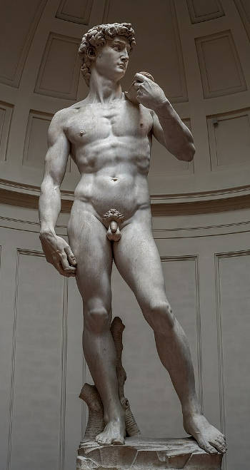
Michelangelo
1501–1504
Carrara marble, 517 × 199 cm.
Galleria dell'Accademia, Florence
In general terms, sculpture is the art of shaping materials into three-dimensional forms, either by carving, modeling, casting, or assembling. It has existed since prehistoric times, evolving through countless styles and purposes across cultures and eras. In the Western tradition, sculpture was initially tied to religious, ceremonial, and commemorative functions, from the stone figures of antiquity to the idealized marble statues of ancient Greece and Rome. During the Middle Ages, sculpture often served architectural purposes, adorning cathedrals with saints, gargoyles, and intricate narrative scenes. The Renaissance reawakened interest in freestanding sculpture, with artists such as Donatello (c.1386–1466) and Michelangelo (1475–1564) creating works that emphasized the human form, emotional expression, and the study of anatomy. Sculpture has historically been valued not only for its technical difficulty—working in marble, bronze, or wood requires considerable skill—but also for its ability to convey presence, weight, and spatial interaction in ways that two-dimensional arts cannot.
In painting, the term "sculptural" describes a style of painting in which figures or objects appear solid, weighty, and modeled as if carved, often emphasizing mass and contour.
In 17th-century Dutch culture, sculpture did not occupy the same dominant position that it did in contemporary Italy or France. The Calvinist spirit that shaped much of the Dutch Republic tended to discourage lavish public monuments or religious statuary, favoring simplicity and moral restraint. Nevertheless, sculpture was still present in Dutch society, though often in more modest or functional forms. Carved wooden pulpits, civic busts, funerary monuments, and decorative architectural elements provided outlets for sculptural craftsmanship. Artisans such as Rombout Verhulst (1624–1698) and Artus Quellinus the Elder (1609–1668), both active in the Northern Netherlands, produced refined marble and stone works that adorned town halls, churches, and patrician houses. Quellinus, for example, was instrumental in decorating the Amsterdam Town Hall, one of the grandest civic projects of the era, where allegorical sculptures reflected the city's wealth and ideals.
Although large-scale sculpture was relatively rare, Dutch painters frequently depicted sculptural objects within their compositions. Still life paintings often include marble busts, bronze figurines, and carved reliefs, reflecting both the collector's taste and the broader cultural fascination with antiquity and artisanal excellence. In the works of Willem van Aelst (1627–1683) and Jan Davidsz. de Heem (1606–1684), stone urns, intricate vases, and classical fragments appear alongside flowers and fruits, subtly merging painting and sculpture within the same visual field.
Thus, while the Dutch Golden Age was primarily a painters' culture, sculpture remained woven into daily life, appreciated as part of architecture, civic pride, private collection, and the wider fabric of material culture. Its quieter but steady presence, often glimpsed through painting, reveals how even a society devoted largely to modesty and restraint could find a place for the enduring power and beauty of the sculpted form.
Scumble / Scumbling
In a certain sense, scumbling is the opposite of glazing. The term scumbling refers to the use of opaque paint thinly applied over a dried layer of different colored paint. Glazes are also applied thinly but only inherently transparent pigments are employed for the purpose. Another difference between the two techniques is that glazes are applied over lighter-toned paint layers while scumbles are generally applied over darker ones. The difference produces two completely different optical effects. Scumbles produce pearly opalescence or a soft smoky effect while glazing creates a deep jewel-like one. Scumbles tend to appear cooler (bluer) in hue, especially when applied over warm dark browns of the underpainting. Scumbles seem to advance towards the surface of the canvas while glazes create depth. By manipulating the optical effects of these two valuable techniques in tandem, the painter may enhance depth and atmosphere of his work.
Scumbling can also be used to create smooth transitions from light to dark or to subtly alter the tone or hue of the underlying paint layer. In order to scumble, the artist first picks up a bit of paint with his brush and then wipes away surplus paint with a cloth. In a sense, the paint is then "scrubbed" or "rubbed" over an underlying dry paint layer. Little or no medium is required since it would make the paint flow. If applied lightly, scumbles remain attached to the highest relief of the paint surface but if they are rubbed with vigor they will penetrate into the interstices of the canvas grain. Fingertips and the ball of the hand are very good tools for fine scumbling.
It is sometimes said that Titian (c 1488/1490–1576) discovered that a light, opaque tone could be rendered semi-transparent by the addition of a bit more oil and/or simply by scrubbing it on thinly with a stiff brush. A scumble over a flesh tone would produce an analogous effect as powder on a woman's face; that is, it makes its texture appear softer. This is a useful device when painting women and young people of both sexes. Scumbling may be used to modify the color of a given area after that area is dry. Such an application tends to soften transitions of tone from the previous sitting that were done too harshly. If used properly, it confers a higher degree of refinement to the image.
The 18th-century English Romantic painter, Turner, Claude Monet (1840–1926), and others to create the effects of beautiful soft cloth, atmospheric skies, wispy clouds, smoke, and to bring light into a painting, whether sparkling light on water or a general diffused hazy light.
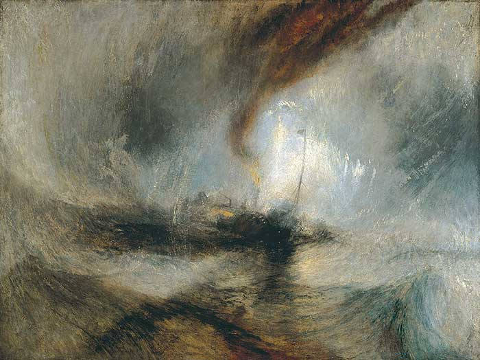
Joseph Mallord William Turner
1842
Oil on canvas, 91.4 x 121.9 cm.
Tate, London
Seascape
Holland is more intimately linked to the sea that any other nation on the earth. It is not surprising, therefore, that a number of Dutch artists devoted their careers to seascapes. "The sea was significant in a variety of ways to the Dutch. They were constantly warring with it in the struggle to increase and retain their land. On the other hand, the sea was the source of their wealth and their economic stability. The United Provinces was a great maritime trading nation; this was the backbone of its economy. The Dutch relied on the sea for a crucial part of their food supply. The herring, so often represented in still life paintings, was indeed a national treasure. Salted, it remained edible and provided sustenance during the long sea voyages that promoted Dutch prosperity, and it also enriched the economy as a major item for export. The sea was also the scene of their military successes. Dutch national heroes were admirals rather than generals; the great tomb sculptures in Dutch churches are tombs of admirals. Paintings of seascapes reflected the specific maritime interests of the Dutch people, and there seems to have been a large market for them in the 17th century.
"A number of Dutch artists whose work consisted mainly of other kinds of subjects painted seascapes as well. Jan van Goyen (1596–1656), for example, painted numerous coastal scenes and purely marine subjects. Jacob van Ruisdael (c. 1629–1682) and Aelbert Jacobsz Cuyp 1620–1691) also painted seascapes. Some artists, however, specialized in seascapes. Most marine painters were experts on ships."Madlyn Millner Kahr, Dutch Painting in the Seventeenth-Century (New York: Routledge, 1978), 232–133.
Vermeer is not know to have ever painted a seascape. However, the maps which hang on the background walls of his compositions often remind the viewer of the fundamental role that the sea played in the lives of many Dutchmen. In the late The Love Letter, an ebony framed seascape hangs directly behind the maid and mistress who has presumably just received a letter from her loved one. This picture-with-a-picture mostly likely was intended to clarify the meaning of the composition as it refers to the loved one of mistress' who is not present. Ships at stormy seas often were connected to the idea of uncontrollable the passions of the lover's heart. But the seascape in Vermeer's composition seems to be relatively calm. In Dutch emblematic traditions a calm sea represents a good omen for love.
Seccative
Seccatives, also known as driers, are substances added to oil paints to accelerate the drying process. Their use dates back to at least the 15th century, becoming increasingly common as oil painting painting techniques developed and spread throughout Europe. In traditional oil painting, pigments are suspended in drying oils such as linseed or walnut oil, which oxidize and harden over time when exposed to air. This process can be slow, particularly with certain pigments or under humid conditions. Seccatives—often metallic compounds like lead, manganese, or cobalt salts—catalyze the oxidative reaction that causes the oil to polymerize and set more quickly. While effective, seccatives can cause long-term problems such as discoloration, cracking, or embrittlement if used excessively or improperly. The use of these additives was sometimes controversial, as their effects were not always predictable.
In the context of 17th-century Dutch painting, seccatives played an important but generally discreet role. The Dutch tradition emphasized meticulous technique, careful layering, and controlled drying times. Painters like Gerrit Dou (1613–1675), known for his fine detail and enamel-like surfaces, needed their layers to dry sufficiently before applying the next, which may have encouraged cautious use of driers to keep their work moving forward. Some painters employed rapid underpainting or grisaille stages that benefited from a faster drying base. While there is limited documentary evidence specifying particular recipes, analysis of works from this period has shown that artists sometimes applied lead-based driers to achieve consistent drying and maintain smoothness in their carefully constructed images. At the same time, painters trained in larger studios or under workshop conditions—such as those of Frans Hals (c. 1582–1666) or Jan van Goyen (1596–1656)—may have used seccatives with more freedom to maintain productivity, especially when working on multiple paintings simultaneously or on larger canvases with bold brushwork.
Certain elements and even some pigments themselves were used as seccatives in early painting, often for their natural ability to promote drying through catalytic action. In early oil painting—particularly from the 15th to 17th centuries—painters relied on both deliberately added metallic compounds and the drying properties inherent in specific pigments.
The most commonly used metallic seccatives included lead, manganese, and later cobalt:
- Lead compounds, especially lead (II) oxide (litharge) and lead (II) acetate (known historically as "sugar of lead"), were among the earliest and most effective driers. When added to oil, these helped form a fast-setting film. They were often used in ground layers or underpaintings. White lead (basic lead carbonate), while primarily a pigment, also had strong drying properties and may have contributed to faster drying in mixtures.
- Manganese compounds, usually in the form of manganese dioxide or manganese resinate, became important by the 16th century. Manganese-based driers tend to promote surface drying and were often less prone to causing the long-term brittleness associated with lead.
- Verdigris, a green pigment made from copper acetate, is another case where the pigment itself had strong drying properties. While primarily used for its color, verdigris was known to speed the drying of oil paint, possibly because of the copper salts it contained. However, verdigris was also notoriously unstable, prone to color change and degradation, especially when exposed to light or combined with other pigments, so it was used with caution.
- Other copper-based pigments, such as azurite, and even some iron oxides found in ochres and umbers, also exhibited moderate drying properties. Brown earth pigments like raw and burnt umber, which contain natural manganese, were particularly valued for their ability to accelerate drying when added in small amounts to mixtures.
By contrast, more expressive painters like Frans Hals may have taken advantage of naturally quick-drying mixtures to complete sections of a painting in a more direct and spontaneous manner, which depended in part on how the underlying materials behaved during the painting process.
Seeing
The concept of vision—and by extension, seeing—has occupied a central place in the history of art and its theory, particularly in the long effort to understand how artists translate the visible world into pictorial form. Vision is not merely a physiological process of light entering the eye, but a culturally, historically, and psychologically shaped act of interpretation. This visualpereption is especially important in art, where the gap between perception and representation is never neutral. Throughout Western history, thinkers have debated whether vision provides direct access to reality or whether it is filtered through assumptions, memory, and learned conventions. The ancient Greeks already recognized this ambiguity. Plato (c. 428–c. 348 BCE) viewed vision as unreliable, a shadow of the real, while Aristotle (384–322 BCE) treated sight as the noblest of the senses, central to knowledge and learning.
From a psycological poin of view, Rudolf Arnheim (Art ad Visual Perception: A Pschology of the Creative Eye, 1954) explains that seeing is not a passive recording of the world but an active process in which every object is immediately experienced in relation to others. When we see an object, we perceive its size, brightness, and position within a broader spatial context that includes the observer. A book, a disk, or a square is not viewed in isolation but as part of an integrated visual field. These elements gain meaning only through their relationships—with the surrounding space, other objects, and the viewer's point of view. Vision inherently assigns order and context, embedding every object in a mental framework of relative scale and placement.
This perception differs significantly from mechanical measurement. Whereas a yardstick measures one unit at a time, visual understanding works holistically: size, distance, and direction are grasped in relation to the entire field, not in isolated fragments. More than that, visual experience is inherently dynamic. Elements within a composition are not fixed in meaning or position—they generate psychological tension. For example, a slightly off-center disk in a square appears not merely displaced but "wants" to move, or seems to have been moved. This restlessness, this sense of inner pressure or imbalance, is perceived instinctively and viscerally. These tensions are not subjective inventions; they are integral to how we perceive. The visual field is charged with what can be called psychological "forces"—energies that guide the eye and shape emotional response. These forces have direction and intensity, just like physical forces, and they play a fundamental role in how forms interact and how compositions are experienced. Such dynamics are not added by the viewer but are embedded in the act of perception itself, making them as essential to the visual world as light or color.
Pliny the Elder (23–79 CE) and Ptolemy both made significant contributions to early theories of vision that directly touch on the themes Ernst Gombrich (1909–2001) explored centuries later. These ancient voices offer powerful evidence that the act of seeing has long been recognized as something far more complex than a mechanical recording of the world. Their insights add historical depth to the discussion and reveal that skepticism about the reliability of sight is not a modern development but a continuous thread in the history of art and science.
Pliny, in his Natural History, makes the striking observation that "the mind is the real instrument of sight and observation, the eye acts as a sort of vessel, receiving and transmitting the visible portion of the consciousness." This formulation captures the fundamental dilemma that Gombrich would later articulate in psychological terms: that seeing is not a neutral activity, and that what is perceived is already shaped by cognition. Pliny's statement suggests that the eye is merely a conduit, a sensor rather than a judge, and that interpretation—the transformation of sensation into meaning—happens in the mind. The distinction he draws between physical reception and mental understanding anticipates later debates about the relationship between perception and representation. It also raises the essential problem of so-called "pure" seeing: if the mind is always involved, can we ever see without bias, habit, or expectation?
Claudius Ptolemy (c. 100–c. 170 CE), known primarily for his contributions to astronomy and geography, also played an important role in the development of optical theory. He inherited and modified earlier Greek ideas, notably the extramission theory of vision, which proposed that visual rays are emitted from the eyes and interact with objects. Though later disproven, this theory held for centuries because it metaphorically supported the idea that the act of seeing is an active engagement with the world, not a passive reception. Ptolemy's writings on optics, including experiments with mirrors and refraction, were less concerned with psychological interpretation than with the physical properties of light and geometry. Yet even here, the link between mathematical structure and human perception reveals an early desire to systematize the act of seeing—to give it rules and limits, and to place it within the reach of reason.
During the Renaissance, theorists like Leon Battista Alberti (1404–1472) advanced the idea of the picture as a window onto the world, suggesting that vision could be systematized and disciplined through perspective and proportion. This geometric and optical model of seeing dominated art theory for centuries.
By the late 19th century, the notion of simply imitating nature in art had collapsed, prompting thinkers to reconsider how we perceive the world. Konrad Fiedler and Adolf von Hildebrand argued that seeing is not a passive recording of the external world but a mental process shaped by memory and sensation—particularly touch. A sphere, for example, appears flat to the eye, but we understand its volume through touch and movement.
Hildebrand believed that the artist's job was to compensate for the lack of movement in images by appealing to these tactile memories, allowing viewers to reconstruct spatial form mentally. This idea influenced Bernard Berenson (1865–1959), who claimed that the best painters give "tactile values to retinal impressions."
Heinrich Wölfflin (1864–1945) extended this idea by showing how different eras used different visual strategies to represent the world, coining the concept of the "history of seeing." Alois Riegl (1858–1905) went further, suggesting that every style reflects a specific way of perceiving and interpreting reality, shaped by cultural and historical conditions. Even abstract or decorative styles, he argued, embodied a deliberate "will to form" (Kunstwollen)—a visual mindset rather than a technical limitation.
This reframing shifted art history from a catalog of masterpieces to a study of perception and its historical conditions. It legitimized styles once dismissed as decadent or primitive, such as late Roman or Egyptian art, by showing they were not inferior but built on different perceptual priorities. It also laid the foundation for modern visual culture studies, making space for psychological, sociological, and anthropological approaches to art.
In Art and Illusion (1960), Gombrich reframed the relationship between seeing and style by arguing that artistic representation is not the result of simply copying what is seen, but of interpreting and "constructing" what is seen through learned conventions and expectations. His central premise is that there is no such thing as an "innocent eye." All seeing is shaped by experience, culture, and prior knowledge—what he calls "schemata."
Gombrich challenges the idea that art history is a record of progress toward greater realism. Instead, he shows that artists work within visual traditions—systems of expectation—that guide both what they perceive and how they depict it. When these traditions evolve, it is not because artists suddenly see more accurately, but because their expectations change, prompting them to revise their schemata. This process, he argues, is one of trial and correction: artists experiment within a style until they find new ways of resolving visual problems.
Unlike Riegl's notion of Kunstwollen, which implies a kind of collective visual will or cultural mindset, Gombrich grounds stylistic change in individual psychology and cognitive processes. He borrows insights from perception science and psychology (notably from Hermann von Helmholtz (1821–1894)) to show that our visual system itself is not passive but interpretive, always guessing and adjusting based on partial input.
Gombrich quoted from a range of sources to show that artists themselves were aware of these constraints. He cited, for instance, the assertion by Nicolas Poussin (1594–1665) that one must learn to see nature with a painter's eye, and Goethe's (1749–1832) belief that the senses are themselves acts of interpretation. These ideas suggest that seeing is an art in itself—conditioned by training, purpose, and historical context. Even the development of scientific tools such as the camera obscura did not eliminate subjectivity; they merely offered a different way to measure or frame the act of looking. Artists continued to choose, emphasize, and omit according to the expressive needs of their time.
Thus, for Gombrich, "seeing" in art is not a mirror of reality but a negotiation between mental habits and visual challenges. Style, in turn, is not a decorative feature but the very structure of how vision is organized and translated into image.
Gombrich's Art and Illusion had a major impact on the development of art history and visual studies, both in method and in scope. Its central hypotheses—that perception is shaped by learned conventions, that artistic style evolves through a cycle of schema and correction, and that representation is not a copy of nature but a cognitive construction—introduced a fundamentally new way of thinking about images, seeing, and the history of art.
First, Gombrich's work helped to dismantle the older notion that art history was a linear progression toward realism. He demonstrated that no image is ever a neutral record of visual facts, and that even the most "realistic" works are structured by stylistic conventions. This reorientation made it possible to study periods and styles that had previously been dismissed as naïve, decadent, or primitive on more equal terms, since all visual languages are seen as systems with their own internal logic.
Second, Art and Illusion integrated psychology into art historical thinking more systematically than earlier works. Gombrich drew on empirical studies of perception—especially gestalt psychology and the theory of unconscious inference—to argue that visual representation is a process of educated guesswork, not passive reception. This opened up a rich dialogue between art history, cognitive science, and later semiotics, influencing how scholars approached the viewer's role in interpreting images.
Third, Gombrich's emphasis on schemata—mental templates artists use to make sense of what they see—provided a powerful tool for analyzing how style operates across cultures and periods. It allowed scholars to explore how artistic conventions arise, solidify, and are eventually challenged or revised. This idea influenced not only traditional art historians but also theorists of visual culture, image studies, and design.
After Gombrich, there have been substantial revisions and critiques of his ideas about style and seeing—some building on his work, others challenging its assumptions or proposing alternatives. These revisions have emerged across multiple disciplines, including art history, visual culture, anthropology, and cognitive science.
1. Social and cultural turn in art history:
While Gombrich emphasized individual perception shaped by tradition and psychology, later scholars—especially in the 1970s and 1980s—shifted attention to broader social, political, and ideological factors that influence how art is made and seen. Michael Baxandall, for example, in Painting and Experience in Fifteenth-Century Italy (1972), extended Gombrich's insights but rooted style in the specific "visual habits" of a culture, linking artistic choices to education, economics, and patronage. His notion of the "period eye" added a more socially situated account of perception.
2. Structuralist and post-structuralist critiques:
Thinkers like Roland Barthes and Michel Foucault criticized Gombrich's reliance on empirical psychology and his assumption that meaning and perception are ultimately personal and reconstructible. From their point of view, vision is shaped by language, discourse, and power structures that go beyond the individual. Style, in this context, is less a matter of solving perceptual problems and more a reflection of larger symbolic systems.
3. Feminist and postcolonial perspectives:
These approaches questioned the neutrality of Gombrich's framework, arguing that it ignored gendered and colonial dimensions of seeing. Scholars such as Griselda Pollock and David Summers have emphasized that what is seen—and how it is seen—is embedded in systems of dominance and exclusion. They also criticized the idea of universal cognitive processes, showing how perception and representation are historically and geographically contingent.
4. Cognitive and neuroscientific developments:
In the late twentieth and early twenty-first centuries, some researchers returned to Gombrich's cognitive focus but revised it in light of newer findings. Vision scientists and neuroaestheticians have explored how the brain constructs images, sometimes supporting Gombrich's idea of "unconscious inference" but also complicating it by showing the dynamic interaction between attention, emotion, and context. Semir Zeki, for example, has investigated how the brain processes line, form, and color in ways that intersect with art-making but don't always align neatly with Gombrich's trial-and-error model.
5. Image theory and visual culture studies:
Hans Belting and others in the field of Bildwissenschaft (image science) have moved beyond the idea of style as a purely formal or perceptual issue. Belting argues that images have a "double ontology": they exist both as material objects and as part of larger symbolic and ritual systems. In this framework, seeing is not just biologically conditioned but also mediated by social use, belief, and cultural function.
In sum, Gombrich's model of style and seeing has been revised in at least five major directions: toward historical specificity (Baxandall), linguistic and ideological critique (Foucault, Barthes), cultural embeddedness (Pollock, Summers), updated cognitive science (Zeki), and image-centered anthropology (Belting). His work remains foundational, but no longer definitive.
Self-contained
A self-contained work of art is one that establishes its meaning, coherence, and expressive force entirely within its own formal and visual boundaries. Such a work does not require external narrative explanation, historical backstory, or textual commentary in order to be intelligible or complete. Its internal relationships—between figures, space, light, color, gesture, and composition—form a closed system in which every element contributes to a unified whole. The viewer may bring knowledge or associations to the encounter, but the work itself does not depend on them. In this sense, a self-contained artwork invites sustained looking rather than explanation, rewarding attention to what is present rather than what is implied beyond the frame.
The idea has roots in classical and Renaissance thought, where unity, proportion, and internal harmony were regarded as essential artistic virtues. Renaissance art theorists such as Leon Battista Alberti (1404–1472) emphasized concinnitas, the fitting together of parts so perfectly that nothing could be added or removed without damage to the whole. Although Renaissance art often relied on literary, religious, or mythological sources, the highest praise was reserved for works whose formal structure carried conviction on its own terms. By the early modern period, this concern for internal coherence increasingly separated the visual arts from purely illustrative functions, allowing paintings to be judged as autonomous objects rather than as dependent vehicles for stories.
In seventeenth-century Dutch painting, the notion of self-containment found especially fertile ground. Many Dutch works depict ordinary moments—reading a letter, playing music, pouring milk—without clear narrative progression or dramatic climax. These paintings rarely point forward or backward in time; instead, they concentrate meaning within a single, suspended moment. Moral, emotional, or symbolic resonances are present, but they are embedded within the depicted situation rather than explained from outside it. The absence of overt narrative resolution encourages the viewer to read significance through balance, stillness, light, and restraint. As a result, the painting functions as a complete visual statement rather than as an illustration of a larger story.
This quality is particularly evident in the work of Vermeer. His interiors are often described as closed worlds: quiet rooms bounded by walls, windows, and tiled floors that seem to contain not only figures and objects but also light, sound, and time itself. Each painting operates as a finely calibrated equilibrium in which nothing appears accidental or excessive. Meaning arises from internal relations—the angle of a head, the fall of light across a wall, the measured spacing between objects—rather than from narrative cues or explanatory symbols alone. Even when recognizable emblems or paintings-within-paintings are present, they do not open the work outward toward a larger story; instead, they reinforce the painting's internal logic.
In this context, a self-contained work of art does not imply isolation from culture or ideas, but rather a disciplined concentration. The painting absorbs its references, meanings, and emotions into its own structure, asking the viewer to find coherence within the frame. For 17th-century Dutch artists, and for Vermeer in particular, this inward completeness became a central source of expressive power, allowing small, quiet scenes to carry a sense of permanence and sufficiency that feels whole in itself.
Self Portrait
A self-portrait is a representation of an artist, drawn, painted, photographed, or sculpted by the artist. Although self portraits have been made by artists since the earliest times, it is not until the Early Renaissance in the mid-15th century that artists can be frequently identified depicting themselves as either the main subject, or as important characters in their work. With better and cheaper mirrors, and the advent of the panel portrait, many painters, sculptors and printmakers tried some form of self-portraiture.
"Jean Fouquet's self portrait (c. 1450), a small picture created in gold on black enamel, is seen as the earliest clearly identified self portrait that is a separate painting, not an incidental part of a larger work. However, self-portraits are known to go back as far as the Amarna Period (c. 1365 B.C.) of Ancient Egypt. Pharaoh Akhenaten's chief sculptor Bak carved a portrait of himself and his wife Taheri out of stone. This is significant because Bak and Taheri were not like the rich and powerful who could afford the privilege of a portrait therefore the artist must have had another reason for creating this work of art. Sean Kelly points out in his book The Self-Portrait, A Modern View, while we know a number of self-portraits from the ancient world, we also know very little about the psychological motivations which inspired them.
"Though Albrecht Dürer (1471–1528) is credited for being the first artist to consistently create self-portraits, Rembrandt (1606–1669) is given credit for being the first artist to intensely study of the self through art.""Self-Portraits as a Self-Study."
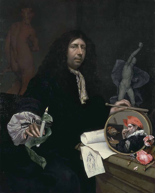
Johannes van Wijckersloot
1669
Oil on canvas, 114.8 x 91.8 cm.
Museum der bildenden Künste, Leipzig
It was not until the 19th and 20th centuries, when scholars studied Rembrandt's oeuvre as a whole, that it was discovered how very many times the artist had portrayed himself. The number is still a matter of contention, but it seems he depicted himself in approximately forty to fifty extant paintings, about thirty-two etchings, and seven drawings. It is an output unique in history; most artists produce only a handful of self portraits, if that. And why Rembrandt did this is one of the great mysteries of art history.
Most scholars up till about twenty years ago interpreted Rembrandt's remarkable series of self portraits as a sort of visual diary, a forty-year exercise in self-examination. In a 1961 book, art historian Manuel Gasser wrote, "Over the years, Rembrandt's self portraits increasingly became a means for gaining self-knowledge, and in the end took the form of an interior dialogue: a lonely old man communicating with himself while he painted.
Art historian Ernst van de Wetering sets forth a view that has gained a number of adherents over the past few decades. The "self portraits" (there was no such term in the 17th century) could not have been made for the purpose of self-analysis, he claims, because the idea of self as "an independent I who lives and creates solely from within" is one that arose only in the Romantic era, after 1800. In the literature of Rembrandt's day, he contends, personality was seen primarily as being bound to certain immutable types discussed in Classical sources. Van de Wetering basically sees that Rembrandt's "programme" in these self portraits was to make paintings for which there was a ready market. He points out that a detailed inventory of Rembrandt's possessions made in 1656, when he faced bankruptcy, included no portrayals of the artist by himself.) In self portraits, artists in Rembrandt's day and previous eras sometimes included a painting in the genre for which they were best known, as an example of their style. In the case of Rembrandt, he was most noted for his eccentricity of technique and for his tronies and depictions of one or a few figures. So, in making his self-portraits, which Van de Wetering contends were probably all seen as tronies in their day, Rembrandt was making the kind of images art buyers expected of him, which had the added attraction of being depictions of their maker and exemplars of his unusual technique.
According to a succinct description in an auction catalogue of 1696 (the Dissius estate sale in Amsterdam) which featured twenty-one Vermeer paintings, the artist had at one time or another depicted a "portrait of Vermeer in a room with various accessories uncommonly beautifully painted by him." Unfortunately, this "uncommonly beautiful" work is currently missing or has not survived. But over the years various works have been candidated as Vermeer self portraits including The Art of Painting even though the artist who is depicted at work in this masterpiece has turned his back to the viewer.
While the Dissius self-portrait has disappeared, the pose, the glance, the fancy costume and the lateral position of the figure on the left of the composition of Vermeer's The Procuress (1656) all suggest it a self-portrait by Vermeer. This grinning figure, who clutches a cittern in his right hand and seemingly cheers to both the viewer and his companions with a glass of beer, is a typical Caravaggesque merry drinker popular pictured frequently brothel scenes of the Utrecht Caravaggists. The semi-comical figure serves as a kind of third-person "fictional narrator," within yet partially extraneous to the scene which unfolds. He wears a fanciful black doublet with broad slashes on the sleeves and so-called shoulder-wings. A similar figure appears out a work by Gerrit Dou (1613–1675). At the time of The Procuress was painted the painter was nearly twenty-four.
Setting
In the context of visual art, the term setting refers to the environment or surroundings in which the figures or subjects of a composition are placed. Unlike the more technical term background, which often indicates the spatial layer farthest from the viewer or behind the primary subject, setting encompasses the broader narrative, emotional, and cultural context in which the action or moment takes place. A setting can include architecture, landscape, interior furnishings, natural elements, or even symbolic objects that establish the mood, time period, or thematic resonance of the work. Throughout the history of painting, the setting has served as a crucial narrative device, supporting the subject by reinforcing its meaning or helping to evoke a particular atmosphere.
In medieval and early Renaissance painting, settings were often schematic or symbolic rather than naturalistic, with gold backgrounds and flattened architectural forms signifying spiritual rather than earthly realms. As techniques in perspective and observation improved, particularly in the 15th and 16th centuries, settings grew more spatially convincing and more integrated with human activity. Artists such as Giotto and later the painters of the Italian Renaissance developed settings that contributed to the drama and realism of their scenes, placing figures in plausible interiors or carefully observed landscapes.
In 17th-century Dutch painting, the setting became a defining feature of many compositions and a site of creative innovation. Painters used settings not just as decorative or supportive elements, but as active components of storytelling and moral suggestion. In domestic genre scenes, for example, the setting often reflected contemporary middle-class interiors—complete with tiled floors, Delftware, carpets, and painted wall panels. Artists like Pieter de Hooch (1629–c.1684) were masters at arranging interiors in ways that guide the viewer's attention through doorways and light sources, creating a layered world of rooms and courtyards that situate human behavior in a recognizable and meaningful space.
The setting in a painting by Vermeer often serves a similar function. His interiors are not merely architectural shells but carefully ordered spaces that echo the psychological or emotional state of the figures. The precise arrangement of windows, tables, maps, curtains, and floor tiles forms a quiet but eloquent setting in which gesture, light, and expression take on deeper significance. Though not overtly narrative, these spaces speak through their refinement and order, suggesting themes of contemplation, isolation, or harmony.
In history painting, allegory, and portraiture, the setting might shift from domestic to classical or symbolic. Painters such as Caesar van Everdingen (1616–1678) or Govert Flinck (1615–1660) placed their figures in theatrical settings with columns, drapery, or distant landscapes to evoke historical or moral grandeur. In still life and vanitas painting, the setting includes the table, cloth, and objects that create a platform for meditating on transience, luxury, or learning. In all these genres, the setting operates as more than a passive backdrop—it is a compositional and interpretive element that frames the subject, shapes the mood, and invites reflection.
Govert Flinck (1615–1660)
1639
Oil on panel, 160 × 196 cm.
Musée du Louvre, Paris
Understanding the setting in Dutch painting thus requires more than a visual scan of where objects are placed. It involves grasping how environment and narrative interlace, how social and material details anchor the viewer in a familiar world while simultaneously guiding them toward ethical or emotional engagement. The setting, in this way, becomes the stage on which Dutch visual culture negotiated its values, beliefs, and ideals.
Sfumato
Sfumato is a technique, theorized and developed by Leonardo da Vinci (1452–1519), in which the transitions from light to dark are so gradual they are almost imperceptible; sfumato softens lines and creates a very natural soft-focus effect. This slight blurring of contours was associated with the realization that air has a mellowing effect comparable of smoke or vapor. "Fumo" in Italian means smoke. Leonardo advised that "the painter, depicting figures and objects distant from the eyes, should put in only blots, not detailed but with distinct outlines."
Vermeer, in his individual way of rendering sfumato, let areas of paint slightly overlap at the transition areas along contours in order to create a special luminous effect around his pictorial motifs. The result of this technique can be seen, for example, around the skirt of The Milkmaid and the Young Woman with a Water Pitcher, but also between the floor tiles in The Music Lesson.
Another extraordinary use of sfumato in Vermeer's oeuvre can be seen in the late Guitar Player. The strings of the guitar are blurred and appear that they had been just plucked. Curiously, the Spanish master Diego Velázquez (1599–1660), with whom Vermeer's painting have been compared even thought there are no historically proven ties between the two masters, also experimented with blurred contours to convey the sense of movement in the spinning wheel of the Las Hilanderas (The Spinners) c. 1657.
Shading
Shading, which aims at creating a sense of volume of solid objects through the manipulation of gradients rather than registering of the effects of natural light, generally issues from the contour and gives way gradually to lighter tonal values toward the center. Shading can be achieved even by non-painters while the creation of a convincing feel of natural light and shadow requires training. Since shading is in not accordance with the rules of illumination, an object shaded by gradients alone implies no fixed source of light. Creating form with shading can be done without actually seeing an object so it is essentially a conceptual exercise, and it is immediately distinguishable with respect to true chiaroscural modeling.
Cimabue
c.1267–1271
Distemper and gold on wood panel, 336 x 267 cm.
Basilica of San Domenico, Arezzo
Shadow
In painting, there are essential four kinds of shadows that occur when light shines upon an object, attached, cast, form, and mass shadows.
Attached Shadows
Attached shadows are shadows that naturally occur on the surfaces of objects where light is obstructed. They follow the form of the object and help define its curves, angles, and depth by creating gradients of light and dark. For instance, the shadow cast by the nose across a face, or the darker side of a sphere away from the light source, are examples of attached shadows. These shadows are essential for making forms appear three-dimensional, as they reveal the way light interacts with the object's surface. "Attached shadow (chiaroscuro), however, is not universally used in depiction, but even where it is mastered skillfully, it is not generally accompanied by the use, let alone the mastery, of cast shadows—as shadows are rare until the European Renaissance. After the Renaissance, shadows in European painting were canonized and shadow painting was the subject matter of a number of painting treatises. During a circumscribed period in history, the depiction of cast shadows has been the object of a representational struggle. Painters of the early Renaissance appear to have been fascinated by shadows, and to have learnt over about one century how to depict them in a geometrically and perceptually adequate or satisfactory way."Roberto Casati, "Methodological Issues in the Study of the Depiction of Cast Shadows: A Case Study in the Relationships between Art and Cognition," The Journal of Aesthetics and Art Criticism 62, no. 2 (2004): 165.
Cast Shadows
In the simplest terms, a cast shadow is a shadow that is projected on a form nearby by an object which occludes the light which emanate from the principal light source (multiple cast painting are caused by multiple light sources, usually avoided in painting). Each object which blocks light has a cast shadow associated with it. The shape of the cast shadow, which appears to be separated from the object which casts the shadow, is determined not only by shape and dimensions of the object that blocks the light, but by the surface form on which the cast shadow falls as well as the direction, origin and intensity of the light—and, crucial for the painter, the point from which the shadows are observed. An example of a cast shadow is a shadow of a tree that falls on the ground below, or the shadow cast upon the tabletop from an apple sitting on it. The farther a cast shadow is from the object the lighter and softer are its edges. A general rule for painters is that cast shadows are darker than any part of an objects attached shadow. A soft cast shadow, which has a blurred or feathered edge, is often used when the light source is diffuse or far away. A hard cast shadow, with a sharp-edged, is common under direct light. An occlusion shadow is the darkest portion of a cast shadow, closest to the object.
Form Shadow
refers to the three-dimensional quality of objects, encompassing their volume, shape, and structure as represented in a painting or sculpture. The depiction of form relies on the careful use of light, shadow, and perspective to convey the solidity and contour of objects, making them appear as if they occupy space rather than being flat shapes.
Mass Shadow
A mass shadow is the broad, generalized shadow that defines the overall shape of an object in relation to a light source, as opposed to the smaller, more detailed shadows within it. It is the dominant shadowed area that conveys the three-dimensional form of an object, helping to distinguish its volume and placement in space. Unlike cast shadows, which are projected onto a surface by an object blocking the light, a mass shadow remains attached to the object itself, transitioning gradually from light to dark depending on the intensity and direction of illumination.The adequate depiction of cast and attached shadows is essential for creating the illusion of volume, mass and depth. Without shadows, objects have no substance do not seem real. Understanding the subtle variations of attached and cast shadows requires careful observation: squinting at the subject to see tends to simplify the relationships between lit and unlit areas of the scene and make figure-ground making value relationships clearer. In the 18th century, the so-called Claude glass was considered an indispensable tool for an amateur landscape artist. Named for French 17th-century painter Claude Lorrain (1600–1682), the Claude glass is a black mirror, slightly convex, that serves to concentrate and frame scenery, as well as simplifying the color and tonal range. This created an image with the qualities of a painting by Claude and made drawing scenery much simpler.
In 17th-century Dutch painting, artists demonstrated a keen awareness of these distinctions. Rembrandt van Rijn (1606–1669) mastered the use of mass shadows to create dramatic effects, often plunging large portions of his compositions into deep shadow while allowing selective highlights to emerge with striking intensity. His chiaroscuro technique relied heavily on the manipulation of form shadows to sculpt faces, hands, and drapery, making them appear almost tangible. Vermeer, by contrast, employed an extraordinary subtlety in his use of form shadows, carefully observing how light softly enveloped objects and figures. His mastery of tonal transitions gave his interior scenes an unparalleled sense of atmosphere and realism, where objects seemed to glow from within rather than being starkly illuminated.
Painting shadows convincingly is challenging because the human eye does not perceive shadows as distinct, separate colors from the objects they fall upon. Instead, shadows are understood as variations of the local color, subtly altered by the quality and direction of light. For a painter, this presents a significant difficulty: it is not enough to darken the local color by simply adding black, as this approach tends to produce a dull, muddy effect that lacks the transparency and depth required to depict shadows realistically. Shadows must appear both immaterial and integrated with the object, preserving the underlying hue while suggesting the influence of ambient light and reflections.
To achieve this effect, painters typically use thin, semi-transparent paint for shadows. By layering paints composed of inherenlty translucent pigments, they can create shadows that retain a sense of the object's local color while appearing immaterial and luminous. This glazing technique allows light to pass through the upper layers of paint, reflect off the ground beneath, and return, producing a subtle glow that suggests the airiness and intangibility of shadows. The transparency is vital because it prevents shadows from seeming like opaque stains on the surface, which would destroy the illusion of relief and volume.
In contrast, areas of light are often rendered with thick, opaque paint applied in thick layers to enhance their solidity and weight. This contrast between thick, substantial lights and thin, ethereal shadows not only reinforces the illusion of light and shadow but also accentuates the volume of forms, making them seem to advance and recede convincingly within the pictorial space.
Moreover, painters typically represent less detail in the shadowed areas rather than the illuminated areas. Detail in shadow subtract from sensation of natural light and the painting surface overworked. By rendering shadows flat and relatively devoid of detail, the painter enhances through his medium the unsubstantial nature of the shadow itself.
Thus, the difficulty of painting shadows lies in capturing their dual nature: they must darken without obscuring, outline without solidifying, and suggest depth without substance. Mastering this balance is what allows shadows to support the perception of volume, light, and spatial coherence in a painting.
Seventeenth-century artist were keenly aware of the proper rendering of shadows. The painter and art theoretician Samuel van Hoogstraten (1627–1678), warned against overworking shadows lest they become hard:
But whether you begin or end with the shadows, you should split them up in your mind into lesser and greater, and depict each in a flat manner, according to its darkness; for by working them too much, and melting them in, all your work would turn to copper; and you would even lose the capacity to judge it. Don't allow yourself to be bothered by small modulations [kantigheden] in a soft shadow, nor by the fact that, when viewed from close by, a darker one can be seen in the middle of it; because the force will be all the greater if you hold it at arm's length…
From inspecting his theory and his practice, it would seem that what Van Hoogstraten wanted was a drawing built out of crisp contrasts, in which light and shade were clearly articulated, both between and within themselves.Paul Taylor, "Flatness in Dutch Art: Theory and Practice," Oud Holland Jaargang 121, no. 2/3 (2008): 161.
Vermeer himself greatly minimized detail of his shadows, especially the mass shadows. For example, the mass shadow of the blue attire of the blue morning jacket of the Woman in Blue Reading a Letter is rendered almost entirely with a single tone of unmodulated dark blue (natural ultramarine). This pictorial strategy not only enhances the sensation of natural light but simplifies the planimetric composition of the painting into large masses of dark and light which can be more comfortably assimilated by the observer. However, the drastic simplification of Vermeer's shadows may not only owe to Dutch practice recommenced by Van Hoogstraten but to the peculiar image produced by the camera obscura (known to have been employed by Vermeer) which, in situations of all but exceptionally strong illumination, does not evidence tonal variations in shadowed areas of objects.
Shadow Contrasts
In 17th-century Dutch art theory, particular attention was given to the careful ordering and distribution of light and shadow across a composition. Painters were repeatedly warned against the careless scattering of lights and darks, as this could result in a fragmented surface that confused the eye and disrupted the unity of the image. Samuel van Hoogstraten (1627–1678), a pupil of Rembrandt, addressed this issue in his Inleyding tot de Hooge Schoole der Schilderkonst, published in 1678, the year of his death, and several decades before Gerard de Lairesse's better-known Groot Schilderboek of 1707–1710. Drawing on classical rhetorical principles, Hoogstraten likened the arrangement of lights and shadows to the structure of a persuasive speech, in which the parts must support one another and lead the listener—or viewer—coherently from one point to the next.
Hoogstraten made significant use of De Pictura Veterum (1637), a foundational art-theoretical treatise by Franciscus Junius (1591–1677). Referring to Junius's account of Greek and Roman ideas about light and shadow in painting, Hoogstraten warned against excessive tonal contrast. As Ernst van de Wetering has observed, Hoogstraten interpreted Junius's position as a critique of overly abrupt alternation between light and dark, imaginatively adding that such paintings appear "like chessboards." Expanding on this idea, Hoogstraten advised painters:
"I therefore recommend that you not mix up lights and shadows too much, but rather combine them properly into groups. Let your strong lights be gently accompanied by weaker ones, and I assure you they will shine all the more beautifully. Let your deepest darks be surrounded by milder darks, so that the force of the light will stand out all the more powerfully."
The implication is not that painters should avoid shadow, but that the frequency of alternation between light and dark must be controlled. Visual transitions should be measured and purposeful, allowing the structure of the composition to emerge clearly and directly to the eye.
Hoogstraten explicitly credited Rembrandt with mastering this principle, writing that "Rembrandt developed this virtue to a high degree, and he was a master at properly combining related colors."
Later, Gerard de Lairesse (1640–1711), although critical of Rembrandt in many respects, echoed similar concerns about tonal scattering in his Groot Schilderboek. He cautioned that the unregulated alternation of light and dark across the canvas could result in a restless and incoherent image, undermining the pictorial unity. Like Hoogstraten, he advocated the grouping of shadows into masses that could act in unison—what he metaphorically described as an "army of shadows"—thereby supporting the structural integrity of the work.
As Ernst van de Wetering has observed, this method allows the viewer to grasp the light-dark structure of a painting almost at once, by reducing the number of distinct tonal contrasts. Instead of piecing together a composition from many dispersed points of contrast, the viewer experiences a unified, instantaneous perception. This was central to the pictorial logic of Baroque masters like Rembrandt, who drew upon both classical models and empirical observation to guide the eye through an image as one would guide a listener through an oration.
The challenge of organizing shadows is perhaps more pertinent to history painting, where the artist may invent groupings and dispose of them in settings, lighting the composition largely from imagination. Interior painting, by contrast, as practiced by Vermeer or Pieter de Hooch (1629–c.1679), often represent existing spaces to high degree of accuracey that constrain the painter to situate figures, give them postures, and place still-life objects in believable positions. The figures are meant to interact intimately with their surroundings, respecting both the architectural framework and the conditions of natural light.
Vermeer's Diana and Her Companions, probably painted around 1653–1654, stands in striking contrast to the principles outlined by Van Hoogstraten and later de Lairesse. In this early canvas, the illumination appears sporadic and unanchored. Each figure seems individually lit, with no coherent system of tonal organization guiding the viewer's eye through the composition. Only the upper right-hand quadrant is left in comparative shadow, giving the scene a broken, almost disjointed surface that undermines the structural unity idealized by contemporary theory. The absence of grouped light and shadow masses—a compositional device meant to direct perception and support the narrative—reveals the work of a young painter still testing the basic conventions of pictorial construction. Despite the intimacy and dignity of the subject, the painting remains uneven in its spatial rhythms, and its visual logic lacks the concentrated tonal control that would become central to Vermeer's mature style.
In Vermeer's early Girl Reading a Letter at an Open Window, painted a few later, despite the magnificent interpretation of natural light, the artist's focus on composition and on capturing observed light effects produces, in effect, an almost chessboard-like alternation of light and dark—exactly the kind of distribution that de Lairesse and Samuel Van Hoogstraten warned against. In most of Vermeer's later interiors, however, he seems marginally concerned with rigidly grouping lights and shadows according to the art theoreticians' prescriptions. Only in works such as Lady Writing a Letter with her Maid, Lady Writing and The Astronomer does he gather his principal light sources into deliberate clusters, achieving a calm balance that aligns more closely with the Dutch art writers' ideals.
Shape
A shape of an object or its external boundary, outline, or external surface, as opposed to other properties such as color, texture or material composition. Some simple shapes can be put into broad categories. For instance, polygons are classified according to their number of edges as triangles, quadrilaterals, pentagons, etc. Each of these is divided into smaller categories; triangles can be equilateral, isosceles, obtuse, acute, scalene, etc. while quadrilaterals can be rectangles, rhombi, trapezoids, squares, etc. In the visual arts, shape is a flat, enclosed area of an artwork created through lines, textures, colors or an area enclosed by other shapes such as triangles, circles and squares. Likewise, a form can refer to a three-dimensional composition or object within a three-dimensional composition. Shapes are limited to two dimensions: length and width.
Geometric shapes are precise edged and mathematically consistent curves, they are pure forms and so consist of circles, squares, spirals, triangles, while geometric forms are simple volumes, such as cubes, cylinders and pyramids. They generally dominate architecture, technology, industry and crystalline structures.
In contrast, organic shapes are free-form, unpredictable and flowing in appearance. These shapes, as well as organic forms, visually suggest the natural world of animals, plants, sky, sea, etc... The addition of organic shapes to a composition dominated by geometric structures can add unpredictable energy.
Artists must pay attention not only the surface qualities and underlying form of the objects he depicts but the shape these objects describe on the picture plane.
Shape Recognition
Shape recognition is the perceptual and cognitive process by which the human visual system identifies, categorizes, and interprets forms within a visual field. It is one of the most fundamental aspects of visual perception, allowing people to distinguish between objects based on their outlines, proportions, and spatial relationships. This process begins in the retina, where light information is encoded, but it quickly involves complex neural pathways in the brain that compare incoming visual data to stored mental representations, or templates, of known shapes.
At a basic level, humans can detect simple geometric forms—circles, squares, triangles—almost instantly. This capacity extends to more complex and irregular forms, including faces, letters, animals, and manufactured objects. Shape recognition functions independently of color, texture, or lighting, which is why silhouettes or line drawings can still be easily interpreted. It is also remarkably tolerant of variation: people can recognize a cat whether seen from the side, front, or at a distance, even if the shape is distorted or partially hidden.
Historically, shape recognition has been a subject of interest in both philosophy and science. In antiquity, thinkers such as Plato proposed that the ability to discern ideal forms reflected an innate knowledge of abstract geometric truths. In the early modern period, especially with the advent of empirical observation and anatomy, scientists began studying the physiology of vision and how the eye and brain collaborate to identify form. This interest deepened in the 19th and 20th centuries with the development of Gestalt psychology, which emphasized how the mind tends to organize visual input into coherent wholes rather than a collection of isolated parts. Gestalt principles such as proximity, similarity, closure, and continuity describe ways in which shapes are grouped and perceived even when information is incomplete.
Shape recognition remains a central concern in fields as diverse as cognitive psychology, artificial intelligence, and neurology. It underlies essential human activities such as reading, face recognition, spatial navigation, and artistic creation. Its reliability and adaptability explain how viewers can engage with both the simplest symbolic drawings and the most complex naturalistic images, interpreting them fluently and often unconsciously.
Sheen
The terms sheen, luster, glimmer, shine, and reflection all describe qualities of light interacting with a surface, but they convey different effects, intensities, and material properties. In painting, these distinctions are essential for rendering different textures, from the dull glow of fabric to the sharp gleam of polished metal. Each term captures a unique aspect of light's behavior, affecting how an object appears and how viewers perceive depth, form, and relief.
- Glimmer conveys a fleeting, delicate play of light, often appearing as small, shifting highlights. It is associated with flickering candlelight, shimmering water, or the sparkle of gemstones. Artists create the effect of glimmer through carefully placed dabs or strokes of bright paint, often contrasting them against darker areas to enhance the sense of movement and light variation.
- Gleam is similar to shine but often implies a sudden or concentrated burst of brightness, such as light catching the edge of a curved surface.
- Gloss refers to the degree of surface reflectivity, determining how much light is specularly reflected rather than diffused. A high-gloss surface creates sharp, mirror-like highlights, while a matte surface scatters light more evenly, reducing glare. Gloss is influenced by the paint's binder, pigment properties, and application techniques. Artists historically manipulated gloss through varnishes, glazes, or oil layering to enhance depth, luminosity, and material contrast, as seen in the polished highlights of metal, glass, or moist surfaces in still-life painting.
- Glow refers to the effect in which an object appears to emit a soft, radiant light, rather than merely reflecting illumination from an external source. This distinguishes it from other light effects, which describe how light interacts with an object's surface rather than seeming to originate from within it. Glow is often achieved through careful manipulation of color transitions, transparency, and layering, creating the illusion of an internal or diffused light. This effect is particularly evident in works where artists use warm glazes, subtle blending, or atmospheric contrast to make certain areas appear to softly radiate light, as seen in Vermeer's treatment of pearls and fabric or Rembrandt's use of chiaroscuro to suggest an inner warmth in illuminated faces.
- Luster implies a deeper, more pronounced glow, often with a sense of richness or depth. It is frequently used to describe surfaces like pearls, silk, or fine ceramics, where light seems to emerge from within the material rather than merely reflecting off its surface. In painting, Vermeer's depictions of pearls exhibit a delicate luster, where light softly transitions from highlight to shadow, giving the illusion of translucency and depth.
- Radiance, which suggests an inner glow, as seen in certain gemstones or illuminated surfaces.
- Reflection refers to the direct bouncing of light from a surface, creating mirror-like effects. This quality is most evident in still-life paintings, where artists like Willem Kalf (1619–1693) captured the precise reflections on silverware, glass, and polished wood. Unlike sheen or luster, which are inherent properties of a surface, reflections are dynamic and change depending on the angle of light and the position of the viewer.
- Sheen refers to a soft, diffused glow that is often subtle and evenly spread across a surface. It is commonly associated with materials like satin, polished wood, or burnished stone, where the light does not create sharp highlights but instead produces a gentle radiance. Painters achieve sheen by carefully modulating mid-tones and highlights to suggest a continuous, smooth surface without abrupt transitions.
- Shine is a more general term for a bright, direct reflection of light on a surface. Unlike sheen or luster, which suggest a softer diffusion of light, shine often appears as a distinct, focused highlight. Glossy materials like polished metal, glass, or wet surfaces exhibit shine, which painters replicate through strong contrast and crisp, high-intensity highlights. Frans Hals (c.1582–1666) frequently used loose, expressive strokes to depict the shine of fabrics, particularly in his portraits, where light plays across embroidered collars and shimmering satins.
In 17th-century Dutch painting, these qualities were meticulously observed and rendered to heighten the sensation of observed reality. Vermeer's handling of pearls and fine textiles demonstrates a mastery of luster, while Rembrandt (1606–1669) often contrasted deep shadows with strong highlights to suggest the shine of armor, jewelry, or moist eyes. Still-life painters like Pieter Claesz (1597–1660) used subtle gradations of sheen and reflection to capture the convincing materiality of objects. Understanding these distinctions allows painters to replicate the complexities of light and texture, bringing surfaces to life with remarkable accuracy.
Sight-Sizing
Sight-sizing is a drawing and painting technique where the artist views the subject and the artwork side-by-side from a fixed distance, ensuring that both appear at the same scale, allowing for accurate proportions and a direct comparison of measurements.
Drawn from: The Sight-Size Portrait Tradition, Nicholas Beer (2009).
Since the very earliest commentaries on painting, it has been acknowledged that to ascertain unity of effect the artist should stand back and view the picture at a distance. In Di Picturaof 1436, Leon Battista Alberti (1404–1472) suggests that if it is possible to think of a painting as a vertical plane which intersects the field of vision, then there is an optimal position from which it should be viewed: "Each painter, endowed with his natural instinct, demonstrates this when, in painting this plane, he places himself at a distance as if searching the point and angle of the pyramid from which point he understands the thing painted is best seen."
A generation later, in a passage from his Tratatto della Pittura, Leonardo da Vinci (1452–1519) states: "It is also advisable to go some distance away, because then the work appears smaller, and more of it is taken in at a glance, and lack of harmony and proportion in the various parts and in the colors of the objects is more readily seen."
Signature
A signature is a handwritten depiction of someone's name, or, in some cases, even a simple "X" if he is not able to write, or other mark that a person writes on documents as a proof of identity and intent. Analogous to a handwritten signature, a "signature work" describes the work of art readily identifying its creator. A signature may be confused with an autograph, which, instead, is chiefly an artistic signature. The act of signing a painting can be very meaningful: by applying words onto an image, intentionally or not, the artist reminds the spectator that they are looking at a flat surface purposefully created by a real person.
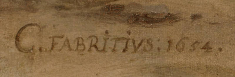
Carel Fabritius
1654
Oil on canvas, Gallery of Old and New Masters
Staatliches Museum Schwerin, Schwerin
Although the great majority of extant artworks from Greek antiquity lack signatures, the Greek artist nonetheless signed his products far more than any other artist of the time. Artist signatures first became prevalent during the early Renaissance, which saw art production shift from co-operative guild systems to a celebration of individual creativity. Between the 14th and 15th century the artist's signature was conventional and straightforward. The signature included the artist's name, a date, usually assumed to be the date of completion, and occasionally, information about the person who commissioned the work and the site where the work was completed. Signatures were usually placed on the frame or along the bottom edge of the painting. Latin was preferred with numbers in Roman Numerals. After the mid-1400s Gothic fonts were replaced with Roman letters and the signatures were sometimes placed in more conspicuous places so as to add to its meaning. Additional phrases were adjoined to the signature telling the viewer how the artist felt about his work or what he wanted them to feel about it. Duccio Bouninsegna (c. 1255–1260–c. 1318–1319) of Siena inscribed on the base of a sculpture of the high alter of the Siena Cathedral "Holy Mother of God, be peace for Siena's sake, be life for Duccio who painted you thus." Michelangelo left only one of his works signed (The Pieta'), which has given rise to much scholarly speculation. One of the most prolific and sought after paintings of the Baroque, Peter Paul Rubens (1577–1640), rarely signed his work. Albrecht Dürer (1471–1528) placed his famed monogram on everything from printed masterpieces to hurried sketches.
The manner in which painters have affixed their signatures varies enormously. Some painters signed with their initials, some with their whole names and some with Latinized names. Some used only a monogram, and some adopted their own handwriting style while still others in elegantly formed calligraphy, and a few a style midway between the later two. Particularly popular was the use of Roman lettering. Some signatures are incorporated within the image itself, and some appear to belong to the object over which they are superimposed. For example, a painter may place his signature on a piece of marble or stone rendering it with shadowed and illuminated sides as if the letters were carved into the marble itself. Some signatures were affixed on a small tromp-l'oeil paper called a cartellino. In any case, signatures were always applied with a brush, usually over a layer of dry, rather than wet paint. Occasionally, signatures took unusual forms such as secret codes, hidden signs and bizarre imagery. Lucas Cranach the Elder's (c. 1472–1553) signed his Adam and Eve (1526), on Tree of Life in the form of a winged snake-like creature wearing a crown and carrying a ring in its mouth.
Owing to the close operative relationship between the master, assistants, and apprentices of a botegga or workshop, signatures may have been less meaningful than today. Authenticity was not of overriding importance so a signature did not necessarily bear evidence that the work had been done entirely by the hand of the master, although some sources suggest that contemporaries were interested in knowing by whom a work had been made. Early paintings could be marked by the personal mark or stamp of the artisan or of his workshop as well as the hallmark of the guild or city council, in order to guarantee a certain level or quality. By the second half of the sixteenth century artists began to sign their works with signatures that resembled their written signatures, but monograms remained in usage. Still, not all painters signed their works. Before the 1600s, Italian painters often signed their works in full followed by a "P" or "pinxit" (Latin for painted) while in the Netherlands painters used "pingebat," although the term "fecit" (Latin for made) was increasingly used. Seventeenth-century Dutch paintings with signatures were almost always followed by "f[ecit]." The great part of Dutch paintings are not signed except those by the most ambitious painters in order to distinguish their works from those of their less illustrious colleagues. Rembrandt seems to have signed almost all of his works. Some Dutch painters hid their signatures while some placed them so that they could not be overlooked. Many painters had variant signatures. The earliest documentation of falsely applied signatures can be pin-pointed to the last quarter of the 17th century.
However, even when signatures are present caution must be exercised when examining it. Signatures were routinely added to works—without malign intentions, but simply to authenticate a well-known fact.
After an analysis oif hundreds of artists' signatures the professor Yi Zhou of Florida State University holds that the size of an artist's signature may be closely linked to self-regard and that artists with bigger-than-average signatures, possess bigger egos and get greater-than-average attention. Zhou's paper argues: "A one standard deviation increase in narcissism increases the market price by 16% and both the highest and lowest auction-house estimates by about 19%."
Signature Style
A signature style in art refers to the set of visual traits, techniques, or thematic choices that make an artist's work recognizable, often across different subjects and periods. This might include a particular use of color, brushwork, composition, treatment of light, or recurring subject matter. Some artists intentionally cultivated a distinctive style as part of their identity, while others arrived at it more gradually as a natural outcome of their evolving practice. In earlier centuries, particularly during the Renaissance and Baroque periods, signature style also had commercial value: collectors and patrons were drawn to recognizable approaches, and the repetition of certain effects or motifs helped establish an artist's name in the market. Thus straightforward "style" emphasizes clarity and convention, often prioritizing subject over expression, while a "signature style" predominantly reflects the artist's personal touch, making their work instantly recognizable. Signature styles appear when individuality is valued or marketable, whereas more neutral approaches are used when uniformity or tradition is preferred.
In the context of 17th-century Dutch painting, signature style could operate subtly or boldly, depending on the artist and his audience. While portraitists often repeated compositional formulas, landscape painters distinguished themselves through variations in light, atmosphere, and regional setting. Genre painters, who depicted scenes of everyday life, developed signature styles that combined specific settings—like kitchens, music rooms, or taverns—with refined technical handling or suggestive content.
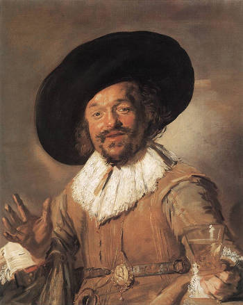
Frans Hals
c. 1628–1630
Oil on canvas, 81 x 66.5 cm.
Rijksmuseum, Amsterdam
In some instances, the works of the Dutch portrait painter Frans Hals (1582–1666) showcase his characteristic dynamic technique, capturing spontaneous expressions and animated poses. A notable example is The Merry Drinker (c. 1628–1630), where the subject's jovial demeanor is rendered with brisk, fluid strokes that convey movement and liveliness. This painting exemplifies Hals's ability to infuse portraits with a sense of presence and character. Conversely, Hals demonstrated his versatility by adopting a more restrained and polished technique when the context demanded formality. In commissioned works for affluent or prominent individuals, he often employed a subdued palette and meticulous brushwork to align with the decorum expected in such portraits. For instance, in his portrayal of Pieter Jacobsz. Olycan (1629–1630), Hals presents the Haarlem brewer and civic leader with a composed posture and detailed rendering, emphasizing the sitter's status and respectability.
This strategic modulation of style indicates that Hals was acutely aware of the social and economic factors influencing art commissions in 17th-century Holland. By adjusting his technique to meet the specific desires of his clientele, Hals not only satisfied patron expectations but also enhanced his reputation and marketability as a portraitist capable of capturing both the vivacity and dignity of his subjects.
For marine and beach painters like Jan Porcellis (1584–1632) or Jan van Goyen (1596–1656), signature style involved a muted tonal range and a compositional structure that placed the horizon low, emphasizing vast skies and changing weather. These choices were not simply aesthetic—they reflected a cultural mood, one that found meaning in the ordinary and the impermanent.
In sum, a signature style in the Dutch 17th century often involved a balance: enough distinctiveness to be recognized, but enough conformity to meet the expectations of patrons and market. For today's viewer, these styles help us read not only individual works, but the values and structures of a culture deeply attuned to the visible world.
Silhouette
The term "silhouette" refers to the outline or profile of a person, object, or scene filled in with a uniform color, typically black, creating a strong visual contrast against a lighter background. The effect emphasizes shape and contour over detail and texture. In its most basic form, a silhouette simplifies the visible world into essential forms, reducing a subject to its most recognizable elements.
The word itself is derived from the name of Étienne de Silhouette (1709–1767), a French finance minister under Louis XV who became associated, somewhat unfairly, with cheapness and austerity. Around the mid-18th century, the term began to be used mockingly for cut-paper profile portraits, which were popular as an inexpensive alternative to painted miniatures. These profile images were typically cut freehand from black paper and pasted onto a pale background. They became a form of personal memento and were often produced quickly by skilled cutters at fairs or in drawing rooms.
Although the specific term silhouette did not exist in the 17th century, the visual concept was already present in artistic practice. Painters, printmakers, and draftsmen were deeply aware of the expressive power of outline and contour. In chiaroscuro woodcuts and engravings, strong silhouettes were used to define form and separate figures from their surroundings. In painting, the silhouette of a figure—especially when seen against a window, an illuminated doorway, or an open sky—was a compositional device used to clarify action, heighten drama, or suggest character.
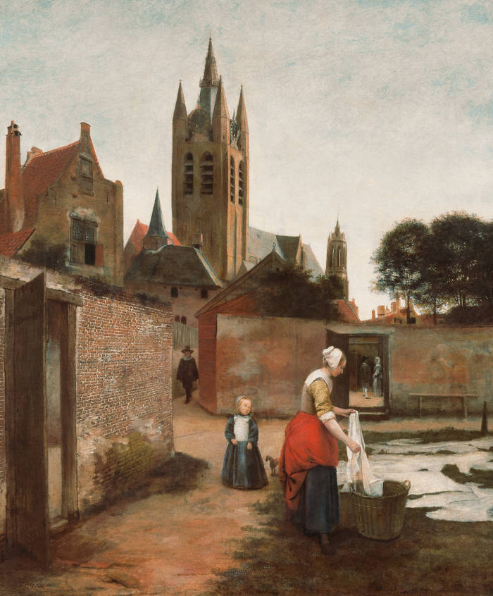
Pieter de Hooch
c.1657–1659
Oil on canvas, 73.5 x 63 cm.
Private collection
In 17th-century Dutch painting, the use of silhouette is subtle but deliberate. Painters like Pieter de Hooch (1629–c.1684), Vermeer, and Jacob van Ruisdael (1628–1682)frequently composed figures and objects in such a way that their dark shapes stood out against luminous walls or sunlit courtyards. The result was not a complete flattening of form but a careful balance between mass and light. Silhouettes helped stabilize the composition and direct the viewer's attention to human gestures or architectural rhythm.
One finds, for instance, the head of the cavalier in Officer and Laughing Girl is plunged into shadow with repect to the luminous background reducing the plastic modeling of the head and reducing the head and hat to a simple highly contrasting silhouetts. The crisp edges of her figure are nearly silhouetted in the diffused interior light. Similarly, in the nocturnal or candle-lit scenes by painters such as Gerrit van Honthorst (1592–1656) or Godfried Schalcken (1643–1706), figures are sometimes illuminated from behind or below, creating pronounced outlines and shadowed faces that heighten the dramatic tension.
Silhouette also connects to the idea of recognition through shape—a theme relevant to 17th-century theories of vision and painting. Painters understood that even in low light or at a distance, a viewer could identify familiar forms by their outlines alone. This knowledge informed their choices about costume, gesture, and posture, all of which contributed to a figure's readability within the scene.
While the 18th-century popularity of black-paper profiles brought the silhouette into popular culture, the visual principle had long been active in painting and drawing. In the Dutch Golden Age, it served as both a compositional tool and a means of visual clarity, helping artists shape the visible world into comprehensible and expressive arrangements.
Simplicity
Simplicity in art refers to the deliberate reduction of form, detail, or complexity in the service of clarity, harmony, or expressive strength. Far from indicating deficiency or crudeness, simplicity has long been associated with mastery, moral integrity, and visual eloquence. In antiquity, simplicity often signified ideal balance and restraint. Classical Greek sculpture, especially in the High Classical period of the fifth century BCE, emphasized proportion, calm poses, and lucid structure. These qualities were interpreted not as limitations but as evidence of inner order and rational control. The aesthetic ideal was one in which nothing superfluous remained—form and meaning were united in a kind of visual aphorism.
The idea of noble simplicity emerges most clearly in later aesthetic theory, particularly in the writings of Johann Joachim Winckelmann (1717–1768), who looked to classical antiquity as the highest model of artistic achievement. In Winckelmann's famous formulation, "noble simplicity and quiet grandeur" characterized Greek sculpture, which he praised for its calm, balanced forms and lack of ornamentation. This kind of simplicity was not to be confused with mere plainness or a lack of technical complexity. It was the result of refinement—of removing all that was unnecessary so that only what was essential remained.
The highly influential art writer E. H. Gombrich's (1909–2001) explored how this principle reflects an ethical as well as an aesthetic stance. Simplicity of form could suggest purity of spirit. Restraint in depiction implied not limitation but control, even moral elevation. The ideal was a certain serenity, a clarity of expression that did not overwhelm the viewer with emotion but instead encouraged reflection. In this sense, noble simplicity stands in contrast to both the decorative excesses of some Baroque art and the theatricality of later Romanticism. Yet Gombrich, with characteristic skepticism, also questions whether such simplicity is ever truly "natural." He observes that it is often the result of complex cultural choices, and what appears noble and serene may in fact be the outcome of convention or ideology. The simplicity we admire in classical sculpture or early Renaissance painting is learned and constructed, not spontaneous. The very act of eliminating detail requires discipline and taste, both of which are shaped by tradition.
This ideal of measured simplicity reemerged with force during the Renaissance, when artists and theorists rediscovered classical models. Figures like Leon Battista Alberti (1404–1472) promoted disegno—the underlying design or structure of a work—as more important than decorative detail. In his treatise De pictura, simplicity in composition and structure was linked to reason, dignity, and clarity of purpose. Renaissance artists sought to balance the expressive possibilities of the human figure with the restraint needed to preserve unity. Simplicity, here, was both intellectual and visual, tied to the humanist belief that beauty arises from order.
In the Baroque period, this balance tilted toward complexity, movement, and emotional impact. Yet even then, simplicity remained a point of reference. For example, artists working in the so-called classical Baroque style—such as Nicolas Poussin (1594–1665)—pursued clarity of gesture and compositional structure, seeking a noble sobriety in contrast to the theatrical exuberance of their contemporaries. Poussin's works, though intellectually dense, often adopt simple architectural frameworks and uncluttered figure arrangements that reflect Stoic ideals.
The Enlightenment brought renewed interest in simplicity as an aesthetic and moral value. Winckelmann's phrase "noble simplicity and quiet grandeur" summarized the neoclassical ideal: that art should speak with calm authority, free from ornamental excess. The simplicity admired in ancient Greek sculpture was equated with virtue and rationality. In this period, simplicity was not only an aesthetic choice but a statement about civilization itself—a rejection of artifice and corruption.
With the rise of Romanticism, simplicity took on new meanings. It could represent sincerity, emotional directness, or a return to nature. The rustic scenes of Jean-Baptiste-Camille Corot (1796–1875) or the uncluttered landscapes of Caspar David Friedrich (1774–1840) conveyed a contemplative quiet that set them apart from academic spectacle. Simplicity in this context often meant humility, introspection, and spiritual openness.
In modern art, simplicity underwent further transformation. The emergence of abstraction brought a radical paring down of visual language. Artists such as Kazimir Malevich (1879–1935) or Piet Mondrian (1872–1944) sought the purest forms—squares, lines, and primary colors—as the basis of a universal visual order. In this radical context, simplicity became almost metaphysical: a striving toward essence beyond representation. In minimalist art, which developed in the 1960s, simplicity became an assertion of presence. Works by Donald Judd (1928–1994) or Agnes Martin (1912–2004) reject narrative and gesture, inviting the viewer to confront objects as they are—stripped of metaphor, psychology, or illusion.
Yet simplicity in art is never absolute. It is always relative to the expectations of the viewer, the context of the work, and the culture from which it emerges. What one generation sees as austere, another may find rich in implication. Simplicity is not the absence of complexity but a form of refinement—one that guides attention, organizes meaning, and often demands deeper perception. Whether in the measured bodies of Greek statues, the quiet interiors of early Renaissance painting, or the bare geometry of modernism, simplicity functions as a statement of control, focus, and often truth.
Sink In
Sinking-in occurs when the oil in a freshly applied paint layer is absorbed into the underlying layer, particularly if that layer is not fully dry. This causes the new color to appear dull and uneven in gloss. To correct or prevent this, a painter may "oil out" the surface—applying a very thin film of oil or medium, known as a "couch," to restore saturation and unify the appearance of new and existing paint. This practice helps ensure that the fresh color matches the surrounding tones and adheres properly.
Sinking-in should be distinguished from the reverse phenomenon, where excess oil rises to the surface, leaving certain passages with an unintended gloss. The problem may also stem from an overly absorbent or inconsistently primed ground, which draws the binding oil away from the pigment too quickly. The use of excessive solvent or thinner in the paint can likewise contribute to sinking-in by weakening the binder's ability to form a proper film, leaving the pigment underbound and vulnerable. The result is not merely aesthetic: it can compromise the integrity of the paint film over time. Sinking-in was a known concern among 17th-century painters and was often addressed through carefully prepared grounds and controlled layering techniques. Painters such as Frans van Mieris (1635–1681), who worked with exceptional finesse, were especially attentive to maintaining an even, saturated surface.
Sitter
Although the terms sitters and models are often used interchangeably, they refer to different roles in art. Sitters are individuals who pose for portraits, often commissioned or depicted to capture their likeness, status, or character, while models are typically posed for studies of anatomy, movement, or composition without necessarily being the focus of the artwork. Sitters usually imply a more formal and personalized engagement, often with specific clothing and settings that reflect their identity, whereas models serve as references for the artist's exploration of form, light, and technique.
The concept of the sitter in painting has undergone a significant evolution from the Renaissance to the modern era. In its broadest sense, a sitter is the person who poses for a portrait, traditionally conveying not just physical likeness but social identity, emotional expression, or symbolic function. In earlier periods, particularly in the Renaissance and Baroque, sitters were often embedded in broader narratives—religious, allegorical, or familial—and their inclusion was rarely neutral. They could be members of the aristocracy, figures of authority, or patrons of the artist, portrayed with attributes that revealed their status, virtue, or role in society.

Henri Matisse
1937
Oil on canvas, 55.2 x 46 cm.
Philadelphia Museum of Art, Philadelphia
By the 20th century, however, especially in the works of Henri Matisse (1869–1954) and Pablo Picasso (1881–1973), the sitter often became an anonymous or depersonalized figure. These modern portraits were less about the individual and more about formal composition, color relationships, and the painter’s interpretation of the human form. The sitter was no longer a conduit for narrative or emblematic meaning but a figure occupying space, sometimes distorted, sometimes abstracted, shaped by the aesthetic concerns of the artist rather than by the sitter's identity or social function. In many cases, the model was simply someone available, posed for the purpose of the composition rather than as the subject of it.
This shift contrasts starkly with the role of sitters in 17th-century Dutch painting, where portraiture was a vital genre that mirrored the social structure of the Dutch Republic. Sitters, except for those of the tronie genre, were almost never anonymous. Even when not named explicitly, they were recognizably part of a defined civic, familial, or professional world. Portraits commemorated marriage, office, membership in a militia company, or intellectual achievement. In the work of Frans Hals (c.1582–1666), for instance, sitters are rendered with a vivid immediacy that conveys both individual personality and the vitality of Dutch urban life. His Banquet of the Officers of the St George Civic Guard Company (1616) displays not just a group of men but their ranks, their camaraderie, and their pride in civic duty.
Similarly, in the intimate portraits of Gerrit Dou (1613–1675) and Gabriel Metsu (1629–1667), the sitter often appears within a domestic or symbolic context, blurring the line between genre and portrait. A woman reading a letter or a man writing at a desk may have been an actual sitter, but the setting and accessories deepen the portrayal into something suggestive and layered, linking individual identity with cultural ideals such as virtue, literacy, or piety. The sitter becomes part of a small narrative, one legible to contemporary viewers through shared conventions and iconography.
Even Vermeer, who did not paint formal commissioned portraits, populated his interiors with sitters who radiate interior life and quiet reflection. The figures are not anonymous models; rather, they are portrayed with such specificity of gesture and setting that they suggest social roles, emotional states, and cultural significance, even without being formally identified. A girl writing, a woman tuning a lute, or a maid offering a letter—each becomes a sitter inscribed into a larger moral or contemplative framework.
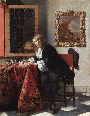
Gabriel Metsu
1665
Oil on panel, 52.5 x 40.2 cm.
National Gallery of Ireland, Dublin
In this Dutch context, the sitter is inseparable from meaning. Identity, virtue, status, and narrative are all tightly woven into the act of sitting. The figure is not just an image; it is a participant in a cultural discourse. The later modern decoupling of sitter from story, of individual from role, reveals a transformation not only in style but in the very purpose of depicting the human figure.
The people in Vermeer's paintings are more accurately described as models rather than sitters. Unlike formal portraits commissioned to capture the likeness, status, or character of specific individuals, Vermeer's figures often lack identifiable personal features or social status markers, suggesting that they were posed primarily to explore composition, light, and the intimate moments of daily life. His focus was less on the individuality of the subject and more on the harmony of the scene, the play of light, and the depiction of quiet domestic interiors. This approach aligns more closely with the use of models as tools for studying form, posture, and atmosphere rather than the personalized engagement typical of sitters in traditional portraiture.
Women are seem to be the central focal point of many of Vermeer's paintings. "Vermeer painted about 49 figures of women, but only 12 men, and no children (except those who play bit pèarts in The Little Street and View of Delft) despite having an extremely large family himself). This emphasis on women is logical in the work of an artist who was entirely devoted to the painting of interiors, as the domestic space was the realm which society had assigned to women. Nonetheless, while for Pieter de Hooch (1629–1684) and Nicolaes Maes (1634–1693) the home was a setting for maternity and domestic tasks, Vermeer—according to some modern critics, was alert to the appearance of a new type of woman, better educated than her predecessors and more absorbed in her interior life. It is not my chance that among the innovations of interior paintings we find a sensibility towards the intimate psychology of individuals, given the concept of an interior life was developing at just this time. Street life and family life became more separated in houses at this period and more private spaces and areas for withdrawing begun to appear." Alejandro Vergara, ed., Vermeer and the Dutch Interior (Madrid: Museo Nacional del Prado, 2003), 20.
Oddly enough, the only historically documented model in Vermeer's oeuvre was Vermeer himself who posed for a now lost self portrait cited in the 1696 Dissius auction of 21 Vermeer paintings. The remaining women and men who populate the artist's extant interiors remain anonymous. Perhaps this fact has encouraged much speculation by scholars and general public alike as to just who they may have been.
Due to the intimate nature of Vermeer's art, there has been a certain inclination to link Vermeer's own family members to the sitters of his paintings, some of which seemed to have posed more than once. The economic advantage of employing sitters from the artist's family willing to pose long hours without pay would be obvious. This fact would not be without precedent. Gerrit ter Borch (1617–1681), a fellow Dutch artist whose discreet genre interiors probably inspired some of Vermeer's own compositions, frequently used members of his own family as models, in particular his step-sister Gesina. The tenderness with which Ter Borch portrays this woman on numerous occasions indicates his fondness for her.
Size / Dimension
See also: Scale.
The term size in art has two distinct meanings. First, it refers to the dimensions of an artwork—its height, width, and, in the case of sculpture, depth—determining how a piece interacts with the spectator and its surroundings. The size of a painting can influence its impact, with larger works often commanding attention and smaller ones inviting a more intimate examination.
Secondly, size also denotes a preparatory layer made from diluted glue, gelatin, or animal skin, applied to porous supports like canvas, paper, or wood panels before priming. This type of size serves to seal the fibers, preventing the paint from soaking in too rapidly and ensuring a stable ground for subsequent layers of gesso and pigment. In 17th-century Dutch painting, this practice was essential for preserving the brilliance and durability of oil paints, preventing the oil from penetrating the canvas or panel directly and causing discoloration or deterioration over time. Vermeer, for instance, would have used size to prepare his canvases, creating a smooth and absorbent surface that contributed to the luminous, enamel-like finish of his works.
Traditional sizes for paintings may have been rabbit skin or fish glue. Parchment was also used. Size also serves to protect the canvas, as oil paint in direct contact with the canvas will cause it to become weak and brittle.
Traditional size for oil was a solution of rabbit skin collagin heated with water, fish glue, or parchment. Although this has been used for hundreds of years it is know known by conservators to cause more problems than it solves. Since the size continuously absorbs moisture from the atmosphere, causing it to continuously swell and shrink, over time, this constant flexing causes the oil paint on top, which is quite brittle, to crack. It is now believed to be the main cause of cracking in old oil paintings.
Sketch
A sketch is a rapidly executed depiction of a subject or complete composition, which is usually produced in preparation for a more detailed and completed work. "Despite the interest in the outdoors, the Dutch landscape painters rarely painted their. His usual practice was to make sketches of scenes that caught his eye; then, returning to his studio, he would begin to paint, using his drawings for reference. And since he might use as many as a dozen drawings from different locations in a single painting, the final scene was often entirely the product of his imagination."Hans Koningsburger, The World of Vermeer 1632–1675 (New York: Time-Life Books, 1968), 109.
While a sketch is typically a rapid, spontaneous drawing that captures the general idea or composition of a subject without concern for precision or finish, a preparatory drawing is more generally more deliberate and refined, serving as a step toward a final work, often used to resolve details of form, lighting, or placement in advance of painting or engraving.

Raphael
c. 1503
Pen and brown ink over blind stylus, dimensions unspecified
Ashmolean Museum, Oxford
Many Dutch painters also sketched their initial idea directly on the canvas (see in-depth investigation of Rembrandt's (1606–1669) drawing techniques in Ernst van de Wetering (Rembrandt: Artist at Work). Although a great number of sketches on paper by Rembrandt have survived, very few of them were intended as preparatory works for his painting compositions.
Although no preparatory or final drawings of Vermeer remain, this does not necessarily mean that he had not at some time or the other produced them. Drawings, although collected by some connoisseurs at the time, did not have the same value as they do today and considering that Vermeer's preparatory drawings might have been done in a more schematic rather than expressive style, it is not unreasonable that they were not deemed of great value. A single "folio" such as the ones listed in the artist's death inventory may have contained his precious drawings which could have been lost or destroyed.
As odd as it may seem, it is possible that Vermeer was able to transfer the final image of his composition without having ever realized any kind of material sketch or drawing. Philip Steadman, in his study of Vermeer's use of the camera obscura (a sort of precursor of the modern photographic camera widely known by painters in Vermeer's time), conjectures that the artist may have actually traced the image projected by the camera obscura directly on the canvas. The camera obscura, which certainly served Vermeer as a compositional aid, would have rendered preparatory drawing superfluous. Although some scholars still strongly dissent with Steadman's arguments, a growing number have begun to concede they have a strong rational base and moreover are in conformity with Vermeer's pictorial and expressive objectives. (For detailed information on the subject, read Steadman's Vermeer's Camera: Uncovering the Truth behind the Masterpieces, or visit his web site at: http://www.vermeerscamera.co.uk/home.htm.)
In the probate inventory complied after the death of the painter five books in folio, and twenty-five books "of all kinds" that were in the back room upstairs. By standards of the time, twenty-five books signals a relative economic prosperity as books were rather costly. Five books in folio suggestes prints of Italian or northern masters. In any case, it would be hard to beleive that Vermeer had not in some manner mades some sort of preliminary sketch to work through his compositonal ideas, although there is no evidence of prints or sketches he many have prodiced during his brief career.
Skill
A skill is the ability to carry out a task with pre-determined results often within a given amount of time, energy or both. Skill is acquired through deliberate, systematic and sustained effort to smoothly and adaptively carryout complex activities or job functions involving ideas, things and/or people.
Mastery, although realted to skill, implies a more complete, refined, and deeply internalized command of one's craft. It includes skill but goes further. Mastery suggests a level of excellence that borders on the intuitive, where technique becomes so natural that it enables expression, subtlety, and invention rather than just correct execution. While skill can be measured in discrete actions, mastery is often recognized in the unity, balance, or authority of a finished work. It is something others acknowledge in the artist, often only after repeated demonstration of exceptional ability.
All of the arts have traditionally demanded great levels of skill. Until the 1850s, the greatest artists we were also the most skillful. Today, skill is no longer a requirement for visual artists longer or a meter for judging artworks; conceptual artist views skill as largely irrelevant, or "busy work." They are happy to hire highly skilled artisans to create their physical work.
The two components underlying the creation of a painting or sculpture, conception and execution, were characterized around 1400 by Cennino Cennini (c. 1370–c. 1440) as fantasia (imagination) and operazione di mano (handiwork), and by Giorgio Vasari (1511–1574) in 1568 as il mio pensiero (my considered judgment) and le mie mani (my hands). Renaissance society focused on the second component, the arte or, in Latin, ars, that signified the skill of hand or mastery of illusionism required to execute the work, a skill that could be mastered by practice. The artists themselves, on the other hand, emphasized the ingegno or ingenium, the inborn talent or creative power needed to conceive the work in the first place, that could not be learned. For Vasari, a key element in the intellectual component of art lay in disegno (planning/drawing) which underlay the three "arts of design" (painting, sculpture, architecture). These principles were incorporated into the Florentine Academy of Design (founded 1563) which, although it did not replace the apprenticeship system, did much to elevate the status of artists.
In the time of Vermeer there existed a level of skill among artists that is now scarcely imaginable. As Ernst van der Wetering pointed out, "if we wish to get an idea of the discipline and skill of a painter like Rembrandt (1606–1669) today, we would do better not to look at the great majority of our contemporary painters, but at the performing musician or ballet dancer. In these arts, it is still understood that professional skill can only be built up through endless practice from an early age on...and the same pertained just as much in Rembrandt's day to the art of drawing and painting. But it should be added that whoever inquires more than superficially into the careers of those dancers and musicians of our own time who have practiced all their lives, will realize that only a few arc able to command that unique set of qualities and talents that are necessary in order to develop into major artists. Without that basis of skills, there is, however, no way that this can happen."
Basic artistic skills were taught through the tried-and-proven master/apprentice relationship in which the young painter acquired hands-on experience regarding every facet of painting technique. The apprentice's skills were developed gradually through unremitting practice and as his skills improved, he was allowed to work on his master's work, filling in anonymous backgrounds or tedious vegetation, while attending to his chores such as cleaning brushes, setting out the daily palette, stretching canvases, processing and hand grinding pigments and running errands. Some of the most important skills were drawing from previous works of arts (copying), drawing from life, foreshortening, perspective, composition and chiaroscural modeling.
Snowscape
Snowscapes, or snowy landscapes, represent a subgenre of landscape painting that features winter scenes dominated by snow. In general terms, these works focus on the atmospheric effects of winter, often emphasizing the stark contrasts of light and shadow on snow-covered ground, the subdued palette of winter skies, and the specific challenges of depicting coldness, silence, and stillness. Though the depiction of snow in Western painting dates back to the Middle Ages in illuminated manuscripts and background scenes, it became a more fully realized theme during the Renaissance, particularly in Northern Europe. Pieter Bruegel the Elder (c. 1525–1569) was among the first artists to treat snow as a serious pictorial subject, especially in his famous painting Hunters in the Snow (1565), which set the stage for later explorations of winter landscapes.
In 17th-century Dutch painting, snowscapes flourished as part of the broader rise of landscape art. These works were often admired not just for their depiction of nature, but for the painter's ability to evoke atmosphere, seasonality, and daily life under winter conditions. Artists like Hendrick Avercamp (1585–1634) became specialists in such scenes, portraying frozen rivers, ice skaters, and villagers going about their activities amid a white landscape. Avercamp's snowscapes combine detailed observation with lively genre elements, transforming a potentially bleak setting into something full of narrative and community. His use of delicate color and compositional clarity also helped define the aesthetic of Dutch winter scenes. Other painters, such as Aert van der Neer (1603–1677), included snowy settings in their repertoire, often combining them with nocturnal effects or reflective water surfaces. These works were more than mere records of weather—they suggested moral or poetic meanings, such as the passage of time, the stillness of nature, or the resilience of daily life. In Dutch culture, where the harshness of winter was a familiar and communal experience, the snowscape became both a celebration of the national environment and a demonstration of technical skill in handling light, atmosphere, and human activity in a restricted, mostly monochrome palette.
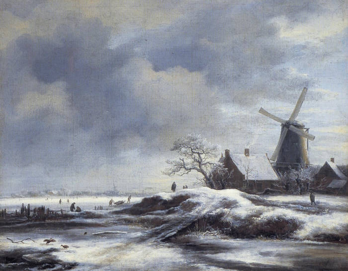
Jacob van Ruisdael
1670s
Oil on canvas, 37.3 x 46 cm.
Fondation Custodia, Paris
Solvent
A solvent is a substance that dissolves a soluble material (or solute). For example, varnish is insoluble in water but might dissolve in propanone or acetone. The solubility of a substance depends on many factors, but a solute will dissolve in a solvent that has a similar polarity.
Solvents such as turpentine, mineral spirits, and odorless mineral spirits are the most commonly found in the artist's studio. Turpentine, is the strong smell that is associated with an oil painter's studio but turpentine many causes health problems for some people including irritation of the skin, eyes, mucous membranes and upper respiratory tract.
Space
In painting, space carries two complementary meanings. On one hand, it refers to the illusion of depth, the sensation that the viewer can look into the painted surface and perceive three-dimensional forms or environments. Artists often create this depth through techniques such as linear perspective, where lines converge toward a distant vanishing point; aerial perspective, where distant objects appear softer or lighter; overlapping shapes to suggest objects existing in different planes; or variations in size, where closer objects appear larger than those farther away.

Pierre-Athanase Chauvin
Date unknown
Oil on canvas, 99.7 x 149.9 cm.
Private collection, location unknown
At the same time, space also pertains to the relationships and arrangements of two-dimensional forms directly upon the canvas itself, independently of depth or realism. Here, the artist carefully manages the distances, gaps, and visual connections between objects, attending to how positive space (occupied by objects or figures) interacts with negative space (the empty or background areas). This aspect of space contributes significantly to a painting's overall composition, rhythm, and visual harmony.
Thus, space is not exclusively tied to creating a realistic illusion; it is equally involved in establishing balance and coherence among the painting's shapes and forms within the flat plane of the canvas. In practice, artists usually engage with both aspects simultaneously, manipulating spatial relationships to communicate meaning or evoke emotion, whether aiming for lifelike representation or focusing purely on abstract visual organization.
Spanish Chair
The social history of the chair is as interesting as its history as an art and craft. The chair is not merely a physical support and an aesthetic object; it is also an indicator of social rank.
Perhaps the most popular form of seating in the time of Vermeer was the so-called Spanish chair, two of which are represented in this painting. Its basic model had evolved in Spain by the 15th century and was soon after adopted all over Europe. Normally, the legs of the chair are smooth, round in section and of slender dimensions. They are sometimes baluster-shaped (vase-shaped) or twisted. It was clearly a bourgeois piece of furniture and produced in considerable numbers. Perhaps the hand-carved lion-head finials were made by a sculptor. The Amsterdam chairmakers' guild treated the Spanish chairmakers as a separate group from 1600. The most durable upholsteries were made of leather and fixed to the chair's frame by large brass nails. Chairs with cloth upholstery were generally lined with decorative fringes, tassels and other ornaments.
The spanish chair was typically constructed of turned or squared wooden frames with a seat and back of stretched leather or hide, often secured with metal studs. In Western art, the Spanish chair became a recognizable marker of status, sobriety, and authority, valued as much for its visual clarity as for its practical durability. Its angular form, exposed structure, and restrained decoration made it especially legible within painted interiors.
The origins of the Spanish chair lie in late medieval and early Renaissance Spain, where leather-working traditions and portable furniture were well developed. The chair's design favored firmness and endurance over comfort, aligning it with ideals of discipline and restraint. Through Spain's political and commercial reach in the sixteenth and seventeenth centuries, the type spread widely across Europe. By the Dutch Golden Age, Spanish chairs were familiar furnishings in prosperous households, valued both for their foreign association and their sober elegance.
In painting, the Spanish chair offered clear compositional advantages. Its rectilinear frame and taut surfaces provided strong verticals and horizontals that helped anchor figures in space. Unlike upholstered chairs, whose softness could dissolve form, the Spanish chair preserved a crisp silhouette that interacted cleanly with light. Painters could describe its leather surfaces with minimal means, using small highlights and tonal variation to suggest texture without distraction. As a result, the chair often reinforces a sense of order and gravity within domestic scenes.
Symbolically, the Spanish chair carried associations of authority, seriousness, and self-control. In Spanish portraiture, particularly in works by Diego Velázquez (1599–1660), such chairs frequently support seated nobles or courtiers, underscoring dignity rather than comfort. The chair's severity complements the restrained poses and dark tonalities typical of Spanish court painting, reinforcing an image of social discipline and moral weight.
In seventeenth-century Dutch painting, the Spanish chair appears regularly in genre interiors and portraits. Its presence often signals respectability and wealth without ostentation. Dutch painters adopted the form not for its national origin but for its visual and moral clarity. The chair could function as a quiet counterpoint to softer elements—curtains, clothing, or human flesh—thereby stabilizing the composition.
Spanish chairs were made of many kinds of wood and in many styles. Among other precious gifts, in 1612 the city of Amsterdam presented the Sultan of Turkey with 14 Spanish chairs made of different exotic woods and upholstered in satin, velvet and gold. This indicates they were considered characteristic and desirable products.
There are about five or six different types of chairs in Vermeer's paintings. The two blue chairs in the present picture are different from other Spanish chairs in Vermeer's paintings, other than in their upholstery. The lion-head finials are more slanted than the oval ones, seen for example, in The Officer and Laughing Girl and The Duet by Jan Miense Molenaer (c.1610–1668).
The Spanish chair of Vermeer's Officer and Laughing Girl presents two finials with lion heads with rings through the muzzles. The laughing girl is also seated on such a chair. Vermeer took great care in their rendering, particularly the heads of the hand-carved lions. Various writers have attributed psychological connotations to the lions. Lawrence Welscher opined that the "roaring lions heads carved into the chair posts signal potential violence." In the same interpretive vein, the wall maps signify the incessant shifting of national boundaries achieved at the cost of many lives.
Others, perhaps less prone to interpretive flights, might prefer to think that Vermeer, like thousands of fellow Dutchmen, found these types of chairs beautiful in themselves and that their beauty was a sufficient reason to paint them. Moreover, the ornate finials presented a technical challenge and a way to embellish the otherwise austere interiors he chose to paint, or even as as a nod to the aesthetic tastes of his contemporaries and the masterful craftsmanship that went into producing such furniture. Regardless, the lion-head finial is one of Vermeer's favorite motifs.
A few examples of Spanish chairs can be found in the Rijksmuseum in Amsterdam and the Prinsenhof Museum in Delft, Vermeer's birthplace. The same chair is represented other times in Vermeer's scenes. In the Woman with a Lute, it appears with a large piece of drapery heaped up in front of it. The different lighting scheme in The Glass of Wine lets us observe the finely carved finials.
Spatial Depth
See also: Overlap, Planar Perspective, Aerial Perspective, Advancing and Receding Colors, and Rough and Smooth Manner of Painting.
Spatial depth, or the illusion of depth, in art refers to the illusion of three-dimensional space within a two-dimensional composition, creating a sense of distance and volume that guides the viewer's eye through the scene. Artists achieve this effect through techniques such as linear perspective, where converging lines lead to a vanishing point; atmospheric perspective (aerial perspective), which softens and cools distant elements; and the use of overlapping forms, gradients of light and shadow, and scale variation. In 17th-century Dutch painting, spatial depth was masterfully employed to enhance the realism and intimacy of domestic interiors and landscapes. Vermeer's interiors, for instance, often feature receding floors, open doorways, and carefully controlled light to create a convincing sense of space, inviting viewers to step into the tranquil worlds he depicted.
The prioritization of spatial depth in art has its roots in antiquity but evolved significantly over time as artists sought more convincing ways to depict three-dimensional space on flat surfaces. The earliest evidence of attempts to convey depth can be seen in ancient Egyptian and Mesopotamian art, where artists used overlapping figures and hierarchical scaling—depicting more important figures as larger regardless of actual spatial relationships. While effective for conveying narrative and status, these techniques lacked a true sense of recession into space.
A more deliberate pursuit of spatial depth began in ancient Greece, particularly during the Classical Period, when artists like Polygnotus (c. 5th century BC) were said to have experimented with foreshortening and rudimentary perspective in wall paintings. The Greeks also introduced skiagraphia—or shadow painting—attributed to Apollodoros of Athens, which used light and shadow to suggest volume, a precursor to the more advanced chiaroscuro techniques of the Renaissance. In Hellenistic Greece and later in Roman art, frescoes such as those in Pompeii began to depict architectural settings with a nascent understanding of linear perspective, using columns, archways, and receding streets to suggest depth. While these attempts were impressive, they were often inconsistent and lacked a unified system for depicting space.
In medieval art, spatial depth was limited and often subordinate to symbolic and narrative concerns rather than attempts to depict three-dimensional space realistically. Artists prioritized clarity and hierarchy over naturalism, using techniques such as hierarchical scaling—where important figures like Christ, the Virgin Mary, or saints were depicted larger than others—to communicate spiritual significance. This approach emphasized the theological and didactic function of art, ensuring that the key figures and messages were immediately recognizable to viewers.
Medieval artists also relied on stacking and tilted perspective, where scenes and objects were layered vertically on the picture plane (planar perspective) rather than receding into depth, creating a flattened, tapestry-like effect. Architectural elements were often shown in reverse or herringbone perspective, which diverged rather than converged, making buildings appear more as symbols than realistic spaces. Byzantine mosaics and Gothic altarpieces typically featured gold backgrounds that dissolved any sense of atmospheric depth, reinforcing the transcendence and otherworldliness of the scenes.
However, there were early signs of an emerging interest in spatial depth even within the medieval period. For instance, in the works of Giotto (c.1267–1337), such as the frescoes in the Scrovegni Chapel, figures were depicted with a more convincing sense of volume and spatial relationships. Giotto's use of light and shadow, overlapping forms, and rudimentary attempts at linear perspective hinted at a break from the Byzantine flatness that had dominated medieval art. His innovations in depicting space more naturally laid the groundwork for the full development of spatial depth during the Italian Renaissance.
In essence, while medieval art did explore spatial relationships to some extent, these efforts were generally secondary to conveying religious meaning and clarity, resulting in a stylized and symbolic treatment of space rather than a pursuit of realism.
The true breakthrough in spatial depth came during the Italian Renaissance, when artists systematically developed techniques to render three-dimensional space accurately. Filippo Brunelleschi (1377–1446) is credited with formally discovering linear perspective in the early 15th century, demonstrating how parallel lines appear to converge at a vanishing point on the horizon. This method was soon codified by Leon Battista Alberti (1404–1472) in De pictura, providing artists with a mathematical approach to creating depth. The impact was immediate and profound; paintings like Masaccio's The Holy Trinity employed perspective grids to create a convincing illusion of architectural space, guiding the viewer's eye into the depth of the scene.
At the same time, the use of aerial perspective emerged as a complementary technique. Leonardo da Vinci (1452–1519) articulated the principles of atmospheric perspective—softening outlines, reducing tonal contrast, and cooling colors in distant elements to enhance the perception of depth. This was based on the observation that distant objects appear less distinct and bluer due to the scattering of light through the atmosphere.
In 17th-century Dutch painting, spatial depth was refined and applied with a new level of subtlety and precision. Artists like Pieter de Hooch (1629–c.1684) and Samuel van Hoogstraten (1627–1678) expanded on Renaissance techniques by integrating them into genre scenes and domestic interiors, using open doors, tiled floors, and sequences of rooms to draw the viewer deeper into the pictorial space. Their manipulation of perspective was often more about enhancing the sense of lived-in space than demonstrating technical skill. Vermeer's interiors are exemplary in this regard, balancing perspective, lighting, and carefully placed objects to create a serene and believable sense of depth. His use of diffused light and softly blurred backgrounds not only added volume to figures and objects but also guided the viewer's gaze naturally through the space.
Spatial depth can be achieved by a number of methods. Since depth is not really present in painting (except for slight relief of the canvas tooth, paint thickness and the discreet overlapping of different paint layers) its sensation must be communicated by exploring a series of so-called visual depth cues. Depth cues can be applied singularly in different parts of the painting (e.g., overlap) or over the whole design (e.g. perspective) but are most effective when used systematically in unison. Each cue communicates different visual information.
The cues used in painting to achieve the illusion of depth are called monocular cues. Monocular cues can be perceived with just one eye or both eyes. On the other hand, binocular cues are based on information gathered from both eyes.
The principal means of creating the illusion of three-dimensional depth on a flat surface are overlapping, changing size and placement, linear perspective, and relative hue and value. For the oil painter, the illusion of spatial depth may also be also enhanced by exploiting the inherent physical and optical properties of paint itself.
- Linear perspective - is a technique which allows artists to simulate or construct the appearance of three dimensional space on a two dimensional surface in a rational manner. The property of parallel lines converging in the distance, at infinity, allows us to reconstruct the relative distance of two parts of an object, or of landscape features. An example would be standing on a straight road, looking down the road, and noticing the road narrows as it goes off in the distance. It is one of the major innovations of European art, with an extraordinary impact on western visual culture from the fifteenth to the 19th centuries.
- Overlap, or occlusion, is the strongest cue for depth and overrides all other cues when a conflict seems to be present. When one object occludes part of another object there must be space between them although simple overlap by itself does not furnish clues at what distance they are from one another. Objects that occlude seem nearer while objects that are occluded seem further away. The viewer must be able to recognize the partially overlapped object otherwise the two objects might appear to be sitting side by side.
- Relative hue, value, focus, texture and detail provide various clues of visual depth. Some colors tend to recede form the viewer's eye and some tend to recede. such as thes sensation of spatial depth can also be greatly enhanced by exploiting paints inherent physical and optical properties.
- Size and scale - Larger objects tend appear closer and smaller objects appear further away.
In The Girl with a Wine Glass, the most ambitious and carefully contrived of Vermeer's three early interiors, the artist employed various tactic to reinforce the sense of spatial recession: overlapping, geometrical perspective, sharp and blurred contours, and variations in color saturation (brighter colors which seem nearer to the viewer's eye are reserved for the foreground figures while the background figures are depicted with drab greens and mute browns). The disorderly recession of the small ochre and blue ceramic tiles in proximity to the background walls of both pictures reveals a less than complete mastery of perspective.
Spatial Recession
Spatial recession refers to the illusion of spatial depth in a two-dimensional work of art , achieved through a variety of techniques that guide the observer's eye into the pictorial space. In Western art, the mastery of spatial recession developed gradually, with ancient painters using overlapping figures and variations in scale to suggest depth. The frescoes of Pompeii, for example, reveal an awareness of spatial depth through architectural elements and foreshortening, though without a fully systematized perspective. The Renaissance brought a profound transformation, as artists such as Leon Battista Alberti (1404–1472) and Piero della Francesca (c. 1412–1492) codified linear perspective, allowing painters to create mathematically precise recession into space. Aerial perspective, which relies on atmospheric effects like color fading and softening of detail with distance, further enhanced the illusion.
Seventeenth-century Dutch painters approached spatial recession with a more naturalistic sensibility, emphasizing optical effects rather than rigidly applied geometric perspective. Artists such as Pieter de Hooch (1629–1684) and Emanuel de Witte (1617–1692) were particularly skilled in the use of receding architectural spaces, employing open doorways, tiled floors, and carefully calculated light sources to lead the viewer's eye into the depths of an interior. In landscape painting, Jacob van Ruisdael (c. 1628–1682) and Aelbert Cuyp (1620–1691) conveyed vast distances through atmospheric perspective, rendering distant elements in cooler, grayer tones with softened edges. Vermeer, though his output was relatively small, demonstrated an exceptional understanding of spatial recession in his interior scenes. His subtle manipulation of perspective, combined with his ability to suggest depth through shifts in color and light, creates an effect that is at once mathematically precise and optically natural. The recession of space in his compositions is often reinforced by objects such as chairs, map edges, or floor patterns, which serve as both compositional anchors and guides for the viewer's gaze. Unlike the dramatic plunging perspectives favored by some of his contemporaries, Vermeer's interiors maintain a measured and harmonious depth, drawing the viewer into an intimate world.

After Aelbert Cuyp
17th century
Oil on panel, 76.2 x 106.4 cm.
Dulwich Picture Gallery, London
Vermeer's The Music Lesson mastery of spatial depth draws us closer to the Dutch concept of houding as described by Willem Goeree (1635–1711), who defined it as the quality that binds everything together in a painting, ensuring that objects and figures occupy their correct spatial positions with clarity and naturalness. According to Goeree, good houding allows forms to move convincingly from the foreground to the middle ground and into the background without appearing artificially closer or farther away, too dark or too light for their position. It ensures that everything maintains its proper place, standing out without confusion, and that the intervening spaces between objects feel tangible—as though the observer could "go there on foot" and navigate the depth of the painting.
This principle is pursued with extraordinary refinement in The Music Lesson, where Vermeer constructs a space that is at once optically convincing and thematically charged. The perspective of the orthogonals—particularly those of the windows and the floor tiles—draws the viewer's attention toward the vanishing point located at the woman's right-hand sleeve, accentuating the figural relationship and integrating it seamlessly with the overall spatial reading. The recession is further reinforced by the deliberate structuring of objects. Almost all of the free-standing elements—the carpeted table, the viola da gamba, the chair—are clustered on the right-hand side of the composition, creating a "deck-of-cards" effect of overlapping forms that unfolds in a sequence of seven layers, culminating in the whitewashed wall at the back of the room. This controlled layering establishes a clear sense of atmospheric and positional depth, ensuring that each object remains distinct in relation to the others, without visual confusion.
By concentrating these objects on one side, Vermeer creates an open "corridor" of space through which the viewer's eye—and, conceptually, the viewer's presence—may move freely toward the figures without obstruction. This structural clarity directly aligns with Goeree's description of houding, where the interplay of size, color, light, and shadow makes every form legible within its proper place. The scene does not merely depict depth; it invites the observer to perceive and experience it as though one could step inside, reinforcing the sensation that Vermeer's world is not only seen but almost physically inhabited.
Spatial Relationships
Space in painting involves not only creating the illusion of depth but also arranging forms across the flat surface of the canvas to establish clear relationships among them. These relationships, known as spatial relationships, refer to how objects are positioned relative to one another, determining how viewers perceive depth, distance, and visual balance within the work of art . For example, artists carefully control intervals between objects, their overlap, or their size differences to imply proximity or separation. Objects placed closer together may suggest connection or interaction, while greater separation may indicate isolation or distance. Likewise, overlapping forms imply depth by indicating that one object is situated in front of another, while larger objects appear nearer and smaller ones recede into the background. By thoughtfully managing spatial relationships, artists structure how viewers navigate the painting visually, guiding attention toward focal points or creating a sense of harmony, order, or dynamic tension.
Specialization
In art, specialization refers to an artist's focus on a particular subject matter, technique, or genre, often leading to a high degree of mastery in a specific area. While some artists work across multiple disciplines, others refine their skills within a single category, developing a distinctive style that sets them apart from their contemporaries. Specialization has played a crucial role in art history, shaping both individual careers and broader artistic movements.
During the Renaissance, many artists were polymaths, working in painting, sculpture, architecture, and even engineering. However, as the demand for art grew, particularly with the rise of patronage from courts, churches, and merchants, artists increasingly specialized in portraiture, religious scenes, history painting, landscape, or still life. The hierarchical structure of the Academies of Art, such as the French Académie Royale de Peinture et de Sculpture, further reinforced specialization by ranking genres according to prestige, with history painting (depicting biblical, mythological, or historical events) considered the highest form, followed by portraiture, genre scenes, landscapes, and still lifes.
In the Dutch Golden Age (17th century), specialization became even more pronounced, as artists catered to a burgeoning middle-class art market. Unlike the large religious commissions of Catholic Europe, Dutch artists worked primarily for private collectors, leading to an explosion of highly specialized painters. Rembrandt (1606–1669) and Frans Hals (1582–1666) focused on portraiture, capturing their sitters with remarkable psychological depth and liveliness. Jan van Goyen (1596–1656) and Jacob van Ruisdael (1628–1682) devoted themselves to landscape painting, mastering atmospheric effects and naturalistic depictions of the Dutch countryside. Pieter Claesz (1597–1660) and Willem Kalf (1619–1693) excelled in still life, particularly the pronkstilleven (opulent still life), where carefully arranged objects conveyed themes of wealth and transience. Specialization allowed these artists to refine their techniques and develop reputations as leaders in their respective genres.
In the 18th and 19th centuries, as art movements diversified, specialization remained common but took on new forms. Academic painters continued to adhere to traditional genre distinctions, while others focused on more personal themes or experimental techniques. J.M.W. Turner (1775–1851), for example, specialized in atmospheric landscapes, particularly those depicting light and movement. The Impressionists, while sharing common stylistic traits, often had individual specializations—Claude Monet (1840–1926) in light and water, Edgar Degas (1834–1917) in ballet dancers and motion, and Pierre-Auguste Renoir (1841–1919) in portraits and social scenes.
In modern and contemporary art, specialization is less rigid but still exists in various forms. Some artists focus on a single medium, such as Jackson Pollock (1912–1956) with abstract expressionist drip painting, or Louise Bourgeois (1911–2010) with sculptural explorations of memory and trauma. Others specialize in conceptual approaches, photography, or digital media. The contemporary art world, however, also encourages cross-disciplinary work, allowing artists to move fluidly between genres and techniques.
Throughout history, specialization has provided artists with both artistic refinement and commercial viability. Whether driven by market demand, academic tradition, or personal artistic vision, focusing on a specific genre or technique has allowed many artists to push the boundaries of their craft and leave a lasting impact on the history of art.
Spiritual
Spiritual in the context of the arts refers to an orientation toward inner meaning, transcendence, or immaterial values that exceed physical appearance or worldly function. In painting, the spiritual is not confined to explicitly religious subject matter. It may arise through stillness, inward absorption, light, restraint, or the suggestion of an unseen reality that cannot be fully grasped by the senses alone. A spiritual work of art often encourages contemplation rather than narrative engagement, drawing the viewer toward reflection, silence, or moral awareness.
Historically, the spiritual dimension of art was closely bound to religious belief. In late antiquity and the early Christian world, thinkers such as Augustine of Hippo (354–430) emphasized the idea of interior vision: truth was to be sought not in outward appearances but within the soul. This notion shaped medieval art, where material form served primarily as a vehicle for invisible realities. The spiritual was communicated through symbolic gesture, hieratic composition, and a deliberate suppression of naturalism, all intended to direct attention beyond the physical world.
Greek and Roman artists did not generally aim to evoke inward transcendence, interior devotion, or immaterial experience in the way later artists would. Their goals were oriented toward order, proportion, harmony, clarity, and ideal beauty, all of which were understood as qualities of the visible and intelligible world rather than as gateways to an inward spiritual realm.
For Greek thought, especially as articulated by philosophers such as Plato (c. 428–348 BC) and Aristotle (384–322 BC), beauty and form were closely tied to reason and nature. Even when Plato spoke of immaterial ideals, artists were not expected to represent interior states of transcendence or personal spirituality. Sculpture and painting sought to embody ideal physical form, balance, and intelligibility. The gods themselves were imagined as perfected human beings, not as ineffable or inwardly experienced presences. What later viewers might interpret as "spiritual calm" in classical sculpture is better understood as rational equilibrium rather than spiritual inwardness.
During the Renaissance, spirituality in art was redefined rather than abandoned. Painters sought to reconcile the visible beauty of the world with spiritual purpose. The influence of Neoplatonic philosophy encouraged the belief that material beauty could lead the mind toward higher truths. Figures such as Marsilio Ficino (1433–1499) argued that contemplation of beauty fostered love of the divine, an idea that informed the calm dignity and measured harmony of Renaissance painting. Spirituality here was not opposed to realism; instead, it was embedded within clarity, proportion, and balance.
In 17th-century Dutch art, the spiritual took on a more subdued and inward character. In a largely Protestant culture wary of overt religious imagery, painters increasingly expressed spiritual values through everyday subjects. Clean interiors, careful labor, quiet domestic order, and attentive reading or writing could all suggest moral seriousness and inward devotion. Spiritual meaning was no longer declared through iconography alone but inferred through atmosphere, light, and restraint. This approach allowed ordinary life to serve as a site of reflection and ethical presence.
Vermeer's paintings exemplify this inward spirituality. His figures are rarely engaged in explicit acts of worship, yet they often appear absorbed, calm, and detached from external distraction. Light enters softly, defining space without drama, and the surrounding world seems hushed. The spiritual quality of these works lies in their concentration and equilibrium: attention is focused, time appears suspended, and the viewer is invited into a state of quiet observation. In paintings such as Woman in Blue Reading a Letter or The Milkmaid, spiritual resonance arises not from doctrine but from the intensity of presence and care.
In art more broadly, the term spiritual thus describes a mode of meaning rather than a category of subject matter. It signals an emphasis on inwardness, moral gravity, and reflection, achieved through formal means as much as through iconography. From early Christian thought to Renaissance harmony and Dutch interior quiet, the spiritual in painting marks the point at which visible form gestures toward realities that lie beyond description, inviting contemplation rather than explanation.
Sprezzatura
See also: Je Ne Sais Quoi.
See also: Je Ne Sais Quoi.
Sprezzatura is a term coined by Italian statesman Baldesar Castiglione in his Il libro del cortegiano (1528) to describe an ideal of courtly behavior. Castiglione defined sprezzatura as a style of behavior in which every action "conceals art, and presents what is done and said as if it was done without effort and virtually without thought" (Book 1, Chapter 26). Sprezzatura is usually translated as "nonchalance." The Italian author was likely elaborating upon "an ancient Roman notion of seeming negligence that was already expressed by Ovid and Virgil. According to Castiglione, sprezzatura had to be found primarily in the courtier's speech and in the gracefulness of his movements while exercising, giving the example of a horseman who does not sit stiffly in the saddle, but seems to ride without any effort with an ease and confidence as if he were on foot."Harry Berger Jr., The Absence of Grace: Sprezzatura and Suspicion in Two Renaissance Courtesy Books (Stanford, CA: Stanford University Press, 2000), 296.
Sprezzatura, however, is a contradictory concept because it demands "the ability to show that one is not showing all the effort one obviously put into learning how to show that one is not showing effort."Harry Berger Jr., The Absence of Grace: Sprezzatura and Suspicion in Two Renaissance Courtesy Books (Stanford, CA: Stanford University Press, 2000), 296. Castiglione resolved this paradox of contrived spontaneity by contrasting sprezzatura with affettazione (affectation), which "exceeds certain boundaries of moderation" and must be avoided "in every way possible as though it were some very rough and dangerous reef.." Affectation draws attention to the effort the courtier makes in maintaining the appearance of taking "no thought in what he is about." Castiglione illustrated the difference between affectation and sprezzatura by contrasting the ungraceful rider who tries "to sit stiff in his saddle (in the Venetian style, as we are wont to say" with "one who sits his horse as free and easy as if he were on foot."
Although the term is usually applied to manners, speech, and comportment, it had powerful implications for painting, especially as artists like Titian (c. 1488–1576) moved from being seen as craftsmen to creators worthy of aristocratic and intellectual status. Titian's painting style—particularly his later work—may be viewed as a visual counterpart to sprezzatura. In contrast to the highly finished, almost enamel-like surfaces of early 16th-century painting (such as in Raphael (1483–1520) or early Titian himself), his mature style embraced looseness, improvisation, and painterly brushwork that suggested immediacy and mastery. His ability to suggest form and texture through broken, feathery strokes was admired not only for its visual power but for the sense that it came effortlessly—without visible struggle.
Writers like Lodovico Dolce (c. 1508–1568), in his Dialogo della pittura (1557), describe Titian's touch in ways that echo sprezzatura: his figures are rendered with such ease that they seem to breathe, his colors so natural that they appear drawn from life rather than pigment. Later viewers, including Vasari (1511–1574) and later 17th-century critics, would marvel at how Titian’s works achieved their effects with what appeared to be minimal effort—though in reality this required tremendous skill and experience. Vasari even admitted in his Vite that while he initially underestimated Titian’s seemingly casual technique, he came to see it as the pinnacle of painterly intelligence.
Titian's portraiture especially resonates with sprezzatura. In portraits like Man with a Quilted Sleeve or Portrait of Pietro Aretino, the sitters appear elegant yet relaxed, self-assured yet without affectation. Not only the loose, casual style of applying paint but the pose of the sitters mirror the duality of sprezzatura: studied artifice hidden behind a mask of ease.

Titian
c. 1510
Oil on canvas, 81.2 x 66.3 cm.
National Gallery, London
So while Titian may not have used the termtechnique himself, and Castiglione does not explicitly discuss painting technique, Titian’s style was almost a painterly manifesto of the same ideals Castiglione celebrated in words: authority, elegance, and the concealment of labor behind grace.
It has been hypothesized that the rough manner in Dutch painting, practiced by Frans Hals (c. 1582–1666) and Rembrandt (1606–1669), was a conscious aesthetic choice and is tied to the concept of lossigheydt, "looseness." Castiglione, in effect, had already equivalent of the sprezzatura of the Italian writer Baldassare had already drawn parallels between the effortless nonchalance of courtly behavior and the loose, seemingly careless touches that the artist applied with his brush. He explicitly drew the parallel between the manner of the courtier and the artist's ability to draw a seemingly effortless line: "Often too in painting, a single line not labored, a single brushstroke easily drawn, so that it seems as if the hand moves unbidden to its aim according to the painter's wish, without being guided by care or any skill, clearly reveals the excellence of the craftsman, which every man appreciates according to his capacity for judging."
Staffage
Staffage refers to the small human or animal figures that artists incorporate into landscapes, cityscapes, or architectural paintings to provide scale, atmosphere, and narrative context. These figures are not the primary focus of the composition but serve to animate the scene, suggest movement, or emphasize the grandeur or solitude of the environment. The term, derived from the German Staffage, meaning "decoration" or "accessory," became widely used in the 17th and 18th centuries, particularly in Dutch and Flemish landscape painting. Many artists, such as Jacob van Ruisdael (c. 1628-1682) and Aelbert Cuyp (1620-1691), frequently included shepherds, travelers, hunters, or peasants in their compositions, sometimes collaborating with painters who specialized in adding such figures. In classical landscapes by Claude Lorrain (1600-1682) or Nicolas Poussin (1594-1665), staffage often consists of mythological or biblical characters, subtly reinforcing the mood of the scene. In architectural paintings by Pieter Saenredam (1597-1665) or Canaletto (1697-1768), the presence of small figures not only enhances realism but also helps establish scale. While often generic and secondary, these figures contribute significantly to the visual and emotional resonance of a painting, drawing the viewer into a world that feels lived-in and dynamic. It was standard practice with many architectural painters (and landscape painters) that figures were added by collaborators, often from different cities. Staffage figures were always added once the underlying architecture or landscape was dry.

Claude Lorrain
1644
Oil on canvas, 97 x 132 cm.
Fine Arts Museums of San Francisco, San Francisco
Stelsel
The Dutch word stelsel, from stellen (to place), is similar to ordineren (to arrange). Both terms were used to describe the organization of the composition. Stesel refers to generalized sketch in any material, used as a guide to the composition.
Still Life
A still life painting in which the subject matter is an arrangement of objects—fruit, flowers, tableware, pottery and so forth—brought together for their pleasing contrasts of shape, color and texture. Dutch still life painters delighted in the play and contrast of transparent and reflective surfaces: the finely wrought metal of the ewer, the representation of smooth glass, the weave of the linen drapery, the dry crumbly texture of the bread, and the wet, shiny insides of the open pomegranate. At first glance, this still life implies an absence of human presence. But a closer look reveals just the opposite. The torn bread, half empty glass of wine, sliced fruit, and overturned glass allude to human intervention, as if these lavish delicacies were abruptly left on the table. The modern term derives from the Dutch stilleven, which became current from about 1650 as a collective name for this type of subject matter.
The origins of the still life as an independent genre trace back to antiquity, though it only became a recognized category of painting in the early modern period. In ancient Greece and Rome, artists painted realistic images of food, vessels, and other everyday items, often as part of frescoes or mosaics. The anecdote of Zeuxis and Parrhasius, two painters who allegedly competed to create the most lifelike image—grapes in one case, and a painted curtain in the other—testifies to the long-standing fascination with illusionism, which still life would later refine.
Unknown Egyptian artist
13th century BC
Wall painting, Abydos Temple Complex
Egypt
The origins of still life painting stretch deep into antiquity. Some of the earliest known examples come from ancient Egypt, where tomb paintings included carefully arranged images of food, flowers, and vessels—offerings meant to accompany the dead into the afterlife. These were not still lifes in the modern sense, but they reveal an early impulse to represent inanimate objects with care and intention.
In the Greco-Roman world, artists developed a more illusionistic approach. Frescoes from Pompeii, for instance, show bowls of fruit, hanging game, and glass vessels rendered with remarkable realism. These were meant to decorate domestic interiors and demonstrate the owner's taste and wealth. One famous story tells of the Greek painter Zeuxis, who painted grapes so realistically that birds tried to peck at them—an early legend illustrating the artistic aim to trick the eye, or trompe l'oeil, which would remain central to still-life painting.
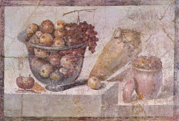
Unknown Pompeian painter
c. 63–79 AD
Fresco, 70 x 108 cm.
National Archaeological Museum, Naples
After the fall of Rome, still life imagery largely disappeared from Western art. In the Middle Ages, objects like fruit, flowers, or candles appeared only as symbolic details within larger religious works—never as independent subjects. But the painstaking attention to naturalistic detail seen in manuscripts and panel paintings of the 14th and 15th centuries laid the groundwork for what would come.
However, it was in the late Middle Ages and early Renaissance that the groundwork for the genre was laid in Northern Europe. Small details—fruit, flowers, coins, books—began to appear in larger religious compositions, often laden with symbolic meaning. These objects were not yet the primary subject, but they were rendered with increasing attention.
Caravaggio
1597–1600
Oil on canvas, 54.5 x 67.5 cm.
Pinacoteca Ambrosiana, Milan
By the 16th century, particularly in the Low Countries and Germany, still life elements started to assert more autonomy. Paintings by artists such as Pieter Aertsen (1508–1575) and Joachim Beuckelaer (c. 1533–c. 1574). introduced market scenes and kitchen interiors in which the still life dominated the foreground, even if a biblical or moralizing scene was tucked into the background. These were transitional works that gave increasing prominence to material objects and domestic abundance.These transitional works blurred the line between genre painting and still life.
The true emergence of still life as a standalone subject occurred in the early 17th century, especially in the Dutch Republic and Spanish Netherlands. The rise of a prosperous urban middle class created a market for smaller, secular works that could be displayed in private homes. Specialization among painters became common, and distinct subgenres developed—flower pieces, vanitas, banquet scenes, game pieces, and pronkstillevens (opulent still lifes).
Still life painting flourished in Holland in the 1600s. A great interest in botany arose toward the end of the 1500s, when collectors of herbs and plants were spending fortunes on their gardens; their desire for portraits of their prized possessions fueled the popularity of flower painting. Later on, Dutch still lifes were eagerly taken up by French painters and collectors and came to decorate the most fashionable French salons. Among the most famous Dutch and Flemish painters who specialized in still life subjects were Willem Heda (1593/1594–c. 1680/1682), Willem Kalf (1619–1693), Jan Fyt (1611–1661), Frans Snyders (1579–1657), Jan Weenix (1640/1649–1719), Melchior d'Hondecoeter (c. 1636–1695), Jan van Huysum (1682–1749), and the de Heem family.
"In 17th-century Holland the pressures of art theory were less heavy and real, and it was here that landscape and still life, as an autonomous categories of painting, began to occupy major place in art production. Even so, there was no serious theoretical discussion of them; Dutch theorists tended to regard the practitioners of still life in particular as something of a joke. Samuel van Hoogstraten (1627–1678), just after the middle of the 17th century, called them 'common footmen of the Army of Art. '"R. H. Fuchs, Dutch Painting (London: Thames & Hudson, 1976), 42.
"Though it started in the kitchen, still life painting soon branched out to include a whole catalogue of decorative and useful items which Dutch burgers surrounded themselves: silver tankards, half-filled wine glasses, tobacco pipes, musical instruments, parchment and globes, along with the usual fruit, vegetables and game. As the century wore on, still life reflected the increasing of middle-class luxury; the late 1660s simple white tablecloths had given way to ornate Persian rugs and china was often fine Ming. Such glorification of the Good Life matched the mood of the prosperous art buyer. The paintings obviously fit nicely over his dining table, and the artists who made them were assured of a steady demand."Hans Koningsburger, The World of Vermeer 1632–1675 (New York: Tine-Life Books, 1968), 101.
By far the most common generic name for what are today called still lifes is "bancquet" (diminutive "bancquettien"); the abstract designations are "vanitas" and "memento mori"; the specific may be any title from a "roemer with oysters" to a "skull." The words ontbift/ ontbijtken (breakfast) and stil leven may also be construed as generic terms. The word stil leven first appears in Delft in the inventory of Gertruy van Mierevelt who died on 30 October, 1639, and again in an Amsterdam inventory of 1647.A bancquet could equally well denote a seated meal (as in "banquet of the gods") or a still life (as in "a little banquet of oysters"). These are quite different sorts of paintings-the former coming closer to genre or "history" than to still life-and it may have caused confusion in identifying paintings in inventories.John Michael Montias, "How Notaries and Other Scribes Recorded Works of Art in Seventeenth-Century Sales and Inventories," Simiolus: Netherlands Quarterly for the History of Art 30, no. 3/4 (2003): 225.
Competition in the Dutch art market was fierce and consequentially, prices were generally low. In order to survive each painter had to secure himself a particular style to differentiate his work from others already available. Many painters depended on secondary sources of income to survive. Since it took a very long time to become proficient in any one category of painting such as landscape, still life, or portraiture, painters usually worked in one area only.
Within this context Vermeer, like Rembrandt (1606–1669), was a part of a minority of more talented Dutch painters who were able to work in different categories. However, neither Rembrandt nor Vermeer are known to have painted independent still lifes.
Stofuitdrukking
The term stofuitdrukking, exclusive to the Dutch language, describes the way the painter conveys the look and feel of materials, especially fabric. In addition to a composition or narrative, the expression of virtuoso rendering of various substances was one of the prime goals of the Dutch painter. Dust, gloss, rough and smooth textures were side by side in order to heighten their reciprocal effects. Many still lifes were composed expressly to show as many different surface textures as possible. Recurring motifs were glasses, often partially filled with wine and a plethora of metal objects: a rusty knife, a tin can, and silver, pewter or gold objects, or a dusty lute. Other favorite stofuitdrukking motifs were foods with a different surface qualities such as grapes, crustaceans, lemons, bread and fruits. One of the most accomplished practitioners of this type of painting was Willem Heda (1593/1594–c. 1680/1682) who often represented two different tablecloths in his still lifes.
Stoof
In 17th-century Dutch households, the stoof played a quiet but important role in daily life, especially during the long, cold months. A stoof was a small, practical foot warmer, usually constructed as a low wooden box with openings—sometimes slats, sometimes perforations or simple carved designs—that allowed heat to escape. Within the hollow space inside, a small metal or ceramic pot filled with hot coals or embers would be placed, radiating warmth upward toward the user 's feet. The heat would rise gently through the openings, providing localized comfort in a time when heating entire rooms was difficult and expensive.
Stoofs could vary greatly depending on the household 's wealth and taste. Some were very plain, made entirely of simple wood, while others featured refined carpentry, decorative carvings, and even inlays of metal such as brass. The size and form were fairly standardized: usually large enough to accommodate both feet but small enough to be easily portable. Materials like oak or pine were common, as they were sturdy and relatively inexpensive, though finer homes might have commissioned more ornate examples. Some footwarmers were decorated with elaborate carving, which commemorates family ties, religious beliefs, or national preoccupations. Sometimes they were carried on long carriage or barge trips, although the poor are said to have had to make do with hot potatoes. Curiously, the base was often as elaborately carved as the other sides because when they were not in use, foot warmers were hung from a ceiling beam to save space. They appear an infinite number of times in Dutch interior paintings. The types of footwarmers used by the Dutch were also common in northern Germany.
The stoof was not limited to home use. Many women brought them to church services to warm their feet during long sermons in unheated buildings. Stoofs were also placed under the covers of beds to warm them before sleeping, or carried into carriages to make winter travel more tolerable. In everyday scenes at home, the stoof often accompanied domestic activities like sewing, lace-making, reading, or child-minding, offering a discreet but vital source of warmth.
The foot warmer motif appears in the famous emblem book Sinnepoppen by Roemer Visscher (1547–1620)., in which a stove with a firepan is referred to as "Mignon des Dames" or "Love of the Ladies." The text reads that in winter, women cherish their warm stoves above all else. And should a man come along, even if he tries his hardest, he can only hope to be second best.
In paintings, the stoof appears frequently, offering a glimpse into the texture of Dutch daily life. Artists such as Pieter de Hooch (1629–c.1684), Gerrit ter Borch (1617–1681), and Vermeer included stoofs in their domestic interiors, using them to add both realism and atmosphere. Sometimes they are tucked partly under a skirt, almost hidden, while other times they are positioned clearly in view, subtly reinforcing the setting 's comfort and intimacy. In some contexts, especially when paired with imagery of women and enclosed spaces, the stoof could carry a secondary symbolic weight, suggesting sensual warmth, domestic virtue, or fertility. However, for the most part, its presence simply underscored the ideals of good housekeeping, attentiveness, and prudent living that were so central to Dutch culture in the Golden Age.
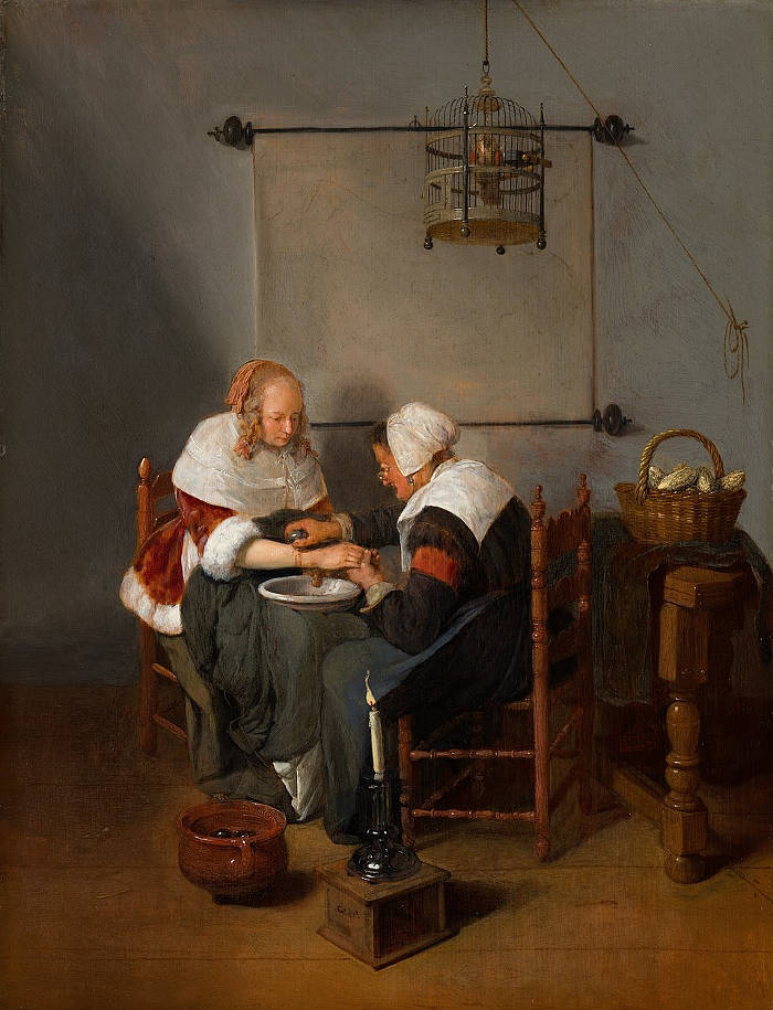
Quirijn van Brekelenkam
c. 1660
Oil on panel, 47.9 × 36.7 cm.
Mauritshuis, The Hague
A particularly good example can be seen in Vermeer 's The Milkmaid, where a small, simple stoof is placed near the maid 's feet on the tiled floor. Vermeer, who rarely overloaded his scenes with accessories, included it to reinforce the strong domestic character of the painting. The stoof here is a plain, practical object, entirely appropriate to the modest setting. It helps anchor the lower part of the composition and contributes to the overall atmosphere of modesty, warmth, and diligence. The cool tiles, heavy masonry, and simple furnishings in the room suggest a space that, without small interventions like the stoof, would be cold and uncomfortable. Vermeer 's careful observation of such a humble but essential object speaks to his deep sensitivity toward everyday life and his ability to find poetry in the simplest elements of existence.
Although Vermeer may have depicted the foot warmer as an incidental slice of daily life, he may have intended to convey some symbolic meaning. In emblematic literature of the day, footwarmers were sometimes associated with a lover's desire for constancy and caring, an idea reinforced by the cupid images on the tiles directly behind it. As Walter Liedtke pointed out, it may allude to the maid's inner warmth or even have a sexual implication since the warmth of the coals moved upwards under the skirt towards the lady's private parts.
Thus, the stoof was more than just a piece of furniture; it was a silent companion to daily labor, a small but telling sign of the way Dutch society valued domestic comfort, careful household management, and attention to detail. It remains today a tangible reminder of how even minor conveniences shaped the rhythm and feel of life in the 17th-century Netherlands.
Stretcher / Strainer
In the realm of canvas painting supports, the terms stretcher and strainer refer to two distinct types of wooden frames used to keep the canvas taut. In the 17th-ecntury, the stretcher was a rigid frame with fixed corners, meaning once the canvas is stretched over it, the tension could not be adjusted without removing and re-stretching the canvas. This inflexibility can pose challenges over time, as environmental factors like humidity and temperature changes may cause the canvas to slacken, leading to potential distortions or damage.
The keyed stretcher mechanism, which allows for the adjustment of canvas tension by means of small wooden wedges inserted into the corners, was developed around the mid-18th century. The transition to adjustable stretchers was driven by the need for greater flexibility in maintaining canvas tautness over time, especially as paintings were exposed to fluctuating humidity and temperature. These keys allow for the adjustment of tension after the canvas has been mounted, enabling artists or conservators to re-tighten the canvas as needed without the need for re-stretching. This feature makes stretchers particularly advantageous for larger artworks or in environments subject to fluctuating conditions.
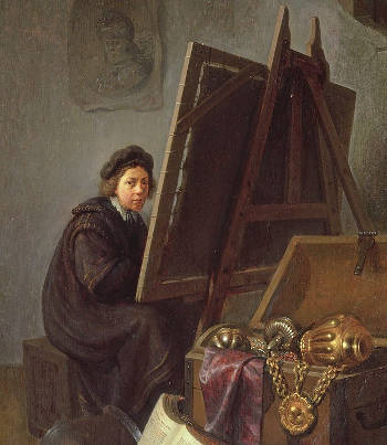
Gerrit Dou
Oil on panel
Private collection, Whereabouts unknown
The strainer, instead, was used in some traditional painting techniques, particularly before the introduction of keyed stretchers. This laced strainer system allowed artists to adjust the canvas tension while working by tightening the cords or threads laced through holes in the strainer's frame. The canvas remained suspended above the wooden edges rather than being fixed directly onto them, eliminating contact with the wood and minimizing any potential damage or interference with the painted surface. It also allowed the painter to remove the finished work from the temporary strainer and mount it onto a more permanent stretcher, where the excess canvas could be wrapped around the edges and secured with tacks or nails. This method not only facilitated transport but also helped in preservation, as the final attachment to a stretcher would ensure stable tension over time.
In the 17th-century Netherlands, painters likely used both fixed strainers and variations of this laced system, depending on the scale and technique of the work. Dutch artists often painted on fine linen rather than coarser canvases, which required stable support to prevent sagging during the meticulous application of glazes and layered detail. The existence of depictions showing artists at work on canvases laced to strainers suggests that this was a common practice, particularly in workshops where multiple works were being produced simultaneously. While the stretcher eventually became the standard due to its convenience and ability to adjust over time, the use of laced strainers underscores the practical solutions painters employed to maintain control over their working surfaces.
Even though canvas was generally attached to a stretcher or a strainer, it could also be stuck onto some sort of rigid support such as panel.
Stretchers and strainers are generally made of wood (most commonly pine or ash) and usually with tongue and groove joins, mitred at the corners and beveled away from the canvas toward the inside. The terms stretcher and strainer are often used interchangeably, but should differentiate between a framework which has no method of opening out the joins to tighten the canvas (strainer), and one which does by means of wedges or keys (stretcher). Recently new methods of creating a more even tensioning have been developed using metal inserts in the wood which enlarge the joint evenly through each member of the stretcher. Large paintings require the stretcher itself to be further supported. This is provided by cross members or cross bars. Today's familiar expandable stretchers which take up the lost tension by means of wedges inserted in the corners became common only in the 1750s.
The profiles on the modern stretcher bar should be slightly rounded. This has two advantages: It allows the framer to see and obtain clear edges on images that have precise borders; it also allows the canvas weave to "roll over" the profile rather than snap over a sharp edge which is a major cause of canvas cracking.
There are many different stretcher bar profiles, and many different styles of cutting of the wood. So it is impossible to say anything is "standard." There are also many big regional difference in the style and cutting of the wood, due to the historical reasons. For the same reasons, the wood used for making stretcher bars differs a lot from country to country depending on the forest that is present. But most stretchers, to avoid warping is made in well dried Nordic pinewood sourced from Scandinavia, Russia and Canada.
Another way in which stretcher bars can be strengthened is by having a cross brace inserted. It is advised that lengths over 40 cm. or 1 meter be fitted with a cross brace. By doing this it ensures the wood will not warp and will hang flat.
In 17th-century Netherlands, cloth was measured by ell, a measurement that varied from town to town. It generally ranged from 68–70 cm. Dutch paintings, which have often been studied, approximate this standard dimension. In a study of Vermeer's paintings, observations reveal different formats used for different subjects. These could be distinguished by the differences in height-to-width ratios. Prepared artists' materials existed in the Netherlands and standard sizes occurred, but, again not with the standardization of the French charts or numbers to identify one size from another. By the 19th century, French color merchants had such influence on the market that in Holland, as in many other places, the French system was followed.
Vermeer's late Guitar Player is a rarity of 17th-century paintings in as much as it is one of the few canvases of 17th century that is still is on its original stretcher complete with the original wooden pegs once used fasten the canvas to its stretcher.
Strong Color
The bright colors of the 17th-century palette were known as the strong colors. Compared to those available at a reasonably supplied art shop of today, the 17th-century painter had to do with a paltry few bright and stable colors, the most widespread being: ultramarine blue, azurite, lead-tin yellow, vermilion, verdigris, orpiment and red madder. Various yellow and red lakes were available but produce a bright hue only when the are used as a glaze. Strong light tends to destroy the local color, just as a strong colors partially or totally destroy the effect of light. Strong colors confined to one object have a hard, cut-out effect. Strong colors seem to advance toward the eye with repect to nuetral colors. They were general reserved for brightly colored drapery, skies, fruit, flowers and vegetation.
Seventeenth-century artist lacked strong oranges and purples. Moreover, the strong colors that were available were not always mutually compatible and even if two strong colors are mixed to produce a new tint (e.g., blue and yellow to create green) the intensity of the new color is always less intense that either of the original colors. Strong colors were generally used in their purest state possible, to preserve their intensity and minimize adverse behavioral properties.
Structural Drawing
Structural drawing, in general terms, refers to a type of drawing that emphasizes the underlying framework, proportions, and spatial organization of a figure rather than its surface details. It is a fundamental approach in both architectural and artistic practices, where the focus is on the composition's geometry, perspective, and construction. Structural drawings can range from preliminary sketches outlining the basic forms of a composition to detailed studies of perspective, anatomy, or architectural elements. Artists use this method to establish the correct proportions and spatial relationships between forms before refining their work with light and shadow, color, and detail.
The difference between structural drawing and artistic drawing lies primarily in their purpose, approach, and the way they represent form. Structural drawing focuses on the underlying framework of a subject, emphasizing geometry, proportion, and perspective. It serves as a foundation for a composition, ensuring that forms are accurately constructed before details and expressive elements are added. This type of drawing is analytical, often involving precise lines, measured spatial relationships, and an emphasis on compositional order. Structural drawing is common in architectural renderings, anatomical studies, and perspective sketches, where accuracy is more important than aesthetic expression.
Artistic drawing, on the other hand, is broader and encompasses a wide range of styles and techniques. It is more expressive, allowing for fluidity, mood, and personal interpretation. While artistic drawing may incorporate elements of structure, it is not bound by strict precision and often prioritizes texture, movement, and emotion. Artists may use gestural lines, shading, and varying degrees of abstraction to convey their vision, rather than adhering rigidly to proportional accuracy.
Structure
The term structure in art-related discussion refers to the underlying framework that gives form and coherence to a work, whether it be a painting, sculpture, or piece of architecture. In its most basic sense, structure is about how the parts of a composition are arranged to create stability, clarity, and meaning. This can involve formal elements such as line, shape, and volume, as well as the spatial relationships among figures and objects. During the Renaissance, artists studied geometry and perspective to build structurally sound compositions that reflected both natural observation and intellectual order. The use of linear perspective, developed in the 15th century, was itself a way of imposing structure onto pictorial space, guiding the observer's eye and establishing a believable depth. Later, in the Baroque period, structure took on more dynamic and theatrical forms, with sweeping diagonals and complex arrangements designed to create movement and emotion.
The terms "composition" and "structure" in art are closely related and often overlap, but they are not identical. Understanding the difference involves recognizing the levels at which each operates.
Structure refers to the underlying framework of a work of art—the scaffold that supports the arrangement of its parts. It includes the spatial organization, perspective system, balance of volumes, and geometric relationships that give the work coherence and stability. Structure is often hidden from immediate view but felt through the clarity and order of the image. It is what allows a work to hold together logically, even if the viewer does not consciously analyze it.
Composition, on the other hand, refers more broadly to the actual placement and arrangement of elements within the work of art —figures, objects, light, color, and empty space. It involves decisions about how to lead the viewer's eye, how to create rhythm or tension, how to balance symmetry with asymmetry, and how to orchestrate visual movement. Composition is what we see and feel directly: the interaction between parts and the choices that give an image its mood, emphasis, and visual impact.
In practical terms, structure can be thought of as the bones of the painting, while composition is the living surface. A painter may use a structured system of perspective lines to determine spatial depth, but the composition involves how a figure leans against a window, how a curtain falls across the side, how color contrasts are distributed, or where the brightest highlight appears.
In essence, structure is the logic of the image, often invisible but essential; composition is the expression of that logic through artistic choices that are directly perceived. Both are crucial to the success of a painting, but they operate at different levels.
In 17th-century Dutch painting, the distinction between structure and composition can be clearly felt. Vermeer built a strong underlying structure using perspective and architectural elements—the floor tiles, walls, and window casings—but his composition depended on the placement of a woman in relation to a chair, the open space around her, and the subtle play of light that creates a visual dialogue between different parts of the painting. Pieter de Hooch (1629–c. 1679) similarly used structural devices such as doors and tiled floors to create spatial logic, while his compositions often reveal interlocking scenes or repeated visual motifs that give the painting its rhythm and narrative interest.
In 17th-century Dutch painting, structure was often subtler and more internally focused than in the grand narratives of southern Europe. Artists in the Netherlands emphasized balance, proportion, and clarity in scenes drawn from everyday life, religious stories, and the natural world. Painters like Nicolaes Maes (1634–1693) and Cornelis de Man (1621–1706) used the structure of interiors—doorways (doorkijkje), walls, beams, and furniture—not only to frame their figures but to shape the composition as a whole. The placement of light sources and architectural elements helped create a sense of depth and enclosure, guiding the eye and organizing the action.
Vermeer's work exemplifies a highly refined sense of structure. His use of perspective, carefully aligned floor tiles, windows, and background elements creates a mathematical yet intimate space in which his figures are placed with quiet deliberation. Even when only one or two people are shown, the composition is often constructed around a triangulated balance of figure, furniture, and architectural boundaries. The spectator feels that nothing is arbitrary; everything serves the whole. Structure in Dutch painting of this period was not an overt scaffolding but an invisible order, built from geometry, light, and placement, that made the image legible and enduring.
Studio
See also: Atelier and Botegga.A studio is an artist's or worker's place of work. This can be for the purpose producing architecture, painting, pottery (ceramics), sculpture, woodwork, photography, graphic design, music and other artistic activities.
The word "studio" is derived from the Italian: studio, from Latin: studium, from studere, meaning to study or zeal. In the Renaissance, the "studiolo," a room where the painter might pursue the intellectual and inpsirational aspects of his art, was separate from the actual workshop. The French term for studio, atelier, in addition to designating an artist's studio is used to characterize the studio of a fashion designer. Atelier, as studio, also has the connotation of being the home of an alchemist or wizard. The Renaissance term botegga indicates an artists' workshop, which was similar to those of many other crafts (it was usually located together in the same area of town, the botegga was usually small room opened to the street by the raising of heavy wooden shutters, making it a semi-public shops. The botegga was eventually replaced by the studio, which, differently, was also a reflexive space, a combination of the workroom and a study in which the act of contemplation was incorporated into the process of painting itself.
In 16th-century Florence artists struggled with the place the botegga occupied in their artistic identity. Though art-making with the collaboration of assistants remained the norm, among elite artists the concept of the workshop became troublesome. In his Le Vite de' piu' eccellenti pittori, scultori, e architettor (1550), in fact, Giorgio Vasari (1511–1574) uses the term "ordinary painters" to refer negatively to "painters who keep a workshop," which was tied to its associations with artisanal trade. The workshop also tied the artist to a single location, while many cinquecento artists relied on the ability to move freely between cities in response to patronage.
In any case, 20th-century notions of art—that the painter's job is to communicate personal subjective states rather than to transmit traditional values—do not prepare us to understand the studio environment of the past. The majority of artists did not think of themselves solely as independent individuals living siolated on the fringe of society if necessary, but a member of society who practiced a craft within the social and economic boundaries of the system that supported it. The idea of painting often entailed important concepts but the handicraft of paintings was still of primary value, which was transmitted through the tried and proven master/apprentice relationship. While the master practiced his art in his studio, the apprentice was instructed in the fundamentals of art—geometry, perspective, anatomy. The master was expected to be the young artist's guide to this higher realm of learning. The studio was frequently the place where the artist might actually display and sell his work to collectors, even though paintings were for sale at public markets, dealers and auctions. In the 17th-century Netherlands paintings of studios proliferated partly because painters were growing more self conscious but because the general public seemed particularly vexed by the mysterious goings-on in the painter's studio. Depictions of artists' studio emphasize different facets of the studio activity, such as teaching, discussing art matters with visiting connoisseurs and commerce.
Not all artist's studios were laid out in the same way. The landscape painter had different requirements from the portrait and still-life painter, these were again different from those who painted interiors only. The first always worked from drawings and sketches he had made on his trips by field and path, and therefore a space with only one window was sufficient. If he got enough light on his work he was satisfied; it was not necessary to group anything but a few drawings on the floor nearby his easel. The still-life painter collected the objects of his choice and arranged them on a small table, painting them directly and from close range. He had need of no more space. The portrait painter required a larger window to cast light on his sitter, and more space so that he could keep himself at a comfortable distance from the sitter, as various representations of portrait painters in their studios demonstrate.
The painter of domestic life , instead, needed more space still. If he had the opportunity, he liked to work in an environment with at least two windows, which afforded him the possibility to distance himself from the subject, and the opportunity to open and close them. Given the variety of interior scenes that appear in the works of certain interior painters, it is likely that many interior paintings were not executed from life, but from sketches.
The contents of the studio depended on both the artist's means and the character of his work, although certain pieces of furniture and equipment were indispensable, such as an easel, a stool, a cabinet for storing brushes, lumps of raw pigment, hand-ground pigments, drying oils and essences. Plaster casts of Classical Sculpture were extensively used for instruction and can be seen in almost any portrayal of an artist's studio of the time. Skulls too, are constantly pictured and not only in the studios of painters who devoted themselves to vanitas still-life genre. The artists who were most successful in painting ducks are known to have kept them in their gardens. Otto Marseus van Schrieck (c. 1613–1678), famous as a painter of insects and reptiles, kept his "models" in a building behind his house to study them at his convenience. On the other hand, flower painters worked extensively from prints or sketches that they had done during the blooming seasons, allowing them to create "impossible" bouquets throughout the year. Figure painters, especially interior painters, usually had a lay-figure on which they could arrange fancy costumes. Some painters, like Rembrandt, collected exotic costumes, natural oddities, weapons etc.
One of the most iconic artist's studios in modern times is that of the Spanish master Pablo Picasso (1881–1973). In 1955, Picasso relocated with his last wife-to-be, Jacqueline Roque, to Cannes where he bought an eccentric 19th-century house which became known as "La Villa California." Villa de la Californie, with its art nouveau studio space with uninterrupted sea views, has often been dubbed the "court of Picasso," where movie stars, poets and bullfighters would congregate for the artist's pleasure. The villa was built in 1920, and was the residence of artist Pablo Picasso from 1955 to 1961.
Informed specialists maintain that Vermeer probably worked in two or three different studios during his twenty-year career. This hypothesis is based on the differing structures of the side windows of his interior scenes, although it cannot be not ruled out that he painted in fewer rooms but introduced variants to make them look different, a practice which is particularly evident in the work of Pieter de Hooch (1629–1684). Henk Zantkuijl, former head of the Amsterdam Office of Monuments, suggested that the windows shown in some of Vermeer's earlier paintings might be rooms in Maria Thins' house; but according to Philip Steadman these are pictures dated to the period before Vermeer and his wife moved to Thins' house, some time in the late 1650s. It has been speculated that the windows shown in The Astronomer and The Geographer belonged to the house of the Delft scientist Antony van Leeuwenhoek (1632–1723), although there is not evidence in regards.
Only two of Vermeer's studios have been identified with any degree plausibility. The first is the upper floor of his father's inn, called Mechelen. This conjecture is based on the architectural features of the early The Little Street, which supposedly gives a view of the façades of early Delft houses from an upper floor window located at back Mechelen across the canal on Voldersgracht. The houses were torn down to make way for the new Guild of Saint Luke soon after the artist depicted them. Some believe that the rustic-looking windows of the Officer and Laughing Girl and The Milkmaid suggest that both works were painted there as well. The second candidate, more credible than the first, is the Oude Langendijk studio, which is probably represented in The Music Lesson and other paintings with similarly constructed window fittings. According to estimates made by Steadman, this studio was about 6.6 meters deep, 4 meters wide and about 3 meters high. The walls were layered with thick coats of white-wash applied over a brick wall to create a smooth, hygienic and light-reflective surface. Since it was located on the second floor, the brownish coloring of the glass panes of the window nearest to the background wall of The Music Lesson may possibly represent a part of the tower of the Nieuwe Kerk or other buildings nearby. Vermeer's chief biographer, John Michael Montias, speculated that Vermeer might have maintained a studio in the family inn after this move to Oude Langendijk. In any case, archival evidence proves that Vermeer had a studio in a "front room" of his mother-in-law's house at one time or another although the year he transferred his family from one location to the other is not known precisely.
Art historians have unanimously discounted the possibility that Vermeer's studio was actually fitted with real black and white marble floor tiles. Marble flooring was far too expensive for the artist's income—there is no marble native to the Netherlands—and it was probably too heavy for use for upper floors. It is possible, however, that the studio was fitted with the small ceramic tiles like those seen in his earliest shoe-box interiors.
Chris Eckersley, a freelance designer and sculptor, has recently suggested that Vermeer may have possessed a stock of real marble tiles and laid them out on the floor in these varying patterns for each of his paintings. After Eckersley had read Steadman's calculation that the floor tiles in Vermeer's paintings measured 29.3 cm. (derived by a process of adjusting the entire size of the studio and all its contents to arrive at the best fit to the known sizes of many objects: chairs, tables, virginals, painted paintings, maps, as well as the Delftware skirting tiles), he realized that this size is extremely close to half of a Florentine brachia (29.18 cm.), which was the standard size of 17th-century Italian marble tiles (presumably from Carrara). However, it is hardly out of the question that the artist used faux tiles made of colored wood which could be arranged in any pattern desired. With the collaboration of the industrial designer Allan Kuiper (based upon reconstruction drawings by Zantkuijl) the Dutch art historian Kees Kaldenbach developed a digital reconstruction of Vermeer's home at the Oude Langendijk.
Vermeer's studio was a noisy place, near the bustling hub of the town's civic life (Markt) only one story above the narrow Oude Langendijk. Below, carts full of fruit and vegetables rolled in the street hours before the artist had enough light to work by. Throughout the day street peddlers hawked their wares, traders shouted and children played kolf. Street musicians sang and played the latest tunes on droning bagpipes or screeching hurdy-gurdies. The back side faced a narrow alley which connected Oude Langendijk to the noisy cattle market. At only a stone's throw away was the mastodonic tower of the Nieuwe Kerk which was armed with 32 bronze bells that clanged throughout the day at regular intervals keeping time and lifting the spirit of the town's hard working citizens. Some foreigners enjoyed the frequent carillon concerts but some were annoyed by their "incessant jangling." Moreover, Vermeer's resilient wife, strong-willed mother-in-law, domestic maid and a slew of children roamed around just beneath the timber floor which separated the artist's studio from the living quarters below. Factoring in the already noisy environment and that children are children—it is well know that foreigners thought Dutch parents were intolerably tolerant to their children's misconduct—the silence which exudes from the artist's perfect constructs is all the more perplexing.
Meteorology also played an important role in Vermeer's studio activities, a fact that is generally ignored by many who look at his paintings. Dutch winters, already inimical to the fine painter who must remain seated dead-still at his easel for hours on end, was even more merciless in Vermeer's time owing to the so-called Little Ice Age that started during the mid-sixteenth century and ended about 1850. In this period, the average temperature was significantly lower, winters were very much colder and expanses of water remained frozen over longer periods. Vermeer's biographer John Montias discovered that the artist may have bought an ice sled equipped with a sail for his children for eighty guilders to make the best of the stern conditions.
On the average, Vermeer had to factor into his working schedule more than 200 days of rain per year with less than two hours a day of sunshine in the winter months. In the Netherlands, winter days can be exceptionally gloomy even at midday; rain, intermittent drizzle and cloudy skies were, and still are, the norm. Light was so scarce that windows could fill from two-thirds to three-quarters of an external wall. Various combinations of curtains, shutters and half-shutters were used to retain warmth or exclude sunlight on bright days.
Although the three large windows of the Vermeer's studio let in the cool, constant light of the north adapted for painting, its intensity was often unpredictable owing to the incessant march of low-flying clouds that with no warning plunged the studio into a deep penumbra and released it back to brilliance in a matter of seconds. In such conditions, the rendering of light and shadow, which plays such a crucial role in establishing atmosphere and compositional unity in Vermeer's art, would have been almost maddening.
The bottom two casements of Vermeer's windows had shutters on the outside, which are never seen in his paintings. We do not know if the upper casements also had shutters although these can be seen in many paintings of Dutch household. It is likely that Vermeer did not portray them for aesthetic reasons. By opening and closing the shutters, the artist could create almost any lighting situation he desired. A third window outside the picture cast light on the artist's work station. On heavily overcast or rainy days the artist may have found more productive things to do than paint his brightly lit pictures. Perhaps, the brighter works were programmed for the summer months when light was more abundant. In any case, Vermeer's studio was reasonably well-lit. Approximately 40% of the area of the wall visible to the left was occupied by windows.
Studio Light
See also: Northern Light.
Studio light, in general, refers to the controlled lighting used by artists to illuminate their subjects while working. It can be natural or artificial and is manipulated to enhance form, spatial depth, and atmosphere. Artists have historically used various methods to direct and soften light, such as north-facing windows, curtains, or reflectors, to achieve a specific effect.
The light in a typical 17th-century Dutch artist's studio came primarily from large, north-facing windows. This orientation was intentional, as northern light is more diffuse and consistent throughout the day, reducing harsh shadows and strong variations in illumination. The use of north-facing windows allowed artists to work under steady lighting conditions, a crucial factor when painting fine details and subtle tonal transitions. This practice was not unique to the Netherlands, but it became particularly important in Dutch interior scenes, where painters sought an even, naturalistic rendering of space and material.
In a Dutch studio, the window was usually positioned high on the wall, allowing light to enter at a controlled angle, which prevented direct sunlight from overpowering the scene. These windows were often divided into small panes by lead cames, a common feature in Dutch architecture. Some studios had adjustable shutters or curtains that could be drawn or partially closed to regulate the amount and direction of light. Artists may also have used translucent fabrics to soften the illumination or dark panels to block unwanted reflections. Reflective surfaces, such as white walls or strategically placed objects, could further modify the light, subtly brightening shadowed areas.
The light typically entered from the left side of the studio, as seen in numerous Dutch paintings of the period. This convention was likely due to practical concerns: since most people are right-handed, a leftward light source reduced the chance of the artist's hand casting unwanted shadows on the canvas. The leftward illumination is evident in the works of Vermeer, Pieter de Hooch (1629–c.1684) , and Gerrit Dou (1613–1675), among others, whose compositions show figures bathed in soft, indirect daylight coming from a left-hand window.
Overhead lighting, in the form of skylights, began to appear more commonly in the 18th century with the development of larger purpose-built studios. In the 17th century, overhead illumination was rare in Dutch interiors, as most buildings did not have skylights. Even when present, they were typically small and used to supplement rather than replace window lighting. In southern Europe, where the sun is stronger and more direct, artists often had to deal with more pronounced shadows, making controlled lighting more difficult without the aid of overhead illumination or deep studio recesses.
Attributed to Willem Drost (formerly attributed to Rembrandt)
c.1650–1655
Drawing, 13 x 19.8 cm.
British Museum, London
The Netherlands, situated at a higher latitude than southern Europe, received significantly less direct sunlight, especially in the winter months. The diffused light characteristic of the region played a role in the development of Dutch painting, particularly in the soft, atmospheric effects seen in works by Vermeer and his contemporaries. In contrast, the sharp contrasts and intense highlights typical of Italian and Spanish Baroque painting were influenced by the stronger, more directional Mediterranean light. Dutch artists adapted to their environment, making subtle tonal gradation and intricate reflections a defining feature of their work.
The relatively low natural light levels in the Netherlands also meant that Dutch artists had to be highly sensitive to variations in brightness and shadow. Many paintings depict interiors where daylight filters through windows, casting gentle beams across tiled floors and walls, reinforcing the idea of a carefully structured lighting environment. This attention to light as a subject in itself reflects both the natural conditions of the Dutch climate and the technical mastery of the painters who worked within it.
Many painters, including Vermeer, appear to have favored a soft, diffused light entering from a high, left-facing window, a feature commonly found in Dutch homes and studios of the period. This approach heightened the sense of realism and volume, allowing for delicate transitions between light and shadow.
Caravaggio (1571–1610) and his Dutch followers, the Utrecht Caravaggisti, took a different approach, using dramatic chiaroscuro with strong contrasts between light and dark, emphasizing theatricality and emotional intensity. In contrast, painters such as de Hooch and Gabriel Metsu (1629–1667) used studio light to create a more subtle interplay between interior and exterior spaces, often showing how light filters through doorways and windows.
Vermeer is often associated with an exceptionally refined understanding of light, using it to sculpt forms gently and create an almost optical clarity in his compositions. His light sources are nearly always natural, coming from a window on the left, and he carefully studied how light reflects off different surfaces, from pearl necklaces to patterned tapestries. The effect is often described as luminous and tranquil, evoking an almost timeless serenity.
Studio Prop
A studio prop is an object which is kept in an artist's studio for the purpose of being represented, often many times, in one or more works. These props can range from everyday items like chairs, drapery, and musical instruments to more elaborate objects such as globes, maps, and armor. Their function extends beyond mere decoration; they help establish context, convey meaning, and enhance the realism of a scene.Typical studio props include plaster casts of classical sculpture, musical instruments, tapestries, kitchenware, Oriental carpets, books, wall maps, paintings, lay figures (mannequins) and any number of pieces of furniture and clothing. Pieces of the painter's equipment also were featured in representations of artists' studios. Some props were property of the painter while more expensive items might be borrowed for the occasion.
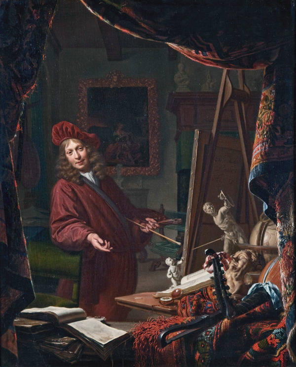
Michiel van Musscher
1679
Oil on panel, 57 x 47 cm.
Historisch Museum Het Schielandhuis, Rotterdam
Many of the most attractive and frequently pictured props in Dutch interior painting, such as the gilt chandeliers and Oriental carpets, were, in fact, parts of a fictitious world created ad hoc for the purpose of making paintings more appetizing to well-to-do consumers. Vermeer is well know for a number of easily identifiable props that appear throughout his work, which, perhaps, a fact which create a sense of reassuring familiarity for the viewer.
Painters in their Studio Scene
The theme of painters in their studios stretches back many centuries, serving both as a statement of the artist's identity and as a meditation on the nature of art itself. From Antiquity, stories circulated of painters so skilled they could fool birds or deceive people with illusions of reality, and these legends laid the groundwork for artists later to position themselves as inspired creators. But it was not until the Renaissance that depictions of artists at work began to take on the self-conscious tone that would carry forward into the modern period. As painting evolved from a craft into a liberal art, painters began to portray themselves not just as skilled artisans, but as intellectuals engaged in the pursuit of higher knowledge. The artist's studio, once a workshop filled with apprentices and tools, began to symbolize a private space of learning, contemplation, and sometimes mystery.
During the Renaissance, the depiction of painters in their studios marked a turning point in how artists viewed themselves and how they wished to be viewed by others. This was the period in which the image of the artist as a learned, even heroic, figure began to solidify. Workshops had long been central to the production of art in the late Middle Ages, with masters overseeing teams of assistants, but in the 15th and 16th centuries, the studio became something more personal and idealized—a space of inspiration, invention, and intellectual labor.
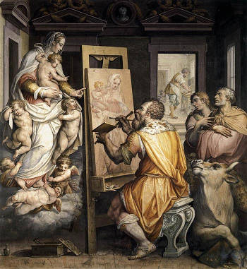
Giorgio Vasari
After 1565
Fresco, Santissima Annunziata
Florence
One of the earliest and most influential portrayals of the artist at work is found in the frescoes of Giorgio Vasari (1511–1574) , who, in addition to painting and architecture, wrote Vite de' piu' eccellenti pittori, scultori, e architettori (1550), the foundational text for art history in the West. In his illustrations and writings, Vasari emphasized the noble status of the artist, aligning painting with the liberal arts rather than with mere manual labor. This intellectualization of art is echoed in depictions of artists seated with compasses, engaged in measurement and geometric design, or contemplating Antique sculptures—activities meant to associate them with the values of Antiquity and philosophy.
Albrecht Dürer (1471–1528), a towering figure of the Northern Renaissance, provided perhaps the clearest example of the studio as a place of individual genius. In his engravings and self-portraits, Dürer represents himself not as a craftsman, but as a man of science and letters. His Melencolia I (1514) is not a depiction of a studio, strictly speaking, but it captures the mental space of the artist—the brooding, thoughtful state from which ideas emerge. In his Saint Jerome in His Study (1514), a detailed engraving that later artists in the Netherlands would often emulate, Dürer creates a quiet, light-filled room filled with symbols of knowledge and time, showing the scholar-artist at peace amid intellectual labor.
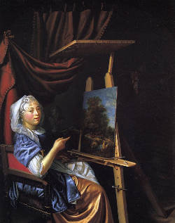
Maria Schalcken
Between 1662 and 1699
Oil on panel, 39.6 x 31.6 cm.
Otterloo Collection, promised gift to Museum of Fine Arts, Boston
By the late 16th century, self-portraits in the studio became more common. Sofonisba Anguissola (c.1532–1625), one of the first known female painters to gain international recognition, painted herself in the act of drawing or at an easel, an assertion of her seriousness as a professional artist in a male-dominated field. Her self-portraits quietly yet firmly claim the studio as her rightful place.
This Renaissance transformation of the artist's space, both real and symbolic, paved the way for the more self-conscious studio images of the Dutch Golden Age. Dutch painters inherited the Renaissance view of painting as an intellectual activity, but they often translated it into more down-to-earth images, in keeping with the cultural values of a mercantile society that prized industry and pragmatism. Still, the Renaissance legacy can be felt in the idealization of the painter's environment, the careful orchestration of objects and gestures, and the subtle claims to status and intellect. The Dutch studio scenes of the 17th century, with their combination of modesty, symbolism, and technical bravura, owe much to this earlier period of self-fashioning and conceptual depth.
However, side these carefull consturcted studio sef portraits, a new type of compositon evolved, aptly branded the "dissolute self portrait" in which Dutch and Flemish artists presented a strange new face of themselves to the public in their self portraits. Rather than assuming the traditional guise of the learned gentleman, artist that was fostered by Renaissance topoi, many painters presented themselves in a more unseemly light. Dropping the noble robes of the pictor doctus, they smoked, drank and chased women. Dutch and Flemish artists explored a new mode of self-expression in dissolute self portraits, embracing the many behaviors that art theorists and the culture at large disparaged. Dissolute self portraits stand apart from what was expected of a pictorial convention self portrait, yet they were nonetheless appreciated and valued in Dutch culture and in the art market.
In the Low Countries, particularly during the 17th century, the theme of the artist in his studio found a distinctive expression that combined the moral, professional, and metaphysical aspects of painting. The studio became a stage where the painter could subtly comment on his profession and place in society. Some Dutch painters depicted themselves hard at work in modest rooms with basic tools and unfinished canvases, underscoring the laborious nature of their task. Others took a more elevated approach, showing grand interiors with costly objects, deep perspectives, and refined costumes, suggesting that painting was as noble and learned a discipline as poetry or philosophy.
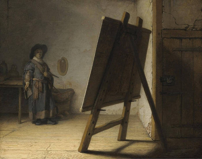
Rembrandt van Rijn
c. 1628
Oil on panel, 24.8 x 31.7 cm.
Museum of Fine Arts, Boston
Although Dutch art abounds in self-portraits of artists in their studio, it is difficult to ascertain how true to life they were to real circumstances. Two conventions in the depiction of artists in their studios dominated the 17th-century art market; both were a subtle blending of fact and fiction.On one hand, history painters, steeped in the memories of classical models, strove to convey an idealistic view of their profession, assuming the traditional guise of the learned gentleman artist as fostered by Renaissance culture. Artists depicted themselves surrounded not only with the tools of their trade but also crowded with seemingly irrelevant props and even mythological figures brought in and arranged for the occasion to communicate specific concepts about their art through the use of symbolism and allegory. A perfect example of this mode of self portraiture is Vermeer's own Art of Painting. However, the The Art of Painting is not a simple self portrait, though the painter in the scene, seen from behind, is almost certainly meant to be Vermeer himself. Instead, the entire room becomes a symbolic space that blends the physical act of painting with history, theater, and allegory. The richly dressed artist and the model posing as Clio, muse of history, point to painting's power to preserve and interpret the past. The curtain pulled aside in the foreground introduces a theatrical element, suggesting that viewers are being granted privileged access to the sacred space of creation.
Other Dutch painters also took up the subject with different emphases. Gerrit Dou (1613–1675), a pupil of Rembrandt (1606–1669), often portrayed himself in small, finely detailed studio interiors, rich with studio props such as skulls, books, hourglasses, and plaster casts. His paintings reflect both the intellectual pretensions of the painter and the tools of the trade. He frequently set up stone window frames or arched openings that separate the viewer from the artist, reinforcing the idea of art as an illusion crafted within a separate world. Dou's Leiden contemporaries, like Frans van Mieris the Elder (1635–1681), followed a similar path, showing studios full of refined objects that demonstrated the artist's wealth, taste, and technical mastery.
Sometimes these studio scenes carried a moral undertone. Paintings might include broken statues, wilting flowers, or overripe fruit—symbols of vanity and the fleeting nature of earthly pursuits—suggesting that the painter, even while creating beauty, remains aware of the transience of all things (i.e., vanitas). In other cases, these elements were used to assert the enduring power of painting itself, capable of capturing what time and decay will erase.

Jan Davidsz. de Heem
c. 1630
Oil on panel, 58 x 81 cm.
Museum of Fine Arts, Boston
The subject also allowed Dutch artists to explore genre conventions. Instead of grand, idealized allegories, many studio scenes are filled with a naturalism that reflects daily life. You might see an artist interrupted by a visitor, a model adjusting her pose, or even a student at work in the background. These elements bring the profession down to earth while still celebrating its value allowing the artist to cast himself as a learned man, a craftsman, a historian, or a magician—sometimes all at once. These images, whether intimate or grand, offered audiences a privileged glimpse into a world that was both ordinary and enchanted.
Study
A study, in the discourse of art-related matters, refers to a preliminary work created as part of the artistic process. It can take the form of a drawing, oil sketch, or compositional draft, serving as an exploration of form, light, movement, or arrangement of compositonal elements before executing a finished painting or sculpture. Studies allow artists to experiment with details, refine their ideas, and resolve technical challenges without committing to the final work. They vary in complexity, from simple line sketches to fully developed oil studies that closely resemble the completed piece. The use of studies became particularly significant with the rise of academic training, where students learned to analyze anatomy, drapery, and perspective through rigorous drawing exercises.
In 17th-century Dutch painting, studies played an important role, though they were often more informal than the highly finished preparatory drawings found in Italian and French academic traditions. Many Dutch artists relied on quick sketches or small-scale oil studies to refine elements of a larger composition. Rembrandt (1606–1669), for instance, produced numerous pen-and-ink sketches, chalk drawings, and oil studies that demonstrate his evolving ideas on light, gesture, and expression. His etchings also reveal a studied approach to composition, where he experimented with different levels of detail and shading before finalizing a print.
Genre painters, such as Vermeer and Pieter de Hooch (1629–c.1684), likely made preparatory studies, though few survive. The precision of their interior scenes suggests that studies of perspective and spatial arrangement were integral to their process. Some Dutch painters, like Adriaen van Ostade (1610–1685), created small sketches of figures, later integrating them into larger compositions. Still-life painters also relied on studies to perfect the arrangement of objects and light effects, ensuring a harmonious balance in their compositions.
Unlike the large, detailed figure studies produced in Italy for grand history paintings, Dutch painters often worked directly on the canvas with minimal preparatory drawing. This approach reflects the emphasis on naturalism in Dutch art, where spontaneous brushwork and lifelike effects were valued. Nonetheless, studies remain an essential part of understanding an artist's working method. The surviving drawings and sketches of 17th-century Dutch painters provide valuable insight into their creative process, revealing how they developed compositions, experimented with poses, and refined their treatment of light and form.
Furthermore, unlike history painters, who often relied on extensive pareparatory studies to arrange complex compositions with multiple figures, painters of domestic interiors may have worked in a more direct manner, laying out their compositions on the canvas itself. The careful structuring of Vermeer's paintings, with their precise spatial relationships and refined perspective, suggests that he must have developed his ideas systematically. However, it is entirely possible that he worked out his compositions through underdrawings or pentimenti rather than on separate sheets of paper. This would align with the practices of painters such as Pieter de Hooch (1629–1684) and Gerrit Dou (1613–1675), for whom few or no preliminary sketches are known.
Additionally, the Dutch art market placed a high premium on finished paintings rather than preparatory studies, meaning that artists had little incentive to preserve their sketches. Drawings that did survive were often those that had an independent artistic value or were intended for reproduction in prints. Vermeer's highly deliberate and methodical approach, in which he seems to have refined his compositions through subtle adjustments rather than through trial sketches, may further explain the absence of preparatory material. The technical examinations of his paintings suggest that changes were made during the painting process itself, reinforcing the idea that he developed his compositions directly on the canvas.
As far as we know, no preparatory drawing or compositional studies by Vermeer's hand have survived. This absence of studies has often been remarked upon, but it is not necessarily unusual. Many Dutch painters of interiors, particularly those working in the meticulously planned and detailed style that Vermeer exemplified, also left little or no evidence of preparatory sketches. This lack of surviving drawings does not necessarily indicate that such studies were never made; rather, it may reflect the working habits of these artists, the materials they used, or the ways in which studio contents were dispersed over time.
While Vermeer's lack of surviving studies has been cited as evidence of his supposedly solitary and unorthodox working methods, it is just as likely that it reflects broader patterns within Dutch genre painting. Many of his contemporaries, including those whose studios were more active or whose output was larger, have also left no trace of preliminary drawings. The absence of studies, then, may be less a unique characteristic of Vermeer's practice than an indication of how artists in his milieu conceived and executed their paintings. In addition, some scholars and critics to speculate that he used the camera obscura to trace the image on its screen on to a translucent surface and then transfer it directly to the canvas correcting the image's right-to-left reversal thereby eliminating any need for traditional preparatory studies. This theory, based on the precise optical effects and pointillés and photographic clarity found in his paintings, suggests that he may have bypassed the traditional practice of preparatory drawing in favor of a more direct observational method. Whether or not he used this device in a systematic way remains a subject of debate, but the absence of preparatory studies continues to fuel discussions about his working process and technical innovations.
Style
In the visual arts, style is a "...distinctive manner which permits the grouping of works into related categories."Eric Gombrich, "Style," in The Art of Art History: A Critical Anthology, ed. Donald Preziosi (Oxford: Oxford University Press, 1998), 150. or "...any distinctive, and therefore recognizable, way in which an act is performed or an artifact made or ought to be performed and made."Eric Fernie, Art History and its Methods: A critical anthology (London: Phaidon Press, 1995), 361.Style refers to the visual appearance of a work of art that relates it to other works by the same artist or one from the same period, training, location, "school" or art movement. In critical analysis of the visual arts, the style of a work of art is often treated as distinct from its iconography, which covers the subject and the content of the work.
The term stylish, instead, refers to works characterized by a refined, elegant, and often consciously cultivated appearance, emphasizing harmony, sophistication, and a well-defined aesthetic. It implies a deliberate choice of composition, color, and technique to create an impression of grace and taste, often aligning with contemporary fashions or cultural ideals of beauty. A stylish approach may prioritize surface qualities and decorum, presenting subjects in an idealized or polished manner rather than aiming for stark realism or raw emotion.
The terms style and technique are often used interchangeably in casual discussion, but in art history and scholarly writing, they have distinct meanings.
Style refers to the overall visual characteristics and expressive qualities that define an artist's work, a school, or a period. It is shaped by choices in form, composition, color, and subject matter and can be influenced by cultural, historical, or personal factors. Style is what allows us to recognize and categorize artworks—such as the dramatic lighting and realism of Caravaggism, the controlled geometry of Neoclassicism, or the soft, diffused light and precise domestic scenes characteristic of Vermeer's paintings.
Technique, on the other hand, is the method or process an artist uses to create a work. It includes the physical execution of a painting, such as how pigments are applied, how brushwork is handled, or how glazes are applied. An artist's technique involves skill, training, and materials—for example, sfumato in Leonardo da Vinci's work, impasto in Rembrandt's, or the fine pointillist stippeling used in 17th-century Dutch painting.
While style and technique are related—since certain techniques may contribute to the development of a particular style—they are not the same. An artist may adopt the style of a period or movement while employing their own preferred technique. Conversely, two artists may use similar techniques but have distinct styles due to differences in composition, mood, or subject matter.
Style can also refer to the movement or school that an artist is associated with. This can stem from an actual group that the artist was consciously involved with or it can be a category in which art historians have placed the painter. The word 'style' in the latter sense has fallen out of favor in academic discussions about contemporary painting, though it continues to be used in popular contexts. The names of many styles are the invention of art historians and would not have been understood by the practitioners of those styles. Some originated as terms of derision, including Gothic, Baroque, Rococo and Neoclassical.Hugh Honour and John Fleming, A World History of Art, 7th ed. (London, 2009), 13–14.
Ever since Johann Joachim Winckelmann and more specifically since the late 19th century, under the influence of such scholars as Heinrich Wölfflin and Alois Riegl, the history of art has been equated with the history of styles, and this approach has still a great many advocates in the third quarter of the twentieth century. Starting from Greece and the Italian Renaissance, standards of judgment, terms of reference, and a critical language have been developed, and step by step the history of art of all cultures and periods has been approached and investigated with similar stylistic criteria.
No one can doubt that large cultural areas (such as Europe and China) have developed mutually exclusive artistic conventions to which they have adhered for very long periods of time; that there are national (French, English), regional (Venetian, Neapolitan), and period styles (Gothic, Renaissance), all vastly different; and that these puzzling phenomena may be described as bearing the mark of individualism of peoples, regions and periods. Nor can one doubt that by a strange emotional and intellectual but basically unconscious submission, creative individuals partake in and, at the same time, become active heralds of the characteristic style of their country, region and period. Each artist has, in fact, an individual style and a fluctuating degree of freedom within the broader stylistic setting of the national and period styles. It must be admitted, however, that individual styles of artists reveal idiosyncratic traits to a varying extent at different periods and in different cultural contexts and, moreover, that the recognition of personal styles is often dependent not only on the degree of study and empathy but also on the theoretical standpoint of critics and historians.Rudolf Wittkower, "Genius: individualism in art and artists," in Dictionary of the History of Ideas, ed. P.P. Wiener (New York: Charles Scribners Sons, 1973).
Comprehending Vermeer's style is problematic. Many art critics maintain that Vermeer's style is "optical," "impersonal" or "mannerless," or even "reticent." However, such a claim would seem somewhat at odds with the fact that his work is able to affect so deeply so many people of such a broad social spectrum. To many museum-goer Vermeer's paintings appear largely consumed in what they represent, the style and atmosphere of his works being by-products of the artist's guiding interest in painting things "exactly they way they are" or "photographically. But as Philip Steadman pointed out (Vermeer's Camera: Uncovering the Truth behind the Masterpieces, 2002) "But what does it mean, precisely, to describe his work as 'photographic? There is the matter of perspective accuracy and the concomitant perspective distortions resulting from taking close-up or wide-angle views, which Joseph Pennell (1857–1926) was the first to notice. Beyond this, a conception of what is 'photographic' might put greatest emphasis on labored, painstaking accuracy in the minute explanatory transcription of detail. If this was truly the distinguishing criterion, then it would be Dou and the Leiden 'fine painters' who would better qualify as 'photographic…" The truth is that Vermeer manages to achieve 'photographic' results while painting in a way which is often locally imprecise, where focus is sometimes lost, where areas of color may be simplified and flattened, texture obliterated. Vermeer is true to tonal values, true to the light from objects seen indistinctly, true to the view through half-closed-eyes as it were, not always true to detail."
In any case, the deeper structure of his style is manifold, complex and consciously elaborate.
The principal components of Vermeer's style are a great attention to spatial depth, planimetric organization and the relationship between light and shadow, as well as frankness in coloring and simplicity in representation. His drawing is unaffected by empathy or an overt rhythm. Form is understood optically rather than physically, although the sense of volume is generally not lost. The artist's touch is generally uncommunicative, although of highly sensitive. A narrowness of thematic range and the sparseness of objects represented in his scenes (with respect to what one would expect to see in average 17th-century Dutch living conditions) might also be considered characteristic stylistic components, although they are more properly aspects subject matter. Likewise, the poses of the figures are understated but expressive—theatrical posing is always shunned.
But Vermeer's style distinguishes itself most deeply from that of any other 17th-century European painter not for the presence of one or another unusual component, such as the optical register, but because the components of his style are so tightly bound and so reciprocally influential that it is often difficult to understand at what point they are divided. For example, the central discourse on light and shadow is simultaneously functional to compositional ends, as color is to spatial depth. Many times the perfect illusion of a cast shadow is inseparable from its shape. In fact, no other painter of the glorious Golden Age was so intensely aware of or able to reconcile the dichotomy of the formal values of the flat canvas and the illusion of depth. Many critics and painters are captivated by this aspect of his art. Kenneth Clark wrote in Looking at Pictures (1960), "Every shape is interesting in itself, and also perfectly related to its neighbors, both in space and on the picture plane. To see pattern and depth simultaneously is the problem that exercised Cézanne throughout half his career, and many layers of agitated paint were laid on the canvas before he could achieve it. Vermeer seems to glide through these deep waters like a swan."Andre Malraux wrote, "some have spoken of the 'recessions' in the View of Delft and the Street in Delft. Actually, when we examine the originals…we are struck by their lay-out in large planes perpendicular to the spectator." And Lawrence Gowing spoke of Vermeer's canvases as "mosaics" of shapes which "bear equally on one another…clasped together by their nature, holding each to every other in its natural embrace. We see a surface which has the absolute embedded flatness of inlay, of tarsia." By giving formal, aesthetic structure to three-dimensional scenes, he was able to connect the senses to the intellect, and convey a sense of permanence and universal meaning to the otherwise transient and unmomentous scenes of daily life.
Stylization
Stylization refers to the deliberate alteration or simplification of natural forms in an artwork to emphasize certain visual qualities, patterns, or expressive effects. Rather than striving for a direct imitation of reality, stylization involves exaggeration, abstraction, or the systematic use of specific forms and conventions. It is often associated with artistic traditions where form takes precedence over naturalism, such as the elongated figures in Mannerist painting, the flattened perspective in Japanese woodblock prints, or the rigid, symbolic representations in medieval and Byzantine art.
As Vermeer's mastery of painting technique progressively matured, his stylistic concerns shifted from the faithful recording of reality's appearance to the representation of a purified vision of the world in which his own pictorial instinct became predominant. In his later works, Vermeer's painting technique has reached an extreme of economy; paint layers are meager, tonal values have been reduced to a paltry few and the canvas appears in the thinly painted shadows.
No detail can represent the departure from the former naturalistic vision more than the rendering of the sleeve of the seated mistress in his late Lady Writing a letter with Her Maid. If this passage is isolated from the context of the rest of the painting, the viewer is at odds to understand just what is being represented. The mosaic of flat shapes carved with knife-like precision which stand in the place of what once were the folds of green satin and starched white cotton, have undergone such a severe process of abstraction that the sense of natural continuity is entirely lost. However, the signs and patterns left by the master's brush are so convincing that, even if we may question the identity of what Vermeer has painted, we are never able to question their authenticity.
Sub-Frame
See also: Framing, Ordinantie , and Composition .
Sub-framing is a device used to emphasize the subject and create depth within a composition. Sub-framing is essentially framing a specific object within the overall scene that has initially been framed by the artist.
Sub-frames can be created by natural or man-made motifs, they may take multiple shapes or forms and may either dominate an image or constitute a small component in a wider composition. Sub-framing may accentuate unexpected sensation of depth to the picture and a better focus on what the main subject is. Objects used to sub-frame are typically architectural elements such as doorways, window frames, archways or framed mirrors, although natural elements such as trees, or even patterns of light and shadow are also are equally effective.
To illustrate the difference between framing and sub-framing one might say the scene of Vermeer's Woman Holding a Balance frames a woman standing in the corner of a room, in front of a table and large painting. A curtain and mirror hang to the left a few floor tiles are seen below the table. Instead, the figure of the woman is, instead, sub-framed by the picture-within-a-picture which appears to embrace her protectively and transmit its symbolic meaning of the with greater emphasis.
Subject Matter
The subject matter of an artwork is generally intended to be what the artist has chosen to paint, draw or sculpt. "Subject matter" and "content" are terms that are frequently used interchangeably referring to both what an artwork depicts as well as its meaning. However, subject matter is more specifically describes exactly what is represented devoid of a deeper or broader meaning, while content is used to refer to the work of art's deeper meaning. Subject matter is the literal, visible image in a work while content includes the connotative, symbolic and suggestive aspects of the image.
The terms subject and subject matter are often used interchangeably but carry slightly different connotations. The subject typically refers to the central focus or main figure of an artwork—what or who is depicted, such as a portrait of a woman, a landscape, or a historical event. Subject matter, on the other hand, encompasses the broader thematic content and context of the work, including the underlying message, symbolism, and narrative elements that give the subject its meaning. For example, in Vermeer's The Milkmaid, the subject is a woman pouring milk, but the subject matter extends to themes of domesticity, simplicity, and perhaps moral or symbolic interpretations related to the virtue of labor and modesty.
Sublime
The concept of the sublime in art has evolved over time, tied to shifting ideas about beauty, nature, and human emotion. In antiquity, Longinus (a writer from the 1st century CE) discussed the sublime in his treatise On the Sublime, describing it as a quality in literature and rhetoric that evokes awe and transcendence. His ideas laid the groundwork for later discussions of the term, but it was not until the 18th century that the sublime became a fully developed aesthetic category in visual art and philosophy. Edmund Burke (1729–1797) and Immanuel Kant (1724–1804) theorized that the sublime was distinct from beauty, associated not with harmony and order but with vastness, power, and the overwhelming forces of nature or the divine.
In Renaissance and Baroque painting, elements of the sublime appeared in dramatic compositions, grand historical subjects, and intense emotional expression. Michelangelo (1475–1564) often infused his figures with a sense of grandeur and force that transcended mere physical beauty, while Caravaggio (1571–1610) used stark contrasts of light and shadow to create an almost violent emotional intensity.
The sublime in art refers to the capacity of an artwork to evoke awe, wonder, or even terror, often by emphasizing vastness, power, or an overwhelming sense of the infinite. The concept has roots in ancient rhetorical and philosophical traditions, particularly in the writings of Longinus (c. 1st century CE), whose treatise On the Sublime described the ability of great art and literature to transport the viewer or reader beyond ordinary experience. Later theorists such as Edmund Burke (1729–1797) and Immanuel Kant (1724–1804) distinguished the sublime from beauty, associating it with the boundless, the untamed, and the terrifying aspects of nature. While classical notions of the sublime were often tied to literature and oratory, visual artists translated these ideas into paintings that depicted grand landscapes, tempests, and other spectacles that surpassed human comprehension. The Renaissance and Baroque periods produced many works that sought to elicit a sublime response, with Michelangelo (1475–1564) infusing his monumental figures with expressive force and Caravaggio (1571–1610) employing dramatic contrasts of light and shadow to heighten emotional intensity.
In the Dutch Republic of the 17th century, the idea of the sublime was less a matter of direct theoretical engagement and more a sensitivity that permeated certain artistic traditions, particularly in landscape painting. Tthe sublime was not commonly discussed in explicit terms, but its qualities can be found in various genres. Dutch landscape painters such as Jacob van Ruisdael (1628–1682) evoked the power of nature through dark, looming clouds, windswept trees, and vast, desolate panoramas. His landscapes, often filled with decaying ruins or dramatic waterfalls, suggest a world that dwarfs human existence, evoking a sense of awe similar to later Romantic notions of the sublime. Hendrick Goltzius (1558–1617), known for his muscular, exaggerated figures, brought a dynamic intensity to his engravings that verged on the overwhelming.The works of Allart van Everdingen (1621–1675) reflected this aesthetic through the portrayal of wild, untamed Scandinavian landscapes featuring craggy cliffs, stormy seas, and rushing waterfalls. His compositions often presented nature as an overwhelming force, with tiny human figures dwarfed by the immensity of their surroundings. Unlike history painters who relied on mythological or biblical theme to evoke grandeur, Van Everdingen's approach was rooted in the observable world, his depictions of northern landscapes carrying an inherent sense of the sublime without requiring literary references. His shipwreck off the coast of Norway, as recounted by Arnold Houbraken (1660–1719), became a defining element of his artistic persona, reinforcing the idea that his work was shaped by lived experience rather than theoretical speculation.
While Van Everdingen may not have been directly influenced by Longinus or other classical sources, his work aligned with a broader pictorial tradition that valued the sublime as an expressive force. Dutch landscape painters before him, including Roelant Savery (1576–1639) and Adam Willaerts (1577–1664), had already introduced dramatic natural scenes filled with jagged mountains and turbulent weather. The influence of this imagery continued through the work of Jacob van Ruisdael (1628–1682), who expanded upon Van Everdingen's vision with even more atmospheric depth and monumental compositions. The Dutch understanding of the sublime, though never explicitly formulated in contemporary art theory, found its most potent expression in these landscapes, where nature's grandeur and unpredictability became central themes. This approach to the sublime would later resonate with Romantic painters, who sought to capture the overwhelming power of the natural world in even more exaggerated forms.
Even in domestic interiors and still lifes, elements of the sublime could emerge. The extreme precision and realism of Dutch still lifes, such as those by Pieter Claesz (1597–1660) or Willem Claesz Heda (1594–1680), often carried a metaphysical weight, making the ordinary seem extraordinary. Some vanitas still lifes conveyed a powerful meditation on mortality, where time and decay were made almost tangible through the meticulous rendering of rotting fruit, burning candles, and crumbling books.
The Dutch concept of the sublime was not as explicitly developed as it would be in later centuries, but its qualities—grandeur, overwhelming detail, emotional intensity, and the power of nature—can be traced in their art, particularly in landscape and still life painting.
Suggestion
The term suggestion in the context of art refers to the capacity of an artwork to imply more than it explicitly states. Rather than depicting every detail with precision, an artist may leave certain passages incomplete, ambiguous, or loosely formed, allowing the viewer's imagination to participate in completing the image or interpreting its meaning. This approach has deep roots in art theory, especially in traditions that value poetic evocation over didactic clarity. Renaissance and Baroque writers sometimes connected this idea with the rhetorical technique of obscuritas, where indirectness served to stimulate intellectual or emotional engagement. In painting, suggestion stands in contrast to an overly literal or documentary style.
In 17th-century Dutch painting, suggestion played a quiet but powerful role. Artists frequently relied on subtle brushwork, lighting effects, or compositional restraint to imply rather than assert. A viewer might sense the damp chill of a courtyard or the psychological tension in a glance without these elements being stated overtly. Pieter de Hooch (1629–c. 1679), for example, used thresholds, doorways, and diffused light to suggest both narrative and mood without providing explicit storytelling.
Vermeer is perhaps one of the most refined practitioners of suggestion in Dutch painting. The details of his compositions are rendered with care, but many of whose meanings remain quietly open-ended. The gesture of a hand, the ambiguity of a glance, or the unexplained presence of a letter may suggest emotional states or narratives that remain just beyond certainty. In his late work, his painterly surface itself becomes more suggestive, as thin glazes and pointillés create shimmering effects that blur the boundaries of form, leaving the viewer suspended in a perceptual moment rather than delivered a closed statement.
Sunday Painter
The term "Sunday painter" refers to someone who paints as a hobby rather than a profession, often during free time—originally, quite literally, on Sundays, the traditional day of rest. It emerged in the 19th century alongside the broader cultural shift that saw increased leisure time for the middle classes, particularly in urban societies where industrial work schedules left weekends free. While sometimes used dismissively to suggest a lack of formal training or artistic ambition, the term also carries connotations of sincerity and personal enjoyment. Sunday painters often work from life, memory, or imagination, creating landscapes, still lifes, portraits, or everyday scenes with a sense of unpolished, direct engagement.
Historically, this kind of amateur painting was made possible by easier access to materials, the availability of instruction books, and the rise of art societies that welcomed non-professionals. In France, the tradition of the "peintre du dimanche" gained visibility through exhibitions and was even celebrated for its authenticity, unburdened by the constraints of academic convention.
Although the term and social phenomenon of the Sunday painter did not exist in the 17th-century Netherlands in a modern sense, there were still amateur painters who created art in their leisure time, often as members of the upper or educated classes. These individuals were not necessarily tradesmen painting on weekends, but well-to-do citizens—lawyers, merchants, physicians, or clergymen—who cultivated drawing and painting as refined pursuits. Constantijn Huygens (1596–1687), for example, was not only a prominent diplomat and writer but also an enthusiastic art theorist and connoisseur with close ties to leading artists. Others, such as the learned collectors of cabinets of curiosities or those involved in humanist circles, often practiced drawing as a part of broader cultural engagement.
In the more professionalized world of Dutch painting, the distinction between amateur and master was clearly marked by guild membership, workshop affiliation, and market participation. But that doesn't mean private painting did not exist. Women of comfortable means, often taught in private, might paint as part of their education. Some were trained to a high level but did not sell their work or join the guild. Maria van Oosterwyck (1630–1693) and Rachel Ruysch (1664–1750), though both were ultimately professional painters, came from this tradition of early domestic instruction. Their success reminds us that the line between amateur and professional could be fluid, especially when talent and opportunity aligned.
While the Dutch Republic did not have "Sunday painters" in the modern sense, the culture of educated amateurs who practiced art privately—often with great seriousness—formed a quiet but significant layer of artistic life. Their contributions may not always have reached public collections or markets, but they participated in the same visual world, shaped by curiosity, discipline, and a personal desire to record or invent through images.
In recent decades, the art world has witnessed a reevaluation and renewed appreciation of certain 17th-century Dutch painters who were previously overlooked or considered minor figures. Among these, Adriaen Coorte (c. 1665–c. 1707) and Jacobus Vrel (active c. 1654–c. 1662) stand out as artists whose unique contributions have been brought to light through dedicated scholarly research and public exhibitions.

Adriaen Coorte
1704
Oil on paper mounted on panel, 29.5 x 22.5 cm.
Los Angeles County Museum of Art, Los Angeles
Adriaen Coorte, active approximately between 1683 and 1707, was a still-life painter known for his intimate and meticulously detailed compositions. His works often feature simple arrangements of fruits, vegetables, or shells set against dark backgrounds, emphasizing the delicate textures and subtle interplay of light and shadow. Coorte's paintings are typically small in scale, yet they captivate museum goers with their refined execution and contemplative quality. After centuries of obscurity, Coorte's oeuvre began to attract attention in the mid-20th century, thanks in part to the efforts of art historian Laurens J. Bol, who published a monograph on the artist in 1977. Subsequent exhibitions, such as the 2008 Ode to Coorte at the Mauritshuis in The Hague, further solidified his reputation, showcasing over half of his known works and highlighting his distinctive approach within Dutch still-life painting. Hanneke Grootenboer wrote an unguarded elegy to the "lost" painter in the Journal of Historians of Netherlandish Art titled "On Adriaen Coorte, Elias van den Broeck, and the Je ne sais quoi of Painting"
Jacob Vrel
c.1650–1660
Oil on panel, 50 x 38.5 cm.
Kunsthalle, Hamburg
Jacobus Vrel, whose active period is believed to be around 1635 to 1654, remains an enigmatic figure due to the scarcity of biographical information. His surviving body of work comprises approximately fifty paintings, primarily depicting quiet domestic interiors and tranquil street scenes. Vrel's compositions are characterized by their simplicity and a certain introspective atmosphere, often featuring solitary figures engaged in everyday activities or contemplative poses. For many years, his works were misattributed to more renowned artists like Johannes Vermeer and Pieter de Hooch, leading to confusion about his identity and artistic significance. The rediscovery of Vrel's paintings began in the 19th century, with art historians such as Théophile Thoré-Bürger (1807–1869) and Cornelis Hofstede de Groot (1863–1930) playing pivotal roles in distinguishing his oeuvre. More recently, the 2023 exhibition Jacobus Vrel: Enigmatic Forerunner of Vermeer at the Fondation Custodia in Paris brought together major works from various museums and private collections, offering a comprehensive view of his artistry and reaffirming his place in the Dutch Golden Age canon.
The reassessment of Coorte and Vrel underscores a broader trend in art history: the continuous exploration and recognition of artists who, despite their initial marginalization, have made unique and valuable contributions to their respective genres. However, it is possible to question the terms on which rediscovered or so-called "minor" artists are brought into the canon. In Coorte's case, the simplicity of his compositions and the humble materials—oil on paper glued to cardboard, often using repurposed account-book pages—can indeed underscore an unpretentious visual language. But what is often celebrated today as aesthetic restraint or poetic minimalism might, from another perspective, be the result of technical limitation or narrow opportunity, not deliberate choice.
The drawing in Coorte's paintings is at times uncertain, his handling of paint cautious, and his sense of space and volume modest. Rather than interpreting this as a cultivated reduction of visual noise, one might argue that these traits reveal the boundaries of his ability. It is plausible that we are seeing not what Coorte aspired to paint, but what he was technically capable of executing. This reverses the modern art-historical tendency to valorize understatement as intentionality. When a work appears naïve or formally unresolved, modern taste sometimes prefers to label it "intimate," "quiet," or "personal," thereby aestheticizing limitation and converting it into virtue.
In the same vein, the cityscapes of Vrel demonstrate an unequivocal lack of even the most basic grasp of linear perspective, anatomical structure, and the rendering of light—qualities that would have been expected of any self-respecting artist working in the Netherlands during the 17th century. In a cultural and artistic environment that prized technical refinement, observational accuracy, and mastery of spatial illusion, Vrel's spatial inconsistencies, stiff figures, and murky or unconvincing lighting would have appeared provincial, if not amateurish. His buildings tilt awkwardly, receding neither naturally nor according to any coherent vanishing point, and his figures often appear flattened, awkward in gesture, and anatomically uncertain. Light, too, seems to strike without consistent direction, illuminating certain surfaces while ignoring others, and failing to articulate depth or atmosphere in the manner expected of Dutch painters trained in chiaroscuro and naturalistic modeling.
To recast these deficiencies as intentional or stylistically avant-garde for "foresight"—as has sometimes been done in recent exhibitions and catalogues—may be more reflective of modern taste and market appetite than of any real evidence of Vrel's intentions or training. Rather than seeing his distortions and silences as choices, it is worth considering the possibility that we are witnessing the limits of his skill, not the articulation of a quiet or eccentric vision. The reevaluation of such artists should not exclude critical judgment. Re-framing weakness as originality can verge on interpretive overreach, especially when such artists are retroactively placed alongside figures like Vermeer or de Hooch, whose works display a deep command of spatial logic, light behavior, and human presence.
Such interpretive reversals are not confined to the past. One sees a comparable dynamic in modern and contemporary art. Frida Kahlo (1907–1954)'s work, for instance, has often been praised for its raw emotional power, personal symbolism, and unorthodox technique. But critics have also noted that much of the veneration for her work—especially in its posthumous rise—may stem from the cult of personality and the compelling narrative of suffering rather than a purely formal or technical appraisal of the paintings themselves. Kahlo's relatively uneven technique, like Coorte's restraint, becomes evidence of "authenticity" in modern discourse, rather than potential markers of constraint, circumstance, or market context.
In both cases, Coorte and Kahlo, we might ask whether revaluation is driven primarily by a critical rediscovery—or by a marketplace hungry for new names, new niches, and narratives that fit current appetites for the modest, the overlooked, the emotionally expressive, or the formally raw. The art world has a long history of investing scarcity or awkwardness with meaning. What was once deemed marginal or inadequate is rebranded as "quiet genius" or "intimate voice." Such moves are not always disingenuous, but they are rarely neutral. And they invite the very scrutiny—scrutiny that asks whether we are celebrating what an artist actually achieved, or simply elevating what remains within the range of our own fashionable tastes.
Sunlight
Painting the effects of direct, unimpeded sunlight in an interior is exceptionally difficult because it forces the artist to reconcile two powerful and often conflicting forces: the overwhelming intensity of the sun's rays, and the relatively low-key, nuanced visual language of interior space. Sunlight is not merely bright; it is harsh, directional, and fast-moving. It produces extreme contrasts—sharp-edged shadows, stark highlights, and rapid shifts in value—which can easily fracture the unity of a composition or overpower the subtle relationships between figures, objects, and architecture that interior scenes depend on.
The challenge lies in rendering this kind of light convincingly without making the space look distorted or chaotic. Direct sunlight does not just illuminate; it transforms. It bleaches surfaces, creates spots of intense glare, and casts shadows with a clarity that can seem almost unnatural in a painted image. It also competes with the viewer's attention, drawing the eye immediately to the area of greatest brightness, which can disrupt the pacing of how the image is meant to be read. For painters striving for balance, harmony, and controlled atmosphere, such as those working in the Dutch tradition, this posed a major compositional hazard.
More than any other painter in the 17th century, Pieter de Hooch (1629–c.1684) mastered this difficulty with remarkable skill. He was able to integrate sunrays streaming through open doors or courtyards into domestic settings without allowing them to dominate. He carefully managed the angles and reflections of light, letting it cascade over bricks, floor tiles, or a woman's skirt, where it would gradually disperse. His sunlight feels real but also tamed—it reveals structure, draws attention to spatial depth, and enlivens the surfaces it touches, all while preserving the coherence of the scene. grappling with one of the most formidable challenges in representational art: conveying the sensation of strong, directional sunlight in an enclosed space, despite the limited dynamic range of oil paint. The human eye can adjust to both searing light and deep shadow, but paint cannot match this fluid adaptability. De Hooch resolves this by using several strategies—technical, perceptual, and compositional—that allow the viewer to sense both the force of sunlight and the depth of shadow without losing clarity or cohesion.
First, he establishes a controlled hierarchy of brightness. The sunlit areas are painted with relatively high-value yellows and light ochres, but never pure white. This preserves headroom in the value scale so that nothing is bleached beyond recognition. The grid of the window frame projected on the wall in both paintings anchors the sunbeam's presence, while the textures beneath—plaster, clothing, or wood—remain visible. This allows the light to feel intense, but not abstract or overpowering.
De Hooch skillfully evokes the effect of direct sunlight by using warm, saturated tones—yellows enriched with pinks or oranges—for illuminated areas, contrasted with cooler, colored shadows that retain depth and detail. Instead of letting darkness obscure, he paints shadows in hues like brown or blue-grey and includes familiar objects to help the viewer orient visually. His compositions are carefully structured around the paths of light, with architectural elements like tiles and beams reinforcing the direction and dispersion of sunlight. By placing figures at different intervals along this light path, from full illumination to deep shadow, he creates a visual rhythm that guides the eye naturally through the space while preserving a sense of unity and realism.
All of these devices allow him to imply a broader dynamic range than is technically possible in paint. He does not attempt to imitate nature one-to-one; instead, he recreates the experience of sunlit interiors—an experience that includes both blinding brilliance and quiet corners—by using the expressive tools of color, value, form, and structure.
Samuel van Hoogstraten (1627–1678) is a masterful engagement with the challenge of rendering direct sunlight within a complex interior—an effort to match, or even outdo, what de Hooch achieved in his complex Interior with a Woman Playing a Virginal. Van Hoogstraten was not only a painter but also a theorist, acutely aware of pictorial illusion and the mechanics of vision. In this work, sunlight becomes not just a naturalistic element, but a demonstration of painterly and intellectual control.
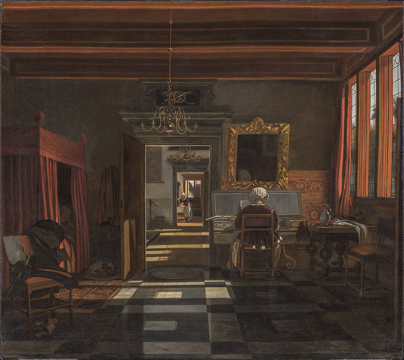
Emanuel de Witte
c. 1660–1667
Oil on canvas, 97.5 x 109.7 cm.
Montreal Museum of Fine Arts, Montreal
The painting is structured around a powerful contrast between light and shadow, made vivid by the long diagonal stripes of sunlight raking across the tiled floor. These bands are crisp and cool in tone, giving the sense of sunlight filtered through leaded glass panes. Their linearity anchors the perspective and draws the viewer deep into the spatial recesses of the room, pulling the gaze toward the light-flooded doorway in the background, where another sunlit figure appears in the far distance. The motif of receding thresholds is characteristic of van Hoogstraten and echoes his interest in trompe-l'œil and staged depth.
What sets this painting apart is the deliberate sacrifice of legibility in favor of light logic. Much of the foreground is swathed in shadow so dense it nearly absorbs the objects within it—the chair, the bed, the corners of the room are subordinated to the drama of the illuminated path. This is the visual price of sunlight: it does not caress form, it strikes it, divides space with ruthless clarity, and reduces volumes to patterns. The room is no longer uniformly available to the eye; it must be discovered in fragments, its parts revealed unequally.
At the same time, van Hoogstraten does not entirely surrender to the flattening effects of full sunlight. The woman at the virginal is partially lit, her form caught at the threshold between light and shadow, still readable as a body with depth and presence. This edge-of-light treatment allows her to retain mass and dignity, while also anchoring the moment in the larger geometry of illumination. Similarly, the distant figure is not simply a vanishing point, but an active participant in the narrative of light—a figure whose position explains the directional source and whose presence punctuates the perspective with human interest.
Like de Hooch, van Hoogstraten here accepts the challenge that direct sunlight poses to the traditional aims of painting—unity, clarity, form—and rises to it not by resisting its effects but by integrating them into a more complex visual logic. Sunlight is no longer a neutral enabler of vision; it is a protagonist. It structures space, directs attention, and introduces a level of abstraction into what is otherwise a deeply descriptive image. This balancing act—between depiction and design, between realism and pattern—is the mark of a painter fully conscious of the limits and possibilities of his medium.
Vermeer, by contrast, never admitted a beam of direct sunlight into his interiors. His light always enters through glass—filtered, scattered, softened. This filtering creates a luminous, even glow that gently reveals form and texture without overwhelming them. It allows him to orchestrate delicate relationships between objects and figures, and to preserve a hushed, timeless atmosphere. In his work, the drama of light is internal: it's not about the sun's force, but about the way light caresses a wall, catches the rim of a glass, or glimmers faintly on a pearl earring.
The difference in approach between De Hooch and Vermeer underscores not only their individual temperaments, but also the extraordinary technical and conceptual demands of working with light. Introducing direct sunlight into a painting is not simply a matter of brightness—it involves careful reckoning with geometry, mood, and visual equilibrium. When done well, as in de Hooch's work, it feels like a triumph over nature's most unyielding force. When avoided, as in Vermeer's interiors, it reflects a different kind of control: an insistence on the meditative quiet that only diffused light can sustain.
Support
In art, the term support refers to the surface on which a painting is created, providing a stable base for the application of paint and other materials. Supports have taken various forms throughout history, including walls for frescoes, wooden panels, canvas, paper, and even copper. Each type of support influences the texture, durability, and appearance of the painting, as well as the techniques and materials that artists use. In medieval and early Renaissance Europe, wooden panels—often made of poplar, oak, or lime—were the standard support for paintings. These panels were meticulously prepared with layers of gesso to create a smooth, absorbent surface for tempera or oil paints. As techniques evolved, canvas became increasingly popular, particularly in Venice, where its flexibility and resistance to humidity made it a practical choice.
In 17th-century Dutch painting, the choice of support was both a practical and aesthetic decision. Dutch artists commonly used oak panels for smaller, detailed works, especially during the early part of the century. Panel painting allowed for fine control of detail and a smooth surface that suited the meticulous style of artists like Gerrit Dou (1613–1675) and other fijnschilders, who often depicted scenes with almost microscopic precision. As the century progressed, however, canvas became the dominant support due to its lighter weight, lower cost, and suitability for larger works. The weave of the canvas could influence the texture of the painting, either subtly visible beneath thin glazes or fully covered with thick impasto.
Even within the context of still-life painting, the choice of support was significant. Artists like Willem Claesz. Heda (1594–1680), known for their monochromatic banquet pieces, often preferred oak panels to achieve the high level of detail required to depict reflective surfaces and the textures of silver, glass, and fruit with convincing realism. In contrast, landscape painters such as Jacob van Ruisdael (c.1629–1682) adopted canvas for its ability to accommodate broader, sweeping compositions without the risk of warping that could affect wooden panels.
Vermeer's paintings were executed primarily on canvas, which he prepared with a gray or ochre ground to influence the luminosity and color harmony of the finished work. The choice of a canvas support allowed him to exploit the interplay of light and surface texture with remarkable subtlety. By applying layers of glaze and employing a smooth, almost enamel-like finish, Vermeer transformed the relatively coarse surface of the canvas into a medium capable of capturing the soft transitions of light and shadow that define his interiors.
Thus, the support was far more than just a passive base for a painting; it was an integral part of the artistic process, influencing everything from the scale of the composition to the technique and visual effect of the work. In the hands of 17th-century Dutch painters, the choice of support became a nuanced decision that contributed significantly to the realism, durability, and emotional impact of their art.
Suspended in Time
Suspended in time describes a pictorial condition in which action seems momentarily halted, as if the flow of events has been gently paused. The scene neither advances nor resolves; instead, it holds the viewer within a narrow interval where attention settles on presence rather than outcome. This effect is not simply stillness. It is the sense that time exists, yet has been temporarily withheld.
Suspended time is achieved through several visual means: stable compositions, limited action, repetition of vertical and horizontal elements, and light that does not dramatize but clarifies. Color relationships remain steady, and nothing in the scene insists on change. Even sound, when implied through music or speech, feels muted or contained.
As a concept, suspended in time points to a particular ambition in painting: to free the image from narrative pressure and allow it to exist as an autonomous moment. The viewer is not asked what will happen next, but invited to remain. In this sense, suspension is not absence of time, but a form of attention in which time momentarily ceases to matter.
The depicted moment feels complete in itself, even if it is brief. Nothing presses forward, and nothing demands resolution. The viewer is invited to dwell. The figures are often absorbed, unaware of being observed, and their actions appear capable of continuing exactly as they are. In such images, time is thinned rather than broken. The painting does not imply a before-and-after sequence with any force; it presents duration without drama.
By contrast, interruption depends on the active presence of time. An interruption is a rupture within an ongoing action. Something has been disturbed, halted, or diverted, and the viewer senses that events would normally continue if not for this break. The image implies a clear before and after, even if only one instant is shown. Interruption therefore heightens narrative awareness: the viewer becomes conscious of what has just happened or what is about to happen. The distinction between suspended in time and interruption is useful because it separates fundamentally different pictorial intentions that are often conflated under the general idea of "frozen moments."
In early painting, time was often structured by narrative. Medieval and Renaissance works typically presented sequential moments—before, during, and after—compressed into a single image. Even when the action was frozen, the viewer understood where the story had come from and where it was heading. The idea of suspension begins to take clearer shape when painters reduce narrative cues and allow the depicted moment to stand on its own, without obvious anticipation or aftermath.
During the Renaissance and Baroque periods, painters became increasingly attentive to the instant just before or just after an event. Artists such as Caravaggio (1571–1610) often selected moments of charged pause: a hand about to move, a gaze about to shift. Time is compressed, but tension remains. The viewer senses imminence rather than calm. Suspension here is brief and unstable.
In seventeenth-century Dutch painting, the idea takes on a quieter, more sustained form. Genre scenes and interiors frequently depict activities that appear ordinary—reading a letter, tuning an instrument, pouring milk—yet are presented without urgency. The figures are absorbed, the gestures economical, and the surrounding space carefully ordered. Nothing presses forward. The moment seems capable of lasting indefinitely.
In practical pictorial terms, interruption is often marked by abrupt gestures, turned heads, open mouths, spilled objects, or unexpected intrusions—a figure entering a room, a curtain drawn aside, a sudden look outward. Attention is redirected. The painting asks, "What caused this?" or "What will follow?" Suspended time asks neither.
The emotional register also differs. Suspension tends toward calm, introspection, or quiet absorption. Even when the subject is serious, the tone remains measured. Interruption introduces tension, surprise, or vulnerability. It exposes a moment of instability, however minor.
Seventeenth-century Dutch painting makes this contrast especially clear. A woman reading a letter in a settled interior can feel suspended in time if her posture is inward, her surroundings stable, and no external force intrudes. The same scene becomes one of interruption if another figure enters, a glance is suddenly lifted toward the viewer, or an object signals disruption. In the first case, time seems to pause; in the second, it is sharply felt.
In short, suspension quiets time, while interruption activates it. One invites lingering attention; the other draws awareness to change. For an art glossary, the distinction is useful because it separates two fundamentally different pictorial intentions that are often conflated under the general idea of "frozen moments."
Vermeer is central to this understanding of suspended time. His interiors often feel detached from chronology. Figures do not act for an audience; they attend to their own thoughts or tasks. Light enters steadily, objects remain undisturbed, and the viewer arrives as a silent witness. There is no visible climax, no narrative demand. Time is present only as duration, felt rather than measured.
Other Dutch painters worked along similar lines, though with different emphases. Pieter de Hooch (1629–1684) structured calm domestic spaces where human movement appears settled into daily rhythm. Gerrit ter Borch (1617–1681) often fixed attention on restrained gestures—hands, glances, the fall of fabric—suggesting social interaction held in careful balance. In each case, time is slowed not through drama but through control.
Symbol / Symbolism
The functioning of symbols in visual art depends on a shared cultural, historical, and contextual framework that allows both artists and viewers to understand their meaning. People learn to "read" symbols through repeated exposure, education, and cultural reinforcement. Symbols operate by association, either through conventional meanings that are socially and historically determined or through more personal, intuitive connections between form and meaning. Religious, mythological, and literary traditions often serve as the foundation for symbolic interpretation, as they provide a system of visual references that have been transmitted across generations.
Artists ensure that their paintings are read not merely as representations of subject matter but also as conveyors of symbolic content through several methods. One of the most fundamental is repetition and convention—certain symbols gain meaning through widespread use, such as the skull representing mortality, the dog symbolizing fidelity, or the laurel wreath signifying victory. Viewers come to recognize these associations because they are reinforced through religious imagery, literature, and even everyday visual culture. Another approach is contextual placement, where an object gains symbolic significance based on its surrounding elements. A book in a still-life may simply suggest reading, but if the book is closed, dusty, or paired with a snuffed-out candle, it may imply forgotten knowledge, transience, or intellectual vanity.
Composition, color, and lighting also guide symbolic interpretation. The arrangement of figures and objects within a painting influences their perceived importance and meaning. Central placement, isolation, or directional gazes can draw attention to a symbol, signaling its importance beyond its immediate function. Similarly, light can be used to elevate an object to a higher, more spiritual status, as seen in the glowing skulls of Dutch vanitas paintings, which serve as meditations on death and the passage of time. The use of gold backgrounds in medieval and early Renaissance art removed figures from earthly space, associating them with the divine.
Dutch artists also create multi-layered meanings by playing with ambiguity and dual readings—a painting may appear to depict a simple domestic scene, but symbolic details embedded within it transform it into a moral or allegorical statement. In 17th-century Dutch painting, a woman pouring milk might (see Vermeer's Milkmaid) at first seem to be a genre scene, yet the presence of certain objects—a foot warmer, an empty jug, or a suggestively open window—could shift the meaning towards a meditation on virtue, temptation, or abundance. The success of these interpretations depends on whether the viewer has access to the visual and intellectual references needed to decode them.
For a painting's symbolic content to be understood, artists often rely on cultural literacy and artistic tradition. Symbols do not exist in isolation; they are part of an evolving visual language that requires a certain level of familiarity to be interpreted correctly. This is why art education, iconographic studies, and an awareness of historical contexts play such an important role in understanding symbolic imagery. A 17th-century viewer, for example, would likely have recognized a lute as an allusion to love, or a candle as a symbol of the fleeting nature of life, without needing explicit explanation. Over time, as cultural contexts shift, some symbols lose their immediate legibility, requiring scholarship to reconstruct their original meanings.
In 17th-century Dutch painting, symbolism played a central role in conveying deeper meanings beyond the surface of a composition. Artists frequently embedded objects, gestures, and settings with symbolic significance, often drawing from religious traditions, emblem books, moral philosophy, and contemporary cultural concerns. These symbols could be explicit, reinforcing widely understood messages, or more subtle, requiring the viewer to engage in interpretation.
One of the most pervasive areas of symbolism was in still life painting, where objects were carefully chosen to evoke themes of transience, morality, and human vanity. The vanitas genre, for example, incorporated skulls, extinguished candles, wilting flowers, and hourglasses to remind viewers of life's brevity and the futility of earthly pleasures. Similarly, luxurious items such as fine fabrics, imported porcelain, and exotic fruit underscored material wealth but also warned of the dangers of indulgence and excess.
In genre painting, everyday scenes often contained moralizing messages hidden within seemingly ordinary activities. A lute or a musical instrument, for instance, frequently symbolized fleeting pleasure or seduction, while an unattended birdcage could imply lost virtue. Artists such as Jan Steen (c.1626–1679) infused their lively domestic interiors with humorous yet cautionary undertones, using drunken revelers, disheveled interiors, or wayward children to hint at the consequences of vice and neglect.
Religious and allegorical symbols were also prevalent, though often more subtly woven into compositions due to the Protestant rejection of overt religious imagery. Vermeer, for instance, frequently placed maps, pearls, or balances in his paintings, each carrying layered meanings tied to knowledge, purity, or divine justice. Likewise, artists such as Pieter de Hooch (1629–1684) used open doors and architectural spaces to suggest themes of domestic virtue and order.
Landscapes and seascapes, too, carried symbolic weight. Stormy skies or crumbling ruins might hint at political instability or the passage of time, while calm waters and orderly villages reinforced ideals of Dutch prosperity and divine favor.
Symmetry
Symmetry in art, characterized by balanced and mirrored arrangements of forms around a central axis, first appeared in some of the earliest known human-made objects and architecture. Ancient cultures such as Mesopotamia and Egypt (c. 3000 BC) were among the first to employ symmetry systematically, using it in temple designs, sculptures, and reliefs to convey order, stability, and divine authority. Egyptian art, in particular, was dominated by symmetrical compositions, reflecting a belief in cosmic balance and the eternal nature of the pharaoh's power. This approach extended to everything from the layout of temples and pyramids to the arrangement of figures in tomb paintings, where symmetry emphasized clarity and the immutable order of the universe.
The Greeks also embraced symmetry but introduced a more dynamic balance by using contrapposto in sculpture and harmonic proportions in architecture, aiming to reflect both naturalism and ideal beauty. In contrast, the Romans maintained a strong preference for symmetry in their public architecture, mosaics, and frescoes, reinforcing the power and order of the state.
The first significant move away from symmetry occurred in early Christian and Byzantine art, where the focus shifted to conveying spiritual truths rather than earthly order. While church architecture often retained symmetrical layouts, iconography and mosaics began to employ asymmetrical arrangements to emphasize hierarchical relationships and the transcendence of the divine. This trend accelerated during the Gothic period (c. 12th–15th centuries), particularly in manuscript illumination and altar panels, where asymmetry was used to create a sense of movement and narrative dynamism.
However, it was during the Renaissance that artists began to consciously abandon strict symmetry in favor of dynamic balance and pyramidal compositions. Figures like Leonardo da Vinci and Raphael employed asymmetrical arrangements to create a more naturalistic and engaging sense of space, using balance rather than mirror-like symmetry to guide the viewer's eye. The Baroque period further embraced asymmetry, emphasizing dramatic contrasts, movement, and diagonals to heighten emotional impact and complexity, as seen in the works of Caravaggio (1571–1610) and Peter Paul Rubens (1577–1640).
The very roots of the theory of symmetry (in Greece) are inseparably linked to the establishment of the aesthetic principles—the canons and theory of proportions. The links between the theory of symmetry and aesthetics
In the context of 17th-century Dutch painting, symmetry was frequently employed in interior scenes to organize space and to suggest moral or social equilibrium. Yet it was rarely rigid, as most artists prioritized the lived quality of the scene over geometrical perfection. Vermeer generally avoided overt symmetry as a method to balance his compositions, although he made frequent use of symmetrical structures in his paintings, especially in the framing of his figures within rooms or against walls (e.g., Woman in Blue Reading a Letter ). However, in Lady Standing at the Virginals, symmetry becomes an overt and defining principle. The composition is anchored by the standing figure, placed precisely at the vertical center of the canvas, flanked by equally weighted visual elements. Lawrence Gowing observed that in this work, "space around the Lady Standing at the Virginals is bound to her and to its frame more exactly than ever... We cannot think that this world extends behind the frame; it is complete and utterly enclosed." Gowing saw in this not just compositional balance but a metaphysical containment: the room becomes a sealed cube, and the painting a world unto itself. The raised lid of the virginals, offering a painted view within the painting, reinforces this enclosure by reflecting a prospect we do not see directly, further emphasizing the centrality and finality of the figure's placement.
Few of Vermeer's works follow this logic so completely. More often, he disrupted symmetry with subtle tilts of the body, irregular lighting, or displaced objects, inviting the viewer into a space that feels lived-in rather than diagrammed. But in Lady Standing at the Virginals, the symmetrical structure seems to echo the self-contained silence and reflective poise that characterize much of Vermeer's art—here rendered with unusual purity.
Tableau Vivant
Tableau vivant, which translates from French as "living picture," refers to a staged arrangement of figures, often in a theatrical or painterly manner, where live models are posed to resemble a painting, sculpture, or historical scene.
Tableau vivant was particularly popular in the 18th and 19th centuries as a form of parlor entertainment, but the concept has deeper roots in art history. Many history painters, especially those working in the Baroque and Neoclassical periods, composed their paintings as if they were carefully arranged theatrical scenes, with figures posed in a frozen moment of dramatic action or narrative clarity. This approach aligns with the idea of a painting as a staged, carefully choreographed event, much like a tableau vivant in performance.
In Dutch 17th-century painting, the influence of tableau composition is evident in history painting and certain genre scenes, where artists structured their compositions with a strong sense of dramatic staging. In the intimate domestic interiors of artists such as Gerard ter Borch (1617–1681) and Vermeer the artists created moments that carry a sense of deliberate composition, as though the figures had been carefully arranged in a still moment of narrative significance.
Tacking Edge
In painting, especially when referring to canvas paintings, the tacking edge is the outer edge of the canvas where it wraps around the stretcher bars and is secured, typically with tacks or staples. This edge holds the canvas tight and flat, ensuring a smooth surface for the artist to work on.
When a canvas painting is framed, the tacking edge is usually hidden from view. However, when conservators or art historians examine a painting, they often look at the tacking edge for clues about the work's history, any potential alterations, or to gather information about the materials and techniques used by the artist.
Vermeer’s paintings are particularly informative in regards to tacking edges, as more than half of them retain their original tacking edges—a rare circumstance for works of this period.
The Lacemaker is now slightly wider than it would have been when first stretched, since both left and right tacking edges have been unfolded and incorporated into the painting. Although the original tacking edges have been removed from the upper and lower edges, it is possible to calculate the initial height based on the distance (2 cm.) between the left and right fold edges and the strainer bar marks. Assuming the strainer bars to have been of the same width, the canvas of the Lacemaker would have measured 24.5 by 19.25 cm.
The original tacking edges of the The Little Street are present and marks from the original strainer bars are 3. 5 cm. from the edge on all sides. The original tacking edges of the Woman Holding a Balance remain intact. The top edge is broader than the others and seems to have been folded over. Marks from the initial strainer bars can be seen along the top and right sides. Remnants of the original tacking edges of A Lady Writing remain, and the canvas is glue-lined. Only fragments of the original tacking edges of the Girl with a Pearl Earring remain. Not only, in The Guitar Player, the painting is still on its original strainer and shows wooden pins rather than metal tacks securing the canvas, a detail that confirms it has never been restretched or altered. The presence or absence of tacking edges also affects how scholars interpret strainer marks and cusping (the scalloped impressions caused by stretching), which can reveal how the canvas was initially mounted.
It is intriguing that Vermeer's inventory lacks frames for stretching canvas, a common feature in many 17th-century studios. Contemporary illustrations of artists' studios depict them working on canvases either set in larger frames, often referred to as the Dutch method, or tacked onto strainers. In most of Vermeer's examined paintings the paint layer doesn't extend over the tacking edges. This suggests that Vermeer preferred to stretch his canvas onto its strainer before beginning to paint. This observation is further supported by his probate inventory, which lists ten canvases and six panels prepped and ready for painting.
Tafelet
The word tafelet in Dutch, equivalent to the Italian tavoletta or tavoletta per scrivere, refers to a small, portable writing or drawing tablet that could be reused by erasing its surface. Typically made from wood or stiff parchment coated with a dark, waxy or specially treated surface, these tablets served as erasable supports for writing, sketching, or calculating. A stylus or other pointed tool was used to make marks, which could later be rubbed out with a cloth or sponge. The use of such tablets stretches back to antiquity and persisted well into the early modern period, valued for their practicality and reusability in an age before paper was cheap and widely available.
In early modern Europe, tafeletten were commonly used by merchants, scholars, students, and artists. In some cases, they were bound into booklets, forming small portable codices with multiple erasable pages. These could be carried around, used for notes or lists, and then wiped clean for reuse. The use of such objects reflects both the resourcefulness of the time and the evolving relationship between thought and notation—an intermediary step between memory, manuscript, and finalized writing or drawing.
In 17th-century Dutch culture, the tafelet had multiple functions, and its meaning could extend beyond the physical object. In artists' workshops, a tafelet might serve as a tool for sketching out compositional ideas, recording measurements, or noting pigment recipes. It was a practical instrument of daily work, rather than a finished object to be preserved. The existence of such tools suggests that many stages of artistic planning have been lost to time—not only because preliminary drawings were discarded, but because some may never have been committed to permanent materials in the first place.
Genre paintings occasionally depict such tablets in use, often in educational or domestic settings. In the work of Caspar Netscher (1639–1684) and other painters of intimate interiors, children can sometimes be seen writing or drawing at desks, perhaps with wax tablets or similar erasable surfaces. These scenes not only reflect the objects of everyday literacy but also the role of repetition and correction in learning, where erasability was a practical necessity.
Although no direct evidence ties Vermeer to the use of tafeletten, the logic of his working process—with its attention to geometry, spatial relationships, and careful compositional placement—suggests that temporary planning tools like these may well have formed part of his studio practice. The absence of preparatory drawings for his works supports the idea that not all early stages of invention were carried out on durable supports.
In the broader sense, the tafelet stands as a reminder of the impermanent steps behind permanent works. It is a humble object, but one that speaks to the continuous effort to think through the hand, to test and revise, and to prepare the surface of thought before it took lasting form.
Talent
In art, the term talent refers to an individual's natural ability or aptitude for creative expression, particularly in drawing, painting, sculpture, and other visual arts. Unlike skill, which is acquired through study and practice, talent is often regarded as an inherent capacity—an intuitive grasp of form, color, composition, or technique that allows an artist to produce remarkable work with apparent ease. While talent alone does not guarantee mastery, it provides a strong foundation upon which training and experience can build.
Psychologically, talent is sometimes associated with an individual's capacity for visual thinking, creativity, and problem-solving. Some artists demonstrate an intuitive sense of proportion, composition, and color harmony from an early age, while others develop these abilities through practice. Studies in art pedagogy suggest that talent is often a combination of genetic predisposition, early exposure to artistic stimuli, and sustained practice. Even self-taught artists, often cited as examples of pure talent, typically undergo extensive personal exploration and refinement of their techniques.
The perception of talent in art has evolved with contemporary attitudes toward creativity. While the Romantic era celebrated the notion of the artistic genius, modern and postmodern art movements have challenged the idea that talent is a prerequisite for artistic innovation. Marcel Duchamp (1887–1968) and conceptual artists of the 20th century questioned the emphasis on technical skill, shifting focus toward ideas, process, and meaning rather than traditional craftsmanship. Nevertheless, in representational and classical art, talent continues to be highly valued, especially in fields such as portraiture, illustration, and sculpture.
Historically, artistic talent was viewed as a divine or innate gift. In the Renaissance, artists such as Leonardo da Vinci (1452–1519) and Michelangelo (1475–1564) were praised for their exceptional talent, often described as a God-given ability that set them apart from ordinary craftsmen. This idea continued into the 17th century, when artistic academies institutionalized the study of art, but talent remained a distinguishing factor between mere artisans and true masters. Peter Paul Rubens (1577–1640), for example, was celebrated not only for his technical mastery but also for his innate ability to capture dynamic movement and dramatic expression.
Despite its historical emphasis on innate ability, talent in art is rarely sufficient on its own. Throughout history, even the most gifted painters and sculptors underwent extensive training. In the workshop system of the Renaissance and Baroque periods, apprentices honed their skills under established masters, learning anatomy, perspective, and the handling of materials. In the Dutch Golden Age, artists such as Rembrandt (1606–1669) and Vermeer refined their talent through years of study and observation, demonstrating that talent must be cultivated through disciplined effort.
In modern times, talent is often viewed as an initial advantage rather than a determinant of success. Many artists who lack an early display of natural talent develop their abilities through dedication, discipline, and persistence. The rise of formal art education, particularly in the 19th and 20th centuries, emphasized that artistic excellence could be achieved through structured learning. Schools such as the École des Beaux-Arts in Paris and the Bauhaus in Germany trained artists in both traditional and innovative approaches, proving that talent, while valuable, is neither the only nor the most essential ingredient in artistic achievement.
Ultimately, talent remains an important but often misunderstood aspect of artistic development. While it can provide an initial advantage, its full realization depends on dedication, discipline, and continuous learning. Many great artists, regardless of their natural aptitude, have attributed their success not to talent alone but to relentless work and refinement. As Édouard Manet (1832–1883) once observed, "There are no lines in nature, only areas of color, one against another," a statement that suggests that artistic mastery is as much about seeing and understanding as it is about any innate gift.
Tapestry
Tapestry is a form of textile art, traditionally woven on a vertical loom. Tapestry is weft-faced weaving, in which all the warp threads are hidden in the completed work, unlike cloth weaving where both the warp and the weft threads may be visible. In tapestry weaving, weft yarns are typically discontinuous; the artisan interlaces each colored weft back and forth in its own small pattern area. It is a plain weft-faced weave having weft threads of different colors worked over portions of the warp to form the design. Most weavers use a natural warp thread, such as linen or cotton. The weft threads are usually wool or cotton, but may include silk, gold, silver, or other alternatives.
The success of decorative tapestry can be partially explained by its portability. Kings and noblemen could roll up and transport tapestries from one residence to another. In churches, they were displayed on special occasions. Tapestries were also draped on the walls of castles for insulation during winter, as well as for decorative display. In the Middle Ages and Renaissance, a rich tapestry panel woven with symbolic emblems, mottoes, or coats of arms called a baldachin, canopy of state or cloth of state was hung behind and over a throne as a symbol of authority. The seat under such a canopy of state would normally be raised on a dais.
By the 16th century, the Flemish towns of Oudenaarde, Brussels, Geraardsbergen and Enghien had become the centers of European tapestry production. In the 17th century, Flemish tapestries were arguably the most important productions, with many specimens of this era still extant, demonstrating the intricate detail of pattern and color embodied in painterly compositions, often of monumental scale.
Although some interesting tapestries were produced in Holland in the second half of the 16th century, it was the migration north caused by the religious wars that enabled Delft to become a center of international importance. François Spiering (c. 1550–1620), a weaver operating from Brussels and Antwerp, fleeing religious persecution was given premises in 1592 in the St. Agnes Convent in Delft. From the late 1580's until his retirement in 1620, he produced the greatest tapestries in Europe. His patrons were mostly protestant rulers and aristocrats.
There are various examples of richly designed tapestries in Vermeer's paintings, some of which, erroneously, have been described as carpets. In most cases the tapestries are hung from an unseen rod and serve as a repoussoir devise which serves to heighten the illusion of three-dimensional space by placing a large figure or object in the immediate right-hand foreground. None of tapestries have been identified with surviving own tapestries but experts of the field believe that they were most likely woven in Vermeer's native Delft.
Intricately woven tapestries appear in the large-scale The Art of Painting and, Allegory of Faith, The Love Letter and A Lady Seated at a Virginal. In Allegory of Faith the tapestry resembles examples of the Oudenaarde style made in Belgium in the second half of the 16th century. All Oudenaarde tapestries were made by hand with sometimes up to five weavers sitting next to each other on a horizontal loom (as opposed to the French vertical loom). During the work, only a part of the tapestry was visible to the weavers who based their weaving on a cartoon copy of the design. Only when the tapestry was finished, the result could be admired in its fullness. It took a long time to weave a complete tapestry. An average weaver was able to produce a piece of tapestry as big as a grown man's hand in a day. In the beginning, only a limited number of colors were used, mainly shades of green, hence the typical name Verdures, (French for "greenery").
The somewhat analogous floral patterns of the two heavily rucked-up pieces of fabric in The Geographer and The Astronomer suggest that they too are woven tapestries rather than imported Oriental carpets. Parts of what appear to be woven tapestries also appear in The Lacemaker. Since tapestries are labor-intensive objects they would most likely would have been quite expensive, out of reach of Vermeer's means. The absence of any tapestries among the movable objects listed in the inventory of Vermeer's living quarters suggests that they were lent by his eventual clients or supporters.
Taste
In art, taste refers to the ability to discern and appreciate aesthetic qualities, encompassing both personal preferences and culturally shaped judgments about beauty, style, and artistic value. Taste is not merely an instinctive reaction but a complex interaction of education, experience, cultural background, and historical context, shaping how individuals and societies evaluate art. While taste is often considered subjective, it has historically been influenced by artistic canons, philosophical discourse, and shifting social ideals.
The word taste originally referred specifically to the physical sense—gustation—the ability to perceive flavor through the tongue and palate. This sensory experience, especially in antiquity and the early modern period, was considered one of the most immediate and personal forms of judgment: instinctive, involuntary, and rooted in the body. Over time, taste was metaphorically extended to describe aesthetic and moral judgment, especially in Western philosophical traditions. The idea was that just as the tongue could discern sweetness or bitterness, the mind or spirit could "discern" what was beautiful, harmonious, or appropriate.
This metaphor became especially prominent in the 17th and 18th centuries. Philosophers such as the Earl of Shaftesbury, David Hume, and Immanuel Kant developed theories of aesthetic taste that treated it as a kind of inner sense—subtle, refined, and shaped by education and culture, but still fundamentally rooted in perception and feeling. The word taste retained its original bodily association even as it moved into intellectual discourse, giving aesthetic judgment an aura of naturalness and immediacy. So while modern usage rarely confuses aesthetic taste with physical taste, the metaphor persists because it captures that blend of instinct, pleasure, and personal reaction that underlies both eating and judging beauty.
Today, taste is commonly understood as a person's individual preference or judgment about what is beautiful, stylish, or appropriate, especially in matters of art, fashion, food, music, or home décor. Among the general public, it tends to imply a mix of personal inclination and cultural influence rather than formal knowledge or expertise. Someone might be said to "have good taste" if their choices align with what is widely admired or considered refined, though this is often subjective and varies across social and cultural groups. In everyday use, taste no longer necessarily refers to a deeply cultivated aesthetic sensibility but often reflects familiarity, social aspiration, lifestyle, or simply what one finds appealing or comfortable.
The concept of taste became particularly significant in the 17th and 18th centuries, when art critics and aesthetics emerged as formal disciplines. Thinkers such as Jean-Baptiste Du Bos (1670–1742) and Edmund Burke (1729–1797) explored the emotional and intellectual responses to art, suggesting that taste could be refined through education and exposure to great works. Immanuel Kant (1724–1804) argued that true aesthetic judgment arises from a universal sense of beauty, distinct from personal preference or mere enjoyment. For Kant, taste was based on the ability to appreciate beauty disinterestedly, meaning without bias or practical considerations.
During the same period, aristocratic circles and academies played a key role in defining good taste, particularly in painting, sculpture, and architecture. The French Royal Academy of Painting and Sculpture, for instance, established hierarchies of artistic genres, with history painting considered the highest form of artistic achievement, followed by portraiture, genre painting, landscape, and still life. This institutionalized view of taste shaped artistic production for centuries, as artists were expected to adhere to Classical ideals and academic principles.
Taste, however, is far from static. The Romantic movement of the late 18th and early 19th centuries rebelled against academic standards, valuing emotional intensity, individuality, and the sublime over rigid artistic conventions. Artists such as Eugène Delacroix (1798–1863) and J.M.W. Turner (1775–1851) pushed the boundaries of accepted taste, challenging audiences to reconsider what was considered beautiful or worthy of admiration. Similarly, the Impressionists, once dismissed as crude and unfinished, transformed artistic taste by introducing new ways of seeing and painting light, color, and movement.
The 20th century saw an even more radical shift, as modernist and avant-garde movements dismantled traditional notions of taste. Marcel Duchamp (1887–1968), with his readymades such as Fountain (1917), questioned whether artistic value was inherent or socially constructed. The Surrealists, Abstract Expressionists, and later Conceptual artists further blurred the lines between high and low culture, redefining taste as something fluid and often provocative. Today, artistic taste is shaped by a vast array of influences, including personal experience, education, digital media, and globalization, making it more diverse and subjective than ever.
Despite these changes, the idea of refined taste persists, often tied to cultural capital and exposure to a broad spectrum of artistic traditions. Art collectors, curators, and critics still play a role in shaping taste, though contemporary art challenges the notion that there is a single standard of artistic excellence. The interplay between personal preference and historically constructed ideals remains central to discussions of taste, ensuring that it continues to evolve alongside art itself.
Tavern Scene
In 17th-century Flanders, paintings of peasant scenes began to take on a new character, emphasizing carousing, drinking and smoking. The central action of this painting is a variation on the theme of cardsharks made popular by Caravaggio (1571–1610). Josse van Craesbeeck's Card Players also shows the influence of his friend and teacher Adriaen Brouwer (c. 1605–1638), who also painted sordid tavern scenes.
Some of the most common tavern scenes show the dark confines of a spacious tavern with country folk who have gathered to pass the evening hours warming themselves by the fire, playing cards or backgammon, or just kibitzing while enjoying the soothing effects of tobacco and beer. One senses that such scenes are a recurring rituals, in which residents from the local community play out familiar roles throughout the year. Much of the appeal of these small paintings comes from the sense of atmosphere that helps unify the composition. One can imagine the quiet din of conversation within the dark recesses of this smoke-filled space. Light from various sources—the fire, the candle attached to the hearth, and the hidden candles on the tables—gives a warmth to the scene that is reinforced by the attitudes and expressions of the figures themselves.
With the presence of beer, tobacco, playing cards, and a backgammon game, other scenes show men and women who have succumbed to vices so often associated with those who have yielded to sensual pleasures: here, someone passed out, there, someone vomiting or threatening a fellow man.
A few painters like Brouwer and Jan Steen (c. 1626–1679), a painter and himself briefly a brewer, were thought to portray the sordid tavern scene as pictures of their own life. Perhaps, the earliest drunkard painter of legend is Frans Hals (1582/83–1666). The image of Hals as an alcoholic and wife-beater was established by Arnold Houbraken's(1660–1719) colorful biography in Groot Schilderboek (1718-1721). Houbraken claims that Hals was "filled to the gills every evenin'," and that when Anthony van Dyck (1599–1641) came to meet him in Haarlem he was not at home, and "it took a long time to scour the taverns for him." Despite the fact that these raccounts may be only in part true the reputations of the artist had been fixed.
Early biographers describe how Brouwer and his artist friends spent considerable time partying in the local taverns, often joined there by fellow artists. Brouwer painted a tavern scene called The Smokers, which included a self-portrait together with portraits of Jan Cossiers (1600–1671), Jan Lievens (1607–1674), Joos van Craesbeeck (c. 1605/06– c. 1660) and Jan Davidsz. de Heem (1606–1684) The company of friends is shown sitting around a table and smoking. Brouwer is the figure in the middle who is turned around to face the viewer. This type of group portrait doubled as a representation of one of the Five Senses (in this case the sense of taste). Despite his reported dissolute lifestyle and his preference for low-life subjects, Brouwer was highly respected by his colleagues as evidenced by the fact that Rubens (1577–1640) owned 17 works by Brouwer at the time of his death, of which at least one had been acquired before Rubens got to know Brouwer personally. Rembrandt (1606–1669) also had paintings by Brouwer in his collection.
The art historian Seymour Slive opined, "'the fallacious idea that an artist who depicted merry drinkers must needs have been a tosspot himself dies hard." In fact, recent scholarship has shown the myth of the drunkard painters of the Dutch Golden Age not always true to form, but a product of an erred identification of artists with their subject matter, and a misunderstanding of just how respectable and dignified brewers were as civic figures.
Technique / Painting Technique
Technique, a French word, is defined as a procedure that is used to accomplish a specific task in any profession or trade, but it is also a factor in many things that we all do in life such as cooking or washing a car. The French derived the word from ancient Greek word technikos, which meant "to be skillful" as pertaining, however, only to the artistic endeavor. The concept of technique in the art of painting has taken on various shades of meaning. Technique may be said to encompass the processes, or methods, which are necessary to create a painting. A painting technique may also refer to a specific medium (e.g., oil painting, watercolor painting, fresco or tempera) and everything relevant to its technical implementation. Although in the strictest sense technique is a means rather than an end, the construction of a picture can never really be separated from its aesthetic content because the two are intimately bound. When a technique is applied it gives rise to aspects of style which in turn will often suggest modifications in technique.
Style, instead, may be said to be the sum of aesthetic peculiarities which characterize a recognizable manner. Style is often divided into the general style of a period, country or cultural group, group of artists or art movement, as well as the individual or signature style of an artist. Style, then, can be thought to be a particular appearance brought on by technique. It is often said that technique is something that can be taught, while style is personal. The notion of style has long been the art historian's principal mode of classifying works of art, while technique has received proportionally less attention.
In the case of the Great Masters, we should always remember that we are dealing with a preconceived, thought-out pictorial project, in which every phase of a painting is executed according to a schedule. The rationale behind this system is that, unlike today, the problems of drawing, composition, form and color were addressed separately. Far from stifling inspiration, this step-by-step system allowed the most talented painters to program works of exceptional artistic level, sometimes of vast dimensions, and the lesser talented painters to fashion dignified, well crafted paintings, many of which appear as if they were made only yesterday. As the art historian Ernst van de Wetering pointed out, the work of art of a great master may be likened to a game of chess in which many moves have to be considered in advance. A remarkable combination of calculation and creativity is required if the final outcome is to be a success. No doubt, Vermeer was one of the most remarkable chess players of all.
Vermeer's painting technique is complex when compared to that of modern realists, but relatively simple with respect to that of the most competitive Dutch painters. From what historical and scientific investigations have yielded, Vermeer's materials and methods, including his canvas, paints, drying oils and multi-stage paint layering, are largely analogous to those of those contemporaries who worked within the same thematic area and fine painting style. Comprehending Vermeer's style is more problematic, and has given rise to a small mountain of intepretative literature.
Tempera
Tempera is a method of painting in which the pigments are mixed with an emulsion of water and egg yolks or whole eggs (sometimes glue or milk). Tempera was widely used in Italian art in the 14th and 15th centuries, both for panel painting and fresco, then being replaced by oil paint. Tempera colors are bright and translucent, although because the paint dried very quickly there is little time to modeling.
Tenebrism
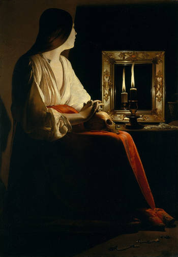
Georges de La Tour
c. 1640
Oil on canvas, 133.4 x 102.2 cm
The Metropolitan Museum of Art, New York
Tenebrism is a painting technique characterized by the use of stark contrasts between light and dark, creating a dramatic effect that emphasizes certain parts of the composition while leaving others in deep shadow. The term derives from the Italian tenebroso, meaning "dark" or "gloomy," and refers specifically to compositions where darkness dominates most of the scene, with figures or objects illuminated by a focused light source. Unlike chiaroscuro, which subtly models light and shadow to convey volume and form, tenebrism employs abrupt transitions between brightly lit and completely dark areas to heighten emotional impact and direct the viewer's attention. This technique was popularized by Caravaggio (1571–1610), whose intense and theatrical use of light influenced a generation of European painters.
Chiaroscuro and tenebrism are often confused because both involve the use of light and shadow, but they serve different purposes: chiaroscuro creates form through gradual tonal modeling, while tenebrism emphasizes exceptionally stark contrasts and dramatic illumination for expressive effect. The latter emerged more forcefully with artists like Caravaggio, whereas chiaroscuro has deeper roots in Renaissance naturalism.
Furthermore, a key distinction between tenebrist and more naturalistic uses of shadow lies in their treatment of color. In tenebrism, shadows are often rendered in dense, neutral browns or near-blacks that suppress the intrinsic, or local, color of the objects they cover. These shadows serve a theatrical function: they heighten contrast, direct the viewer's attention to brightly lit forms, and create a sense of immediacy and drama. The cost, however, is that the subtle coloration of objects in shadow is largely sacrificed to the overall tonal effect. In the work of Caravaggio and his followers, this obliteration of color within dark passages reinforces the psychological and narrative intensity of the scene.
By contrast, Vermeer approached shadow with greater optical sensitivity. Even in his darkest passages, the local color of objects remains visible—at time muted, but always perceptible. A shadowed blue curtain retains its coolness, a red or blue garment deepens in tone but does not turn brown or gray. This reflects not only Vermeer’s interest in the subtleties of natural light but also an empirical approach to vision: he paints what the eye actually perceives, rather than stylizing shadow for effect. His method suggests an awareness of how light diffuses across surfaces and how color behaves under diminished illumination. The result is a shadow that models form while preserving chromatic integrity, giving his paintings a luminosity and unity that sharply contrasts with the stark tonal schemes of tenebrist art.
In the context of 17th-century Dutch painting, tenebrism was notably embraced by the Utrecht Caravaggists, a group of artists who had traveled to Rome and were profoundly influenced by Caravaggio's works. Painters like Hendrick ter Brugghen (1588–1629), Gerrit van Honthorst (1592–1656), and Dirck van Baburen (c. 1595–1624) adopted and adapted tenebrism to suit Northern tastes, combining it with the meticulous detail and domestic themes that appealed to Dutch patrons. Their works often depicted religious or genre scenes with half-length figures dramatically lit against dark backgrounds, using tenebrism to convey a sense of immediacy and psychological depth. In this way, tenebrism contributed to the broader development of light manipulation in Dutch painting, bridging the intense contrasts of Italian Baroque with the naturalism that defined the Dutch Golden Age.
Although Vermeer's use of chiaroscural values is sometimes strongly contrasted, he never employed true tenebrist contrast. However, he was very much aware of the technique through the Utrecht Caravaggist paintings that appear in the background of a seedy bordello picture-within-a-picture in two of his compositions, The Concert and A Lady Seated at a Virginal, presumably works by Dirck van Baburen (c. 1595–1624). However, in order not to monopolize the viewer's attention, Vermeer diminished the contrast and color achieving a flatter effect, so that the picture-within-a-picture remained a stationary in the backdrop of the pictures space.
Text
A great part of European painting had drawn its subject from literary sources such as the Bible, mythology and Classical texts. These subjects were considered those most adapted to achieve the highest goal of art: that of elevating the humans spirit. In the 17th century, Dutch painters began to exploit the pictorial possibilities of direct observation of the natural world. And the new subject matters of landscape, still life and genre, which once had been predominantly existed only as descriptive elements in history, became separated into distinct categories.
However, the remembrance of the world of classical painting which the Dutch seemed had done away with in the span of less than 50 years, was not easily forgotten and perhaps exerted itself once again under the form of allegory in genre painting. Dutch genre painting did not represent a text but rather a situation, it was through the introductions of recognizable symbols these situations could reversed into a moral example. Emblems too were used for the same purpose.
In the past decades, attempts to interpret 17th-century Dutch genre painting, and that of Vermeer as well, through association with contemporary texts such as emblematic literature have flourished. Although much has been learned, no general agreement has been reached on how Vermeer employed emblems in his own paintings, and critical investigation of the meanings of Vermeer's paintings has gradually turned elsewhere. For example, Mariët Westermann has written recently that "the pictorial and literary sources for Vermeer's interior paintings show the limited usefulness of hunting for textual or artistic precedents. What makes Vermeer's rare but powerful contributions to the history of interior painting interesting is the way in which they articulate thought in pictorial terms. Philosophers might say that Vermeer was a strongly eidetic painter (from the Greek eidos, mental image, visual thought) in that his way of conceiving his paintings and their mode of communication was distinctly visual rather than literary in origin."Mariët Westermann, "Vermeer and the Interior Imagination," in exh. cat. Vermeer and the Dutch Interior, ed. Alejandro Vergara (Madrid: Museo Nacional de Prado, 2003), 233.
Textiles
In general terms, textiles have long held a dual role in the visual arts: they serve both as subjects in their own right and as key compositional devices. Textiles, whether in the form of garments, drapery, upholstery, or decorative hangings, bring a material richness to paintings, offering artists opportunities to explore texture, color, and form. Historically, depictions of textiles allowed painters to demonstrate technical skill by rendering the different weights, folds, sheens, and patterns of fabrics. At the same time, textiles often carried symbolic meaning: luxurious fabrics could indicate wealth, status, or sacred significance, while humble, worn cloth might suggest modesty or labor. From medieval religious panels to Renaissance portraiture, textiles were frequently used to enrich the narrative, create rhythmic movement across the surface, or introduce vivid colors into otherwise muted scenes. In many traditions, they also served to unify disparate parts of a composition, leading the viewer's eye through the painting.
Jan van Eyck
1434–1436
Oil on wood, 122 × 157 cm.
Groeningemuseum, Bruges
In 17th-century Dutch culture and painting, textiles played an essential and sometimes overlooked role both as subject matter and as a powerful aesthetic tool. The Dutch Republic's wealth, derived from trade and global commerce, allowed a growing middle class to afford fine fabrics from across Europe and beyond, such as silk from Italy, velvet from Spain, and cotton from India. These textiles appeared not only in still life paintings but also in portraits, genre scenes, and domestic interiors, reflecting both the economic success and the personal tastes of the sitters. Artists took full advantage of textiles' visual possibilities. In portraits by Michiel van Mierevelt (1566–1641) or Thomas de Keyser (c.1596–1667), richly textured garments, elaborate lace collars, and gleaming satin sleeves often dominate the surface, signaling the wealth and refinement of the subject.
Within genre painting, textiles allowed artists to introduce bright colors and patterns into everyday scenes without disrupting the overall sense of realism. Vermeer often included vibrant touches of blue, yellow, and red through garments, tablecloths, or curtains, balancing these colors carefully against the neutral tones of walls and floors. Gabriel Metsu (1629–1667) used sumptuous drapery and clothing to add flashes of brightness and opulence to his scenes of bourgeois life, creating moments of heightened visual interest. In Pieter de Hooch's (1629–c.1684) courtyard and interior views, patterned floor tiles, hanging curtains, and domestic garments offer visual rhythms and color accents that animate otherwise quiet, orderly spaces.
In still life painting, textiles often serve as platforms for displaying luxury goods—silverware, porcelain, fruit, and flowers—while their folds and textures introduce movement and depth into the composition. Willem Kalf (1619–1693) frequently used heavy oriental carpets, their deep reds and intricate patterns providing a rich contrast to the luminous surfaces of glass and metal objects.
Thus, textiles in 17th-century Dutch painting were not merely decorative. They played a critical compositional and symbolic role, allowing artists to introduce bright color, refine texture, convey social status, and create harmonious yet lively surfaces that invite prolonged and attentive looking.
Texture
In painting, the term texture may be used in relation to both the surface quality of a painting itself or the perceived surface qualities of the objects represented in it. The use of texture, along with other elements of design, can convey a variety of messages and emotions. Texture stimulates two different senses; sight and touch.
Physical texture, also known as actual texture or tactile texture, is the actual variation upon a surface of the painting. Actual texture differentiates itself from visual texture by having a physical quality that can be felt by touch. Rough surfaces can be visually active, whilst smooth surfaces can be visually restful. The use of actual texture can give a sense of character and presence that is not present in the same work had it no actual texture. It can be utilized to create emphasis, rhythm and contrast. Actual texture is associated both with the heavy build up of paint, called impasto, the fluid transparency of glazes, the rough surface of a canvas of the enamel like surface of a glass pane, or the addition of materials.
Visual texture, on the other hand, is an illusion of texture created through painting techniques, without an actual change in the surface. It relies on precise rendering of light, shadow, and detail to suggest different materials, such as the softness of fur, the roughness of wood, or the shimmer of silk. Vermeer's paintings are a prime example of visual texture mastery—his depiction of textiles, pearls, and reflections gives the illusion of texture without thick paintef='#' class='internal-link' data-nodeid='gl-paintapplication'>paint application. The fine control of transitions between colors and values creates an almost photographic quality, making the viewer believe in the presence of different surfaces, even though the actual canvas remains smooth.
Dutch painters were keenly aware of both kinds of texture and realized that the two could be associated in the pursuit of mimetic painting. Painters like Gerrit ter Borch (1617–1681) and Gerrit Dou (1613–1675) were especially skilled at rendering the visual textures and surfaces of objects like those found in the foreground of their paintings: the roughly hewn stool, the wooden basin filled with water, the chipped ceramic crock, and the shiny metal hinges of the buckets. Rembrandt van Rijn (1606–1669) often used impasto to create a sculptural effect, particularly in depicting light on skin or fabric, adding a sense of depth and realism through physical relief. Conversely, painters who worked in a fijnschilder manner, like Gerrit Dou, minimized physical texture by using extremely fine brushwork and smooth layers of glaze, resulting in a polished, nearly invisible surface.
The first history paintings and genre interiors of Vermeer present relatively highly textured surfaces, in accordance with pictorial conventions of the time. That is, the strongly illuminate parts of objects were worked up with heavy, clearly visible impasto while their shadowed areas were rendered with more fluid, transparent paint. This technique creates a material tactile sensation that is physically engaging for the spectator. The works of the 1660s, instead, the surface is built up with smooth layers of paint, impasto passages are minimized. The even sheen of the works lend the image represented a sense of illusive distance, a reality which can be seen but not touched. In the latest works, which present an almost enamel-like surface, paint build up is almost completely lost.
Theme
A theme in works of art refers to the underlying subject, concept, or message that the artist seeks to convey through their work. Themes can range from broad and universal ideas—such as love, mortality, power, and faith—to more specific and culturally grounded topics like domestic life, political conflict, or the relationship between humans and nature. A theme acts as the interpretive framework that gives coherence and depth to an artwork, guiding both the artist's choices in composition, color, and form and the viewer's understanding and emotional response. By exploring themes, artists invite viewers to reflect on particular aspects of the human experience, often infusing their works with layers of symbolism, allegory, and moral or philosophical implications.
The difference between theme, meaning, and subject matter in art discourse lies in their levels of abstraction and focus. While they are interconnected, each term addresses a distinct aspect of how an artwork communicates with its audience.
Subject matter refers to what is depicted in the artwork—the visible and tangible elements that form the scene or composition. It is the literal content, such as a landscape, a portrait, a still life with fruit, or a historical event. For instance, in Vermeer's The Milkmaid, the subject matter is a woman pouring milk in a quiet domestic setting. Subject matter is straightforward and focuses on the "what" of an artwork.
Theme is broader and more abstract, addressing the underlying ideas or messages that the artist wants to convey through the subject matter. It is the conceptual core that gives depth and coherence to an artwork. While the subject matter of The Milkmaid is a woman performing a household task, the theme might be domestic virtue, the dignity of labor, or the quiet beauty of everyday life. Themes often touch on universal concepts such as love, mortality, power, or faith, providing a framework for interpreting the subject matter.
Meaning is the most interpretive of the three, encompassing the viewer's understanding of the artwork's significance based on the subject matter and theme. Meaning can be multifaceted, shaped by the artist's intention, the cultural context, and the viewer's own perspectives and experiences. In The Milkmaid, the meaning might involve reflections on modesty, the passage of time, or even subtle religious or moral connotations implied by the serene composition and lighting. Meaning is how the theme resonates with the audience and what they take away from the artwork.
One early example a theme can be seen in the works of Jan van Eyck (c. 1390–1441), a Northern Renaissance painter who incorporated meticulously detailed interiors and objects into religious scenes. In The Annunciation and the Ghent Altarpiece, van Eyck depicted domestic interiors with realistic lighting, furniture, and household items, transforming biblical events into scenes that could be imagined in the contemporary home of a wealthy merchant. The polished surfaces, textiles, and reflective objects in these paintings not only demonstrated van Eyck's technical skill but also subtly brought the sacred into the realm of everyday experience.
The Mérode Altarpiece (c. 1427–1432) by Robert Campin (c. 1375–1444) is another significant example, presenting the Annunciation set within a typical Flemish domestic interior. The detailed rendering of everyday objects—such as books, candles, and a kettle—served dual purposes: enhancing the realism of the scene and symbolizing aspects of the Virgin's purity and domestic virtue. This blending of the sacred and the ordinary paved the way for later artists to focus more directly on domestic life as a worthy subject in itself.
In Italy, artists of the early Renaissance, such as Domenico Ghirlandaio (1448–1494), also began to introduce elements of domestic life into religious paintings. In works like The Birth of the Virgin from the Tornabuoni Chapel, Ghirlandaio depicted interiors with realistic architecture, clothing, and furnishings, emphasizing the material aspects of everyday life. His attention to the details of domestic interiors reflected the growing interest in humanism and the everyday experiences of ordinary people.
By the late 15th and early 16th centuries, Pieter Bruegel the Elder (c. 1525–1569) expanded the scope of domestic and peasant life in art with his large-scale genre scenes. Works like The Peasant Wedding and The Return of the Herd depict ordinary people at work and leisure, with a focus on the communal and agricultural aspects of rural life. Bruegel's scenes are notable for their lack of idealization, presenting the rough textures of rural interiors, the humble simplicity of peasant clothing, and the lively disorder of gatherings. His ability to capture the rhythms and hardships of daily life directly influenced the later development of Dutch genre painting.
In religious art of the late Renaissance, artists like Caravaggio (1571–1610) intensified the focus on realism and the depiction of everyday settings. His use of chiaroscuro and lifelike details brought a new immediacy to scenes of saints and apostles, making them appear as common people in ordinary environments. This approach helped to bridge the gap between sacred subjects and the reality of everyday existence, foreshadowing the more secular and domestic themes that would flourish in Dutch painting.
By the time Dutch painters of the 17th century turned fully to domestic scenes as primary subjects, the groundwork had already been laid by these earlier artists. Dutch painters expanded on this tradition by focusing almost exclusively on domestic interiors, household activities, and the intimate moments of family life. This shift was not merely a change of subject matter but also a deepening of the naturalistic and detailed approach to painting, emphasizing the dignity, comfort, and material wealth of the home. Artists like Pieter de Hooch (1629–c. 1679) and Gerrit ter Borch (1617–1681), and Vermeer continued this evolution, transforming the depiction of domestic life into a celebration of the everyday, rendered with extraordinary precision and a profound appreciation for the subtleties of light, texture, and space.
Thick and Thin Paint
Thick and thin paints refer to the physical consistency and application of paint, affecting texture, opacity, and the overall handling of a painting's surface. Thick paint, often associated with the term impasto, has a dense, viscous quality that allows for bold, expressive brushstrokes and visible paint texture. It holds the shape of the brush or palette knife, creating areas of raised relief that catch light differently from the surrounding surface. Thin paint, on the other hand, is more fluid and transparent or semi-transparent, often diluted with a medium such as oil or water to achieve smooth transitions, delicate layering, or glazing effects. The contrast between thick and thin applications is fundamental to the expressive range of painting, offering both structural definition and atmospheric subtlety
In 17th-century Dutch painting, the interplay between thick and thin paints was a critical tool for artists seeking to achieve the sensation of spatial depth, realism, and textural variety. Thick paint tends to advance optically, analogous to the play of warm and cool colors, appearing firmly anchored to the surface, while thinly applied paint seems to recede, creating an illusion of depth. This effect becomes especially pronounced when thick and thin layers are applied adjacent to one another, enhancing the contrast between illuminated areas and shadows. The careful placement of these variations in paint thickness contributes to the sense of relief, illumination, and volume of form, making objects feel more tangible and three-dimensional.
Rembrandt (1606–1669) masterfully built up thick highlights on the faces, hands, and fabrics of his portraits while leaving shadows in thin, almost transparent layers of deep browns, allowing the dark ground or earlier paint layers to subtly influence the final effect. This interplay of texture and light not only enhanced the sculptural presence of his figures but also drew the viewer's attention to key focal points.
The variation between thick and thin paint can be tied to the Dutch art concept as explained by the painter and art writer Samual van Hoogstraten in his Inleyding tot de Hooge Schoole der Schilderkonst (1678).
Van Hoogstraten discussed the concept of kenlijkheyt—a term best translated as "perceptibility" or "visibility"—to describe how certain visual textures make objects appear nearer or farther in a painting. He illustrates this with the example of looking at a blue sky while holding a piece of blue paper. No matter how similar in color the paper is to the sky, the eye always perceives the paper as being close and the sky as infinitely distant. The reason, he explains, is that even the smoothest sheet of paper has some visible texture or roughness for the eye to "grasp," allowing it to focus. The sky, by contrast, offers no such anchorage—there is nothing in it for the eye to fix on, so it appears distant and immaterial.
From this, Van Hoogstraten draws a broader principle that he claims is essential to Rembrandt's method: it is not color alone that creates spatial depth, but rather the degree of perceptibility. He argues that rough, textured brushwork in the foreground gives a sense of solidity and nearness, while smoother, more polished areas appear to recede. Thus, to convey depth, a painter should render nearby forms roughly and energetically, and distant areas more smoothly and delicately. This approach depends not on chromatic contrasts but on the optical "anchoring" of texture—on whether or not the eye can find something to latch onto in the painted surface.
The irony, noted in the last sentence, is that Van Hoogstraten himself did not consistently apply this principle in his own work, despite insisting on its theoretical importance. His assertion, however, offers a rare and articulate account of how Dutch painters like Rembrandt manipulated surface qualities to structure pictorial space—not just through perspective or shading, but through the perceptual behavior of the eye itself.
Vermeer, though more restrained in his brushwork, also used this technique with remarkable subtlety. He applied delicate, thin layers of body color while alternating them with translucent glazes, creating seamless tonal transitions in skin and fabric while reserving small, dense highlights of thick paint for strongly lit passages, reflections on pearls, metal, and glass. The juxtaposition of smooth, softly blended areas with these precise, impastoed accents increased the sense of volume, relief, and material presence and a sheen that is characteristic of his most consered works.
Thixotropy
Thixotropy is the property of a material which enables it to stiffen or thicken on a relatively short time upon standing but upon agitation or manipulation to change to a very soft consistency or a high viscosity fluid; a reversible process. Thixotropic materials are gel-like at rest but fluid when agitated and have high static shear strength and low dynamic shear strength, at the same time. Thixotropy occurs in paint, such as lithopone in oil, which flows freely when stirred and reverts to a gel-like state on standing. Quicksand, a mixture of sand and water, is rendered thixotropic by the presence of certain clays.
It is believed that 17th-century painters, especially Rembrandt (1606–1669) and Rubens (1577–1640), deliberately produced and took advantage of the thixotropic properties of their paints to obtain certain visual effects. Rembrandt's paintings, in particular, display a vast array of surface qualities that are virtually unique which have gone largely unexplained. His paint has "a certain 'shortness' which results in the tracks of the brush which are interrupted the moment the paint breaks off. In other passages the paint remains, after it has left the brush, in rounded 'hills' which betray a paint substance with a certain 'flow.'"Ernst van de Wetering, Rembrandt: The Painter at Work (Berkeley: University of California Press, 2004), 233. Anyone who paints and has the possibility to examine Rembrandt's canvas from life ponders how such a variety of paint behavior can be gotten with only pigment and oil. And yet, scientific evidence has show that there Rembrandt's paint contains no additives that were not know to his contemporaries.
Thixotropic paint behaves differently from normal paint; it "stands up" as it were and creates a peculiar relief. Thixotropic paint is a liquid or paste paint that behaves like solid at rest, but when undergoing shear stress, such as brushing or knifing, its viscosity lowers and it begins to flow. Thick, lush passages of paint could be as probably easily executed in just a handful of deft strokes with a stiff brush and a mayonnaise-like paint instead of laborious multi-layering technique. Thixotropic is particularly associated with lead white, the ubiquitous, backbone white pigment used from antiquity. However, even after years of intense study and much experimentation, by the part of both scientific and the practicing figurative artists communities it is not fully understood how Rembrandt was able to produce thixotropic paint.
Some believe that it is the very nature of lead white which determines a thixotropic behavior. While modern lead white and traditional lead white do not differ chemically a great deal, the size, shape and distribution of particles of traditional lead white vary greatly. Thus it may be that the particle size variance and size distribution, rather than additives other than pigment and simple drying oil, gives lead white oil paint thixotropic handling properties. However, attempts to add chalk or marble dust to modern white lead increases the texture of the paint but does not produce thixotropic properties. Others have suggested that it is possible that water played a part in the thixotropic behavior of some paints.
A video produced by Ernst van de Wetering, the Dutch art historian considered the world's foremost expert on Rembrandt and his work, shows that when piles of modern lead white and traditional lead white are placed adjacent to one another and manipulated with the tip of a palette knife, the modern lead white is stiff and buttery, while the stack process white lead begins to soften and flow while being acted upon by the knife and then suddenly freezes into position when the knife is withdrawn.
Although there are passages of great technical finesse in Vermeer's paintings, no one has ever questioned that the artist may have adopted means or materials that were not within the reach of ordinary Dutch painters of the time. All the effects of Vermeer's paints can be explained by simple paint, mediums and superlative brush handling skill.
Thread Count
Thread count is a measure of the coarseness or fineness of fabric. It is measured by counting the number of threads contained in one square inch or one square centimeter of fabric, including both the length (warp) and width (weft) threads. Thread count is used especially in regard to cotton linens such as bed sheets, and has been known to be used in the classification of towels. As applied to painting, thread count can yield valuable information as to the provenance and authenticity of works of art.
"Considering how a loom works reveals what detail can be discerned from thread count measurements. The vertical threads mounted in a loom, known as the warp, are usually well aligned with a fairly uniform spacing. The horizontal threads, known as the weft, are threaded back and forth through the warp in an interlaced fashion, with the weft compacted occasionally to strengthen the cloth. In most cases, the weft shows more variability than the warp. When the artist cuts a piece of canvas for a painting, he or she will orient the canvas on the stretcher in whatever way seems best: the warp may correspond to either the vertical or horizontal threads in the painting. Thread count spread across a painting provides a strong clue as to how the canvas was cut from the roll: one would expect the thread count having the narrower distribution to be the warp direction In addition, paintings made from the same canvas rolls may not have been made on pieces cut the same way: the warp may be horizontal in one painting and vertical in another. Thread counts along with related forensic data allow the art historian to pose strong hypotheses about how the canvas roll was used for paintings contemporary with each other."Don H. Johnson et al., "A Thread Counting Algorithm for Art Forensics," Conference: IEEE Digital Signal Processing Workshop - DSP/SPE, Workshop, Marco Island, FL, 2009.
The thread counts of Vermeer's canvases are comparable with those of his fellow Dutch painters.
For the past several years two American scientists, C. Richard Johnson Jr. and Don H. Johnson, "have developed computer algorithms that allow an analysis of canvas weaves that is more precise than traditional methods. They have digitally mapped canvases used by European artists ranging in date from the 1450s (Dieric Bouts's tüchlein paintings, in London, Los Angeles, and Pasadena) to Vincent Van Gogh's (1853 1890) pictures of 1888–90 (187 canvases from that period alone). The results so far have been variously revealing for those artists and for Diego Velázquez (1599–1660), Vermeer, Claude Monet (1840–1926), Renoir (1841 1919), Paul Gauguin (1848–1903), and Henri Matisse (1869–1954). In the case of Johannes Vermeer, twenty nine of his canvases have been digitally mapped to date, out of the thirty-six paintings by him (two of which are on wood) that are generally accepted by scholars."Walter Liedtke, C.R. Johnson, Jr. and D.H. Johnson, "Canvas matches in Vermeer: A case study in the fabric analysis of canvas supports," Metropolitan Museum Journal 47 (2012): 99.
The two scientists found that in the case of Vermeer, "three canvas weave matches were found, with three different implications: a question of authenticity; another concerning chronology; and the hypothesis that two pictures were intended by the artist as a pair." The scientists suggest that the canvas of the The Lacemaker originated from the same bolt of canvas as that of the recently reattributed A Young Woman Seated at the Virginal [not to be confused with the London work of Vermeer by a similar title]. This match has significantly strengthened the case of the latter picture's reattribution since the canvases are also of the same dimensions. Another weave match found in Vermeer's oeuvre is between two genre paintings of identical size, A Lady Standing at a Virginal and A Lady Seated at a Virginal, both in the National Gallery, London. Some scholars believe the two paintings conceived as a pendant based principally on their common subject matter, similarities in style and near identical dimensions. The third pair is composed of two pictures which present few elements in common other than the canvas weave, the Lady Writing a Letter with Her Maid, in the National Gallery of Ireland, Dublin and Woman with a Lute in the Metropolitan Museum of Art.
The two scientists team believes "weave matches in canvases used by Vermeer or by another artist or by several painters at a particular time and place (for example, Rembrandt's (1606–1669) workshop in Amsterdam) must be considered along with many other technical and historical factors."
Three-Quarters Portrait
See also: Portrait, Portrait Historié and Portrait Lighting.
A three-quarter portrait can mean two different things. It can mean three-quarter length portrait or three-quarter facial portrait.
A three-quarter length portrait means the sitter is pictured from the top of their head to somewhere between mid-thigh and just above the knees. With respect to the standard head-only portrait, the three-quarters format gives more importance to the sitter's body, costume and allows the artist to exploit the figure's gesture to expressive ends.
A three-quarters facial view, instead, is a particular pose of the sitter's head that exposes about three-quarters of his or hers physiognomy. The model is pictured facing about a 45 degree angle to the painter/viewer so that the far ear is just out of view. The exact angle will depend upon the physical characteristics of the model's face.
While the profile portrait was de rigueur in Florence for most of the 15th century, artists in Flanders had been painting portraits of sitters turned in three-quarters view since the 1430s. Much admired in Florence, Flemish paintings hung in patrician palaces like that of the Medici, the city's most prominent family. In the 1470s, both Sandro Botticelli (c. 1445–1510) and Leonardo Da Vinci (1452–1519) introduced this new type of three-quarters portrait in Florence. Botticelli's Portrait of a Lady known as Smeralda and Leonardo's Ginevra de' Benci represent a radical departure from prevailing conventions. Unlike the profile, which tended to conceal the sitter's individuality, the three-quarters pose reduced the barrier between sitter and viewer, bringing the two into eye contact. The new frontal gaze opened the door to portraiture that explored character as well as appearance.
The term "American shot" or "American cowboy shot" originated in cinema but is now also used in still photography. It is both a three-quarter angle shot where the model is turned about 45 degreesº from the camera and a three-quarters portrait shot that makes about three-quarters of the model's body visible. This allowed both the actor's face and the six-gun on his hip to be visible to the camera. It can also be used in a context without the model wearing cowboy attire or a six-gun. Interestingly, the phrase was coined by French filmmakers as a derisive term associated with the American cowboy movies that they detested. The same type of three-quarters view shot is also popular among automotive and train photographers.
Timelessness
Timelessness in art refers to the quality of a work of art that transcends its historical moment, remaining relevant, emotionally resonant, or aesthetically compelling across generations. It suggests an enduring appeal that is not confined to the artistic trends, political climates, or cultural conditions of its time. This can be achieved through universal themes, masterful composition, or a certain ambiguity that allows viewers from different periods to interpret the work in new ways. While some works feel deeply embedded in their era, others seem to step outside of time, speaking as vividly to modern audiences as they did to their contemporaries.
The concept of timelessness is frequently evoked in conjunction with Vermeer's art. By avoiding the purely incidental and anecdotal detail of daily life, where gestures become tied to specific events, Vermeer was able to convey the universal, rather than the temporal realm of the everyday life. "The emotions of longing and expectations which he so often incorporated in his work provide a thematic means for suggesting the extension of time, a quality he enhanced with purity of compositions, purposefulness of human gaze and gesture, and evocative treatment if light. Through these means Vermeer not only succeeded in transforming a momentary activity into a timelessness vision, but also created images whose moods and concerns continue to speak directly to viewers far removed from the world in which he lived."Arthur K. Wheelock Jr., Vermeer and the Art of Painting (New York and New Haven: Yale University Press, 1995), 166.
Tint
In painting and color theory, tint refers to a hue that has been lightened by the addition of white. It is distinct from a shade, which results from adding black, and from a tone, which is created by mixing a color with gray. Tints allow painters to manipulate value, creating variations in luminosity and spatial depth. When white is added to red, for example, it produces pink; when mixed with blue, it yields sky blue. These lighter variations play a crucial role in shaping the visual atmosphere of a painting, particularly in achieving highlights, subtle gradations, and the effects of light diffusion.
Tints are fundamental to atmospheric perspective, where distant objects are rendered in lighter values to simulate depth. In painting techniques, artists use tints to model forms by creating smooth transitions from shadow to highlight, a principle essential to the rendering of volume and three-dimensionality. The strategic use of tints in impressionistic and post-impressionistic works, for instance, helped artists capture the effects of fleeting light. Claude Monet's (1840–1926) landscapes demonstrate this beautifully, with softened blues, pinks, and yellows creating a shimmering interplay of color.
Different painting media handle tints uniquely. In oil painting, white pigments such as lead white, zinc white, and titanium white each create different effects depending on their opacity. Zinc white, being more transparent, allows for delicate transitions, whereas titanium white is highly opaque, producing stronger and crisper highlights. Watercolor artists, by contrast, create tints primarily through dilution rather than mixing with white, allowing the paper to reflect light and contribute to the luminosity of the paint. Acrylics, which dry quickly, offer a practical way to mix and apply tints with precise control, while fresco and tempera painters often layer tinted colors to build form.
The psychological and symbolic effects of tints vary across cultures and artistic traditions. Lighter colors are often associated with delicacy, softness, and ethereality. Pastel tints, prevalent in Rococo art, contribute to its sense of playfulness and refinement, as seen in the works of François Boucher (1703–1770). In contrast, the bold chiaroscuro techniques of Baroque painters such as Caravaggio (1571–1610) often eschewed tints in favor of stark contrasts between deep shadows and illuminated forms. During the 19th century, Impressionist and Luminist painters embraced high-key color schemes dominated by tints, seeking to capture the transient effects of light in a way that felt immediate and spontaneous. In the 20th century, artists like Mark Rothko (1903–1970) explored the emotional resonance of tinted colors by layering them to create depth and subtle fluctuations in tone.
Practical considerations in using tints include selecting the right white pigment, as some whites cool a color while others warm it. Overmixing can lead to a chalky or flat appearance, dulling the vibrancy of a composition. In watercolor, layering with transparent glazes rather than directly mixing tints can maintain luminosity, while in oil and acrylic painting, careful balancing of tinted areas with richer, more saturated hues prevents the overall palette from appearing washed out.
Tints are among the most versatile tools in an artist's repertoire, enabling nuanced variations in tone, atmosphere, and form. Whether used in classical oil painting, luminous watercolors, or modern abstract works, they shape the viewer's perception of depth, light, and emotion. Through the thoughtful use of tints, artists can imbue their paintings with a sense of airiness, radiance, and delicacy, enhancing both realism and expressiveness in their work.
Title
A title is a name that identifies a book, movie, play, painting, musical composition, or other literary or artistic work.
In ancient cultures, artworks were generally not given specific titles as they are today. Instead, descriptions might refer to the subject matter or the purpose of the piece, such as "statue of Aphrodite" or "fresco of the Last Supper." During the Middle Ages, the primary purpose of most artworks was religious. These works might be referred to based on their subject or location, for instance, "the altarpiece of St. Mark" or "the stained glass of the Nativity in the north transept."
As we transition into the Renaissance and Baroque periods, the commissioning of artworks began to include more secular themes and private patrons. While artists often created works based on well-known stories or religious topics, these might still not have specific "titles" but rather descriptions. It is in the late 18th and 19th centuries, especially with the establishment of public museums and the practice of holding regular art exhibitions, that the act of giving a work of art a specific title became more commonplace. This was particularly true for works that were being exhibited publicly, such as in the Salons in France. Titles helped the viewing public identify and understand the subject or theme of a work, especially for those that did not depict recognizable stories or figures.
By the 20th century, the title of a work of art became a standard convention. In many instances, especially in modern and contemporary art, titles can be abstract, poetic, or even intentionally misleading, serving as an additional layer of meaning or interpretation for the viewer. Many historical artworks' "titles" might not have been given by the artist but could have been assigned by later scholars, collectors, or curators based on the work's subject or theme.
The titles that have been given to Vermeer's paintings present problems. The art historian Ivan Gaskell (Vermeer's Wager, 2000) has noted that some works by the artist are referred to as what we take as being a title in early documents (such as The Dissius auction of 1696 in which 21 paintings by Vermeer were sold) even though they may represent nothing more than convenient descriptions. "The only exception is The Art of Painting. John Montias has demonstrated that Vermeer's widow, Catharina Bolnes (1631–1687) had gone to great lengths to keep the painting from being taken from her by her creditors. Two months after Vermeer's death, it was described in a notorial documents as "a painting done by the aforementioned late husband, wherein is depicted The Art of Painting (de Schilderconst)." All other titles of Vermeer's paintings must be considered convenient descriptions based on subject matter and colors (eg. Woman in Blue Reading a Letter) rather than titles in the modern sense of the term.
Since the rediscovery of the Girl with a Pearl Earring in 1881, the painting has been given a number of different titles in various publications according to authors' preference. Some have identified the painting with the girl's turban, or some with the girl's youth and some have considered it as a portrait and others as a study. The discrepancies, if nothing else, show that the work was evidently not always associated so strongly with the pearl earring as it is today. The pearl seems to become a part of the title only after the first half of the 20th century. The title given by the Mauritshuis, where the painting is housed, is Meisje met de parel.
Tonal Painting
In the history of painting, the terms tonal painting and chiaroscural painting refer to two fundamentally different approaches to the use of light, shade, and color. Both methods aim to create a sense of form and atmosphere, but they do so in distinct ways, shaped by artistic intent, cultural tradition, and regional schools of thought.
Tonal painting builds its structure primarily through the modulation of closely related values and hues. Instead of dramatic contrasts, tonal painters use subtle gradations of light and shadow to construct their forms and unify the surface of the canvas. The emphasis is on harmony, mood, and an almost atmospheric cohesion. Historically, this approach was associated with painters who were interested in evoking a quiet, contemplative world, where the eye moves gently across surfaces without being arrested by harsh transitions. In Italy, artists of the Venetian school such as Titian (c.1488–1576) and later Giorgione (c.1477–1510) laid the groundwork for tonal painting with their emphasis on layered color and soft transitions rather than sharply defined contours.
Chiaroscural painting, by contrast, relies on clearly visible contrasts between light and dark to model form and generate drama. It traces its roots to the Renaissance, where artists like Leonardo da Vinci (1452–1519) experimented with sfumato and chiaroscuro to create more lifelike images. However, it reached its most forceful expression with the work of Michelangelo Merisi da Caravaggio (1571–1610), whose paintings often throw figures into stark illumination against dark backgrounds. This technique not only sculpted the forms with intense light but also heightened the emotional and psychological tension of the scene. His Calling of Saint Matthew is a classic example, with divine light cutting across the room, isolating figures, and creating a moment of narrative climax.
In the 17th-century Netherlands, both approaches were absorbed and adapted to local sensibilities. Dutch tonal painting reached a high point with artists such as Pieter de Hooch (1629–c.1684), Adam Pynacker (c.1620–1673), Paulus Potter (1625–1654), and above all, Vermeer. These painters preferred to depict interiors flooded with even light, where shadows were soft and the relationships between colors were finely calibrated. Vermeer's Milkmaid, for instance, shows how tonal variation alone can carry a composition: the light is natural, consistent, and envelops the scene in tranquility, with form defined more by gentle modulation than by contour or contrast. The effect is one of serene realism, often interpreted as a metaphor for order, clarity, and domestic virtue.
Chiaroscural tendencies were also present in Dutch painting, especially in artists influenced by Caravaggio, such as Dirck van Baburen (c.1595–1624) and Hendrick ter Brugghen (1588–1629), both of whom worked in Utrecht. These so-called Utrecht Caravaggisti adopted the Roman master's use of dramatic lighting and pushed it into northern themes. A painting like Ter Brugghen's Saint Sebastian Tended by Irene combines intense illumination, theatrical gesture, and tenebrism, evoking both physical suffering and spiritual intensity. Later, Rembrandt van Rijn (1606–1669) brought chiaroscuro to new psychological depths, as seen in his Philosopher in Meditation or v The Night Watch, where light does not merely illuminate but probes inward, casting figures into states of reflection or action.
Thus, tonal painting in the Dutch context often signals restraint, balance, and the everyday made luminous, while chiaroscuro tends toward drama, emotion, and sometimes spiritual gravity. Both traditions coexisted and occasionally merged, but each carried a distinct emotional and aesthetic charge that shaped the visual language of the Dutch Golden Age.
The difference between tonal painting and chiaroscuro is clearly evident when comparing Van Honthorst's The Concert and Caravaggio's The Calling of Saint Matthew. In Honthorst's work, the scene is lit evenly, with soft, harmonious transitions and pastel-like colors that preserve the local color even in shadow. In contrast, Caravaggio's painting is built on stark contrasts between light and darkness, where the shadows consume color and detail, isolating figures in a dramatic interplay of illumination and void.
This is a fundamental and perceptive observation. At the heart of the contrast between Caravaggio's chiaroscuro and Van Honthorst's lighter, more tonal style lies a difference in how each painter treats shadow, local color, and the interaction of light with material surfaces.
In Caravaggio's chiaroscuro, the lighting is theatrical and highly directional. The shadows do not simply represent the absence of light; they often obliterate detail and suppress local color almost entirely. The objects and faces that fall into shadow seem to merge with the surrounding darkness. There is no secondary light, no soft reflection from surfaces. The space beyond the lit forms becomes an opaque void. This gives the figures a powerful sculptural presence, but it also heightens the drama by removing any ambient softness. Color is concentrated in the lit portions and cut off sharply when it meets shadow—a finger's breadth can mean the difference between vivid life and complete visual erasure. In this sense, Caravaggio's shadows are metaphysical: they suggest the unknown, the unconscious, the spiritual.
In Van Honthorst's Concert, the tonal handling of light creates an entirely different atmosphere. The lighting is broader, more diffused, and appears to emanate from within the space rather than entering it like a divine spotlight. His shadows are neither deep nor all-consuming. They are more accurately described as gentle dimmings of local color. The folds of a sleeve in shadow still show their blue or green hue; a cheek turned slightly away from the light retains its warmth. Light and shadow are not in opposition, but in modulation. Instead of obliterating detail, Van Honthorst allows shadows to soften contours and preserve form. The result is a continuity of visibility—every object retains its identity, even when partially shaded.
Moreover, the color palette in Van Honthorst is characteristically Dutch in its preference for lighter, harmonious tones. His light reveals texture—the sheen of satin, the grain of a lute, the rosy skin tones—while Caravaggio's light reveals essence, isolating what is spiritually or morally significant. In Caravaggio, color is a vehicle for emphasis. In Honthorst, it is a surface truth, and shadows are just another shade of that truth.
Caravaggio's chiaroscuro suppresses local color in favor of dramatic force, casting whole regions into black to heighten the impact of illuminated forms.Van Honthorst, by contrast, allows light to settle gently on his figures, preserving chromatic richness even in shadow. His scenes feel grounded in physical presence and collective joy, whereas Caravaggio's are marked by existential weight and revelation. Both manipulate light and dark masterfully, but to entirely different expressive ends.
Tonal Transition
Tonal transition refers to the gradual change from one tonal value within a work of art. This shift can occur in subtle increments, such as from light to shadow, creating a sense of depth, relief, and volume. Artists use tonal transitions to guide the viewer's eye, add dimensionality, and produce the illusion of three-dimensional forms on a two-dimensional surface. A smooth tonal transition might appear as a delicate gradient, while a sharper transition could create a dramatic contrast.
The concept of soft and tonal transitions in art has evolved significantly over centuries. In essence, a soft or tonal transition refers to the gradual blending of colors or values—shifting from light to shadow—without abrupt boundaries. This technique has a long history, intertwined with advancements in both artistic understanding and the development of materials.
During the ancient and Classical Periods, artists primarily relied on line and contour to define forms. Sculptors, for example, created three-dimensional depth by carving shadows into stone, while early painters often used stark contrasts and strong outlines. It was not until the late medieval and early Renaissance periods in Europe that artists began experimenting more intentionally with tonal transitions. The introduction of oil paints and the widespread use of finely ground pigments allowed for smoother blending, giving rise to subtler gradations of light and color.
One of the pivotal moments in the history of tonal transitions came during the Italian Renaissance, particularly through the work of Leonardo da Vinci (1452–1519). Leonardo's use of sfumato, a technique that softened edges and created smoky, almost imperceptible transitions between light and shadow, revolutionized portraiture and figurative painting. In works such as the Mona Lisa, sfumato made it possible to render flesh tones and atmospheric effects with unprecedented realism. This approach spread to other Renaissance masters and became a hallmark of sophisticated technique.
The Baroque period brought further refinement, with artists such as Caravaggio (1571–1610) employing dramatic contrasts between light and dark (i.e., tenebrism) —also known as chiaroscuro. While chiaroscuro often emphasized sharp transitions to heighten drama, it also depended on carefully modulated tonal shifts to model form convincingly.
The 17th-century Dutch interiors and still-life paintings of artists such as Vermeer further advanced the use of tonal transitions, but in a quieter, more understated manner. Vermeer's subtle blending of light and shadow on walls, fabrics, and everyday objects created a sense of calm intimacy. This approach—marked by meticulous control of tonal values—was instrumental in conveying the quiet beauty of domestic life and natural light. Vermeer's work exemplified the culmination of a centuries-long exploration of tonal transition, demonstrating its power to evoke atmosphere, depth, and realistic appearances.
Tone
Due to the vagaries of the English language, the word tone is an often misunderstood word, especially when used by artists, yet its meaning is very straightforward. Dictionary entries sometimes use to define tone or as referring to color, but in art discussion tone use hue or chroma to refer to this quality, preferring to use tone, tonal value, or value to describe lightness or darkness. "Value" by itself tends to be used by those speaking North American English, while those speaking British English use "tone."
Tone, then, is lightness or darkness of a color, rather than the actual color, such as yellow, blue, red, green etc. Studies have indicated that the average person can visually differentiate eleven tones between white a black without undue effort. Painting, in a sense, is the art of making clear painted statements in flat toned areas. For this the painter must learn how to see nature in terms of lightness and darkness, rather than color. Tone give volume to form and a sense of depth to a painting. To accurately assess tone, one must temporarily ignore texture, shape, detail and color, which is easier said than done. In order to "remove" hue from vision painters often resort to squinting, which effectively reduces the mid-tones, leaving only the darks and lights. The Claude glass and the camera obscura can also be used to evaluate tonal intervals with greater accuracy.
A tonal interval is the space in between a change in value. The chart below has ten regular (i.e., equal) tonal intervals.
Tonal perception is dependant on context. As many optical illusions demonstrate, what may seem a bright tone in one circumstance may appear less so in another. In his seminal book, Art and Illusion: A Study in the Psychology of Pictorial Representatin, E.H. Gombrich wrote: "According to a classic experiment by Wolfgang Köhler (1887–1967), you can take two gray pieces of paper-one dark, one bright-and teach the chickens to expect food on the brighter of the two. If you then remove the darker piece and replace it by one brighter than the other one, the deluded creatures will look for their dinner, not on the identical gray paper where they have always found it, but on the paper where they would expect it in terms of relationships-that is, on the brighter of the two. Their little brains are attuned to gradients rather than to individual stimuli. Things could not go well with them if nature had willed it otherwise. For would a memory of the exact stimulus have helped them to recognize the identical paper? Hardly ever! A cloud passing over the sun would change its brightness, and so might even a tilt of the head, or an approach from a different angle. If what we call "identity" were not anchored in a constant relationship with environment, it would be lost in the chaos of swirling impressions that never repeat themselves." The mimetic painter, then, has the chore to create a picture in which the tonal values are correct relative themselves within that context.
The pigments available to the artist have unsequenced tonal values. For example, the tone of natural ultramarine blue pigment (Vermeer's characteristic blue) is very dark. On a scale of grays it appears near black. On the other hand, lead-tin yellow, (Vermeer's characteristic lemon yellow) is very light, quite near pure white. In order to lighten the tone of ultramarine blue, the painter has simply to add white. To darken light toned pigment such as lead-tin yellow the painter must add a darker tint. However, if black is added for this purpose, the yellow immediately appears distinctly greenish in color and no longer conveys the idea of a darker shade of yellow but, rather, of a different pigment altogether. Painters often used raw umber, a deep semi-transparent brown earth pigment, to approximate the color of the shadow of a yellow tones object such as the yellow morning jackets worn by many of Vermeer's sitters.
Top and Bottom
Human experience of top and bottom is shaped by gravity, which renders the vertical axis inherently unequal and anisotropic—that is, directionally dependent. To rise upward means to overcome resistance; it signals effort, energy, even triumph. To descend is to yield to gravity, and is perceived as passive or inevitable. This basic asymmetry of top and bottom is not only physical but visual. Physics tells us that potential energy increases with height, and perception mirrors this: an object placed higher in the visual field appears heavier, more charged, or more significant than the same object placed lower. Psychologist H.S. Langfeld (1879–1953) demonstrated this phenomenon in a simple experiment: when asked to bisect a vertical line without measuring, subjects consistently placed the midpoint too high, revealing a cognitive tendency to assign more visual weight to the top half. For a vertical composition to appear evenly balanced, the upper portion must actually be smaller or lighter.
This perceptual bias complicates our sense of vertical balance. While physical uprightness has a stable reference—the pull of gravity—visual orientation can shift depending on context. If one views a painting lying flat on a table, the "top" is defined by the orientation of the eyes rather than by gravity. This is sometimes called retinal orientation, in contrast to environmental orientation, which reflects our body's relation to upright space. Artists have long worked within the convention that the bottom of a composition is heavier—filled with landforms, figures, and structural grounding—while the top, often occupied by sky or open space, appears lighter. Yet this convention has been challenged, especially in the 20th century. In later works by Piet Mondrian (1872–1944), for example, visual weight is deliberately distributed more evenly across the canvas, reducing the gravitational pull of the lower portion. Still, turning such compositions upside-down often reintroduces a sense of imbalance, as the heavier top feels unnatural.
The impulse to overcome gravity through visual means corresponds with broader aesthetic and cultural trends. With the invention of flight and the use of aerial photography, artists and viewers became increasingly familiar with perspectives that defied traditional orientation. The motion picture camera, no longer fixed to the horizon, introduced scenes where the viewer's sense of up and down was fluid. Modern dance, too, faced a conceptual tension: while classical ballet aimed to deny the weight of the body through lifted movement and verticality, modern dance embraced bodily mass and groundedness, even as it moved toward abstraction. Despite such modern shifts, there remains a powerful tradition—expressed by thinkers like Horatio Greenough (1805–1852)—that buildings and images should grow lighter as they rise. In his words, "That buildings, in rising from the earth, be broad and simple at their bases… is a principle established." His understanding reflects the enduring visual truth that we trust and understand forms that echo the pull of gravity.
This principle was deeply embedded in the pictorial strategies of 17th- and 18th-century landscape painting. In such works, the visual center of gravity is generally placed below the geometric center of the canvas. The lower region is filled with figures, roads, foliage, or land—anchoring the composition and giving it visual solidity. Sky, clouds, or distant hills fill the upper half with visual air and expansiveness. This structural asymmetry mimics the natural world and aligns with our physical experience: the ground is dense and filled with life, while the sky is open, remote, and light. The resulting balance between mass and void, substance and atmosphere, not only satisfies perceptual expectations but also evokes the viewer's lived bodily sense of orientation in space.
Topos
Topos is a term derived from the Greek word for "place" or "common place" and is used in literary and artistic contexts to refer to recurring themes, motifs, or conventional ideas that appear across different works and time periods. In visual art, a topos can be an established compositional formula, a standard subject, or a symbolic device that carries recognizable meaning for the viewer. Artists often draw upon these familiar themes, reinterpreting or adapting them to suit their own artistic vision and the expectations of their audience. Common topoi in Western art include the idealized landscape, the triumph of virtue over vice, and the contrast between youth and old age. The use of topoi does not necessarily indicate a lack of originality but rather an engagement with artistic tradition, where meaning is enriched through reference and variation.
Touch
The word "touch" in relation to painting begins to take on specific technical and aesthetic meanings in the late Renaissance, gaining particular currency in the 17th century. In general terms, the word refers to the visible presence of the artist's hand in a work—the trace of the brush, the way paint is applied, the texture it creates, and the confidence or delicacy of execution. Earlier artistic traditions, especially those rooted in medieval workshop practices or high Renaissance ideals, often aimed to suppress the visible mark of the artist, striving instead for smooth surfaces and an almost immaterial perfection. But by the 16th century, and increasingly during the 17th, the artiti's touch began to be recognized as a meaningful, even expressive, component of painting—an indication of mastery, spontaneity, and personality.
The Italian term tocco and the French touche began appearing in critical texts to describe the painter's physical and expressive handling of the medium. Giorgio Vasari (1511–1574), in his Vite (Lives of the Artists), does not use the term "touch" in the modern sense, but he often describes how artists like Titian changed their approach as they aged, moving from finely finished surfaces to looser, more gestural application of paint. These observations laid the groundwork for a broader appreciation of the painterly touch as something intentional and virtuosic.
Touch refers, quite literally, to how the brush—loaded with pigment—meets the surface of the canvas. This contact can be extremely varied, ranging from delicate grazes to bold strikes, and can leave a bewildering gamma of effects depending on the thickness of the paint, the fluidity of the medium, the texture of the support, and the energy of the hand that applies it. Touch can be intentional, deliberately cultivated to produce a certain atmosphere or impression, or it can emerge naturally from a painter's personal manner of working. Even a seemingly casual or hasty stroke can carry expressive weight, whether meant to evoke light, gesture, volume, or spontaneity.
By the 17th century, particularly in France and the Low Countries, art theorists and collectors were increasingly sensitive to the quality of an artist's touch. In French art criticism, a light, suggestive touch became associated with artistic intelligence and refinement, while a heavy or coarse touch could be read as clumsy or unskilled. The term thus developed not only a technical but also a moral and social resonance. A noble touch implied a noble mind.
In the Netherlands, the appreciation of touch also evolved within a society that valued both illusion and technical achievement. Dutch painting often relied on meticulous rendering and smooth finishes, especially in the case of fine painters like Gerrit Dou (1613–1675), where the "lack" of visible touch was part of the work's virtuosity. But even here, subtle differences in texture and brushwork could carry meaning. In more expressive traditions—such as the work of Frans Hals (c.1582–1666)—the term touch becomes unavoidable. Hals's lively brushwork, with its apparent rapidity and looseness, was highly unusual among his contemporaries. His portraits convey movement and life not through precise detail but through bold, abbreviated strokes that seem to capture the fleeting moment. Later viewers and critics recognized in Hals a kind of painter's painter, whose touch embodied both control and spontaneity.
The idea of touch also intersected with debates around connoisseurship. In the 18th century, critics like Roger de Piles (1635–1709) praised artists whose touch revealed their genius and distinguished them from imitators. This retrospective assessment was sometimes applied to 17th-century artists, helping to shape their reputations. The visible touch thus became a key marker in identifying authenticity and artistic personality.
In Vermeer's case, the touch is often almost imperceptible. His surfaces are generally smooth, his transitions soft, and yet under close scrutiny, subtle touches of light and pigment reveal extraordinary control and sensitivity. Unlike Hals, Vermeer rarely makes the viewer aware of the brush itself, but his *touch* lies in the precision of detail, the modulation of light, and the harmonious integration of forms. The touch is there—quiet, refined, and deeply intelligent—even if it does not announce itself.
So within 17th-century Dutch painting, "touch" was not a universal goal or value but rather one pole of a wide stylistic spectrum, ranging from the almost invisible craft of the fijnschilders to the expressive gestures of Hals, and somewhere between them, the balanced and poetic surfaces of Vermeer.
In modern times, the touch of John Singer Sargent (1856–1925) came to be one of the most admired and widely studied. Though born in the mid-19th century, Sargent inherited many of the values of earlier painting traditions, especially the fluid and confident brushwork admired in artists like Velázquez and Hals. For Sargent, *touch* was not only a technical skill but a means of expression, encapsulating elegance, immediacy, and a striking sense of presence. He was known for executing portraits with astonishing speed and sureness, often completing complex passages with a few sweeping strokes. Yet despite this seeming effortlessness, his touch was always deeply considered—he was known to practice a single gesture many times on separate canvases before applying it to the final work.
What made Sargent's touch so compelling to modern eyes was its synthesis of precision and freedom. He managed to suggest textures, forms, and emotions with an economy of means that seemed both modern and rooted in Old Master traditions. In many ways, his paintings acted as a bridge between the highly finished portraiture of earlier centuries and the looser, more subjective brushwork that would define Impressionism and beyond.
The fascination with Sargent's touch only increased after his death. Artists, critics, and students have long studied the subtleties of how his brush met the canvas. He showed how a single confident movement could convey the weight of a velvet gown, the glint of a pearl, or the fleeting expression of a sitter. His paintings remind us that the physical interaction between hand, brush, and surface—what we call touch—remains one of the most immediate and intimate ways in which an artist communicates with the viewer.
Artistic Tradition vs. Innovation
Artistic tradition refers to the inherited conventions, methods, subjects, and stylistic ideals that are passed from one generation of artists to the next. These traditions form the bedrock of artistic training and appreciation. In Europe, tradition was codified through workshops, academies, guilds, and texts like Leon Battista Alberti's (1404–1472) treatise on painting ( De Pictura, 1435) or Giorgio Vasari's (1511–1574) biographies (Le Vite de' piu' eccellenti pittori, scultori, e architettori, 1550). Artists were often trained by copying established masters, mastering anatomy, proportion, and perspective, and adhering to compositional rules. This reliance on tradition preserved technical excellence and transmitted shared visual languages, making it easier for viewers to interpret themes, especially in religious and historical subjects.
At the same time, artistic innovation involves breaking with or expanding upon these traditions—experimenting with new techniques, materials, subject matter, or modes of expression. Innovation often arises when artists question received norms or respond to changing cultural, social, or scientific conditions. It can refresh art by introducing personal vision, psychological depth, or contemporary relevance. However, innovation sometimes risks alienating viewers, particularly if it undermines what they expect or value in art. Tradition, conversely, can lead to repetition and stagnation if followed too rigidly. The healthiest moments in art history tend to occur when tradition and innovation are balanced: when new ideas are integrated with time-tested methods.
In the 17th-century Netherlands, artistic tradition and innovation were both vital and in constant negotiation. Dutch painters inherited the techniques of the Renaissance, including linear perspective and naturalistic observation, but they redefined many subjects to suit their own culture. In place of grand history painting, which remained the most prestigious category in the academies of Italy and France, Dutch artists developed innovative forms of genre painting, landscape, still life, and portraiture. These innovations were not entirely new, but they were explored with an unprecedented autonomy and realism.
Artists like Pieter Saenredam (1597–1665) followed a very specific tradition in their precise architectural renderings, often based on measured drawings and years of careful study. His depictions of empty church interiors reflect a reverence for structure and a nearly mathematical serenity, which aligns with traditional ideals of harmony and order. In contrast, painters such as Jan Steen (c.1626–1679) introduced more unruly, humorous, and chaotic scenes into genre painting, challenging moral conventions and expectations of decorum.
Some artists consciously positioned themselves as innovators. Carel Fabritius (1622–1654), a pupil of Rembrandt, developed a softer light and more atmospheric depth, stepping away from his master's heavy chiaroscuro. His View of Delft and The Goldfinch reveal a sensitivity to spatial illusion that was experimental for the time. Similarly, Gerrit Dou (1613–1675), another of Rembrandt's early pupils, established the fijnschilders school in Leiden, refining the tradition of fine, detailed brushwork while exploring the everyday interior with a microscope-like intensity.
Even in subject matter, painters balanced tradition and invention. Mythological and biblical themes, part of a long European tradition, were still painted by figures like Jan Lievens (1607–1674), but often with a psychological immediacy and earthiness that departed from the idealized forms of Italian models. At the same time, innovations in optics and lenses influenced how artists thought about seeing itself, inspiring new ways of handling light and focus—something that can be seen in Vermeer's work.
Thus, in Dutch 17th-century painting, tradition provided a stable framework within which artists could experiment, refine, and push boundaries. Innovation was not a rupture from tradition but often a reimagining of it in response to a changing world—marked by religious shifts, economic prosperity, scientific discovery, and a new kind of viewer. The tension between fidelity to tradition and the desire for individual expression helped make this period one of the richest and most enduring in the history of painting.
Transcendence
Transcend means to go beyond or above ordinary limits or to surpass a given boundary or condition. It implies rising above material existence, limitations, or conventional understanding, often suggesting a movement toward something higher, more profound, or universally significant.
In relation to works of art and painting, transcendence refers to the ability of a work to surpass mere representation or decorative appeal and to evoke deeper meanings, emotions, or universal truths. A painting that transcends may capture something essential about the human experience, convey a spiritual or metaphysical dimension, or provoke a response that goes beyond the visible subject matter.
For example, in 17th-century Dutch painting, Vermeer's depictions of quiet interiors can be seen as transcending the ordinary domestic scenes they portray by suggesting themes of contemplation, time, and the interplay between light and perception. Similarly, Rembrandt's portraits often transcend individual likeness to explore the complexities of the human soul, making them resonate on a universal level.
Transfering / Tracing / Squaring Method / Spolvero
The transfer of drawings to canvas or fresco has been a crucial part of artistic practice for centuries, allowing artists to refine their compositions before committing them to a final surface. Various methods have been used depending on the time period, materials, and artistic tradition, each with advantages suited to different contexts.
One of the most widely used techniques is the squaring method, in which a preparatory drawing is overlaid with a grid of squares. The artist then reproduces the drawing onto the larger surface by copying the contents of each square in proportion, ensuring accuracy and correct scaling. This method, which dates back to the Renaissance, was particularly useful for enlarging small studies onto large canvases or frescoes. Artists such as Peter Paul Rubens (1577–1640) often used squared-up drawings to translate their fluid sketches into carefully composed large-scale works. The grid method remained a fundamental technique in Dutch and Flemish workshops, where painters sometimes transferred intricate preparatory studies onto panel or canvas to maintain the integrity of a design across multiple versions of a composition.
Another common method, particularly for fresco painting, was spolvero, also known as the pouncing technique. This involved pricking tiny holes along the contours of a preparatory drawing, placing the perforated sheet onto the final surface, and dusting powdered charcoal or pigment through the holes to create a dotted outline. This method was widely employed in Italian Renaissance fresco painting, notably by Michelangelo (1475–1564) in the Sistine Chapel, but it was also used in the Netherlands for transferring complex designs onto large-scale works. The technique allowed for the repeated use of a single cartoon, making it ideal for decorative cycles and serial compositions.
A variation of spolvero involved using a stylus or blunt tool to trace the lines of a drawing, pressing it against the wet plaster or prepared canvas to leave a faint indentation. This technique was particularly useful for fresco painting, where the artist needed a quick and reliable guide before the plaster dried. Some artists reinforced these traced lines with red or black chalk before beginning to paint, ensuring clarity. In the Northern tradition, where fresco painting was rare, similar techniques were used for transferring underdrawings onto panels and canvases, particularly in the workshops of large-scale painters.
A more direct approach, often associated with the Italian Renaissance but also used by Northern artists, was cartoon transfer by pressing, commonly referred to as incision transfer or calco (in Italian). In Dutch and Flemish contexts, it is sometimes described as doortekening, meaning "tracing through." In this method, the artist created a full-scale drawing on paper and then applied a layer of chalk or charcoal to the back of the sheet. By pressing down on the lines with a stylus while the paper was placed on the painting surface, a faint outline was transferred. This technique was particularly useful for precise designs in altarpieces and large compositions, as it allowed for a faithful reproduction of a carefully planned image.
Transience
Painters and writers have often reflected on the transient nature of human life. Human mortality is often contrasted with the everlasting nature of the truths of religion. Pictorially, artists express this notion of transience by using symbolic objects such as skulls, hour-glasses, extinguished candles and soap bubbles.
Translucent / Translucency
When light encounters a material, or medium as it is also referred to, it can interact with it in several different ways. Translucence occurs when light is able to pass through a medium but is diffused to the point that objects on the opposite side are not clearly visible, an example being a frosted window glass, which is translucent but not transparent. In other words, a translucent medium allows the transport of light while a transparent medium not only allows the transport of light but allows for complete image formation. The opposite property of translucency is opacity. Transparent materials appear clear, with the overall appearance of one color, or any combination leading up to a brilliant spectrum of every color.
Painters must learn how not only cope with the unavoidable and varying interactions between light and their paints, but exploit them towards their advantage. Fully opaque painting is highly adapted for creating voluminous modeling and creating the sensation of plastic substance, while transparent paints, called glazes, may be advantageously used to create a luminous shine-through optical quality that cannot be imitated with any combination of opaque colors. Translucent paints, instead, are adapted for rendering translucent substances, such as the all-important flesh tones.
Transparent / Transparency
When light encounters a material, it can interact with it in several different ways. These interactions depend on the wavelength of the light and the nature of the material. In the field of optics, transparency (also called pellucidity or diaphaneity) is the physical property of allowing light to pass through the material without being scattered. Transparent materials appear clear, with the overall appearance of one color, or any combination leading up to a brilliant spectrum of every color.
In the art of painting, the representation of transparent objects, such a glass containers or jewelry, has always been a challenge of the artist's ability. Roman frescoes feature transparent glass objects. The glass jar shows the artist's ability to register two types of transparency at once: the clear glass vessel and the clear liquid that it contains.
There can be little doubt that the 17th-century Dutch still life painters painted glass more frequently and more realistically than any other school of any other period in history.
When painting a glass object one is mostly painting what is behind, or immediately beside the glass, with some lighter highlights and darker accents. Like all representations of fully transparent objects, such as a drinking glass or a bottle, this technical feat can only be achieved by describing the "outside" objects that appear "inside" the glass as essentially flat shapes, each one independent of the glass itself, as if one were creating a jigsaw puzzle. Squinting helps to flatten the exasperating mix of distorted reflections, highlights and shadows which, to make matters worse, appear to be located on different planes of depth.
If the glass is colored the objects seen through it will take on some of the color of the glass. The thicker or more opaque the glass the stronger the change in colors will be. The ethereal highlights, usually complicated in shape, must be treated with the same psychological detachment, and it is usually best practice to paint them wet-over-dry during the finals stages of the work. The difference in brilliance (tonal value) of the different parts of the highlights must not be gotten by adding color to darken the very light mixture—often pure unadulterated white is used for the most intense lights—but by painting them more thinly by decreasing the pressure of the brush on the canvas. This technique will give rise to the turbid medium effect which create automatically a slightly bluish cast characteristic of the weaker highlights. In short, painting glass objects successfully demands that the painter place all his trust in eyes and ignore what is brain knows (i.e., that the glass is a solid object), something that no few painters find extremely taxing and thus avoid painting glass objects altogether.
Transparent vs. Opaque Paint
Transparent vs opaque paint is one of the most fundamental distinctions in how pigments behave on a surface. Today's artists are sometimes surprised to see how variable in opacity pigments can be. Some pigments produce a glass-like effect which barely hides the underdrawing while other seemingly opaque ones do not fully cover it. Other pigments mask all that was underneath. These differences are experienced by painters of the past and present because each pigment, depending on its chemical properties and methods of production, has its own character and behavior which must be reckoned with.
"An opaque paint is one that transmits no light and can readily be made to cover or hide what is under it. A semi-opaque paint transmits very little light, but is incapable of concealing dark colors and strong markings under it unless an unusually heavy coat is applied. A transparent material transmits light freely; when a transparent glaze of oil color, for example, is placed over another color, it produces a clean mixture of the two hues without much loss of clarity. A semi-transparent paint transmits much light, but is not clear; a semi-transparent glaze, when placed over another color, will produce a pale or cloudy effect because of the reflection of light from the surface. Semi-transparency and semi-opacity are also known as translucency. Pigments are generally classed as opaque, semi-opaque, and transparent.
In painting techniques, opaque and transparent pigments produce color effects in two different ways: Watercolor employs transparent color, relying on the brilliant white paper to create white and pale colors; casein, gouache and pastel are completely opaque, using white pigment to obtain whites and pale colors; tempera is semi-opaque, combining the effects of both systems; and oil painting is capable of utilizing opaque, translucent and transparent effects, sometimes all in the same painting."Ralph Mayer, The Artist's Handbook of Materials and Techniques (Oxford: Viking, 1972), 132.
The hiding strength of paint is largely influenced by the relative refractive indices of the pigment and the medium, as well as the particle size and distribution of the pigment, the proportion of pigment in the vehicle and the thickness of the applied film.
Transparency depends largely on the physical characteristics of the pigment itself rather than how it is bound to the vehicle. Good red madder will always be transparent, no matter how it is bound or applied except, of course, if it is mixed with white which provides an excellent pink hue. And on the other hand, vermilion will always be one of the most opaque pigments and it is precisely in its opacity that the Great Masters found it most useful. These paints must be used according to their intrinsic qualities.
Many inexperienced painters would prefer to have paints of all the same opacity. This is a mistake. The breadth and depth of the Masters' works is as much consequence of the strong variations in opacity of their pigments as the way they are applied to the canvas.
Trial and Error / Experimentation
Trial-and-error experimentation in painting refers to the process by which artists refine their compositions, techniques, and color harmonies through repeated adjustments rather than following a strictly predetermined method. Some artistic conventions arise through deliberate experimentation, while others emerge from logical deduction. However, what is often insufficiently considered is the fundamental role of chance in spawning new conventions that may lead to ever more realistic or effective images. It is well known among artists of all fields that chance plays a key part in the creative endeavor—modern watercolor painters commonly refer to these occurrences as "happy accidents"—and, as some studies have shown, chance also plays a critical role in scientific discovery. The scientists Kevin Dunbar and Jonathan Fugelsang maintain that somewhere between 33% and 50% of all scientific discoveries are unexpected. Joshua Reynolds (1723–1792) would later affirm the positive role of chance in painting, writing, "Work produced in an accidental manner, will have the same free, unrestrained air as the works of nature, whose particular combinations seem to depend upon accident." The better painter immerses himself in the physical and mental process of painting, responding positively to change and the fortuitous, while the mediocre painter clings fearfully to the conventions he has learned by rote.
In 17th-century Dutch painting, trial-and-error experimentation was an essential part of artistic practice, particularly among painters who sought to refine their compositions and achieve a heightened sense of realism. Vermeer, for example, made subtle but significant modifications to his works, altering the placement of objects or figures to improve balance and narrative clarity. Infrared reflectography and X-ray analysis reveal many changes in the positioning of hands, furniture, maps, and drapery, demonstrating a careful process of revision. Jan van Goyen (1596–1656) had an unusually fluid and improvisational approach to landscape painting, often allowing forms to emerge organically from his brushwork rather than following a rigidly pre-planned composition. He applied paint broadly over the whole panel, letting shapes and immaginary landscapes emerge spontaneously, discovering forms in a manner akin to seeing accidental shapes in natural textures. This method involved chance, allowing intuitive creativity to direct his work. His rapid, almost calligraphic handling of paint suggests that he responded intuitively to shapes and atmospheric effects as they developed on the panel or canvas, rather than meticulously sketching everything in advance. This approach aligns with the broader idea of trial-and-error experimentation in painting, where the artist engages dynamically with the medium and adapts to unforeseen results.
The role of chance was not confined to composition alone but extended into technical aspects of painting. Some effects that became hallmarks of Dutch realism—such as atmospheric softness achieved through thin glazes or the shimmering textures of fabrics—were sometimes the result of accidental discoveries rather than strict adherence to formalized techniques. The most accomplished painters of the period understood that by embracing unexpected results, they could create works that felt more natural, immediate, and alive. The lesser painter, in contrast, relied on rigidly learned formulas, reluctant to deviate from established methods. In this way, trial-and-error, guided by both intention and chance, shaped the evolution of Dutch art, allowing painters to push the boundaries of realism while maintaining an organic, uncontrived quality in their work.
In several of Vermeer's late works, brushwork takes on a remarkable freedom and boldness, standing in striking contrast to the meticulous finish traditionally associated with his style. In Girl with a Flute, Girl with a Red Hat, and especially The Guitar Player, this confident handling of paint is particularly noticeable. For instance, in The Guitar Player, the gilded frame depicted behind the young woman is rendered through touches of luminous pigment so freely applied that, at first glance, they might seem to prioritize the painter's please in wielding his brush over the precise representation of the object itself. Similarly, in the faux marble paneling on the right-hand side of Lady Standing at a Virginal, sweeping strokes confidently mimic the veins of marble, giving the viewer an immediate sense of the artist's spontaneous gesture rather than a painstaking imitation of reality. Such handling suggests that Vermeer was increasingly captivated by the gesture and the possibilities of paint itself, allowing his brushwork to assert a vivid presence that rivals or even supersedes the objects depicted.
Trompe-l'Oeil
Trompe-l'oeil (French for "deceive the eye," pronounced [t??~p lœj]), which can also be spelled without the hyphen in English as "trompe l'oeil," is an art technique involving realistic imagery in order to create the optical illusion that the depicted objects exist in three dimensions. Forced perspective is a comparable illusion in architecture. All figurative art contains an element of trompe l'oeil, while the essence of the "true" trompe-l'oeil is that it sets out to deceive us into believing that the objects we are seeing are not the result of artifice but real. While perspective generally creates the illusion of space behind the picture plane, trompe l'oeil creates the illusion of space in front of the picture plane.
One of the first records of trompe l'oeil hails back to the 5th century B.C. The artist Zeuxis, so the story goes, painted grapes so life-like that birds flew down to peck at them. But even such an artist as Zeuxis was fooled by his rival Parrhasius. When Zeuxis tried to push aside the cloth covering one of Parrhasius's paintings the trompe-l'oeil fabric turned out to be the painting itself. One of the best known examples from Classical Antiquity comes from Roman art and was unearthed as part of a number of archeological discoveries at Pompeii. Scientists uncovered Roman villas decorated with a mass of mural painting designed to look like wall alcoves, intricate ceiling plasterwork, double-doors and even windows overlooking lush gardens.
With the superior understanding of perspective drawing achieved in the Renaissance, Italian painters of the late Quattrocento such as Andrea Mantegna (1431–1506) and Melozzo da Forlì (1438–1494), began painting illusionistic ceiling paintings, generally in fresco, that employed perspective and techniques such as foreshortening in order to give the impression of greater space to the viewer below. This type of trompe l'oeil illusionism as specifically applied to ceiling paintings is known as "di sotto in sù," meaning "from below, upward" in Italian. The elements above the viewer are rendered as if viewed from true vanishing point perspective.
A fanciful form of architectural trompe-l'oeil is known as "quodlibet" which features realistically rendered paintings of such items as paper-knives, playing-cards, ribbons and scissors, apparently accidentally left lying around, painted on walls.
Perhaps the most straightforward example of trompe-l'oeil in Vermeer's oeuvre is the green, satin repoussoir curtain that hangs on the right-hand side of the Girl Reading a Letter at an Open Window. On close inspection, the curtain does not in fact seem to hang in the same implied three-dimensional space of the painting but rather in front of the painting itself. This kind of curtain, which Vermeer intended to imitate, was widely employed to protect the more precious works of from dust. This trompe-l'oeil device was a favorite among Dutch genre painters of the Delft School.
Trompe-l'Oeil Curtain
Trompe-l'oeil, a French term meaning "deceive the eye," refers to a technique in painting that creates the illusion of three-dimensionality so convincing that viewers may momentarily mistake a painted object for a real one. The tradition goes back to antiquity; Pliny the Elder recounts the tale of the ancient Greek painter Zeuxis, who painted grapes so realistically that birds attempted to peck at them. While trompe-l'oeil can depict a variety of objects—architectural features, still life elements, or written documents—painted curtains hold a special place within this tradition. They serve not only as demonstrations of technical virtuosity but also as playful or self-aware commentary on the act of painting itself.
The use of trompe-l'oeil curtains in painting draws not only on technical bravura but also on a long-standing narrative about illusion and artistic rivalry, rooted in Classical Antiquity. One of the most famous legends comes from Pliny the Elder's Natural History, in which he recounts a contest between two ancient Greek painters, Zeuxis and Parrhasius. Zeuxis, known for painting grapes so lifelike that birds came to peck at them, believed he had won the competition when he revealed his work to Parrhasius. But when Zeuxis asked Parrhasius to draw back the curtain covering his painting, he realized he had been deceived—the curtain itself was painted. Zeuxis conceded defeat, acknowledging that while he had fooled animals, Parrhasius had fooled a fellow painter. This tale became a foundational anecdote in the Western tradition of painting, celebrating the artist's ability to rival nature through illusion.
In 17th-century Dutch painting, the motif of the curtain as a trompe-l'oeil device took on multiple meanings, from playful homage to the Classical legend to metaphors of revelation and concealment. Some artists adopted the painted curtain as a way of demonstrating their mastery in deceiving the viewer's eye, drawing a direct line back to the competition between Zeuxis and Parrhasius. The curtain serves as both a barrier and an invitation—a marker of the illusion's depth and the painter's control over it.
A striking example is the work of Cornelis Norbertus Gysbrechts (c.1630–after 1683), who painted several compositions featuring trompe-l'oeil curtains that appear to be half-drawn, pinned, or folded aside. In one of his most celebrated works, Trompe-l'oeil with Studio Wall and Curtain (c.1665), the curtain is rendered with such realism that viewers may instinctively want to reach out and draw it further back. The painting not only showcases technical precision but also functions as a clever reflection on the nature of artifice and concealment. Gysbrechts, whose career included service to the Danish court, frequently painted the reverse sides of framed paintings as a further extension of the illusion, deepening the viewer's awareness of the constructed nature of the image.
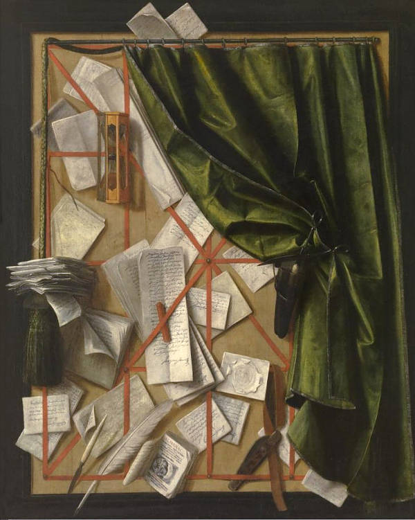
Cornelis Norbertus Gysbrechts
Probably 1664
Oil on canvas, 101.9 x 83.4 cm.
Museum of Fine Arts, Ghent
Another artist who engaged with this idea was Samuel van Hoogstraten (1627–1678), who studied with Rembrandt (1606–1669) and wrote extensively on art theory. In his painting View through a House (c.1655–1660), a green curtain is painted to appear partially drawn, inviting the viewer to "enter" the domestic scene beyond. The curtain not only acts as a compositional device but also as a visual metaphor, suggesting thresholds of space, privacy, and artistic performance.
Trompe-l'oeil curtains in Dutch painting thus serve a dual purpose: they honor a classical story of artistic triumph and illusion, and they engage the viewer in an intellectual game about seeing, believing, and the boundary between image and reality. Far from being mere decoration, the curtain becomes a statement on painting itself—its capacity to deceive, to reveal, and to reflect on its own making.
In the context of 17th-century Dutch art, trompe-l'oeil curtains appear in several forms and with varying intentions. Sometimes they are included as part of the composition, seemingly pulled aside to reveal the scene behind them, as if the viewer is peeking into a private or sacred space. In other cases, the curtain is painted over an existing painting, meant to imitate a protective drape used in actual households or churches to cover valuable or sensitive images. This second use adds a further layer of illusion, since the viewer knows there is no real curtain, yet is made to imagine its tactile presence. The curtain may also serve as a threshold between the viewer and the image, a reminder that one is engaging with illusion and representation rather than reality.
Gerard Houckgeest (c.1600–1661), for example, painted architectural church interiors in which a trompe-l'oeil curtain might be seen partially obscuring a monument or niche. Cornelis Norbertus Gysbrechts (c.1630–after 1683), a Flemish painter who worked in Denmark, took the idea even further, painting entire canvases that mimic the appearance of the back of a framed painting, or show a curtain pinned up to reveal the image behind. These works often toy with the boundary between reality and artifice and demonstrate the painter's technical prowess.
In the Dutch Republic, the trompe-l'oeil curtain was sometimes a respectful nod to sacred or intimate content, but it could also serve a more secular, even humorous role. In genre scenes and allegorical paintings, the drawn curtain might playfully echo theatrical conventions, as if the artist were presenting a stage set for the viewer's contemplation. While Vermeer did not typically use overt trompe-l'oeil curtains, the heavy tapestry in The Art of Painting, partially pulled aside to reveal the studio scene, functions as a visual curtain of sorts. It emphasizes the theme of revelation and controlled access to artistic creation. More broadly, the illusionistic curtain became a sophisticated device through which Dutch painters could reflect on the nature of seeing, the boundaries of illusion, and the painter's own role in creating convincing fictions.
Building on the broader tradition of trompe-l'oeil curtains in 17th-century Dutch painting, Vermeer's Girl Reading a Letter at an Open Window offers a particularly refined and psychologically rich example of the device. The green curtain at the left edge of the composition is painted in a way that directly recalls the Classical legend of Parrhasius, whose illusionistic curtain fooled even the great Zeuxis. Here, Vermeer draws from that tradition not as a mere display of technical prowess, but as a way of framing and deepening the emotional resonance of the scene. The curtain appears to have just been drawn aside, inviting the viewer into a private interior space where a young woman stands absorbed in reading a letter. Its realistic folds and soft lighting simulate the tactile presence of fabric, but its function is clearly symbolic—it marks the threshold between the viewer's world and the intimate drama unfolding within.
This illusionistic curtain, unlike more theatrical examples in Flemish painting, is understated yet purposeful. It subtly engages the viewer in the act of looking, as if we are pulling it back ourselves to catch a glimpse of a quiet, unseen moment. In its original form, the painting also featured a large Cupid image on the back wall, later overpainted and only recently recovered through restoration. The curtain thus serves not only as a visual reference to ancient illusionism, but also as a metaphorical veil over the subject's emotional life—one that Vermeer allows us to momentarily lift. The girl's thoughtful pose, the letter in her hand, and the presence of Cupid now visible behind her all contribute to a layered narrative of love, secrecy, and introspection. The trompe-l'oeil curtain becomes, in this context, a gateway into both pictorial illusion and human interiority.The curtain in Vermeer's Art of Painting functions not only as a technical tour de force of illusionism but also as a conceptual device that aligns with a long tradition of representing curtains as thresholds to painted worlds. According to scholars, the painted curtain in this work likely reminded educated viewers of the ancient Greek tale of Zeuxis and Parrhasios. In Vermeer's case, the curtain serves a similarly theatrical role—it is swept aside to reveal a richly appointed space with a painter at work, drawing the viewer into the interior both physically and intellectually.
This act of unveiling aligns with the rhetorical structuring of the painting as discussed by the art historian Hessel Miedema, who interprets the curtain as a visual proemium, or introduction, that delays immediate access to the image, encouraging contemplation. It acts as a repoussoir, halting the viewer's eye and directing attention toward the heart of the composition—Clio, the muse of history. The curtain thus becomes a device that engages the viewer in an interpretive act, setting the stage for a complex meditation on the nature of the art of painting itself.
Moreover, the rich texture and out-of-focus quality of the curtain, painted with broad strokes, contrasts with the crisp details beyond it, enhancing its illusionistic power and underlining the painting's themes of appearance versus reality. Far from being merely decorative, this curtain encapsulates the painter's intellectual ambitions, affirming the status of painting as both a mechanical craft and a liberal art.
Tronie
See also: Portrait and Physiognomy.
"The now defunct term tronie r efers to heads, "faces," or "expressions" (compare the French trogne, or "mug") and to a type of picture familiar from many examples by Rembrandt (1606–1669) and his followers. The majority of Dutch tronies appear to have been based upon living models, including the artists in question or a colleague, but the works were not intended as portraits. Rather, they were meant as studies of expression, type, physiognomy, or any kind of interesting character (an old man, a young woman, a 'Turk,' 'a dashing soldier' and so on). Garments that looked foreign, 'antique,' costly, or simply curious were of interest for their own sake and frequently offered opportunities to show off painterly techniques. "Walter Liedtke, ed., exh. cat. Vermeer and the Delft School (New York: Metropolitan Museum of Art, 2001). Tronies, were in effect, paintings usually made and sold for the open market. The artist was entirely free to choose the model, dress and technique and faced none of the restrictions of formal portraiture. The tronie would normally be sold on the art market without identification of the sitter, and would not have been commissioned and retained by the sitter as portraits normally were.
Michiel Sweerts
1661
Oil on canvas, 61 x 53.5 cm.
Kremer Collection, Amsterdam
Nonetheless, the term tronie is still subject to debate. "Some critics use the word 'tronie' as the name of a genre comparable to that of landscape or portrait but this a recent development, not justified by the way in which 17th-century sources apply the word."Groningens Lyckle de Vries, review of "Tronie und Porträt in der niederländischen Malerei des 17. Jahrhunderts," by Dagmar Hirschfelder, (Berlin: Gebr. Mann Verlag, 2008), in: H-ArtHist. According to the art historian Dagmaire HirschfelderDagmar Hirschfelder," Tronie und Porträt in der niederländischen Malerei des 17." Jahrhunderts (Berlin: Gebr. Mann Verlag, 2008). "the 'tronie' originated in Leiden and Haarlem in the third decade of the 17th century, where Jan Lievens (1607–1674), Rembrandt (1606–1669) and Frans Hals (c. 1582–1666) were its inventors. This choice implies a definition: a painting is a 'tronie' when it has the characteristics these three artists gave to their tronies. The author's criteria are mostly negative; a tronie is a head or a half-figure without significant attributes or actions, not identified as a figure from history, literature, mythology or the Bible. The face is not stereotyped as the representative of one of the social or psychological groups we know from genre painting, such as the quick-tempered 'Capitano', the miser or the glutton."Groningens Lyckle de Vries, review of "Tronie und Porträt in der niederländischen Malerei des 17. Jahrhunderts," by Dagmar Hirschfelder, (Berlin: Gebr. Mann Verlag, 2008), in: H-ArtHist.
In the 17th century, there was an avid market for tronies, which were considered a separate genre (although for an artist such as Rembrandt, they also served as a storehouse of facial types and expressions for figures in history paintings).
Historical evidence refers to three tronies painted by Vermeer. John Larson was a Hague/London sculptor who in an inventory drawn up in August 1664 had a painting described as "a tronie by Vermeer." It was valued at 10 guilders. In the Dissius auction of 1696 in which 21 works by Vermeer were sold, two of the paintings were described as tronien. The relative part of the catalogue is reproduced below.
38. a tronie in antique dress, uncommonly artful, by the same (Vermeer) — 36 guilders.
39. another ditto (tronie) by Vermeer — 17 guilders.
40. a pendant by the same — 17 guilders.
The first tronie fetched 36 guilders while the other two only 17 guilders each. Some scholars have conjectured that item numbers 39 and 40 are perhaps the Girl with a Red Hat and Girl with a Flute which are among Vermeer's smallest pictures. The prices of the three paintings were low in respects to many of the other 18 Vermeer's sold in the same auction, a fact which has lead some scholars to believe that the Girl with a Pearl Earring was not among the tronies listed. The beauty of the painting, they argue, must have surely been evident to buyers present at the auction and it would not have been bought for a fraction of the price reached by The Milkmaid (item no.1 at 155 guilders), or Woman with a Balance (item no. 2 at 175 guilders.) However, Dutch buyers may have had a somewhat different perception of a tronie such as the Girl with a Pearl Earring and before spending their hard earned money, they may have considered more than just the work's aesthetic value alone.
In any case, if we are to accept the authenticity of the Washington Girl with a Flute it would seem that four tronies by Vermeer have survived: Girl with a Pearl Earring, Study of a Young Woman, Girl with a Red Hat and the Girl with a Flute.
Turbid Medium Effect
The turbid medium effect in nature can be readily observed when the thin layers of fat that lay over raw reddish meat take on an unappealing blue cast. Another example of the turbid medium effect is when white smoke passes in front of a dark backdrop creating a bluish haze. Painters may replicate this effect dynamically by superimposing a thin (translucent) light layer of paint over a darker one: the layer above appears much cooler than it would have appeared had it been painted over a lighter layer of paint.That is, a light color painted thinly over a warm dark tone will appear cooler than if painted over a lighter tone. Thus, by underpainting the shadows and half-tone areas with a dark color and then overlapping it with the warm translucent color of the general lights, the cool half-tones are produced automatically. Light blues skies are particularly airy if the painters superimposes a light blue mixture of paint over tan or light brown ground. The turbid medium effect is greatly amplified if the dark tone underneath is a warm brown,perhaps the ground or the imprimatura.
The first written notice of the effect were Goethe's studies of color which began with subjective experiments. He observed that lights seen through a turbid medium would appear yellowish, and darkness seen through a turbid medium that had been lightened would appear blue. Rembrandt (1606–1669) and Rubens (1577–1640), both of whom possessed an enviable understanding of their materials and extraordinary manual dexterity, used this technique extensively to create the cool half tones of human flesh automatically. This was done by first modeling the darker shadows in dark browns, most umbers. The lighter flesh tone (usually mixture of lead white and small amounts of vermilion and/or yellow ochre) was applied adjacent to the shadows and then drawn over with a light brush with great finesse tapering off gradually over the darker shadow to indicate the turning of the underlying form. This technique, extraordinarily difficult to master, creates a subtle pearlescent tone. The fresher the paint application, the more pronounced and natural is the result. Repeated stirring and mixing of the paint destroys the effect almost immediately. Anthony van Dyck (1599–1641), was known to have used ultramarine in the half-tones of the flesh.
The turbid medium effect can also be produced by mixing cool blue pigments, such as natural ultramarine, directly into the paint reserved for the half-tones (only when representing flesh) but the result is hardly as attractive the effect produced by the technique described before.
Turpentine
Turpentine (also called spirit of turpentine, oil of turpentine, wood turpentine and colloquially turps) is a fluid obtained by the distillation of resin obtained from live trees, mainly pines. It is mainly used as a solvent and as a source of materials for organic synthesis. Turpentine is for the painter the most important and by far the best of all the essential oils. It is prepared from the balsam (pitch) of various pine trees through distillation by means of steam without pressure. The residuum is Burgundy pitch, and further fused colophony. Oil of turpentine was already known to the ancients. The trade' distinguishes different varieties. Good oil of turpentine should make a rapidly evaporating spot on paper and should leave no residuum behind. When shaken in a bottle, the air bubbles which form should disappear quickly without iridescence. The odor of good oil of turpentine is pleasantly aromatic, not penetrating or like benzene as is the case when adulterated. Oil of turpentine must be kept in a cool place in tightly covered bottles; otherwise it will evaporate also becomes resinous, in which process the poorer sorts turn very brown. Resinous old turpentine has a drying effect like siccative, and frequently causes color to remain sticky for a long time.
There are many historical forms of turpentine, all made from the resin of trees. Perhaps the oldest, dating from the 14th century, was made from the terebinth tree, a member of the cashew family. Later, various turpentines were made from pine and fir trees, including Canada balsam, made from the balsam fir, and Venice turpentine, made from the western larch tree. Artists valued these forms of turpentine for their resinous sap, not for their use as a solvent. Today, what we call "turpentine" is made from distillation of the sap of pine trees, and as such it is sometimes added to cleaning products, or used as a substitute for gasoline. Turpentine solvent, sometimes called "spirits," has the opposite effect in painting from the earlier turpentines used by historical painters, thinning the paint rather than adding clarity and brilliance.
Turpentine is used only sparingly in paint as it weakens the paint film so that it will not stick to the ground very well and when used excessively it makes the paint look dry, less colorful and opaque when it dries.
Two-Dimensional / Three-Dimensional
Two and three dimensions, as referred to in painting, describe the different ways in which space and form are represented on a flat surface. Two-dimensional refers to the flatness of the painting surface, which possesses only height and width without any actual depth. In a two-dimensional treatment, forms are depicted using outlines, shapes, and flat areas of color without an attempt to create an illusion of spatial depth or volume. This approach is characteristic of early medieval art, Byzantine icons, and certain modern movements like Cubism, where the focus is on pattern, symmetry, and the surface itself rather than on mimicking the real world.
Three-dimensional in painting refers to the illusion of depth and volume created on a flat surface through techniques such as linear perspective, shading, and the careful treatment of light and shadow. Artists use linear perspective—where parallel lines appear to converge at a vanishing point—as well as atmospheric perspective, which makes distant objects appear lighter and less distinct, to convey a sense of space that recedes into the distance. Chiaroscuro, the contrast of light and dark, is another essential technique for suggesting roundness and solidity in figures and objects.
In 17th-century Dutch culture and painting, the representation of three-dimensional space was pursued with remarkable precision and skill, reflecting both the scientific interests of the period and the tastes of a prosperous middle class that valued realism and detail. Dutch artists perfected the use of linear perspective to render complex interiors, streetscapes, and landscapes with convincing depth. Pieter de Hooch (1629–1684), for instance, employed precise perspective to draw the observer's eye through doorways (doorkijkje)and corridors, creating an almost architectural sense of space. His ability to render sunlight streaming through open doors and illuminating successive rooms enhanced the impression of spatial depth and connected the foreground to the distant background seamlessly.
The still lifes of Willem Kalf (1619–1693) also exemplify the mastery of three-dimensional effects. His arrangements of glass goblets, silverware, and fruits not only display meticulous attention to texture and reflection but also create a palpable sense of volume and weight. By carefully modulating light and shadow and using overlapping objects, Kalf's works suggest that the viewer could reach out and touch each item, making the flat canvas seem to expand into real space.
Vermeer's paintings further demonstrate the subtleties of three-dimensional illusion. His use of perspective and light transforms ordinary domestic interiors into spatially coherent and luminous environments. In works like The Music Lesson and The Art of Painting, Vermeer's mastery of optical effects—possibly aided by the camera obscura—produces a sense of depth and atmosphere that is both natural and transcendent. The way light models forms and creates spatial relationships in his works elevates the mundane to the timeless, showcasing the power of three-dimensional representation to evoke a sense of presence and reality.
Conversely, some Dutch artists explored a more two-dimensional approach within certain elements of their compositions, using flat areas of color and pattern in textiles, maps, and wall hangings as a counterpoint to the more sculptural treatment of figures and objects. This interplay between flatness and depth added complexity to their compositions, inviting viewers to consider both the illusion of space and the materiality of the painted surface.
Ultramarine Sickness
Ultramarine sickness is a degradation phenomenon of natural ultramarine pigment that can cause a paint layer that contains ultramarine to turn lighter or greyish in color, develop a wrinkled appearance and/or lose details.
Vibrant blue ultramarine may have been an expensive pigment, but it was not without problems. Over time, the paint surface can acquire a blanched appearance, so that these areas are now lighter in color. Natural ultramarine pigment, obtained from the semi-precious stone lapis lazuli, has been one of the most valued pigments by European painters since the late thirteenth century. Before nineteenth century, the only known source of lapis lazuli was in the quarries of Badakhshan (northeastern Afghanistan), a site visited and described by Marco Polo. He wrote: "There is a mountain in that region where the finest azure [lapis lazuli] in the world is found. It appears in veins like silver streaks." Lapis lazuli provided not only a vibrant blue color unmatched by any other pigment available at the time, but it bestowed a divine nature to the artwork in which it was used. Since it was valued more highly than gold, its use typically conveyed the high status of a work's commissioner. Ultramarine was the pigment often reserved to paint the mantel of the Virgin Mary.
The deterioration process of this pigment is not well understood, though, as with lead pigments there is some indication that ultramarine may interact in some way with an oil binder influencing the changes in its chemistry on ageing.
There are various examples of ultramarine sickness in the paintings of Vermeer. It is particularly evident in the A Lady Seated at a Virginal, where the initial dark blue drawings on the wall tiles has become a light blue. The blue upholstery of the foreground chair of A Lady Standing at a Virginal shows evidence that the ultramarine blue paint layer is severely deteriorated and blanched.
Underdrawing
Underdrawing refers to the preliminary sketch that an artist makes on a prepared surface, usually a panel or canvas, before applying paint. This initial drawing serves as a guide for the composition, helping the artist establish proportions, outlines, and details before committing to colors and modeling. Depending on the artist's method, underdrawing can range from simple lines marking essential elements to highly detailed renderings with indications of light and shadow. It is typically executed in a dry medium such as charcoal or graphite, or in a liquid medium like ink or diluted paint. Some underdrawings remain visible through thin layers of paint, but generally, the overwhelming majority of underdrawings are entirely covered in the final composition. Infrared reflectography has allowed scholars to detect these hidden sketches beneath the surface of many historical paintings, providing insight into the artist's working process, including adjustments made during the course of painting, provided that the drawing contained carbon.
Crayon of chalk or yellow ocher or charcoal or anything else that can be wiped off easily were sued for underpainting. Once the artist was satisfied with the design, it might be sketched in with black or lac (red lake) in oil or with ink. Period prescriptions state that a little verdigris should be added to the black—one of the slowest drying pigments—so that it dries quickly. Others drew with common ink such as one uses for writing.
Chalk has been a common material for underdrawing in painting since at least the Renaissance, valued for its softness, subtle tonality, and ease of manipulation. It allows the artist to work out the initial structure and proportions of a composition on a prepared ground before any paint is applied. Chalk comes in various colors—black, red, and white being the most frequent—and each serves a different function depending on the surface and the desired contrast. Red chalk, for instance, was particularly favored in figure studies for its warmth and tonal range, while black chalk could provide sharper lines and deeper tonal modeling. Because chalk can be easily smudged or blended, it offers an excellent medium for establishing volume and atmosphere at the earliest stages of a work. Artists could also revise freely, either by rubbing away lines or layering over them, a flexibility not afforded by ink or stylus.
White chalk was often utilized for underdrawing. It could be later covered with an oil-based medium (such as oil paint or oil-rich ground), where becomes nearly invisible because the refractive index of the chalk is close to that of the oil. As a result, light passes through both substances with minimal scattering or contrast, causing the chalk marks to "disappear" visually. This optical effect is why white chalk is often not visible under paint layers, especially in technical imaging like infrared reflectography.

William Hogarth
c. 1757
Oil on canvas, 45.1 x 42.5 cm.
National Portrait Gallery, London
Vermeer's underdrawing technique remains a subject of debate, as few traces of it have been found in his works. However, the absence of extensive underdrawing may not necessarily mean that he worked without it. Scientific analysis, particularly infrared reflectography (IRR), is most effective at detecting black carbon-based pigments, and if Vermeer used a different dark pigment for his underdrawing—one not easily captured by this method—his preparatory sketches could remain largely invisible. Furthermore, the limited optical evidence of underdrawing in paintings such as Woman Holding a Balance and The Art of Painting suggests that when he did use it, he employed a highly deliberate and precise approach, possibly drawing with fine lines in a dilute medium rather than a more substantial layer of paint or charcoal. His underdrawing, if it existed, may have served as a subtle guide rather than a rigid structure, aligning with his meticulous working method and emphasis on controlled refinement rather than visible pentimenti.
In recent developments, researcher Arie Wallert has proposed that the Lady with a Guitar in the Philadelphia Museum of Art (PMA) is not merely a studio copy of Vermeer's Guitar Player housed in Kenwood House, London, but may indeed be an original work by Vermeer. Wallert's hypothesis is grounded in scientific analyses revealing the use of expensive pigments, such as ultramarine, and lead-tin yellow, which fell out of use around 1700. These findings suggest a 17th-century origin consistent with Vermeer's known materials and techniques.
The two paintings share identical dimensions and compositions, yet notable differences exist, particularly in the depiction of the guitarist's hairstyle. In the Kenwood version, the subject features long curls framing her face, whereas the PMA's Lady with a Guitar presents a more modest, pulled-back hairstyle. This variation has sparked debate among scholars regarding the relationship between the two works.
Wallert suggests that the similarities between the paintings may be due to Vermeer employing one of various techniques that is used to transfer a sketches or finished drawing to the final support, possibly the doortekening, or "tracing through" method, to replicate the composition. In this method, the artist created a full-scale drawing on paper and then applied a layer of chalk or charcoal to the back of the sheet. By pressing down on the lines with a stylus while the paper was placed on the painting surface, a faint outline was transferred. This technique was particularly useful for precise designs in altarpieces and large compositions, as it allowed for a faithful reproduction of a carefully planned image. This process involves creating a full-scale preparatory drawing, placing it over the canvas, and tracing the design to transfer the composition accurately. Such a method would account for the compositional congruence while allowing for variations in details like hairstyle.
The PMA's picture has suffered significant damage over time, including severe paint loss and canvas tears, likely due to inadequate conservation efforts before its acquisition by the museum in the 1930s. These conditions have historically led to skepticism about its authenticity. However, Wallert's findings have reignited discussions about the painting's provenance and authorship.
In response to this renewed interest, the Philadelphia Museum of Art placed Lady with a Guitar on public display for a period in 2023, allowing both experts and the public to engage directly with the artwork during the ongoing investigation into its origins.
Underpainting
In its simplest terms, an underpainting is a monochrome version of the final painting intended to initially fix the composition, give volume and substance to the forms, and distribute lights and darks in order to create the effect of illumination. In Dutch art terminology, it was referred to as doodverf, which translates literally to "dead-painting". This term reflects the muted, monochromatic nature of the initial layer of paint, which lacked the final richness of color and detail.
Underpainting is one of the least understood techniques of historical painting and remains especially prone to misinterpretation by artists who wish to replicate it in ther studio process. This may be because although it played a vital role in the structure and visual effect of many works, its purpose and execution varied greatly across time and between artists.
Underpainting was generally preceeded by an underdrawing to fix the bounderies of forms with thin outlines.The lack of color probably explains the word "dead" in the term Dutch term "dead painting." In the 17th century, underpainting, appears in various forms, sometimes as loose monochrome brushwork and sometimes as an assembly of evenly blocked-out "puzzle pieces" of different colors. The final color and detail was then applied over the underpainting only when it was thoroughly dry. Underpaintings were usually executed in warm earth tones or with flat areas of thin color which approximated the final color over neutral gray grounds. Raw umber at times mixed with black were frequently used for this purpose when much contrast is sought after. Cool gray underpaintings were also employed.
Underpainting is rarely practiced today. For the last century, artists have simply begun their painting directly on commercially pre-prepared white canvases with full color surpassing anything but a abbreviated sketch.
Without a thorough knowledge and mastery of the underpainting technique, the extraordinary pictorial coherence which characterizes Vermeer's most mature pictures may not have been easily achieved. The underpainting technique greatly facilitates the realization of finely balanced compositions, accurate depictions of light and chromatic subtleties.
It now seems certain that underpainting was a fundamental step in Vermeer's relatively methodical creative process. In the underpainting stage, the artist may have made many major and minor alterations in the type, placement and dimensions of objects found in his compositions. Chairs, maps, framed pictures-within-pictures, musical instruments, baskets, a standing cavalier and even a dog (A Maid Asleep)can no longer be seen where they were originally represented. Vermeer may have painted them out in the underpainting stage having seen that they did not create the desired aesthetic effect or that they were distracting to the painting's theme.
Underpainting was also used by Vermeer to create particular optical effects which cannot be produced by direct mixture of paints. The most cited example is certainly that of the blue drapery which casually tossed over the shoulder of the sitter in Girl with a Red Hat. When observed with care, it can be seen that Vermeer had applied a layer of cool natural ultramarine over a warm brown ground. The warm ground which appears through the brushmarks of blue sets creates a unique luminosity since blue is nearly complimentary color of brown. Had the two pigments been physically mixed, the would have resulted in a nondescript greenish-blue tone.
Undertone / Mass Tone / Overtone
In general terms, undertone, mass tone, and overtone are ways of describing different visual characteristics of a pigment or paint, particularly how it behaves under varying conditions of thickness, transparency, and light. The mass tone is the color of the pigment as it appears in its most concentrated, thickest application, without dilution or mixing. This is the dominant color you see when the paint is laid down heavily, where it absorbs most light and reveals its strongest hue. The undertone, on the other hand, is the subtle hint of color that becomes visible when the pigment is spread thinly or used transparently. It can differ markedly from the mass tone, and is often cooler, warmer, or of a different chromatic cast. The overtone refers to the slight color impression or nuance that appears on the surface as light reflects off the pigment, often influenced by the way particles are suspended in the binder. It is generally a secondary visual effect that enriches the overall perception of the color.
Understanding the behavior of a pigment's mass tone, undertone, and overtone was important for artists historically because these qualities could dramatically affect the final appearance of a painting. For example, certain red pigments like madder lake could appear deep crimson in mass tone, but when thinned out, might show a cooler, pinkish undertone. Some blues, like ultramarine, had a rich mass tone but could reveal a violet or greenish cast in undertone depending on the preparation and layering. The ability to manipulate these variations allowed skilled painters to create luminous, complex surfaces by layering transparent and opaque passages, exploiting the subtle shifts in color to build form and atmosphere.
Unity
Like contrast, unity is an element that describes a relationship between two or more elements or objects within a composition. Unlike contrast, however, which tends to focus on isolated relationships, unity usually describes such relationships within the context of the composition as a whole. Unity can be said to define how any one element or group of elements is related to the rest of the composition. Thus, contrast itself would be an aspect of unity, as is color, value, etc. The most common quality of unity that art classes and critics focus on is visual flow or connectivity. This can be described as the way in which compositional elements "lead the viewer's eye" from one area of the image to another.
Utrecht School
The Utrecht School refers to a group of Dutch painters active in the early 17th century, primarily based in the city of Utrecht, who were significantly influenced by the dramatic lighting and naturalism of Caravaggio (1571–1610).The school was comprised principally by three Dutch painters—Dirck van Baburen (c. 1590–1624), Gerrit Van Honthorst (1592–1656), and Hendrik Terbrugghen (1588–1629)—who went to Rome and fell under the pervasive influence of Caravaggio (1571–1610) before returning to Utrecht. Although none of them ever actually met Caravaggio, each had access to his paintings, knew his former patrons, and was influenced by the work of Caravaggio's follower Bartolomeo Manfredi (1580–-1620/21), especially his half-length figural groups, which were boldly derived from Caravaggio and occasionally passed off as the deceased master's works.Their works often featured half-length figures illuminated by a single, strong light source, emphasizing texture, expression, and the immediacy of the scene. Back in the Netherlands the Caravaggisti were eager to demonstrate what they had learned. Their subjects are frequently religious ones, but brothel scenes and pictures in sets, such as five works devoted to the senses, were popular with them also. The numerous candles, lanterns and other sources of artificial light are characteristic and further underscore the indebtedness to Caravaggio.
While Italian painters typically used Caravaggesque techniques for religious subjects, the Utrecht School adapted these methods to secular themes, including genre scenes, music-making, and tavern interiors. Van Honthorst, known as Gherardo delle Notti for his mastery of candlelit scenes, exemplified this approach with compositions that explored the interplay of artificial light and shadow to create an almost theatrical effect. Ter Brugghen's paintings, on the other hand, balanced Caravaggesque lighting with a distinctive Northern attention to detail and color, lending a more subdued and reflective quality to his works.
The influence of the Utrecht School was relatively short-lived, peaking in the 1620s and gradually waning as the more restrained and naturalistic approaches of artists like Rembrandt and Vermeer gained prominence. However, their contributions to the handling of light, shadow, and the depiction of dramatic realism left a lasting impact on Dutch painting, bridging Italian Baroque and Northern realism in a uniquely powerful synthesis.
Although Van Honthorst enjoyed the widest reputation at the time, painting at both the Dutch and English courts, Ter Brugghen is generally regarded as the most talented and versatile of the group.
Vermeer must have been familiar with the Utrecht School, not only because it was very influential but also through his father's art dealings and through his mother-in-law, Maria Thins. It is documented that Thins possessed a discreet collection of paintings, one of which, The Procuress, was the work of the Utrecht master, Dirck van Baburen. This work appears on the background wall of two paintings by Vermeer, in The Concert and A Lady Seated at a Virginal. In an inventory of movable goods taken after the death of the painter it was described as "a painting wherein a procuress points to the hand."
Another painting in the possession of Thins was described as "one who sucks the breast," probably a Roman Charity or The Story of Cimon and Pero which appears, although difficult to make out, on the wall of: Vermeer's Music Lesson."
Other pictures that belonged to the Thins included a portrait of Dirck Cornelisz. van Hensbeeck, Thins' great-great grandfather who had the stained-glass window to St. Jan's in Gouda in 1561, A Trumpet Player, A Flute Player, A Homo Bulla, possibly a man blowing bubbles, symbolizing the evanescence of life, A Man Being Flayed, perhaps Marsyas Flayed by Apollo, and One Who Decries the World, perhaps a picture of Heraclitus, the weeping philosopher of mediaeval legend. As John Michael Montias pointed out, with the exception of the portrait, all the paintings mentioned were typical Utrecht School subjects.
Value
See also: Tone.
Also referred to as "tonal value," value referrs to the lightness or darkness of tones colors, e devoid of their hue. White is the lightest value; black is the darkest. The value halfway between these extremes is called middle gray. Because a painted image is physically two-dimensional, a painter must have some tool to create a false, but convincing illusion of three-dimensionality. The effects of value are most easily seen in a black and white drawing. In such a drawing, one can find a range of tones from pure black, across a spectrum of gray, ending in pure white. By using such a scale of tones, a painter is able to recreate in two dimensions the effects of light and shadow on a three-dimensional object. In a painting, such tones are usually found in spectrums of color instead of gray, but the effect is the same. Value is extremely important to a painter because without its proper use it would be impossible for a painter to create convincingly realistic imagery. It is also a useful tool for adding further definition to forms, of which line alone is incapable of doing. Value also works in conjunction with contrast.
Vanishing Point
A vanishing point is a fundamental concept in linear perspective, the system used to create the illusion of depth on a two-dimensional surface. It is the point at which parallel lines (orthtogonals) appear to converge as they recede into the distance , giving a painting or drawing a structured sense of spatial depth. The technique relies on the idea that objects appear smaller the farther they are from the observer, ultimately converging at a single or multiple vanishing points depending on the complexity of the perspective system used. Developed during the Renaissance, the mathematical precision of vanishing points transformed the way artists depicted architectural space, making compositions appear more natural and ordered.
In 17th-century Dutch painting, the vanishing point was an essential tool for artists constructing meticulously rendered interiors, cityscapes, and perspective-driven compositions. The Dutch had a deep appreciation for geometric precision, influenced by the scientific advancements of the period. The painters of Delft, in particular, were known for their masterful use of perspective, often employing a single vanishing point to lead the viewer's eye into the scene. Vermeer, who may have used a camera obscura to aid in his perspective studies, placed his vanishing points at eye level to enhance the sense of realism and intimacy in his domestic interiors. His works demonstrate an extraordinary sensitivity to how space is structured, with floor tiles, windows, and receding walls guiding the viewer's gaze effortlessly. Pieter Saenredam (1597–1665), known for his church interiors, used vanishing points to create an almost ethereal clarity, reinforcing the grandeur of architectural spaces. Perspective was not only a technical device but also a means of suggesting order, stability, and even spiritual harmony in the meticulously designed compositions of the Dutch Golden Age.
Although it has been stated that Vermeer placed the vanishing point of his perspectival constructions to emphasize the one or another compositional element in the painting, perhaps only in one work, the Woman Holding a Balance, does it occur at a truly significant point: very near the hand holding the balance which surprisingly, is also very near the geometrical center of the painting. By drawing the spectator's eye towards this crucial point where the balance slowly comes to rest, the artist enhances the underlying theme of equilibrium and deliberateness of one's actions.
In all the other paintings by Vermeer, the vanishing point seems to occur randomly or in correspondence to the central figure of the composition although this could be easily explained by the fact that a painter naturally seats directly in front of the part of the composition which interests him most, which would by itself cause the vanishing point to be inline with his line of sight. However, it is notable that in all of his interiors, the vanishing point is established within the rectangle of the picture plane while in many works of his colleagues, it lies outside.
In Vermeer's times an artisinal method of working out the perspective drawing existed. Jørgen Wadum has noted that paintings by Vermeer, including Woman Holding a Balance, "contains evidence of Vermeer's system, by which he inserted a pin, with a string attached to it, into the grounded canvas at the vanishing point. With this string he could reach any area of his canvas to correct orthogonal, the straight lines that meet in the central vanishing point." This system was widely used among painters of the time. In Wadum's opinion, Vermeer had most likely had fully assimilated the laws of perspective perhaps using various extant guides and did not use the camera obscura for working out perspective problems as the London architect Philip Steadman has argued.
Vanitas
Vanitas is the Latin for "vanity," in the sense of emptiness or a worthless action. "Vanity of Vanities, saith the preacher, all is vanity'" (Ecclesiastes 12: 8). The implication of these words from the Old Testament is that all human action is transient in contrast to the everlasting nature of faith.
A vanitas painting (or element in painting) is one that acts as a reminder of the inevitability of death, and the pointlessness of earthly ambitions and achievements. Common vanitas-symbols include skulls, candles, hour-glasses and clocks, overturned vessels, and even flowers (which will soon fade). The vanitas theme became popular during the Baroque, with the vanitas still life flourishing in Dutch art.
The vanity of all earthly things was one of the most popular themes of Dutch still life painter. They often included objects which suggested the transience of life: skulls, bones, hourglass, flowers or a snuffed-out candle. There were countless other symbols; the sea-shell, a collector's item, represented wealth; musical instruments symbolized the pleasure of the senses. The vanitas tradition was particularly strong in Leiden, possibly because the university there made the town the center of theological study. It has been suggested that the vanitas painting played a role in Dutch painting parallel to that of the crucifixes and religious paintings in Catholic countries.
In the dim backdrop of Vermeer's A Lady Writing appears a picture-within-a-picture still life g featuring a foreshortened viol da gamba, painted by an unidentified artist. There is a strong likelihood that this depiction aligns with the piece cataloged in Vermeer's posthumous inventory of movable goods as a "bass viol with a skull," a composition that would have unquestionably fallen into the category of a memento mori or Vanitas work of art, in the binnekeucken (interior kitchen). While the bass viol is reasonably distinguishable, the presence of the skull eludes us, conceivably owing to the degradation of the picture-within-a-picture. Within the interior kitchen, a notation by a notary's clerk enumerates a variety of items including multiple paintings: a seascape, two "tronien" (faces) executed "in the Turkish fashion," and an additional pair of "tronien" attributed to Hoogstraten.
Varnish
See also: Dammar.
Varnish is a transparent, hard, protective finish or film that is primarily used in wood finishing but also for other materials, and fine art painting. A good varnish has little or no color, is transparent, and has no added pigment, as opposed to paints or wood stains, which contain pigment and generally range from opaque to translucent. Early varnishes were developed by mixing resin-pine sap. Traditional varnishes include Dammar, Copal, Amber and Mastic. Dammar (also, Dammar) and Mastic varnishes are referred to as soft varnishes, they dissolve in solvents such as turpentine and mineral spirits, which allows them to be removed from an oil painting surface without greatly affecting the paint layers below.
All oil paintings should be varnished in order to give them an even gloss, and permanently restore the original luster of the colors, which often dry to very different states of gloss. It also acts as the painting's protective layer. An oil painting should be dry for three to six months, depending on the thickness of the paint, before its final varnish is applied.
Dammar varnish began to be used in Europe to protect oil paintings in the late 18th to early 19th century. It was introduced as an alternative to older varnishes like mastic and copal, offering a clearer and more easily removable protective layer. Dammar, derived from the resin of trees in the Shorea and Hopea genera found in Southeast Asia, became particularly popular in the 19th century due to its relative ease of application and desirable optical properties, such as providing a warm, glossy finish without excessive yellowing.
In order to varnish a painting the painting, the surface of a painting is completely should be completely dry. In a dust free area the varnish must be applied with a flat wide, soft, tightly packed varnishing brush used it only for varnishing.The work must be laid flat on a table or work surface and the varnish applied in two or three thin coats rather than one thick coat.
Verdaccio
Michelangelo (attributed)
c. 1496–1497
Tempera on panel, 105 × 76 cm.
National Gallery, London
In general terms, verdaccio refers to a greenish-gray underpainting mixture traditionally used by painters during the early stages of a work, particularly in fresco and panel painting. Made typically from a blend of black, white, and a small amount of yellow ochre, verdaccio produces a muted, olive-toned color that serves as an ideal base for modeling light and shadow, particularly in flesh tones. Its purpose was to establish the tonal structure—the lights and darks—before the application of full color. Because verdaccio contains little chromatic intensity, it allows for subtle gradations of value and gives the painter a solid foundation upon which to build realistic forms. The technique is especially associated with Italian Renaissance fresco painting, where artists like Giotto (c.1267–1337) and later Michelangelo (1475–1564) used similar approaches to manage the complexities of modeling large compositions quickly and effectively on wet plaster. In oil painting, analogous practices continued with monochrome underpaintings in gray or brown tones, sometimes called grisaille or brunaille, depending on the specific palette.
Verhevenheid / Ronding / Tweede Tint
Verhevenheid, ronding, and tweede tint are closely related concepts in 17th-century Dutch painting theory that deal with the representation of three-dimensional form and volume on a flat surface. Painters were advised to make their figures and objects "bulge" or appear elevated (verhevenheid) through careful modulation of light and tone. In his Het Groot Schilderboek (1707-1711), Gerard de Lairesse (1640–1711), wrote that true roundness (ronding) is nothing more than light glancing obliquely across a surface and receding toward the background. While a draughtsman was limited to light and shadow, a painter could exploit color and hue to reinforce form, as certain colors visually advance while others recede. However, de Lairesse strictly rejected the use of impasto or textured paint to create illusionistic depth; all modelling had to be achieved through smooth transitions of tone and color.
He outlined a systematic approach to painting skin and other rounded forms using three primary tones: the highlight (het licht), the tweede tint (translated as second tint or mezzo tint), and the even shadow (de vlakke schaduwe). These tones were to be derived from a single base color, and additional highlights or deep shadows were to be introduced sparingly. The tweede tint played a crucial role by occupying the area between the illuminated and shadowed zones—where light strikes obliquely—and served both to model the form and to fuse it softly into the background. This middle zone was not to be confused with true shadow, as overemphasis would result in murky or "grimy" color transitions rather than the tender softness De Lairesse advocated. He criticized painters like Frans van Mieris (1635–1681), who often ignored this principle, using sharp contours and limited tonal gradation, especially when drawing on white rather than blue paper, which offered less subtlety in rendering rounded form.
Thus, verhevenheid, ronding, and tweede tint were understood not as isolated techniques but as interlocking principles that contributed to a painting's visual unity and plasticity, allowing flat images to convey convincing spatial depth and corporeal presence.
Yes, the concept of "rounding" or achieving plasticity in painting—making forms appear convincingly three-dimensional—has a long theoretical lineage in European art, extending well beyond de Lairesse. While de Lairesse gave it a particularly systematic and prescriptive treatment in his Groot Schilderboek, earlier and contemporary thinkers addressed the idea in various ways, often tied to light, shadow, and modeling.
Leonardo da Vinci (1452–1519) offers one of the earliest and most influential discussions. In his treatise Trattato della pittura, he emphasizes the importance of sfumato—the imperceptible transitions between light and dark that allow for the modeling of form without hard edges. He argues that good painters should avoid strong contours, which flatten the form, and instead use gradual tonal shifts to create the illusion of volume. This is directly related to his understanding of how light behaves in nature, diffusing softly over curved surfaces. Though he doesn't use the term "rounding" explicitly, the entire concept of sfumato is aimed at creating rounded, living presence.
In the 17th century, French academic theorists such as Charles Le Brun (1619–1690) and André Félibien (1619–1695) also contributed to the discourse. Le Brun, while focusing more on expression and anatomy, nonetheless emphasized the importance of modeling volume with carefully calculated lighting. In France, as in the Netherlands, the tension between linear precision and painterly modeling was central to academic instruction and critique.
In Italy, the Carracci academy promoted a balance between drawing and color, line and mass. Annibale Carracci (1560–1609) and his followers sought to unify classical form with naturalistic volume, using light and shadow to round figures convincingly, but within a controlled framework. Their use of chiaroscuro was less atmospheric than Leonardo's but essential to volumetric representation.
Later, Joshua Reynolds (1723–1792), in his Discourses on Art, praised the "rounding" of forms through subtle tonal transitions. He warned against excessive detail or linearity that could destroy the illusion of three-dimensionality. Though writing in the 18th century, Reynolds reflects longstanding Renaissance and Baroque concerns about how to give painted bodies the illusion of sculptural presence.
So while de Lairesse may be one of the few to codify the concept of ronding or verhevenheid in Dutch terms, the idea of rounding as a visual and conceptual goal was widely shared among European painters and theorists, though expressed with varying emphasis on optical behavior, anatomical structure, and tonal organization.
Viewer / Spectator / Observer
See also: Art Museum, Art Exhibition, and Blockbuster.
In the arts, a viewer, observer, or spectator refers to the person who looks at, experiences, or interprets a work of art. This role can be passive—simply seeing the artwork—or active, involving reflection, analysis, and emotional or intellectual response.
When we view paintings in an art museum our eyes usually move across the surface of the canvas, skimming over the objects, colors, shapes and figures in the picture. Our attention is drawn to particular parts of the image—to certain figures or actions—which propel the narrative or provide aesthetic stimulus to the viewer. We come away, hopefully enlightened, aware of what the painter had to say. Today, however, it is broadly held that not only does the viewer collaborate with the artist in transforming a two-dimensional likenesses on a canvas into a three-dimensional depiction of the visual word, he interprets what he or she sees on the canvas in personal terms, thereby adding meaning to the picture. This phenomenon was termed the "beholder's share" by Eric Gombrich. According to others, the viewer's response to art stems from an irrepressible urge to re-create his our own brain the creative process. In any case, the viewer is no longer considered a passive receptacle of the painter's intentions, but an essential part in completing the work of art. But how do viewers actually experience art?
Different parts of our vision have various different functions. When we look at a painting, were typically using what is called "foveal vision." This is the optical function we use to see fine details. At the very center of our gaze, our visual acuity is amazingly sharp. However, the center of the gaze focuses on a relatively small point and at the periphery, our visual acuity drops dramatically. The eye does not slide over the picture, it moves in a series of quick jerks and pauses moving from one so-called "point of fixation" to another, somewhat like a water strider on the surface of a pond. During the movements, called saccades, our vision is not completely lost but significantly reduced. When looking at pictures the duration of the fixations varies a great deal. One thirtieth of a second is very brief, 8 to 10 thirtieth of a second being very common and pauses more than 20 thirtieth of a second occurring in only one out of 20 fixations. The eyes are particularly drawn to areas of high contrast and fine detail, and especially to human and expressionistic areas, such as eyes and lips. In mimetic art, our vision darts from one point to the next, visually constructing a story in our mind. Our interpretation may feel instantaneous, but is actually composed of smaller units that make up a whole, like a series of storyboards, as if experiencing a scene in a movie or graphic novel. Essentially, we're editing the painting in our minds to construct a narrative.
Painters and untrained viewers see picture differently. The artistically untrained participant showed a preference for viewing human heads and faces, and to a somewhat lesser extent with the human body. This preference seems to override all other features, such as color and brightness contrast or the amount of detail. Oddly, it would appear that color in itself has no special significance in respects to the objects being represented and has little or no effect on the character of the eye movements.
In mimetic art, our vision darts from one point to the next, visually constructing a story in our mind. Our interpretation may feel instantaneous, but is actually composed of smaller units that make up a whole, like a series of storyboards, as if experiencing a scene in a movie or graphic novel. Essentially, we're editing the painting in our mind.
While a symphony may require up 40 minutes of one's time, a film two hours, a play perhaps three or four hours, most viewers spend comparatively much less time in front of a single painting. In a study conducted at the Metropolitan Museum of Art it was discovered that the average time spent looking at an artwork 17 seconds. One survey discovered that an average viewer goes up to a painting, looks at it for less than two seconds, reads the wall text for another 10 seconds, glances at the painting and moves on. The Louvre museum unveiled that the average viewing time for the most famous painting in the world, Mona Lisa, is a mere 15 seconds. There are viewers who spend much more time, but they are generally a tiny proportion.
In Vermeer's day there was a fast-growing but distinct interest in art and artists, with an elite public that was designated as Liefhebbers van de Schilderkonst ("Lovers of the Art of Painting"). Ernst van der Wetering wrote that "the art lover's, in the present case, the viewer's, main purpose was to understand paintings so as to be able to discuss them with other devotees and, preferably, with painters as well. Both the artist and the art lover were inspired by the special relationship between Alexander the Great and his court painter, Apelles (as recounted by Pliny the Elder), and the almost equal footing that Titian (c. 1488/1490–1576) enjoyed with Emperor Charles V (1500–1558). They admired and identified with these great role models of the past in terms of both the mutual relationship enjoyed by artist and patron and the importance each attached to the pursuit of the art of painting and to the deeper knowledge of that art—a mixture of art history, arttheory, and technical understanding. Studio visits became popular. Texts written by artists for art lovers, and some by the latter themselves, give the impression that the insights gained from studio visits to a great extent concerned the "miracle" of creating an illusion of reality on a flat surface, the pictorial and technical means employed in creating that illusion, and the many aspects of the reality that was to be rendered—such as the natural grouping of the figures in a painting, the proportions of the figures and the expressiveness of their poses and gestures, the play of light and its reflections, the natural rendering of draped fabrics, and the use of color.
Points of View / Viewpoints
Viewpoint, in its broadest sense, refers to the position or perspective from which something is observed or depicted. In art, it encompasses both the literal vantage point of the viewer or artist and the conceptual perspective that informs a work's composition, subject matter, and meaning. The choice of viewpoint determines how a scene unfolds visually, guiding the eye, structuring spatial relationships, and influencing the emotional or intellectual impact of an image. In painting, viewpoint can be manipulated through perspective, framing, and depth, creating illusions of space or directing attention to particular focal points.
In 17th-century Dutch painting, viewpoint played a crucial role in shaping how subject matter were presented and experienced. Artists manipulated perspective and composition to achieve both realism and narrative clarity, making deliberate choices about how to position the viewer in relation to the scene. The development of linear perspective, refined during the Renaissance and widely adopted in Dutch art, allowed painters to construct images that appeared spatially coherent and immersive. Pieter Saenredam (1597–1665), for example, specialized in architectural paintings that emphasized precise perspective, offering elevated viewpoints that led the eye through grand church interiors, highlighting their vastness and structural harmony.
In genre painting, viewpoint was often used to invite or exclude the viewer from intimate domestic scenes. Vermeer, for instance, frequently positioned his subjects near windows, with light falling across them in carefully controlled angles, creating an illusion of natural depth. His compositions often suggest a slightly raised or oblique viewpoint, giving the impression of an observer standing just outside the frame, peering into a quiet, private moment. This controlled perspective, coupled with the balance of light and color, enhances the contemplative atmosphere of his work.
In contrast, the lively and more spontaneous paintings of Frans Hals (c. 1582–1666) often employ a closer, more immediate viewpoint. His loose, dynamic brushwork and slightly tilted perspectives make his portraits feel animated and engaging, as if the subjects are directly interacting with the viewer. Similarly, the fijnschilders of Leiden, such as Gerrit Dou (1613–1675) and Frans van Mieris the Elder (1635–1681), used viewpoint to enhance the illusionistic effect of their meticulously detailed interiors, often placing objects in the extreme foreground (repoussoir) to create the sensation of looking through a small window into another world.
Rembrandt (1606–1669) experimented with viewpoint in a more dramatic and psychological manner. In his self portraits, he often presented himself from unconventional angles, capturing not just his physical likeness but also the weight of his expression and inner experience. In history paintings and biblical scenes, he frequently employed low viewpoints, making figures appear monumental and imposing, while in his etchings, he played with perspective distortions to create a more intimate or unsettling effect.
The role of viewpoint extended beyond individual paintings to reflect broader cultural and scientific developments in the Dutch Republic. The widespread use of the camera obscura, an optical device that projected images onto a surface using lenses and mirrors, contributed to a heightened awareness of optical perspective and naturalistic depiction. Some scholars have speculated that Vermeer used such devices to refine his compositions, adjusting viewpoint with precision to achieve his distinctive softness of form and clarity of detail.
Ultimately, viewpoint in Dutch painting was not merely a technical consideration but a powerful tool for engaging the observer, shaping narrative meaning, and enhancing the illusion of reality. Whether creating a sense of intimacy, grandeur, or movement, artists of the period used viewpoint to control the visual experience, reinforcing their mastery of space, perspective, and storytelling.
Virtuosity
Virtuosity in painting generally refers to a demonstrable mastery of the craft, an ability to manipulate the materials and techniques of the medium with precision, inventiveness, and apparent ease. The term originated in the broader context of the Renaissance and Baroque periods, when artists began to be viewed not simply as skilled craftsmen but as creative individuals whose technical prowess could be admired in the same way as that of a musician or poet. In painting, virtuosity often implies a kind of dazzling competence: the ability to render difficult effects such as drapery, flesh tones, transparency, reflection, or elaborate spatial constructions in ways that seem both convincing and graceful. It may also involve the subtle modulation of surface or the confident economy of brushstroke. The concept emerged as art itself began to reflect the ambitions and sophistication of courtly or urban elites who prized connoisseurship and who expected artworks not just to represent but to impress.
A virtuoso also refers to a person who has cultivated appreciation of artistic excellence, either as a connoisseur or collector. According to Music in the Western Civilization by Piero Weiss and Richard Taruskin: "...a virtuoso was, originally, a highly accomplished musician, but by the 19th century the term had become restricted to performers, both vocal and instrumental, whose technical accomplishments were so pronounced as to dazzle the public."
Bravura, while related to virtuosity, emphasizes a more ostentatious and performative kind of skill. Bravura painting is not simply about mastery, but about the display of mastery. It characteristically involves broad, sweeping strokes, painterly flourishes, and a freedom of execution that calls attention to the hand of the artist. Originating in music, where it described passages meant to show off the performer-s abilities, the term came to describe visual gestures that are almost theatrical in their boldness. While virtuosity can be cool and controlled, bravura carries a sense of risk and exuberance. Bravura painters may court imperfection if the result appears alive, spontaneous, or thrilling.
In the context of 17th-century Dutch painting, both concepts were understood and appreciated, but they played out differently than in the more rhetorical and theatrical painting cultures of Italy or France. Dutch painters were often celebrated for their control, subtlety, and realism. Their virtuosity might lie in the delicate transition between light and shade, the exact rendering of texture, or the illusion of reflected light—quiet achievements rather than grand statements. Frans van Mieris the Elder (1635–1681), for example, achieved a kind of micro-virtuosity through his meticulous rendering of silk, metallic surfaces, and miniature details, painted with almost invisible brushstrokes. Gerrit Dou (1613–1675), too, epitomized this refined and controlled virtuosity, spending weeks on a single inch of canvas. These artists were lauded for their painstaking technique, not for flamboyance.
That said, there were moments and individuals who flirted with bravura. Frans Hals (c. 1582–1666) is perhaps the most obvious example. His lively, calligraphic brushwork and looseness of handling stand out in the Dutch tradition. The roughness of execution in his portraits was often mistaken for carelessness (see: sprezzatura) but later came to be admired as a kind of daring modernity. In his group portraits and expressive heads, the brush is not hidden but asserted, celebrating the artist's presence in the work. This kind of visible handling might be called bravura, though it should be noted that in Hals' case it was paired with acute observation and psychological depth.
Giovanni Boldini (1842–1931)
c. 1890
Oil on canvas, 200 x 99.5 cm.
Museo Giovanni Boldini, Ferrara
Giovanni Boldini (1842–1931) was an Italian painter known for his flamboyant portraiture, particularly of fashionable women in late 19th- and early 20th-century Paris. His rapid, fluid brushwork and sweeping lines earned him the nickname "the master of swish," a phrase that captures both the energy and theatricality of his style. Boldini's portraits are unmistakably performative: dresses whirl, hair glistens, and skin glows in his animated compositions, which often verge on caricature in their emphasis on elegance and movement.
While his technical skill is undeniable, critics have long debated whether Boldini's bravura brushwork represents genuine artistic insight or simply a virtuoso spectacle. Compared to Diego Velázquez (1599–1660) or John Singer Sargent (1856–1925), whose own painterly freedom was grounded in a strong grasp of structure and character, Boldini can seem overly concerned with surface and flourish. His technical command, rather than being restrained or embedded in a deeper pictorial logic, often dominates the sitter, turning the painting into a display of style rather than an exploration of form or psychology.
In this sense, Boldini's work exemplifies the tension between bravura and virtuosity. While he clearly possessed both, his use of bravura—the exaggerated gestures and conspicuous technique—could tip the balance away from what earlier painters might have considered the measured, purposeful control that defines true virtuosity. This has made his reputation more divisive. Some see in Boldini a brilliant stylist who captured the spirit of his time; others view him as a late representative of a declining tradition, where surface supplanted substance.
Vermeer rarely if ever worked in a bravura style, yet elements of virtuosity are unmistakable in his later paintings. In works like The Lacemaker or Lady Seated at a Virginal, the fine pointillés and fluid brushstrokes sometimes obscure the object itself, favoring instead the act of painting. One sees him drawing attention to the touch of the brush, especially in passages of fabric or reflected highlights. These moments signal a quiet assertion of control and mastery—virtuosity not as spectacle, but as evidence of complete command over the medium. Occasionally, as in the swirling threads in The Lacemaker or the luminous sleeves in Lady Standing at a Virginal, the rendering is so unrestrained that it borders on bravura. But unlike Hals, Vermeer always reins it back into compositional harmony. His virtuosity remains in service of restraint, clarity, and stillness.
In the broader Dutch context, then, virtuosity was often about finesse and control, while bravura—though less dominant—emerged occasionally in artists who allowed the viewer to witness the painter's hand in action. The distinction was not absolute, and in some cases, especially toward the end of the century, one sees overlaps and experiments that suggest a shifting appreciation of what painting could be.
Viscosity
Viscosity is a measure of a fluid's resistance to deformation by stress and corresponds to a liquid's thickness. In general, the more pigment in a paint there is relative to binder, the thicker the paint and the more viscous it will be.
In earlier practices, sometimes the drying oils themselves were thickened (see Stand Oil). A viscous paint with specific characteristics could then be produced using these thickened oils.
Visible World
In his 1678 treatise Inleyding tot de Hooge Schoole der Schilderkonst, Samuel van Hoogstraten (1627–1678) devoted significant attention to what he called the "visible world" (de zichtbaere werelt), a term that sheds light on the Dutch view of painting and perception in the 17th century. For Van Hoogstraten, the task of the painter was deeply connected to the rendering of visible reality—not merely as imitation, but as a disciplined way of interpreting the sensory world and guiding the viewer's experience of it.
Van Hoogstraten was a pupil of Rembrandt (1606–1669), but he moved well beyond his master's painterly approach in both theory and practice. He was highly intellectual and aimed to elevate painting to the status of a liberal art, on par with poetry and philosophy. His treatise is filled with philosophical asides, practical advice, and commentary on artistic principles, drawing on classical sources like Aristotle (384–322 BCE) and Pliny the Elder (23–79 CE) as well as on contemporary science and optics.
The "visible world," in van Hoogstraten's formulation, was not only the raw material for art but also a field of illusion and deception. He was especially interested in perspectival tricks, trompe-l'oeil effects, and the power of art to make the viewer doubt the boundary between real and painted space. He argued that the best painters were those who could convincingly render the world in such a way that the observer momentarily forgot they were looking at a painting at all. He praised illusionistic effects not as gimmicks, but as demonstrations of mastery over nature and vision.
In this context, the visible world was both a domain to be studied and a medium through which the painter exerted control over perception. Van Hoogstraten's emphasis on observation, perspective, and optical understanding aligns with the broader Dutch fascination with seeing and knowing, a culture that also produced advances in lens-making, microscopes, and theories of light. Painters like Pieter de Hooch (1629–c.1684), Gerard Houckgeest (c.1600–1661), and Carel Fabritius (1622–1654) similarly played with spatial effects and architectural depth, reflecting this shared concern with how the world is perceived.
His own painting career was marked by architectural scenes, perspective boxes, and narrative compositions that demonstrate these principles. In his perspective boxes—especially the one preserved in the National Gallery, London—he used peepholes and mirrors to create a perfectly constructed illusion of domestic interiors, echoing his belief that painting should not simply imitate nature but reconstitute it through understanding and control.
Van Hoogstraten's idea of the visible world, then, speaks not only to the subjects that Dutch painters chose—rooms, courtyards, maps, still lifes, and the light that flows through them—but also to their ambition to reveal the structures of vision itself. In doing so, painting became a way of testing the boundaries between the real and the represented, between what is seen and what is known.
Visual Arts
Today, the visual arts are art forms such as painting, sculpture, architecture, drawing, printmaking, design, crafts, photography, video and filmmaking. Current usage of the term includes fine art as well as the applied, decorative arts and crafts, but this was not always the case. Before the Arts and Crafts Movement in Britain at the turn of the 20th century, the term "artist" was often restricted to a person working in the fine arts (such as painting, sculpture, or printmaking) and not the handicraft, craft, or applied art media, such as ceramics. Art schools made a distinction between the fine arts and the crafts, maintaining that a craftsperson could not be considered a practitioner of the arts. Also included within the visual arts are the applied arts, such as industrial design, graphic design, fashion design, interior design and decorative art.
Visual Perception
Visual perception refers to the process by which the human eye and brain interpret light, form, color, spatial depth, and movement to construct an image of the surrounding world. It involves both physiological mechanisms—such as the function of the retina, optic nerve, and visual cortex—and cognitive processes that shape how we understand and interpret what we see. Factors like contrast, perspective, chiaroscuro, and composition influence the way objects are perceived, often in ways that can be manipulated through artistic techniques.
In the context of 17th-century Dutch painting, visual perception played a crucial role in how artists approached representation, illusionism, and viewer engagement. The Dutch masters were highly attentive to the way light and color interact, exploiting the subtleties of optical effects to create the illusion of reality. Vermeer, in particular, demonstrated an extraordinary sensitivity to the behavior of light, often diffusing it across surfaces in a way that mimicked human vision rather than strict linear perspective. His handling of soft edges, glazes, and subtle tonal shifts suggests an intuitive grasp of visual perception, possibly influenced by the camera obscura, which projected images onto a surface in a way that mimicked how the eye perceives light and shadow. Other painters, such as Gerrit Dou (1613–1675) and Frans van Mieris the Elder (1635–1681), were celebrated for their fijnschilder (fine painting) techniques, achieving an almost microscopic attention to detail that further tested the limits of human perception.
Dutch artists also played with visual perception by constructing complex spatial arrangements, particularly in interior scenes. Pieter de Hooch (1629–c.1684) often used doorways (doorkijkje), windows, and reflective surfaces to lead the viewer's eye deeper into the pictorial space, creating a layered, immersive experience. Trompe-l'oeil (literally "deceive the eye") was another means of exploiting visual perception, as seen in the work of artists such as Cornelis Gijsbrechts (c.1630–c.1675), who painted objects that seemed to protrude from the picture plane. Whether through an understanding of perspective, the effects of light, or the meticulous rendering of textures, Dutch painters engaged with the science of seeing in ways that elevated their work beyond mere representation, creating paintings that felt strikingly immediate and alive.
Visual Recognition
Visual cognition refers to the suite of mental processes by which the brain interprets and gives meaning to visual input. It is not limited to the passive reception of light or color; rather, it encompasses the complex process of how the mind organizes, categorizes, remembers, and understands what is seen. From recognizing a face to understanding a diagram or interpreting the mood of a scene, visual cognition is what transforms raw sensory data into structured experience.
The concept has deep roots in ancient philosophy. Plato (c. 427–c. 347 BCE) proposed that vision connects the soul to abstract, perfect forms that exist beyond the material world. Aristotle (384–322 BCE), more grounded in empirical observation, considered vision one of the primary senses through which humans come to know the world. These ideas were adapted and reworked throughout the Middle Ages, often in theological contexts where seeing was closely linked with spiritual understanding.
In the Renaissance, a growing interest in empirical observation and mathematics prompted artists and scholars to reconsider the act of seeing. The development of linear perspective and the camera obscura were not only technical tools but also conceptual shifts, emphasizing the structured nature of vision and its reliance on individual point of view. These changes reflected a broader cultural realization: vision was not just physical, but mental and interpretive.
During the 17th century, the nature of visual cognition was examined more analytically. René Descartes (1596–1650) studied the physiological pathways of vision, tracing how light is refracted through the eye and processed by the brain. But Descartes also argued that true perception requires mental interpretation—that we "see" only when the mind has made sense of the input. This dualistic view, separating body and mind, placed visual cognition at the meeting point of mechanism and thought.
John Locke (1632–1704) developed an opposing but equally influential view, insisting that the mind is shaped by sensory experience, including vision. In his theory, complex ideas are formed from simpler sensory impressions, and visual knowledge is accumulated gradually rather than being innate.
In the 19th century, the study of visual cognition became more experimental. Hermann von Helmholtz (1821–1894) introduced the idea of unconscious inference, suggesting that the brain constantly makes educated guesses based on fragmentary visual data and past experience. This idea—that seeing is a learned process informed by memory—marked a turning point.
Gestalt psychology, developed in the early 20th century by thinkers such as Max Wertheimer (1880–1943) and Wolfgang Köhler (1887–1967), argued that the brain instinctively organizes visual information into coherent patterns. Principles like similarity, proximity, and closure were formulated to explain how we group and interpret visual elements into wholes, even when information is incomplete.
In the later 20th century, the rise of cognitive science brought further advances. Visual cognition came to be understood as a series of stages: from early vision (detecting edges, movement, and contrasts) to higher-level functions (recognizing objects, interpreting context, guiding decisions). Attention, memory, and expectation were all shown to influence how people see. Research in artificial intelligence revealed how difficult it is to replicate these processes in machines, highlighting how sophisticated human visual cognition truly is.
Today, visual cognition is understood as a dynamic interaction between sensory input and mental structure. It is not a passive reflection of reality but a complex, constantly adjusted process of interpretation. Each moment of seeing draws on biology, learning, experience, and context.
Visual Weight
Visual weight refers to the perceived importance or prominence of elements within a composition, determined by factors such as size, color, contrast, texture, and placement. A visually heavier element naturally draws the viewer's attention, while lighter elements recede into the background. Artists and designers manipulate visual weight to guide the eye through a work, ensuring balance and coherence. In painting, contrast between light and dark, sharpness versus softness, and dense versus open areas all contribute to the distribution of visual weight. Successful compositions achieve a dynamic equilibrium, where no single element overwhelms the whole but instead contributes to a unified structure.
In 17th-century Dutch painting, visual weight was an essential but often intuitive aspect of composition. Artists arranged figures, objects, and architectural elements to create a natural sense of depth and focus, often using light and shadow to reinforce hierarchy. Vermeer's paintings are particularly striking for their subtle manipulation of visual weight. He employed strong contrasts between illuminated and shadowed areas, directing the viewer's gaze toward key subjects while maintaining an overall sense of balance. The placement of objects and figures, often in relation to window light, helped to establish compositional stability.
Pieter de Hooch (1629—c. 1684) and Emanuel de Witte (1617—1692) used architectural frameworks to control visual weight, balancing empty spaces with structured elements such as doorways, columns, and tiled floors. In still-life painting, artists like Willem Claesz. Heda (1594—1680) and Pieter Claesz (1597—1660) employed carefully placed highlights and textural contrasts to ensure that certain objects, such as a gleaming pewter plate or a partially peeled lemon, carried more visual weight than surrounding elements. Landscape painters, including Jacob van Ruisdael (1628—1682), guided the viewer's eye using areas of light and shadow, clusters of trees, and the rhythmic arrangement of land and sky. Dutch painters, though not necessarily theorists of visual weight, mastered its effects through observation and a refined sense of balance, creating compositions that feel both natural and deliberately structured.
Le Vite de' più eccellenti pittori, scultori, e architettori (by Giorgio Vasari)
Vasari's Le Vite de' più eccellenti pittori, scultori, e architettori, first published in 1550 and expanded in 1568, is widely recognized as the foundational text of modern art history. Structured as a series of biographies, it traced the lives and works of Italian artists from Cimabue (c. 1240–1302) through to Michelangelo (1475–1564), situating them within a narrative of progress and refinement. Giorgio Vasari (1511–1574), himself a painter and architect, framed his Vite not merely as documentation but as a didactic and moral history of art, emphasizing the evolution of artistic skill and the emergence of the "divine" artist. Vasari's work deeply shaped the way art was understood in the West, establishing a model in which the lives of artists were inseparable from their achievements, and in which the trajectory of art moved from awkward beginnings to the perfection of the High Renaissance.
This biographical format, combining anecdote, critical judgment, and praise, had a strong rhetorical character, and it presented a clear hierarchy of values. Chief among them was the idea of disegno—not just drawing, but the intellectual foundation of art, placing painting on par with poetry or philosophy. Florentine and Roman artists were privileged in this structure, while others—particularly Northern artists—were often overlooked or misunderstood. Vasari praised the technical accomplishments of Jan van Eyck (c. 1390–1441) but saw northern art as overly detailed and lacking in conceptual unity. Despite this bias, the Vite had an enormous influence across Europe, including the Dutch Republic, where artists and theorists sought both to emulate and to distinguish themselves from the Italian model.
Today, instead, mainstream art history has largely shifted away from Vasari's celebratory and linear model. While biography remains an important tool, contemporary scholars often approach art through broader lenses, including social, political, economic, and material contexts. Rather than focusing solely on individual genius, modern art history tends to emphasize networks of production, the role of institutions, the influence of patrons and markets, and the cultural meanings embedded in visual forms. Vasari privileged Florentine and Roman artists and often downplayed or misunderstood non-Italian traditions. In contrast, today's approaches aim for a more inclusive and critical view, questioning the hierarchies and assumptions that shaped early art writing. Vasari's work remains foundational, but it is now read as both a product of its time and a key moment in the construction of art's historical identity.
By the 17th century, Dutch painters were well aware of Vasari's framework but often operated under different ideals. They were more likely to emphasize the craft of painting, the painter's moral character, and the importance of observation and nature rather than idealized forms. Local writers, such as Karel van Mander (1548–1606), produced their own adaptations. His Schilder-Boeck, published in 1604, was clearly modeled on Vasari but adapted to a Netherlandish context. Van Mander included biographies of Italian artists but gave significant space to Northern painters, including Van Eyck (c. 1390–1441), Hieronymus Bosch (c. 1450–1516), and Pieter Bruegel the Elder (c. 1525–1569). He combined classical learning with practical advice, and his writing was aimed as much at young artists as at collectors or scholars.
For Dutch painters of the Golden Age, the Vasarian model remained in the background, but their cultural and professional context demanded a more empirical approach. The notion of genius was tempered by the realities of market production and civic values. While figures such as Samuel van Hoogstraten (1627–1678) aspired to elevate painting in his Inleyding tot de hooge schoole der schilderkonst: anders de zichtbaere werelt (1678), to a liberal art and engaged in theoretical reflection, many artists focused on visual persuasiveness and technical refinement rather than the narrative of upward progression that Vasari had championed.
Vasari's Vite, then, provided an origin story and a conceptual structure that remained influential, but in the Dutch Republic it was reshaped to fit a different conception of what painting could and should be. The artist was not merely a divine creator but also a citizen, a craftsman, and a keen observer of life. The painter's life still mattered—but it was judged as much by integrity and labor as by myth and fame.
Vasari rated artists according to how closely they approached what he saw as the perfection of nature, with drawing (disegno) as the highest intellectual achievement in painting. Michelangelo stood at the pinnacle of his hierarchy, not only for his technical brilliance but for his perceived moral and spiritual depth. Vasari's ratings were also shaped by regional loyalty—Florentine and Roman artists were favored as the true inheritors of classical ideals, while others, particularly those from Northern Europe, were often marginalized or described as overly concerned with detail at the expense of design or grandeur. His judgments frequently reflected personal opinion, anecdotes, or admiration for character, and were often based on secondhand information.
On the other hand, Vasari's treatment of the Venetian school is notably ambivalent, and it highlights the limitations of his Florentine-centered perspective. While he acknowledged the accomplishments of Venetian painters such as Giovanni Bellini (c. 1430–1516), Giorgione (c. 1477–1510), and especially Titian (c. 1488–1576), his admiration was often tempered by his belief that their approach—grounded in rich color, atmosphere, and painterly softness—was inferior to the Florentine emphasis on disegno, or drawing and design. For Vasari, the true elevation of painting came through intellectual structure and clear contour, not the sensual and tonal beauty and lush colorito that characterized Venetian art. Although he recognized Titian's brilliance and included him in the revised edition of the Vite, he still framed him as lacking the rigorous foundation found in central Italian artists.
Today, the Venetian school is evaluated through a very different lens. Modern art historians often see it as a decisive and original contribution to Western painting, particularly in its elevation of colorito—the use of color and modulation—as an expressive and structural force. Rather than judging it against the Florentine standard, contemporary scholarship tends to explore Venetian painting on its own terms, emphasizing its innovations in oil technique, treatment of light, and atmospheric effects. The work of painters like Giorgione and Titian is now appreciated for its poetic ambiguity, emotional depth, and visual richness. The binary opposition between color and drawing, once used to rank artistic achievement, has largely been set aside in favor of a more nuanced understanding of regional diversity and the multiple ways artists sought to represent the world.
Vasari was not only aware of the Mannerists—he was one of them. As both a practicing painter and an art theorist, Vasari worked in what is now recognized as the Mannerist style, and many of the artists he praised or knew personally were central figures in that movement. Mannerism, which emerged in the decades following the High Renaissance, is generally characterized by elongated forms, exaggerated poses, complex compositions, and a certain artificial elegance that departed from the balanced naturalism of artists like Raphael and Leonardo da Vinci.
Though Vasari did not use the term "Mannerism" as we do today—it was coined much later—he often referred to maniera, or "style," which in his usage implied a refined personal idiom. He admired artists such as Rosso Fiorentino (1494–1540), Pontormo (1494–1557), Parmigianino (1503–1540), and Francesco Salviati (1510–1563), all of whom are now considered key Mannerists. He celebrated their inventiveness, grace, and expressive complexity, which he saw as evidence of their sophistication and command of the painter's art. For Vasari, the development of maniera represented an evolution beyond mere imitation of nature—it was a mark of artistic nobility and intellectual elevation.
That said, modern historians have sometimes interpreted Vasari's enthusiasm for style and refinement as part of the very cultural climate that produced Mannerism's more mannered qualities—its turn toward artifice, virtuosity, and sometimes self-conscious distortion. While today's scholarship often reads Mannerism as a response to the perceived perfection and closure of the High Renaissance, Vasari saw it as a flourishing continuation, a display of the full potential of the artist's inventiveness.
Contemporary evaluations of artists tend to be more critical, pluralistic, and self-conscious. Rather than ranking artists according to a singular ideal of perfection, modern art historians consider a variety of criteria, including innovation, influence, cultural significance, and social context. There is greater awareness that aesthetic standards are historically constructed and culturally situated, rather than universal. The importance of marginalized artists, non-Western traditions, and previously overlooked genres has grown considerably, and evaluations often question the very notion of fixed hierarchies. While admiration for skill and originality remains, today's art history generally avoids the kind of moralized and linear rating that defined Vasari's approach, seeking instead to understand artists in relation to the conditions of their time.
Volume
Volume, in general artistic terms, refers to the representation of three-dimensionality within a two-dimensional medium or the physical mass of a sculptural object. Artists achieve the illusion of volume through techniques such as shading, chiaroscuro, perspective, and variations in color and texture, allowing flat surfaces to suggest relief and solidity. In sculpture, volume pertains to the actual spatial presence of a work, encompassing its contours, voids, and how it interacts with light and shadow.
The transition from flatly painted objects with clear outlines to the creation of convincing volume was a gradual process that took place over several centuries, driven by evolving artistic techniques and theories of perception. In medieval European painting, figures and objects were often defined by strong contour lines and areas of flat color, with little concern for naturalistic modeling. Gold backgrounds, commonly used in religious art, reinforced the sense of an abstract, non-spatial environment rather than a tangible, three-dimensional world.
A major shift occurred during the early Renaissance, particularly in the 15th century, when artists in Italy began to experiment with light, shadow, and linear perspective to create the illusion of depth and solidity. Italian painters such as Masaccio (1401–1428) were among the first to use chiaroscuro to give figures a sense of physical presence. His fresco The Tribute Money (c. 1425) demonstrates a revolutionary use of light and shadow to model volume, making the figures appear weighty and embedded in space. Around the same time, Flemish painters like Jan van Eyck (c. 1390–1441) refined oil painting techniques, allowing for more delicate transitions of tone and the depiction of light interacting with surfaces, enhancing the perception of volume.
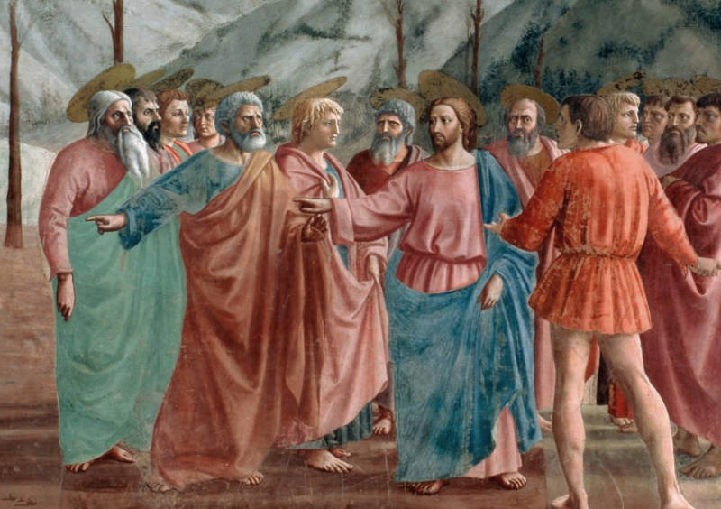
Masaccio
c. 1425
Fresco, 247 x 597 cm
Brancacci Chapel, Florence
By the 16th century, these techniques were fully developed, with High Renaissance painters such as Leonardo da Vinci (1452–1519) using sfumato, a method of blending light and shadow seamlessly to avoid harsh outlines, creating forms that appeared to emerge naturally from their environment. In Northern Europe, artists such as Albrecht Dürer (1471–1528) and Pieter Bruegel the Elder (c. 1525–1569) applied similar principles to their work, though often with a greater emphasis on crisp detail.
In the 17th century, Dutch painters took the representation of volume to new levels of refinement. The tonal painting style of artists like Frans Hals (1582–1666) and Rembrandt van Rijn (1606–1669) relied on expressive brushwork and a sophisticated use of light to create figures with a palpable sense of physical presence.
While early Dutch painters of the late 16th century, such as Hendrick Goltzius (1558–1617), still emphasized sharp contours and crisp modeling, by the mid-17th century, the influence of chiaroscuro, atmospheric perspective, and refined oil techniques had made the illusion of volume a defining feature of Dutch painting. This evolution marked a departure from rigid outlines toward a more naturalistic depiction of the world, where forms were integrated into their surroundings through the interplay of light and shadow.
In Vermeer, volume is created through the modulation of light across surfaces, particularly in the subtle rendering of fabrics, human skin, and architectural elements. However, viewers are generally less aware of the sense of volume than lightfall a truly striking sense of atmosphere and realism.
Warm Color
See also: Cool Colors, Color Temperature, Advancing and Receding Colors, Broken Color, and Color Harmony.Warm colors are colors whose relative visual temperature makes them seem warm. Warm colors or hues include red-violet, red, red-orange, orange, yellow-orange, and yellow.
Wash
A wash in oil painting refers to a thin, transparent layer of pigment diluted with a medium, typically a drying oil or turpentine. It allows for broad, fluid applications of color, often used in the early stages of a painting to establish tone, composition, and light effects. Unlike watercolor, where washes are an essential technique throughout the painting process, in oil painting they serve a more preparatory function. When mixed with too much turpentine alone, a wash results in a matte, dry finish with weak adhesive properties, meaning it does not bind well to subsequent layers of paint. Because of this, washes were generally confined to the underpainting stage or the initial blocking-in of colors and were never used in later stages, detailed work, or final glazes.
Vermeer's technique, while subtle and refined, also depended on careful preparatory work, likely involving thin underpainting layers and a careful underdrawing as well. Though no direct evidence survives regarding his exact methods, his ability to control the behavior of light and shadow suggests a precise understanding of how transparent and opaque layers interact.
Watercolor
Watercolor is a painting medium composed of pigments suspended in a water-based solution. Its primary characteristic is transparency: unlike oil or tempera, watercolor is applied in thin, translucent layers that allow light to reflect from the surface of the paper through the pigment, creating a luminous effect. While the use of water-soluble color dates back to ancient times—seen, for instance, in Egyptian tomb decorations and medieval manuscript illumination—what we now recognize as watercolor painting gained recognition in Europe during the Renaissance. Artists such as Albrecht Dürer (1471–1528) used it for both studies and finished works, establishing its status as a legitimate artistic medium. By the 17th century, it was commonly used for botanical illustration, topographical views, and preparatory sketches, often in tandem with ink.
In the Netherlands of the 17th century, watercolor had a more modest and utilitarian presence than in later centuries or in English artistic tradition. It was frequently used in drawings, where artists would apply transparent washes of color over black chalk or ink outlines. Artists such as Jacques de Gheyn II (c. 1565–1629) and his son Jacob de Gheyn III (1596–1641) exemplify this practice. Their works combined highly detailed draftsmanship with delicately applied watercolor to record flowers, insects, and natural curiosities, often for cabinets of curiosities or scientific collections. The interest in nature and close observation found a fitting partner in the precision of watercolor techniques. Watercolor was also used in architectural renderings and cartographic illustration, especially in the service of the Dutch Republic's growing needs in urban planning and military defense. Though watercolor was not the preferred medium for finished easel paintings, it remained a vital component of the visual culture of the period, supporting scientific study, artistic training, and documentation.
In contrast to oil painting, which was dominant for expressive and narrative compositions, watercolor in the Dutch Golden Age had a more restrained and descriptive function. Nevertheless, the skillful integration of ink and wash techniques found in the work of figures such as Roelant Savery (1576–1639), particularly in his studies of nature, and the careful notational use of color in the architectural studies of Pieter Saenredam (1597–1665), suggest that watercolor, even when secondary, contributed to the aesthetic discipline and observational precision that characterize much of Dutch art in this period.
One of the most esteemed watercolorists of all time is John Singer Sargent (1856–1925), whose work in this medium constitutes a significant and highly regarded portion of his artistic output. Although best known for his society portraits in oil, Sargent produced nearly 2,000 watercolors over the course of his career, many of which were created during his travels throughout Europe, the Middle East, and North Africa. His watercolor subjects range from sunlit Venetian canals, Bedouins in desert landscapes, and architectural studies, to intimate scenes of friends, family, and informal moments of leisure.
John Singer Sargent
1909
Transparent and opaque watercolors over wax resist and graphite on paper, 36.7 x 53.8 cm.
Brooklyn Museum, New York
Sargent's watercolor technique is notable for its boldness and immediacy. He frequently worked outdoors, painting directly from observation with a brisk and confident hand. His approach combined spontaneous brushwork, unblended washes, and strategic use of the white paper surface to evoke light and atmosphere. Though loose in execution, his compositions were carefully judged, revealing a deep understanding of form, structure, and visual rhythm. Sargent's watercolors stand out for their freshness, technical mastery, and the sheer pleasure they convey in the act of looking and recording. He elevated the status of watercolor as a medium of serious artistic ambition rather than a secondary or preparatory tool. His works in this medium, particularly those exhibited in the early 20th century, were met with critical acclaim and helped reassert watercolor as a form of high art.
Painting Water
Painting water has long posed a special challenge to artists, as it requires not only a grasp of how light interacts with surfaces but also an understanding of how transparency, reflection, movement, and depth can be rendered within the static medium of paint. In early Western art, water was often stylized or symbolic—depicted with wavy lines, flat color, or decorative motifs that bore little resemblance to nature. It was during the Renaissance, with its renewed emphasis on natural observation and perspective, that artists began to study water more closely, examining its changing character under different light conditions and in different states: still, rippling, turbulent, or refractive. The development of oil painting allowed for more complex renderings of water's properties, as the slow-drying nature of oil made it possible to create soft gradations, thin veils, and glazed layers that could evoke both surface and depth.
In early painting—particularly during the medieval and Gothic periods, and even into the early Renaissance—the effect of water was often conveyed through repetitive, schematic, curving lines rather than through observation-based rendering. These stylized patterns were used to indicate flow, surface texture, and motion, not reflection or depth. The goal was symbolic or decorative rather than naturalistic, and such conventions persisted well into the 14th and even 15th centuries in many parts of Europe.
One clear example is in the Baptism of Christ scenes found in illuminated manuscripts and panel paintings. In many of these, such as the Baptism of Christ by the Master of Saint Cecilia (early 14th century, Florence), the Jordan River is shown as a vertical column or stream of undulating blue bands, sometimes decorated with concentric curls or waves. Christ is placed upright in the water, which wraps around him in stylized arcs—less a fluid medium than a graphic frame.
Giovanni Baronzio
c. 1335
Tempera on panel, 46.3 x 49 cm.
National Gallery of Art, Washington, D.C.
Similarly, in Giotto's (c. 1267–1337) Baptism of Christ in the Arena Chapel in Padua, the water is painted as a nearly flat blue field punctuated by rounded, scalloped lines that suggest movement. The depiction includes small gold or white lines to show ripple effects, but there is no attempt at optical reflection. The river behaves more like a patterned textile than a transparent or light-bearing substance.
Another example is found in Ambrogio Lorenzetti's Effects of Good Government in the Countryside (c. 1338–39) in Siena. In this large fresco, a winding river cuts through the landscape, painted in a broad blue band with rhythmic, curved lines to suggest current and flow. Though the river moves through a carefully organized perspectival space, the water itself does not reflect its surroundings and remains entirely schematic.
In Northern European painting, we see a similar approach in works like the Très Riches Heures du Duc de Berry (early 15th century), where rivers and ponds are often depicted as smooth blue zones filled with decorative ripple marks or tightly coiled lines, stylized fish, and boats. These visual conventions helped readers and viewers immediately identify water, but they bore little resemblance to how water appears under natural light.
These patterned approaches to water belonged to a larger visual language that prioritized clarity, narrative legibility, and ornament over naturalism. It was only with the growing interest in empirical observation, combined with the technical possibilities of oil paint in the 15th century, that artists began to move beyond these stylized motifs and attempt to capture the transient, optical effects of light and movement on water's surface.
Leonardo da Vinci (1452–1519) was profoundly fascinated by water, not only as a natural phenomenon to be observed and understood, but as a subject of artistic, mechanical, and scientific inquiry. For Leonardo, water was not merely a reflective or decorative surface—it was a living, dynamic force, the ";driving force of nature," as he called it. His extensive notebooks are filled with studies of water in motion: eddies, whirlpools, wave patterns, splashes, and cascades, all rendered with obsessive attention and a search for underlying laws. He sought to understand how water flowed, how it carved the earth, how it rose into the sky and fell again as rain. He compared the movement of water to that of hair, smoke, and wind, recognizing in all these phenomena a similar kind of fluidity and turbulence.
In painting, Leonardo applied this knowledge with remarkable sensitivity. In works like The Virgin of the Rocks and The Baptism of Christ (the latter partly painted by his master Andrea del Verrocchio (c. 1435–1488)), water is shown not just as a background element, but as a tactile, responsive substance. In The Baptism, the small ripples beneath Christ's feet register the impression of his presence on the water's surface, while in The Virgin of the Rocks, water flows through the rocky grotto with quiet gravity, integrating geological structure and botanical detail into a single, cohesive vision of the natural world.
Leonardo also understood the visual complexity of water's surface. He explored how it reflects both light and shadow, how objects can be seen through it and also mirrored upon it, how color and depth shift depending on the viewer's angle and the conditions of light. This dual role—of water as both a transparent medium and a reflective plane—was something he investigated with remarkable acuity. His studies in chiaroscuro and sfumato were not limited to skin and atmosphere but extended to how water could veil or distort forms.
Alhough rare and generally limited in sophistication, there are examples of bodies of water and rudimentary reflections depicted in paintings before Leonardo. These early efforts are mostly symbolic or decorative, but a few show real attempts to observe how water behaves.One notable example is The Madonna of Chancellor Rolin (c. 1435) by Jan van Eyck (c. 1390–1441). In the background of this small panel painting, a river flows through a delicately rendered cityscape, and we see the buildings and bridge faintly mirrored in its surface. While the reflections are not mathematically precise, they mark a significant departure from the more stylized or purely emblematic depictions of water typical in earlier Gothic art. Van Eyck understood water not only as a setting but as a surface that responds to light and space, and his ability to convey this subtle visual information was unmatched in his time.
Jan van Eyck (c. 1390–1441)
c. 1435
Oil on panel, 66 × 62 cm.
Musée du Louvre, Paris
Another early instance is in A Goldsmith in His Shop (1449 by Petrus Christus (c. 1410–1475), where a convex mirror on the back wall reflects the street and window behind the viewer. While not a body of water, it demonstrates the growing interest among early Netherlandish painters in optical effects and mirrored surfaces, which are closely related in terms of technique and conceptual approach.
Outside of the Northern tradition, some limited attempts appear in Italian fresco cycles. In Effects of Good Government in the Countryside (c. 1338–39) by Ambrogio Lorenzetti (c. 1290–1348) in Siena, streams and small bodies of water wind through the landscape, though no real attempt is made to show reflection or transparency. Similarly, in Gentile da Fabriano's Adoration of the Magi (1423), a small stream flows through the scene, painted more for ornamental richness than for naturalism.
By and large, the consistent, accurate rendering of reflections on water—as distinct from symbolic, decorative, or schematic depictions—only becomes widespread after the technical advances of the early 15th century, particularly in the Low Countries. It was the combination of oil painting's flexibility, the Northern emphasis on close observation, and the growing interest in naturalistic space that enabled painters like van Eyck to approach water not merely as a backdrop but as a fully integrated element of the visible world.
While Leonardo's influence was profound, especially in Italy, his particular interest in water as a visual and scientific subject did not become a dominant theme in Western painting until much later. It would be in the art of the Northern European painters, especially in the Dutch Golden Age, that water as a subject in its own right would be pursued with a similarly empirical but more pictorial aim. Still, Leonardo's drawings and observations remain foundational—both for the science of hydrodynamics and for the painterly rendering of one of nature's most elusive elements.
By the 17th century, especially in the Netherlands, painting water became not just a matter of accurate representation but an expressive language of its own. Dutch painters, surrounded by canals, rivers, lakes, and a sea-facing landscape, had daily access to scenes where water was not only central to daily life but visually dominant. Painters such as Aert van der Neer (1603–1677) and Jan van de Cappelle (1626–1679), excelled in portraying quiet river scenes and harbors where the water lies almost motionless, broken only by the faint trace of a boat's wake or the shimmer of light drifting across the surface. These works often employ thin glazes and soft blending to create the sensation of a gently unified world. Reflections are painted with slight distortion or downward elongation, subtly registering the movement of air and light. In these images, water is not just part of the setting—it is a kind of visual and emotional mirror, drawing the viewer into a state of quiet observation.These painters used a combination of techniques to suggest the behavior of water: wet-in-wet blending for softness, dry brushing to indicate ripples, thin glazes for depth, and subtle variations in color temperature to convey transparency and reflection.The differing moods of water—still, flowing, or violently agitated—offered painters a wide range of expressive possibilities, each demanding its own technical vocabulary and compositional approach. Unlike objects with fixed form, water changes constantly with wind, weather, and light. For this reason, its depiction in painting is never only about accurate representation, but also about conveying sensation, atmosphere, and movement. The mood of water can shift a painting's tone from meditative to dramatic, from harmonious to sublime.
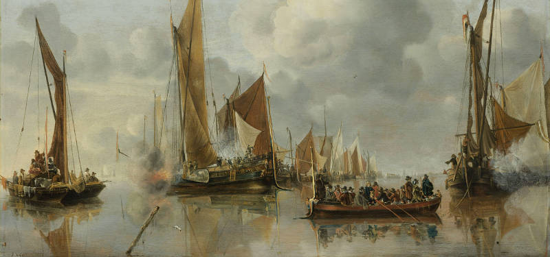
Jan van de Cappelle
1650
Oil on panel, 64 × 92.5 cm.
Rijksmuseum, Amsterdam
Still water, with its glassy surface and slow rhythms, evokes calm, reflection, and permanence. It allows for careful observation of mirrored forms, subtle tonal shifts, and delicate surface disturbances. Flowing water, on the other hand, such as that of rivers and streams, presents a more dynamic challenge. It must appear directional, continuous, and modulated by the terrain through which it moves. Leonardo da Vinci (1452–1519) studied such movements with intensity, sketching the twisting currents and foaming eddies of rivers and waterfalls. In Northern Europe, painters often introduced such effects in the background of landscapes to show transition, scale, and the cycle of nature. The surface of flowing water is less about reflection and more about texture—suggested by broken brushwork, tonal variation, and diagonal movement across the picture plane. In some Dutch paintings, rivers function not only as a physical element but as a metaphor for time and transience, subtly pulling the viewer's gaze into the distance.
Particularly for the Dutch, who were both surrounded and shaped by water—threatened by its potential for flood and ruin, yet sustained and enriched by it through trade, fishing, and maritime dominance—the depiction of water carried a resonance far beyond mere description. Water was not only a physical reality but a central force in the Dutch struggle for independence and prosperity. It carved the land, enabled the nation's commercial rise, and remained a constant presence in daily life. As such, its rendering in painting held particular relevance.
In the case of flowing water, the artistic focus shifts from reflection to movement and texture. Dutch painters often portrayed rivers and canals not as static mirrors but as living surfaces, where current and direction were indicated through broken brushwork, subtle tonal variation, and sweeping diagonals that carried motion across the picture plane. In many works, the river does not just connect parts of the composition—it functions symbolically, as a metaphor for time, impermanence, and the slow passage of life. The viewer's gaze is drawn along its surface, into the distance, toward something unseen, echoing the open, forward-facing outlook of a seafaring nation.
Crashing waves and stormy seas bring water into the realm of drama and power. Marine painting, which became a significant genre in the Netherlands during the 17th century, often focused on the sea not as a tranquil backdrop but as an agent of force and unpredictability. Artists such as Ludolf Bakhuizen (1630–1708) specialized in portraying the open sea under threatening skies, with ships tossed on towering waves and spray exploding into the air. The mood here is entirely different—tense, awe-filled, and sometimes catastrophic.
To depict the effects of water in motion—an extraordinarily complex and elusive subject—Dutch painters relied on a process of incremental refinement in observation and technique. Capturing the behavior of moving water required not only a sharp eye but also a deep familiarity with the medium of oil paint and a willingness to experiment with brushwork, layering, and tonal structure. The sea, with its heaving waves and sudden bursts of foam, demanded particularly bold methods. In marine painting, crashing surf was often rendered with vigorous brushwork that built physical energy into the surface of the canvas. Painters used sharp contrasts of light and shadow to give the water sculptural form, while angular, overlapping brushstrokes mimicked the disordered violence of wind-driven waves. Foam was laid in with broken, flicked strokes of white or pale green, suggesting spray and turbulence, while the heavier troughs beneath were built with cool, opaque pigments layered over dark underpaintings to evoke both transparency and mass.
To depict the effects of water in motion—an extraordinarily complex and elusive subject—painters relied on a long process of incremental improvements in both observation and technique. Capturing the shifting forms, translucency, and force of moving water required not only acute visual attention but also a command of the painter's materials that evolved over time. Nowhere was this more evident than in the rendering of crashing waves in marine painting, where the energy of the sea had to be made visible on a static surface.
Waves in full motion were evoked through vigorous, sometimes impasto brushwork that gave the paint itself a sense of physical energy. Sharp contrasts of light and shadow created a sculptural structure to the sea, while angular, overlapping forms conveyed the instability and collision of water driven by wind. Foam was painted with irregular, broken strokes of white or pale green, flicked or dabbed across the crest of waves to suggest both motion and texture. Beneath these crests, the heavy undersides of the waves were built up with cool, opaque pigments—blues, grays, and dark greens—applied over darker grounds to give a sense of depth and weight. This method allowed artists to convey not just the appearance of the sea, but its restless power, and in doing so they turned water into one of the most expressive elements in 17th-century Dutch painting.
In contrast, the flowing water of rivers and streams offered a quieter, more sustained kind of motion, and painters such as Jacob van Ruisdael (1628–1682) approached it with remarkable sensitivity. In his woodland and hilly landscapes, water is often shown streaming around rocks or descending in small cascades, its surface shifting from glassy smoothness to silvery agitation. Van Ruisdael achieved this effect through delicate modulations of tone and carefully varied brushwork: long, fluid strokes to capture calm currents, and broken touches or dabs to suggest movement and disruption. Highlights were used sparingly but precisely, sometimes placed to catch a glint of light on a wet stone or the white churn at the base of a fall. His treatment of moving water conveys not only the physical properties of flow, weight, and light, but also a mood of persistence and quiet power, deeply rooted in the Dutch experience of land shaped and bounded by water.
Nor were Dutch painters less intrigued by the transformations of water into ice. Frozen canals and rivers were a prominent feature of life in the northern provinces, and they became a frequent subject in painting, especially in winter scenes that combined landscape with genre. Artists such as Hendrick Avercamp (1585–1634) specialized in these subjects, capturing not only the gleam and texture of the ice but the life that gathered upon it—skaters, sleds, games, and distant villages. The surface of frozen water was often rendered with broad, cool planes of gray, blue, or pale brown, sometimes lightly scumbled to suggest snow or ruts. Reflections and shadows were carefully observed, but slightly diffused, suggesting the uneven and granular character of ice. In these works, the fascination with water was no less present—only stilled, solidified, and reimagined as a stage for human activity. Whether in motion or frozen, water remained central to Dutch painting, a subject that was at once practical, symbolic, and endlessly variable in its visual challenges.
Each mood of water requires not only a different technical solution, but a different conceptual approach. Still water invites meditation, flowing water implies movement and continuity, while stormy seas evoke human fragility before nature. Dutch painters of the 17th century, perhaps more than any others before them, found in water not just a backdrop but a deeply expressive subject that could carry both physical detail and emotional weight.
In genre scenes and cityscapes, water often served as a compositional anchor or a means of expanding pictorial space. In Vermeer's View of Delft, the surface of the water in the foreground not only mirrors the skyline but introduces a level of visual delicacy that contrasts with the architectural solidity of the buildings. The faint ripples that distort the reflection ever so slightly create a sensation of air and motion, as if the image were still forming in the viewer's eye. In marine painting, too, artists captured the weight and energy of waves with bold, broken brushwork, while in still-life compositions, water held in glass vessels or wine glasses demanded an entirely different touch—carefully observed refraction, soft-edged reflections, and pinpoint highlights to suggest volume and clarity.
Painting water in Dutch art of the 17th century thus combined empirical observation with painterly innovation. Whether in the vast expanse of a harbor, the gentle arc of a canal, or the glint of liquid in a pewter tankard, water was not simply background but a dynamic presence—mutable, expressive, and deeply integrated into the painter's understanding of the visible world.
The use of reflection on water is one of the principal means of expression in Vermeer's masterful View of Delft. In the quiet expanse of water before the quay, the background edifices are mirrored with remarkable delicacy, their forms softened by a barely perceptible breeze. This faint disturbance causes small ripples that subtly blur the outlines of the broader silhouettes cast in reflection, breaking them here and there with thin, wavering strokes of light paint that suggest a sudden puff of wind ruffling the otherwise still surface. The effect is extraordinary, not only for its technical refinement but for the emotional resonance it generates: the softened reflections seem to hover between presence and disappearance, contrasting with the firm, solid mass of the buildings themselves. The sensation it evokes—that of reality being registered with a sensitivity almost beyond human effort—is one that would be difficult to achieve even with the precision of photography.
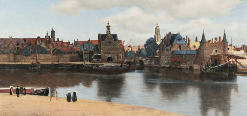
Johannes Vermeer
c. 1660–1663
Oil on canvas, 98.5 × 117.5 cm.
Mauritshuis, The Hague
Yet this poetic solution was not arrived at effortlessly. X-radiographic analysis of the painting has revealed that Vermeer originally attempted to depict the reflections with perfectly calm water, rendering the mirrored silhouettes with hard, clearly defined outlines. In this earlier version, the water mirrored the city more precisely but less evocatively, lacking the quiet dynamism that now defines the finished work. Vermeer's decision to revise the water's surface—transforming it from a static mirror to a living element responsive to the faintest movement of air—was key to the painting's extraordinary atmosphere. It demonstrates not only his technical command of the oil medium, but also his capacity to observe, reconsider, and refine his perception of nature in order to convey something more truthful than a direct replication.
Wet-in-Wet
Wet-in-wet painting refers to a method in which fresh paint is applied directly onto still-wet layers of paint, allowing adjacent strokes and passages to merge, soften, or interact before drying. Because the surface remains open, edges can be blended seamlessly, tonal transitions can be adjusted on the fly, and forms can responsiveness to the evolving image, since debe modeled through subtle shifts of tone and color rather than through sharply bounded contours. The method encourages cisions must be made while the paint remains workable and cannot easily be revised once the surface has set. The technique is particularly effective for capturing fleeting effects of light, atmosphere, and texture, making it popular in portraiture, landscapes, and scenes requiring immediacy and freshness. However, the sense of sculptural volume is better attained with indirect painting.
Wet-into-wet painting implies an advanced command of painterly technique, since the artist must not only understand the colors and tonal values required for a given passage, but must also anticipate how different paints will physically interact while still wet. Every stroke alters the surrounding paint, and misjudgments cannot be isolated without disturbing the whole. The painter must therefore work with exceptional foresight, controlling hue, value, viscosity, and timing simultaneously, while allowing the image to develop as a unified surface rather than as a sequence of corrections.
For this reason, wet-into-wet painting leaves little margin for hesitation or repair. Once the surface loses its initial vitality, attempts at local correction often result in heaviness or muddiness rather than improvement. John Singer Sargent (1856–1925), perhaps the undisputed master of this technique, was keenly aware of this limitation. He is known to have scraped down entire passages—or even nearly complete paintings—with a palette knife when he sensed that the surface had lost the freshness essential to his style. This process often left a thin, diaphanous residue of color and tone on the canvas: hazy remnants that preserved the general chromatic relationships without the burden of overworked paint. Upon this pared-down surface, Sargent would begin again, finding it more effective to rebuild the image than to attempt to rescue compromised passages.
Once Sargent had put in a general outline very rapidly, hardly more than smudges, from that moment that he began really to paint, working with a kind of concentrated deliberation, a slow haste so to speak, holding his brush poised in the air for an instant and then putting it just where and how he intended it to fall. As for what Sargent himself said about painting in this manner, one of his most cited remarks is both modest and revealing: "A portrait is a painting with something wrong with the mouth." While humorous, it hints at his awareness of how easily a seemingly minor passage can unbalance an otherwise complete work. More to the point, he once commented on the difficulty of achieving effortless results, saying: "You must first know your subject thoroughly, and then forget all about it and go ahead." This attitude reflects the heart of his wet-in-wet approach—deep knowledge held in reserve beneath the appearance of immediacy and freedom.

John Singer Sargent
1905
Oil on canvas, 133.3 x 188 cm.
Tate, London
This willingness to erase and restart reflects a deep understanding of the wet-into-wet method's strengths and constraints. Rather than treating revision as incremental correction, Sargent accepted that freshness, once lost, could not be restored through adjustment alone. Painters such as Édouard Manet (1832–1883) and Sargent mastered this demanding approach by recognizing when decisiveness was required—not only in execution, but also in abandonment—allowing clarity and immediacy to prevail over methodical refinement.
In historical practice, wet-in-wet painting is closely associated with direct, continuous working methods rather than staged procedures involving underpainting and successive layers of body paint and glazes. It favors unity of surface and immediacy of effect, but it also imposes technical limits: excessive reworking can muddy colors or disturb underlying forms. For this reason, the method rewards control, economy of touch, and a clear visual intention. In early modern painting, wet-in-wet handling often appears in flesh passages, skies, shadows, and softly lit interiors, where gradual tonal transitions and atmospheric coherence were valued over crisp linear definition.
Wet-in-wet painting differs fundamentally from the more conventional procedures of classical painting, in which painters generally worked with relatively separated layers and avoided the physical mixing of paints when possible. In these layered methods, the principal forms were first established in an underlying paint layer and allowed to dry thoroughly. Only afterward were fine details or decorative motifs—such as the complex patterns of drapery—applied on top. Working in this manner allowed the painter to define forms and colors with the highest degree of precision, since the upper layer could be adjusted or even removed entirely if it failed to meet expectations. Because the lower layer was dry, the newly applied paint remained optically and materially intact rather than blending into the underlying surface.
This "dry-over-wet" procedure proved especially effective for the depiction of gilt ornament, embroidery, and other intricate decorative motifs on luxurious textiles, where sharp edges and clarity were essential. Landscape painters also relied on this approach. Skies and clouds were often laid in first and left to dry completely; only afterward were trees, branches, and leaves painted on top. This method allowed painters to construct highly complex vegetation with ease and variety, without the risk of the foliage blending into the sky. Painting vegetation wet into wet would tend to mix greens and blues, dulling color and softening form. By contrast, placing foliage over a dry sky layer reinforced the sensation of spatial depth, since the vegetation is literally—and visually—positioned in front of the background. While this technique aligns closely with the logic of spatial illusion, it also produces a certain separation between layers: decorative motifs placed over drapery remain optically distinct and never fully merge with the underlying fabric.
In a broader sense, many of the most accomplished painters of the Renaissance and Baroque periods also maintained a clear separation between illuminated and shadowed areas of an object. Rather than allowing light and shadow to intermix freely, they carefully controlled the boundary between them, feathering the two areas just enough to prevent harsh transitions while minimizing physical blending. Peter Paul Rubens (1577–1640) was an absolute master of this refined handling, achieving remarkable vitality without sacrificing clarity or structure.
Vermeer seems to have employed localized wet-in-wet methods in various paintings. Girl with a Pearl Earring shows that the painter applied paint wet-into-wet. The lighter and darker parts of the young girl's blue turban were mixed wet-in-wet with rounded brushstrokes of ultramarine and white mixtures. Once dry, the area it received a transparent glaze with natural ultramarine. However, a significant part of his painting technique involved a multi-step layering process, in which each step was achieved according to an established sequence. On the other hand, Vermeer frequently employed dry-over-wet procedures to preserve tonal and chromatic precision. In Lady Standing at a Virginal, for example, the lead cames of the window are clearly superimposed over the yellowish paint beneath, rather than being worked into it. Similar applications can be seen in the decorative elements of the virginals in the mature Music Lesson, as well as in the veining of the characteristic white floor tiles.
Welstand
The Dutch term welstand in 17th-century art theory refers to the harmonious integration of all elements within a painting to achieve an optimal visual and aesthetic effect. Rather than focusing on individual components, welstand emphasizes the overall balance and unity of a composition.
In his Het Groot Schilderboek (1707-1711), the art theorist Gerard de Lairesse (1640–1711) discussed welstand in his writings, suggesting that it embodies the idea of achieving the best possible arrangement in a painting. He associated welstand with the concept of "optimum," indicating a state where all parts of the artwork coalesce to form a cohesive and pleasing whole.
In practice, achieving welstand involves careful consideration of various elements such as composition, color harmony, light and shadow, and the arrangement of figures and objects. The goal is to create a painting where these components work together seamlessly, resulting in a balanced and aesthetically satisfying piece.
Window
The window in the history of Western art functions as both a literal architectural feature and a conceptual device through which painters address vision, light, space, and the relationship between inner and outer worlds. From the Renaissance onward, the window became a key mediator between reality and representation, between the private sphere of the image and the implied world beyond it. Its meaning has never been fixed: at different moments it has served symbolic, optical, moral, and psychological purposes, often combining several of these roles within a single work.
Since the early Renaissance, painting itself was frequently described as a "window opened in the wall," a formulation that defined the picture as a transparent opening onto a constructed world. This idea encouraged artists to organize space perspectivally and to treat the painted surface as an extension of real vision. Northern painters soon complicated this notion by playing with the boundary between the viewer's space and the depicted interior. Painted frames, shutters, and curtains created trompe l'oeil effects that suggested continuity between domestic architecture and pictorial illusion, subtly questioning where reality ended and representation began.
In Northern Renaissance art, the window often carried explicit symbolic weight. In works by Robert Campin (c. 1375–1444) and Rogier van der Weyden (c. 1400–1464), windows appear in Annunciation scenes with layered theological meaning. The intersection of window mullions could form a cross, alluding to Christ as Savior, while light passing through glass without breaking it served as a metaphor for the Virgin's reception of the Holy Spirit without loss of purity. Here the window is not primarily an optical device but a vehicle for doctrinal ideas made visible within a domestic setting.
By the mid-seventeenth century, Dutch painters redirected the function of the window toward spatial construction and optical realism. In Delft, artists such as Gerard Houckgeest (1600–1661) and Emanuel de Witte (1617–1692) used windows to anchor linear perspective, supplying the orthogonals that define the recession of interiors. At the same time, attention shifted from the window as a drawn shape to the window as a source of observable effects: uneven panes, reflected highlights, softened shadows, and modulated light. Vermeer took this development further by recording not only the presence of a window but the way light behaves as it enters a room, diffuses across walls, and strikes surfaces with varying intensity.
Within Dutch genre painting, the window became a crucial psychological and thematic hinge. It links the enclosed domestic interior to an unseen exterior world of travel, commerce, and absence. Although Vermeer rarely showed detailed outdoor views, the light entering his rooms quietly implies the larger world beyond the frame. In a mercantile society shaped by overseas trade, this light could allude to distance and separation, while also animating intimate moments of reading, writing, or contemplation. Windows thus register presence and absence at once.
Windows also carried moral associations. Stained-glass elements, such as quatrefoils depicting allegorical figures like Temperance holding a bridle, act as silent commentaries on the behavior unfolding below. Earlier pictorial traditions sometimes associated women looking out of windows with desire or moral vulnerability. Dutch painters nuanced this inheritance. Artists such as Jacobus Vrel (c. 1617–after 1662) and Vermeer often present women near windows as figures of expectation or inward reverie rather than transgression, suspended between interior restraint and outward longing.
The window also intersected with contemporary theories of light rooted in devotional thought. In Jesuit-influenced imagery, sunlight entering a darkened room functioned as a metaphor for divine truth illuminating the soul, an idea closely aligned with the principle of the camera obscura. Light becomes revelatory not through spectacle but through contrast, clarity, and gradual disclosure.
Among individual artists, approaches varied. Vermeer used windows to calibrate light with extraordinary precision, often reserving his brightest whites for sunlit window jambs to suggest the intensity of the exterior world while maintaining a subdued interior range. In paintings such as Woman with a Pearl Necklace, an empty wall framed by a window becomes a field for reflected light, quietly opposing worldly adornment with a more inward register. Pieter de Hooch (1629–1684) employed windows and open doors to construct layered spatial sequences, leading the eye through successive thresholds into courtyards or streets. In Leiden, Gerrit Dou (1613–1675) and other fijnschilders developed the niche painting, in which a window-like stone surround creates the illusion that the figure inhabits the viewer's own space.
Across these traditions, the window evolved from a symbolic sign to a sophisticated pictorial instrument. It became a means of shaping space, directing light, and articulating the psychological boundary between interior life and the world beyond. In Dutch painting of the seventeenth century, the window stands as one of the most eloquent devices through which artists joined optical observation, moral reflection, and quiet human experience within a single frame.
In general, the windows in Vermeer's paintings conform to a pattern typical of Delft houses of the period. Each window is divided into four lights. There are two side-hung casements in the lower half of the frame and two fixed lights in the upper half. Almost all the casements feature decorative patterns—some plain, some intricate—formed by the shapes of their leaded panes. Philip Steadman, the London architect and Vermeer/camera obscura specialist, distinguishes three basic window patterns, which he dubs: the "lozenge" type, the "hourglass" type and the "squares and circles" type.
The lozenge design can be found in works like Officer and Laughing Girl, Girl Reading a Letter at an Open Window and The Milkmaid. The lozenges are situated in the topmost of five rows of rectangular panes. The casements are almost flush with the wall, not recessed to create a sill like other window types. There's a short distance from the window frame to the far wall of the room due to similarities in its overall design and positioning. The Milkmaid and the Officer and Laughing Girl , the variations of color and unevenness of the glass panes are registered with the singular attention. In his later interiors, Vermeer treated the windows more as abstract patterns, accentuating their geometric properties.
In the 17th century, the uneven or wavy appearance of glass panes in windows, as depicted in the present work, was a common characteristic due to the manufacturing techniques of the time. The primary method for producing window glass then was the "crown glass" process. Here's how it worked:
Molten glass was first blown into a large bubble. This bubble was then transformed into a flat disc by spinning it while it was still hot, creating a thick lump or "bullion" at the center. As the disc cooled and solidified, the outer edges were thinner, with the thickness increasing as one moved towards the center. Once cooled, the disc was cut into smaller panes. This method inherently resulted in uneven thickness.
As of yet, no one has identified the object(s) reflected in the window of Officer and Laughing Girl, with certainty. Gregor Weber posits a that in the closed section of the casement window, Vermeer subtly introduces a glimpse of the outside world. According to Weber, the artist uses a whitish tone to depict a cloud-covered sky and incorporates reddish tones below to represent the roof and facade of the building opposite. What makes this observation particularly intriguing is that no other painting by Vermeer provides or even hints at such a detailed view of the external world from an interior setting. On the other hand, Tim Jenison hypothesized that the reflection may, in fact, be precisely identified as the facade of the Nieuwe Kerk on Markt, in the center of Delft as seen from the first story of Mechelen, where Vermeer is may possibly have painted the scene. The reflection, if accurately represented by Vermeer, could offer valuable clues about the location and viewpoint of the room in which he painted. Still, without concrete evidence, this remains one of the many mysteries surrounding Vermeer's work.
Wine Jug
The all-white tin-glazed containers with a silver or pewter lid that appears in Vermeer's and countless other Dutch painters' interior scenes were originally produced in Faenza, Italy, from which the word "faïence" "or "faience" is derived. The design of these wine jugs was derived by the Italians from the popular earthenware jugs from the German Rhineland. In the 1550s, they were exported to all over Europe and by the late 16th and early 17th century had become very fashionable. They appear in numerous genre interior paintings between 1650 and 1670.
Vermeer must have been very fond of this type of wine jug since it appears in strategically important areas in four works: A Maid Asleep, The Glass of Wine, The Girl with a Wine Glass and The Music Lesson. Although it is very difficult to distinguish between the original Italian pieces and Dutch imitations through painted images, historian of the Dutch decorative arts Alexandra Gaba van Dongen believes that the ones in Vermeer's paintings are Italian. Many of the potters and tile makers of Delft were descendants of 16th-century Italians from Faenza who had migrated north to Antwerp in the 16th century looking for work, and continued farther north to escape the Spanish military efforts to suppress Dutch independence.
Early Work / Mature Work / Late Work
The terms early work, mature work, and late work describe different phases in an artist's career, helping to trace stylistic development, thematic evolution, and technical refinement over time. When a distinction is made between the different phases of an artist's development, the mature period is sometimes described as the "height of their career", "fully developed style," or simply ";mature phase" rather than using "middle work" explicitly.
The categorization of an artist's early, mature, and late work has its roots in 19th-century art historical writing but became more formally integrated into the discipline in the early 20th century. These terms were influenced by broader historiographical trends, particularly the study of artistic evolution, connoisseurship, and stylistic analysis.
The origins of such classifications can be traced to Giorgio Vasari (1511–1574) in Lives of the Most Excellent Painters, Sculptors, and Architects (1550, revised 1568), where he structured artists' biographies in a developmental manner, often emphasizing youthful promise, a peak period, and decline in old age. However, Vasari's approach was largely anecdotal and did not systematically analyze stylistic phases.
The 19th century saw the emergence of modern art history as a discipline, particularly with the work of Johann Joachim Winckelmann (1717–1768) and later scholars like Heinrich Wölfflin (1864–1945). Wölfflin's Principles of Art History (1915) emphasized the evolution of form and style over time, laying the foundation for a more structured analysis of artistic periods. Though Wölfflin did not explicitly use "early, middle, late" to describe individual careers, his framework for understanding stylistic development encouraged later art historians to apply these terms to individual artists.
In the late 19th and early 20th centuries, connoisseurs such as Giovanni Morelli (1816–1891) and Bernard Berenson (1865–1959) began using stylistic phases to attribute paintings, particularly in the study of the Italian Renaissance. The practice was further solidified in Dutch art history by scholars such as Wilhelm von Bode (1845–1929) and Cornelis Hofstede de Groot (1863–1930), who analyzed Rembrandt's (1606–1669) stylistic evolution and divided his career into different periods. This period also saw increased focus on mature work, particularly in the writings of scholars like Max J. Friedländer (1867–1958), who contributed significantly to the categorization of Netherlandish painting.
The widespread use of these terms in 20th-century art history was closely linked to catalog raisonnés and scholarly monographs that sought to systematically arrange an artist's work chronologically. The study of Rembrandt, in particular, played a crucial role. The work of the Rembrandt Research Project (founded in 1968) classified his paintings into different career stages, reinforcing the notion of an artist's developmental trajectory. Similarly, Pieter de Hooch (1629–c.1684) and Frans Hals (c.1582–1666) were studied using similar methodologies, particularly by Dutch art historians such as Seymour Slive (1920–2014) and Jeroen Giltaij (b. 1947).
There is no universally fixed definition of the characteristics of early, mature, and late work, but general patterns have emerged in art history based on stylistic development, technical refinement, and thematic evolution. These phases are often shaped by an artist's training, influences, market conditions, and personal circumstances. While the specifics vary from artist to artist, broad tendencies can be observed.
- Early work is typically associated with a formative period, when an artist is developing technical skills and absorbing influences from teachers, contemporaries, or artistic traditions. The handling of form, composition, and color may be more tentative, and experimentation is common. This phase often includes works that closely follow prevailing styles or the conventions of a workshop or guild. In the 17th-century Netherlands, young artists were often trained in the studios of established masters, which meant their early work frequently bore the hallmarks of their instructors. Rembrandt's early paintings, for example, show the strong influence of Pieter Lastman (c.1583–1633) in their bright colors and complex, multi-figured history compositions, while Vermeer's earliest surviving works suggest an engagement with the grand manner of history painting before he transitioned to his signature domestic interiors.
- Mature work usually represents a period of confidence and refinement, where an artist has developed a distinct personal style. This phase often marks technical mastery, where brushwork becomes more assured, compositions more balanced, and the handling of light and perspective more sophisticated. Many of the most celebrated works in an artist's career emerge during this stage. In the Dutch Golden Age, painters often found success in specialized genres during this period—whether in portraiture, still life, or genre painting—catering to the tastes of patrons and the art market. Pieter de Hooch's (1629–c.1684) mature period, for instance, is marked by his finest Delft interiors, which show precise light effects and a harmonious arrangement of figures within a structured space.
- Late work often shows a deepening of artistic expression, with many artists moving toward greater freedom in brushwork, a more limited or expressive palette, and a focus on essential forms rather than elaborate detail. This phase is sometimes characterized by bold simplifications, a more direct engagement with light and shadow, or even a departure from earlier methods.
Although mature work is often used as a separate designation to describe an artist's peak period, this can overlap with mature or late work and is generally understood as the phase in which an artist fully realizes their artistic vision. It is the period in which technical skill, compositional complexity, and thematic depth are most harmoniously integrated. Vermeer's mature work, for example, shows complete mastery of light, atmosphere, and composition, resulting in paintings of extraordinary subtlety and balance. While many artists' most famous paintings come from this phase, it is not always the case that late works are considered superior to those of an earlier peak.
Despite these general tendencies, the phases of an artist's career are not always neatly divided, and external factors—such as changing patronage, financial hardship, or shifting artistic trends—can influence an artist's trajectory. Some painters achieve artistic maturity early, while others evolve more slowly or experience fluctuations in style. Additionally, some artists, particularly those who died young, may never have reached a defined late phase, and others, such as those working within strict workshop systems, may show relatively little stylistic evolution at all. The classification of an artist's early, mature, late, and mature work thus remains a useful, but flexible, framework for understanding artistic development.
Today, these terms remain widely used in art history, museum cataloging, and connoisseurship, providing a structured way to discuss an artist's evolution. While they offer a useful framework, some scholars caution against overly rigid periodization, as artistic development is not always linear, and external factors—patronage, economic conditions, or personal circumstances—can influence an artist's output unpredictably. Nonetheless, the classification of an artist's early, mature, and late works continues to be a fundamental tool in understanding stylistic progression and artistic legacy.
Vermeer's artistic career is typically categorized into three main periods: his early phase (c. 1654–1658), characterized by experimentation, religious and biblical themes, and stylistic exploration; his mature or middle phase (c. 1657–1667), when he painted most of his widely recognized masterpieces; and his late period (after c. 1670), marked by stylistic evolution and shifts in technique .
- In the early phase (c. 1655–1660), Vermeer explored various genres, including religious and mythological subjects, likely influenced by Italian and Utrecht Caravaggist painters, and a single bordello scene. His brushwork at this stage was relatively firm and assertive, with carefully defined forms, strong contrasts of light and shadow, and vivid coloring. Notable works from this period include Christ in the House of Martha and Mary, and The Procuress. These paintings show his initial experimentation with compositions and themes typical of upper-tier history painting mode, but he had not yet achieved his characteristic refinement or the subtle modulation of light and coolr for which he later became known. However, the Diana and Her Companions clearly exhibits lacune in both compositon and execution, even taking into consideration that the work is in poor condition and that it may be the artist's earliest surviving work.
- Vermeer's mature phase (c. 1660–1670) contains the majority of his celebrated masterpieces. In this decade, Vermeer fully developed his characteristic style, distinguished by subtle lighting effects, luminous colors, balanced compositions, and serene interiors portraying quiet moments of domestic life. Many critics beleive that this change may have been inaurgurated by the artist's use of an optical aid called the camera obscura. Representative masterworks from this period include The Milkmaid, Woman Holding a Balance, Woman in Blue Reading a Letter, Woman with a Pearl Necklace, The Music Lesson, Woman Holding a Balance, and notably, the monumental The Art of Painting. Each of these works demonstrates Vermeer's meticulous control of spatial relationships (i.e., negative and positive shape), perspective, the balanced interplay between figures and setting, and a masterful modulation of color and light that evoke tranquility and a sense of timelessness. The technique in e these works is unusually broad, shunning picayune detail and facile anecdote, out of reach of the great part of Dutch genre painters, except for Gerrit ter Borch (1617–1681). The planimetric organization of his compositions is so carefully manipulated in this period that they seem almost ot anticipate modern formalism, although narrative remained a paramount concern to his concept of art.
- In his late phase (c. 1670–1675), Vermeer's style shifted subtly but distinctly. He employed looser, freer brushwork, with forms becoming softer, and in certain areas almost impressionistic, moving towarda bizarre, calligraphic touch rather than purely menial, descriptive handling of paint prized by his contemporaries. The subtle shifts in tone are replaced by flat carefully modulated shapes to create form and relief. The palette in these late works subtle yet powerful, and his approach to form and brushwork becomes increasingly virtuosic. Notable late works include The Guitar Player, A Lady Standing at a Virginal, A Lady Seated at a Virginal, and The Lacemaker. In these paintings, his brushwork grows more audacious, sometimes nearly abstract, demonstrating a hitherto unseen confidence. The late style emphasize formal relationships, the manipulation of negative and positive shape, light and shadow rather than detail, creating effects that, from a suitable viewing distance, achieve what critics describe as and optical realism.
Working Up
The concept of working up in 17th-century painting refers to a particular stage in the painting process, distinct from the initial underpainting stage. In Duth, it was called "opmaken" which means to bring up or finish. During the working up phase the main concern was to give everything its correct coloring, to render materials and textures appropriately, and to fix the final contours of each form. Each distinctive passage of the painting was generally executed as a separate entity and finished in one or two sessions. Whenever it was necessary to achieve strong, bright colors, (for red, yellow and blue robes and the like), the passage concerned was clearly executed within carefully delineated contours in accordance with fixed recipe, involving a specific layering or fixed type of underpainting.
During the working-up stage, the artist would focus on refining the painting by adding details, depth, and texture to the forms established in the underpainting. This is the stage where the artist would give specific attention to the proper rendering of materials, like the sheen on silk or the texture of skin, and the correct coloring of each element. It is also the stage where the final contours and boundaries between forms would be established.
The objectives of this stage varied depending on the painter's style, the artistic conventions of the period, and the type of painting being created. In the 17th century, for example, there was a strong emphasis on realistic representation, especially in genres like still life and portraiture. Therefore, the working-up stage was crucial for achieving the level of detail and realism that paintings from this era are known for.
The transition from the underpainting to the working-up stage was significant. Underpainting primarily laid out the composition and general lighting scheme of the painting. It created a base layer, often in monochrome or a limited color palette, upon which the artist would build up layers of more complex color and texture. The working-up stage is where this buildup occurs, often using glazes and other techniques to achieve nuanced color effects and intricate details.
The concept and practice of working up a painting may have differed slightly from artist to artist and school to school, but it remains a useful term for understanding a critical stage in the creation of many 17th-century European paintings.
Recent technical study of Vermeer's paintings indicates that he most likely used the standard working-up method employed by Northern European artists. In his mature work, many passages are completed with only one or two pigments different than those of the adjacent ones. Furthermore, there is sound reason to believe that in the working-up stage, sittings occurred a long time from one another. Rather than a being a slow painter, Vermeer may have been a more meditative painter who concentrated fully on one area at a time with long intervals between painting sessions.
It remains very difficult to understand the sequence in which Vermeer worked up each separate passage. Ernst van der Wetering has hypothesized that Rembrandt (1606–1669) worked from "the back to the front" of his pictures by analyzing the system of overlapping areas of pigment.Ernst van de Wetering, Rembrandt: The Painter at Work (Berkeley: University of California Press, 2004), 233. No such study has been conducted in regards to Vermeer's painting. However, one might reason that the background white-washed walls, which play such an important role in the artist's pictorial conception, may have been among the first areas to be completed in the working-up phase. More than any other pictorial element, the walls' color and tone determine the amount and quality of light which will be represented in a given painting. Analogously, landscape painters often depict the sky first in order to properly gauge the correct colors and tonal values of the rest of the painting. For it is obviously the sky which influences the tone of the landscape itself and not vice versa. After having defined the various tones of the wall, perhaps Vermeer then worked up the larger areas of color such as the various costumes worn by the models which usually play a decisive role in the chromatic harmony of the painting.
Work Session
A work session refers to a focused period of time during which an artist engages in painting, drawing, or another form of artistic production. Depending on the artist's working method, a session may be brief and spontaneous or highly structured and prolonged. Work sessions vary in intensity and purpose—some may be dedicated to preliminary sketches or underpainting, while others focus on refining detail or applying, glazes and final touches. Factors such as lighting conditions, available materials, and the physical demands of a particular technique influence the duration and effectiveness of a session. In many cases, artists develop a rhythm in their work, balancing long, concentrated efforts with breaks to maintain precision and fresh observation.
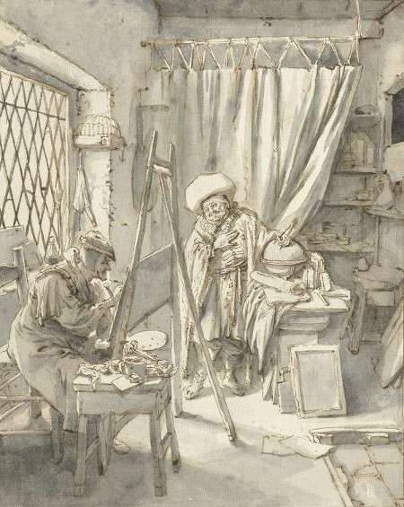
Cornelis Dusart
1690–1700
Paper, 24 x 19 cm.
Rijksmuseum, Amsterdam
In 17th-century Dutch painting, work sessions were shaped by the nature of the materials, the working environment, and an artist's personal technique. Oil paint, the dominant medium of the period, required varying drying times depending on paint composition and layer thickness, meaning that artists often worked in carefully planned sessions that allowed for complex, multi-stage techniques. Some painters, such as Rembrandt (1606–1669), applied paint with bold, expressive brushwork in what appears to be a relatively fast and direct manner, suggesting that his work sessions were dynamic and adaptive. By contrast, Vermeer's meticulous technique, with its slow buildup of opaque and translucent layers and delicate tonal shifts, implies that his work sessions were deliberate, deeply pondered and relatively methodical. His paintings often show many pentimenti and an extraordinary degree of refinement, suggesting extended periods of adjustment and careful observation.
Artists in the Dutch Golden Age often had to structure their work sessions around market demand, commissions, and guild regulations. The workshop model, where multiple assistants contributed to a painting at different stages, allowed for more efficient production, especially for prolific artists like Frans Hals (c.1582–1666). However, some artists worked more independently, producing fewer but highly detailed paintings. Still-life painters, such as Willem Kalf (1619–1693), needed to plan their work sessions carefully to capture the transient qualities of light on reflective surfaces , while portrait painters often scheduled sittings with their clients, balancing direct observation with studio-based refinements.
Work sessions were also influenced by the technical and economic realities of the time. In an era when artificial lighting was limited, many painters relied on daylight , meaning their sessions had to align with natural light conditions. Additionally, materials such as pigments and canvas were expensive, and artists needed to be efficient in their use of resources. Whether in a bustling workshop or a quiet studio, the structure of work sessions in 17th-century Dutch painting reveals much about an artist's technique, working habits, and creative process.
We have no direct information about Vermeer's working methods. However, his technique suggests that his procedures were consistent with those of other painters working in the same genre of high-life domestic interior painting.
Workshop
See also: Studio, Studio Lighting, Studio Props, and Northern Light.
A workshop was where a painter in the Middle Ages and Renaissance carried out his work, at a time when painting was considered to be a craft, a studio or space where an artist, often with the assistance of apprentices and journeymen, created artworks. In addition to being a place for painting, sculpting, or other forms of artistic production, a workshop also functioned as a center for training young artists in techniques, materials, and the master's particular style. In the workshops of the Renaissance and Baroque periods, it was common for apprentices to prepare panels or canvases, refine pigments, grind paints, and even execute parts of a composition under the master's supervision, allowing the master to focus on the most critical aspects of the work. A painting without the master's participationis referred to as a "workshop"' piece.

Philips Galle after Jan van der Straet
c. 1588
Engraving, dimensions unknown
Collection unspecified, Whereabouts unspecified
The workshop environment began to decline in the late 18th and early 19th centuries, primarily due to the shifting social and economic landscape of the art world. One major factor was the rise of academies and formal art education, such as the Académie Royale de Peinture et de Sculpture in France, which provided systematic training in drawing, anatomy, and theory, gradually replacing the traditional apprenticeship system of workshops. These institutions emphasized individual creativity and theoretical knowledge over the collaborative and hierarchical production model typical of workshops. The French Academy, in particular, promoted the idea of the artist as an independent creator rather than a craftsman, encouraging artists to work alone and develop distinctive personal styles.
Another significant factor in the decline of workshops was the changing structure of art markets. With the growth of art dealers, galleries, and exhibitions such as the Salon in Paris, artists gained new avenues to reach patrons directly, bypassing the need for large-scale workshop production to satisfy commissions. This shift empowered individual artists to control their output and public personas, fostering the rise of the "artist-as-genius" concept that celebrated originality and individual vision over the collective production of workshops.
The Industrial Revolution also played a role by transforming material production and altering the economic conditions of art-making. Advances in paint manufacturing and the availability of pre-prepared canvases and pigments reduced the need for apprentices who previously handled these tasks in workshops. Additionally, the Romantic movement's emphasis on personal expression and authenticity further eroded the workshop model by framing art as a product of solitary inspiration rather than collaborative craft.
In place of workshops, artist studios emerged as the new standard, where artists worked independently or with a small team of assistants. These studios prioritized personal creativity and exploration over the division of labor seen in workshops. The modern art market's preference for unique, signed works by individual artists reinforced this trend, making the collaborative and sometimes anonymous production of workshops seem outdated. As a result, the studio became not only a place of work but also a symbol of the artist's identity and independence, defining the new paradigm of art production that persists to this day.
X-Radiography
Although X-radiography is a well-known diagnostic tool in the medical field, it is used extensively by conservators to determine how artists applied different layers of paint to create an image. X-rays penetrate through paint layers and record on film the atomic weight or density of the various materials present. This technology reveals changes, such as figure pose and placement, costume details, or background composition, the artist made during the process of painting. An X-ray can also easily spot repaired tears on the canvas, holes in the panel support, losses in the ground layers, and cut down edges and transfers.
Information collected by X-ray examination is extremely valuable to conservators as it helps to determine the conservation issues of the object and subsequent correct conservation approach. The information revealed by this type of examination can also assist art historians in the interpretation of the artwork and more specific dating.
X-ray examination is able to detect the presence of paints such as lead white, lead-tin yellow, or vermilion that contain heavy metal elements because they absorb the x-rays and prevent them from blackening the film. Materials that do not absorb x-rays, such as carbon black, will allow x-rays to pass through the object and blacken the film. Fortunately, X-ray opaque pigments include most of the whites and yellows, meaning that light areas in a painting are mostly light on the radiograph. Those pigments with weaker absorption power are zinc white, cadmium yellow and emerald green. Very weak absorbers include umber, cobalt blue, red/yellow ochre and Prussian blue. The worst absorbers are the organic pigments based on carbon such as carbon black and carmine lake.
Yellowing
Yellowing of varnish is a common issue in oil paintings, caused by the natural aging of traditional resins such as mastic or dammar. These varnishes, initially applied as a protective and unifying layer, gradually oxidize and darken over time, altering the original color balance of a painting. This effect is particularly noticeable in lighter areas, where whites and blues take on a warm, amber cast, and can obscure the painter's intended contrasts. While exposure to daylight can slow the process, many older paintings were kept in dimly lit churches or private collections, accelerating varnish discoloration. In extreme cases, accumulated layers of aged varnish led to an overall darkening that distorted the painting's tonal relationships, creating the appearance of a more somber or heavily shadowed work than the artist originally conceived.
In 17th-century Dutch painting, varnishing was a crucial final step, enhancing spatial depth, enriching colors, and protecting the surface. Because many Dutch painters employed glazing techniques—applying transparent layers of color to achieve heidthened effects of luminosity—the final varnish played a significant role in amplifying these effects. However, as varnish aged, it transformed the tonal balance of paintings. Rembrandt van Rijn (1606–1669), whose work was already rich in deep umbers and ochres, appeared even warmer and darker under layers of old varnish, reinforcing the perception of his paintings as possessing an "Old Master glow". This change became so culturally ingrained that when later generations viewed these darkened works, they assumed this was the intended aesthetic, rather than the result of accumulated oxidation.
By the 19th and early 20th centuries, many art experts and collectors believed that removing old varnish would strip paintings of their historic character. Some argued that artists, particularly those working in the Baroque tradition, had anticipated the yellowing process and had intentionally painted in cooler tones, knowing that the varnish would eventually warm the palette and bring the final effect into balance. According to this view, cleaning paintings down to their original, unvarnished state risked exposing an unfinished, overly cold, or harsh appearance. Others felt that the golden patina created by aged varnish gave Old Master works their distinctive atmosphere, lending them a sense of grandeur and historical weight that should not be disturbed. Today, art conservationists carefully weigh these factors, recognizing that aged varnish can alter but also contribute to an artwork's historical presence. Modern synthetic varnishes, which resist yellowing more effectively than traditional resins, offer a way to preserve a painting's clarity without the risk of dramatic color shifts over time. Nevertheless, the question of whether artists accounted for varnish aging in their color choices remains open, and each restoration decision is made with the understanding that a balance must be struck between historical authenticity and the artist's original vision.
Vermeer, whose paintings are distinguished by their precise modulations in of light and color, was particularly affected by these debates. His characteristic blues and light grays, created with the addition of small amounts of the precious ultramarine, could become dulled or muddied under layers of yellowed varnish. Yet when 20th-century restorers removed darkened varnish from some of his works, revealing a cooler, crisper palette, the results initially shocked those accustomed to the warmer, golden-toned versions. Similar reactions accompanied the cleaning of other Old Master paintings, including works by Raphael (1483–1520) and Titian (c. 1488–1576), where restored colors seemed startlingly bright compared to their varnished appearance.
Since the 1950s almost every painting by Vermeer was undergone important conservation treatment and once again reflect the art's cool palette and rich coloring. Some removal of old varnish has sometimes had a spectacular results, such as Girl Reading a Letter at an Open Window and The Procuress, provoking adamant protests.
At the moment, the only paintings Vermeer that still bears the "Old Master " glow are The Lacemaker and The Astronomer, both of which are housed in the Louvre. The Louvre has faced criticism regarding its restoration practices, with debates centering on both overcleaning and excessive caution. For instance, the restoration of Leonardo da Vinci's The Virgin and Child with Saint Anne (c. 1503) led to concerns among experts that the cleaning process had gone too far, potentially altering the artist's original intent.
Stand Oil
Stand oil is nothing more than linseed oil that has been heated to about 525–573º F under conditions that exclude oxygen for a number of hours. This process changes the oil's mechanical and physical properties. The change is a molecular one called polymerization; nothing is added to the oil and nothing is lost. Stand oil forms a tough strong film for paint and its working qualities differ so much from the drying oils listed above that it is hard to believe that it has been obtained only by heat.
Although stand oil appears darker than oil in its pure from, if diluted with turpentine to obtain good working consistency, it is actually paler than straight linseed oil. It turns much less yellow with age than raw oils do and when it is diluted or mixed with other ingredients to a usable consistency, the resulting medium is practically non-yellowing. Only very little quantity of stand oil is necessary to appreciable alter a paint's characteristics.
The value of stand oil for fine painting has long been recognized and it seems that it was commonly employed by Dutch and Flemish painters.
Even a small amount of stand oil imparts to paint an enamel-like smoothness and tends to make the paint fuse and blend. The paint layer, even if applied thickly, levels out to a smooth, enamel-like surface. Being so heavy, it supplies the paint with a "drag" that permits the painter to manipulate the brush with the greatest deliberation obtaining the most precise control imaginable. Contours can be subtly fused with the background and one can easily manage thick layers of opaque paint without digging up the underlying paint with the brush. It is particularly useful for achieving thick, perfectly homogeneous layers of opaque paint and lends pure white pigments an extraordinary luminosity. It also stays fluid for a length of time sufficient for elaborate modeling.
When used properly, it produces a satin-like surface that recalls the finer works of Vermeer's mid career. Stand oil is also frequently used as a component for glazing mediums as well.
No trace of stand oil have been found in the works of Vermeer but this is probably due to the fact that specific tests must be performed to detect it and the great parts of Vermeer's canvases have not been examined in depth.