Art is filled with specialized language that can often puzzle the lay reader. Many terms used by artists, historians, and critics carry meanings that differ significantly from their everyday use, while others are so particular to the field that they remain virtually unknown outside it. This online glossary aims to clarify these distinctions, offering clear definitions enriched by historical and visual context.
Each entry begins by examining the term within the broader history of art—tracing its development, significance, and changing interpretations across time and cultures. When relevant, the discussion shifts to the term’s role in the Dutch Golden Age, a period of extraordinary artistic innovation, technical refinement, and market-driven production. Here, the glossary highlights how concepts were understood and applied by Dutch painters, collectors, and theorists, situating them within the intellectual and social fabric of the seventeenth century.
Given the focus of this website, many entries also include a dedicated section marked with Vermeer’s distinctive monogram. These sections examine how each concept relates specifically to Vermeer’s work—his use of perspective, light, and material texture, or his place within broader Dutch artistic practices. In doing so, the glossary functions not only as a reference tool, but as a framework for understanding Vermeer’s enduring contribution to the history of art.
With more than 700 carefully curated terms and a network of over 30,000 internal links, the glossary allows users to navigate across multiple facets of art, revealing unexpected connections and deeper layers of meaning. Designed to function as both a structured reference and an open-ended journey, it encourages readers to move beyond isolated definitions—tracing the evolution of artistic ideas across disciplines and centuries. Whether used by scholars or by curious enthusiasts, this glossary offers an extensive, interconnected resource for anyone wishing to deepen their understanding of visual art.
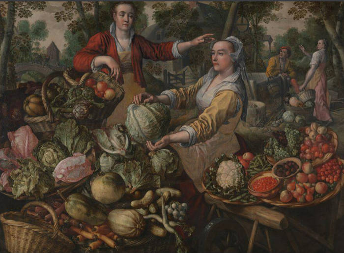
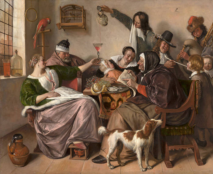
The Jak, a type of short jacket commonly worn by women in the Dutch Republic during the 17th century. In general terms, a jak was a practical and often elegantly decorated garment, typically made of wool, silk, or linen, and occasionally lined with fur for warmth. It usually had long sleeves and was worn over a chemise or a bodice, sometimes fastened at the front with hooks or ribbons. The jak was both functional and fashionable, reflecting the wearer's social status through the choice of fabric and ornamentation, such as lace or embroidery.
Jakken appears frequently in genre scenes, particularly in the works of artists like Pieter de Hooch (1629–1684), Gerard ter Borch (1617–1681), and Vermeer. These painters often depicted women engaged in domestic activities—pouring milk, writing letters, or playing music—dressed in jaks of various styles and materials. The representation of these garments was not merely incidental but served to convey information about the character's social standing, occupation, and even moral virtues. Gabriel Metsu (1629–1667) painted them many times, sometimes green or blue, occasionally yellow, but most often red. Red had been a popular color for clothes and drapery. It had positive associations since antiquity and was regarded as a "warm color." Judging by the number of times that jacks appear in Dutch interior paintings of the 1650s and 1660s, it must have been a popular but elegant daily wear for ladies of the middle class, adapted for both indoor and outdoor use. The jack is represented countless times in Dutch interior painting, sometimes in views of market scenes, but it would not do for portraits.
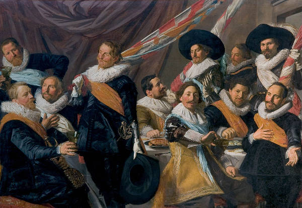
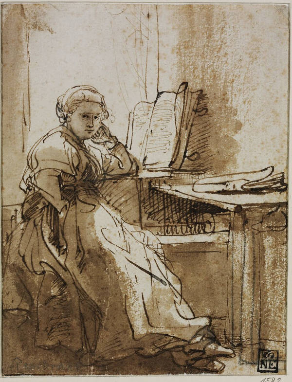
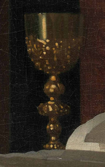
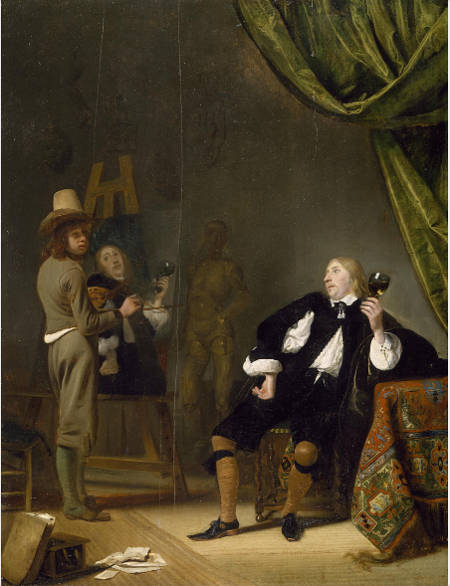
A Lady Reading a Letter
Gerrit ter Borch
c. 1665
Oil on canvas, 76 x 62 cm.
Wallace Collection, London
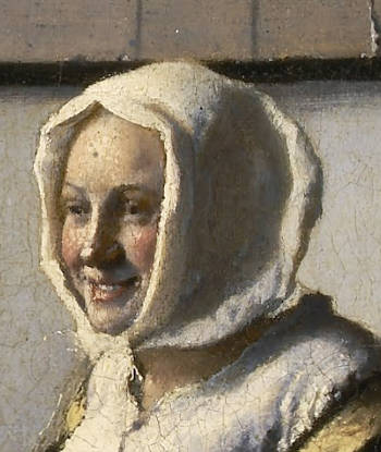
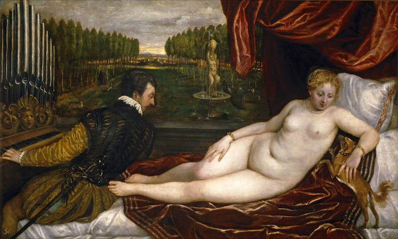
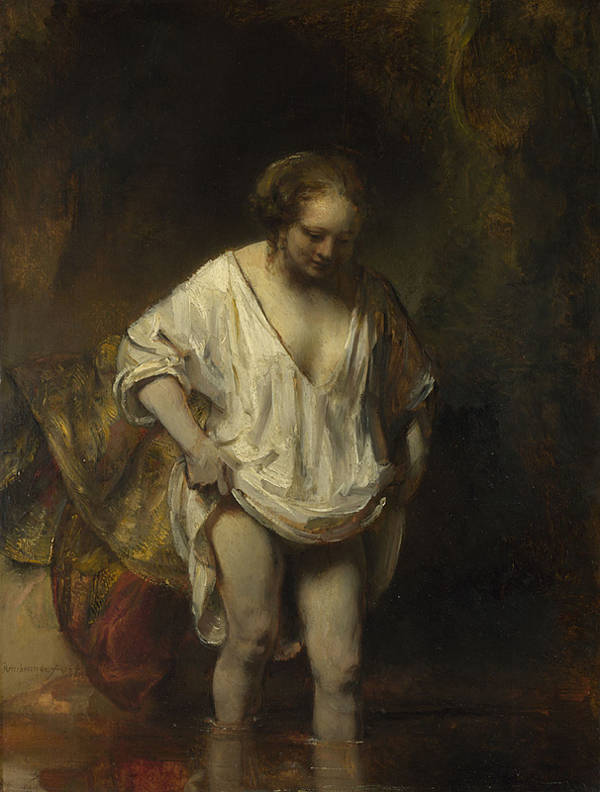
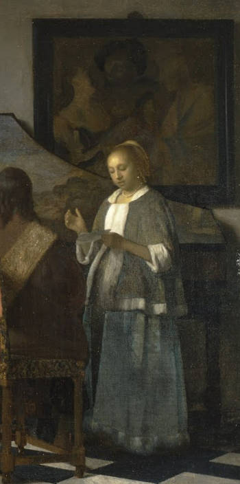
Following a timid debut in Woman with a Lute, a stylish fur-trimmed yellow satin jacket, which is now synonymous with Vermeer's art, is represented in five other pictures of the 1660s and 1670s. In three works it can be considered a sort of opticalfocal point, and so must have responded to important aesthetic requisites, although it is not out of the question that it had a sentimental significance for the artist. One such article is listed among the possessions of the artist's beloved wife, Catharina Bolnes (1631–1687). The folds of this jacket are handled so differently from picture to picture that it appears to be made of various kinds of fabric, although a side-by-side comparison of the shapes and the distribution of the spots on the fur trim of three paintings (A Lady Writing, Woman with a Pearl Necklace and Mistress and Maid) assures us that it is one and the same article. The fact that the painter would have so willfully distorted the garment's folds but so carefully attended to the positions and shapes of the spots, which perhaps even Vermeer's wife would never have noticed, is somewhat perplexing.
Historians of costume tell us that the spotted fur trim of Vermeer's jacks was probably not precious ermine but cat, squirrel or mouse decorated with faux spots. In fact, even in the inventories of the wealthiest women, ermine is never mentioned. Unlike those portrayed in Vermeer's paintings, very few renderings of jakken show spots on the fur. In Vermeer's The Concert, a deep blue jack is portrayed without any spots and with no trim around the collar. Collars began to be trimmed in the 1660s. The same jack likely appears inWoman Holding a Balance as well as in Girl with a Flute. Not a single jack has been preserved.
The color of Vermeer's jack was probably obtained with a common dye called Dyer's Weed or weld (in Dutch, wouw or woude). Yellow was seen as a "cooler color" and was valued slightly less than red because it was not quite gold.
Je ne sais quoi [French: literally: I don't know what] is an intangible quality that makes something distinctive or attractive, which is, however, ultimately unsayable. It is sometimes associated with other historical terms such as sprezzatura, galanterie, honnêteté. Je ne sais quoi suggests the impossibility of defining the term itself. Since different individuals perceive it differently, it is not a rational value.
Je ne sais quoi is assumed to be a quintessentially French phenomenon and to belong purely to the realm of the literary. Richard ScholarRichard Scholar," The Je-Ne-Sais-Quoi in Early Modern Europe Encounters with a Certain Something" (Oxford: Oxford Scholarship Online, September 2008). argued that in the early modern period it served to address problems of knowledge in natural philosophy, the passions, and culture and that major figures of the period such as Montaigne, Shakespeare, Descartes, Corneille and Pascal alongside some of their lesser-known contemporaries can be a tied to it. The term shows up Voltaire's Dictionnaire philosophique under finesse, but seems to have no other influence until the next century. James Elkins, Why are Our Pictures Puzzles? On the Modern Origins of Pictorial Complexity (New York: Routledge, 1999), 138.
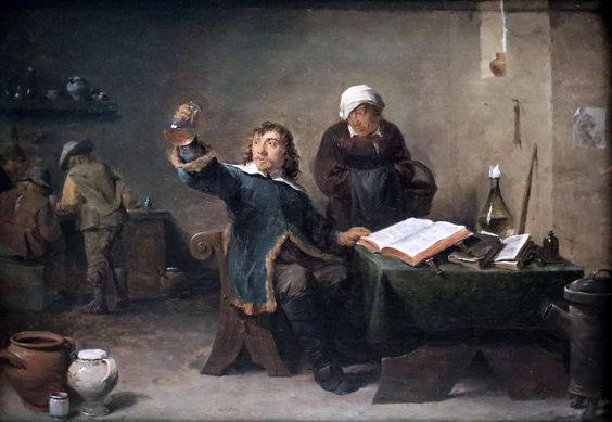
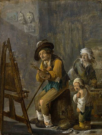
Paint Making in a Painter's Studio David Ryckaert III c. 1635–1638 Oil on panel, 42.8 x 31.7 cm. Stadtgeschichtliches Museum "Schabbelhaus", Wismar
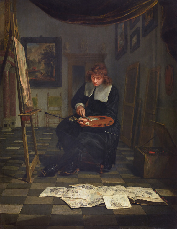
A journeyman is a skilled worker who has successfully completed an official apprentice qualification in a building trade or craft. He is considered competent and authorized to work in that field as a fully qualified employee. When the master-painter and guild were satisfied with an apprentice's progress, usually after two to four years, he became a journeyman. He could sign and sell his own pictures and work towards becoming a master himself. After submitting a masterpiece, a journeyman could be accepted as a master himself, open his own studio, and take on students. Many, however, continued to work in the shops of other artists. Thus, after his three years or so as a pupil of the history painter Jacob van Swanenburgh (1571–1638) in Leiden, in 1624 Rembrandt (1606–1669) went to study with Pieter Lastman (1583–1633), also a history painter, in Amsterdam for about six months, before returning to Leiden to practicepainting as an independent master. Govert Flinck (1615–1660), who joined Rembrandt's studio in about 1633, while he was still using studio space in Hendrick Uylenburgh's premises, who was also a journeyman or assistant, rather than a pupil.
By definition, a journeyman was an artist who may have been employed by a master craftsman but could charge a fee for each day's work. A journeyman could not employ others but could live apart from the master, unlike an apprentice who usually lived with the master and was employed for a period of several years. Traveling from town to town, journeymen would have gained experience in a variety of workshops. Itinerant journeymen were not subject to most of the regulations protecting municipal craft guilds and unlike apprentices, they were not recorded in official sources such as the registers of the painters, and, thus, it is impossible to quantify the number of journeymen who worked in Dutch workshops. The art historians Marten Jan Bok and Gary Schwartz have contended that even in the mid-17th century more than half of Dutch paintings could have been commissioned, and were mainly carried out by assistants, journeymen and copyists, whose works were sold at the lower end of the market through art dealers.
The practice of employing journeymen in the bigger studios led to a large-scale division of labor and to art being mass produced. For example, in the case of Michiel van Miereveld's (1566–1641) portraits, his sons, grandsons and journeymen worked on them. The portraits of the members of the court of the House of Orange were done by journeymen and were stockpiled against future demand. Miereveld just signed them, sometimes reworking them with one or two brushstrokes. The fact that some of his work was signed "painted by myself" (door mij zelven geschilded) may indicate that like other artists he differentiated between his own work and that produced by his studio, a difference that would have been reflected in the price.
Van Hoogstraten (1627–1678), a Dutch painter, writer, and art theorist, made this point about kenlijkheyt in reference to Rembrandt's The Night Watch:
I therefore maintain that perceptibility [kenlijkheyt] alone makes objects appear close at hand, and conversely that smoothness [egaelheyt] makes them withdraw, and I therefore desire that which is to appear in the foreground, be painted roughly and briskly, and that which is to recede be painted the more neatly and purely the further back it lies. Neither one color nor another will make your work seem to advance or recede, but the perceptibility or imperceptibility [kenlijkheyt or onkenlijkheyt] of the parts alone.
The Night Watch Rembrandt 1642 Oil on canvas, 363 x 437 cm. Rijksmuseum, Amsterdam
"Interestingly Van, Hoogstraten did not apply this proposition, which he advances with great emphasis, to his own paintings in the period which were smoothly executed, in both foreground and background."Ernst van de Wetering, Rembrandt: The Painter at Work (Berkeley: University of California Press, 2004), 184–185.
Kitchen scenes in painting depict domestic interiors focused on food preparation, household work, and the people—most often women or servants—engaged in those tasks. The subject has deep roots in European art and did not originate with the Dutch Golden Age. In the 16th century, artists in Italy and Spain began to explore the kitchen as both a physical setting and a thematic focus, often merging still life, genre, and religiousimagery.
A Baker Preparing Pies Bartolomeo Passaroti Date unknown Oil on canvas, 156 x 110 cm. Location unknown
In Italy, Vincenzo Campi (c.1536–1591) and Bartolomeo Passarotti (1529–1592) were among the first to treat kitchen and market scenes as independent subjects. Campi's detailed paintings of cooks and vendors surrounded by meat, vegetables, and cookware are early examples of the kitchen scene presented with humor, realism, and moral overtones. Passarotti's works similarly straddled genre and satire, portraying butchers and market folk with a fascination for the earthy and grotesque. These paintings often carried warnings about gluttony or folly while indulging in the visual pleasures of abundance and detail.
In Spain, the tradition took a somewhat different form. Diego Velázquez (1599–1660), in his early Seville period, painted kitchen scenes known as bodegones. His Old Woman Cooking Eggs (c.1618) and Christ in the House of Martha and Mary (c.1618) combine intimate genre details with subtle spiritual reflection. The latter places a biblicalnarrative in the background, while the foreground is dominated by a sharply observed kitchen interior, a compositional strategy that recalls the work of earlier Flemish painters.
In the Low Countries, the kitchen scene had already been developed in the mid-16th century by Pieter Aertsen (c.1508–1575) and his nephew Joachim Beuckelaer (c.1533–c.1574), both active in Antwerp. Their large-scale paintings often featured elaborate foreground still lifes of food and cooking tools, with small religious or market scenes tucked into the background. These works juxtaposed earthly abundance with spiritual neglect, encouraging the viewer to reflect on moral priorities.
By the 17th century, particularly in the Dutch Republic, kitchen scenes had undergone a significant transformation. No longer dominated by allegory or didactic messages, they became smaller, more focused, and increasingly secular. Reflecting the values of the urban middle class, these paintings emphasized cleanliness, domestic order, and the quiet dignity of daily labor. Artists such as Pieter de Hooch (1629–c.1684) and Gerrit Dou (1613–1675) brought refinement and light to the genre. De Hooch often portrayed kitchens as part of a larger household, connected by tiled floors and sunlitcourtyards, while Dou specialized in meticulously finished cabinet pictures showing women engaged in household tasks. Their works suggest ideals of modesty, propriety, and feminine virtue, reinforced by the careful rendering of utensils, foodstuffs, and tiled surfaces.
Other painters like Cornelis Bega (1631–1664) and Jan Miense Molenaer (c.1610–1668) introduced more humorous or morally ambiguous scenes, sometimes portraying kitchens as settings of disorder, flirtation, or indulgence. These contrasted with the more idealized and serene kitchens of the Delft or Leiden fijnschilderschools, offering a broader view of domestic life.
Kitchen Interior Emanuel de Witte c. 1660s Oil on canvas mounted on panel, 48.6 x 41.6 cm. Museum of Fine Arts, Boston (Deaccessioned October 24, 2024)
Thus, kitchen scenes in painting evolved from moralizing narratives and religious parables into richly observed depictions of daily life. Their development across Italy, Spain, and the Netherlands shows both the adaptability of the genre and its central role in articulating cultural ideals of household, virtue, and material beauty.
Although he painted principally domestic interiors, Vermeer depicted one of the most celebrated kitch scenes of European painting: The Milkmaid.
The Milkmaid, however, strips the genre to its essentials. The figure of the maid takes up a striking portion of the composition—far more than is typical in other kitchen scenes, where figures often appear secondary to the surrounding space or narrative. In Vermeer's painting, the woman’s monumental presence is central and dignified, framed within a simple room whose sparse furnishings draw attention to her form and gesture. The painting’s psychological weight lies in the moment she pours milk, a minor action rendered with such concentration and gravity that it becomes almost ceremonial.
Another difference is Vermeers treatment of light and surface. Unlike the busy, anecdotal interiors of painters like Pieter de Hooch (1629–c.1684) or Nicolaes Maes (1634–1693), Vermeer reduces narrative detail to focus on light’s play across textures—the roughness of the bread crusts, the worn glaze of the jug, the glint of the brass container, the cool blue of the foot-warmer tiles. It is not simply the scene but the sensation of presence that defines the work.
There are some similarities too. The earthenware vessels, the bread, the tile floor, and the faint suggestion of a kitchen’s utilitarian role link the painting to its genre. Like many such scenes, it implies order and domestic stability, possibly even a moral virtue in hard work. Yet Vermeer transforms the topos into something nearly silent and timeless, where narrative dissolves into pure perception. The result is a kitchen scene, yes, but one that refuses anecdote and elevates its subject through light, composition, and profound stillness.
Woman Pouring Water into a Jar Gerrit Dou 1640s Oil on panel, 36 x 27 cm. Musée du Louvre, Paris
Krachtig, a Dutch term meaning strong or powerful, refers in art theory to the intensity or visual force of a color. In 17th-century Dutch painting discourse, particularly in the writings of the influential Dutch painter and art theortician Gerard de Lairesse (1640–1711), krachtig describes how some colors assert themselves more strongly than others within a composition. Among the primary colors, yellow was considered the most powerful, followed by red and then blue. For mixed hues, purple was stronger than violet, and violet stronger than green. White, despite its brightness, was also described as a strong color due to its visual dominance.
Importantly, strength in this context does not imply importance—colors can take on varying roles depending on the demands of a composition. A color may serve as a focal point in one work and play a supporting role in another, much like an actor shifting between leading and secondary roles. However, placing two equally strong colors side by side was discouraged, as their similar intensity could produce a jarring visual conflict. When strong colors are combined with softer or derived tones, the dominant color should be given precedence to maintain clarity and order.
The concept of houding, or the relationship between a figure and its background, is central to understanding how krachtig colors function. De Lairesse emphasized that visual strength is not absolute but contextual—it depends on how a color interacts with adjacent tones. For example, a strongly colored object gains clarity and prominence when placed against a weaker background, and vice versa. This dynamic use of contrast contributes to spatial coherence and depth.
In his Groot Schilderboek, De Lairesse frequently paired kracht (strength) with terms like krachtigheid (power) and geweld (force), treating them as largely synonymous. He also linked strength with gloed or glow, particularly in colors like red and yellow that possess both saturation and luminosity. A phrase such as gloeijend feuiljemort kleed—a glowing, golden-brown robe—illustrates how strength and radiance are often intertwined in descriptions of color. Thus, krachtig is not only a technical term for chromatic intensity, but a concept deeply connected to the structure, legibility, and emotional force of a painting.
A compelling example of a painting contemporary to de Lairesse that may illustrate what he would have considered an uncontrolled or overly decorative use of color is The Garden of Love by Peter Paul Rubens (1577–1640), completed around the 1630s. Although Rubens belonged to an earlier generation, his influence persisted into De Lairesse's time, and his work often embodied what Dutch classicists like de Lairesse viewed with suspicion.
The Garden of Love Peter Paul Rubens 1630–1635 Oil on canvas, 199 × 286 cm. Museo del Prado, Madrid
In The Garden of Love, the canvas teems with richly dressed figures, flowing fabrics, bright reds, glowing golds, icy blues, and creamy whites, all set against lush greenery and ornate architectural settings. The chromatic opulence is matched by an abundance of detail and movement. To de Lairesse, who championed measured, harmoniouscoloring in service of composition and houding, this kind of color saturation and abundance could easily be seen as excessive. In his view, when every color competes for attention and no clear hierarchy is established, the visual order—and therefore the meaning—of the painting is diminished.
Closer to the Dutch context, one might point to certain festive genre scenes by Jan Steen (c.1626–1679), such as The Feast of Saint Nicholas or The Merry Family, where a profusion of bright clothing, decorative patterns, and scattered objects fills the canvas with a theatrical vividness. Although Steen used this richness to serve moral or comic storytelling, a classicist like De Lairesse would likely have criticized the lack of tonal restraint and the visual competition between parts of the composition.
Thus, while artists like Rubens and Steen used vibrant color for narrative and emotional effect, De Lairesse would have seen in such works an example of what happens when kracht—that is, visual strength—is not carefully subordinated to structure and unity.
The term Kunstkamer—literally "art room" in German and Dutch—refers to a room or cabinet dedicated to the collection and display of art and curiosities. In general terms, a Kunstkamer was a precursor to the modernmuseum, emerging in the late Renaissance among wealthy European princes, merchants, and scholars. These spaces often housed paintings, sculptures, scientific instruments, natural specimens, and exotic objects from distant lands. The goal was not only to showcase wealth and status but also to reflect the owner's erudition and the Renaissance ideal of universal knowledge. Items were typically organized according to themes or materials, emphasizing a sense of order and intellectual curiosity about the world. Quite often Kunstkamer paintings present images of existing paintings by popular contemporaryartists, such as Rubens (1577–1640), David Teniers (1610–1690), Anthony van Dyck (1599–1641), etc.
The genre of Kunstkamer painting was developed in the first decade of the 17th century in Antwerp and within the following decade emerged into a specialty of Frans Francken the Younger (1587–1642), Jan Brueghel (1568–1625), Willem van Haecht (1593–1637) etc. Scholars estimate that this genre lasted for about half of the century, even though Kunstkammer paintings are found in the later seventeenth and eighteenth centuries.
In the context of 17th-century Dutch culture and painting, the Kunstkamer played a significant role in the burgeoning art market of the Dutch Republic. Prosperous merchants and art collectors transformed rooms in their homes into miniature museums, displaying not only Dutch paintings but also Italian and Flemish works, shells, coins, scientific instruments, and rare artifacts brought back by the Dutch East India Company. These collections were symbols of status, intellect, and the global reach of the Dutch Republic.
Curiously, the theme of the Kunstkamer itself also appeared directly in paintings, creating a genre of art that depicted rooms filled with artworks and curiosities. Artists such as Willem van Haecht (1593–1637) specialized in these scenes, meticulously capturing walls covered with paintings, tables strewn with exotic items, and collectors engaged in animated discussions. These works were both a reflection of actual collections and a subtle commentary on the nature of art and connoisseurship. Kunstkammer paintings frequently illustrated great collections of royal and aristocratic patrons, such as Archduke Albert and Isabella, and display the appreciation, taste and interest for art by these patrons to other European courts. Many Kunstkammer paintings feature artists, patrons, nobles and connoisseurs within exquisite gallery interiors.
Kunstkammer paintings present modern art scholars with a great opportunity to identify symbols embedded shedding light on the time of their execution. Based on known dates of embedded paintings, it is possible to determine the earliest date of the Kunstkammer painting, which was obviously painted after the identified embedded paintings.
The objects within Kunstkammer paintings are full of deliberately contrived symbols, allegories, emblems, allusions reflecting the contemporary taste for exchanging ideas between learned members of the 17th-century society. Unfortunately, many of their meanings are lost to us.
A lake is a pigment that has been made by precipitating or fixing a dye upon (usually in the form of a fine, fluffy powder) a semi-transparent inert pigment or lake base in order to give it bulk so that it might behave like other paints. This process may be compared to that of dying cloth. It requires a high degree of skill to achieve good results. Lakes are made in a great range of hues and strengths. Alumina hydrate, chalk and ground eggshells were used as bases for lakes.
Some lakes had organic and unusual origins."Until the middle of the last century, when it was discovered that aniline dyes could be made from coal tar, most dyes were obtained from natural substances in plants or animals called carmine lakes. There are two varieties of carmine lake, both produced from insects, cochineal lake and kermes lake and both employed as a dye and lake. Cochineal lake comes from cochineal beetle, native to the New World, which was used by the Aztecs for dyeing and painting and was brought to Europe in the 16th century following the Spanish conquest. Kermes lake comes from another species of cochineal living on certain species of European oaks. These insects were scratched from the twigs with the fingernails and produced a powerful permanent scarlet dye believed to be that obtained from the Phoenicians by the Hebrews to dye the curtains of their tabernacle.""Carmine Lake," Pigments through the Age.
Indigo and red madder, two widely used lakes, are now produced more cheaply from synthetic sources, although some use of natural products persists, especially among artisans. The food and cosmetics industries have shown renewed interest in cochineal as a source of natural red dye. Schietgeel, (Dutch pinke or fading yellow), another widely used lake, was made from Buckthorn berries and fixed onto a substrate of aluminum hydrate. Schietgeel in oil is perfectly transparent since the refractive indices of aluminum hydrate and oil are very close to each other. Unfortunately, the yellow color in schietgeel, rhamnetin, is not light-fast, causing the yellow glaze to fade, and if over a blue underpaint to produce green, the bluefish color underneath will become dominant.
Vermeer used lakes pigments which are commonly found on Dutch painters' palettes of the time:
Cochineal - Natural organic dyestuff made from the dried bodies of the female insect Coccus cacti, which lives on various cactus plants in Mexico and in Central and South America. First brought to Europe shortly after the discovery of those countries. Cochineal has only been identified in the background of the Vermeer'slateLove Letter.
Indigo - Is present in various plants, not only in the East Indian indigo plant but also in woad. It is the most important plant dye. Indigo was recognized as a valuable blue dye by most early explorers of the Indian region. The Venetian explorer Marco Polo described in detail the Indian indigo industry and by the eleventh century, Arab traders had introduced indigo to the Mediterranean region, where it became more popular than the local blue dye (woad). Indigo was brought to Britain in Elizabethan times (1500–1600), but its use was banned there and in other European countries due to protests from woad growers, whose business was being undercut. Today, indigo is still used to dye jeans—the irregular attachment of the dye causes the bleaching and mottling effect. Indigo has become naturalized in the southern United States.Indigo was detected in the deep blue robe of Christ in Vermeer's early Christ in the House of Martha and Mary and in the background of the Girl with a Pearl Earring (now faded).
Red madder - A natural dyestuff from the root of the madder plant (rubia tinctorium), formerly cultivated extensively in Europe and Asia Minor. The coloring matter is extracted from the ground root by fermentation. Vermeer presumably used red madder to glaze the feathered hat of the Girl with a Red Hat and likely the gown of the seated lady in the early The Girl with a Wine Glass.
Weld - A natural yellow dyestuff, obtained as a liquid or as a dry extract of the herbaceous plant, Dyer's Rocket (Reseda luteola) formerly cultivated in central Europe a widely used to dye cloth. Grown easily from seed, weld grows as far north as Scotland and has been extensively naturalized around the world in temperate areas. This pigment was known to be susceptible to fading. It has been suspected that weld was admixed or glazed over the foilage of The Little Street but has faded producing an unnatural bluish color.
Landscape with Alexandrian Buildings, Statues, Fountains, and Travellers in Front of a Shrine with a Leafy Tree Unknown artist 1st century AD Fresco, 195 x 123 cm. National Archaeological Museum, Naples
The term landscape in art refers to a depiction of natural scenery such as mountains, valleys, trees, rivers, and forests, especially where the main subject is a wide view, often with sky. While backgrounds with elements of nature had long appeared in Western painting, especially as settings for religious or mythological scenes, it took many centuries before landscape emerged as a subject in its own right. In the classical world, landscapes were appreciated in decorative arts and Roman frescoes—particularly in villas such as those found in Pompeii—offered fantasy views of gardens or seascapes, but these served a supporting rather than primary role.
It has been noted that the bottom part of realistic landscapes—particularly in the 17th and 18th centuries—tends to be visually "heavier" reflects a broader aesthetic and perceptual principle rooted in human vision and compositional stability. In such paintings, the center of gravity is often deliberately placed below the geometric center of the canvas. This means that more visual mass (visual weight) —dense clusters of forms, darker tones, or detailedforegrounds—is concentrated in the lower half of the composition. The sky, which often dominates the upper portion, is usually rendered with lighter tones and fewer details, creating a natural visual lift and balance. This approach not only mimics how people generally experience space—with the ground close and substantial, and the sky distant and diffuse—but also creates a psychologically satisfying structure. The viewer feels grounded, as if standing on stable terrain.
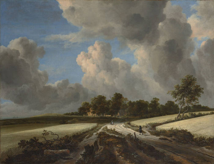
This compositional principle can be found across a wide range of landscape painters. Jacob van Ruisdael (c. 1628–1682), for example, often built his compositions around a richly textured foreground—fields, trees, rivers—that anchors the viewer before leading the eye upward toward the lighter, more open sky. Meindert Hobbema (1638–1709) used similar devices, frequently using roads or waterways that recede into the distance from a solid, structured foreground. Even in dramatic or dynamic scenes, the weight of the image tends to sit low on the canvas, a choice that helps preserve visual stability.
This visual logic was not confined to painting. Typographers and layoutdesigners—especially from the Enlightenment onward—adopted similar strategies. In printed pages, the visual "weight" of type is carefully distributed to avoid top-heaviness. The bottom margins are often slightly larger than the top ones, and the densest blocks of text sit lower on the page. This creates an optical sense of stability and prevents the composition from feeling as though it might tip or float.
In both visual art and printed design, this sensitivity to balance aligns with how humans interpret space and mass. We are biologically attuned to gravity; we expect things to be heavier and more grounded at the bottom. When this expectation is met, the result feels natural and harmonious—even if the viewer is not consciously aware of the underlying structure. In both painting and design, then, placing the center of gravity below the geometric center is not just an aesthetic convention—it is a subtle but powerful response to the way we see and experience the world.
During the Middle Ages, the focus of art was overwhelmingly religious, and landscape was subordinated to symbolicmeaning or allegory. Artists such as Giotto (c.1267–1337) began experimenting with placing figures in coherent spatial environments, but nature remained largely a backdrop. It was not until the Renaissance that a deeper interest in the natural world took root. Leonardo da Vinci (1452–1519) conducted extensive studies of geology and weather, and the panoramic backgrounds seen in the works of painters like Albrecht Altdorfer (c.1480–1538) point to the growing autonomy of landscape in art. The breakthrough moment, often cited by scholars, is a small painting known as the Saint George and the Dragon (c.1505–1510) by Altdorfer, in which the landscape nearly engulfs the tiny narrative figures. Around the same time, Joachim Patinir (c.1480–1524), working in the southern Netherlands, began producing what are often considered the first independent landscape paintings—works where the subject is no longer biblical or mythological, but the land itself. Patinir even signed some of his paintings as "pictor landscapiorum," or "landscape painter," a highly unusual declaration for the period.
Landscape with the Flight into Egypt Joachim Patinir 1516–1517 Oil on panel, 17 x 21 cm. Royal Museum of Fine Arts, Antwerp
By 1600, both the terms lantschap and its diminutive or frequentative lantschapken were already well established in the inventories and sales records of Amsterdam, Delft, Haarlem and Antwerp, and they remained dominant in describing landscapes of all sorts until the very end of... the 1670s. The words lantschap/lantschapjea denoted a relatively abstract, generic category into which many specialties were folded. Some of the most common were: wilderness (woestyjne), hunting (jacht), harvest (oogst), mountain(s) (gebercht(en), fishing (visserij), beach (strand, zeestrand), ruins (ruzjnen), moonlight (maenschijin), woods (bos, bossagie), pastorelle, hermitage, ice promenade (qjsgangh), dawn (morgenstond, dagerat), evening (in landscape) (avondstond), dunes (duijnen), river (rivier) and panorama (verschiet).John Michael Montias, "How Notaries and Other Scribes Recorded Works of Art in Seventeenth-Century Sales and Inventories," Simiolus: Netherlands Quarterly for the History of Art 30, no. 3/4 (2003), 219.
Although landscape had always existed as a descriptive element of history painting, it only became independent in the early 16th century. Seventeenth-century Dutch landscape paintings have been described as empirical, naturalistic images of the real Dutch landscape, yet they also reflect the social issues and aspirations of the time. Perhaps because the pressures of art theory in the Netherlands had weakened, landscape began to occupy a major place in art production. Landscapes were avidly collected by the growing middle class who did not speak French or Latin and were not educated with humanist reverence for Classical Antiquity but who loved valued land as a national identity.
"That Dutch countryside is oddly striking—it almost demands to be painted, although it has little of the drama of the tropics or of mountainous terrain. In fact, the land has almost no verticals at all but is conspicuously flat; the horizon is ever-present—so much that the Dutch language has four words for horizon. The wind sweeps over the low land. The changeable sky, with its towering clouds reflected in rivers and canals, is more dramatic than the earth: nature in itself seems as moody as man. In their efforts to catch the essence of this ever-changing setting, the new landscapist painted pictures that were different than anything seen before. Nature was portrayed for its own sake rather than as a background ton divine or human enterprises, or an artificial arrangement to convey literary allusion."Hans Koningsburger, The World of Vermeer 1632–1675 (New York: Time-Life Books, 1968).
Johan Huizinga in 1968 ably described the Hollanders' "intense enjoyment of shapes and objects, the(ir) unshakable faith in the reality and importance of all earthly things, a faith that... was the direct consequence of a deep love of life and interest in one's environment."
The Dutch had a deep respect and understanding of their land, shaped by the hazards of flooding, the challenges of being that about one-third to one-half of their land was below sea level or was subject to regular flooding during high tides and storm surges. This relationship was marked by a constant struggle against the forces of nature, reflected in an extensive network of dikes, canals, and windmills that transformed marshes and tidal flats into arable land. These engineering efforts not only protected cities and farmland but also became powerful symbols of civic pride and resourcefulness.
The land of the Netherlands was not only important to the daily lives of its inhabitants but also profoundly influencing the art of Dutch painters. The constant struggle against water, combined with the necessity of managing and reclaiming land, fostered a deep appreciation for the diverse conditions and transformations of the landscape. This relationship is vividly reflected in the fascination of Dutch painters, who captured the ever-changing skies, expansive wetlands, and meticulously managed farmlands with remarkable precision and sensitivity. Their works convey not only the beauty of the Dutch countryside but also an underlying recognition of its fragility and the ongoing battle to preserve it.
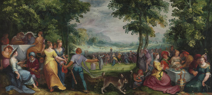
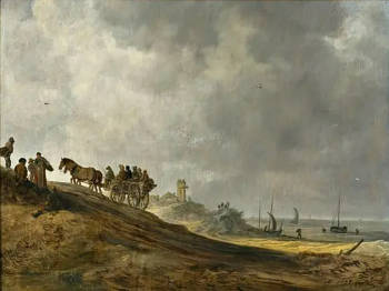
Land transformation occurred in the North Netherlands, during the seventeenth century. The physical geography of northern Holland was dramatically altered by the reclamation of about two hundred thousand acres of land from the inland sea, by means of a complex system of dikes and drainage. The creation of land was a commercial investment made by private citizens. By 1612 over one hundred citizens had invested in the scheme. Projects such as these dramatically altered the appearance of the region. These speculators constructed a system of canals and forty-two windmill pumps across the land. The resulting landscape was an extremely flat land, as recorded in Jan van Goyen's(1596–1656) View of Leiden (1647; see image left). The land was highly regular polder, punctuated by a grid-like system of canals and waterways across the drained areas.
Landscape painting underwent a profound shift with the Impressionists in the late 19th century. No longer bound to the academic tradition that treated landscape as a backdrop for historical or mythological subjects, these painters took the natural world as a primary subject in itself. Their interest lay not in rendering a fixed, idealized view of nature, but in capturing fleeting sensations—light shimmering on water, the golden haze of late afternoon, or the subtle transitions of color at dusk. This emphasis on immediacy was aided by innovations in materials: portable paint tubes and folding easels allowed artists to work directly outdoors, or en plein air, with unprecedented freedom. The loose brushwork, broken color, and vibrant palettes of painters like Claude Monet (1840–1926) and Camille Pissarro (1830–1903) foregrounded the act of seeing itself, presenting the viewer with a surface that vibrated between description and sensation.
Women in a Garden
Pierre-Auguste Renoir
1873
Oil on canvas, 55 x 65.5 cm.
Private collection, location unknown
Within this group, Pierre-Auguste Renoir (1841–1919) brought a distinct sensibility to landscape, often infusing his scenes with a warm, human presence even when figures were absent. His landscapes tend to favor lush foliage, dappled light, and a kind of visual abundance that mirrored his treatment of the human form. In works like The Skiff or La Grenouillère, water becomes a lively stage for leisure and sunlight, but unlike Monet's cooler gaze, Renoir's landscapes almost always suggest the presence of people, or the conviviality of a shared experience. In this sense, his approach to landscape connects to broader cultural ideals of harmony and pleasure, distancing itself from both Romantic grandeur and the more analytical tendencies of later Impressionism.
View of Haarlem Jan van Goyen 1646 Oil on wood, 34.6 x 50.5 cm. Metropolitan Museum of Art, New York
In the noted 1696 Dissius Amsterdam auction of 21 paintings by Vermeer, three landscapes are mentioned although only two have survived. Items 31, 32 and 33, with relative description and sales price in guilders are listed below.
31. The Town of Delft in perspective, to be seen from the south, by J. van der Meer of Delft 200-0 32. A view of a house standing in Delft, by the same 72-0 33. A view of some house, by ditto 48-0
Item 31. certainly corresponds to the View of Delft. Although it fetched the highest price (200 guilders) it is curious to note that The Milkmaid, a fraction of the View of Delft's dimension, was paid almost the same price, 175 guilders. The View of Delft is somewhat an anomaly in as much it had always been highly considered throughout its known history while many other of Vermeer's painting slipped into oblivion and even received signatures by other artists to increase their commercial value. This large work is also considered to be perhaps the first true "urban landscape" in European painting. Unfortunately, one of the two "view of house(s)" mentioned in the Dissius auction is missing. Vermeer's Little Street could be either no. 32 or 33.
The term layout generally refers to the arrangement and organization of elements within a given space, whether it's on a canvas, page, screen, or architectural plan. It involves deciding how different components—such as text, images, shapes, and empty spaces (i.e., negative shapes) —are positioned and aligned to create a visually harmonious and functional whole. In art, design, and graphic work, a good layout ensures that visual and narrative information flows smoothly, guiding the viewer's eye and enhancing clarity.
In the context of painting, layout and composition are related but not identical concepts. While they both deal with the organization of elements within the artwork, the key difference lies in their focus and purpose.
Layout generally refers to the preliminary arrangement of the various visual elements—such as figures, objects, background, and foreground—on the canvas or surface. It is akin to a blueprint or plan, setting the groundwork for how the viewer's eye will travel across the piece. The layout often involves basic decisions about proportions, positioning, and spatial relationships, without necessarily delving into deeper artistic principles. For example, a painter might sketch a layout to ensure that the main subject is placed in a specific quadrant of the canvas or that the horizon line sits at a certain height. In essence, the layout is about structure and placement, helping to establish the basic framework of the painting.
Composition, on the other hand, is a more nuanced and complex concept. It encompasses not only the placement of elements but also the spatial relationships, harmonies, and visual flow within the artwork. A successful composition guides the viewer's gaze in a meaningful way, balancespositive and negative spaces, creates a sense of unity, and often evokes particular emotions or ideas. Composition is where the artistry comes in—how the elements interact, the rhythm they create, and the mood they convey. It involves decisions about balance, contrast, focus, and the use of visual principles like the rule of thirds or the golden ratio.
In short, layout is the initial organizational plan, a starting point for where things will go. Composition is the deeper, more refined process of arranging those elements into a visually compelling and harmonious whole.
This attention to layout extended to other areas as well. In printmaking and book illustrations, Dutch artists and publishers arranged elements on the page with precision, ensuring that illustrations complemented the accompanying text. This approach to layout in the Netherlands mirrored the region's broader culturalemphasis on order, clarity, and attention to detail, distinguishing Dutch artistic production from many of its European contemporaries.
Drawn from Rudolf Arnheim, Art and Visual Perception: A Psychology of the Creative Eye, 1974.
The asymmetry of physical space, particularly between top and bottom, is deeply ingrained in human perception, while lateral differences—left and right—are less biologically distinct. This explains why symmetrical objects like a violin appear more balanced when upright than when placed on their side. Humans and animals, being bilaterally symmetrical, often struggle to differentiate left from right, especially in early development, as in confusing the letters "b" and "d." Psychologists Michael Corballis (1936–2021) and Ian Beale argued that such bilateral confusion might have offered evolutionary advantages when survival depended on responding equally to threats or rewards from either side. However, the emergence of tool use and handedness introduced a useful asymmetry, favoring one side over the other. When writing developed as a linear, sequential process, this asymmetry was reinforced culturally, leading to a consistent visual and directional preference in both text and image. Johann Wolfgang von Goethe (1749–1832) insightfully observed that "the more perfect the creature, the more dissimilar its parts get to be," recognizing asymmetry as a marker of complexity and evolution.
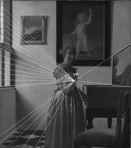
This visual asymmetry manifests in composition. Though not always obvious in strictly symmetrical designs such as architectural façades, in painting and other pictorial arts, viewers tend to "read" an image from left to right. Heinrich Wölfflin (1864–1945), a major figure in formalistart history, demonstrated that inverting a painting alters its meaning and balance. He pointed out that diagonals running from the bottom left to the top right are experienced as ascending and energetic, while the reverse diagonal appears descending and heavy. In this framework, elements placed on the right side of an image carry more visual weight. Wölfflin noted this effect in Raphael's Sistine Madonna: when the composition is mirrored, the figure of Pope Sixtus becomes too heavy and visually disrupts the scene. Experiments confirm that identical objects shown on both sides of a viewer's field appear unequal in weight or size, with the right-side object seeming larger—suggesting a systematic perceptual bias.
Mercedes Gaffron (1895–1981) expanded this idea through her studies on printmaking and perception. She argued that viewers unconsciously identify with the left side of an image, where attention begins. According to her, this tendency is so strong that asymmetrical compositions seem spatially altered when mirrored. Gaffron applied her ideas to Rembrandt's etchings, claiming that the true compositional meaning becomes clear only when the viewer imagines the image as it appeared on the copper plate—reversing the reversed. Alexander Dean (1893–1939), writing on stagecraft, made similar observations in theater: audiences tend to identify with the actor entering from the left (from the viewer's perspective), assigning symbolic importance to that side, while those entering from the right are often seen as challengers or antagonists. This directional framing shapes how narrative and emotional weight are distributed on stage and on canvas.
Cognitive and neurological research supports these perceptual tendencies. Gaffron connected them to the lateralization of brain function: the left hemisphere, dominant for language and analytical functions, corresponds to the right visual field, which may explain why objects on the right seem more articulate or conspicuous. The left side of the visual field, meanwhile, becomes the natural point of entry, emphasized by identification and narrative alignment. The interaction between where attention begins (on the left) and where visual articulation is strongest (on the right) creates a dynamic visual system in which the eye tends to move from left to right. Psychological experiments by H. C. van der Meer in the late 20th century showed that people move their heads faster from left to right and perceive movements to the left as slower or more effortful. This suggests that directional flow in visual art is not just conventional but physiologically and neurologically grounded. Artists have long played with these effects, choosing to depict movement leftward or rightward to manipulate visual rhythm, effort, and emotional tone.
Left-to-right light bias refers to the common tendency in Western painting to depict light entering a composition from the left side. This preference is often linked to natural perception, as many people in the West read from left to right, making left-sided illumination feel more intuitive and harmonious. Architectural considerations have also contributed to this bias, with windows frequently placed on the left to provide consistent lighting for right-handed individuals engaged in tasks such as writing or painting. Some researchers suggest that cognitive processing plays a role, as the human brain tends to favor left-to-right directional movement in visual interpretation. However, this bias is not universal. In cultures where writing systems flow from right to left, such as Arabic, Persian, and Hebrew traditions, or where texts are arranged vertically from top to bottom, as in classical Chinese, Japanese, and Korean writing, visual organization follows different principles. Rather than favoring a dominant horizontal light source from one side, many East Asian artistic traditions emphasize verticality, atmospheric gradation, and balanced compositions that do not rely on a single directional light source. This reflects a different aesthetic approach, where space is often conceived as layered rather than strictly organized by linear perspective and directional illumination.
In 17th-century Dutch painting, left-to-right light bias is particularly evident in interior scenes, where windows—often the primary source of illumination—are frequently positioned on the left. Vermeer exemplifies this tendency, with nearly all his interiors showing light entering from the left, as seen in The Milkmaid, Woman Holding a Balance, and The Art of Painting. This consistency suggests not only an aesthetic preference but also an awareness of how light falloff and shadow contribute to spatial depth and volume. Pieter de Hooch (1629–1684) and Gabriel Metsu (1629–1667) also adhered to this convention, using left-sided lighting to enhance the clarity and realism of their domestic scenes. In still-life painting, artists such as Willem Kalf (1619–1693) and Pieter Claesz (c. 1597–1660) frequently arranged their compositions with a left-oriented light source to create strong highlights and shadows that reinforced the three-dimensionality of objects. While not an absolute rule, left-to-right light bias became a defining characteristic of Dutch realism, reflecting both observational accuracy and an intuitive approach to composition that aligned with contemporary artistic ideals. In contrast, artistic traditions influenced by top-to-bottom writing systems, such as Chinese or Japanese painting, often avoided rigid left-right structuring, instead emphasizing vertical balance and dynamicsymmetry. These differences highlight the extent to which visual perception and composition are shaped by cultural habits, demonstrating that directional bias in light is as much a product of convention as it is of natural observation.
A Painter at Work in his Studio
Thomas Wijck (1616?–1677)
1663–77
Pen and brown ink, brown wash, white gouache, over black and red chalk on blue paper, 40 x 49.6 cm.
Metropolitan Museum of Art, New York
In three paintings—Girl with a Flute, Girl with a Red Hat, and The Guitar Player—light enters from the right-hand side, a departure from Vermeer's usual practice. No definitive explanation has ever been offered for this unusual lighting arrangement. Some scholars propose that the two small troniepanels, Girl with a Flute and Girl with a Red Hat, may have been traced directly from the projected image of a camera obscura, an optical device many critics believe Vermeer used as an aid to painting. However, tracing from a camera obscura would have required a translucent material, such as oiled paper, which could easily be reversed, thus reversing the right-to-left direction of the traced image. One specialist has suggested that The Guitar Player might have been hung to the right of an open window, aligning the painted illumination with the actual direction of natural light entering the room. It is widely recognized that when the direction of light within a painting mirrors real-world illumination, the overall luminosity and realism of the painting are significantly increased.
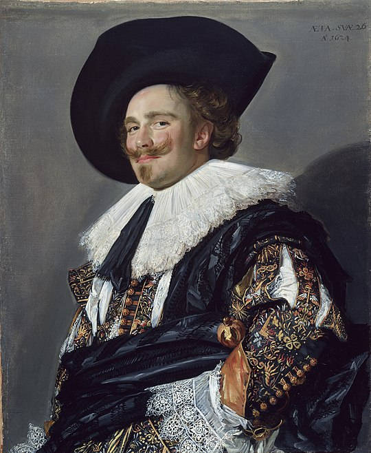
In 17th-century Dutch art discourse, the term lekker—literally meaning "tasty" or "pleasant"—was occasionally employed to describe elements in painting that were visually appealing or sensually gratifying. While not a formal art-theoretical term like welstand or heldere wyze, lekker conveyed an immediate, visceral appreciation for certain qualities in a work of art.
For instance, the brushwork of Frans Hals (c.1582–1666) was often characterized as lekker due to its lively and expressive quality. Hals's technique, marked by visible, energetic strokes, imparted a sense of spontaneity and vitality to his portraits, distinguishing them from the more polished finishes of his contemporaries. This approach resonated with viewers who found his paintings to possess a directness and charm that could be described as lekker.
Similarly, the works of Rembrandt van Rijn (1606–1669), particularly his later works, exhibit a tactile richness and depth achieved through layered brushwork and nuanced use of light and shadow. These qualities contributed to a sensory experience that viewers might have described using the term lekker, appreciating the textural and emotional complexity of his art.
In this context, lekker functioned as a colloquial expression of aesthetic pleasure, capturing the viewer's immediate and personal response to the sensory aspects of a painting. While not codified in art theory, its usage reflects the broader appreciation for artworks that engaged the senses and evoked a sense of enjoyment or delight.
However, the concept of lekker was not universally admired. Gerard de Lairesse (1640–1711), a painter and leading advocate of idealizedclassicism, strongly objected to what he saw as the vulgarity of a lekkere penceel—a "nice" or "tasty" brush. To him, such painterly freedom drew attention to the hand of the artist rather than to elevated content. He associated the term with coarse subjects, including common household objects, insects, and even the artist's own family members, all of which he considered unworthy of serious art. De Lairesse condemned the idea that lively or sensual brushwork could justify the imitation of flawed or lowly reality. Despite this, for others, lekker brushwork was precisely what elevated naturalistic painting beyond mere copying into something expressive and vital.
Letter writing and letter reading emerged in early modern Europe as more than practical acts of communication, developing into culturally charged activities closely associated with privacy, emotional exchange, and love. In the visual arts, letters offered painters a means to suggest inner life, absence, anticipation, and memory without resorting to overt action. A letter could stand in for a distant presence, allowing a painting to register feeling through stillness rather than gesture. As a result, epistolary themes proved especially suited to the quiet, inward character of domestic painting.
In the 17th-century Dutch Republic, this motif acquired particular richness. Before the middle of the century, painted reactions to letters tended to be direct and legible, with emotional responses clearly signaled. Works by Dirck Hals (1591–1656) from the 1630s, for example, present letter readers whose expressions leave little doubt about the message's effect. After about 1650, however, letter writing and reading became closely tied to the social habits of the urban elite. Rising literacy, economic prosperity, and the constraints of supervised courtship encouraged the use of letters as discreet vehicles for romantic exchange. This cultural shift was reinforced by popular letter-writing manuals, many adapted from French models, which supplied formulas for all occasions, including declarations of love and responses to emotional dilemmas.
Painters responded quickly to these developments. Gerrit ter Borch (1617–1681) played a decisive role in establishing the refined, "high-life" imagery of elegantlydressed women absorbed in correspondence. His example was extended by artists such as Frans van Mieris (1635–1681) and Gabriel Metsu (1629–1667), who developed the theme into one of quiet concentration, luxury, and psychological nuance. In these works, the letter often functions as a catalyst for emotion rather than as a narrative device, allowing meaning to remain suspended and unresolved.
Vermeer devoted an unusually large portion of his work to epistolary subjects, producing six paintings centered on letters. These works fall broadly into two types. In paintings of single figures reading or writing, the emphasis lies on inward absorption. In Girl Reading a Letter at an Open Window, the woman's profile and isolation create a sense of private communion with the unseen sender; the later removal of a wall image of Cupid intensified ambiguity rather than clarifying the letter's meaning. Woman in Blue Reading a Letter carries this inwardness even further, presenting a figure so absorbed that the viewer's presence seems almost intrusive. A Lady Writing introduces a subtle variation, as the sitter looks outward with a fleeting, questioning expression, momentarily breaking the closed circuit of attention.
The second group depicts a mistress and maidservant, introducing restrained narrative tension. In Mistress and Maid, the delivery of a letter interrupts the domestic calm and provokes visible emotional response. The Love Letter casts the viewer as a distant observer peering through a dark anteroom into a moment of intimate disruption, while Woman Writing a Letter with Her Maid presents two women inhabiting separate psychological worlds: one absorbed in writing, the other gazing outward in calm detachment.
Vermeer's handling of the theme is marked by an extreme economy of anecdote and a reliance on symbolic resonance. Backgroundseascapes often evoke the long-standing metaphor of love as a sea and the lover as a ship navigating uncertain waters. Wall maps suggest distance and absence, particularly apt in a mercantile society shaped by travel and overseas trade. In his later work, crumpled letters and broken seals hint at prior agitation or urgency without specifying events. Musical instruments reinforce the amorous context, reflecting the close association between music and love in seventeenth-century thought.
Through these means, Vermeer transformed an earlier, more explicit tradition into scenes of profound stillness. The letter becomes a silent agent linking separated individuals, allowing emotion to unfold inwardly rather than theatrically. In Dutch painting of the period, epistolary imagery thus provided a uniquely powerful way to represent love, absence, and interior life within the quiet boundaries of the domestic interior.
Leveling refers to the ability of oil paint to spread evenly across a surface, eliminating paint texture, brushstrokes, or application marks to create a smooth and uniform finish. This property is essential for achieving a polished appearance, where the viscosity and drying time of the paint can influence how well it settles. Factors such as the medium used, the thickness of the paint, and the technique of the artist can all impact leveling. Stand oil can be added to paint to greatly increase its leveling properties.
Woman and a Jester Adriaen van de Venne c. 1604–1662 Oil on oak panel, 54 x 75 cm. National Museum in Warsaw, Warsaw
A representative example is Woman and a Jester by Adriaen van de Venne (1589–1662), a painter known for his allegorical and genre scenes. In this intimate and theatrical composition, a richly dressed woman reclines in a large curtained bed while a jester playfully pulls at her leg. The woman's expression is coy, and the jester's is gleeful—his red hood with ass's ears symbolizing folly. The overturned slippers, the ornate bedcoverings in disarray, and the chamber pot placed prominently at the foot of the bed all point toward a sexual encounter, past or imminent. This sort of visual storytelling blends humor with a clear cautionary tone: the jester was a stock figure of foolishness and moral blindness, and his intrusion into the bedroom would have been understood by contemporaryviewers as both comic and improper.
Luid content in Dutch painting flourished particularly in the first half of the 17th century, especially in the merry company genre, brothel interiors, and bedroom scenes. Artists such as Jan Steen (1626–1679), Dirck van Baburen (c. 1595–1624), and Cornelis van Haarlem (1562–1638) created scenes that were often comic but also layered with moralizing intent. In Steen's household scenes, sexual innuendo could be conveyed by a man tuning a lute while gazing at a woman, or a dog sniffing under a table—standard visual metaphors of desire.
Beyond the Netherlands, lewd or erotic content also had a strong presence in Italian, French, and Flemish painting, though it often took on different tones. In Italian Renaissance art, nudity was frequently idealized under the guise of mythological narrative—Venus, Danaë, Leda, and Susanna were pretexts for the display of the female form. While these scenes were ostensibly moral or classical in content, they were also plainly erotic in function, especially when painted for private patrons. Titian (c. 1488–1576), Correggio (c. 1489–1534), and later Guido Reni (1575–1642) all participated in this dual-purpose genre.
Leda and the Swan Antonio da Correggio c. 1532 Oil on canvas, 152 x 191 cm. Gemäldegalerie, Berlin
In Flemish painting, artists like Jan Massys (c. 1509–1575) produced overtly eroticized versions of biblical stories such as Lot and His Daughters or Judith and Holofernes, infusing them with sensuality rather than purely didactic content. The tension between narrative propriety and erotic appeal was often deliberate.
In both north and south, lewd subject matter was never simply about titillation—it existed within a complex framework of moral instruction, male fantasy, social commentary, and the coded communication of cultural values. Viewers were expected to read these images with an awareness of allegory, proverb, and satire, and to see through appearances to a deeper layer of meaning.
Gustave Courbet (1819–1877) was a French realist painter known for rejecting academictraditions and portraying real people and unidealized scenes. His most provocative work, L’Origine du monde (1866), shows a close-up view of a nude woman's genitals without allegory or narrative, confronting traditional norms of modesty and artistic decorum. The painting remained hidden in private collections for over a century and challenged the conventions that had long justified nudity through myth or moral framing.
The distinction between the liberal arts and the mechanical arts has been a fundamental concept in the history of art and craftsmanship. Traditionally, the liberal arts are understood as those creative disciplines that prioritize aesthetic and intellectual engagement, including painting, sculpture, architecture, music, and poetry. These arts have been associated with higher forms of human expression, often linked to imagination, beauty, and the refinement of taste.
In ancient Greece and Rome, the highest forms of human activity were those associated with intellectual reflection, reason, and the cultivation of the mind. These were known as the liberal arts, which included subjects such as grammar, rhetoric, logic, arithmetic, geometry, music, and astronomy—disciplines that were considered essential for a free citizen (liber in Latin meaning "free"). The liberal arts were contrasted with the mechanical arts, a term used to describe activities that required manual labor or physical effort, including painting, sculpture, metalwork, carpentry, and other crafts. This distinction was deeply tied to social class, as those who engaged in mechanical work were often enslaved persons, artisans, or laborers, while the liberal arts were reserved for the educated elite.
The philosopher Plato (c. 427–c. 347 BCE) reinforced this division by viewing art as an imitation of nature and therefore as something inferior to pure intellectual contemplation. In his ideal society, as described in The Republic, poets and artists were regarded with suspicion because they created mere copies of reality rather than engaging with truth directly. Aristotle (384–322 BCE), in contrast, offered a more nuanced view in his Poetics, recognizing the importance of artistic representation in shaping human experience. Nevertheless, the idea persisted that manual labor, including artistic creation, was inherently less prestigious than theoretical knowledge.
In Roman thought, this distinction continued, particularly in the writings of Cicero (106–43 BCE) and Vitruvius (c. 80–c. 15 BCE). Cicero reinforced the idea that activities requiring physical exertion were lower in status than those that involved intellectual cultivation. Vitruvius, in his treatise De Architectura, classified architecture as a noble discipline because it combined both intellectual and practical knowledge, but even he acknowledged that many skilled crafts were seen as purely mechanical. Roman society admired craftsmanship, particularly in luxury goods, mosaics, and monumental sculpture, but artists and artisans were often seen as tradesmen rather than intellectuals.
This hierarchy persisted through the medieval period, when the concept of the seven liberal arts—divided into the trivium (grammar, rhetoric, logic) and the quadrivium (arithmetic, geometry, music, astronomy)—was central to education. The mechanical arts, which included painting, goldsmithing, weaving, and architecture, were categorized separately and often associated with guilds rather than universities. The medieval world largely inherited the classical view that intellectual labor was superior to physical labor, though the growth of cathedral workshops and illuminated manuscript production elevated certain artistic practices.
The Renaissance marked a turning point in the perception of the fine arts, as thinkers and artists sought to redefine painting and sculpture as intellectual rather than purely mechanical pursuits. Figures such as Leon Battista Alberti (1404–1472) and Giorgio Vasari (1511–1574) argued that painting and sculpture should be considered liberal arts because they required knowledge of geometry, perspective, anatomy, and history. Alberti, in his treatise De Pictura (1435), asserted that painting was a form of intellectual discipline, akin to poetry, because it required theoretical understanding and creative vision. Vasari, in his Lives of the Artists (1550), reinforced this idea by presenting painters, sculptors, and architects as figures of genius, elevating their status above that of mere craftsmen.
By the 17th century, this distinction between fine and mechanical arts had become more firmly established, particularly in the academies of art that emerged across Europe. In France, the Académie Royale de Peinture et de Sculpture, founded in 1648, promoted history painting as the highest artistic form, emphasizing intellectual rigor over manual skill. Yet in the Dutch Republic, where the guild system remained dominant and artistic production was deeply intertwined with trade, the relationship between fine and mechanical arts remained more fluid. Dutch painters, though often viewed as craftsmen due to their guild affiliations, navigated a complex space between these categories, demonstrating that artistic excellence could emerge from both intellectual ambition and technical mastery.
Thus, while ClassicalAntiquity laid the foundations for the hierarchical separation of the arts, the early modern period saw challenges to these ideas, particularly in regions where the economic and social structures allowed for a more integrated view of artistic labor. The Dutch Golden Age exemplified this ambiguity, as painters simultaneously engaged with humanist theories of art while remaining part of a highly commercialized and technically sophisticated craft tradition.
This division, deeply rooted in Classical Antiquity and reinforced during the Renaissance, was not always rigid. In many periods, particularly in the 17th century, the line between fine and mechanical arts was subject to debate, especially as painting and sculpture became more professionalized and theoretically sophisticated. The Dutch Republic, with its thriving economy and innovative approaches to trade and craftsmanship, presented a particularly fluid relationship between these categories. The surge in artistic production, coupled with an expanding middle-classmarket for paintings, challenged traditional hierarchies that privileged history painting above all other genres. Unlike the Italian Renaissance model, which emphasized the intellectual prestige of the fine arts through treatises and academies, Dutch artists often worked within guild structures that were more closely aligned with the mechanical arts.
Painters in the Dutch Republic were frequently members of the schilder guilds, which regulated the trade of painting alongside other crafts. The Guild of Saint Luke, present in cities like Amsterdam, Leiden, and Delft, oversaw not only painters but also glassmakers, engravers, and even bookbinders. This institutional connection to artisanship reinforced the perception that painting, while a highly skilled pursuit, was still linked to the world of practical trades. Yet within this system, some artists sought to elevate their status beyond that of craftsmen, arguing that painting required intellectual training, mastery of perspective, and a deep understanding of human nature, placing it on par with poetry or philosophy.
One of the figures who embodied this shift in status was Samuel van Hoogstraten (1627–1678), a painter and theorist who studied under Rembrandt (1606–1669) and later wrote extensively on the nature of painting. His treatise Inleyding tot de Hooge Schoole der Schilderkonst (1678) argued that painting was more than a mechanical craft—it was a noble pursuit requiring intellect, learning, and refined taste. He acknowledged that while painters worked with their hands, their success depended on their ability to understand light, illusion, and storytelling, elevating their practice beyond mere manual labor.
Despite such arguments, Dutch painters remained part of an economy that did not afford them the same aristocratic status enjoyed by court artists elsewhere in Europe. While history painters, such as Gerard de Lairesse (1641–1711), sought to align themselves with the ideals of Classical Antiquity, many successful artists embraced the practical realities of their profession, producing work tailored to an eager market of collectors. Genre painters like Gerrit Dou (1613–1675) and still-lifespecialists such as Willem Kalf (1619–1693) demonstrated extraordinary technical skill, creating works that blurred the distinction between fine and mechanical artistry. Their meticulous detail and illusionistic effects required the same precision as a silversmith or a glassblower, yet their paintings were prized for their aesthetic and intellectual qualities, complicating the traditional hierarchy of the arts.
In the broader cultural context of the Dutch Republic, where scientific discovery, trade, and craftsmanship were deeply intertwined, the divide between fine and mechanical arts was not always clear-cut. Artists often borrowedtechniques from artisans, and craftsmen incorporated artistic principles into their work, reflecting a society that valued skill and innovation in multiple domains. The status of painting evolved within this dynamic environment, balancing intellectual ambition with the realities of a commercial art market. While the distinction between fine and mechanical arts persisted in theory, the Dutch art world of the 17th century demonstrated that artistic excellence could emerge from both sides of the divide.
Life and art—the relationship between the life and work of an artist—have long been intertwined in human thought, yet the nature of this relationship has shifted with changing ideas about art, individuality, expression, and interpretation. In antiquity, the question of whether an artist's life was reflected in his or her work was rarely asked in modern terms. Art was seen as a craft, embedded in shared traditions and serving communal or religious functions. The life of the artist was often subordinated to the expectations of patrons, guilds, or society at large. Even during the Renaissance, when figures such as Giorgio Vasari (1511–1574) began writing biographical accounts of artists, the connection between life and work was presented more as moral exemplum or anecdotal support than psychological inquiry. Vasari's Le Vite de' piu' eccellenti pittori, scultori, e architettori (1550) shaped centuries of thinking about artists as people with character traits that either aided or hindered their output, but these accounts often lacked critical detachment or reliable evidence.
Rudolf and Margot Wittkower, in their seminal study Born Under Saturn, explored the evolving image of the artist from antiquity through the 18th century, showing how deeply the idea of personality became entwined with artistic creativity. They traced how artists, once regarded as anonymous craftsmen, gradually came to be seen as exceptional individuals marked by unique temperaments, and often by melancholy or eccentricity. The title itself reflects the old astrological belief that those born under the planet Saturn were contemplative, solitary, and prone to melancholy—traits thought to be especially common among artists. This belief took hold particularly during the Renaissance and persisted well into the modern era, providing a framework for interpreting artists as beings somehow apart from ordinary society, inwardly driven and fated to suffer or stand outside convention.
This legacy has shaped how we approach art ever since.
In the 19th century, Romantic ideals gave rise to a new conception of the artist as a unique and often tormented genius whose personal suffering or alienation was believed to inform their creative output. This view encouraged a more direct reading of art through the lens of biography. Such ideas persisted into the early 20th century, when psychoanalysis, especially Freudian theory, began to be applied to art history. Sigmund Freud (1856–1939) himself wrote about Leonardo da Vinci (1452–1519), attempting to interpret his art through a reconstruction of early childhood trauma, based largely on speculative biography. Later scholars refined these approaches or reacted against them. By the mid-20th century, thinkers like Roland Barthes (1915–1980) and Michel Foucault (1926–1984) questioned the very idea of authorial intent, famously claiming the "death of the author," and shifting focus from biography to textual structures and cultural contexts.
In more recent decades, there has been a return to nuanced biography, with careful attention to archival sources, economics, social ties, and psychological interpretation—though usually with greater skepticism and methodological care. Scholars now consider an artist's upbringing, family circumstances, religious background, professional constraints, and even health as part of a larger web that might influence, but not determine, artistic choices.
In certain artists, the resonance between life and art seems so clear as to be almost unavoidable. Pablo Picasso (1881–1973) offers a prime example: his restlessly shifting styles, explosive creativity, and long, eventful life full of lovers, political gestures, and personal reinventions appear mirrored in the jagged tensions and bold transformations of his work. His Blue Period is commonly linked to a time of mourning and poverty, while Guernica is a thunderous artistic cry against the bombing of a Spanish town. Likewise, Salvador Dalí (1904–1989), with his carefully cultivated eccentric persona, appears fused with his surreal images—melting clocks, suspended bodies, hyper-real dreamscapes. In these cases, it becomes difficult to separate the biography from the work; the public myth feeds the interpretation.
Dali Atomicus
Philippe Halsman
c. 1948
Gelatin silver print, dimensions not given
Library of Congress, Washington, D.C.
But there are artists for whom the gap between life and art feels more pronounced. Pietro Perugino (c.1446–1523), praised in his time for his gentle, harmonious compositions, led a life that seems almost muted compared to the grandeur or drama of his religious paintings. His calm Madonnas and elegantly composed altarpieces appear to belong more to an idealized world than to the man himself, who was described by contemporaries as financially shrewd and even somewhat avaricious. Similarly, the courtly and serene portraits of Agnolo Bronzino (1503–1572) betray little of his human character; his poetic writings, by contrast, suggest a more humorous and satirical temperament than his aloof, polished paintings might imply.
Frans van Mieris the Elder (1635–1681) presents a compelling case of the dissonance between an artist's life and the meticulous nature of his work. His paintings are celebrated for their exquisite detail, refined compositions, and the polished finish characteristic of the Leiden fijnschilders, or "fine painters." These qualities suggest a disciplined and controlled temperament, one that meticulously orchestrates every element on the canvas.
However, historical accounts reveal a more tumultuous personal life. Despite his artistic success and the patronage of notable figures such as Cosimo III de' Medici (1642–1723), Van Mieris struggled with financial instability, partly due to excessive drinking. In 1675, the Tuscan envoy Giovacchino Guasconi (c. 1650–c. 1720)reported that Van Mieris arrived at an appointment inebriated, having left behind the painting he was supposed to deliver. In one instance, his wife, Cunera van der Cock, insisted on receiving payment directly, fearing that her husband would squander the funds on alcohol. She likened his spending to acid on an etching plate, emphasizing the rapidity with which money disappeared in his hands.
This dichotomy between Van Mieris's artistic precision and personal indiscretions challenges the notion that an artist's work is a direct reflection of their character. It also underscores the complexities of interpreting art through the lens of biography. While some artists, like Picasso or Dalí, exhibit a clear alignment between their personal lives and artistic output, others, like van Mieris, demonstrate that exceptional artistry can emerge amidst personal turmoil.
The case of Van Mieris invites a more nuanced understanding of the relationship between an artist's life and their work, reminding us that the creative process often transcends personal circumstances, and that the final artwork may not always mirror the artist's lived experience.
This disjunction raises important questions. Modern viewers, especially after the rise of psychological interpretation, tend to assume that an artist's personality or inner life is somehow legible in their work—even if only through minor details. In the 19th century, Giovanni Morelli (1816–1891) developed a method for attributing paintings by analyzing the smallest anatomical features—earlobes, hands, or fingernails—believing that artists unconsciously revealed themselves in such traits. Morelli's theories, though primarily meant to solve attribution problems, reflect a deeper assumption: that a person's identity is inevitably expressed in their gestures, and by extension, in their art.
This idea gained traction as psychology developed as a discipline. Even when artists were not overtly autobiographical, critics began to hunt for traces of personal experience—trauma, longing, repression, or defiance—encoded in brushwork, subject matter, or compositional choices. Sigmund Freud's reading of Leonardo da Vinci, however flawed, contributed to this outlook. In contemporary culture, it has become difficult to approach art without some degree of biographical speculation. Even highly formalist works are often interpreted through the lens of the maker's identity—whether in terms of gender, class, trauma, or ideology.
But this tendency is not without risk. It can flatten complex visual language into mere symptom, or worse, confine an artwork to the known facts of an artist's life. The Dutch painters of the 17th century complicate the issue in interesting ways. Their biographies are often scant, their public images modest, and their work shaped more by genre and expectation than personal confession. Yet even here, viewers may read into the hush of a Vermeer interior or the exuberant disorder of a Jan Steen as expressive of something uniquely personal.
Whether this is a modern imposition or an intuitive truth is still debated. What seems clear is that our urge to see life in art—whether in the grandeur of a Michelangelo (1475–1564) or the quiet intimacy of a Pieter de Hooch (1629–c.1679)—speaks to a broader desire to connect with human presence through images, even when that presence remains ultimately unknowable.
Unlike earlier periods, when an artist's life might remain largely veiled behind the conventions of religious or civic commissions, 20th-century America saw a dramatic shift in the way life and art were perceived. Nowhere is this more evident than in Abstract Expressionism, a movement in which the artist's personality, presence, and process became inseparable from the work itself. In the 1940s and 1950s, the New York School—led by figures such as Jackson Pollock (1912–1956), Willem de Kooning (1904–1997), and Mark Rothko (1903–1970)—promoted a vision of painting as a direct, bodily extension of the artist's inner world. The canvas was no longer simply a surface for composition but a stage for psychological revelation.
Pollock, in particular, became emblematic of this fusion. His "drip paintings" were presented not merely as aesthetic objects but as traces of lived action—evidence of the artist's movements, decisions, and struggles. Photographs and films of Pollock painting, especially those by Hans Namuth, helped solidify the myth of the artist as a raw, elemental force whose psyche could be read in the energetic scatter of paint. His personal story—marked by alcoholism, brooding intensity, and a tragic early death—became part of the artwork's aura. In many ways, the myth became as important as the object.
This marked a departure from earlier traditions, in which the work stood on its own, often judged apart from the artist's biography. In Abstract Expressionism, however, the very meaning of the painting was thought to reside in the personality that produced it. The artist was not simply a maker but a kind of modern shaman, translating private turmoil into visual form. In doing so, the movement reshaped the role of the artist in American culture, aligning it more closely with the individualistic, confessional, and existential currents that defined the postwar period.
This approach stood in contrast to much of European art before it, where style and content often conformed to shared conventions and market expectations. In the Dutch 17th century, for example, personal expression was frequently mediated through genre, symbolism, and the competitive logic of the open art market. In the age of Abstract Expressionism, by contrast, personality and performance became the content. The boundary between life and art dissolved into a single, performative identity, reshaping the expectations of modern viewers and critics alike.
Turning to 17th-century Dutch art, the question of how an artist's life relates to their work becomes especially intriguing because so many Dutch painters were deeply embedded in the social fabric of their communities. Many belonged to the Reformed Church, were members of guilds, owned businesses, or took civic roles. Their artworks were often created for a competitive open market rather than courtly or ecclesiastical commissions, which encouraged attention to public taste over personal confession. Yet that doesn't mean individual experience played no role.
For example, Jan Steen (c.1626–1679), known for his humorous and sometimes chaotic domestic scenes, ran a tavern for part of his life, and many have noted the lively, at times bawdy, atmosphere in his paintings as perhaps reflecting this background. Carel Fabritius (1622–1654), a student of Rembrandt and an artist of subtle psychological depth, died tragically young in the Delft gunpowder explosion, leaving a small body of work that feels unusually introspective. The fragility and hush of his painting The Goldfinch has led some to muse, albeit cautiously, on the role of personal temperament or tragedy in his vision.
On the other hand, Vermeer's life remains partially veiled. His conversion to Catholicism, his marriage into a well-connected but financially troubled family, and his limited but meticulous output all invite speculation about how his personal and spiritual world may have shaped his quiet interiors. Yet speculation must be carefully weighed against the realities of artistic practice, including studio training, material constraints, and market pressures. It is always tempting to interpret art biographically, but the very silence of a painting—its resistance to direct translation—warns us not to reduce it to a reflection of personal experience.
Life-drawing refers to the artistic practice of drawing the human figure from a live, usually nude, model. It is one of the oldest and most foundational exercises in the training of an artist, as it requires a careful study of anatomy, proportion, movement, and expression. The roots of life-drawing as a formalized discipline can be traced back to the Italian Renaissance, when the study of the human body took on new significance due to a renewed interest in classical antiquity and naturalism. Artists such as Leonardo da Vinci (1452–1519), Michelangelo (1475–1564), and Raphael (1483–1520) undertook extensive anatomical studies, often in direct collaboration with physicians or through dissections. This period saw a major shift in the understanding of art as an intellectual discipline grounded in empirical observation. Drawing from life became an indispensable exercise not just for representing the human body accurately, but also for understanding its expressive potential.
During the Renaissance and into the early modern period, life-drawing developed in tandem with the rise of the artist's workshop and later, the academic system. In the large workshops of Florence, Rome, and later Antwerp and Paris, pupils typically began their training by copyingdrawings or prints before progressing to casts of antiquesculptures and finally, to live models. In Italy and France, life-drawing was often associated with the hierarchy of the arts promoted by academies such as the Accademia di San Luca in Rome or the Académie royale de peinture et de sculpture in Paris. These institutions emphasized history painting, which demanded mastery of the human figure, and life-drawing was seen as a prerequisite for creating compositions involving complex bodily poses, anatomical precision, and dramatic expression.
By the 16th century, some artists' workshops had begun to produce and even sell independent life-drawings, which were not always preparatory studies for a final painting, but objects of value in their own right. Collectors admired these sheets as evidence of the artist's skill and spontaneity. In the north, especially in the Southern Netherlands, artists like Peter Paul Rubens (1577–1640) and Anthony van Dyck (1599–1641) conducted well-organized studios that incorporated systematic life-drawing, both for pedagogical and creative purposes. Rubens in particular trained many students using a rigorous progression that included drawing from life, and his workshop produced numerous studies of nudes, often in chalk or ink, that reveal the analytical and expressive functions of such exercises.
In the Dutch Republic during the 17th century, life-drawing occupied a more ambiguous place. The Calvinist ethos did not suppress the nude entirely, but it encouraged a more discreet approach to its depiction. While the human figure remained essential for artists trained in history painting, the genre itself was less dominant than in Catholic Europe. The Dutch market favored portraiture, scenes of daily life, landscapes, and still life. Nevertheless, life-drawing was practiced, though often in private settings or among artists themselves, rather than under official academic structures. Because the Netherlands lacked a centralized state-run academy for most of the 17th century, instruction was generally carried out in workshops or local guilds.
Some larger cities did, however, offer access to live models through their guilds of Saint Luke. For example, in Haarlem, the influential artist and teacher Karel van Mander (1548–1606), who had studied in Italy, promoted life-drawing in his Schilder-boec (1604) and helped raise the status of figure studies. Van Mander advocated the idea that drawing from life was crucial to imitating nature and understanding ideal beauty. The Guild of Saint Luke in Haarlem, where Van Mander was active, is known to have sponsored life-drawing sessions with male models—female nudes were far more controversial and rarely permitted. Students paid fees to attend sessions and were supervised by a master, though these practices were not consistent across the Republic.
In Amsterdam, artists such as Govert Flinck (1615–1660) and Ferdinand Bol (1616–1680), both pupils of Rembrandt, engaged in life-drawing, although much of the evidence comes indirectly through drawings, sketchbooks, or references in inventories. While Rembrandt did create powerful studies of the nude, including etchings that reveal a frank and unidealized vision of the human body, he was not alone in doing so. In his Het Groot Schilderboe (1707-1711), the painter-gone-blind and art writer Gerard de Lairesse (1641–1711), whose later career became closely linked with academic ideals and classicalsubjects, championed the use of life-drawing, especially after the founding of the short-lived Konst-Academie in Amsterdam around 1690. De Lairesse, whose treatises advocated classical norms and hierarchical genres, viewed drawing from life as essential to composing history paintings of grandeur and dignity.
It is also worth noting that life-drawing in the Dutch Republic was influenced by prints, both as models to be studied and as a medium through which nudes were more easily disseminated.
In the Renaissance, life-drawing required models who were willing to pose nude, often for extended periods and in uncomfortable positions. The identity of these models is usually undocumented, but various sources—letters, contracts, and anecdotal evidence—indicate they were drawn from lower social strata: apprentices, laborers, poor women, and, not uncommonly, prostitutes. In Italy, particularly in the studios of Florence and Rome, male models were more commonly employed for public drawing sessions and academic studies. This preference was shaped by social and moral constraints, as well as the influence of classical statuary, which tended to celebrate the male nude.
Female models were more controversial. In many cases, when female nudes were required, artists turned to women of loose reputation or those already involved in sex work. In his Le Vite de' piu' eccellenti pittori, scultori, e architettori (1550), Giorgio Vasari (1511–1574) and other writers hint at the use of such women in the workshops of artists like Michelangelo and Raphael. While this wasn't always stated openly, it was generally understood that posing nude was a role not suited to women of respectable standing, given the physical exposure and associations with immorality. Even so, some artists used their wives or lovers as models, often in private, and artists like Titian (c.1488–1576) and Lorenzo Lotto (c.1480–1556) occasionally employed courtesans for their striking features and willingness to pose.
The Painter and his Model Arnold Houbraken c. 1690 Oil on panel, 28.5 x 19 cm. Rijksmuseum, Amsterdam
In the Dutch Republic, the situation was more constrained by religious and civic morality, particularly in the Calvinist north. Nude figure drawing was accepted as a necessary part of artistic training, especially for those aspiring to history painting, but it was carefully regulated. Guild records from cities like Haarlem and Amsterdam occasionally mention organized life-drawing sessions, and there is some documentation of guilds employing models, usually men. For example, Haarlem's Guild of Saint Luke offered figure drawing evenings where artists paid a fee to participate. The presence of nude female models was far more limited and typically confined to private studios or small circles of artists.
Prostitutes or women from the margins of society were indeed used as female models in the Dutch Republic, especially when the nude was needed and social constraints made it difficult to find willing subjects. These women were accessible, often already exposed to male attention, and generally less protected by social norms. There is no direct record of prostitutes being employed as models in Vermeer's circle, but it is highly probable that many of the female nudes drawn in Dutch studios came from the sex trade. Even when clothed, female models in some genre scenes—especially those painted by artists like Jan Steen (1626–1679)—appear to embody an earthy sensuality that hints at this origin.
Evidence also suggests that some women posed in partial states of undress or wore sheer garments to maintain a thin veil of propriety, especially when the session was not entirely private. In Amsterdam in the later 17th century, de Lairesse, who tried to introduce a more academic structure to art education in his, supported the use of nude models for proper artistic instruction, though by that time such practices remained carefully confined to respectable circles or private workshops.
So while men, including students and fellow artists, were often used for standard life-drawing in both Italy and the Netherlands, women—when needed—were usually drawn from the fringes of society. The practical demands of art education collided with prevailing views about morality, propriety, and the body, creating a quiet but enduring tension between necessity and social convention.
While painters such as Vermeer are not known to have created drawings of the nude, their figures were often based on live models or studies from life. Vermeer's women, although always clothed and modestly presented, suggest a some degree observation of the body beneath fabric, an awareness of weight, balance, and gesture that is closely related to the skills cultivated through life-drawing, although his early Diana and her Companion is far from a competent dispaly of the knowledge of human anatomy, and there are various instances in which critics have noted less-.than-satisfactory drawing of hands (The Art of Painting) and arms.
Drawn from: Drawn from Rudolf Arnheim, Art and Visual Perception: A Psychology of the Creative Eye, 1974.
Portrait of a Man (Portrait of Perugino)
Attributed to Raphael
c. 1504–1506
Oil on panel, 51 x 37 cm.
Uffizi Gallery, Floren
Lifelikeness is generally understood as the quality in a work of art that makes it resemble life or nature. But lifelikeness is actually more complicated. It is not determined solely by how closely a painting or sculpture mimics the visible world in measurable detail. Rather, it depends on how convincingly the work conforms to the viewer's internalized standards of representation. These standards are not stable or universal; they are shaped by culture, historical moment, and repeated exposure to certain kinds of images. A depiction that once struck observers as uncannily real may later seem conventional or even stylized. What appears lifelike is always filtered through an adaptation level—an internal norm against which each new image is judged, as theorized by the psychologist Harry Helson (1898–1977).
This principle is supported by accounts from different periods of art history. In ClassicalAntiquity, stories circulated about paintings so realistic they fooled both people and animals—such as the tale of Zeuxis (c. 464–c. 398 BCE), whose painted grapes were said to attract birds. These anecdotes were not about literal deception but about how well those images matched the perceptual norms of the time. Likewise, Giotto (c. 1267–1337) was praised by Giovanni Boccaccio (1313–1375) for painting with such fidelity to life that viewers mistook his painted objects for real ones. To modern eyes, Giotto's work appears stylized and schematic, but to his contemporaries, his innovations in gesture, spatial coherence, and human expression represented a major departure from the hieratic conventions of his predecessors. It was that departure—rather than photographic imitation—that produced the experience of lifelikeness.
Madame Cézanne in a Red Dress
Paul Cézanne
1888–1890
Oil on canvas, 116.5 x 89.5 cm.
Metropolitan Museum of Art, New York
The shifting standard of lifelikeness is evident again in the reception of modern painting. Artists such as Paul Cézanne (1839–1906) and Pierre-Auguste Renoir (1841–1919) were initially criticized for abandoning traditional modeling, proportion, and clarity. Many early viewers found their paintings incoherent or "unreal." Today, those same works are seen as richly expressive and psychologically accurate. Similarly, the stylized distortions of Pablo Picasso (1881–1973) or Paul Klee (1879–1940) may seem alienating or vivid depending on whether the viewer is attuned to their visual logic. In Picasso's portrait of a schoolgirl, for instance, the overlappingshapes and bold color are not obstacles to recognition but instruments of expression. They communicateposture, restraint, youthful emotion, and psychological atmosphere so effectively that the forms are absorbed into the subject. In successful works, these shapes vanish into the larger act of representation. What remains is not a diagram of a girl, but the lived perception of her presence.
Seventeenth-century Dutch painters demonstrated an exceptional command of lifelikeness through visual structure rather than mimicry. Artists such as Vermeer, Gerard ter Borch (1617–1681), and Gabriël Metsu (1629–1667) constructed scenes in which spatial coherence, balance, and gesture align so completely with perceptual expectation that the viewer is drawn into the depicted moment without resistance. A hand pausing above a letter, a glance held in silence, the texture of a satin sleeve—these are not merely described but re-experienced. The lifelikeness of these paintings lies in their ability to fuse observed reality with psychological presence. They do not copy nature; they recreate the act of seeing. Within their own culture, and still today, these works feel convincing not because they imitate life, but because they embody the way it appears to the attentive and emotionally responsive eye.
"Although the painter who uses effects of illumination is very much aware of their power, the influence of light and shadow is experienced in everyday life mostly in very practical ways. The seeking or avoidance of light is common at all levels of the animal world, and in the same way man seeks light when he wants to see or be seen and avoids it otherwise. For these practical purposes, however, light is merely a means of dealing with the objects. Light and shadowed objects are observed, but hardly consciously for their own sake. They define the shape and spatial position of things and are consumed in this service. The naive observer is unlikely to mention them when asked to give a careful and detaileddescription about objects and their adherent properties.
"Without light, the eyes can see no shape, no color or movement. But light is for human beings more than just the physical cause of what we see. Yet since man's attention is directed mostly towards the objects and their actions, the debt we owe to light is not widely acknowledged. Even psychologically it remains one of the most fundamental and powerful of human experiences."Rudolf Arnehim, Art and Visual Perception: A Psychology of the Creative Eye (Berkeley and Los Angeles: University of California Press, 1974), 320.
The representation of light in painting—meaning not just illumination, but an attempt to depict its qualities, direction, and interaction with form and space—evolved gradually and in distinct ways across different periods. In ancient art, light was not typically rendered in a naturalistic sense. Egyptian, Mesopotamian, and early Greek painting used flat, symboliccolor and linear outlines, where light did not play an independent visual role. Even Roman wall painting, such as that found in Pompeii, though it includes some sense of depth and shadow, rarely explores the subtleties of how light behaves in space.
However, it is generally agreed that a significant early attempt to represent light and its effects appears in the painting traditions of ancient Greece, particularly in the Hellenistic period (c. 323–31 BCE), when artists began to experiment with modeling volume through light and shadow—known as skiagraphia (σκιαγραφία). Unfortunately, almost no panel paintings survive, though ancient sources describe painters such as Apelles (active in the 4th century BCE) as masters of illusion, suggesting some awareness of light's role in creating realism.
In the modern tradition, a decisive leap occurs during the Renaissance, particularly in the 15th century. Painters like Masaccio (1401–1428) in Italy are credited with using light directionally and consistently to shape form and space, as seen in works like The Tribute Money, where the fall of light across figures gives them volume and connects them convincingly to their environment. Leonardo da Vinci (1452–1519) took this further by studying atmospheric perspective (aerial perspective)and the diffusion of light, giving his figures an extraordinary softness and integration with their settings.
The Tribute Money Masaccio c. 1425 Fresco, 247 x 597 cm Brancacci Chapel, Florence
Thus, while ancient artists made early strides in suggesting light and shadow, it was in the Renaissance that the systematic and observational use of light as an expressive and structural element became central to Western painting.
In the case of representational painting, the artist of both the past and present must come to grips with one of the principal dilemmas of his craft: how to render the dialogue of natural light and shadow with material, unctuous paint. In regards to this problem, at least, the painter has a decisive advantage over the photographer.In painting, the sensation of light is evoked by manipulating the material qualities of paint—its color, texture, and application techniques—to mimic how light interacts with different surfaces. This involves a careful balance of contrast, color temperature, and the reflective properties of pigments. Moreover, shadows and lights should be . The use of high-value contrasts between light and dark areas creates the illusion of light sources and enhances the three-dimensionality of forms.
Photographers of all levels know that in conditions of intense light it is impossible to make a "perfectly" exposed photograph. If the highest lights are captured correctly, the darks will be uniformly dark if not pitch black. On the other hand, if the camera aperture is exposed to capture the shadows, the great part of the sunlit areas will be bleached out. Instead, the painter may "expose" lights and darks differently according to his artistic necessities and represent them "correctly" on his canvas. He is free to exalt or suppress any tonalvalue he observes and create a "perfectly" exposed image. He creates, as it were, a handmade High Dynamic Range photograph (HDR photography captures and then combines several different, narrower range, exposures of the same subject matter).
However, the capacity to simultaneously expose areas of dark and light does not alleviate the difficulty of expressing in pictorial terms the extraordinary range of natural light's intensity. Beginning with the actual source of light, the sun, and terminating with the total absence of light in the deepest shadow, the range of light in nature is unbounded when compared to the range of light and dark paints available to the artist which do not emit, but only reflect light. While black pigmentsuggests fairly well the deepest darks we see in nature, the lighter end of tonal values is exceptionally limited.
The expert of craquelure in painting, Spike Bucklow, discloses that "a sun-lit cloud is tens of thousands times brighter than the shadowy foliage under a tree, yet when the artist paints a landscape his brightest clouds can only be thirty times brighter than his darkest shadows (assuming that they—like the white paper and black ink—reflect about 90% and 3% of the light falling on the painting, respectively). The artist is able to re-construct a dynamic range of 10,000s to 1, with paint that reflects 30 to 1 of ambient light." Bucklow also reveals the painter's limited possibilities of suggesting light with reflective pigments is further exacerbated when his work ages and develops a network of cracks. "If the painting develops a crack network that reduces the perceived reflectivity of the bright clouds, then the dynamic range is further reduced. White paint that reflects c. 90% of the light becomes cracked paint which may reflect c. 80% of the light, but the 'spreading effect' means that it is perceived as if it reflects only c. 50%. The painting's dynamic range therefore shrinks from 30 to 1 when new, to 17 to 1 when heavily cracked, yet it still adequately represents a scene of 10,000s to 1." "The presence of crack networks therefore influences the tonal organization of paintings, effectively reducing their dynamic range."Spike Bucklow, "The effect of cracks on the perception of paintings," 1996. See also: Bucklow, "The effect of cracks on the perception of paintings," Research at the Hamilton Kerr Institute.
Light, though fundamental to vision, is not something we see directly. What we perceive are its effects—either through its emission from a source or its interaction with surfaces. Emitted light originates from sources such as the sun, candles, or artificial lamps, radiating outward until it meets an object. Reflected light is what allows us to see objects themselves, as light bounces off surfaces and enters our eyes. Without reflection, forms would remain invisible in darkness, as they do when light is completely absorbed. Another important phenomenon is transmitted light, which passes through transparent or translucent materials such as glass, water, or fine fabric, often creating softened or diffused effects.
From a scientific point of view, light is electromagnetic radiation that is visible to the human eye and is responsible for the sense of sight. Visible light, however, occupies a very small part of the entire electromagnetic spectrum. Visible light is conventionally grouped into seven wavelength groups, each of which corresponds to the colors of the rainbow: red, orange, yellow, green, blue, indigo and violet. The colors we see, however, do not really belong to the objects. When light hits an object, some of the wavelengths are absorbed and some are reflected, depending on the molecular composition of the object. The reflected wavelengths that meet our eyes are what we perceive as the object's color. If all the wavelengths are reflected, the object is white. When none are reflected, the object is black. In everyday living, the perception of light in our environment is a complicated matter that depends on both physical and psychological causes.
The Electromagnetic Spectrum showing segments of the spectrum with associated wavelengths (nm). Also, note the emittance curves for the Sun and Earth provided in the graph.
The difference between the colors of pigments and the colors of light lies in the way they mix and create new colors, which are fundamentally opposite processes: pigments follow a subtractive color model, while light follows an additive color model.
In the subtractive color model, used for pigments like paints, inks, and dyes, colors are created by absorbing (or subtracting) certain wavelengths of light and reflecting others. When pigments are mixed, each absorbs different parts of the light spectrum, reducing the amount of light that is reflected back to the eye. The primary colors in the subtractive model are cyan, magenta, and yellow. Mixing these primaries in different combinations can create a wide range of colors, with all three combined ideally producing black, though in practice, they often result in a dark brown or gray. In traditional painting, the primaries are often referred to as red, yellow, and blue, which are close approximations for practical use.
In the additive color model, which applies to light sources like computer screens, theater lighting, and the human perception of light, colors are created by combining different wavelengths of light. The primary colors of light are red, green, and blue. When these lights are combined in different intensities, they create various colors, with all three combined at full intensity producing white light. For example, red and green light combine to create yellow, green and blue light create cyan, and red and blue light create magenta.
In painting, the understanding of pigments was entirely subtractive. Artists mixed different pigments to manipulate the absorption and reflection of light, skillfully creating the illusion of depth, texture, and lighting effects. The use of glazes—thin, transparent layers of paint—allowed painters like Vermeer to subtly adjust the hues of underlying layers, enhancing the luminous quality of the painted surface. By carefully managing how pigments absorbed and reflected light, these artists achieved the rich, naturalistic effects that are characteristic of Dutch Golden Age painting. The mastery of subtractive color mixing was essential to their ability to depict the complex interplay of light and shadow so convincingly.
However, inspired by scientific advances in optics and color theory, the Impressionists, sought to capture how light and color are perceived by the human eye rather than how they exist materially on the canvas. Instead of mixing pigments thoroughly on the palette, which would follow the subtractive model, Impressionists applied small, distinct strokes or dots of pure color directly to the canvas. When viewed from a distance, these colors visually blended in the viewer's eye, mimicking the additive process of light mixing. For instance, placing strokes of blue and yellow side by side could be perceived as green by the viewer, not because the pigments were mixed subtractively but because the eye combined the wavelengths additively.
This technique, known as optical mixing, was heavily influenced by the theories of scientists like Michel Eugène Chevreul (1786–1889) and Ogden Rood (1831–1902), who explored how juxtaposed colors influence perception. Impressionists such as Claude Monet (1840–1926) and Pierre-Auguste Renoir (1841–1919) used this understanding to capture fleeting effects of light, atmosphere, and time of day with remarkable vibrancy and immediacy.
The interplay of lights and darks in a painting is a fundamental aspect of creating a convincing illusion of three-dimensional form and space on a two-dimensionalsurface. These variations can result from both the intrinsic colors of different objects—their local color—and the effects of light and shadow interacting with those objects. When we speak of local color, we refer to the inherent hue and tonal value of an object under neutral lighting conditions, without the influence of shadows, reflections, or intense illumination.
When light strikes an object, the illuminated areas appear lighter, and the areas in shadow appear darker, following a gradation that is proportional to the intensity and direction of the light source. This relationship creates a range of values—from highlights, where the light is brightness concentrated, to midtones, or halftones, and deep shadows. Importantly, the brighter the light, the more intense and dark the shadows become, due to the increased contrast between the two. This phenomenon,codified in art discussion as chiaroscuro, was famously explored by artists such as Caravaggio (1571–1610) and Rembrandt (1606–1669), who used dramatic lighting contrasts to enhance the realism and emotional impact of their works.
However, as light becomes too bright, it begins to wash out the local color of objects. In extreme cases, intense illumination can reduce the saturation of an object's color, making it appear almost white or desaturated. This is evident in sunlit scenes where the brightest areas might lose their color intensity, appearing nearly bleached. Conversely, shadows can seem to deepen the color of an object or shift it subtly due to the influence of ambient light, reflections, and the surrounding environment.
To the naked eye, shadows might not appear to have a distinct color but rather seem like a darker version of the object's local color. In reality, shadows often contain subtle hues influenced by reflected light and the environment. For instance, outdoor shadows can appear cool and slightly blue due to the influence of the sky's ambient light, while indoor shadows might carry warmer tones, depending on surrounding objects and light sources.
For a painter, accurately representing these lights and darks requires mixing separate colors for the illuminated and shadowed parts of an object. Even if an object has a uniform local color, the areas in light and shadow demand different treatments to convey form and volume convincingly. Highlights may need a mixture with more white and a slight shift in hue to capture the effect of direct light, while shadows might require a cooler or warmer variation of the local color, often muted with complementary colors to avoid appearing flat or unnatural.
The manipulation of lights and darks, rather than color, gives volume and relief to form and creates the illusion of natural light. A common strategy for mimetic painting is to begin with the darkest darks and gradually progress through the middle tones to the lights, adding the highlights at the end. Moreover, darks have more depth when they are painted thinly with dark transparent or semi-transparentpaint, while the lights are most effective when they are painted thickly and opaquely. However, if the scene of a painting is largely filled with darkness, it is convenient to begin with a dark ground and work upwards to the lights. Rendering with light and dark originated during the Renaissance as drawing on colored paper, where the artist worked from the paper's base tone toward light using white gouache, and toward dark using ink, bodycolor or watercolor.
Seventeenth-century artists were keenly aware of the proper management of lights and darks. The Dutch painter and art theoretician Samuel van Hoogstraten (1627–1678), in his influential treatise Inleyding tot de Hooge Schoole der Schilderkonst (1678), cautioned painters against overworking shadows lest they become harsh and metallic in appearance: "But whether you begin or end with the shadows, you should split them up in your mind into lesser and greater, and depict each in a flat manner, according to its darkness; for by working them too much, and melting them in, all your work would turn to copper; and you would even lose the capacity to judge it. Don't allow yourself to be bothered by small modulations [kantigheden] in a soft shadow, nor by the fact that, when viewed from close by, a darker one can be seen in the middle of it; because the force will be all the greater if you hold it at arm's length…"
It would seem that what Van Hoogstraten aimed at was crisp contrasts in which light and shade were clearly articulated, both between and within themselves.
Van Hoogstraten also warned against alternating lights and darks too frequently or too dramatically. He wrote, "I therefore recommend you not to mix up lights and shadows too much, but to combine them properly in groups; let your strong lights be gently accompanied by lesser lights, and I assure you that they will shine all the more beautifully; let your darks be surrounded by lighter darks, so that they will make the power of light stand out all the more powerfully." Referring specifically to Rembrandt, Van Hoogstraten added: Rembrandt (1606–1669) developed this virtue to a high degree, and he was a master in combining bevriende (in tone related) colors."
In the history of Western painting, the depiction of light and, later, particular effects of light has always been central to the illusion of form, space, and mood. From the early Christian mosaics to the fresco cycles of Giotto (c. 1267–1337), light served more as a symbolic presence than a physical one. It was with the rediscovery of classicaloptics and a deepened interest in naturalism during the Renaissance that artists began to study the behaviors of light with greater insistance. By the 15th century, painters like Massaccio (1401–1428) and Leonardo da Vinci (1452–1519) were exploring how light interacted with three-dimensionalforms in space, giving rise to techniques such as chiaroscuro, in which light and shadow were used not only to model volume but to guide the viewer's focus and evoke emotional depth. This trajectory continued into the 16th century, when painters like Titian (c. 1488–1576) and Correggio (c. 1489–1534) began experimenting with atmospheric effects and diffused illumination, pushing light from a purely descriptive tool into an expressive force.
Once painters had convincingly learned to render form and space through the observation of light and shadow, many of the more peculiar and fleeting effects of light—such as glimmer, sheen, and glow—remained either elusive or were not yet seen as essential to pictorial description. This was partly due to the technical limitations of earlier painting media, such as tempera or fresco, which dried quickly and did not allow for prolonged blending or the gradual modulation of tone. The invention and refinement of oil painting in the late Middle Ages, especially in the Low Countries, fundamentally changed what could be achieved. Oil paint dried slowly and could be applied in transparent or semi-transparent layers, giving the artist time to model surfaces with subtle tonal transitions and to build depth through glazing.
Jan van Eyck (c. 1390–1441), often credited as the first true master of the oil painting technique, demonstrated with startling clarity how this medium could be used to simulate an astonishing range of light effects. In his works, polished metals reflect pinpricks of light, damp eyes glisten, and velvets shimmer—all rendered with a precision and delicacy that had no precedent in earlier painting. He was able to balance minute surface detail with the broader demands of spatial coherence, and in doing so, he effectively opened the door for generations of painters to explore not only how light defines form, but how it behaves across different textures, materials, and atmospheres. The technical possibilities of oil paint made it possible to shift attention from the structural logic of light and shadow to its subtleties and idiosyncrasies—effects that had previously gone unnoticed or were simply unachievable.
The possibility to employ a much greater range of paint textures and optical properties allowed artists to accentuate the effect of strong light with thick impasto paint and, conversely, to explore the depth and transparency of shadows using thin veils of dark color. Highlights were often rendered with small, concentrated dots of white paint applied so thickly that they physically stood up from the surface of the painting. These tiny ridges cast minute shadows on the surrounding brushwork, and by contrast, made the depicted light appear even brighter. This physicality of paint, with its capacity to mimic both the immaterial substance of light and the character of matter, became one of the defining expressive tools of oil painting from the 15th century onward.
In the Netherlands, artists responded to the unique light of their environment—often filtered through damp skies or reflected from canal waters—with a sensitivity that went far beyond stark light–dark contrasts. Although chiaroscuro remained an essential pictorial device, Dutch painters of the Golden Age became increasingly skilled in rendering more subtle phenomena: the shimmer of satin, the wet gloss of a lemon peel, the gleam of a pewter jug, or the glint of sunlight diffused through a windowpane onto a tiled floor. These effects were not merely decorative but tightly woven into the meanings of the works, often inflected with moral, scientific, or symbolic dimensions.
By contrast, Italian painters, even at the height of the Renaissance and Baroque periods, often used light primarily to model form and direct narrative emphasis, rather than to explore the full range of its optical effects. Their focus remained on clarity of composition, idealized space, and the dramatic arrangement of figures, with light serving those broader structural and expressive goals. In contrast, the northern schools—particularly the 17th-century Dutch painters—devoted far greater attention to the behavior of light across surfaces and materials, often for its own descriptive or atmospheric value.
It remains uncertain to what extent Dutch painters developed these nuanced light effects independently or whether they were, in part, indebted to their Flemish predecessors. The influence of earlier masters such as Van Eyck and Rogier van der Weyden (c. 1400–1464) was well known, and some technical knowledge may have circulated through prints, paintings, or workshop traditions. But much of the refinement seen in Dutch art appears to reflect a local sensitivity to light as it was experienced in the damp, reflective environments of the Netherlands—a sensibility that may have emerged as much from direct observation as from artistic inheritance.
The Bedroom (detail) Pieter de Hooch 1658–1660 Oil on canvas, 51 × 60 cm. National Gallery of Art, Washington, D.C.
As soon as one light effect had been developed and convincingly rendered by a skilled painter, it was often quickly absorbed into the broader vocabulary of painterlyconventions. What might have required weeks or months of close observation and technical trial for one artist to master could be imitated—sometimes in simplified form—by others with far less effort. The act of inventing, with all its uncertainties and dead ends, is invariably more difficult than that of copying. In this way, even the most subtle or original effects, once discovered, tended to diffuse rapidly through workshops, schools, and studios, gradually becoming part of the visual shorthand shared by a generation.
Several visual phenomena associated with light took on new importance in this period.
Afterglow The soft, lingering light seen after sunset or the dimming of a fire. Jacob van Ruisdael (1628–1682) often captured this effect in landscapes where the horizon remains warm while the land falls into shadow.
Ambient light The general, evenly diffused light of an interior or cloudy day. Painters would lay down even middle tones and carefully balance values across the entire scene, avoiding hard shadows and instead building volume through tonal modulation. The landscape painter Jan van der Heyden (1637–1712) occasionally illuminated his scenes with a soft, evenly distributed light that seems to suggest the presence of a thin veil of atmospheric haze or the subdued glow of the sky in the moments just before or after sunset. This gentle illumination does not cast sharp shadows or create strong contrasts but instead lends a quiet clarity to architectural forms and foliage, allowing intricate details to emerge without theatricality. The effect likely stemmed from careful modulation of tonal values and a restrained use of highlights, combined with a palette that favored warm grays, pale yellows, and muted blues. Rather than relying on directional sunlight, van der Heyden often constructed a sense of light that felt ambient and diffused, contributing to the stillness and contemplative mood that characterizes many of his cityscapes and wooded views.
Backlighting Light coming from behind the subject, often producing silhouettes or luminous outlines. Backlighting was not frequently employed in 17th-century painting, particularly in the Dutch tradition, as it tends to undermine two of the central aims of Western pictorial art: the rendering of convincing volume and the creation of spatial depth. When a light source is placed behind the subject, it often causes the illuminated forms to collapse into dark silhouettes, stripping them of internal modeling and leaving little room for the nuanced interplay of light and shadow that artists used to convey three-dimensional structure. The resulting flatness, while sometimes effective for dramatic or symbolic purposes, worked against the prevailing goals of naturalisticrepresentation. For this reason, backlighting was used sparingly, and usually only when its visual impact or narrative significance justified the loss of form. Painters such as Gerrit Dou (1613–1675) and Godfried Schalcken (1643–1706), both trained in the fijnschilder tradition, occasionally experimented with backlit effects in candlelit interiors, where the surrounding gloom allowed for the subtle suggestion of forms that would otherwise be reduced to silhouette.Gerrit Dou (1613–1675) occasionally used this in candlelit scenes, where figures glow at the edges against dark grounds. The technique required reserving thin highlights and controlling contrast to avoid flattening forms—artists would sometimes lift paint or use touches of lead white to create a halo effect.
Walk near Argenteuil
Claude Monet
1875
Oil on canvas, 61 x 81.4 cm.
Musée Marmottan Monet, Paris
Bloom A hazy or foggy light effect on a surface, often used to suggest vapor or condensation. In the vanitasstill lifes of Harmen Steenwijck (c. 1612–after 1656), pewter and glass sometimes appear with a bloom of oxidation or mist. This was achieved by gently scumbling a cool, semi-opaque layer over a dry underpainting, allowing a dull veil to obscure parts of the reflective surface.
Diffuse reflection Light that scatters across a surface rather than forming a distinct reflection. Gabriël Metsu (1629–1667) captured this particularly well in garments like linen or wool. To paint it, artists used dry brushing or stippling with light tones over darker ones, suggesting that no one point receives direct light, but the whole surface is quietly lit.
Glimmer A small, shifting light, often seen in rippling water or metal threads. Jan van de Cappelle (1626–1679) created fine glimmers on canal water using tiny touches of pale lead-tin yellow or white laid onto a dark base with a fine brush. The technique demanded precision, as the light had to appear random yet natural, never overly patterned.
Glow An internal radiance, often without a visible source. In Rembrandt's (1606–1669) late religious works, such as the Simeon in the Temple, figures seem to glow softly from within. He achieved this with multiple translucent layers of warm glazes, often built over a middle-tone ground and then pushed toward light using semi-opaque yellows, reds, and ochres. Some things in nature truly emit their own light and appear to glow, most notably fire, but also embers, certain insects like fireflies, and in rare cases, phosphorescent fungi or marine organisms. In painting, capturing such natural luminosity posed a particular challenge, as it required not merely the depiction of light falling upon a surface, but the illusion of light originating from within the subject itself. Artists had to abandon the conventional play of light and shadow and instead use color and contrast to suggest radiance. In Dutch painting, this was especially evident in scenes lit by candlelight or hearths, where firelight was not only a source of illumination but a subject in its own right. Painters like Godfried Schalcken (1643–1706) became renowned for their ability to depict such glowing effects, using layered glazes of warm pigments—yellows, oranges, reds—surrounded by enveloping darkness. By intensifying the saturation of warm colors at the core of the flame and letting them gradually diffuse into browns or grays, artists could simulate the way fire spreads light outward, creating the impression that the canvas itself holds a flickering, living source of light.
Glisten A strong, bright sparkle on a moist or reflective surface. Willem van Aelst (1627–c. 1683) painted glistening dewdrops on petals and fruit by placing minute white or light-blue dots on top of dark, glossy colors. Sometimes a highlight was set next to a dark accent to amplify the sense of contrast and moisture.
Highlight The brightest point where light hits a surface directly. Frans Hals (1582–1666) was renowned for his bravura highlights on lace, metal, and flesh. These were often applied wet-in-wet or with a last-minute flick of the brush—sometimes even using the edge or a dry tip to place a burst of lead white in just the right spot.
Iridescence The shifting colors seen on layered or refractive surfaces, like mother-of-pearl. Obects such as the nautilus shell, mother-of-pearl inlay, and other highly polished or layered surfaces were among the rare natural materials that seemed to glow or shimmer with their own internal light, even though they did not emit it. In painting, their visual allure came from their iridescence, a phenomenon caused by the interference of light waves reflecting off multiple microscopic layers within the surface. This created shifting colors that appeared to change depending on the angle of view or illumination. Jan Davidsz. de Heem (1606–1684) was particularly adept at depicting such materials in his luxurious still lifes. In his treatment of a nautilus shell mounted in silver, for example, he did not just describe its spiral structure or creamy surface—he conveyed the subtle interplay of green, pink, and violet hues that ripple across the shell's interior. These effects were achieved through painstaking layering of glazes in cool and warm tones, often laid over a white or light gray underpainting to preserve brightness. Tiny strokes or stippling helped simulate the pearly surface texture, while the surrounding shadows were carefully modulated to set off the shell's internal glow.
Luminescence Light that seems to originate from within the subject, rather than from an external source.
Luster The soft, polished shine of smooth surfaces like pearls, varnished wood, or hair. Gerard ter Borch (1617–1681) depicted satin and hair with exceptional delicacy, using careful layering of semi-opaque whites over warm grounds, sometimes finishing with tiny reflective touches to indicate burnish or groomed polish.
Reflected light Light bouncing off one surface and illuminating another, often subtly. In Vermeer's interiors, reflected light from white walls or dresses lights up faces and furniture. This required a disciplined hierarchy of tonal values and warm-cool contrasts, with reflected light often slightly duller and cooler than direct light.
Refraction The bending of light through transparent materials. Seen in glassware, especially with liquids or thick crystal. Pieter Claesz (1597–1660) painted glass with meticulous attention to how refraction distortslines and colors. Thin glazes and precise drawing were essential; often the background was visible through the glass, subtly shifted in shape.
Sheen A smooth, soft shine, often on fabrics like satin or polished leather. Ter Borch again stands out here, especially in garments. The painter had to balance highlight placement with extremely fine blending, often using dry brushes or fingers to feather transitions and make light move across folds.
Shine A sharper reflection, brighter than sheen or luster, and often used to suggest a slick surface. Dirck van Delen (c. 1605–1671), known for architectural interiors, used shine to emphasize polished floors and marble columns. This required high contrast and careful geometry, with stark highlights placed accurately and reinforced by adjacent darks.
Specular reflection A mirror-like flash of the light source, seen in metal and glass. Willem Claesz Heda (c. 1594–c. 1680) was a master of this effect, placing pinpoint reflections to suggest candlelight or windows. Achieved through small, sharp dabs of pure white or very pale yellow applied over a fully dried, dark glossy surface.
Translucency The diffusion of light through a material, partially illuminating it from within. Seen in fabrics, alabaster, and skin. Artists like Caspar Netscher (1639–1684) rendered translucent veils with extremely thin oil glazes, occasionally scratched or lifted in spots to preserve the effect of light permeating the material.
Twinkle A sparkle used to suggest animation or preciousness, often in eyes or jewelry. Nicolaes Maes (1634–1693) applied tiny white specks or highlights near pupils or on earrings to give the impression of life or light glancing off gems. These were usually final touches, sometimes done with a very fine brush or even the tip of a needle.
Veiling light A term used for a soft, diffused light that settles over a scene like mist. Aert van der Neer (1603–1677), a painter of nocturnes and winter scenes, often used veiling light to unify forms and distances. Thin glazes of lead white or blue-gray pigments over fully modeled scenes helped achieve this atmospheric unity.
In the Middle Ages light was used to convey religious significance, not physical reality. The gold grounds, halos and geometric star patterns (symbolicrepresentations of divine light) appeared to the eye not as effects of lighting, but as shinyattributes. It was only in the Renaissance that light eventually became the means for modelingform and attributing physical qualities to the object, such as weight and texture. But for the early part of the Renaissance, the painted world remained uniformly bright, objects were intrinsically luminous and shading had the unique function of creating the relief of surfaces.
Although there is no linear development in the treatment of light in the Quattrocento, Giotto (1266–1337) had sensed the value of a consistent light source, in the Arena Chapel frescoes. However, it was Masaccio (1401–1428) who first employed directional light in a systematic manner in the frescoes of the Brancacci chapel in Florence. Directional light not only gives a clearer sense of volume; it anchors more convincingly the figures to their environment. Light, then, no longer was a spiritual emanation but a means to measure volume and to reinforce perspectivalillusionism. During this time light originating from the right-hand side of the picture and flowing to the left became a fixed convention.
It is generally believed in the Baroque light became for the first time a deliberate means for evoking emotion. New forms of lighting were experimented including candlelight, especially favored by Dutch painters of the Golden Age. Lighting was greatly exaggerated, commonly referred to as chiaroscuro, by Caravaggio (1571–1610), who sparked a revolution in European painting. Moderncritics have interpreted the mysterious lights and darks of chiaroscuro as a metaphor for the two realms of the human soul, but it should be remembered that period art literature speaks of light uniquely in terms of mimetic enhancement.
In the great part of Renaissance and Baroquehistory paintings, the figures, architectural elements and props were drawn from various monochromedrawings and afterward recomposed on a cartoon or on the canvas itself. Rarely, if ever, did the painter have the whole scene set up in his studio, to say nothing of outdoor scenes. Thus, we must presume that lighting was largely a factor of artistic invention and learned pictorial convention. If a foregroundrepoussoir figure was represented immersed in a dark shadow with the background powerfully lit, it was not because the painter saw his scene this way in the moment he began paint, but because he either he had noted a similar effect in nature or he had copied the effect from another painting.
Interior with Painter, Woman Reading and Maid Sweeping Pieter Janssens Elinga c.1665–1670 Oil on canvas, 82 x 99 cm. Städel Museum, Frankfurt
It should always be remembered that the human eye is particularly forgiving to lightning in the visual arts. Is well known that some of the figures in certain works of Rubens (1577–1640) are illuminated from the right, but in the same picture some receive light from the left, and yet this is generally not noticed. Many Italian Renaissance history paintings represent a backdrop landscape immersed in the dim evening light while the foreground figures are fully illuminated, yet the whole appears nonetheless magically unified despite the notable incoherency in lighting.
Light perception is the foundational process by which the human visual system detects and responds to light, enabling the experience of sight. It begins when photons—particles of light—enter the eye and are absorbed by photoreceptor cells in the retina, known as rods and cones. Rods are highly sensitive and operate in low-light conditions, allowing for night vision, but they do not detect color. Cones, by contrast, function in brighter light and are responsible for perceiving color and fine detail. The signals from these cells are then transmitted through the optic nerve to various parts of the brain, where they are interpreted as images.
This capacity to register and interpret differences in brightness and illumination is not merely mechanical—it is deeply tied to how people understand the world visually. Light perception makes it possible to distinguish form, texture, and spatial relationships. Without light, shape recognition, depth judgment, and color vision all collapse. Importantly, light perception also enables contrast detection, a key feature that helps differentiate objects from their backgrounds.
Historically, light perception has fascinated scientists and philosophers alike. In antiquity, theories of vision often debated whether the eye emitted rays or simply received them. During the Renaissance and into the early modern period, advances in optics began to explain how lenses and the eye refract light, gradually aligning physiological knowledge with empirical observation. By the 17th century, figures like Johannes Kepler (1571–1630) and René Descartes (1596–1650) had laid the groundwork for understanding light not only as a medium but as a measurable phenomenon subject to physical laws.
The study of light perception expanded further with the discovery of the electromagnetic spectrum in the 19th century and the understanding that visible light occupies only a small portion of it. Modern neuroscience now examines how different wavelengths of light stimulate specific receptors and how variations in light intensity affect visual processing, mood, circadian rhythms, and even behavior.
More than a simple sensory function, light perception governs how humans experience contrast, glow, reflection, and brilliance. It influences aesthetic responses and visual decisions, from recognizing a shadow to marveling at the shimmering surface of a body of water. This sensitivity to light is not passive but highly selective and interpretive, shaping the way the external world is translated into meaningful experience.
In painting, the use of contrast in the placement of light elements against dark ones, and dark against light ones is one of the most effective ways to establish visual clarity, depth, and focus. This principle, deeply rooted in both naturalobservation and classical theory, was emphasized in the teachings of the Dutch painter and art theorist Gerard de Lairesse (1641–1711), who in his Het Groot Schilderboek (1707-1711) argued that contrast is essential not only to distinguish objects from one another and to create the sensation of plasticvolume—contrast with the background makes the edges readable—but also to organize a composition coherently.
According to de Lairesse, contrast creates what he calls "force," the visual strength or presence of an element in a painting. When two objects share a similar value—meaning they are both light or both dark—they tend to blur together and lose their individual character. But when placed against one another with a strong difference in tone, even the most modest elements can gain importance and clarity. For example, a brightly lit figure set against a dim background will stand out decisively, while a pale object on a pale ground will not. In his treatise, de Lairesse illustrates this principle through imaginary compositions where figures in dark drapery are placed before luminous skies, and sunlit architectural elements are contrasted against foliage in deep shadow.
He also notes that successful contrast must be thoughtfully distributed throughout the painting. It is not enough to have bright lights and deep shadows scattered at random; they must be arranged with balance. If one section of a painting contains strongly lit objects, another should include darker elements to maintain harmony and guide the viewer's attention across the entire image. In his words, "when there are some light objects on one side of the composition, those on the other should be dark."
This approach was not purely theoretical. In 17th-century Dutch painting, this method of balancing light and dark can be seen not only in dramatic works like those of Rembrandt but also in quieter genre scenes by artists such as Pieter de Hooch (1629–c. 1684) and Jacob Ochtervelt (1634–1682), where figures are often carefully placed to stand out from their environments through shifts in tone.
Equally important is the logic behind color. De Lairesse stressed this principle again as essential to achieving visual strength. He observed that a dark, strongly colored figure stands out most effectively when placed against a faint or distant ground, while a pale or lightly colored figure gains definition when set before a dark background. For example, a man in rich, dark red drapery might appear in front of a hazy sky, while a woman in pale blue is set against deep foliage. These contrasts create visual tension and draw the viewer's eye to the figures, allowing them to dominate their setting without distortion or exaggeration.
De Lairesse also emphasized that not all light or dark colors function equally. Pure, unmixed hues such as deep red, saturated blue, or strong yellow retain expressive warmth and visual weight. When these colors are diluted with white—becoming light blue, light red, or pastel yellow—their force diminishes, and they behave as "weak" colors. In such cases, their placement must be adjusted accordingly, often set against darker grounds to preserve their visibility and effect.
De Lairesse's approach reveals a broader idea: contrast is not merely an optical trick, but a compositional necessity. It enables the painter to articulate form, establish hierarchy, and unify a scene. When managed with intelligence and restraint, the interplay of dark against light becomes one of the most powerful tools in
Vermeer, too, employed this strategy in subtle ways. For example, in the late Lady Writing a Letter with Her Maid, the illuminated left-hand side of the seated figure stands out clearly against a dark background. Oppositely, the shadowed right-hand side of the same figure is set against the brightly lit background wall. The effect must have been deliberately and consciously devised to heighten the presence of the mistress, even though, in reality, the background wall would have received much less light than Vermeer depicts. The same technique is apparent in the standing figure of the early Girl Reading a Letter at an Open Window.
Perhaps the most striking and inventive use of this technique can be found in Woman with a Pearl Necklace. The figure is set against a pale gray wall, softly illuminated by light filtering in from a nearby window. This light creates an extremely subtle falloff from left to right, as the wall gradually dims without ever plunging into true shadow. Against this delicate background, the darker figure stands in pronounced contrast—the irregular, organic forms of the woman's pose and complex interplay of light and shadow heightened by the plainness and evenness of the wall behind her.
To the left, a rather large still life is enveloped in deep penumbra, its few objects barely discernible. When viewed in person, however, this passage is far less obscure than reproductions suggest, but it nonetheless produces an unmistakable effect of concealment. Amid this shadowed mass, a brilliantly illuminated sliver of tiled floor suddenly emerges, ringing sharply against the surrounding darkness. This single passage reimagines, in a highly original way, the interplay of light-against-dark and dark-against-light so prized by contemporary art theorists. Whether Vermeer arrived at this orchestration instinctively or through deliberate calculation remains unknown, but the result stands as one of the most refined expressions of tonal architecture in all of Dutch genre painting.
A light source is the most luminous element affecting any given environment, for example, the sun, a fire, a candle, an overhead skylight or an open window. The nature of the light source plays a critical role in formdescription. Normally, painters utilize only one light source, while photographers and filmmakers may use two or more. However, in order to enhance narrative, painters of the past were more willing to use more than one light source, which, however, is rarely noticed by viewers because the human visual system is quite tolerant to incoherences in lighting in that its paramount function is to comprehend volume, distance and local color.
Until the early years of the Renaissance, there was no light source in painting. Shadows on draperies and anatomical and architectural features were not caused by directional light originating from a specific source but by the need to create localized relief, object by object—shading rather than chiaroscuro. Early Renaissance paintings were illuminated by ambient light, that is, a general, even illumination of a scene from no apparent direction. Although there is no linear development in the treatment of light in the Quattrocento, Giotto (1266–1337) sensed the value of a consistent light source. However, Masaccio (1401–1428) was first to employed directional light in a systematic manner in the frescoes of the Brancacci chapel in Florence. Directional light not only gives a clearer sense of volume; it anchors more convincingly the figures to their environment. Light, then, no longer was a spiritual emanation but a means to measure volume and to reinforce perspectivalillusionism. During this time light originating from above and from the right-hand side of the picture and flowing to the left became a fixed pictorial convention.
Light in Western painting almost always originates from above rather than from below. This may be because on the surface of Earth the most common source of illumination is the Sun, except in unusual circumstances, such as at sunset on a mountain top, or when light is reflected from water. This fact seems to have conditioned the visual system to such a point that if three-dimensional objects are illuminated from below rather than above, concave appears convex, and vice-versa.
In the great majority of Western paintings with directional light, light also originates from the left-hand side of the painting and flows to the right. This convention has been sometimes explained by the fact that Westerners read from left to right but this can only be associated with Western art because Eastern painting does not feature directional light and writing is done downwards, beginning at the right-hand side of the page proceeding to the left. The pictorial convention of light originating from the left is not comforted by the visual system adapting to recurring natural circumstances in that human beings do not spend more time with the light source on their left rather than on their right'. An observer on the surface of the Earth who can look in any direction being as likely to have light coming from their right as from their left. There must be another explanation.
Perhaps the most prominent source of the idea that light might come from the left is Ernst Gombrich, who commented in his Art and Illusion that: "Psychologists have found that in the absence of other clues, Western observers have settled for the probability that the light falls from high up and from the left-hand side. It is the position most convenient for drawings and writing with the right hand, and it therefore applies to most paintings." (Gombrich 1960, page 229) As observed by McManus, Buckman and Woolley ("Is light in pictures presumed to come from the left side?" Perception, 2004, vol. 33, p.1422) Gombrich's argument suggests that this bias is found mainly in works of art, and is secondary to the handedness of the artist, since, like most other people, artists are mostly right-handed. As a result, light from the left provides the clearest view of the working surface, whereas light from the right causes the right hand to cast a shadow over the paper or canvas. Certainly, there seems little doubt that paintings in the Western tradition usually show light coming from the left side. Researchers found paintings with lighting on the left to be more aesthetically pleasing than when it was lighter on the right side.
Of Vermeer's 35 interior paintings, 28 are clearly illuminated from the left, three from the right, and the remaining ones from a more indeterminate position—perhaps from above or the left. In both of his landscapes, the light filters softly from above.
Self Portrait Nicholas Hilliard 1577 Watercolour on vellum, 4.1 cm diameter Royal Collection Trust, London
In general terms, limning refers to the act of drawing or painting, particularly in a detailed, delicate, and often small-scale manner. The word comes from the Middle English limnen, derived from the Latin illuminare, meaning to illuminate, originally used in the context of decorating manuscripts with intricate images and decorativelettering. Over time, limning evolved to describe a broader range of fine, meticulous painting, especially portrait miniatures and small, highly detailed works. In early modern England, for instance, limning became associated with artists such as Nicholas Hilliard (c.1547–1619) and Isaac Oliver (c.1565–1617), who produced exquisite portrait miniatures painted in watercolor on vellum. By the 17th century, the term had begun to fall out of general use, replaced by more specific references to painting and drawing, but for a time it captured an important facet of artisticpractice: the intimate, almost jewel-like rendering of subjects intended for close, personal viewing.
In 17th-century Dutch culture and painting, although the word limning itself was not commonly used, the practices it described were very much alive, particularly in the tradition of miniature painting and fine portraiture. Dutch artists cultivated an extraordinary precision in their handling of paint, whether on a large or small scale. Artists like Gerrit Dou (1613–1675), a student of Rembrandt (1606–1669), created highly detailed paintings with a technical finesse that echoes the spirit of limning, even though he worked in oil on panel rather than in watercolor on vellum. Dou's works, filled with minute textures of fabric, metal, and glass, often required magnifying lenses for their completion and are best appreciated at close range, much like the portrait miniatures of the English tradition.
Moreover, the detailed botanical studies and small, jewel-like still lifes produced by artists such as Rachel Ruysch (1664–1750) and Ambrosius Bosschaert the Elder (1573–1621) embody the careful, exacting sensibility associated with limning. These painters celebrated the intricate beauty of flowers, insects, and fruit with a degree of observation and delicacy that aligned closely with the older values of illuminated manuscripts and miniature painting.
Thus, while the specific term limning faded from everyday usage, the ideals of precision, intimacy, and painstaking craftsmanship that it once described remained vital to Dutch painting, influencing not only portraiture but also still life, scientific illustration, and genre scenes where the smallest details contributed to the larger poetic resonance of the work.
Line is essentially a convention because it is generally believed that lines do not exist in reality. Lines must be thought of as boundaries between different tonal values, the edges of adjoining areas of light and dark or darker tones. A line is a fundamental element in art used to connect points, define edges, and suggest movement or direction, serving as a versatile tool for constructing shapes and forms.
An outline is a specific type of line that traces only the outer edge of an object, separating it distinctly from the surrounding space without conveying depth or internal details. A contour, instead, which is sometimes confused with line, refers to the perceived edges or boundaries of a form, capturing both its outer shape and subtle interior details that suggest volume and depth.
Line is the most basic art and design element , the foundation that other elements are built on. Line was used by ancient cave painters, and it is used in children's art. Theoretically, it is a one-dimensional element measured only in length—an abstract concept that is more perceived than actually viewed.
In the visual arts, instead, lines are characterized by their length, weight (darkness/thickness) and direction.
From a visual point of view the simplest line is the straight line, but the straight line is by no means the simplest to draw. On the contrary, a complex muscular arrangement must be activated to produce straightness, the reason being that the upper arms, lower arms, hands and fingers are levers, which naturally pursue curved paths.Rudolf Arnehim, Art and Visual Perception: A Psychology of the Creative Eye (Berkeley and Los Angeles: University of California Press, 1974), 182. Straight lines look stiff in comparison to curved lines. Curved and irregular lines dominate European and Oriental painting alike. They introduce linear extension in space and thereby direction. Compositional lines, or implied lines, guide the viewer's eye within the composition of a painting and designates the action within the picture. Eugène Delacroix (1798–1863) noted in his journal that "the straight line never occur in nature, they exist only in the brain of man."
There are different kinds of lines.
Analytical line is a formal use of line. The analytical line is closer to geometry with its use of precise and controlled marks. A grid is a very popular analytical use of visual line as a way to organize a design. The Golden Section is an example of the traditional use of analytical classical line, which uses calculated implied lines to bring unity to the structure of a painting's composition.
Contour is the use of line to define the edge of an object but it also emphasizes its plastic qualities of volume or mass of the form. Contours may describe the shapes and variations in relief (such as an eye or a nose) that lay inside the outline. Outline, then, is perceived as flat while contour emphasizes the three-dimensionality of an object.
Gestural lines are quick marks that capture the impression of a pose or movement rather than the shape and volume of an object.
Horizontal lines tend to convey a sense of homeostasis (lack of change) and stability. They are commonly found in landscape paintings giving the impression of calm, tranquility and space. Both horizontal and vertical lines become particularly powerful in painting if they extend from one side of the canvas to the other. If the artistemphasizes line, the term "linear" is used to describe his or her style. If the lines are broken and lost amidst the artist's brushwork, we use the term "painterly."
Implied lines are broken lines that are aligned in such a manner that the immigration is able to complete them. Implied lines can be suggested by objects disposed in sequence or even by the glance seen in someone's eyes. These lines, called implied lines, are completed with the viewer's imagination through the concept of closure. Painters call them compositional lines.
Modeling line is used to create the illusion of volume in drawing. Hatching is the use of parallel lines to suggest value change. Parallel lines on another angle can be added to create cross-hatching to build up a gradation and more value in areas of a drawing.
Outlines describe the outer boundary of an object such as a hand, although it can also distinguish objects or abrupt changes in planes that lie with an object, such as the wrinkles or nails of a hand. Outlines are generally uniformly thick.
Vertical lines have the ability to convey a variety of different moods ranging from power and strength (think of skyscrapers) to growth (think of trees). An image filled with strong vertical lines tends to give the impression of height and grandeur. The straight line is imbued with symbolicattributes that denote moral rectitude and is woven into the imagery of literature and media to representorder, strength and stability.Juliette Aristides, Classical Drawing Atelier: A Contemporary Guide to Traditional Studio Practices (New York: Watson-Guptill, 2006), 37.
Vermeer's compositions are pervaded by straight lines. They divide, join and sub-frame objects and the space around them. By dividing the composition into simplegeometric forms, the artist created a stable foundation that reinforcse the actions of the painting's sitters and their gestures bestowing an air of restful permanence to the whole composition. Many times discontinued straight lines are aligned along the same axis in order to bring into relation diverse parts of the composition.
The following writing by Lawrence Gowing (Vermeer, 1950), author of one of the most penetrating interpretations of Vermeer's art and a painter himself, elegantly sums up the atypical relation between linear and tonal value in Vermeer's art.
His is an almost solitary indifference to the whole linear convention and its historic function of describing, enclosing, embracing the forms it limits, a seemingly involuntary rejection o the way which the intelligence of painters had operated from the earliest times to our own day. Even now, when photographers have taught us how to recognize visual as against imagined continuity, and in doing so no doubt blunted our appreciation of Vermeer's strangeness, the feat remains as exceptional as it is apparently perverse, and to a degree which may not be easy for those unconcerned with the technical side of a painter's business to measure. However firm the contour in these pictures, line as a vessel of understanding, has been abandoned and with it the traditional apparatus of draughtsmanship. In its place, apparently effortlessly, automatically, tone bears the whole weight of formal explanation.
An example of an implied line can be clearly seen in Vermeer's The Astronomer wherein a single horizontal line that runs horizontally from one side of the picture to the other is implied by various straight but interrupted contours. The light-toned horizontal line representing the lower illuminated edge of the window extends itself towards the right and almost connects with the horizontal stand of the globe. This line proceeds to the right and is picked up by the upper edge of the astronomer's extended arm and finally reaches the other side of Vermeer's composition through the lower edge of the picture-within-a-picture which hangs to the right behind the scientist. This line gives a sense of purpose to the overall composition which is also reflected upon the psychology of the astronomer himself. On the other hand, the gaze of the young woman of the Woman with a Pearl Necklace seems to imply a line between herself and the mirror hanging on the wall to the extreme left of the composition. The iImplied lines is fundamental tool for organizing composition and guiding the spectator's eyes throughout the composition or directly towards the key areas of interest.
The term linear style is best understood in relation to its counterpart, the painterly style. These two approaches to image-making describe different ways of constructingform, space, and movement in painting. While they are not strict categories, they offer a valuable framework for understanding how artists conceive and execute their compositions. The linear style prioritizes contour, structure, and clarity, often relying on precise outlines and controlled transitions between forms. In contrast, the painterly style leans into the fluid application of paint, favoring tone over line, and often allowing visible brushwork, light, and atmosphere to shape the subject. These opposing tendencies have been in dialogue throughout the history of painting, particularly since the Renaissance.
The linear style has its intellectual roots in the Florentine tradition of the 15th and 16th centuries, where artists such as Raphael (1483–1520) and Michelangelo (1475–1564) emphasized disegno, or drawing, as the foundation of painting. In this tradition, painting was closely linked to sculpture and architecture in its concern for clearly modeled forms, balancedcompositions, and the ideal human figure. Forms are built through line and careful modulation of light and shadow, often giving the viewer the impression that the painting could be transformed directly into a drawing or reliefsculpture. The linear style lends itself to clarity of narrative and logical organization within the picture plane, making it well suited to historical or religious scenes where moral or intellectual content is central.
On the other hand, Titian (c. 1488–1576) is one of the defining examples of the painterly style, especially in the later phases of his career. His mature works feature loose, expressive brushwork, a rich and naturalistic use of color, and soft, sometimes even indistinct edges that let forms emerge through color rather than hard outline. In paintings like The Madonna of the Cherries or the later The Death of Actaeon, the texture of the brushstrokes and the layered handling of the paint are easily discernable.
The Madonna of the Cherries Titian 1515 Oil on canvas, 81.6 x 100.2 cm. Kunsthistorisches Museum, ViennaDoni Tondo (Doni Madonna) Michelangelo c. 1507 Oil and tempera on panel, 120 cm. diameter Uffizi, Florence
In the Dutch Republic of the 17th century, the linear style found expression in several distinct ways. Painters associated with the so-called fijnschilders (fine painters) of Leiden, such as Gerrit Dou (1613–1675), brought the linear tradition into intimate, domestic scale. Their works are marked by minute attention to detail, with every object crisply defined and rendered with almost microscopic precision. The smooth, enamel-like surface of their paintings shows little to no trace of the brush, emphasizing the visual illusion of reality and the artist's technical mastery. Another figure strongly aligned with the linear mode is Pieter Saenredam (1597–1665), whose serene church interiors are built from measured perspective lines, clear contours, and delicate tonal contrasts. His approach reflects not just aesthetic choice but a cultural preference for order, structure, and restraint.
Even among painters more commonly associated with drama and emotion, elements of the linear style persisted. In the early works of Rembrandt (1606–1669), such as his anatomicalstudies and biblical compositions, the influence of linear design is apparent in the way figures are arranged, their outlines firm, and their gestures clearly articulated. Later in his career, his style shifted markedly toward the painterly, with looser brushwork and dissolving contours—a move that mirrored broader tensions within Dutch painting between surface finish and expressive immediacy.
The linear style in 17th-century Dutch art is therefore not simply a matter of drawing versus color, but a reflection of broader artistic and cultural ideals. It speaks to a desire for visual clarity, discipline, and craftsmanship, whether in the rendering of a pewter tankard or the architectural structure of a gothic nave. Though often contrasted with the painterly approach, the linear mode was not its inferior—it was a conscious artistic choice, cultivated with care and admired by a sophisticated viewing public attuned to the virtues of precision and control.
In any case, the actual categorization of linear versus painterly styles was systematically introduced by the German art historian Heinrich Wölfflin (1864–1945). In his influential book Kunstgeschichtliche Grundbegriffe (published in 1915 and translated into English as Principles of Art History), Wölfflin developed a set of five pairs of contrasting stylistic principles to analyze and compare works of art, particularly those from the Renaissance and Baroque periods.
Among these pairs, the distinction between linear (linear) and painterly (malerisch) became one of the most enduring. Wölfflin applied these terms to describe broader stylistic shifts across centuries, arguing that High Renaissance painting (such as that of Raphael or Leonardo) exemplified the linear ideal, while Baroque painting (especially Rubens and Rembrandt) embraced the painterly. For Wölfflin, the linear style was characterized by clear outlines, distinct forms, and stable compositions, whereas the painterly style dissolved contours, emphasized movement and light, and often subordinated drawing to tonal unity.
Although artists and critics before Wölfflin had commented on differences in style—especially in the context of the long-standing debate between disegno and colorito—it was Wölfflin who formulated these opposing categories into a coherent analytical framework and used them comparatively in a formal, methodical way. His approach helped shape the discipline of art history in the twentieth century, shifting emphasis from purely biographical or iconographicinterpretations toward a systematic study of visual form.
Lining, also known as relining when referring to a second or subsequent application, is a conservation technique in which a deteriorated or weakened canvas is reinforced by adhering it to a new, supportive fabric, typically linen or synthetic material. This process helps stabilize paintings that have suffered from tears, flaking, or severe structural damage, preventing further deterioration. Traditionally, lining was done using natural adhesives such as paste or wax-resin, though modern conservators often employ synthetic materials and vacuum lining techniques to minimize alterations to the original artwork.
In the 17th-century Dutch Republic, paintings on canvas were common, and while some artists, particularly those working on a small scale, favored wooden panels, large-scale works were almost exclusively executed on canvas. The humid climate and frequent use of oil-based grounds meant that paintings could become brittle over time, and as Dutch paintings traveled widely through trade and collectors, many were relined in later centuries to ensure their longevity. Though the practice was largely a later intervention, there is evidence that some canvases were reinforced even in the 17th century when damage occurred. Given the high technical standards of Dutch painting, especially in the representation of light and detail, excessive or poorly executed lining in later centuries has sometimes flattened delicate surface textures, a particular concern in the works of Vermeer and his contemporaries.
The Adoration of the Lamb (Right wing: Eve and the Musical Angels)
Jan van Eyck and presumably Hubert van Eyck
1432
Oil on oak panel, 340 x 520 cm.
St Bavo's Cathedral, Ghent
The first clear signs that European painters were basing their figures on the observation of live models—rather than on schematicpatterns, symbolic formulae, or inherited conventions—emerge in the early 14th century, particularly in central Italy. This shift coincides with the broader humanistic turn that would later develop fully in the Renaissance. It was not a sudden break, but rather a slow and uneven evolution, marked by increasing naturalism and attention to the human body, gesture, and spatial relationships.
Giotto di Bondone (c.1267–1337) is widely credited with initiating this transition. His frescoes, especially those in the Arena Chapel in Padua, show a new attention to the weight, movement, and emotional expressiveness of the human figure. While we cannot prove that Giotto used live models in a systematic way, the bodies he painted—unlike the elongated and abstracted forms of Byzantine tradition—appear to have been observed from real life or constructed with an acute awareness of how real bodies behave in space. His figures turn, bend, embrace, or collapse in ways that suggest first-hand familiarity with human anatomy and expression.
By the early 15th century, particularly in Florence, more deliberate and documented forms of life study emerge. Lorenzo Ghiberti (1378–1455), in his Commentarii, mentions the importance of studying nature, and artists like Masaccio (1401–1428) introduced figures that possess a physicality and presence grounded in observation. Masaccio's frescoes in the Brancacci Chapel—most notably The Expulsion of Adam and Eve—demonstrate a deep understanding of the human form, muscular tension, and emotional suffering. This kind of representation likely stemmed from sketching live models or closely observing the nude, though few preparatory drawings survive from that early period.
In Northern Europe, similar advances in naturalism occurred somewhat differently, often through painstaking observation of clothing, faces, and detail rather than nude bodies. In the work of Jan van Eyck (c.1390–1441), one finds extraordinary realism in surface textures and expressions, though the figures tend to retain a stiffness that suggests less direct study of the nude form. Northern painters may have used clothed models or mannequins, but they were also deeply influenced by the descriptive precision of manuscript illumination.
A more systematic use of live models becomes evident by the late 15th century, particularly in the work of artists such as Leonardo da Vinci (1452–1519), Michelangelo (1475–1564), and Andrea del Verrocchio (c.1435–1488). Leonardo explicitly describes drawingfrom life, both clothed and nude, male and female, young and old. His anatomical studies, based on human dissection as well as live observation, go far beyond artistic convention and reflect a scientific curiosity about the body's structure and movement. Michelangelo, trained as a sculptor, routinely used male models to develop his heroic figures, and there is evidence that he arranged live sessions to study torsion, weight distribution, and foreshortening.
By the early 16th century, drawing from life had become a recognized and even required stage in anartist's formation, particularly in Italy. Workshops employed live models more openly, and this practice was codified in the newly emerging academies. By the time we reach the Carracci family in Bologna in the late 16th century—especially Annibale Carracci (1560–1609)—life-drawing had become central to artistic training. The Carracci established a school where students drew from live nude models in a structured, academic setting, combining observation with idealization.
So while scattered evidence of life observation can be found earlier, it is in the 14th century with Giotto that we first see a decisive move away from schematic representation toward naturalism based on lived reality. By the late 15th and early 16th centuries, drawing from live models became not just a sign of artistic modernity, but an institutionalized part of training—especially in Italy—and set the stage for academic practices that would define European art education well into the 19th century.
The Interior of David’s Studio at the Collège des Quatre-Nations, Paris
Léon-Mathieu Cochereau
1814–1817
Oil on canvas, 87 x 100.3 cm.
Toledo Museum of Art, Toledo
Local color is the true color of an object removed from all outside influence. Thus, the local color of a lemon is yellow and the local color of a tree's leaves is green. Every local color has its own intensity. Lead-tin yellow, the pigment used to depict the yellow morning jackets worn by Vermeer's female sitters, is an intense yellow, while yellow ochre is dull in comparison. Cobalt blue paint straight from the tube is very intense. When it is mixed with white or black, it becomes less intense.
A painting that relied solely on local colors would appear unnaturally flat and lifeless, as it would lack the variations caused by light, shadow, reflection, and atmosphere. Each object would retain its inherent color without adjustments for environmental effects, meaning a red apple would appear a uniform red, a blue dress would have no shifts in tone due to folds or shading, and a white wall would be the same white across its entire surface regardless of illumination. In practical terms, this would result in a very schematic, almost cartoon-like image where objects are clearly delineated but do not interact with their surroundings in a natural way. Forms would lose volume, perspective would feel artificial, and the sense of realism—so essential to 17th-century Dutch painting—would be absent. If all the objects in painting were rendered only with their local colors they would appear flat and unnatural, somewhat like a Simpsons cartoon.
Strong light in nature tends to destroy local color.
Perhaps the most striking example of the use of strong local color in Vermeer's painting is The Milkmaid. Other paintings, such as the Woman Holding a Balance, present such limited areas of local color that one wonders why the paintings seem so naturalistic. It is surprising to note how restricted a role local color plays in some of Vermeer's most intensely illuminated works such as the Officer and Laughing Girl or the Woman with a Pearl Necklace. Although both pictures seem literally bathed in sunlight, only a minimum part of the surface is painted with strong color.
Love is one of the most enduring and multifaceted concepts in the arts, encompassing emotional attachment, desire, devotion, loyalty, and spiritual union. In painting and other visual arts, love operates both as subject matter and as motivation: it may appear as erotic attraction, marital affection, parental care, friendship, or religious devotion, but it also functions as the inner impulse that drives artistic labor itself. Artists across periods have understood love not only as something to be depicted but as a force that shapes attention, patience, judgment, and commitment to craft. In this sense, love bridges feeling and discipline, sentiment and structure.
In classical antiquity, love was closely tied to ideas of beauty, knowledge, and artistic inspiration. In Plato's dialogues, especially the Symposium, love (eros) is presented as a motivating force that leads the mind from physical attraction toward the contemplation of ideal beauty and, ultimately, truth. For Plato (c. 428–348 BC), love begins with desire for the visible body but matures into devotion to intellectual and moral excellence. This philosophical conception had a lasting impact on ancient and later artistic theory: the artist's attraction to beauty was understood as a necessary step toward grasping higher, invisible forms. Sculpture and poetry in antiquity often reflected this idea by presenting idealized bodies not merely as objects of desire but as vehicles through which harmony, proportion, and order could be apprehended.
During the Renaissance, love was reinterpreted through a renewed engagement with classical philosophy, especially Neoplatonism. Artists and writers associated with the Florentine circle of Marsilio Ficino (1433–1499) described love as a spiritual ascent that begins with sensory beauty and culminates in divine contemplation. This view deeply informed Renaissance art. In painting and sculpture, idealized human forms were seen as expressions of divine love made visible in matter. The work of Michelangelo Buonarroti (1475–1564) offers a clear example: his treatment of the nude body, whether in sculpture or in the Sistine Chapel, reflects an intense attraction to physical beauty that simultaneously gestures toward spiritual elevation. Love here is neither purely erotic nor purely religious; it is the force that binds bodily form to transcendent meaning.
In both antiquity and the Renaissance, love thus functioned as more than narrativecontent. It was understood as the engine of artistic perception itself, compelling the artist to seek beauty, order, and truth through visual form. This legacy continued to shape later artistic cultures, including that of the 17th-century Netherlands, where love remained inseparable from both moral meaning and artistic practice.
In 17th-century Dutch art, love assumed a particularly broad and articulate range of meanings. Contemporary artists and writers frequently described love as a primary stimulus for artistic effort. The Delft painter Leonaert Bramer (1596–1674) signed an album with the mottoLiefde baart konst (Love gives birth to art), expressing a widely shared conviction that genuine artistic achievement arose from deep attachment to the practice itself. The painter and theorist Samuel van Hoogstraten (1627–1678) echoed this idea when he adapted a thought attributed to Seneca, stating that love, profit, and honor together inflame the desire to learn the arts. In Vermeer's The Art of Painting, love is often understood not as romantic feeling but as devotion to the profession and to lasting reputation, embodied by the figure of Clio, muse of history. Elsewhere, as in The Music Lesson, the reflective mirror has been read as an artistic conceit that equates the lover's gaze with the painter's gaze, suggesting that the act of painting itself is guided by a form of loving attention.
Within Dutch genre painting, art historians often distinguish between two related but contrasting terms: minne and liefde. Minne refers to erotic or mercenary love and dominates scenes of prostitution, taverns, and moral warning. Such imagesemphasize transaction, desire, and deception, frequently underscored by coins, wine, or suggestive gestures. Vermeer's The Procuress belongs to this tradition, presenting love as an exchange governed by money rather than affection. Liefde, by contrast, denotes civil, moral, or spiritual love. After about 1660, many painters turned toward scenes of polite courtship set within respectable domestic interiors, where restraint, mutual regard, and social order replaced overt eroticism. Related to this category are depictions of parental love, such as mothers caring for children, which were understood as visual testimony of natural affection and moral stability, sometimes reinforced by emblematic references to Cupid.
The visual language of love in Dutch art relied heavily on shared symbols drawn from emblem books, poetry, and moral literature. Music was among the most pervasive metaphors, since harmonious sound provided an obvious parallel to harmony between hearts. The moralist Jacob Cats (1577–1660) compared lovers to resonant instruments whose unity persists even when physically separated. Emblem books also supplied painters with concise visual formulas. Vermeer repeatedly incorporated paintings-within-paintings derived from Amorum Emblemata by Otto van Veen (1556–1629), including images of Cupid holding the number one to signify fidelity, or trampling a theatrical mask to signify sincerity. Other motifs extended the metaphorical range of love: seascapes in letter-reading scenes alluded to the long-standing comparison between love and a restless sea, while wine pitchers placed prominently in music scenes signaled seduction and the weakening of restraint.
Taken together, these meanings show that love in seventeenth-century Dutch painting was neither singular nor sentimental. It could warn, instruct, amuse, or elevate, and it could also stand as a metaphor for the artist's own commitment to seeing, making, and refining. In this culture, love was understood not simply as an emotion but as a binding force—between people, between moral ideals, and between the painter and the act of painting itself.
The concept of love, in its many forms, has long provided artists and writers with a shared framework for exploring human attachment, desire, loyalty, and moral choice. From antiquity onward, however, love was rarely treated as a single emotion. Greek thought distinguished between eros, the force of physical attraction and desire; philia, the bond of friendship and mutual regard; and agape, a form of selfless, ethical love oriented toward others rather than the self. Later Roman authors such as Ovid (43 BCE–17/18 CE) emphasized love's instability and theatricality, shaping a tradition in which love could be tender, comic, destructive, or deceptive. Medieval and Renaissance writers layered these categories with Christian ideas of marital duty, divine charity, and spiritual devotion, while courtly literature refined love into ritualized longing, restraint, and idealization. Visual artists absorbed these distinctions, translating them into gesture, proximity, gaze, and setting rather than explicit narrative.
Sacred and Profane Love
Titian (1490–1576)
c. 1514–1515
Oil on canvas, 118 x 279 cm.
Galleria Borghese, Rome
In visual terms, love is rarely shown as an abstract concept alone; it is made legible through bodies in space. Physical closeness or distance, the direction of a glance, the presence of touch or its deliberate avoidance all signal different kinds of love. Erotic love tends to appear through exposed flesh, softened contours, and a heightened awareness of surfaces, fabrics, and skin. Companionate or marital love is often conveyed through calm symmetry, shared domestic space, and gestures that suggest trust rather than urgency. Familial love appears in protective postures and enclosing arms, while spiritual love withdraws from the body altogether, favoring upward gazes, light-filled spaces, or acts of renunciation. Artists learned these visual cues in dialogue with poetry, sermons, and moral texts that trained viewers to recognize emotional states through outward signs.
In the 17th-century Dutch Republic, these distinctions were especially sharp because love was closely tied to social order, morality, and everyday behavior. Marriage was regarded as the proper setting for erotic desire, but it was also understood as a partnership grounded in moderation and mutual responsibility. This view appears repeatedly in genre painting, where different forms of love coexist within the same image. In the lively scenes of Jan Steen (1626–1679), love often appears unruly and excessive, entangled with drink, music, and flirtation. Such images echo popular songs and comic literature that warned, half-seriously, of love's tendency to slide into disorder. By contrast, painters such as Gerrit ter Borch (1617–1681) present love as controlled and inward, expressed through refined posture, restrained touch, and charged silence. Here love resembles the ideal promoted in conduct books and moral poetry: emotionally intense but socially contained.
Another strand emphasizes domestic and companionate love. Interiors by Pieter de Hooch (1629–c.1684) often show couples sharing orderly spaces bathed in even light, where affection is implied through shared routines rather than dramatic action. Love here is visualized as stability and continuity, aligned with civic values of cleanliness, harmony, and mutual respect. Familial love appears in similar terms, especially in scenes of mothers and children, where care and attentiveness replace passion as the dominant emotional register.
Spiritual love also had a visual presence, though it was more subdued in Dutch painting than in Catholic regions. It emerges through quiet acts of reading, prayer, or contemplation, where love is directed toward God rather than another person. Such scenes resonate with devotional literature that framed love as discipline and inward commitment rather than emotional display. Vermeer, while not overtly didactic, engages these ideas by stripping scenes of excess and allowing love, whether romantic or contemplative, to exist as a state of heightened awareness rather than action.
Across Dutch 17th-century art, different kinds of love are not neatly separated but allowed to overlap and sometimes contradict one another. Erotic attraction, moral restraint, companionship, and spiritual reflection coexist within a shared visual language that assumes a literate viewer, familiar with poems, songs, proverbs, and sermons. Love is shown less as a single emotion than as a spectrum of states, each recognizable through subtle visual means. In this way, painting and literature reinforce one another, teaching viewers how to see love not only as passion, but as behavior, choice, and enduring human condition.
In Vermeer's paintings, love appears less as a clearly defined emotion than as a condition shaped by uncertainty, restraint, and social convention. As analyzed by H. Rodney Nevitt Jr.Wayne Franits, ed., The Cambridge Companion to Vermeer (Cambridge Companions to the History of Art) (Cambridge: Cambridge University, 2001)., the images in Vermeer's compositions belong to a broader seventeenth-century Dutch culture in which love was understood through poetry, songbooks, emblem literature, courting manuals, plays, and prose romances. Viewers were trained by this literature to read gestures, objects, and spatial relationships as signs of emotional states rather than explicit actions. Vermeer's scenes of music-making, letter writing, or quiet conversation assume this shared visual literacy, presenting love not as declaration or fulfillment, but as something implied, deferred, and inwardly negotiated.
Courtship in Dutch culture was itself an ambiguous zone, morally and emotionally unstable. The language of the period allowed love to signify both honorable wooing and illicit desire, and moral writers repeatedly warned that appearances were deceptive. Vermeer's paintings reflect this instability by using familiar markers of love—wine, music, proximity, letters—while refusing to bind them into a single narrative. Figures rarely touch, faces remain unreadable, and relationships are suggested without being resolved. This deliberate openness mirrors contemporary literary ideals in which lovers concealed their emotions, women were advised to remain reserved, and desire intensified through distance rather than fulfillment.
Letters play a central role in this conception of love, functioning as tokens of absence rather than presence. In both literature and painting, letters bridge separation while confirming it, offering emotional connection without physical closeness. Vermeer's letter scenes emphasize privacy, interruption, and suspension: curtains, empty chairs, see-through doorways, and profile views place the viewer close to the beloved yet deny emotional access. Even when Cupid appears, as in some interior paintings, the sign of love frames the situation without clarifying it, allowing romantic, familial, or purely introspective readings to coexist.
Visually, Vermeer reconciles love with ideals of moderation, cleanliness, and order associated with elite Dutch domestic culture. His figures are elegant but restrained, surrounded by refined objects without excess or overt sensuality. Pale light, white walls, pearls, and carefully balanced spaces merge beauty with moral discipline, aligning desire with self-control rather than indulgence. Love, in this vision, is neither comic disorder nor overt passion, but a poised, inward state held between attraction and restraint. The enduring power of Vermeer's treatment of love lies precisely in this suspension, where emotional intensity is real but never fully disclosed, and meaning remains open to the attentive viewer.
Low-life painting refers to a genre of art that emerged in the Dutch Republic during the 17th century, depicting scenes of everyday life among the lower classes with a focus on taverns, kitchens, market, and rural settings. Often characterized by its earthy realism and unidealized portrayals of peasants, innkeepers, soldiers, and prostitutes, this genre served both as entertainment and as a vehicle for moral commentary. This development was part of a broader shift towards realism and a growing interest in portraying the lives of common people, moving away from the religious and mythological themes that had previously dominated art. The rise of a wealthy and increasingly influential middle class, particularly in the Netherlands, played a significant role in fostering this trend, as these patrons were eager to acquire paintings that reflected their own experiences and environments.
Autumn
David Teniers the Younger
c. 1644
Oil on copper, 22.1 x 16.4 cm.
National Gallery, London
In the Netherlands, low-life painting flourished as part of the Dutch Golden Age. Adriaen Brouwer (1605–1638), born in Flanders but active in the Northern Netherlands, was known for his vivid and often unflattering depictions of peasants engaged in brawling, drinking, and gambling. His expressivebrushwork and focus on raw human emotions set a standard for this type of painting. Jan Steen (1626–1679), famous for his lively and often humorous depictions of chaotic households, tavern scenes, and moralizing narratives, blended humor with moral commentary, making him one of the most beloved genre painters. Adriaen van Ostade (1610–1685), a prolific painter of peasant life, ranged from boisterous tavern scenes to more serene depictions of rustic interiors, using chiaroscuro and detail to provide a sense of intimacy. David Teniers the Younger (1610–1690), though Flemish, had a significant influence on Dutch low-life painting with his scenes of peasant fairs, taverns, and alchemists, which were widely collected and admired. Jan Miense Molenaer (c. 1610–1668) explored the humorous and satirical aspects of lower-class life, often providing moral lessons through his compositions. Meanwhile, Hendrick Terbrugghen (1588–1629) and Dirck van Baburen (c. 1595–1624), as part of the Utrecht Caravaggisti, brought Caravaggio's influence to the Netherlands with their dramaticlighting and focus on the seamier sides of life.
Self-portrait of an Artist among a Merry, Drinking Company of Peasants in a Tavern Mattheus van Helmont Between 1645 and 1679 Oil on panel, 49 x 65 cm. Douwes Fine Art, Amsterdam
Beyond the Netherlands, the tradition of low-life painting also took root in other parts of Europe, often influenced by Caravaggio's dramatic realism. Although not a low-life painter in the strict sense, Caravaggio (1571–1610) used common people as models for religious scenes and his unflinching realism influenced countless followers. Works like The Cardsharps and The Fortune Teller directly engage with low-life themes. Bartolomeo Manfredi (1582–1622), a follower of Caravaggio, specialized in scenes of brawling soldiers, drinkers, and card players, popularizing a style that became known as the Manfrediana methodus. In Spain, Jusepe de Ribera (1591–1652) was known for his gritty realism, often portraying beggars, philosophers, and saints in a stark, unidealized manner. Similarly, Louis Le Nain (c. 1593–1648) and his brothers in France produced deeply empathetic and realistic depictions of French peasant life, focusing on the dignity and hardships of rural existence. Pieter van Laer (1599–1642), a Dutch artist active in Italy and known as Il Bamboccio, founded the Bamboccianti, a group of Northern European artists in Rome who depicted scenes of Roman street life, beggars, and bandits with a stark realism. Diego Velázquez (1599–1660), in his early career, painted numerous scenes of taverns, kitchen maids, and commoners with a naturalism that was groundbreaking for Spanish art.
The low-life painters of the 17th century were not typically from the lower classes themselves, despite their fascination with depicting peasants, tavern scenes, and the grittier aspects of daily life. Most of these artists were, in fact, relatively well-educated and often came from artisanal or middle-class backgrounds, which provided them with the skills and financial stability necessary to pursue their craft. They operated within a burgeoning art market that, particularly in the Netherlands, was driven by an affluent and increasingly diverse class of patrons eager for scenes that reflected or commented on ordinary life.
In the Netherlands, many genre painters were part of professional guilds, such as the Guild of Saint Luke, which regulated training, quality, and sales practices for artists. For instance, Jan Steen was not only a painter but also ran a tavern, an arrangement that allowed him to observe the types of scenes he later portrayed in his work. However, Steen's financial situation was often unstable, a common predicament for artists who relied heavily on unpredictable sales rather than steady patronage. Adriaen van Ostade, on the other hand, managed his finances more successfully, producing a considerable number of paintings and etchings that found a steady market among the Dutch middle class. David Teniers the Younger was among the more prosperous, serving as a court painter and curator for the Archduke Leopold Wilhelm in Brussels, a role that secured him both income and social standing. Brouwer, despite his influence, struggled financially throughout his short life, likely due to his own immersion in the tavern culture he depicted.
Elsewhere in Europe, the situation varied. In Italy, followers of Caravaggio, like Bartolomeo Manfredi, often led precarious lives financially, depending on sporadic commissions and the sale of smaller works. Many of these artists, known as the Bamboccianti in Rome, painted directly for the tourist market, selling scenes of local street life that appealed to Northern European visitors. In Spain, Jusepe de Ribera managed to secure a relatively stable living through royal and ecclesiastical commissions, despite his focus on unidealized and often brutal depictions of lower-class figures. Similarly, Diego Velázquez, though he started with low-life themes, quickly ascended to the position of court painter to Philip IV, ensuring his financial and social security. In France, the Le Nain brothers were known for their sympathetic depictions of peasant life but struggled with financial instability, reflecting the limited market for such subjects outside the Netherlands.
In general, the financial success of low-life painters depended on their ability to balance their artistic interests with market demands. Those who managed to appeal to wealthy merchants or secure courtly patronage were able to live comfortably, while others, more committed to unsentimental depictions of the lower classes, often faced financial difficulties. This disparity suggests that while these artists were fascinated by the lives of common people, their own livelihoods were shaped by the tastes and means of a far wealthier clientele.
Luminosity, in a general sense, refers to the brightness or radiance emitted by a light source or reflected by a surface. It is a measure of how much light energy is perceived, with greater luminosity corresponding to a stronger or more intense glow. In everyday use, the term can apply to the soft glow of a candle flame, the gleam of polished metal, or the vibrant glow of illuminated colors in fine art or design. Scientifically, luminosity is also used in physics and astronomy to describe the total amount of light emitted by an object, such as a star, irrespective of distance. In artistic terms, it often describes the quality of light within a composition—how it enhances the mood, defines form, and creates spatial depth.
In the context of 17th-century Dutch painting, luminosity was a critical element in the depiction of light and atmosphere. Dutch Golden Age artists were renowned for their mastery of lighting effects, often employing subtle tonal gradations and glazes to produce a radiant quality in their works. Painters such as Rembrandt (1606–1669) and Vermeer achieved a sense of luminosity that seemed to emanate from within the canvas. Vermeer, in particular, was acclaimed for his ability to capture the delicate play of light in domesticsettings, giving his interior scenes an almost ethereal glow. The interplay of light and shadow on walls, fabrics, and reflective surfaces—such as the opalescence of pearls or sheen of polished silver—imbued his paintings with a soft, luminous quality that feels both natural and transcendent.
This luminous effect was not only a matter of technical skill but also of material choices and artistic innovation. The use of high-quality pigments, including ultramarine and lead-tin yellow, contributed to the vibrant yet subtle illumination of objects and figures. Dutch artists also explored how natural light entering through windows or reflecting off surfaces could create layers of brightness, guiding the viewer's eye through the composition and enhancing the sense of realism and depth. Luminosity, in this period, became synonymous with a painter's ability to render light and form with unparalleled delicacy, shaping the visual language of the time.
Although the optical phenomena that form distinct highlights on objects with highly reflective surfaces (known also as "luster," "sparkle," "glitter," "glimmer," or "splendor") had been know to painters since the antiquity, it was lost in Medieval times but was recovered by Northern painters of the 1400s who painted real highlights on metallic objects such as organ pipes that were distinguishable from mere lights which, instead are meant to give volume to objects rather than describe a surface quality. However, the "full potentiality of lustro [luster] to reveal not only sparkle but sheen is a discovery that will always remain connected with the Van Eycks." E. H. Gombrich, The Heritage of Apelles (Oxford: Phaidon Press, 1976), 31.
The Adoration of the Lamb (detail)
Jan van Eyck presumably with Hubert van Eyck
1432
Oil on oak panel, 340 x 520 cm.
St Bavo's Cathedral, Ghent
Later Leonardo da Vinci (1452–1519) was the first to write about and explain how luster varies according to the observer's viewpoint. He distinguished two forms of reflected light: the so-called lume, by which he meant randomly scattered light, and lustro, which was responsible for the gleam which is to be seen "on the polished surface of opaque bodies." According to Leonardo, luster "will appear in as many different places on the surface as different positions are taken by the eye." Leonardo's text reads as follows:
Of the highest lights which turn and move as the eye moves which sees the object. Suppose the body to be the round object figured here and let the light be at the point a., and let the illuminated side of the object be b. c. and the eye at the point d: I say that, as luster is everywhere and complete in each part, if you stand at the point d. the luster will appear at c., and in proportion as the eye moves from d. to a., the luster will move from c. to n.
The principle behind Leonardo's observation is that luster appears at the point of intersection of the cathetus (the perpendicular from the image) and the ray, such that the angle of incidence is equal to the angle of reflection
The optical instability of luster varies according to other factors, one of which is the size of the luminous source. When a surface is illuminated from a relatively small source—say a distant window—the visibility of the reflected highlight is critically dependent on the viewpoint, whereas if the scene is more broadly illuminated—say from the sky—the reflected luster is relatively widespread and the visibility is comparatively resistant to changes of viewpoint. Even so, the fact that a highlight is preferentially reflected at one angle rather than another means that the luster unmistakably fluctuates when viewed from different positions. This is not observable, however, in pictorial representations, since the highlight is depicted on a two-dimensional surface and cannot vary as viewers change their position. The same applies to the legendary eyeline of a portrait which is said to follow the spectator around the room. It does no such thing, of course. The gaze, like the luster, is represented on a flat surface and it cannot change its appearance with alterations in the observer's position.
Another factor which influences the visibility of luster or sheen is the curvature of the surface from which it is reflected. Highlights which are thrown off from sharply angled surfaces come and go with captivating abruptness, should either the object or the observer shift. This is why diamonds glitter or scintillate when twiddled in the incident light. Another characteristic of luster is the fact that it seems to hover somewhere below the surface in which it appears. In contrast to the local texture and color of the object, which is coextensive with the plane of its surface, the sheen or gleam appears to be in the depths. Once again, this is less apparent in a flat picture than it is in three-dimensional reality.Jonathan Miller and Valerie D. Mendes, On Reflection (London: National Gallery, 1998).
The effect of light a on objects with different surfaces are described differently.
Glimmer describes a faint, flickering light that appears intermittently, often suggesting something distant or partially obscured.
Glitter is characterized by an intense, scattered reflection of light from many small, bright points, often associated with shiny or metallic surfaces.
Glow describes a soft, steady emission of light from a surface, suggesting warmth and a gentle, diffusedillumination.
Luster refers to the soft, reflective shine of a surface, often seen on materials like pearls, metals, or polished wood, suggesting a smooth and subdued glow.
Sparkle is the effect of numerous small, bright flashes of light that catch the eye, typically produced by faceted surfaces like gemstones or rippling water.
Splendor refers to a radiant and impressive brilliance that conveys grandeur or magnificence, often applied to scenes of great beauty or rich decoration.
Vermeer, like most painters of the northern schools, was deeply fascinated by the play of light on reflective surfaces—whether on the smooth curve of a white porcelain jug or the gilded chandelier in *The Art of Painting . Such chandeliers first appear in Jan van Eyck’s Portrait of Giovanni Arnolfini and his Wife and recur throughout the high-genre interior scenes of the 17th-century Netherlands. Van Eyck rendered the muted gleam of his brass chandelier with carefully layered low-relief strokes in deep ochres, punctuated by touches of lead-tin yellow. Vermeer, by contrast, captured the brilliance of gilt surfaces with thick, globular dots of impasto in the highlights—so pronounced that they cast tiny shadows along their edges. These subtle physical effects heighten the sensation of brightness and convey the full radiance of reflective metal.
The chandelier in Vermeer's work, however, is not actually treated with real gold but treated with a technique called geelgieten (literally "yellow casting"), especially as it relates to the making of brass chandeliers that resembled gold. During the 17th century, artisans developed this method to create elaborate chandeliers using brass (an alloy of copper and zinc), which could be polished to a golden sheen. These objects were seen as symbols of wealth and refinement, prominently featured in both churches and private homes. The brass was cast using sand molds made with a special clay mixture called "Brusselse aarde," and artisans employed techniques like polishing and varnishing to achieve a bright, reflective surface that imitated gold. The molten brass was often poured into wooden molds that had been passed down through generations, and skilled workmen—geelgieters—would meticulously finish and assemble the pieces, often using silver solder for complex joins.
The Art of Painting (detail)
Johannes Vermeer
c. 1662–1668
Oil on canvas, 120 x 100 cm.
Kunsthistorisches Museum, Vienna
Pittura di macchia, an Italian term meaning literally "painting in blotches" or "spots," refers to a style of brushwork characterized by visible, often loosely applied touches of paint that may not strictly follow the contours or modeled volumes of the depictedforms. The term emerged in Italian art theory in the 17th and 18th centuries, used both descriptively and sometimes critically to discuss techniques that emphasizedpainterly surface over precise delineation. It stands in contrast to a more linear or disegno-based approach, where lines and contours define structure and form with clarity.
Historically, macchia painting finds early roots in Venetian painting of the 16th century, particularly in the work of Titian (c. 1488–1576), who developed increasingly free and expressive handling of paint as he aged. His late works show bold brushstrokes and flickers of lightrendered in pigment alone, anticipating the broken surfaces that would much later appear in Impressionism.
Nymph and Shepherd
Titian
1570–1575
Oil on canvas, 149.6 x 187 cm.,
Kunsthistorisches Museum, Vienna
In Florence and Rome, where academictraditions stressed drawing and form, this freer method of paint handling was sometimes seen as lacking rigor or discipline. By the 19th century, however, macchia took on new life in the so-called Macchiaioli, a group of Tuscan painters who used bold spots of color and light to capture natural effects—preceding the French Impressionists in their aim to record direct visual experience through visible touches of paint.
While the term is Italian, the idea of painting with visible strokes that suggest rather than describe was not confined to Italy. In the 17th-century Netherlands, a number of painters developed techniques that correspond to the principle of pittura di macchia, even if the term was not used by them or their contemporaries. Frans Hals (c. 1582–1666) is the most cited Dutch example. His rapid, expressive brushwork created compelling impressions of his subjects without dwelling on finish or minute detail. In portraits and genre scenes alike, Hals often used flicks of white to bring a cuff to life or left swaths of canvassketchy and unresolved, emphasizing vitality over polish.
Another example can be found in the late works of Jan van Goyen (1596–1656), who developed a monochrometonal style for landscape painting. His technique often left the underlayers of paint visible, and his brushstrokes served not so much to describe forms with precision as to suggest atmosphere and motion. Similarly, painters like Aert van der Neer (1603–1677) and Philips Wouwerman (1619–1668) at times used suggestive brushwork to animate their scenes without laborious detail.
Even painters known for tighter techniques—such as Vermeer—sometimes allowed traces of macchia-like touches in their preliminary stages. In infrared or X-ray images of some of his paintings, one can see loosely placed blotches of light and dark paint, laid down to organize the composition before refining it into his famously polished finish. In this way, the impulse of pittura di macchia—to block out light, shade, and mass quickly with visible brushwork—had its place even in studios where the final result was anything but loose.
Thus, while pittura di macchia is rooted in Italian art theory and often discussed within that national context, its practice resonates with developments across Europe. In the Dutch context, it illuminates the divide between artists who pursued smooth, enamel-like surfaces and those who favored a livelier, more immediate response to their subject—a divide not just of style, but of attitude toward painting itself.
Self-Portrait Joachim Wtewael 1601 Oil on canvas, 9.8 x 7.36 cm. Centraal Museum, Utrecht
A mahlstick is a tool used by painters to steady their hand and keep ther hands from touching the wet paint while working on delicate or detailed passages of a painting. It typically consists of a long, slender wooden or metal rod with a soft, padded end, often covered in leather or cloth. The artist rests one end of the stick against the canvas or another stable surface, such as the edge of the canvas, while using the other hand to paint with precision. This tool helps prevent smudging and provides stability for executing fine details, particularly in areas that require controlled, minute brushstrokes. It also served to create perfectly staright lines.
In 17th-century Dutch painting, where precision and refineddetail were highly valued, the mahlstick was an essential instrument for artists engaged in fine painting. The fijnschilders of Leiden, such as Gerrit Dou (1613–1675) and Frans van Mieris the Elder (1635–1681), who specialized in meticulously rendered genre scenes, likely relied on the mahlstick to achieve their extraordinarily smooth surfaces and sharp contours. Given the Dutch rendering with illusionistic detail, including the precise rendering of lace, fur, metal, and glass, a steady hand was crucial to maintaining the crisp, polished effect that collectors admired.
Artists in the Dutch Republic often depicted themselves in their studios, sometimes including the mahlstick as a symbol of their craft. For example, self portraits of painters frequently show them holding this tool, underscoring their technical skill and emphasizing the refined nature of their work. In some cases, the mahlstick appears in tronie-like depictions of painters, adding to the theatricality (gheestig) of the artist's image, as seen in portraits of Rembrandt (1606–1669) and his followers.
Beyond its practical function, the mahlstick could carry connotations of artistic discipline and control, qualities highly esteemed in the competitiveart market of the Dutch Republic. The emphasis on steady, precise execution reflected broader cultural values of the time, including an appreciation for craftsmanship, order, and scientific observation. The mahlstick, though a simple tool, was thus an integral part of the working methods that defined Dutch Golden Age painting.
Dutch marine painters commonly used a combination of a mahlstick and a specialized brush called a rigger to achieve perfectly straight, delicate lines, such as those required for depicting ship rigging. By combining the support of the mahlstick with the precise brushstroke capacity of the rigger brush, marine painters could consistently achieve straight, elegant, and delicate lines, capturing intricate details characteristic of ships' rigging with accuracy and ease.
When using both tools together, the artist would hold the mahlstick in the non-painting hand, carefully positioning it to steady the hand holding the brush. The artist rested the hand holding the rigger brush against the mahlstick, using it as a support to guide the smooth, straight lines necessary for painting fine details, such as the rigging of ships. By gently sliding the handle of the brush along the mahlstick, the painter could maintain stability and precision throughout each stroke.
Mahlsticks are represented frequently in portrayals of European painters at work. In most representations one end of the mahlstick is topped with a leather cover—one with a red cap is proudly displayed in Vermeer's The Art of Painting .
The Art of Painting (detail) Johannes Vermeer c. 1662–1668 Oil on canvas, 120 × 100 cm. Kunsthistorisches Museum, Vienna
Maidservant (Domestic Maid) as a figure in painting has deep historical roots, emerging from the visual representation of household labor long before it became a defining element of Dutch genre art. From antiquity onward, servants appear in art primarily as functional attendants—anonymous figures who support narrative action rather than shape it. In medieval and early Renaissanceimagery, maids were most often subordinated to biblical or aristocratic scenes, their presence justified by service rather than individuality. A decisive shift occurred in Northern Europe during the sixteenth century, when domestic labor itself began to attract sustained artistic attention.
One of the clearest early origins lies in the Netherlandish kitchen and market scenes of the sixteenth century, where household workers—often women—occupied the foreground. These paintings established the maid as a recognizable social type linked to food preparation, cleanliness, and the moral order of the home. By the seventeenth century, as domestic service became indispensable to urban middle- and upper-class households in the Dutch Republic, the maid emerged as a familiar and flexible subject within genre painting. Artists who catered to elite patronsdepicted maids repeatedly, exploring their roles as workers, intermediaries, observers, and sometimes disruptors of domestic harmony.
Despite their narrative variability, maids in Dutch painting tend to wear remarkably standardized attire: plain bodices, aprons, and caps that visually distinguished them from their mistresses while reinforcing ideals of modesty and order. This uniformity is striking across different artists. The maid in Gabriel Metsu's (1629–1667) The Cook, for example, is dressed almost identically to Vermeer's maids, suggesting that painters relied on shared visual conventions to signal social status quickly and unambiguously. Costume thus functioned as a stable code, even when the maid's psychological role varied.
Narratively, the maid could be active or passive. In Vermeer's The Love Letter, the smiling servant appears fully aware of the message she has delivered, her expression hinting at complicity and amused insight. In other works, however, Vermeer assigns the maid a quieter presence. A neutral expression, respectful posture, or slightly parted lips may suggest little more than the announcement of a letter's arrival, yet such restraint often heightens suspense within the scene. The maid becomes a hinge between action and stillness, between privateemotion and social protocol.
Contemporary attitudes toward maidservants were conflicted. In theory, they were expected to be diligent, loyal, and morally upright. In practice, emblem books, moral tracts, and popular theater frequently portrayed them as sources of disorder or temptation within the household. As Simon Schama (1945– ) observed, 17th-century Dutch culture often regarded maids as the most dangerous figures in domestic life, precisely because of their intimate access to the home. This ambivalence made them particularly useful to painters seeking to introduce tension into otherwise orderlyinteriors.
In Northern European painting more broadly, maids often appear in calmer, less charged roles: caring for children, cleaning floors, or assisting their mistresses under supervision. A number of Dutch painters treated them with notable sympathy. Vermeer's The Milkmaid presents domestic labor as focused, steady, and worthy of respect, while Pieter de Hooch (1629–1684), especially during his Delft years, repeatedly depicted maidservants as careful caretakers of both children and household space. In such works, the maid is neither comic nor threatening but integral to the moral and emotional stability of the home.
Across these traditions, the maid in painting evolved from a marginal attendant into a central figure through whom artists could examine labor, trust, hierarchy, and intimacy. By the mid-seventeenth century, she had become one of the most eloquent vehicles for exploring the tensions and ideals of domestic life in Dutch art.
As maids became an indispensable part of Dutch upper-class life, genre painters, who catered to this class's aspirations, depicted them numerous times in various attitudes. Their working attire, however, seems to have been fairly standardized. In fact, the maid in Gabriel Metsu's The Cook is dressed almost identically to the maid in the current work by Vermeer.
Unlike the grinning maid in Vermeer's later Love Letter, who appears quite informed about the content of the letter she has just delivered, her neutral facial expression and respectful demeanor in the present painting suggest a relatively passive role in the story. Her open mouth might indicate she has just announced the letter's arrival, contributing to a suspenseful moment in Vermeer's quiet narrative.
How did Dutch maids behave? In theory, maids were hard-working, supportive and loyal. However, the reality could differ. In emblematic literature and popular theater of the time, maids often posed a threat to the security of the home, the heart of Dutch life. As Simon Schama noted, in the 17th century, "maids were indisputably regarded as the most dangerous women of all..."
In Northern Europe, maids often appeared in a more neutral role, either caring for children or being overseen by the mistress of the household. A few painters, including Michael Sweerts and Vermeer in The Milkmaid, depicted them with dignity and compassion as well as de Hooch, who portrayed them sympathetically during his Delft period, illustrating their diligent assistance to their mistress or their care for the household's children.
The idea of "making before matching," is central to the theory of image-making developed by Ernst Gombrich (1909–2001), reorients our understanding of how artists throughout history have engaged with the visual world. Rather than imagining that the artist stands before nature and passively records what they see, Gombrich emphasized that image-making begins with pre-existing habits, formulas, and conventions. These inherited schemata, which may be as simple as a stick figure or as complex as a canon of proportion, form the framework within which artists operate. Observation modifies that framework, but only gradually and never independently of it.
Gombrich's point was not merely that tradition influencesart, but that vision itself is shaped by expectations. He argued that artists do not begin with a "neutral" eye or a blank slate. What they see is informed by what they know how to depict. Thus, they are always caught in a recursive process: they begin by making—constructing forms based on learned or culturalmodels—and only later attempt matching, adjusting their forms to better approximate observed reality. This cognitive process resists the idea of spontaneous realism, replacing it with a dynamic model of visual trial and error.
Therefore, artists of the past were not all striving to createperfectlyillusionisticimages but failing for lack of skill or scientific knowledge. Rather, they were often working within visual systems that prioritized other values—narrative clarity, symbolic resonance, spiritual authority—over strict imitation of optical reality. A clear example can be seen in the Maestà by Duccio di Buoninsegna (c. 1255–1319), in which the Virgin and Child are enthroned amid saints and angels in a hieratic, frontal arrangement that emphasizes divine majesty rather than spatial coherence. Figures are flattened, gold backgrounds substitute for natural setting, and relative size indicates importance rather than physical distance. These choices were not errors in perspective or failures to observe nature; they reflect a schema deeply rooted in liturgical function and theological hierarchy. Within this system, clarity and reverence mattered more than optical illusion. Only later, through successive modifications of such inherited schemata, would artists begin to adjust these forms in the direction of visual naturalism.
One of the most significant implications of this approach concerns the relationship between technique and illusionism. In Gombrich's view, illusion in art is not a trick produced by mimicking appearances, but the result of a refined language of signs that the viewer has learned to interpret. Illusionistic effects—such as the convincing rendering of space, volume, or texture—depend on the artist's ability to manipulate expectations. A shadow, for example, need not be optically correct to be effective; it must be recognizable as a shadow within the system the artist and viewer share.
Technique, then, is not simply mechanical skill but a structured vocabulary of forms. Gombrich rejected the romantic notion that the artist sees more than others, or that genius lies in the eye. He believed that skill develops through schematic learning, by internalizing conventions and then adjusting them incrementally through feedback—either from nature, from peers, or from one's own dissatisfaction. This process mirrors the scientific method: hypothesis, experiment, and correction.
The illusionism that emerges from this process is therefore always provisional and context-bound. What appears "lifelike" in one period may not in another, because the cultural framework for interpreting the image has changed. A medievalpainting might appear stylized or symbolic to a modern eye, but it may have seemed perfectly natural and coherent to its original audience, because it worked within a shared visual code. Gombrich's contribution was to make this relativity central, insisting that illusionism is not an achievement of optical fidelity but of psychological persuasion. He often illustrated this point with examples from children's drawings, caricature, and non-Western art—not to diminish them, but to show that all visual systems rely on conventions. Even the most naturalistic image is built from learned methods of construction. As he put it, "there is no innocent eye." What we see, and what we believe we see, is shaped by layers of interpretation, habit, and expectation.
In this way, the idea of "making before matching" becomes more than an account of how artists progress; it becomes a theory of perception itself. Gombrich's insight was that art is not a mirror but a process—an evolving negotiation between what the hand knows and what the eye wants. The history of art, then, is not the gradual uncovering of visual truth, but a record of how human beings have learned to represent their world in ways that are intelligible, effective, and meaningful within a shared framework of signs.
Art and Illusion, published by Gombrich in 1960, marked a turning point in the study of art history by challenging many of the prevailing assumptions about how images function and how artistic "progress" should be understood. Its influence was immediate and long-lasting, helping to move the discipline away from formalism and static classification, and toward a more dynamic, psychological, and historically sensitive account of artistic development. Gombrich reframed visual representation as an ongoing process of problem-solving—where the artist continually negotiates between inherited formulas and observed reality. This approach emphasized not just style or iconography, but perception itself as historically contingent. Art, in Gombrich's view, was not a series of breakthroughs in mimetic accuracy, but a continuous dialogue between convention and correction.
In the broader field of modern art history, Art and Illusion helped dismantle the old teleological view that artists were steadily marching toward ever greater realism, culminating in the Renaissance and finally in 19th-century academic painting. By showing that illusionistic effects were tied to cultural expectations and learned patterns, Gombrich shifted attention to the viewer's role in interpretation and the context-specific nature of visual meaning. His ideas were especially influential in the rise of interdisciplinary approaches, drawing on psychology, cognitive science, and semiotics to understand how images operate.
This psychological and interpretive emphasis made a powerful contrast to another major art historical model, one developed in the 1980s by Svetlana Alpers in her book The Art of Describing. Where Gombrich saw image-making as fundamentally conditioned by the artist's mental schema and problem-solving, Alpers argued that 17th-century Dutch painting was characterized less by a desire to "match" or correct schematic expectations than by a fundamentally descriptive impulse. She proposed that Dutch artists were engaged in a process of observing and recording the visible world with the eye of a mapmaker or surveyor—producing visual knowledge rather than constructing narrative or allegorical meaning.
Alpers critiqued the idea, inherited from Italian art theory and supported to some extent by Gombrich, that painting aspired to the condition of poetry (ut pictura poesis). In her view, this analogy fit Italian painting, which was narrative, idealizing, and centrally concerned with invention. Dutch painting, by contrast, was a visual culture of fact, precision, surface, and detail—a world of inventories, lenses, atlases, and empirical looking. Where Gombrich focused on the inner mechanisms of representation—how artists build images from conventions and gradually match them to vision—Alpers emphasized the outward orientation of Dutch artists toward the sheer act of looking and describing.
Despite these differences, Gombrich's theory and Alpers' model are not incompatible. In fact, they can be seen as complementary. Gombrich helps explain how artists of any tradition, including the Dutch, work within learned visual habits and slowly refine them; Alpers shows that in the Dutch Republic, the goals and cultural values that shaped those habits were distinctively empirical and observational. Where Gombrich provides the cognitive scaffolding of image-making, Alpers supplies the socio-cultural content—the motives, technologies, and institutions that channeled Dutch attention toward the visible world.
In the broadest sense, Gombrich's theory relates to the development of Dutch realism by emphasizing that it was not the outcome of a sudden leap in optical skill, but the product of evolving visual systems. Dutch artists did not "discover" realism as if stumbling upon a universal truth; rather, they inherited models from earlier Flemish and German art, experimented with techniques of observation, and gradually tuned their work to match both the eye and the expectations of a discerning, increasingly literate audience. The realism we see in a Vermeer interior or a still life by Willem Claesz. Heda (1594–1680) is not raw perception rendered directly onto canvas. It is a culturally and psychologically mediated construction—one that balances inherited techniques, technical innovation, and the viewer's readiness to be convinced.
Gombrich's insistence that illusion is always tied to expectation helps explain why Dutch realism could flourish at a time when religious painting had been pushed aside, and when artists needed to engage viewers on new terms. The success of Dutch realism lies not only in how accurately it copies the world, but in how fluently it speaks the visual language its audience already knows how to read.
La prima-[quinta] parte della luce del dipingere et disegnare Crispijn van de Passe 1643 Printed book, — Getty Research Institute, Los Angeles
This term mannequin is derived from mannekijn, an old Dutch word for "little person." It was absorbed into English usage at about the same time that English speakers took from the Dutch the words "easel" and "landscape." It was sometimes referred to as "the boy" or a "lay figure." Mannequins are used tailors, dressmakers, windowdressers and others especially to display or fit clothing.
Historically, artists have often used articulated mannequins as an aid in drawing draped figures. The advantage of this is that clothing or drapery arranged on a mannequin may be kept immobile for far longer than would be possible by using a living model. Although rarely represented, mannequins must have been stock tools in figurative artist'sstudios of the Netherlands, especially the upper-tier portraitpainters who were often commissioned to represent the luxurious, intricately decorated costumes of their sitters which would have required days of patient labor to paint.
Giorgio Vasari (1511–1574) claimed that Fra Bartolommeo (1472–1517) was the first artist to use a mannequin, but an earlier description of earlier of such a device is found in Filarete's Treatise on Architecture (1461–1464). It was said to be life-size, but early mannequins were probably small.
Mannequins were a frequent motif in the works many early twentieth-century artists, notably the Metaphysical painters Giorgio de Chirico (1888–1978, Alberto Savinio (1891–1952), and Carlo Carrà (1881–1966.
Vermeer most likely possessed at least one life-size mannequin. Unlike even the most patient model, the mannequin remains motionless for as long as it was needed: for days, weeks or months. Dutch painters had employed mannequins for decades, especially as an aid to full-length portraiture. Gabriel Metsu (1629–1667) once exchanged a portrait for a mannequin. The father of Gerrit ter Borch (1617–1681) wrote to his son in London, "Dear child, I am sending you the mannequin, but without a stand because it is too large and too heavy to be put into the trunk. For a small amount of money you can have the stand made there. Use the mannequin and do not let it stand idle, as it has done here, draw a lot: large dynamiccompositions." From this letter, it appears that mannequins were unknown or unavailable in London.
The term manner originates from the Latin manuarius, meaning "of the hand,"; which in turn derives from manus (hand). This etymology underscores its early association with craftsmanship, skill, and execution. In the Middle Ages and Renaissance, the term evolved in various European languages—maniera in Italian, manière in French, and manier in Dutch and German—where it came to denote not just the technical handling of a craft but also an artist's characteristic style or approach.
In Italian art theory, maniera gained particular significance during the 16th century, especially in the writings of Giorgio Vasari (1511–1574), who used it to describe an artist's refined, distinctive way of working. He praised the bella maniera (beautiful manner) of artists like Raphael (1483–1520) and Parmigianino (1503–1540), whose elegant compositions and idealizedfigures embodied artistic sophistication. However, the term also became associated with Mannerism, a style that emerged after the High Renaissance, emphasizing elongated proportions, complex compositions, and a heightened sense of artificiality. While originally a mark of artistic excellence, by the late 16th century, maniera could carry negative connotations, implying an excessive or overly stylized approach.
In the context of 17th-century Dutch painting, manner retained its dual meaning: it referred both to an individual artist's signaturetechnique and to broader aesthetic judgments. The concept of goede manier (good manner) and slechte manier (bad manner) was actively debated by painters and theorists. Karel van Mander (1548–1606), the most influential Dutch art theorist of the early 17th century, urged artists to develop a strong, yet naturalistic manier, drawing inspiration from both Northern and Italian traditions. He admired the grace and elegance of Renaissance masters but also emphasized direct observation (naer het leven) and a connection to lived reality, anticipating the naturalistic tendencies that would come to define Dutch painting.
This balance between expressive style and realism played a crucial role in the evaluation of Dutch artists. A painter's manier was expected to be distinctive yet not overly rigid or artificial. For instance, the bold, spontaneous brushwork of Frans Hals (c. 1582–1666) was considered an expressive and lively manier, capturing the personality and movement of his sitters. In contrast, Gerard ter Borch (1617–1681) employed a more restrained, polished manier, which lent his interior scenes an air of refinement and quiet introspection. Artists who adhered too strictly to formulas risked being accused of having a droge manier (dry manner), lacking vitality, while those who exaggerated their style too much could be seen as overly theatrical or foreign to Dutch taste.
Although Mannerism as a formal style had largely faded by the time of the Dutch Golden Age, its influence lingered in the work of certain artists. Gerard de Lairesse (1641–1711), for example, promoted a classicizing manier rooted in Italian and French traditions, favoring idealized forms and grand historical compositions over the observed realism of painters like Rembrandt van Rijn (1606–1669). However, by the late 17th century, Dutch art generally moved toward a more restrained and naturalistic aesthetic, where manner was valued for its refinement rather than for any virtuotistic display of technique.
The term manner originates from the Latin manuarius, meaning "of the hand," which in turn derives from manus (hand). This etymology underscores its early association with craftsmanship, skill, and execution. In the Middle Ages and Renaissance, the term evolved in various European languages—maniera in Italian, manière in French, and manier in Dutch and German—where it came to denote not just the technical handling of a craft but also an artist's characteristic style or approach.
In Italian art theory, maniera gained particular significance during the 16th century, especially in the writings of Giorgio Vasari (1511–1574), who used the term in his Le Vite de' più eccellenti pittori, scultori, e architettori (first published in 1550) to describe an artist's refined, distinctive way of working. He praised the bella maniera (beautiful manner) of artists like Raphael (1483–1520) and Parmigianino (1503–1540), whose elegantcomposition and idealizedfigures embodied artistic sophistication. However, the term also became associated with Mannerism, a style that emerged after the High Renaissance, emphasizing distortedproportions, complex compositions, and a heightened sense of artificiality. While originally a mark of artistic excellence, by the late 16th century, maniera could carry negative connotations, implying an excessive or overly stylized approach.
In the context of 17th-century Dutch painting, manner retained its dual meaning: it referred both to an individual artist's signaturetechnique and to broader aesthetic judgments. The concept of goede manier (good manner) and slechte manier (bad manner) was actively debated by painters and theorists. Karel van Mander (1548–1606), the most influential Dutch art theorist of the early 17th century, who in his Schilder-Boeck (1604), urged artists to develop a strong, yet naturalisticmanier, drawing inspiration from both Northern and Italian traditions. He admired the grace and elegance of Renaissancemasters but also emphasized direct observation and a connection to lived reality, anticipating the naturalistic tendencies that would come to define Dutch painting.
The Adoration of the Golden Calf Karel van Mander the Elder 1602 Oil on canvas, 98 x 213.5 cm. Frans Hals Museum, Haarlem
This balance between expressive style and realism played a crucial role in the evaluation of Dutch artists. A painter's manier was expected to be distinctive yet not overly rigid or artificial. For instance, the bold, spontaneous brushwork of Frans Hals (c. 1582–1666) was considered an expressive and lively manier, capturing the personality and movement of his sitters. In contrast, Gerard ter Borch (1617–1681) employed a more restrained, polished manier, which lent his interior scenes an air of exquisite refinement and quiet introspection. Artists who adhered too strictly to formulas risked being accused of having a droge manier (dry manner), lacking vitality, while those who exaggerated their style too much could be seen as overly theatrical or foreign to Dutch taste.
Although Mannerism as a formal style had largely faded by the time of the Dutch Golden Age, its influence lingered in the work of certain artists. Gerard de Lairesse (1641–1711), for example, promoted a classicizing manier rooted in Italian and French traditions in his Het Groot Schilderboe (1707-1711) , favoring idealized forms and grand historical compositions over the observed realism of painters like Rembrandt van Rijn (1606–1669). However, by the late 17th century, Dutch art generally moved toward a more restrained and naturalistic aesthetic, where manner was valued for its refinement rather than for any ostentatious display of technique.
The term Mannerism derives from manieria, an Italian word that means "style." Mannerism is a style in European art that emerged in the later years of the Italian High Renaissance around 1520, lasting until about 1580 in Italy, when the Baroque style began to replace it. Though unified as a general phenomenon, Mannerism achieved distinct characteristics in different parts of Northern Europe.
The Deposition Pontormo c. 1525–1528 Oil on panel, 313 × 192 cm. Santa Felicità, Florence
Northern Mannerism continued into the early 17th century. Mannerism is sometimes referred to as the "stylish style" for its emphasis on self-conscious artifice over realisticdepiction (as opposed to the "mannerless manner" evoked by a 17th-century Dutch art theorist). The 16th-century artist and criticGiorgio Vasari (1511–1574)—himself a mannerist—believed that excellence in painting demanded refinement, richness of invention and virtuoso technique , criteria that emphasized the artist's intellect. Mannerism may appear artificiality bizarre, to some unsettling, with its often acidic coloring, illogical compression of space, elongated proportionsanatomy and serpentine poses.
Stylistically, Mannerism encompasses a variety of approaches influenced by, and reacting to, the harmonious ideals associated with artists such as Leonardo da Vinci (1452–1519), Raphael (1483–1520), and early Michelangelo (1475–1564). Where High Renaissance art emphasizes proportion, balance and ideal beauty, Mannerism exaggerates such qualities, often resulting in compositions that are asymmetrical or unnaturally elegant. The style is notable for its intellectual sophistication as well as its artificial (as opposed to naturalistic) qualities. It favors compositional tension and instability rather than the balance and clarity favored by early Renaissance painters. Mannerism in literature and music is notable for its highly florid style and intellectual sophistication.
Distinct from the Mannerist period in Italy, which began slightly later and lasted until the 17th century, Northern Mannerism in the early 16th century is characterized by unique stylistic and thematic traits, a number of which derive from late Gothic art. Though many of the early 16th-century Mannerists were based in Antwerp, where the movement was most clearly defined, other centers in France, Germany and the southern and northern Netherlands (i.e., present-day Belgium and Holland, respectively) were important for the transmission and divergence of the style.
The Dutch art writer Philips Angel (1616–1683) recommended to painters that they adopt what he called a mannerless manner, or a manner in which the sign of the painter's handiwork should not be too evident and overshadow the illusionist image, warning painters not to focus too strongly on brushwork. This means painting precisely, like Gerrit Dou (1613–1675), who approached real life "without […] [showing] the manner of the master who made it." In other words, a painter's manner should not interfere with the picture's mirror-like illusion of reality. Curiously, Angles also recommended a certain looseness in brush handling , an evident contradiction of the mannerless manner. As the art historian Johanna Catharina Tummers pointed out ("The Fingerprints of an Old Master On Connoisseurship of Dutch and Flemish Seventeenth-Century Paintings: Recent Debates and Seventeenth-Century Insights," 2009), when art theorists of the time struggled to define ideal styles, which required uniting the divergent goals of painting, they realized that "a perfect illusion cannot be appreciated if the viewer does not realize that he or she is looking at a picture. In other words, a perfect illusion requires an awareness of the deception. Praise of the illusion created in a painting and of its excellence as a work of art were necessarily at odds with each other."
In Abraham Bosse's treatise Sentimens sur la distinction des diverses manières (1649), the author wrote that the so-called "mannerless manner" was particularly adapted in the field of portraiture; because, unlike other types of paintings, portraiture should aim solely at a convincing imitation of nature, Thus, one should not be able to distinguish the painter's manner in a portrait.
Marine painting, in general terms, refers to the depiction of seas, ships, and coastal scenes in art, often capturing the drama of maritime life or the serene beauty of open water. This genre includes a wide range of subjects, from stormy seascapes and naval battles to tranquil harbors and merchant vessels. Marine paintings require a skilled understanding of how light, water, and atmosphere interact, as well as a keen eye for the technical details of ships and sailing.
The Dutch Republic relied on trade by sea for its exceptional wealth, had naval wars with Britain and other nations during the period, and was crisscrossed by rivers and canals. It is, therefore, no surprise that the genre of maritime painting was enormously popular, and taken to new heights in the period by Dutch artists; as with landscapes, the move from the artificial elevated view typical of earlier marine painting was a crucial step. Pictures of sea battles told the stories of a Dutch navy at the peak of its glory, though today it is usually the more tranquil scenes that are highly estimated. Ships are normally at sea, and dock scenes are surprisingly absent.
The Maas at Dordrecht Aelbert Jacobsz Cuyp circa 1650 Oil on canvas, 114.9 x 170.2 cm. National Gallery of Art
More often than not, even small ships fly the Dutch tricolor, and many vessels can be identified as naval or one of the many other government ships. Many pictures included some land, with a beach or harbor viewpoint, or a view across an estuary. Other artists specialized in river scenes, from the small pictures of Salomon van Ruisdael (c. 1602–1670) with little boats and reed-banks to the large Italianatelandscapes of Aelbert Jacobsz Cuyp 1620–1691), where the sun is usually setting over a wide river. The genre naturally shares much with landscape painting, and in developing the depiction of the sky the two went together; many landscape artists also painted beach and river scenes. Artists included Jan Porcellis (1580/8–1632), Simon de Vlieger (c. 1601–1653), Jan van de Cappelle (1626–1679), Hendrick Dubbels (1621–1707) and Abraham Storck (1644–1708). Willem van de Velde the Elder (c. 1611–1693) and his son are the leading masters of the later decades, tending, as at the beginning of the century, to make the ship the subject, whereas in tonal works of earlier decades the emphasis had been on the sea and the weather. They left for London in 1672, leaving the master of heavy seas, the German-born Ludolf Bakhuizen (1630–1708), as the leading artist.
Marine painters of the 17th century employed specific techniques, procedures, materials, and tools to capture the intricacies of the sea, ships, and sky with remarkable realism and precision. One common technique was the use of grisaille—a monochromaticunderpainting, often in shades of gray or brown, which helped to establish the composition and tonal values before color was applied. This method allowed artists to build up the painting in layers, ensuring both structural coherence and depth. The reflective quality of oil paint was particularly effective for capturing the shimmer of sunlight on waves and the translucent quality of sails. Artists would often employ a smooth ground—typically a finely sanded panel or a canvas prepared with gesso—to facilitate precise detailing, crucial for depicting rigging, sails, and other intricate elements of ships.
Pigments played a key role in marine painting. Blues, such as natural ultramarine derived from lapis lazuli or the more affordable azurite and indigo, were essential for rendering skies and distant water. Lead white was commonly used for highlights, while earth pigments like ochres and umbers helped create the warm tones of sunlit decks and reflections. The combination of lead-tin yellow and vermilion was often employed for flags, buoys, and other bright details that added visual interest and conveyed national identity.
For tools, Dutch marine painters relied on a range of brushes, including fine sable brushes for detailed work on the ships' structure and figures, and broader hog's hair brushes for sky and sea. Palette knives were used for impasto techniques, especially when depicting foamy waves or the texture of wooden hulls. The use of a dividers or measuring tools was also common to ensure the accuracy of ship proportions and perspective, particularly in scenes that combined multiple vessels and complex seascapes. The rigger brush was also an essential tool, valued for its ability to create fine, elongated lines with precision. Named for its original purpose of painting the intricate rigging of ships, this brush features long, thin bristles that hold a substantial amount of paint, allowing for smooth, continuous strokes. Typically made from sable or soft animal hair, the rigger brush's design enabled artists to pick up considerable amount of fluid paint depict the delicate lines of ropes, masts, and sails with accuracy and fluidity.
The Van de Velde family, with Willem van de Velde the Elder (c. 1611–1693) and Willem van de Velde the Younger (1633–1707), exemplified the technical mastery of Dutch marine painters. Willem the Elder, known for his pen paintings—detailed monochrome works executed in ink on prepared panels—set a high standard for accuracy and realism. His son, Willem the Younger, expanded on these techniques, mastering the use of light and atmosphere to convey both the drama of naval battles and the serene expanses of coastal waters.
Before the Storm Willem van de Velde the Younger and workshop c. 1700 Oil on canvas, 25.8 x 43.4 cm. National Gallery of Art, Washington, D.C.
As far as we know, Vermeer never painted a true marinescape, but he did include an ebony-framed marinescape, a so-called picture-within-a-picture, in the background of the lateThe Love Letter. Although the authors of a number of the pictures which appear in the background of Vermeer's interior scene have been identified, or at least conjectured, no one has of yet attempted to link the marinate with any contemporary Dutch marine painter.
The Love Letter (detail)
Johannes Vermeer
c. 1667–1670
Oil on canvas, 44 x 38.5 cm.
Rijksmuseum, Amsterdam
Art historiansmuse that the anonymous seascape may represent an absent loved one which presumably functions as a pictorial stand-in for the author of the letter which has just been received by the seated mistress. Large numbers of Dutch women of the time must have experienced the great distances of the globe through their loved ones at sea.
A significant percentage of able-bodied Dutchmen earned their living from sea trade or the fishing industry and both Dutch painters and poets drew heavily from seafaring experience for their imagery. On the other hand, the ship in the present picture-within-a-picture may be associated with the emblematic motif of the suitor as a ship on the sea of love searching the safe harbor of his lady's arms. The motto inscribed above Jan Krul's contemporary emblem reads: "Even Though You Are Far Away, You Are Never Out of My Heart." In any case, the calm sea and blue sky of the ebony-framed seascape in Vermeer's picture may be a good omen in love providing a hint that the anxieties of the mistress are unfounded.
Market scenes are a subgenre of genre painting that depict the buying, selling, and displaying of goods in open-air markets, fish stalls, butcher shops, or domestic settings where foodstuffs are prepared for sale or transport. Their roots lie in late medieval and Renaissance visual traditions, especially in Northern Europe, where daily life and labor increasingly became subjects of artistic interest. These scenes were not just literal representations of economic activity; they often carried symbolic meanings related to abundance, moral behavior, or social commentary. Artists used market scenes to explore contrasts—between wealth and poverty, freshness and decay, or virtue and indulgence. In many cases, they incorporated references to vanitasthemes, warning viewers of the transience of pleasure or the dangers of excess.
In the 16th century, painters like Pieter Aertsen (c. 1508–1575) and his nephew Joachim Beuckelaer (c. 1533–c. 1574), both working in Antwerp, were instrumental in establishing the visual formula of the market scene. Their compositions typically place a richly laden foreground—heaped with meat, poultry, fish, vegetables, and household goods—before a smaller, often religious narrative set in the background. This juxtaposition allows for a complex layering of meanings: the visible abundance of worldly goods is set against spiritual stories that suggest temperance or humility. These paintings helped shift attention toward the material and sensory world, paving the way for secularized genre painting in the following century.
The Four Elements: Earth Joachim Beuckelaer 1569 Oil on canvas, 158 x 215.4 cm. National Gallery, London
In the 17th-century Dutch Republic, market scenes flourished in an even more detailed and specialized form. Dutch society, shaped by a strong urban middle class, a thriving trade economy, and the Protestant emphasis on worldly diligence, provided fertile ground for images that celebrated food, labor, and commerce. Painters no longer felt the need to embed a religious scene in the background; instead, the market itself became the focus. Artists created vivid depictions of fishmongers, cheese sellers, and vegetable stalls that captured the textures, colors, and smells of everyday life. While some scenes remained moralizing—showing gluttony, flirtation, or wastefulness—others simply recorded the bustle of a well-ordered society.
Frans Snyders (1579–1657), a Flemish painter who often collaborated with Rubens, had a profound influence on Dutch painters. His vast market and kitchen scenes are crowded with fruit, dead game, and energetic figures, often with dramaticlighting and dynamicarrangements. Though based in Antwerp, his works circulated widely in the Republic. Within the Dutch tradition, painters like Gerrit van Honthorst (1592–1656) and Cornelis de Vos (c. 1584–1651) contributed to the lively atmosphere of market and kitchen subjects, though their focus was sometimes more theatrical.
In a more restrained and local tone, Pieter Cornelisz van Rijck (c. 1567–c. 1637) and Floris van Schooten (c. 1585–1656) produced paintings that emphasize the domestic side of food preparation and sale, highlighting the quiet dignity of work and the abundance of the Dutch table. Nicolaes Maes (1634–1693), better known for his domestic interiors, occasionally painted kitchen scenes that border on the market genre, especially in his early years under the influence of Rembrandt. Jan Steen (c. 1626–1679), ever alert to human behavior, painted market stalls with his characteristic humor and psychological insight, often showing the interaction between buyers and sellers in a way that suggests comedy, temptation, or folly.
Vegetable Market Nicolaes Maes 1655–1665 Oil on canvas, 71 x 91 cm. Rijksmuseum, Amsterdam
In 17th-century Dutch painting, mass played a significant role, though often in ways that differed from its use in other European traditions. While Italian and Flemish painters such as Peter Paul Rubens (1577–1640) employed large, dynamic compositions with dramatic interplays of mass and movement, Dutch painters typically worked on a smaller scale, emphasizing precision and balance rather than grand theatricality. However, they still demonstrated a sophisticated understanding of mass in their manipulation of light, form, and spatial relationships.
In the 17th century, the Dutch art market underwent significant commercialization, leading to the mass produced art . This era saw the rise of large studios where multiple artists and apprentices worked together under the supervision of a master, like Michiel van Miereveld (1567–1641), to produce paintings, many of which portraits of distinguished Dutchmen, that were sold as originals. These studios operated much like small factories, churning out works in large quantities to meet the growing demand from a burgeoning middle-class market. Art became more accessible, with genres like landscapes being particularly popular and cheaper to produce.
This commodification of art reflected broader economic trends in the Dutch Golden Age, where market forces often dictated artistic production more than patronage. Dealers played a crucial role, commissioning works that were then sold in bulk at fairs or through galleries, making art a common feature in many Dutch homes. The mass production of art in this period represents a significant shift from the earlier, more exclusive nature of art collection , democratizing art ownership and integrating it into the fabric of everyday life in the Netherlands.
Mass-produced paintings were indeed a significant phenomenon not just in the Netherlands but also in other cities like Brussels. Brussels was known for its large-scale production of paintings, particularly for export. Workshops in Brussels, often operated by skilled artists and their apprentices, produced numerous copies of popular works. These workshops specialized in replicating compositions that were in high demand, making art more affordable and accessible to a broader audience. This practice was similar to what was happening in other art centers like Antwerp, where artists such as Peter Paul Rubens (1577–1640) had their designs reproduced for wider distribution.
The production methods in Brussels often involved a division of labor, where different artists would work on specific parts of a painting, such as backgrounds, figures, or details. This assembly-line approach allowed for quicker production times and lower costs, catering to both local and international markets. As a result, Brussels became known not only for its tapestries but also for its contributions to the mass production of paintings, which were sold across Europe and helped spread Flemish artistic styles. Depending on the region, quality, and artist involved he cost of mass-produced paintings was significantly lower than bespoke commissions. Artists working on the lower commercial tier, worked under grueling conditions for art dealers, painting from dawn to sunset on whatever the dealer commissioned. These painters were often paid poorly and had little control over their artistic output, leading to a sense of exploitation similar to that of a "galley slave." Prices could range from a few guilders for simpler works to higher amounts for larger or more detailed pieces, but they were generally affordable to the middle class. The accessibility of these paintings allowed them to be sold in large quantities, making art more widely available and economically viable for both artists and buyers.
Self Portrait Peter Paul Rubens c. 1638 Oil on canvas, 110 x 85.5 cm. Kunsthistorisches Museum, Vienna
A master is an artist or artisan of skill qualifies him to teach an apprentice; also a great artistic figure of the past whose work serves as a model or ideal. Originally, the qualification of master was applied only to artists who were fully trained and belonging to their local artists' guild. Masters worked independently, but in practice, paintings produced with the collaboration of his pupils and journeymen. The master demonstrated the correct way of completing a task, and afterward, the apprentice attempted to imitate the master's skills while being corrected for any mistakes. Before training began, the apprentice and the master would sign a legal contract, with specific terms for the training.
In various apprentices' contracts it is added that the master is expected not to hold back anything of what he knows, such that the pupil zijn cost eerlijck sal kennen verdienen (would be able honorably to earn his living). In some, though certainly not all, cases the pupil would receive board and lodging from his master. In addition to this, providing the material to be used by the pupil was an important factor. The apprentice was required to sign an apprenticeship contract of several years before he could become a journeyman, a person fully trained in a trade or craft, but not yet a master. The master was also responsible for everything that took place in the workplace. He rented the studio space, negotiated commissions and checked the contracts that went with them. He kept the books and paid the bills. Other than formal lessons in perspective and anatomy, the apprentice acquired tacit knowledge by observing how the master used his skills, sometimes said to be analogous to the interplay between parent and child. Through participation in daily activities, children learn skills by observing their parents, a process sometimes called observational learning.
Training with a recognized master was expensive. On average, the family of a young apprentice who continued to live with his parents paid between twenty and fifty guilders per year. Without board or lodging, the apprentice could disburse fifty to one hundred guilders in order to study with a famous artist such as Rembrandt (1606–1669) or Gerrit Dou (1613–1675), although highly productive pupils might be exempted from paying fees. Some even received wages. At the end of his tenure, the apprentice was required to submit a meesterstuk (masterpiece) to the local guild commission. If approved, he became a master and was admitted to the guild, paid an entrance fee and thereafter a yearly fee. He could now paint, sign, sell his works and take on apprentices of his own. In all likelihood, the guild would continue to play a central role in his life.
Some new masters established independent studios while some became specialized journeymen offering their assistance to painters who were unable to keep pace with market demand. Others moved on to another master whose style was more congenial to their interests. Rembrandt progressed so rapidly that he had pupils of his own when he was twenty-one. However, there was no obligatory system of instruction, so training varied from master to master to some degree.
Students were trained to work in the master's style and often succeeded to such a degree that today's art historians find it difficult to distinguish the hand of a master from that of his most talented pupils. Attributions of some paintings from the studio of Verrocchio (c. 1435–1488) and Rembrandt, for example, have gone back and forth between the master and various assistants. The same confusion applies to works of Perugino (c. 1446/1452–1523) (one of Verrocchio's students) and his young assistant Raphael (1483–1520), and those of Giovanni Bellini's (c. 1430–1516) students Giorgione (c. 1477/8–1510) and Titian (c. 1488/1490–1576). Although contracts sometimes specified that the master himself execute certain parts of a composition, guild rules allowed him to sign as his own any work that emerged from his shop. Authenticity in the modern sense was not at issue. A master's signature was a sign that a particular work met his standards of quality, no matter who had actually painted it.
Masterpiece (French: chef d'œuvre) is a term now loosely applied to the finest work by a particular artist or to any work of art of acknowledged greatness or of preeminence in its field. A masterpiece is a work of exceptional quality and significance, often regarded as the pinnacle of an artist's skill and creativity. Although it is extremely difficult, if not impossible, to articulate a definition of masterpiece that could be accepted universally, superlative craftsmanship, extraordinary design, rich materials, purity of form, artistic genius, originality and influence on other artists must be taken into consideration. Historically, the term was associated with the guild system, where an aspiring master craftsman was required to produce a masterpiece to demonstrate their ability before being admitted to the rank of master. Over time, the word has come to refer more broadly to any work of art, literature, or craftsmanship that is considered outstanding in execution and importance.
Laughing Cavalier Frans Hals 1624 Oil on canvas, 83 x 67.3 cm. Wallace Collection, London
In the context of 17th-century Dutch painting, the term takes on both a technical and an artistic meaning. The Dutch Republic had a well-organized system of painters' guilds, such as the Guild of Saint Luke, which regulated the profession and, in some cases, required artists to submit a work proving their competence. While we have little documentation of specific masterpiece submissions, the concept of a defining work remains relevant in discussions of painters like Rembrandt (1606–1669), whose The Night Watch is often cited as a masterpiece, or Frans Hals (c. 1582–1666), whose lively portraiture is best exemplified in works such as The Laughing Cavalier, although neither were masterpieces in the 17th.-century meaning of the term.
For Vermeer, whose relatively small body of work is uniformly refined, the question of a single masterpiece is more complicated. The Art of Painting is sometimes considered his most ambitious and self-reflective work, while Girl with a Pearl Earring has, in modern times, become his most widely recognized painting. However, within the Dutch artistic tradition, a masterpiece was not necessarily the most famous or beloved work but rather the one that best demonstrated the artist's skill, intellect, and technical prowess.
The word skill refers to the learned ability to perform a task with competence. It implies practice, training, and functional knowledge, whether in drawing a straight line, mixingcolors accurately, or maintaining perspective in a composition. Skill can be taught, acquired gradually, and evaluated by clear criteria. In art, it encompasses both technical execution—such as the ability to handle a brush or create anatomical precision—and procedural know-how, such as preparing a canvas or applying glazes.
Mastery, by contrast, implies a more complete, refined, and deeply internalized command of one's craft. It includes skill but goes further. Mastery suggests a level of excellence that borders on the intuitive, where technique becomes so natural that it enables expression, subtlety, and invention rather than just correct execution. While skill can be measured in discrete actions, mastery is often recognized in the unity, balance, or authority of a finished work. It is something others acknowledge in the artist, often only after repeated demonstration of exceptional ability.
In the 17th-century Dutch context, the distinction between skill and mastery had economic, educational, and reputational dimensions. Artists began their training as apprentices, learning skills through workshops. These skills could make them competent journeymen capable of contributing to workshop production or earning a living painting modest works. Mastery, however, was a title granted by guilds when an artist had reached a level of recognized excellence and autonomy. A master could sign his own works, open a studio, and take on pupils of his own.
This distinction is visible in the careers of artists such as Pieter Saenredam (1597–1665), whose skilledrenderings of church interiors demonstrate technical precision, especially in linear perspective and architectural detail. Yet his mature works display a quiet mastery in their serenity, spatial clarity, and spiritual resonance. Similarly, Gabriël Metsu (1629–1667) reveals skill in his fine brushwork and keen observation of daily life, but mastery in his ability to capture emotional nuance and narrative depth within intimatedomestic scenes.
Even lesser-known artists could show mastery within a narrow range. Willem van Aelst (1627–c.1683), for instance, specialized in still life. While many painters had the skill to imitateobjects convincingly, van Aelst's best works convey a poised elegance, subtle lighting, and compositional tension that elevate them beyond mere representation.
In the case of Vermeer, mastery is often associated with his ability to integrate technical expertise—such as his treatment of light and perspective—with profound calm, psychological depth, and a sense of suspended time. While some contemporary painters may have had equal or greater skill in specific areas, Vermeer's mastery lies in his capacity to synthesize technique, mood, and meaning in a way that continues to command attention centuries later.
The word meaning in the context of art refers to the ideas, emotions, messages, or symbolic content conveyed by a work. It can be derived from the subject matter, the composition, the use of symbols or allegories, the technique, and even the historical or cultural context in which the artwork was created and viewed. Meaning is not necessarily fixed; it often depends on the intentions of the artist, the conditions of its production, and the interpretation brought by the viewer.In classical theories of art, particularly those influenced by Aristotle and later by Renaissance theorists like Leon Battista Alberti (1404–1472), meaning was often associated with the imitation of nature (mimesis) and the moral or intellectual instruction that a painting could offer. Alberti articulated this view in his treatiseDe pictura, first published in 1435, where he emphasized painting as a means to represent the visible world and to elevate the mind through virtuous subjects. In the 16th century, art was expected to convey clear and instructive narratives, particularly in religious and historical subjects—a view reinforced by Giorgio Vasari (1511–1574) in his Le Vite de' più eccellenti pittori, scultori, e architettori, first published in 1550. However, by the 17th century, particularly in the Netherlands, meaning in art began to shift toward more nuanced, layered, or even ambiguous forms.
In 17th-century Dutch painting, meaning was often conveyed subtly through symbols, gestures, settings, and light rather than through overt narrative. This was especially the case in domestic genre scenes, still lifes, and portraits. Artists like Pieter de Hooch (1629–c.1684) and Gabriel Metsu (1629–1667) created compositions that appear straightforward but invite the viewer to interpret the relationships and moral implications of the scene. Meaning could lie in a glance between figures, a musical instrument lying idle, or the presence of a dog or a mirror. Vermeer, in particular, left many of his works open to interpretation. In paintings such as Woman Holding a Balance or The Art of Painting, scholars have debated whether the intended meaning is religious, philosophical, political, or meditative—or if ambiguity itself was part of the effect. In contrast to the didacticism of some contemporarypainters, Vermeer's restraint has often been praised for allowing personal reflection rather than enforcing a single interpretation. Thus, in the Dutch Golden Age, meaning became a more open and sometimes elusive category, shaped not only by symbolism but also by mood, atmosphere, and viewer engagement.
Understanding meaning in art is never a matter of identifying a single answer. Rather, it involves recognizing a network of possible readings, informed by visual cues, cultural knowledge, and the viewer's own framework of interpretation.
In art, meaning can take many forms, ranging from the immediately visible to the deeply embedded. Below are several types of meaning commonly discussed in art historical and interpretive contexts. These categories often overlap, and a single work may carry several at once:
Literal or Narrative Meaning This is the straightforward content of the image—what is represented. For example, a painting of a woman playing a virginal literally shows a domestic music scene. This type of meaning is often rooted in the visual subject matter and can be described in simple terms.
Symbolic Meaning Objects, gestures, or settings may stand for something beyond their immediate appearance. A skull may symbolize mortality; a candle, the soul; a dog, fidelity. In 17th-century Dutch painting, symbolic meaning was especially common in still lifes and genre scenes, where ordinary items often carried moral or spiritual implications.
Allegorical Meaning Allegory involves a more structured and often abstract layer of meaning, in which figures or scenes represent larger ideas such as the virtues, the seasons, or the five senses. Gerard de Lairesse (1641–1711) wrote extensively about allegory in painting, believing it to be the highest form of intellectual art.
Moral or Didactic Meaning Some works are designed to instruct the viewer, morally or spiritually. A tavern scene might warn against intemperance; a depiction of a biblical story might reinforce religious values. Artists such as Jan Steen (c.1626–1679) frequently embedded moral lessons within apparently humorous or chaotic scenes.
Emotional or Expressive Meaning Meaning can also lie in the emotional tone of a painting—its colors, gestures, and light effects. A somber, dimly lit scene may evoke melancholy or introspection. This kind of meaning often transcends language and relies on a viewer's sensitivity to mood and atmosphere.
Contextual or Historical Meaning A painting may have meanings rooted in its historical moment: political, religious, or economic. For instance, depictions of merchant wealth or orderly homes in Dutch interiors reflect a rising bourgeois culture. The presence of a map on a wall or a globe in a study may carry geopolitical implications, especially in a time of overseas expansion.
Personal or Psychological Meaning Some interpretationsfocus on the artist's internal world—his or her beliefs, desires, or identity. In modern and contemporary art, this layer is often foregrounded, but it also appears in earlier periods, albeit more cautiously. Vermeer's quiet interiors, for example, have prompted speculation about the artist's own temperament and beliefs, though the evidence remains elusive.
Ambiguous or Open Meaning Certain works seem deliberately crafted to resist fixed interpretation. Many of Vermeer's paintings fall into this category. Their compositional clarity contrasts with their conceptual openness. The viewer is invited to reflect, speculate, and perhaps even feel unsure.
The concept of meaning in a work of art began to be seriously challenged in the late 19th and especially the 20th century, as artistic movements increasingly distanced themselves from traditional narrative, symbolism, and representation. Several key moments and developments contributed to this shift:
Symbolism and the Decadent Movement (late 19th century): Artists like Gustave Moreau (1826–1898) and Odilon Redon (1840–1916) began to question the idea that meaning should be clear or fixed. They embraced ambiguity, dream imagery, and personal mythologies, undermining the notion that a painting's purpose was to convey a message or teach a lesson.
Formalism and Early Modernism (early 20th century): With the rise of formalist criticism, especially through figures like Clive Bell and Roger Fry, meaning was relocated from subject matter to form. What mattered was not what the artwork depicted but how it was composed—line, color, rhythm, and balance. This was central to abstraction, from Paul Cézanne (1839–1906) to Piet Mondrian (1872–1944), where the artwork was to be experienced rather than read.
Dada and Surrealism (1916–1930s): Dada artists such as Marcel Duchamp (1887–1968) directly attacked the idea that art needed meaning at all, famously submitting a urinal titled Fountain (1917) as a ready-made. Surrealists, led by André Breton and artists like Max Ernst (1891–1976), believed that true meaning emerged from the unconscious mind, bypassing rational interpretation.
Abstract Expressionism and Postwar Art (1940s–1950s): American artists such as Jackson Pollock (1912–1956) and Mark Rothko (1903–1970) produced works that were intensely expressive but often refused narrative content. Critics like Clement Greenberg pushed the view that art was "about" its own material and visual structure, not external references. Viewers were encouraged to respond emotionally or intuitively, not to search for fixed meanings.
Post-structuralism and Postmodernism (1960s onward): The most thorough challenge came from post-structuralist thought, especially in literary and art theory. Writers like Roland Barthes and Michel Foucault argued that the "author" (or artist) was no longer the source of meaning; instead, meaning was produced by the viewer, shaped by language, culture, and context. In Barthes' 1967 essay The Death of the Author, the artist's intention was deemed irrelevant. Art became open, ironic, often self-referential, and critical of grand narratives. Conceptual artists such as Joseph Kosuth or Jenny Holzer embraced these ideas, producing works where the instability of meaning was itself the subject.
In sum, the challenge to the idea of stable, intentional meaning in a work of art occurred gradually but decisively over the course of the 19th and 20th centuries. While earlier periods often assumed that art had meaning and that this meaning could be uncovered or learned, modern and contemporary approaches often question whether meaning exists at all—or suggest that meaning is plural, shifting, and constructed in the act of viewing.
A well-known quote that captures the idea of negating or questioning the necessity of meaning in art comes from Oscar Wilde, who famously wrote in the Preface to The Picture of Dorian Gray (1891):
"All art is quite useless."
Though seemingly dismissive, Wilde meant it as a defense of l'art pour l'art (art for art's sake)—the idea that art need not serve a moral, didactic, or representational purpose. In this view, asking about the "meaning" of a work of art is like asking about the meaning of a flower or a sunset: the question itself may be misplaced.
A closely related modern quote often paraphrased in art criticism is from Georges Braque (1882–1963):
"I do not believe in things. I believe only in their relationships."
While not explicitly about meaning, this statement challenges the idea that objects—or by extension, artworks—carry intrinsic meaning.
You may also be thinking of something like Frank Stella's (1936–2024)oft-quoted line, spoken in the 1960s:
"What you see is what you see."
This minimalist credo dismisses the search for hidden content, stressing the autonomy of the visual experience and rejecting symbolic interpretation.
Finally, art historian E.H. Gombrich (1909–2001) once remarked in The Story of Art:
"There is no such thing as art. There are only artists."
Though not a negation of meaning, it destabilizes the notion that art has an abstract or inherent essence apart from the act of creation and the individuals who make it.
James Elkins is a prominent art historian and theorist whose work frequently explores how we talk about, interpret, and experience art. His views on meaning in art are scattered across several of his books, but he consistently expresses skepticism about the clarity and stability of meaning in visual art. He often critiques both academic and popular approaches to interpretation, questioning whether artworks trulycommunicate fixed ideas—or if we impose meaning through language, habit, or institutional frameworks. In Why Are Our Pictures Puzzles? (1999), Elkins explores how modern viewers are trained to seek hidden meanings or symbolic systems in paintings, particularly those from earlier centuries. He argues that art historians often over-intellectualize artworks, reading them as puzzles to be solved, even when that may not reflect how they were originally intended or perceived. He questions whether all this interpretation is productive or just a performance of scholarly authority.
The question of meaning in Vermeer's paintings has evolved strikingly over time, reflecting broader shifts in art criticism and cultural values. From the 19th-century aestheticism of Thoré-Bürger, who celebrated Vermeer as a master of l'art pour l'art, to the allegorical readings of the mid-20th century and the feminist critiques of recent decades, Vermeer's work has repeatedly been reinterpreted through the lens of each era's concerns. His paintings, with their compositional clarity and emotional restraint, seem to invite projection—functioning almost like cultural mirrors or, as one might say, chameleons—subtly adapting to the intellectual and philosophical demands placed upon them. Rather than resisting interpretation, they absorb and accommodate it, making Vermeer a figure whose art remains continuously open to redefinition.
In the essay On Balance: Theme and Meaning in the Paintings of Johannes Vermeer by the art hisotrian Eddy de Jongh, ( Vermeer Studies, Gaskell & Jonker, eds.), the author explores the underlying content and interpretative dimensions of Vermeer's paintings, particularly challenging the view that they are devoid of moral or symbolic meaning. De Jongh argues that, despite their tranquil surfaces and modern appeal, Vermeer's paintings are deeply embedded in 17th-century systems of iconography and meaning.
He focuses particularly on Woman Holding a Balance, interpreting it not merely as a depiction of serene domesticity but as a complex moral image concerning judgment, balance, and the weighing of earthly versus spiritual concerns. The painting's composition—featuring a woman poised before a mirror and holding a balance, with a Last Judgment scene behind her—is not incidental. De Jongh shows how such juxtapositions draw upon a long-standing visual and emblematic tradition, where weighing and balancing are metaphors for ethical discernment. The stillness of Vermeer's figure thus becomes an embodiment of inner reflection and moral tension, not simply an aesthetic pause.
More broadly, de Jongh resists the notion that Vermeer's art represents a turning away from the emblematic culture of his time. He suggests instead that the apparent modernity and openness of Vermeer's works result from a refined integration of symbolic motifs rather than their absence. Vermeer, in this reading, participates in the emblematic tradition while also subtly transforming it—placing familiar symbols in ambiguous or meditative contexts that encourage thoughtful interpretation rather than straightforward decoding. De Jongh's approach exemplifies the balance between historical specificity and interpretative flexibility, making a case for meaning in Vermeer's art that is neither doctrinaire nor empty.
In Vermeer's Wager (2000), Ivan Gaskell explores not only the question of meaning in Vermeer's paintings but also the problem of how we, as viewers and historians, construct meaning through interpretation. Rather than proposing a definitive reading of Vermeer's work, Gaskell examines the interpretive frameworks that have been applied over time—from symbolic analysis to socio-historical critique—and expresses skepticism about their ultimate authority.
What Gaskell investigates the instability and contingency of interpretation itself. He does not deny that Vermeer's paintings may carry meaning, but he questions our ability to access that meaning in any definitive way. The titular "wager" reflects a kind of intellectual gamble: if we assume Vermeer's paintings are meaningful in a historically recoverable sense, we risk over-reading; if we assume they are not, we risk missing their historical depth. He emphasizes how fragile the interpretive scaffolding can be, particularly when based on assumptions about intent, symbolism, or viewer response that may not hold up to scrutiny.
At the same time, Gaskell offers probing insights—such as how the paintings operate at the threshold of the knowable and the visible, or how their "opacity" may be deliberate rather than incidental. He is deeply interested in the act of interpretation itself, drawing attention to the role of curators, historians, and institutions in shaping what we think Vermeer's work means. In this sense, Vermeer's Wager is less about unlocking the artist's intentions and more about reflecting on the ethics, limitations, and ambitions of art historical discourse.
Each of these phrases resists the expectation that art must carry a fixed or decipherable meaning, especially one imposed from outside.
In relation to art, medium term has three meanings, two of which have overlapping, even slightly confusing meanings. Painting, sculpture, drawing, printmaking, are all media ("medium" [singular] - "media" [plura]) of art in the sense of a type of art: however, the term can also refer to the materials a work is made from.
Each medium has its unique properties: oil paint is valued for its perceived depth and versatility, watercolor for its transparency and fluidity, and fresco for its durability and integration with architecture. The medium can also convey certain meanings or associations, such as the intimacy of a small watercolor or the grandeur of a large-scale oil painting.
Some of the most popular artistic painting mediums are acrylic, encaustic paint, gouache, oil, tempera, watercolor and fresco. Finally, in a third meaning, the term medium also refers to the liquid in which the pigment is suspended to make paint.
The term "genre," which is widely used by art historians to describe a variety of subject matter found in Dutch paintings of contemporary life, was not employed by 17th-century Dutch viewers, who, instead, used more specific terms to such as gezelschappen ("merry company") and koortegardje ("guardroom pieces"). During the 17th century, a small army of Dutch artists made a discreet living painting gezelschappen which compassed a wider range of styles and subject matter, both "high" and "low."
Although many merry companies display typical elements of contemporary life they cannot be seen as records of real-life circumstances but pictorial conventions continually repeated and elaborated upon over many generations to meet and better the expectations of art collectors.
The origins of the merry company motif were colorful paintings of flamboyantly dressed young people engaged in merry-making and amorous play in open garden terraces (buijtenpartij), which in turn may have been transformations of the "Courtly Garden on Love" which had lived a long life in late medieval manuscript illuminations and paintings. Other sources of the merry companies may have been the "Garden of Fools" and the biblical parable of the Prodigal Son, both of which moralized against lasciviousness and drink.
Merry Company on a Terrace Willem Buytewech c. 1616–1617 Oil on canvas, 71 x 94 cm. Mauritshuis, The Hague
By 1610, Willem Buytewech (1591/1592–1624) and Dirck Hals (1591–1656, Fran Hals' younger brother, were actively producing merry companies in Haarlem in which the careless young, fritter away their lives on drink, women and revelry. "Whilst Buytewech seems to have been responsible for moving scenes of merry companies to the indoors, he only painted a handful of pictures of this type." Buytewech, however, died prematurely in 1624 and left only a few works. "It remained for Dirck Hals (1591–1656) to develop the theme, updating it and restyling it in a more secular vein. In his hands, the didactic character of the early prototypes largely disappears and is replaced by a new emphasis on modernmanners and pastimes. Judging by the considerable number of scenes of merry companies produced by Hals during his career, his new gloss on the traditional theme must have struck a positive chord with the art-buying public.""Dirck Hals (1591–1656) 'A Musical Company in an Interior'," Johnny van Haeften.
Most of the first merry companies were small in scale and bright, if not gaudy, color which featured people of different generations. However, later generations of painters gradually transformed the typically packed merry company scene excluding all but two or three figures. The scenes were no longer staged in flat, compressed space but set in boxlike rooms in elegant interiorsettings decked out with the latest style of dress and most elite social decorum. While the first painters who brought ushered in the more gentrified merry company motif were Anthonie Palamedesz (1601–1673) and Dirck Hals (1591–1656). Pieter Codde (1599–1678) and William Duyster (1599–1635) brought hitherto unseen refinements to both in subject matter and technique and provided important precedents for other artists, the most significant of which was the representation of guardroom scenes. Duyster's merry companies strike a contemplative note that was altogether foreign to works of the early 17th-century renditions of the motif. In this, more than any other genre painter of his generation, Duyster's merry companies anticipate those of Gerrit ter Borch (1617–1681), perhaps the finest exponent of the motif.
Despite the apparent lowliness of subject matter of some merry companies—one of the more direct examples is group scenes by Jan Miense Molenaer (c. 1610–1668) in which people sing, dance, drink and smoke while two skeletons lurk (i.e., vanitas), Merry Company With Death Entering the Door (c. 1631)—such pictures were quite popular in the Netherlands and could demand high prices.
A metaphor in art is the visual or symbolicexpression of an idea through a representational device, where one element stands in for or suggests another. Rooted in rhetoricaltraditions, metaphors have been central to Western art since antiquity, often used to express complex concepts like time, vanity, virtue, or death through material objects or narrative settings. While verbal metaphors rely on language to establish comparisons, visual metaphors depend on association and context, drawing on the viewer's capacity to interpret one thing as representing another. In Renaissance art, for instance, a skull placed on a table might not simply be part of a still life but a metaphor for mortality—a reminder that all things pass. In allegoricalpainting, entire figures might serve metaphorical roles, such as a blindfolded woman symbolizing Justice or a lamb indicating innocence and sacrifice. These images were often drawn from a shared vocabulary found in emblem books, religious texts, and classical literature.
In the context of 17th-century Dutch painting, metaphor became a subtle but powerful tool for artists working within a culture that often prized the appearance of everyday life over overt symbolism. Still, many Dutch genre paintings, landscapes, and still lifes are constructed around metaphorical meanings. A rotting fruit, for example, might refer to the fleeting nature of beauty or sensual pleasure. In still lifes by Willem Claesz Heda (c. 1594–c. 1680), overturned goblets and extinguished candles quietly allude to the brevity of life. Genre painters like Gabriel Metsu (1629–1667) or Jan Steen (c. 1626–1679) often layered metaphor into domestic scenes, using animals, gestures, or background paintings (pictures-within-pictures) to suggest moral commentary or emotional undercurrents. A dog sniffing at a couple's feet might signal lust or loyalty, depending on the tone of the painting. Even Vermeer, whose scenes appear restrained and observational, occasionally employs metaphor: a musical duet may speak to harmony in love, while a window casting light onto a woman's face could suggest the divine illumination of reason or truth. Dutch viewers, steeped in the emblematic culture of their time, would have been attuned to these layers, reading metaphor not as decorative surplus but as a quiet structure behind the painted world.
Breakfast Still Life (1647) Willem Claesz. Heda
The difference between metaphor and symbolism in painting lies in how meaning is conveyed and the relationship between the object and the idea it represents.
A symbol is generally fixed, conventional, and widely understood within a cultural or religious context. It stands directly for a particular concept or idea, often based on established associations. A skull is a symbol of death, a lily can represent purity, and an anchor might suggest hope or steadfastness. These meanings are often learned through tradition, literature, emblem books, or religious instruction. In visual art, symbols function as a kind of shorthand—objects or figures that carry specific, usually stable meanings. For example, in religious painting, a lamb at the foot of Christ nearly always refers to sacrifice and redemption. In Dutch still lifes, items like hourglasses, wilting flowers, or bubbles became established symbols in vanitas painting, reflecting the fragility of life and the certainty of death.
A metaphor, by contrast, is more dynamic and relational. It doesn't just substitute one thing for another; it invites the viewer to understand one thing "in terms of" another. While a symbol may simply denote an idea, a metaphor suggests a likeness or a transfer of meaning through comparison. In a painting, metaphor arises from visual context, composition, and the interaction of forms. It isless about a fixed meaning and more about generating interpretation. A broken lute string in a domestic scene might not be a universally recognized symbol, but when paired with a young woman turning from her suitor, it becomes a metaphor for discord or emotional rupture. Metaphors are often situational and require more of the viewer—they are interpretive bridges rather than signposts.
In 17th-century Dutch art, symbolism and metaphor often coexist. An artist like Pieter Claesz (1597–1660) might use a skull symbolically in a vanitas still life, but when placed beside an overturned wine glass, the whole composition may become a metaphor for moral decline or the vanity of earthly pleasures. Likewise, in genre painting, Steen's raucous households often include symbolic objects like playing cards or pipes, but it is their integration into the overall scene that produces metaphor—the whole image becoming a statement on human behavior, not through a single emblem but through a web of comparisons and relationships. So while symbolism tends to rely on established meaning, metaphor in painting works through implication and context, requiring the viewer to make an imaginative leap.
The Annunciation in The Belles Heures of Jean de France Herman Paul and Jean de Limbourg, 1405–1408/1409 The Metropolitan Museum of Art, New York
The Middle Ages refers to the long period of European history between the fall of the Western Roman Empire around 476 and the beginning of the Renaissance, which traditionally begins in the 14th or 15th century. This era spans roughly a thousand years and is sometimes divided into three phases: the Early, High, and Late Middle Ages. In the realm of art, the Middle Ages witnessed dramatic shifts in style, subject matter, and function. Art during this time was predominantly religious, created for churches, monasteries, and cathedrals. Styles ranged from the symbolic and flattened figures of Byzantine icons to the intricate lineardetail of Gothic illuminated manuscripts and stained glass. The goal of much medieval art was not to replicate the visible world but to instruct and inspire devotion. Figures were often stylized, spaces compressed, and symbolism emphasized over naturalisticrepresentation.
In painting, artists of the Middle Ages typically used tempera on wooden panels, with gold leaf and vivid pigments to depict saints, Christ, the Virgin Mary, and biblicalnarratives. The patronage of the Church dominated artistic production, though courts and wealthy individuals began to commission works in the later medieval period. By the 14th century, in regions like Italy, painters such as Giotto di Bondone (c. 1267–1337) began to experiment with more naturalistic settings and human expressions, paving the way for the Renaissance.
In the Netherlands, while the term "Middle Ages" is often overshadowed by the subsequent Renaissance and Golden Age, its influence was still deeply felt in the 17th century. Many of the foundational practices, iconographies, and themes that shaped Dutch painting in the Golden Age had roots in the medieval worldview. Panel painting, for example, which had been perfected by artists like Rogier van der Weyden (c. 1399–1464) and the Van Eyck brothers, carried forward traditions in composition, symbolism, and attention to fine detail. The tradition of devotionalimagery evolved gradually into more secular forms but retained a strong sense of order, clarity, and didactic function, which would later manifest in genre scenes and moralizingallegories.
The legacy of medieval emblematic thinking—combining text, image, and moral insight—continued into the 17th century in emblem books, which were popular among Dutch readers and often influenced painters. Even the carefully structured interiors and codified gestures in the paintings of Pieter de Hooch (1629–c.1684) and Gerard ter Borch (1617–1681) recall the instructive clarity of medieval narrative cycles. In this sense, the Middle Ages were not a closed chapter but a quiet undercurrent in the intellectual and visual culture of the Dutch Republic. Painters may have moved beyond the stylistic constraints of medieval art, but they often inherited its conceptual frameworks—such as the division between sacred and profane, or the use of visual cues to convey moral truths.
While often used interchangeably in everyday speech, the terms bourgeois and middle class carry distinct meanings in art historical discourse, especially when describing the social and cultural context of early modern Europe. Middle class refers broadly to a socioeconomic group situated between the working class and the aristocracy. It includes merchants, skilledartisans, professionals, and others who had achieved a degree of financial independence but held no noble status. In the context of 17th-century Dutch painting, the middle class made up a substantial portion of the art-buying public, supporting a market for domestic scenes, still lifes, and portraits that reflected their own lives and values.
Bourgeois, by contrast, refers more narrowly to the urban, property-owning segment of this group and emphasizes a cultural identity shaped by ideals such as stability, modest prosperity, cleanliness, moral order, and familial duty. In visual art, the bourgeois ethos is often expressed through well-appointed interiors, depictions of domestic virtue, or the discreet presence of luxury items. A painting by Gerrit Dou, showing a woman meticulously engaged in household tasks, conveys not only the economic status of its likely purchaser but also the bourgeois values that shaped their world.
The distinction lies in nuance: "middle class" is best used when speaking about economic position, social mobility, or access to the art market, while "bourgeois" better describes the aesthetic preferences, moral codes, and ideological frameworks that are frequently encoded in the works themselves. An awareness of the difference sharpens our understanding of both who was looking at paintings, and what they were meant to see in them.
In visual art, the term middle ground refers to the spatial contruction in a composition that lies between the foreground—the area closest to the spectator—and the background, which recedes into the far distance. It plays a crucial role in creating the illusion of depth and continuity in two-dimensional art. A well-defined middle ground helps the viewer move gradually through the picture space, giving the composition structure and coherence. It is often the place where narrative action unfolds, where key figures are situated, or where transitions between planes are made smooth and believable. Most significantly, the middle ground is often where the most important subject matter is positioned. This allows the primary action or focal point to be neither too close nor too distant, lending clarity without confrontation and enabling the viewer to engage the scene comfortably.
Militia scenes refer to paintings that depict civic guard companies or citizen militias, a genre that flourished in the Netherlands during the 17th century. These groups were composed of well-to-do citizens who served as part-time soldiers responsible for maintaining order and defending their cities in times of crisis. Militia companies were also significant social institutions, hosting banquets, parades, and other public ceremonies that reinforced their status within the urban hierarchy. Paintings of these militias, often large-scalegroup portraits, were commissioned to celebrate their civic contributions, commemorate their leaders, and enhance their prestige. The specific Dutch term for militia scenes is schuttersstuk. This term is derived from schutter (meaning "shooter" or "militiaman") and stuk (meaning "piece" or "painting").
The Celebration of the Peace of Münster, 18 June 1648, in the Headquarters of the Crossbowmen's Civic Guard (St George Guard), Amsterdam Bartholomeus van der Helst and Jan Vos 1648 Oil on canvas, 232 x 547 cm. Rijksmuseum, Amsterdam
Schuttersstukken typically featured militia members arranged formally, either standing or around a banquet table, with a focus on conveying both individual likenesses and a sense of collective pride. Artists like Frans Hals (c. 1582–1666) and Bartholomeus van der Helst (1613–1670) were renowned for their schuttersstukken, which showcased their ability to balance individual portraiture with a cohesive group dynamic. Rembrandt (1606–1669)'s The Night Watch is one of the most famous examples of a schuttersstuk, though his dramatic and dynamic approach was a departure from the more formal and static compositions typical of the genre.
The origins of militia scenes can be traced to the early 17th century when Dutch cities, following their independence from Spanish rule, sought to express their newfound autonomy and civic pride. These paintings were typically commissioned by the officers of the militia companies and displayed in guild halls or other public buildings. The format usually consisted of members arranged formally around a banquet table or in parade, with each figure distinctly recognizable. Artists often faced the challenge of balancing the individuality of each officer with the need to present the group as a cohesive unit, reflecting both the status of the sitters and the solidarity of the civic body.
Early schuttersstukken, often depicted members in rigid, linear arrangements, with the heads displayed in an enve horizontal line, each head looking stright out from the picture toward he viewer, such as Dirck Jacobsz.'s (1496–1567) A Group of Guardsmen (1529, which portrays seventeen men gazing proudly at the viewer in a straightforward composition. This style persisted into the early 17th century, with figures often aligned in a manner reminiscent of a frieze. Over time, artists like Frans Hals (c. 1582–1666) and Rembrandt (1606–1669) introduced more dynamic compositions, moving away from the static arrangements of earlier works. Hals's The Banquet of the Officers of the St George Militia Company (1616) and Rembrandt's The Night Watch (1642) exemplify this evolution, depicting militia members in more naturalistic and animated poses. These innovations marked a departure from the earlier, more static portrayals of civic guardsmen
The Banquet of the Officers of the St George Militia Company in 1627 Frans Hals c. 1626–1627 Oil on canvas, 179 x 257.5 cm. Frans Hals Museum, Haarlem
One of the most famous examples of a militia scene is Rembrandt's The Night Watch (1642), which depicts the Amsterdam militia company of Captain Frans Banning Cocq. Unlike the static and hierarchical arrangements typical of earlier works, Rembrandt introduced dramatic lighting, movement, and a narrative element, transforming the group portrait into an almost cinematic scene of action and suspense. However, while Rembrandt's approach was groundbreaking, many militia scenes retained a more conventional format, focusing on the ceremonial aspects of militia life.
Frans Hals (c. 1582–1666) was another leading painter of militia scenes, known for his lively and informal compositions. His works, such as The Banquet of the Officers of the St. George Civic Guard Company (1616), are characterized by vivid brushwork and a sense of conviviality, capturing the camaraderie and pride of the sitters without resorting to stiff formalism. Hals's ability to convey individual personalities while maintaining the group's collective identity set a standard for the genre.
Bartholomeus van der Helst (1613–1670) also made significant contributions to militia scenes, bringing a polished and detailed style that appealed to the wealthier members of Amsterdam's civic guard. His Banquet of the Amsterdam Civic Guard in Celebration of the Peace of Münster (1648) is notable for its sense of order and opulence, reflecting the civic pride and prosperity of Amsterdam at the end of the Eighty Years' War.
Militia scenes not only documented the civic and military role of these companies but also served as instruments of self-promotion for the sitters, who often paid substantial sums to be included and depicted prominently. This commercial aspect encouraged artists to develop a range of techniques for differentiating individual figures, such as varying poses, expressive faces, and detailed depictions of uniforms and weaponry. The emphasis on individual likenesses and the display of luxury items such as sashes, armor, and ceremonial weapons also reflects the social aspirations of the Dutch burgher class, who used these paintings to assert their status and influence.
By the late 17th century, the popularity of militia scenes declined as the role of civic militias diminished and the focus of Dutch painting shifted towards smaller-scale portraits and genre scenes. However, the genre remains a vital part of Dutch Golden Age art, offering a detailed and often vibrant glimpse into the social, political, and civic life of the Dutch Republic. The combination of individual portraiture with group dynamics in these paintings continues to be admired for both its technical skill and its insight into the complexities of Dutch society at the time.
Mimesi is one of the oldest, most fundamental concepts in Western aesthetics. Generally speaking, is the imitation of life or nature in the techniques and subject matter of art and literature. Mimesi is a species of imitation, although the word has specialized uses ensuring that it is not a straightforward synonym. Mimesi is the enactment of the elements of a text as opposed to the imagination of them—in other words, the showing of things as opposed to the telling of things (diegesis). One of the major concerns of painting in the Western world has always been representing the appearance of things.
Moshe Barasch, in Theories of Art (New York: New York University Press, 1985), states that "there is...one belief that was regarded as dogma and that was reverently observed by everybody who thought, or wrote, on painting and sculpture: the belief that the visual arts imitate nature." Barasch continues: "Not a single Renaissancetreatise fails to make the point that the imitation of nature is the very aim of painting and sculpture and that the more closely a work approaches this aim the better that it is." This tradition, wherein the painter's task is to rival the truth of nature, which had became a fundamenta goal, has survived to the present day, and the more accurately a painting represents the real world, the greater the aesthetic value attached to it.
In the world of Leonardo da Vinci (1452–1519), the assessment of art is largely a mimetic one, where the beauty of an artwork is judged in part by its visual approximation of Nature. Giorgio Vasari (1511–1574), the 16th-century da Vinci biographer, describes the artist's Mona Lisa thus:
Mona Lisa Leonardo da Vinci c. 1503–1506 possibly until c. 1517, Oil on poplar panel 77 x 53 cm, Louvre, Paris
If one wanted to see how faithfully art can imitate nature, one could readily perceive it from this head; for here Leonardo subtly reproduced every living detail. The eyes had their natural luster and moistness….The mouth, joined to the flesh tints of the face by the red of the lips, appeared to be living flesh rather than paint. On looking closely at the pit of her throat, one could swear that the pulses were beating. …in this painting of Leonardo there was a smile so pleasing that it seemed divine rather than human; and those who saw it were amazed to find that it was as alive as the original.
"Vermeer's use of perspective and camera obscura vision to outdo life was one response to the Renaissance idea that art is the rival and lover of nature, and that art's highest challenge is mimesis, the most persuasive representation of the visible world. In Dutch painting, the goal of painting, naer het leven (after life), was pursued with a whole range of new tactics. Seventeenth-century viewers relished the miniaturized reproduction of their world that painting offered. A contemporary praised Gerrit Dou (1613–1675), for example, "for bringing 'such perfection to his living subjects, on such a neat and small scale, that his creations can hardly be distinguished from life itself.'"Mariët Westermann, "Vermeer and the Interior Imagination," in Vermeer and the Dutch Interior, ed. Alejandro Vergara (Madrid: Museo Nacional de Prado, 2003), 228.
The word "miniature" has a surprisingly unromantic origin. It derives not from "minute" or "small" but from the Latin miniare, meaning to color with red lead, a reference to the reddish pigments used to embellish manuscripts in the Middle Ages. Over time, the term came to describe the images themselves, and eventually any small-scale painting, especially those found in illuminated books. These early miniatures were not simply decorations—they were visual counterparts to the text, guiding reading, devotion, and meditation. Their scale required both precision and intimacy, and they demanded a different kind of attention than larger works. Even after books began to be printed, the art of the miniature remained alive, particularly in portraiture.
By the 16th and 17th centuries, miniature painting had evolved into an independent form, especially in England and France, where it was used for personal mementos, diplomatic gifts, and tokens of affection. Miniatures were typically painted in watercolor on vellum or ivory, often encased in lockets or small frames. These objects had an intensely private dimension. Their small size meant they could be held, worn, or hidden, and they often served emotional or symbolic roles not easily fulfilled by larger portraits.
In the 17th-century Dutch Republic, miniatures were less dominant than in England, but the tradition was still practiced and respected. Dutch artists, more than their foreign counterparts, tended to produce small paintings rather than true miniatures—oil on panel or canvas, often no bigger than a sheet of paper, but executed with the same kind of meticulous care. The concept of the miniature here can be extended to include these cabinet-sized works, which were collected, hung in domestic interiors, or placed in specially made display cases. Their intimate scale encouraged close viewing and made them suited to the domestic settings so characteristic of Dutch art.
Some painters, like Gerrit Dou (1613–1675), trained in the studio of Rembrandt (1606–1669), specialized in small, highly finished works that required long periods of labor. Dou's paintings of scholars, kitchen maids, or candlelit interiors were often smaller than a folio page, yet dense with detail and visual richness. These works were prized for their technical perfection and for the pleasure they offered the viewer in discovering small subtleties up close. They also played on themes of sight and illusion, often including trompe-l'oeil effects, painted niches, and curtains that seemed to open onto a miniature world.
Other artists, such as Pieter van Slingelandt (1640–1691), extended this tradition, producing works so refined that they were often compared to jewels. The distinction between miniature and small-scale painting was blurred, but the cultural function remained: these works were made to be handled, discussed, admired at close range. They spoke to the ideals of refinement, technical mastery, and cultivated taste.
In this sense, the miniature in Dutch 17th-century art goes beyond size. It represents a mode of looking—slow, careful, sustained—and a way of thinking about art as something personal and contemplative. While not as overtly sentimental as the portrait miniatures of France or England, Dutch small-scale paintings offered their own kind of intimacy: an interior world rendered in exquisite detail, meant not for public display but for the private pleasure of knowing, seeing, and imagining.
The use of mirrors in art and thought stretches back to Antiquity, where their practical, symbolic, and even metaphysical dimensions were already well established. In ancient Egypt, mirrors were made of polished bronze or copper and often buried with the dead. While not always depicted in visual art as reflective tools in the way later European painting would present them, they had strong associations with femininity, beauty, and ritual purity. In Greek and Roman contexts, mirrors—again typically of polished metal—were common in daily life and funerary imagery. They appear in vase painting and sculpture as attributes of goddesses like Aphrodite, suggesting allure, self-awareness, and sometimes vanity. Philosophically, Plato and later Neoplatonists referred to the mirror as a metaphor for human perception or the soul's reflection of higher truths.
By the Renaissance, the mirror's symbolic and optical significance expanded dramatically. Artists were increasingly captivated by its ability to produce not just reflections, but distortions, inversions, and alternative perspectives. Leonardo da Vinci (1452–1519) advocated for mirror drawing as a tool to test the fidelity of a composition. He also made use of mirrors in his studies of optics, anatomy, and perspective, sometimes using them to understand how light behaves on curved surfaces or how the human form appears from unusual angles. His fascination with the "burning mirror"—a concave mirror capable of concentrating sunlight into a single point—merged empirical investigation with mythic ideas drawn from Antiquity, where such devices were said to have been used in warfare. This theme survives in later Renaissance curiosity about mirrors not only as tools of vision but as instruments of power.
In Baroque painting, Caravaggio (1571–1610) is often thought to have used mirrors to stage and study his dramatic lighting effects. Though no mirrors are shown in his canvases, the intense contrast of light and shadow—the tenebrism he pioneered—suggests a precise understanding of how light behaves in enclosed space, likely aided by reflective devices. Mirrors may have helped him observe subtle tonal transitions and construct complex arrangements of figures in confined spaces. Moreover, the psychological dimension of his work, with its probing depiction of the self and the sacred, reflects a culture in which mirrors had become potent symbols of both divine truth and human vanity.
Self Portrait in a Convex Mirror
Parmigianino
c. 1523–1524
Oil on poplar panel, diameter 24.4 cm.
Kunsthistorisches Museum, Vienna
By the time we arrive at the 17th-century Netherlands, the mirror had become both a literal household object and a recurring motif in painting. While the symbolism of vanitas lingered—mirrors often appear in still-life compositions as memento mori—they were also valued for their optical function. Dutch artists' mastery of perspective and light, refined over decades of technical experimentation, made mirrors both a technical challenge and a compositional tool. What connects this era to Antiquity and the Renaissance is the persistent sense that mirrors occupy a liminal space: they seem to reflect reality while also altering it, doubling it, or subtly deceiving the viewer. That ambiguity—both perceptual and philosophical—is what gives the mirror its enduring presence in art history.
By the 17th century, especially in Dutch painting, mirrors were frequent and carefully chosen elements, reflecting not only light and space but also deeper thematic concerns. Dutch artists were particularly fascinated by how mirrors could interact with light and geometry, often using them to amplify the apparent space of an interior or to insert the viewer into the composition through reflection. In genre painting, a mirror could subtly critique a figure's vanity or self-absorption—yet this moralizing tendency was rarely heavy-handed and often balanced by an appreciation for beauty and refinement.
Painters such as Gerard Dou (1613–1675), known for his meticulously detaileddomestic interiors, sometimes employed mirrors as a way to heighten the complexity of a scene, doubling forms or offering glimpses into areas otherwise hidden. Pieter Janssens Elinga (c.1623–1682) used mirrors in a more architectural sense, positioning them in orderly compositions that explored the division of space and the behavior of light. In Vermeer's paintings, mirrors do not always play a central role but, when they appear, they tend to be understated and carefully integrated, such as the faint mirror behind the young woman in Lady at the Virginals with a Gentleman. In such cases, the mirror often participates in the quiet visual logic of the composition, echoing shapes and lights rather than calling attention to itself thematically.
Occasionally, a mirror reveals something the viewer cannot otherwise see—a figure's face, the outside world, or an object of desire. This device recalls older allegorical uses while remaining embedded in the sensory and moral realism that defined much of Dutch art. The mirror could be a symbol of vanitas, tied to the transience of beauty and life, or simply part of the material richness of a well-appointed room. Its ambiguity is one reason why it continues to fascinate viewers and scholars alike.
The theory proposed by artist David Hockney and physicist Charles Falco, often called the Hockney–Falco thesis, suggests that some Old Master painters, beginning as early as the 15th century, used optical devices such as concave mirrors, camera obscuras, or lens projections to achieve their remarkable realism. First published in 2001, their argument centers on the idea that certain visual characteristics in paintings—such as sharp focus in specific areas, distortions consistent with optical projection, and sudden advances in precision—are best explained by the use of tools rather than by purely observational drawing. They point to artists like Jan van Eyck and Hans Holbein as early adopters and suggest that these optical aids were quietly embedded into studio practice, well before the invention of photography or modern lenses.
The thesis has generated both enthusiasm and controversy among art historians. Supporters argue that it accounts for an otherwise puzzling leap in visual accuracy and that it doesn't diminish the artist's genius but rather reframes it within a culture of experimentation. Critics counter that there is little documentary evidence to support the widespread use of such devices, and that the visual effects identified by Hockney and Falco can often be explained through skilleddraftsmanship. In the case of 17th-century Dutch painting, the idea resonates particularly with discussions of artists like Vermeer, whose work exhibits extraordinary optical refinement. While there is no direct proof that Vermeer used a camera obscura or a mirror-based system, the precision of light falloff, depth of field, and surface textures in his paintings has kept the debate alive, especially among those interested in how artists may have merged visual science with pictorial invention.
Mise-en-scène is the way a director arranges people and objects on a stage to create verisimilitude in theatre and film. It is the stage setting, including all props, lighting effects, costumes, etc., but excluding the narrative proper. Mise-en-scène is especially critical in film studies, where it implies the orchestration of all the seen elements, with special reference to composition, visual weights, the function of the frame, and staged movements within the scene.
The distinctive mise-en-scène of The Cabinet of Dr. Caligari (Germany, 1920) features jagged architecture.
There are essentially three distinct aspects of composition in painting. The first is the painter's immaterial vision, which in the case of Vermeer was an imaginary ensemble of figures and objects within an environment adapted for telling a specific story; for example, a woman who fastens a pearl necklace to her neck while gazing at a mirror in a peaceful, light-filled domestic setting. The second aspect is three-dimensional and consists in arranging objects in a real setting corresponding to those of the artist's vision from which he can effectively paint. For despite the opinions of a few art historians, given the intricacies of renderingperspective, drawing, color, and light and shadow, it is impossible to depict scenes like those of Vermeer's paintings without a relatively complete observable model. This sort of purposely staged model has much in common with the term mise-en-scène used in theatre and cinema. The third aspect of composition is the arrangement of the shapes, lines and colors of objects as they appear when they are transmuted into paint on the flat surface of the canvas. Thus, to give full body to his original vision the artist must create an aesthetic arrangement of the two-dimensional pictorial elements that complements the order of the real scene as seen from the single viewpoint of the painter.
Mistress and maids, or maidervants, refers to a recurring relationship in early modern European art, especially in Dutch genre painting, in which domestic hierarchy, moral conduct, intimacy, and social tension are explored through scenes of household life. The pairing provided painters with a flexible framework for addressing themes of labor and leisure, authority and dependence, virtue and temptation, while remaining grounded in familiar interiors. Within the visual arts, the maidservant often functions as both participant and observer, a figure whose presence can stabilize a scene morally or quietly unsettle it.
The roots of this theme lie in the sixteenth-century "kitchen-piece" (pièce de cuisine), developed by painters such as Pieter Aertsen (1508–1575) and Joachim Beuckelaer (c. 1534–1574). These large-scale works emphasized abundance—meat, vegetables, larders, and market goods—while situating women at the center of domestic labor. Although often lively and crowded, such paintings established the kitchen as a site where moral and social meanings could be articulated through female activity. Over time, the emphasis shifted away from spectacle toward restraint, as Dutch painters of the mid-seventeenth century recast domestic service within calmer, more ordered interiors aligned with ideals of household virtue.
Despite this shift, social attitudes toward servants remained ambivalent. In the Dutch Republic, maidservants were frequent targets of satirical and moralizing literature, which portrayed them as idle, deceitful, or morally lax. A popular late-17th-century tract, Seven Devils, Ruling and Seducing Contemporary Maidservants (1682), described maids as ruled by sloth and excess, accusing them of mimicking their mistresses' fashions and neglecting their duties. Visual art echoed these stereotypes. Painters such as Nicolaes Maes (1634–1693) repeatedly depicted sleeping or inattentive maids amid disorder, fallen objects, or thieving animals, images that functioned as warnings against domestic negligence and indulgence.
Vermeer's early engagement with the theme initially touches this moralizing tradition. A Maid Asleep was described in a 1696 auction as a drunken servant slumped at a table, aligning it with images of bodily weakness and moral lapse. Yet even here, Vermeer altered the inherited formula. By removing overt narrative cues—such as a male figure in a back room or a dog at the threshold—he transformed what might have been a cautionary scene into one marked by silence and ambiguity. The maid's sleep becomes less a moral verdict than a moment suspended between fatigue, reflection, and vulnerability.
As taste in the art market moved toward more polished and decorous subjects after about 1650, the pairing of mistress and maidservant became increasingly prominent. In contemporary theater and manuals on courtship, servants often appeared as trusted intermediaries, carrying letters and facilitating discreet communication. Dutch painters adopted this motif to introduce controlled narrative tension into otherwise still interiors. In Vermeer's Mistress and Maid and The Love Letter, the servant plays a crucial role in the emotional exchange, witnessing or enabling moments of surprise, embarrassment, or anticipation. The scenes invite interpretation without resolving it, encouraging viewers to speculate on motives and outcomes.
In Vermeer's late Lady Writing a Letter with Her Maid, the dynamic shifts again. Mistress and servant share the same space but occupy distinct psychological realms. The mistress is absorbed in writing, her world narrowed to the act before her, while the maid gazes outward, calm and contemplative. Hierarchy remains intact, yet the servant is no longer defined by mischief or mediation; she becomes a figure of stillness and reflection in her own right.
Throughout Dutch painting, a stable vocabulary of objects helped define the moral atmosphere of these interiors. Brooms and pails signaled cleanliness and spiritual order, while discarded shoes could suggest domestic intimacy or a temporary suspension of duty. Maps and landscapes on the walls often referred to travel, absence, or the emotional uncertainties of love, themes that resonated strongly in a mercantile society shaped by mobility.
Vermeer's most radical reworking of the servant figure appears in The Milkmaid. Here, the traditional kitchen maid of earlier Flemish art is stripped of anecdote and sensual suggestion and presented instead with gravity and permanence. Viewed from a low vantage point and absorbed in her task, she assumes a monumental presence unusual for a domestic servant. In this painting, Vermeer recast humble labor as an emblem of steadiness and moral weight, transforming a familiar social type into a figure of lasting dignity within Dutch art.
Mixing paint is the process of combining pigments to achieve desired colors and tones. In traditional painting, this involves blending dry pigments with a binder such as oil, egg yolk, or water to create a workable paint. The principles of color mixing, including primary, secondary, and tertiary colors, are fundamental to an artist's craft. Mastery of mixing allows painters to achieve a wide range of hues, controlsaturation, and create subtle gradations that add depth and realism to their work. Techniques such as glazing, where thin layers of transparent color are applied over dried layers, and scumbling, which involves applying a lighter, opaque layer over a darker one to create a soft, atmospheric effect, are based on sophisticated paint mixing skills.
In a self portrait by Anders Zorn, painted in 1896, offers a striking visual statement on the discipline of mixing paint. On his palette, the viewer sees only four pigments: white, black, yellow ochre, and vermilion—commonly referred to today as the \"Zorn palette.\" Zorn deliberately limits his means, not as a constraint, but as a challenge to his skill and understanding of color relationships. The success of the painting—its warmth, sense of depth, and lifelike presence—relies entirely on his ability to mix a full range of tones and hues from these few components. His selection and the visible display of the palette suggest that the painting was both a technical demonstration and a personal manifesto: a declaration that mastery does not require an abundance of pigments, but rather a deep knowledge of how to make color function within form and light.
Self-portrait with Model
Anders Zorn
1896
Oil on canvas, 118 x 91 cm.
Nationalmuseum, Stockholm
However, mixing colors for painting and mixing in the sense of grinding pigments are two distinct processes, each requiring different tools and techniques. When painters mix colors, they are blending already prepared paints on a palette or directly on the canvas to achieve the desired hues and tonal variations.
Grinding and mixing pigments, on the other hand, is a preparatory stage that takes place before painting begins. In the 17th century, painters or their apprenticesground dry pigment powders with a binding medium, such as linseed oil, using a stone slab and a muller. This process ensured that the pigment was fully dispersed and smoothly integrated with the oil, creating a consistent paint with good handling properties. This step was crucial because improperly ground pigments could result in streaky, uneven applications, while finely ground colors allowed for smooth brushwork and controlled blending.
Painters in the 17th century mixed their paints physically on a palette, using either a palette knife or the brush itself, depending on the desired effect. The palette, usually made of wood and held in one hand, provided a smooth surface where pigments could be blended before application. Artists kept their pigments in small mounds and would use a palette knife—a flat, flexible metal blade—to mix colors thoroughly, ensuring even distribution of oil and pigment while avoiding contamination with the brush's bristles. The knife was particularly useful for mixing thicker paints and could also be used to scrape excess paint from the palette or canvas.
However, many painters also mixed directly with their brushes, particularly when working on the canvas. This allowed for subtle gradations of tone as colors were blended in real time. Some artists, such as Rembrandt van Rijn (1606–1669), employed impasto techniques where thick, textured paint was worked with both brushes and knives to create striking highlights.
Pigment were not pre-mixed into tubes as they are today, so artists prepared small amounts of paint as needed. Pigment powders were hand-round with linseed oil using a muller—a rounded tool that pressed the pigment and oil together on a stone slab. This ensured a smooth consistency and prevented clumps, though some painters deliberately left certain colors less refined to create textural effects or because over grinding diminishes their color intensity. The labor-intensive nature of paint preparation meant that many artists relied on apprentices or studioassistants to grind and mix pigments before painting began. Once ground, paint was stored in small shells or bladders to keep it from drying out, though artists often had to remix frequently throughout a working session.
The method of mixing also depended on the composition and style of the painting. A rapid, fluid approach like that of Frans Hals (c. 1582–1666) often involved mixing directly on the canvas with expressivebrushwork, while a meticulous painter like Gerrit Dou (1613–1675) or Vermeer. would have carefully premixed subtle variations of color to ensure smooth transitions and refined details. In all cases, the act of mixing was both a technical necessity and an artistic decision that shaped the final appearance of a work.
The mixing of paint were almost universally achieved with a palette knife rather than with brushes. This practice was rooted in the desire to preserve the purity and vibrancy of colors. The reason lies in the nature of brushes: even when cleaned thoroughly, the bristles and the ferrule (the metal part that holds the bristles) retain small amounts of paint. As a result, mixing paints directly with brushes risks contamination, leading to duller, muddier colors. The fine residues left in the brush can subtly alter hues, especially in the lighter cool colors and the all-importnat whites and off-whites making it difficult to achieve the clarity and intensity of color that was so prized in Dutch painting.
Using a palette knife, on the other hand, allowed artists to mix pigments on a smooth surface—often a wooden, marble, or glass palette—without the risk of contamination. Palette knives are flat, rigid tools that can thoroughly blend pigments and oils without absorbing any of the mixture. This ensures that each color remains distinct and that the final mix reflects only the pigments the artist intended to combine. The clean, sharp edges of the knife also allowed artists to control the amount of paint mixed at any time, enabling precise adjustments to hue and tone.
In addition to maintaining color purity, the palette knife offered advantages in consistency and texture. Artists could blend paints to an even and homogeneous mixture, avoiding the streakiness that sometimes results from brush mixing. For more textured effects, a palette knife could also be used directly on the canvas to apply thick, impasto strokes, although this was less common in Dutch painting, which often emphasized smooth, detailed surfaces.
It is above all desirable that you should accustom yourself to a lively mode of handling, so as to smartly express the different planes or surfaces (of the object represented); giving the drawing due emphasis, and the coloring, when it admits of it, a playful freedom without ever proceeding to polishing or blending: for this annihilates feeling, supplying nothing in its stead but a sleepy constraint, through which the legitimate breaking of colors is sacrificed. It is better to aim at softness with a well-nourished brush, and, as Jordaens used to express it, "gaily lay on the color," caring little for the even surface produced by blending; for, paint as thickly as you please, smoothness will, by subsequent operations, creep in of itself.
Joshua Reynolds (1723–1792) later wrote, "To preserve the colors fresh and clean in painting, it must be done by laying on more color, and not by rubbing them in when they are once laid; and if it can be done, they should be laid just in their proper places at first, and not any more be touched, because the freshness of the colors is tarnished and lost in mixing."
The term model in the visual arts carries two distinct but related meanings. It can refer first to an artistic or conceptual model—a precedent or exemplar that other artistsstudy, imitate, or adapt in their own work. Second, it denotes the person who physically poses for the artist, serving as the model or sitter for a particular composition. These two senses of the word are deeply interwoven in art history, as both forms of modelingshape the visual and intellectual language of painting.
In its first sense, a model is an ideal or standard—whether visual, stylistic, or thematic—that guides artistic creativity. Throughout history, artists have drawn on earlier models to learn, experiment, and innovate. The practice of copying exemplary works was fundamental to artistic training, particularly in academies, where students were expected to study antiquesculpture, Renaissancemasters, and authoritative works of composition and anatomy. Artists might adopt the model of a famous pose, compositionalstructure, or even an entire approach to color and brushwork. For example, Titian's (c. 1488–1576) treatment of flesh, Raphael's (1483–1520)harmonious arrangements, or Caravaggio's (1571–1610) dramatic lighting all became models that shaped entire schools of painting. These visual ideals were not static but adapted to new cultural contexts, evolving into fresh expressions as they passed from hand to hand.
In the 17th-century Dutch Republic, artistic models were particularly diverse, reflecting the varied demands of a thriving art market and a wide range of genres. Painters such as Abraham Bloemaert (1566–1651), who taught many students, provided models in both senses—compositional templates and access to live models. Young artists would often study prints and drawings based on earlier masters and internalize their visual strategies. The idea of modeling was not limited to formal imitation; it included intellectual and moral emulation. An artist like Hendrick Goltzius (1558–1617), who absorbed Italian and Northern influences into his engravedfigures, became a model for how to blend learning, invention, and visual wit.
The second, more literal meaning of model refers to the sitter—the individual who poses for a painter or sculptor, usually in a studiosetting. This model provides the artist with immediate reference for anatomy, expression, and light. The sitter might be hired specifically for the task, or might be a relative, servant, or friend of the artist. In 17th-century Dutch art, where a strong emphasis was placed on the believablerendering of everyday life, models played a critical role in giving form to genre scenes, portraits, allegories, and even religious or mythological compositions.
Artists such as Gerard Dou (1613–1675) and Frans van Mieris the Elder (1635–1681), both associated with the fijnschildertradition, were known for using live models and executing extremely refinedstudies of their faces, hands, and clothing under controlled lighting. They transformed these observations into small-scale works filled with texture and detail. In some cases, the same model appears in several paintings, suggesting long-term collaboration or a limited circle of trusted sitters. Models helped define types—the flirtatious maid, the noble scholar, the modest housewife—through pose, costume, and setting, though the figures they portrayed were rarely meant to be understood as portraits.
Vermeer's use of models exemplifies this quiet, anonymous presence. Though no names have been preserved, it is likely that he used the same young woman repeatedly, possibly his daughter or a servant, adapting her appearance to different roles: reader, writer, musician, contemplative figure. The constancy and restraint of Vermeer's figures suggest a model who was not only physically present, but who also became an internal model—an ideal—of female grace, balance, and introspection.
Thus, in Dutch painting, the model operated both as a bodily reference and as a conceptual force. Whether as a living person in the studio or a tradition passed down through art, the model shaped the practice of painters who combined observation with memory, invention with discipline. The model stood quietly behind the visible image, essential but rarely named, forming the bridge between artistic idea and material expression.
In prehistoric cave paintings, such as those found at Lascaux and Chauvet, early artists achieved a rudimentary sense of modeling through the use of natural rock contours and shading techniques. By following the irregularities of cave walls, they enhanced the illusion of volume in their depictions of animals. Some figures show an early understanding of tonal variation, where darker pigments emphasize shadows and lighter ones suggest highlights, particularly in the rendering of musculature and fur. This approach, while not systematic in the way later painting traditions would develop, reveals an intuitive grasp of how light affects form.
Detail from the Tomb of a Sculptor Unknown Egyptian artist c. 1279–1213 B.C. Pigment on plaster, dimensions unknown Deir el-Medina Tomb, Thebes
In ancient civilizations, including Egyptian and Mesopotamian art, modeling was largely subordinated to symbolic and hierarchical concerns. Egyptian painters, for example, typically employed a flat, linear style that prioritized clarity over naturalism. However, in some instances, subtle shading and contouring appear, especially in later periods, where artists began to suggest rounded forms in flesh and drapery through controlled variations in hue. Similarly, Greek vase painters experimented with shading techniques, such as the use of diluted slip to create softer transitions, foreshadowing later developments in modeling.
Byzantine painting, rooted in a tradition that emphasized spiritual transcendence over naturalisticrepresentation, retained a largely schematic approach to modeling. Faces and garments were often delineated with strong contour lines, and shading was applied in a stylized manner, with highlights sometimes rendered in gold to suggest divine radiance rather than natural light. In icons and frescoes, modeling was often limited to a few gradations of tone, resulting in an effect that, while hinting at volume, remained largely abstracted from the physical world. The drapery folds of figures, for example, were defined by sharp, almost geometric highlights and shadows rather than fluid, naturalistic transitions.
With the resurgence of classical ideals in the Renaissance, artists fully developed systematic modeling through chiaroscuro and sfumato, allowing for seamless transitions between light and dark. This approach reached a pinnacle in the works of Leonardo da Vinci, Caravaggio, and the Dutch masters, including Vermeer, who perfected the rendering of light effects to enhance spatial illusion.
A modello (from the Italian; plural, modelli) is a sketch for a painting (or other work of art, especially sculpture) made in the same, or similar, medium. Modelli were usually made to show patrons what the end result would roughly look like, as well as to help artists work out their ideas.
A modello is not usually as detailed as a cartoon, which is intended to be copied accurately. Modelli were admired and collected by connoisseurs of the 16th century in Italy. It is often hard to distinguish them from ricordi, which are reduced replicas of larger paintings also often executed with freedom of touch. A distinction may be made between a bozzetto—a roughly blocked-out preliminary sketch—and a modello, which is more finished.
Modello for the Ascension of the Virgin (detail)
Peter Paul Rubens c. 1622–1625 Oil on panel, 87.8 x 59.1 cm Museum Collection, Antwerp
In the arts, the term modern generally refers to a break from traditional forms, techniques, and subjects in favor of innovation, experimentation, and new ways of seeing the world. It is often associated with the rise of modernism in the late 19th and early 20th centuries, when artists rejected academic conventions and embraced abstraction, non-traditional materials, and the influence of industrialization, urbanization, and psychological theories. Modern art prioritizes individual expression, originality, and often a critical or conceptual engagement with contemporary society. While "modern" in a broad sense can simply mean belonging to the present or recent past, in the history of art, it denotes a specific movement toward redefining artistic practice in response to shifting cultural and technological landscapes.
In his Groot Schilderboek, Dutch painter Gérard de Lairesse (1641–1711), who turned art theoretician after he became blind, first distinguished between the two modes of painting which he called "the Antique" and "the Modern." According to de Lairesse, "'the Antique' persists through all periods while 'the Modern' constantly changes with fashion." Therefore, the most adapted subjects of great painting were Biblical, historical and mythological themes, in appropriate the dress and settings and notrepresentations of modern scenes such as those of Vermeer in contemporary dress since in this manner the viewers would become estranged by their paintings due to the continual changes. The idea of "the Antique" corresponds to our concept of "classicist."
In the important 1740 edition of de Lairesse's treatise, Vermeer was cited among other "modern" Dutch masters whose art was destined to perish: "the old Mieris, Metzu, van der Meer."
Modernism in art-related discourse refers to a broad cultural and artistic movement that emerged in the late 19th and early 20th centuries as a response to dramatic changes in society, technology, philosophy, and political structures. At its core, modernism represents a break with past traditions and a desire to create new forms of expression suited to the conditions of modern life. Modernist artists often rejected historical styles, academic rules, and conventional narratives, embracing instead abstraction, experimentation, and self-consciousness. Rather than imitatenature or follow established models, they explored the autonomy of form, color, and material, placing emphasis on the act of creation itself.
The intellectual foundations of modernism were shaped by the disintegration of Enlightenment certainties, the rise of industrial capitalism, and the crises of meaning that followed. Thinkers such as Friedrich Nietzsche (1844–1900) challenged traditional moral structures, while advancements in science and psychology reframed how humans understood perception and the self. In the visual arts, this shift can be seen in the progression from realism to impressionism, and then to movements such as cubism, expressionism, futurism, and surrealism. Each aimed in its own way to rethink the purpose and language of art. Artists like Pablo Picasso (1881–1973), Wassily Kandinsky (1866–1944), and Piet Mondrian (1872–1944) stripped away representation in favor of structure, sensation, or spiritual resonance. Others, like Marcel Duchamp (1887–1968), challenged the very definition of art itself.
Composition VII
Wassily Kandinsky
1913
Oil on canvas, 200.6 x 302.2 cm.
Tretyakov Gallery, Moscow
While modernism as an articulated movement did not exist in the 17th century, its intellectual roots can be traced to earlier disruptions in art and thought. The Reformation, the rise of individualism, the scientific revolution, and the expansion of global trade all introduced new ways of seeing and understanding the world. In this sense, the Dutch Republic played an important historical role as a precursor to the modern condition. Its artists, patrons, and viewers operated in a society that was remarkably urban, literate, and commercially sophisticated. The absence of a powerful court or a dominating religious institution allowed for greater freedom in the subjectspainters could explore. This led to the flourishing of landscape, still life, and scenes of daily life, genres often overlooked by the traditional academic hierarchy.
Dutch painters in the 17th century developed approaches that anticipated some modernist concerns, particularly in their attention to optical experience, material surface, and the constructed nature of images. Vermeer's manipulation of light, spatial ambiguity, and painterly precision invite comparisons with later explorations of perception. The meticulous surfaces of Willem Claesz Heda (1594–1680) or the introspective calm of Pieter de Hooch (1629–c.1684) reveal an engagement with the visual world that is grounded yet strangely detached, an effect often pursued by modernist painters in different terms. Likewise, the sharp delineation of forms and deliberate flatness in some Dutch still lifes prefigure aspects of modernist abstraction.
Modernism, with all its fragmentation and radical redefinition, may seem far removed from the ordered and representational world of Dutch Golden Age painting. But in both, one finds a shared seriousness about the act of looking, the constructed nature of the image, and the relationship between reality and its visual expression. The transition from the quiet realism of a 17th-century interior to the non-objective geometries of the 20th century is long and complex, but it unfolds along a continuum of questions that artists have been asking for centuries—how to see, how to represent, and what it means to make something new.
Modernist concepts of painting and design have likely played a significant role in the spectacular 20th-century reevaluation and eventual elevation of Vermeer's status as one of the premierWestern artists. His work, which was relatively obscure until the late 19th century, began to resonate strongly with artists, critics, and viewers shaped by modernist values—particularly those who emphasized formal discipline, reduction of narrative, and a concern for visual structure over storytelling. While earlier academic taste often favored the intricately composed, symbol-laden, or theatrically expressivecanvases of painters like Gerrit Dou (1613–1675), modernist sensibilities shifted attention away from such virtuosic excess and toward quieter, more self-contained visual worlds.
Vermeer's compositions are now often admired for their economy and restraint. Details, though finely rendered, are never gratuitous. Each object serves a visual or thematic function, contributing to a tightly controlled spatial and optical experience. The sense of order is not imposed through grand architecture or rhetoricalgesture, but through proportion, light, and rhythm. The flattening of space, frequently noted in modernist analysis, contributes to a sense of pictorial clarity that aligns with twentieth-century notions of design. Vermeer's preference for frontality, geometric anchors, and restricted depth created images that can be seen as prototypes of formal modernism, even while grounded in naturalisticobservation.
In contrast, Dou—whose fame in his own time far exceeded Vermeer's—came to represent a style of painting that modern critics found overly ornate and narratively heavy. His brilliant technique and jewel-like finishes, while astonishing, were increasingly seen as superficial, saccarine in effect. His scenes, rich with anecdotal content and symbolicprops, reflected a culture of virtuosity and moral instruction that modernist artists and theorists often rejected in favor of ambiguity, introspection, and pure visuality. The broader academic spirit that elevated painters like Dou in the 17th and 18th centuries came to seem doctrinaire or overly didactic to modern eyes.
Vermeer's domestic scenes, particularly those without overt allegorical or biblical references, have proven especially congenial to contemporary viewers. Their thematic discretion—their capacity to suggest without declaring—offers a kind of openness rare in early modern painting. The figures are frequently absorbed in thought or action, but the nature of that thought is rarely dictated. This lack of prescription stands in contrast to the clear moralizing of genre painters such as Eglon van der Neer (1635–1703), whose interiors often signal virtue or vice through recognizable narrative cues, or Michiel van Musscher (1645–1705), who occasionally composed interiors designed to communicate specific lessons or social ideals.
Modern criticism has often remarked on the way Vermeer avoids overt symbols, leaving interpretations unfixed. A woman holding a letter may suggest longing, reflection, anxiety, or nothing more than a moment of pause. A man tuning a lute or weighing pearls might carry traditional allegorical connotations, but these are never insisted upon. This interpretive indeterminacy has allowed viewers from diverse cultural and psychological backgrounds to find their own meanings. In a modern context where individual perspective and subjectivity are highly valued, this quality has only increased Vermeer's appeal. What once might have been dismissed as uneventful has become a space for quiet discovery.
The terms modulation and gradation andare closely related in art, but they emphasize slightly different aspects of visual transition and serve distinct expressive purposes.
Gradation generally refers to a steady, measurable change from one value, hue, or intensity to another. This could mean the gradual shift from dark to light, from one color to another, or from coarse texture to smooth. It is often used in a more technical or descriptive sense to indicate a continuous scale—such as the transition from black to white in a grayscale drawing, or the fading of blue into yellow in a sunset sky. In painting, gradation is frequently used to renderthree-dimensional form and spatial recession. For example, a sphere shaded from shadow to highlight employs gradation to suggest roundness.
Modulation, by contrast, implies a more active shaping of tone, color, or form for expressive or structural ends. Where gradation is the phenomenon of transition, modulation is often the artist's deliberate orchestration of that transition to enhance realism, harmony, or emotional effect. Modulation may include gradation, but it also suggests an ongoing adjustment—a sensitive attunement of one visual quality into another, often nuanced and context-dependent. While gradation may be mechanical, modulation is responsive.
In 17th-century Dutch painting, gradation appears clearly in the modeling of light across surfaces, such as the slow darkening of a wall as it recedes from a window. Modulation, however, can be found in the subtler play of reflections and color adjustments within that same space—such as Vermeer's handling of pale yellow and bluish shadows in white drapery, or the way Gerard Dou (1613–1675) softly adjusted skin tones to distinguish the age or temperament of a figure. Modulation in Dutch art is thus often what gives painted forms their lifelike presence: it binds the technical with the perceptual. In still-life painting, gradation is visible in the transition from light to dark across a fruit or goblet, while modulation allows a painter like Abraham van Beyeren (c.1620–1690) to suggest the difference between the sheen of lemon rind and the glassiness of wine, not through abrupt contrast but through infinitesimal shifts in color and reflection.
View on the Beach Jan van Goyen 1638 Oil on panel, 37 x 49 cm. The Nivaagaard Collection, Nivå
A monochrome is a work painted in a single color, but the term is often used more loosely to describe works in which a single color predominates. In such pictures it is the subtle variation of tone which creates the desired effects. The term derives from the Greek monos (single) and chroma (color), and has been used historically to describe images painted in shades of black, gray, brown, or even blue. From antiquity, monochrome painting served both practical and conceptual purposes. In Roman times, it appeared in wall painting and illusionistic decoration. During the Middle Ages, artists used grisaille—monochrome painting in grays—to imitate sculptural relief on illuminated manuscripts, altarpieces, or panels. The technique was also associated with restraint and devotion, appropriate for religious contexts or preparatory underpainting.
In the Renaissance, monochrome served as both a technical and intellectual tool. Artists such as Andrea Mantegna (c. 1431–1506) and Jan van Eyck (c. 1390–1441) employed it to emulate classical statuary or to explore tonal relationships without the distraction of color. Monochrome was also used in the underlayers of more complex paintings—dead color or imprimatura—which allowed the artist to plan value contrasts and Woman with a Pearl Necklace or Woman in Blue Reading a Letter, he maintained a dominant chromatic harmony that recalls monochrome in its calming restraint. His contemporaries often explored this approach to reflect a Calvinist aesthetic that valued sobriety and internal order. Monochrome in this period was not merely an aesthetic choice but an index of thought, signifying taste, modesty, or spiritual contemplation. It offered a counterpoint to the more lavish polychrome traditions of the Southern Netherlands and reaffirmed the quiet moral atmosphere central to much of Dutch visual culture.
There was a school of landscapepainting in Haarlem in the early 17th century that painted "monochrome" landscapes. The school included Salomon van Ruisdael (c. 1602–1670) Jan van Goyen (1596–1656) and Pieter de Molijn (1595–1661).
Young Hare (detail) Albrecht Dürer (1471–1528) 1502 White body color and watercolor on paper, 25 x 22.5 cm Albertina, Vienna
A monogram is a motif made by overlapping or combining two or more letters or other graphemes to form one symbol. Monograms are often made by combining the initials of an individual or a company, used as recognizable symbols or logos. Monograms first appeared on coins, as early as 350 B.C. The earliest known examples are of the names of Greek cities that issued the coins, often the first two letters of the city's name. For example, the monogram of Achaea consisted of the letters alpha (?) and chi (?) joined together.
Monograms have been used as signatures by artists and craftsmen on paintings, sculptures and pieces of furniture, especially when guilds enforced measures against unauthorized participation in the trade. A famous example of a monogram serving as an artist's signature is the "AD" used by Albrecht Dürer (1471–1528).
Also well known is Vermeer's monogram which employs an "M" and "I" in which the "I" stands for "Johannes," the "M" stands for "Me.
A monograph is a detailed, scholarly study on a single subject, typically written by one author and focusing on a specific aspect of an academicdiscipline. In art history, a monograph often explores the work of a single artist, movement, or theme, offering in-depth analysis supported by historical research, technical examination, and criticalinterpretation. Unlike general surveys or broad studies, monographs are characterized by their narrow focus and exhaustive treatment of a topic, making them essential contributions to specialized knowledge.
Monographs on individual artists have played a crucial role in shaping the way we understand art. Many of the most influential studies in art history have been dedicated to singular figures, examining their techniques, stylistic evolution, influences, and historical context. Giorgio Vasari's Le Vite de' piu' eccellenti pittori, scultori, e architettori (1550), written in the 16th century, can be considered an early example of artist monographs, though it covered multiple figures. In the modern era, detailed monographs on artists such as Johannes Vermeer (1632–1675), Rembrandt (1606–1669), and Leonardo da Vinci (1452–1519) have provided essential frameworks for interpreting their works.
Beyond individual artists, monographs may also focus on specific themes, artistic techniques, or historical movements. A monograph on Dutch still-life painting, for example, might examine its symbolism, market dynamics, and evolving styles across the 17th century. Similarly, a technical monograph might investigate the materials and methods of oil painting in the Renaissance, providing insights into workshops and studiopractices.
Monographs hold an important place in academic and museum scholarship, serving as authoritative references for researchers, curators, and collectors. They are often produced in connection with major exhibitions, allowing for new discoveries and reassessments of known works. Unlike shorter essays or journal articles, which address specific arguments or case studies, monographs aim for comprehensive coverage, making them foundational texts in art historical research.
Despite their scholarly nature, monographs vary in accessibility. Some are highly specialized, intended for experts in the field, while others are written in a more accessible style for general readers interested in art. With the rise of digital publishing, many monographs have become available online, expanding their reach beyond traditional academic circles.
In essence, a monograph is a cornerstone of serious scholarship, allowing for the deep and sustained study of an artist, period, or artistic practice. Whether revealing the nuances of an artist's technique, tracing the evolution of a style, or reassessing historical interpretations, monographs continue to shape the way we understand and appreciate art.
Monumentality in art refers to a quality of scale, presence, and structural gravity that gives a work an impression of permanence and importance beyond its literal dimensions. In painting, monumentality does not depend solely on size. It can arise from compositional balance, simplified forms, controlled rhythm, and a sense that figures or spaces possess weight and stability. A monumental painting appears self-assured and enduring, as if it could withstand time and scrutiny without reliance on dramatic action or narrative excess.
Historically, monumentality was closely associated with large public works and with subjects deemed elevated—religious ceremonies, state rituals, or mythological events. In the early Renaissance, monumentality became closely associated with mathematical order and clarity of structure. Few painters embody this more fully than Piero della Francesca (c. 1415–1492). Piero's figures are distinguished by their calm, immobile presence and by the geometric logic that governs their placement in space. In works such as The Resurrection, monumentality is achieved without theatrical gesture or emotional display. The figures appear solid, self-contained, and timeless, defined by broad planes and measured relationships rather than surface detail. Piero's approach established a model in which monumentality derived from intellectual control and visual stillness, allowing even relatively modest scenes to assume an air of permanence and gravity.
In the Renaissance, painters pursued monumentality by organizing figures into coherent architectural frameworks and by subordinating anecdote to order. A canonical example is The Marriage at Cana by Paolo Veronese (1528–1588). Although the painting depicts a festive biblical banquet crowded with figures, its effect is not chaotic. Veronese achieved monumentality through symmetry, grand architectural setting, and a measured distribution of color and light. Individual figures retain clarity, yet they function as parts of a stable whole, giving the scene a ceremonial gravity appropriate to its sacred meaning.
During the seventeenth century, Dutch painters redefined monumentality in a strikingly different way. Working for private homes rather than churches or palaces, they rarely produced paintings of imposing physical scale. Instead, monumentality was transferred inward, achieved through restraint, stillness, and concentration. A single figure, carefully placed within a quiet interior, could carry as much visual authority as a vast multi-figure composition. Weight was conveyed through light, geometry, and the measured articulation of surfaces rather than through architectural grandeur.
Vermeer offers one of the clearest demonstrations of this transformation. In The Milkmaid, a humble domestic worker is presented with a solidity and dignity that far exceed the modest subject matter. The low vantage point, the broad planes of light, and the deliberate pacing of forms lend the figure a sculptural presence. Nothing is exaggerated, yet everything feels firmly anchored. Monumentality here is achieved not by size or spectacle but by concentration and equilibrium, allowing an everyday act to assume an almost timeless character.
In painting more broadly, monumentality thus describes a mode of visual authority rather than a fixed format. From Veronese's vast ceremonial canvas to Vermeer's quiet interior, the concept adapts to changing cultural conditions. What unites these works is the sense that each element has found its necessary place, producing an image that feels complete, durable, and resistant to triviality. In this way, monumentality remains one of painting's most powerful means of conferring lasting significance on both grand events and ordinary human presence.
Mood in art refers to the emotional atmosphere or feeling that a work conveys to the viewer. It is not tied to the subject alone but emerges from the overall orchestration of elements such as color, light, composition, gesture, and space. Mood can range from serene and contemplative to tense, joyful, melancholic, or eerie. While often subjective—dependent on the viewer's perception—it is typically guided by intentional choices made by the artist to evoke a particular psychological response.
Mood refers primarily to the emotional content or feeling conveyed by a work—what the viewer senses emotionally. It is internal, psychological, and often subjective. Mood can be described in terms like calm, tense, melancholic, joyous, lonely, or intimate. It emerges from the combination of visual elements and the way the viewer responds to them emotionally. For example, a painting of a solitary figure in a dimly lit room may evoke a mood of introspection or sadness.
Atmosphere, on the other hand, is more environmental and sensory. It refers to the overall quality or "climate" of the depicted space—how the air feels, how the light moves, how space is constructed, and how these elements create a unified impression. It is more about the conditions that surround the figures and objects, rather than the specific emotions they may suggest. Atmosphere can be warm or cool, hazy or clear, heavy or light, and it contributes to mood but does not define it completely.
The idea of mood in painting has existed since antiquity, though it was not always explicitly discussed. In Renaissance art, mood was frequently linked to the expression of idealbeauty or moral clarity, often grounded in classicalmodels. With the rise of genre painting and more emotionally charged religious or historical works in the Baroque period, mood became more varied and pronounced. Artists learned to manipulate light, color, and gesture to generate atmosphere, suggest states of mind, or guide the viewer's emotional engagement with the scene.
In 17th-century Dutch painting, mood was of particular importance, even in scenes that might seem mundane. The use of light filtering through windows, the calm arrangement of figures, or the quiet presence of objects could evoke an atmosphere of order, introspection, or unspoken tension. Artists like Pieter de Hooch (1629–c.1684) created tranquil domestic interiors where the mood is one of peace and balance, often enhanced by spatial clarity and warm, gentle light. In contrast, Jan Steen (1626–1679) produced chaotic, humorous scenes full of boisterous energy, where mood arises from disorder and excess.
Vermeer is often noted for the meditative mood of his paintings. In works such as Young Woman Holding a Water Pitcher or The Milkmaid, the careful placement of figures, the soft play of natural light, and the restraint of movement generate an atmosphere of stillness and concentration. The viewer is drawn into a quiet world where time appears suspended. The mood in these works is not merely the result of what is depicted, but of how it is orchestrated. Even when the subject is simple, the mood can be profound.
Rembrandt (1606–1669), while often associated with more dramatic lighting and emotional weight, shaped mood differently in his late portraits and religious scenes. His use of deep shadows, textured surfaces, and introspective gazes creates a mood of spiritual gravity and human vulnerability.
Mood and atmosphere are closely related in the context of art, and they often overlap, but they describe slightly different aspects of a viewer's experience and the way a painting communicates.
In 17th-century Dutch painting, atmosphere was often created through the precise treatment of light, air, and space. Artists like Jan van Goyen (1596–1656) and Aelbert Cuyp (1620–1691) mastered the rendering of atmosphere in their landscapes, where distant light, moisture in the air, and the tone of the sky combine to give a sense of time, weather, and place. The mood in these paintings might be calm or nostalgic, but the atmosphere is what establishes the physical and visual conditions for that mood to emerge.
Man Offering Money to a Young Woman Judith Leyster 1631 Oil on panel, 30.9 x 24.2 cm. Mauritshuis, The Hague
Judith Leyster's painting A Man Offering Money to a Woman (often titled The Proposition, c.1631) is a subtle and instructive example of how mood can be conveyed through restraint and ambiguity rather than overt action. At first glance, the scene might seem simple: a man leans toward a woman with a coin in hand, while she appears absorbed in her sewing. But the painting is constructed in such a way that it radiates tension, discomfort, and psychological depth without needing to depict any dramatic gesture or clear narrative outcome.
The mood here is quiet, serious, and somewhat uneasy. Much of it is generated by the woman's expression and posture—she doesn't acknowledge the man or his offering, and her lowered eyes and concentration on her needlework give the impression of resistance or disengagement. This is not the smiling, flirtatious woman typical of many contemporary genre scenes with similar themes. Instead, her demeanor and the subdued lighting suggest a mood of moral self-possession or internal conflict.
Leyster carefully controls the lighting to reinforce this mood. The scene is dimly lit, with the woman's white collar and hands illuminated just enough to draw the eye. The background remains dark, with little detail, intensifying the intimacy and isolation of the two figures. The quiet palette—mostly browns, blacks, and muted whites—removes any sense of playfulness or indulgence. There is atmosphere, of course—low light, enclosed space, warm shadows—but it serves to sharpen and support the mood, which is introspective and emotionally charged.
This painting also invites interpretation through symbolic and moral lenses, but it is the mood that carries the first and strongest impact. Unlike many similar compositions by male contemporaries, who often rendered such exchanges as light-hearted or bawdy, Leyster offers something more psychologically complex. It is not a scene that explains itself; it must be read, and part of what makes that reading compelling is the quiet emotional resonance she creates through tone, light, gesture, and expression.
Vermeer provides one of the clearest examples of the interaction between mood and atmosphere. His interiors are known for their serene mood, often evoking quietude, concentration, or emotional restraint. But this mood is inseparable from the atmosphere he creates: the soft daylight falling through a window, the precise modulation of shadows, the stillness of air within the room. In Woman in Blue Reading a Letter, the mood is contemplative, possibly tinged with longing, but the atmosphere—subdued light, muffled tones, uncluttered space—establishes the conditions in which that emotional response takes shape.
So while mood speaks to what a painting "feels like emotionally", atmosphere describes how it "feels sensorially"—how it envelops the viewer in space, light, and tone. Mood is about emotion; atmosphere is about presence.
Mood, then, is the emotional echo of a painting's formal elements. It is how the work communicates not just what it shows, but how it feels. In Dutch painting, mood was often understated but carefully constructed, revealing the subtle power of silence, light, and space to move the viewer.
In general terms, morality refers to the principles or rules concerning right and wrong behavior as understood within a given society, culture, or philosophical framework. In the Western tradition, morality has long been shaped by religious teachings, particularly Christianity, which has influenced how artists and patrons conceived of the purpose and meaning of visual images. In art, morality is often communicated through subject matter, symbolism, and narrative structure. This can take the form of allegoricalrepresentations of virtues and vices, biblical stories intended to instruct, or genre scenes that reflect moral judgments on everyday behavior. During the Renaissance and Baroque periods, artists were frequently called upon to convey not only aestheticbeauty but also moral clarity—reinforcing social norms, warning against temptation, or encouraging pious behavior. The Reformation and the subsequent iconoclastic debates intensified concerns about how visual imagery might promote or undermine morality, especially in Protestant regions.
In 17th-century Dutch culture and painting, morality was a pervasive, though often subtly rendered, theme. The Dutch Republic was predominantly Calvinist, and while the strictest forms of Calvinism discouraged religious imagery in churches, they did not suppress painting in the private or civic sphere. Instead, a thriving art market developed that allowed for a broad spectrum of moral messages—some overt, others encoded in familiar domestic scenes or popularmotifs. Moral lessons were often embedded in representations of ordinary life: a servant drinking from her master's wine glass, a young couple flirting behind a virginal, or a child playing with a bubble might all carry implications about virtue, vice, transience, or proper conduct.
Artists like Jan Steen (c.1626–1679) are well known for inserting moralizing commentary into chaotic, humorous domestic scenes. His paintings often show families carousing or children misbehaving, accompanied by inscriptions or visual clues that warn the viewer not to follow such examples. At the other end of the emotional spectrum, painters such as Gerard ter Borch (1617–1681) or Pieter de Hooch (1629–c.1684) often explored themes of restraint, decorum, and domestic order, suggesting the moral dignity of disciplined, private life. Even works that appear serene and secular, like those by Vermeer, often suggest an underlying moral message—about fidelity, moderation, or the fleeting nature of beauty and youth.
Prints and emblem books were also key vehicles for moral instruction in the Dutch Republic. Jacob Cats (1577–1660), a lawyer and poet, produced widely read emblem books that combined images with short moralizing poems, serving as an important cultural bridge between literature and the visual arts. These emblems often drew upon classical and biblical sources to reinforce social and religious virtues, and many Dutch paintings show a clear relationship to the visual language of emblematic literature. In short, morality in 17th-century Dutch art was not only a matter of explicit narrative but also of atmosphere, gesture, and allusion, woven into the fabric of daily life and visual culture.
A mosaic is a work of art created by assembling small pieces of colored stone, glass, ceramic, or other materials, called tesserae, into patterns or images. The technique is extremely ancient, with roots in Mesopotamia, where simple arrangements of colored stones were used to decorate temple floors as early as the third millennium BCE. The Greeks refined the technique by arranging pebbles into more precise designs, often with geometric borders or mythological scenes. The Romans brought mosaics to a high level of sophistication, using finely cut tesserae to create intricate floor and wall images, often imitating the effects of painting. Some of the finest Roman examples come from Pompeii and Herculaneum, where whole rooms were decorated with mosaics that combined architectural illusion, rich color, and narrative detail.
Oceanus and Tethys Unknown artist(s) 1st–2nd century AD Mosaic, Gaziantep Museum of Archaeology Gaziantep
With the rise of Christianity and the shift of cultural power to Byzantium, mosaics took on a new spiritual function. From the 5th to the 15th centuries, Byzantine artists covered church interiors with luminous wall mosaics that depicted religious figures in a symbolic, stylizedmanner. Glass tesserae backed with gold leaf were widely used, giving an ethereal quality to the scenes, especially when lit by candlelight. Western Europe adopted mosaic art in religious contexts as well, but it remained more prominent in the East, especially in regions like Ravenna, Thessaloniki, and Constantinople.
In northern Europe, and especially in the Dutch Republic of the 17th century, mosaics had little role in contemporaryart production. The Protestant Reformation, which discouraged religious imagery in churches, combined with a shift in materials and market demand, contributed to the decline of mosaics as a living art form in this region. Dutch artists favored painting, particularly oil on canvas or panel, which allowed for portability, subtlety of tone, and rapid production to meet the demands of a growing middle-class art market. However, ancient and Renaissance mosaics were known to some educated Dutchmen through travel, prints, and collections of antiquities. There was scholarly and antiquarian interest in Roman mosaics, especially among the learned elite who saw them as evidence of the classical past's grandeur.
While 17th-century Dutch painters did not work in mosaic, the compositional logic and decorative rhythm of mosaics may have found echoes in other forms of domestic decoration, such as tilework. Delftware tiles, for example, arranged in repetitive patterns on walls or fireplaces, offered a visual experience not unlike a mosaic, though they were manufactured using very different techniques. Artists such as Pieter de Hooch (1629–c.1684) sometimes depicted tiled floors with a geometric regularity that recalls the structuralrhythm of ancient pavements. These allusions, however, were subtle and more architectural than artistic in intention.
So while the art of mosaics had a long and illustrious history stretching back to antiquity and the Byzantine world, it was largely a dormant form in the Netherlands during the 17th century. The Dutch Golden Age focused instead on new directions in painting, leaving mosaic to remain a part of the past or the exotic.
A motif is an element, usually characterizing, of an image, most commonly used in creative fields like visual arts, literature and design. A motif may be repeated in a pattern or design, often many times, or may just occur once in a work. Paisley designs are referred to as motifs. Many designs in mosques in Islamic culture are motifs, especially those of flowers. Two major Roman motifs are egg and tongue, and ball and reel.
A motif may also signify the main subject of an work of art . The depiction of a motif can be obvious or understated. Often, a motif will form a basis for the work of which it is a part; in this case, the motif is usually a key concept that the artist or designer feels is essential and wishes to represent through the immediate sensory experiences engendered by the piece.
Many motifs that Vermeer painted are those that he encountered in daily life: a young woman absorbed in reading a letter in a corner of a sunlit room; a girl adorning herself in the morning with a pearl necklace (Woman with a Pearl Necklace), a girl making lace (The Lacemaker), a view of the harbor filled with boats in front of the skyline of his native Delft (View of Delft) and two young children quietly playing in front of their house under the watchful eye an elderly woman (Little Street).
A motto is a short phrase or sentence that expresses a guiding principle, ideal, or sentiment. Often concise and memorable, mottos have been used historically by individuals, families, organizations, and institutions to encapsulate values or goals. The tradition of adopting mottos can be traced back to ancient times, but it gained particular visibility in the Renaissance and Baroque periods, especially in the form of inscriptions on coats of arms, monuments, and in emblem books. Mottos were frequently composed in Latin, emphasizing learnedness and universality, and they often carried double meanings or moralistic overtones.
In the context of visual art, mottos appeared as part of emblems or allegoricalrepresentations. These could take the form of scrolls, tablets, or plaques included within a painting or print, guiding the viewer toward a moral, philosophical, or religious interpretation of the image. The inclusion of a motto was not merely decorative—it served as a textual key, helping to unlock the image's deeper meaning.
In 17th-century Dutch culture, the use of mottos was deeply tied to the widespread production and appreciation of emblematic literature. Emblem books—combinations of a motto, an image, and an explanatory poem or text—were immensely popular across the Dutch Republic, with authors such as Jacob Cats (1577–1660) reaching broad audiences through moralistic and often domestic themes. These books were more than literary amusements; they shaped how people interpreted images and symbols in all forms of visual culture, including painting.
Dutch painters frequently adopted the structure or spirit of emblematic thinking, and mottos sometimes appeared directly in their compositions. For instance, Jan Steen (c.1626–1679), known for his humorous and often didactic domestic scenes, occasionally included motto-like inscriptions either painted into the setting itself—on walls, scrolls, or household objects—or suggested them implicitly through the scene's structure. His painting "As the Old Sing, So Pipe the Young" draws on a well-known Dutch proverb and operates much like a pictorial emblem, delivering a cautionary tale about adult behavior influencing children.
Painted during the uneasy calm of the Twelve Years' Truce, Fishing for Souls (1614) by Adriaen van de Venne (1589–1662) captures the intense spiritual rivalry between Protestant and Catholic powers in the Low Countries. Along the banks of a symbolic river, opposing factions cast their nets, each hoping to draw new believers into the fold. The composition is densely populated with clergy, dignitaries, and personifications, each aligned beneath flags and banners inscribed with mottos and Latin phrases. These textual elements are not decorative but central to the painting's meaning: they identify the various sects and articulate their competing claims to spiritual authority. The Catholic side bears slogans aligned with Counter-Reformation doctrine, while the Protestant camp—home to Dutch, English, and other Reformist figures—flies banners proclaiming scripture and salvation through faith alone. The inscriptions function as both identifiers and arguments, embedding the viewer in the polemical tension of the era. Van de Venne's painting is not merely allegorical but pointedly topical, using the visual language of satire and emblem to comment on the confessional struggle then shaping the Dutch Republic's political and religious future.
Fishing for Souls (1614) Adriaen Pietersz. van de Venne
In portraiture, particularly those of scholarly or civic figures, mottos might appear on the edge of a book or a scroll held by the sitter, signifying their education, values, or public responsibilities. Artists such as Thomas de Keyser (c.1596–1667) and Paulus Moreelse (1571–1638) sometimes incorporated such details to emphasize the intellectual character of their subjects. The motto became a subtle device to assert status and align one's personal identity with broader cultural or ethical ideals.
In all these cases, mottos were more than slogans; they served as bridges between text and image, thought and vision, public message and private meaning.
Movement, in the sense of the illusion of physical motion within a two-dimensional painting, is a fundamental principle of composition that guides the viewer's eye and creates a sense of dynamism or flow. Artists achieve this illusion through various techniques, including diagonal lines, gestural brushwork, rhythmic repetition, and contrasts of light and shadow. A composition that suggests movement can evoke energy, drama, or narrative progression, drawing the observer into the depicted scene. Even in static subjects, an artist can imply motion by positioning figures in mid-action, using billowing drapery, or rendering natural elements like wind, water, or fire in a way that suggests change over time.
Daphne Fleeing from Apollo Master of the Apollo and Daphne Legend c. 1500 Oil, formerly on panel transferred to canvas, 65.1 x 136.5 cm., Smart Museum of Art, University of Chicago
Unlike other forms of artistic expression, painting can only suggest movement rather than depict it in real time. Early painters did not yet pose the problem of how to convey the sensation of physical movement, as their primary concerns lay in rendering volume, relief, and perspective. Figures were largely depicted in static, positions, as if posed in a tableau vivant , their gestures carefully arranged to convey clarity rather than motion. Even in narrative paintings, where action was implied, figures often retained a sculptural stillness.
When painters first became interested in representing the movement of figures, they relied on dynamic poses to suggest action. However, the result was essentially movement frozen in time rather than a true sensation of motion. Figures in dramatic gestures, caught mid-step or mid-action, suggested the energy described in a narrative, but they remained sharply defined, as if arrested at a single instant. The challenge for painters was not only to depict figures in motion but to make the viewer feel the continuation of that movement beyond the still image.
Las Hilanderas (detail) Diego Velázquez c. 1657 Oil on canvas, 220 x 289 cm. Museo del Prado, Madrid
With advancements in technique and growing conceptual sophistication, painters began to experiment with ways of visually suggesting movement. Velázquez (1599–1660), for example, introduced blurring as a means of conveying motion, most notably in Las Meninas (1656), where the hands and foreground figures appear slightly softened, strongly implying potential and active movement. In The Spinner's (Las Hilanderas, c. 1657), he applied the same technique to the spokes of the spinning wheel, rendering them blurred rather than rigidly detailed. Before this, artists had always depicted spinning wheels with clearly defined spokes, treating them as they would any other stationary object in a painting. Velázquez's innovation demonstrated a new willingness to trust direct observation rather than intellectualized knowledge of an object's form. Yes, the visual effect seen in Las Hilanderas—where the spokes of the spinning wheel are blurred into semi-circles to suggest rapid motion—has a direct parallel in modern animation and comics, where it is known as "motion blur" or "speed lines." The blurred spinning wheel in Las Hilanderas is an early and sophisticated example of an effect that would later become a standardized visual language in animation and illustration, demonstrating how painters of the 17th century were already engaging with the complexities of depicting motion in a way that prefigured modern techniques.
In forms of contemporary animation and comic book illustration, the technique employed by Velázquez is often referred to as "streaking" or "smear frames" when motion is suggested through elongated or duplicated forms that create a sense of movement. In comics and cartoons, "motion lines" or "speed lines" are used to indicate the trajectory of an object or a character in motion. These conventions developed in the 20th century as artists sought to depict action within a static medium, much as painters like Velázquez and Vermeer had experimented with blurring and softened edges to imply movement.
These experiments in suggesting movement through visual techniques marked an important evolution in painting. Unlike sculpture, which remained entirely bound to static forms, and unlike music or theater, which unfold over time, painting had to find ways to imply action within a fixed image. The gradual shift toward motion blur, softened contours, and dynamic composition reflected an increasing understanding of how vision perceives movement in real life. It also required a painter to rely not just on their knowledge of an object's structure but on the willingness to "betray" that knowledge in favor of the way the eye actually sees—a step that was both technically and conceptually daring in the history of painting.
In 17th-century Dutch painting, movement was often subtly implied rather than overtly dramatic, reflecting the cultural preference for naturalism and restrained elegance. In history painting and large-scaleallegories, artists such as Rembrandt van Rijn (1606–1669) and Jan Lievens (1607–1674) used sweeping gestures, dynamic postures, and chiaroscuro to create a sense of theatrical movement. Genre painters like Jan Steen (c. 1626–1679), known for his lively domestic scenes, infused their compositions with bustling activity through animated figures caught mid-gesture, tilted perspectives, and expressive facial interactions. In marine painting, artists such as Willem van de Velde the Younger (1633–1707) mastered the depiction of rolling waves and billowing sails, with sweeing brushwork that mimes the movments of the cresping waves giving the viewer a palpable sense of wind and tide. Even Vermeer, known for his quiet, composed interiors, used subtle cues like draped fabrics, softly shifting light, and frozen gestures to suggest the momentary quality of his scenes. While Dutch painters did not typically employ the grand swirling compositions of their Italian contemporaries, they nonetheless harnessed movement in more understated ways, lending their works a sense of life and immediacy.
"The Way You Hear It, Is the Way You Sing It" Jan Steen (1625/1626–1679) c. 1665 Oil on canvas, 134 x 163 cm Mauritshuis, The Hague
Several schools of modern painting became explicitly involved in the representation of movement, particularly in the early 20th century, when artists sought to capture dynamism, speed, and the passage of time within a static image. One of the most significant movements in this regard was Futurism, with Umberto Boccioni (1882–1916) being one of its leading figures.
Vermeer, known for his meticulous realism and evocative stillness, also explored the challenge of movement in his paintings. In The Guitar Player (c. 1672), he deliberately blurred the strings of the instrument, creating the illusion of a just-strummed note. This subtle but revolutionary approach departed from earlier conventions, where strings were rendered with precise clarity regardless of whether they were in motion. By softening their appearance, Vermeer conveyed not only movement but also the fleeting nature of sound itself, capturing the momentary vibration of the strings in a way that suggests time passing within the stillness of the painted world.
Clio, Muse of History Charles Meynier 1800 Oil on canvas, 273 x 176 cm. Cleveland Museum of Art, Cleveland
The muses were nine sister goddesses who in ancient Greece were credited with the inspiration for learning and the arts. They include muses of history, comedy, tragedy, music and dancing: Clio, Thalia, Melpomene, Euterpe and Terpsichore. They were considered the source of the knowledge embodied in the poetry, lyric songs, and myths that were related orally for centuries in these ancient cultures. They were later adopted by the Romans as a part of their pantheon.
An appeal to a muse would be to a specific muse, rather than for general inspiration. By extension, a museum is a place where objects pertaining to the arts and learning are kept.
In current English usage, "muse" can refer in general to a person who inspires an artist, musician, or writer.
In Vermeer's The Art of Painting it is believed that the standing female figurerepresents Clio, the muse of history, evidenced by the fact that she wears a laurel wreath, holds a trumpet, possibly carries a book by Herodotus or Thucydides, which matches the description in Cesare Ripa's 16th-century book on emblems and personifications entitled Iconologia.
A museum goer is a person who visits museums regularly or occasionally, engaging with artworks, historical artifacts, or scientific exhibitions. The term encompasses a wide range of individuals, from casual visitors seeking entertainment to scholars conducting research. Museum goers have played a vital role in shaping the purpose and evolution of museums, which have transitioned from private collections of the elite to public institutions that aim to educate, inspire, and preserve cultural heritage.
In the 17th-century Dutch Republic, the concept of a museum as a public institution did not yet exist in its modern form, but there were early precursors. The closest equivalent for a museum goer at the time would have been collectors, scholars, and the broader art-buying public who engaged with kunstkamers (art chambers) and rariteitenkabinette (cabinets of curiosities). Wealthy merchants and intellectuals assembled private collections of paintings, prints, sculptures, scientific instruments, natural specimens, and exotic objects brought back from Dutch global trade. These collections were sometimes accessible to fellow scholars, artists, or elite visitors, fostering an early culture of artistic and scientific appreciation.
Artists themselves were frequent visitors to these spaces, studying works by past masters and learning from the assembled objects. For example, Rembrandt van Rijn (1606–1669) amassed an extensive collection of prints, armor, and curiosities, which he used both as artistic inspiration and as a financial investment. The physician and collector Levinus Vincent (1658–1727) curated a well-known rariteitenkabinet, blending natural wonders with artistic objects, demonstrating the interconnectedness of art and science in the period.
While formal museums were still absent, early public engagement with art occurred in spaces such as stadhuis (town halls), where civic leaders displayed commissioned paintings that citizens could view. Additionally, open art sales and annual fairs allowed prospective buyers and art lovers to see and interact with paintings in a more public setting, further broadening access to visual culture.
The role of the museum goer evolved significantly in later centuries with the establishment of formal museums. The Louvre opened as a public institution in 1793 after the French Revolution, marking a turning point in making art accessible beyond the aristocracy. The Netherlands followed suit in the 19th century with institutions such as the Rijksmuseum (founded in 1800), which finally made many masterpieces of the Dutch Golden Age available to a broader audience.
From a modern perspective, the museum goer now occupies a more active role, engaging not just with art but with interpretive frameworks provided by curators, digital guides, and interactive exhibits. Unlike in the 17th century, when access to art was largely restricted to collectors, artists, and civic leaders, today's museum visitors represent a diverse public with varying levels of knowledge and interest. Yet, the fundamental experience remains the same—encountering works of art firsthand, contemplating their meaning, and placing them within historical and cultural contexts.
The history of museum goers is thus intertwined with the evolution of art accessibility, from private collections in the Dutch Republic to the grand institutions of today. While 17th-century viewers engaged with art in more informal or exclusive settings, they laid the groundwork for the museum culture that flourishes today, where anyone can step into a gallery and experience the legacy of artistic achievement.
Female Musicians
Charles Wilkinson
c. 1920–1921 (after original from c. 1400–1390 B.C.)
Tempera on paper, 41 x 64.8 cm.
Metropolitan Museum of Art, New York
The theme of music in painting has deep roots that extend far beyond the Dutch Golden Age, reaching into antiquity and evolving significantly over time. In ancient cultures, music was closely tied to religion, myth, and civic life, and its representation in visual art reflected these associations. In ancient Greece and Rome, for instance, music was seen as a divine gift and a symbol of harmony in the cosmos. Painters and sculptors frequently depicted mythological figures such as Orpheus, Apollo, or the Muses with instruments like the lyre or aulos, not to portray the act of listening or performance in itself, but to emphasize the civilizing or transcendental power of music. These images were allegorical, bound to ideals of order, beauty, and divine inspiration.
In the early Christian and medieval periods, music continued to be represented symbolically. Angels playing instruments filled illuminated manuscripts, frescoes, and altarpieces, illustrating the celestial harmony of heaven or accompanying scenes of the Nativity or Last Judgment. Music here was not so much a reflection of daily life as it was a metaphor for divine order or spiritual elevation. Secular music, though widely practiced, was rarely portrayed in elite art during the Middle Ages. However, from the Gothic period onward, visual art began to reflect more earthly and narrative uses of music, particularly in the margins of manuscripts, where musicians, minstrels, and dancers appeared in courtly and popular contexts.
The Renaissance brought a more naturalistic and human-centered approach to painting, and music increasingly appeared in domestic, allegorical, and mythological scenes. Artists such as Titian (c. 1488–1576) and Giorgione (c. 1477–1510) included musicians and instruments in their works not only as symbols of harmony and love, but also to evoke mood and suggest sensual or intellectual refinement. Instruments were painted with care, and artists began to explore the emotional and visual resonance of performance. Music was still often tied to allegory—symbolizing transience, love, or divine inspiration—but it also became an element of real-life settings and portraits, suggesting education, leisure, or romantic exchange.
Pastoral Concert
Giorgione and/or Titian
c. 1510
Oil on canvas, 110 x 138 cm.
Louvre Museum, Paris
By the 17th century in the Dutch Republic, music had fully entered the domain of the everyday. It was no longer solely the province of allegory or mythology, though those traditions continued. The growing middle class, the proliferation of printed music, and the cultural value placed on domesticity and refinement created a fertile environment for genre scenes featuring music. Dutch painters began to focus on how music was practiced and enjoyed within the home, among friends, or even in solitude. The instrument itself became an object of artistic interest, beautifully rendered and positioned to reflect not only sound but also social status and emotional tone.
Music played a central role in 17th-century Dutch culture, inspiring a significant portion of the art produced during the Dutch Golden Age. Musical subjects are estimated to appear in up to 12 percent of all Dutch paintings of the period, and as high as 30 percent among some genre painters. Vermeer, for example, included musical themes or instruments in 13 of his 36 surviving works.
A Musical Company
Jan Verkolje (I)
1673
Oil on canvas, 44 x 53 cm.
Rijksmuseum, Amsterdam
The accessibility and popularity of music in the Dutch Republic virtually assured its success as a motif in the visual arts, as musicians and art aficionados looked to prolong music's pleasurable, but ephemeral, sensa tions with more lasting visual mementos. There was a long tradition of representing musical themes in Netherlandish art that encompassed both positive and negative associations: music was usually cast as a divine gift of the gods or of God, but its inherently sensual and sensory qualities also led to its being viewed with deep suspicion, a way for sin to gain access to the unwary soul. The earliest representations of music, from the fifteenth and sixteenth centuries, tend to be allegorical or symbolic in nature: in angelic concerts; as a saintly attribute or in the hands of mythological figures such as Apollo or Orpheus in representations of Hearing from allegories of the Five Senses or as a symbol of harmony, temperance, or transience. The concept of harmony- whether marital or familial- was frequently expressed metaphorically through the tonal unity of a consort of instruments. For example, Jan Miense Molenaer portrayed his own extended family as an ensemble of musicians gathered before a gallery of portraits of other (deceased) family members The image clearly expresses the warm and harmonious bond that united several generations of this family.
In the 17th-century Dutch Republic, musical instruments were widely owned and played by the middle and upper classes, particularly in urban centers. It was common for well-to-do households to possess a lute, viola da gamba, harpsichord, or cittern, and learning to play an instrument was part of the expected education of young women, especially those from prosperous merchant families. Music was not merely a form of entertainment but a marker of refinement, a way to pass time respectably, and an acceptable outlet for emotion, particularly in a culture that often prized restraint.
Printed music books proliferated during this period, with a wide range of instructional manuals, songbooks, and collections of part-songs becoming easily accessible to amateurs. The affordability of print and the strong Dutch book trade helped circulate both native compositions and imported works. While many of the texts were in Dutch, French and Italian pieces were also printed, reflecting the international character of musical taste. These books were often used in domestic settings for casual performance and were tailored for small gatherings rather than public concert life.
Music was an integral part of public and private life, readily accessible across all levels of Dutch society. Most towns employed civic musicians who played at weddings, feasts, processions, and fairs, and in larger cities, they might also give daily performances from the town hall or central square. Outdoor music typically involved loud wind instruments like shawms, trumpets, and horns, while indoor gatherings favored gentler sounds from recorders, viols, or keyboard instruments such as the virginal. One of the most distinctive features of Dutch towns was the carillon—sets of tuned bronze bells installed in church or municipal towers, played with a manual keyboard mechanism. The brothers François (c. 1609–1667) and Pieter Hemony (1619–1680), active in the mid-1600s, were renowned for casting more than fifty such carillons, celebrated for their precise harmonic tuning. Churches also offered regular organ concerts by city-appointed organists, such as Jan Pieterszoon Sweelinck, who performed twice daily in Amsterdam and taught both amateur and professional students. Notably, city records suggest these organ concerts served not only to entertain but also to lure citizens away from taverns and reduce public disorder.
Taverns and inns remained central venues for musical performance, despite the disapproval of civic and religious authorities. These establishments hosted everything from rough folk ensembles to specialized dance and music halls known as danscamers and muziekherbergen. On ordinary days, travelling musicians would perform popular songs using hurdy-gurdies, fiddles, bagpipes, and the rommelpot, often playing with enough volume to draw patrons inside. More skilled musicians, including moonlighting civic performers, were hired for weddings and public festivals. However, noise complaints were frequent, prompting ordinances against loud music during evening hours. Professional musicians, regardless of skill, were often regarded as socially marginal, akin to actors or itinerant performers. Still, the danscamers—even when functioning partly as brothels—were frequented by the elite, provided they maintained a respectable distance from the sex trade. Music in such venues might feature small groups combining violin, bass, and keyboard instruments. In contrast, muziekherbergen invited active participation: guests were encouraged to pick up an instrument and play, and those who refused might be mockingly fined in drink, adding to the communal, convivial atmosphere of Dutch musical life.
Despite this widespread participation in music-making, the Dutch Republic was not especially known for musical innovation or a flourishing tradition of composition compared to other European countries. Italy, France, and the German states produced the leading composers of the period, and the Netherlands did not give rise to figures of similar renown. Most professional musicians active in the Republic were foreigners, and Dutch composers rarely reached an international audience.
Still, the Dutch produced a number of songs that became widely popular and were often reprinted or anthologized. These included liederen (songs) set to both sacred and secular texts, often simple and tuneful, suited to amateur performance. The enduring popularity of such songs suggests a deep cultural investment in music as a part of daily life, even if the Republic did not aspire to the theatrical or operatic ambitions seen elsewhere. Instead of fostering court-sponsored opera houses or ambitious public concert series, the Dutch preferred private musical gatherings, collegia musica, and informal chamber performances, all of which are reflected in the intimate musical scenes painted by artists like Vermeer and his contemporaries.
In this new context, artists like Vermeer, Gerrit ter Borch (1617–1681), and Pieter de Hooch (1629–c. 1684) explored how music could signify love, harmony, longing, or introspection. A young woman tuning a lute, a man offering music sheets, or a girl singing by an open window—these were not just decorative or anecdotal moments but complex images that spoke to the human condition. Through the subtle depiction of light, posture, and expression, these painters transformed music from a motif into a rich emotional and narrative device, rooted in daily life but echoing centuries of symbolic tradition.
This widespread artistic engagement with music stemmed not just from its prevalence in Dutch life—which was notably more bourgeois and less hierarchical than in other European countries—but also from the artistic challenge of representing sound and its emotional effects through visual means. Painters sought to capture music's sensory richness using light, composition, and gesture. Theorists like Karel van Mander (1548–1606) even encouraged artists to think in musical terms when composing their scenes.
In thirteen of the thirty-six known Vermeer paintings, a remarkable variety of musical instruments are portrayed even though they are not always clearly visible and in some cases they appear as a symbolic prop. But nonetheless, their frequency suggests that they held significant interest for the painter.
In Vermeer's paintings we find four muselar virginals, one harpsichord, three bass viols, five citterns, two lutes, a guitar, a trumpet and a recorder. In eight or nine compositions, music-making is the central theme. We do not know whether Vermeer himself kept any musical instruments in his household. Not a single one was listed in the inventory of 1676. However, it is very likely that Vermeer's patrician mother-in-law, Maria Thins, had at least one instrument, perhaps a lute, and that he often had the chance to observe them first-hand at the home of his patron Pieter van Ruijven (1624–1674). In Van Ruijven's inventory, a viola da gamba, a violin and two flutes, together with several music books were mentioned. Vermeer may also have had direct access to them at the home of the wealthy Delft brewer Cornelis Graswincke (1590–1664) whose remarkable collection of music books contained a large part of vocal music, several editions for keyboard instruments and tablatures for flutes. Many critics have speculated on Vermeer's ties with Constantijn Huygens who is considered one of the foremost figures of Dutch culture. Huygens was an accomplished musician, composer and art connoisseur and if indeed Vermeer did know him, he would have certainly taken the hour's walk to the nearby Hague to admire his important collection of musical instruments.
The word "mystery" has ancient roots, stemming from the Greek mysterion, which referred to secret rites and religious truths accessible only to the initiated. In early Christian tradition, mystery referred to divine matters that surpassed human understanding—truths revealed through faith rather than reason. For centuries, the concept remained primarily religious, linked to the unknowable nature of God, the sacraments, and the hidden structure of the universe. In medieval Europe, mystery was embedded in theology and ritual, not yet in art as we think of it today. Visual representations of mysteries, such as the Annunciation or the Passion, were meant to clarify rather than obscure, to teach rather than to suggest enigma.
As the Renaissance took hold, the idea of mystery began to expand. artists, while still concerned with religious subjects, became more interested in psychological ambiguity, symbolic layers, and the inner life of their figures. The notion that a painting could contain a mystery—rather than simply depict one—emerged slowly but decisively. Leonardo da Vinci (1452–1519) was often seen as a turning point. His sfumatotechnique, subtle shading, and fascination with expression gave rise to images like the Mona Lisa, where meaning feels suspended, unresolved. Here, mystery becomes part of the aesthetic experience. The viewer is drawn in not by what is explained, but by what remains unsaid.
By the seventeenth century, mystery had entered the language of art criticism and connoisseurship, though still informally. It was used to describe works that resisted quick interpretation, that carried a quiet power not easily named. In the Dutch Republic, where clarity, realism, and material precision were prized, mystery did not announce itself loudly—but it was very much present. Artists found ways to imbue even the most ordinary scenes with a sense of the inexplicable.
Vermeer stands at the center of this evolution. His a woman reading a letter, a servant pouring milk, a girl with a pearl earring—yet they pulse with a kind of stillness that eludes full explanation. The spaces are ordered, the light is calm, the gestures restrained. But the mood often hovers between presence and absence, intimacy and distance. art historians have long tried to define what gives his paintings this quality. Some point to his use of the camera obscura, others to his choice of muted action and lack of narrative. But none of these fully accounts for the atmosphere his paintings generate. In Vermeer, mystery arises from precision itself—from the gap between what we see and what we feel.
Other Dutch painters achieved similar, though different, effects. Carel Fabritius (1622–1654), a pupil of Rembrandt, produced works that feel oddly suspended in space, their perspectives subtly off-kilter, their emotional tone delicate and hard to fix. Pieter Janssens Elinga (c.1623–c.1682) painted interiors with rigid geometry and intense quietude, as though time had stopped just before or after something had happened. In these cases, mystery is not about symbols or theological depth, but about a certain psychological and optical tension—a feeling that the surface of things conceals something deeper, perhaps unknowable.
In this context, the concept of mystery in art moves away from religious secrecy and toward experiential uncertainty. It becomes a way to describe the open-endedness of meaning, the poetry of ambiguity. Dutch painters, though often celebrated for their clarity and naturalism, made room for mystery by suggestion rather than statement. The viewer is not led to a revelation but invited into a silence. This form of mystery—subtle, interior, unresolved—has since become one of the most admired qualities in painting, precisely because it resists closure and continues to haunt the imagination.
Mythology in painting refers to the depiction of stories, characters, and themes drawn from ancient myths, particularly those of Greece and Rome. These narratives provided artists with a vast repertoire of subjects, rich in drama, symbolism, and allegory. Since antiquity, mythology had been a cornerstone of Western art, flourishing during the Renaissance when Classicaltexts were rediscovered and artists sought to revive the ideals of antiquity. In Italy, figures such as Botticelli, Raphael, and Titian infused mythological themes with a sense of poetic grace and sensuality, creating compositions that combined historical accuracy with artistic invention. Their works often reflected the influence of humanist scholarship, which encouraged a deeper engagement with the philosophical and moral dimensions of Classical Mythology.
The Birth of Venus Sandro Botticelli c. 1484–1486 Tempera on canvas, 172.5 x 278.9 cm. Uffizi, Florence
By the 17th century, mythology remained a favored subject, but its role in painting varied significantly across Europe. In Catholic regions, particularly Italy and France, mythological painting often coexisted with religious themes, serving as a means to explore human passions, idealizedbeauty, and allegorical storytelling. The grand, theatrical compositions of artists such as Peter Paul Rubens and Nicolas Poussin exemplified this approach, where mythological subjects were treated with a blend of historical grandeur and dynamicmovement.
In the Dutch Republic, where Protestant values shaped much of artistic production, mythology occupied a more marginal role compared to religious or genre painting. While the large-scale mythological works favored by Italian and Flemish patrons found little demand among Dutch buyers, some painters engaged with these themes, adapting them to local tastes. Rembrandt, for example, painted mythological subjects but approached them with the same psychological depth and chiaroscuro he applied to biblical stories. His Danaë, with its dramaticlighting and intimate portrayal of the heroine, departed from the idealized forms of Italian predecessors, presenting a more human and emotionally resonant interpretation of myth.
Other Dutch artists, particularly those working in Leiden and Amsterdam, found ways to integrate mythology into the broader tradition of history painting. Gerrit van Honthorst (1592–1656) and Jan Steen (1626–1679) both produced mythological scenes, but their interpretations often carried a playful, satirical, or even moralizing tone, aligning with the Dutch preference for storytelling that resonated with contemporary audiences. Mythological themes also appeared in still life and landscape painting, where references to classical figures such as Bacchus or Diana could serve as allegories for broader themes of abundance, nature, or the fleeting nature of pleasure.
While mythological painting never dominated the Dutch market as it did in Italy or France, it remained an important genre for artists who sought to demonstrate their knowledge of classical literature, their ability to depict the human form with elegance, or their engagement with European artistic traditions. In some cases, mythology also functioned as a form of intellectual expression, appealing to a cultured elite who appreciated the nuanced references and erudite themes embedded within these works.
Vermeer is known to have completed only two mythological paintings, of which the only surviving work is the Diana and Her Companions, created between 1655 and 1656. This work depicts the Roman goddess Diana accompanied by her nymphs in a tranquil setting, diverging from the more dynamic interpretations of mythological themes common during that period.
Although scholars have pondered the choice of such an apparently unusual subject, the twenty-one-year-old Vermeer may have wished to cater to the classical tastes of the nearby Hague court where the figure of Diana was much in vogue. There, large-scale paintings of Diana had been commissioned by such successful Dutch artists as Gerrit van Honthorst (1592–1656), Jacob van Campen (1596–1657) and the Delft artist Christiaen Van Couwenbergh (c. 1604–1667). However, the compositional solutions they devised were drastically different from those elaborated during the same period in Italy and France or even in neighboring Flanders. The historical verisimilitude of settings, costumes and facial expressions, all rigidly codified in the Italian and French academies, were approached much less dogmatically in the Netherlands.
Why Vermeer abandoned the path of history painting soon after the first works is unknown. As Arthur K. Wheelock Jr. suggests, perhaps he came to realize that although he was a talented painter of biblical and mythological scenes, his true genius lay in his ability to convey a comparable sense of dignity and purpose in images drawn from daily life. More banally, it cannot be ruled out that the support he expected as a history painter did not materialize.
As Gregor Weber points out, "Vermeer was not the only one to change his career path. Several of his most accomplished contemporaries initiated their career as history painters only to become specialists in other fields: the landscape painters Nicolaes Berchem (1620–1683), Aelbert Cuyp (1620–1691), and Paulus Potter (1625–1654), as well as the genre painter Gabriel Metsu (1629–1667). Such shifts were probably always influenced by a variety of factors, from economics to taste and from artistic skills to personal preferences. We have to assume the same for Vermeer's step around 1656. Shortly after he painted The Procuress, Vermeer's relationship with the collectors and his possible patrons, Pieter Claesz van Ruijven (1624–1674) and his wife, Maria de Knuijt (c. 1623–1681) began and may guided the budding artist towards a more 'modern' approach."
Additionally, a lost or missing painting by "J. ver Meer," mentioned in the mid-18th century auction catalog of the collector Willem van Berkel, was entitled "Jupiter, Venus and Mercury" (although this descriptor was likely a misnomer, for this kind of painting almost always placed Virtue or Psyche in the picture rather than a Venus) A work with this sort of mythological theme would likely have been painted early in Vermeer's career as a complement to Diana and Her Companions.
Officer and Laughing Girl Johannes Vermeer c. 1657–1660 Oil on canvas, 50.5 x 46 cm. Frick Collection, New York
Vermeer painted different types of women's head coverings in eleven works. Bianca M. du Mortier wrote, "The most common type is the nachtdouck, or night kerchief, a simple piece of white cloth which was folded or rolled back around the woman's face and tied under the chin. The nachtdouck kept the woman's head warm, protected her hair and prevented fragrant oils or powders—sprinkled on the hair to rid it of grease—from getting onto the bedclothes." The nachtdouck was frequently worn in combination with the jack. In Vermeer's Officer and Laughing Girl, the ends of the nachtdouck are neatly tied under the chin, while in all other pictures they fall loosely to the breast, framing the woman's face in a protective rectangle. Interestingly, only in The Procuress, which features a young prostitute plying money from her client, is the nachtdouck bordered with lace.
Bianca M. du Mortier, "Costumes in Gabriel's Paintings: Mode and Manners in the Mid-Seventeenth Century." Gabriel Metsu. Adriaan E. Waiboer. New Haven and London. 2010.
Young Artist Drawing Beggars in a Landscape Michiel Sweerts c.1643–1652 Oil on canvas, 76 x 60 cm. Gebrüder Douwes, Amsterdam
The Dutch expression naer het leven and its counterparts in other languages serve as meaningful tools for discussing key challenges and aspirations of early modern representationalart. While not uniquely Dutch, these issues were significantly examined and addressed by Dutch artists and theorists. The use of naer het leven signifies a turning point in how art could assert its claims to truth concerning various subjects and artistic practices.
There are good reasons to associate specifically Dutch traditions of early modern art and art theory with the formulation naer het leven. The visual testimony alone consists of approximately 80 drawings, which for quite some timewere attributed to Pieter Bruegel the Elder (c. 1525–1569) but are now considered to be by Roelant Savery (1576–1639). On many of these sheets the draftsman has inscribed the formulation naer het leven in his own hand. Moreover, it was probably Karel van Mander (1548–1606), in Het Schilder-Boeck of 1604, who first lent the expressiona dimension relevant to art theory: in this text, working naer het leven repeatedly confronts the reader as both an artistic faculty and an independently valuable mode of depiction.
The alternative to naer het leve was uyt den geest, "from the mind."It was only in 1604 that working naer het leven was introduced as an art theoretical concept in van Mander's Schilder-boeck. Van Mander encouraged young artists to go into the countryside to observenature and make drawings from life, but once back in the studio, the impressions gathered from nature needed to be transformed. In his opinion, the aspect of invention, suggested by the expression uyt den gheest, is the most crucial within the process of artistic creation.
Although the Dutch school is primarily known for naturalism and illusionism, it is not known to what extent Dutch painters actually worked from or after life, as it is sometimes termed. Until then, artists had ubiquitously constructed their paintings within the confines of their studios with the aid of sketches from life of single objects, prints, memory and fantasy.
Most authorities doubt that Dutch landscape painters carried their painting equipment outside and painted directly from life, as the Impressionists would do centuries later. Rather, the abundance of landscape drawings that have survived would indicate that 17th-century landscape painters habitually went of outdoor trips to make drawings, both quick sketches and finished drawings, which they brought back to their studios and elaborated in oil. An example the practice of working from drawings is emphasized in a work by Michiel van Musscher (1645–1705) called The Painter's Studio which represents a finely dressed painter who momentarily meditates on a number of ship drawings at the feet of his easel while he paints on a seascape using full color, a fact confirmed by the artist's fully set palette tilted obligingly towards the viewer.
Portrait of an Artist in his Studio Michiel van Musscher c. 1670/75 Oil on oak panel, 47 x 37 cm. Liechtenstein, The Princely Collections, Vaduz–Vienna
On the other hand, some Dutch landscape painters stated on the title pages of series of landscapes had been done from sketches naer het leven thereby guaranteeing a higher degree of authenticity. As late as 1860 Johan Conrad Grieve felt compelled to declare it on the title page of a series of lithographs he published of various types of Dutch ships; he states the ships were "drawn from nature," and then lithographed by him.Seymour Slive, "The Manor Kostverloren: Vicissitudes of a Seventeenth-Centre Dutch Landscape Motif," papers in Art History from Pennsylvania State University 3 (1988): 141.
Nonetheless, only rarely did contemporaries describe single works as done from life. "A very long inventory, in which at a certain point three panels representing the face of Christ were listed. One in particular is defined in these terms: 'Cristus tronie nae't Leven'. Literally: Head of Christ from life. What did that specific "from life" mean? The first scholar to publish the inventory in 1834, decided it was an oversight on the part of the Dutch magistrate, and thus ignored it and suppressed the description. Two years later, an attentive observer remarked the act of censorship and solved the problem for himself by a decidedly forced interpretation: life-size. But in Dutch nae't leven, a contraction of naar het leven, leaves no room for ambiguity: it means "taken from life," that is from a living model.Giuseppe Frangi, "Rembrandt moved by the face of Jesus," 30 Days in the Church and the World.
In regards to genreinteriors, art historians and art specialists are divided into separate camps. On side, exemplified by art scholar Walter Liedtke, hold that Dutch painters, including Vermeer, were so technically well equipped that they were able to construct a good part of their paintings from acquired conventions of pictorial representations and from imagination. On the other hand, the London architect Philip Steadman, author of a game-changing book on Vermeer and the camera obscura, believes that Vermeer not only assembled all the details of his scenes in a controlled studio environment in order to work from life, he also employed the camera obscura to help him compose and subsequently trace the device's projected image directly to his canvas, shortcutting the need for tedious line drawings and problems of perspective. Unfortunately, there exist are no period documents which discuss the matter.
Narrative is a term used to describe art that provides a visual representation of some kind of story, sometimes based on literary work. Narration, the relating of an event as it unfolds over time, is in principle a difficult task for the visual arts, since a work of art usually lacks an obvious beginning, middle and end, essential features of any story. Nevertheless, since ancient times many works of art have had as their subject matter, figures, or tales from mythology, legend or history (i.e., history painting). The artists overcame the inherent limitations of visual narrative by representing stories that the viewer might be expected to know and would therefore retell in his or her mind while taking in the representation.
The function of narration is to deliver a narrative, although it may also include descriptive or other elements that are not narrative proper. In a simplistic distinction, the narrative is comprised of the events of a story, whereas the narration consists of the way(s) in which the story is presented, ranging from the implied author's tone to such things as the actual order of events.
Genre and history painting are each a type of narrative art. While genre paintingsdepict events of an everyday sort, history paintings depict famous events.
Dutch genre painting of the period, in its apparent preoccupation with the description of interiors and domestic scenes, was fundamentally different in character from contemporary Italian painting, with its narrative portrayals of events, typically from Classical Mythology or the Bible. The art historian Svetlana Alpers argued that the descriptive Dutch painting should not be subjected to analytic and critical methods, such as Panofskian iconography, which had been developed for use in the interpretation of the narrative imagery of Italian painting. She particularly castigated a favorite method of some of the recent scholars of Dutch painting, which was to use the imagery they found in emblems to interpret, by extension, the subject matter of the genre paintings. To her, subjecting the immediacy and simplicity of Dutch painting to minute, iconographical analysis was an aberration.
Modernists largely rejected narrative art.
Although Vermeer worked within an accepted iconographic framework, the specific narrative content of many of his paintings remains unclear. Perhaps Vermeer deliberately left the narrative of his works open so as to not exclude the viewers' eventual participation or perhaps he wished to investigate more fundamental and universal human values.
In 17th-century Dutch culture and painting, naturalism became a defining characteristic, reflecting the pragmatic and detail-oriented nature of Dutch society. Dutch artists pursued naturalism not only in grand historical or religious scenes but also in the portrayal of ordinary life—kitchen interiors, markets, and landscapes—imbuing even the most modest subjects with dignity and authenticity. This approach was closely linked to the rise of a prosperous middle class that favored paintings reflecting familiar and tangible aspects of everyday life over the idealizedthemespopular in other parts of Europe.
Naturalism in Dutch painting during the 17th century was characterized by an unflinching commitment to depicting the world with a high degree of accuracy and detail, focusing on the textures, lighting, and material reality of everyday life. This approach became dominant in the Dutch Republic for several reasons. First, the Protestant Reformation had diminished the demand for religious art, leading artists to explore secular subjects such as landscapes, still lifes, and genre scenes that depicted domestic interiors, cityscapes, and common people engaged in daily activities. The rise of a wealthy, art-collectingmiddle class also played a significant role. These patrons favored artworks that reflected their own lives and values—paintings that celebrated the beauty of the ordinary with precision and clarity.
Naturalism's dominance was further supported by the scientific spirit of the age, exemplified by advances in optics, cartography, and anatomy, which encouraged a meticulous observation of nature. Dutch painters employed a range of techniques to achieve naturalism, such as glazing—applying transparent layers of oil paint to create depth and luminosity—and careful attention to the effects of light and shadow. Their use of oil on panel or canvas, combined with a smooth ground, allowed for detailed rendering of surfaces, from the sheen of metals to the roughness of tree bark.
One of the most notable practitioners of naturalism was Jacob van Ruisdael (c. 1628–1682), a landscape painter renowned for his ability to capture the infinite physical textures of nature: forests, waterfalls, and skies with striking authenticity. His paintings, such as The Jewish Cemetery and View of Haarlem with Bleaching Fields, display a masterfulhandling of atmospheric effects and light, conveying a sense of vastness and the transient qualities of nature. Van Ruisdael's use of detailed foliage, nuanced skies, and carefully observed reflections in water demonstrate a profound engagement with the natural world that goes beyond mere documentation, infusing the landscapes with a mood that is both contemplative and grand.
Wheat Fields Jacob van Ruisdael c. 1670 Oil on canvas, 100 x 130.2 cm The Metropolitan Museum of Art, New York
Another significant exponent of naturalism was Willem Kalf (1619–1693), known for his opulent still lifes that feature a masterful rendering of reflective surfaces, fruits, and textiles. Kalf's ability to depict light interacting with different materials—such as the gleam of silverware, the transparency of glass, and the soft texture of fruit peels—exemplifies the naturalistic pursuit of material truth. His compositions, often illuminated by a single, raking light source, reveal an almost scientific precision in the portrayal of textures and surfaces.
Gerrit ter Borch (1617–1681) also contributed to the naturalistic tradition with his genre scenes, which captured the subtleties of light on satin, wool, and other fabrics. His ability to depict the sheen of satin gowns and the softness of felt, combined with an acute observation of human expressions and gestures, lent his works an intimacy and realism that resonated strongly with contemporary viewers.
The uncertainties provoked by the iconographicalinterpretations of Vermeer's painting have led to different reactions. "Painting is different from emblem books and other literary genre and its principal aim, unlike these and other forms of culturalproduction, was not didactic. While today it seems obvious that paintings of domestic interiors are not a mere mirror of reality, as occurred in the 19th century, it is helpful to call attention, as the art historian Svetlana Alpers has done, to the fact that one of the main motivations of this kind of painting is a curiosity of the world, which is expressed in visual terms and is accessible through sight. This interpretation establishes parallels between painting and the interest which existed at the time in acquiring information about the natural world through scientific instruments such as the microscope (a Dutch invention), different types of lenses, the camera obscura and cartography. It also relates the realism of Dutch genre paintings to other spheres of contemporary thought such as the theories of sight proposed by Johannes Kepler (1571–1630) or writing on the visibility of knowledge by Francis Bacon (1561–1626)."Alejandro Vergara, ed., Vermeer and the Dutch Interior (Madrid: Museo Nacional del Prado), 215.20
Nature has played a role in art for as long as humans have made images, though how it has been seen and understood has changed across time. In prehistoric art, nature was both immediate and mysterious—a source of food, danger, shelter, and transformation. Cave paintings in Lascaux and Chauvet, which date back over 30,000 years, show animals such as bison, deer, and horses with startling vitality, rendered with careful observation of movement and form. These images suggest a deep awareness of the natural world, though not necessarily in a purely descriptive or decorative sense. Rather, they may have served ritual, magical, or shamanistic purposes, reflecting a belief that humans could commune with or influence natural forces. In this earliest phase, nature in art was not something to be looked at from a distance, but a living reality bound up with survival and meaning.
In ancient civilizations, nature began to be stylized and organized into systems. Egyptian art, for example, depicted animals, plants, and landscapes with high consistency and symbolicsignificance. The Nile and its cycles shaped not only the content of Egyptian art but its overall rhythm and structure. Greek art marked a significant shift by idealizing nature and using it as a model for human beauty, proportion, and philosophy. For the Greeks, nature was governed by order—underlying mathematical principles that artists sought to reveal through balanced composition and lifelike form. Trees, animals, and even waves might appear in painting and sculpture, but almost always in harmony with the human figure. Roman art expanded on this with greater realism and interest in nature for its own sake, as seen in their detailedfrescoes of gardens, birds, and rural scenes. Nature began to be viewed both as a subject and a pleasure, something to be captured and enjoyed visually.
In medieval Europe, nature receded from the center of artistic concern, subordinated to religious meaning. Trees and animals were present in manuscripts and stained glass, but as symbols more than observations. However, nature regained importance during the Renaissance, when artists like Leonardo da Vinci (1452–1519) and Albrecht Dürer (1471–1528) studied it with scientific intensity. This was a return to nature as truth—a source of knowledge as well as beauty. Nature was no longer divine metaphor alone but something to be understood and rendered faithfully. This marked the beginning of the modern idea of nature in art as both subject and mirror of human understanding.
In the Dutch Republic of the 17th century, the treatment of nature was shaped by local geography, economic conditions, and cultural attitudes. The Dutch lived in a landscape largely created by human effort—diked, drained, and cultivated—and their art often reflects this relationship between people and nature. Painters such as Jacob van Ruisdael (c.1629–1682) depicted forests, rivers, and skies with depth and atmosphere, showing a land that was both wild and ordered. These landscapes, while grounded in observation, were often composed with emotional or moral resonance, suggesting themes of transience, resilience, or national pride. Flower painters like Rachel Ruysch (1664–1750) approached nature with a mixture of scientific precision and poetic sensibility, creating compositions that reflect both wonder and fragility.
After the Baroque period, the depiction and understanding of nature in art underwent a series of major shifts, each reflecting deeper changes in how people saw their relationship with the world around them. The Enlightenment brought a more analytical, rational view of nature, but also a growing fascination with its emotional and sublime aspects. By the time we reach the 19th century, nature had become not only a subject to observe but also a territory of personal expression, political reflection, and philosophical inquiry.
Jean-Baptiste-Camille Corot (1796–1875) stands as a bridge between classical landscape traditions and modern sensibilities. His early works reflect the academictraining of the time, with structured compositions and idealizedforms, but as his career developed, he began to paint directly from nature, often en plein air. His studies of trees, ponds, and twilight skies are suffused with quiet atmosphere and tonal subtlety, pointing the way toward Impressionism. Corot's nature is not dramatic or heroic—it is soft, lyrical, and deeply personal, suggesting a reflective intimacy with the natural world rather than dominance or spectacle.
The Bridge at Narni
Jean-Baptiste Camille Corot
1826
Oil on paper mounted on canvas, 34 x 48 cm.
Louvre Museum, Paris
Gustave Courbet (1819–1877), on the other hand, brought a more grounded, often confrontational approach. As a leading figure of Realism, Courbet insisted on painting the world as it was, not as tradition or academic rules dictated. His landscapes often depict rugged cliffs, forests, or the Jura countryside in bold, almost sculptural terms. Courbet's nature has weight and presence. It is neither background nor mood but a force unto itself, resistant to sentimentality. For Courbet, painting nature was a political act—a declaration of truth and of solidarity with the real and the tangible.
Then came Impressionism, which transformed the representation of nature more radically than any previous movement. Artists like Claude Monet (1840–1926), Camille Pissarro (1830–1903), and Pierre-Auguste Renoir (1841–1919) sought to capture fleeting moments in the changing light of the outdoors. Instead of idealized landscapes or composed vistas, they painted the sensation of nature as it appeared to the eye in motion: reflections on water, shifting shadows, the haze of morning, or the heat of a summer afternoon. These works often reject traditional perspective and compositional order, favoring immediacy, spontaneity, and broken color. Nature becomes something felt and experienced rather than understood through structure. The Impressionists were not only painting nature—they were painting in nature, embracing its unpredictability, its impermanence, and its refusal to be fixed.
This turn toward spontaneity and perception marked a fundamental break with the orderliness of earlier depictions. While Vermeer and the Dutch masters structured nature carefully within interiors or measured landscapes, the Impressionists dissolved the boundaries between observer and observed. Nature was no longer something arranged by human hands but something that shimmered, shifted, and enveloped the viewer.
And yet, even in these later movements, one can find echoes of the earlier values: Corot's sense of tonal unity, Courbet's tactile presence, and the Impressionists' attention to light all speak to a continuing desire to understand and respond to nature, not through control but through attention. The conversation between the human eye and the natural world continues, but the terms have changed. Where once artists sought to master nature through order and proportion, modern painters began to surrender to its rhythms, letting nature's own patterns guide the brush.
After Impressionism, nature remained a powerful source of inspiration, but its role began to shift further away from direct observation toward emotional interpretation and structuralexperimentation. The Post-Impressionists, including Paul Cézanne (1839–1906), Vincent van Gogh (1853–1890), and Paul Gauguin (1848–1903), each reimagined nature in ways that departed from the fleeting light effects of their predecessors. Cézanne sought to reveal the underlying structure of nature, reducing landscapes to geometric forms and carefully modulated color. Van Gogh turned fields, skies, and trees into carriers of emotion, using swirling brushwork and exaggerated color to express psychological intensity. Gauguin infused nature with symbolic and spiritual meaning, often drawn from his experiences in Tahiti, presenting it as a realm of mystery and myth rather than realism. These painters treated nature not simply as something to depict but as a language through which inner life and formal concerns could be explored.
As the 20th century progressed, nature continued to inform art, even as it was abstracted, fragmented, or reduced to its essence. The early modernists of Fauvism and Cubism used natural motifs as starting points, but their focus shifted to color, form, and multiple perspectives. Later, in Abstract Expressionism, nature took on an even more internalized role. For artists like Jackson Pollock (1912–1956) and Mark Rothko (1903–1970), nature was less a subject than a force—something felt in the body and psyche, evoked through gesture, rhythm, and scale. Pollock's drip paintings, though abstract, echo natural processes of growth, movement, and energy. Even when no recognizable landscape is present, these works carry a sense of the organic and elemental. In this evolution, nature moves from external appearance to internal presence, from visible subject to invisible energy, continuing to shape the language of painting in ways that are less literal but still deeply rooted in how humans relate to the world around them.
Vermeer, though he rarely painted nature directly, remains deeply attuned to its effects. His interiors are suffused with natural light that enters through windows, touches surfaces, and defines space. Fabrics, glass, skin, and fruit are rendered with such sensitivity that the viewer is constantly reminded of the world outside the frame. Nature for Vermeer is not a backdrop or a motif but a presence—a quiet participant in the scene. He does not depict vast skies or forests, but in the fall of light on a tablecloth or the soft texture of a lemon peel, the order and delicacy of nature are fully present. His work suggests a vision of nature that is intimate and integral, not separate from the human world but woven into it.
In this long arc from the prehistoric to the Dutch Golden Age, the understanding of nature in art moves from awe and survival, to system and ideal, to scientific study and emotional resonance. By the time we reach Vermeer and his contemporaries, nature has become a quiet force within art, not only observed but deeply integrated into the fabric of daily life and visual experience.
Negative space, in the art of painting is the space around and between the subject(s) of an image. Negative space may be most evident when the space around a subject, and not the subject itself, forms an interesting or artistically relevant shape, and such space is occasionally used to artistic effect as the "real" subject of an image. The use of negative space is a key element of artistic composition. The Japanese word "ma" is sometimes used for this concept, for example in garden design.
In a two-tone, black-and-white image, a subject is normally depicted in black and the space around it is left blank (white), thereby forming a silhouette of the subject. However, reversing the tones so that the space around the subject is printed black and the subject itself is left blank causes the negative space to be apparent as it forms shapes around the subject, called figure-ground reversal.
Elements of an image that distract from the intended subject, or in the case of photography, objects in the same focal plane, are not considered negative space. Negative space can be used to depict a subject in a chosen medium by showing everything around the subject but not the subject itself. Usage of negative space will produce a silhouette of the subject. Most often, though, negative space is used as a neutral or contrasting background to draw attention to the main subject which is then referred to as the positive space.
The use of equal negative space, as a balance to positive space, in a composition is considered by many as good design. This basic and often overlooked principle of design gives the eye a "place to rest," increasing the appeal of a composition through subtle means. The term is also used by musicians to indicate silence within a piece.
Many art critics maintain that Vermeer was highly conscious of the importance of negative shape in his finely gauged compositions even though there is no documentary evidence that negative shape was contemplated by 17th-century artists. In many of his paintings, especially of the mature works of the mid-1660s, the viewer becomes aware that the pieces of background wall are not simply "leftovers" formed by foreground objects, but rather positive shapes in their own right capable of evoking an expressive response. Lawrence Gowing (Vermeer, 1950) certainly had the play of negative and positive shapes in mind when he stated: "Nothing else evokes the impression, certainly no printed reproduction, nothing but the canvas itself: we see, large and plain, a mosaic of shapes which bear equally on one another. They are clasped together by their nature, holding each other to every other in its natural embrace. We see a surface that has the absolute embedded flatness of inlay, of tarsia. And in an instant we recognize its shapes as emblems which carry in their stillness the force of the real world."
Neoclassicism literally means "new classicism" or a revival of classical values. The word is used as a style label and is applied to aspects of the arts of the later 18th and early 19th centuries. At that period there was a conscious revival and appropriation of classicalmodels of art and architecture. The word "classical" is used in this context to imply both ancient works of art, especially architecture and sculpture, and those by painters of the 16th and 17th centuries such as Raphael (1483–1520) and Poussin (1594–1665) who were inspired by antique precedents, and in turn, established ideals in their work which came to be regarded as "classic."
Et in Arcadia Ego Nicolas Poussin 1637–1638 Oil on canvas, 87 x 120 cm. Musée du Louvre, Paris
A renewed emphasis—both inside and outside the academies—on the public and didactic function of art was an important factor in the rise of Neoclassicism, as were the excavations of ancient sites in Italy and elsewhere painters, for instance, were a part of the Arte dei Medici e Speziali, the doctors' and spice merchants' guild. Elsewhere they were associated with sculptors. In the Netherlands, painters on cloth sometimes belonged to different guild from painters on wood.
"In many Neoclassical paintings there is a clear, logical, planimetricstructure to the composition: that is, a series of implied horizontal and vertical planes (straight layers or 'slices' through the imagined three-dimensionalspace of the painting) along which the whole is structured so that the composition remains taut, stable and balanced. This stability was often achieved partly through the use of the straight horizontal lines of Classical Architecture, which locked figures and objects into a geometric "grid." Figures, derived from antique statuary, are idealized rather than realistic, and arranged hierarchically so that heroes and protagonists and the planes on which they are located are clearly dominant. Neoclassical compositions of the late 18th and early 19th centuries express the traditional values of a Classical style: simplicity, unity, order, idealism, balance, symmetry and a general respect for rules and reason. They also adhere to the traditional Classical practice of studying antique statuary and the posed academic model as a basis for figuredrawing: if "nature" was to be "imitated" this had to be in a highly selective, idealizing and refining way. The Neoclassical style developed and championed by Jacques-Louis David (1748–1825) offers a particularly striking version of the Classical characterized by stark linearity: clearly delineated, outlined or contoured figures and objects, standing out from a neutral, non-distracting background, and often arranged horizontally so that they line up directly in front of the viewer."Open University, "2: The Death of Sardanapalus, 2.5: Neoclassical–the established style,".
Neoclassicism was a cultural and artistic movement that arose in the mid-18th century and dominated much of Europe through the early 19th century. It emerged as a reaction against the perceived excesses and frivolity of the Rococostyle and drew direct inspiration from the art, architecture, and literature of ancient Greece and Rome. Neoclassical artists valued clarity, order, harmony, and idealized form, all of which were associated with ClassicalAntiquity. In painting, this meant a return to clean lines, balanced compositions, and subjects that conveyed moral virtue, civic duty, or heroic resolve. The movement was heavily influenced by archaeological discoveries at Herculaneum and Pompeii, as well as the writings of Johann Joachim Winckelmann (1717–1768), who advocated for the "noble simplicity and quiet grandeur" of ancient art.
Prominent painters of Neoclassicism include Jacques-Louis David (1748–1825), whose works such as The Oath of the Horatii and The Death of Socrates became iconicimages of stoic sacrifice and republican virtue. Sculptors like Antonio Canova (1757–1822) echoed these ideals in marble, creating forms that appeared timeless and untroubled by emotion. The movement also had political undertones: it was associated with Enlightenment rationalism and later became linked to revolutionary and imperial ideologies, particularly in France.
In the Netherlands, Neoclassicism arrived somewhat later than in France and was largely adopted in the realms of architecture and decorative arts rather than painting. By the time Neoclassicism gained traction in the late 18th century, the Dutch Republic had experienced a decline in artistic innovation compared to its 17th-century flourishing. However, the Neoclassical taste influenced academictraining and public commissions, especially in the depiction of historical and mythologicalthemes.
The legacy of 17th-century Dutch painting did not align easily with Neoclassical ideals. Dutch artists of the Golden Age, such as Jan Lievens (1607–1674), Caesar van Everdingen (1616–1678), or Ferdinand Bol (1616–1680), had painted classical subjects, but their handling was more grounded in observation and texture than in idealization or strict adherence to antiquemodels. Vermeer, with his focus on intimatedomestic interiors and the quiet behavior of everyday life, offers a vision quite distinct from Neoclassical aspirations toward grandeur and timeless moral narratives.
Nonetheless, Dutch painting had long promoted clarity, compositional balance, and an underlying sense of order—qualities Neoclassicism admired, even if applied to different ends. The shift from the visual poetry of 17th-century realism to the sculpturalrestraint of Neoclassicism marks a change in artistic values, one rooted not in the Dutch Republic's civic culture but in the broader Enlightenment's call for rationality, historical consciousness, and universal beauty.
A nuetral color is a color which in color theory is neither warm nor cool. Neutral colors are said to result from the combination of two complementary colors (e.g., red and green, blue and orange, and yellow and purple). Neutral colors can also be mixed by other means. (See also: Color Temperature).
Vermeer used neutral color with great expertise. Although a great many areas of his compositions are painted with neutral grays and low-key ochers, one never has the sense that his compositions are lacking color.
Niche painting refers to a genre of painting that depicts objects, figures, or scenes set within an architectural niche—typically an arched or recessed frame painted to mimic stone or wood. This type of painting often creates the illusion of sculptures or objects displayed in a three-dimensionalspace, blending the boundaries between painting, architecture, and sculpture. Niche paintings may also focus on still lifes arranged as if displayed in a shallow alcove, using trompe-l'oeil techniques to enhance the realism and suggest a tangible, enclosed space.
Before the 17th century, niche painting was most commonly associated with religious art, particularly in Italy during the Renaissance. Early examples can be seen in the works of artists like Andrea Mantegna (1431–1506), who employed niche-like spaces to frame religious figures, creating the impression of sculptures placed within architectural settings. This approach not only lent a sense of solidity and permanence to the figures but also emphasized their sanctity by separating them from the viewer's space. The technique of using painted niches to create the illusion of depth and to present religious figures as if they were statues became a popular way to merge painting with architectural elements, enhancing the sense of realism and devotion.
Vase of Flowers in a Stone Niche 1615 Roelandt Jacobsz. Savery 1615, Oil on panel 63.5 x 45.1 cm., Mauritshuis, The Hague
In the Netherlands, however, the use of niches evolved significantly during the 17th century, shifting from religious to secular themes in response to the Protestant Reformation and the growing demand for private, domestic art. Dutch artists adapted the niche format for still lifes, vanitas paintings, and depictions of everyday objects, transforming the niche into a stage for showcasing the material and symbolic richness of the secular world. Artists like Pieter Claesz (1597–1660) and Cornelis Norbertus Gijsbrechts (c. 1630–c. 1675) explored trompe-l'oeil techniques, presenting shelves or niches with items such as books, musical instruments, and skulls that appeared to project into the viewer's space. The use of light and shadow effects, perspective, and precise rendering of textures created a striking illusion of three-dimensionality, challenging the viewer's perception and inviting them to reflect on the transient nature of material wealth and human life.
The evolution of the Dutch niche picture, particularly developed by Gerrit Dou in the 1640s, represents a significant advancement in the art of illusionism. Dou's niche pictures, such as The Doctor (1653), are characterized by their meticulous detail and the use of an arched masonry window, which was not common in Dutch domestic architecture. This window device, framing the scene, created a visual illusion that objects were projecting beyond the picture plane, enhancing the sense of realism. However, the small scale of these paintings, combined with Dou's intricate rendering, produced a paradox between verisimilitude and artifice, as the paintings were too small to be mistaken for reality.
Dou's use of this framing device allowed him to manipulate perspective, creating abrupt spatial shifts that added layers of complexity to his compositions. For example, in The Trumpeter from the 1660s, Dou juxtaposes two distinct spatial zones with different scales and light sources, making the background appear as an image within an image. This innovative approach made Dou's niche pictures highly sought after and influential, contributing to the broader tradition of Dutch fine painting.
The niche also became a way to elevate still life painting, which was traditionally considered a lesser genre. By placing fruits, flowers, and objects in arched niches or against dark backgrounds, artists like Willem Kalf (1619–1693) and Samuel van Hoogstraten (1627–1678) imparted a sense of monumentality and permanence to these arrangements. This compositional strategy not only highlighted the skill of the painter in depicting textures and light but also transformed everyday objects into meditative subjects, often laden with moral and symbolic meanings.
After the 17th century, the use of niche painting declined as artistictastes shifted towards Rococo and then Neoclassicism, which emphasized more open compositions and less illusionistic approaches. However, the trompe-l'œil techniques and the play between flatness and depthdeveloped in niche painting persisted, influencing later art movements. In the 18th century, French artists like Jean-Baptiste-Siméon Chardin (1699–1779) adapted the niche-like presentation of objects for his still lifes, focusing more on the subtle play of light and the naturalistic rendering of everyday items. Even in the 19th and early 20th centuries, the tension between flatness and depth explored in niche paintings resonated with artists experimenting with realism and early modernism, keeping the principles of niche painting alive in subtler forms.
Nativity (Adoration of the Shepherds) Antonio da Correggio c. 1529–1530 Oil on canvas, 256.5 x 188 cm. Gemäldegalerie Alte Meister, Dresden
Nocturnal paintings, or night scenes, represent a specialized area of artistic practice in which the primary setting takes place after dark. In general, depictions of nighttime are relatively rare before the late Middle Ages. Darkness limited visibility, and symbolic associations with danger, mystery, or the unknown made it an unusual subject in earlier art. However, by the Renaissance, artists began to experiment with representing the subtle effects of light at night, using candles, moonlight, or fire to illuminate their compositions. These paintings were often opportunities to explore contrasts between light and shadow—what Italian art would come to call chiaroscuro—and to create dramatic or contemplative moods not possible in daylight scenes.
In the 17th-century Netherlands, nocturnal paintings gained new attention as part of the broader interest in observationalrealism, technical mastery, and domestic or civic life rendered with unprecedented detail. Artists were drawn to the visual challenges and poetic possibilities of limited light and color. Night scenes allowed them to test their skills in rendering artificial illumination—most often candlelight or firepainting—and in evoking mood through reduced palettes, strong tonalcontrasts, and careful composition.
Aert van der Neer (1603–1677) became one of the most consistent practitioners of nocturnal painting in the Dutch Republic. His landscapes by moonlight or torchlight feature soft glows reflected on water, figures barely visible in the dimness, and a quietness that distinguishes them from his daytime compositions. His paintings are often devoid of strong narrativecontent, instead offering a kind of visual meditation on light and atmosphere. The nocturnal theme in his hands became a vehicle for both naturalistic study and emotional tone, sometimes bordering on the sublime.
Moonlit Landscape with Bridge Aert van der Neer Probably 1648–1650 Oil on panel, 78.4 x 110.2 cm. National Gallery of Art, Washington
Other artists used nighttime settings more theatrically. Gerard van Honthorst (1592–1656), who trained in Italy and absorbed the lessons of Caravaggio (1571–1610), became known in the Netherlands for his candlelit scenes of taverns, musicians, and biblicalsubjects. His nickname, "Gherardo delle Notti," or "Gerard of the Nights," reflects the popularity of his work in this genre. Unlike van der Neer's quiet landscapes, Van Honthorst's interiors are populated and lively, and the candle often becomes the centerpiece around which the action and composition revolve. The glow of the flame defines faces, highlights gesture, and casts shadows that deepen the spatial illusion.
In Vermeer's work, full nocturnes are absent, but the control of interior light—often seen as filtered daylight—shares many goals with nocturnal painting. The measured quality of light in his domestic interiors can be understood as part of the same technical lineage: a fascination with the interaction between light source, object, and mood.
Candlelightpainters such as Godfried Schalcken (1643–1706) refined the nocturnal mode even further. Schalcken's genre scenes and portraits often feature a single candle casting light on a figure's face or hands, sometimes partially obscured to produce a heightened sense of intimacy or secrecy. In these works, the artificial light is not just a technical challenge but a thematic one: it becomes part of the story, suggesting privacy, seduction, contemplation, or even deceit.
Nocturnal paintings in the Dutch tradition were not limited to interiors. Some artists used the night to convey religious mystery or military action, such as Jan Baptist Weenix (1621–c.1660), who painted dramatic scenes of ancient ruins or camps lit by firelight. In all cases, the night functioned as more than just setting—it was a way to explore new emotional registers and to push the boundaries of what painting could render.
What makes nocturnal painting in the Dutch Republic especially notable is the combination of naturalistic observation (naer het leven) with expressive subtlety. These works often evoke a quiet world alive with small details: a glint of light on glass, the shimmer of water, the profile of a face in shadow. In a culture that prized clarity and precision, the choice to depict the obscured and the dark was in itself an artistic statement—one that aligned with the Dutch taste for refinement, introspection, and technical sophistication.
Drawn from: James Elkins, "Exploring Famous Unfinished Paintings in Google Art Project | Cézanne, De Kooning, Ofili (PHOTOS)," in The Huffington Post, 2011.
A non finito, or unfinished, painting is referred to as non finito when the artist deliberately stopped working before the painting was finished in order to create an effect. Some art historians maintain that non finito had been invented by other Italian Renaissance artists including Donatello (c. 1386–1466), and Michelangelo (1475–1564), who left rough-carved surfaces in their works. Titian's (c. 1488/1490–1576) Flaying of Marsyas, and his other late works, are other examples of Renaissance works left intentionally unpolished, rough, non finito.
But in general, the non finito is a Romantic idea; the 19th-century Romantics were in love with partial things, fragments, pieces, lost parts and orphaned forms. For a Romantic viewer, the tenuous, unpolished, wavering, dappled surface was far more evocative than the veneered and polished surface.
The Italian term non finito initially meant to indicate a painting that was left incomplete, either, accidentally, by artistic choice, or via the death of the arist. There exists, in fact, no historical evidence that paintings or works of art were intentionally left unfnished for aesthetic motives or to convey a particular meaning. Although relatively rare in painting—since unfinished works were often completed by studio assistants to make them suitable for sale—some examples do survive and can offer valuable insight into the artist’s working process, including sequencing, surface preparation, and layering techniques.
A compelling example is the unfinished Mystic Marriage of Saint Catherine by Parmigianino (1503–1540). In this work, one clearly sees the neutral ground used to prepare the canvas and the early underpainting stages, particularly where illuminated surfaces have been blocked in with a pale flesh tone. The Virgin's sleeve, initially modeled in white, has received a red glaze, likely a red lake, to build up color and depth. The primary figure of the Virgin has been more fully developed, receiving greater attention to detail and chromatic modulation. In contrast, the surrounding figures remain more schematic, allowing viewers to observe the artist's progression from broad underdrawing to localized refinement. The landscapebackground, though incomplete, shows a further level of development in both form and tone.
Mystic Marriage of Saint Catherine of Alexandria Parmigianino c.1529 Oil on panel, 20 x 27 cm. Louvre, Paris
Northern light in general terms refers to the quality of natural light that comes from the north, characterized by its soft, diffuse, and cool appearance. Unlike sunlight from the south, which can be harsh and direct, northern light tends to be more consistent and evenly spread, casting fewer strong shadows and allowing for a more neutral presentation of colors.
Studio lighting is a most important factor for a painter, and it is narrowly connected with the architecture of the studio, more especially with the source of light. Whether a window faces north, east, south or west makes a noteworthy difference in the type of light it receives. If one prefers morning sunlight to spray across the breakfast table, the breakfast room window should face east, but if one wants to paint, the window must face north. Painters have always preferred a northern exposition for their studios because northern light is cooler than southern light, but above all, because it is diffused and constant throughout the great part of the average working day. Thus, the amount, intensity and temperature of light that falls on any object or model will be roughly the same. The direction of direct light rays of the sun coming from the east, west and south shift angles from one minute to the next creating fascinating but hopelessly complex patterns of dark and light. Within little time, much of the scene needs to be repainted. Moreover, for the great part of paintingstyles, direct sunlight produces such a wide range of lights and darks that it is practically impossible to capture them with artists' pigments.
Leonardo da Vinci (1452–1519) seems to have been the first to have recognized the advantages of northern light for the painter.
Nude female figures called Venus figurines are found in very early prehistoric art, and in historical times, similar images represent fertility deities. Representations of gods and goddesses in Babylonian and Ancient Egyptian art are the precursors of the works of Western Antiquity.
Aphrodite of Knidos Praxiteles (active 4th century B.C.) 4th century B.C. Marble, dimensions unknown Ludovisi Collection, Rome
In Ancient Greece, where the mild climate was conducive to being lightly clothed or nude whenever convenient, male athletes competed at religious festivals entirely nude. The Greeks associated the male nude form with triumph, glory and even moral excellence. Although the Greek goddess Aphrodite was always pictured clothed, in the mid-4th century B.C., Praxiteles made a nude Aphrodite, called the Knidian, which established a new tradition for the female nude, having idealized proportions based on mathematical ratios as were the nude male statues. The nudes of Greco-Roman art are conceptually ideals, visions of health, youth, geometric clarity, and organic equilibrium. The art historian Kenneth Clark considered idealization the hallmark of true nudes, as opposed to more descriptive and less artful figures that he considered merely naked.
The development and dominance of Christianity in late antiquity changed the exigencies of patrons and art production. Unlike paganism, Christianity required no images of naked divinities, and new attitudes cast doubt and opprobrium on nude athletics, public bathing, and the very value of the human body. Christian emphasis on chastity and celibacy further discouraged depictions of nakedness, even in the few surviving early medieval survivals of secular art. Completely unclothed figures are rare in medieval art, the notable exceptions being Adam and Eve and the damned in Last Judgment scenes, and the ideal forms of Greco-Roman nudes are completely lost, transformed into symbols of shame and sin, weakness and defenselessness.
By the late medieval period, female nudes intended to be attractive edged back into art, especially in the relatively private medium of the illuminated manuscript, and in Classical contexts such as the Signs of the Zodiac and illustrations to Ovid. The shape of the female "Gothic nude" was very different from the Classical ideal, with a long body shaped by gentle curves, a narrow chest and high waist, small round breasts, and a prominent bulge at the stomach. The rediscovery of Classical Culture in the Renaissancerestored the nude to its preeminent status in art. Donatello (c. 1386–1466) made two statues of the Biblical hero David, a symbol for the Republic of Florence: his first (in marble, 1408–1409) shows a clothed figure, but his second, probably of the 1440s, is the first freestanding statue of a nude since antiquity, several decades before Michelangelo's massive David (1501–04). Nudes in Michelangelo's Sistine Chapel ceiling reestablished a tradition of male nudes in depictions of Biblical stories; the subject of the martyrdom of the near-naked Saint Sebastian had already become highly popular. The monumental female nude returned to Western art in 1486 with The Birth of Venus by Sandro Botticelli for the Medici family, who also owned the Classical Venus de' Medici, whose pose Sandro Botticelli (c. 1445–1510) adapted.
The Dresden Venus of Giorgione (c. 1477/8–1510), also drawing on Classical models, showed a reclining female nude in a landscape, beginning a long line of famouspaintings including the Venus of Urbino (Titian, 1538), the Rokeby Venus (Diego Velázquez, c. 1650), Goya's Nude Maja (c. 1798) and Manet's Olympia (1863). Although they reflect the proportions of ancient statuary, such figures as Titian's Venus and the Lute Player and Venus of Urbino highlight the sexuality of the female body rather than its ideal geometry. In addition to adult male and female figures, the Classical depiction of Eros became the model for the naked Christ child.
Venus and Organist and Little Dog Titian c. 1550 Oil on canvas, 138 x 222.4 cm. Museo del Prado, Madrid
Raphael (1483–1520) in his later years is usually credited as the first to consistently use female models for the drawings of female figures, rather than studioapprentices or other boys with breasts added, who were previously used. Michelangelo's suspiciously boyish Study of a Kneeling Nude Girl for The Entombment (Louvre, c. 1500), which is usually said to be the first nude female figure study, predates this and is an example of how even figures who would be shown clothed in the final work were often worked out in nude studies so that the form under the clothing was understood. The nude figure drawing or figure study of a live model rapidly became an important part of artistic practice and training and remained so until the 20th century.
In the early part of the Renaissance apprentices posed for both male and female figures; the use of women models was extremely rare and probably limited to the master's own wife or daughters. Giorgio Vasari (1511–1574), who apprenticed in Andrea del Sarto's (1486–1530) workshop and disliked Andrea's wife, Lucrezia, observed that every woman Andrea painted looked like Lucrezia. In this case, however, Vasari attributed the resemblance to Andrea's devotion, not simply studio practice.
In Baroque art, the continuing fascination with Classical Antiquity influenced artists to renew their approach to the nude, but with more naturalistic, less idealized depictions, perhaps more frequently working from live models. Both genders are represented; the male in the form of heroes such as Hercules and Samson, and the female in the form of Venus and the Three Graces. Rubens (1577–1640), who with evident delight painted women of generous figure and radiant flesh, gave his name to the adjective rubenesque.
In the later Baroque or Rococo period, a more decorative and playfulstyle emerged, exemplified by François Boucher's Venus Consoling Love, likely commissioned by Madame Pompadour.
Beyond their physical presence, objects play a crucial role in shaping the meaning of a painting. They can function as symbolic elements, conveying moral, religious, or personal significance. In Dutch Golden Age painting, for example, musical instruments often symbolized transience or harmony, while maps suggested exploration, trade, or worldly knowledge. Objects also help define spatial depth and perspective, acting as compositional anchors that guide the viewer's eye through the painting.
Thus, objects in figurative painting are more than passive details; they shape the narrative, symbolism, and composition, enhancing both the visual and conceptual depth of the work of art.
Observation, in the most basic sense, means the attentive act of looking, noticing, and registering the details of the visible world. It implies not just passive seeing, but an active and often deliberate process of perception. In ancient and medieval thought, observation was typically linked to the natural world or celestial phenomena, and it was more often associated with scholars, scientists, or theologians than with artists. Art, meanwhile, was governed more by inherited forms, idealproportions, or symbolic codes than by the close study of what lay before the eye. But the Renaissance brought a decisive change: artists began to value firsthand observation of nature, the human body, and daily life. They no longer relied solely on established conventions or textual sources, but began to look outward—with attention, curiosity, and increasing fidelity to the seen world.
This emphasis on observation was deeply connected to broader shifts in science, anatomy, optics, and natural philosophy. Drawing from life became a foundation of artistic training, and painters took pride in rendering what they saw rather than what they knew by rote. Leonardo da Vinci (1452–1519), among others, elevated observation to an intellectual method, filling notebooks with studies of plants, bodies, light, and water, all driven by the belief that nature was the supreme teacher.
By the 17th century, observation had become both a technical skill and a cultural value, nowhere more clearly than in the Dutch Republic. The Dutch prized accurate representation, whether in mapping coastlines, cataloguing exotic specimens from abroad, or painting a pewter jug with convincing surface texture. This visual culture, shaped by a mix of Protestant values, middle-class pragmatism, and a flourishing art market, placed a premium on what could be seen, described, and understood through the senses.
Dutch painters elevated observation to a kind of aesthetic principle. Their subjects were drawn from the world around them: interiors, markets, landscapes, rivers, seaports, and people engaged in work or leisure. Jan van Goyen (1596–1656) captured the changing atmosphere of the Dutch countryside with a loose brush and careful eye. Adriaen van Ostade (1610–1685) painted peasants in dimly lit taverns, with gestures and faces observed in daily life rather than invented from imagination. Even still life painters, such as Willem Claesz Heda (1594–c.1680), built their reputations on how convincingly they could portray the sheen of a silver goblet, the crumb of bread, or the peel of a lemon—objects selected not for symbolism alone but for how beautifully they rewarded close looking.
Vermeer, while more selective in subject and output, demonstrated an extraordinary degree of observational subtlety. His paintings offer a distilled vision of ordinary life—a woman weighing gold, a servant pouring milk, a girl caught mid-glance—but the quietness of his scenes is built on precise attention to light, perspective, gesture, and material. His work reveals how observation can produce not just accuracy but intimacy, even poetry. What we see in his paintings is not just the world, but how it feels to really notice it.
In the Dutch context, observation was also tied to knowledge and morality. A painting that faithfully recorded the world was seen as both a delight and a lesson. It reminded viewers of the richness of creation, the passing of time, or the orderliness of nature. In this way, observation became a form of understanding—a means by which artists engaged with reality, and by which viewers, in turn, were invited to look more closely at their own surroundings. The Dutch 17th century, so often defined by its visual clarity and empirical spirit, gave observation a central place in both art and life, not as a dry technique but as a mode of thought.
An oeuvre refers to the complete body of work produced by an artist, writer, or composer over their lifetime. The term, borrowed from French, conveys a sense of unity and coherence across an artist's creations, whether in painting, literature, or music. It can also be used more narrowly to describe the collected works within a specific period of an artist's career or within a particular genre. The concept of an oeuvre is particularly important in art history, where scholars analyze an artist's development, recurring themes, and technical evolution by studying their entire body of work rather than isolated pieces.
Through more than one hundred and fifty years of rather painstaking study beginning in 1850, scholars have identified 35, perhaps 36 paintings they now safely attribute to Vermeer. Their task was made difficult for a variety of reasons: Vermeer's varied and changeable painting style; the range of his choices of subject matter; the fact that he less than half of those works which yet survive and dated only one; and that, for several hundred years after his death in 1675, no one knew the true extent of his oeuvre. In addition, his contemporaryreputation probably did not extend much beyond Holland, in all likelihood because only a small number of local connoisseurs collected his relatively few paintings. According to scholarly estimates, Vermeer completed perhaps no more than forty or sixty works, and he left behind no drawings or preliminary works of any kind.
When so little is known about an artist, the science of artistic attribution becomes a weaving of a few threads of hard historical data with the fabric of informed but subjective interpretive analysis based upon a shared sense of the artist's style, technique, composition and subject matter. An attribution's authenticity is greatly strengthened if it can establish direct links over time to the artist himself or to an ownership during the artist's lifetime or fairly soon after his death. And this is precisely what Vermeer scholars have attempted to do. In examining relevant records of art and estate auctions of the late 17th and early 18th centuries, they have rather confidently connected those documents with about two dozen extant Vermeer paintings. There also appear to be another nine (or maybe eleven) paintings that have survived for which no contemporary corroboration in Vermeer's time has yet been found. Conversely, there seems to be at least six, and perhaps eight or ten, Vermeer paintings identified by historical records which today either remain hidden or have not survived. This latter group is known as the "missing Vermeers."
The Girl with a Flute at the National Gallery in Washington D.C., was likely begun by Vermeer but finished or restored by another; its lack of Vermeer's characteristic refinement has discouraged most scholars from making a firm attribution. For an informed discussion of this painting, see Arthur K. Wheelock Jr.'s article, Girl with a Flute, in the catalogue of the 1995–1996 National Gallery of Art Johannes Vermeer Exhibition, pages 204–207. It is therefore cited by the National Gallery of Art itself as a work merely "attributed" to Vermeer.
Another work, A Young Woman Seated at the Virginal, which had languished in a critical limbo of defaced, has made headway amongst art historians and is now accepted as a secure addition to Vermeer's oeuvre by Walter Liedtke, one of the foremost Vermeer experts.
Another painting, Saint Praxedis, has generated much controversy over the last 20 years as a possible addition to Vermeer's oeuvre. However, an overwhelming consensus among scholars has emerged recently backed by persuasive analytical evidence which argues against the inclusion of this work as a genuine Vermeer.
The present-day account of Vermeer's oeuvre is very close to that established in 1948 by Ary Bob de Vreis V (A. B. de Vreis, Jan Vermeer van Delft, London/New York (2nd.ed.), 1948) In his penetrating study of the artist Lawrence Gowing. Vermeer. Berkeley CA: University of California Press, 1997.), Gowing set an example followed by nearly all scholars afterward by not listing rejected works. Ben Broos has been argued that any significant dispute was been laid to rest (until the case of the Saint Praxedis) with the publication of Albert Blanket's book on the artist, Vermeer, Oxford, 1978).
Oiling out is a technique used by oil painters to restore the richness and saturation of colors that have become dull or sunken during the drying process. This dullness, known as sinking in, occurs when the upper layer of paint absorbs the binding oil from the layers beneath, causing the surface to appear matte and lifeless.
Depending on the absorbency of a painting's ground and the medium used to temper paint, the paint on the canvas will usually sink in as it dries. Thus, halftones and especially darks will dry a lighter and more matte than when originally applied. Because it is fundamental to be able to judge value and color relatively of a painting during the working process, oiling-out allows the painter to correctly gauge the true values of his tones and color restoring the original values and luster. Oiling out consists in brushing on a very thin layer over the area that has sunken in (the whole surface of the painting can also be oiled out). For small paintings, the oil may be spread out and thinned by using a badger brush or the ball of the hand.
To oil out, the painter applies a thin layer of oil—often linseed or walnut oil—directly onto the affected areas with a brush or a lint-free cloth, making sure to wipe away any excess to prevent a sticky or glossy finish. This process revives the depth and luminosity of the colors, allowing the artist to assess the painting's true appearance and continue working without tonal imbalances. Oiling out is also used before applying new layers of paint to improve adhesion and ensure a uniform surface. However, it must be done carefully to avoid creating a surface that dries unevenly or becomes problematic over time.
Unfortunately, earth tones, which are among the most extensively used pigments in oil painting, and dark values are especially prone to sinking in. Once the oiling-out layer has thoroughly dried, it can be painted upon again. Oiling out too much or too may times will create long term problems such as yellowing and an unworkable glossy finish. A thin layer of dammar varnish will normally suffice. Too much varnish will cause the brush to drag and cause problems when large areas of paint must be blended with one another.
Oiling-out may also be used to create a surface that can be painted into fluidly while the surface is still wet.
Jacob Cornelisz. van Oostsanen Painting a Portrait of His Wife (detail) Dirck Jacobsz c. 1530–1550 Oil on panel, 62.1 x 49.4 cm Toledo Museum of Art, Toledo
Oil painting distinguished itself significantly from earlier techniques like egg tempera, encaustic, and fresco, offering a range of expressive possibilities that revolutionized Western art. Egg tempera, a medium made by mixing pigments with egg yolk, was widely used in medieval and early Renaissance Europe. It dried quickly, which made it challenging to blendcolors smoothly or achieve soft transitions of light and shadow. Its matte finish and limited ability to create depth made it more suitable for flat, linear compositions with a focus on detail rather than atmospheric effects. Encaustic painting, which involved pigments mixed with hot wax, was known for its durability and rich texture but was cumbersome to work with due to the need for constant heat to keep the wax malleable. Fresco, another popular medium, involved applying pigments mixed with water onto fresh lime plaster. While frescoes allowed for expansive, durable murals, the technique's rapid drying time demanded swift execution, limiting opportunities for fine detail and reworking.
Oil painting, by contrast, introduced a transformative flexibility and range to artists' techniques. Made by mixing pigments with drying oils such as linseed oil, it allowed for extended working time, enabling painters to blend colors gradually and build up layers to achieve realistic depth, texture, and luminosity. The slow drying nature of oil paint also permitted more detailed corrections and the application of glazes—thin, transparentlayers of color that enriched the surface with a subtle glow and a greater sense of volume. Its ability to capture the subtlties of light and nuanced color variations was unparalleled, giving rise to a new standard of realism and expression.
In the 17th-century Dutch Republic, oil painting became the preferred medium, aligning well with the local artists' emphasis on realism, domestic interiors, and still-lifecompositions. Dutch painters, such as Gerrit Dou (1613–1675) and Gabriel Metsu (1629–1667), exploited oil paint's versatility to achieve remarkable detail in scenes of everyday life, capturing the texture of fabrics, the play of light on glass and metal, and the minute imperfections of natural objects. The glazing technique was particularly useful in creating the illusion of depth in dark backgrounds while maintaining the crispness of illuminated objects in the foreground. Vermeer's mastery of oil painting is evident in his ability to convey the soft diffusion of daylight and the subtle interplay of shadows, enhancing the tranquil atmosphere of his interiors.
Only 35 (?) works by Vermeer have survived. Scholars hypothesize that he may have painted perhaps forty but no more than sixty. All of his extant works were painted oil on canvas except for the tiny Girl with a Red Hat and the Girl with a Flute, both on panel, and there exists no historical evidence that he worked on other mediums such as drawing, etching, fresco or watercolor.
In fine art, the terms Old Master or Great Master traditionally refers to venerated European painters practicing during the period roughly 1300–1830. This era begins with the Proto-Renaissance, exemplified by the Florentine artist Giotto (1266–1337) and thereafter encompasses artistic styles and movements of the 15th-century, such as the Early Renaissance (Piero della Francesca (c. 1415–1492), Leonardo da Vinci (1452–1519), the Northern Renaissance of Flanders, Holland, Germany and England (Jan Van Eyck), the 16th-century which included the High Renaissance (Michelangelo (1475–1564), the Venetian Renaissance (Tintoretto (1518–1594) and Mannerism (El Greco), the 17th-century featuring the Baroquestyle (Rubens (1577–1640), and the Dutch school (Vermeer), and finally the 18th-century which saw Rococo (François Boucher (1703–1770)), Neoclassicism (Jacques Louis David (1748–1825) and Romanticism (Francisco Goya (1746–1828).
Venus Consoling Love
François Boucher
1751
Oil on canvas, 107 x 84.8 cm.
National Gallery of Art, Washington, D.C.
In the 18th and 19th centuries, the term was often understood as having a starting date of perhaps 1450 or 1470; paintings made before that were "primitives," but this distinction is no longer made. The Oxford English Dictionary defines the term as "A pre-eminent artist of the period before the modern; esp. a pre-eminent western European painter of the thirteenth to 18th centuries." The first quotation given is from 1696, in the diary of John Evelyn: "My L: Pembroke..shewed me divers rare Pictures of very many of the old & best Masters, especially that of M: Angelo..,& a large booke of the best drawings of the old Masters." The term is also used to refer to a painting or sculpture made by an Old Master, a usage datable to 1824. There are comparable terms in Dutch, French and German; the Dutch may have been the first to make use of such a term, in the 18th century, when oude meester mostly meant painters of the Dutch Golden Age of the previous century. Les Maitres d'autrefois of 1876 by Eugene Fromentin (1820–1876) may have helped to popularize the concept, although "vieux maitres" is also used in French. The famous collection in Dresden at the Gemäldegalerie Alte Meister is one of the few museums to include the term in its actual name, although many more use it in the title of departments or sections. The collection in the Dresden museum essentially stops at the Baroque period.
How good a painter must be to qualify as an Old Master, is not clear. In practice, all of the well-known artists from the above period fall into the category. While avoided by most art historians for its vagueness, the term is regularly employed by galleries and art auctions to brand and separate the great European artists of yesteryear from the famous painters of the modern era.
Still Life of Porcelain Vessels Containing Sweets, Pewter Plates Bearing Sweets and Chestnuts, Three Pieces of Glassware and a Bread Roll on a Table Draped with a Mauve Cloth Osias Beert c. 1600–1619 Oil on copper, 50 x 67.6 cm Private collection
A breakfast piece—an ontbijtje—is a still life painting that depictssimple foodstuffs, such as herring, ham or cheese with a bread roll and a glass of beer or wine. Though ontbijtje translates literally from the Dutch as "little breakfast," paintings categorized as such do not necessarily depict elements of a typical Dutch breakfast. Breakfast pieces were especially popular in the Netherlands during the 1620s and 1630s, and Pieter Claesz. (c. 1597–1660) Willem Claesz Heda (1593/1594–c. 1680/1682), and Osias Beert (c. 1580–1623/24), among others, are remembered for their production. By the 1640s the simple breakfast piece had been transformed into a banquet, a Pronkstilleven: a rich painting of opulent spreads of lobster, oysters, imported fruits and expensive tableware.
Opacity is the measure of a substance's impenetrability to visible light. An opaque object is neither transparent (allowing all light to pass through) nor translucent (allowing some light to pass through). An opaque object allows no light to pass through it.
In oil painting, each pigment, by its own chemical nature, will tend to be either transparent, translucent (semi-transparent) or opaque. A paint is said to be opaque when it hides what's underneath it. Titanium white, vermilion and the whole range of modern cadmiums are extremely opaque. Opaque paint is primarily used for modeling, as it creates, especially in the lights, a sense of physical nearness and solidity. Shadows, instead are best painted with translucent paint as to imitate the shadow's natural lack of substance. An opaque paint can be made translucent, or even transparent, by adding more medium.
The open art market refers to a system in which works of art are sold through unrestricted trade rather than through commission-based patronage or state or church control. Unlike closed markets, where artists worked exclusively for specific patrons, guilds, or institutions, an open market allows buyers and sellers to interact more freely, setting prices based on he economics of supply, demand, and competition. This system gradually emerged in Europe as economic structures evolved, particularly with the rise of a wealthy middle class that could afford and desire art for private enjoyment.
In the 17th-century Dutch Republic, the open art market reached an extraordinary level of sophistication, largely due to the Republic's commercial prosperity, expanding urban centers, and the absence of a dominant aristocracy or centralized monarchy. Instead of relying solely on commissions from religious institutions or the nobility, painters produced works speculatively, selling them at markets, auctions, or through dealers. This approach created a highly dynamic art economy, where artists had to cater to shifting tastes and compete for buyers. It also allowed for greater specialization, as painters honed their skills in specific genres—landscapes, still lifes, marine scenes, and domestic interiors—depending on demand.
Art dealers and intermediaries became essential to this system, ensuring that paintings reached buyers both within the Netherlands and abroad. One of the best-known figures in this trade was Hendrick Uylenburgh (c. 1587–1661), who operated a successful workshop and dealership in Amsterdam, hiring painters and selling works to both local and foreign clients. His enterprise exemplifies how artists and merchants collaborated within the market-driven structure. Auctions were also common, often held in inns or specialized venues, where buyers could bid on works from artists' studios or private collections.
The competition created by this open system meant that prices varied widely. Established artists could command significant sums, while lesser-known or struggling painters often had to sell their works cheaply or produce in high volume. This environment led to a remarkable degree of artistic innovation and adaptation, as painters experimented with new subjects and techniques and styles to attract buyers. It also contributed to the diversity of Dutch painting, with many artists excelling in specialized, niche subjects tailored to middle-classtastes. Vermeer, for example, worked within this market, though his limited output and reliance on patrons like Pieter van Ruijven (1624–1674) suggest that he was not deeply embedded in the speculative aspects of the trade.
While the Dutch open art market fostered remarkable artistic achievements, it also had its risks. Economic downturns or shifts in taste could quickly impact an artist's livelihood, and many painters struggled financially despite their talents. The system, however, laid the groundwork for the modern art market, where galleries, auctions, and collectors play central roles in determining artistic value and success.
The camera obscura, known since Antiquity and described in detail by figures like Leonardo da Vinci (1452–1519) and Johannes Kepler (1571–1630), was a darkened chamber or box with a small aperture through which an image of the outside world was projected onto a surface. By the 16th and 17th centuries, refinements in lens-making allowed for clearer and brighter images, making the device a useful aid for artists. The camera lucida, introduced much later in 1807, superimposed an image onto a drawing surface using a prism rather than a projection, enabling the artist to see both the subject and the drawing simultaneously.
Concave mirrors and glass spheres were also explored as optical tools, bending and focusinglight to create sharp, miniature reflections that could aid in rendering perspective and fine details. These tools were often linked to the growing scientific curiosity of the Renaissance and Baroque periods, particularly among those fascinated by optics, such as Constantijn Huygens (1596–1687), a Dutch polymath who took an interest in the mechanisms of vision.
The broader Dutch fascination with optics was not confined to painting. The Golden Age saw remarkable developments in lens crafting, particularly in Delft, where Antonie van Leeuwenhoek (1632–1723) revolutionized microscopy. The parallel advancements in scientific observation and artistic representation reflect a shared preoccupation with capturing reality in its most precise and luminous form.
While the extent to which Dutch painters relied on optical devices remains a matter of debate, there is no doubt that the scientific and artistic communities of the 17th century influenced one another. Whether through the direct use of lenses and projections or through a more theoretical engagement with the properties of light and vision, the painters of this period demonstrated a sophisticated understanding of optics that contributed to the extraordinary realism and innovation of their work.
The camera obscura, an optical device that projects an external scene onto a flat surface within a darkened space, was one of the most significant tools in this regard. It had been known since antiquity but gained widespread recognition in the Renaissance when scholars such as Leonardo da Vinci (1452–1519) and Johannes Kepler (1571–1630) studied its properties. By the 17th century, the refinement of lenses enabled brighter and sharper projections, making the camera obscura a practical tool for artists. Theories regarding its use in painting have sparked extensive debate, particularly regarding whether it served as an aid in drawing, a compositional guide, or merely as an observational tool for understanding light and perspective.
In the Netherlands, where scientific inquiry flourished alongside the arts, optical developments played a crucial role in shaping painting techniques. The camera obscura has often been associated with Vermeer, whose masterful treatment of light and spacesuggests an intimate familiarity with optical effects. The slightly softened contours, carefully observed tonal gradations, and complex spatial arrangements in his interiors parallel the characteristics of a projected image. Though no written records confirm his use of such a device, his contact with figures like Constantijn Huygens (1596–1687), who had a keen interest in optics, and Antonie van Leeuwenhoek (1632–1723), a pioneer in microscopy, suggests he was aware of contemporary optical advancements.
In the context of 17th-century Dutch painting, optical aids have been frequently discussed in relation to Vermeer, whose meticulous handling of light and perspective suggests a deep understanding of optical principles. While no direct evidence confirms his use of a camera obscura, scholars have speculated that he may have employed such a device to refine compositions and enhance atmospheric depth. The softened edges, precise falloff of light, and subtle tonal transitions in his work resemble optical effects produced by a lens-based system. His association with Huygens and the broader Dutch scientific community further supports the idea that he was exposed to contemporary optical theories.
Other Dutch painters, particularly those engaged in genre scenes and still life, benefited from advancements in lens-making and perspective techniques. Carel Fabritius (1622–1654), a pupil of Rembrandt (1606–1669), experimented with extreme foreshortening and curved perspective, as seen in his painting A View of Delft with a Musical Instrument Seller's Stall, which suggests an awareness of optical distortions akin to those produced by convex mirrors. Gerard Dou (1613–1675), a master of fine detail, may have used magnifying lenses to achieve his meticulous rendering of textures and surfaces.
The Dutch Golden Age coincided with significant advancements in lens-making, particularly in Delft, where microscope development paralleled the refinement of artistic observation. The relationship between scientific optics and painting was not merely technological but philosophical. Both disciplines sought to render the visible world with the utmost clarity, whether through artistic illusion or microscopic examination. Dutch painters did not merely copy optical effects; they interpreted and manipulated them to heighten the illusion of reality, creating compositions that appeared natural while being carefully constructed.
An optical illusion is an illusion caused by the visual system and characterized by visually perceivedimages that differ from objective reality. Such illusions occur when our eyes send information to our brains and when processed by the visual system tricks us into perceiving something that does not match reality. However, in order to describe these unusual phenomena, the term "optical illusion," may not be the best as scientists make a distinction between optical illusions and what they call "visual illusions." An optical illusion suggests that the illusion arises because of some properties of the eye, such as floaters, those small specks, spots or shadowy shapes that occasionally seem to cross over the field of vision. But since optical illusions are rare, the term "visual illusions" is more accurate because this helps to explain why these perceptions happen.
To make sense of the world it is necessary to organize incoming sensations into meaningful information. Gestalt psychologists believe one way this is done is by perceiving individual sensory stimuli as a meaningful whole. Gestalt organization can be used to explain many illusions including the rabbit–duck illusion where the image as the whole switches back and forth from being a duck then being a rabbit and why in the figure–ground illusion the figure and ground are reversible.
There are three main types of such illusions.
A literal illusion is when the brain depicts an image that is completely different than the objects that create it. One of the most well-known literal illusions is a painting by Charles Allan Gilbert titled All is Vanity. In this painting, a young girl sits in front of a mirror that appears to be a skull. There is not actually a skull there, however, the objects in the painting come together to create that effect.
All is Vanity
Charles Allan Gilbert
1892
Oil on canvas, Dimensions unknown
Private collection, Whereabouts unknown
Physiological illusions, such as the afterimages following bright lights, are presumed to be the effects on the eyes or brain of excessive stimulation or interaction with contextual or competing stimuli of a specific type—brightness, color, position, size, movement, etc. The theory is that a stimulus follows its individual dedicated neural path in the early stages of visual processing, and that intense or repetitive activity in that or interaction with active adjoining channels cause a physiological imbalance that alters perception.
Pathological visual illusions arise from a pathological exaggeration in physiological visual perception mechanisms causing the aforementioned types of illusions. Cognitive illusions are assumed to arise by interaction with assumptions about the world, leading to "unconscious inferences," an idea first suggested in the 19th-century by the German physicist and physician Hermann Helmholtz.
Optics is the branch of physics concerned with the behavior and properties of light, including its interactions with matter and the instruments used to manipulate it. The study of optics dates back to Antiquity, with early theories developed by thinkers such as Euclid c.300 BCE and Ptolemy c.100–c.170, who explored the principles of reflection and refraction. During the Islamic Golden Age, scholars like Ibn al-Haytham c.965–c.1040 made significant advances in understanding vision and light, laying the foundation for later European developments. By the Renaissance, optics became a crucial area of scientific inquiry, with figures such as Johannes Kepler 1571–1630 and René Descartes 1596–1650 refining the mathematical principles behind lenses and mathematical perspective.
Shadow Drawings Leonardo da Vinci c. 1492–1493 Ink and chalk on paper, Bibliothèque de l’Institut de France Paris
In the 17th-century Netherlands, optics played a vital role in both science and the visual arts. The Dutch were at the forefront of lens-making technology, leading to advancements in telescopes and microscopes that revolutionized astronomy and biology. Antoni van Leeuwenhoek 1632–1723, who lived in Delft where Vermeer was active, using finely crafted lenses, was among the first to observe microscopic life, while Christiaan Huygens 1629–1695 made groundbreaking contributions to wave theory and the construction of precision lenses. This scientific progress influenced painters, particularly those interested in perspective, effects of light, and visual perception.
The fascination with light in Dutch art, evident in the works of Rembrandt 1606–1669 and Pieter de Hooch 1629–1684, parallels contemporary scientific investigations into how light behaves and is perceived. Whether in the rendering of reflections, the play of light through glass, or the illusion of texture, optics not only shaped scientific discoveries but also deepened the visual realism and poetic atmosphere of 17th-century Dutch painting.
Vermeer's work is often linked to optics, particularly through his possible use of the camera obscura—an optical device that projects an external scene onto a surface inside a darkened room, or box. While there is no direct evidence that he used it to trace his compositions, his paintings exhibit qualities that suggest an awareness of optical effects, such as soft focus, heightened luminosity, and a striking sense of spatial depth and tonal value.
Order in art is a fundamental but complex concept. At its core, it refers to the way elements—such as shape, color, space, and line—are arranged in a composition. This arrangement can be strict or loose, harmonious or tense, deliberate or spontaneous. Order does not always mean symmetry or tidiness; it means that the viewer senses some kind of internal logic or cohesion, even if that logic is dynamic or unconventional. In general terms, "order" in art refers to the structured arrangement of visual elements according to principles that guide composition, proportion, balance, and hierarchy. The concept originates in ClassicalAntiquity, particularly in architecture and rhetoric, where "order" implied clarity, logic, and a harmonious relationship among parts. The Greeks developed architectural orders such as Doric, Ionic, and Corinthian, each defined by strict rules about proportions and ornamentation. During the Renaissance, the idea of order was revived and extended to painting and sculpture, where it was associated with ideal beauty and rational design. Artists and theorists like Leon Battista Alberti (1404–1472) and Giorgio Vasari (1511–1574) believed that good art should reflect a clear and comprehensible organization of forms and narratives, drawing from both mathematical harmony and intellectual control.
Not all art has visible or conventional order. Some artworks appear chaotic, improvisational, or fragmented. Yet even these often possess an underlying structure, though it may be psychological, emotional, or intuitive rather than visual or geometric. Think of Jackson Pollock's (1912–1956) paintings: they may appear disorderly at first glance, but they are governed by rhythm, gesture, and internal consistency. This raises the question of whether true disorder is even possible in art—or whether the human mind is so wired to seek patterns that we tend to impose order even where little exists.
From a psychological perspective, humans tend to prefer order because it provides a sense of stability, control, and legibility. This preference is tied to how we process information: our brains look for repetition, symmetry, and hierarchy because they reduce cognitive load. Ordered art often gives us a sense of clarity and purpose, especially when it reflects proportions, rhythms, and balance that echo natural or mathematical relationships. This may explain the lasting appeal of ancient art—Egyptian, Greek, Roman—which so often adheres to clear systems and stylized forms. These works seem to express civilizations confident in their values and structures, where the visual world mirrors social or cosmic order.
Disorderly art does exist. It can be found in the uninhibited drawings of children, in the fragmented imagery of individuals with psychotic conditions, or in certain cave paintings that resist conventional symmetry or proportion. But even in prehistoric art, we often find repeated motifs, rhythm, and placement that suggest a nascent form of order—perhaps ritualistic or symbolic rather than purely visual. Disorder in art is more often associated with rupture, rebellion, or marginal perspectives: art movements like Dada or Art Brut intentionally rejected traditional order to question norms or express inner chaos.
Highly ordered art often tells us that a society values control, hierarchy, and clarity. In ancient Egypt, for example, the strict rules for depicting figures and hieroglyphs reinforced religious and political order—art was not an expression of individual creativity but a system of communication grounded in stability. The Greeks, by contrast, used order to embody an ideal of beauty based on reason, proportion, and balance, reflecting their philosophical and civic ideals.
The difference between Renaissance and Baroque order helps illustrate a shift in how order is conceived. Renaissance art—such as that of Raphael (1483–1520) or Piero della Francesca (c.1415–1492)—tends toward calm, proportioned compositions, where perspective and human figures are carefully balanced and clarity prevails. This reflects the Renaissance emphasis on harmony, reason, and control, rooted in classical revival. Baroque art, while still deeply ordered, presents a more dynamic form of order. Painters like Peter Paul Rubens (1577–1640) or Guido Reni (1575–1642) created swirling, dramatic scenes filled with movement and emotional tension, but with a composition that still guides the viewer's eye with precision. Baroque order is theatrical and forceful, often used in service of persuasion, especially by the Catholic Church during the Counter-Reformation. Where Renaissance order is stable and contemplative, Baroque order is dramatic and engaging, showing how the idea of order evolves in response to cultural and psychological needs.
Madonna and Child with Saints, Angels, and Federico da Montefeltro (San Bernardino Altarpiece)
Piero della Francesca (c. 1412–1492)
1472–1474
Tempera on panel, 251 x 172 cm.
Galleria Nazionale delle Marche, Urbino
So, while order in art may take many forms, its presence—or its disruption—always tells us something about how people think, feel, and structure their world.
Vermeer offers one of the most refined and nuanced expressions of order in the history of painting, yet it is an order so seamlessly woven into the fabric of his images that it rarely calls attention to itself and it uncannily conditons the viewer's engagement. Unlike many of his contemporaries, who may have approached composition with visible systems of balance or allegorical structure, Vermeer avoids overt displays of symmetry or theoretical proportion. Instead, his paintings feel grounded in lived observation and everyday life, even while they are underpinned by a rigorous internal architecture. This balance—between naturalism and structure, intuition and control—is what sets him apart, not only from other Dutch painters but from nearly all Western artists of his time.
Vermeer's order operates on multiple levels. There is a clear planimetric logic to his interiors: spaces unfold in carefully measured planes, with figures and objectsaligned in relation to the picture surface in a way that feels both deliberate and organic. His use of linear perspective is subtle but firm, creating an anchoring geometry that structures the scene without overwhelming it. Structural order is likewise evident in the careful spacing of forms, the rhythm of objects, and the measured dispersion of light and shadow. Yet the effect is never dry or mathematical. It seems to arise not from a theory imposed on the scene, but from an unusually heightened visual sensitivity—perhaps an intuitive sense of how form, light, and meaning can be held in equilibrium.
This sensitivity is especially evident in what are often called Vermeer's "pearl paintings"—scenes of a single woman standing near a window, usually in the left-hand corner of a modest interior. Though each painting has its own narrative and pictorial identity, they share a compositional vocabulary that suggests a reflective and continuous search for ideal balance. Among these shared elements are the presence of a large table, often draped with a simple but irregularly bunched cloth; a quiet still life arranged without flourish; chairs placed in mirrored or rotated positions; and a standing figure captured in profile or slight turn. The women, absorbed in tasks or contemplation, are not dramaticallyposed, yet they are always perfectly situated in their surroundings. The depth in these paintings is achieved not through aggressive diagonals or foreshortening, but through restrained, planar layering—walls, furniture, and figures ordered by gentle overlaps and spatial intervals.
What is remarkable is how these compositions rarely rely on decorative balance. They often appear asymmetrical or even casual at first glance, but closer looking reveals an intense control of visual weight, direction, and light. The floor tiles—an easy tool for constructing recession—are sometimes barely visible, suggesting that Vermeer trusted his eye and inner sense of space more than any mechanical system. There is no evidence that he used symbolic geometry or encoded classical proportions; his order may be more closely tied to musical rhythm or poetic pacing than to strict architectural rules.
The sense that each painting may have been conceived in relation to the one just before it further deepens this idea of a painter searching—not for a formulaic solution, but for a mutable, living order. The paintings seem to speak to one another across time, echoing and refining visual themes and compositional types as if Vermeer were tuning a single instrument across multiple works. In doing so, he constructed not just individual images, but a world of quiet coherence—a world where the pursuit of order is inseparable from the expression of presence, stillness, and contemplation.
In Dutch art theory of the 17th century, ordinantie referred to the harmonious arrangement of elements within a composition to guide the viewer's eye effectively and create a balanced, pleasing effect. This concept was closely tied to the ideas of proportion and hierarchy, influencing how artists like Pieter Lastman (1583–1633) and Gerard de Lairesse (1641–1711) structured their paintings to enhance both clarity and narrative impact.
The following information on ordinantie is drawn from: Paul Taylor, "Composition in Dutch art theory," in Pictorial Composition from Medieval to Modern Art, ed. Paul Taylor and François Quiviger, London and Turin (Warburg Institute and Nino Aragno) 2000, pp. 146–171
Even though no European country had such a high production of paintings than the Netherlands, Dutch art theory, which had never evolved as an organic whole and was based on ideas reformulated in former times, is fundamentally encapsulated in five volumes written over a span of one hundred years. In good part, Dutch concepts of pictorial composition elaborated in these volumes overlap those of Leon Battista Albert in De pictura (On Painting, 1435). The 17th-century Dutch painters and art theorists Karel van Mander (1548–1606) and Gérard de Lairesse (1641–1711) furnished the most exhaustive account for pictorial composition or, ordinantie.
According to these art theorists, composition and narrative were indissolubly linked. For de Lairesse, ordinantie, was "first and foremost the attempt to tell a story clearly and logically." Key elements for a good composition were the disposition of figures, probability, force of narrative and posture. The centrality of narrative was so important that de Lairesse boasted he could compose a istoria (history painting) as well as any other painter notwithstanding the fact that he was blind.
On "probability," a term completely extraneous to any modern concept of pictorial composition, de Lairesse wrote, "Probability (waarschynelykheid) is the most important thing to bear in mind when composing a picture." One must make probability "evident not only in the general disposition, but also in each particular object, and attentively reject things which are in conflict with it." "To give an example: de Lairesse tells us that if we are painting a dining room we should make it clear whether a meal is about to take place, or has already taken place; if the latter, we should depict empty vessels lying in disorder, empty plates, a dog gnawing a bone, chairs strewn around and the table cloth pushed to one side, and so forth. We should also avoid painting details which are obviously improbable; thus he writes disparagingly of an artist who made a painting of Abraham sacrificing Isaac, in which the patriarch used a curved sword, but had a straight scabbard."
We typically think of a shape as a closed by contour. An organic shape is a free-flowing, curvilinear shape frequently occurs in nature, and so dominates all other kinds of shapes in the of painting. Organic shapes and forms are typically irregular or asymmetrical. Organic shapes are associated with things from the natural world, like plants and animals.
A Lady Standing at a Virginal Johannes Vermeer c. 1670–1674 Oil on canvas, 51.7 x 45.2 cm National Gallery, London
The term orthogonal means "at right angles," and is related to orthogonal projection, a method of drawingthree-dimensionalobjects on a flat surface with linear perspective. Orthogonal lines, also known as "convergence" or "vanishing lines," are those lines that are at right angles to the picture plane when observing an object in one-point perspective, and which converge to the vanishing point. These imaginary lines help the artist maintain coherent perspective in their drawings and paintings and ensure a highly illusionist view of the scene and the objects the scene contains.
The term has, however, a different meaning in the literature of modernartcriticism. Many works by painters such as Piet Mondriaan (1872 1944) and Burgoyne Diller (1906–1965) are noted for their exclusive use of "orthogonal lines"—not, however, with reference to perspective, but rather referring to lines that are straight and exclusively horizontal or vertical, forming right angles where they intersect.
In paintings that make use of linear perspective with appropriate architectural features, it is sometimes possible to project the orthogonals to the vanishing point through a process called CAPTIONGOESHERE"reverse perspective analysis." In optimal circumstances, it is then possible to deduce the real dimensions of the objects that appear in a painting on the condition that the actual size of one or more geometrically based objects—typically furniture, wall-maps or tiles—represented in the painting is known. Various authors have reverse reconstructed the rooms which are pictured in Vermeer's paintings, although not all are in complete agreement. Among the most accurate reconstructions are those of the London architect and Vermeer/camera obscuraexpert Philip Steadman who discovered that all the picturesdepict the same room—the painter's studio in Delft—and the geometry of six of them was consistent with their being projected on to the back wall of the room using a lens and then traced. His conclusions caused controversy, dividing art historians while convincing many scholars in the history of science, technology, optics and photography.
Study for the Mounted Centurion (in The Martyrdom of St. Symphorien)
Jean-Auguste-Dominique Ingres
1825–1834
Graphite, 32.5 x 19.9 cm.
The Morgan Library & Museum, New York
An outline in art refers to the visible or implied edge of a shape, object, or figure that defines its form and separates it from its surroundings. It plays a fundamental role in drawing, printmaking, and painting, shaping how viewers perceive structure, volume, and space. In drawing, outlines often serve as the initial framework, guiding the composition before shading or color is applied. Contour drawing emphasizes the outer edges of forms, while gesture drawing captures movement and energy through expressive, loose outlines. In printmaking techniques such as woodcut and engraving, outlines are crucial for defining distinct forms, as seen in the precise line work of Albrecht Dürer (1471–1528), where strong contours establish structure before tonal effects add depth.
In painting, the role of the outline has evolved over time. In early medieval and Gothic art, strong black outlines were used to define figures and decorative elements, reinforcing their stylized and symbolic nature. Illuminated manuscripts and religiouspanel paintings relied on crisp contours to distinguish sacred figures from their backgrounds. As Renaissanceartists pursued naturalism, they moved away from rigid outlines in favor of gradual tonal transitions. Leonardo da Vinci's sfumatotechnique softened edges, making objects appear more lifelike by eliminating harsh separations between forms. Baroquepainters such as Rubens (1577–1640) and Velázquez (1599–1660) further diminished the role of outlines, using fluid brushwork and subtle color transitions to merge figures with their surroundings, enhancing the illusion of movement and depth.
Neoclassical painters like Jean-Auguste-Dominique Ingres (1780–1867), however, revived the use of precise, elegant outlines, particularly in portraiture, where contour definition contributed to an idealized clarity of form. Romantic painters, in contrast, often blurred outlines to create a sense of atmosphere and emotional intensity, focusing on expressive color and dramaticlighting. With the rise of modernism, artists began to approach outlines as a stylistic choice rather than a necessity. Impressionists such as Monet and Renoir abandoned strong contours altogether, relying instead on broken color and soft transitions to define form through light and movement. Post-Impressionists reintroduced bold outlines, with Vincent van Gogh (1853–1890) using thick, expressive contours to heighten energy and emotion, as seen in The Starry Night, where swirling brushstrokes and dark outlines give the painting a pulsating, dynamic quality.
When one object partly obscures another, the first object is said to overlap the other.
There are two kinds of overlapping in mimetic painting, the overlapping of one illusionist object with respect to another and real, physical overlapping of paint layers. The overlapping object partially obscures the object behind it another.
Egyptian Dancing, Detail from a Tomb Painting Unknown Egyptian artist c. 1400 B.C. Pigment on plaster, British Museum London
Overlapping is the most primitive but, nonetheless, unequivocal manner of creating the illusion of depth on a flat surface. Overlapping can be found in Paleolithic cave drawings, Egyptian art and Mesoamerican wall paintings. However, by itself, overlapping tells us only that one object is in front of the other but it does not tell us how distant the two objects are from each other. To achieve a more convincing illusion of space, changing size and placement, linear perspective, relative hue and tonal value and the degree of detail are necessary. Linear perspective is the most rational method of creating the sensation of space.
Physical overlapping of paint layers compeiments illusionist overlapping. This explains the logic of painting "back to front" recommended by Dutch art theorists. This method ensures that the contour of the object nearest the viewer physically overlaps the paint surface of the object behind it.
Gérard de Lairesse (1641–1711), the Dutch art theorist and painter, wrote:
If a picture be well dead-colored, and have a good harmony and decorum, we certainly render the second coloring the more easy; for then we can unbend our first general thoughts, and apply them solely to lay neatly and finish particular parts, and so to work on the former good ground. But, to do this in the best manner, we must, as I have said, begin from the greatest distance, the sky, and work forwards from thence: by this means we have always a wet ground to melt in with the out-lines of the forward figures, which otherwise they would not have; besides another pleasing advantage, that the piece goes forward, all parts well supported, and a good harmony in the whole; whence the eye must be satisfied, and the mind continually spurred.
Overpainting can mean the final layers of paint, over some type of underpaint. When properly done, overpainting does not need to completely obscure the underpainting. It is precisely the interaction of the two that gives the most interesting effects.
It can be difficult to distinguish overpainting from underpainting in finished historical artworks in the absence of scientific tests. X-rays are often used to examine paintings because they allow the conservation technician to see what is hidden beneath a surface without having to damage it, depending on the materials used. By using different intensities of X-rays, experts can see different layers of paint and determine whether a canvas was ever painted over.
Overpainting was used extensively in many schools of art. Some of the most spectacular results can be seen in the work of Jan van Eyck (before c. 1390 1441).
Paints are substances composed of pigments suspended in a binder that adheres to surfaces, allowing artists to createimages with color, texture, and permanence. Throughout history, different types of paints have been developed based on available materials and evolving artistic needs. In ancient times, artists used natural pigments mixed with binders like animal fat or egg yolk, leading to the creation of media such as encaustic and tempera. Encaustic paints, made with hot wax, were valued for their durability and rich texture but were labor-intensive due to the need for heat. Tempera, made by blending pigments with egg yolk, allowed for fine details and a matte finish but dried quickly, limiting blending and requiring a methodical approach. Fresco paints, applied to wet plaster walls, offered longevity and were ideal for large-scale murals but restricted artists to swift execution without the ability to rework areas.
"During the Middle Ages and the Renaissance, the paint used by artists was prepared in the studio. The painter purchased pigment from apothecaries, and apprentices, who also prepared panels and grounds for the master painter, then prepared it for use as paint. To obtain a smooth spreading pigments had to be hand ground into particles of fairly uniform size. Most pigments were ground as smoothly as possible to improve their color and to make a better flowing paint. The pigment was then mixed with sufficient medium , or binder, to make an easily workable paint. The recipes or instructions used by painters were handed down from master to pupil. Many survive as manuscripts and printed books, such as Theodore de Mayerne's 17th-century notebooks on painting and Cennino Cennini's 14th-century treatise, Il Libro dell'Arte.
Paint consists of small grains of pigment suspended in a drying oil. Although it appears smooth to the naked eye, on a microscopic level, particles of pigment are suspended in oil. Oil paints do not "dry" by evaporation (as do watercolor paints); rather they harden through chemical reaction Contact with the air causes oils to oxidize and to crosslink. The paint sets and hardens over time. Paints of different pigments dry at different rates. Charcoal black retards the drying (creating a slow-drying paint); ochre accelerates the drying (producing a quick-drying paint).
Modern paint is different from older paints. In order to increase the covering power of a pigment, particle sizes are reduced to the smallest possible. The smaller the particles, the more the color nuances of the pigment are absorbed into its basic hue, as in inks that have no texture. Particles that are more consistent in shape and size also tend not to settle quickly and separate from their binder once inside a container. This increases the shelf life and thereby marketability of paint but does not necessarily increase its desirability as a color for artists.
The idea that paint itself—its texture, viscosity, opacity, or fluidity—could serve not merely as a medium but as a central subject of the artwork is a relatively modern reevaluation, but its seeds were already present in earlier periods. Traditionally, painting was understood as a transparent vehicle for representation. The paint was meant to disappear in the service of illusion. In academic traditions especially, the highest praise often went to paintings that concealed their material execution, rewarding the suppression of brushwork in favor of seamless modeling. However, this ideal was by no means universal.
By the late 19th and early 20th centuries, artists such as John Singer Sargent (1856–1925) began to challenge this expectation. Though celebrated for his elegantrealism and fluent portrayals of the upper classes, Sargent often handled paint with an assertiveness that drew attention to its material nature. In works like Simplon Pass or The Daughters of Edward Darley Boit, the viewer is invited to look not only at what is being painted, but at how it is painted. The brushstroke becomes a visible agent of meaning, conveying movement, spontaneity, or emotional temperature. The eye shifts from the depicted surface to the painted surface. What was once secondary becomes primary.
Untitled XXV Willem de Kooning 1977 Oil on canvas, 195.7 x 223.5 cm. Private collection
This emphasis on the physicality of paint was later amplified by figures such as Willem de Kooning (1904–1997) and Jackson Pollock (1912–1956), for whom the paint itself became the locus of meaning and action. The gesture, the drip, the smear—these were no longer subordinated to an underlying subject but became the subject. This marked a radical departure from centuries of Western painting and was interpreted by many critics as the logical culmination of a slow but steady loosening of pictorial conventions.
But it would be a mistake to see this trajectory as strictly modern. In 17th-century Dutch painting, there are moments when the behavior of paint—its daubed or dragged application, its gleam, its ability to imitate or assert—becomes a conscious component of the viewing experience. Painters such as Frans Hals (c. 1582–1666) were praised, and sometimes criticized, for their rapid, visible brushwork. In some of his portraits, one senses that the portrayal of the sitter is equally an occasion for showcasing painterlybravura. The texture of lace or hair is often rendered with a few flickering strokes of pigment that stop just short of abstraction. Govaert Flinck (1615–1660), a student of Rembrandt, and Jan Lievens (1607–1674) likewise permitted paint to perform in ways that challenged the strict codes of finish. While Rembrandt (1606–1669) often softened or diffused contours in his late works, encouraging paint to evoke rather than describe, other artists like Jan van Goyen (1596–1656) and Philips Koninck (c. 1619–1688) explored looser tonal handling in landscape, letting thin veils of paint suggestatmosphere more than terrain.
Vermeer, typically associated with clarity and restraint, nonetheless explored the dual identity of paint as both sign and substance. In his later works, such as The Lacemaker or The Allegory of Faith, his pointillé technique and passages of thick white highlight approach an almost abstract sensibility. The paint ceases to be simply a vehicle for representing light; it becomes light itself, with the tactile and luminous surface drawing attention to the act of depiction. In this way, Vermeer—though never overt—shares with more gestural painters an awareness that paint, when skillfully handled, does not vanish but resonates.
Thus, while the modern celebration of paint as paint may seem to break decisively with the past, the idea has precedents in the Dutch Golden Age. The 17th-century Dutch viewer, accustomed to evaluating the skill and inventiveness of a painter, would not have been blind to the beauty or audacity of surface. Although the ideology of mimetic accuracy dominated much of the period’s art theory, a parallel appreciation for touch, facture, and pigment as meaningful in their own right quietly coexisted alongside the drive to imitate.
Simplon Pass (detail) John Singer Sargent 1911 Oil on canvas, 71.8 x 92.6 cm. Corcoran Collection, National Gallery of Art, Washington, D.C.
Self Portrait Michiel van Musscher 1673 Oil on panel, 40 x 30 cm The Leiden Collection, New York
Because some paints were rare and costly, painters learned to economize. Roger de Piles (1635–1709), who made important contributions in the 17th century to the understanding of color, wrote in his Dialogue sur le colori "(Dialogue on colours"):
We can make an observation here that makes use of certain oil colors in the underpainting with common colors sparing those colors of too great a price. For example, when one wants to finish a drapery with fine lake, you can use common colors in the underpainting. Similarly, a drapery that we must finish with the best ultramarine can be started in underpainting with the most common ultramarine. Finally, instead of ultramarine in the first hue shade and even in halftones, we can use willow charcoal, which is a little bluish, or bone black in the underpainting, and then finish with ultramarine, but the practice is not so good and the tints not so fresh.
It is a conventional belief that artists' paint began to be commercially produced during the Industrial Revolution. Until then, painters had to make their own paints by grinding pigment into oil. The paint would harden and would have to be made fresh each day. However, there is growing evidence that reveals that some tools of the painter's craft were already being produced industrially in 17th-century Netherlands, including prepared canvas and pigments.
The Paint Dealer Job Adriaensz. Berckheyde c. 1670 Oil on panel, 33.7 x 27.9 cm. Museum der Bildenden Künste, Leipzig
Historical evidence suggests that paint was already being commercially produced in the mid-17th-century in major artistic centers in Holland. However, it is not to know exactly to what extent painters employed such paint since production methods are unknown and thus cannot be determined by laboratory analysis. However, if we consider Vermeer's highly perfectionist approach to the thematic, and technical components of his art, it might be safely assumed that he was more apt to have made his own paint in order to ensure the exact quality he desired. This attitude is confirmed by his use of the finest grade of the costly ultramarine (crushed natural lapis lazuli) instead of the cheaper and more common azurite.
A Woman Bathing in a Stream Rembrandt 1654 Oil on panel, 61.8 x 47 cm. National Gallery, London
The choice of painting medium—whether oil, tempera, watercolor, fresco, or acrylic—determines the possibilities and limitations of paint application, influencing blending, drying time, and the overall perception of the work of art. Each medium possesses distinct chemical properties that either enable artists to manipulate paint with fluidity and depth or impose restrictions that necessitate more controlled applications.
Oil paint, the dominant medium in 17th-century Dutch painting, is uniquely suited to a wide range of applications, from the meticulous glazing of fijnschilders to the bold, spontaneous brushwork of Frans Hals (c. 1582–1666). The slow drying time of oil paint allows for seamless blending and smooth transitions between tones, making it particularly effective for achieving a high degree of realism. The ability to layer thin, translucent glazes—seen in the work of Vermeer—creates luminous effects that enhance depth and volume. This quality was fundamental to the illusionistic effects found in Dutch still life and portraiture, where artists used layering to mimic the transparency of glass, the reflective sheen of metal, and the softness of fabric. The flexibility of oil paint also permitted impasto, where thick, raised applications of paint catch the light and create a tactile quality, as seen in the pointilléshighlights in Vermeer's depictions of pearls. However, the extended drying time required careful planning, as too many wet layers could result in muddiness, and excessive layering could lead to cracking over time.
Tempera, an older medium composed of pigment mixed with egg yolk, dries quickly, necessitating a precise and deliberate application. Unlike oil, it does not allow for smooth blending or thick layering but instead produces crisp, defined edges and a characteristic matte finish. In early Netherlandish painting, artists such as Rogier van der Weyden (c. 1400–1464) often combined tempera with oil techniques, applying delicate hatch marks and cross-hatching to suggest soft modeling. However, by the 17th century, tempera had largely fallen out of favor in favor of oil's superior ability to create atmospheric effects and depth.
Watercolor, composed of pigment suspended in a water-based binder, behaves differently from both oil and tempera, as it is absorbed into the paper rather than sitting on top of the surface. The rapid drying time and fluid nature of watercolor make it unsuitable for detailed, layered realism but well-suited for capturing lightness, transparency, and immediacy. Although not a primary medium for Dutch Golden Age easel painting, watercolor was used for preparatory sketches and botanical studies, where delicate washes could suggest softness and natural transitions in form. The lack of opacity, however, made it challenging to make corrections, as once a pigment was applied, it could not be easily adjusted or reworked.
Corfu: Lights and Shadows John Singer Sargent 1909 Watercolor with wax resist over graphite, 40.3 x 53.1 cm Museum of Fine Arts, Boston
Fresco, a technique in which pigments are applied to wet plaster, dries permanently and rapidly, demanding confident, swift brushwork. This medium is inherently resistant to extensive blending and detailed revisions, making it less compatible with the finely tuned realism that Dutch artists pursued in oil painting. While fresco was widely used in Italy for monumental cycles, it was almost entirely absent in the Netherlands, where artists preferred the versatility of panel and canvas painting.
Acrylic paint, a 20th-century innovation, shares some properties with both oil and watercolor, as it can be diluted for thin, fluid washes or applied thickly for impasto effects. However, its much faster drying time limits the extended blending and glazing techniques that make oil so well-suited for realism. Unlike oil, which can take weeks or even months to fully dry, acrylic sets quickly, making it ideal for artists who wish to work in multiple layers without long waiting periods.
Each medium thus imposes its own set of constraints and possibilities, shaping the way paint can be applied. The supremacy of oil paint in 17th-century Dutch art was not coincidental—it provided the flexibility needed to develop the extraordinary realism and optical effects that defined the period's painting styles. While other media could achieve precision or luminosity in their own ways, none matched the range of applications oil allowed, from the minute details of fijnschilders to the expressive looseness of Hals, the soft radiance of Vermeer, and the textural richness of still-life painters such as Willem Kalf (1619–1693). The ability to manipulate paint—whether through a variety of paint qualities, or wet-in-wetblending—depended entirely on the properties of the chosen medium, and in the Dutch Republic, oil painting proved to be the most effective vehicle for their pursuit of visual truth.
In the 17th-century Dutch Republic, where realism was a dominant aesthetic concern, artists tailored their paint application techniques to reinforce the illusion of tangible, physical presence. The fijnschilders, including Gerrit Dou (1613–1675) and Frans van Mieris the Elder (1635–1681), perfected an almost invisible brushstroke, applying thin, smooth layers of paint that concealed any sign of manual intervention. This technique created an uncanny sharpness, making objects appear almost photographic in their clarity. The perception of realism was heightened by the painstaking representation of surfaces—glass with reflections, satin with subtle highlights, and the delicate textures of lace—all achieved through meticulously controlled applications of paint.
Frans Hals (c. 1582–1666) demonstrated an entirely different approach to realism by relying on bold, visible brushstrokes that captured the fleeting expressions and movement of his sitters. While his technique might seem less detailed than that of the fijnschilders, it nonetheless conveyed a compelling sense of life and immediacy. The looseness of his paint application did not undermine the realistic appearance of objects, light and atmosphere; rather, it suggested the natural spontaneity of human presence, reinforcing the psychological depth of his portraits.
Still-life painters such as Willem Kalf (1619–1693) and Pieter Claesz (1597–1660) used varied paint applications to emphasize material contrasts, heightening the illusion of realism. Thin glazes created the transparency of glass, while heavier, textured strokes simulated the roughness of bread crusts or the soft decay of a lemon peel. These subtle variations in application invited viewers to engage with the painting on a tactile level, reinforcing the idea that each object possessed its own distinct materiality.
Vermeer's approach to realism, with respects to his fellow domestic interior painters, was markedly different from the extreme precison and smoothness of the fijnschilders, relying instead on a strategic interplay of soft transitions, diffused light, and optical effects. While certain areas of his paintings are built up with delicate, blended layers, others feature pronounced impasto highlights that appear almost to dance above the surface of the canvas, as seen in the gleaming pearls and metallic accents in Woman with a Pearl Necklace or The Lacemaker. He also employedpointillé, small dots of thick, bright paint, to simulate the way light scatters across the surface of the crusty bread in the foregroundstill life of The Milkmaid. This careful manipulation of paint not only contributed to the lifelike quality of his compositions but also imbued them with a unique visual softness, suggesting atmospheric depth rather than rigid precision.
Paint behavior refers to the way paint interacts with a uppermost surface of the painting's support, how it flows, adheres, and dries, as well as how pigments mix and settle over time. Factors such as viscosity, opacity, drying time, and the interaction of pigments with binders and solvents influence the final appearance of a painting. Different mediums—oil, tempera, or watercolor—exhibit distinct behaviors due to their chemical properties. Oil paint, for example, has a slow drying time, allowing for smooth blending and layering, whereas tempera dries rapidly, requiring precise, short strokes. The behavior of paint is also affected by environmental conditions, including humidity, temperature, and light exposure, which can alter its texture, gloss, and colors stability over centuries.
Dutch still-life painters, such as Willem Claesz. Heda (c.1594–1680) and Pieter Claesz (c.1597–1660), observed how light played on various surfaces, from the matte textures of bread and textiles to the reflective sheen of silver and glass, adjusting their paint application accordingly. The accuracy of these depictions relied on an intimate understanding of how paint could be manipulated to replicate the behavior of light and texture. In marine painting, artists like Willem van de Velde the Younger (1633–1707) mastered the depiction of turbulent waters and billowing sails, using fluid brushwork and thin, controlled layers of pigment to suggest movement and atmospheric effects.
The Dutch tradition of cabinet painting, with its emphasis on small, highly finished works, further highlights the calculated approach to paint behavior. Whether rendering the shimmering pearlesence of a pearl in a portrait or the diffuse glow of daylight filtering through a window, artists in the Netherlands refined their techniques to align paint application with the precise observation of nature (naer het leven). The durability and stability of oil paint, combined with the innovations in layering and glazing, contributed to the remarkable preservation of many Dutch paintings, allowing modernviewers to appreciate the technical mastery of the era.
In general terms, paint consistency refers to the thickness, viscosity, and flow behavior of paint, all of which greatly affect how it can be applied and how it behaves once laid on a surface. A paint's consistency determines whether it spreads easily, holds sharp brush marks, levels into smooth surfaces, or builds into textured relief. Consistency can be modified by the proportion of pigment to binder, by the addition of solvents or oils, or by mechanical methods like grinding and mixing. A thick, buttery paint is rich in pigment and oil, often ideal for impastotechniques where the texture of the brushwork is meant to be seen. A thin, fluid paint, usually diluted with a solvent like turpentine, allows for rapid sketching, transparentglazes, and smooth transitions. Artists throughout history have adjusted the consistency of their paints depending on the desired visual effects, the structure of the painting, and the speed at which they intended to work.
In 17th-century Dutch culture and painting, an acute awareness of paint consistency was central to artistic practice. Dutch painters employed a wide range of consistencies within a single work, carefully modulating their technique to achieve the varied textures of skin, fabric, metal, glass, and stone. In the luminous interiors of Vermeer, the paint is generally of a smooth, moderately fluid consistency, allowing for soft gradations and finely balancedpassages of light and shadow. Vermeer's surfaces are often built up through thin layers of translucent paint, especially in the depiction of fabrics, flesh tones, and atmospheric backgrounds, where an even, slightly oily consistency enabled delicate transitions without visible brush marks.
Frans Hals (c.1582–1666), by contrast, often worked with a looser, more paste-like consistency, using rapid, confident brushstrokes to capture the fleeting expressions and animated gestures of his sitters. His handling of paint allowed him to suggest textures and liveliness with remarkable economy, relying on the thickness and energy of the brushwork itself to convey form. Rembrandt (1606–1669) explored the full range of paint consistency in his work, from thin, transparent passages to heavy impasto where the paint was so thick it almost became sculptural. His use of rich, textured paint particularly in flesh tones and garments helped create a palpable sense of physical presence and material richness.
Willem Coymans (detail)
Frans Hals
1645
Oil on canvas, 77 x 64 cm.
National Gallery of Art, Washington, D.C.
Still life painters such as Willem Kalf (1619–1693) and Pieter Claesz (1597–1660) were no less attentive to consistency. They manipulated thinner paint to create convincing reflections on glass and metal, while using slightly heavier applications for textured fabrics and fruit skins, exploiting the tactile differences to intensify the realism of their images.
In every case, the careful adjustment of paint consistency was not accidental but a crucial part of the painter's technical vocabulary, allowing 17th-century Dutch artists to achieve an extraordinary range of visual effects while maintaining structural stability across complex, layered compositions.
Self-Portrait Nicolas Poussin (1594–1665) 1650 Oil on canvas, 98 x 74 cm Louvre, Paris
A painter, in the broadest sense, is an artist who applies pigments to a surface to create images, whether for aesthetic, religious, political, personal, or decorative purposes. Throughout history, the painter's role has evolved in response to shifting social, economic, and cultural conditions. In medieval Europe, painters were often regarded as craftsmen, working within guild systems alongside artisans such as carpenters and goldsmiths. Their work was largely devotional, tied to religious institutions that commissionedaltarpieces, frescoes, and illuminated manuscripts. The Renaissance elevated the painter's status, recognizing figures such as Leonardo da Vinci (1452–1519) and Raphael (1483–1520) as intellectuals and creators rather than mere artisans. This shift laid the groundwork for painters to be seen not only as skilled laborers but as individuals capable of profound artistic innovation and human expression.
The Dutch painter, therefore, was not simply an artisan or a court artist but an entrepreneur navigating an emerging art market. Some achieved great success, like Gerrit Dou (1613–1675), who commanded high prices for his refinedgenrepaintings, while others, such as Frans Hals (c. 1582–1666), experienced financial hardship later in life despite earlier acclaim. The 17th century marked a turning point in the professionalization of painters, laying the foundation for the modern concept of the artist as an independent creator rather than a servant to religious or aristocratic patrons.
Portrait of a Man, Possibly a Self-Portrait (detail)
Diego Velázquez
c. 1635
Oil on canvas, 68.6 x 55.2 cm.
Metropolitan Museum of Art, New York
Drawn from: Wikipedia.
Painterliness is a concept based on the German term malerisch (painterly), a word popularized by Swiss art historian Heinrich Wölfflin (1864–1945) to help focus, enrich and standardize the terms being used by art historians of his time to characterize works of art. It is the opposite of linear, plastic or formal linear style.
Woman with a Hat Henri Matisse 1905 Oil on canvas, 80.65 x 59.69 cm San Francisco Museum of Modern Art, San Francisco
An oil painting is painterly when there are visible brushstrokes, the result of applying paint in a less than completely controlled manner, generally without closely following carefully drawn lines. Works characterized as either painterly or linear can be produced with any painting media: oils, acrylics, watercolors, gouache, tempera etc. Some artists whose oeuvre could be characterized as painterly are Rembrandt (1606–1669), or the moderns August Renoir (1841–1919), Vincent Van Gogh (1853–1890), Pierre Bonnard (1867–1947), John Singer Sargent (1856–1925), Robert Henri (1865–1929) and Francis Bacon (1909–1992).
In contrast, linear could describe the painting of artists such as Sandro Botticelli (c. 1445–1510), Michelangelo (1475–1564), and Jean-Auguste-Dominique Ingres (1780–1867, whose works depend on creating the illusion of a degree of three-dimensionality by means of "modeling the form" through skillful drawing, shading and an academic rather than expressive use of color. Contour and pattern are more in the province of the linear artists, while dynamism is the most common trait of painterly works. The Impressionists, Fauvists and the Abstract Expressionists tended strongly to be painterly movements.
In general terms, painterly tricks refer to the various techniques, devices, and small maneuvers that artists use to create certain visual effects, resolve challenges within a composition, or heighten the illusion of reality. These can include the suggestion of detail through broad or broken brushstrokes, the use of reflected light to model form more subtly, the intentional softening or sharpening of edges to guide the viewer's eye, and the manipulation of color contrasts to imply depth or texture. Painterly tricks are part of the artist's practical vocabulary, acquired through experience and experimentation rather than formalized instruction. They reflect an understanding of both the physical behavior of paint and the psychological behavior of the viewer's eye. Throughout the history of painting, from Antiquity to the Renaissance and beyond, artists have employed such techniques to create the illusion of movement, transparency, volume, and atmosphere, allowing their works to breathe with a life that surpasses mere mechanical copying of nature.
In 17th-century Dutch painting, the use of painterly tricks was widespread and highly sophisticated, although often so deft that it might pass unnoticed at first glance. Dutch painters, committed as they were to creating convincing representations of the visible world, developed an extraordinary range of methods to simulate different materials and surfaces. Vermeer, for instance, used delicate, seemingly incidental touches of pure white paint, often applied with the tip of a brush or even a fine point of wood, to suggest glints of light on jewelry, glass, or tiles. These tiny accents, often referred to as pointillés, create the sensation of sparkling highlights without resorting to laborious detailing. Frans Hals (c.1582–1666) employed rapid, broken brushstrokes to suggest the texture of lace collars, shimmering satins, or tousled hair, relying on the viewer's eye to blend the seemingly casual marks into a coherent image at a distance. What at close range might appear almost abstract resolves into lively, convincing form when seen properly.
Portrait of a Man (detail)
Frans Hals
1638
Oil on oak, 94.5 x 70.3 cm.
Städel Museum, Frankfurt
Still life painters like Willem Claesz Heda (1594–c.1680) and Willem Kalf (1619–1693) used painterly tricks to suggest the reflections and transparency of glassware, the sheen of polished silver, and the subtle variations in the surface of fruits and bread. Often they would employ minute variations in tone and a few deft highlights to imply the rounding of a goblet or the texture of a lemon's rind, achieving a dazzling illusion with remarkable economy. In genre scenes, artists such as Gabriel Metsu (1629–1667) and Gerrit Dou (1613–1675) refined their handling of paint to suggest luxurious fabrics, soft flesh, and even the crispness of a letter's paper or the sheen of a satin ribbon.
The conscious use of painterly tricks also allowed Dutch artists to control the viewer's emotional and visual experience. By softening certain edges and sharpening others, they could subtly direct attention to the focal point of a scene. By layering translucentglazes over opaqueunderpainting, they could imbue their compositions with a depth and richness that seemed to radiate from within. These tricks were not superficial embellishments but integral to the very structure of Dutch painting, demonstrating a profound understanding of both the material possibilities of oil paint and the perceptual habits of the human eye.
While all of Vermeer's map have been historically identified, matched to extant museum copies and extensively interpreted for their presumed symboliccontent, scarce attention has been paid as to how they were actually painted and how they compare to those of his colleagues.
There are two fundamental challenges in painting a wall map comparable in verisimilitude to those seen in Vermeer's pictures. The first is accuracy in drawing, and second, attaining proper colors and chiaroscuralvalues (i.e., gradations of light and dark ) necessary to create the sensation of light as it gently rakes across the map's uneven surface. The map must appear flat, coherent with ambient light and nearly but not perfectly adherent to the surface of the wall. This is very difficult. Experienced painters know that in paintings strong linearpatterns and legible text seem to disconnect and appear independent from the surface to which they belong. The solution to this latter problem is complex and involves a constant variation in tone and hue of both the underlying object and the text or linear pattern on which it lies. Somewhat counter intuitively, attaining a drawing as precise as those we see in Vermeer's paintings is less vexing than creating the sensation of a flat object caressed by natural light.
When compared to their real counterparts in museums, the level of topographical accuracy in Vermeer's maps is indeed astounding. In most instances, when tracings of principal lines of Vermeer's maps are superimposed over the original maps (via computer graphic applications) they are closely adherent to the model. True, a few lines stray from the originals and on occasion the textual and decorative elements are slightly misplaced, but one has the sensation that such inaccuracies are caused by the intrinsic difficulties of controlling brush and paint—exacerbated by the multi-layer technique—, which are more rebellious than the hard, fine-tipped drawing tools used by the creators of the maps.
The term paint flow refers to the way paint moves and spreads across a surface, influenced by its viscosity, medium, and the artist's technique. A controlled paint flow allows for smooth tonal transitions and precise detailing, while a more fluid application can create expressive or blended effects. Factors such as pigment composition, oil-to-pigment ratio, and drying time play a role in how the paint behavior whether it levels out, retains brushstrokes, or forms sharp edges. The manipulation of paint flow is essential for achieving different textures, from the crisp lines of linear painting to the soft, atmospheric effects of blendedcolor.
Pillar of Fire Morris Louis 1961 Magna on canvas, 233.7 x 121 cm. Private Collection, New York
In the work of modernartists such as the Abstract Expressionists such as Jackson Pollock (1912&–;1956) and Willem de Kooning (1904&–;1997), the physical flow of paint became a central expressive element. Rather than merely applying paint to define form or space, these artists emphasized the movement, texture, and energy of the paint itself. Whether flung, dripped, smeared, or rapidly brushed, the paint carried the trace of the artist's gesture, transforming the act of painting into a direct extension of emotion and presence.
This emphasis on the actual material behavior of paint was carried further by Morris Louis (1912&–;1962), a leading figure in the Washington Color School. He developed a method of pouring diluted acrylic paint onto unprimed, unstretched canvas, often positioning the surface vertically or at an angle so the pigment would flow downward in translucent bands. In series such as the Veils and Unfurleds, Louis squirted pure colors at the top and allowed them to stream toward the bottom edge, creating luminous effects that evoke drapery, rainbows, or stained fabric. In his work, the paint's flow was not only a means of composition but also the subject itself.
The way paint flows across a surface is influenced by a combination of its physical properties, the artist's technique, and the conditions in which it is applied. One of the most critical factors is viscosity, or the thickness of the paint, which depends on the ratio of pigment to binder. A high pigment load creates a more textured, resistant paint that holds its shape, while a greater proportion of oil or other binders results in a more fluid consistency that spreads easily. In 17th-century Dutch painting, artists hand ground their paints so the viscosity could be easily adjusted to suit their artistic goals. The fijnschilders of Leiden, such as Gerrit Dou (1613–1675) and Frans van Mieris the Elder (1635–1681), often worked with finely ground pigments mixed with a higher oil content, producing an exceptionally smooth, flowing application that allowed for meticulous detailing. By contrast, Rembrandt (1606–1669) frequently used a stiffer, more viscous paint, allowing him to sculpt rugged impasto and create dramatic light effects and physical presence. Frans Hals (c. 1582–1666) embraced a more dynamic paint flow. Hals worked with loose, expressive brushwork, allowing his paint to move freely across the surface in visible, rapid strokes that conveyed energy and immediacy. Rembrandt, particularly in his later years, manipulated paint flow to build up texture, alternating thin washes with loaded impasto and dry dragging techniques to enhance the depth and sculptural quality of his forms.
The choice of medium also plays a significant role in paint flow. Adding linseed oil increases the paint's spreadability, while stand oil, which is thicker and slower-drying, helps create smooth, glassy layers ideal for glazing. Resins such as dammar or mastic impart a glossy, flowing quality, whereas turpentine or spike lavender oil thins paint for more transparentwashes. Dutch painters combined these mediums strategically to manipulate the drying process and enhance their desired effects.
The surface on which the paint is applied also affects how it spreads. A highly absorbent ground, such as a chalkygesso, pulls oil from the paint, causing it to set quickly and produce dry, broken brushstrokes. In contrast, a smooth, oil-primedground allows the paint to glide more freely across the paint surface, making it ideal for precise detailing. Many 17th-century Dutch painters worked on finely prepared panels or canvas with carefully applied primers, ensuring optimal control over how their paint behaved. The choice of brush further influences paint flow, with soft sable brushes allowing for smooth, delicate strokes, while stiff hog bristles deposit paint in thicker, more textured layers. Hals (c. 1582–1666), known for his energetic and free-flowing brushwork, used larger, more absorbent brushes that allowed him to lay down paint with an immediacy that stood in stark contrast to the painstaking refinement of the fijnschilders.
Environmental conditions, such as temperature and humidity, also play a role in how paint flows. In cooler weather, oil paint thickens and resists movement, whereas warmth makes it more fluid. High humidity can slow drying time, providing artists with more opportunity to blend and refine their work.
Even the properties of individual pigments affect how they move on the canvas. Heavy, granular pigments like ultramarine and ochre tend to resist smooth blending, while finely ground pigments like lead white and ivory black disperse more evenly. Artists compensated for these differences by adjusting their medium or layering technique. The control of paint flow in 17th-century Dutch painting was not merely a matter of technical mastery but an essential element of artistic expression, allowing painters to evoke texture, light, and form with astonishing realism. Whether seeking the refined precision of fijnschilders, the luminous softness of Vermeer, or the expressive dynamism of Rembrandt, Dutch artists understood that paint, in its movement and behavior, was as much a part of the illusion as the forms it depicted.
The temperate and often damp climate of the Dutch Republic may have influenced the slow-drying, layered techniques favored by painters like Vermeer, whose surfaces reveal a carefully controlled paint flow that suggests deliberate, methodical application.Vermeer mastered a different approach to paint flow, using glazes and subtle blending to create his characteristic luminosity. While his paint application was often delicate, he also exploited thicker, more raisedpointilléshighlights, particularly in areas where light struck surfaces directly, such as pearls or reflections on metal. The way his paint flowed across the canvas suggests a keen understanding of both the material properties of oil paint and the opticaleffects of light dispersion.
Paintings are made of organic and inorganic materials which are put together by an artist to create a specific image. They form a simple construction consisting of one or more paint layers and a support for those layers. However, the structure of a painting can be very complex within these two general layers. Supports can themselves be supported. For example, a piece of paper could be attached to a canvas or panel. There can be additions or changes made by the artist or by another hand. With careful observation a trained eye should be able to detect many of these elements. The materials found in and on paintings are best considered layer by layer. Easel paintings are defined as paintings not attached to an immovable object and therefore portable (albeit often with difficulty). There exist many other kinds of paintings such a watercolor, tempera, tempera, and fresco.
The increasing tendency to privilege painting, and to a lesser degree sculpture, above other arts has been a feature of Western art as well as East Asian art. In both regions, painting has been seen as relying to the highest degree on the imagination of the artist, and the furthest removed from manual labor—in Chinese painting the most highly valued styles were those of "scholar-painting," at least in theory practiced by gentleman amateurs. The Western hierarchy of genres reflected similar attitudes.
The evolution of the self-standing painting—artworks designed to be viewed independently, without being integrated into architecture or religious settings—represents a significant shift in both the practice of art and its social function. This transformation unfolded gradually, shaped by changes in patronage, religious practices, and the rise of a market-oriented art economy.
In Antiquity and the medieval period, most paintings served a utilitarian or religious purpose, integrated into the architecture of churches, temples, or public buildings. Frescoes, altarpieces, and manuscript illuminations were the dominant forms of painting, and their prestige was closely tied to their religious or civic function. Individual artists were often seen as skilledcraftsmen rather than independent creators. The focus was less on personal expression or the autonomous value of a painting and more on its ability to convey religious narratives and enhance the sanctity of the spaces they adorned.
The shift towards self-standing paintings began during the Renaissance, particularly in Italy, where a growing emphasis on humanism and individualism transformed the status of the artist and the function of art. Wealthy patrons, both secular and ecclesiastical, began to commission paintings for private enjoyment rather than purely religious devotion. Easel paintings—portable, self-contained works on wood panels and later on canvas—gained popularity, allowing art to be displayed in domestic settings such as palaces, villas, and urban residences. This development was closely linked to the rise of the merchant class, whose desire for art as a status symbol and a source of intellectual and aesthetic pleasure expanded the market for non-religious subjects, including portraits, mythological scenes, and landscapes. The increased use of oil paint, which permitted greater detail and a wider range of tonal effects, also contributed to the rise of self-standing paintings by enhancing their visual appeal and durability.
Calumny of Apelles Sandro Botticelli 1494–1495 Tempera on panel, 62 x 91 cm Galleria degli Uffizi, Florence
Paintings age at different rates depending on the way they are created and with what materials have been used. Paint layers may dry and become brittle, eventually cracking, the varnish may yellow as well as the oil contained in the paint itself. Pigments can alter in color; oil paint becomes more transparent and underneath drawings may show through; the canvas may become brittle or weak, or slack; and the painting may become coated with a layer of dirt, nicotine, finger marks, etc. Not all the effects of aging necessarily impair our aesthetic enjoyment of the work of art although restoration may bring back some of the painting's initial appearance.
A binder is the component of paint that holds the pigment particles together and helps them adhere to the surface being painted. It is responsible for the paint's film formation once it dries, ensuring that the pigment remains fixed to the canvas or panel. Common binders include linseed oil in oil paints, gum arabic in watercolors, and egg yolk in tempera. Without a binder, the pigments would simply dust off the surface. The choice of binder affects the texture, drying time, and durability of the paint, as well as its gloss or matte finish.
A medium, on the other hand, is a substance added to paint to alter its consistency, transparency, drying time, or finish. Mediums can enhance the workability of paint, making it easier to apply in various techniques such as glazing or impasto. In oil painting, for example, linseed oil can act as both a binder (when used in the paint itself) and a medium (when added to adjust flow and gloss). Other common mediums include turpentine for thinning oil paints, acrylic gels for altering texture, and water for adjusting the flow of watercolors.
In summary, the binder binds pigments to the surface, providing adhesion and durability, while the medium modifies the paint's properties to suit the artist's technique and desired effects.
Oil paint is made from a drying oil bound with a pigment, the actual coloring substance. Binders are usually vegetable oil that dry to a tough hard film by oxidation through absorption of oxygen from the air. Numerous different oils are used in paints, however, the most common is linseed oil made from the pressed seeds of the flax plant. Walnut and poppy seed oils are also commonly found used as paint binders.
Drying oils were known to painters of the 14th century and earlier but were not widely adopted for use until about 1400. By the middle of the 16th century, it was fully in use as the main form of paint medium. This medium leaves paintings with a well saturated rich tonality to the colors.
Ideal mediums are colorless, permanent, flexible and do not influence the color of a pigment. Learning the particular properties of a drying oil is part of the essential technical knowledge an oil painter should have. When an oil paint feels dry to the touch, it will still be drying under the surface for some time, which is why the principle of painting "fat over lean" is so important in oil painting.
Linseed oil is made from the seeds of the flax plant. It adds gloss and transparency to paints and is available in several forms. It dries very thoroughly, making it ideal for underpainting and initial layers in a painting. Refined linseed oil is a popular, all-purpose, pale to light-yellow oil that dries within three to five days. Cold-pressed linseed oil dries slightly faster than refined linseed oil and is considered to be the best quality linseed oil.
Stand Oil
Stand oil is a thicker processed form of linseed oil, with a slower drying time (about a week to be dry to the touch, though it will remain tacky for some time). It is ideal for glazing (when mixed with a diluent or solvent such as turpentine) and produces a smooth, enamel-like finish without any visible brushmarks. Sun-thickened linseed oil is a mixture of linseed oil and water which has been exposed to the sun for weeks to create a thick, syrupy, somewhat bleached oil, with similar brushing qualities to stand oil. As linseed oil tends to yellow as it dries, it must be avoided in whites, pale colors and light blues (except in underpaintings or lower layers in an oil painting when painting wet on dry). Stand oil and sun-thickened oil yellows very little.
Poppy seed oil is a very pale oil, more transparent and less likely to yellow than linseed oil, so it is often used for whites, pale colors, and blues. It gives oil paint a consistency similar to soft butter. Poppy seed oil takes longer to dry than linseed oil, from five to seven days, making it ideal for working wet on wet. Because it dries slowly and less thoroughly, avoid using poppy seed oil in lower layers of a painting when working wet on dry and when applying paint thickly, as the paint will be liable to crack when it finally dries completely. Poppy seeds naturally contain about 50 percent oil.
Walnut oil is a pale yellow-brown oil (when newly made it's a pale oil with a greenish tinge) that has a distinctive smell. As it is a thin oil, it's used to make oil paint more fluid. As it yellows less than linseed oil (but more than safflower oil) it's good for pale colors. Walnut oil dries in four or five days. It is an expensive oil and must be stored correctly otherwise it goes rancid (off). Walnuts naturally contain about 65 percent oil.
Turpentine is the traditional solvent used in oil painting. It's based on tree resin and has a fast evaporation rate, releasing harmful vapors. Turpentine is principally used to clean brushes and is a dilutent, rather than a binder, so it should be used with parsimony to thin paints.
Vermeer most likely used simple oil/pigment paint since no other element has been detected in his paint other than inert pigments and a protein-based material. These elements, however, were commonly mixed with particular pigments such as lakes, azurite and smalt to mitigate their inherent defects and render them more adapted for painting.
For centuries it has been assumed that the great masters, and especially Rembrandt (1606–1669), used complex mixtures of drying oils, resins and other materials to obtains the extraordinary technical effects which later painters were at a loss to explain. However, recent research into the exact composition of Rembrandt's painting medium has shown that he used primarily linseed oil and that resins and wax, which were believed to have been present in his paint, were not detected.
However, it is quite probable that he added amounts of egg (egg yolk, egg white or both) and perhaps water to his mixtures of white impasto (heavy opaque paint). The oil and egg contents of this kind of paint create an emulsion. The emulsion has more body than simple oil paint and brushes easier. The textural effect of emulsion is greater than that of oil/pigment. However, the presence of emulsion in Rembrandt's work should not be considered a "secret" since emulsion in various forms was widely employed in European easel painting.
The basic sequence of layers in an oil painting typically begins with preparing the support, which could be a wooden panel, canvas, or even metal. For canvas, this means stretching it taut to prevent cracking and warping over time. Once the support is ready, a sizing layer is applied, often made from rabbit skin glue or modern alternatives like acrylic polymer. The purpose of this layer is to seal the porous surface, preventing the oil from the paint layers above from seeping in and causing the support to deteriorate.
After sizing, a ground layer is applied to create a smooth and even surface for painting. Traditional gesso, a mixture of animal glue and chalk, or an oil-based primer can be used for this. The ground layer not only helps the paint adhere better but also provides a reflective base that enhances the luminosity of the colors applied later. Once the ground has dried, the artist usually creates an underdrawing using charcoal, pencil, or ink to outline the composition. If charcoal is used, a fixative might be applied to prevent smudging during subsequent layers.
To avoid the stark whiteness of the ground, many painters apply a colored imprimatura, which is a thin, transparentwash of a neutral or warm color spread evenly over the entire surface. This toning layer helps unify the composition and subtly influences the mood of the painting by affecting the colors laid on top of it. Following this, the artist typically works on an underpainting, often in shades of gray—a technique sometimes referred to as grisaille—or in earth tones. The underpainting focuses on defining the distribution of lights, shadows, to suggestvolume without yet introducing the final colors.
After having completed the underdrawing and monochromeunderpainting, in what sequence did the 17th-century painter work up in full color the different passages of his composition? Conventional prescriptions entailed depicting the background first, leaving flat, unmodulated reserves or parts of the underpainting for the subjects located in the foreground. In this manner, when painted, the edges of the foregroundobjects would ever-so-slightly overlap those of the background, thereby accentuating the sense of spatial distance and facilitating roundness. The only objective way to understand sequencing is to find evidence of physical overlapping of paint layers, which can be best accomplished with laboratory investigation—in some instances it may be observed with the naked eye. The idea of a proper sequence must have been important seeing that in his Het Groot Schilderboek (1707-1711), the Dutch painter and art theoretician Gérard de Lairesse (1641–1711) railed, "many painters indeed err, in not knowing where to begin rightly, and, only consulting what objects they like best, heedlessly fall on them first: for instance, if it be a gold vase, they begin with that, and then proceed to a blue drapery, then a red one, &c. Others begin with the nudities, and so run through all the nakeds in the picture; by which strange disjunction, the work becomes misshapen, and the painter made more uneasy..." It is no easy task to understand if Dutch painters followed de Lairesse's advice to the letter or if they proceeded according to a different logic.
Although to some degree it is possible to hypothesize how Vermeer might have worked up individual passages of his compositions, the sequence por basic logic in which they were executed gives rise to more doubts than certainties. Sometimes, adjacent areas of paint in Vermeer's paintings do not overlap but subtly intermingle where they meet, and sometimes a small sliver of the brownish underpainting (reserve) can be detected between them (e.g., the lower contour of the head of Study of a Young Woman or left-hand contour of the gown of Woman Holding a Balance).
On the basis of a recent examination of The Art of Painting, the conservator Robert Wald was able to provide a partial account of how various compositional elements were sequenced. While lamenting the lack of the physical overlapping of paint layers, he nonetheless opines that black-tiled floors, the chandelier and the figure of the muse if fame Clio were painted without any painted surround, followed by the tabletop, and the tapestry including the chair. Furthermore, "the order of all these elements cannot be exactly determined as there is little overlapping of form between them. They must, however, have been positioned after the black tiles and before the following passages: the painter with his mahlstick and stool, followed by the canvas and the easel, the chair against the back wall follows (with the painter—the black of his jacket is applied before the white—and the red leggings before the white of the socks); the ceiling is painted after the tapestry and the chandelier; the sequencing of the elements on the table begins with the plaster cast (face)—followed by the blue/ochre textile and the open book; then comes the blue-green textile followed by the standing book; the table leg is added after the blue/ochre textile; the map is painted around the chandelier and figures; last is the white wall—at the upper section and between the map and tapestry—as with the white tiles in the floor." One of the last areas to be painted was the triangular piece of wall between the curtain and the map. Wald further suggests that the final layer of the whitest passages were painted lastly for reasons linked to paint stability. As informative as Wald's observations may be, they suggest no particular logic of a broader sequencing scheme that might have applied to other works. But it would seem only logical that a methodical painter such as Vermeer would have devised some sort of system for the working-up sequence.
Although unconfirmed by any objective data, Vermeer's whitewashed walls may have been among the first areas to be completed during the working-up phase. De Lairesse wrote that the best way to proceed in the working-up stage of a landscape was "to start from the back…for all things have to suit the lightness and darkness of the sky…" Obviously, in nature the colors and brightness of the sky influence those of the landscape and not the other way around, and these nuances must be captured by the painter if the picture is to be truly lifelike. For example, on a bright day the greens of the foliage will be more intense. The shadows will be sharp and take on a bluish cast of the sky. On a gray overcast day, instead, the same foliage will appear duller, the shadows will be softer and less colorful. For the landscape painter the most efficient manner to calculate the colors of the landscape is to paint the sky first so that those of the landscape can be evaluated more accurately.
By analogy, one might conjecture that the background walls of Vermeer's scenes constitute the "sky" of his interiors, being as they are the element farthest from the spectator and that which registers more faithfully than any other the amount, direction and the quality of the incoming light. Once the sense of lightfall on the wall had been captured, those of the surrounding objects could be more accurately gauged. Likely, the dark backgrounds of Girl with a Pearl Earring and Study of a Young Woman were blocked in before the artist approached the working-up phase. A number of unfinished 17th-century portraits show that the dark background was blocked in before the head.
The depiction of shadows in oil has never been a matter of mere darkening; it is a complex interpretive act that reflects a painter's understanding of light, form, atmosphere, refelction, half-tones, as well as the expressive aims of the painter. While shadows serve a structural function—helping to model volume and place forms in space—they may also may be carriers of significant visual and symbolic weight. Throughout the history of Western painting, approaches to rendering shadows have evolved in tandem with changing theories of perception, color, and the ultimate goal of painting.
It is evident that, as in nature, shadows are not caised by changes in an object's local color. Shadows appear darker than the illuminated parts of an object simply because they receive less light. In fact, shadows have no material existence. Yet if questioned, most observers would instinctively say that the color of a shadow is essentially the same as the color of the lit portion of the object. This paradox arises from the fact that shadows are not things in themselves—they are conditions of light's absence. The most fitting visual adjective to describe their character is transparent—in a certain sense, we seethrough them.
This apparent transparency can, to some extent, be mimed by the painter through careful use of materials and technique. Shadows in painting appear more atmospheric and weightless when they are rendered with relatively transparent paint, regardless of their actual hue. Such transparency can be an intrinsic quality of certain pigments—such as madder, ultramarine, or verdigris—but it can also be approximated by diluting the paint with a medium with more opaque pigments, allowing the underlying layers to show through. In this way, the artist mirrors the optical effect of real shadows: insubstantial yet present, shaped not by substance but by the absence of direct light.
In medieval painting, particularly in the Gothic and earlier Romanesque periods, the concept of shadow as we understand it today—an area deprived of light and modulated according to the direction and intensity of illumination—was not yet fully developed. Instead, what often served the function of shadow was a highly schematic and symbolic treatment of form, where volume was indicated through modeling, but not through an optical understanding of how light behaves in nature.
One of the most common techniques for modeling during this period involved underpainting with green earth (called verdaccio in Italian). This method was especially widespread in fresco and tempera painting. Faces and flesh tones were first built up over a greenish base layer, which served to neutralize the later application of warm flesh tones and helped suggestdepth. But this green was not a shadow in the naturalistic sense—it was more a technical and stylisticconvention to temper the pinks and reds of human skin.
True cast shadows—those created by one object blocking light from another—are almost entirely absent from most medieval painting. When darkness or contrast is used, it's usually to indicate hierarchy, symbolism, or the separation of spiritual and earthly realms, not optical realism. Drapery folds might be darkened to show form, but again, this was often done through linear hatching or stylized dark tones, rather than an observation of how light falls and diffuses.
The turning point began in the 13th and early 14th centuries, especially with artists like Giotto (c. 1267–1337), who began to experiment with more naturalistic light and shadow, using a single light source to shape figures more convincingly in space. But even Giotto's shadows are relatively schematic by later standards. It was only in the 15th century, particularly with the development of oil painting in the Netherlands and more advanced fresco techniques in Italy, that a systematic rendering of cast shadows and atmospheric modeling became widespread.
So in short: medieval painters did use dark tones to model form, and green earth was a central part of this practice, especially for flesh. But these were not shadows in the modern sense—they were conventional tools for suggesting form in a symbolic or idealized way, rather than attempts to reproduce the effects of light as perceived in the natural world.
In early Renaissance theory, the most influential guidance came from Cennino Cennini (c. 1370–c. 1440), who recommended darkening local colors with black in order to model shadow. Though practical and easy to apply, this approach tended to dull colors and flatten the sense of atmosphere.
Cennino Cennini, in his Il Libro dell'Arte (c. 1400), however, does indeed recommend darkening local colors with black to model form—but his primary concern is not with creating naturalistic shadows as we think of them today. Rather, his goal is to establish relief—that is, the visual impression of three-dimensional form—within the framework of late medieval pictorial conventions. He writes that to model a figure, the painter should begin with the local color (colore di incarnazione for flesh, for instance), and then shade using a mixture of that color plus judicious amounts of black. He also suggests highlighting by lightening the local color with white. This approach results in clearly defined volumes with a relatively narrow and controlled range of tones. The aim is to build up a sense of form through value contrast, not to simulate the way light falls across surfaces in atmospheric space.
In fact, Cennini does not treat shadows as phenomena caused by light being blocked or diffused. Instead, he conceives them as part of a systematic modeling scheme rooted in workshop tradition, inherited from the Byzantine and Gothic approach to form. His use of black in shadows was practical and formulaic—an efficient, durable method for creating the illusion of volume—but not one concerned with optical realism.
It was gradually superseded by more nuanced ideas, particularly those advanced by Leonardo da Vinci (1452–1519), who observed that shadows are not simply darkened areas but are affected by surrounding colors, ambient light, and reflected tones. Leonardo's approach encouraged painters to move away from black, favoring subtle shifts in hue and value to achieve a more lifelike, atmospheric rendering—what later came to be known as sfumato.
After Leonardo, there was no single prescribed method for painting shadows. By the 17th century, painters tailored their handling of shadow to the goals of the work. For example, (1606–1669),one of the greatest light and shadow painters of all times, often relied on warm, earthy shadows built from umber and sienna, lending his figures a sculptural gravity. Vermeer, by contrast, used cooler, transparent shadows—sometimes tinged with blue or violet—particularly on white fabrics or walls, which helped unify the image tonally and simulate the effect of diffused daylight. Rubens warned against using black in shadows, recommending instead that they retain some color and transparency. Painters judged how to darken a given pigment—more or less, cooler or warmer—based on the specific material depicted, the quality of light, and the mood desired. There was no formula, only informed judgment and experience.
Theoretical critiques of shadow painting also emerged. Gerard de Lairesse (1641–1711), in his Groot Schilderboek, ridiculed the so-called Zonschilders (Sun painters) who rendered everything in strong, direct sunlight, often forcing artificial clarity onto scenes that lacked any real atmospheric coherence. He advocated for painting in gemeen licht—diffuse, indirect light—which allowed for more naturalistic and structurally meaningful transitions between light and shadow. De Lairesse also mocked painters who over-polished their modeling into hard, glassy surfaces, comparing them to copper or porcelain, and warning that excessive smoothness could undermine the "force" of form.
In the 19th century, with the rise of Impressionism, shadow painting took on a new character. Impressionists rejected academic conventions of modeling with dull earth colors altogether. Painters like Claude Monet (1840–1926) insisted that shadows were full of color, often cool and vibrant—blue, violet, or green—depending on the lighting and environment. They saw shadows not as mere absences of light, but as zones of luminous interaction between objects and their surroundings. Instead of blending tones smoothly, they used broken color and visible brushstrokes, allowing the eye to do the work of optical mixing. While there was no written rulebook, these shared principles created a relatively cohesive approach to shadow painting that, in some ways, was more standardized than what had existed in the 17th century.
Stacks of Wheat (End of Summer)
Claude Monet
1891
Oil on canvas, 60 x 100.5 cm.
Art Institute of Chicago, Chicago
Of course, shadows more broadly can also be painted using opaque pigments, but this produces a very different optical effect. While transparency suggests atmosphere and depth, opaque shadows assert the surface, often giving rise to a more sculptural impression. Few painters have mastered this approach with the brilliance of the American artist John Singer Sargent (1856–1925). Sargent's shadows—despite being executed in opaque, covering paint—possess an extraordinary airiness and immediacy rarely matched in the history of painting, that cannot be formulated although many painters have attempted imitate them. Their vitality lies in their confident execution and in his ability to maintain both freshness and clarity even without the use of glazes.
Sargent worked primarily through alla prima (wet-into-wet) painting, which allowed him to fuse adjacent planes of light and shadow while the paint was still workable. He rarely glazed and almost never modeled form over dry layers. If he did return to a dry surface, it was usually for brief drybrushed accents or surface adjustments, not for building shadows. This method contributed to the luminous softness and unity of his forms, despite the opaqueness of the materials.
Still, painting shadows opaquely—even with great finesse—has a notable drawback. Without the inherent depth that comes from layering translucent tones, opaque shadows can lack the internal vibration and spatial recession that give modeled forms their "push and pull." They may float beautifully on the surface but do not always suggest the same atmospheric recession as shadows constructed through glazing or optical mixtures. Even so, when done well, as in the work of Sargent—or in earlier painters like Édouard Manet (1832–1883) and Jean-Baptiste-Camille Corot (1796–1875), both of whom painted from close observation of nature—opaque shadows can produce an impression of lightness and immediacy that distinguishes them from the more heavily constructed shadows of academic tradition, which appear to be almost carved into the canvas.
In the wake of Impressionism, the direct painting of shadows with opaque paint became a defining trait of many realist painters, helping to establish a new balance between immediacy and form. What had once been a technical limitation —working without transparency—was transformed into a stylistic virtue, emphasizing the liveliness of observation and the painter's touch over illusionistic depth.
Today, the great majority of realist painters—most of whom are deeply indebted to Impressionism tend to construct their shadows using mixtures of brilliant tints rather than the dull ochres and earth browns favored in earlier academic traditions. These shadows often contain vibrant combinations of blues, violets, greens, or warm grays, carefully judged in relation to the local color and surrounding light. The result is not necessarily more colorful in appearance, but more optically active: the shadow retains a sense of air and light, even when fully opaque. This approach reflects a continued emphasis on perceptual painting, where color relationships take precedence over fixed formulas, and where shadows are treated not as stains of absence, but as vital zones of interaction between light, form, and atmosphere.
Thus, across time, painting shadows has never been a fixed technique, but a flexible, evolving language. Whether used to describe structure, evoke mood, or define spatial relationships, shadows reveal how painters negotiate the boundary between observed reality and pictorial invention.
Paint layering refers to the technique of applying multiple layers of paint to a surface, often with the goal of achieving depth, luminosity, texture, or refined detail in a painting. This approach developed gradually across centuries and became a defining feature of many European painting traditions. The roots of layering can be traced back to the oil painting methods of the late Middle Ages and early Renaissance, when artists began experimenting with the transparency of oil pigments and the flexibility of drying times, which allowed for a more deliberate and extended working process than earlier methods like fresco or egg tempera.
In tempera painting, which dominated European art before the rise of oil painting, pigments were bound with egg yolk and applied in relatively fast-drying, opaque strokes. Though artists could build up areas of color and detail in successive passes, each layer tended to sit flat on the surface, and the medium didn't allow for the same kind of optical depth or blending. Washes and glazes—thin, translucent layers—weren't commonly used in tempera because they could disturb the dry layers beneath and were difficult to control. Watercolor, although more modern and generally used for drawings or studies, behaves in a similar way: because it relies on thin washes of pigment and water on absorbent paper, the ability to revise or build up layers is limited. Successive applications of color can easily reactivate or muddy the ones below.
Oil paint changed all this. With oil as a binder—usually linseed—artists found they could manipulate paint in ways that were previously impossible. It could be applied thickly or thinly, opaquely or transparently, wet-in-wet or in stages. Most crucially, it dried slowly, which allowed painters to rework areas over days or even weeks. This led to the widespread adoption of a layered painting method, where a monochromaticunderpainting (sometimes in shades of brown, gray, or green) would be gradually built up with glazes, scumbles, and highlights to produce a fully developed image. The resulting depth, richness, and realism became hallmarks of oil painting, especially in the hands of artists working in the Low Countries during the 16th and 17th centuries.
In the Dutch Republic of the 17th century, paint layering was practiced with exceptional refinement. Artists developed sophisticated working methods that involved numerous passes over a painting. A common sequence might include a preparatory drawing, a colored ground, a tonal underpainting (often called the dead color or doodverf), and then several layers of increasingly detailed paint. Transparent glazes, in particular, were used to modify the tone and hue of the layers underneath without obscuring them, a technique that gave Dutch paintings their characteristic inner glow. This is especially visible in depictions of textiles, metal, glass, and skin, where delicate transitions in color and light were built up with successive thin layers.
Artists such as Gerrit Dou (1613–1675), a student of Rembrandt, are renowned for their meticulous technique and fine layering, which allowed for breathtaking effects of transparency and surface texture. Vermeer also employed careful layering, though with more painterlyhandling in the later stages. The luminosity of Vermeer's interiors, for instance, often stems from a deliberate buildup of light tones under translucent colors, creating effects that would be difficult to achieve in a single application.
Layering also played a structural role. Because oil paint takes time to dry and contracts as it does, artists learned to follow the principle of "fat over lean"—applying oilier (more flexible) layers over leaner (less oily) ones—to prevent cracking. This method ensured both visual success and material longevity.
The evolution of this multi-layered approach transformed painting from a graphic and linear art into one where light and color could be modulated with extraordinary subtlety. The Dutch mastery of these techniques contributed significantly to the period's artistic achievements and helped shape modern understandings of realism in painting.
Surface in painting refers to the literal, physical plane on which an image is made—the canvas, panel, wall, or support—and to the visible skin of the work as experienced by the viewer. It is both a material fact and a conceptual boundary. Everything a painting communicates must ultimately register on this flat plane, regardless of how convincingly depth, space, or volume are suggested. Surface is therefore not merely a carrier of images but an active participant in meaning, shaping how paint, light, and form are perceived.
Head of E.O.W. I
Frank Auerbach
1960
Oil on wood, 43.3 x 35.5 cm.
Tate, London
From early Western art onward, painters have been acutely aware of the surface as a constraint. The surface limits depth in an absolute sense: no matter how persuasive illusion may be, the painted world cannot extend physically beyond the plane. Ancient and medievalartists generally embraced this limitation openly, organizing figures in stacked registers or shallow spaces that reinforced the primacy of the surface. Depth was symbolic or hierarchical rather than optical, and surface coherence mattered more than spatial recession.
During the Renaissance, the relationship between surface and depth was rethought rather than overcome. Theories of perspective allowed painters to simulate three-dimensional space with increasing plausibility, but the surface remained the controlling factor. Thinkers such as Leon Battista Alberti (1404–1472) described painting as an illusion constructed on a plane, implicitly acknowledging that depth exists only as a visual fiction. Renaissance painters learned to balance the pull into space with the need to keep the composition legible and stable on the surface. Excessive depth risked dissolving pictorial unity; too little risked stiffness.
In 17th-century Dutch painting, surface awareness became especially refined. Dutch artists were masters of illusion, yet they consistently avoided deep, theatrical space. Interiors are typically shallow, compressed between foreground and back wall, which keeps attention on the painted surface itself. Light, texture, and material description—linen, plaster, metal, glass—are handled in ways that emphasize how paint lies on the canvas even as it suggests substance. The result is a controlled tension between surface flatness and spatial suggestion.
Painters have long understood that the surface texture of a painting—how paint sits, accumulates, or thins on the support—can actively strengthen the illusion of depicted reality, even while never eliminating the flatness of the surface itself. Texture operates at the threshold between material fact and visual fiction: it reminds the viewer that paint is matter, yet it can also persuade the eye that this matter stands in for light, flesh, fabric, or stone.
One of the most direct ways texture supports illusion is through selective variation. Smoothly brushedpassages tend to recede visually, allowing forms to appear calm, distant, or continuous, while thicker or more irregular paint draws attention forward. By alternating between smooth and rough handling, painters create a hierarchy of emphasis that mimics how vision prioritizes certain surfaces in the real world. This contrast does not increase actual depth—since the surface remains flat—but it increases the perception of spatial differentiation.
During the Renaissance, theorists were already aware that illusion depended on controlling surface effects. Leon Battista Alberti (1404–1472) emphasized the coherence of the pictorial plane even as painters learned to simulate depth through perspective. Texture was generally restrained, subordinated to clarity of form. Paint was expected to disappear into representation, avoiding excess material presence that might disrupt illusion.
By the seventeenth century, painters increasingly exploited texture as an optical ally rather than a liability. In Dutch painting, this took a particularly refined form. Artists used minute variations in paint thickness to suggest differences in material: the dry drag of a brush for plaster walls, soft transitions for skin, or crisp highlights for metal and glass. These tactile cues reinforce illusion because they correspond to how light behaves on real surfaces. The eye reads texture not as paint alone, but as evidence of how light encounters matter.
Impasto—paint applied thickly enough to stand in relief—plays a special role. When used sparingly, impasto catches real light, producing highlights that change slightly as the viewer moves. This subtle interaction between actual light and painted light strengthens the illusion rather than breaking it. In the work of Rembrandt van Rijn (1606–1669), raised highlights on flesh or costume convey vitality and physical presence, making illuminated passages appear more intense and immediate than surrounding areas.
Vermeer employed texture with far greater restraint, yet with equal intelligence. His surfaces are largely smooth, which supports the calm, enclosed spaces of his interiors. However, he introduced slight texturalaccents—on window frames, bread crusts, or sunlit walls—where light is most intense. These passages quietly assert the presence of paint while simultaneously suggesting brilliance or density. The illusion is strengthened because texture appears only where the eye expects resistance from light.
Crucially, surface texture does not deepen space in a literal sense; instead, it augments illusion by cooperating with perception. The viewer's eye interprets variations in texture as variations in material and illumination, not as interruptions of realism. When handled with control, texture allows painters to suggest richness, weight, and immediacy while keeping the surface intact and unified.
Across Western painting, surface texture has thus functioned as a calibrated instrument rather than a decorative excess. It acknowledges the material limits of painting while using those very limits to persuade the eye. By allowing paint to remain visible at strategic points, artists transform surface from an obstacle into a means—one that strengthens illusion precisely because it never pretends to escape the plane on which the image exists.
Vermeer exemplifies this balance with exceptional clarity. His paintings often appear spatially convincing at first glance, yet closer inspection reveals how carefully depth is restrained. Walls close in, floors rise gently, and figures are pressed toward the picture plane. Highlights, especially on white walls or window frames, remind the viewer of the surface by asserting the paint's presence. Rather than attempting to dissolve the surface, Vermeer uses it as a stabilizing force, allowing space to unfold slowly and calmly without threatening pictorial unity.
The limitation imposed by surface is not a deficiency but a condition that shapes pictorial intelligence. Because depth must be simulated, painters rely on conventions—overlap, scale, tonal modulation, perspective—that remain subordinate to the flat support. Awareness of surface encourages economy, clarity, and control. It also explains why paintings can feel more concentrated and deliberate than lived vision: the surface filters experience, forcing selection and compression.
Across the history of Western art, debates about painting repeatedly return to the surface. At moments of illusionistic ambition and at moments of restraint, painters have negotiated how much depth the surface can bear without losing coherence. Surface thus defines both the limits and the strength of painting: it restricts physical extension into space, but in doing so it concentrates meaning, attention, and visual order within a single, bounded plane.
The concept of paint texture describes the relationship between the materiality of paint and the depiction of light and shadow has long been central to the craft of painting. Translucent layers are often reserved for shadows because they mimic the nature of shadows themselves—immaterial, insubstantial, and shaped by the lack or presence of light rather than by the solidity of objects. Shadows do not possess tangible substance; they are optical phenomena, the absence or obstruction of direct illumination, and their visual softness and depth are best conveyed through quickly applied layers and thin of paint. In contrast, the use of thick, textured paint, sometimes referred to as impasto, for highlights and fully illuminated ares of a form aligns with the physical reality of illuminated objects. Just as light reveals the solidity of objects by catching on their highest points—creating form, weight, and texture—so too does impasto reinforce the tangibility of these areas in a painting. The buildup of paint in the lighter sections makes them appear more present, more corporeal, in direct contrast to the transparent veils that suggestshadow and atmosphere.
This principle is particularly evident in the works of Rembrandt van Rijn (1606–1669), who manipulated these material properties of paint to heighten the expressive force of his compositions. His shadows are often built up through multiple glazes, subtly shifting in hue and warmth, enhancing their illusionistic depth while maintaining a sense of immateriality. Meanwhile, his use of thick, sculptural highlights—especially in the rendering of flesh, brocade, and jewelry—reinforces the palpable presence of his figures. His thick, almost sculptural application of paint in highlights—particularly in areas like the forehead, nose, or folds of fabric—contrasts starkly with the diaphanous glazes that form his shadows, creating a sense of volume and tactility. This technique is especially powerful in his late portraits, where the impastoed light catches on wrinkles, curls of hair, and metallic reflections, making them seem almost touchable, while the surrounding darkness, built up through delicate layers, enhances their sense of depth.
A Slaughtered Ox Rembrandt 1655 Oil on beech wood, 94 x 69 cm. Louvre Museum, Paris
Peter Paul Rubens (1577–1640), whose dynamic, fluid technique was informed by his knowledge of Venetian colorito, relied on translucent passages to create spatial depth and form. His shadows, often warm and startling transparent, retreat into the background, while his lights, composed of animated, virtuosobrushwork, seem to advance toward the viewer. Although favoring a more fluid and energetic technique, he similarly exploited the contrast between thick highlights and soft quasi-washes of translucent paint to animate his figures, his rapid, strongly colored paint sitting atop warm, transparent shadow passages that give his compositions their lively sense of movement, although often exaggerated for modern sensibilities.
This contrast between the immaterial and the material was not only a technical device but also a way of reinforcing the perceptual experience of reality in painting. In Vermeer's work, it is particularly refined in the juxtupositon of thick and thin paint, although distant from the almost brutal application of this formula; his delicate modulations of shadow, often achieved through thin and thicker layers of paint, create an atmospheric softness that envelops his figures, while his judicious use of impasto in highlights—on pearls, the edges of fabric, or the curve of a lip—imbues these objects with a physical presence. He often allowed his shadows to remain semi-transparent, allowing light to subtly filter through, while his highlights—on pearls, satins, and other reflective surfaces—were applied with a more substantial touch.
Pictura (An Allegory of Painting) (detail) Frans van Mieris the Elder (1635–1681) 1661 Oil on copper, 12.7 x 8.9 cm. The J. Paul Getty Museum, Los Angeles
The palette, a fundamental tool for painters, has undergone significant changes in size, shape, and material over time, adapting to artistic needs and technological advancements. In antiquity, artists mixed pigments on flat surfaces such as stone, wood, or ceramic slabs, rather than using a dedicated handheld palette. Egyptian and Roman painters likely worked with fixed mixing areas, while medieval manuscript illuminators prepared their pigments in small shells or dishes.
During the Renaissance, the classical wooden palette took shape as a thin, lightweight board with a rounded or oval form and a hole for the thumb, allowing the artist to hold it comfortably while painting. This curved design followed the natural movement of the arm, making it easier to access colors. The Baroque period saw continued use of large wooden palettes by painters such as Peter Paul Rubens (1577–1640) and Rembrandt van Rijn (1606–1669), who required ample space for their rich, layeredoil colors.
By the 18th century, palettes varied more in size and shape, with some taking on a crescent form to follow the painter's arm. As color theory developed, many artists favored larger palettes to accommodate a wider range of tones. The 19th century introduced pre-mixed, tubed paints, reducing the need for manual pigment grinding and influencing how artists arranged colors on their palettes. Impressionists often worked with smaller palettes, placing bright, unmixed colors side by side to facilitate rapid, spontaneous brushwork. Some, like Claude Monet (1840–1926), preferred palettes with lighter backgrounds to better judge color relationships.
The 20th century saw an expansion in materials, with disposable paper palettes becoming popular for convenience, particularly for oil and acrylic painters. Glass palettes gained favor for their smooth mixing surface and ease of cleaning, while stay-wet palettes were introduced to prevent acrylics from drying too quickly. Traditional palettes were typically made of mahogany, walnut, or pear wood, sanded and oiled to create a smooth, non-absorbent surface, while porcelain palettes became common among watercolorists due to their non-porous nature. Plastic palettes, lightweight and resistant to staining, also became widely used. Today, tempered glass palettes are favored by many contemporary artists for their durability and ability to work with multiple paint types. Throughout its evolution, the palette has remained an indispensable tool, reflecting shifts in artistic practice, material innovation, and individual working styles.
The palettes that are represented in paintings of Vermeer's time are surprisingly small in dimension with relatively few pigments placed on them, always in an orderly fashion. Wood was preferred because it was lightweight, rigid and could be easily shaped. Another advantage of wood was its warm brown tone. It may be that the brown color of the wooden palette is a heritage from the time of bolegrounds when it was appropriate because it was in keeping with the color tone of the canvas. If one paints on a gray or a white ground while using a brown palette, one is forced to translate the color values. The difficulty of working correctly on white grounds is due in no small measure to the opposing tonal value of the brown palette, which has an influence on every tone and makes it appear quite different from what it will on a white ground. Since the perception colors are strongly influenced by the dominating tone that surrounds them, the paint that was mixed on the palette did not change perceptibly when applied to the canvas.
The earliest palettes were small and remained so until the end of the 19th century when they were about 10 to 12 inches long. Only in the 19th century did they assume the half table-top size which permitted artists to have available every pigment as well as areas for mixing a variety of specific tones during every phase of the working process. This larger palette allowed the artist to work on any area of the composition. Before the 19th century, instead, painters employed smaller palettes primarily because they worked on only one area of the painting at each painting session and thus their palettes contained only those pigments necessary for the day's work.
Just as we humans consider ourselves the foremost amongst animals; so too, are we the foremost subject of the art of paintings, and it is in painting human flesh that its highest achievement are to be seen, whenever a painter succeeds in rendering the diversity of colors and string hues found in human flesh and particularly in the faces, adequately depicting the intricacy of the diversity of people or their different emotions.
Le coucher à l'italienne Jacob van Loo 17th century Oil on canvas, 143.5 x 187 cm. Museum of Fine Arts, Lyon
The layout of the pigments, from light to dark, was common.
Vermeer most likely used a wood palette like every painter of his time. In the 1676 death inventory of Vermeer's house in the front room of the first floor of the Oude Langendijk, there were listed twee schilders eesels, drye paletten (two painters easels, three palettes), suggesting a practical and possibly systematic approach to his painting process. The presence of multiple palettes aligns with the practicesdepicted in various paintings of artists in their studios during the 17th century, where it was not uncommon to see several palettes laid out or being used simultaneously. This detail implies that artists may have used different palettes to separate pigments by color family or palettes or set out spefically for a given work session and maintain a clean and organized workflow, preventing unwanted mixing of hues.
In Vermeer's time the familiar painter's palette with a hole for the thumb had replaced the older rectangular kind with a handle. The artist held the palette with his thumb inserted into the hole leaving the rest of his fingers free to comfortably hold a number of brushes and the mahlstick on which he steadied his hand.
It is curious to note that in the representation of the artist at work in The Art of Painting, Vermeer has hidden the palette behind the artist's body as well as a great part of the easel 's left-hand leg.
A palette knife is a blunt, flexible blade with a rounded or pointed tip, traditionally used for mixing paint on a palette. Mixing with brushes is always avoided as the color looses much of its brilliance. In painting, it is also employed as an alternative to brushes for applying paint directly to the canvas, producing thick, textured strokes characteristic of impasto techniques. Unlike a standard knife, a palette knife has no sharp edge and is designed specifically for handlingpigments and mediums. The palette knife has been used by painters since at least the 17th century, though its early use was primarily for mixing colors rather than direct application. The technique of painting with a palette knife became more prominent in the 19th century, particularly with Romantic and Impressionistartists who sought expressive, textured effects. French painters such as Théodore Rousseau (1812–1867) and Gustave Courbet (1819–1877) helped popularize the method, applying thick layers of paint to create depth and movement. The technique was further embraced by Vincent van Gogh (1853–1890), whose bold, swirling strokes often relied on the palette knife to sculpt his compositions.
Stormy Sea (The Wave)
Gustave Courbet
1870
Oil on canvas, 170 x 160.5 cm.
Musée d'Orsay, Paris
Courbet was known to have used the palette knife in several of his seascapes, a technique that drew both attention and criticism from his contemporaries. Théodore de Banville, writing in 1869, lamented Courbet’s "dangerous work with the palette knife which, in some spots, gives to the sea waves the gloss, the polish and solidity of agate," suggesting that the artist's approach hardened the sea’s fluid surface into something unnaturally dense and shiny. These responses point to a recurring tension in Courbet’s marine pictures between the illusion of natural movement and the overt materiality of the painted surface. His waves, often described as frozen or unnaturally solid, challenged traditional expectations of seascape painting by foregrounding the physical presence of pigment. This was not lost on his critics: in 1870, the cartoonist Stock satirized Courbet's Stormy Sea by depicting a wave of paint cresting on a knife, accompanied by the caption, "Allow me to offer you a slice of this lightweight painting."
The caption reads: "Allow me to offer you a slice of this lightweight painting..."
Portrait of the Boy Eutyches Unknown artist A.D. 100–150 Encaustic on wood, 38 x 19 cm. The Metropolitan Museum of Art, New York
Panel painting refersto the technique of painting on a rigid support, typically made from wood, rather than on canvas. Lime, beech, chestnut and cherry as well as oak were used in Germany and Austria. This method was predominant in Europe from the early Middle Ages through the Renaissance until canvas gradually replaced it as the preferred support by the 16th and 17th centuries. Panel paintings were used for altarpieces, portraits, devotional works, and secular art, and they allowed artists to achieve an exceptionally high level of detail and luminosity due to the smooth surface they provided.
Until the introduction of canvas in the 15th century, wooden panels were the standard support in painting. Although canvas had become more popular, Dutch painters continued to employ panels as well. The extremely smooth surfaces of panels make them particularly adapted for fine detail.
The portability and durability of panel paintings made them ideal for altarpieces and private devotion, as well as for wealthy patrons who could afford such commissions. Diptychs, triptychs, and polyptychs—multiple panels hinged together—were especially popular for religious works. Panels also played a significant role in the development of portraiture, offering a stable surface that enabled fine detailing of textures, fabrics, and skintones.
The preparation of a wooden panel was a meticulous process, often starting with the selection of hardwoods like oak, poplar, lime, or walnut, chosen for their stability and minimal warping over time. After cutting and assembling the panel, usually from several planks joined and reinforced with battens or dovetails, the surface was carefully smoothed and sealed with a sizing made from animal glue. This step was essential to prevent the subsequent layers of paint from penetrating the wood and causing deterioration. In Italy, the planks used for panel paintings were most often made of native poplar, a widely available wood that was, however, soft and vulnerable to warping. A piece of linen soaked in size was often laid over the front of the panel to conceal any surface flaws.
Following the sizing, the panel was coated with a ground layer, traditionally made from a mixture of chalk or gypsum and animal glue, known as gesso. This gesso was applied in multiple thin layers, each sanded to create an ultra-smooth and absorbent surface ideal for fine brushwork. In Northern Europe, artists often tinted the gesso with a gray or neutral tone, while in Italy, a white gesso was more common, enhancing the brightness of oil or temperapaints applied over it.
By the early 15th century, particularly in Northern Europe, oil paint began to supplant tempera due to its extended drying time, which facilitated smooth blending, glazing, and the creation of deeper, more saturated colors. The transition to oil paint is often credited to artists like Jan van Eyck (c. 1390–1441), who exploited its properties to achieve unprecedented realism and luminosity.
Panel paintings were typically constructed in a sequence of layers. After sketching the composition directly onto the gesso with charcoal or ink, artists would proceed with an underpainting in monochrome, often in shades of gray (known as grisaille). This layer helped define the composition and shades of light and shadow before the application of color. Successive layers of paint were then applied, often using glazes—thin, transparent layers that enhanced depth and richness. The final steps included applying details and highlights and, once fully dried, a protective varnish to preserve the colors and impart a uniform gloss.
By the 16th century, the popularity of canvas began to overshadow panel paintings due to its lighter weight, lower cost, and ability to be produced in larger formats without the risk of splitting or warping. However, the precision and luminous quality of panel paintings continue to be admired, providing valuable insights into the materials, techniques, and artistic priorities of early European painters.
Only two of the surviving 35 paintings by Vermeer are painted on panel: Girl with a Red Hat and The Girl with a Flute. However, in Vermeer's probate inventory there were listed ten canvases and six panels in the front room of his house, a fact that would lead us to believe that he may have used more panels than is generally believed. It is most likely that panels were used for quick extemporaneous works, that might be easily sold to visiting collectors.
A pantograph is a mechanical linkage connected in a manner based on parallelograms so that the movement of one pen, in tracing an image, produces identical movements in a second pen. One arm of the pantograph contained a small pointer, while the other held a drawing implement, and by moving the pointer over a diagram, a copy of the diagram was drawn on another piece of paper. By changing the positions of the arms in the linkage between the pointer arm and drawing arm, the scale of the image produced can be changed. If a line drawing is traced by the first point, an identical, enlarged, or miniaturized copy will be drawn by a pen fixed to the other. Using the same principle, different kinds of pantographs are used for other forms of duplication in areas such as sculpture, minting, engraving and milling.
The first pantograph was constructed in 1603 by Christoph Scheiner, who used the device to copy and scale diagrams, but he wrote about the invention over 27 years later, in Pantographice (Rome 1631).
These mechanical tracing devices (German: Storchenschnabel, or "stork's beak"!) have been used for copying images and paintings for centuries.
In the time of Vermeer, about a quarter of the population of Delft was Catholic. Some Catholics resided in the so-called Papenhoek, or "Papists' Corner" adjacent to the Nieuwe Kerk. The Papist Corner was not a ghetto because many families chose to live there by their own free will, and were prosperous. Although Catholics were not actively repressed, they were not altogether free to act as they wished.
According to the research of John Michael Montias, by 1686, the Papist Corner included 15 houses in all. One was the Catholic "hidden" church, as it was called, and another a Jesuit school. The image to the right shows the Jesuit church in the early 18th century. From left to right would be the Jesuit school, a house, the church where two people can be seen standing, and seen partially on the edge of the drawing, the Thins' house, or possibly one just to the right of it, beyond the edge of the drawing.
We know that by 1660, Vermeer and his family had been living together in his mother-in-law's (Maria Thins [c. 1593–1680]) house at Oude Langendijk, in the heart of Delft's Catholic community, the "Papenhoek," or Papists' Corner adjacent to the Nieuwe Kerk. The first document which unequivocally proves that the Vermeer and his wife Catharina (1631–1687) had changed living quarters is dated 27 December 1660 although it is possible he made his move somewhat earlier. We do not know where they lived prior to this move but the house and inn owned by his father, Mechelen on the Groote Markt (Market Place) is the most likely candidate. From a topographical point of view, the move from Mechelen to Oude Langendijk was a short one, perhaps no more than 120 paces across the Market Place. But from a social point of view, it was a world apart.
Paper is a flat, flexible material made from interwoven fibers, traditionally derived from linen, cotton, or other plant-based sources. Its invention in China around the 2nd century BCE eventually spread westward, reaching Islamic territories by the 8th century and Europe by the 12th. Handmade paper in Europe was typically produced from linen rags, beaten into pulp, formed on a mesh mold, and then pressed and dried. These early European papers were durable, often with a warm, textured surface, and well-suited for drawing, printing, and manuscript production. They often bore watermarks—designs embedded in the paper mold's wire structure—that can today help scholars identify origin and date.
The main difference between paper and parchment lies in their material origin and working properties. Paper is made from plant-based fibers, typically linen or cotton rags in early European production, beaten into pulp, formed into sheets, and dried. It is absorbent, flexible, and well-suited to drawing, painting, and printing, especially once papermaking techniques matured in the late medieval and Renaissance periods. Its surface can range from smooth to textured, and it can be produced in various weights and tones. Paper was generally less expensive than parchment, easier to handle in large quantities, and became increasingly available through local mills by the 17th century.
Parchment, by contrast to paper, is made from animal skin, usually calf, sheep, or goat, that has been soaked, limed, scraped, and stretched under tension to create a smooth, durable surface. Vellum refers specifically to fine-quality parchment made from young calfskin. Because it is a natural material, parchment retains subtle variations in texture and tone and reacts more to humidity and handling. It is less absorbent than paper, so media tend to sit on the surface, making it especially suitable for fine brushwork, gold leaf, and crisp line work. However, it is also more difficult to erase or correct on parchment without damaging the surface.
Historically, parchment was the preferred support for manuscripts, legal documents, and religious texts before the rise of paper in Europe. Its use declined after the 14th century with the introduction of paper from Islamic Spain and Italy, though it continued to be used for luxury books and official records well into the early modern period.
In 17th-century Dutch culture, paper was the dominant support for drawings, prints, and everyday documentation. Parchment still had ceremonial or archival uses—such as legal contracts, charters, and illuminated presentation manuscripts—but artists almost universally worked on paper for preparatory sketches, studies, and finished drawings. The affordability and availability of paper, especially from Dutch mills, supported the extraordinary flourishing of works on paper, from the rough compositional notes of history painters to the refinedpen drawings of landscape artists. The shift from parchment to paper marked more than a material change—it reflected a broader democratization of art and knowledge, as visual production became more accessible to artists and collectors alike.
By the 17th century, paper was firmly established as a primary support for drawing, printmaking, and watercolor. Its affordability, relative to parchment, and its versatility made it indispensable for both studio work and finished works of art . Artists selected paper based on its texture (rough or smooth), color (usually off-white, gray, or beige), and weight. Blue paper was sometimes favored for pastel or chalk drawings, as it allowed for a striking contrast between dark contours and white highlights.
In the Dutch Republic of the 17th century, paper played a crucial role in artistic production, especially in the thriving market for works on paper. Drawings, prints, architectural plans, maps, scientific diagrams, and even ephemeral designs for decorative arts were all executed on paper. Dutch papermaking itself had become a sophisticated industry by this time, with mills operating in regions like Gelderland and along the Zaan River. The quality of Dutch paper was high, and many sheets were exported across Europe. Artists could acquire paper in various formats, often buying it in bound sketchbooks or in individual sheets of differing sizes.
In the 17th-century Netherlands, paper was widely produced and varied in type, quality, and intended use. Dutch papermaking had become a well-established industry by this time, with mills operating in regions like the Zaanstreek, Gelderland, and along various rivers that provided the necessary water power and clean supply. The Netherlands, importing linen rags from across Europe, became a leading exporter of high-quality paper. The paper produced in the Republic was known for its strength, purity, and consistency, and was often marked with watermarks—sometimes intricate emblems or initials—that can today help identify its origin and quality.
Different kinds of paper were used for different purposes, though distinctions were often practical rather than rigidly formalized. For drawing in pen and ink, artists typically preferred smooth, moderately heavy paper that allowed for clean lines and absorbed ink without feathering. These sheets might have a slight sizing—gelatin or starch applied during production to reduce absorbency and strengthen the surface. For watercolor, artists favored paper that could hold washes without warping or blotting, often slightly thicker and with less sizing to allow pigment to settle into the fibers. However, full watercolor papers as we know them today, specifically formulated for that medium, did not yet exist; artists adapted existing drawing papers for watercolor with variable success.
Printmaking demanded specific paper qualities. For etching and engraving, slightly dampened paper with a good balance of strength and flexibility was needed to receive ink from metal plates under pressure. The paper had to be soft enough to absorb the ink from the incised lines but durable enough not to tear under the heavy pressure of the press. Laid paper—recognizable by its grid of chain and laid lines from the mold—was commonly used, as it had structure and resilience. The smoother and more even the paper, the more refined the print.
Calligraphy and fine handwriting often relied on finely sized and burnished paper, especially for presentation manuscripts or legal documents. Sizing prevented ink from soaking into the paper and feathering, allowing for sharp, elegant lines. Less expensive, lightly sized papers were used for everyday writing.
As for affordability, paper had become reasonably accessible by the mid-17th century, especially for urban households. A sheet of common writing paper cost a small fraction of a guilder, affordable enough for letter writing, bookkeeping, or copying texts. Letter writing was widespread, and the Dutch postal system was relatively efficient, particularly for its time. Many people reused paper or wrote across the page in two directions to conserve it. Artists and writers often bought paper in bulk, either in reams or bound sketchbooks. Still, higher grades of paper, especially those imported from Italy or France, or those with special finishes, remained expensive and were reserved for important works or wealthy clients.
In daily practice, Dutch artists like Herman Saftleven (1609–1685) and Jan van Goyen (1596–1656) used paper of varying grades depending on the purpose—quick sketches might be on modest, coarse paper, while finished drawings for sale or patronage were done on fine, imported stock. The widespread availability of relatively high-quality domestic paper supported not only the practical work of artists and craftsmen but also the broader literacy and visual culture that helped define the Dutch Republic.
Dutch artists used paper not only for preparatory studies but also for autonomous drawings, often enhanced with wash, watercolor, or white chalk. Figures such as Jan van Goyen (1596–1656), Herman Saftleven (1609–1685), and Roelant Savery (1576–1639) produced landscapes and natural studies directly on paper, which were collected and traded much like paintings. Architectural specialists like Pieter Saenredam (1597–1665) relied on highly accurate preliminary drawings on paper to plan their perspectivalchurch interiors. In still life and scientific illustration, the fine texture and absorbent surface of paper supported precise renderings of shells, insects, and botanical specimens, as in the work of Maria Sibylla Merian (1647–1717).
For artists and patrons alike, paper held a practical and intellectual appeal: it was a space for experimentation, study, and expression, less constrained by the formality of canvas or panel. As both a working surface and a medium for collecting, paper shaped the rhythms of Dutch artistic life from the sketchbook to the print shop to the drawing cabinet.
The Italian term il paragone (the comparison) refers to various theoretical discussions which include the comparison between the differing aesthetic qualities of the Italian and Venetian schools of painting (the so-called disegno /colorito) and whether painting or literature was the more effective medium. However, the term most often refers to debate about the relative merits of painting and sculpture. This debate unfolded primarily in Italy but also in the Low Countries (Flanders and the Netherlands) and protracted well into the 17th century.
Leon Battista Alberti (1404–1472), in his treatise on painting of 1435 (De Pictura), set forth many of the arguments in favor of painting. Giorgio Vasari (1511–1574), the painter and author of Le Vite, a fundamental art historicaltext, and Benvenuto Cellini (1500–1571), one of Italy's most celebrated sculptors, are among those who argued most eloquently for the superiority of their respective arts. However, the debate, which today has no more than historical importance, was also taken up by a significant number of artistic and literary theorists and practicing artists including Leonardo da Vinci (1452–1519), Michelangelo (1475–1564), Pompino Gaurico (c. 1482–1528–1530), Paolo Pino (1534–1565), Vicenzo and Raffaello Borghini (1537–1588, Angelo Bronzino (1503–1572), Giancristofero Romano (1456–1512), Baldassare Castiglione (1478–1529) and in the following century, Federico Zuccari (c. 1540/1541–1609), Galileo Galilei and Giulio Mancini (1559–1630). Although Leonardo had committed significant energy to uplifting painting from of the charge of being a "mechanical art," thereby elevating the artist from mere artisan to the status of the poet and man of letters, in the 1350s the Italian poet Petrarch (1304–1374) had already extolled the durability of sculpture over painting. Leonardo extended the comparison between painting and sculpture into the realms of poetry and music to argue that painting was the most noble and superior of all the arts.
In these discussions, Leonardo presented a series of arguments emphasizing painting's intellectual and technical advantages over sculpture. One of his central arguments was that painting is a more refined and intellectual art because it requires the artist to master perspective, light and shadow, and color to create the illusion of three-dimensionality on a flat surface. He believed that the ability to represent the natural world with convincing realism required a profound understanding of optics, geometry, and anatomy, elevating painting as an art of the mind. By contrast, Leonardo viewed sculpture as a more manual and labor-intensive practice, focusing on physical effort rather than intellectual design. He remarked that sculptors, covered in marble dust and exhausted by the use of heavy tools, seemed more like laborers than artists.
Leonardo also emphasized the ability of painting to capture a broader range of subjects and emotions. He argued that painting could depict not only form but also atmosphere, movement, and the subtleties of human expression, which were limited in sculpture due to its static and monochromatic nature. In his view, painting's capacity to convey complex narratives and emotions through the use of chiaroscuro (the contrast of light and dark) and sfumato (the subtle blending of colors and tones) made it a superior art form.
Additionally, Leonardo highlighted the practical advantages of painting, noting that it could represent distant landscapes, expansive skies, and even the effects of weather, none of which were feasible in sculpture. He argued that the painter's ability to imitate nature more completely gave painting a higher status among the visual arts.
In 1546, Benedetto Varchi (1502/1503–1565), the Italian humanist writer and historian, canvassed eight prominent artists on the question. All eight responded in a predictable manner (the painters proclaimed the primacy of painting, while the sculptors) "but the main impression left by their letters is that they were genteel, skilled in the use of the pen, and well versed in the classic arguments on either side. This is further proof…that artists were no longer humble craftsmen but cultivated letterati whose opinions were worth having." "Only Michelangelo, eminently qualified in both fields, seemed a little irritated by the question."Peter Hecht, "The paragone debate: ten illustrations and a comment," Semiolus 14 (1984): 125.
The Dutch art writer, Philips Angel (1616–1683), commented on why painting is superior to sculpture:
[Painting] is capable of imitating nature much more copiously, for in addition to depicting every kind of creature, like birds, fishes, worms, flies, spiders and caterpillars it can render every kind of metal and can distinguish between them, such as gold, silver bronze, copper, pewter, lead and all the rest. It can be used to depict a rainbow, rain, thunder, lightning, clouds, vapor, light, reflections and more of such things, like the rising of the sun, early morning, the decline of the sun, evening, the moon illuminating the night, with her attendant companions, the stars, reflections in the water, human hair, horses foaming at the mouth and so forth, none of which the sculptors can imitate.
Those who favored the superiority of SCULPTURE argued that:
Sculpture was considered superior to painting because it possessed true three-dimensionality, allowing viewers to experience it from multiple angles and making it more lifelike. Its durability surpassed that of painting, as materials like marble and bronze ensured greater permanence. The physical labor and skill required to carve or cast were seen as a testament to artistic mastery, elevating sculpture above the perceived ease of painting. Deeply rooted in ClassicalAntiquity, sculpture was regarded as the highest form of artistic achievement, continuing the legacy of ancient Greek and Roman excellence. Unlike painting, which relied on illusion, sculpture interacted directly with light and space, creating a more dynamic presence. Its tactile quality further distinguished it, as viewers could engage with it in a physical way, reinforcing its claim to artistic supremacy.
Those who favored PAINTING argued that:
The debate over the merits of painting and sculpture also appears in works of art from the period. These examples often involve paintings that imitate sculpture and sculptures that imitate painting, a strategy of undermining claims about the unique advantages of one art over the other. Sculptors—first and most notably Donatello (c. 1386–1466) for his Feast of Herod and marble schiacciatoreliefs, and Lorenzo Ghiberti (1378–1455) for his Gates of Paradise—employed systems of linear and aerial perspective in narrative scenes, which painters had claimed as essential components of good painting. These reliefs are some of the most admired works of the early Renaissance, and had a great impact on the next generation of sculptors and painters alike. In works like his Nativity, Petrus Christus (c. 1410/1420–1475/1476) juxtaposed a rich, colorful scene, made possible by the recent adoption of the medium of oil painting among Flemish painters, and a fictive stone arch with grisaille statues and reliefs. Christus contrasts the naturalisticcolors and textures that could be represented in painting with the monochrome sculpture, while showing that a painter can also create the effects of sculpture on a flat surface. Titian (c. 1488/1490–1576) used a similar device in his Portrait of a Woman ("La Schiavona"), including a fictive stone relief of his subject in profile next to the colorful, vividly rendered portrait. To show that painters could also depict figures from multiple angles, they incorporated reflective surfaces into their compositions (also a virtuoso demonstration of illusionisticskill). According to a fifteenth-century source, Jan van Eyck (before c. 1390–1441) composed a magnificent painting (now lost) showing a nude woman emerging from her bath, her back reflected in a mirror on the wall. Titian's Venus with a Mirror was likely inspired by the written description, and likewise responded to the argument in favor of sculpture that only a figure sculpted in the round could be seen from multiple viewpoints."Renaissance Paragone: Painting and Sculpture," Benezit: Thematic Guide: Oxford Art Online, http://www.oxfordartonline.com/public/page/benz/themes/Renaissance.
In The Art of Painting, Vermeer may have made reference to the il paragone with the inclusion of the plaster cast of an antique sculpture (Apollo, the god of light?). The handsome slashed velvet bodice and ballooned pantaloons worn by the seated artist, already somewhat anachronistic when Vermeer executed the work, could have conceivably been a reference to Michelangelo's idea that the painter was superior to the sculptor since the former could work comfortably in his peaceful studio while the latter in a noisy, dirty studio. In any case, Vermeer clearly presents to his publicthe painter as a person of refinement and learning.
Seeingrecognizable objects or patterns in otherwise random or unrelated objects or patterns in nature is called pareidolia, a purely physiological effect caused by a human tendency to seek, usually in images—particularly faces—or in sounds, a familiar pattern where none exists. Common examples are perceived images of animals, faces or objects in cloud formations, the Man in the Moon, the Moon rabbit, hidden messages within recorded music played in reverse or at higher- or lower-than-normal speeds, and hearing indistinct voices in random noise such as that produced by air conditioners or fans. This capability is probably the result of natural selection whereby people who are most able to quickly identify the mental state, for example, of threatening people, have an opportunity to flee or attack pre-emptively. In other words, processing this information subcortically—therefore subconsciously—before it is passed on to the rest of the brain for detailed processing accelerates judgment and decision making when an immediate reaction is needed. The ability to experience pareidolia is more developed in some people and less in others.
In his notebooks, Leonardo Da Vinci (1452–1519) wrote of pareidolia as a device for painters, writing, "If you look at any walls spotted with various stains or with a mixture of different kinds of stones, if you are about to invent some scene you will be able to see in it a resemblance to various different landscapes adorned with mountains, rivers, rocks, trees, plains, wide valleys, and various groups of hills. You will also be able to see divers combats and figures in quick movement, and strange expressions of faces, and outlandish costumes, and an infinite number of things which you can then reduce into separate and well-conceived forms." This tendency also is active when exploring works of art, we end to see in anonymous brushwork and simplified forms recognizable patterns.
In the arts, the term passage refers to a distinct yet seamlessly integrated segment within a larger work, contributing to its overall structure, meaning, and flow. This concept is widely applicable across various disciplines, each with its own nuanced interpretation. In literature, a passage denotes a portion of text that holds thematic, narrative, or rhetorical significance, often serving as a key moment of character development, symbolic resonance, or stylisticexpression. In music, it describes a sequence of notes or phrases that connect sections, frequently showcasing the performer's technical prowess or deepening the emotional intensity of a composition. In theater and film, a passage may indicate a transition between scenes, moods, or time periods, playing a crucial role in shaping continuity, pacing, and dramatic impact. Across all artistic forms, a passage functions as a bridge, guiding perception and movement within the artistic experience.
The term is also used in art criticism and connoisseurship to analyze sections that have been reworked or overpainted, sometimes by a hand other than the original artist. In this context, passages provide valuable insights into an artwork's history, revealing evidence of restoration, pentimenti, or later interventions. Whether discussing the brushwork of Rembrandt van Rijn (1606–1669) or the luminous color transitions in the paintings of Vermeer, the concept of passage remains a vital tool for understanding technique, composition, and the evolution of an artist's vision.
Patina is a tarnish that naturally forms on the surface of copper, bronze and similar metals and stone. It is also a sheen on wooden furniture produced by age, wear and polishing; or any such acquired change of a surface through age and exposure. Patinas can provide a protective layer to materials that would otherwise be damaged by corrosion or weathering and are sometimes considered aesthetically appealing. Artists and metalworkers often deliberately add patinas as a part of the original design and decoration of art and furniture, or to simulate antiquity in newly made objects.
The changes caused by natural aging of the materials, are intrinsic to the materials used by the painter, are also referred as patina. Some painters of today prefer varnishes made of traditional organic resins because with age they tend to lend their works an "Old Master" look.
The word "patina" derives from the Latin for plate, the paten for the wafer in a mass, or the varnish used for coating shoes.Randolph Starn, "Three Ages of 'Patina' in Painting," Representations 78, no. 1 (2002): 86–115. In his art dictionary (Vocabolario toscano dell'arte del disegno, 1681) the Italian painter and art historian Filippo Baldinucci calls patina a "term used by painters, otherwise they call it 'skin' (pelle), and it is that universal darkening that time makes on pictures." As early as 1660 Marco Boschini maintained that "the patina of time," la patina del tempo, makes colors ever more perfect and heightens the value of the facture, the work, of painting.
"About the middle of the 19th century, a flurry of lengthy controversies arose almost simultaneously in England, France and Bavaria. Artists, connoisseurs, art dealers, collectors and amateurs of art found themselves embroiled in an artistic ideological debate on the aging of paintings. Toward the end of the 17th century, a theory had emerged and continued to gain currency through the 18th, that 'Time' improved and mellowed paintings, increasing their beauty, harmony, subtlety and mystery."Sheldon Keck, "Some Picture Cleaning Policies Past and Present," JAIC 23, no. 2 (1984): 73–87, http://cool.conservation-us.org/jaic/articles/jaic23-02-001.html.
The London National Gallery has been at the center of various controversies regarding their conservation policy and were violently accused on stripping great works of art of their patina, considered by some quarters an essential aspect of great paintings of the past.
In 1978, the National Gallery of Art in Washington became embroiled in a heated debate regarding what was called "tasteless" cleaning of their paintings.
The restoration policy of the Louvre is one of the most conservative among major art institutions. Many of their old-master works still possess a patina that is no longer seen in many museums. Nonetheless, following of the accusations that the Louvre had overcleaned a masterpiece by Leonardo da Vinci (1452–1519), leaving it with a brightness that the Renaissance master had presumably never intended, Ségolène Bergeon Langle and Jean-Pierre Cuzi—eminent former specialists in conservation and painting respectively at the Louvre—resigned causing major embarrassment. There were also disputes over whether an area dismissed as removable repaint was, in fact, a glaze applied by Leonardo.
According to Sheldon Keck, a pioneer in the field of art conservation, "Careful study of the documents of these controversies suggests that at times the clamor and criticisms were motivated less by genuine concern for the condition of the paintings, than by politics, self-aggrandizement or jealousy on the part of the most persistent complainants."
Patronage, the financial and social support provided to artists by individuals or institutions, has been a fundamental aspect of art history since Antiquity. In ancient Greece and Rome, patrons commissioned works to enhance their status, commemorate victories, or honor the gods. This practice continued through the Middle Ages when the Church became the dominant patron, commissioning altarpieces, frescoes, and illuminated manuscripts to inspire devotion and convey religious narratives. During this period, artists were often seen as craftsmen, working within guilds and fulfilling commissions based on religious or civic necessity rather than personal expression .
In contemporary society the word "patron" has lost some of its original connotation. Today we usually reserve the term for one who is specifically a "patron of the arts." Certainly, the closeness of the original relationship between a patron and his client is no longer implied in the term.
In early Netherlandish and Flemish painting, especially in the late 15th and early 16th centuries, it was common for patrons—often referred to as donors—to be depicted within religious scenes. Gerard David's (c. 1460–1523) The Nativity with Donors and Saints Jerome and Leonard (c. 1510–15) is a good example of this practice. In this painting, the donors are shown kneeling in adoration beside the central Nativity scene, their hands clasped in prayer. They are placed just outside the stable, humbly turned toward the Virgin and Child. Importantly, they are flanked by their name saints: Saint Jerome stands behind the male donor, and Saint Leonard behind the female. This visual pairing not only identifies the donors but also places them under the spiritual protection of their respective saints.
The Nativity with Donors and Saints Jerome and Leonard Gerard David c. 1510–1515 Oil on canvas, transferred from wood 90.2 x 114 cm. (overall), The Metropolitan Museum of Art, New York
The Renaissance marked a turning point in the evolution of patronage. With the rise of wealthy merchant families and princely courts in Italy, such as the Medici in Florence, patronage became both a tool of political propaganda and a means of displaying personal wealth and sophistication. Artists like Leonardo da Vinci (1452–1519) and Michelangelo (1475–1564) were commissioned to create works that not only glorified their patrons but also advanced the artist's status from mere craftsmen to individual creators with intellectual authority. The proliferation of humanism emphasized the artist's role as an intellectual and transformed the nature of patronage into a more collaborative and dynamic relationship between artist and patron.
By the 17th century, the nature of patronage in Europe had diversified significantly. In Catholic regions such as Italy and Flanders, the Church remained a powerful patron, commissioning large altarpieces and grand religious cycles to counteract Protestant iconoclasm. However, in Protestant countries like the Dutch Republic, the decline of Church patronage led to a unique and flourishing art market where middle-classcollectors, rather than aristocrats or religious institutions, became the primary patrons. This shift fundamentally altered both the subjects of paintings and the relationship between artist and client.
In the Netherlands, patronage took on a distinctly commercial character, reflecting the entrepreneurial spirit of the burgeoning middle class. Wealthy merchants, civic institutions, and guilds became significant patrons, commissioning individual and group portraits, genre works, and landscapes that reflected their values of industry, piety, and domestic virtue. Artists like Frans Hals (c. 1582–1666) and Gerrit ter Borch (1617–1681) frequently received commissions for portraits that not only captured the likenesses of their sitters but also subtly conveyed their status through attire, settings, and accessories. Civic groups, such as shooting companies and charitable institutions, also played a vital role in supporting artists through commissions for large group portraits, often displayed in guild halls or public spaces.
The diversification of patronage in the Dutch Republic also encouraged the specialization of artists into distinct genres, such as still lifes, seascapes, and domestic interiors, each catering to specific tastes and markets. For instance, Willem Claesz Heda (1594–1680) and Pieter Claesz (1597–1660) became renowned for their refined still lifes, which appealed to prosperous merchants who sought to display both wealth and the moral virtue of temperance and transience. The adaptability of Dutch artists to market demands, combined with the relatively modest scale of most commissions, led to a democratization of art ownership unparalleled in other parts of Europe.
The scholar John Michael Montias has shed the most light upon Vermeer's social and economic situation. His seminal research has shown there was at least a small number of people who acquired Vermeer's paintings during his lifetime or shortly thereafter and that at least one of these, Pieter van Ruijven (1624–1674) and his wife Maria de Knuijt (c. 1629–1681) , may have been significant patrons, protecting Vermeer and his family during his lifetime from the vicissitudes of the national economy. Van Ruijven was a wealthy Delft merchant and art collector, best known for being a significant patron of Vermeer. He is believed to have purchased a substantial portion of Vermeer's works, possibly securing financial stability for the artist throughout his career. De Knuij is thought to have shared her husband's appreciation for art. After Pieter's death in 1674, Maria inherited his collection, which included numerous paintings by Vermeer. Upon her death in 1681, the collection was passed to their daughter, Magdalena van Ruijven. The couple's support was crucial for Vermeer, allowing him the freedom to pursue his meticulous and time-intensive painting style without the pressures of the open art market.
After reviewing the records that Montias and others have uncovered, two facts become apparent. First, Vermeer's paintings commanded relatively high prices when compared to those of many of his contemporaries. The price of six hundred livres that the wealthy baker Hendrick van Buyten (1632–1701) thought reasonable for his painting compares favorably with the six hundred livres that Dou asked from Balthasar de Monconys (1611–1665) for his Woman in a Window, "clearly also a painting with only one figure." Evidently, a painting by Vermeer had the same market value as a work by Dou, whom King Charles II of England had invited to become his court painter in 1660.
This list comprises his table lists the owners born before 1650 of the largest collections of paintings by the principal eighteen genre painters in the Netherlands: Abraham(?) van Waesbergen (1602–1672), Cosimo III de' Medici (1642–1723), Hendrick Bugge van Ring (1615–1669), Johan de Bye (c. 1626–c. 1672), Pieter Claesz van Ruijven (1624–1674), Petronella de la Court (1624–1707), François de le Boë Sylvius (1614–1672), Pieter Spiering (1591–1652), Pieter van Grient (c. 1610–1656), Justus de la Grange (1623–1664), Gerrit Uylenburgh (c. 1625–1679), Pieter de Graeff (1638–1707), Isaac Gerard (1616–1694), Hartlief van Cattenburgh (1629/35–1669), Laurens Bernards (c. 1625–1676), Johannes de Renialme (c. 1600–c. 1657), Gerard van Hoogeveen (1587–1665), Michiel Silkens (1633–1670), Jacob Lois (c. 1620–1676), Abraham Torenvliet (1620–1692), and Evert van Sypesteyn (1636–1713).
After reviewing the records that Montias and others have uncovered, two facts become apparent. First, Vermeer's paintings commanded relatively high prices when compared to those of many of his contemporaries. The price of six hundred livres that the baker thought reasonable for his painting compares favorably with the six hundred livres that Gerrit Dou (1613–1635) asked from Balthasar de Monconys for his Woman in a Window, "clearly also a painting with only one figure." Evidently, a painting by Vermeer had the same market value as a work by Dou, whom King Charles II of England had invited to become his court painter in 1660. Dou, one of Rembrandt's prized students, commanded very high prices for his work throughout his career.
A pattern can be described as a repeating natural or man-made unit of shape or form, but in the visual arts it can also be thought of as a "skeleton" that draws together the parts of a composition or design, that is, an underlying structure that organizes the surface of an artwork in a consistent, recognizable and non-arbitrary manner. When we think of patterns, we quickly think of checkerboards, bricks and floral wallpaper, but patterns in painting may also be much broader or completely non-repetative.
At any scale, whenever we look at the world it is full of predictable or semi-predictable cycles, rhythms and patterns. The planets revolve around the sun and electrons revolve around the nucleus of an atom. The earth moves through cycles, rhythms and seasons, as do all the plants, animals and insects. Even our social, economic and political history moves through semi-predictable cycles and patterns. By understanding the behavioral patterns of wild animals we are ableto hunt them or avoid being hunted by them. Later, by recognizing the recurring patterns of nature allowed mankind to develop agriculture.
Pattern recognition and pattern making—for the artist—are particularly significant because human survival is dependent on the ability of the mind to extract patterns from natural stimuli and events, and transform these into concrete, actionable information. Recognizing patterns allows us to deal with observations of never-seen objects and never-experienced events in a sensible way based on already experienced patterns, bringing with it biological advantages.
In the visual arts, the human mind is somehow satisfied when it is able to discern rhythmic patterns. However, if the pattern proves too repetitive or too easy to recognize, it quickly becomes boring, for this reason repetition is not made too apparent or left unaccompanied by unexpected "irregularities." If no pattern can be detected in a work of art the effect may be that of estrangement. Artistic engagement is based on the artist's ability to propose new patterns and creative deviations. The recognition of the patterns in music, painting or literature is a very challenging problem because the same pattern in any given work of art may not be recognized by all observers, making it difficult to evaluate patterns objectively. Moreover, the patterns experienced by the observer may be very different from the ones that are intentionally sought by the creator.
Patterns may also be seen in a series of works or in the entire body of work of an artist as well. The techniques, media, approaches and subject matter they choose can show a "pattern" across a lifetime of work and it often defines their signaturestyle. In this sense, pattern becomes a part of the process of an artist's actions, a behavioral pattern.
The design—the pattern, so to say—of certain of Vermeer's works is superlatively beautiful. This excellence is the more remarkable as it is a quality that does not appear in the work of most of the other Dutch painters. Their pictures are often admirably composed; they convey their motive and their story, yet even the ablest of them were uninterested, as a rule, in the underlying pattern of their compositions.
In Vermeer's best works, pattern is immediately clear. He was, although in all probability unconsciously, closer to the Oriental pattern sensitivity in that he frequently created pattern by positioning dark masses upon light grounds while Dutch painters based almost exclusively their design on light objects on dark backgrounds. In the late works, especially, forms are frequently broken down into curious, calligraphic patterns, somewhat akin to unconscious doodling rather than mimetic description. Lawrence Gowing, painter and esteemed Vermeer expert, wrote that although Vermeer's "design is usually considered to be classical in kind, a deliberate ordering of space and pattern, and in general the classical designer makes his deliberation visible, as do Piero and Poussin, in the smallest form he represents. Vermeer's representation is of the opposite kind, the kind which abhors preconception and design and relies entirely on the retina as its guide, the kind which, in contrast to conceptual representation, we know as impressionism."
In general, pearlescent describes a surface or material that has a luminous, iridescent quality reminiscent of a pearl. It is characterized by a subtle play of light and color that shifts as the angle of viewing or lighting changes. This effect is often achieved by layers that reflect and refract light in slightly different ways, creating a soft sheen that resembles the nacre found inside mollusk shells. In contemporary usage, pearlescent finishes are common in luxury goods, automotive paints, cosmetics, and even certain types of fabrics, where the aim is to evoke a sense of refinedelegance and subtle radiance.
A pearlescent surface has a subtle, soft sheen that is typically associated with the smooth, glowing qualities of a pearl. The reflection is usually even and understated, with a creamy, luminous quality. While pearlescent finishes can display slight shifts in color depending on the angle of light, these changes are usually gentle and restrained, maintaining a harmonious and refined appearance.
An opalescent surface, on the other hand, evokes the shimmering, multicolored effect seen in the semi-prescious opals stones. Opalescence often includes more vivid shifts in hue, with a play of colors—such as blues, greens, pinks, and yellows—that seem to move across the surface as the angle of light changes. This quality can give an opalescent material a more dynamic and vibrant look compared to the softer glow of pearlescence.
A peasant scene is a genre of painting that depicts rural life, particularly the everyday activities of laborers, farmers, and villagers. These scenes became especially popular in the Northern Renaissance and Dutch Golden Age as artists moved away from purely religious or aristocratic subjects and embraced depictions of common people in their natural environments.
The tradition of peasant scenes can be traced back to the 16th century, particularly in the works of Pieter Bruegel the Elder (c.1525–1569), whose paintings such as The Peasant Wedding and The Return of the Herd captured the rhythms of rural life with a combination of humor, observation, and social commentary. His approach influenced generations of artists, particularly in the Low Countries, where the genre developed into a major artistic theme.
By the 17th century, Dutch and Flemish paintersrefined the peasant scene into a more specialized genre. Some artists, such as Adriaen van Ostade (1610–1685) and his brother Isaack van Ostade (1621–1649), portrayed rustic taverns and village gatherings with warm, atmospheric lighting and a sense of familiarity. Others, like David Teniers the Younger (1610–1690), infused their compositions with humor, depicting peasants drinking, brawling, or engaging in mischievous behavior. While some artists, particularly in Flanders, leaned toward caricature and moralizing undertones, many Dutch painters took a more neutral or even sympathetic approach, presenting peasant life as a natural and sometimes dignified existence.
Peasants Carousing Outside, in Front of an Inn Adriaen van Ostade 1670 Oil on canvas, 47.6 x 38.1 cm. Ascott House, Buckinghamshire
Peasant scenes also reflected the shifting social attitudes of the period. In the Dutch Republic, where urban prosperity and a rising middle class fostered an interest in rural nostalgia, these paintings appealed to collectors who viewed the countryside as a symbol of national identity. At the same time, some depictions subtly reinforced class distinctions, emphasizing the roughness, simplicity, or unrefined manners of peasants in contrast to the more cultured urban elite.
Artists who specialized in peasant scenes often collaborated with other painters, especially in staffage work, where figures were added to landscapes or architectural settings painted by another artist. This practice was common in the workshops of Dutch and Flemish artists, ensuring that scenes of rural life remained visually dynamic and engaging.
Although peasant scenes gradually declined in popularity by the 18th century, their influence persisted, particularly in the works of later artists who sought to capture the lives of common people, such as in France and the 19th-century Realist painters who revived interest in working-class subjects. Today, these paintings provide valuable insight into historical perceptions of rural life, offering both artistic beauty and social commentary on the world of early modern Europe.
Pen and ink is one of the oldest and most enduring media in Western art, used for both writing and drawing since antiquity. Ink, typically made from carbon black or iron gall, was applied with a quill or reed pen to parchment, paper, or vellum. Unlike charcoal or chalk, pen and ink offered artists the ability to create precise, linear work with strong contrasts and clear detail. The medium's permanence and clarity made it suitable for illustrations, manuscripts, and preparatory studies, but it was also used for autonomous works of art, particularly in the hands of skilled draftsmen. In the Renaissance, figures like Leonardo da Vinci (1452–1519) and Albrecht Dürer (1471–1528) demonstrated the expressive and descriptive power of pen and ink, setting a high standard for the medium's use.
In the Netherlands of the 17th century, pen and ink was central to the practice of many artists. It was often paired with wash—diluted ink applied with a brush—to provide tonal modeling and depth. Artists used the medium to record compositions, work out ideas, or capture everyday observations. Rembrandt (1606–1669), who made hundreds of drawings, employed pen and ink with remarkable fluency, creating loose, lively sketches of beggars, landscapes, biblical scenes, and figurestudies. He sometimes combined vigorous pen lines with broad washes to suggestvolume and atmosphere.
Saskia Seated before a Window Rembrandt c. 1635 Brown ink and wash, 16.2 x 12.5 cm. Szépmûvészeti Múzeum, Budapest
But Rembrandt was hardly alone in his use of ink. The marinepainter Willem van de Velde the Elder (c. 1611–1693), for instance, specialized in detailed ship portraitsexecuted almost entirely in pen and ink. These drawings, some on an unusually large scale, display astonishing technical precision and were often collected as finished works of art. Similarly, artists such as Jan van Goyen (1596–1656) and Herman Saftleven (1609–1685) used pen and brown ink with wash for expansive landscape drawings. These were not merely preparatory but often intended for sale or collection, as the Dutch market had a strong appetite for works on paper.
The appeal of pen and ink in the Dutch Golden Age lay in its adaptability. It could be meticulous and controlled, as in architectural renderings, or loose and gestural, capturing fleeting expressions or movements. The fine detail possible with a well-cut quill, especially on smooth paper, suited the Dutch emphasis on close observation and visual truth. Despite its unforgiving nature—it allows no real erasure—pen and ink remained a favored tool for those with confident hand and practiced eye. Its role in 17th-century Dutch culture was both practical and aesthetic, supporting everything from cartography and book illustration to the quiet intimacy of a quick study drawn at a kitchen table.
The pencil, in its modern form, is a drawing tool made from a core of graphite encased in wood. Although graphite was discovered and used in England during the 16th century, the modern wood-encased pencil did not become widely available until the 18th century. Before that, artists used metalpoint, charcoal, or chalk for drawing. Early forms of the pencil—essentially sticks of pure graphite—were already in use in the 17th century, but they were fragile, prone to smudging, and difficult to sharpen precisely.
In general terms, the pencil became popular because it allowed for a fine point, a range of tones from light gray to deep black, and a relatively clean application compared to charcoal or ink. Its precision and control made it attractive for detailedstudies and preparatory sketches. However, despite these advantages, the modern pencil is usually not recommended for serious fine art because of the shiny, metallic quality of graphite, which can reflect light in distracting ways, especially in dense areas. In addition, the tonal range of graphite is limited in comparison to charcoal, which offers deeper blacks and a more velvety texture. Charcoal also allows for broader, more expressive marks and is far easier to blend, erase, and rework. For this reason, most academic drawing instruction and professional practice favor charcoal over pencil for finished works.
In the 17th-century Netherlands, pencils as we know them were not used in artistic contexts. Draftsmanship was primarily executed in metalpoint, chalk, charcoal, and ink. Artists such as Hendrick Goltzius (1558–1617) and Jan van Goyen (1596–1656) worked extensively with chalk and ink wash to produce studies and landscape drawings. Rembrandt van Rijn (1606–1669) used reed pen and ink with occasional wash to record fleeting impressions of faces, scenes from everyday life, and biblicalsubjects. These drawings demonstrate a preference for media that allowed a full expressive range, rather than the controlled precision of the graphite pencil.
Charcoal, in particular, remained essential for large compositional studies and underdrawings. It could be used vigorously or subtly, offering tonal depth and immediacy. Although drawings in graphite would become more common in the 18th and 19th centuries, particularly among academicians and travelers, the medium never displaced charcoal, red chalk, or ink in the golden age of Dutch art. The pencil, in short, is a tool of modern convenience, but its limitations in depth and texture have kept it mostly in the realm of sketching and design rather than finished fine art.
Pendant is the name given to one of two paintings conceived as a pair. Pendants were often works intended for a particular domestic setting—perhaps to hang either side of a fireplace or window. By far the most popularsubject of pendants display married couples. The word "pendant" can also be used for sculptures, pieces of furniture and other objects that are made in pairs. Usually, pendant paintings are compositionally and thematically related; for example, the landscape pairs of Claude Lorrain (1600–1682) share similarly structured compositions, but depict the light at different times of day and male and female portraits might respond to one another in pose. Dutch painters were capable of conceiving pendants in a highly original manner. Willem van de Velde the Elder (c. 1611–1693), one of the most refined of Dutch marine painters, depicted two ships in completely different weather and lighting conditions.
Pentimenti refers to visible traces of an artist's changes or revisions within a painting, revealing adjustments made during the creative process. The term comes from the Italian pentirsi, meaning "to repent" or "to change one's mind," and is used to describe instances where an artist altered the composition—whether by shifting the position of a figure, modifying an object, or reworking details. These changes may become visible over time as the upper layers of paint become more transparent, exposing the original underlying brushstrokes. Pentimenti offer insight into an artist's working method, demonstrating spontaneity, experimentation, or second thoughts about an initial composition.
In 17th-century Dutch painting, pentimenti appear in both portraiture and genre scenes, particularly in cases where artists made on-the-fly adjustments to positioning, anatomy, or compositional balance. Because Dutch painters often worked with direct underpainting rather than detailed preparatory drawings or full-scale cartoons, they sometimes refined their compositions as they painted. X-ray and infrared reflectography (IRR) have revealed pentimenti in the works of Rembrandt van Rijn (1606–1669), where figures and hands were repositioned to enhance expression and dramatic tension. Vermeer, known for his meticulous compositions, also left subtle pentimenti, suggesting that even his carefully structured interiors were subject to revision.
Pentimenti are particularly valuable to art historians and conservators, as they provide direct evidence of an artist's process and can help authenticate a painting. In some cases, they serve as proof of an original work rather than a later copy, as copies tend to replicate the final version without including earlier revisions. While some pentimenti remain hidden beneath opaque paint layers, others emerge naturally over time as oil paint becomes increasingly translucent, allowing viewers a glimpse into the artist's evolving vision.
Although in Vermeer's oeuvre there are a number of clearly visible pentimenti, most of the significant changes that he made during the course of painting can only be revealed through laboratory analysis methods such as IRR or X-ray photography. One of the most striking pentimenti can be seen in the lower left-hand corner of the Young Woman with a Water Pitcher. The profile of the upper part of the typical lion head chairs which can be seen in many of his interiors, can be fairly well discerned. It would seem that Vermeer had brought the chair to a rather advanced stage of finish before he eliminated it from the composition. Other changes are only visible through close scrutiny. In the same painting, the left-hand edge of the hanging map of Europe once was fell to the right-hand side of the woman's head. One can only perceive a very shift in tone which runs vertically from the top of the canvas to the edge of the woman's white linene headdress. A similar white cap worn by the young woman finds itself recurrently featured in various of Vermeer's compositions, as well as within numerous genre paintings from the same period. This cap is seen both secured and loosely fastened. Marieke de Winkel, an esteemed authority on Dutch attire, elucidates that these caps bore a dual purpose. While they held an ornamental role, they also served a practical function, safeguarding the wearer's hairstyle before and after dressing. In the inventory of Vermeer's wife, Catharina Bolnes, three such caps were meticulously cataloged as "drye witte kappen," although in Delft, this form of headgear was also referred to as a "hooftdoek." It was commonly donned during informal occasions and was typically crafted from white linen, occasionally from nettlecloth or cotton.
In general terms, penumbra refers to the partially shaded area that occurs between full shadow and full illumination. The concept is primarily associated with optics and astronomy, where it describes the outer part of a shadow during an eclipse. It is a region where only a portion of the light source is obscured, resulting in a gradient from light to dark rather than a sharp boundary. The word comes from the Latin roots paene meaning "almost" and umbra meaning "shadow." It entered scientific discourse during the Renaissance as artists and scholars began to study light and perspective more systematically, seeking to represent natural phenomena with greater precision. Leonardo da Vinci (1452–1519) explored the behavior of light and shadow in his notebooks, observing how soft transitions between light and darkness created a sense of volume and realism in painting.You are absolutely right. Let me elaborate on your ideas and weave them into a continuous, flowing explanation.
In general terms, the idea of penumbra was not only important for understanding light and shadow in isolated objects, but it became a valid tool for constructing entire atmospheres within paintings. The Dutch painters of the 17th century, particularly those devoted to landscape, understood that light in nature is rarely a simple contrast between bright sun and dark shadow. Instead, much of the world appears within a soft, transitional state—a penumbra—where objects remain visible but are subtly veiled, lending them both clarity and mystery.
View of Haarlem with Bleaching Fields Jacob van Ruisdael c. 1670–1675 Oil on canvas, 62.2 x 55.2 cm. Kunsthaus Zürich, Zürich
Dutch landscape painters such as Jacob van Ruisdael (1628–1682) made masterful use of penumbra to animate their views of the natural world. In his celebrated painting The Bleaching Grounds near Haarlem, for instance, a large swath of the foreground lies under a luminous penumbra, likely caused by a passing cumulus cloud. Though the land is clearly in shadow, every feature—the tufts of grass, the white sheets laid out for bleaching, the paths and fences—is perfectly legible. This kind of treatment allowed Van Ruisdael to set up a breathtaking dynamic between the gently muted shadowed areas and the brilliantly lit patches that break through the cloud cover, emphasizing both the changeable Dutch weather and the vastness of the sky. Rather than presenting light as a fixed or theatrical element, he portrayed it as something living and unstable, an integral part of the natural environment.
Jan van der Heyden (1637–1712), who specialized in detailed townscapes, similarly deployed penumbra to structure his compositions. In many of his paintings, large parts of the cityscape are immersed in a legible penumbra where architectural and natural details remain visible but softened, while selected sunlit zones, such as a facade, a bridge, or a canal, take on greater prominence. This careful modulation created a rhythm across his paintings, where light moves gently from form to form, making the scenes both believable and quietly dramatic.
The Dutch landscape tradition, then, did not simply use light to model form; it used penumbra to express the world's changeability, its beauty, and its quiet drama. This approach marked a fundamental departure from earlier Renaissance ideals of fixed clarity and helped lay the groundwork for the later development of atmospheric painting in Europe.
Vermeer himself demonstrated an extraordinary sensitivity to penumbral effects, even in his few outdoor scenes. In The Little Street, the entire facade of the humble houses is wrapped in a luminous penumbra, probably cast by an unseen cloud overhead. Though the light is diffuse and even, every brick, window frame, and paving stone remains discernible, rendered with a clarity that seems effortless. In View of Delft, the use of penumbra becomes even more profound. Most of the town, the roofs, the quay, and the boats are enveloped in a benevolent, soft-edged shadow, while the tower of the Nieuwe Kerk and a strip of houses near the waterfront are fully illuminated by a passing break in the clouds. This sharp contrast between the bright patch and the expansive, calm penumbra generates a strong emotional effect, conveying not only the passing of a cloud but also a sense of suspended time and an underlying mystery in the everyday world. By emphasizing the shifting conditions of light, Vermeer signaled the dynamic relationship between the viewer, the landscape, and the mutable sky above, inviting a deeper contemplation of the natural rhythms that shape human experience.
View of Delft Johannes Vermeer c. 1660–1663 Oil on canvas, 98.5 x 117.5 cm. Mauritshuis, The Hague
Perfection, as a concept in art, has shifted over time according to cultural, philosophical, and artistic ideals. In antiquity, Greek sculptors and architects sought an idealizedform of beauty, guided by mathematical proportions and symmetry. Polykleitos (5th century BCE) defined his vision of perfection in the now-lost Canon, in which he proposed that beauty arises from precise numerical relationships within the human body. The Parthenon, with its subtle corrections to optical distortions, reflects this same pursuit of ideal form. Greek and Roman art often aimed to express an eternal, unchanging perfection, particularly in sculpture and architecture.
Parthenon Iktinos and Callicrates; sculpture by Phidias 447–432 B.C. Pentelic marble, 69.5 x 30.9 m. (structure); cella: 29.8 x 19.2 m. Acropolis, Athens
During the Middle Ages, perfection was largely associated with religious ideals rather than mathematical precision. The finest works of art were not necessarily those that adhered to a proportional system but those that communicated divine truth. Art was crafted according to theological concerns, with figures often stylized rather than anatomically precise, their proportions dictated by their spiritual rather than physical significance.
In the 17th-century Dutch Republic, perfection took on different meanings depending on the genre of painting. In history painting, the highest category of art according to academic theory, artists like Gerard de Lairesse (1641–1711), who in his Het Groot Schilderboek (1707-1711), sought idealized classical beauty, rejecting the rugged realism of artists such as Rembrandt. However, in genres like portraiture, still life, and interior scenes, perfection was often equated with precision, naturalism, and the mastery of light. Vermeer's paintings, for instance, exhibit an extraordinary degree of technical refinement, with flawless rendering of textures, subtle lighting, and perfectly composed interiors.
Perfection in art has never been a fixed concept; it has always been shaped by cultural values and artistic aims. While some artists pursued perfection through strict mathematical principles, others sought it in emotional expression, naturalism, or technical mastery.
Personification is one of the oldest devices in the visual and literary arts, rooted in the classicaltradition and carried forward through the Middle Ages and the Renaissance. The term refers to the representation of abstract qualities, natural forces, or moral ideas as human figures, typically idealized and often female. This practice allowed artists and writers to render intangible concepts—such as Justice, Time, Death, Fame, or Melancholy—visible and relatable. In ancient Greece and Rome, personifications played a prominent role in both civic art and mythology. Goddesses often embodied not only divine attributes but also abstract values or powers. Over time, the allegorical figure became a fixture in Western art, not just in sculpture and painting but also in pageantry, literature, and political iconography
The tradition of personification remained central during the Renaissance, when humanist learning reinvigorated interest in classical symbolism. Artists drew upon sources like Cesare Ripa's Iconologia (first published in 1593), a handbook that described how to visually represent dozens of abstract ideas using recognizable costumes, gestures, and attributes. These personifications were not merely decorative. They offered a kind of visual grammar—conveying moral lessons, political messages, or philosophical insights in symbolic form. In large-scale history paintings, ceiling frescoes, and civic commissions, personification provided a way to communicate meaning beyond the literal subject matter.
In the 17th-century Dutch Republic, where the taste for overt allegory was more restrained than in Catholic Europe, personification adapted to local values and pictorial conventions. Dutch art tended to favor realism, domesticity, and subtlety, yet personification still played a role—often embedded in emblems, title pages, or more formal history paintings. Artists might include personified figures in a way that was either plainly legible or veiled in ambiguity, depending on the audience and purpose.
One of the most notable examples is the occasional use of female personifications of the Republic itself, such as the figure of Nederlandia, usually shown as a strong woman holding a spear or liberty cap, flanked by lions or civic coats of arms. Justice (Justitia) was another frequent presence in both paintings and public sculpture, especially in courtrooms and town halls, where she served as a reminder of the moral foundations of governance. Jan Lievens (1607–1674), who often moved between the Dutch Republic and England, painted allegorical works that relied on personification, such as his representations of Truth, Wisdom, or Time, drawn with a gravity inherited from classical models.
More subtly, personification found its way into genre painting and emblem books. In emblematic literature, which flourished in the Dutch Republic, personifications were paired with mottos and moralizing verses. These small, illustratedtexts shaped the way people thought about art and interpretation. A painting of a woman with a balance (e.g., Vermeer's Woman Holding a Balance )might be read not simply as a portrait or domestic scene, but as a personification of Temperance or Judgement. Artists like Cornelis de Vos (c.1584–1651) and Salomon de Bray (1597–1664) occasionally painted full-scale personifications with classical poses and props, blending allegory with portraiture and historical reference.
Even Vermeer, though not a painter of overt allegory, created at least one work in this mode: The Art of Painting, which includes a female figure crowned with laurels and holding a trumpet and a book—traditional symbols of Clio, the muse of History. Her presence elevates the painting beyond a scene of studio life into a reflection on the act of painting itself and its role in recording human achievement.
Thus, personification in Dutch 17th-century art maintained a complex balance. While the culture favored empirical observation and moral clarity, it still found room for the older language of allegory. Personifications were used not to obscure but to clarify—to embody ideas in forms that viewers could recognize, decode, and reflect upon. They offered artists a way to participate in an intellectual tradition that spanned Antiquity to their own time, while adapting it to the tastes and values of a society increasingly oriented toward the here and now.
There are differences between the terms perspective, linear perspective, geometric perspective, and mathematical perspective though they are closely related concepts in painting and drawing.
Linear perspective is a specific type of perspective that relies on straight lines converging at one or more vanishing points to create the illusion of depth.
Geometric perspective is often used interchangeably with linear perspective but can refer more broadly to any method that relies on strict mathematical principles and geometric constructions to render depth accurately. While linear perspective focuses on vanishing points and converging lines (orthogonals), geometric perspective can include techniques such as orthogonal projection and axonometric projection, which are used in architectural drawing and technical illustration. In painting, geometric perspective ensures precision in rendering architectural elements, tiled floors, and spatial relationships.
It is believed that in about 1413 Brunelleschi demonstrated the geometrical method of perspective, by painting the outlines of various Florentine buildings onto a mirror. When the building's outline was continued, he noticed that all of the lines converged on the horizon line. According to Giorgio Vasari (1511–1574), he then set up a demonstration of his painting of the Baptistery in the incomplete doorway of the Duomo. He had the viewer look through a small hole on the back of the painting, facing the Baptistery. He would then set up a mirror, facing the observer, which reflected his painting. To the viewer, the painting of the Baptistery and the building itself were nearly indistinguishable. Soon after, nearly every artist in Florence and in Italy used geometrical perspective in their paintings, notably Paolo Uccello (1397–1475), Masolino da Panicale (c. 1383–c. 1447) and Donatello (c. 1386–1466). Although largely ignored in perspective histories, the central vanishing point appears to have been first used in 1423 by Masolino, and is well-illustrated by his painting from the same period of a double scene of miracles of St. Peter, which has a strong perspective construction.
Perspective creates an illusion of three-dimensional space on a two-dimensional picture plane. Objects in the background appear smaller than those in the foreground. Differently than other pictorial conventions, linear perspective evolved only in one place and in one time in history. Before that, the earliest paintings and drawings typically sized many objects and characters hierarchically according to their spiritual or thematic importance, not their distance from the viewer, and did not use foreshortening. The most important figures are often shown as the highest in a composition leading to the so-called "vertical perspective," common in the art of Ancient Egypt, where a group of figures closer to the viewer are shown below the larger figure or figures. The only method to indicate the relative position of elements in the composition was by overlapping, of which much use is made in works like the Elgin Marbles.
Giotto (c. 1267–1337) and Duccio di Buoninsenga (c. 1255–1260–c. 1318–1319) were among the first Italians to explore the idea of depth and volume and can be credited with introducing an early form of perspective, using shadowing to great effect to create an illusion of depth, but it was still far from the kind of perspective we are used to seeing in art today. Analysis reveals that Giotto had implemented the idea of convergent parallels without the use of an accurate vanishing point.
Netherlandish painters in the early 15th century seem to have created a convincing illusion of three-dimensional space empirically, employing some elements of linear perspective although not the rational system devised in Italy. Unlike the Italian Renaissance artists, Northern European artists were absorbed in capturing every detail in nature through direct observation, and by following only what they observed, in some cases came very close to the effect of central perspective with orthogonals that recede in space. However, while all the orthogonals in Italian painting converged at a unique point, those of the Northern artists converged, sometimes only roughly so, at different vanishing points.
In Vermeer's time, the study and practice of perspective were held in high esteem throughout Europe. Correct representation of perspective went hand in hand with accurate draftsmanship, careful rendering of the play of light and the description of texture which were employed in order to achieve the most illusionistic portrayal of reality as possible. This was considered one of the highest goals of art. Vermeer's own paintings were once praised by the young Dutch connoisseur Pieter Teding van Berkhout (1643–1713) as "curious and exceptional perspectives." There existed at the time various guides to aid the artist in perspective drawing for artists such as those of Samuel van Marolois (c. 1572–c.1627), Hendrick Hondius (1573–1649), Francois Desgagues (1593–1662), and Hans Vredeman de Vreis (1526/1527–1606). It is likely that Vermeer was familiar with the principles of perspective drawing expounded in these manuals.
It is usually assumed that for practical purposes, complicated perspectives were first worked out in preparatory drawings on paper. The drawing could then be transferred efficiently to the painter's canvas with the pin-prick and dust method. Another, highly practical method of creating perspective was with the pin-and-string method.
Recent scholarship has called attention to the importance of perspective in Vermeer's painting. In fact, one of the three contemporary testimonies of Vermeer's art describes one of his pictures, perhaps The Art of Painting, as a "perspective." Jørgen Wadum of the Mauritshuis has noted that thirteen paintings by Vermeer, including Woman Holding a Balance, "contains evidence of Vermeer's system, by which he inserted a pin, with a string attached to it, into the grounded canvas at the vanishing point. With this string, he could reach any area of his canvas to correct orthogonals, the straight lines that meet in the central vanishing point." This system was widely used among painters of the time. In Wadum's opinion, Vermeer had most likely had fully assimilated the laws of perspective perhaps using various extant guides.
Perhaps the modern eye has become somewhat jaded to the magic of perspective due to the literal flood of photographic images in which the camera resolves automatically correct perspective.
The perspective box, "peep box" or "peepshow," as it is incorrectly termed, is an optical device that enables an artist to create a convincing illusion of interior (or, more rarely, exterior) space. Using a complex perspectival construction, the four inside walls of a wooden box are painted to simulate the space and the scene is then viewed through a carefully positioned eyehole. The eye is deceived into believing that this is really the inside of a room.
The perspective box was popular among Dutch 17th-century artists, reflecting a fascination with perspectival and optical devices. Of the six perspective boxes which survive from the 17th century the best is that by Samuel van Hoogstraten (1627–1678) in the National Gallery. The inside of the box is painted in such a way that when viewed through either of the peepholes, located at each end, it gives the illusion of a three-dimensional interior of a modest Dutch room, sparsely furnished and with views through into other rooms.
The perspective box was only a short-lived phenomenon. However, the effect that such boxes had on contemporaries can be judged by an account by the English traveler and diarist John Evelyn (1620–1706) of a perspective box he saw in London in 1656:
[...] was shew'd me a pretty Perspective & well represented in a triangular Box, the greate Church at Harlem in Holland, to be seene throgh a small hole at one of the Corners, & contrived into a hansome Cabinet. It was so rarely done, that all the Artists and Painters in Towne, came flocking to see & admire it.
A perspective manual is a guide that explains the principles of linear perspective, offering artists, architects, and designers a systematic approach to constructing depth and spatial relationships on a two-dimensional surface. These manuals provide step-by-step instructions on geometric projection, vanishing points, and foreshortening, often incorporating discussions on related optical effects such as reflections and shadows. Although perspective was widely understood through practice before its formalization, the emergence of dedicated manuals transformed it into a theoretical discipline, making it more accessible and refined.
Underweysung der Messung, mit dem Zirckel und Richtscheyt, in Linien, Ebenen unnd gantzen Corporen Albrecht Dürer 1525 Printed book in German, Published in Nürnberg
The study of perspective manuals must begin with Italian Renaissance treatises, where the mathematical foundations of perspective were first codified. One of the earliest and most influential was De Pictura (1435) by Leon Battista Alberti (1404–1472), which laid out the rules for constructing a single-point perspective system. Later, Piero della Francesca (c.1412–1492) expanded on Alberti's work in De Prospectiva Pingendi, offering detailed geometric diagrams that demonstrated how to render three-dimensional forms on a flat surface with precision. These texts shaped artisticpractices throughout Europe and influenced subsequent authors, including Albrecht Dürer (1471–1528), who brought Renaissance perspective theory northward with his treatise Underweysung der Messung (1525). Dürer's work provided practical applications of perspective for artists working in woodcuts, engravings, and paintings, integrating the mathematical precision of Italian theory with a Northern European emphasis on meticulous detail.
By the late 16th and early 17th centuries, the Netherlands had developed its own tradition of perspective treatises, often emphasizing architectural applications. Hans Vredeman de Vries (1527–c.1609) published Perspectiva (1604), a richly illustrated guide that demonstrated complex spatial constructions and their use in designing elaborate architectural settings. His treatise was particularly influential in the Low Countries, where artists such as Pieter Saenredam (1597–1665) and Emanuel de Witte (1617–1692) refined the depiction of church interiors with an almost scientific approach to perspective.
By the mid-17th century, Dutch painters increasingly relied on perspective not just for accuracy but for subtle compositional effects. Samuel van Hoogstraten (1627–1678), a pupil of Rembrandt, contributed to this tradition with Inleyding tot de Hooge Schoole der Schilderkonst (1678), in which he discussed the role of perspective in guiding the viewer's eye through a painting. His work was both theoretical and practical, emphasizing how perspective could be manipulated to create illusions of depth and reality. Painters like Vermeer applied these principles with remarkable subtlety, constructing domestic interiors where perspective was not merely a technical device but a means of orchestrating light, space, and atmosphere.
These perspective manuals, from Alberti's Renaissance formulations to Hoogstraten's later refinements, reveal the evolving understanding of spatial representation in art. While Italian theorists sought mathematical precision and idealized space, Dutch painters adapted these principles to the demands of realism, integrating perspective seamlessly into everyday interiors, architectural views, and cityscapes. This interplay between theory and practice helped define the extraordinary visual sophistication of 17th-century Dutch painting.
Photography, since its invention in the early 19th century, has altered how we perceive painting both historically and critically. In general terms, photography introduced a mechanical method for capturing visual reality, one that bypassed the hand of the artist and instead relied on chemical and optical processes. From the outset, it posed both a challenge and a complement to painting. Some feared that painting's role as a means of faithful representation would be rendered obsolete. Others saw photography as a tool to liberate painting from its documentary obligations, allowing it to pursue more imaginative, symbolic, or emotional goals.
The earliest practitioners of photography, such as Nicéphore Niépce (1765–1833) and Louis Daguerre (1787–1851) in the 1820s and 1830s, quickly recognized its capacity for recording light, shadow, and detail with an immediacy that painting could not match. This apparent objectivity influenced how viewers came to regard images in general—associating sharpness and clarity with truth, and thus creating new pressures on painting to assert its relevance either through imitation or reaction. By the mid-19th century, painters like Gustave Courbet (1819–1877) and later the Impressionists responded to photography's rise not by competing with its exactitude, but by emphasizing perception, mood, and the fleeting qualities of light that the camera could not yet capture.
Although photography postdates the 17th century, its relationship to Dutch painting of that era is often discussed retroactively. This is especially true of painters like Vermeer, whose pictures have long been admired for their quiet stillness, precision of detail, and luminous clarity—qualities that some critics and scholars have likened to photographs. The development of optical devices such as the camera obscura, which projected an image through a lens onto a flat surface, is often cited as a possible influence on Vermeer's compositional choices and treatment of light. While there is no conclusive evidence that he used such a device directly, the comparison underscores a deeper visual affinity between certain modes of painting and the photographic image.
Seventeenth-century Dutch artists were particularly attuned to the play of light, the geometry of space, and the minute observation of daily life. In the work of Pieter de Hooch (1629–c.1679), one finds a comparable concern with perspective and interiorillumination, producing views of domestic life that seem to anticipate the framing and tonalbalance of later photographic tableaux. Gerard Dou (1613–1675), a Leiden fijnschilder, is another figure often associated with proto-photographic precision, his brushwork so meticulous that each detail appears hyperreal. The stillness and intimacy of their compositions often carry an aura that aligns more closely with staged photography than with theatrical Baroque painting.
Photography also invited a reassessment of how we interpret older paintings. As photographs of paintings became widely circulated through prints and books, the public began to see these works not in the context of churches or private homes but as reproducible images, open to close inspection and comparative study. This affected both connoisseurship and criticism, often placing renewed value on artists like Vermeer whose subtle harmonies and restrained narratives were not always appreciated in earlier centuries. In this way, photography has shaped not only the creation of art but the very lenses—literal and metaphorical—through which we view art history.
From the perspective of art philosophy, the relationship between photography and painting is complex, often defined by shifting notions of representation, authorship, and perception. Philosophers and critics have long debated whether photography should be considered an art in its own right or a mechanical reproduction lacking the intentionality and subjectivity of painting. Thinkers like Walter Benjamin, in his influential 1936 essay The Work of Art in the Age of Mechanical Reproduction, argued that photography changes the status of the artwork by detaching it from its unique existence in time and place—its "aura." This line of thought implies that photography democratizes visual experience, but also introduces a rupture in how authenticity and authorship are understood. A painted portrait bears the visible presence of the artist's hand; a photograph, by contrast, seems to capture reality without mediation, even though this perception can be misleading.
Historically, painting was tied to ideas of invention (invenzione) and expression. A painter was expected to interpret the world, not merely reproduce it. Photography complicated this hierarchy. On one hand, it seemed to offer a neutral, even scientific method of seeing. On the other, its practitioners began to assert aesthetic decisions—about framing, exposure, subject matter—that blurred the boundary between mechanical process and creative authorship. In the late nineteenth century, movements like Pictorialism sought to make photographs look painterly, using soft focus and careful printingtechniques to align the medium with fine arttraditions.
From the point of view of the general public, photography had a profound effect on how art was consumed and understood. Before photography, few people had direct access to famous paintings; reproductions were limited to engravings or lithographs, which were filtered through another artist's hand. Photography allowed for more faithful reproductions and widespread circulation, creating a broader visual literacy and altering the public's expectations. A painted portrait that once seemed miraculous in its likeness now competed with the sharpness and economy of a photograph. At the same time, photographic reproductions of paintings allowed the public to develop familiarity with art historical works, even masterpieces in distant museums. This had the unintended consequence of transforming painting into something fixed and codified, as if each image could be fully known through its photograph, even though the texture, scale, and light of the original could never be fully conveyed.
In the context of 17th-century Dutch painting, the post-photographic eye began to see these works anew. The apparent realism of painters such as Vermeer, Gerrit ter Borch (1617–1681), and Nicolaes Maes (1634–1693) seemed photographic in hindsight, though the similarity lies more in the optical clarity and framing than in any actual mechanical process. The camera did not exist, but the eye of the Dutch artist had already achieved a vision grounded in observation, geometry, and the natural fall of light. For the public shaped by photography, these paintings felt surprisingly modern—quiet, composed, and intimate, akin to staged but unspoken moments caught on film.
Thus, the relationship between photography and painting is not simply one of replacement or rivalry, but of mutual transformation. Photography reshaped the public's way of seeing, while prompting painting to reconsider its own aims. For some, it meant moving toward abstraction or expressive gesture; for others, like the Dutch masters rediscovered through photographic reproduction, it meant a renewed appreciation of the painted image as a constructed, sensitive, and deeply human vision.
Vermeer's pictures have provoked comparisons with photographs since the 1860s. But what does it really mean to describe his work as "photographic"? According to the London architect and camera obscura/Vermeer connection epert, "there is the matter of perspectival accuracy and the accompanying distortions that result from close-up or wide-angle views, which Joseph Pennell was among the first to observe. Beyond this, a naïve understanding of what constitutes the 'photographic' might emphasize painstaking accuracy and the minute, explanatory transcription of detail. If that were the true measure, then Gerrit Dou and the Leiden fijnschilders would better qualify as photographic. Yet unlike Vermeer, they are not typically described in those terms. The truth is that Vermeer achieves effects that appear photographic while painting in a way that is often locally imprecise. Focus may soften, areas of color may be simplified or flattened, and surface texture is sometimes omitted altogether."
Physiognomy in painting refers to the depiction and interpretation of facial features to convey personality, character, or emotion. Rooted in the ancient belief that outward appearance reflects inner qualities, physiognomy played a crucial role in artistic representation, influencing portraiture, caricature, and even genre scenes. Artists carefully studied the subtleties of facial expressions, bone structure, and musculature to communicate not only the likeness of a subject but also their temperament, intelligence, or social standing. While physiognomic theories were often subjective, they shaped artistic conventions and contributed to broader cultural attitudes toward identity and human nature.
In 17th-century Dutch painting, physiognomy was of particular importance, as the era placed a strong emphasis on realism and the observation of human character. Portraitists such as Rembrandt van Rijn (1606–1669) and Frans Hals (c. 1582–1666) mastered the art of rendering expressive faces that conveyed psychological depth. Rembrandt's portraits, especially in his later years, often depict sitters with deeply furrowed brows, sagging eyelids, and subtly pursed lips, capturing the passage of time and the complexities of human experience. His self portraits, in particular, serve as studies in physiognomy, documenting his own aging process with an almost forensic level of detail. Hals, in contrast, used loose, energetic brushwork to animate his subjects, infusing them with liveliness and immediacy. His portraits of civic guardsmen, musicians, and laughing figures often highlight the individuality of each person, emphasizing distinct facial features and spontaneous expressions.
Beyond portraiture, physiognomy played a role in genre painting, where artists used facial expressions to enhance narrative and character development. Jan Steen (c. 1626–1679), known for his lively and sometimes chaotic domestic scenes, frequently depicted exaggerated facial features to suggest merriment, drunkenness, or foolishness. His figures, with their flushed cheeks, half-closed eyes, and smirking mouths, invite viewers to interpret their states of mind, often reinforcing moralizing themes about excess and folly. Adriaen Brouwer (c. 1605–1638) took this even further, painting rough tavern-goers and peasants with deeply etched faces, capturing emotions such as pain, anger, and laughter with startling naturalism.
Physiognomy also intersected with scientific inquiry during the period. Scholars and artists alike studied facial expressions and skull structure as part of a broader interest in human anatomy and the nature of perception. In his influential Het Groot Schilderboek (1707-1711) Gerard de Lairesse (1641–1711), a painter and art theorist, discussed the idealization of facial features in his writings, advocating for a balance between naturalism and Classical beauty. However, the period also saw the darker side of physiognomy, as some artists and intellectuals associated facial characteristics with moral or social inferiority, reinforcing stereotypes and biases.
In Vermeer's work, physiognomy is treated with subtlety and restraint. His figures often have serene, contemplative expressions, their emotions conveyed through the gentlest shifts in gaze or the soft curve of a mouth. Unlike Hals or Steen, Vermeer avoided exaggeration, instead favoring an introspective quality that leaves much to the viewer's imagination. The quiet dignity of his subjects, from the young women absorbed in domestic tasks to the figures lost in thought, reflects his delicate approach to physiognomic expression.
It has often been noted that Vermeer, with respects to his contemporaries, generally did not pursue his sitters' individual physiognomy or psychology at length. None of them, even the Girl with a Pearl Earring or Study of a Young Woman are considered to be true portraits, at least in the 17th-century meaning of the term.
One moderncritic went so far as to state that Vermeer seems to have lost his patience while painting faces and treated them as if they were still lifes. In any case, Vermeer preferred to generalize (differently than idealize) his sitters' features in order to convey a more universal meaning to his compositions. Credible comparisons of the faces found in Vermeer's oeuvre are very difficult to make because the woman are portrayed in different lighting conditions, poses and presumably ages.
Pictor doctus, amoris causa, and alter deus are all terms used by scholars in the 20th and 21st centuries to characterize painters, however the ideas they encapsulate also circulated in the 17th century.Denise Giannino, "Gerrit Dou: Seventeenth-Century Artistic Identity and Modes of Self-Referentiality in Self-Portraiture and Scenes of Everyday Life" (PhD diss., 2006), 3, note 12.context=etd. The pictor doctus, is one who paints amoris causa, skillfully imitating nature his paintings so that he might surpass nature itself. The figure of the pictor doctus was epitomized both by sophisticated artist-gentlemen like Rubens's (1577–1640), Anthony van Dyck (1599–1641), and Nicolas Poussin (1594–1665). The Dutch painters Gerrit Dou (1613–1675) and Rembrandt (1606–1669) would have been aware of the tradition of pictor doctus although Rembrandt might be considered by some of his contemporaries as a pictor vulgaris, whose crude working clothes are soiled with paint. The image of the scholarly painter is frequently expressed through self portraiture. Dou, who lived in the university atmosphere of Leiden, made a number of such self portraits in which he consistently surrounded his own image with props and accouterments that reflect diligent study and erudition.
Painter Defecating on Palette and Brushes Aert van Waes 1645 Etching, 16.2 x 21.4 cm. Rijksmuseum, Amsterdam
Both the pictor doctus and pictor vulgaris derive from Horace's Ars Poetica of 18 B.C. as positive and negative ideals within the creative life—the Learned Poet and Vulgar Poet. The development of the artist as pictor doctus, which began during the Renaissance, reflects a long struggle by artists and theorists to retrieve the fame, glory and honor of the profession enjoyed by the ancients.
Despite the many literary and visual topoi designed to elevate the status of the artist in the sixteenth and 17th centuries, Dutch artists of the Golden Age were all too often reported as misbehaving. Instead of emulating the noble exempla offered by the model of the pictor doctus, Dutch painters drank (Jan Steen (c. 1626–1679) and reveled in public (Van Laer), could not pay their bills (Frans van Mieris (1635–1681) and eschewed conventions of dress and gentlemanly comportment (Brouwer). [Philip] Angel complained in his speech that drinking and carousing derailed artists from articulating the Renaissance topoi of the artist as an intellectual, famed, respectable gentleman. He emphasized the ideas that drinking made artists inelegant ("you walk with splayed legs"), indolent ("devote your useful time/To the service of painting, not squander it uselessly"), dim-witted ("[you] celebrate…until the brainpan knows neither rule nor law") and unworthy of fame ("This would give you great honor, now you have great shame"). Instead of "brutish carousing," Angel encouraged artists to "perfect the praise of painting with your scholarly writings."Ingred Cartwright, "Hoe schilder hoe wilder: Dissolute self-portraits in 17th-century Dutch and Flemish Art" (PhD diss., University of Maryland, 2007), 113.
A pictorial convention refers to established techniques, symbols, or compositional practices that artists use to represent subjects in a recognizable and accepted manner. These conventions act as a visual language, allowing viewers to interpret and understand what is depicted based on shared cultural or artistic norms. For example, in Western art, halos are a pictorial convention used to signify saints or holy figures, while the use of linear perspective is a convention for depicting spatial depth. Pictorial conventions often concern how space, light, and human figures are rendered, how emotions are conveyed, and even how narratives are structured within a composition.
By contrast, pictorial tradition refers to the broader and more enduring body of techniques, themes, and stylistic choices that develop over time within a particular culture or school of art. Pictorial traditions encompass multiple conventions but also include the evolution of styles, materials, and themes passed down through generations of artists. For instance, the Dutch tradition of still-life painting, with its emphasis on realism, symbolism, and the depiction of luxury objects, represents a pictorial tradition rather than a single convention.
The key difference between the two lies in their scope and temporality. Pictorial conventions are specific, often technical or symbolic practices that can be adopted, modified, or rejected by individual artists. They tend to be more immediate and localized, guiding the way particular subjects are portrayed. Pictorial traditions, on the other hand, are broader and encompass entire movements or schools of thought, representing a cumulative history of how a culture or region has approached visual representation. An artist might choose to work within a tradition while either adhering to or subverting certain conventions within that tradition.
Pictorial traditions determine the characteristic form of art in every age. For example, ancient Egyptian figures are almost exclusively viewed from the side while in the overwhelming number of cases light originates from the left in Western paintings following the Renaissance use of a single directional light. Until the 12th century, when the realistic image was no longer an overriding priority, a stock of pictorial conventions allowed each painter to represent natural phenomena and explicate narratives as was consistent with current temporal and geographical concepts of art. In Europe, the discovery of a new pictorial trick spread rapidly and soon became common stock of any skilled artist.
The approximations of early forms of illusionism were gradually refined and new solutions spread from studio to studio until any sufficiently talented painter was able to perform tricks that would have shocked even his greatest predecessors. Some conventions perdured unaltered for centuries, while some were challenged and replaced with those more effective. Some conventions, especially anatomical proportion, perspective and foreshortening, were amply codified in print, but the great part was transmitted verbally within the studio environment. However, while pictorial conventions may enable a painter to create images impossible only a generation before, they may also restrict or even disqualify the work of a painter or school of painters if they are unable to apply them creatively.
Some conventions are created via trial-and-a experimentation, and some by logical deduction. However, even though it is generally not considered sufficiently, chance played a fundamental role in spawning new conventions that might lead to ever more realistic images. In fact, it is well known among artists of all fields that chance events plays a key part in the creative endeavor (modern watercolor painters commonly call these events "happy accidents"), and, as some studies have shown, in scientific discovery as well. The scientists Kevin Dunbar and Jonathan Fugelsag maintain that somewhere between 33% and 50% of all scientific discoveries are unexpected. The English painter Joshua Reynolds (1723–1792) would eventually affirm the positive role of chance in painting wrote, "Work produced in an accidental manner, will have the same free, unrestrained air as the works of nature, whose particular combinations seem to depend upon accident." Thus, the better painter immerses himself in the physical and mental process of painting and responds positively to change and the fortuitous, while the mediocre painter fearfully clings to his tried-and-proven conventions he has learned by rote.
In the seminal Art and Illusion (1960), the art historian Ernst Gombrich gave a clear account of progress in mimetic forms of art. In order to represent nature artists did not simply engage in a process of naively looking at their motif and copying it one-to-one—nature, he held, cannot be imitated without being taken apart and put together again. Instead, the skilled artist manipulated a compendium of what he termed "schemata," a term that corresponds roughly to pictorial convention. As Gombrich put it, "The artist, no less than the writer, needs a vocabulary before he can embark on a "copy" of reality."
In each age painters employed a distinct set of pictorial conventions, rejecting some and discovering, perhaps, a new convention that allowed him to attain a hitherto unknown aesthetic or thematic effects. The vocabulary of pictorial conventions is not discovered individually by each artist—this is impossible—but passed on through a prolonged master/apprentice relationship. By the Renaissance, the number of pictorial conventions had grown to such a point that many of the effects of nature, but certainly not all nor to the same degree of efficacy, could be satisfactorily represented. Many new conventions required years to perfect, but once understood, they could be taught or imitated quickly. The process is revealed in Giorgio Vasari's comment on the paintings of Taddeo Gaddi (c. 1290–1366) and Giotto (1266/7–1337). "Taddeo always adopted Giotto's manner but did not greatly improve it except for coloring, which he made fresher and more vivid. Giotto had paid so much attention to the improvement of other aspects and difficulties of this art that although he was adequate in coloring, he was not more than that. Hence, Taddeo, who had seen and learned what Giotto had made easy, had time to add something of his own by improving coloring."
As of yet, there has been no attempt by art specialists to codify pictorial conventions, without which, European mimetic painting could not have made such impressive strides.
It should be remembered that each culture has its own set of pictorial conventions which may differ enormously from one another. For example, Western painting may be described an ever-increasing search to create the illusion of spatial depth and physical plasticity and the pictorial conventions necessary to those ends while, for all practical purposes, both were utterly ignored in Oriental painting.
The systematic exploration of pictorial space as a structured and rational construct began during the Renaissance, when artists such as Filippo Brunelleschi (1377–1446) and Leon Battista Alberti (1404–1472) formulated the principles of linear perspective. Alberti's De pictura (1435) established the idea of a painting as a window onto the world, with depth receding toward a vanishing point on the horizon. This innovation revolutionized European painting, allowing artists to framing convincing spatial depth within a controlled geometric framework.
In 17th-century Dutch painting, pictorial space was treated with remarkable sophistication, though often in a manner distinct from the grand, stage-like compositions of Italian Baroque art. Dutch artists focused on naturalisticinteriors, cityscapes, and landscapes, developing nuanced ways to suggest depth without relying solely on strict linear perspective. Vermeer, for example, achieved a remarkable sense of spatial depth through subtle gradations of light and color, careful placement of figures and objects, and the interplay of foreground and background elements. His interiors create an almost tactile sense of air and space, with open doorways, receding tiled floors, and softly illuminatedbackgroundsleading the eye deeper into the composition.
The manipulation of pictorial space was particularly important in Dutch architectural painting, where artists such as Pieter Saenredam (1597–1665) used precise perspective to render the soaring interiors of churches with an almost mathematical clarity. Saenredam's compositions emphasize spatial order, with light streaming through high windows to reinforce the sense of depth and recession. In contrast, landscape painters like Jacob van Ruisdael (c. 1628–1682) employed atmospheric perspective, where distant elements become hazier and bluer as they recede into the background, mimicking the natural effect of light scattering in the air.
Still-life painters approached pictorial space differently, often flattening the background to focus the viewer's attention on objects in the foreground. However, trompe-l'œil painters such as Samuel van Hoogstraten (1627–1678) and Cornelis Norbertus Gijsbrechts (c. 1630–1675) played with spatial illusion, creating compositions where objects seem to project beyond the picture plane, challenging the boundary between painted space and the viewer's reality.
Ultimately, pictorial space in Dutch 17th-century painting was defined by a tension between naturalistic depth and compositional clarity. Whether through carefully measured perspective, atmospheric effects, or illusionistic tricks, artists manipulated space to enhance realism and engage the viewer, reinforcing the era's fascination with visual perception and the nature of representation.
The word picture is a broad and flexible term that generally refers to any visual representation of a scene, object, or person. It can apply to a wide range of media and techniques—drawings, photographs, prints, and paintings alike. In everyday language, it's often used interchangeably with painting, especially when speaking casually or when the exact medium is not central to the discussion. However, in more precise or art historical contexts, there can be important distinctions.
Painting, instead, refers specifically to an artwork made by applying pigment to a surface—traditionally oil or tempera on panel or canvas, but also including fresco, watercolor, acrylic, and other media. It defines both the object and the method of its creation. Painting carries with it a sense of materiality and process; one thinks of brushstrokes, surfaces, layers, and color relationships shaped by hand and pigment.
Picture, by contrast, emphasizes the representational or perceptual aspect of the work—what is being shown or suggested, rather than how it was physically made. A painting is always a picture, but a picture is not always a painting. In 17th-century usage, especially in the Dutch Republic, the term schilderij (painting) might refer to both the object and its status as a crafted work, whereas prent (print) or afbeelding (image) might denote something more general. The English word picture, especially in translated texts, often captures this more general sense, encompassing both painted and printed images.
In Dutch painting of the 17th century, the distinction could also be cultural. A painting might be valued for its physical qualities, its surface effects, or the reputation of the painter. A picture, meanwhile, might be discussed in terms of its narrative, symbolism, or visual impact. So when a collector or connoisseur admired a picture, they might be referring to its composition or subject matter; when they admired a painting, they might be speaking of the artist's skill in applying paint or the beauty of the surface.
Painters themselves were aware of this dual identity. A picture had to function convincingly in the eyes of the viewer—tell a story, evoke a space, suggest a mood—but it also had to satisfy the expectations of the market and the guild, which valued technical mastery. Vermeer's works, for example, are often admired as pictures for their quiet scenes and subtle narratives, but they are also celebrated as paintings for the extraordinary delicacy of their execution and the intelligence of their color.
Thus, while the two terms overlap, picture leans toward the image and its visual or thematiccontent, whereas painting emphasizes the object and the method of its construction. Both perspectives were important to 17th-century viewers, who brought to the act of looking not just expectations of meaning, but also an appreciation of craft.
The picture plane is a plane occupied by the physical surface of the picture. In most representational painting, all the elements in the picture appear to recede from this plane, while trompe l'oeil effects are achieved by painting objects in such a way that they seem to project in front of the picture plane. Conceptually, it acts as a transparent window into illusionistic space.
The picture plane is the conceptual surface that separates the world within a painting from the observer's space. It is an essential concept in both artistic theory and practice, referring to the imaginary, two-dimensional boundary where the depicted scene meets the real world. Artists manipulate the picture plane to create depth, perspective, and spatial illusion, guiding the viewer's eye into or across the composition. In traditional linear perspective, objects closer to the picture plane appear larger and more detailed, while those receding into space diminish in scale and clarity.
While painters had long understood the importance of compositional structure, the recognition of the picture plane as the fundamental basis of painting took shape gradually. The shift toward fully acknowledging the two-dimensional surface as a defining element of pictorial composition can be traced to Renaissance theories of perspective, particularly those formulated by Leon Battista Alberti (1404–1472) in De pictura (1435). Alberti described the picture plane as a transparent window through which the viewer looks into an illusionistic space, formalizing a principle that became central to Western painting. However, it was not until later—particularly in the Baroque period and beyond—that artists consciously engaged with the picture plane not just as a passive surface for illusion but as an active part of composition itself.
In 17th-century Dutch painting, the picture plane was often treated with remarkable subtlety. Many artists, especially those engaged in genre scenes and trompe-l'œil effects, played with the boundary between the depicted world and the viewer's reality. Vermeer, for example, frequently positioned figures or objects very close to the foreground, engaging the observer as though they were stepping into the scene. In works like The Milkmaid and Woman with a Water Pitcher, the compositional elements—such as a table jutting forward or a hand extending toward the viewer—reinforce the presence of a tangible picture plane while simultaneously dissolving it through soft modeling and light effects.
Other painters, such as Gerrit Dou (1613–1675) and Samuel van Hoogstraten (1627–1678), explored the picture plane through the use of illusionistic framing devices. Dou's niche paintings, in which figures appear behind an arched stone opening or a curtain drawn back, emphasize the painting's surface as a physical threshold. Van Hoogstraten, who wrote extensively about perspective and illusion, took this further in his trompe-l'œil works, where everyday objects—letters, slippers, or ribbons—seem to protrude beyond the canvas, blurring the distinction between real space and pictorial space.
In portraiture, artists like Rembrandt van Rijn (1606–1669) used light and gesture to manipulate the picture plane. His later portraits often feature subjects emerging from darkness, their hands or faces catching the light just at the threshold of the pictorial surface. This technique adds an immediacy that makes the figures seem alive and present, as though they are breaking through the constraints of the painted world.
By the 19th and 20th centuries, the picture plane was no longer merely an implicit tool of illusion but became a central concern of artistic theory. The rise of modernism, particularly with movements such as Impressionism, Cubism, and Abstract Expressionism, marked the full acceptance of the picture plane as an independent reality rather than a window into another world. In Dutch 17th-century art, however, the picture plane was still largely employed as a means to create depth and illusion, though the most innovative artists found ways to test and blur its boundaries. Whether reinforcing the boundary or subverting it, Dutch painters skillfully used this concept to draw viewers into their compositions, heightening the illusion of reality while maintaining a sophisticated understanding of space and perspective.
One of the representational painter's principal tasks is to "collapse" the real three-dimensional world he wishes to represent onto the bi-dimensional picture plane. This transposition must take into account that what may appear to be an agreeable and significant arrangement of objects in the real world may not seem equally significant once it is flattened onto the canvas, a fact which many amateur photographers are painfully aware of. The illusion of depth is usually obtained by the use of geometrical or aerial perspective.
In the 18th century, the term "'picturesque"' was applied to a landscape that looked as if it had come straight out of a painting, but now the word has changed to mean that a scene is charming and quaint and would make a good picture. In the 18th century, the Picturesque, particularly in reference to landscape gardening, was a type of beauty characterized by an irregular and rough naturalism, most famously exemplified in the work of the English landscape gardener Capability Brown. As an aesthetic concept applied to painting, it looks back to the "Classical picturesque" style seen in the works of Claude Lorrain (1600–1682) and Poussin (1594–1665), and the Romantic picturesque derived from Adam Elsheimer (1578–1610) and Salvator Rosa (1615–1673).
Art historians use the term picture-within-pictures to describe framed paintings that appeared in the backgrounds of many 17th-century Dutch interior paintings, particularly numerous in the 1650s and 1660s. Evidently, paintings had become such a ubiquitous commodity in the Netherlands—certainly more than in any other country in Europe—that it was inevitable that they would become a subject of paintings themselves. Many art historians hold that aside from functioning as straightforward portrayals of common household objects, the subject matter of the pictures-within-pictures was exploited to comment on the principal scene of the painting. Given that they were generally hastily depicted, pictures-within-pictures may have had the more prosaic function as handy decorative fillers.
Merry Company in an Interior
Palamedes Palamedesz.
1633
Oil on panel, 39.7 x 66.5 cm.
Private collection, location unknown
The Concert (detail) Johannes Vermeer c. 1663–1666 Oil on canvas, 72.5 x 64.7 cm. Isabella Stewart Gardner Museum, Boston
The symbolic meaningsattributed to Vermeer's pictures-within-pictures are as numerous as they are variegated—a few are outright contradictory. Some interpretations are more specific, referring to period texts, emblematic literature, popular sayings or common beliefs. On the other hand, some critics propose that the artist purposely left their meanings "open ended" so that they could be read in different ways according to the personal inclination and cultural background of individual viewers. However, the uncommon technique that Vermeer developed for this motif has been almost completely neglected. Only Lawrence Gowing commented how Vermeer's pictures-within-pictures were actually depicted, noting that for Gabriel Metsu's (1629–1667) and Jan Steen (c. 1626–1679) pictures-within-pictures of are "little, conceptual replicas," but for Vermeer they are "pure visual phenomenon, a flat, toned surface." Gowing did not explain why the painter adopted such an idiosyncratic approach, which, in the present writer's opinion, is not only a question of style, but of concept. In any case, readers interested the symbolic contents of Vermeer's pictures-within-pictures are encouraged to immerse themselves in the small mountain of art historical literature dedicated to this topic.
Pigment is the element in paint that provides its color. Pigments can be made of a wide range of materials, including minerals, natural and synthetic dyestuffs, and other man-made compounds. Paint consists of pigment bound in a binder through hand grinding. The ratio of pigment to medium affects the malleability, color and drying time of the paint. Different pigments deteriorate over time in different ways and at different rates. Many pigments in utilized in the past were very expensive and difficult to acquire. Their history is fascinating and can be very romantic. True ultramarine blue, for instance, is made from ground lapis lazuli imported from special mines in Afghanisastan, while Indian yellow was made from the urine of cows fed on mangos in India, a practice which has been banned as it harms the cow. Carmine come from the secretion of the females and eggs of the cochineal beetle and dragon's blood was long thought to be a mixture of dragon and elephant blood. It is, in fact, a dark resin from an eastern Asian tree (Calamua draco). Mauves and purples were difficult to obtain from the 17th-century palette except by mixing since no pure purple-colored pigment was available for oil painting. A successful color could be obtained by combining ultramarine with red lake, with or without white, or by glazing one over the other, but at considerable expense on account of the ultramarine content. Azurite combined with red lakes tends to make more muted grayish mauves.
Raw Umber Pigment
Some pigments require great quantities of drying oil to transform them into a workable paste for the painter. These pigments produce paint that is structurally weaker than those denser, more highly pigmented paint. Some paints are heavy or coarse while some are light and fluffy. Alizarin, a ruby red lake, comes in the form of a fluffy light-weight powder. The particles of smalt are so coarse and heavy that they slide down the canvas if it is set vertically on the easel. One pound of it will almost fill a half-gallon (1.9 liters) pound of vermilion will go into a four-ounce (.11 liters) jar.
Pigments are named for their color, resemblance to objects in nature, for their inventors, their places of origin, the purpose for which they are used or for their chemical compositions or derivations. For centuries, the nomenclature of pigments was confusing and unsystematic. The term "lake," which now comprises an array of transparent pigments of different colors, was until the 18th century intended only for red lakes only. Some colors had dozens of names.
By the early 19th century, most of the colormen were producing color from traditional pigments, manufactured by traditional methods. Advances in the chemical industry at the close of the 18th century and throughout the 19th century produced an enormous expansion in the range of pigments. Some of these new pigments made valuable additions to the artists' color range by providing less expensive alternatives for expensive traditional pigments, for example, artificial ultramarine.
"Modern pigments are developed on a quantitative basis for the paint industry, in which producing paints for artists plays an insignificant role. They are formulated for maximum tinting strength, covering power and stability in paint without concern for their chromatic diversity and novel consistency. To achieve maximum desirability in modern paints, pigments are made homogenous in shape, size and composition.
Paint made with traditional pigments result in paint with chromatic diversity. The heterogeneous size and shape of traditional pigments gives a novel and unique behavior to oil paint. Modern additives alter the behavior of paint, reducing or eliminating the individual effects created by pigments, and granular, crystalline pigments give a certain pleasing quality to paint films that cannot be had from fine, well-dispersed pigments such as are produced for the modern paint industry.George O'Hanlon, 2012.
Many pigments have had dubious histories. Being an artist and handling dangerous, and in some cases lethal compounds, should have given an artist pause to consider alternatives. However, knowledge of the depth of the inherent danger of pigments, to some degree, was misunderstood. In the 15th through 17th century, industrial progress had limited impact on the art materials trade.
Stone Age Basic earth pigments like yellowish, brownish or reddish clay ochres, along with mineral oxides and charcoal
Ancient Egypt Egyptian blue frit, orpiment, realgar, malachite, hematite, azurite, gypsum and chalk
Ancient Mesopotamia Smalt (cobalt glass)
Ancient Greece and Rome Lead white, dragons blood, vermilion, indigo, madder lake, Tyrian purple, verdigris, green earth, massicot and Naples yellow
Renaissance Carmine, natural ultramarine, lead-tin yellow and gamboge
No new colors were discovered after the Renaissance until the 1850s when Prussian blue, cobalt blue, veridian, cerulean blue, cobalt green, cadmium yellow and red, alizarin crimson, manganese violet and emerald green were discovered. More recently, hansa yellow, permanent orange, napthol scarlet, quinacridone orange, crimson, red scarlet and violet, dioxazine purple, phthalo blue and green, manganese blue, aurolin, arylide yellow, titanium and zinc white and many other synthetically produced pigments were added to the artist's palette.
Vermeer used the same pigments as his contemporaries. The only significant difference was his preference for the costly natural ultramarine (lapis lazuli) instead of the common azurite. About twenty pigments have been detected in Vermeer's works although he probably employed not more than ten or twelve systematically.
Pigment analysis is undertaken to establish the contents of an artist's pigments. The identification of pigments provides information about the artist, era, history and style of an object or painting, and allows accurate pigment selection for restoration. Some pigments change chemically, so accurate pigment identification is important to help return a painting to its original color after restoration. Their chemical identification is also crucial for finding safe conservation treatments and environmental conditions for display, storage and transport of valuable art.
In general, only a minute sample of paint is taken from the edges of pre-existing losses or other areas of damage. These samples can then be viewed under high magnification with a microscope. This helps to identify the painting materials present, particularly the pigments. Other laboratory techniques can in turn be applied to identify the paint binding medium.
An experienced researcher who has seen many cross-section samples, and who is familiar with the rather small number of pigments generally used in traditional painting, will be able to identify most of those pigments with nothing more than an optical microscope. Identifying the media within which the pigments are bound, however, is impossible with the naked eye; and there are too a few cases where natural and synthetic varieties of a pigment are visually indistinguishable. When the eye is no longer able to answer our questions, other methods have to be brought into play. There are a number of chemical and physical techniques which are used by conservation scientists. Commonly used methods at present include gas chromatography, mass spectrometry, Raman spectrometry, Fourier transform infrared spectrometry, scanning electron microscopy, energy-dispersive X-ray spectroscopy and infrared microscopy.Paul Taylor, "Condition: The Ageing of Art" (forthcoming, 2014), 10.
Studio techniques may involve a two-way system: identifying the pigments by carrying out a number of the chemical reactions with powdered pigment particles under a microscope (dissolving in acids or observation of the characteristic crystals created as a result of the chemical reaction with reagents) or secondly visual observation of pigment dispersions (pigment powder, mounted in a clear-setting resin) with a polarizing light microscope, using gemological and mineralogical optical analytical processes.
Each type of pigment reacts differently to the polarized light rays so that every single particle can be identified.
The problem of sequenced tonal values in pigments is one of the painter's oldest and most persistent technical challenges. Ideally, a painter would have access to a range of pigments whose values were uniformly distributed—so that, for example, a set of differently hued paints could all appear as middle gray when photographed in black and white. These middle tones could then be lightened or darkened at will, allowing for precise control over formmodeling across various hues. But this is not how fine artists' pigments behave.
Pigments are not engineered from scratch for optical balance; they are extracted or synthesized from specific materials—earths, minerals, metals, or later, chemicals—that must meet various conditions: they need to be permanent, mixable with binders like oil, and possess workable characteristics when brushed out. Historically, the number of pigments meeting these requirements was relatively small. The painter's palette before the 19th century bore little resemblance to the color-rich shelves of modern art supply stores. Not only were vivid or "strong"; colors rare, but many of the most desirable pigments were extremely expensive (such as ultramarine made from lapis lazuli) or difficult to prepare safely (such as vermillion) and consistently.
More fundamentally, these pigments had intrinsic tonal values that were not evenly spaced. Some, like ivory black or ultramarine, were naturally very dark. There was not need to darken them and lightening can be effectively done with the addition of whitle paint. Others—whites aside—like lead-tin yellow, were extremely light. A painter trying to transition smoothly across a form in this yellow might begin in light with lead-tin yellow, but soon face a gap: the pigment does not darken gracefully, and its tone cannot be simply pushed into shadow with black without turning muddy or greenish. A different pigment entirely—like yellow ochre, or even an earth brown laind in translucently —would have to be introduced for the darker portions, even though it may not in all circumstances match the hue. Worse, yellow ochre itself, while sitting at a mid-value, does correspond chromatically to either lead-tin yellow or Naples yellow, making transitions awkward or optically inconsistent.
Thus, rather than relying on a single pigment for hue and value, painters had to learn how to substitute strategically, choosing pigments not for their color match alone, including chemical compatablity, but for how well they sat within a compositional tonal scale. The art of painting became, in part, the art of value engineering: building form and illusion out of limited and unruly materials, carefully balancing brightness, opacity, temperature, and consistency.
This is the underlying reason why painters like Vermeer and Frans van Mieris (1635–1681) relied on a subtle orchestration of pigment choices, and, quite often, traditiponal prescriptions. Instead of pushing a single color across the full tonal range, they modulated between different pigments—sometimes sacrificing local color for optical believability in the successful rendering of the interplay of light and shadow. They accepted that the viewer's eye would integrate the disjunctions, recognizing form through value and light, not pigmental fidelity. This sensitivity to the behavior of paint, rather than to idealized color logic, was one of the quiet but essential skills of the 17th-century painter.
The problem of creating shadows by darkening lighter pigments reveals one of the most intractable limitations in traditional painting technique. While white pigments, such as lead white, can be added to virtually any other pigment to produce a predictable and often beautiful range of pastel tones, the reverse is not true: there exists no universal darkening pigment that can be mixed into light-toned colors to generate convincing shadows without compromising hue, saturation, or clarity.
Attempts to darken lighter pigments—such as yellows, pale blues, or pinks—by adding black or deep earths often result in muddied, greenish, or desaturated mixtures that fail completely to produce the sensation what we are looking at the local color in shadow.. This is due to the unequal tinting strength and chromatic impurities of many dark pigments, particularly blacks. Ivory black, for example, has a bluish undertone, which when mixed with warm yellows often produces an olive hue instead of a believable deep yellow. Similarly, earth pigments like raw umber or burnt sienna may lower value but also impose their own chromatic cast, shifting the base color away from its original character. Even ultramarine, useful in many mixtures, can have unpredictable effects when introduced into mixtures with warm or neutral colors.
Painters of the early modern period developed several pragmatic workarounds for this problem. One method was to abandon the idea of shadow as a continuation of local color and instead treat it as a space of ambient or reflected tone. In painting yellow drapery, for instance, the brightest areas might be rendered with lead-tin yellow or Naples yellow, while shadows would be constructed using ochres or grays—tones that bear no direct pigmental relation to the illuminated portions, but which complete the illusion of form through optical cohesion, not pigmental continuity. This substitution technique allowed painters to create good approximations of light and shadow and preserve color harmony within the composition even when the pigments themselves resisted smooth gradation.
Another solution was to apply color in successive layers, using glazes of transparent or semi-transparent pigments to modulate tone without excessive mixing on the palette. A luminous midtone might be established first, then deepened through a thin glaze of a darker, tonally appropriate hue. This allowed painters to preserve the clarity of each pigment while achieving a sense of atmospheric depth. Painters such as Vermeer and Gerrit Dou (1613–1675) mastered this layered approach, building shadows from overlapping veils of carefully chosen pigments rather than a single, compromised mixture.
In some cases, artists relied on adjacent colors to imply the effect of shadow rather than modeling it directly within the same passage. The juxtaposition of warm light and cool surrounding tones could create the illusion of depth and contrast without requiring a fully modeled shadow within each form. This technique, grounded in perceptual observation rather than theoretical color systems, exemplifies the painter's sensitivity to visual relationships over material logic.
Ultimately, the inability to darken lighter pigments cleanly was not so much a failure of the medium as a condition of the painter's task—one that required judgment, experience, and a deep understanding of how paint behaves. The old masters did not force pigments to do what they could not do naturally. They learned to work with their limitations, absorbing them into the expressive and technical grammar of painting. In doing so, they elevated these constraints into tools of nuance and suggestion, achieving effects far beyond the nominal capabilities of their materials.
The pin-and-string method is a traditional technique used by artists to construct linear perspective with elevated precision. It involves placing a pin at the designated vanishing point on the drawing surface and attaching a string to it, allowing the artist to align perspective lines accurately. By extending the string to different points within the composition, painters could ensure that architectural elements and spatial relationships followed a consistent perspective system, leading to a convincing illusion of depth. This method was particularly useful in the early applications of linear perspective, providing a straightforward and mechanical means of establishing spatial recession.
Importantly however, while the pin-and-string method is effective for constructing orthogonal lines, it has limitations when it comes to accurately rendering complex objects within a scene. The London architect and camera obscura specialist Philip Steadman, who has extensively studied Vermeer's use of this technqiue argues that this method is inadequate for achieving the precise perspectives evident in Vermeer's work. Steadman contends that although the pin-and-string technique can assist in drawing and correcting orthogonals, it falls short in facilitating the detailed perspective measurements required for accurately depicting furniture and other objects with known dimensions. He suggests that Vermeer's consistent and precise portrayal of interior spaces and objects indicates the use of more advanced methods, such as the camera obscura, to achieve the high level of accuracy observed in his paintings.
The system of linear perspective, which had been formalized during the Renaissance through the work of Filippo Brunelleschi (1377–1446) and Leon Battista Alberti (1404–1472), became an essential tool for painters in the 17th century. In the Netherlands, where realism and spatial accuracy were highly valued, artists used perspective techniques to construct interiors, cityscapes, and architectural spaces with remarkable precision. Pieter Saenredam (1597–1665), known for his meticulously rendered church interiors, relied on mathematical perspective to translate real-world spaces onto the picture plane, often making preparatory drawings with carefully measured vanishing points.
Samuel van Hoogstraten (1627–1678), a painter and theorist, wrote about perspective in Inleyding tot de hooge schoole der schilderkonst (1678), offering practical guidance on the application of linear perspective. His writings reflect the importance of structured perspective methods, including mechanical aids such as the pin-and-string technique, in achieving spatial coherence in painting. The method was particularly useful for architectural painters but also found applications in still life and trompe oeil compositions, where perspective tricks created the illusion of objects extending beyond the picture plane.
In 17th-century Dutch art, the mastery of perspective was not merely a technical exercise but a means of reinforcing the realism and clarity that characterized the period's aesthetic. Whether constructing vast church interiors, intimate domestic settings, or illusionistic effects, artists used methods like the pin-and-string system to guide their compositions, ensuring that space was rendered convincingly while maintaining the naturalistic qualities for which Dutch painting is renowned.
Although Vermeer was likely familiar with the principles of linear perspective kdescribed in contemporaryperspective manuals, in daily practice, he very likely employed the pin-and string-method to work out and verify the perspectival construction of his interiors during the planning and working stages of the working process.
Painters of domestic interiors, such as Vermeer, also employed linear perspective to create immersive spaces where depth was subtly reinforced through tiled floors, receding walls, and carefully placed furniture. Some scholars have speculated that Vermeer may have used the pin-and-string method or even optical devices such as the camera obscura to refine his perspective, given the geometric vlidity in works like The Music Lesson and The Art of Painting. His interiors exhibit an effortless sense of space, achieved not only through perspective but also through tonal variation and soft transitions of light. . While the pin-and-string method could have been used for establishing basic orthogonals, the intricate depiction of objects and the cohesive spatial harmony in Vermeer's interiors suggest the implementation of more sophisticated tools or methods. The debate over the exact techniques employed by Vermeer reflects the broader discourse on the evolution of artistic methods during the Dutch Golden Age, highlighting the intersection of art, science, and technology in the pursuit of realism.
"Remarkably, thirteen paintings still contain physical evidence of Vermeer's system, by which he inserted a pin, with a string attached to it, into the groundedcanvas at the vanishing point. With this string he could reach any area or his canvas to create correct orthogonals, the straight lines that meet in the central vanishing point. The vanishing point of the central perspective in The Art of Painting is still visible in the palm layer just the end of the lower map-rod, below Clio's right hand.
To transfer the orthogonal line described by the string, Vermeer would have applied chalk to it. While holding it taut between the pin in the vanishing point and the fingers of one hand, his free hand would have drawn the string up a little and let it snap back onto the surface, leaving a thin line of chalk. This could then have been traced with a pencil or brush. Such a simple method of using a chalk line to make straight lines was probably used by Vermeer's Delft colleagues Leonard Bramer (1596–1674) and Carel Fabritius (1622–1654) to compose wall paintings and is still used today by painters of trompe l'oeil interiors."Jørgen Wadum, "Vermeer in Perspective," in Johannes Vermeer, eds. Arthur K. Wheelock Jr. and Ben Broos (London and New Haven: Yale University Press, 1995), 67–68.
Little or no trace of Vermeer's method remains except the pinhole, revealed in X-rayimages.
The Village Doctor De dorpsarts David Teniers 1645, Oil on panel 28 x 37 cm., Royal Museums of Fine Arts of Belgium, Brussels
The Dutch word piskijken literally translates to "urine looking" or "urine inspection," and it refers to the practice of examining a patient's urine to diagnose illness. This term comes from early medical traditions in which a physician—or sometimes a charlatan—would hold up a flask of urine to the light and inspect its color, clarity, or sediment. The practice, known in Latin as uroscopy, has ancient roots and was widely used throughout the Middle Ages and into the early modern period, based on the belief that urine mirrored the body's internal state. Doctors carried a urine flask as a recognizable symbol of their profession, and this diagnostic ritual came to symbolize learned medicine, even as it was increasingly satirized in literature and visual culture.
In 17th-century Dutch painting, piskijken became a familiar motif in both genre scenes and representations of medical practice. It allowed painters to address themes of science, medicine, quackery, and even gender roles through the figure of the urine-inspecting doctor. David Teniers (1610–1690), for instance, often depicted village physicians scrutinizing flasks of urine, sometimes treating female patients whose conditions were hinted at rather than directly shown. Jan Steen (c.1626–1679) also took interest in such scenes, which gave him an opportunity to blend humor and moral commentary. His depictions often play on the ambiguity between legitimate medical practice and farcical quackery, a tension that would have been recognized by contemporaryviewers.
The presence of piskijken in Dutch visual culture also reflected broader tensions between traditional medicine and emerging scientific skepticism. While some paintings may mock the outdated method, others evoke empathy for the sick or suggest a lingering respect for older forms of diagnosis. For the Dutch public, such scenes offered both entertainment and reflection on health, uncertainty, and the limits of medical knowledge.
The Village Doctor David Teniers 1645 Oil on panel, 28 x 37 cm. Royal Museums of Fine Arts of Belgium, Brussels
In sites such as Lascaux, Chauvet, and Altamira, prehistoric artists often depicted animals overlapping one another, which can be interpreted as an early form of spatial organization. For example, in the Hall of the Bulls at Lascaux, multiple animals—particularly aurochs, deer, and horses—are shown with some figures painted partially "over" others. This suggests an awareness of foreground and background, even if not consistently applied.
This type of overlapping is not systematic or based on a fixed viewpoint, but it does imply a visual logic: the animal whose form is uninterrupted appears to be in front, and the one partially hidden seems to recede behind. So while prehistoric artists did not employ linear perspective, they did use overlapping planes as a rudimentary way to indicate spatial depth—which falls under the broad category of planar perspective.
The middle ground typically overlapped the distant plane of the mountains or horizon, which lastly overlapped the most distant of all planes: the sky. Although the fact that objects near the observer obfuscate the view of distant objects appears obvious, overlapping constitutes the most unambiguous depth cue of all. Ancient Egyptian and Oriental artists used planar perspective almost exclusively to indicate distance between the vast landscapes and complex multi-figure scenes. Effective planar perspective is considerably enhanced when each of the overlapping planes is simplified into broad shape, often by narrowing the range of tonal variations of each plane. Thus the nearest plane would be dark, the middle ground medium-light, the distance light, and the sky, the lightest of all. Planar perspective was often employed in conjunction with aerial perspective by rendering the foreground planes with saturated colors while those more distant were progressively desaturated.
In art discourse, the term plane refers to an imaginary or conceptual surface within a pictorial space on which objects or parts of objects are thought to lie. Planes happen when forms turn. Forms that belong to a single plane share similar tonal values. Keeping values together in a plane is how an artist creates dimension on a flat surface. The idea derives from geometry, where a plane is a flat two-dimensional surface, but in visual art, the term is used more flexibly. Painters often speak of the "picture plane"—the flat surface of the canvas itself—and the "spatial planes" that recede into depth: foreground, middle ground, and background. When applied to the human figure or other three-dimensionalforms, planes refer to the facets or surfaces that define its structure. Artists simplify complex forms into a series of flat or curved planes in order to understand and depict light, shadow, and volume more convincingly. These planes may be described as frontal, lateral, top, bottom, or oblique, depending on their orientation toward the light source and the viewer.
Historically, the conscious treatment of planes becomes particularly evident in Renaissancedrawing and sculpture, where understanding the figure in terms of geometry allowed for more accurate renderings of volume and light. The concept was emphasized in academic training, especially through life drawing, where artists were taught to construct the figure with clarity of mass by breaking it into simplified planar segments. Classicalantiquity, especially as filtered through artists like Michelangelo and later theorists such as Giovanni Battista Armenini (c. 1530–c. 1609) or Leonardo da Vinci (1452–1519), promoted the notion that modeling should rely on a precise understanding of how light strikes the planes of the body.
In 17th-century Dutch painting, the treatment of planes played a crucial but often understated role. Unlike Italian art, where figures might be dramatized with muscular modeling and overt use of chiaroscuro, many Dutch painters favored subtler transitions. Nonetheless, they were fully conscious of the figure as a structure composed of planes, which is evident in the way light wraps across faces, arms, and garments. Artists such as Gerrit ter Borch (1617–1681), who is admired for his depictions of satin and tender skin, built up subtle modulations by observing the inflections of light across planar surfaces. The carefully structured shadows in his and Vermeer's interiors demonstrate an understanding of how planes receive and reflect light differently.
Nonetheless, in the Het Groot Schilderboek (1707-1711), Gerard de Lairesse (1641–1711) presents the concept that nature should not be observed as an unbroken continuum of soft transitions but rather understood through its underlying planar structure. This engraving, drawn from his treatise, reduces the head to a series of flat geometric planes, delineating the major facial surfaces and their orientations in space. The approach offers a pedagogical tool for artists to grasp how light falls across various surfaces, making it easier to interpret and model form. By conceptualizing the human face in this simplified, planar manner, painters could better anticipate where highlights, midtones, and shadows should be placed, according to the direction and strength of the light source. This method bridges observation and construction, allowing painters to move beyond mere imitation and toward a more reasoned, constructive depiction of form. In Dutch painting of the 17th century, this influence can be seen in the clarity and restraint with which artists defined faces and drapery, even when these passages appear seamlessly natural.
In figure painting, the articulation of planes was often subdued to preserve the illusion of softness and naturalism. Yet, beneath the seemingly effortless rendering of flesh or fabric, a framework of implied geometric construction shaped the composition. Painters like Nicolaes Maes (1634–1693) or Caspar Netscher (1639–1684), both of whom worked within domestic interiorgenres, handled the human figure with a sensitivity to planar construction that allowed them to control the illusion of depth and roundness, even within a tight, controlled lighting environment.
Vermeer, too, with his keen attention to how light fell across cheeks, shoulders, or draped cloth, clearly recognized and translated these planes into gradual transitions, giving the impression of solid, volumetric forms under natural light. This understanding was not declared but embodied in the work through quiet mastery. In his late works, such as The Guitar Player, Lady Writing a Letter with her Maid, The Lacemaker, and The Love Letter, Vermeer's mode of description abandons continuous gradation in favor of defining and accentuating the principal planes of forms. The yellow satin gown worn by the seated mistress in The Love Letter is broken down into simple geometric areas, each with carefully modulated color. These planes convey not only the texture of satin, but also its thickness, stiffness, and the subtle pressure of the figure's legs that give the material its volumetric presence. Perhaps the silver satin gown in The Guitar Player represents one of the most extreme examples of Vermeer's effort to distill form to its essential structure, with barely a trace of continuous modeling and instead abrupt tonal shifts that define the garment's construction. Few works in 17th-century genre painting make so clear that the painter must first study his motif intently and then reconstruct it in purely pictorial terms—a process that shuns methodical one-to-one description in favor of a freer, interpretive translation of the visible world where underlying construction of natures is more imprtant than its superficial qualities. Consistent with this bold concept is the general simplification of form as well as composition.
In modern art, planimetric structuring reemerged with Cubism, where artists like Pablo Picasso (1881–1973) and Georges Braque (1882–1963) fractured space into interlocking planes, rejecting traditional Renaissancelinear perspective. It is also found in Abstract art, Suprematism, and Constructivism, where spatial relationships are often flattened and reduced to essential geometric arrangements.
Whether used for stylistic, symbolic, or conceptual purposes, the planimetric approach prioritizes compositional order over naturalistic space, reinforcing the formal qualities of line, shape, and surface.
Bust of George Washington Jean-Antoine Houdon c. 1786 Plaster, 55.9 x 33.7 x 24.8 cm. National Portrait Gallery, Smithsonian Institution, Washington, D.C.
A plaster cast is a copy made in plaster of another three-dimensionalform. The original from which the cast is taken may be a sculpture, a building, a face, a fossil or other remains such as fresh or fossilized footprints—particularly in paleontology.
Plaster is applied to the original to create a mold or cast, that is, a negative impression of the original. This mold is then removed and fresh plaster is poured into it, creating a copy in plaster of the original. Very elaborate molds were usually made out of several to even dozens of pieces, to cast the more difficult undercut sculptures. Plaster is not flexible, therefore the molds were made as three-dimensional jigsaw puzzles for easy removal of the original and the cast from the mold. Later gelatin, rubber and silicone molds were used, backed by plaster or polyester for support.
Plaster casts have been formative for many artistic movements such as Renaissance, Baroque or Neoclassicism. From the 15th century on, casts were part of private collections of scholars, artists, aristocrats and royals in Europe. The replicas constituted an early canon of what were considered masterworks of the ancient Greek and Roman world. The latter formed the basis for the establishment of the royal or courtly academies of arts, the first of which were several precursors of the later Académie des Beaux-Arts founded in Paris in the second half of the 17th century. Casts enabled artists to study human anatomy and to learn "the idea of beauty."
The practice of reproducinvg famous sculptures in plaster originally dates back to the 16th century when Leone Leoni (c. 1509–1590), an Italian sculptor of international outlook who traveled in Italy, Germany, Austria, France, Spain and the Netherlands, assembled a collection of casts in Milan. He collected "as many of the most celebrated works… carved and cast, antique and modern as he was able to obtain anywhere." Such private collections, however, remained modest and uncommon until the 18th century. The use of such casts was particularly prevalent among classicists of the 18th and 19th centuries, and by 1800 there were extensive collections in Berlin, Paris, Vienna and elsewhere. By creating copies of ancient Greek and Roman sculptures held at various museums across Europe in this way, a reference collection of all the best and most representative sculptural types could be formed, at a fraction of the cost of purchasing original sculptures, which scholars could consult without necessarily having to travel abroad to see all the originals.
In the French and Italian academies, students attended lectures on anatomy, foreshortening, geometry and perspective and gradually advanced from making drawings from others' drawings to drawings of plaster casts of Classical Sculpture, referred to as drawing "from the round." "The plaster casts were essential study material. "It will be absolutely necessary," wrote Willem Goeree (1635–1711), 'that one make drawings after copies in the round and plaster casts of good masters; such as one can come across very easily, some being very common and familiar; many of these can be bought for a modest sum and used to great advantage in the practice of art." Examples of plaster casts cover the standard Greek and Roman examples such as the Spinario and Farnese Hercules and Medici Venus, as well as the work of modern sculptors, not just Michelangelo (1475–1564) and Giambologna (1529–1608).
Examples of plasters casts can be seen in many depictions of Dutch artists' studios. Rembrandt (1606–1669) had "eight large pieces of plaster, cast from life," one of a moor, two others of Prince Maurits, including a death mask." A plaster cast of a large Classical head lies on the table in Vermeer's The Art of Painting and was recently identified by the art historian Sabine Pénot as the head of Apollo, who was, among other things, the god of light.
The Art of Painting (detail) Johannes Vermeer c. 1662–1668 Oil on canvas, 120 x 100 cm. Kunsthistorisches Museum, Vienna
In painting, plasticity is most often achieved through careful modulation of light and shade—what is sometimes called chiaroscuro. By varying tone and manipulating edges, artists can create the illusion of sculptural form without physical relief. This effect is especially valued in traditions that favor naturalism, where the aim is not merely to record surface appearance but to convey the tactile presence of things.
Patroclus Jacques-Louis David 1780 Oil on canvas, 122 × 170 cm. Musée Thomas-Henry, Cherbourg
In the context of 17th-century Dutch painting, plastic form played an essential role in the development of both portraiture and genre painting. While Dutch artists were not bound by the idealizing tendencies of Italian classicism, they shared a concern for rendering volume and weight in a convincing manner. The refinedstill lifes of Willem Claesz. Heda (1594–c. 1680), for instance, demonstrate a remarkable command of plastic form through the interplay of glistening surfaces, reflectiveobjects, and soft shadows, giving the impression that each goblet or pewter dish could be touched and held.
Painters of the human figure likewise emphasized volume, though their approaches varied. Carel Fabritius (1622–1654), a pupil of Rembrandt, brought a subtle and atmospheric touch to his figures, integrating light in a way that allowed bodies to emerge softly yet firmly from the surrounding space. In contrast, Gerard ter Borch (1617–1681) often modeled his figures with a fine, porcelain-like precision, making use of muted light and exquisitely observed transitions of tone to build up a sense of form, particularly in the folds of satin or the curve of a cheek. These approaches were not about dramatizing the human body in an antique or heroic mode but rather about giving it believable presence and tactile integrity in everyday scenes.
Plastic form was also fundamental to Vermeer's technique. His women at domestic tasks are rendered with quiet solidity, their forms sculpted not with bold lines but through gentle variations in hue and tone. Whether the contour of a sleeve or the fullness of a cheek, Vermeer used light to describe form in a way that suggests both immediacy and permanence.
Thus, while Dutch artists may not have theorized about plastic form in the same terms as their Italian counterparts, they understood it intuitively and used it to create a world where objects and bodies felt real, substantial, and beautifully observed.
Poetry and painting have long been linked through the shared ambition to give form to human experience, yet the relationship between the two has been marked as much by tension as by affinity. From antiquity onward, writers and artists have debated whether the visual and verbal arts operate according to the same principles, or whether their powers and limits are fundamentally different.
The classical point of departure is the phrase ut pictura poesis—"as is painting, so is poetry"—associated with Horace (65–8 BC). In this formulation, both arts were understood as modes of imitation, capable of instructing and pleasing through ordered representation. Renaissance theorists embraced this parallel with enthusiasm. Painting was often described as "silent poetry," while poetry was praised as "speaking painting," an equivalence that elevated the status of painters by aligning them with learned literary traditions.
Yet even during the Renaissance, the differences between the two media were increasingly acknowledged. Leonardo da Vinci (1452–1519) argued that painting possessed a unique authority because it addressed the eye directly and presented its subject all at once, rather than unfolding over time as poetry does. For Leonardo, the immediacy of vision gave painting a distinct cognitive force, even if it lacked the temporal reach of language.
This question came into sharper focus in the eighteenth century with Gotthold Ephraim Lessing (1729–1781), whose treatiseLaocoön drew a firm distinction between the arts of time and the arts of space. Poetry, Lessing argued, unfolds through succession and is suited to action and narrative, while painting operates through simultaneity and is bound to the depiction of bodies, surfaces, and spatial relations. Attempts to force one art to behave like the other, he warned, risk confusion rather than clarity.
Painters nonetheless continued to borrow from poetic strategies, especially suggestion and ellipsis. By selecting a single moment charged with implication, painting can invite the viewer to imagine what precedes and follows, achieving a form of narrative without literal sequence. Poetry, in turn, often relies on vivid visual description to anchor abstract thought in concrete imagery. The exchange between the two arts is thus less about imitation than about analogy.
In seventeenth-century Dutch painting, this relationship becomes especially refined. Rather than illustrating specific texts, painters developed visual equivalents to poetic compression: restrained scenes that imply inner states, moral reflection, or emotional tension without overt statement. Meaning arises not through explicit narration but through balance, omission, and tone. The painting, like a well-constructed poem, says just enough.
Seen this way, poetry and painting are neither identical nor opposed. Each addresses the imagination through different means—one through words unfolding in time, the other through forms held in space. Their long dialogue reflects a shared concern with how much can be conveyed, and how much must remain unspoken, for an image or a poem to resonate fully.
Pointillé is a decorativetechnique in which scintillating patterns are formed on a surface by a means of punched dots. The technique is similar to embossing or engraving but is done manually and does not cut into the surface being decorated. Pointillé was commonly used to decorate arms and armor starting in the 15th century.
The term "pointillé" was borrowed by art historians to describe tiny small globs of thick light-colored paint seen in Vermeer's paintings that seem to dance above the surface of the canvas. Pointillés are presumably a pictorial equivalent of what in photographic jargon are termed "disks of confusion," "circles of confusion" or "halations." The same optical phenomenon is produced on the screen of a camera obscura in the place of pinpoint highlights, especially on shiny surfaces such as glass or polished metal. If a small highlight of this type, whatever its shape, is not brought exactly into focus at the viewing plane of the camera obscura or the lens is imperfect, as in the case of 17th-century lenses, its image becomes spread out into a circle. In photography, the circle of confusion is used to determine the depth of field, the part of an image that is acceptably sharp.
Allegory of Faith (detail) Johannes Vermeer c. 1670–1674 Oil on canvas, 114.3 x 88.9 cm. Metropolitan Museum of Art, New York
For reasons unknown, Vermeer deliberately imitated disks of confusion of the camera obscura which cannot be perceived by the naked eye in normal circumstances. Pointillés, although detectable in many mature works by Vermeer, are particularly abundant in the View of Delft, The Milkmaid and The Lacemaker. Vermeer's pointillés are usually pure white or slightly yellowish in tone but sometimes they are the same color, but lighter, as the underlying local color, such as in the tapestries of The Art of Painting and Allegory of Faith. Pointillés are present in about half of Vermeer's 35 paintings. The maker their first appearance in the early Girl Reading a Letter at an Open Window.
However, the overwhelming part of the pointillés in Vermeer's paintings—there are literally thundered of them—must be considered as a sort of pictorial artifice, or stylistic device, in that the disks of confusion which they supposedly imitate would not have occurred on the camera's screen in such relatively lighting conditions as are represented in Vermeer's interiors, no matter how unfocused the lens of his camera obscura was. It is highly unlikely that Vermeer would have seen any disks of confusion on the screen of his camera when looking at the hanging tapestries or Turkish carpets, and absolutely impossible in shadowed areas.
Popularity, in the context of art history, refers to the extent to which a work of art, artist, or style is embraced by the public or artspecialists during a particular period. The popularity of a work can be gauged by its demand, the frequency of its replication or adaptation, and the degree of influence it exerts on other artists. Popularity is not solely a measure of quality but often reflects the cultural, political, and religious tastes of the time. For instance, the rise of genre painting in the 17th century Netherlands, depicting everyday scenes of domestic life, can be attributed to the growing middle class market that preferred art reflecting their own experiences and values rather than religious or mythological themes.
The subject matter of paintings in the 17th-century Netherlands reflects a dynamic art market driven by changing tastes and societal influences. Early in the century, history paintings , including religious, mythological, and allegoricalthemes, constituted nearly 45% of the total output. However, their prevalence sharply declined to about 10% by the century's end, as other genres gained popularity. Landscapes, initially a smaller percentage, grew to account for more than 30% of all paintings. Genre scenes depicting everyday life increased substantially, becoming one of the most popular categories. Portraits remained stable at about 20%, while still lifes grew in popularity, representing about 10-15% of paintings by the century's end.
Landscapes: By the late 17th century, landscapes made up more than a third of all paintings. The increasing popularity of landscape painting is tied to the Dutch people's pride in their homeland and the growing appreciation for their unique geography. Dutch landscapes often depicted the flat, expansive terrain, windmills, rivers, and seascapes, serving both as a celebration of the nation's land and a symbol of its identity.
Genre Paintings: Depictions of everyday life in the Netherlands gained prominence throughout the century. By the end of the century, genre paintings had become one of the most popular categories, resonating particularly with the middle class. These scenes often portrayed domestic life, tavern scenes, markets, and other aspects of daily life, capturing the ordinary experiences of Dutch society with remarkable detail and realism.
Portraiture: Portraits remained a significant portion of the art market throughout the century. As the Dutch middle class grew, so did the demand for portraits, which were used to display wealth, social status, and family connections. Portraits ranged from formal, full-length representations of wealthy individuals to smaller, more intimate depictions of family members, emphasizing the personal and social identities of the sitters.
Still Life: Still-life paintings, which depicted arrangements of objects such as food, flowers, and everyday items, became increasingly popular. These works often carried symbolicmeanings, reflecting the wealth and prosperity of the Dutch Golden Age, while also serving as memento mori, reminding viewers of the transience of life. Still-life paintings were appreciated for their intricate detail and the skill required to rendertextures and surfaces realistically.
Overall, the shift in the subject matter of Dutch paintings during the 17th century—from grand historical and religious themes to more personal, everyday subjects—mirrored the broader social and economic changes of the Dutch Golden Age. This period saw the rise of a prosperous middle class, which had a profound impact on the art market, driving demand for works that reflected their own lives, values, and surroundings.
Drawn from: Wikipedia: A portrait is a painting, photograph, sculpture, or other artistic representation of a person, in which the face and its expression are predominant. The intent is to display the likeness, personality and even the mood of the person. For this reason, in photography a portrait is generally not a snapshot, but a composed image of a person in a still position. A portrait often shows a person looking directly at the painter or photographer, in order to most successfully engage the subject with the viewer. Many painters have worked almost exclusively in portraiture.
Portrait of Clara Serena Rubens, the Artist's Daughter
Sir Peter Paul Rubens
c. 1616
Oil on canvas, laid down on panel, 37.3 x 26.9 cm.
The Princely Collections, Liechtenstein, Vienna
Profile view, full-face view, and three-quarters view are three common designations for portraits, each referring to a particular orientation of the head of the individual depicted. Such terms would tend to have greater applicability to two-dimensional artwork such as photography and painting than to three-dimensional artwork such as sculpture. In the case of three-dimensional artwork, the spectator can usually alter their orientation to the artwork by moving around it.
Most early representations that are clearly intended to show an individual are of rulers, which tend to follow idealizingartistic conventions, rather than the individual features of the subject's body, though when there is no other evidence as to the ruler's appearance the degree of idealization can be hard to assess. Nonetheless, many subjects, such as Akhenaten and some other Egyptian pharaohs, can be recognized by their distinctive features. The 28 surviving rather small statues of Gudea, ruler of Lagash in Sumeria between c. 2144–2124 B.C., show a consistent appearance with some individuality.
Some of the earliest surviving painted portraits of people who were not rulers are the Greco-Roman funeral portraits that survived in the dry climate of Egypt's Fayum district. These are almost the only paintings from the Classical World that have survived, apart from frescos, though many sculptures and portraits on coins have fared better. Although the appearance of the figures differs considerably, they are considerably idealized, and all show relatively young people, making it uncertain whether they were painted from life.
Bust of Piero de' Medici Mino da Fiesole 1453–1454 Marble, 55 cm. Bargello National Museum, Florence
The Roman portrait bust survived in the form of life-sized reliquaries of saints, but it was in 15th-century Florence that the individual features and character of a contemporarysitter were accurately recorded by sculptors such as Donatello (c. 1386–1466), Desiderio da Settignano (c. 1428 or 1430–1464), Mino da Fiesole (c. 1429–1484) and Bernardo Rossellino (1409–1464). A similar degree of realism occurs in fifteenth-century tomb sculpture. Portraiture, visual representation of individual people, distinguished by references to the subject's character, social position, wealth, or profession. Owning a portrait of him/herself was a clear demonstration of taste, prestige and wealth of the patron. Usually, to mark this idea, the person who commissioned the work of art was portrayed with possessions, buildings of his property, jewelery and rich clothes.
Portraitists often strive for exact visual likenesses. However, although the viewer's correct identification of the sitter is of primary importance, exact replication is not always the goal. Artists may intentionally alter the appearance of their subjects by embellishing or refining their images to emphasize or minimize particular qualities (physical, psychological, or social) of the sitter. Viewers sometimes praise most highly those images that seem to look very little like the viewer because these images are judged to capture some non-visual quality of the subject. In non-Western societies, portraiture is less likely to emphasize visual likeness than in Western cultures.
As R. H. Fuchs has pointed out, "...no category in pictorial art is so conservative as portraiture. A portrait is not just a likeness of an individual to be preserved for posterity; it was also an image of pride, a projection of social position. A man who wants his portrait painted cannot but attach a certain importance to himself, in whatever sense, and he is not likely to take chances; he is concerned about his appearance. Normally, and the history of portraiture testifies to this fact, he opts for the classic formula—the formula which has proved its efficiency." It is all too obvious that it was the commissioner who had a fundamental role in determining the painting's final aspect. He chose the sitter, attire, dimension, technique and often the type background and surroundings props as well. The painter's role was essentially to give life to the clients' vision of himself via the technical and expressive means which had initially attracted the client's attention to the artist.
Drawn from: "Portraiture," in Making, Meaning and Market: Seventeen-Century Dutch Painting from the Huntarian Gallery
In the 17th century, there was an unprecedented range and number of portraits created in the Netherlands. This was the result of social and economic factors. Portraits were often the only steady source of income for an artist as virtually all portraits were commissioned with prearranged prices being set by them.
The market for portraits increased during the 17th century because the huge success of Dutch trade had resulted in the rise of a strong middle class who were eager for portraits to symbolize their new status. Portraiture became accessible to a much wider social group in the 17th century and all types of customers seem to have ordered portraits, from shopkeepers to local militias. Delft and The Hague were important centers for portraiture during the first part of the 17th century because the House of Orange had residences in both cities and The Hague was the seat of government for the united provinces, thus providing artists with wealthy patrons.
Dutch portrait painters produced an unprecedented number of paintings since the newly affluent middle class provided broad-based patronage. There were many different types of Dutch portraiture in the 17th century. Commissioned portraits of real people of varying sorts were popular as well as tronies, which were portraits of picturesque types for the open market. There was a big market for tronies, which would show a stereotypical peasant woman or similar subject. The most common of the commissioned portraits were marriage, family and group portraits. Portraits were commissioned on a variety of occasions, portraying their sitters from the cradle to the grave. Depictions of the elderly were common and pendant portraits of family founders became treasured family possessions, passed through the generations. Young students and graduates from universities and numerous people in their professional roles were portrayed. Portraits histories' showed their sitters as literary, allegorical, mythological or biblical characters, implying that those painted possessed the same qualities as the people they were playing. State portraiture was uncommon, given the prominence of the middle classes and the relative lack of an aristocracy. The last occasion in a person's life when a portrait would have been made was when someone was dying or recently deceased. This tradition seems strange to a contemporary viewer but was commonplace during the 17th century.
In the light of the above, even Vermeer's most deliberate renderings of female physiognomy, the Girl with a Pearl Earring and Study of a Young Woman, are not to be taken to be portraits in the 17th-century sense of the term. Rather, they are considered examples of the Northern tronie tradition. In any case, it is known that Vermeer painted at least one true portrait, or rather a self portrait, which however is missing. This self portrait was listed as item number 3 of the 1696 Dissius auction of 21 paintings by Vermeer. and described thus: "The portrait of Vermeer in a room with various accessories, uncommonly beautiful painted by him. "
The portrait historié, (historical portrait) was a type of portraiture that was popular in the Golden Age of Dutch art. Many 17th-century people had themselves portrayed as mythological, biblical or historical figures. Differently from traditional portraits in which the sitter wore contemporary clothing and drapery and was set against a blank background or a familiar environment, the portrait historié represents the sitter in the guise of gods and heroes, and at times Biblical figures thereby drawing comparisons between the virtues of the sitters and the historical personalities.
Initially, portrait historié were reserved for princes and nobility, but in the 17th century less affluent citizens increasingly had themselves portrayed in such a manner. Some painters who made portraits historiés are Maerten de Vos (1532–1603), Hendrick Goltzius (\–1617), Rembrandt (1606–1669), Ferdinand Bol (1616–1680), Nicolaes Maes (1634–1693)\ and Jan de Bray (c. 1627–1697) De Bray is also known for the portrait historié of his own family, The Banquet of Antony and Cleopatra (1669, Currier Gallery of Art, Manchester). "In this family portrait, all members participate in the legendary banquet of Antony and Cleopatra. The painter is probably represented in profile at the left. His parents impersonate the Roman general and the Egyptian Queen, at a feast she organized in a bet that she could spend the largest fortune on a meal. Although the fare was simple, Cleopatra defeated Antony by dissolving one outsized pearl earring in acid and swallowing the drink. "Since several contemporaries commented on the humorous but reprehensible vanity of the story, de Bray's decision to make his family perform it may seem bizarre. In most family portraits, poses, gestures, costumes and attributes speak of harmony, good education, and modesty; the wife and mother in particular."Emil Kren and Daniel Marx, "The de Bray Family ('The Banquet of Antony and Cleopatra')," Web Gallery of Art.
Rembrandt was one of the most illustrious practitioners, with his so-called Jewish Bride, which probably represents a Dutch couple in the guise of Isaac and Rebecca. Anthony van Dyck (1599–1641), probably the most sought-after portraitist of the age, set the benchmark for years to come for the portrait historiégenre.
Portrait of Madame de Conti as Venus Nöel-Nicolas Coypel 1731 Oil on canvas, 138.1 x 106.7 cm. John and Mable Ringling Museum of Art, Sarasota
The portrait historié was especially widespread in 18th-century French and English art, when ladies of the nobility and female members of the royal families were depicted as goddesses in many paintings. French artists Nicolas de Largillière (1656–1746), Jean Marc Nattier (1685–1766) and Louise Élisabeth Vigée Le Brun (1755–1842); English artists George Romney (1734–1802) and Sir Joshua Reynolds were among the artists working in this genre. Mythological figures such as Diana, Minerva, Venus, Hebe, Iris, Ariadne, Circe, Medea, Cassandra, Muses, Graces, Nymphs and Bacchantes inspired the artists and their sitters. Ladies were pictured with the attributes of these divine beings.
According to Kees Veelenturf, the early Middle Ages contributed to the development of the portrait historié of later times although not through visual expression but, through "a widespread practice of simile and typology in thought and writing, which usually can be labeled as a Christian allegory. The portrait historié would probably never have evolved since antiquity if these features of ruler metaphysics had not blossomed in early medieval times."Kees Veelenturf, "In the Guise of a Christian: the Early Medieval Preliminary Stage of the Portrait Historié," (prepublication 30, 2011), http://www.kees-veelenturf.nl/.
Portrait lighting refers to the techniques used to illuminate a subject's face in a way that highlights their features, mood, and character. In art, as in photography, the positioning of light sources relative to the subject determines the depth, dimension, and emotional tone of a portrait. Key lighting patterns include Rembrandt lighting, which creates a triangle of light under one eye through a strong contrast of light and shadow, and butterfly lighting, known for its even, flattering illumination and the characteristic shadow beneath the nose. The use of chiaroscuro, with its dramatic contrasts between light and dark, is another notable approach, often employed to focus attention on the subject's face and to convey psychological depth.
Other than how well it is painted, the success of a truly expressiveportrait is greatly dependent on pose and lighting. Effective lighting creates mood and defines the physical structure of the head as well as imparting expressive nuances to the facial features. Portrait lighting traditionally simulated the fall of naturalsunlight because we are accustomed to seeing faces illuminated from above and to one side with shadows cast downward and on one side or the other. Light coming from below eye level casts shadows upward and produces an unnatural, even eerie effect. Painters have always lit their portraits with only a single light source while today's photographers require no fewer than two lights. Backlighting a portrait is extremely rare. Some of the most common schemes of portrait lighting, some of which are derived from painting, are currently termed: broad, short, butterfly, Rembrandt, split, flat and rim.
Flat lighting, or light that strikes the face directly from the front, was used in the Early Renaissance but avoided in later times as it tends to flatten the facial features and dampen physiological penetration, although in photography it may be useful to mitigate or eliminate acne or facial scars. Although there are infinite varieties of portrait lighting, by the 17th century in the Netherlands it was quite common that in husband-wife pendant portraits the husband was lit from the side, to accentuate the head's masculine plasticity, while the wife was lit more frontally, in order to create an evenly lit face with relatively little relief. This second lighting draws attention to the eyes, the entrance to the soul, and the mouth and renders the facial expression more delicately nuanced.
Self-portrait wearing a Hat and two Chains Rembrandt c.1642 Oil on panel, 72 x 54.8 cm. Thyssen-Bornemisza Museum, MadridPortrait of a Man: Mr Tullaway Anonymous 20th Century Photograph,
One of the most common portrait lighting schemes is, today, called Rembrandt lighting, in honor of Rembrandt van Rijn (1606–1669) who used this formula many times in his portraits. Rembrandt lighting calls for the main light to be placed high and to one side of the sitter at about a 45-degree angle with the head turned toward the painter/viewer. Rembrandt lighting creates a typical triangle-shaped area of light underneath the eye. One side of the face is well lit, accentuating the bony mass of the forehead, the prominence of the nose and the presence of the cheek bone, while the other side is in deeper shadows with a trademark triangle under the eye on the darker side created by the shadow cast by the nose on the cheek. The illuminated triangle under the eye—the eye is usually barely lit—is usually no longer than the nose and no wider than the eye. It is said that the movie director Cecil B. DeMille first used the term in 1915 while shooting the film, The Warrens of Virginia.
Another portrait lighting is called the split lighting pattern, which calls for the main light to be placed off to the side of the subject at about 90 degrees and positioned at face height or slightly above. The subject looks straight towards the painter-viewer. This arrangement lights up half the face and leaves the other half immersed in unforgiving shadow. This lighting is adapted for creating a dramatic portrait, ideal for artists or musicians. Split lighting creates a more masculine countenance and as such is usually more appropriate for men than women.
Pose in reference to painting refers to the positioning of the human figure, a fundamental element that conveys movement, emotion, and narrative. Artists have always sought ways to refine and invent poses, balancing naturalism with idealization, compositionalharmony with expressive impact. The study of pose was closely linked to the study of anatomy, particularly through figure drawing, which played a crucial role in the development of Western painting. Nowhere was this more evident than in the Renaissance, when artists turned to the nude as the foundation for understanding the human body in motion.
During the Renaissance, figure drawing became a disciplinedpractice, essential for mastering the depiction of form and movement. Artists such as Leonardo da Vinci (1452–1519), Michelangelo (1475–1564), and Raphael (1483–1520) filled their sketchbooks with studies of the nude, exploring different poses from multiple angles and dissecting how muscles and bones shaped the body's motion. The nude was not simply a subject of artistic fascination but a training ground for painters seeking to perfect their compositions. Michelangelo's ignudi on the Sistine Chapel ceiling demonstrate his deep understanding of muscular structure and dynamic pose, drawn from countless anatomical studies.
This emphasis on the nude also influenced how artists approached the clothed figure. By constructing the body beneath the drapery, Renaissance painters achieved a greater sense of volume and weight, allowing fabric to follow the body's natural contours rather than appearing stiff or arbitrary as in medieval painting. The study of ancient sculpture further shaped Renaissance approaches to pose, particularly the contrapposto stance, in which weight shifts onto one leg, creating a natural asymmetry that suggests relaxation and potential movement. Raphael's School of Athens is filled with figures in varied poses, each carefully considered to enhance the composition's rhythm and clarity.
Artist in His Studio Simon Kick c. 1645–1650 Oil on panel, 92 x 69.5 cm. National Gallery of Ireland, Dublin
In the 17th century, Dutch painters continued this interest in pose but often adapted it to the demands of realism. While grand mythological and religious compositions were less dominant in the Protestant Netherlands than in Catholic Italy or Spain, Dutch artists still relied on figure studies to refine their ability to depict the human form convincingly. Rembrandt (1606–1669), in particular, made extensive use of figure drawing, often sketchingmodels in informal, naturalistic poses that conveyed a sense of immediacy and individuality. His life drawings, with their loose, searching lines, reveal a deep engagement with human movement and expression, which translated into his paintings. Unlike the idealized nudes of the Italian tradition, his figures are often aging, vulnerable, or caught in unguarded moments, making his work all the more compelling.
The invention and refinement of poses remained a central concern for painters, whether through direct observation of live models, the study of Classical Sculpture, or the adaptation of earlier artistic conventions. From the heroic nudes of the Renaissance to the introspective figures of Dutch interior painting , pose was never merely a matter of positioning but a tool for shaping meaning, directing the spectator's eye, and imbuing the painted figure with a sense of life and presence.
Vermeer, while less concerned with dramatic movement, also relied on a careful study of pose to achieve the stillness and balance that characterize his compositions. His figures, typically engaged in quiet domestic activities, are positioned with deliberate restraint, their gestures understated yet expressive. Whether through the slight tilt of a head, the careful placement of hands, or the graceful arc of an arm, Vermeer's mastery of pose lends his interiors a sense of poise and contemplation.
Sky and Water I M.C. Escher 1938 Woodcut, 43.66 x 43.82 cm. National Gallery of Art, Washington, D.C.
In a picture, the shapes that the artist has placed are considered the positive shapes. The spaces around positive shapes are the negative spaces or negative shapes. Although beginner painters are usually only aware of positive shapes, it is just as important to consider the negative space in a picture as the positive shapes. Sometimes artists create pieces that have no distinction between positive and negative spaces. M. C. Escher (1898–1972) was a master at creating drawings where there was no distinction between positive and negative space.
In 1671 an argument broke out in the French Royal Academy of Painting and Sculpture in Paris about whether drawing or color was more important in painting. On one side stood the Poussinists (Fr. Poussinistes) who were a group of French artists, named after the painter Nicolas Poussin (1594–1665), who believed that drawing was the most important thing. On the other side were the Rubenists (Fr. Rubénistes), named after Rubens (1577–1640), who prioritize color. There was a strong nationalistic flavor to the debate as Poussin was French but Rubens was Flemish, though neither was alive at the time. After over forty years the final resolution of the matter in favor of the Rubenists was signaled when The Embarkation for Cythera by Antoine Watteau (1684–1721) was accepted as his reception piece by the French Academy in 1717. By that time the French Rococo was in full swing.
The Poussinists believed in the Platonic idea of the existence in the mind of idealized objects that could be reconstructed in concrete form by the selection, using reason, of elements from nature. For the Poussinists, therefore, color was a purely decorative addition to form and drawing (disegno), the use of line to depict form, was the essential skill of painting. Their leader was Charles Le Brun (1619–1690), Director of the Academy, and their heroes were Raphael (1483–1520), the Annibale Carracci (1560–1609) and Poussin himself whose severe and stoical works exemplified their philosophy. Their touchstones were the forms of Classical Art. They were opposed by the Rubenists who believed that color, not drawing, was superior as it was more true to nature. Their models were the works of Rubens who had prioritized the accurate depiction of nature over the imitation of ClassicalArt. The Rubenists argued that the aim of painting was to deceive the eye by creating an imitation of nature. Drawing, according to the Rubenists, although based on reason, appealed only to a few experts whereas color could be enjoyed by everyone. The ideas of the Rubenists, therefor,e had revolutionary political connotations as they elevated the position of the layman and challenged the idea that had held sway since the Renaissance that painting, as a liberal art, could only be appreciated by the educated mind.
In 1672, Le Brun, Chancellor of the French Academy, attempted to halt the argument by stating officially that "the function of color is to satisfy the eyes, whereas drawing satisfies the mind." He failed, and the debate was continued in the pamphlets of Roger de Piles (1635–1709), who favored the colorists and set out the arguments in his 1673 Dialogue sur le Coloris (Dialogue on Colour), and his 1677 Conversations sur la Peinture (Conversations on Painting).
The argument was similar to the argument over the merits of disegno vs colorito in Italy in the 15th century but with a particularly French character as the importance of drawing was one of the key tenets of the French Academy and any attack on it was effectively an attack on everything the Academy stood for, including its political functions in support of the King.
To a certain extent, the debate was simply about whether it was acceptable to paint purely in order to give pleasure to the spectator without the nobler purposes typical of a "history" painting.
Poverty among painters has been a recurring theme across many periods of art history, particularly in times and places where the status of artists was uncertain, or where economic and social changes disrupted traditional patronage systems. In general terms, painters often faced precarious financial conditions due to the unpredictability of commissions, limited access to wealthy patrons, or oversaturated markets. Although the idea of the impoverished, misunderstood artist later became a cultural trope in the Romantic period, the financial struggles of painters in earlier times were often very real and rooted in structural economic factors.
In the early modern period, artists operated within a complex web of guild systems, workshops, family ties, and patronage networks. Their income could come from many sources: commissioned portraits, religious works, decorative painting, teaching, or sales through dealers. However, success was uneven. Apprenticeship did not guarantee a stable future, and even accomplished painters could fall into poverty due to illness, widowhood, debt, or shifting taste among buyers. The price of materials, cost of studio upkeep, and competition from rivals added to these pressures. Unlike craftsmen who produced practical goods with predictable demand, painters depended on the discretionary spending of the elite or the middle class, which could dry up in times of war, plague, or economic downturn.
In the context of 17th-century Dutch culture, the situation was particularly complicated. On one hand, the Dutch Republic enjoyed enormous prosperity and an unprecedented explosion of art production. Painters were numerous, workshops flourished in cities like Amsterdam, Haarlem, Leiden, and Delft, and there was a thriving art market that included not only wealthy collectors but also the burgeoning middle class. On the other hand, this very abundance contributed to the financial instability of many artists. The market was so saturated that prices were often driven down. Some painters produced works in large numbers for quick sale, including biblical and mythological scenes, landscapes, still lifes, and genre scenes, which were popular among buyers but often paid poorly.
The Poor Painter in his Studio Andries Both c.1634–1635 Oil on oak panel, 31.8 x 24.8 cm Yale University Art Gallery, New Haven
Guilds such as the Guild of Saint Luke regulated the profession, but they could do little to guarantee income. Many painters took on secondary occupations. Jan Steen (1626–1679), for example, ran an inn. Others, like Carel Fabritius (1622–1654), struggled to maintain a steady income, and some, like the still-life painter Willem Kalf (1619–1693), were more successful due to good connections and changing tastes.
In the Italian Renaissance, poverty among painters was less common than in the Dutch Golden Age, but it certainly existed, especially for those who failed to secure stable patronage or who lived outside major cultural centers. The Italian art world of the 15th and 16th centuries was heavily shaped by the patronage of courts, the Church, and wealthy families such as the Medici in Florence or the Este in Ferrara. This meant that artists who succeeded in attaching themselves to such patrons could live comfortably, at least for a time. However, for lesser-known painters or those working independently, financial hardship was a real risk.
Workshops functioned as a kind of insurance for younger painters, but once a painter left a master's studio and attempted to establish himself, survival often depended on obtaining commissions. Those who lacked access to court or ecclesiastical networks—especially those in smaller towns—might find it difficult to attract buyers. The labor-intensive nature of painting fresco cycles or altarpieces meant long hours and delayed payment. Painters were also expected to supply materials themselves, which could be costly. Sometimes clients failed to pay or changed their minds about commissions, leading to lawsuits or years-long debts.
One well-documented case is that of Piero di Cosimo (1462–1522), a highly original Florentine painter who, though admired in artistic circles, lived in eccenftric and austere conditions. In his Le Vite de' piu' eccellenti pittori, scultori, e architettori (1550), Giorgio Vasari (1511–1574) wrote that Piero was extremely frugal, ate little more than hardf-boiled eggs, and avoided washing. While some of these details may be exaggerations, they reflect a perception of the artist as removed from wealth or comfort.
Another example is Andrea del Castagno (c.1421–1457), who produced powerful workshop and train pupils like Michelangelo, but others like Filippino Lippi (c.1457–1504) struggled with commissions and debt despite strong reputations.
By contrast, artists like Raphael (1483–1520) and Titian (c.1488–1576) amassed considerable wealth through continuous commissions and court patronage. The disparity between successful court painters and struggling provincial ones widened as the market for religious art shifted with the Reformation and the growing dominance of state and Church-sponsored programs in major cities.
In sum, poverty among Renaissance painters was not as widespread as it would be later in the more democratized Dutch art market, but the risk of financial ruin still haunted those without steady commissions or access to elite patrons. Many died without substantial estates, and some were nearly forgotten until later rediscovery.
Rembrandt (1606–1669) died in financial difficulty, though not in total destitution. His artistic career had brought him considerable success in the 1630s and early 1640s, with numerous portraitcommissions and lucrative sales. He lived in a large house in Amsterdam, bought at the height of his prosperity. However, after the death of his wife Saskia and the economic decline following the so-called Rampjaar of 1672, his financial situation worsened. Costly personal choices, poor financial management, and an art market that no longer favored his style contributed to his downfall. In 1656, he was forced to declare insolvency, and an inventory of his possessions was made before they were auctioned to pay debts. Though he continued to produce exceptional works, he never regained financial stability. He died in modest rented lodgings and was buried in a pauper's grave in the Westerkerk.
Frans Hals (c.1582–1666), like Rembrandt, experienced both fame and hardship. For much of his life, he was a prominent and respected portraitist in Haarlem, known for his lively brushwork and expressive style. Yet despite a steady output, his financial position declined sharply in his later years. Records show that he was taken to court several times for unpaid debts, and in 1662, the city of Haarlem began providing him with an annual pension of 200 guilders, a modest amount intended to relieve his evident poverty. He died four years later, still receiving this assistance, and was buried in the city's St. Bavo's Church. His story, like Rembrandt's, illustrates how artistic talent and public acclaim offered no guarantee of lasting financial security in the Dutch Republic.
This period also saw painters like Pieter de Hooch (c.1629–after 1684), whose works were once in demand, gradually fall into obscurity and financial hardship. The exact circumstances of Pieter de Hooch's death remain uncertain. He was last recorded in Amsterdam in 1684, when he was listed in the ledger of the city's dolhuis, or insane asylum, where he may have been institutionalized. No official record of his death survives, but it is generally assumed that he died shortly afterward, likely in the asylum. His death is typically dated as "after 1684."
As for Emanuel de Witte (c.1617–1692), his death is documented in tragic detail. He had long struggled with financial instability and personal turmoil. In 1692, after a series of misfortunes—including conflicts with patrons and landlords, and possible gambling debts—he took his own life by hanging himself from a canal bridge in Amsterdam. According to a contemporary account, the rope broke and his body was only recovered weeks later from the water. His life and death reflect the precariousness of even highly talented painters in the Dutch Republic.
The line between respectability and poverty was thin for many artists, and although some rose to prominence, others vanished from public notice altogether. The boom in production was not matched by a social safety net, and without commissions or support, many painters ended their lives in debt or dependence. Poverty among painters in the Dutch Republic was therefore not exceptional but a persistent risk in a profession both culturally prized and economically unstable.
Vermeer is an especially poignant example of poverty among artists. Despite the enduring fame of his works today, during his life he faced significant financial stress, particularly during the economic crisis of the late 1670s. His paintings, though admired by a few wealthy collectors, were slow to sell and limited in number. His household relied heavily on the financial support of his mother-in-law, Maria Thins (c.1593–1680), and the collapse of the art market after the French invasion in 1672 contributed to his despair. After his death, his widow Catharina Bolnes (c.1631–after 1687) stated that he had left more debts than assets, and she was forced to negotiate with creditors to protect her children.
The word "practice", when used in the context of art, carries several layers of meaning that have shifted over time. In general historical terms, it refers to the regular application of a craft or discipline—the ongoing process through which skills are refined, techniques are repeated, and a body of work is developed. Unlike theory, which concerns itself with principles and ideas, practice is rooted in action: drawing, painting, mixingpigments, preparing canvases, studyingnature, and producing images. The term also refers to a professional career or occupation, such as "the practice of medicine" orb"the practice of painting,"signaling not only habitual activity but also social standing and expertise.
By the early modern period, especially in Italy and the Netherlands, practice had begun to take on more elevated meanings. Artists were no longer simply viewed as craftsmen but as thinkers and creators, and their practice could be seen as both manual and intellectual. Treatises such as Giorgio Vasari's Le Vite de' piu' eccellenti pittori, scultori, e architettori (1550)and Karel van Mander's Schilder-boeck (1604) discussed not only artists' biographies but also the way they practiced art—how they trained, what they studied, and how they brought ideas into form. This elevation of practice helped distinguish the painter from the artisan and emphasized the union of hand and mind.
In the 17th-century Dutch Republic, the notion of practice was especially relevant in shaping how painting was understood both professionally and intellectually. Samuel van Hoogstraten (1627–1678), in his Inleyding tot de Hooge Schoole der Schilderkonst, repeatedly referred to painting as a noble practice and sought to align it with poetry, rhetoric, and philosophy. His view of practice was not limited to brushwork but included perspective, optics, allegory, and composition. For him, practice was something that demanded daily refinement, governed by both nature and learned principles.
For most Dutch painters, however, the practical side of practice remained central. Workshops were structured environments in which apprentices learned by doing—grinding pigments, copyingmasterdrawings, and gradually taking on more complex tasks. Practice meant repetition, familiarity with materials, and the gradual achievement of fluency in a visual language. Artists like Gerrit Dou (1613–1675), trained in the Leiden fijnschilderstradition, are excellent examples of the slow, methodical practice of painting that emphasized patience, precision, and finish.
The idea of practice also intersects with artistic identity. Painters were often judged not only by their works but by the regularity, dedication, and seriousness of their practice. A well-run studio, a consistent body of work, and an adherence to professional discipline all contributed to a painter's reputation. Vermeer, though he produced relatively few paintings, appears to have practiced his art with extreme care and restraint, each work representing a long and concentrated process rather than quick execution. This kind of selective, deliberate practice distinguished him from more prolific artists and is one reason his work later came to be admired for its quiet intensity.
In sum, practice in the 17th-century Dutch context referred not only to the making of art but to the cultivation of character and discipline. It marked the painter as both a craftsman and a thinker, someone rooted in observation and technique, yet striving toward intellectual and artistic clarity.
In 17th-century Dutch painting, the use of preparatory drawings varied significantly among artists and was often shaped by the nature of the final work. Many Dutch painters, particularly those specializing in detailed interior scenes, landscapes, and still lifes, relied less on extensive preparatory drawings than their counterparts in Italy or Flanders. Instead, they often worked directly on the canvas, adjusting their compositions as they painted. This was particularly true for artists like Vermeer, whose meticulous yet seemingly effortless compositions reveal few traces of preliminary sketching beneath the paint layers. However, there were notable exceptions. Rembrandt van Rijn (1606–1669) produced countless drawings in ink and chalk, not only as studies for paintings and etchings but also as independent works of art. His rapid, expressive sketches capture the movement and emotion of figures in a way that his more polished paintings sometimes refine. Similarly, landscape painters such as Jacob van Ruisdael (c. 1628–1682) and Jan van Goyen (1596–1656) often made outdoor sketches to capture atmospheric effects and compositional ideas before translating them into finished oil paintings. In academicsettings, artists like Gerard de Lairesse (1641–1711), who embraced a more classical approach, emphasized the importance of preparatory drawings, following the model established by Italian masters. While Dutch painters generally placed less emphasis on preparatory drawings than their southern European counterparts, the practice remained an essential tool for those working on complex compositions, narrative cycles, or ambitious figure studies.
One of the most significant collectors of Rembrandt's drawings in the Netherlands was the 18th-century Dutch collector Cornelis Ploos van Amstel (1726–1798). He was a wealthy Amsterdam art collector, amateur artist, and art dealer with a particular interest in Dutch Golden Age drawings, especially those by Rembrandt and his circle. Ploos van Amstel amassed a substantial collection of Rembrandt's drawings and prints, recognizing their artistic and historical value long before they were systematically studied by art historians.
Van Amstel was not only a collector but also a printmaker and publisher. He played an important role in preserving and disseminating Rembrandt's legacy by producing facsimile prints that reproduced drawings in his collection. These facsimiles, executed in a highly refinedtechnique that imitated the look of chalk or ink drawings, helped spread knowledge of Rembrandt's draftsmanship at a time when drawings were not as widely accessible as paintings or prints.
Another major collector of Rembrandt's drawings was Johannes de Vos (1665–1735), who assembled an important collection in the early 18th century. Later, Jacob de Vos (1774–1853), a descendant, also contributed to the collecting and preservation of Rembrandt's works. Many of these collections were later dispersed through sales, with individual sheets ending up in major museums, including the Rijksmuseum in Amsterdam, the British Museum, and the Louvre.
The keen interest in Rembrandt's drawings in the Netherlands reflected a broader 18th-century fascination with draftsmanship, as collectors and scholars sought to understand the master's working process. These early collections played a crucial role in the survival and study of Rembrandt's drawings, which are now among the most revered aspects of his oeuvre.
Not a single perparatory drawing, sketch, of print by Vermeer is know. Some critics have speculated that Vermeer used the camera obscura to trace the image projected in the device's screen, thereyby shortcutting the need for time-consuming preparatory work.
Primary colors are the basic hues of the spectrum from which all of the other hues can be mixed. Primary colors actually differ from context to context, but in the classic formal language of much art writing, there are only the three: red, blue and yellow. Classical color theory asserts that admixtures of any two of these in the proper proportions will result in the creation of "secondary" colors which will be the "complementary" of the third primary color. For example, mixing the primary red and blue gives the secondary violet, which is the complementary of yellow; mixing red and yellow gives orange, the complementary of blue; and mixing yellow and blue gives green, the complementary of red. One of the curious optical phenomena attending this observation is that a hue will always seem its most vibrant when accompanied by its complementary. This is very easy to test with combinations of squares of the sort often reproduced in psychology survey texts: several small squares of an identical red will appear quite different when sent into larger squares of different hues, and the apparently most vibrant red will be the one surrounded by the hue closest to its complementary green. Painterlyartists from Titian (c. 1488/1490–1576) to Henri Matisse (1869–1954) have long known and exploited this effect, although it was not theorized coherently until the 19th century publication of the works of Eugène Chevreul and other color theorists. There are, of course, further admixtures of hue one could call tertiary and quaternary colors, and so on down the line, but there are diminishing returns in terms of usefulness.
"It is interesting that, for all their experience and technical proficiency, Renaissancepainters had no conception of primary colors in the sense in which we think of them today: as red, yellow and blue which, in various combinations, produce the secondary colors, orange, green and violet. Leon Battista Alberti (1404–1472; De Pictura, 1435–1436) states that 'there are four genera of colors, and these make their species according to the addition of dark or light, black or white.' 'Red is the color of fire, blue of the air, green of the water, and of the earth gray and ash. Others colors such as jasper and porphyry, are mixtures of these.'"Eugene Clinton Elliott, "On the Understanding of Color in Painting," The Journal of Aesthetics and Art Criticism 16, no. 4 (1958): 458.
The art historian's answer to the questions about primary colors is suggested this last statement: Alberti and his contemporaries thought that before being colors, specific pigments were substances used in the manufacture of paint. "The artist as craftsman, concerned with preparing his own colors, thought of each as a separate entity. No two greens are alike'"
By Vermeer's time, primary colors were understood. In his Het Groot Schilderboek (1707-1711), the Dutch painter and art writer Gérard de Lairesse (1641–1711) wrote, "The number of the Colors is six; and these are divided into two Sorts. The former Sort contains the Yellow, Red and Blue, which are called capital Colors. The latter is a mixed Sort, consisting of Green, Purple and Violet; these have the name of broken Colors ..." The art theoretician suggests various lists of colors that go well with each other and some to be avoided although they were not ordered by a law but "as Experience teaches."
The Dutch term "principael" (also spelled "principaal") historically referred to an important or leading figure, often in the context of patronage, trade, or business hierarchy. In the art world of the Dutch Golden Age (17th century), it was frequently used to denote the principal patron, financier, or commissioner of an work of art, typically someone of wealth and social standing who played a key role in supporting artists. A common usage of the word for "original" principael simply meant that the work was not a copy.
In the structure of Dutch art guilds and workshops, the principael could be a master painter who oversaw apprentices and journeymen. This was particularly relevant within the painters' guilds, such as the Guild of Saint Luke, where a guild master (often a well-established artist) was responsible for maintaining artistic standards, securing commissions, and managing workshop production. The term might also be applied to art dealers or merchants who acted as intermediaries between artists and buyers, a crucial role in the flourishing art market of cities like Amsterdam, Haarlem, Delft, and Utrecht.
Beyond the arts, the term was widely used in mercantile and financial contexts, especially within the Dutch East India Company (VOC) and other commercial enterprises, where a principael was a high-ranking official, investor, or leading figure in business operations. This dual meaning reflects the close ties between art, trade, and economic power in the Netherlands during the 17th century, where many of the same individuals commissioning paintings were also influential in commerce and civic affairs.
Print, in the context of art, refers to an image that has been transferred from a prepared surface—such as a woodblock, metal plate, or lithographic stone—onto paper or another material. Printmaking allows for the creation of multiple impressions of the same image, making it a powerful medium for artistic expression, communication, and reproduction. The history of printmaking dates back to antiquity, with early examples found in China, where woodblock printing was used for both text and images by at least the 9th century. In Europe, printmaking gained importance in the 15th century, coinciding with the rise of paper production and the spread of movable type. Artists and craftsmen developed techniques such as woodcut, engraving, and later etching, each offering different aesthetic and technical possibilities.
Traditional printmaking before the mid-19th century consisted of several main techniques, each with distinct processes and characteristics:
Relief Prints – The image is carved in relief on a surface, with the raised areas holding ink.
Woodcut – The oldest printmaking technique, in which an image is carved into a wooden block, inked, and pressed onto paper. Common in book illustrations and early prints.
Wood Engraving – A refinement of woodcut, developed in the 18th century, using the end grain of wood for finer detail and greater durability.
Intaglio Prints – The design is incised into a metal plate, and ink is held in the grooves before being transferred to paper under pressure.
Aquatint – A variation of etching, developed in the mid-18th century, that created tonal effects resembling ink or watercolor washes.
Drypoint – A technique similar to engraving, but using a needle to scratch the plate, leaving a characteristic soft, velvety line due to the metal burr it creates.
Engraving – Created by cutting lines into a metal plate (often copper) with a burin. This method was widely used for reproducing paintings and producing detailed book illustrations.
Etching – The metal plate is coated with an acid-resistant ground, scratched with a needle to expose the metal, then submerged in acid to create lines. This allowed for freer, more spontaneous drawing than engraving.
Mezzotint – Developed in the 17th century, this method involved roughening the entire plate to hold ink and then scraping areas to create smooth gradations of tone. It was often used for reproducing oil paintings.
Planographic Prints – Images are drawn on a flat surface, rather than incised or carved.
Lithography – Invented in 1796, this technique relied on the principle that oil and water repel each other. The artist drew with a greasy substance on a limestone block, which was then treated to fix the image before printing.
By the 16th century, printmaking had become a sophisticated art form, not only serving as a means of reproducing images for wider distribution but also as an independent artistic practice. Albrecht Dürer (1471–1528) was instrumental in elevating the status of prints, demonstrating that they could rival paintings in complexity and detail. With the development of etching in the 16th and 17th centuries, artists gained greater freedom to create prints that resembled hand-drawn compositions.
In 17th-century Dutch culture, prints were central to the art market and the dissemination of artistic ideas. The Dutch Republic, with its prosperous and literate population, had an unprecedented demand for visual material, ranging from religious and historical subjects to landscapes, genre scenes, and portraiture. Prints were affordable compared to paintings and could be produced in large quantities, allowing collectors of modest means to own images by well-known artists.
Dutch artists and publishers played a leading role in the European print trade. Printmakers such as Hendrick Goltzius (1558–1617) brought technical brilliance to engraving, while Claes Jansz. Visscher (1587–1652) and his publishing house specialized in topographical prints, maps, and historical illustrations. The city of Haarlem, a center for innovation in printmaking, produced artists such as Jan van de Velde II (c.1593–1641), whose refined landscape prints influenced Dutch painters.
Rembrandt van Rijn (1606–1669) transformed printmaking, particularly through his mastery of etching and drypoint. His prints, rather than being merely reproductive, were dynamicworks of art, capturing light, texture, and emotion with extraordinary sensitivity. He treated the printing plate much like a painting, reworking compositions through multiple states and sometimes leaving ink on the plate to create atmospheric effects. His prints of biblical subjects, self- portraits, and genre scenes were widely collected, reaching an international audience.
Prints also played an essential role in the scientific and intellectual culture of the Dutch Golden Age. They were used in botanical and anatomicalillustrations, architectural designs, and books on engineering and cartography. The ability to reproduce and circulate images efficiently contributed to the exchange of knowledge across disciplines.
By the late 17th century, mezzotint and aquatint techniques expanded the possibilities of printmaking, allowing for richer tonal variations. However, etching and engraving remained the dominant methods for artists. The widespread distribution of prints ensured that Dutch artistic innovations influenced painters and printmakers across Europe, extending the legacy of the Dutch Golden Age beyond its own time.
There are no surviving examples of any kind of print in Vermeer's oeuvre—no etchings, engravings, or woodcuts—only oil paintings, typically on canvas and occasionally on panel. This absence is not unusual among painters who specialized in the so-called high-life genre, a term often used to distinguish works that convey subtle social meaning, psychological nuance, and carefully wrought spatial composition from more popular or decorative forms. Many leading genre painters of the Dutch 17th century, such as Gerard ter Borch (1617–1681) and Pieter de Hooch (1629–c.1684), also did not venture into printmaking.
There are a number of reasons for this. First, the technical demands and extended time investment required to produce high-life genre paintings often left little room for the production of multiples. The craft involved in these works depended not on rapid execution but on the gradual buildup of layers, refined glazes, and complex spatial construction. A Vermeer painting could take months to complete, particularly given his emphasis on optical fidelity, light effects, and delicate surface transitions. The aesthetic of such work does not easily translate into the graphic idioms of line-based printmaking, which tend to favor different artistic solutions, such as strong contours, compositional clarity, and expressive gesture.
In addition, the printmaking trade in the Dutch Republic was often distinct from painting, both in terms of training and clientele. Artists who wished to disseminate their compositions widely often collaborated with professional engravers, as did history painters like Abraham Bloemaert (1566–1651) or religious artists such as Jan Luyken (1649–1712). Others, like Hercules Segers (c.1589–c.1638), made printmaking a central part of their identity. But high-life genre painters, whose market appeal often relied on exclusivity and the refinement of a finished oil surface, had little incentive to translate their works into prints. Their clientele tended to be private collectors interested in owning unique, contemplative images, not in multiplying them for broader consumption.
Thus, the absence of prints in Vermeer's body of work reflects both the technical demands of his method and the cultural positioning of his painting practice. His pictures were not commodities to be reproduced, but singular meditations on light, form, and domestic presence—qualities deeply bound to the medium of oil paint itself.
Pronkstilleven (Dutch for "ostentatious," "ornate" or"'sumptuous" still life) is a style of ornate still life painting, which was developed in the 1640s in Antwerp from where it spread quickly to the Dutch Republic. Flemish artists such as Frans Snyders (1579–1657) and Adriaen van Utrecht (1599–1652) started to paint still lifes that emphasized abundance by depicting a diversity of objects, fruits, flowers and dead game, often together with living people and animals. The style was soon adopted by artists from the Dutch Republic. A leading Dutch representative was Jan Davidsz. de Heem (1606–1684, who spent a long period of his active career in Antwerp and was one of the founders of the style in Holland. Other leading representatives in Flanders and the Dutch Republic were Nicolaes van Verendael (1640–1691), Alexander Coosemans (1627–1689), Carstian Luyckx, (1623–c. 1675), Jasper Geeraards (c. 1620–between 16491654), Peter Willebeeck (fl. 1632–1648), Abraham van Beyeren (c. 1620–1690) and Willem Kalf (1619–1693).
Cornelis Norbertus Gijsbrechts (c. 1630–c. 1675) developed the style further by incorporating pronkstillevens in the trompe-l'oeilcompositions for which he was known. An example is his Silverware in an Open Cabinet at the Museum of Fine Arts, Ghent.
Opulent Still-Life with Silver and Gilt Metal Objects, Nautilus Shell, Porcelain, Food and Other Motifs on a Draped Table Carstian Luyckx c.1650 Oil on copper, 81.9 x 100.6 cm. Montreal Museum of Fine Arts, Montreal
Pronkstillevens are usually interpreted as a form of vanitas painting that conveys a moral lesson, although they could be appreciated for their exqusite facture and compositonal inventiveness. The various objects in the compositions serve as symbols that can be read as an admonition or a life lesson. The objects usually refer to the transience and emptiness of wealth and possessions and the ultimate extinction and emptiness of earthly life. For instance, roses are often used as a vanitas motif, as they recall that all life and earthly beauty are fleeting. Hourglasses are an admonition that life is fleeting and will end. Empty containers such as glasses or vases point to the emptiness of earthly wealth and aspirations. The paintings remind the viewer of the need to practice moderation and temperance.
In the context of 17th-century Dutch painting, such works were distinct from more modest still lifes of kitchenware or breakfast tables, which often emphasized frugality or honest labor. The pronkstilleven, by contrast, was closely aligned with the elite sphere. It reflected not just personal taste but broader ideas about global trade, culturalhierarchy, and the tension between material possession and spiritual awareness. The genre's popularity owed much to this complex balancing act between outward display and inward contemplation.
In painting, sculpture and architecture, proportion is the ratio between the respective parts and the whole work.
Proportion, as a fundamental principle in art, has its origins in Antiquity, where it was closely associated with harmony, balance, and the pursuit of ideal beauty. It refers to the relationship between the sizes of different elements within a a work of art. In general terms, proportion can apply to the human figure, architecture, or even abstract arrangements of forms and colors. When proportions are accurate or balanced, the viewer tends to perceive the image as orderly, stable, or natural. A lack of proportion, by contrast, involves the intentional or unintentional disruption of these relationships. This can occur when figures are too large or small relative to their environment or to other figures, when limbs are elongated or compressed, or when elements are arranged in ways that create spatial confusion. In some periods, such disproportion was not considered an error but a choice. Medieval art, for instance, often used hierarchical proportion, where the size of a figure reflected social or religious status rather than physical realism.
The ancient Greeks were among the first to formalize the concept of proportion, particularly through the works of sculptors such as Polykleitos (c. 5th century BC), who introduced the Canon, a treatise proposing a set of mathematical ratios to define the perfect human figure. The Greeks believed that the human body and the natural world were governed by universal laws of proportion, exemplified by the golden ratio, a mathematical relationship that creates aesthetically pleasing compositions. This notion was also integral to Greek architecture, as seen in the Parthenon, where proportional relationships between columns and spaces created a sense of order and balance.
The following are important: 1. the Canon of Proportion, a mathematical formula establishing ideal proportions of the various parts of the human body. The unit of measurement is usually the relationship of the head to the torso (1:7 or 1:10); 2. the golden section, a line C divided into a small section A and a larger section B, so that A:B are in the same relationship as B:C; the quadrature, which uses the square as a unit of measurement; 4. triangulation, which uses an equilateral triangle in order to determine important points in the construction; and 5. harmonic proportions, an analogy with the way sounds are produced on stringed instruments, for an example an octave = 1:2 (the difference in pitch between two strings, one-half the length of the other), a fifth = 2:3, a fourth = 3:4.
The Romans inherited and expanded on Greek ideas of proportion, applying them not only to sculpture and architecture but also to mosaics and wall paintings. Vitruvius (c. 80–15 BC), a Roman architect and engineer, codified these principles in his treatise De Architectura, which became a crucial text for Renaissance theorists. Vitruvius emphasized the importance of symmetry and proportion in architecture, linking them to the human body as a measure of all things.
During the Renaissance, a renewed interest in antiquity led to a systematic exploration of proportion. Artists and theorists like Leon Battista Alberti (1404–1472) and Leonardo da Vinci (1452–1519) examined Vitruvian principles and the golden ratio. Alberti's De pictura advocated for proportion as a key to creating realistic and harmonious paintings, emphasizing the importance of a mathematical approach to art.
In 17th-century Dutch painting, the classical principles of proportion were subtly integrated into a distinctly Northern approach to realism. While not overtly theoretical, Dutch artists displayed a sophisticated understanding of proportion in their compositions. The careful balance of elements within domestic interiors, still lifes, and landscapes reflects a keen sensitivity to proportional relationships, ensuring that objects, figures, and spaces felt natural and credible.
Pieter Saenredam (1597–1665), known for his church interiors, applied mathematical precision to capture the proportions of architectural spaces with extraordinary accuracy. His use of perspectivelines and proportional relationships between columns, arches, and figures enhanced the sense of depth and serenity in his works. In genre painting, artists like Nicolaes Maes (1634–1693) and Gerrit Dou (1613–1675) achieved intimacy and realism by balancing figures and furnishings in a way that preserved the scale and harmony of domestic settings. In still-life painting, the careful placement of objects by artists like Willem Kalf (1619–a1693) reflects a nuanced appreciation for proportion, with each item meticulously positioned to create a harmonious and balanced composition.
Vermeer's use of proportion is evident in the spatial coherence of his interiors. The arrangement of figures, windows, and furnishings demonstrates a precise understanding of proportional relationships, often enhanced by a grid-like composition that subtly guides the viewer's gaze. This proportional balance, combined with his mastery of light and color, creates a sense of calm and order that is both realistic and idealized.
Provenance, from the French provenir, "to come from," refers to the chronology of the ownership or location of a historical object. The term was originally mostly used in relation to works of art but is now used in similar senses in a wide range of fields, including archaeology, paleontology, archives, manuscripts, printed books, and science and computing. The primary purpose of tracing the provenance of an object or entity is normally to provide contextual and circumstantial evidence for its original production or discovery, by establishing, as far as practicable, its later history, especially the sequences of its formal ownership, custody and places of storage. The practice has a particular value in helping authenticate objects. Comparative techniques, expert opinions, and the results of scientific tests may also be used to these ends, but establishing provenance is essentially a matter of documentation.
The objective of provenance research is to produce a complete list of owners (together, where possible, with the supporting documentary proof) from when the painting was commissioned or in the artist's studio through to the present time. In practice, there are likely to be gaps in the list and documents that are missing or lost. The documented provenance should also list when the painting has been part of an exhibition and a bibliography of when it has been discussed (or illustrated) in reproductions.
Where the research is proceeding backward, to discover the previous provenance of a painting whose current ownership and location is known, it is important to record the physical details of the painting: style, subject, signature, materials, dimensions, frame, etc. The titles of paintings and the attribution to a particular artist may change over time. The size of the work and its description can be used to identify earlier references to the painting. The back of a painting can contain significant provenance information.
The psychology of art, as a field of inquiry, explores the mental processes involved in the creation, perception, and appreciation of art. It encompasses how we interpret visual stimuli, the emotional responses art evokes, and the ways cultural and individual experiences shape those responses. Although this discipline only fully developed in the 20th century, its concerns were anticipated by earlier thinkers and artists who tried to understand how art moves viewers and why certain forms, colors, or compositions seem to speak to us more powerfully than others.
In early art theory, particularly among Renaissance and Baroque thinkers, one finds a different but related concern with psychology, though not labeled as such. Alberti (1404–1472), Vasari (1511–1574), and later Dutch and German theorists wrote of the painter's ability to imitate nature, move the viewer's emotions, and produce harmony or disquiet through formal means. These ideas reflect a proto-psychological awareness of how composition and gesture affect human perception and feeling, even if they lacked the vocabulary or frameworks later scholars would apply.
Modern conceptions of the psychology of art—particularly those developed in the 20th and 21st centuries—shift the focus from the object alone to the dynamic relationship between artwork, artist, and viewer. Unlike traditional art theory, which often treated the image as a representation or a moral vehicle, psychological approaches insist that perception, memory, emotion, and cognitive bias shape every aspect of how art is made and understood.
Ernst Gombrich (1909–2001) was pivotal in articulating how our perception is never neutral. In Art and Illusion, he drew from psychological theories—especially those of Herman von Helmholtz (1821–1894) and Richard L. Gregory (1923–2010)—to argue that artists do not simply copy reality but work within conventions, and viewers, in turn, perceive works of art through differnt levels of expectation. Gombrich introduced the idea of "schema and correction": artists rely on mental templates (schemas), which are continually refined by their visual experiences and training. This approach undermined the romantic notion of spontaneous genius, instead framing artistic development as a process of learned pattern recognition and strategic refinement based on feedback from the eye and brain.
Rudolf Arnheim (1904–2007), working from Gestalt psychology, emphasized that perception is not passive reception but active organization. He believed that visual art mirrors the way the mind seeks balance, structure, and order. According to Arnheim, elements such as symmetry, contrast, and visual rhythm are not just compositional choices—they are psychological necessities that align with the brain's built-in tendencies. He held that great artworks satisfy these perceptual needs while also introducing controlled tensions, which create expressive power. Arnheim's work helps explain why even abstract or non-narrative art can move viewers: it speaks in a language of form that precedes verbal reasoning.
Other scholars extended these ideas into affect theory and embodied cognition. For instance, the work of Nelson Goodman (1906–1998) introduced the idea that art is a kind of symbolic system—a set of visual languages we learn to read. His theory accounts for how very different types of images, from photographs to abstract painting, can still be interpreted and emotionally resonant depending on the codes we bring to them. More recently, neuroaesthetics—developed by figures like Semir Zeki and V.S. Ramachandran—seeks to locate the neurological underpinnings of aesthetic experience. These researchers have shown that certain visual patterns, such as symmetry, high contrast, or rhythmic repetition, activate pleasure centers in the brain. This biological dimension suggests that at least part of our response to art is hardwired.
Certainly. Sigmund Freud (1856–1939) and Carl Jung (1875–1961) laid the psychological foundations for understanding art not only as a cultural or formal product but as a manifestation of inner life—desire, repression, memory, and symbolic expression. Their theories, though overlapping in many respects, diverge crucially in emphasis and scope. Both, however, changed how we interpret artistic production and reception, opening the door to introspective and symbolic readings that go far beyond formal analysis.
Freud's approach to art was grounded in his theory of the unconscious and the mechanisms by which forbidden or painful material is repressed and then disguised in other forms. For Freud, art—like dreams—was a kind of compromise formation: a safe space in which the unconscious could express itself indirectly. In his essay Leonardo da Vinci and a Memory of His Childhood (1910), Freud famously tried to psychoanalyze Leonardo through his art and his writings, proposing that Leonardo sublimated his libido into intellectual curiosity and aesthetic pursuits. Although many of Freud's biographical assumptions in this work are now considered speculative or erroneous, the broader idea—that artists transform repressed desire into cultural expression—became a cornerstone of psychoanalytic art criticism.
Freud also emphasized the idea of sublimation: the process by which base or socially unacceptable drives (especially sexual or aggressive ones) are redirected into noble or productive activities, such as art. This view allowed critics to interpret the tension or beauty in artworks as rooted in inner conflict. A painting might attract not merely because of its subject, but because it resolves or masks some deeper psychic contradiction. Symbols in art, under Freud's view, are rarely neutral: they often point to latent content disguised by the artist's own psychological defenses.
Carl Jung (1875–1961), initially Freud's disciple, eventually broke away to develop analytical psychology, which took a more expansive and spiritual view of the unconscious. While Freud focused on personal trauma and infantile sexuality, Jung proposed the existence of a collective unconscious—a realm of shared psychic structures inherited across generations. He believed that human beings are born with innate psychological patterns called archetypes—primordial images and motifs that recur in myths, religions, and dreams across cultures.
Jung argued that artists were often in touch with this deeper stratum of human experience and that great art gives form to these archetypal contents. In his essay Psychology and Literature (1930), Jung distinguished between two types of artistic creation: psychological art, which is concerned with the artist's personal experience, and visionary art, which taps into the collective unconscious and speaks to universal human concerns. Under Jung's view, art becomes not merely a reflection of the individual psyche but a medium through which the unconscious of humanity expresses itself.
Jung's emphasis on symbols—such as the shadow, the anima/animus, the wise old man, the hero, and the mandala—has had a deep impact on art criticism and interpretation. His approach opens the possibility of analyzing a painting not just for what it shows, but for what mythic or archetypal energies it evokes. Unlike Freud, Jung saw artistic inspiration as potentially healing, even redemptive. He did not pathologize the artist but often celebrated artistic vision as a sign of psychic individuation—the process of becoming fully oneself by integrating unconscious elements into conscious life.
When applied to 17th-century Dutch painting, these two perspectives offer different but complementary ways to understand the quiet intensity and psychological subtlety of the period's art. A Freudian analysis might view certain genre scenes as projections of repressed desire or moral tension, especially in images that show intimatedomestic interiors with underlying erotic or social tension. Consider, for instance, the seated woman with a letter in Vermeer's Woman in Blue Reading a Letter—a Freudian might interpret her inward gaze as a symbolic register of emotional or sexual longing, disguised under a domestic veneer.
A Jungian, on the other hand, might see in that same figure the archetype of the contemplative feminine, or interpret the interior space as a kind of sacred enclosure—the temenos—where transformation occurs. The painting becomes a site of psychological unfolding, not just of the figure but of the viewer, who projects unconscious content into the image and finds there something larger than narrative or technique: the echo of timeless inner patterns.
Jung's theory is also relevant when considering Dutch vanitaspaintings, where the symbolic objects—skulls, extinguished candles, hourglasses—can be interpreted as more than moral reminders. They are symbolic condensations of archetypal themes: death, impermanence, the passage of time. These motifs appear not only in Christian allegory but across cultures, and Jung's framework helps explain why they continue to resonate.
Both Freud and Jung remind us that art is never merely external. It is shaped from within—by the inner life of the artist, the psychic forces of the culture, and the subconscious expectations of the viewer. Though their methods differ, both theorists reveal how art's power lies in its ability to express what cannot be said, to make visible what remains hidden, and to connect individual experience with something deeper and more universal.
By the mid-20th century, art historians and critics began to turn their attention not only to the external qualities of artworks but to the presumed inner worlds of their creators. Freud's legacy had made its way into the humanities, and a new generation of writers sought to probe the unconscious motives of painters long dead. Vermeer, who had largely evaded this form of analysis due to the serene restraint of his paintings, was finally subjected to this psychological scrutiny—most influentially by Lawrence Gowing (1918–1991) in his 1950 monograph, Vermeer. Gowing challenged the prevailing view of Vermeer as a detached and immaculate observer of everyday life. He proposed instead a deeply internalized artist, one marked by emotional ambiguity, avoidance, and a subtle withdrawal from direct human engagement. In Gowing's view, the stillness and polish of Vermeer's surfaces were not aesthetic choices alone but psychological indicators—defenses, even—against a turbulent inner world.
Gowing interpreted compositional devices such as repoussoir objects—chairs, tables, and curtains placed between viewer and subject—not merely as spatial tools but as psychological barriers. The artist's preference for indirect gazes, for silences and suspended gestures, seemed to Gowing less about visual clarity and more about emotional reticence. Vermeer, he argued, approached humanity "cautiously," as if fearful or reluctant to engage it head-on. The immaculate visual logic of his interiors thus masked a kind of evasion, a retisence to reveal. Gowing's speculative psychoanalysis cast Vermeer as neither aloof genius nor naive craftsman but a man constructing pictorial fortresses against emotional exposure.
This view, while compelling to many, drew criticism from figures such as Gombrich and the art historian Ivan Gaskell, who questioned the logic and validity of such inferences. Gombrich warned against conflating artistic style with personal psychology, suggesting that the notion of detachment in painting need not reflect an actual detachment in personality. Gaskell went further, asserting that no reliable knowledge of an artist's character could be extracted solely from paintings. He pointed out that similar compositional techniques—such as the use of foreground barriers—were common among Vermeer's contemporaries like Frans van Mieris (1635–1681), yet were rarely subject to such deep psychological readings. To interpret the blue chair in A Lady Standing at a Virginal as a fortress while ignoring the functionally identical chair in The Duet by van Mieris raised questions of consistency and method.
Nonetheless, Gowing's psychological portrait of Vermeer took hold, influencing not just academic interpretation but broader cultural perceptions of the painter. Later writers like Edward Snow pushed the psychological reading even further, proposing that Vermeer's erotic restraint and formal precision stemmed from painterly inhibitions and a conflicted sexuality. Snow described The Glass of Wine as a scene of veiled aggression, its reflective highlights stabbing at the woman's eyes, its finely tuned distortions suggesting a repressed hostility toward the feminine. Though Snow's work did not gain as much traction in scholarly circles, it echoed and amplified the idea that Vermeer's paintings are not just mirrors of outer life but haunted interiors of the self.
The psychoanalytic discourse surrounding Vermeer, sparked most decisively by Lawrence Gowing in the 1950s, continued well into the late 20th century, even as the broader discipline of art history began to move away from strictly Freudian frameworks. Gowing had suggested that Vermeer's refined, measured, and reserved compositions might be understood as aesthetic defense mechanisms—pictorial bulwarks against emotional exposure. Later writers, such as Lawrence Weschler, built upon this premise, interpreting Vermeer's paintings as psychic refuges from the turbulence of a Europe wracked by religious violence and social unrest. Weschler's allusion to the painter as one who conjures an imagined stillness in an age of calamity—likening 17th-century Europe to Bosnia during the 1990s war—underscores a recurring view of Vermeer as a creator of delicate havens, of compositions that resist the world's ugliness through their very serenity. Yet, as with Gowing, this reading is largely speculative, based on interpreting visual signs—lion-head chairs, silent women, unbroken surfaces—as metaphors for inner states.
Bryan J. Wolf (Vermeer and the Invention of Seeing, 2004) offered a more immediate source for this interpretation by connecting Vermeer's psychological reticence to actual familial violence. Drawing on archival material, Wolf reconstructed a domestic atmosphere shaped by threat, volatility, and abuse. The stormy relations between Maria Thins (c.1593–1680) and her husband Reynier Bolnes, the aggression of their son Willem, and the intrusion of this strife into the very household where Vermeer lived and worked could, he suggested, help explain the painter's turn toward a visual language of order, quiet, and control. Here, psychological interpretation takes on a biographical cast: the paintings are not universal sanctuaries against historical horrors but highly personal responses to chaos close at hand. Whether Vermeer sublimated this violence into visual harmony, or sought through his craft to transcend it, remains speculative. But for Wolf, the impulse to see his art as "zones of safety" is not only understandable—it may be justified.
This reading, however, was not universally accepted. John Michael Montias (1928–2005), whose archival discoveries radically reshaped Vermeer studies, argued against making too much of the artist's personal hardships. He believed Vermeer's artistic choices were more deeply rooted in long-standing interests and ambitions than in immediate emotional disturbances. Furthermore, Montias noted that Vermeer was not unique in painting scenes of domestic quietude. Artists like Pieter de Hooch (baptized 1629–after 1683) and Gerrit ter Borch (1617–1681), both of whom depicted similar themes with similar formal restraint, likely did so out of market awareness or aesthetic preference rather than psychological need. It would be problematic, Montias suggested, to claim that Vermeer's repoussoir chairs were unconscious fortresses while de Hooch's served only compositional function. Unless one psychoanalyzes all Dutch painters of the period—or proves that Vermeer's devices carried a distinct psychological freight—the logic of Gowing and his successors collapses into poetic conjecture.
By the 1970s, psychology's dominance in art history had faded, though the instinct to probe the artist's inner life never fully disappeared. Vermeer's supposed detachment and quietism became a popular subject not just for scholars but novelists as well. Fictional treatments like The Girl with a Pearl Earring projected entire psychologies into a man about whom so little is verifiably known, blurring the lines between speculation and story. Meanwhile, scholars such as James Elkins raised epistemological objections to psychoanalytic interpretation, warning that such methods often strip artists of intentionality and instead privilege the unconscious, replacing deliberate artistry with unconscious confession. Elkins questioned whether it is even interesting—or relevant—to speculate about Vermeer's repressed conflicts when the work's emotional and formal resonance is so clearly available to any attentive viewer.
At the same time, feminist art historians began to reshape the conversation. Instead of asking what Vermeer's paintings said about his hidden desires, they asked what his depiction of women revealed about his values and intentions. Scholars like Lisa Vergara and Mariët Westermann emphasized Vermeer's attentiveness to women's intellectual and spiritual lives, noting how often his figures appear absorbed in thought or engaged in refined, contemplative activity. They suggested that Vermeer's women are not mute icons of domestic virtue but active minds in civilized settings—mirroring perhaps the artist's own values as he sought out mental quiet rather than social spectacle. The growing consensus that Vermeer's principal patron may have been a woman, Maria Simonsdr de Knuijt (1623–1681), further complicates the picture. If Vermeer painted for a female gaze, this may explain the empathetic distance, the avoidance of vulgarity, and the emphasis on spiritual and cognitive dignity that characterize so many of his works.
Yet, Vermeer's paintings have not been entirely shielded from erotic readings either. Walter Liedtke (1945–2015) reminded viewers that milkmaids and kitchen maids had longstanding reputations in Netherlandish art for sexual availability, and elements in The Milkmaid—its visual warmth, the bared arm, the foot warmer—could be interpreted as inviting, even sensual. For Liedtke, the painting's power lies in its balance between allure and restraint. This tension, characteristic of Vermeer's finest works, allows for multiple readings: symbolic, formal, psychological, or historical. That so many approaches coexist without collapsing into one definitive interpretation may be less a failure of method than a measure of Vermeer's elusive genius. His paintings remain among the most studied in Western art, and yet the man behind them continues to defy psychological capture, as silent and sealed as the women he so lovingly portrayed.
In recent decades, art historians have largely moved away from psychological interpretations of Vermeer's work and Dutch art more broadly. Rather than speculating about the artist's unconscious motives or emotional life, scholars now favor technical analysis and contextual inquiry. Vermeer is increasingly understood within the framework of the artistic, social, and philosophical currents of his time. Considerable effort has also been devoted to iconographic interpretation—reading his paintings through the lens of period literature, moral values, and visual codes known to his contemporaries. In addition, Vermeer's Catholic faith, once regarded as a biographical detail of minor consequence, is now seen as one of the driving forces behind his artistic choices. His religious affiliation shaped not only his imagery and patronage but his entire orientation toward silence, interiority, light, and the sacred potential of the everyday.
In general terms, public and private spaces refer to two broad categories of physical environments that differ according to their accessibility, purpose, and degree of intimacy. Public spaces are areas open to everyone, such as streets, squares, markets, churches, and government buildings. These spaces often serve civic, commercial, religious, or social functions, allowing large numbers of people to interact, exchange goods, participate in collective rituals, or simply coexist in daily life. Historically, the concept of public space evolved from ancient forums and agoras, through medieval marketplaces, into the carefully regulated civic environments of early modern cities. Private spaces, on the other hand, are areas intended for restricted use, usually for individuals, families, or invited guests. These spaces, like homes, gardens, and certain chambers within larger buildings, foster intimacy, privacy, personal expression, and family life. The boundary between public and private was never completely rigid; public events could occur within private homes, and some public institutions maintained private rooms for specific functions.
In the 17th-century Netherlands, the distinction between public and private spaces became particularly meaningful, both socially and artistically. The Dutch Republic's prosperity created a wide middle class that valued domestic life, resulting in homes that were not just shelters but places of comfort, personal pride, and moral order. Paintings of this period often reflect these values. Vermeer, for example, produced images of quiet, luminous interiors where women read letters, play instruments, or engage in small, refined tasks—scenes that captured the dignity and beauty of private life. Pieter de Hooch (1629–c.1684) similarly explored the domestic sphere, often situating his figures in well-ordered homes with doorways leading to inner courtyards, subtly connecting the interior world to the exterior. His paintings often emphasize the importance of thresholds and passageways, suggesting the interplay between the public world outside and the protected private world within. Gerrit ter Borch (1617–1681) also excelled at representing intimatesettings, focusing on delicate moments such as the act of writing, letter reading, or conversation, underscoring the new cultural attention to privacy and inner life. Even in genre scenes that depict taverns or markets, painters like Jan Steen (c.1626–1679) made clear distinctions between the unruliness of public life and the ideals of private domestic order, sometimes humorously highlighting the dangers of blurred boundaries.
By the mid-1650s, in the Dutch Republic, the division between public and private spaces had become more formally structured within the architecture and life of the home. Generally, women managed the private, interior spaces of the household. The home was seen as the woman's domain, not merely in a practical sense of cleaning or cooking, but in a broader moral and social sense. The woman of the house was responsible for maintaining order, cleanliness, and virtue, which were viewed as reflections of personal dignity and family honor. The ideal Dutch home was an extension of the woman's ability to govern and instill discipline, values that were deeply rooted in Calvinist teachings and the wider bourgeois culture of the time.
Men, on the other hand, were associated more strongly with the public sphere, which encompassed business, politics, and professions carried out beyond the threshold of the home. However, this separation was not absolute. Many urban houses had a special room at the front that opened onto the street, sometimes referred to as a "voorkamer," or front room. This space served as a transitional zone between the private family world and the public life of commerce or profession. Artisans, merchants, and professionals could receive clients, conduct business, and manage affairs there without disturbing the intimate life of the household. In homes of lawyers, notaries, doctors, or artists, this room sometimes functioned as a study or office, a masculine enclave dedicated to intellectual or professional pursuits. These studies, often furnished with bookcases, globes, maps, and writing desks, appear frequently in Dutch painting. Works by artists like Cornelis de Man (1621–1706) and Gabriel Metsu (1629–1667) sometimes depict these interior studies, subtly reflecting the prestige and individuality associated with male professional identity.
This arrangement reveals how Dutch domestic architecture and interior life mirrored broader social ideals: the careful management of the household by women was a moral and civic duty, while men maintained their social standing through business and public engagement. The existence of intermediary spaces within the home allowed families to participate in the public economy without fully compromising the privacy and sanctity of domestic life. These distinctions, though never absolute, were widely understood and culturally reinforced through literature, moral treatises, and painting, giving us a rich visual and textual record of how public and private life were negotiated in everyday experience.
Genre painters of Vermeer's time explored these interior settings with particular sensitivity, frequently focusing on women as the primary occupants of the private domestic sphere. Women are often shown engaged in reading, music-making, sewing, or other refined activities that emphasized their central role within the household. Occasionally, men appear within these interiors, especially in the studies, where they are portrayed in acts of reading, writing, or conducting business, reinforcing their association with learned and professional pursuits. Men are also sometimes depicted as entering the domestic space from the outside world, bearing letters, game, or goods, as seen in paintings by Gabriel Metsu, where the exchange between interior and exterior spheres is made visible. These subtle narratives, conveyed through careful staging and symbolism, reveal a society highly attentive to the social meaning of space, behavior, and gender roles within everyday life.
Beginning already in the mid-16th century and continuing into the 17th, artists in the Netherlands increasingly depicted scenes of artisans working within domestic or semi-domestic interiors, often close to the front window or door that opened onto the street. These compositions reflect not only the economic realities of urban life but also the cultural importance of the household as a place where professional and family life overlapped. Shoemakers, tailors, barbers, cobblers, and other tradespeople frequently ran their businesses from the ground floor of their homes, using the light from the front windows both for practical reasons and as a way to signal their availability to passersby. In such settings, the workshop became an extension of the household, and it was common to find family members, apprentices, and assistants actively engaged in the work alongside the master craftsman.
Painters like Quirijn van Brekelenkam (c.1622–c.1669) captured this world with particular sensitivity. His painting The Tailor's Workshop from 1661, for example, presents a tailor absorbed in his craft, surrounded by the tools of his trade, an apprentice, and a domestic atmosphere that blends work and family life. The scene is lit by natural light streaming through a window, emphasizing both the intimacy of the space and the honesty of the labor performed there. Van Brekelenkam and his contemporaries often emphasized the virtue of industriousness and the dignity of manual labor, consistent with broader Calvinist ideals that celebrated hard work and modest prosperity. These paintings were not mere documentary records; they conveyed moral messages about order, discipline, and the integration of work and family responsibilities within the home.
Such imagery reveals a continuum between the public and private spheres, rather than a strict separation. The front rooms of houses, especially those of craftsmen and small merchants, served as visible points of contact with the broader community. Yet these spaces remained under the moral governance of the household, managed by the family, and connected to the larger domestic world hidden from the street. The Dutch taste for portraying these modest, everyday scenes points to a culture that valued both economic self-sufficiency and the blending of work and home life, without sharply dividing the professional from the personal. It also speaks to the broader visual language of 17th-century Dutch painting, which found poetry not in grand historical events, but in the honest depiction of ordinary life.

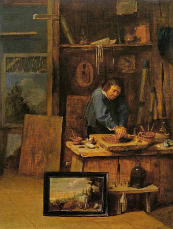
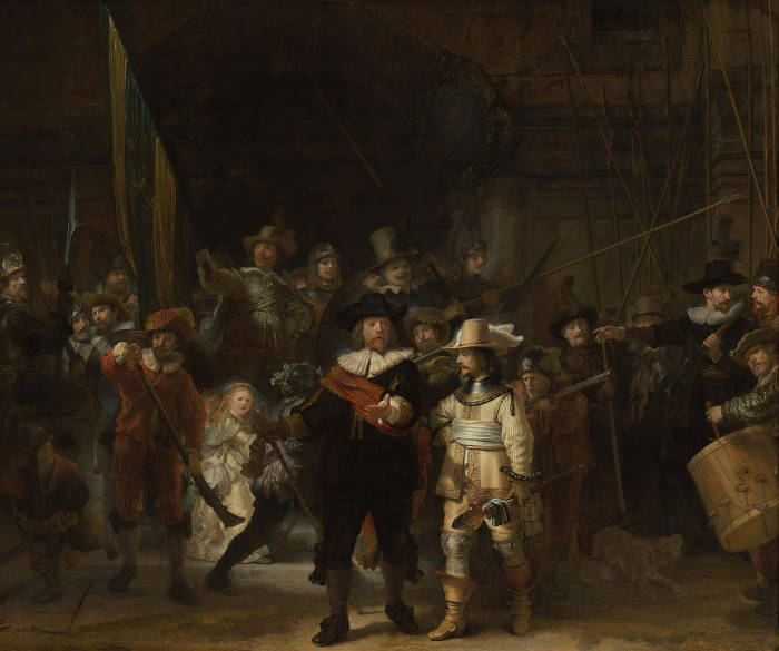
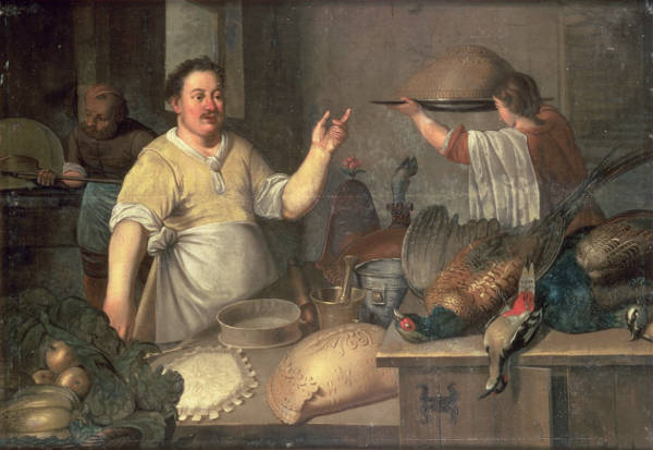
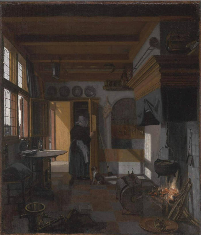
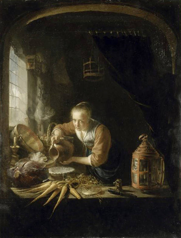

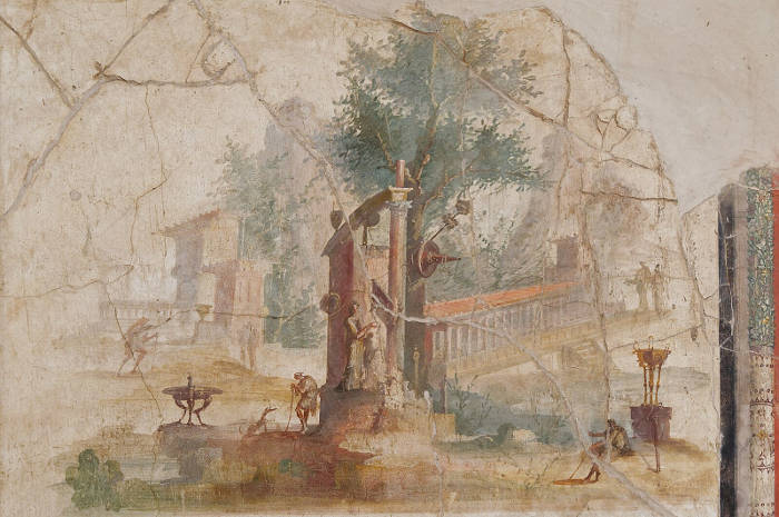
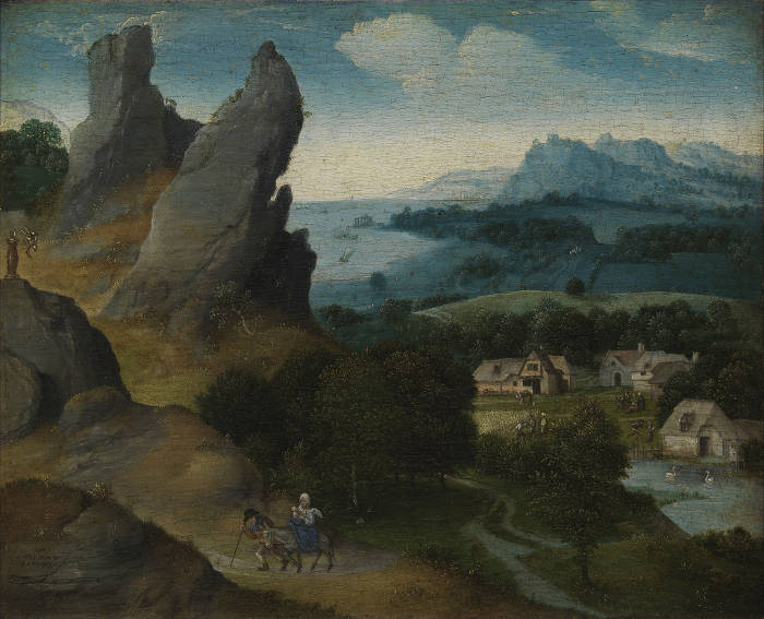

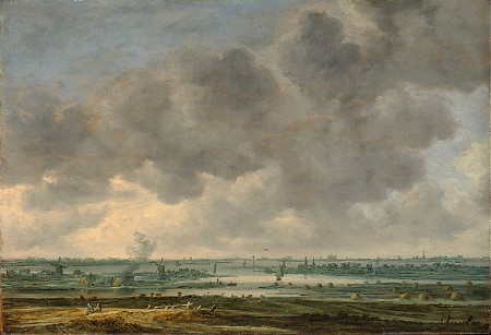

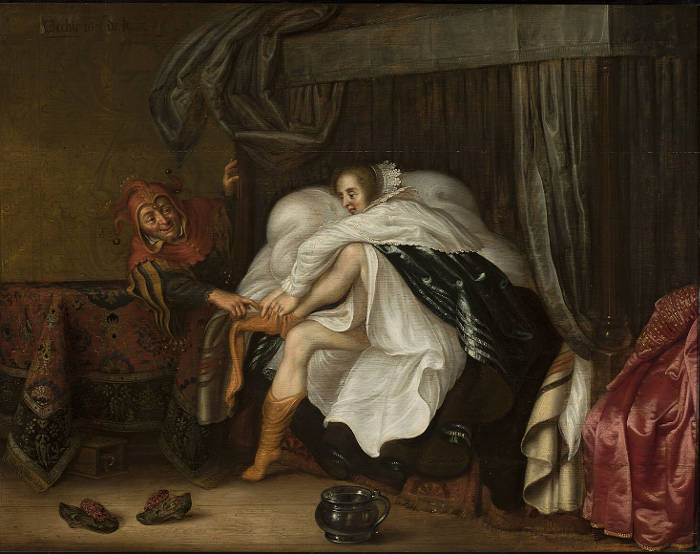
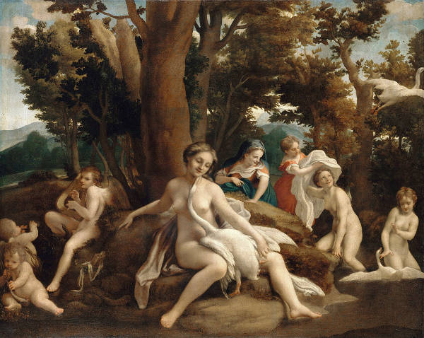


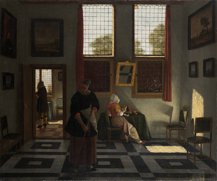


![La prima-[quinta] parte della luce del dipingere et disegnare, Crispijn van de Passe](../ev-database/database-images/gl-mannequin-drawing.jpg)