Art is filled with specialized language that can often puzzle the lay reader. Many terms used by artists, historians, and critics carry meanings that differ significantly from their everyday use, while others are so particular to the field that they remain virtually unknown outside it. This online glossary aims to clarify these distinctions, offering clear definitions enriched by historical and visual context.
Each entry begins by examining the term within the broader history of art—tracing its development, significance, and changing interpretations across time and cultures. When relevant, the discussion shifts to the term’s role in the Dutch Golden Age, a period of extraordinary artistic innovation, technical refinement, and market-driven production. Here, the glossary highlights how concepts were understood and applied by Dutch painters, collectors, and theorists, situating them within the intellectual and social fabric of the seventeenth century.
Given the focus of this website, many entries also include a dedicated section marked with Vermeer’s distinctive monogram. These sections examine how each concept relates specifically to Vermeer’s work—his use of perspective, light, and material texture, or his place within broader Dutch artistic practices. In doing so, the glossary functions not only as a reference tool, but as a framework for understanding Vermeer’s enduring contribution to the history of art.
With more than 700 carefully curated terms and a network of over 30,000 internal links, the glossary allows users to navigate across multiple facets of art, revealing unexpected connections and deeper layers of meaning. Designed to function as both a structured reference and an open-ended journey, it encourages readers to move beyond isolated definitions—tracing the evolution of artistic ideas across disciplines and centuries. Whether used by scholars or by curious enthusiasts, this glossary offers an extensive, interconnected resource for anyone wishing to deepen their understanding of visual art.
Dammar is a type of tree sap from Malaysia, Borneo, Java or Sumatra. This varnish retains its colorless appearance longer than any other common varnish. It is generally composed of a single resin, such as Dammar or a synthetic type. Dammar contains a high percentage of turps or mineral spirits. This means that it does not form a thick layer like normal varnishes and is therefore used for bringing out the full wet appearance of the oil paint on a dry ground before resuming to paint. Dammar varnish does yellow and crack, as all varnishes do, but less so than others. The addition of dammar to a paint medium adds brilliance and luminosity to color.
Dammar varnish began to be used by European painters in the early 19th century, gradually replacing older varnishes made from resins such as mastic and copal. Before its introduction, artists primarily used mastic varnish, which had been in use since at least the 17th century, and copal varnish, which was more durable but also prone to yellowing.
Asian cultures had long used dammar resin for various purposes, it was not widely adopted as an artists' varnish in Europe until the 19th century, when increased trade with the East Indies made it more available.
The first known mention of dammar varnish in an artist's context appears in early 19th-century technical manuals, particularly in France and England. By the mid-19th century, it had become the preferred final varnish for many painters because it was clearer and less yellowing than mastic and easier to remove than copal. The Impressionists, for example, often favored dammar over older varnishes, as it provided a bright, glossy finish without significantly altering color values.
The dating of an artwork refers to determining when it was created, whether through documentary evidence, stylistic analysis, or scientific methods such as dendrochronology, infrared reflectography, or pigment analysis. Establishing a date is fundamental to art historical research, as it allows scholars to place a work within an artist's career, understand its relationship to broader artistic movements, and assess its historical and cultural context. A securely dated painting can provide insight into artistic influences, patronage, and the evolution of styles and techniques. For connoisseurs, especially in earlier periods, dating was often based on the eye and judgment of those with deep experience in a given school of painting, who relied on intuition and comparison rather than modern forensic methods.
In 17th-century Dutch culture, the dating of works of art was not always considered essential in the way it is today. Many paintings were unsigned and undated, as they were produced for an open market rather than for formal commissions that might require inscriptions. However, guild regulations sometimes mandated signatures for accountability, and some painters, such as Rembrandt van Rijn (1606–1669), frequently dated their works, allowing scholars to reconstruct his artistic development with great precision. Other artists, including Vermeer, rarely dated their paintings, making it more difficult to establish the chronology of their output. In the case of Vermeer, whose oeuvre is relatively small, dating his works relies heavily on stylistic evolution, the materials he used, and historical documentation.
Among 17th-century connoisseurs and collectors, dating was often a matter of attribution rather than absolute chronology. Patrons and art dealers were more concerned with authorship, quality, and condition than with the exact year of execution. Figures like Constantijn Huygens (1596–1687), an influential statesman and patron, wrote about artists and their works with an awareness of stylistic changes over time, but systematic dating was not a priority. In contrast, later connoisseurs, such as Arnold Houbraken (1660–1719), who chronicled Dutch painters in De groote schouburgh, attempted to place artists in a chronological framework, though often relying on anecdotal evidence. The modern emphasis on precise dating reflects a shift toward scientific methods and historical accuracy, whereas in the Dutch Golden Age, paintings were often judged more by their perceived artistic merit than by the year they were created.
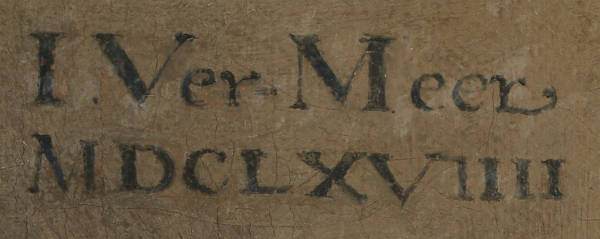
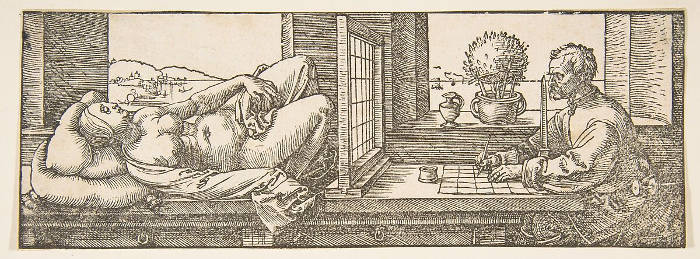
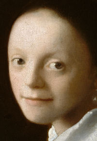
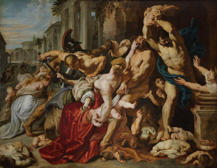
Vermeer's paintings have been considerably vexing to date: only three bear dates: The Procuress, The Geographer and The Astronomer. During a recent examination of The Art of Painting, traces of the date (in Roman numerals) have been discovered and appear to indicate the date 1666–67–68. The Procuress is dated 1656, and The Geographer c. 1668–1669, and and The Astronomer c. 1668. All other dates are hypothetical and vary according to art historian.
The Geographer Johannes Vermeer c. 1668–1669 Oil on canvas, 53 x 46.6 cm. Städelsches Kunstinstitut, Frankfurt am Main
Daylight in art refers to the naturalillumination provided by the sun, as distinct from artificial or symbolic sources of light. Across history, the depiction of daylight has evolved from a simple narrative tool to a complex subject in its own right. In ancient and medieval art, light often had a symbolic role—divine illumination or spiritual clarity—rather than being a carefully observed natural phenomenon. It was during the Renaissance, particularly with artists like Leonardo da Vinci (1452–1519) and Raphael (1483–1520), that daylight began tfo be studied as an optical reality, giving rise to more convincing modeling of forms and spatial depth. The scientific interest in light during the early modern period further fueled this development, as artists began to understand how light could define volumes, affect color, and direct the viewer's attention. By the 17th century, daylight had become not only a descriptive element but a narrative and emotional force, shaping the tone and rhythm of a painting.
In 17th-century Dutch art, daylight took on a unique prominence. Painters worked in a culture deeply engaged with empirical observation and fascinated by the visible world, including the nuanced changes brought by light at different times of day or in different interiors. Daylight in Dutch painting is rarely theatrical or exaggerated; it tends to be quiet, indirect, and specific. Vermeer is among the most accomplished in this regard. His interiors are bathed in soft, filtered daylight, usually entering from a window on the left, and gently illuminating fabrics, faces, and surfaces with a kind of restrained radiance. This light is not merely functional—it animates space, creates mood, and reveals texture with extraordinary subtlety. In works by Pieter de Hooch (1629–c.1684), daylight often plays across tiled floors and through open doorways, structuring the geometry of space while also suggesting domestic order and calm. Gerard ter Borch (1617–1681) used daylight to caress satin and lace, emphasizing tactile luxury and emotional stillness. Even in landscape, artists like Jan van Goyen (1596–1656) and Aelbert Cuyp (1620–1691) used daylight not for drama, but to evoke a believable and often poetic atmosphere—the golden haze of late afternoon, the pale greys of a winter sky, or the delicate transparency of air after rain. In all these cases, daylight is not simply shown; it is felt, understood, and deeply integrated into the fabric of the painting, reflecting a culture that prized clarity, realism, and the quiet observation of everyday life.
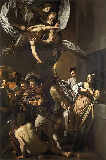
On the other hand, artficial light in art refers to any source of illumination that does not come from the sun or natural phenomena like moonlight or firelight. Historically, this has included torches, candles, oil lamps, gaslight, and later electric light. The concept of artificial light is significant not only for its physical characteristics—its direction, intensity, and color—but also for its symbolic and emotional implications. In classicalantiquity, scenes of night or interior settings lit by manmade sources were rare. It was during the Renaissance and especially in the Baroque period that artists began to explore artificial light with new intensity, both for its dramatic visual possibilities and its capacity to heighten mood or narrative. Caravaggio (1571–1610) is often credited with transforming the use of artificial light through his bold chiaroscuro technique, which placed figures in sharp relief against dark backgrounds, lit by a concentrated, often invisible source. This approach emphasized emotional immediacy and moral gravity, and it influenced generations of artists throughout Europe.
In 17th-century Dutch painting, artificial light is less frequent than natural daylight, but when it appears, it is used with remarkable subtlety and inventiveness. Artists such as Gerrit van Honthorst (1592–1656), who had studied in Italy and absorbed Caravaggesque techniques, became known for night scenes where a single candle or lantern casts a warm glow on a group of figures, often creating an intimate, theatrical atmosphere. In these works, the light source is usually visible within the painting, which allows the artist to explore reflections, shadows, and the gradual fall-off of light. Another notable example is Godfried Schalcken (1643–1706), who specialized in candlelit scenes that emphasize the sensual play of light on skin, fabric, and metal. These paintings often carry an air of seduction or quiet introspection, the artificial light setting the stage for subtle psychological dramas. In genre painting, artificial light might also appear in tavern scenes, nighttime settings, or interiors lit after dusk, adding a sense of time and occasion. While Vermeer primarily worked with daylight, there are exceptions where softer, less directional lighting may suggest early evening or the interplay of multiple light sources. In all cases, artificial light allowed Dutch artists to explore not only technical challenges but also the richness of human experience under conditions of privacy, interiority, and emotional nuance.
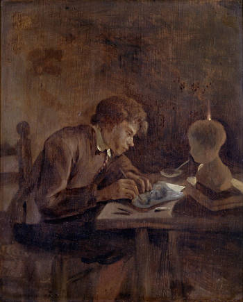
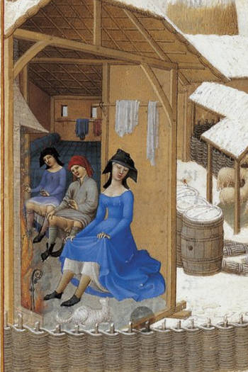
Girl in Hyacinth Blue (underpaintings stage) Jonathan Janson 2002 Oil on canvas, Hallmark Corporation St. Louis
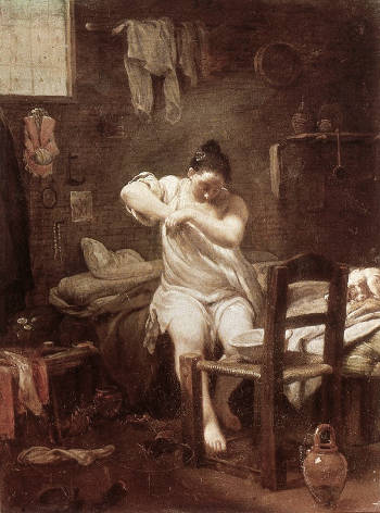
Dead-color (in Dutch, dood-verf), which is the equivalent of today's term "underpainting," is a more or less monochrome version of the final painting that gives volume, suggests substance, substantiates the principal compositional elements and distributes darks and lights. The lack of color used in the term probably explains the word "dead." In the seventeenth century, dead-coloring appears in various forms.
Dead-coloring was so important in the painting process that it was mandatory in the early days of Flemish painting. In 1546, one of the 's Hertogenbosch guild rules states, "7. item. All painters will be bound to work with good paints, and they will not make any paintings than on good dry oak planks or wainscot, being each color first dead-colored and this on a double ground…"
It was not uncommon in the busier 17th-century studios that assistantsworked up numbers of paintings to the dead-coloring stage that only needed to be finished by the master. Maintaining an abundant stock of images on spec may have been an expedient to entice prospective buyers.
Click here for more information on dead color.
As far as it is possible to understand, Vermeer used the dead-coloring methods common among Northern painters.
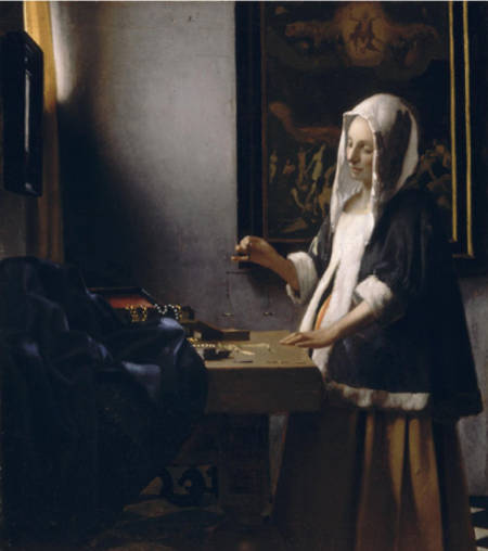
In the Woman Holding a Balance, the brown (raw umber and/or black) dead-color filled two functions: the broader areas of dark brown paintrepresented the masses of shadows with the light buff color of the ground serving as the lights. In the early Diana and her Companions, a carefully brushedunderdrawing was followed by a monochrome dead-coloring in order to determine the essential forms of the composition. Some of the dead-coloring can be made out here and there through abradedpaint layers.
It has been remarked that more than one passage in The Geographer appears unfinished and that this allows us to have a glimpse at Vermeer's underpainting although it is not out of the question that early restoration may be partially responsible for the loss of the uppermost paint layers. The massive wooden window frame and the deeply shadowed area of the carpet correspond rather closely to our idea of Vermeer's underpainting method. Neither of these two areas is defined according to the artist's habitual standard of finish. The darkest parts are all painted with the same semi-transparent dark gray pigment, most likely a mixture of raw umber and black. Here and there on the carpet's fore side we may observe the initial accents of local color. Some of the decorative features have been painted with medium blue paint over the monochrome ground, most likely a mixture of natural ultramarine blue and a touch of lead white. It is probable that the blue areas would have been subsequently glazed with the same ultramarine, this time in a dense, transparent medium in order to deepen and enrich their color. Other parts of the decorative patterns have been brought up with a medium-toned earth color, which compared to the darkest underpaint seems to be a medium-dark yellow ochre. The upper folds of the carpet which catch the incoming light have been depicted with light-toned paint, here with the addition of ochre and there with ultramarine.
The word decorative in its absolute sense refers to something that is intended to adorn or beautify. It implies a focus on visual appeal, ornamentation, and the enhancement of surroundings without necessarily conveying deeper meaning or function beyond aesthetics.
In the context of fine artpainting, decorative can carry a more nuanced implication. It is often used to describe works that emphasizecolor, pattern, and surface beauty rather than narrative, symbolism, or profound intellectual content. While some critics might use the term decorative dismissively, suggesting that a work prioritizes form over substance, others see it as a legitimate and valuable aspect of painting, celebrating harmony, balance, and aesthetic pleasure. In 17th-century Dutch painting, for instance, certain still lifes and genre scenes were appreciated for their decorative qualities—such as the meticulous rendering of textures, drapery , and intricate compositions—without necessarily diminishing their artistic merit.
Interior of Sankt Johann-Nepomuk-Kirche (Asamkirche), Sendlinger Straße, Munich, Germany
The decorative arts are arts or crafts concerned with the design and manufacture of beautiful objects that are also functional. It includes interior design, but not usually architecture. The decorative arts are often categorized in opposition to the "fine arts," namely, painting, drawing, photography and sculpture, which generally are thought to have no function other than to be seen. The distinction between the decorative and the fine arts arose from the post-Renaissanceart of the West but is much less meaningful when considering the art of other cultures and periods, where the most highly regarded works—or even all works—include those in decorative media.
The promotion of the fine arts over the decorative in European thought can largely be traced to the Renaissance, when Italian theorists such as Giorgio Vasari (1511–1574) promoted artistic values, exemplified by the artists of the High Renaissance who placed little value on the cost of materials or the amount of skilled work required to produce a work, but instead valued artistic imagination and the individual touch of the hand of a supremely gifted master such as Michelangelo (1475–1564), Raphael (1483–1520) or Leonardo da Vinci (1452–1519), reviving to some extent the approach of antiquity. Most European art prior to this period had been produced under a very different set of values, where both expensive materials and virtuoso displays in difficult techniques were highly valued.
Decorum (from the Latin: "right, proper") was a principle of Classicalrhetoric, poetry and theatrical theory that was about the fitness or otherwise of a style to a theatrical subject. The concept of decorum is also applied to prescribed limits of appropriate social behavior within set situations and suitability of subject matter and style in painting. Decorum also determined that a pictorial or sculptural subject was suitable for an architectural setting, such as Vulcan's forge over a fireplace, or that kinds of buildings are fitting in urban or rural contexts or appropriate for persons of certain status. Liturgical functions influenced by decorum dictate the placement of paintings, mosaics, and sculpture in religious buildings.
Originally a literary term, it was first used in relation to the visual arts in the Renaissance in the writings of Leonardo da Vinci (1452–1519). According to da Vinci's theory of Decorum, the gestures which a figure makes must not only demonstrate feelings but must be appropriate to age, rank and position. So must also be dress, the setting in which the subject moves and all the other details of the composition. Such thinking greatly influenced academicart, in particular history painting, from the Renaissance through to the nineteenth century. According to his detractors, the cardinal sin of Caravaggio (1571–1610), who refused to study either ancient sculpture or Raphael's (1483–1520) paintings, was the lack of decorum in subject matter and his supposed unfiltered imitation of nature.
Such an unselective imitation became a leitmotif of seventeenth-century art criticism, and Giovanni Pietro Bellori (1613–1696) was its most vocal exponent. In his influential essay "L'ldea" (1664), published as the preface to his Lives of Modern Painters, Sculptors and Architects, Caravaggio was compared to Demetrius for being "too natural," painting men as they appear, with all their defects and individual peculiarities. In his influential Het Groot Schilderboek (The Great Book of Painting) the Dutch painter and art theoretician Gérard de Lairesse (1641–1711) faulted the art of his fellowmen for its too often vulgar subject matter, its lack of decorum in dressing Classical figures in contemporaryclothes, its lack of composition and sober painting handling, believing that only correct theory could produce good art.
The Law Descends to the Earth
Michel Martin Drolling
1827
Oil on canvas
Louvre Museum, Paris
A color is a deep color or has depth when it has low lightness and strong saturation. Opposite to deep colors in both value and saturation are pale colors, such as lead-tin yellow, and white. Some paints are inherently deep, such as natural ultramarine and alizarin crimson.
Dendrochronology (or tree-ring dating) is the scientific method of dating tree rings (also called growth rings) to the exact year they were formed in order to analyze atmospheric conditions during different periods in history. Dendrochronology is useful for determining the timing of events and rates of change in the environment (most prominently climate) and also in works of art and architecture, such as old panel paintings on wood, buildings, etc. It is also used in radiocarbon dating to calibrate radiocarbon ages. Dendrochronology has become an important tool for dating panel paintings. However, unlike analysis of samples from buildings, which are typically sent to a laboratory, wooden supports for paintings usually have to be measured in a museumconservation department, which places limitations on the techniques that can be used.
In addition to dating, dendrochronology can also provide information as to the source of the panel. Many Early Netherlandish paintings have turned out to be painted on panels of "Baltic oak" shipped from the Vistula region via ports of the Hanseatic League. Oak panels were used in a number of northern countries such as England, France and Germany. Wooden supports other than oak were rarely used by Netherlandish painters.
The support of Vermeer's Girl with a Flute is a single, vertically grained oak panel with beveled edges on the back. Dendrochronology gives a tree felling date in the early 1650s.
To depict means to represent or show something, whether visually, verbally, or symbolically. The word is broad in application and refers to the act of making something known through any form of representation. One can depict a landscape in paint, but also in words or even through gesture. The term comes from the Latin depictus, meaning "to portray," and it emphasizes the image or subject being communicated rather than the specific medium or technique used.
To paint, by contrast, refers specifically to the physical act of applying pigment to a surface—canvas, panel, wall, or other support—using tools such as brushes or knives. Painting is a material process, involving color, texture, and surface, and it implies not just representation but craftsmanship and technique. While one can depict without painting (as in drawing, engraving, or writing), one cannot paint without, in some way, depicting—unless the work is wholly abstract.
The two terms often overlap in casual speech but carry different emphases. To depict stresses the idea, the subject, the content: a painter might depict a historical battle, a quiet domestic interior, or a mythologicalfigure. To paint stresses the action and the medium: a painter paints with oils or watercolors, employing certain styles, brushes, and surfaces.
In the 17th-century Dutch context, this distinction becomes especially meaningful. Dutch artists were known for their meticulous depiction of the visible world—everyday life, textures of cloth, glimmers of light on metal or glass. Artists like Willem Claesz. Heda (1594–c.1680) or Pieter Claesz (1597–1660) excelled at depicting reflective surfaces and minute details in their still lifes. Yet their achievement was also in how they painted: the brushwork, the layering, the use of color and glaze to createlifelikeillusions.
Vermeer, for example, did not merely depict domestic scenes. He painted them with such refinement that the material reality of the painting—the cool light, the softness of fabric, the precise edge of a map—becomes inseparable from the subject itself. The viewer is not only seeing what is depicted but also made aware of how it is painted. This dual awareness—of representation and of process—is central to the appreciation of Dutch art from this period.
Thus, to depict is to show; to paint is to build the showing out of pigment and gesture. One describes the result, the other describes the means.
De pictura, written in 1435 by Leon Battista Alberti (1404–1472), is one of the most influential early Renaissancetreatises on painting, theory, and perspective. Originally composed in Latin and later translated by the author into Italian, it lays out a systematic approach to painting as a liberal art—one grounded not only in craftsmanship but in geometry, optics, proportion, and moral philosophy. Alberti, drawing on his knowledge of classicaltexts and his humanist training, sought to elevate painting to the intellectual level of poetry and rhetoric. For him, the painter was not merely an artisan but a learned interpreter of nature and a shaper of ideal forms.
A core feature of De pictura is its introduction of mathematical perspective as a rational tool for constructing pictorial space. Alberti provides a method for organizing a two-dimensional surface according to a visual grid based on the laws of linear perspective. This system was not invented by Alberti—Brunelleschi had already experimented with it—but Alberti's formulation gave it theoretical clarity and made it accessible to artists as a structured technique. The goal was to create a convincing illusion of depth, grounded in observation yet ordered by reason. The human figure, too, was to be constructed proportionally and posed according to decorum, with gestures that conveyed narrative meaning and emotional truth.
Beyond the mechanics of perspective, De pictura is deeply concerned with the moral and social role of painting. Alberti believed that painting should move the viewer emotionally and morally, in the same way classical oratory could. He stressed the importance of istoria—the narrative scene—as the highest achievement of the art, because it combined composition, expression, beauty, and ethical gravity. A successful painting, in his view, teaches and uplifts by depicting noble actions and dignified characters, ideally drawn from biblical, historical, or mythological sources.
Although De pictura was written in 15th-century Italy, its influence spread gradually across Europe, shaping the educational ideals of academies and informing the self-conception of painters for generations. In 17th-century Dutch culture, the direct influence of Alberti's treatise was more diffuse, but the broader principles he set forth were nonetheless absorbed into the evolving discourse about painting. The Dutch Republic, with its mercantile class and Protestant values, tended to favor genre scenes, landscapes, and still lifes over grand istoriasubjects, yet there remained a persistent interest in the intellectual and moral potential of art.
Dutch theorists and artists were aware of the classical tradition and often engaged with it selectively. Karel van Mander (1548–1606), for example, incorporated elements of Alberti's approach in his Schilder-boeck, adapting the humanist model for a northern audience. He praised drawing, anatomy, invention, and decorum—central themes in De pictura—while also emphasizing the value of local traditions. Even in the more modest pictorial genres that flourished in the Dutch Republic, such as the interiors of Vermeer, one can detect echoes of Alberti's call for clarity, harmony, and moral weight. The orderlyspace, balanced composition, and psychological nuance seen in these paintings reflect a sensibility that, though far removed from Roman antiquity, remained committed to the idea that art was more than imitation—it was a means of shaping vision and thought.
Depth is a fundamental aspect of human vision, shaping the way we perceive and navigate the world. In everyday experience, depth allows us to judge distances, recognize spatial relationships, and move through an environment with ease. Our sense of depth is informed by a combination of binocular vision, where each eye perceives a slightly different angle, and monocular cues such as relative size, overlappingobjects, atmospheric perspective, and the way light and shadow interact with surfaces. These cues allow us to interpret three-dimensional space even when looking at a flatrepresentation, such as a painting or a photograph.
The perception of spatial depth is particularly well developed in predatory animals such as cats, eagles, and owls, whose forward-facing eyes provide precise depth discrimination for striking prey. Humans, primates, and many birds of prey share this adaptation, as accurate depth perception is essential for activities like grasping, pouncing, or catching moving objects. In contrast, herbivorous prey animals such as deer, rabbits, and horses typically have laterally placed eyes, which maximize their field of view to detect predators but reduce their binocular overlap. While this limits their ability to perceive depth using stereopsis, they compensate with other depth cues, such as motion parallax, where closer objects appear to move faster than distant ones when in motion, and monocular cues such as shading and texture gradients. Some grazing animals move their heads side to side to create artificial parallax, helping them judge distances without relying on binocular vision.
Other species have evolved highly specialized depth perception systems suited to their environments. Birds provide a striking variety of adaptations. Pigeons and chickens, for example, have largely lateral eyes and rely on rapid head bobbing to create depth cues through movement, while owls, with their large forward-facing eyes, perceive depth in a way more similar to primates. Fish and aquatic animals experience unique challenges, as water affects light refraction and clarity. Some species, such as archerfish, which spit jets of water at insects above the surface, have developed highly accurate depth perception to account for the bending of light as it moves between air and water.
Insects, with their compound eyes, perceive depth quite differently from vertebrates. Many insects rely on motion detection rather than stereoscopic vision, as their eyes are made up of thousands of tiny lenses (ommatidia) that capture fragmented images. Some species, such as mantises, have evolved a form of binocular vision that enables them to judge distances precisely when striking at prey. Experiments with tiny 3D glasses placed on praying mantises have shown that they use depth perception in a way that is functionally similar to vertebrates, though their neural processing is much simpler.
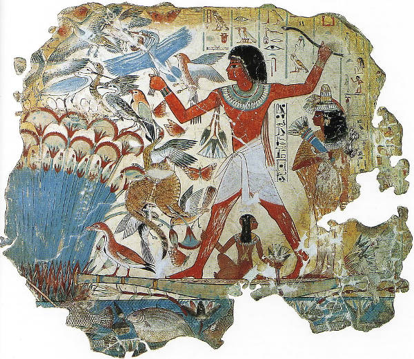
Artists likely began to contemplate spatial depth as their technical abilities and conceptual ambitions expanded. The earliest forms of visual representation focused on the most immediate and essential aspects of imagery—outline, shape, and symbolic clarity—rather than a fully realized sense of space. It is possible that the gradual evolution of spatial depth in art paralleled the mastery of more fundamental pictorial elements, such as line and form, which had to be established before the complexities of recession and volume could be systematically explored. However, the purpose of a given work of art also played a decisive role in whether depth was pursued or ignored. In some cultures, particularly those with strong religious or ritualistic traditions, the symbolic power of an image was often prioritized over naturalistic spatial organization.
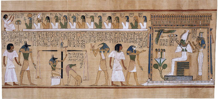
Ancient Egyptian art provides a striking example of a sophisticated visual system that largely disregarded spatial depth in favor of clarity and order. Egyptian artists developed a highly codified method of representation that prioritized recognizable forms over opticalrealism. Figures were typically arranged in composite views, where heads and legs were shown in profile while torsos faced forward, ensuring that each body part was depicted in its most characteristic aspect. Scenes were structured hierarchically rather than perspectivally—more important figures were rendered larger, regardless of their spatial position, while secondary elements were placed in stacked registers rather than in a true recession into space. This system was perfectly suited to the religious and commemorative purposes of Egyptian art, which sought to convey eternal, immutable truths rather than fleeting moments of perception. There was little need to create a pictorial world that mimicked how the eye perceives depth because the function of the artwork was not to transport the viewer into an illusionistic space but rather to affirm divine and social order.
The Judgement of the Dead in the Presence of Osiris Unknown artist c. 1275 BCE Papyrus, 39.8 x 550 cm. British Museum, London
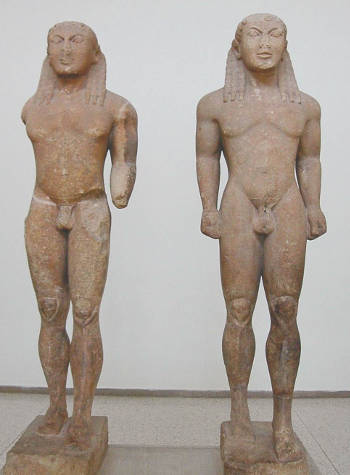
In contrast, classical Greek art moved toward an increasing interest in three-dimensionality and spatial organization, particularly in sculpture and painted decoration. The transition from archaic to classical Greek sculpture, for instance, shows a clear evolution from rigid, frontal figures to dynamic, naturalistic forms that suggestmovement and volume. The same principles of foreshortening, shading, and spatial awareness that were refined in sculpture gradually influenced Greek painting as well. The wall paintings of Pompeii and Herculaneum, preserved by the eruption of Mount Vesuvius in 79 CE, reveal an advanced understanding of spatial recession, with architectural elements rendered in perspective and atmospheric effects creating the illusion of depth. These developments suggest that artists gradually expanded their pictorial concerns as they refined their ability to depict the human figure and other essential elements.
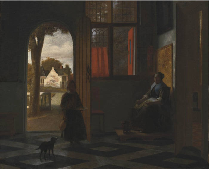
By the time of the Renaissance, the systematic exploration of depth became one of the central concerns of European painting. The development of linear perspective provided artists with a geometric framework for structuring space, allowing for mathematically precise recession. However, even as perspective became a dominant tool, painters remained aware that spatial depth could be achieved in multiple ways—through colorcontrast, the softening and limitation of of details, and the careful arrangement of overlapping forms. The Dutch painters of the 17th century inherited these techniques but often adapted them to suit the demands of their subjects. Genre painters like Pieter de Hooch (1629–1684) and Vermeer constructedintimatedomestic spaces where depth was not simply a technical achievement but a means of reinforcing narrative and mood.
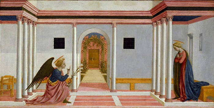
The Annunciation Domenico Veneziano c. 1442–1448 Tempera on panel, 27.3 x 54 cm. Fitzwilliam Museum, Cambridge
Seventeenth-century Dutch painters inherited and refined these techniques, often adapting them to the specific demands of their subject matter. While artists such as Pieter Saenredam (1597–1665) and Emanuel de Witte (1617–1692) used rigorous perspective to structure their church interiors, others relied on more observational approaches to create a naturalistic sense of recession. In landscape painting, Jacob van Ruisdael (c. 1628–1682) achieved a striking depth by carefully layering planes of land, water, and sky, while his contemporaries like Aelbert Cuyp (1620–1691) used light and atmospheric perspective to suggest vast, luminous distances. In genre scenes, Vermeer demonstrated an extraordinary sensitivity to depth, often using subtle variations in color and tone to differentiate spatial planes rather than relying solely on rigid perspective lines. His compositions frequently include objects such as chairs, tables, and floor tiles that establish a foreground, middle ground, and background, subtly guiding the viewer's eye through the space.
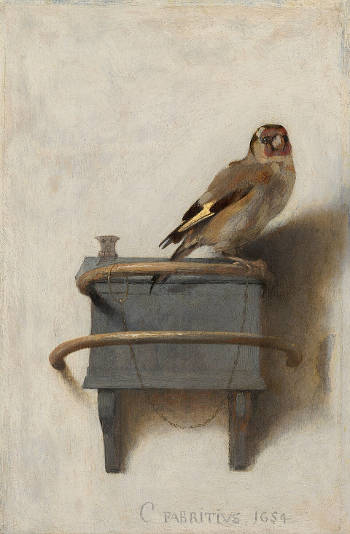
The Goldfinch Carel Fabritius 1654 Oil on panel, 33.5 x 22.8 cm. Mauritshuis, The Hague
The pursuit of depth in Dutch painting was not merely a technical exercise but a means of enhancing meaning and engagement. Artists also manipulated depth to heighten drama, as in the work of Carel Fabritius (1622–1654), whose The Goldfinch plays with the perception of space by positioning the tiny bird on a thin perch that appears to extend outward from the picture plane, momentarily tricking the eye into perceiving a tangible three-dimensional presence. The Dutch fascination with optical precision, including probable experiments with the camera obscura, reflects a broader cultural interest in vision and perception, influencing how depth was conceptualized and rendered in painting.
A depth cue refers to any visual signal that helps the human eye and brain perceive depth and spatial relationships in a two-dimensional image or a three-dimensional scene. These cues can be monocular (requiring only one eye) or binocular (requiring both eyes). Monocular depth cues include linear perspective, occlusion, texture gradients, shading, and atmospheric perspective, while binocular cues rely on the slight difference between the images perceived by each eye (binocular disparity) to create a sense of depth.
Other than linear perspective, the principal depth cues in realistic painting include atmospheric perspective, cast shadows, chiaroscuro, color perspective, foreshortening, overlap, size diminution, and texture gradients.
Atmospheric perspective (aerial perspective) refers to the practice of softening contours, reducing contrast, and cooling colors in distant elements to mimic the effect of air and light scattering over long distances. This technique, used masterfully by artists like Leonardo da Vinci, creates a sense of vastness and depth, particularly in landscape painting. Artists such as Jacob van Ruisdael (c.1628–1682) mastered this technique to create a sense of vastness in their views of the Dutch countryside.
Cast shadows serve as a critical depth cue by anchoring objects within the space and indicating their spatial relationship to one another and to the light source. The direction, length, and softness of shadows help viewers interpret the relative positions of elements within the scene.
Chiaroscuro is the use of light and shadow to model forms convincingly, enhancing the sense of volume and spatial separation between objects. By applying gradual transitions from light to dark, artists can suggest rounded surfaces and the way light falls across a scene.
Color perspective can inhance the sensation of depth by painting the objects nearest the observer in warm colors and those in receding plaes with more nuettral or cooler colors.
Foreshortening is a technique that adjusts the proportions of objects or figures to reflect how they appear compressed when viewed at an angle, making them recede convincingly into space. It requires a precise understanding of anatomy and perspective to execute successfully.
Overlap is a straightforward but effective way to convey depth by positioning some objects partially in front of others, creating a clear spatial hierarchy. Size diminution involves depicting objects that are farther away as smaller than those closer to the viewer, reinforcing the perception of distance.
Size diminution is a depth cue in painting that involves depicting objects that are farther away as smaller than those that are closer to the viewer. This technique helps create the illusion of distance and spatial depth by following the natural way our eyes perceive size relative to distance.
In 17th-century Dutch painting, these depth cues were employed with exceptional skill to create scenes that felt both convincing and natural. Vermeer's works, for instance, often combine atmospheric perspective, chiaroscuro, and subtle overlaps to build a serene and believable sense of interior space. The integration of these techniques allowed Dutch painters to achieve a depth and realism that made their works appear almost as windows onto the world.
The combination of these depth cues in painting can create the sensation of depth that cannot be replicated in photography.
Vermeer's use of depth cues was particularly sophisticated. He integrated soft edges and atmospheric effects to suggest recession, while also using subtle shifts in focus—what some scholars interpret as an awareness of the optical effects of the camera obscura—to create a naturalistic sense of depth. His careful arrangement of figures, furniture, and architectural elements within interior spaces relied on occlusion, perspective, and lighting contrasts to establish spatial clarity.
In photography, depth of field the distance between the nearest point and the farthest point in the subject that is perceived as acceptably sharp along a common image plane. For most subject matter, it extends one-third of the distance in front of and two-thirds of the distance behind the point focused on.
Although the human eye makes use of a convex lens there is no perception of depth of field because the lens continually changes its shape in order to bring whatever it is looking at into perfect focus. In traditional forms of visual representation, even those which encompass expansive landscapes where the depth of field is very noticeable with a modern camera, there is no true depth of field. However, by the Renaissance, painters began to systematically soften the contours and modeling of objects seen at great distances as a means of enhancing the illusion of depth.
The word "description" comes from the Latin describere, meaning to write down, to draw out, to delineate. In its broadest sense, it refers to the act of portraying something—whether in words, images, or other media—so that it can be perceived or imagined by others. In the visual arts, description is not simply a list of features but an interpretive process. It involves selecting, emphasizing, and sometimes even altering what is seen in order to communicate a deeper sense of reality or meaning. A descriptive work does not merely replicate the world; it shapes it into something legible and compelling. During the Renaissance, and well into the seventeenth century, art theory emphasized the importance of imitatio—the imitation of nature—but also of selectio, the artist's judgment in choosing what to include and how to show it. Description in this context was about achieving convincing effects, not mere duplication.
In seventeenth-century Dutch painting, description took on a particularly strong role, both in subject matter and execution. Dutch artists were admired throughout Europe for their acute observational powers and their ability to depict surfaces, textures, and materials with striking precision. This descriptive impulse permeated still life, genre scenes, landscapes, and even religious or historical painting. The Dutch prized the visible world, and painters responded by offering it back to them with remarkable fidelity. But the most compelling descriptions went beyond realism—they constructed a vision of everyday life that felt both familiar and heightened.
Painters such as Pieter de Hooch (1629–c.1684) and Gerard ter Borch (1617–1681) excelled in descriptive painting. Ter Borch, for example, was renowned for his portrayal of satin and other fine fabrics, which he painted with astonishing subtlety. His works demonstrate how description could serve not only to render the physical world but also to suggestmood, character, and social nuance. Pieter Saenredam (1597–1665) applied a similarly descriptive method to architecture, producing serene images of whitewashed church interiors that feel both precise and contemplative. Even Jan van Goyen (1596–1656), with his more economical and atmospheric landscapes, was engaged in a form of description that captured the essence of Dutch light, weather, and geography.
Vermeer, of course, brought descriptive painting to an extraordinary level. His attention to light and surface, to the fall of a shadow across a wall or the glint of a pearl earring, goes beyond the accurate rendering of appearances. In his hands, description becomes a kind of meditation, a quiet act of reverence for the visible world. Yet his scenes are carefully constructed, even staged. The descriptive quality is so persuasive that it can disguise the painter's intervention, making his compositions feel inevitable and unforced.
Design is the intentional process of planning and creating objects, systems, or experiences to fulfill specific functions or achieve desired outcomes. It involves making decisions about form, structure, and aesthetics based on principles of usability, efficiency, and appeal.
The words "composition" and "design" when applied to the visual arts are often used as if they were interchangeable, but each connotes something rather different. Composition is an arranging or pushing-about of the various parts of a picture—of the items, whether they be figures, architectural features or man-made props, of main interest and of secondary and tertiary interest—in such manner that the narrative picture explains itself and tells a given story. Design, instead is the arranging of an agreeable or significant pattern, a formal framework that complements the composition and its story. Among many other elements of design, is the disposing of the dark masses so that they will balance agreeably with the light masses. In moderncommercial art, as is well known, the designer makes great care of to properly relate the dark masses of his poster or advertising placard properly related to the light masses. Strictly speaking, while the function of composition is narrative, that of design is aesthetic.
The design—the pattern, so to say—of certain of Vermeer's works is superlatively beautiful. Such excellence is the more remarkable as it is a quality that does not appear in the work of most of the other Dutch painters. Their pictures are often admirably composed; they convey their motive and their story. They are sometimes composed subtly and elusively. Yet the ablest of these painters were uninterested, as a rule, in the underlying pattern of their compositions.
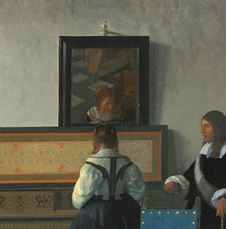
An exception among them, in this regard, was Carel Fabritius (1622–1654), Vermeer's fellow townsman; and this circumstance gives one reason for supposing that Fabritius may have been intimate with Vermeer. The methods of the two men as designers, however, were not closely alike, and Vermeer excelled in both composition and design. As his subjects were usually of the simplest nature, his compositional problems were not particularly intricate. Whatever story there was to tell, this was of the shortest and simplest; the intrigue required no elaborate working out. The design, on the other hand, of a Vermeer, is often subtle, highly original, and, in his best works, very beautiful. For their qualities of design, one thinks especially of The Music Lesson, formerly in Windsor Castle, the National Gallery Lady at the Virginals, the Woman with a Pearl Necklace, Berlin Gallery, the Woman at the Casement (Young Woman Holding a Water Pitcher) , Metropolitan Museum, the Reader, Amsterdam Gallery, and the Girl Reading a Letter at an Open Window, Dresden Gallery.
Some of Vermeer's works, which contain his best paintings, are not remarkable in design. Thus, the weakly patterned The Art of Painting of the Czernin Collection seems to have been painted for the sheer pleasure of the painting. As Vermeer's design and composition are so original and personal, it is strange that his work was ever mistaken for that of other me—Gerrit ter Borch's (1617–1681), Pieter de Hooch (1629–1684), and Gabriel Metsu (1629–1667), for instance, each of whom had his own mode of composition. Ter Borch, as a rule, employed his background merely as a foil for the human figure. He made wonderful little figures which are the whole thing in his pictures; to them the background is entirely subsidiary, delightful as it may be in its manner of staying back. In planning a composition, Ter Borch apparently at first arranged his mannikins agreeably and then bethought himself of a fitting background. De Hooch's plan of composing was quite different from Ter Borch's. A picture presented itself to his mind as an interior composed of beautiful lines and chiaroscuro. His figures look like afterthoughts, as in the one—Dutch Interior with Soldiers—at the National Gallery, London, in which lines of the background can be seen showing through one of the principal figures. De Hooch, in point of fact, did not do the figure at all well. He is a painter of interiors, par excellence.
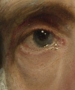
A detail is an individual or minute part of an item or particular. The etymology of the word involves cutting, as in nouns like "tailor" and "retail."
In modern art history, the study of detail is not just a specialty investigative tool, but a fundamental part of the discipline. "Just as a mycologist looks at spores, or an ornithologist at the markings on birds' breasts, or a dermatologist at tiny suspicious spots, so an art historian looks at details."Elkins, James. "On the Impossibility of Close Reading: The Case of Alexander Marshack." Current Anthropology 37, no. 2 (April 1996): 185. Accordingly, art historians who concentrate on detail "are only doing what scientists are…doing: they are systematically dissecting or disassembling their objects into component parts..." in order to more fully understand their innermost workings. In the opinion of the art historian James Elkins, this model may also betray art history's desire to "become scientific, a desire that has long infected the humanities."
The Milkmaid (detail) Johannes Vermeer c. 1657–1661 Oil on canvas, 45.5 x 41 cm. Rijksmuseum, Amsterdam
Art historians generally work with two types of details. The first regards the details of a painting's narrative, that is, of specific illusory objects or parts of objects which are represented in the pictured scene. Often, such details occupy only a minimum area of the painting's surface, but for the inquiring art historian they have great consequence on the final reading of the work as a unified whole. For example, a tiny, barely noticeable floor tile with a Cupid scribbled upon it in Vermeer's Milkmaid, a picture which has been traditionally interpreted as a hymn to domestic virtue, may, according to one analysis, suggest covert amorous undertones. In this case, the amorous reading would be presumably strengthened by the nearby footwarmer which, according to one art historian, was at times associated with a lover's desire for constancy and caring but may likewise have carried sexual implication since most Dutchman would have known that the warmth of the coals moved under the skirt upwards towards the lady's private parts.
The second kind of detail regards an isolated area of the painting where the object of attention is not so much an illusory object but the manner or means by which it is depicted. The most frequently analyzed details of this kind are brush handling , peculiar paint or surface qualities and stylistic components which might distinguish the technique of one painter from that of another. Various art historians have argued that "the fragment played a central role in Romanticaesthetics; it was taken to possess a greater immediacy than the whole, as well as a privileged relation to truth. Artworks were understood to have been muted by systems of academicconventions and skills, and by concepts such as balance, symmetry, composition and especially decorum. Details were thought to be outside such systems"Elkins, James. 1996. and thus capable of revealing the artist's innermost nature.
Portrait of Giovanni Morell Franz von Lenbach 1886 Oil on canvas, 125.5 x 90.2 cm. Accademia Carrara
Giovanni Morelli (1816–1891) was an Italian art critic and political figure who developed the technique of scholarship, identifying through minor details that, revealed artists' scarcely conscious shorthand and convention for portraying. The Morellian method is based on clues offered by negligible details rather than identities of composition and subject matter or other broad treatments that are more likely to be seized upon by students, copyists and imitators. Morelli's method has its nearest roots in his own discipline of medicine, with its identification of disease through numerous symptoms, each of which may be apparently trivial in itself. Adopting Morelli's approach, one scholar has recently argued that the authorship or Vermeer's early Diana and her Companions and Christ in the House of Martha and Mary is strengthened by the fact that the toes of two females figures are painted in a similar manner. The Morellian method of finding essence and hidden meaning in details not only influenced the course of art history but also had a much wider cultural influence. There are references to his work in the Sherlock Holmes novels by Arthur Conan Doyle and in the works of Sigmund Freud.
Some art historians object to the dangers of considering detail as the key, or "the last word" "that is capable of unlocking and exhausting all the meaning of all that is painted around it."Didi-Huberma, Georges. "The art of not describing: Vermeer—the detail and the patch." History of the Human Sciences 2 (1989): 137. Jenkins postulates that the modern-day "fascination with the detail can be nothing more or less than an attempt, sometimes not fully articulated, to escape the potentially rigid grip of iconographic interpretation"' The French philosopher and art historian Georges Didi-Huberman opines that the painting "is always considered to be a ciphered text, and the cipher, like a treasure chest, or a skeleton hidden in a cupboard, is always there waiting to be found, somehow behind the painting, not enclosed within the material density of the paint: it will be the 'solution' to the enigma posed by the picture, its 'motive', or the 'admission' of its secret meaning. In most cases it will be an emblem, a portrait, or some allusion to the 'events' of narrative history; in short, what the historian will have the duty of making the painted work 'confess' or give up will be a symbol or a referent. This means acting as though the painted work had committed a crime, a single crime (when the fact is that the painted work, pretty as a picture and good as gold, has either committed no crime at all, or, by cunningly exploiting the black magic of sight, is getting away with hundreds of unseen ones)."Didi-Huberma, Georges. 1989: 137.
Christ Crowned with Thorns
Dirk Bouts
c. 1470
Oil with egg tempera on canvas backed onto board, 43.8 x 37.1 cm.
The National Gallery, London
Devotional subject matter in painting refers to images intended not simply to illustrate religious stories or dogma but to encourage personal meditation, prayer, or spiritual intimacy. These works were created as aids to devotion, often emphasizing emotional immediacy, physical closeness, and accessibility to the viewer rather than complex narratives or public liturgical use. The tradition of devotional imagery reaches back to early Christian icons, altarpieces, and panels used in private chapels, where figures such as the Virgin Mary or Christ are shown in tender, humanizing ways that draw the viewer into a one-on-one spiritual encounter. The format and scale of such works often reflect their use in personal settings, with smaller dimensions, fewer figures, and a compositional clarity that supports concentrated reflection.
This is different from religious-themed painting more broadly, which may include grand biblical scenes, martyrdoms, saints' lives, or architectural visions of heaven designed for large public churches or civic commissions. These paintings serve a wider public function—educating the faithful, affirming communal beliefs, or expressing institutional power. They can be theatrical, complex in their composition, and geared toward narrative spectacle rather than quiet inward engagement.
In the 17th-century Dutch Republic, the Protestant rejection of religious imagery in churches largely curtailed the production of traditional altarpieces, but devotional painting continued to thrive in Catholic households, particularly among wealthy families like that of Vermeer's mother-in-law, Maria Thins (c. 1593–1680). These works might depict Christ at prayer, the Virgin in contemplation, or saints in states of ecstasy or suffering. The presence of a crucifix, a prayer book, or an image of the Virgin in domestic interiors often signals ongoing Catholic devotion despite public restrictions. In the paintings of Abraham Bloemaert (1566–1651), who worked in Utrecht, one finds a strong strain of Catholic devotional imagery shaped by the Counter-Reformation, often centered on the suffering of Christ or the intercessory role of the Virgin Mary. Similarly, some of Vermeer's early works, such as Christ in the House of Mary and Martha or Saint Praxedis, reflect a kind of Catholic inwardness and reverence that may have been shaped by the Thins household's piety and Jesuit influence, but whoich, perhpas, cannot be considered devotional subject matter in the strictess sense, even though they are carefully composed to draw the viewer into a mood of contemplation.
In Johannes Vermeer: Faith, Light and Reflection, the Vermeer expert and art historian Gregor J.M. Weber's provides substantial evidence connecting Vermeer and his family to Catholic devotional painting. Weber explains that Vermeer lived with his Catholic mother-in-law, Maria Thins, in the Papenhoek, a Catholic enclave in Delft near a Jesuit station. The 1676 inventory of their house, compiled shortly after Vermeer's death, lists several explicitly devotional artworks, including a crucifix, paintings of the Virgin Mary, the Adoration of the Magi, a Veronica's Veil. These were not decorative or merely illustrative religious themes, but works of affective piety meant to foster private devotion in the Jesuit tradition.
The Veronica painting, especially, is given detailed contextualization: Weber links it to Jesuit devotional practices emphasizing emotional engagement and eye contact with the suffering Christ. He also notes that this image was often paired, in Catholic literature and painting, with vanitas imagery—highlighting worldly vanity versus spiritual reflection. In Vermeer's household, a painting of "all kinds of womenìs things" was listed next to the Veronica image, suggesting a didactic contrast consistent with Jesuit teachings.
Moreover, Vermeer included a painting by Jacques Jordaens of the Crucifixion in his Allegory of Faith, which may be the same painting owned by the family. This further indicates that the devotional artworks were not only present in his domestic space but found reflection in his own paintings. The house itself functioned as a private Catholic sanctuary, with paintings serving both a spiritual and pedagogical role for the family. In all, we find these objecys that can be considered as devotional in intent:
A crucifix, the most recognizable Christian devotional object, used in private prayer and frequently associated with affective piety.
A painting of the Virgin Mary, common in Catholic interiors and intended to foster veneration and reflection on her intercessory role.
A depiction of the Adoration of the Magi, often included in household devotional art as a meditation on the recognition of Christ by the gentile world.
A painting described simply as "a crucifixion," perhaps distinct from the one in the Allegory of Faith, emphasizing the central image of Christ's redemptive death.
Several prints and artworks that are not described in detail but are grouped with the above in contexts suggesting religious function or content.
Thus, Weber provides compelling documentation that Vermeer was surrounded by and contributed to an environment rich in Catholic devotional painting, likely influencing the emotional and spiritual tenor of some of his works, particularly the early religious paintings and the later Allegory of Faith.
Line, along with color, is considered the most basic elements of drawing. Different lines have different psychological impacts depending on variations in their length, direction and weight.
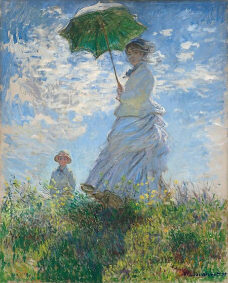
Diagonal linessuggest a feeling of movement or direction. Diagonal lines create a sensation of instability in relation to gravity, being neither vertical nor horizontal, but also because they are not related in a static way to the edges of the artist's paper or canvas. They seem to tip in space. Since the periphery of the eye is sensitive to movement or to any diagonal, its calls for complete attention from the viewer which is why traffic signs designed to warn of hazards are diamond-shaped use diagonals.
In a two-dimensional composition, diagonal lines are also used to indicate depth, an illusion of perspective that pulls the spectator into the picture, creating an illusion of a space that one could move about within. Thus, if a feeling of movement or speed is desired, or a feeling of activity, diagonal lines can be used. Baroque artists in particular made use of the diagonal line to introduce energy and movement in their works.
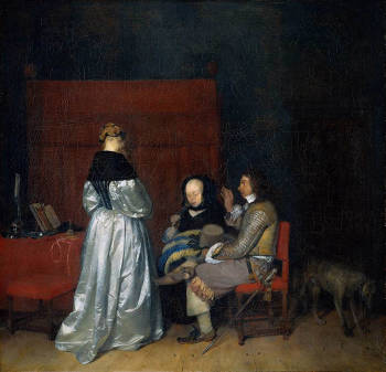
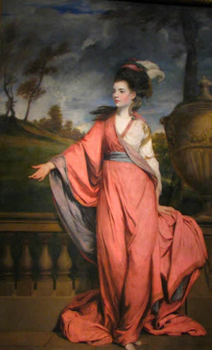
Lady Writing a Letter with her Maid Johannes Vermeer c. 1670–1671 Oil on canvas, 71.1 x 58.4 cm. National Gallery of Ireland, Dublin
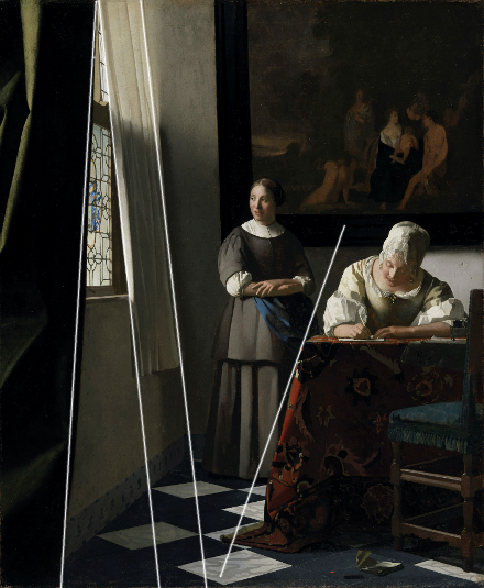
Although Vermeer's designs are generally thought of as predominantly rectilinear, the artist made continual use of strong, clear diagonals in order to introduce a visual dynamism and confer the sensation of ongoing narrative development. One of the most effective uses of diagonal lines can be found in the Lady Writing a Letter with her Maid. In this picture, a series of three implied diagonal lines superimpose themselves over the rectilinear compositional structure invigorating the narrative tension, wherein the mistress has cast aside a letter she has just received (see the letter and red wax seal on the floor in front of the table) and hastily writes as her maid patiently waits to deliver the letter as soon as it is finished.
Ambient light and diffused light are related but distinct concepts in both natural observation and artistic depiction. Ambient light refers to the general illumination present in a scene, often coming from multiple indirect sources, creating an overall sense of brightness without deep shadows or clear highlights. It is the light that fills a space evenly, reducing harsh contrasts and making details visible throughout the composition. Diffused light, on the other hand, is light that has been scattered or softened, usually by passing through a medium (see: Turbid Medium Effect) such as clouds, fabric, or frosted glass. Unlike ambient light, which describes an overall effect, diffused light refers to a particular way in which illumination is modified, reducing glare and harsh shadows while enhancing subtle tonal transitions.
In painting, ambient light has historically been used to create a sense of space and atmosphere. Early Renaissance artists, influenced by the study of optics and perspective, began to explore how light could unify a composition rather than simply highlight individual forms. The development of linear perspective by figures such as Leon Battista Alberti (1404–1472) and the sfumato technique perfected by Leonardo da Vinci (1452–1519) laid the groundwork for a more naturalistic approach to light. Rather than relying on sharp contrasts, Renaissance painters began to suggest an enveloping light that permeated the entire scene, lending greater cohesion and depth to their compositions.
Flagellation Piero della Francesca 1459 Tempera on panel, 81.5 x 58.3 cm. National Gallery of the Marche, Urbino
By the 17th century, Dutch painters had refined the use of ambient and diffused light to an extraordinary degree, perhaps unsurpassed by any other school of painting. The soft, luminous quality found in Vermeer's interiors is a masterful example of diffused light in painting. His compositions often feature light entering through a window, scattering gently across surfaces, producing delicate gradations of light and shadow. This effect enhances the illusion of relief and natural forms , as the light behaves as it would in reality— evenly falling off as it rakes across walls, furniture, and fabric, while highlighting textures without overpowering them. The subtle transition between light and shadow in his work demonstrates an acute awareness of how diffused light can create atmosphere and mood.
The evolution of ambient and diffused light in painting mirrors broader developments in artistic naturalism and optical study. Dutch painters, in particular, elevated the depiction of light to a level of unparalleled sophistication, balancing precision with an atmospheric subtlety that continues to captivate viewers centuries later. Through their careful modulation of ambient and diffused light, they created works that not only depicted reality but also evoked a palpable sense of space and tranquility.
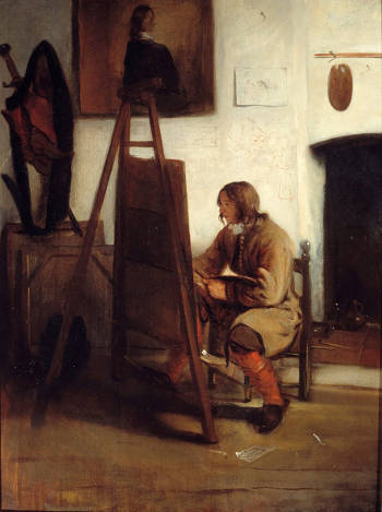
Originally, a dilletante wasan admirer or lover of the arts, a connoisseur. Or, a dabbler in an art or a field of knowledge; an amateur. Today, "dilettante" is more likely to be used in the latter sense, and taken by many—by the listener, even if not by the speaker—as an insult. It was more innocent in its original uses, as derived from the Italian word "dilettare," meaning "to delight." In the 18th century, a dilettante was simply a person who delighted in the arts. Later, the term came to refer to an amateur—someone who cultivates an art as a pastime without pursuing it professionally. From this meaning developed the pejorative sense the word carries now: a person who dabbles in an art but is not truly devoted to it.
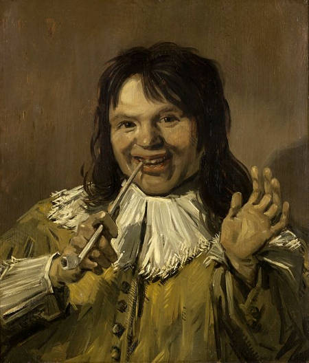
While indirect painting remained dominant in the Dutch Golden Age, particularly in portraiture and genre painting, certain artists favored more direct approaches. Frans Hals (c. 1582–1666), for instance, was known for his spirited, alla prima technique, where lively, spontaneous brushwork gave his portraits an animated quality. Rather than painstakingly building up his surfaces with glazes, he often worked rapidly, using visible, energetic strokes to define form, particularly in his later works, where the fluidity of his handling became even more pronounced.
Rembrandt van Rijn (1606–1669), on the other hand, combined both approaches with extraordinary effect. While he used indirect methods in his early works, layering glazes to achieve complex lighting effects, his later style increasingly embraced the direct application of layers of thick textured paint. His portraits, particularly in his mature period, reveal an expressive immediacy, with paint laid down in bold strokes and left visible as a record of the painter's touch. He often contrasted delicate glazes in the shadows with impasto in the highlights, creating a textural interplay that reinforced the physical presence of his figures.
The understanding and deliberate use of directional light in painting emerged gradually, with its origins traceable to ancient art but reaching new levels of sophistication during the Renaissance and Baroque periods. Early painters recognized the role of light in defining form, but it was not until the late Middle Ages and the Renaissance that artists began systematically exploring its effects to create spatial depth and the illusion of reality .
In Antiquity, Greek and Roman painters likely employed directional light in illusionisticfrescoes, though few surviving examples allow for detailed analysis. Roman wall paintings from Pompeii and Herculaneum suggest an awareness of how light could enhance volume and depth, particularly in the modeling of figures and architectural trompe-l'oeil effects. However, these works generally lack the strong directional light that later became a defining characteristic of Western painting.
The first painters to consciously and systematically exploit directional light as a central compositional tool emerged in the early Renaissance. Giotto di Bondone (c. 1267–1337) was among the first European artists to use light to define form with greater naturalism, moving away from the flat, gold-background traditions of medieval painting. His frescoes, such as those in the Arena Chapel in Padua, demonstrate a rudimentary understanding of how a single light source can shape figures and cast shadows, lending them a newfound solidity.
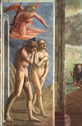
Expulsion from the Garden of Eden Masaccio 1426–1428 (altered in 1680 restored in 1980), Fresco 208 x 88 cm., Santa Maria del Carmine, Florence
This exploration deepened in the 15th century with artists such as Masaccio (1401–1428), whose fresco cycle in the Brancacci Chapel in Florence is among the first to show light coming from a consistent, external source. His use of directional light enhances the volume of figures, reinforcing their sculptural presence. Leonardo da Vinci (1452–1519) advanced this approach further by studying the diffusion of light and shadow, developing the technique of sfumato, which allowed for seamless transitions between light and dark, enhancing the perception of depth. His meticulous observations of how light interacts with different surfaces and atmospheric conditions had a profound impact on later painters.
In the 16th century, Venetian painters such as Titian (c. 1488–1576) and Giorgione (c. 1477–1510) refined the use of directional light to create warmth and depth, often using it to guide the viewer's eye through their compositions. However, it was Caravaggio (1571–1610) who revolutionized the use of dramatic, directional lighting with his intense chiaroscuro. His compositions often feature a single, strong light source illuminating figures from the side, casting deep shadows and creating a theatrical intensity that influenced painters across Europe.
The 17th-century Dutch Republic inherited and transformed these discoveries, integrating directional light into a new style of painting that emphasizedrealism, atmosphere, and materiality. Vermeer, Rembrandt van Rijn (1606–1669), and Pieter de Hooch (1629–1684) applied directional light not only for dramatic effect but also to heighten the illusion of texture and space. Vermeer's interiors are structured around light entering through windows, casting soft yet well-defined shadows that lend an almost photographic clarity to his compositions. Rembrandt, in contrast, used directional light for expressive and psychological depth, often illuminating faces and hands while allowing much of the composition to dissolve into darkness. Pieter de Hooch manipulated directional light to structureperspective within architectural settings, using doorways and windows as conduits for light to create spatial depth.
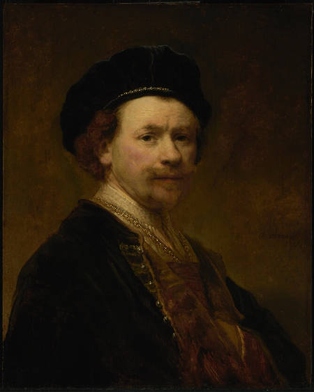
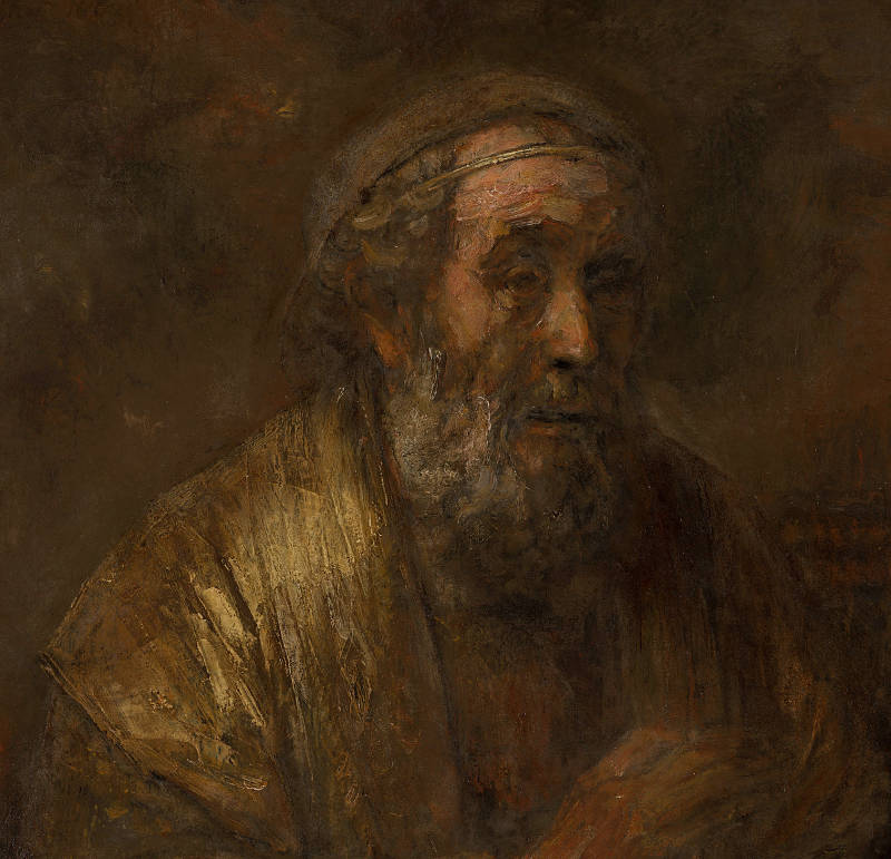
Self-Portrait
Rembrandt van Rijn
c. 1639
Oil on panel, 63.2 x 50.5 cm.
The Norton Simon Foundation, Pasadena
The evolution of directional light in painting, from its early Renaissance origins to its full realization in the Dutch Golden Age, marked a fundamental shift in the depiction of reality. No longer merely a means of illumination, light became an active compositional force, shaping space, defining form, and evoking mood in ways that continue to influence art and photography to this day.
The dichotomy of discipline and feeling has long been one of the central tensions in the creation and evaluation of art. E.H. Gombrich's observation—that a great work of art reveals an intensity of emotion held in check by an even greater intensity of discipline—touches on a timeless ideal. This balance is neither accidental nor secondary; it is foundational to the experience of great art. The quote suggests that emotional power, to be fully effective, must be governed by structure. In this sense, restraint is not a limitation but a condition for expression. A scream uncontrolled becomes noise; shaped by rhythm and contour, it becomes music. Likewise, a brush charged with feeling, when guided by technical command, produces not just passion but meaning.
Throughout the history of art, this tension between impulse and order has taken different forms depending on the prevailing cultural and intellectual climate. In classicalantiquity, artists and philosophers such as Polykleitos (c. 480–c. 420 BCE) and Plato (c. 428–c. 348 BCE) upheld ideals of proportion and harmony, believing that beauty arose from a rational balance of parts. Yet they also acknowledged the role of divine inspiration, or furor poeticus, that infused art with life. During the Renaissance, figures like Leon Battista Alberti (1404–1472) and later Giorgio Vasari (1511–1574) continued to promote the idea that art must combine learned knowledge with inspiredexecution. Michelangelo (1475–1564), in particular, was admired for fusing intense expressive energy with rigorous formal design, sometimes called terribilità, the awesome emotional force tempered by order.
In the 17th-century Dutch Republic, this principle found a particularly vivid expression, though shaped by different aesthetic values. Dutch painters did not generally seek the heroic sublime of the Italian tradition, but they did prize a similar harmony of emotion and control. In genre scenes, domestic interiors, and landscapes, the emotional register is often more subdued—imbued with quietude, intimacy, and restraint. Yet within that restraint lies a world of feeling.
Painters such as Pieter de Hooch (1629–c.1684) exemplify this balance. His interiors are not emotionally neutral, but rather evoke a deeply felt calm, an emotional atmosphere conveyed through light, order, and the dignity of everyday life. De Hooch's carefully constructedperspective and architecture do not suppress emotion but provide the setting in which emotion can unfold subtly and persuasively. It may be telling that it is said that this artists died in an insane asylum. Vermeer, whose paintings possess an inner stillness shaped by luminous technique and meticulous design. The sensation of quiet longing or spiritual concentration in works like Woman Holding a Balance would lose its depth without the clarity and control of the composition.
Gerrit Dou (1613–1675), a successful student and follower of Rembrandt, offers a different version of the same equation. Rembrandt (1606–1669), whose technical mastery is beyond dispute, often pushed technique to its limits in the service of emotional expression. His late works, in particular, are notable for their willingness to forgo finish, to embrace roughness and painterly boldness, all in the interest of conveying states of mind, psychological truth, and human vulnerability. The technique does not obscure the emotion—it seems to tremble with it.
Dou, by contrast, pursued the opposite extreme: a surface so polished, so minutely detailed, that no brushstroke remained visible. The textures of metal, fur, parchment, and glass in his niche paintings are astonishing. Yet that very accomplishment can feel, to the modernviewer, like a kind of barrier. The passion is buried under layers of control. His paintings rarely breathe; they glisten, but do not pulse. The viewer is left to wonder whether the absence of overt feeling is a matter of choice or of capacity. Was Dou merely subduing his emotions under layers of varnish-like discipline, or did he in fact work from a fundamentally different emotional register—one that prized stillness and perfection above expression?
It is telling that Dou's technical accomplishments were enormously admired in his lifetime, while Rembrandt's more turbulent later style fell out of fashion. Dou was once considered the more "perfect" artist. But as taste shifted—especially from the 19th century onward—the valuation of visible feeling, of painterly risk, of the trace of the artist's hand and impulse, brought Rembrandt back into primacy. What had seemed messy or unruly became evidence of depth. What had seemed perfect became sterile.
In that light, Dou's discipline may be read as both an achievement and a kind of evasion. His paintings are not void of emotion, but the emotion is deeply recessed. It is encoded in gesture and stillness, in the staging of control itself. But if, as Gombrich suggests, great art results from the dominance of discipline over impulse without extinguishing it, then in Dou the dominance is so total that the spark seems barely to survive. Whether this reflects a temperamental limitation or a stylistic ideal is open to debate—but the emotional absence many perceive today is hard to dismiss. His discipline is immaculate, but it may well have been a form of concealment.
In Florence, disegno("drawing" or "design") was viewed as the sine qua non of the artistic endeavor, the primary means for making painting approximate nature. Disegno was fundamental for all areas of art in the Renaissance: painting, sculpture and architecture. Although it is believed that the notion of drawing as the foundation for the art of painting and sculpture had been expressed at least as early as Petrarch,Williams, Robert. Art, Theory, and Culture in Sixteenth-Century Italy (Cambridge: Cambridge University Press, 1997) 16. the art historical concept of disegno "originated partly in the workshop of sculptors and had direct reference to the plastic quality of a work. Giorgio Vasari (1511–1574), the foremost art critic of the Renaissance, gave the concept its universal form by lumping together all the visual arts as arti del disegno and by initiating the foundation of the Academy of Design (Accademia del Disegno) in Florence in 1562. In Vasari's usage disegno points to the regular form or idea of things in artist's mind, that is, disegno is understood primarily as the right proportion of the whole to its parts and of the parts to one another."Undusk, Rein. "Disegno e colore: Art Historical Reflections on the Structuring of Space." Accessed January 13, 2025. Thus, disegno was considered the key to the entire imaginative process, the medium of the painter's thought and its concrete expression.
On the other hand, in Venice, colorito, "coloring" was not only color but the fundamental means by which painted images could be charged with the look of life. Florentine color was frequently more vivid than the palette used in Venetian paintings; typically Venetian, however, was the process of layering and blending colors to achieve a glowing, natural richness. Rather than beginning with careful drawings where contours are fixed with meticulous certainty, Venetian painters often worked out compositions directly on the canvas, using layered patches of colors and visible brushwork, rather than line, to evoke the sense of space and the sense of light. Venetian painters paid much closer attention to the effects of light than the Florentines and used this knowledge to create both movement and volume in composition.
This debate, which raged throughout the Early Renaissance (c.1400–1490) and the High Renaissance (c.1490–1530) was argued over by many of the leading exponents of academic art, up until the nineteenth century. The debate between the two positions involved theorists as well as artists and regional rivalries as well as aesthetic concerns.
Roger De Piles (1635–1709), a French art critic who gave an important contribution to aesthetics in his Dialogue sur le coloris ("Dialogue on colours"), broke with tradition and argued strenuously that color was not simply accidental ornamentation, but the main condition of an object's visibility. Thus color, to de Piles, was part of the natural order of painting. It is an attempt to assess the achievement of the major artists since Raphael (1483–1520), De Piles awarded marks out of twenty for each composition, design or drawing, color and expression, De Piles' evaluations have been denigrated after the decline of Classicism, and his ranking is now considered his "most notorious contribution to criticism" even though his "decomposition of the overall quality of the work into four properties was revolutionary and ambitious at the time." After an examination of the historical correlation (1736–1960) between prices achieved by their works at auction and the De Pile's evaluation of a list of fifty-six major painters in his own time (with whose work he had acquainted himself as a connoisseur during his travels) the professor of economics Kathryn Graddy concluded that the critic's "ratings have held up very well," better than those of other critics or "random judgments." In sum, "His [De Piles'] higher-rated artists achieved a greater return than his lower-rated artists."Graddy, Kathryn. "The Extraordinary Art Critic Roger de Piles (1635–1709): An Empirical Analysis of his Rankings and Sale Prices." Dissertation, Brandeis University, 2012: 7.
De Piles' table of artists is reported below. Each painter was given marks from "0" to "18" in composition, drawing, color and expression which was intended to provide an overview of aesthetic appreciation that hinges upon the balance between color and design. The highest marks went to Raphael, with a slight bias on color for Rubens, a slight bias on drawing for Raphael. Painters who scored very badly in anything but color were Giovanni Bellini, Giorgione (c. 1477/8–1510) and remarkably Caravaggio with "16" on color and "0" (zero) on expression. Painters who fell far behind Rubens and Raphael but whose balance between color and design was perfect were Lucas van Leyden (1494–1533), Sebastian Bourdon (1616–1671), Albrecht Dürer (1471–1528). Rembrandt (1606–1669), who is today considered one of the world's greatest draughtsmen, was given a desultory "6."
The Holy Family, with Saint Elisabeth and the Infant Saint John the Baptist
Sébastien Bourdon
ca. 1653 - 1657
Oil on canvas. 39 x 50 cm
Museo Nacional Thyssen-Bornemisza, Madrid
In optics, a disk of confusion (also referred to as halation, blur circle, circle of confusion and circle of indistinctness) refers to the effect of non-converging, unfocused light rays that have entered a lens. When light waves do not converge after passing through a lens, they produce a larger optical spot, instead of coming together at a single point, as in the case of a specular highlight.
Under normal conditions, disks of confusion are not seen with the human eye because "it quickly shifts focus to the object being momentarily considered so that most persons are unaware that the...eye is focused on a single plane at any given instant. If the eye did not shift focus as quickly as it does one might be able to notice circles of confusion forming on the retina, but experimentation shows that the out-of-focusimage formed on the retina is useless for picture-making purposes even if one is aware of its existence."Fink, Daniel A. "Vermeer's Use of the Camera Obscura: A Comparative Study." The Art Bulletin 53 (1971): 495.
View of Delft (detail) Johannes Vermeer c. 1660–1663 Oil on canvas, 98.5 x 117.5 cm. Mauritshuis, The Hague
Art historians have equated certain globular highlights of light-toned paint found in many of Vermeer's paintings with circles of confusion that the artist presumably observed through a camera obscura. These painterlyinterpretations are called "pointillés." Vermeer made extensive use of pointillés in The Milkmaid although they appear, somewhat rudimental, for the first time scattered in the hair of Girl Reading a Letter at an Open Window, on the satin bodice and the knobby surface of the foregroundTurkish carpet. The View of Delft also presents a profusion of pointillés, many of which, however, would not have registered by a real camera obscura in natural conditions, above all, those that occur within deep shadows such as the undersides of the boats moored on the scene's quay. Pointillés are also very noticeable in the late-workLacemaker where they shimmer on the foreground still life. It must be assumed that once Vermeer had understood how the disks of confusion are produced by the camera obscura and how to imitate them with paint, he employed them with considerable artistic license to enhance the effect of light as it plays upon natural surfaces.
Although Dutch painters experimented with a number of techniques to represent highlights, which are key to creating the illusion of light conditions (usually intense), on shiny surface textures, only Vermeer adopted circular highlight in a methodical manner. Perhaps the only other instances of such highlights in Dutch painting are those on a pair of slippers in the foreground of Gabriel Metsu's (1629–1667) Woman Reading a Letter, a picture that was likely inspired by Vermeer himself.
This highly peculiar optical phenomenon in Vermeer's painting was systematically investigated Charles Seymour ("Dark Chamber and Light-Filled Room: Vermeer and the Camera Obscura," Art Bulletin 46, 1964) and Daniel A. Fink ("Vermeer's Use of the Camera Obscura: A Comparative Study," The Art Bulletin 53, 1971). Both writers experimented with actual camera obscuras focused on mock-Vermeer still lifes in attempts to replicate the effects seen in Vermeer's paintings.
Drawn from the abstract of: Ingred Cartwright, "Hoe schilder hoe wilder: Dissolute self-portraits in seventeenth-century Dutch and Flemish Art," dissertation, University of Maryland, 2007.
The Smoker (Portrait of the Artist?) Joos van Craesbeeck c. 1635–1636 Oil on panel, 41 x 32 cm. Louvre Museum, Paris
In the 17th century, Dutch and Flemish artists presented a strange new face to the public in their self portraits. Rather than assuming the traditional guise of the learned gentleman artist that was fostered by Renaissancetopoi, many painters presented themselves in a more unseemly light. Dropping the noble robes of the pictor doctus, they smoked, drank and chased women. Dutch and Flemish artists explored a new mode of self-expression in dissolute self portraits, embracing the many behaviors that art theorists and the culture at large disparaged.
Dissolute self portraits stand apart from what was expected of a pictorial convention self portrait, yet they were nonetheless appreciated and valued in Dutch culture and in the art market.
Dissolute self portraits also reflect and respond to a larger trend regarding artistic identity in the seventeenth century, notably, the stereotype "hoe schilder hoe wilder"["the more of a painter, the wilder he is," a reference that reappears throughout the century, both in print and in paint] that posited Dutch and Flemish artists as intrinsically unruly characters prone to prodigality and dissolution. Artists embraced this special identity, which in turn granted them certain freedoms from social norms and a license to misbehave. In self portraits, artists emphasized their dissolute nature by associating themselves with themes like the Five Senses and the Prodigal Son in the tavern.
Drunken Artist
Abraham Bloemaert
c. 1591–1657
Brown ink on paper, dimensions not specified
Fleming Museum, University of Vermont, Burlington
In general terms, distortion refers to the alteration or deformation of an object, figure, or space from its natural or expected appearance. It can occur accidentally, as a result of imperfect technique or limitations of materials, but in art, it is often a deliberate choice. Distortion has historically served a variety of purposes: it can express emotion, emphasize particular features, create symbolicmeaning, or challenge conventional ways of seeing. In medieval art, for example, physical proportions were often distorted to reflect spiritual hierarchies rather than physical reality. During the Renaissance, a growing emphasis on naturalism led many artists to minimize distortion, seeking instead to masterperspective and anatomical accuracy. However, even in the most rigorous traditions of realism, some degree of distortion persisted, whether to amplify a gesture, dramatize a pose, or create compositional balance. Artists understood that true naturalism was not the mechanical copying of nature but a thoughtful interpretation that sometimes required bending appearances for the sake of greater expressive or visual coherence.
In general terms, distortion in Mannerist painting refers to the purposeful stretching, twisting, or altering of human figures and spatial environments to create heightened emotional effects, sophistication, or elegance. Emerging in the late 16th century as a reaction to the balanced harmony of the High Renaissance, Mannerism favored complexity, artificiality, and tension over clarity and natural proportion. Artists often elongated limbs, twisted bodies into improbable poses, and constructedsettings that were spatially ambiguous or vertiginous. The intent was not to mimic nature exactly but to show the artist's skill in transforming it, revealing an intellectual and expressive virtuosity. Distortion thus became a marker of creative refinement, a means to suggest an idealized, sometimes otherworldly beauty rather than a strictly empirical one.
The Assumption of the Virgin Domenico Theotokópoulos called El Greco 1577–1579, Oil on canvas 403.2 × 211.8 cm., The Art Institute of Chicago, Chicago
Two of the most notable practitioners of Mannerist distortion were El Greco (1541–1614) and Parmigianino (1503–1540). El Greco, trained in the traditions of Byzantine and Venetian art, developed a personal style marked by elongated figures, swirling drapery, and ethereal light. In paintings like The Burial of the Count of Orgaz, his human forms stretch unnaturally, their limbs and torsos extended beyond anatomical possibility to evoke spiritual intensity and transcendence. The physical distortion in his work was deeply tied to the emotional and mystical content he sought to convey. Parmigianino's Madonna with the Long Neck presents a similarly extreme example: the Virgin Mary is shown with an unnaturally elongated neck and slender body, while the infant Christ appears disturbingly large and contorted. This was not due to a lack of skill—Parmigianino was a master draftsman—but a deliberate choice to create an otherworldly grace and refinement, elevating his figures beyond the earthly into the realm of the ideal.
In 17th-century Dutch painting, by contrast, such extreme distortions were generally avoided. The dominant values of Dutch art were rooted in natural observation, realism, and an interest in the tangible world. Artists like Frans Hals (c.1582–1666) captured lively movement and fleeting expressions, but even when brushwork became loose and animated, the basic proportions of figures remained plausible. Vermeer, Pieter de Hooch (1629–c.1684), and Gerard ter Borch (1617–1681) all constructed their figures and interiors with great care for naturalisticrepresentation. Even Jan Steen (c.1626–1679), who introduced playful exaggeration into facial expressions and bodily gestures, rarely ventured into the kind of radical distortion seen in Mannerism.
Domestic life, in general terms, refers to the everyday activities, relationships, and routines that occur within the home. It encompasses the intimate sphere of family interactions, household tasks, meals, and private moments, often characterized by a sense of stability, comfort, and routine. The depiction of domestic life in art and literature serves to highlight the personal and often overlooked aspects of human existence, contrasting with more public or dramaticthemes. In Western art history, scenes of domestic life have been used to explore themes of morality, virtue, and the passage of time, often infused with subtle symbolism or moral lessons.
Before the rise of 17th-century Dutch painting, scenes of domestic life were gradually introduced into religious paintings and other types of works of art , often as secondary or background elements that added a sense of realism and relatability. In the medieval and early Renaissance periods, most art was commissioned by the Church and focused on religious themes, but artists began to include detailed depictions of everyday objects, interiors, and activities to make these scenes more accessible to viewers. These glimpses of domestic life served to bridge the divine and the mundane, allowing viewers to connect more personally with the holy figures and narratives depicted.
One early example can be seen in the works of Jan van Eyck (c. 1390–1441), a Northern Renaissance painter who incorporated meticulously detailed interiors and objects into religious scenes. In The Annunciation and the Ghent Altarpiece, Van Eyck depicted domestic interiors with realistic lighting, furniture, and household items, transforming biblical events into scenes that could be imagined in the contemporary home of a wealthy merchant. The polished surfaces, textiles, and reflective objects in these paintings not only demonstrated Van Eyck's technical skill but also subtly brought the sacred into the realm of everyday experience.
The Mérode Altarpiece (c. 1427–1432) by Robert Campin (c. 1375–1444) is another significant example, presenting the Annunciation set within a typical Flemish domestic interior. The detailed rendering of everyday objects—such as books, candles, and a kettle—served dual purposes: enhancing the realism of the scene and symbolizing aspects of the Virgin's purity and domestic virtue. This blending of the sacred and the ordinary paved the way for later artists to focus more directly on domestic life as a worthy subject in itself.
In Italy, artists of the early Renaissance, such as Domenico Ghirlandaio (1448–1494), also began to introduce elements of domestic life into religious paintings. In works like The Birth of the Virgin from the Tornabuoni Chapel, Ghirlandaio depicted interiors with realistic architecture, clothing, and furnishings, emphasizing the material aspects of everyday life. His attention to the details of domestic interiors reflected the growing interest in humanism and the everyday experiences of ordinary people.
Birth of Mary Domenico Ghirlandaio c. 1486–1490 Fresco, Tornabuoni Chapel Florence
By the late 15th and early 16th centuries, Pieter Bruegel the Elder (c. 1525–1569) expanded the scope of domestic and peasant life in art with his large-scalegenre scenes. Works like The Peasant Wedding and The Return of the Herd depict ordinary people at work and leisure, with a focus on the communal and agricultural aspects of rural life. Bruegel's scenes are notable for their lack of idealization, presenting the rough textures of rural interiors, the humble simplicity of peasant clothing, and the lively disorder of gatherings. His ability to capture the rhythms and hardships of daily life directly influenced the later development of Dutch genre painting.
In religious art of the late Renaissance, artists like Caravaggio (1571–1610) intensified the focus on realism and the depiction of everyday settings. His use of chiaroscuro and lifelike details brought a new immediacy to scenes of saints and apostles, making them appear as common people in ordinary environments. This approach helped to bridge the gap between sacred subjects and the reality of everyday existence, foreshadowing the more secular and domestic themes that would flourish in Dutch painting.
By the time Dutch painters of the 17th century turned fully to domestic scenes as primary subjects, the groundwork had already been laid by these earlier artists. Dutch painters expanded on this tradition by focusing almost exclusively on domestic interiors, household activities, and the intimate moments of family life. This shift was not merely a change of subject matter but also a deepening of the naturalistic and detailed approach to painting, emphasizing the dignity, comfort, and material wealth of the home. Artists like Pieter de Hooch, Gerard ter Borch, and Vermeer continued this evolution, transforming the depiction of domestic life into a celebration of the everyday, rendered with extraordinary precision and a profound appreciation for the subtleties of light, texture, and space.
In 17th-century Dutch culture and painting, domestic life became a prominent theme, reflecting the social and economic realities of the Dutch Republic. The rise of a prosperous middle class, combined with the Protestant emphasis on modesty and private piety, created a market for paintings that celebrated the order, harmony, and dignity of home life. Unlike the grand historical or religious scenes popular in Southern Europe, Dutch artists turned their attention inward, depicting everyday domestic activities with meticulous detail and a profound sense of intimacy. These works often captured the material wealth of the Dutch burgher class—fine furniture, polished silver, and rich textiles—while simultaneously conveying the virtues of diligence, modesty, and family devotion.
Pieter de Hooch (1629–1684) was particularly noted for his serene depictions of domestic life, often featuring women engaged in housework, children playing, and sunlit interiors. His use of perspective and natural light created an atmosphere of calm and order, suggesting a well-regulated household where daily tasks were performed with quiet dignity. In paintings like A Woman Peeling Apples and The Courtyard of a House in Delft, de Hooch's careful attention to the play of light on tiles, bricks, and fabric emphasized both the material reality and the moral uprightness of domestic life.
A Woman Peeling Apples Pieter de Hooch c. 1663 Oil on canvas, 67.1 x 54.7 cm. Wallace Collection, London
Gerard ter Borch (1617–1681) offered a different perspective on domestic life, focusing on the more refined and contemplative aspects of upper-middle class households. His works, such as The Letter and The Gallant Conversation, often depict figures absorbed in private moments—reading letters, playing music, or engaged in quiet conversation. Ter Borch's ability to render the textures of satin, velvet, and wool with extraordinary realism not only demonstrated technical skill but also elevated the everyday interactions of his subjects to a level of subtle psychological complexity.
The genre of merry companies, popularized by artists like Dirck Hals (1591–1656) and Pieter Codde (1599–1678), presented a more lively and often humorous view of domestic life. These scenes of drinking, music, and flirtation were typically set in well-appointed interiors, offering a glimpse into the social side of home life. While often infused with moral undertones warning against excess, these paintings also celebrated the pleasures of food, drink, and sociability, capturing the warmth and vitality of domestic gatherings.
Vermeer's treatment of domestic life is perhaps the most introspective and refined. His scenes of women reading letters, making lace, or playing instruments are marked by a profound stillness and clarity, transforming ordinary tasks into moments of meditative beauty. The precision with which he captured the fall of light through windows, the texture of maps and carpets, and the subtle expressions of his figures suggests a world where domestic life is both meaningful and timeless. Rather than emphasizing moral lessons, Vermeer's works invite viewers to contemplate the quiet significance of everyday existence, revealing the grace and dignity that can be found in even the most mundane of activities.
One of the most effective manners for 17th-century Dutch painters for achieving pictorial depth within domestic settings was the so-called doorkijkje, or "see-through" doorway which permits the spectator to view something outside the pictured room, whether it be another room, a series of rooms, a hallway, a street, a canal, a courtyard or a garden. The doorkijkje offers the painter an opportunity to create a more complicated architectural space and contemporarily expand the scope of narrative.
In Dutch art, both doorsien and doorkijkje both refer to techniques that involve leading the observer's eye through pictorial space, but they differ subtly in focus and application. Doorsien (literally "see-through") emphasizes the illusion of depth by presenting an uninterrupted view through successive spatial planes—such as open doors, windows, or colonnades—using perspective to create a convincing sense of recession into the distance. It is often associated with the mastery of linear perspective and the ability to render a seamless progression of spaces, enhancing the viewer's perception of the depth and volume of the scene. On the other hand, doorkijkje (meaning "view through" or "peek-through") is more about the charm of discovering a hidden or secondary scene through an opening within the composition, often framed by doorways or arches. While it also relies on the laws of mathematical perspective, the doorkijkje tends to focus on drawing the viewer's gaze into a more intimate or intriguing vignette, revealing glimpses of additional figures or activities beyond the immediate space. In essence, doorsien is concerned with the technical execution of depth, while doorkijkje adds a narrative or voyeuristic element, inviting the viewer to explore what lies beyond.
The Courtyard of a House in Delft Pieter de Hooch 1658 Oil on canvas, 74 x 60 cm. National Gallery, London
Nicolaes Maes (1634–1693) painted six versions of an idle servant eavesdropping or an encounter between a man and a maidservant glimpsed through an open door. Other examples of the doorkijkje device can be found in Emmanuel De Witte'sInterior with a Woman at the Virginals (c. 1660) and Samuel van Hoogstraten's (1627–1678) View of a Corridor (1662) and TheSlippers by the same. However, no Dutch artist made use of this device more than Pieter de Hooch (1629–1684) in both interior and exterior scenes. In the Courtyard of a House in Delft, we see it in the sequence of full light on the foreground bricks, contrasting the quieter shade of the covered tiled passageway, and the open door to the sunlit street beyond. The art historian Martha Hollander found that among more than 160 paintingsattributed to De Hooch, only twelve do not exhibit this technique of a doorkijkje revealing secondary and tertiary views to other rooms, courtyards or the street beyond.Hollander, Martha. An Entrance for the Eyes: Space and Meaning in Seventeenth-Century Dutch Art ( Berkeley, CA: University of California Press, 2002) 153.
It has been pointed out that in the 20th century, the Italian film director Luchino Visconti, somewhat as 17th-century Dutch painters were centuries before, was particularly fond of framing his actors through doorways doors in art and film or, on the contrary, by blocking our view onto another character we would like to see; so deliberately withholding information.Blom, Ivo. "Frame, space narrative. Doors, windows, and mobile framing in the work of Luchino Visconti." Acta Universitatis Sapientiae, series Film & Media Studies 2 (2010): 91–106.
In all, Vermeer painted three doorkijkjemotifs: the early Love Letter and lost work described in a 1696 auction catalogue as "In which a gentleman is washing his hands in a perspectival room with figures, artful and rare..." The picture fetched 95 guilders, making it one of the highest-priced works of the auction.
It is generally believed that Vermeer drew directly from doorkijkje paintings of Nicolaes Maes for his A Maid Asleep while the complicated compositionalstructure of his late Love Letter can be traced to Van Hoogstraten's The Slippers or Pieter de Hooch's Couple with a Parrot. Although there is obviously no way to envision the lost doorkijkje, after A Maid Asleep Vermeer never again opened a view on another room beyond that in which the scene is set.
Doorsien is a Dutch word that literally means "plunge through." Dutch painters were particularly interested in views into the distance, which they called doorsien. Doorsiens not only enhance the sense of depth in a picture but also helped the artiststructure complex scenes with large numbers of figures, convincingly situating them on different planes. The Dutch painter and art theorist Karel van Mander (1548–1606) even criticized Michelangelo's Last Judgment in the Sistine Chapel because it was lacking in sufficient depth. In his influential Schilder-boeck (Painter book) of 1604, Van Mander wrote: ":Our composition should enjoy a fine quality, for the delight of our sense, if we there allow a view [insien] or vista [doorsien] with small background figures and a distant landscape, into which the eyes can plunge. We should take care sometimes to place our figures in the middle of the foreground, and let one see over them for many miles."
The Adoration of the Golden Calf Karel van Mander the Elder 1602 Oil on canvas, 98 x 213.5 cm. Frans Hals Museum, Haarlem
In Dutch art, both doorsien and doorkijkje both refer to techniques that involve leading the observer's eye through pictorial space, but they differ subtly in focus and application. Doorsien (literally "see-through") emphasizes the illusion of depth by presenting an uninterrupted view through successive spatial planes—such as open doors, windows, or colonnades—using perspective to create a convincing sense of recession into the distance. It is often associated with the mastery of linear perspective and the ability to render a seamless progression of spaces, enhancing the viewer's perception of the depth and volume of the scene. On the other hand, doorkijkje (meaning "view through" or "peek-through") is more about the charm of discovering a hidden or secondary scene through an opening within the composition, often framed by doorways or arches. While it also relies on the laws of mathematical perspective, the doorkijkje tends to focus on drawing the viewer's gaze into a more intimate or intriguing vignette, revealing glimpses of additional figures or activities beyond the immediate space. In essence, doorsien is concerned with the technical execution of depth, while doorkijkje adds a narrative or voyeuristic element, inviting the viewer to explore what lies beyond.
"Although Van Mander used the term doorsien to refer to vistas or views in general, he uses perspect to indicate the more specific context of an architectural setting in which, for example, a receding passageway or colonnade is viewed through an archway. He distinguishes perspecten from the natural opening provided by rocks and trees in landscapes but notes that they have the same effect." Martha Hollander, An Entrance for the Eyes: Space and Meaning in Seventeenth-Century Dutch Art (Berkeley, CA: University of California Press, 2002), 9
The Music Lesson (detail) Johannes Vermeer c. 1662–1665 Oil on canvas, 73.3 x 64.5 cm. The Royal Collection, The Windsor Castle
In various interiors by Vermeer, evidence exists of an optical phenomenon that reveals the artist's keen interest in capturing the activity of light: the so-called double shadow. These complex shadows are cast on back wall by objects close to it and caused by the light which enters simultaneously from two windows. For example, in The Music Lesson the wider shadow to the right of the black-framed mirror is caused by the near raking light entering from the window closest the background wall. But it is partially weakened—and here the double shadow appears—because light from the second window closer to the spectator enters the room at a less oblique angle and invades the most external part of the wider shadow. In the same picture, the lid of the opened virginal also creates a double shadow. Double shadows are also present in The Concert and A Lady Standing at a Virginal, The Guitar Player and, although more tentatively defined, in some of the artist's earlier interiors. By obscuring one of the two windows all double shadows are avoided.
Curiously, the London architect and Vermeer/camera obscuraexpert Philip Steadman noted that the widths and angles of the double shadow of the mirror in The Music Lesson are not coherent with the angle of the mirror as it appears in the painting. Since the top of the mirror leans a considerable distance out from the wall, the shadows would have been much wider and more angled and would have appeared as they now do only if the mirror had laid flat against the wall. According to Steadman, the artist evidently wanted to show both the reflection of his own vantage point in the mirror (the painter's easel and canvas can be seen in the reflection) and have the mirror appear to hang in a more normal, near-vertical position, requirements that are obviously incompatible in reality (although they are made to look compatible in the painting).
The double shadow which descends downward from the window sill in A Lady Standing at a Virginal, however, is not caused by the light of two different windows. Although difficult to understand, the profile of the outermost shadow may have been caused by a building outside Vermeer's studio which blocked some of the light entering the studio. The innermost profile is caused by the light of the sky which descends from a higher angle, blocked by the thickness of the wall above the window frame.
In Dutch painting double shadows were avoided as much as possible because they tend to create compositions that seem restless and confused. It is an evil against which the art experts of Vermeer's time and later were always warning artists. Samuel van Hoogstraten (1627–1678) writes about this in hisInleyding tot de hooge Schoole der Schilderkonst and Gérard de Lairesse (1641–1711) devotes a whole chapter to: Van de lichten binnenskamer (Of Indoor Lighting), which he illustrates with a few examples. Other than those of Vermeer, one of the very few careful portrayals of double shadows in Dutch interior painting can be found in Gabriel Metsu's A Man and a Woman Seated by a Virginal (c. 1665), which, however, is a composite of certain aspects of Vermeer's The Music Lesson and The Concert.
In general terms, drama in painting refers to the capacity of an image to stir emotion, create tension, or convey a sense of action unfolding in time. This can be achieved through various means: dynamiccomposition, intense contrasts of light and shadow, expressive gestures, striking facial expressions, or even the suggestion of a story whose climax is imminent or has just occurred. The concept of drama has deep roots in classicalantiquity, particularly in theatre and rhetoric, where it was linked to the idea of moving the viewer or listener—movere, as Cicero described it—as a measure of artistic success. In painting, drama gained new prominence during the Renaissance and especially in the Baroque period, when it became closely associated with the visual language of persuasion and emotional impact.
By the 17th century, drama became a recognized aesthetic value in much of European painting, encouraged by religious and political institutions that wanted to appeal to the senses and stir devotion or awe. Italian painters like Caravaggio (1571–1610) used extreme contrasts of light and darkness—chiaroscuro—as well as lifelikerealism and theatrical staging to inject drama into familiar biblical scenes. His influence extended northward, particularly to Utrecht, where painters such as Gerard van Honthorst (1592–1656) and Hendrick ter Brugghen (c.1588–1629) adapted his techniques to suit Dutch tastes. These artists embraced the dramatic potential of light falling onto figures in darkened interiors, often highlighting a single emotional moment frozen in time.
In the Protestant north, where grand religious commissions were rare, drama often took on more secular forms. Jan Lievens (1607–1674), for example, explored dramatic effects in history paintings and portraits through bold contrasts and psychological intensity. Rembrandt (1606–1669), of course, brought drama into even the quietest moments, using lighting, staging, and expression to suggest inner turmoil or divine revelation. But he was not alone. Jan de Bray (c.1627–1697), active in Haarlem, also demonstrated a dramatic instinct, particularly in his group portraits, where emotional interactions and narrative cues are carefully arranged to heighten the viewer's engagement.
Dramatic effects were not limited to history painting or portraiture. Genre scenes could also be charged with theatrical tension, especially when they hinted at moral choices, social risks, or concealed emotions. Jan Steen (c.1626–1679), though often viewed as a painter of humorousdomestic chaos, understood the value of staging and timing—his figures often perform for the viewer, balancing comedy with moments of discomfort or irony. Even Vermeer, whose works are usually described as calm or meditative, introduces drama through subtle shifts in gesture, lighting, or the intrusion of a letter, a glance, or a gesture that quietly alters the emotional temperature of a scene.
As the Old Sing, So Pipe the Young
Jan Steen
c. 1668–1670
Oil on canvas, 133.7 x 162.5 cm.
Mauritshuis, The Hague
So in the context of 17th-century Dutch painting, drama was neither constant nor overtly theatrical in every case, but when present, it often served to heighten realism, suggest inner life, or guide the viewer toward a deeper reading of the scene. It was not merely spectacle—it was a compositional and emotional tool that, when used skillfully, gave static images the vitality of lived experience.
The use of drapery in art has been a powerful means of conveying movement, emotion, and status since ancient times. In Classical Greek and Roman art, drapery was employed not merely to clothe figures but to accentuate the anatomy beneath, revealing the tension of muscles and the body's natural form through intricate folds and fluid lines. Sculptors like Phidias (c. 480–c. 430 BCE) and Praxiteles(c. 395–c. 330 BCE) mastered the technique of wet drapery, where garments appeared to cling to the body, creating a dynamic interplay of light and shadow that suggested both motion and sensuality. The careful rendering of drapery also served symbolic purposes, distinguishing deities, heroes, and common mortals through variations in fabric type and arrangement. Roman frescoes and mosaics continued this tradition, using draped garments to add a sense of depth and realism to their depictions of mythological and everyday scenes.
Judging from the paucity of period art treaties and modern artart historical literature that address the topic, one would never think that the representation of drapery has been one of the primary preoccupations in Western art from Classical time onward. In fact, until 1904, it had not been the exclusive subject of any published work.
During the Renaissance, artists elevated the depiction of drapery to new heights, using it to demonstrate their technical prowess and to enhance the emotional impact of religious and secular subjects. Leonardo da Vinci's (1452–1519) studies of drapery show an almost scientific fascination with how cloth responds to gravity and movement, capturing every fold with meticulous precision. In contrast, artists like Titian (c. 1488–1576) used drapery expressively, employing rich, voluminous fabrics to evoke grandeur and drama. Renaissance painters also explored the symbolic aspects of drapery; for instance, the color, material, and style of garments often carried specific meanings related to purity, wealth, or spiritual authority. The manipulation of drapery became a way to direct the viewer's eye, frame figures, and create a rhythm within the composition, turning fabric into an essential conveyor of narrative and a powerul aesthetic element in art.
Drapery Study for a Seated Figure Leonardo da Vinci c. 1475–1480 Drawing, Louvre Paris
In the Baroque period, drapery took on an even more dramatic and expressive role, reflecting the era's fascination with movement, contrast, and emotional intensity. Artists such as Caravaggio (1571–1610), Peter Paul Rubens (1577–1640), and Gian Lorenzo Bernini (1598–1680) used drapery not only to enhance the physical presence of their figures but to amplify the dynamism and theatricality that defined Baroque art. Rich, flowing fabrics with deep, twisting folds became a means of conveying the turbulence of spiritual ecstasy, martyrdom, or intense emotion, aligning with the Catholic Church's goal of inspiring awe and devotion through art. In painting, Caravaggio's mastery of chiaroscuro was often complemented by drapery that seemed to emerge from darkness, its luminous folds guiding the viewer's eye and heightening the realism of his scenes. Rubens, with his grandiose compositions, used drapery to emphasize movement and sensuality, rendering silk, velvet, and brocade with a tactile richness that seemed almost palpable.
Ecstasy of Saint Teresa
Gian Lorenzo Bernini
1647–1652
Marble, life-size
Santa Maria della Vittoria, Rome
Baroque sculptors also exploited drapery to breathe life into marble, transforming rigid stone into billowing fabric that appeared to pulse with motion. Bernini's Ecstasy of Saint Teresa is a prime example, where the swirling robes of the saint seem to flutter with divine energy, enhancing the spiritual fervor of the scene. Drapery became a tool for creating contrast—between light and shadow, soft and hard surfaces, stillness and action—capturing moments of transformation and heightening the viewer's emotional response. Beyond its decorative function, drapery in Baroque art was instrumental in expressing the underlying drama of the human condition, drawing viewers into scenes of heavenly visions or earthly struggles with an almost cinematic immediacy.
For the painter, the movement of drapery is nearly inexhaustible in its variety and capacity to suggest things other than itself. Drapery can be stretched softly to suggest peace, relaxation or the flow of nature, or taut, to suggest tension or alarm. Folded upon itself, drapery may convey shades of passion, confusion, wealth or sensuality. Vertical folds may convey strength while horizontal may convey repose and diagonal folds, movement. Sometimes, drapery seems able to move by its own will. The high number of Renaissance and Baroque figure drawings that show the lavish attention bestowed to the actions of drapery but only a scarce few lines to define the anatomical features which emerge from them attest to the wealth of aesthetic solutions which helped the painter develop narrative and mood. It is impossible to imagine the splendor of color in European easel painting without drapery. The character of painted drapery is strongly linked to both the age in which it is painted and the individual artist who treats it.
But one of the main attractions of drapery for the painter was technical. In all but the most meticulous forms or realism, the representation of drapery allows freedom in painthandling that other motifs do not, and after the High Renaissance drapery is often painted in a looser stylistic register than that of the figure to which it belongs, without, however, disrupting illusionist verisimilitude. Drapery is, perhaps, more easily imitated with the brush and paint than any other motif. In collaboration with the shape of the brush and the natural flow of paint, the anatomical articulations of the body favor easy, rhythmic back-and-forth movements of the arms and wrist that are particularly adapted for describing the sweeping curves and angular character of drapery's folds and flat planes. For artists who followed Titian's (c. 1488/1490–1576) revolutionary painterlystyle, drapery provided an opportunity to explore the one-to-one relationship between brush strokes and the thing represented, but it likewise exposed them to the dangers of empty virtuosity.
Members of the French Academy believed that the depictions of different kinds of fabrics could potentially distract from the essence of painting, some praising the sobermanner in which Nicolas Poussin (1594–1665) and Charles Le Brun (1619–1690) had depicted drapery. Velvet, satin or taffeta should be avoided in favor of more generic, non-reflective fabrics. Sir Joshua Reynolds (1723–1792), who continued to defend the "grand style" of history painting well into the eighteenth century, wrote, "as the historical painter never enters into the details of colors, so neither does he debase his conceptions with minute attention to the discriminations of drapery. It is the inferior style that marks the variety of stuffs. With him the clothing is neither woolen nor linen, nor silk, satin, nor velvet—it is drapery; it is nothing more."
Drapery was a fundamental part of Vermeer's art. He employed colorful costumes to create mood and define the social standing of his sitters. He hung tapestries in the foreground to force spatial depth and energize his compositions. Anonymous tablecloths bridge differently shaped objects and conceal compositional distractions. Richly patterned imported carpets were thrown over tables to create compositional structures, sometimes geometrically shaped, but more frequently sculpted by deep valleys and tortuous folds to evoke the psychological states of his sitters. Their rich reds vibrate against the cool grays and pure blues which dominate the artist's palette. Marieke de Winkel, an expert in 17th-century Dutch fashion, published an interesting study regarding the identity and function of the costumes portrayed in Vermeer's mises-en-scène.
It has been long debated if the outward flare of the fur-trimmed morning jackets that appear various times in the interiors of Vermeer is the result of pregnancy or fashion because this would have pivotal importance in assigning meaning to the pictures in which they occur. Some critics have described the colors of Vermeer's costumes, especially those painted with natural ultramarine, and a few have noted how the realistic folds of the works of the 1660s gradually succumb to the heavy stylization of the late works.
St. Philip and St. Andrew (detail) Raphael Sanzio Black chalk and white heightening over pouncing 499 x 364 mm, Ashmolean Museum Oxford
A drawing instrument releases a small amount of material onto a surface, leaving a visible mark. The most common support for drawing is paper, although other materials, such as cardboard, wood, plastic, leather, canvas and board, have been used. Temporary drawings may be made on a blackboard or whiteboard. Drawing has been a popular and fundamental means of publicexpression throughout human history. It is one of the simplest and most efficient means of communicating ideas. The wide availability of drawing instruments makes drawing one of the most common artistic activities.
In addition to its more artistic forms, drawing is frequently used in commercial illustration, animation, architecture, engineering, and technical drawing. A quick, freehand drawing, usually not intended as a finished work, is sometimes called a sketch. An artist who practices or works in technical drawing may be called a drafter, draftsman, or draughtsman
It seems somewhat surprising that not even a single preparatory or finished drawing by Vermeer has survived. One would expect that such meticulously balancedcompositions and problematic perspectives could be most efficiently resolved through preparatory drawings which would allow the artist to easily correct any errors. There were many ways to transfer drawings efficiently and accurately to canvas.
Only scant traces have remained of the initial drawing methods on Vermeer's canvases although evidence seems to suggest that it was deliberate and controlled.
It was once thought that Vermeer revealed some of his own working procedure , including his drawing methods, in The Art of Painting. On a toned canvas the artist represented in Vermeer's picture has laid in the contours of the model in white paint or chalk and has begun to paint in various shades of blue the laurel leaves. However, there exist many discrepancies between real working habits seen in representations of painters' studios of the 17th century and those illustrated in The Art of Painting. While some of the indications given by The Art of Painting of the painter's technique may be factual, others may have a more symbolic function and, in any case, they do not seem to correspond closely to what were most likely Vermeer's own methods.
A drawing frame, also mentioned as a perspective frame, is a tool used by artists to assist in translating a three-dimensional scene onto a two-dimensional surface with greater accuracy and proportion. Its structure is simple: typically a rectangular frame made of wood or metal, sometimes mounted vertically on a stand, with a network of strings or wires arranged in a grid. The origins of the drawing frame can be traced back to the Renaissance, when artists became deeply concerned with perspective, geometry, and naturalistic representation. It was during this time that various tools and techniques were developed to aid in the study of visual perception. The drawing frame works through a simple but effective principle: it helps artists break down a complex three-dimensional scene into manageable two-dimensional sections. A typical drawing frame consists of a rectangular frame strung with a grid (graticule) of thread or wire, forming evenly spaced squares. The device works like this: the artist positions his eye at the tip of a small rod or peg fixed to the drawing frame, ensuring that he always looks at the subject from exactly the same point. This stability is essential—any shift in the position of the eye, even slightly, will alter the apparent placement of objects within the grid and throw off the accuracy of the drawing. With one eye closed, the artist gazes through the gridded frame at the subject and records what he sees onto a piece of paper prepared with a matching grid. The corresponding squares allow the artist to judge where each form or contour lies in relation to the others, translating the observed scene into manageable segments. This method helps preserve accurate proportion and spatial relationships throughout the composition. This supports accurate placement of forms and proportions, especially helpful when working from life or attempting to scale up or down a composition. In some 16th- and 17th-century sources, especially in Latin or translated texts, you might find references to instrumentum ad regulas delineandas or other descriptive phrases meaning "instrument for drawing by rules."
In practice, both tools served different purposes. The drawing frame was better suited for live observation in variable conditions, or for training the eye in proportion. The camera obscura was more powerful for capturing exact perspective and light relationships but depended on environmental factors. Dutch artists might have been familiar with both—perhaps beginning with a drawing frame for preliminary structure, and later experimenting with a camera obscura to study light effects. Neither tool replaced the artist's skill, but each gave different kinds of support to the process of seeing and representing the world.
Before its quiet role in 17th-century Dutch painting, the drawing frame was more actively explored and documented during the Renaissance, especially in Italy and Germany, where a heightened interest in perspective, anatomy, and optics pushed artists to develop aids for more faithful representation. The use of the drawing frame belongs to a broader movement that saw the artist not only as a craftsman but also as a kind of scientist or investigator of the visual world.
Albrecht Dürer (1471–1528) offers the clearest early evidence of the device. In his Underweysung der Messung (1525), a treatise on measurement and geometry for artists, he includes woodcuts showing the artist seated at a table before a gridded frame, eye fixed, stylus in hand, mapping out the contours of a reclining figure or a lute. Dürer's use of the frame is not merely practical—it is symbolic of the shift from instinctual to intellectual art-making. For Dürer, the drawing frame was part of a system of visual control, much like the vanishing point in perspective, and it embodied the artist's effort to fix the fleeting world into a rational image. He may not have invented the device, but he was among the first to systematically document and promote it.
Draughtsman Making a Perspective Drawing of a Reclining Woman Albrecht Dürer Woodcut 7.7 x 21.4 cm., c. 1600 Metropolitan Museum of Art, New York
Draftsman Drawing an Armillary Sphere on a Glass Window Leonardo da Vinci c. 1480 Drawing on paper, from: Codice Atlantico f.1ra, Biblioteca Ambrosiana, Milan
Leonardo da Vinci (1452–1519), who referred to his version as a "machine for drawing"—though this was a broader category encompassing a few different contraptions he designed to help artists achieve realism and proportion—also experimented with gridded devices and similar tools, although he left less visual documentation than Dürer. Leonardo's interest in anatomical precision, optical distortion, and perspectival illusion aligns with the motivations behind the drawing frame. Though not always employed in final compositions, such tools allowed artists to gather accurate studies that could be recombined or refined later.
In workshops and studios throughout the 16th century, artists likely used gridded frames or comparable methods when precision was necessary, especially in portraiture or architecture. The grid also became a means of enlarging small sketches onto larger surfaces—a practice used in fresco painting and tapestrydesign. By placing a grid over a small preparatory drawing and replicating each square on a larger scale, artists could maintain proportion while working on monumental projects. In this way, the drawing frame connects to the broader history of the grid as a translation tool across scales and surfaces.
In Northern Europe, the tool remained part of the artist's arsenal but was often used privately, without much fanfare. It was rarely depicted in use, perhaps because it was considered a means to an end, not an aspect of artistic genius worth displaying. By the time the Dutch Republic emerged as a center of painting, the drawing frame had largely receded from public view, though its principles continued to inform studio practice. The increasing focus on domestic scenes, portraits, and architectural views would have benefitted from the proportional accuracy that such a device offered.
So while the drawing frame never reached the fame of the camera obscura or the dramatic appeal of perspective constructions, its role in training the eye and hand remains part of the technical legacy inherited by 17th-century Dutch painters. Even when not directly used, it shaped how artists learned to see, divide, and transfer reality to the flat surface.
In the context of 17th-century Dutch painting, the drawing frame played a more modest but still significant role, particularly among artists who were concerned with architectural perspective or complex arrangements of figures and church interiors. While not all painters left records of their use of such tools, the precision found in the work of Pieter Saenredam (1597–1665), who specialized in meticulously rendered church interiors, suggests the possibility of aid from gridded devices or equivalent preparatory methods. Similarly, in the paintings of Gerard Houckgeest (c. 1600–1661), who developed exaggerated perspective views of church architecture, the consistency of receding orthogonals and vanishing points may reflect the use of mechanical aids like a drawing frame.
The theme of drunkenness—and more broadly, the loss of one's senses through intoxication—has a long history in art, literature, and moral philosophy. It is often represented not simply as a physical condition but as a symbolic reversal of reason, dignity, and social order. In classicalantiquity, drunkenness appeared in both festive and cautionary contexts. Dionysus, the god of wine, fertility, and ecstasy, was celebrated in visual art for his ability to liberate mortals from their inhibitions. His followers, the satyrs and maenads, embodied the wild, ecstatic, and sensual aspects of intoxication, often shown in dancing, stumbling, or frenzy. While such scenes could be celebratory, they also carried a warning: the suspension of reason could lead to chaos, shame, or even madness.
In the Christian tradition, drunkenness was generally seen as a vice, a sign of moral weakness or spiritual fall. Medieval and early Renaissance art sometimes depicted drunkenness among the deadly sins, linked to gluttony and sloth. The loss of self-control through drink or narcotic pleasure was understood not just as an offense against the body, but against God's order. This moralizing thread remained strong well into the early modern period.
Young Dutch Woman Drinking Wine
Gerrit ter Borch
c. 1650s
Oil on panel, 34.5 x 27.5 cm.
Musée Fabre, Montpellier
By the 16th and 17th centuries, the theme of drunkenness was increasingly depicted in secular terms, especially in Northern Europe. The low-lifegenre scenes that flourished in the Dutch Republic frequently included drinkers, smokers, gamblers, and carousers—figures caught in various states of inebriation or abandon. Rather than strictly condemning such behavior, these paintings often oscillated between amusement, criticism, and reflection. Artists like Jan Steen (c. 1626–1679) turned household disorder and public revelry into richly detailed images of human folly. In these works, drunkenness is not simply sinful but comically familiar—a reflection of social habits that everyone recognizes and perhaps secretly shares.
Tobacco, introduced to Europe in the 16th century, quickly became associated with leisure, sensual pleasure, and, in some contexts, indulgence bordering on moral decay. The smoker, like the drinker, appears in art as a figure suspended between enjoyment and stupefaction. He may be shown blowing rings of smoke in idle contemplation or passed out among empty bottles and broken pipes. The effect of both substances was linked to the temporary suspension of rational faculties—what Dutch culture often referred to as zinneloosheid (loss of sense).
At the same time, these motifs allowed painters to explore deeper contrasts between self-possession and loss of control, moderation and excess. The smoky, dim atmosphere of a tavern interior, filled with laughter and overturned jugs, became an ideal setting for both painterlyvirtuosity and moral ambiguity. The viewer is invited to observe, perhaps to laugh, but also to consider the consequences of surrendering to appetite.
Drunken Peasant
Adriaen Brouwer
c. 1633–1634
Oil on oak, 13.4 x 18.3 cm.
Städel Museum, Frankfurt
In emblem books and moralizing literature of the time, intoxication was often paired with imagery of falling, darkness, and animals. A man who loses control to drink becomes beast-like, his reason extinguished. Yet there is also a lingering fascination with this loss—the way it breaks down social masks, exposes hidden desires, and momentarily frees one from the constraints of custom and discipline. It is this ambivalence that gives the theme its lasting power in the visual arts: the intoxicated figure may be degraded, but he is also disarmed, human, and somehow closer to an unsanitized truth.
In this sense, representations of drunkenness and smoking serve as cultural barometers, marking the boundaries between civility and disorder, freedom and folly. They are reminders not only of what it means to lose control, but of why control is valued in the first place.
Drying cracks are curved and wide cracks that occur during the drying stage of the color layers that are a result of the chemical processes and/or physical influences; in the paint layer only. This is one of the major cracks in the paint layer. Also called "alligatoring."
A drying oil is an oil that hardens to a tough, solid film after a period of exposure to air. The oil hardens through a chemical reaction in which the components crosslink (and hence, polymerize) by the action of oxygen (not through the evaporation of water, turpentine or other solvents). Drying oils are a key component of oil paint and some varnishes. The more drying oil is introduced into paint, the more the paint becomes transparent and glossy. Some commonly used drying oils include linseed oil, sunflower oil, safflower oil, poppy seed oil and walnut oil. Each oil has distinct mixing and drying properties and each creates a different type of film when it dries. The use of drying oils has somewhat declined over the past several decades, as they have been replaced by alkyd resins. Nondrying oils are mineral oils and vegetable oils, such as peanut oil and cottonseed oil that resemble animal fats and, because they do not oxidize naturally and harden, are unsuitable as a binder for paint.
Some painters, particularly in the 17th century, intentionally worked in two different stylistic registers at the same time. This practice differs from a gradual evolution or shift in style over a career; instead, it refers to artists who maintained two distinct visual approaches simultaneously, often based on the nature of the subject or the expectations of their audience.
In the Netherlands, Jan Lievens (1607–1674) is a striking example. While still young, he produced both dramaticbiblical scenes with coarse brushwork and polished, courtly portraits in the Anglo-Dutch tradition. These choices often responded to the different markets he served in Leiden, London, and later The Hague. Cornelis Bega (c.1631–1664) alternated between elegant, bourgeoisinteriors and rough tavern scenesmodeled on the work of Adriaen Brouwer (c. 1605–1638). This duality suggests an awareness of social contrast in both subject and taste.
Elsewhere in Europe, the phenomenon was equally present. In Italy, Guido Reni (1575–1642) simultaneously painted graceful, idealized Madonnas and darker, more intense images, often responding to client preference or local sensibility. Jusepe de Ribera (1591–1652), active in Naples, could produce graphic martyrdoms in a brutally realisticmanner while also painting softly lit, introspective religiousfigures. His stylistic choices were frequently adapted to the differing demands of Neapolitan collectors and Spanish patrons. Peter Paul Rubens (1577–1640), with a large and flexible workshop, could create a turbulent altarpiece full of dramatic movement alongside a serene landscape or an intimateportrait. His ability to command multiple styles reflected his extraordinary versatility and international network of patrons.
Artists worked in this dual mode for a variety of reasons: to appeal to different markets, to demonstrate their range, or to adapt to the expectations of specific commissions. In some cases, switching registers allowed them to maintain a place in both courtly and bourgeois circles, or to present different aspects of their technical and intellectual capacity.
This practice complicates the idea of a unified artistic "style" and suggests that many painters, even those closely associated with a specific school or movement, approached painting as a flexible instrument—something to be adapted depending on circumstance, ambition, and audience.
Boy Sleeping in a High Chair Johannes Verspronck 1654 Oil on panel, 96 x 75.7 cm. Private collection
Dummy boards (the actual term is a 19th-century invention) are life-size flat figures painted on wooden panels and shaped in outline to resemble figures of servants, soldiers, children and animals. On the other side, dummy boards are fitted with a wood support that allows them to stand upright in corners, doorways and on stairways to surprise visitors. The taste for illusionistic painted figures as a form of house decoration probably originated in the trompe-l'oeil, or life-likeinterior scenes painted by Dutch artists in the early 17th century. Dummy boards continued to be produced well into the 19th century. Many later dummy boards were made by professional sign painters.
Dummy boards belong to a wide range of trompe-l'oeil devices that were immensely popular in the 17th-century Netherlands. A number or artists tried their hands at these "eye foolers" (oogenbedriegers), and their works were also in great demand abroad. Cornelius Gijsbrechts (c. 1630–c. 1675), who would become one of the most innovative trompe-l'oeil painters in Europe moved to Stockholm in 1672, where he lived for a few years, and then went on to seek his fortune again in Germany. In 1675 he probably resided in Breslau (presently Wroclaw in Poland). The painter and art writer Samuel van Hoogstraten (1627–1678) is noted to have kept many such eye foolers strewn around his house. According to Arnold Houbraken (1660–1719), another Dutch art writer, one could find them practically every where one looked:Brusati, Di Celeste. Artifice and Illusion: The Art and Writing of Samuel Van Hoogstraten. (Chicago: University of Chicago Press, 1995) 152.
Here an apple, pear or lemon in a dish rack, three a slipper in the corner of the room or under a chair. There were also dried, salted fish on a nail behind the door, and these were so deceptively painted that one could easily mistake them for the dried plaice.
Houbraken credited Cornelius Bisschop (1630–1674) with being "the first, if not the best, to paint all manners of images on wood in life-like colors and then cut them out so that they would be placed in a corner or doorway. Houbraken thought that Bisschop's were "the most natural and witty and inventive examples" and he claims to have "seen some that, when in position, deceive the eye and cause people to greet them as though they were real." The esteemed portrait painter Johannes Verspronck (between 1600 and 1603–1662) also painted one of the first dummy boards, Boy in his Highchair which is both signed and dated (1654).
Dummy boards are a good resource for understanding costume.
In the study of 17th-century Dutch painting, modern art history has identified a wide array of recurring types Dutch genre paintings, each reflecting aspects of daily life, social mores, or symbolicnarratives in ways that resonated with contemporary audiences. These scenes, while often small in scale and intimate in character, offered commentary, entertainment, or subtle instruction, and were immensely popular across social classes, coverling bot low- and high-class subects. Dutch terms were frequently used in inventories and treatises of the time, many of which survive in modern art historical vocabulary, either untranslated or lightly adapted. However, it is important to note that was no terms that was used to group the various categories of genre paintings much less the some-time subtle shift in meaning betweem them.
The terms used often come not from formal art theory but from inventory descriptions, estate records, sale catalogs, and to some extent from contemporary writings, such as poetry, emblem books, or treatises like those by Karel van Mander (1548–1606) (Schilder-boec) or Gérard de Lairesse (1640–1711) (Het Groot Schilderboek). However, most of the precise genre terms like koortegardje, kamerken, or jonkertjes were popular or colloquial labels, not technical classifications in academic art theory. They reflect how owners, viewers, and dealers identified works for sale or inheritance—often describing setting, action, clothing, or social class.
One of the most commonly referenced types is the koortegardje, a colloquial shortening of kortegaardje or kortegaertje, literally "little guardroom piece." These paintings depict off-duty soldiers—sometimes playing cards, drinking, or pestering women—and often appear as cautionary or moralizing scenes. The interiors are dimly lit, the figures relaxed or unruly, and while the subject appears lighthearted, themes of transience and folly often lie beneath. Examples can be found in the works of Pieter Codde (1599–1678) or Willem Duyster (1599–1635), who specialized in refined depictions of military leisure, although Vermeer's Officer and Laughing Girl may be considered a gentrified version of the theme.
A key term is gezelschapsstuk, or "company piece", describing scenes with small groups of people engaged in leisure—drinking, music-making, or polite conversation. These are also referred to as conversaties, especially in the Southern Netherlands. In both Antwerp and Amsterdam, a more fashionable variant appears under the name à la mode stuk, or "modern-style piece," implying a depiction of contemporary elegance or refined sociability. These terms signal not only subject matter but also a certain tone or level of refinement. The works of Gerard ter Borch (1617–1681) and Gabriel Metsu (1629–1667) exemplify this tradition, presenting elegant figures often engaged in quiet domestic rituals.
Closely tied to domesticity are beeldekens, or "little pictures," a term sometimes used to refer to small, refined panels or canvases meant for private enjoyment. They often depict interiors, still lifes, or genre scenes, and were collected by burghers and displayed in homes, sometimes embedded in paneled walls or in cabinets. While the term is somewhat elastic, it emphasizes scale and intimacy over specific subject matter.
Another important category is conversaties, or "conversation pieces," which refer to paintings showing small groups of people engaged in social interaction—at a table, playing music, or in leisurely dialogue. These were often idealized depictions of elite or middle-class sociability, where dress, posture, and gestures were rendered with careful attention. Artists such as Pieter de Hooch and Gabriel Metsu (1629–1667) explored these formats, balancing formality with a sense of natural interaction. In inventories, such works might be referred to as gezelschapjes (little companies), a term that underscores the social ensemble.
Scenes of women engaged in household tasks or music-making were described in period inventories with terms such as vrouw met virginaal (woman with virginal), keukenstuk (kitchen piece), or melkmeid (milkmaid). Though these sound generic, they now correspond to recognized subgenres in modern scholarship. The kitchen scenes of Joachim Beuckelaer (c. 1533–c. 1574) laid the groundwork for these representations, which were later adapted in more intimate and idealized terms by painters such as Gerrit Dou (1613–1675) or Gerard ter Borch (1617–1681).
Boereninterieur (peasant interior) and boerenkermis (peasant fair) referred to depictions of rustic festivities, drunken brawls, or bawdy scenes in village inns, exemplified in the works of Jan Steen (1626–1679). These scenes were popular not just for their humor but for their allegorical overtones, often illustrating the consequences of excess or foolishness.
Genre painting also encompassed straatgezichten (street views), marktgezichten (market scenes), and tuinstukken (garden scenes), which frequently blended architectural settings with daily life. Ludolf de Jongh (1616–1679) and Esaias van de Velde (c. 1590–1630) contributed to this category with structured compositions populated by finely observed figures.
Other important Dutch descriptors include stilleven (still life), a term still in use today, and vanitas, a Latin-based term used in the Netherlands as well, to describe symbolic still lifes that alluded to the transience of earthly things. A subcategory was the pronkstilleven, or "display still life," which featured luxurious objects—goblets, exotic fruits, gold—often overlaoded with objects for modern taste—painted with astonishing detail by artists such as Willem Kalf (1619–1693).
Paintings with moral or allegorical meaning were often called zinnespelen, referring to emblematic representations inspired by emblem books and theatrical allegory. The influence of this tradition on Dutch painting was significant, often woven into genre scenes with a subtle touch.
Lastly, the term historiestuk (history piece) was used to describe paintings with mythological, biblical, or classical subjects—technically not genre painting, but essential for understanding the hierarchy of subjects. While Vermeer and his contemporaries mostly worked within the so-called lower genres, these paintings often aspired to the seriousness and compositional clarity of historiestukken, adopting rhetorical structures, gestures, and symbolic references to elevate the everyday.
Further specificity is seen in terms like signoren en juffrouwen (gentlemen and young ladies), jujfer (an alternate spelling of juffer, or damsel), and jonkertjes (little dandies). These labels emphasize the social types depicted in the paintings, especially in representations of courtship, flirtation, or youthful display. Originally jonken referred to young nobles, yet in Vermeer's time jonkers and juffers were also in use for young upper-class burghers.
In Delft, the label malle jonkertjes—"foolish little dandies"—echoes the moralizing tone often underlying these works. Cornelis de Bie (1627–c. 1715), in his 1661 book Het Gulden Cabinet, described the paintings of Anthonie Palamedesz. and Jacob van der Laemen (c. 1584–1624) as depictions of riotous young people, full of "foolishness," "guzzling," dancing, teasing, and exaggerated display, all "without rule, without moderation"—sonder reghel, sonder maet. These courtship and dance scenes, sometimes referred to as danserij or simply dansers, were particularly prevalent in both Amsterdam and Antwerp.
Loose Company Dirck van Baburen 1623 Oil on canvas, 110 x 154 cm. Gemäldegalerie, Mainz
The bordello scenegenre (in Dutch bordeeltje) which dealt in mercenary love had long been popular with Netherlandish artists. In the 16th century, the pictorial tradition of the brothel was closely associated with the New Testament parable of the Prodigal Son (Saint Luke 15:11-32) who squandered his inheritance on wine, women and song. However, like many other traditional genrethemes, during the first decades of the 17th century, the brothel scene became gradually distanced from its religious origins and took on a life of its own.
Brothel scenes became popular in 17th-century Dutch painting for several reasons, reflecting a complex interplay of social, moral, and economic factors. As the Dutch Republic experienced unprecedented prosperity and urbanization, a wealthy and increasingly secular middle class emerged, eager to acquire art that depicted familiar aspects of daily life with a mix of realism, humor, and moral undertones. in which male camaraderie and shared mischief or occupation are central. These can be closely related to guardroom scenes or tavern interiors but are often quieter and more intimate, suggesting fraternal loyalty or common vice.
Together, these terms form the basic vocabulary for discussing 17th-century Dutch genre painting in modern scholarship. They remind us that far from being merely descriptive, the categories used by artists, collectors, and viewers at the time were embedded in a shared visual and moral culture.
The concept of dynamism in art refers to the suggestion or expression of movement, energy, or tension within a visual work of fine or decorative art, often in contrast to a static or fixed quality. In the broadest sense, dynamism developed as artists sought to break away from purely symmetrical, calm, and balancedcompositions in order to capture a sense of life, force, or emotion. Its roots lie in ancient art, particularly in the classical sculptural traditions of Greece and Rome where the human figure was rendered in motion.
Dynamic compositions are often created through the deliberate use of diagonal lines, asymmetry, and implied movement. Diagonals introduce a sense of instability or motion, drawing the viewer's eye along an active path rather than anchoring it in place. Unlike verticals and horizontal lines, which suggest stability, calm, and structure, diagonals resist rest; they tilt, lean, or push across the visual field, creating a sense of momentum or tension. In Western art history, this contrast has long been a tool for shaping emotional or narrative energy within an image.
In static compositions, horizontal and vertical lines dominate the structure. These lines form a visual grid that encourages balance, clarity, and stillness. The viewer's gaze rests easily on symmetrical arrangements and closed forms. This kind of order was valued in Egyptian art, Byzantine icon painting, and much medievalaltarpiece work, where the goal was often to convey eternity, divinity, or a moral clarity untouched by human drama.
Kleobis and Biton Polymides of Argos c.580 BC Marble, height 216 cm. Delphi Archaeological Museum, Delphi
In ancient art, the contrast between dynamic and static forms is especially visible when comparing Egyptian art with later developments in Greek sculpture. Egyptian figures, whether painted or carved in relief or round, generally followed rigid conventions that emphasized timelessness and order. These figures often appear frontal, symmetrical, and enclosed within a compositional grid. Standing statues typically show one foot forward, arms at the sides, and an expressionless face that projects eternal calm. This formula was not meant to capture natural motion but to convey stability, continuity, and divine permanence—qualities essential to Egyptian religious and funerary art.
In contrast, early Greek sculpture, particularly from the Archaic period, began to challenge these static models. While early kouroi (nude male youth statues) clearly borrowed from Egyptian prototypes, with their forward step and stiff symmetry, Greek sculptors slowly introduced suggestions of life and motion. This shift grew more pronounced in the Classical Period, especially in the 5th century BCE. The contrapposto pose, seen in works like the Doryphoros by Polykleitos (c.480–c.420 BCE), marked a major development. In this pose, the weight is shifted onto one leg, causing a subtle but naturalistic tilt in the hips and shoulders, suggesting the body at rest yet capable of movement. Musculature, facial expression, and drapery began to respond to implied action or mood, creating sculptures that felt alive in ways that Egyptian art never attempted.
This evolution toward dynamism culminated in the Hellenistic period, when sculptors pushed the human form into dramatic action, complex spirals, and emotionally charged expressions. Figures from this era—twisting, straining, or recoiling—reflect a fascination with motion, psychological intensity, and narrative drama. A figure like the Nike of Samothrace, with her garments swept back as if by wind, embodies both grace and power in motion.
The Winged Victory of Samothrace Unknown artist c.200–190 BC Parian marble, 244 cm. Louvre, Paris
The progression from the formal stillness of Egyptian art to the expressive dynamism of Greek sculpture mirrors deeper shifts in how the human body was understood—not just as a sacred symbol or ideal, but as a vessel of lived experience, capable of emotion, story, and transformation. This legacy of visual motion laid the groundwork for later developments in Western art, including the careful tensions seen in 17th-century Dutch painting, where even a modest tilt of the head or a shaft of light could suggest movement, decision, or the passage of time.
The Seven Works of Mercy Caravaggio 1607 Oil on canvas, 390 x 260 cm. Pio Monte della Misericordia, Naples
Dynamic compositions, by contrast, emerged more prominently during the Renaissance and especially in the Baroque period, as artists sought to involve the viewer more deeply in the unfolding of a scene. In paintings by Caravaggio (1571–1610) or Rubens (1577–1640), figures often enter from the side, lean into space, or are caught mid-action, with diagonal spears, drapery, or outstretched arms pulling the composition into motion. Even light and shadow are cast diagonally across the scene, reinforcing this dynamic tension. Artists pushed diagonals, lighting, and psychological tension to new extremes. Dramatic chiaroscuro, spiraling compositions, and theatrical gestures were common tools for creating visual intensity. This energy was often used to heighten biblical, mythological, or historical narratives, as in the works of Caravaggio (1571–1610) and Peter Paul Rubens (1577–1640).
In the 17th-century Dutch Republic, where large-scale religious commissions were rare due to Protestant influence, dynamism found a more restrained but no less impactful expression. Dutch painters, while often focusing on domestic interiors, still lifes, or portraits, explored movement and contrast in subtler ways. One of the key shifts was a dynamic use of composition: diagonals, cut-off foregrounds, asymmetry, and unexpected viewpoints created a liveliness that belied the calm of the subject matter. A woman reading a letter or a servant pouring milk might appear still, but the tension of their posture, the direction of their gaze, or the soft interruption of light across a wall introduces an emotional or visual energy that activates the space.
Many painters adopted subtler means of achieving dynamism. Diagonal floor tiles, receding perspective, the angle of a lute or a tablecloth—all of these could guide the viewer's eye and introduce visual energy. A good example is Jan Steen (1626–1679), whose lively domestic scenes are filled with overlapping figures, angled furniture, and narrative clutter that draws the eye in a spiraling, almost theatrical way. In contrast, Pieter Saenredam (1597–1665), who painted church interiors, used vertical and horizontal architecture to emphasize serenity and order. His works are striking for how deliberately static they feel—an effect achieved by avoiding diagonals and resisting asymmetry.
Color contrast also played a vital role. Painters began to explore the dynamics of warm against cool, saturated against muted, or light against dark. Pieter de Hooch (1629–c.1684) often used geometric compositions with strong linearrecession but would animate them through the play of red garments against gray walls, or golden light spilling across black-and-white tiled floors. In genre scenes, color was never random; it helped to lead the viewer's eye, emphasize a figure, or inject warmth or drama into an otherwise orderlysetting.
Even still lifes, which might seem the most static genre, often exhibit a carefully calculated dynamism. In the work of Willem Claesz Heda (1594–c.1680), for example, overturned goblets, half-peeled lemons, and ruffled tablecloths suggest both a moment just passed and an anticipation of what might come. This kind of tension—between stillness and suggestion—creates a different, more psychological dynamism that aligns with Dutch culture's emphasis on observation, restraint, and everyday experience.
Vermeer, whose scenes are often described as calm or harmonious, make careful use of compositional diagonals. The falloff of light crossing over the surface of an uneven the whitewashed wall, a leaning curtain, or the slight angle of a woman's posture—all nudge the scene away from stasis. His geometry is quiet but never rigid. He balanced the underlying rectilinear grid of his interior spaces with small elements of asymmetry and direction, so that the final composition breathes, as if held for a moment between stillness and movement. A curtain slightly pulled back, a glance turned away from the viewer, a balance between figure and setting creates the sensation of potential movement. His use of color contrast is subtle but deliberate, often favoring the shimmering interplay between ultramarine and warm yellows, which softly vibrate within the harmony of his interiors. Though his scenes are among the most tranquil in Western art, they pulse with inner life—a testament to a sophisticated and internalized form of dynamism that came to define the Dutch Golden Age.
Dynamic range describes the ratio between the maximum and minimum measurable light intensities (white and black, respectively). In the real world, one never encounters true white or black—only varying degrees of light source intensity and subject reflectivity. But we can interpret dynamic range as the measurement between the whitest whites and the blackest blacks of an image as captured by a camera, a scanner, a print, a computer display, a painting or the subject itself. Any image created by a device can only record so much detail between the darkest shadows of a scene and the brightest highlights, and eventually will rendertones at the end of this scale as an effective black or white simply because there is not enough detail available. Each medium has its own dynamic range, and often the goal is to extend the range of tones in between the maximum and minimum values to create a more full-feeling image, similar to the gradient that runs from pure black to pure white.
Although brightness is typically measured in units called candelas per square meter (cd/m2), one of the most functional units is the so-called f-stop, a dimensionless number that refers to the ratio between the diameter of the aperture in the lens and the focal length of the lens. What is important to know, however, is that with each added f-stop the amount of light that passes through the aperture into the camera is doubled, and with each subtracted f-stop, it is halved.
The human sense of sight is incredibly sensitive to light. It can see objects in bright sunlight or in starlight, even though on a moonless night objects receive 1/1,000,000,000 of the illumination they would on a bright sunny day. Some sources claim that the overall range of brightness that the human eye can see (static range) is equivalent to 20 f-stops while others 24 or even 30, the brightness ratio being roughly 1,000,000:1. In any case, the eyes cannot perform this feat of perception at both extremes of the scale at the same time. They must constantly adapt to higher and lower lighting conditions, altering their sensitivity in order to be responsive at different levels of illumination.
The range of brightness that the eye can see in a given moment and circumstance is called the dynamic range because, unlike the static range, it is always changing. This adaptation, which is highly localized, is so efficient and so rapid that we are rarely aware of it. One of the most important factors in the process of adaption is the pupil, which regulates the amount of light that enters the eye by widening its diameter (to let more light in) or narrowing it (to protect the eye from too much light). For example, when one looks at a bright sky the pupil becomes very small but it instantaneously opens as we shift our gaze down to a group of shadowed trees below allowing us to make out details of contrast in both points of view. However, to adapt from complete darkness to the very strongest light it takes considerable time for the eyes to adjust, as we all know when we are suddenly woken up after a night's sleep to an open window on a sunny morning.
One can easily intuit the difficulties faced by a painter who wishes to accommodate the range of natural luminosity in his painting when we think that the dynamic range of a room like that in Vermeer's Music Lesson may be approximately 12 f-stops while that of his paints are only about 5 f-stops. Notwithstanding the limits of their "poor" paints, artists have been able to produce convincing illusions of almost any light found in nature, except for the sun.
Although the eye can accommodate about 24 f-stops of light over all, it can accommodate only a range of about 1,000:1 at any given moment (i.e., its dynamic range) usually given to be between 10 to 14 f-stops. This range can be calculated when one looks at only one region within a field of view, letting the eyes adjust and not looking anywhere else so that the opening of the eye's pupil remains unchanged. A typical compact digital camera has a dynamic range of about 5 to 7 f-stops while a high-end DSLR camera (Nikon D800) has a dynamic range of about 14.4 f-stops.
Any amateur photographer who has looked at his vacation shots as photographs rather than souvenirs is very familiar with the issue of dynamic range. He finds that in most of his snapshots taken in strong light either the shadowed areas are legible and the lights look washed out, or the contrary, the lights are properly detailed and the shadows are disappointing black splotches. It is usually only by chance the all the objects in his pictures are uniformly detailed in both the lights and shadows. This is not the amateur's fault, it is the camera's. For while the eyes constantly adapt and so give the viewer the experience of being able to perceive nature's full range of brightness, the camera can bracket only a much smaller range of brightness at one moment, that is, its dynamic range. To get a photograph to look approximately like the scene that the photographer actually perceived, he would either have to purchase a sturdy tripod and HDRI software or become a very good painter. For example, the Italianate Landscape (1650–1683) by Nicolaes Beechen (1620–1683) exhibits tonal variety detail in both the lights and the shadows even though the outdoors scene must have had an enormously large range of brightness. Everything looks utterly natural as if we were standing next to the painter immersed in the deep shade of the soaring hillside looking out towards the distant horizon and a wondrously luminous blue sky tainted only with a few fluffy clouds. To approximate the effect of Berchem's landscape in photography it would be necessary to take multiple photographs from Berchem's viewpoint with varying shutter speed/aperture combinations in order to produce a set of images with varying luminosity and depth of field—and then process them with HDRI software.
Italian Landscape
Nicolaes Pieterszoon Berchem
1650–1683
Oil on canvas, 65 x 81 cm.
Rijksmuseum, Amsterdam
Pieter de Hooch (1629–c.1684) was one of the few painters tackle the technical and perceptual challenge of dynamic range in his paintings in a way that was unusual for his contemporaries. His experiments with tonal transitions between dimly lit interiors and the bright exterior world—often seen through open doors (doorkijkje), passageways, or windows—are a subtle but important development in Dutch genre painting. He was one of the very few who did not just stumble into this problem but seemed to study it: wanted to show what it feels like to look from darkness into light.
In a number of his compositions, De Hooch stages the viewer inside a room, often in partial shadow or muted ambient light, and then opens a clear visual path to the outside. The outdoor scene—whether it is a courtyard, a canal, or a sun-drenched street—is flooded with daylight. The challenge is in balancing the brightness of the exterior without blowing out the light values or losing the definition of the interior. To maintain a convincing sense of light realism, de Hooch often subdued the interior palette, using deep browns, grays, and umbers that help preserve a sense of interior gloom without making it unreadable. This necessarily restricts the painter' ability to explore a full chromatic range inside the room, since strong colorcontrasts or high tonal variation would disturb the sense of dim light.
A Woman Seated at a Window and a Child in a Doorway Pieter de Hooch c.1680 Oil on canvas, 54.1 x 67.2 cm. Private collection
Yet within this constraint, de Hooch managed to evoke form and space using gentle tonal shifts and compositional clarity. In some paintings, the frame of the doorway or window functions almost like an aperture in photography: it lets in a controlled stream of light and focuses the eye beyond. You can see this clearly in paintings such as A Woman and Child in a Courtyard or The Courtyard of a House in Delft, where the light is not only spatially directional but also structurally significant in organizing the composition.
Vermeer, by contrast, rarely attempted to address this dilema. Although his scenes are celebrated for their luminous calm and strightforward lighting, he typically avoided abrupt contrasts between interior and exterior spaces. His light almost always enters from the side through a window that is not directly visible (or just partially so), creating a soft, diffuse effect that allows him to render color and form with exceptional subtlety. Vermeer was less concerned with the literal experience of peering into a bright outdoors from a darker room and more concerned with the modulation of light across interior surfaces.
It is also worth noting that the technical difficulty of painting such transitions—especially with the limitations of 17th-century materials—likely discouraged many painters from attempting the kind of optical balancing act de Hooch pursued. The issue of glare, exposure, and tonal compression was not merely aesthetic but also practical, especially with the limited dynamic range of oil paints when used in thin layers or glazes.
That De Hooch not only attempted but often succeeded in rendering convincing transitions between dim and bright zones speaks to his technical daring and observational sensitivity. This makes him an important figure in the discussion of light management in Dutch painting, especially when considered alongside painters like Vermeer, who approached interior illumination from a different but equally refined direction.
Earth colors are pigments that are obtained by mining; usually metal oxides. Earth colors do not show up on the color wheel. Some earth colors can be created by mixing two complementary colors or combining a pure color with white, black, or gray, but naturally occurring earth pigments produce paints that have specific, highly desirable handling and coloring characteristics that mixtures of brightcolors do not. Earth colors are also easy to come by, relatively easy to prepare and thus, inexpensive making it particularly desirable for professional painters. Earth colors include yellow ochre, raw sienna, raw umber, green earth, Cassel earth, Van Dyck brown, various shades of black and even blue ochre (Vivianite). When some earth colors are heated appropriately they produce different and highly useful and unmixable colors such as burnt, sienna, burnt umber and red ochre.
Earth Colors: Yellow Ochre, Red Ochre, Raw Umber, Raw Sienna, and Green Earth
While most earth colors can be produced synthetically, naturally occurring iron oxide pigments generally preferred by artists because they are inherently more translucent and offer some warm, rich qualities. Because they are natural they are variable in composition and physical properties, which can result in significant color variances. While this natural modulation is of great allure to artists, natural variability can cause paint makers some concern.
Some Dutch painters of the 17th century developed a distinctive palette that relied predìominetly on earth colors, a choice that both reflected practical considerations and contributed to the understated realism that characterized much of Dutch art. Earth pigments were not only affordable and readily available but also offered a subdued yet versatile range of warm browns, deep reds, and muted yellows. These tones proved ideal for capturing the dimly lit interiors, modest garments, and everyday scenes and low-lifetavern scenes. Even Rembrandt van Rijn (1606–1669), known for his dramaticchiaroscuro, often leaned heavily on earth pigments, mixing them to create an astonishing depth of tone that emphasized the sculptural qualities of his figures. The selective use of earth colors thus became a hallmark of Dutch painting, enhancing its naturalism and intimacy.
Young Painter in His Studio Barent Fabritius? c. 1655–1660 Oil on oak wood, 72 x 54 cm. Louvre Museum, Paris
An easel is an upright frame for displaying or supporting a canvas while the painter is at work. Easels are made of wood and have various designs. The most common in Vermeer's time was the tripod easel which had three legs. Variations include crossbars to make the easel more stable. The height of the movable front crossbar could be adjusted by means of pegs inserted in regularly staggered hole along the two front legs. This feature allowed the painter to work comfortably with both small and large canvases while seated or standing. Most paintings that representartists in their studios show them working while seated. In an earlypainting by Rembrandt (1606–1669) of an artist at work, perhaps a self portrait, the lower, fixed support bar bears two indentations where the artist presumably rests his feet while working. Typically, the tripod easel is fully adjustable to accommodate for different angles. Furthermore, when they are collapsed, this type of easel becomes very slim and can be fit in small spaces around the studio.
It is only around 1600 that the Dutch word ezel, meaning donkey, begins to appear in written sources used in the secondary sense of a stand for supporting paintings. By mid-century, English and German had adopted this use of the Dutch word as well, and the easel painting was well on its way to becoming the quintessential modernwork of art.Powell, Amy. "Painting as Blur: Landscapes in Paintings of the Dutch Interior." Oxford Art Journal 33.2 (2010): 146.
An easel painting is a painting that is small enough to be comfortably executed on an easel. Easel painting became pre-eminent in the sixteenth century and has remained so. It is likely that easel paintings were known to the ancient Egyptians, and the first-century-AD Roman scholar Pliny the Elder refers to a large panel placed on an easel; it was not until the 13th century, however, that easel paintings became relatively common, finally superseding in popularity the mural or wall painting. The term implies not only physical aspects but also inherent concepts that are very different from those associated with wall paintings or those intended for a fixed position or an architectural scheme.
Easel painting is therefore associated with the increased secular use of art from the 16th century and with the identification of paintings as objects of worth in their own right. The rise of easel painting involved a subtle assertion of the independence of the art of painting and the profession of the painter. The status afforded to painting in the writings of, for example, Leonardo da Vinci (1452–1519)and Giorgio Vasari (1511–1574) reflects these developments and anticipates the increased social and intellectual status of the individual artist. Being highly transportable, easel paintings were easy to buy and sell, easel painting facilitated the growth of the art market.
"Almost all our knowledge about the ownership of easel paintings in the seventeenth-century Netherlands comes from information gathered upon death or in anticipation of death in probate inventories. As far as those inventories are concerned, one painting is pretty much like the next and one painting's front is pretty much like its back. That is to say, in the inventories of all but the wealthiest 17th-century Dutch collectors, paintings are usually listed without reference even to subject matter—simply as 'a panel', 'a painting', 'two paintings with ebony frames', as if the notary were looking at them from behind. Sometimes minimal indications of genre are given, such as 'a portrait', 'a landscape', or 'a pot of flowers', but attributions to specific artists are very rare.' Work by the dozen [dosijn werk]' is the expression used to designate paintings of especially poor quality. And many of these inventoried paintings were indeed sold by the dozen, i.e., in lots on the auction block."Powell, Amy. 2010: 153–154.
The idea of visual "echo" is not only applicable to the visual arts but embedded in how painters have long structured meaning.
In Greek literature, echo is inseparable from the myth of Echo, most fully preserved in Ovid's Metamorphoses. Echo is a mountain nymph punished by Hera for her talkative distractions: she is deprived of original speech and condemned to repeat only the last words spoken by others. When she falls in love with Narcissus, her condition turns tragic. Unable to speak first or express desire directly, she can only mirror his words, a fractured form of communication that exposes the gap between sound and meaning. Rejected, Echo wastes away until nothing remains but her voice, lingering in nature as a sonic afterimage.
This story establishes echo not simply as a physical phenomenon but as a metaphor for repetition stripped of agency. Echo's voice is faithful yet incomplete: it returns form without intent, sound without origin. Ancient authors understood this as a poignant figure for memory, imitation, and loss, where repetition both preserves and diminishes what it reflects. The echo is thus never neutral; it carries the emotional weight of absence and delay.
In visual and literary culture, this myth gave echo a conceptual depth that extends far beyond acoustics.An echo in this sense is not repetition for its own sake, but a deliberate correspondence between forms, lines, motifs, or compositionalrhythms that prompts the viewer to recognize affinity across different registers of the image. In rhetoric and poetry, echo functions as a figure of return, reinforcement, or variation; in painting, it operates through shape, direction, placement, and visual rhyme. Renaissance and early modern artists were well aware of such strategies, even if they lacked a fixed term for them. Repeated curves, mirrored gestures, or parallel diagonals could link foreground and background, figure and setting, nature and artifice, encouraging the viewer to read the image relationally rather than as a collection of isolated parts.
In writing on Vermeer, the term echo is used to describe visual, thematic, and metaphorical correspondences that operate within a single painting or across related elements. It does not suggest literal repetition, but rather quiet relationships of form, color, gesture, or meaning that bind different parts of a composition together and guide perception without drawing attention to themselves.
On a compositional level, echo often refers to recurring shapes, hues, or alignments that create internal coherence. In The Milkmaid, rounded, rectangular, cubical, and elliptical forms—jugs, baskets, containers, and the foot warmer—are arranged so that they answer one another across the surface. In The Concert, the blue of the singer's costume finds a counterpart in the sky painted on the inside of the harpsichord lid, linking figure and background image through color. A comparable exchange has been observed in Girl with a Pearl Earring, where the highlights of the pearl are set into relation with the reflections in the sitter's eyes. In Lady Writing a Letter with Her Maid, the posture of the seated woman corresponds to the central grouping in the Finding of Moses hanging behind her, while in The Love Letter the calm seascape in the background picture is often read as answering the composed demeanor of the woman in the foreground. In Woman Holding a Balance, the curve of the woman's resting arm is visually related to the arch formed by boxes, drapery, and the descending path of light.
The term is also applied when scholars discuss Vermeer's engagement with earlier artistictraditions or with symbolic contrasts within his own work. The green curtain in Girl Reading a Letter at an Open Window has been interpreted as recalling the legendary painted curtain of the ancient Greek artist Parrhasios, functioning as a historical reference within a domestic scene. In the late pendantsLady Standing at a Virginal and Lady Seated at a Virginal, the decorated instrument lids are set into dialogue with the moral character of the paintings on the wall, such as the Procuress, establishing a correspondence between visual refinement and ethical warning. In The Geographer, the prominence of maps, globes, and instruments has been described as forming a visual field that reflects and reinforces the scholar's inward concentration.
Echo also appears in discussions of Vermeer's musical imagery, where the term takes on a metaphorical sense drawn from emblem literature. In Woman with a Lute and The Music Lesson, the bass viol resting on the floor has been linked to an emblem by Jacob Cats (1577–1660), which describes how the strings of one instrument respond to those of another. This idea of sympathetic vibration was widely understood as a metaphor for emotional affinity, suggesting that feelings remain aligned even across distance. In The Music Lesson, the placement of the viola da gamba implies that it can be set into motion only through the action of the virginal, reinforcing a moral reading in which harmony—musical, emotional, and ethical—arises through proper attunement rather than force.
In Vermeer's work, visual echo sometimes serves to bind the human figure to its environment in subtle, non-narrative ways. The dangling curls of The Guitar Player, for example, find a quiet counterpart in the hanging branches of the lush landscape painting behind her, creating a soft correspondence between living hair and painted foliage. Similarly, the verdant landscape on the open lid of a virginal echoes the green-toned landscape painting framed on the wall beyond it, setting up a chain of visual associations that moves from real space to painted surface to depicted nature. These echoes do not explain the scene, but they deepen it, allowing meaning to arise through resonance rather than statement. They also encourage a slow mode of looking, in which the eye moves back and forth, discovering relationships that are felt before they are consciously articulated.
Such echoes can also carry art-historical weight. As demonstrated by Gregor Weber, the landscape motifs appearing on the virginal lid and on the wall in Vermeer's interiors derive from the same original source, Mountain Landscape with Travelers by Pieter Groenewegen (c.1600–1658), a Delft artist known to have been a friend of Vermeer's father and someone Vermeer must have known personally. In this case, the echo operates not only within the painting but across lived artistic relationships, embedding memory, familiarity, and local artistic exchange into the fabric of the image. The result is a layered visual logic in which form, motif, and reference quietly reinforce one another. Echo, in Vermeer's hands, becomes a means of coherence, a way of making the painting think visually by letting one element answer another across space, surface, and artistic lineage.
In art terminology, edge and contour describe different aspects of how forms are defined and perceived. An edge is the visual boundary where two areas of different color, tone, or texture meet, creating a transition that can be either sharp or gradual. Hard edges appear distinct and well-defined, while soft edges blend subtly, helping to create depth, volume, and atmospheric effects.
Unlike edges, which depend on tonal relationships, a contour refers to the actual outline of an object, marking its physical boundaries. Contour lines define shape and structure, often used in drawing to capture the essential form of a subject. While contoursfocus on an object's inherent shape, edges describe how it interacts with its surroundings. Artists rely on contours to establish form and use edges to refine how that form appears within space, balancing the two to create a sense of realism and dimensionality.
"One particular kind of visual description is also the oldest type of writing about art in the West. Called ekphrasis, it was created by the Greeks. The goal of this literary form is to make the reader envision the thing described as if it were physically present. In many cases, however, the subject never actually existed, making the ekphrastic description a demonstration of both the creativeimagination and the skill of the writer. For most readers of famous Greek and Latin texts, it did not matter whether the subject was actual or imagined. The texts were studied to form habits of thinking and writing, not as art historical evidence.
"In the second half of the 18th century, ekphrastic writing suddenly appeared in a new context. Travelers and would-be travelers provided a growing public eager for vivid descriptions of works of art. Without any way of publishing accurate reproductions, appearances had to be conveyed through words alone. William Hazlitt, John Ruskin, and Walter Pater, to name three great 19th-century writers in English, published grand set-pieces of ekphrasis about older as well as contemporary art. For them, the fact that the object existed mattered a great deal. The goal of these Victorian writers was to make the reader feel like a participant in the visual experience. The more convincingly this was done, the more effective the writing was judged to be."Munsterberg, Marjorie. "Ekphrasis." Writing About Art..
The term elegance, when applied to art, suggests a refined beauty that is often restrained, balanced, and seemingly effortless. It does not clamor for attention but instead evokes a sense of grace through harmony of form, subtlety of gesture, and clarity of expression. Historically, elegance has been associated with classical ideals, particularly in the Renaissance, where artists sought proportion, poise, and the idealizedfigure as pathways to aesthetic excellence. But elegance is not merely a matter of visual perfection; it involves cultural values, ideals of taste, and, often, a quiet sophistication that reflects both the artist's intention and the viewer's sensibility.
In 17th-century Dutch culture, elegance took on a particular character that was both shaped and restrained by the social and moral values of the Dutch Republic. Amid a prosperous merchant class that valued sobriety and practicality, elegance was often understated. It manifested in the clean lines of interior architecture, the careful arrangement of household objects, and the gracefulposes of sitters who rarely sought to appear grandiose. Rather than the overt theatricality of Italian baroque or the aristocratic hauteur of French portraiture, Dutch elegance is quieter, often domestic, and grounded in the lived world.
This can be seen, for instance, in the portraits of Gerard ter Borch (1617–1681), whose rendering of fabrics—satins that catch the light, velvets that softly absorb it—speak to a kind of restrained luxury. His women are composed, self-possessed, elegant not because they are decked in jewels, but because their bearing is natural and their environment is calm. Pieter de Hooch (c.1629–after 1684), in his domestic interiors, brings an elegance to space itself: his tiled floors, orderly rooms, and gentle light create a rhythm that dignifies even the most modest of settings. In Vermeer, elegance finds one of its highest expressions in Dutch painting—not through opulence, but through balance. The precise arrangement of a tablecloth, the downward glance of a girl reading a letter, the glint of daylight on a pearl: these are all moments where elegance is not added, but discovered.
John Singer Sargent (1856–1925) is often regarded as one of the last great portraitists in the grand tradition, and elegance in his work is undeniable. For Sargent, elegance was not only a stylistic aim but a language of social fluency. His brushwork, fluid yet precise, gave life to silk gowns, bare shoulders, and the flicker of candlelight on polished surfaces. His portraits of high society figures, from Lady Agnew to Madame X, captured the polished grace of their subjects, but always with a flicker of psychological insight—sometimes a hint of unease, sometimes veiled pride. Sargent's elegance was rooted in performance: he knew how to create an image that flattered, yes, but also endured. In many ways, his painting aligns more closely with 17th-century ideals than with the modernist impulses of his own time. There is a continuity between his elegance and that of Van Dyck or Velázquez, rather than with the rougher textures or fractured perspectives that were emerging around him.
Lady Agnew of Lochnaw
John Singer Sargent
1892
Oil on canvas, 127 x 101 cm.
Scottish National Gallery, Edinburgh
Edward Hopper (1882–1967), by contrast, operates in a different key altogether. His realism is stripped of flourishes. His people often appear isolated, paused between moments, and his light is not the shimmering kind that dances on fabric, but the stark illumination of midday or the cool fluorescence of a diner after dark. If Sargent's elegance is tactile and tactilely beautiful, Hopper's realism is dry, often silent. There is little sensuality in Hopper—little movement, even—but there is an emotional precision that gives his realism extraordinary weight. He does not idealize his subjects or settings, yet they remain powerfully affecting. One might say that where Sargent leans into elegance as a painterlyvirtue, Hopper uses restraint to approach a truth that elegance would only obscure. His realism is admired because it seems to clear away the decorative, the pleasing, the seductive—all the things Sargent excelled at—to reveal something starker, more modern, and perhaps more enduring in its psychological depth.
Line is a mark with length and direction, created by a moving point, and it guides the viewer's eye through a composition.
Shape refers to a two-dimensional enclosed space, which can be geometric, such as circles and squares, or organic, with free-form and irregular contours. Form extends this concept into three dimensions, encompassing objects like spheres, cubes, and cylinders, or the illusion of three-dimensionality on a flat surface through shading and perspective.
Texture refers to the surface quality of an object, real or implied. Artists use texture to evoke tactile sensations or to add visual complexity to a work.
The classification of these elements does not have a single definitive originator, but it evolved from centuries of art theory. Ancient Greek philosophers such as Aristotle (384–322 BCE) and Plato (c.428–348 BCE) examined aesthetics and artistic representation, while Renaissance theorists like Leon Battista Alberti (1404–1472) and Leonardo da Vinci (1452–1519) explored line, form, and perspective in creating realistic images. The modern articulation of the elements of art as a structured concept emerged in the 19th and 20th centuries, particularly within formal art education. The Bauhaus school and later academic institutions refined these principles, establishing them as fundamental to understanding and analyzing visual art. Today, they remain essential in both artistic practice and education, offering a framework for creating and interpreting visual works.
The length represented by the Dutch ell was the distance of the inside of the arm (i.e. the distance from the armpit to the tip of the fingers), an easy way to measure length. The Dutch ell, which varied from town to town (55–75 cm.), was somewhat shorter than the English ell (114.3 cm). A section of measurements is given below:
one Hague ell or standard ell (Haagse of gewone el) = 69.425 cm.
one Amsterdam ell (Amsterdamse el) = 68.78 cm.
one Brabant ell (Brabantse el) = 69.2 cm. or 16 tailles
one Delft ell (Delfsche el) = 68.2 cm.
one Goes ell (Goesche el) = 69 cm.
one Twente ell (Twentse el) = 58.7 cm.
In 1725 the Hague ell was fixed as the national standard for tax purposes and from 1816 to 1869, the word "el" was used in the Netherlands to refer to the meter. In 1869 the word meter was adopted and the ell disappeared both as a word and as a unit of measurement.
In the 1676 probate inventory of Vermeer's dwelling were listed "about seven ells of gold-tooled leather on the wall" as well as an "ebony wood crucifix," both of which can be seen in the Allegory of Faith.
The term elusive refers to something that is difficult to grasp, define, or pin down. In general use, it may describe a fleeting sensation, an indefinable emotion, or an object of pursuit that constantly evades capture. Its root lies in the Latin eludere, meaning "to evade" or "to escape by playing." In the context of art, and particularly painting, elusive can describe an aspect of a composition, subject, or mood that resists clear identification. The painter may suggest rather than define, creating a sense that something lies just beyond full comprehension. A figure's expression may be called elusive when it defies simple classification as joyous or sorrowful. A quality of light might be termed elusive if it seems to change according to the viewer's position or attention. In aesthetic discourse, elusiveness is often considered a sign of refinement, encouraging sustained contemplation rather than immediate interpretation.
The related term allusive refers instead to the act of suggestion through reference or indirect mention. Something allusive does not resist being understood in the same way the elusive does, but rather calls attention to something else, often from another work of art, a literary source, or a symbolictradition. Allusiveness depends on the viewer's ability to perceive the reference. In this sense, allusion is grounded in culture and shared visual or textual knowledge. A painter might allude to classicalsculpture in a pose, to a religious parable in a gesture, or to a contemporary event through an object placed in the background. While elusiveness evokes the ineffable, allusiveness builds on what has already been seen, read, or known.
Ambiguous, by contrast, involves the possibility of more than one interpretation. It originates from the Latin ambigere, meaning "to wander" or "to go about." In painting, ambiguity often arises when forms, meanings, or relationships between elements are left open. A scene might be ambiguous in its narrative direction: is the figure arriving or departing? A symbolic object might suggest both vice and virtue. Ambiguity can be either accidental or deliberate. Some artists exploit it to invite personal interpretation; others attempt clarity and are interpreted ambiguously despite their intent.
In 17th-century Dutch painting, these three qualities surface in different ways. Elusiveness was particularly relevant to painters like Vermeer, whose treatment of light and human psychology frequently leaves the viewer uncertain. His scenes offer little narrative closure; figures are often absorbed in private thought, their emotional states hard to define. Pieter de Hooch, while more concerned with spatial order, occasionally leaves relationships between figures unclear, allowing for an elusive quality of interaction. Allusiveness, meanwhile, was central to history painting and allegory. Painters such as Caesar van Everdingen (c. 1616–1678) or Jacob van Campen (1596–1657) inserted classical and biblical references that relied on the viewer's knowledge to be recognized. In genre painting, Jan Steen (c. 1626–1679) and Gerard ter Borch (1617–1681) included motifs that alluded to moralizing themes or emblematic literature, often subtly, rewarding informed viewers. Ambiguity finds its place in works where narrative or moral certainty is withheld. The smiling figures in Steen's tavern scenes may be mocking or complicit. In Ter Borch's depictions of elegantinteriors, the meaning of a glance or a letter often remains unclear. Rather than being signs of confusion, these traits reflect a culture of interpretation, inviting viewers to engage with the image not only visually but intellectually.
An emblem is a symbolicimage or design that conveys a moral, religious, or political message, often accompanied by a motto or explanatory text. The emblematic tradition, which flourished in the 16th and 17th centuries, particularly in Northern Europe, was characterized by a combination of images, inscriptions, and verses intended to provoke reflection and convey lessons in a concise and memorable manner. Emblems were commonly found in books, on public buildings, and in domestic settings, where their layered meanings invited contemplation. The appeal of emblems lay in their ability to communicate complex ideas through a combination of visual and textual elements, making them accessible yet intellectually engaging.
In 17th-century Dutch culture and painting, the emblematic tradition played a significant role in shaping both the content and interpretation of artworks. Dutch artists, influenced by popular emblem books such as those by Jacob Cats (1577–1660) and Otto van Veen (1556–1629), often incorporated emblematic motifs into their paintings to enrich their moral or allegoricalsignificance. Vermeer and his contemporaries used symbolic objects, gestures, and compositions reminiscent of emblems to suggest deeper meanings behind seemingly ordinary scenes. For instance, musical instruments, scales, or pearls in Dutch genre paintings could serve as emblematic devices, inviting viewers to reflect on themes like vanity, balance, or the transience of life. The popularity of emblem books in the Netherlands, which were widely read and referenced, created a shared visual vocabulary that allowed audiences to decode these symbols with ease, enhancing the interpretive layers of Dutch art.
Perfect us Amor Est Nisi ad Unum Engraving from Amorum Emblemata Otto van Veen 1608, Antwerp
An example of an emblem is a popular print showing King Midas, unable to eat because his touch turns everything to gold, accompanied by the words "both rich and poor." For the new subject matter of seventeenth-century realism—landscape, still life and genre—an established metaphorical tradition such as the Bible and Classical Literature used in history painting was lacking. "To make up for it, artists started to make use of the popular emblematical literature. The first emblems were published in Italy in the early sixteenth century. Their composition was a literary genre among humanists: by finding apt combinations of image and text they could show off their metaphorical inventiveness and wit. The genre spread quickly and became immensely popular. In Holland, it was soon employed by Calvinist moralists like Johan de Brune who realized the didactic value of a concrete image explained by concise text."Fuchs, R. H. Dutch Painting. London: W W Norton & C, 1976: 38.
Scholars have related various paintings of Vermeer to existing prints in contemporary emblem books which were accompanied by mottoes. While much knowledge has been gained by investigating these associations, important questions remain unanswered. One example of the difficulty in interpreting emblematic meaning may be seen in the Woman Standing at a Virginal. In 1967, Eddy de Jongh ("On Balance" in Vermeer Studies, 1998) proposed an interpretation of the picture in relation to one such emblem with the motto "A lover ought to love only one" in Otto van Veen's emblem book of 1608, Amorum Emblemata. In Vermeer's picture, a painting representing a Cupid holds aloft a card can be closely related to Van Veen's print. However, in Van Veen's print, the Cupid stands with one foot on another card with multiple numbers that are missing in Vermeer's representation. De Jongh wrote: "Although the card of the painted amor is blank and the card with the other ciphers is missing is itself missing, there can be no doubt that Vermeer had been inspired by the very same notion when he painted the woman at the virginal." However, about 20 years later De Jongh readdressed the issue: "I restate the hypothesis that Vermeer was thinking of Van Veen's meaning when he conceived his painting. This hypothesis, however, does not solve very much. For even if the emblematic meaning of any passage may be correctly identified, the crucial question is: how did the painter intend the inserted moral to function?"Gaskell, Ivan. Vermeer's Wager (Essays in Art and Culture) ( London: Reaktion Books, 2000) 44.
Emblem books were a popular literary and visual form that emerged in the early 16th century and flourished throughout Europe, particularly in the Netherlands, well into the 17th century. An emblem book typically combined three elements: a motto (or brief phrase), an image (usually a woodcut or engraving), and an explanatory poem or prose text. These components worked together to convey moral, religious, or philosophical messages in a symbolic, often didactic form. The genre was first formalized by Andrea Alciato (1492–1550), whose Emblematum Liber published in 1531 laid the foundation for a vast tradition of emblematic literature. Emblem books were printed in many languages and read by a wide public, from scholars and theologians to merchants and artisans. They were used for instruction, reflection, and entertainment, providing a rich visual and textual vocabulary for interpreting the world.
Emblematum liber Andrea Alciati 1531 Printed book with autograph letter, 15.2 × 10.4 cm. Private collection
Quite a lot is known about the dissemination of emblem books in the 16th and 17th centuries, especially in the Netherlands, where they were produced and consumed with exceptional enthusiasm. These books were not only literary and moralistic texts but also richly illustrated and widely distributed objects that bridged elite and popular culture. The books were designed to be accessible to a broad audience, and some were published in both Latin and Dutch to appeal to different levels of education. They were read in schools, homes, and religious institutions, and often given as gifts or keepsakes. Small format editions allowed for private reading and reflection, while larger editions served as teaching tools or devotional texts.
The emblematic mode of thinking—combining image, word, and moral reflection—proved highly adaptable. Its influence extended well beyond the printed page into painting, architecture, garden design, and even ceremonial events. In the 17th-century Dutch Republic, emblem books thus played a formative role in shaping visual culture, providing artists and viewers with a shared language of symbolic reference and moral discourse.
Emblem books spread rapidly after the publication of Andrea Alciato's Emblematum Liber in 1531, which was printed in Augsburg by Heinrich Steyner. It was reprinted dozens of times and translated into many languages. Dutch publishers quickly took up the form, recognizing its commercial and educational appeal. The Low Countries, with their flourishing book trade and advanced printmaking industry, became a central hub for emblem book production.
Major Dutch publishing centers included Antwerp, Leiden, Amsterdam, and Haarlem. Antwerp was an early leader, thanks to figures like Christopher Plantin (c. 1520–1589), who printed many religious and humanist works and maintained close ties with scholars and artists. His successors, the Moretus family, continued the tradition. Amsterdam later became dominant, with publishers like Willem Jansz Blaeu (1571–1638) and Jan Evertsz Cloppenburgh producing both scholarly and popular editions.
Authors of emblem books were often educated laymen, poets, or theologians. In the Dutch Republic, Jacob Cats (1577–1660) became the most celebrated author in the genre, particularly for works like Silenus Alcibiadis and Spiegel van den ouden en nieuwen tijdt, which combined moralistic emblems with witty or sentimental verse. His books were immensely popular and widely reprinted. Another significant figure was Roemer Visscher (1547–1620), whose Sinnepoppen (1614) was one of the earliest vernacular Dutch emblem books. Visscher's daughter, Anna Roemer Visscher (1583–1651), also contributed calligraphy and translations, and was praised by her contemporaries for her erudition and poetic sensibility. Later, Jan Luyken (1649–1712) expanded the emblem tradition with his intense, religiously charged imagery, particularly in Het Menselyk Bedryf, which depicted various trades and professions.
Illustrations were critical to the emblem book's appeal and meaning. They were typically printed from woodcuts in earlier editions and later from copperplate engravings, which allowed for finer detail and more sophisticated effects. Artists and engravers collaborated closely with authors and publishers to produce unified visual-literary works. Well-known engravers such as Crispijn van de Passe (c. 1564–1637) and his family workshop played a key role in the visual standardization and dissemination of emblematic imagery. In fact, the van de Passe dynasty—operating across Cologne, Utrecht, and Amsterdam—produced plates for numerous emblem books, and their work is still prized for its clarity and elegance.
The influence of emblem books on 17th-century Dutch painting was profound and pervasive. Many genre scenes, still lifes, and allegoricalcompositions drew directly from emblematic motifs, using objects, gestures, and settings to communicate layered messages. Painters often assumed that viewers would be familiar with emblematic conventions and could decode symbolic references, such as extinguished candles, musical instruments, or reflective mirrors. Artists like Jan Steen (1626–1679), Gabriel Metsu (1629–1667), and Pieter de Hooch (1629–c.1684) incorporated emblematic allusions into their compositions, allowing their works to be read on both literal and metaphorical levels.
Vermeer, while more restrained and subtle in his symbolism, also appears to have been influenced by the emblematic tradition. Paintings such as Woman Holding a Balance or The Allegory of Faith contain symbolic elements—like scales, pearls, or a glass sphere—that reflect emblematic themes of judgment, vanity, and spiritual contemplation. Even in his more secular interiors, the careful placement of objects and the poised gestures of his figures suggest an underlying moral or philosophical resonance. Though Vermeer's meanings are often elusive, they operate within a cultural context where viewers were trained to look for signs and interpret images in terms of emblematic meaning. The tradition of emblem books, then, was not just a literary curiosity but a living framework for visual thinking, one that shaped how artists constructed meaning and how audiences perceived it.
Emphasis is any forcefulness that gives importance or dominance (weight) to some feature or features of a work of art or arguement, something singled out, stressed, or drawn attention to by means of contrast, anomaly, or counterpoint for aesthetic impact. A way of combining elements to stress the differences between those elements and to create one or more centers of interest in a work. Often, emphasized elements are used to direct and focus attention on the most important parts of a composition—its focal point. Emphasis is one of the principles of design.
The purpose of emphasis is not merely to create a focal point, but to structure the viewer's experience of the image, guiding the eye through the work in a deliberate sequence. While the methods used to achieve emphasis can vary widely, the effect is always to create a visual hierarchy that organizes meaning and visual impact. A design lacking emphasis may result in monotony.
"The familiar premium that contemporary Western society places on artistic originality is actually a fairly recent phenomenon. Among the concepts Renaissanceartists most valued were imitation and emulation. Although Renaissance artists did develop unique, recognizable styles, convention, in terms of both subject matter and representational practices, predominated."Gardner, Di Helen, Kleiner, Fred S., and Mamiya, Christin J. Gardner's Art Through The Ages: The Western Perspective, 12th edition. (Belmont California: Cengage Learning, 2006) 431. Imitation and emulation, (Latin; imitatio and aemulatio) both abandoned in modernstudio practices, were key concepts in artistic training. Only when the artist had learned to imitate, then emulate, could he finally invent.
Until the mid-18th century, imitation was considered the first, and absolutely indispensable step to becoming a fully developed artist. Imitation was largely based on the concept of Classicalrhetoric. By imitating (copying) prints, drawings and paintings of the great Italian masters of the Cinquecento (exceedingly little painting had survived from the Greek and Roman times) fledging artists contemporarily stored up knowledge and trained the mind and hand. Emulation was also known to the ancients, Virgil had supposedly emulated Homer "in the race of honour."
Even the greatest artists copied and imitated the work of their colleagues. Leonardo da Vinci (1452–1519) filled his sketchbooks with of well-known sculptures and frescoes while Michelangelo spent days sketchingartworks in churches around Florence and Rome. Philip IV gave Rubens (1577–1640) extraordinary permission to make scale copies of Titian (c. 1488/1490–1576) paintings in the Royal collection that had to be taken off the walls and brought to a temporary studio set up for Rubens.
The limits of imitation were often debated. The Dutch art theorist Samuel van Hoogstraten (1627–1678) raccounts that "Rubens was once reproached for borrowing whole figures from the Italians to which he even sent draftsmen to Italy to bring back examples. Rubens supposedly responded to this criticism by saying, 'They are free to do the same, if they see any advantage in it', thereby suggesting that not everyone was capable of benefiting from imitation."Sluijter, Eric Jan. Rembrandt and the Female Nude ( Amsterdam: Amsterdam University Press, 2006:) 263.
The Dutch referred to imitation, both in the sense of stealing and benign borrowing with the same term, rapen. Good rapen consisted in borrowing from various sources—Seneca's oft-quoted phrase recommended artists to draw from numerous sources as bees take honey from a host of flowers—the fusing them together with one's own genius in a manner that none of the borrowings were evident. In his Het Schilder-Boeck (1604) Karel van Mander (1548–1606), playing upon the double meaning of the word rapen as both "borrowing" and "turnip," wrote that "what is stolen must be welded, molded in the mind as though it were stewed in a pot, and prepared and served with the sauce of ingenuity if it is to prove flavourful."Sluijter, Eric Jan. 2006: 253.
Once the artist in training had acquired sufficient technical means through imitation, he could move on to emulation which was considered improving on the works of established and recognized masters. It was firmly believed that only by knowing the strengths of the previous masters could a painter successfully complete and surpass them. Emulation, therefore, was not the mere slavish imitation of exemplary work of past masters: the artist must strive to emulate their powers of invention. Thus, emulation was considered a key to artistic process progress.
"Tiepolo, for example, was known as a great emulator of Veronese—as was his Venetian predecessor Sebastiano Ricci 1659–1734). What did that mean in terms of his own "original" artistic production? Giovanni Battista Tiepolo (1696–1770) never copied Paolo Veronese (1528–1588) per se, but many compositions of his depend on Veronese for narrativestructure, figure types, color, etc. What made him a great emulator, someone never accused of being a mere imitator as was Ricci, was that Veronese was a point of departure, a creative spark that Tiepolo fanned with his own manner and energy. He needed Veronese, in a way, as a place to begin, but it was never where he ended."Mayernik, David. "All Art is Derivative." Emulation website, 12 January 2010.
However, there was less agreement as to whether one might emulate only one or more masters. "Having first practiced drawing for a while…' Cennino Cellini (c. 1370–1440) recommended young artists to …" take pains and pleasure in constantly copying the best things which you can find done by the hands of the great masters. And if you are in a place where many good masters have been, so much the better for you. But I give you this advice; take the best one every time, and the one who has the greatest reputation." Cennini, however, warned against imitating more than one master because the practitioner's mind would become "distracted"and "you would not get either right."
Today, cutting-edge art institutions discourage both imitation and emulation. Students rarely make copies whether they be by past or contemporary masters. On the other hand, since modern (ambitious) figurativepainters, who work in relative isolation, are rarely concerned with complex narratives or compositions, they tend to emulate only the technical features of great artists of the past. The most frequently emulated artists range from John Singer Sargeant (1856–1925), to William-Adolphe Bouguereau (1825–1905), Diego Velázquez (1599–1660) and at times, Rembrandt (1606–1669).
Engraving is a printmaking technique that involves incising a design onto a metal plate, usually copper, with a tool called a burin. Ink is applied to the plate and wiped clean, leaving it only in the engraved lines. When pressed onto damp paper under high pressure, the inked lines transfer to the paper, creating a print that can be reproduced multiple times. Originating in the 15th century, engraving became a crucial method for disseminating art and information, valued for its ability to produce fine detail and tonal variations. Artists often collaborated with engravers to reproduce paintings or to create original prints, allowing their work to reach broader audiences. The precision and control required in engraving demand significant skill, as each line is permanent and dictates the composition's texture and depth.
Melencolia I Albrecht Dürer 1514 Engraving, 24 x 18.5 cm. Metropolitan Museum of Art, New York
Woodcut, engraving and etching were the principal methods of making prints before the invention of photography. The key difference between engraving and etching lies in the technique used to create lines on a metal plate. While engraving involves directly cutting lines into the metal plate with a burin, etching relies on coating the plate with a waxy ground, drawing into it with a needle, and then immersing the plate in acid, which bites into the exposed lines to create the image.To make an engraving, a plate, usually of copper, is cut with a burin (a sharp gouging tool). The plate is put in a press and ink rolled onto it. The ink is retained in the cuts and transferred to the paper. The advantage of etching over engraving is that the lines can be made with something of the freedom of drawing.
Some of the paintings, such as the Netherlandish landscape, are connected with specific engravings by other artists.
Not even a single engraving, etching or even drawing by Vermeer's hand has survived nor does there exist any historical evidence that they had ever existed.
The term enigmatic refers to something that is puzzling, mysterious, or difficult to interpret. In general usage, it describes a quality that resists easy explanation, often provoking curiosity or a sense of ambiguity. The word comes from the Greek ainigma, meaning "riddle," and in the context of art, it typically points to an image, expression, or scene that invites multiple readings without yielding a clear, definitive meaning. Throughout the history of Western art, the enigmatic has played a powerful role in shaping how viewers engage with works of art—by drawing them in and encouraging speculation or contemplation, rather than offering a straightforward narrative or message.
In painting, the enigmatic may be conveyed through expression, gesture, composition, symbolism, or the relationship between figures and their setting. Sometimes it arises from deliberate choices made by the artist to withhold meaning or to layer references in such a way that no single interpretation seems adequate. At other times, it may reflect a loss of cultural context, where symbols or codes once widely understood become obscure over time.
In 17th-century Dutch painting, a culture generally associated with realism and everyday observation, the presence of the enigmatic might seem unexpected. Yet many Dutch works of the period contain elements that resist simple decoding. The widespread interest in moral ambiguity, subtle social dynamics, and veiled symbolism provided fertile ground for the cultivation of mystery. Artists often painted scenes that appear ordinary at first glance but contain gestures or objects that complicate the interpretation. This is especially evident in the genre scenes of Gerard ter Borch (1617–1681), where the subdued expressions and restrained gestures of his figures often hint at unspoken tensions—psychological, social, or moral—that the viewer can only guess at.
Vermeer's paintings, too, are deeply infused with an enigmatic quality, even when the subject seems clear. In works like Woman in Blue Reading a Letter or The Music Lesson, the quiet atmosphere, the thoughtful or unreadable expressions, and the lack of narrative resolution create a strong sense of inwardness. The viewer is made to feel like an observer of a private moment whose meaning is withheld. Even in Girl with a Pearl Earring, the model's direct gaze and slightly parted lips suggest an emotion or thought that never fully declares itself. The viewer is left to wonder whether she is inviting, confronting, or simply looking. It is not only the content but the treatment—the softened forms, the muted palette, the sense of suspended time—that contributes to the painting's enigmatic power.
Other artists explored similar effects in different ways. Pieter de Hooch (1629–c.1684), for instance, painted interiors in which doorways lead into other spaces, and figures sometimes look away or disappear around corners. These spatial arrangements can evoke a sense of the unknown or unseen. The painting shows much, but never everything, and the unseen often becomes just as important as what is visible. Similarly, in the more overtly moralizing works of Jan Steen (1626–1679), narrative chaos can mask a more complex or ironic message, leaving viewers to puzzle over how seriously they are meant to take the lessons depicted.
In this way, the enigmatic emerges not as a contradiction of realism, but as one of its deeper dimensions. Dutch painters were acutely aware that the visible world could suggest much more than it revealed, and that a picture's power often lay in what it left unsaid.
Non tibi sed religioni Andrea Alciato 1531 Woodcut, approx. 12 × 9 cm. Published by Heinrich Steyner, Augsburg, Private collection
Michael Sweerts (1618–1664) was a Flemish painter whose work often straddles the boundary between genre scenes and portraiture, infusing both with a peculiar quietness and psychological intensity. His Double Portrait, painted around the mid-17th century, is a striking example of the enigmatic in Dutch and Flemish art. The painting features two men in exotic turbans, one in a vivid red robe gazing out with a reserved, unreadable expression, while the other gestures toward him in a manner that seems both intimate and inscrutable. The presence of a folded note, casually held and partially inscribed, adds another layer of ambiguity, as if to suggest a hidden narrative just out of reach.
Double Portrait Michiel Sweerts c.1660–1662 Oil on panel, 21.7 x 17.8 cm. Getty Center, Los Angeles
The painting resists straightforward interpretation. It does not clearly identify the figures as brothers, friends, or theatrical types, nor does it clarify the nature of their interaction. Instead, it invites speculation. The silence between them, combined with the direct but emotionally impenetrable gaze of the front-facing man, contributes to a sense of unresolved tension. Sweerts often painted individuals with a kind of inner gravity, and here he has composed a visual riddle—compelling the viewer to look, wonder, and ultimately remain uncertain. This deliberate withholding of meaning makes the painting a perfect example of the enigmatic in 17th-century art.
Winter Landscape Rembrandt van Rijn 1664 Oil on oak, 17 x 23 cm. Staatliche Museen, Kassel
En plein air simply means that the artist painted outside, literally "in empty (or open) air," instead of in the studio. Occasionally one also sees the derivative term pleinairisme, which is nothing more than a grammatical inflection of the same idea. For example, Claude Monet (1840–1926)—or whoever painted en plein air during the period in which pleinairisme was in fashion. Even though Dutch landscapepainters achieved a truly amazing sense of naturalism, their paintings were largely created inside the confines of their studios and not en plain air. Artists employed monochromesketches done from nature, the knowledge of many pictorial conventions, memory and imagination. Portrait painters often worked from mannequins clothed in the sitter's elaborate dress in order to avoid long and tiring hours of posing for the sitter.
The act of outdoor painting from observation has been continually popular well into 21st century. It was during the mid-19th century that the box easel, typically known as the French box easel or field easel, was invented. It is uncertain who developed it, but these highly portable easels with telescopic legs and built-in paint box and palette made it easier to go into the forest and up the hillsides. Still made today, they remain a popular choice (even for home use) since they fold up to the size of a brief case and thus are easy to store.
The Fountain, Villa Torlonia, Frascati, Italy John Singer Sargent (1856–1925) 1907 Oil on canvas, 71.4 × 56.5 cm. The Art Institute of Chicago, Chicago
The Pochade Box is a compact box that allows the artist to keep all of their supplies and palette within the box and have the work on the inside of the lid. Some designs allow for a larger canvas which can be held by clamps built into the lid. There are designs that can also hold a few wet painting canvases or panels within the lid. These boxes have a rising popularity as while they are mainly used for plein air painting, can also be used in the studio, home, or classroom. Since pochade boxes are mainly used for painting on location, the canvas or work surface may be small, usually not more than 20 inches (50 cm.)
Challenges include the type of paint used to paint outdoors, animals, bugs, onlookers and environmental conditions such as weather. Acrylic paint may harden and dry quickly in warm, sunny weather and it cannot be reused. On the opposite side of the spectrum is the challenge of painting in moist or damp conditions with precipitation. The advent of plein air painting predated the invention of acrylics. The traditional and well-established method of painting en plein air incorporates the use of oil paint.
Rembrandt (1606–1669)'s Winter Landscape, currently housed in Schloss Wilhelmshöhe, Kassel, is a surprisingly casual execution of an everyday country scene, giving the impression that he painted it on the spot, out of doors. In the lower left, it is signed Rembrandt naer het leven (";Rembrandt painted from life"). In reality, most art historians believe it was executed in the studio. This reflects Rembrandt's practice of creating landscapes in his studio based on sketches and studies rather than painting directly from nature. The Rembrandt expert Gary Schwartz believes that both in motif and execution, the painting is similar to a work by Esaias van de Velde (c. 1587–1630) painted twenty or thirty years earlier. In any case, it would have been a rarity among the thousands of landscapes produced from sketches, memory or imagination by the most specialized Dutch landscape painters.
Many scholars believe that Vermeer employed a camera obscura as an aid to paint his View of Delft and that he had most likely had situated himself on the upper story of a building slightly outside the Delft city walls. Judging by the perspective construction of The Little Street, the artist seems to have painted from a window of the second story of a building presumably across a canal. Had Vermeer actually looked out of the windows while painting in both or either of the two landscapes, he would in essence have painted them en plein air. Even though there is no historical evidence that he did so, the perspective accuracy and refinedrenderings of the play of light of his works may have well been the fruit of direct observation. Many Dutch painters were known to have worked largely from drawings.
An epigram is a brief, often witty or pointed statement, usually in verse, that conveys a single idea in a concise and memorable way. Originating in classicalantiquity, epigrams were first inscriptions—short texts carved on monuments or offerings—before evolving into a literary genre. By the Renaissance and early modern period, epigrams had become a favored form for poets and thinkers to express sharp observations, moral lessons, or ironic commentary. They were typically structured with a sense of closure, building up to a twist or punchline that delivered insight or surprise.
In early modern Europe, the epigram was widely cultivated in Latin and vernacular languages alike. Writers such as Martial (c.40–c.104) from antiquity remained popular, and their influence extended into the 16th and 17th centuries, where the epigram was often used as a tool of satire, praise, or philosophical reflection. Epigrams were also used in humanist education as exercises in brevity, wit, and control of language.
In the Dutch Republic of the 17th century, the epigram flourished alongside other literary forms, particularly in emblem books, where it often appeared as the poetic counterpart to a motto and image. Jacob Cats (1577–1660), for example, included epigrammatic verses under each emblem in his widely read publications, offering moral interpretations of daily life. These short poems were not simply literary flourishes; they shaped how viewers and readers were trained to look at images and find meaning in them.
In painting, while the epigram itself might not appear directly within the visual composition as text, its spirit often informed the structure and impact of a work. Genre scenes, for instance, frequently contained visual equivalents of epigrams—condensed observations of human folly, vanity, or virtue. A painting by Gerard ter Borch (1617–1681) showing a finely dressed young woman turning away from a suitor might operate much like a silent epigram, subtly critiquing social pretense or courtship ritual. Viewers attuned to emblematic and poetic traditions would have recognized these visual "epigrams" and interpreted them accordingly.
In portraits of scholars, poets, or clerics, an actual epigram might be included as part of the design—on a book, tablet, or cartouche—underscoring the subject's wit, erudition, or moral stance. Artists like Cornelis van Haarlem (1562–1638) or later Bartholomeus van der Helst (1613–1670) occasionally included such elements in allegorical portraits, inviting the viewer to read both the person and the image through a lens shaped by epigrammatic thought.
In Dutch 17th-century culture, then, the epigram was not merely a literary ornament; it reflected and reinforced a mode of seeing that valued compactness, intellect, and layered meaning—qualities that strongly influenced painting, printmaking, and public discourse alike.
Etching is a printmaking technique that involves incising a design into a metal plate, typically copper, through the action of acid. The process, which developed during the late Middle Ages and became widely used in the 16th and 17th centuries, allows for a high degree of detail and expressive line work. The artist begins by coating the plate with a layer of acid-resistant varnish or wax, known as a ground, before drawing into it with a needle to expose the metal beneath. The plate is then submerged in an acid bath, which bites into the exposed areas, creating grooves that will later hold ink. After the ground is removed, ink is applied to the plate and wiped so that it remains only in the etched lines. Dampened paper is placed over the plate and run through a press, transferring the image onto the paper.
Self-portrait Leaning Forward: Bust Rembrandt c. 1626–1630 Etching on paper, 4.3 x 4 cm. Rijksmuseum, Amsterdam
Unlike engraving, which requires the artist to carve directly into the metal with a burin, etching allows for a freer, more fluid line, closely resembling the spontaneity of drawing. The process was refined by artists such as Albrecht Dürer (1471–1528) and Parmigianino (1503–1540), but it was in the 17th century that etching reached new heights, particularly in the Netherlands, where it became a dominant medium for both independent works and reproductive prints. The relative ease of the technique, compared to engraving, encouraged painters to experiment with printmaking, leading to a rich tradition of artist-etchers.
In 17th-century Dutch culture, etching played a crucial role in the dissemination of artistic ideas and imagery. The Dutch Republic, with its thriving art market, saw an unprecedented demand for prints, which were more affordable than paintings and could be produced in multiples. Etching allowed for the wide circulation of compositions by leading painters, while also serving as a medium for original artistic expression.
Rembrandt van Rijn (1606–1669) is the most celebrated Dutch etcher of the period, transforming the medium into a form of artistic exploration rather than merely a reproductive tool. His prints, characterized by a masterfulcommand of line, shading, and atmosphere, ranged from biblical subjects and landscapes to portraits and genre scenes. He frequently manipulated his plates, reworking them through multiple states to refine his compositions. His ability to suggestlight and texture through subtle variations in line density and plate tone—an effect achieved by leaving residual ink on the surface—set a new standard for printmaking.
Other Dutch artists, such as Adriaen van Ostade (1610–1685) and Jan van de Velde II (c.1593–1641), also made significant contributions to etching, particularly in the realm of genre and landscape prints. Van Ostade, known for his peasant scenes, brought a painterly quality to his etchings, while Van de Velde's delicate landscapes captured the subtleties of Dutch light and atmosphere.
Etching was deeply tied to the broader artistic culture of the Dutch Republic, where the dissemination of images through prints mirrored the increasing demand for visual information in books, scientific illustrations, and artistic treatises. It allowed artists to reach a wider audience beyond elite patrons, making art more accessible to the burgeoning middle class. By the end of the century, the refinement of techniques such as drypoint and mezzotint expanded the possibilities of printmaking, but etching remained a fundamental tool for Dutch artists, contributing significantly to the visual culture of the period.
Everyday life in the arts refers to the depiction of ordinary people and routine activities in a way that highlights the dignity, beauty, or sometimes humor of common experiences. This focus emerged in opposition to traditional subjects such as religious scenes, mythology , or grand historical events, celebrating instead the authenticity and relatable aspects of daily existence. In painting, literature, and theater, the portrayal of everyday life often serves to reflect societal values, cultural norms, and the subtleties of human behavior, transforming mundane moments into significant artistic themes. This approach is closely tied to realism and naturalism, seeking to render the world as it is, with all its imperfections and diversity.
In 17th-century Dutch culture and painting, the depiction of everyday life became a dominant genre, reflecting the prosperity and secular outlook of the Dutch Republic. The decline of large-scale religious commissions after the Protestant Reformation, combined with the rise of a wealthy middle class, created a demand for art that resonated with the experiences and environments of ordinary citizens. Artists turned their attention to domestic interiors, markets, taverns, and streetscapes, capturing moments of work, leisure, and intimate family life with an eye for detail and authenticity. This shift was not just a reflection of societal tastes but also a means of exploring broader themes such as morality, vanity, and the passage of time through seemingly simple scenes.
Pieter de Hooch (1629–1684) is a prime example of an artist who excelled in portraying everyday life with warmth and naturalism. His paintings often depict tranquil domestic interiors and courtyards, where light streams through open doors and windows, illuminating women engaged in housework or children playing. In works like A Woman and Her Maid in a Courtyard, de Hooch's meticulous attention to architectural details and his ability to convey the texture of bricks, tiles, and wooden surfaces create a convincing sense of place. The quiet dignity of his figuressuggests a deeper appreciation for the rhythms and rituals of daily life, making the ordinary feel almost sacred.
Jan Steen (1626–1679), on the other hand, brought a more lively and often humorous perspective to the depiction of everyday life. Known for his scenes of chaotic households, taverns, and festivals, Steen's paintings capture the boisterous side of Dutch society, using caricature and moral allegory to comment on human folly. In works like The Merry Family and The Dissolute Household, the clutter of objects, animated gestures, and vivid expressions of the figures create a sense of spontaneity and realism. Despite the moralizing undertones, Steen's affectionate treatment of his subjects reveals an appreciation for the energy and variety of everyday experiences.
Card Game in an Inn David Teniers the Younger 17th century Oil on panel, 62 x 87 cm. Museum of Grenoble, Grenoble
Gerard ter Borch (1617–1681) offers yet another interpretation of everyday life, focusing on the quiet, reflective moments of the upper middle class. His works, such as The Gallant Conversation and The Letter, depict elegant interiors and figures absorbed in conversation, reading, or playing music. Ter Borch's ability to render the sheen of satin, the texture of wool, and the soft fall of light enhances the realism of his scenes, while the subtle expressions of his figures suggest the complexities of human relationships and emotions.
The Gallant Conversation Gerard ter Borch (1617–1681) c. 1654 Oil on canvas, 71 x 73 cm. Rijksmuseum, Amsterdam
Vermeer's treatment of everyday life is perhaps the most refined and introspective of all. His scenes of women reading letters, making lace, or playing instruments are remarkable for their stillness and the clarity of light that defines them. Rather than focusing on the narrative or moral lessons, Vermeer's paintings capture moments of contemplation and introspection, where the beauty of the everyday is revealed through an almost supernatural clarity of vision. His mastery of perspective, light, and texture transforms domestic interiors into meditative spaces, inviting viewers to pause and reflect on the quiet significance of ordinary acts.
Through these diverse approaches, Dutch painters elevated everyday life to a subject worthy of serious artistic treatment, celebrating the material and spiritual dimensions of ordinary existence. Their ability to infuse common scenes with both realism and deeper meaning not only defined the Dutch Golden Age but also influenced later generations of artists who sought to capture life as it is lived.
Italian - "Ogni pittore dipinge sè" Dutch - "zoo de man was, was zyn werk"
Ogni pittore dipinge sè is a Tuscan proverb that can be found for the first time in Italian literature between 1477 and 1479. The proverb does not seem to have existed in the Middle Ages although Marsilio Ficino (1433–1499), Thomas Aquinas (1225–1274) and Cicero (106–43 BCE) have all addressed the issue of the artist's reflection in his work. In reference to "every painter paints himself" modernscholars employ the term "automimesis."
"Every painter paints himself" refers not to deliberate self-portraiture but to the artist who creates himself involuntarily in his work. At least from the middle of the sixteenth century onwards, it was associated with natural inclination or inborn talent and had implications that were generally positive. The specific proverb is attributed to various figures including Michelangelo (1475–1564) and Gerolamo Savonarola (1452–1498). Albrecht Dürer (1471–1528) may well have taken it quite literally, as his portrait of Emperor Maximilian I is said to bear the artist's superimposed features.Campbell, Lorne. Renaissance Portraits: European Portrait Painting in the 14th, 15th and 16th Centuries ( New Haven and London: Yale University Press, 1990) 14–16. Leonardo da Vinci (1452–1519), however, was the most articulate in addressing this proverb: "the soul," wrote Leonardo, "predetermines for the artist's hand the shape of a man on canvas."Jahosky, Michael Thomas. "Some marvelous thing: Leonardo, Caterina, and the Madonna of the rocks" (2010). Graduate School Theses and Dissertations.
Savonarola commented: "And one says that every painter paints himself. He does not indeed paint himself as man because he produces images of lions, horses, men and women which are not identical with himself, but he paints himself as painter, that is according to his concept (concetto). And although there are different fantasies and figures of the painters who are painting, they are nevertheless all [done] according to his concept."
In the Netherlands, the equivalent phrase "zoo de man was, was zyn werk" appears, again, as a positive statement about the artist's natural abilities and is found in the writings of leading Dutch biographers and theorists including Karel van Mander (1548–1606) and Cornelis de Bie (1627–1715). Draughtsman and engraver Jan de Bisschop (1628–1671) echoed the idea when he stated that "each man often times paints his own manners and activities."Cartwright, Ingred. "Hoe schilder hoe wilder: Dissolute self-portraits in seventeenth-century Dutch and Flemish Art." Dissertation, University of Maryland, 2007: 66.
Likewise, the Dutch Renaissance man and art lover Constantijn Huygens (1596–1687) wrote that a portrait was "a summary of the whole man, of his body as well as his spirit."The concept was even applied to the brushstrokes used to create portraits, something that poet Jan Vos (1610–1667) noted when he wrote of one painter: "But to my distress, as loose as your painting are you."Westermann, Mariët. "Steen's Comic Fictions." In exh. cat. Jan Steen: Painter and Storyteller (Washington: National Gallery of Art, 1996) 61.
Art historians have long remarked that Vermeer is one of the most self-effacing painters of all times. The artist-art historian Lawrence Gowing (1918–1991) summarized the problem of comprehending the Vermeer and his work when he wrote: "What kind of man was Vermeer? Here is the ambiguity. We may examine the pictures from corner to corner and still be uncertain. It seems as if he was of a god-like detachment, more balanced, more civilized, more accomplished, and more immune from the infection of his time than any painter before or since"
An art exhibition is the space in which art objects meet an audience that incluses art lovers and the general public, universally understood to be for a temporary period, making it fundamentally different from an art collection. In American English, exhibitions may be called "exhibit," "exposition" (the French word) or "show." In UK English, they are always called "exhibitions" or "shows" and an individual item in the show is an "exhibit." Art expositions may present paintings, drawings, video, sound, installation, performance, interactive art, new media art or sculptures by individual artists, schools of artists or collections of a specific form of art.
The work of arts may be presented in museums, art halls, art clubs or private art galleries, or at some place the principal business of which is not the display or sale of art, such as a coffeehouse. An important distinction is noted between those exhibits where some or all of the works are for sale, normally in private art galleries, and those where they are not, such as public museums. Sometimes the event is organized on a specific occasion, like a birthday, anniversary or commemoration, but often important exhibitions are almost always organized around a historic period, geographical location, artist, group of artists, art movement, theme or a combination of these features. Sometimes exhibitions are simply works from drawn from a private collection or public institution.
Exhibitions often present the occasion to assemble works together that are dispersed throughout the globe and have never been shown together, allowing curators and the public to make more meaningful comparisons between them. Interpretive exhibitions require carefully managed context. They are often accompanied by explanatory panels, illustratedcatalogues and, occasionally, interactive displays to aid the visitor's understanding of background and concepts. Major exhibitions are overseen by a curator who, along with other specialists, write illustrated exhibition catalogues, both of which may require considerable expense and years of research and planning.
In ancient Greece and Rome, it is known that artists exhibited their works prior to being installed in public buildings, although the works shown were considered offerings to deities rather than for public enjoyment or education. Later, in the Middle Ages the situation remained the same but by the 17th century, artists began to stage rudimentary exhibitions in artistic capitals such as Rome, Venice and Florence in conjunction with religious celebrations, and it was during this time that artists realized they could use these exhibitions to help establish their own reputations. However, the art exhibition as we know it began to play a crucial part in the market for new art since the eighteenth and nineteenth centuries.
On Reflection Vermeer Exhibition 2022 Dresden, Germany
L'Acadèmie de Peinture et de Sculpture in Paris was responsible for the state's educational program in the fine arts held its first exhibition in 1667 for the court society only, but by 1725 the exhibition moved to the Louvre and was open to the general public where it became known simply as the Salon, It rapidly became the key factor in determining the reputation, and so the price, of the works of French artists. The Royal Academy of London soon established a similar influence on the market, and in both countries artists strove to produce artworks that would meet approval, often changing the direction of their style to meet popular or critical taste. The British Institution was added to the London scene in 1805, holding two annual exhibitions, one of new British art for sale. These exhibitions received lengthy and detailed reviews in the press, which were the main vehicle for the art criticism of the day. Among the most important exhibitions are; Paris Salon, 1824, The Salon des Refusés, 1863, The first "Impressionists" show, 1874, The first Salon d'Automne, 1903, the Armory Show, 1913, Degenerate Art, 1937 and The 9th Street Art Exhibition, 1951.
Following Vermeer's rediscovery in the mid-1850s over 320 exhibitions have been staged with one or more of his paintings, the earliest recorded being 1838. Most of these exhibitions featured works of other painters although a few only works by Vermeer. The 1995–1996 exhibit in Washington/The Hague (see image above-left) with 21 paintings by Vermeer remains among the most ambitious—it is highly probable that even during Vermeer's lifetime so many paintings were never on view in the same environment—and visited art exhibitions ever staged (attendance, 327,551). The exhibition drew extraordinary crowds, and free passes were required for admission at all times. Lines for daily passes grew longer each morning. Beginning on November 24, hours were extended until 7 p.m. every Friday, Saturday and Sunday, and from February 1, until 9 p.m. each night.
An exhibition catalogue documents the contents of an art exhibition, ideally providing a forum for critical dialogue between curators, artists and critics. The notion of a separate catalogue of text and labels dates back to 19th-century French Salons. Today, exhibition catalogues printed by major art institutions can be far more detailed than the catalogues of their permanent collections and take the form of substantial books, with hundreds of illustrations and pages becoming comprehensive sources for even rather large subject areas.
Catalogues may range in scale from a single printed sheet to a lavish hardcover "coffee table books." The advent of more economical color printing in the 1960s spawned large-scale catalogues. The largest were produced were in the 1970s, with some that contained over a thousand pages. This trend was led in Britain, and in the United States by the Metropolitan Museum of Art in New York and the National Gallery of Art in Washington. Such catalogues typically require years of research and planning to produce and are often written by more than one art specialist, each one covering different areas of research.
Due to the economic downturns, the fortune of the exhibition catalogue has been seriously redimensioned. For example, rather than a traditional printed catalogue, the Philadelphia Museum of Art posted a digital "gallery guide" for its exhibition Picasso and the Avant-Garde in Paris, allowing online visitors to visit the exhibition remotely. Other museums opted for mini-catalogues, generally for smaller exhibitions. Production costs of a 250–300 page catalogue ranged from $150,000 to $250,000. Thus, while the museums that stage the exhibitions would prefer e-books to traditional paper catalogues for economical reasons, those who lend artworks frequently demand a catalogue and reproduction rights for their pictures—the holders of copyright are reluctant to give permission for digital publishing for fear of high-resolution images being pirated. It is often held that the value of works prominently featured in grand exhibition catalogues may increase their economic value.
The Painting Enthusiasts Honoré Daumier 1860–1865 Oil on panel, 23.5 x 31 cm. Museum Boijmans Van Beuningen, Rotterdam
Expertise refers to the specialized knowledge, skills, and experience that enable an individual to perform tasks or make judgments with a high degree of accuracy and proficiency. It is often developed through years of focused practice, study, and engagement in a particular field. Experts, by extension, are those who possess such expertise, recognized by their peers and the public for their authority, judgment, and ability to solve complex problems or offer credible insights. The distinction between expertise and general knowledge lies in the depth and precision with which experts can address their subject, often relying on nuanced understanding and refined techniques.
Although there existed numerous liefhebbers van de kunst (lovers of art) in 17th-century Netherlands, they were not necessarily kenners (connoisseurs or experts). The distinction between these two groups lies in their levels of expertise and engagement with art.
Liefhebbers van de kunst were individuals who had a deep appreciation for art, often collecting works of art and supporting artists. Their passion for art was driven by personal enjoyment rather than professional involvement or scholarly analysis. While they possessed a genuine love for art, their understanding might not have extended to technical critiques or assessments of artistic quality.Kenners, on the other hand, were recognized for their specialized knowledge and critical judgment in the arts. They could evaluate the quality, authenticity, and provenance of artworks, often advising collectors and influencing artistic trends. Their expertise was grounded in extensive study and experience, allowing them to discern subtle nuances in technique and style.
In essence, while liefhebbers contributed to the art world through their patronage and enthusiasm, kenners played a pivotal role in shaping art appreciation and valuation through their informed critiques and guidance.
Notable examples of liefhebbers include the Reynst brothers, Gerrit and Jan, who amassed the extensive Reynst Collection, showcasing their dedication to art. Similarly, the De Graeff family, particularly Andries de Graeff (1611–1678), were influentialpatrons, commissioning works from top-teir artists like Rembrandt and Govert Flinck, thereby fostering the flourishing art scene of their time. A prominent example of a kenner is Cornelis van der Voort (c. 1576–1624), a Dutch portraitpainter and art dealer. His discerning eye and extensive collection made him a respected figure among art connoisseurs, and his influence extended to mentoring future artists. Additionally, organizations like the Confrerie Pictura, founded in 1656 in The Hague, played a pivotal role in elevating the standards of art by bringing together artists and connoisseurs to promote artistic excellence.
Portrait of Constantijn Huygens and His (?) Clerk Thomas de Keyser 1627 Oil on oak panel, 92.4 × 69.3 cm. National Gallery, London
Constantijn Huygens (1596–1687) was a prominent Dutch poet, composer, and diplomat during the 17th century. His multifaceted engagement with the arts positions him as both a liefhebber van de kunst and a kenner.As a liefhebber van de kunst, Huygens demonstrated a profound appreciation for various art forms. He was an active member of the Muiderkring, a circle of artists and intellectuals who gathered at Muiden Castle near Amsterdam. This group included notable figures such as poets Pieter Corneliszoon Hooft (1581–1647) and Joost van den Vondel (1587–1679), as well as the poet-sisters Anna (c. 1584–1651) and Maria Tesselschade Visscher (1594–1649). Their gatherings fostered artistic collaboration and cultural discourse, reflecting Huygens' deep passion for the arts.
In his capacity as a kenner, Huygens possessed extensive knowledge and critical insight into the arts. His role as a connoisseur is evident in his interactions with contemporary artists and his influence on artistic trends of the time. For instance, he was instrumental in introducing the work of the Flemish painter Peter Paul Rubens (1577–1640) to the Dutch court, thereby shaping the artistic tastes of his contemporaries. Additionally, Huygens' own artistic endeavors, including his compositions and literary works, showcase his deep understanding and mastery of artistic principles, further solidifying his status as a connoisseur. Through Huygens' mediation, Rembrandt (1606–1669) received significant commissions from the Dutch court. In 1632, on Huygens' recommendation, Stadtholder Frederick Henry commissioned Rembrandt to create a series of paintings depicting the Passion of Christ. This project, known as the Passion Cycle, originally included five paintings: The Raising of the Cross, The Descent from the Cross, The Entombment, The Resurrection, and The Ascension. These works not only enhanced Rembrandt's reputation but also established his relationship with the court, leading to further patronage
In the context of 17th-century Dutch culture and painting, expertise was both highly valued and closely scrutinized, particularly concerning art attribution, technique, and authenticity. The flourishing art market of the Dutch Golden Age created a demand for experts who could distinguish between the works of masters like Rembrandt (1606–1669) and lesser-known artists or imitators. Guilds such as the Guild of Saint Luke in cities like Delft and Utrecht served as institutions that not only regulated the art trade but also certified expertise through apprenticeships and mastership tests. Experts in the art of perspective, such as Samuel van Hoogstraten (1627–1678), contributed to the development of optical techniques that enhanced realism and the perception of depth. In Vermeer's case, questions of expertise extend to his precise handling of light, color, and perspective, leading to ongoing debates about whether he employed optical devices such as the camera obscura to achieve his extraordinary accuracy. The evaluation of expertise was also crucial in the authentication of paintings, as collectors and dealers relied on connoisseurs—experts in the visual and technical aspects of artworks—to assess provenance and value. This emphasis on expertise reflects the broader intellectual climate of the Dutch Republic, where scientific inquiry and empirical observation were increasingly prized.
Expression, in its broadest sense, refers to the act of conveying thoughts, emotions, or ideas through various forms of communication. It is a fundamental aspect of human interaction, encompassing language, facial expressions, body movements, and artisticcreativity. Expression can be intentional or unconscious, subtle or dramatic, and is often shaped by cultural, personal, and historical contexts. Whether in speech, writing, or visual representation, it serves as a means of articulating individual or collective experiences, emotions, and perspectives.
In art, expression takes on a more complex and layered role, serving as both a vehicle for personal emotion and a reflection of broader cultural or philosophical ideas. Throughout history, artists have used various techniques and styles to convey mood, meaning, and inner states. Some artistic movements, such as Expressionism, place emotional intensity at the forefront, distorting forms and colors to evoke psychological or visceral reactions. In contrast, classical and Renaissance art often aimed for controlled expression, where emotions were restrained and idealized to align with aestheticharmony and intellectual ideals.
Self Portrait Rembrandt c. 1636–1638 Oil on panel, 63.2 x 50.5 cm. Norton Simon Museum, Pasadena
The role of expression in portraiture is particularly significant, as it captures both the physical likeness and the inner character of a subject. A slight change in gaze, posture, or the handling of light can dramatically alter the perceived emotion of a figure. Artists such as Rembrandt van Rijn (1606–1669) were renowned for their ability to infuse their portraits with deep psychological insight, using expressive brushwork and subtle gradations of light and shadow to reveal the humanity of their subjects.
No. 14, 1960 Mark Rothko (1903–1970) 1960 Oil on canvas, 290.8 x 268.3 cm. San Francisco Museum of Modern Art, San Francisco
In abstract and modern art, expression often transcends literal representation, relying instead on form, color, and texture to evoke emotion. Artists like Vincent van Gogh (1853–1890) used dynamic, swirling brushstrokes and vivid colors to convey intensity and turbulence, while Mark Rothko (1903–1970) created vast fields of color that invite emotional contemplation.
Expression in art is not limited to the emotions of the artist alone; it also depends on the viewer's interpretation. A single image can evoke different feelings in different audiences, influenced by personal experiences, cultural background, and historical context. This interaction between artist, artwork, and viewerhighlights the essential role of expression in art—not just as a means of personal communication, but as a bridge between individual perception and shared human experience.
The term facture refers to the manner in which an artwork is made, especially the artist's handling of materials and the visible texture or technique in the application of paint. It comes from the Latin facere, meaning "to make," and historically has been used to describe not only the process of making but the tactile, often physical evidence of an artist's hand on the surface of a work. In traditional oil painting, facture can be perceived in the thickness of the paint, the visible brushstrokes, and the layering or scumbling techniques that reveal how a picture was constructed over time.
In earlier periods, particularly in the Italian Renaissance, painters often aimed for a non finito or polished surface that concealed their brushwork. The idea was that technical mastery resided in making the painting look smooth and effortless, as though it were a natural image rather than something laboriously made. However, in the later Baroque period, this ideal softened, and viewers began to appreciate the expressive potential of texture and surface variation. In Northern Europe, especially in the Dutch Republic, facture became not just an element of technique but an artistic choice tied to meaning, genre, and cultural expectation.
In 17th-century Dutch painting, facture played a crucial role in distinguishing between artistic modes, subjects, and even social class. Artists such as Frans Hals (c.1582–1666) became renowned for their lively, visible brushwork—energetic and unblended strokes that give a sense of spontaneity and movement. His portraits, often of militia officers or burghers, project immediacy and character through this vivid painterly surface. Hals' technique was sometimes viewed as daring, especially when compared to the more controlled and polished approach of contemporaries like Gerrit Dou (1613–1675), a leading fijnschilder, or "fine painter." Dou and his followers in Leiden employed a microscopic attention to detail and smooth, almost invisible brushwork, which aligned with their small-scale, jewel-like depictions of domestic interiors and scientific curiosity.
Vermeer, whose technique is often considered a middle path, reveals facture in both subtle and intentional ways. Although his surfaces are usually calm and controlled, close inspection shows deliberate layering, slight impasto in highlights, and a sensitive modulation of paint that balances between opticalrealism and compositionalharmony. In some passages, such as the pearl in Girl with a Pearl Earring, he uses just a few deft strokes to suggest luster and roundness. His brushwork is neither overtly expressive like Hals nor obsessively fine like Dou, but rather calibrated to the effect he sought: stillness, clarity, and an underlying sense of constructed beauty.
The variety of facture within Dutch art thus mirrored broader themes in the culture—ideas of craftsmanship, illusion, and the value of labor. Viewers were expected to appreciate not only the subject of the painting but the skill with which it was rendered, whether this meant marveling at a near-invisible touch or admiring the vibrancy of a looser hand. The visible or hidden traces of the painter's process became a sign of both individual style and cultural sophistication.
In the 20th century, the technical facture of painting, mastery of materials, and the discipline of composition saw a marked deterioration in many circles of Western art. As modernism advanced, a deliberate rejection of traditional training and craftsmanship became common, with expressive intent or conceptual innovation often prioritized over competence in drawing, modeling, and color harmony. This decline was not universal, but it was significant enough to be noted by artists, critics, and teachers concerned with the legacy of painting. Within this shifting terrain, painters such as John Singer Sargent (1856–1925) and Robert Henri (1865–1929) stood out as exceptions. While both embraced painterly immediacy, they remained rooted in a solid understanding of form and structure. Their brushwork was bold and free, yet never careless. In Henri’s case, his portraits—such as The Laughing Boy (Jopie van Slouten)—are not only lively in expression but anchored in technical confidence, reflecting his belief that emotion and execution must go hand in hand. Like Sargent, he possessed a rare ability to make a few well-placed strokes convey both likeness and spirit. In resisting the erosion of technical standards, these painters acted as guardians of a fading discipline, drawing inspiration not only from earlier American and European masters, but also from the example of 17th-century Dutch painters, whose balance of realism and technique continued to serve as a touchstone.
Laughing Boy (Jopie van Slouten)
Robert Henri (1865–1929)
c. early 20th century
Oil on canvas, 61 x 50.8 cm.
Birmingham Museum of Art, Birmingham
Fading in painting refers to the gradual loss or alteration of color intensity over time, a process that can significantly affect the appearance and integrity of an work of art. This phenomenon occurs due to a variety of factors, including exposure to light, pigment instability, environmental conditions, and chemical reactions within the paint layers. While fading is most commonly associated with aging, it can also result from the inherent fragility of certain pigments and materials used by artists throughout history.
One of the most common causes of fading is light exposure, particularly ultraviolet (UV) radiation from sunlight or artificial sources. Prolonged exposure to UV light breaks down the molecular structure of many pigments, leading to a loss of vibrancy and, in some cases, complete color shifts. Organic pigments, such as those derived from plants or insects, are particularly vulnerable. Colors such as carmine, indigo, and madder lake, frequently used in paintings from the Renaissance through the 19th century, are known to fade to duller pinks, grays, or browns when exposed to strong light. This is why museums and conservators take great care to controllighting conditions, often displaying fragile works under dim illumination or using UV-filtering glass to protect their surfaces.
Another major factor contributing to fading is pigment instability. Certain historical pigments are chemically unstable, meaning they undergo transformations over time due to their interaction with light, air, or binding media . For instance, verdigris, a copper-based green pigment, was widely used in early European painting but is known to darken significantly with age. Similarly, lead-tin yellow, common in Dutch paintings of the 17th century, can alter in tone depending on environmental conditions. Many of these pigments were replaced in the 19th century by more stable synthetic alternatives, but their fading effects remain visible in historical artworks.
Environmental conditions also play a crucial role in the fading and deterioration of paintings. Humidity, temperature fluctuations, and air pollution can accelerate chemical changes in both pigments and varnishes. Moisture, in particular, can cause pigments to swell or shift in composition, leading to uneven discoloration. Pollutants such as sulfur dioxide, often present in industrialized cities, have been known to react with lead-based whites and cause them to darken. The cumulative effect of these environmental factors can significantly alter an artwork's original appearance, sometimes making it difficult to interpret the artist's intended color palette.
A less obvious but equally important factor in fading is oxidation and chemical reactions within the paint layers. Many oil paintings experience a process known as yellowing, where the oil binder darkens over time due to oxidation. This effect can make originally bright colors appear muted or dull. In some cases, when aged varnishes are removed during restoration, conservators uncover unexpectedly vibrant hues beneath the surface, revealing a painting that looks dramatically different from its previously yellowed or faded state.
The aging of varnish is another factor that can contribute to the perception of fading. Historically, painters applied varnishes made from mastic, copal, or dammar to protect their works and enhance color saturation. Over time, however, these varnishes can yellow, crack, or become opaque, obscuring the original brightness of the paint underneath. When conservators remove these aged layers, the effect can be striking, as seen in many cleaned Rembrandt van Rijn (1606–1669) paintings, where the removal of darkened varnish has revealed far greater depth and luminosity than previously visible.
Fading has affected numerous masterpieces throughout history. Leonardo da Vinci's The Last Supper (c.1495–1498) suffered from extreme deterioration and fading due to Leonardo's experimental technique, which did not adhere well to the wall surface. Many Impressionist and Post-Impressionist works, which often relied on early synthetic pigments, have also faded or shifted in tone. The bright pinks, purples, and blues used by artists such as Claude Monet (1840–1926) and Vincent van Gogh (1853–1890) have, in some cases, changed significantly due to light exposure.
In 17th-century Dutch painting, fading is a well-documented issue, particularly in still-life and landscapecompositions. Many Dutch painters used organic lake pigments, such as carmine or cochineal, which have since faded, affecting the vibrancy of reds and purples. Jan van Huysum (1682–1749), known for his luminous floral still lifes, frequently used delicate organic pigments that have faded over time, leaving once-bright flowers looking subdued. Rembrandt's works have also been affected, as his deep reds and earthy tones often contained fugitive pigments that have darkened or become less intense with age.
To mitigate fading, conservators employ various preventive measures. Museums regulate lighting carefully, ensuring that light-sensitive paintings are displayed under low-intensity, UV-filtered light. Stable temperature and humidity levels are maintained to slow down chemical degradation. Modern varnishes, often made from synthetic resins, provide protection without yellowing over time. In some cases, restoration efforts, such as varnish removal or pigment stabilization, can help reveal a painting's original colors, but the effects of fading are often irreversible.
Despite these challenges, fading is an inevitable part of an artwork's aging process. While scientific advancements in conservation have helped reduce its impact on modern paintings, historical works remain vulnerable to the passage of time. Many of the colors that once defined an artist's palette have changed or diminished, altering how we perceive their work today. However, through careful study and conservation, scholars and restorers continue to uncover new insights into the original brilliance of paintings, preserving their legacy for future generations.
The falloff of light refers to the way light diminishes in intensity as it moves away from its source. This phenomenon follows the inverse square law, meaning that the intensity of light decreases proportionally to the square of the distance from the source. In practical terms, this means that an object twice as far from a light source receives only a quarter of the illumination. This law governs the way light interacts with surfaces, influencing the perception of volume, depth, and atmosphere in both naturalvision and artistic representation.
Woman with a Pearl Necklace Johannes Vermeer c. 1662–1665 Oil on canvas, 55 x 45 cm. Gemäldegalerie, Berlin
In 17th-century Dutch painting, the falloff of light played a crucial role in renderingspace and form. Artists like Rembrandt van Rijn (1606–1669) and Vermeer were acutely aware of how light behaved in an interior setting, carefully modulating its intensity to create a sense of depth and mood. Vermeer, in particular, excelled at depicting soft, natural light as it streamed through windows, gradually losing intensity as it fell across surfaces. His mastery of light falloff is evident in paintings like Woman Holding a Balance, where the transition from brighthighlights to deep shadow is imperceptibly smooth, enhancing the illusion of reality. The Utrecht Caravaggists, influenced by Caravaggio (1571–1610), exploited the dramaticeffects of light falloff to heighten contrast, using strong directional light to sculpt figures in space. Rembrandt, by contrast, often allowed his light sources to dissipate into velvety darkness, using falloff to emphasizeexpressivechiaroscuro. In still-life painting, artists such as Willem Kalf (1619–1693) and Pieter Claesz (c. 1597–1660) used the gradual recession of light to guide the viewer's eye across the composition, lending a quiet grandeur to their depictions of simpleobjects. The Dutch preoccupation with optical precision, likely influenced by contemporary scientific inquiry into light and vision, made the careful observation of falloff essential in achieving their renowned effects of atmosphere and naturalism.
False attachment is a term that describes an optical phenomenon whereby a part of one object is juxtaposed near a second object in such a manner that the lines, shapes or tones of the separate objects seem to join up with the result that they appear to occupy the same plane, thereby creating spatial ambiguity. The false attachment is a popular trick practiced by the amateur photographer who manipulates the pose of his friend in his camera's viewfinder so that he will appear to engage an unlikely object in the distant background, such as a Ferris wheel or another large object. But architects and painters are always taught to avoid them because they corrupt three-dimensional spatial reading.
False attachments are found abundantly dispersed throughout Vermeer's oeuvre. Some of the most striking are those found in the Woman with a Lute, Young Woman Holding a Pitcher, The Love Letter and The Art of Painting. There are used with such insistence that they must have been rationally determined so we can reasonably presume that the artist was indeed interested in how flat shapes relate to one another on the picture plane, a consideration that was not a part of a 17th-century composition.
Although false attachments appear from time to time in the work of other interior painters, most seem to be casual occurrences. A few, perhaps, were influenced by Vermeer, such as those in Gabriel Metsu's (1629–1667) Man Writing a Letter (c. 1664–1666) and Sick Child (c. 1664–1666), both pictures which have been traditionally linked to Vermeer's single-figured works of the 1660s for their evident affinities in compositional organization and light. Another work, Sentimental Conversation (early 1660s) by Quirijn van Brekelenkam ( (1622/29–1669/79), features a carefully composed domestic interior in which the lower corner of a large ebony-framed landscape fits snugly against the gentleman's right-hand profile just as one might have expected from Vermeer.
The concept of fame in the arts has evolved significantly from antiquity to the 17th century, but its core remained deeply intertwined with notions of immortality, honor, and civic pride. In ancient Greece and Rome, fame—kleos in Greek and fama in Latin—was seen as a way to achieve a form of eternal life through the enduring renown of one's deeds. This idea was vividly illustrated in the Homeric epics, where heroes sought kleos through acts of bravery, understanding that while life was fleeting, their names could live on through the songs of poets and the admiration of future generations. Monuments, inscriptions, and public works of art played a crucial role in preserving the memory of leaders, warriors, and patrons, reinforcing the connection between individual achievement and collective identity. Artists and poets of antiquity, such as Horace (65–8 BCE) and Ovid (43 BCE–c. 17 CE), were keenly aware of the power of fame both for themselves and their patrons. Their works often proclaimed the ability of art to defy the erosion of time, offering a form of immortality that even emperors might envy. Public statues, triumphal arches, and frescoescommissioned by wealthy citizens served not only as propaganda but also as a testament to the patron's legacy, ensuring that their fame would be woven into the fabric of the city. In this context, the artist's role was to glorify their subjects while securing their own renown by associating their names with enduring monuments.
By the 17th century, fame continued to function as both a personal aspiration for artists and a reflection of civic and national pride, but it became increasingly tied to the burgeoning art market and the competitive spirit among artists. Seventeenth-century Dutch art theorists and writers, such as Samuel van Hoogstraten (1627–1678) and Gerard de Lairesse (1641–1711), recognized the power of fame as a stimulus for artistic rivalry and innovation. They argued that the pursuit of fame encouraged artists to refine their skills and surpass their peers, referred to as emulation, rather than mere imitation, not just for personal glory but for the honor of their city and nation. This is exemplified by the way Vermeer is often referred to as the "Vermeer of Delft," linking his reputation inextricably to the city where he lived and worked. Such titles functioned as a form of branding, transforming cities like Amsterdam, Haarlem, and Utrecht into symbols of cultural sophistication and artistic excellence. The competitive spirit spurred by the quest for fame led to a flourishing of the arts, where Dutch artists, driven by the desire for lasting recognition, produced works of remarkable technical and conceptual depth. Fame thus operated as a powerful motivator across the centuries, inspiring the creation of great works of art and ensuring that both artists and their cities would be remembered long after their time.
Artistic fame generally suggests being valued in one's own lifetime as well as leaving a significant trace of their art for posterity. Immanuel Kant gave three standards for great art that stand the test of time: 1) originality (the first of its kind in a certain style), 2) exemplarity (others will want to imitate that style) and 3) inimitability (the art is so unique that others won't really be able to imitate it). Sometimes, perhaps more so in modern times, fame has to do as much with the quality of one's artistic production as with the persona of the artist. To offer a notable example, Pablo Picasso (1881–1973).
Fame is known to sometimes be a mixed blessing and can be confused with notoriety or clever marketing.
The role artists played in enhancing the fame of their homeland and their native city was profoundly appreciated in the Netherlands. This concept, one of the subthemes of Giorgio Vasari' s(1511–1574) influentialLives of the Artists, was given a northern flavor by Karel van Mander (1548–1606) in hisHet Schilderboeck(The Book of Painting) of 1604. It also figured in the individual histories of Dutch cities published during the seventeenth century, including Dirck van Bleyswijck's Beschryvinge der Stadt Delft (Description of the City of Delft), published in 1667, the very year that Vermeer executedThe Art of Painting.
Dirk van Bleyswijck (1639–1681), a historian and burgomaster of Delft, made significant contributions to our understanding of the city's artistic landscape in his Beschrijvinge der stad Delft (Description of the City of Delft), published in 1667. In this work, Bleyswijck articulated the idea that artists bring glory and distinction to their native cities, elevating their cultural status and demonstrating the sophistication of their citizens. However, he also expressed regret that fame often comes too late for the artists themselves, typically only after death. This lament reflects a broader understanding of the time—that true recognition often eluded artists during their lifetimes, leaving them to labor in relative obscurity while their contributions to civic pride and cultural memory went underappreciated.
Bound by the conventions of his time, which dictated that only deceased artists were worthy of extensive praise in such civic chronicles, Bleyswijck was compelled to limit his remarks about living artists. As a result, he included Vermeer only as one of the active painters in Delft, without any commentary on his work or artistic achievements. This omission is particularly striking given Vermeer's technical mastery and the profound subtlety of his scenes, which might have greatly enhanced Delft's artistic reputation had they been more widely acknowledged. The irony of this silence is deepened by the fact that Vermeer's fame would indeed come posthumously, when his work was rediscovered and celebrated for its unparalleled rendering of light, atmosphere, and the introspective quality of its figures. Bleyswijck's comments thus presciently foreshadow the fate of Vermeer and many other artists whose contributions to the glory of their cities would only be recognized long after they had passed, underscoring the poignant disconnect between an artist's lifetime efforts and the delayed recognition that so often followed.
The concept of fame is intricately woven into The Art of Painting, a work that serves both as an exploration of the painter's craft and a meditation on the nature of artistic renown. In this complex allegory, Vermeer presents a scene of an artist—often interpreted as a self portrait seen from behind—depicting a modeldressed as Clio, the Muse of History, who holds a trumpet and a book. The trumpet, a traditional symbol of fame, alludes to the idea that art has the power to immortalize both the artist and the subjects portrayed. Clio's presence suggests that true fame is attained not merely through technical skill but by capturing subjects of lasting significance, aligning the painter's craft with the historical function of preserving memory and glory. The book she holds may refer to history or Thucydides' notion that art, like history, should serve as a monument more enduring than bronze.
The luxurious map of the Netherlands in the background further complicates this allegory, intertwining personal fame with national pride. By situating the artist in a grand, meticulously rendered interior, Vermeer elevates the status of painting itself, presenting it as a noble pursuit capable of rivaling the historical significance of other arts. The attention to detail—the shimmeringfabrics, the glint of the chandelier, the intricate play of light—demonstrates the artist's technical mastery, reinforcing the idea that fame is the reward for perfection in one's craft. Yet, the almost theatrical arrangement of the scene also introduces an element of ambiguity, suggesting that the pursuit of fame might itself be a kind of performance. The repoussoir drawn curtain, partially opened to reveal the scene, implies that fame requires both exposure and the artist's willingness to step out from behind the canvas. In this way, Vermeer's The Art of Painting reflects a nuanced understanding of fame—recognizing it as both the artist's aspiration and an elusive ideal shaped by history, national identity, and the public gaze.
Fantasy church paintings, often referred to as imaginary church interiors, were a distinctive genre that emerged in the early decades of the 17th century in the Netherlands. Rather than depicting specific, real-world buildings, these works presented idealized or entirely invented ecclesiastical spaces. They reflected the architectural imagination of the painter as much as a fascination with the formal language of churches—the play of columns, vaults, ribs, light, and shadow—rather than devotional practice. The roots of this genre can be traced to earlier developments in Antwerp and Cologne, where artists such as Hans Vredeman de Vries (1527–c. 1607) combined architectural theory with perspectivalvirtuosity, paving the way for later painters to explore spatial fantasy as a form of pictorial rhetoric.
In the Protestant north, fantasy church interiors evolved with a different emphasis. Whereas in Catholic regions churches were still in active liturgical use and full of religious imagery, in the Netherlands many of the churches had been whitewashed and stripped of ornamentation following iconoclasm. This created a new type of space—bright, bare, and rational—that lent itself to painting not for its devotional character but for its geometry, acoustics, and atmospheric light. Painters began to explore this architecture almost as stage sets, idealized and silent, where the presence of a few figures merely underlined the grandeur of the space.
Pieter Saenredam (1597–1665) is often associated with the real church interior genre, as he based his paintings on meticulous architectural drawings and measurements, particularly of Haarlem's Grote Kerk. But even his most rigorous paintings are not without a quiet degree of idealization. In contrast, artists such as Dirck van Delen (c. 1604–1671) and Bartholomeus van Bassen (c. 1590–1652) often created entirely imagined interiors, frequently incorporating classical and baroque architectural elements in ways that no Dutch church ever had. These works fused Dutch clarity and discipline with a Southern European taste for theatrical grandeur. Their painted spaces were symmetrical, majestic, and often depicted in raking light that emphasized the soaring lines and pale surfaces.
In these fantasy interiors, the spiritual dimension becomes sublimated into formal invention and compositionalequilibrium. They are not about particular rituals or congregations but about the idea of sacred architecture as a mental or artistic construct. This aspect aligns them with broader trends in Dutch painting that privileged observation, order, and constructedharmony—even when those constructions were fictive. While Vermeer never painted a church interior, his understanding of architectural space and light seems at times akin to this genre in spirit, especially in how spatial recession, structure, and silence create a contemplative effect. The fantasy church interior, then, may be understood not as a religious painting in the conventional sense but as a reflection on space, reverence, and the intellect of the painter.
In general terms, the fat over lean principle is a traditional rule in oil painting that governs the layering of paint to ensure the long-term stability of a work. "Lean" paint refers to mixtures that contain relatively little drying oil, often diluted with solvents like turpentine, making the paint thin, quick-drying, and less flexible. "Fat" paint, on the other hand, contains a higher proportion of oil, either because of naturally oily pigments or through the addition of mediums like linseed oil, making it slower to dry but more elastic when it does. The principle advises that each successive layer of paint should be "fatter"—that is, richer in oil content—than the layer beneath it. This ensures that the upper layers remain flexible and can accommodate any slight movement in the layers below. If the rule is not followed, and lean layers are applied over fat ones, the top paint can dry faster and become brittle, leading to cracking and flaking as the underlying, more flexible paint shifts or contracts.
The origins of the fat over lean principle lie in the gradual technical evolution of oil painting during the Renaissance, particularly among Northern European painters who explored how different mixtures of oil, pigment, and varnish affected drying times and surface quality. Although early oil painters such as Jan van Eyck (c.1390–1441) and Rogier van der Weyden (c.1399–1464) did not formulate the rule in explicit terms, their techniques contributed to the accumulated workshop knowledge that later painters codified more consciously.
In 17th-century Dutch painting, adherence to the fat over lean principle was an essential part of the working method, even if it was understood more through practice than formal theory. Dutch painters were deeply concerned with the longevity of their works, and many carefully structured their paintings in layers. The initial stages often involved lean, thinly applied monochromaticunderpaintings, sometimes called "dead colors," which quickly established the tonalframework without risking future instability. Over this, painters built up increasingly richer layers, adding oil or medium to their paints to create glowing flesh tones, vibrant fabrics, or atmospheric effects.
Rembrandt (1606–1669) is often cited as a master of layered painting, although he occasionally pushed traditional techniques to their limits. In his late works, he applied thick, impasto strokes over more delicate underlayers, but careful attention to the fat over lean principle helped maintain the physical integrity of even his most daring surfaces. Vermeer, working with far thinner and smoother applications, almost certainly observed the principle as well, especially in his use of glazes, where transparent, fat layers of color were applied over lean, light grounds to achieve a sense of radiance and depth. In still life and genre painting, highly skilled painters like Pieter Claesz (1597–1660) and Willem van Aelst (1627–1683) demonstrated careful, structured layering, ensuring that fine details like reflections, surface sheens, and minute textures retained their clarity and durability over time.
In all these cases, the fat over lean principle was not merely a technical formality but a vital part of the artistic process, allowing Dutch painters to achieve the luminous effects and material richness that distinguish their work, while safeguarding their paintings for future generations.
Drawn from: Art Glossary of Terms: The Art History Archive.
Faux is a French word which means false, artificial, fake. English speakers sometimes use the term to give a high-toned quality to what is often an imitation of a natural material—leather, fur, metal, or stone for example. Although faux materials are usually less expensive than the real thing, there can be other advantages to them: durability, uniformity, weight, color and availability perhaps. There can be allegorical advantages too (falsity can have its purposes!) particularly when juxtaposed with opulence. Faux finishes arealso painted simulations of other materials—the look of their colors and textures. Examples include stones (marble, granite, sandstone, malachite, porphyry, serpentine, lapis, etc.), wood (also called faux bois—false wood), masonry, and metal (gold, silver and bronze, along with all of their potential patinas). A faux marble might be a substitute like terrazzo or scagliola, each of which employs marble dust in a plaster binder to result in a hard material that will take a polish. See the article on "marbling" for a discussion of marbling papers as well as faux-marbling as a painting technique.
Various faux finishes appear in Vermeer's paintings, including the black ebony frames—the Dutch were particularly adept at imitating exotic imported woods—and the marble slabs of the virginals of his A Lady Standing at a Virginal and A Lady Seated at a Virginal. What was once considered ermine fur trim of the yellow morning jackets worn by various female protagonists was, in effect, rabbit, cat or mouse. The most evident example of a faux finish in Vermeer's work can be seen on the outer panels of the two standing virginals in Lady Standing at a Virginal and Lady Seated at a Virginal. While the faux finish of lighter and darker streaks of paint is relatively visible on the shadowed instrument in Lady Standing at a Virginal, the extraordinarily painted veins on the virginal in Lady Seated at a Virginal represent one of the most audacious departures from the tradition of Dutch fijnschilderen. The boldness and fluidity of these painted veins have even led some critics to draw comparisons to the drip paintings of Jackson Pollock (1912–1956), the famed American abstract painter.
Female artists have made significant, though often underrecognized, contributions to the history of art from antiquity to the Baroque period. In ancient Greece and Rome, few names of women artists have survived, but historical records mention figures like Timarete, who was active in the 5th century BCE, and Iaia of Cyzicus, active in the 1st century BCE, both of whom were praised for their painting and portraiture skills. Their work was often overshadowed by the dominant male tradition, and societal norms limited women's access to formal training and public commissions. The Middle Ages saw women primarily active in manuscript illumination within convents, where nuns such as Ende, active in the 10th century, and Guda, active in the 12th century, contributed to the rich tradition of religious art. The Renaissance brought greater opportunities for women, particularly in Italy, where artists like Sofonisba Anguissola (c. 1532–1625) and Lavinia Fontana (1552–1614) gained recognition for their portraits and religious works. Anguissola, in particular, broke ground as a court painter to Philip II of Spain, proving that women could achieve both technical mastery and professional success.
One of the most accomplished female painters of the Baroque was Artemisia Gentileschi (1593–c. 1656) whose powerful depictions of biblical and mythological heroines, characterized by dramatic use of chiaroscuro and intense emotion, established her as one of the most accomplished Caravaggisti of her time. Despite her extraordinary talent, Gentileschi faced significant hardships, including the trauma of sexual assault by her tutor Agostino Tassi (1578–1644) and the subsequent public trial, which subjected her to humiliation and torture to verify her testimony. Undeterred, she channeled her experiences into paintings such as Judith Slaying Holofernes, where her portrayal of strong, vengeful women resonated both as personal expression and as a broader challenge to the limitations imposed on female artists in a male-dominated art world.
Mary Magdalene in Ecstasy Artemisia Gentileschi (1593–c.1656) c. 1620–1625 Oil on canvas, 81 x 105 cm. Private European collection
In the 17th-century Netherlands, a cultural climate that valued both art and domestic virtue allowed a select number of women to thrive as artists, often with the support of their families. Judith Leyster (1609–1660), a contemporary of Frans Hals, was among the most prominent, known for her lively genre scenes and portraits that skillfully captured light and character. Leyster was one of the few women admitted to the Haarlem Guild of St. Luke, which was a significant recognition of her skill and professionalism. Maria van Oosterwijck (1630–1693) and Rachel Ruysch (1664–1750) achieved considerable fame as still-life painters, specializing in intricate and symbolically rich floral compositions that appealed to the tastes of wealthy Dutch patrons. Their works combined technical precision with a moral or emblematic dimension, aligning with the Dutch fascination for vanitasthemes. Although limited by societal norms, these artists managed to carve out successful careers, leaving behind a legacy that would inspire future generations of women in the arts.
Drawn from: Marianne Berardi, "Netherlandish Artists (1600–1800)." In Women's Studies Encyclopedia, ed. Helen Tierney. Greenwood Press, 2002.
Nearly 250 women artists, amateur and professional, were recorded in the Low Countries (present-day Holland and Belgium) between the mid-16th and the late 18th centuries. A small number were well known in their native Holland or (Flanders, although they never enjoyed international distinction. These artists include such figures as genre/portrait painter Judith Leyster (1609 –1660) and watercolorist Margaretha de Heer. An even smaller group, including still lifespecialists Maria van Oosterwyck (1630–1693) and Ruysch, won international artistic recognition. Their accomplishments were discussed in the major biographies of Netherlandish painters by Arnold Houbraken (1660–1719) and Johan van Gool, and their work attracted the patronage of European nobility.
Self Portrait Judith Leyster c. 1630 Oil on canvas, National Gallery of Art Washington D. C.
Unlike Italy, France and Spain, where artwork was almost exclusively made-to-order for the very wealthy, in 17th-century Holland, art became a portable commodity affordable to the middle class. This development encouraged a diversity of subjects and techniques, and consequently, Dutch painters were the first Europeans to develop fully the genres of still life, seascape, townscape, landscape and scenes from everyday life.
Women artists, however, tended to avoid certain subjects. Unable to study anatomy from the nude, most could not acquire enough proficiency to compose groups of human figures in action, as was necessary for painting successful historical or religious subjects. Seascapes or town views were seldom popular subjects, perhaps because women needed chaperones to study them. With the exception of wax modeling and silhouette cutting, few women produced much sculpture.
Although there were exceptions, the majority of Netherlandish women painters practiced still life and/or portraiture. For women artists of the north, the portrait tradition seems to have peaked not in the golden age of painting but in the century preceding it with Levina Teerlinc (Bruges, c. 1520–1576) and Caterina van Hemessen (1528-after 1587, Antwerp).
While there is no documentary evidence that Vermeer employed female assistants in his studio, art historian Benjamin Binstock has proposed that Vermeer's eldest daughter, Maria, may have apprenticed under her father and contributed to several paintings traditionally attributed to him. In his 2008 book, Vermeer's Family Secrets, Binstock suggests that Maria not only served as a model for works such as Girl with a Pearl Earring but also painted pieces like Girl with a Red Hat and Girl with a Flute. Binstock argues that these paintings exhibit stylistic differences from Vermeer's known works, indicating the hand of an emerging artist under his tutelage. He further posits that Maria's apprenticeship would not have been officially documented, as artists at the time were not required to register their children as apprentices with the painters' guild. This hypothesis, while intriguing, remains speculative and has been met with skepticism within the art historical community.
The term figurative is often used simply to mean that an image contains recognizable images (i.e., that it is not abstract or non-objective). Since this usage does not distinguish between literal and figurative, it is considerably less precise.
Figurative art, sometimes written as "figurativism", describes artwork—particularly paintings and sculptures—that is clearly derived from real object sources, and is therefore by definition representational. "Figurative art" is often defined in contrast to abstract art: Since the arrival of abstract art, the term "figurative" has been used to refer to any form of modern art that retains strong references to the real world.
Painting and sculpture can therefore be divided into the categories of figurative, representational and abstract, although, strictly speaking, abstract art is derived (or abstracted) from a figurative or other natural source. However, "abstract" is sometimes used as a synonym for non-representational art and non-objective art, i.e. art which has no derivation from figures or objects.
Figurative art is not synonymous with figure painting (art that represents the human figure), although human and animal figures are frequent subjects.
The Intervention of the Sabine Women Jacques-Louis David 1799 Oil on canvas, 385 x 522 cm. Musée du Louvre, Paris
The depiction of the human figure has evolved significantly over time, shaped by cultural, philosophical, and artistic developments. In ancient civilizations such as Egypt, Mesopotamia, and early Greece, the human figure was often rendered in a stylized and symbolic manner, with strict conventions governing proportion and posture. The Greeks later sought an idealized naturalism, exemplified by the sculptures of Polykleitos (c.480–c.420 BCE) and Praxiteles (c.370–c.330 BCE), who pursued mathematical harmony and dynamicmovement in the human form. This Classical tradition was revived during the Renaissance, when artists such as Leonardo da Vinci (1452–1519) and Michelangelo (c.1475–1564) deepened the study of anatomy and perspective, producing figures that were both idealized and deeply expressive.
During the Baroque period, the figure became more dramatic and emotionally charged, as seen in the work of Caravaggio (c.1571–1610) and Peter Paul Rubens (1577–1640). These artists emphasized movement, bold contrasts of light and shadow, and dynamic compositions to heighten the viewer's emotional engagement. The Dutch approach in the 17th century, however, often leaned towards a more restrained and observationalstyle, capturing figures with naturalism rather than theatrical grandeur. In the 18th and 19th centuries, the human figure continued to evolve through movements such as Neoclassicism, Romanticism, and Realism, each shifting between idealization and raw humanity. The 20th century saw a radical departure from traditional forms, as artists such as Pablo Picasso (1881–1973) and Henri Matisse 1869–1954 deconstructed and reinterpreted the human figure through abstraction, distortion, and expressive color.
In the Dutch Golden Age, the human figure was primarily a means to explore daily life, morality, and identity. While history painters such as Rembrandt (1606–1669) still engaged in the grand tradition of heroic and biblical subjects, genre painters brought a different kind of vitality to their figures. Artists like Frans Hals (c.1582–1666) captured a remarkable sense of movement and spontaneity, while Vermeer approached the figure with a meditative stillness. The evolution of the figure in Dutch art reflected broader cultural values—whether through the stoic burgher portraits of the time, the playful and often satirical genre scenes, or the deeply psychological studies of light, space, and human presence.
In the context of 17th-century Dutch painting, the depiction of figures took on a distinct character influenced by the culture's emphasis on everyday life, moral lessons, and social structures. While the grand, idealized figures of the Italian Renaissance were admired, Dutch artists approached the human form with a different intent, often focusing on realism, character, and anecdotal detail rather than idealized perfection. Genrepainters such as Jan Steen (1626–1679) and Gerard ter Borch (1617–168)1 created intricate scenes filled with expressive figures engaged in daily activities, from drinking and merrymaking to quiet contemplation. These figures were often rendered with remarkable naturalism, emphasizing facial expressions, posture, and the rich textures of their clothing. In history painting, figures took on a more dramatic and sometimes Classical guise, as seen in the work of Rembrandt and the Utrecht Caravaggists, who were deeply influenced by Caravaggio and his use of strong light and shadow to sculpt the human form.
Whether in elaborate historical compositions, bustling tavern scenes, or serene interior settings, the figure in Dutch art was not merely a subject but a vehicle for storytelling, moral commentary, and the exploration of human nature.
Vermeer's approach to the figure was distinctive in its restraint and quiet intimacy. His figures, often solitary women engaged in domestic tasks, are notable for their stillness, soft modeling, and subtle psychological presence. Rather than grand gestures or theatrical compositions, he captured the quiet moment, where the figure seems almost unaware of the viewer's gaze. This approach aligns with the broader Dutch interest in introspection, everyday beauty, and the depiction of middle-class life.
The term figure-ground is the relationship of the picture surface (ground) to the images on the picture plane. The figure is the space occupied by forms (e.g., a person in a portrait) (also known as the "positive" space); the ground is the "empty" or unoccupied space around the person in the portrait (also known as the "negative" space) The ground is also commonly called the "background." In art since the early 20th century, this division of the picture plane has been seriously challenged, to the point where there is no longer a distinction of figure/ground, but rather one continuous surface and space, with no "positive" or "'negative" space, just one, interwoven space.
Vermeer's awareness of the expressive power of the relationship between figure and ground, positive and negative shape, has no equal in European easel painting. In the single-figure paintings of the mid-1660s he precisely determined the form of negative shapes which surround the standing women in order to restrict any sense of physical movement. The figures are imbued with a sense of stability and permanence which comparative genrepainters were rarely even aware of. What perhaps is even more astounding is that the attention which he affords to the formal relationship of figure and ground never interferes with the naturalistic reading of the painting or feels contrived.
Lawrence Gowing (Vermeer, 1952) certainly had the play of negative and positive shapes in mind when he wrote, "Nothing else evokes the impression, certainly no printed reproduction, nothing but the canvas itself: we see, large and plain, a mosaic of shapes which bear equally on one another. They are clasped together by their nature, holding each other to every other in its natural embrace. We see a surface that has the absolute embedded flatness of inlay, of tarsia. And in an instant we recognize its shapes as emblems which carry in their stillness the force of the real world."
Tancred's Servant Presenting the Heart of Guiscard in a Golden Cup to Guismond Adriaen van der Werff c. 1675 Oil on panel, 43.5 x 36.2 cm. Fitzwilliam Museum, Cambridge
Although in the 17th century the Dutch term fijnschilder (plural: fijnschilderen)was used to differentiate between a painter practicing refinedtechniques and one who, for instance, is a house painter, in the 19th century it became associated with Gerrit Dou (1613–1675), Frans van Mieris (1635–1681) and Adriaen van der Werff (1659–1722)—all among the most successful painters of the Dutch Baroque. These painters were identifiable by their "fine" manner, exquisite techniques, and extreme attention to detail resulting in works with smooth surfaces completely lacking painterlybrush strokes. The application of paintcontrasts with the textures and style of other Dutch painters, such as Frans Hals (c. 1582–1666) and Dou's teacher Rembrandt (1606–1669).
Using fine brushes and delicate layers of translucentpaint, fijnschilders achieved an illusion of reality that was both visually compelling and technically masterful. This approach contrasted with the broader, more painterly techniques of artists like Rembrandt (1606–1669), who worked prevalently in the ruwe (rough) mode, emphasizing clarity, polish, and the virtuosic rendering of materials such as glass, metal, and fabric. The fijnschildertradition reflects a broader cultural appreciation in the Dutch Republic for craftsmanship, domesticity, and the subtle moral or allegorical undertones embedded in seemingly ordinary scenes.
Dou painted in the smooth, precise style that his teacher Rembrandt had employed in his early Leiden years. Unlike Rembrandt, however, Dou remained loyal to this exquisite manner of painting in the late years of his career. Thanks to influential pupils such as Quirijn Brekelenkamp (1622/29–1669/79, Leiden), Gabriel Metsu (1629–1667, Godfried Schalcken (1643–1706) and Van Mieris, this polished style of painting became a specialty of Leiden artists.
In the style of the fijnschilder—minutely proportioned subjects with bright colors, a shiny finish, and precise attention to detail—Van Mieris painted on wood or copper panels rarely larger than fifteen square inches. He represented common incidents in the lives of the lower working class as well as the habits and customs of the wealthy. His paintings were highly acclaimed in his lifetime and earned Van Mieris a great deal of money. Unfortunately, he wasted his fortune through alcoholism and poor management of his finances. Although contemporaries recognized Van Mieris as one of the leading Dutch artists of the 1600s, his paintings, like those of Dou, fell into relative obscurity after the end of the nineteenth century and only on the late 20th century has his work begun to be reevaluated.
Although Vermeer was certainly influenced by the themes and compositions of the fijnschilderen, his concept of pictorial rendering is fundamentally divergent from theirs. Vermeer never seems to have been seriously lured by the microscopic detail which had made the fijnschilderen work prized throughout Europe. His stark, strictly organized interiorscontrast with the essentially picturesque, anecdotal character Dou's and Van Mieris' work and seem almost barren in comparison. Although Vermeer shares their interest in the representation of texture and the activity of light, he subtly suggests rather than describes those qualities. Moreover, Vermeer's use narrative is less defined leaving room for the observer's imagination to come into play. Arthur K. Wheelock Jr. correctly points out that Vermeer's paintings are essentially "poetic" rather than "narrative."
The term final touch generally refers to the last refinements an artist applies to a painting, ensuring that all elements harmonize before the work is considered complete. This can include subtle adjustments in light and shadow, fine details in texture, or small but crucial color modifications that unify and clarify the composition. In a broader artistic sense, the final touch signifies the moment when an artist steps back and determines that nothing more can be added or altered without compromising the integrity of the work.
In European academictraditions, fine art is art developed primarily for aesthetics or beauty, distinguishing it from applied art that also has to serve some practical function, such as pottery or most metalwork.
Historically, the five main fine arts were painting, sculpture, architecture, music, and poetry, with performing arts including theatre and dance. Today, the fine arts commonly include additional forms, such as film, photography, video production/editing, design, sequential art, conceptual art, and printmaking. However, in some institutes of learning or in museums, fine art and frequently the term fine arts as well, are associated exclusively with visual art forms.
Until the English Arts & Crafts Movement of the late 19th century, there was a rigid distinction between fine art (purely aesthetic) and decorative art (functional). During the 20th century, with the introduction of the category of visual art, this arbitrary distinction has become blurred, and certain crafts or decorative arts (notably ceramics) are now considered to be fine art.
As originally conceived, and as understood for much of the modern era, the perception of aesthetic qualities required a refined judgment usually referred to as having good taste, which differentiated fine art from popular art and entertainment.
In the context of 17th-century Dutch painting, fine painting was most prominently developed within the Leiden fijnschildertradition, a term later applied to artists who worked with extraordinary precision, often producing works that were almost photographic in their realism. This approach flourished in the Netherlands, particularly in the city of Leiden, where artists such as Gerrit Dou (1613–1675) and Frans van Mieris the Elder (1635–1681) perfected a technique that emphasized smooth, enamel-like surfaces and an astonishing level of detail. Their works frequently depicteddomestic interiors, genre scenes, and still lifes, all rendered with jewel-like clarity.
The Dutch appreciation for fine painting was tied to broader culturalvalues of the period. The Republic's wealth, derived largely from trade, fostered a thriving art market in which collectors prized works that demonstrated technical virtuosity and a keen eye for detail. This fascination with refinement and exactitude extended beyond painting to luxury goods, from finely woven textiles to exquisitely crafted silverware. In painting, this admiration for meticulous craftsmanship was linked to an intellectual culture that valued observation, empirical study, and scientific advancements, particularly in the fields of optics and natural philosophy. The influence of the microscope, introduced to Dutch scholars in the early 17th century, paralleled the visual precision sought by fijnschilders, as both represented a desire to examine and record the world in minute detail.
Dog at Rest Gerrit Dou 1650 Oil on panel, 16.5 x 21.6 cm. The Boston Museum of Fine Arts, Boston
Fine painting also had social and moral implications. In genre scenes, the heightened realism was often used to underscore themes of virtue, vice, and transience. A work by Gerrit Dou, for example, might depict a scholar surrounded by books and scientific instruments, emphasizing the virtues of knowledge and study, while a similarly detailed painting of a young woman with a lute could allude to more sensual or ephemeral pleasures. The technique served not only to showcase artistic skill but also to reinforce moral and intellectual ideals within Dutch society.
This tradition of meticulous realism eventually lost favor in the late 17th and early 18th centuries as broader European artistic trends moved toward more fluid and dynamic styles. However, the legacy of fine painting remained influential, and its impact can still be seen in later developments in Dutch and European art.
Although Vermeer's sometimes associated with this tradition, his handling of paint was more varied and abbreviated. While his early works, such as The Procuress, display broader, more visible brushstrokes, his mature paintings exhibit a luminous quality that suggests meticulous layering and blending. However, his technique, particularly his use of light and atmosphere, sets him apart from the strict fijnschilders, who favored sharper contours and an miniaturist precision.
Dutch fire paintings refer to a small but fascinating group of works that center on the depiction of fire—often in the form of burning buildings, nocturnal scenes lit by flames, or dramatic domestic mishaps involving light and heat. In general artistic terms, fire has long served as a subject of both narrative and technical interest. From antiquity through the Renaissance, painters used scenes involving fire to explore light effects, atmosphericdrama, and moments of crisis or transformation. The ability to render the varied and shifting qualities of fire—its flicker, color, shadow-play, and emotional charge—offered painters the opportunity to show off their skill and to draw the viewer into a heightened, almost theatrical experience of the image.
In the context of 17th-century Dutch painting, fire scenes occupied a particular niche. These were not dominant genres, but they held a clear place within the broader taste for naturalisticdepictions of everyday life, visual wit, and dramatic contrasts. Fire paintings often functioned as demonstrations of technical virtuosity: the artist had to balance high contrasts between intense points of light and deep shadow, all while preserving clarity of form. This challenge closely paralleled the Dutch interest in depicting candlelit interiors and night scenes, which also relied on extreme chiaroscuro and precise modulation of light.
Great Fire in De Rijp Egbert van der Poel 1662 Oil on panel, 57.3 x 84 cm. Museum In 't Houten Huis, De Rijp
Among the Dutch artists known for such work is Egbert van der Poel (1621–1664), who became particularly associated with scenes of urban conflagration. Following the catastrophic gunpowder explosion in Delft in 1654, which destroyed much of the city and deeply affected its inhabitants, Van der Poel painted numerous variations on the aftermath and destruction caused by the blast. These works combine a documentary impulse with theatrical exaggeration—some show flaming ruins, others the chaos of fleeing townspeople, and still others the eerie glow cast over silent ruins. Although they may have functioned partly as commemorative images, they also catered to the public's fascination with disaster and the visual drama of fire.
Van der Poel was not the only artist to explore this theme. Painters such as Jan van der Heyden (1637–1712), better known for his detailed cityscapes and involvement in fire-fighting technology, also contributed indirectly to this genre by recording the urban environment with a sharp eye for structures vulnerable to fire. His work, while less theatrical, provides important context for understanding how fire was both a visual motif and a real civic concern.
These paintings also had symbolic overtones. Fire could signify divine punishment, human folly, or the fragility of life. In domestic contexts, fire scenes might suggestmoral lessons—such as the dangers of carelessness or the unpredictability of fortune. In this sense, they overlap with the broader emblematic traditions of Dutch culture, where visual symbols carried layered meanings and encouraged viewers to interpret events beyond their surface appearance.
Fire paintings fit into the Dutch Golden Age's broader interest in light, spectacle, and realism. They share characteristics with the work of artists like Godfried Schalcken (1643–1706), whose candlelit scenes probe the effects of limited light in close interiors. Though Schalcken did not paint fires per se, the technical demands of rendering light from a single source align with the visual problems addressed in fire paintings. Likewise, painters of nocturnalcityscapes, such as Aert van der Neer (1603–1677), sometimes incorporated firelight or moonlight to heighten the mood, suggesting that the fire genre was part of a wider experimentation with atmospheric effects.
Allegory of the Five Senses Theodoor Rombout Oil on canvas 207 x 288 cm., Museum of Fine Arts Ghent Ghent
The five human senses–taste, smell, sight, hearing and touch–belong to one of the most varied and most appealing subjects of European painting. The five senses were initially represented two manners, the first using five different animals for each different sense but later using five different objects holding significant objects–a mirror for Sight, a musical instrument for Hearing, a flower for Smell, a fruit for Taste and a harp for Touch. The third way consisted in the actual depiction of the organs associated with each particular sense. Whereas in Antiquity and the Middle Ages, the senses had negative connotations, being considered deceitful or as a promotion of sin, the perception of the senses changed with the increasing scientification of thought in the 17th century and began to be represented in increasingly diverse modes that ranged from popularlow-lifegenre scenes to haute bourgoise narrative scenes, still lifes and high history painting. For example, each figure of the Flemish master's Theodoor Rombouts (1597–1637) symbolizes one of the five senses. The old man with glasses and a mirror represents Sight. The chitarrone, a type of bass lute, stands for Sound. The blind man is symbolic of the sense of Touch. The jolly man with a glass of wine in his hand portrays Taste, and the elegant young man with a pipe and garlic, Smell. The garlic, wine, music and mirror refer to the fallacy of sensory perception and the transience of life.
Educational prints from the 16th century propagated series of systems, such as the Four Elements or the Temperaments, the Four Seasons or the Five Senses. Painters used an endless variety of means to express the different senses, from animals to inert objects and human activities. The allegory of the five senses was perfectly suited to the symbolic intent of 17th-century still lifes. In these emblematic arrangements, one or more objects signify each faculty. The flower arrangement connotes smell; sight pertains to the mirror, and taste to the pomegranate, lemon and cup of wine. An ivory flageolet, or flute, represents hearing, whereas touch is indicated by the playing cards, dice and shaker. At times, a clock or an hourglass were inserted in pictures of the Five Senses both as an admonishment to be moderate in pleasure and as a warning that time is passing. One of the most famous examples of The Five Senses in art is a set of allegoricalpaintings created at Antwerp in 1617–1618 by two Flemish masters Jan Brueghel the Elder (Dutch painter, 1568–1625) and Peter Paul Rubens (Dutch painter 1577–1640), with Brueghel being responsible for the settings and Rubens for the figures. Gérard de Lairesse, an accomplished history painter and one of the most influential Dutch art writers, also made a picture of The Five Senses, Allegory of the Five Senses.
Allegory of the Five Senses Gérard de Lairesse 1668 Oil on canvas, Kelvingrove Art Gallery Glasgow
In the defense of painting with regards to so-called il paragone debate, which was waged from antiquity, the Dutch art writer Philips Angels (Praise of Painting, 1642) argued that since the sense of sight is the noblest of the five senses, so is painting superior to its sister arts.
The sculptors say, for their part, that a painting is sophistic, mere semblance without being, because one cannot find in a painting that which it seems to be. That is not so with the sculptors' art, which is tangible, even though painters imitate the same things as sculptors do, and with more means, namely forms and colors, whereas the sculptors use forms alone. Nevertheless, painters imitate her more truly and faithfully. That this is certain can be deduced from the following. Everyone knows that even though the eye is the noblest of the five senses and that sight has color among its objects it is not the most trustworthy (however true), for we can observe that it is often deceived. The most trustworthy of our senses is therefore touch. Now everyone knows that when one sees a wooden statue one feels a mass, which sight has seen, which is not the case with painting. This is why sculptors believe that their art should take precedence over ours, and that the difference between the two is as great as that between being and seeming. To this I reply that sculptors do not capture nature better by making space-encompassing, three-dimensional objects, and what is more they abuse and plunder the matter which was already as it was in nature. For this reason, all that one finds in it that is round, wide and otherwise is not due to their art, for it already had thickness and height and all those members needed for an integrated body. So in this respect their art does no more than give the contour, which is the surface membrane. For this reason, as has been said, the embraceable and three-dimensional does not come from art but from nature. This answer also applies to what they say about touch, for the reason one finds it tangible is also proved hereby to be not from art but from nature. Yet even though this has all been demonstrated they do not wish to capitulate to us, but wriggle and squirm against it like a snake with a broken head fighting death, and cleave to the lasting durability of their masses. Whereas (they say) our things are not in so much danger from rain, fire and other afflictions as paintings are. To this we say, first of all, this is due not to art but to the object of art, which is real. Secondly, there is nothing upon which the sun shines here on earth that is assured of eternal duration but it is subject to change; nothing has a permanent and unchangeable constant state but the immutable God alone, who is ever one. Even so, paintings can last for hundreds of years, which is sufficient. Thirdly, one can also paint on marble, and in that way paintings are to some extent immortalized. But to bring our case to a close we shall deal the sculptors the final death-blow. We say that the art of painting is far more general because it is capable of imitating nature much more copiously, for in addition to depicting every kind of creature like birds, fishes, worms, flies, spiders and caterpillars it can render every kind of metal and can distinguish between them, such as gold, silver, bronze, copper, pewter, lead and all the rest. It can be used to depict a rainbow, rain, thunder, lightning, clouds, vapor, light, reflections and more of such things, like the rising of the sun, early morning, the decline of the sun, evening, the moon illuminating the night, with her attendant companions, the stars, reflections in the water, human hair, horses foaming at the mouth and so forth, none of which the sculptors can imitate. Moreover, the sculptor's art involves a very laborious, slavish toil, with the result that an old and experienced artist, when he could show himself at his best, is forced to abandon it because of the heavy labor that is required to sculpt, for his greatest powers have usually been eroded by time, which is not the case with painting, even if it is likewise done with the hands. As is clear from all the evidence presented, the aforementioned honor remains with the painters.
In painting and art conservation, flaking refers to the detachment of paint or other surface layers from a substrate, resulting in the loss of material and the exposure of underlying layers. It is a serious deterioration issue that can affect artworks in oil, tempera, fresco, acrylic, and other media, leading to irreversible damage if not stabilized. Flaking is often a consequence of poor adhesion, environmental stress, or the natural aging of materials, and it can progress rapidly if left untreated.
The causes of flaking vary depending on the painting technique and materials used. One of the most common reasons is poor adhesion between paint layers and the support, which can result from incorrect preparation of the ground, weak binding media, or the use of incompatible materials. In oil painting, for example, improper layering—such as applying a fast-drying layer over a slow-drying one—can create internal tensions that lead to separation and flaking. This issue is related to the "fat-over-lean" principle, which ensures that upper layers remain flexible as the painting ages.
Environmental conditions play a major role in the development of flaking. Fluctuations in temperature and humidity cause repeated expansion and contraction of the support and paint layers, weakening adhesion over time. Wooden panel paintings are particularly susceptible, as wood expands and contracts with moisture changes, putting stress on the painted surface. Canva paintings may also develop flaking due to excessive dryness, which causes the fabric to shrink and pull on the paint layer, leading to cracking and detachment.
In fresco paintings, flaking can occur when moisture infiltrates the plaster, weakening the bond between pigment and surface. The presence of salts in the wall can exacerbate this problem, as salt crystallization disrupts the paint layer and causes it to flake away. Many frescoes from antiquity and the Renaissance have suffered significant losses due to environmental exposure and structural instability.
Other factors contributing to flaking include mechanical stress, chemical deterioration, and previous restoration attempts. Paintings that have been rolled, stretched, or transported improperly may develop cracks that eventually lead to flaking. Some pigments and binding media are inherently unstable, becoming brittle over time. Additionally, aggressive cleaning or past restorations—such as overpainting or the application of incompatible varnishes—can weaken the original paint layer, making it more prone to flaking.
In conservation, flaking is treated with stabilization and consolidation techniques to prevent further loss. One common method is the application of adhesives injected beneath the lifting flakes, which are then gently pressed back into place. Traditional adhesives like rabbit skin glue were historically used for this purpose, but modern conservators often rely on synthetic resins such as BEVA 371 or acrylic emulsions, which offer improved flexibility and reversibility. The treatment process is delicate, requiring conservators to work under magnification to ensure minimal intervention and maximum preservation.
Many historical paintings have undergone conservation efforts to address flaking. For example, Leonardo da Vinci's The Last Supper suffered extensive flaking due to Leonardo's experimental fresco technique, which failed to adhere properly to the plaster. Over centuries, large sections of paint detached, necessitating multiple restoration campaigns. Similarly, Dutch Golden Age paintings, particularly those on wood panels, have required careful intervention to address flaking caused by panel warping and environmental fluctuations.
Preventative conservation is essential in minimizing flaking. Stable climate conditions, proper framing, and careful handling help reduce mechanical stress and environmental damage. Museums and galleries often maintain controlled humidity levels (around 50%) and temperature stability to prevent fluctuations that can trigger deterioration.
Flaking remains a major challenge in the preservation of historical and modern paintings, requiring both scientific analysis and skilled intervention. Whether caused by aging, environmental conditions, or poor artistic techniques, it highlights the delicate balance between artistic creation and material stability. Through careful conservation efforts, flaking can be stabilized, ensuring that fragile works of art endure for future generations.
Flatness in a work of art began to evolve into a concerted artistic preoccupation with the illusion of space in painting began in earnest during the Renaissance, particularly in 15th-century Italy. While earlier art, including Egyptian, Greek, and Roman works, often treated the picture plane as a flat surface adorned with figures arranged in a hierarchical, symbolic, or compositonal order, the Renaissance marked a fundamental shift. Ancient art did use some rudimentary spatial cues—such as overlapping figures and the use of hierarchical scale—but these were primarily symbolic rather than efforts to deliberate efforts to create a convincing illusion of depth.
The development of linear perspective, traditionally credited to Filippo Brunelleschi (1377–1446), was a pivotal moment. His experiments demonstrated how a systematic use of converging orthogonallines and a single vanishing point could transform a flat surface into a window-like view of a three-dimensional space. This technique was further refined and popularized by Leon Battista Alberti (1404–1472) in his treatiseDe pictura (1435), which offered a comprehensive guide to creating spatial illusion through perspective.
Simultaneously, Northern European painters, such as Jan van Eyck (c. 1390–1441), developed a different approach to spatial illusion by focusing on meticulous details, atmospheric perspective, and the play of ligh and shadow and reflections to suggestdepth. This technique did not rely on the strict mathematical perspective of the Italians but achieved a convincing sense of space and volume nonetheless.
The dichotomy between the flat surface of the canvas and the illusionistic space it could suggest became a central preoccupation for artists, leading to increasingly sophisticated manipulations of perspective, light, and composition. This preoccupation persisted and evolved, finding new expressions in the trompe-l'œil effects of Baroque art, the ambiguous spaces of 19th-century Symbolism, and the deliberate flattening of space in modernistmovements such as Cubism, which sought to reconcile or foreground the inherent flatness of the picture plane.
Drawn from: "Flatness," The Art Story: Modern Art Insight, by Justin Wolf.
Since humankind first began using tools to depict figurativeforms in an artistic medium, the greatest challenge has been dealing with the flat, two-dimensional surface. From cave drawings forward, artists have continuously experimented with new ways to create a sense of visual depth and three-dimensionality on something that is naturally flat. In times predating the Impressionists, the ultimate goal for artists was to achieve a visual balance of perspective, volume and three-dimensionality. This began to change when Édouard Manet (1832–1883) and other artists challenged such pictorial conventions. However, the idea of flatness as an artistic concept was not a conscious concern until the early 20th century.
A unique characteristic of all modern art forms, from painting to literature, is the self-consciousness of the artist. In other words, in any particular work, the artist will call direct attention to the fact that what people are viewing (or reading, experiencing, etc.) is a work of art. In contemporaryculture, this may seem like an obvious quality, but before the advent of the Modern artistic era (approximately pre-Impressionism), art was not created to call attention to itself, but to celebrate figurative forms and accurately depict things that had some basis in reality.
By deliberately calling attention to the natural flatness of the canvas in a work of art, artists have exercised a uniquely modern phenomenon, wherein the viewer is not meant to appreciate the depiction of anything, but the act of the two-dimensional surface.
Composition with Red, Blue and Yellow Piet Mondrian 1930 Oil on canvas, 45 x 45 cm. Kunsthaus Zürich, Zürich
Prior to the 20th century, the primary characteristic of paintings had been the depiction of an image on canvas. What makes this a self-conscious act is that the artist is openly acknowledging the mechanical limitations of trying to apply visual depth to the depiction of an image on the canvas. Yet, beginning with the non-objective paintings of Wassily Kandinsky (1866–1944) and the geometric De Stijl works of Piet Mondrian (1872 1944), Modern artists began consciously drawing viewers' attention to two important factors: the shape of a painting's support (canvas) and the properties of the painting's abstract forms. Thus the painting's flatness became an integral component in the viewer's experience of the artwork. Paintings are flat by the very nature of the canvas. The perception, or the acknowledgment of flatness, is something that abstract art gave to the art world.
Abstract Expressionist painters, such as Jackson Pollock (1912–1956), Mark Rothko (1903–1970) and Barnett Newman (1905–1970), applied paint in such ways that viewers' eyes were not drawn to any particular central point on the canvas, but rather offered multiple perspectives. The flatness of the canvas was for them a surface in which to create an infinite space, seemingly with no discernable beginning or end. This practice was very much in the tradition of their abstractionist predecessors Kandinsky, Mondrian, Joan Miró (1893–1983), and, particularly for Pollock, the Cubist works of Pablo Picasso (1881–1973) and Georges Braque (1882–1963), wherein multiple perspectives of the same subject were achieved on a two-dimensional surface.
The content of the following entry is drawn from: Paul Taylor, "Flatness in Dutch Art: Theory and Practice," Oud Holland, 121 (2008), pp. 153–184.
The term vlak (in modern Dutch-English dictionaries translated as "flat" or "level") was a key term in the aesthetics of 17th-century Holland. However, flatness suggested not a flatness of the paints themselves on the support of the artwork, but rather a visual flatness, an impression that the objectsdepicted have no or little relief. This kind of flatness is clearly visible in Dutch drawings of the time, where divisions between light and shade are abrupt. The modeling from light to shade is not continuous but minimized to a few essential tones. This technique, usually discussed in Dutch art treatises in relation to drawing rather than painting, lends an immediate force and liveliness to the image.
The history of flatness in Dutch painting can be traced back over a hundred years to Karel van Mander's (1548–1606) Schilder-boeck first published in 1604, but it was also discussed by Samuel van Hoogstraten (1627–1678), Willem Goeree (1635–1711) and Gérard de Lairesse (1641–1711), the latter of whom, deprecated its abuse. The use of the flat shadow technique was not confined to the Netherlands. It stands in contrast with the sfumato developed in the first half of the sixteenth century and perfected by artists such as Leonardo da Vinci (1452–1519), Michelangelo, Raphael (1483–1520), Giorgione (c. 1477/8–1510) and Correggio (1489–1534).
Italianate Landscape with a Couple on a Horse Asking Directions Adriaen van de Velde c. 1664 Brush and grey wash over black chalk, 18 x 17.7 cm. Georg-August-Bibliothek, Göttingen
"But whether you begin or end with the shadows, you should split them up in your mind into lesser and greater, and depict each in a flat manner, according to its darkness; for by working them too much, and melting them in, all your work would turn to copper; and you would even lose the capacity to judge it. Don't allow yourself to be bothered by small modulations [kantigheden] in a soft shadow, nor by the fact that, when viewed from close by, a darker one can be seen in the middle of it; because the force will be all the greater if you hold it at arm's length, and you will get used to comparing parts with one another; and in the end you will find this method of working of more use than you would ever have dared imagine; whereas otherwise, if you fiddle about with trying to smooth everything sweetly away, you run the risk of getting lost entirely; as has happened to many a noble soul, through a tendency to sweeten and reinforce their work continuously with depths and highlights."
Van Hoogstraten thought drawing should be built out of crisp contrasts, in which light and shade were clearly articulated, both between and within themselves.
The Oostpoort Jan de Bisschop c. 1660 Brown ink, 9.8 x 15.8 cm. Amsterdams Historisch Museum, Amsterdam
Willem Goeree (1635–1711) wrote that one should lay down shadows "uniformly flat, whether through hatchings, shadings…" in order to that one "can clearly see what figure or shape such shadows have as a general mass; and that their sides do not disappear in a hazy smoke or indeterminate sponginess…"
On the other hand, the Dutch painter and art theoretician de Lairesse devoted to the topic of light and shade, contends that the most perfect form of lighting in a painting is diffused or indirect light, gemeen licht. The Dutch painter-gone-blind and art writer criticized numerous Dutch painters, which he calls Zonschilders, "Sunpainters," for their practice of painting their subjects as if they were in broad sunlight.
"It isn't flat, they say: by which they means that it isn't sunny, nor clear and sharp in the shadows, as it normally is when they depict things in their sunlight. Flat, flat, they say to their pupils, or disciples, in a soft voice, so that strangers cannot hear: as if it were a secret, unknown to art itself. They say that the good Philemon was so enamoured of things that had flat lights and shades, that he only painted pictures with sun or moonshine."
Flora Titian c. 1517 Oil on canvas, 79.7 x 63.5 cm. Uffizi Gallery, Florence
Painting flesh, in Dutch koleur der naakten, has always been and, among figurative painters, still is considered one of the most demanding and potentially rewarding tasks for the artist. In his Het Groot Schilderboek Gérard de Lairesse (1641–1711), the Dutch artist and theoretician, wrote, "Having extensively and carefully studied this matter I find there is so much to say about it [painting flesh] that it is impossible to fit in one chapter." Painting flesh was not only difficult, it was important. In his De Groote Waereld in 't Kleen Geschildert (1692) Willem Beur (1656–1700), an artist and art writer of Vermeer's time, wrote, "Just as we humans consider ourselves the foremost amongst animals; so too, are we the foremost subject of the art of paintings, and it is in painting human flesh that its highest achievements are to be seen, whenever a painter succeeds in rendering the diversity of colors and strong hues found in human flesh and particularly in the faces, adequately depicting the intricacy of the diversity of people or their different emotions."
Painting flesh is difficult for many reasons. "The appearance of skin to obtain information about age, health or emotional state of another human being. Therefore, flaws in the representation of skin will easily be noticed. Secondly, skin is by its very nature a very complex substance. Skin color seems monochrome, yet is actually composed of many subtle nuances, just like the texture of skin seems even, but at a close look, seamlessly joins soft and rough, wrinkled and smooth zones; skin moreover is neither opaque nor translucent, but both, which creates complex shadows and interreflections. Last but not least, skin can appear different in each individual, depending on gender, race, etc."Ann-Sophie Lehmann, "Fleshing out the body: The 'colours of the naked' in workshop practice and art theory, 1400–1600," in Body and Embodiment in Netherlandish Art, eds. Ann-Sophie Lehmann and Roodenburg (Zwolle, 2008), 88.
One of the great difficulties of painting is determining the local color of the flesh, its numerous nuances and the rendering of its natural translucency. The Great Masters learned to describe this translucency using not so much different colored paints set side by side but layers of translucent paint carefully superimposed on one another. Wax museum artists later found that adding a layer of translucent material to the outer layer of mannequins makes them appear more lifelike.
Flesh colors do not seem to belong to the basic color wheel with which contemporary painters sometimes consult and it varies greatly from individual and from area to area of the same individual. Areas that receive more blood, like the cheeks and nose, are likely to be redder and more saturated, while areas that contain veins close to the surface of the skin may be desaturated or take on a blue cast. Painters learned to exploit the optical effect called the turbid medium effect to create the subtle blues and greens of natural flesh by superimposing light translucent pink paint over darker layers of warm brown underpainting.
By the time we reach the 19th and early 20th centuries, particularly with modern painters like John Singer Sargent (1856–1925) and Robert Henri (1865–1929), approaches to flesh painting became more direct, expressive, and sensitive to the effects of natural light and environment, while still attempting to capture the complexities of flwsh coloring..
Sargent, trained in Paris and deeply familiar with the traditions of Velázquez and (1599–1660) Van Dyck (1599–1641), worked wet-into-wet, or alla prima, laying down broad, confident strokes that simultaneously captured form, temperature, and the play of light. His flesh tones are often cooler and more silvery than expected, sometimes with mauves, grays, or greens subtly shifting across the skin to suggest the interplay of blood and light beneath the surface, producing the He rarely fussed over areas—his technique relied on the belief that a well-prepared brushstroke could, in one motion, suggest volume, direction of light, and character. The treatment of flesh in his portrait of Miss Priestley avoids any reliance on traditional layering or turbid media (a technique in which cool, semi-opaque tones are glazed over warmer underlayers to create atmospheric veils). Instead, Sargent achieves his tonal coolness and subtle temperature shifts by direct, confident intermixing of warm and cool hues directly inot the paint itself, all applied wet-into-wet. The cooler tones—lavender, gray, pale blue—slip into the areas around the eyes, the jaw, and even the lips, but never dominate or flatten the form. They are balanced by small pulses of warmth: pinks, coral, muted reds. There is no linear drawing, no descriptive edge-work. The form emerges from the push and pull of temperature and tone, modeled almost entirely by the interaction of colored light. You can see the brush was dragged, not dabbed, and the painter knew exactly how far to carry a stroke before letting it dissolve into the surrounding color field.
Miss Priestley (detail)
John Singer Sargent
c. 1889
Oil on canvas, 91.4 x 63.5 cm.
Tate Britain, London
Robert Henri, though American, was also educated in the academic tradition, and like Sargent, he sought a fusion of expressive immediacy and solid structure. His portraits, especially of working-class individuals and children, often feature earthy, naturalistic flesh tints—less pearlescent than Sargent's, but full of life. He emphasized the "truth" of the sitter over surface beauty, yet his handling of skin retained painterlyelegance, using mixtures of ochres, reds, and muted greens to build realistic, robust figures. He also believed in what he called "living color," encouraging his students to observe how light, mood, and personality could shift the appearance of flesh. In his writings, he rejected formulas and advocated for a flexible palette that responded to the moment.
Lucian Freud (1922–2011) brought a radically different approach to flesh painting—one that both challenged and extended traditional methods. While earlier artists often aimed to idealize or harmonize the human form, Freud's obsession was with the physical reality of flesh as it actually exists: weighty, flawed, changeable, and full of psychological tension. In contrast to the cooler elegance of Sargent or the democratic empathy of Robert Henri, Freud's treatment of the body was raw, analytical, and intensely corporeal. His paint is thick, worked, almost sculptural in the way it seems to accumulate the experience of observation. Flesh in Freud's paintings often appears sallow, bruised, or blotchy, layered with odd ochres, purples, grays, and muddy greens, rather than relying on traditional red-and-white flesh mixtures.
He often worked over long periods, sometimes requiring dozens or even hundreds of sittings. This prolonged engagement allowed him to build the paint surface slowly, adjusting color and form to reflect the evolving sense of the model's physical and psychological state. He used hog-bristle brushes and dragged the paint across the surface in short, often dry strokes, creating a crusty, tactile skin that refused smoothness or sensuality. In works such as Benefits Supervisor Sleeping (1995), the figure's body is laid out with unflinching honesty—her skin rendered in earthy, unromanticized tones that insist on physical truth over aesthetic pleasure.
Freud's handling of flesh can be seen as the culmination of centuries of Western figure painting, yet it also marks a rupture. Where Sargent may have sought vitality through elegance, and Rembrandt through introspective shadow, Freud pursued a kind of brutal honesty that bordered on clinical. But even within that harshness, there's an undercurrent of reverence—for the materiality of the body, for the complexity of human presence, and for the act of seeing. His method connects more to the tradition of northern European painting than it might appear at first glance. The commitment to empirical observation, the emphasis on material reality, and the rejection of idealization all recall aspects of 17th-century Dutch painting. One might think of painters like Adriaen Brouwer (c.1605–1638), whose boisterous scenes often feature ruddy, sweating faces rendered with a surprising level of painterly tenderness and expressive observation.
What Freud rejects is not so much the past, but a certain polished manner inherited from academic tradition. Instead, he reclaims the flesh as a subject in its own right—not a vehicle for beauty or allegory, but the human condition made visible through the very act of painting. His work reminds us that the treatment of flesh tints is never just about color and form. It is about the painter's stance toward the body, the sitter, and the truth they wish to convey—whether harmonious, tender, confrontational, or even merciless.
The Allegory of Painting Frans van Mieris 1661 Oil on copper, 5 x 3 1/2 in. The J. Paul Getty Museum, Los Angles
Nonetheless, the great part of painters of the past used few pigments to render flesh. In Frans van Mieris' (1635–1681) Allegory of Painting, we see that the conspicuously displayed palette shows only seven pigments which might be considered the standard 17th-century Dutch palette for depicting a variety of skin tones. Sometimes, not only the basic pigments are represented on palettes, but mixtures of different pigments which will serve to depict various shades of illuminated and shadowed parts of flesh are also represented. Similar, restricted palettes are seen in many other paintings. In general, paint mixtures used to represent male flesh contained more yellow while for fair female flesh (the illuminated parts) white lead and a touch of vermilion were sufficient.
"This idea that nature, although it is deficient in every other respect, deserves to be followed by the colorist, is an important concept in de Lairesse's art theory. Much of his criticism of other painters is based on the claim that their colouring, or their treatment of light and shade, is unnatural. And indeed in the last of the three chapters on flesh painting in the Groot Schilderboek, de Lairesse gives us some interesting criticisms of the unnatural colours of Rubens' (1577–1640) and Rembrandt (1606–1669). He there describes Rubens' style of coloring as 'a coarse gaudiness', 'een rauwe bontigheid', and writes that Rembrandt, while trying to attain mellowness, 'murwheid', had fallen into ripeness and rottenness, 'de ryp en rottigheid'. Whether or not we agree with the value judgments implied in these criticisms, they do make an accurate observation, namely, that the overall hue of Rembrandt's nudes is more uniform than that of Rubens' nudes, and that there is a certain calming, smoky softness to the Dutchman's painted skin which the more energetic, alert flesh painting of the Fleming does not share. De Lairesse was surely right to say that the painters of his time were less interested in 'following nature' than in developing the traditions for depicting skin which they had inherited from their predecessors." Taylor, Paul. "Colouring Nakedness in Flanders and Holland." In The Nude and the Norm in the Early Modern Low Countries, eds. K. De Clippel, K. Van Cauteren, and K. Van der Stighelen. (Turnhout: Brepols, 2011).
In truth, we cannot say that Vermeer assigned the same importance to the rendering of human flesh, or for that matter, human physiognomy as did his fellow genre painters even though none of his paintings can be considered portraits according to the 17th-century meaning of the term. Certainly, his flesh colors are technically simpler and far less nuanced than those of the undisputed masters of this facet of painting, Rubens, Anthony van Dyck (1599–1641), and Rembrandt.
Study of a Young Woman (detail) Johannes Vermeer c. 1665–1674 Oil on canvas, 44.5 x 40 cm. Metropolitan Museum of Art, New York
From a technical point of view, Vermeer's faces appear to be adequately depicted in comparison to those of his contemporaries. A few, however, are decidedly are under par. While in the worst cases (Woman with a Lute) this may depend on the degradation of those paint layers most vulnerable to damage such as glazes and final touches applied during the final stages of the painting process, or by overzealous restoration, the artist seemed not to have been allured by the challenge of the complex coloring of flesh tones which was the raison d'etre of Dutch portraitists and for which painters like Rembrandt and Frans Hals (c. 1582–1666) had become the most sought-after painters of their times. Never once do we encounter those healthy, full-blooded youths and fair little faces which populate Dutch genre painting. In most cases, Vermeer's coloring of flesh is conventional with no more indulgence than a bit of extra red in the lips and cheeks. However, Vermeer did later his palette for the flesh tones depending on the intensity of light and the overall coloring of the composition.
Perhaps, the two best renderings of flesh colors in Vermeer's oeuvre can be observed in the Girl with a Red Hat and the Study of a Young Woman in New York. In these two works, the handling of flesh tones is as subtle as it is unobtrusive. It is likely that the particularly finessed flesh colors of the Study of a Young Woman are preserved far better than the more famous counterpart Girl with a Pearl Earring whose coloring appears slightly "washed-out" from a technical point of view.
Curiously, Vermeer experimented with an unusual technique for painting flesh that had been abandoned for centuries wherein green earth, a dull green, was used as the basic component for the shadows. Unfortunately, the fine warm glazes which once were applied over the underlayers of green in the deepest shadows have degraded or been removed by restorations and now appear quite unnatural (see the A Lady Standing at a Virginal). It is likely that the best conserved of this group of late works is the radiant Girl with a Red Hat.
Although Vermeer's women resonate with spirituality, it is conveyed less through how their faces are depicted rather than by their posture and the obsessive care with which the overall composition is crafted.
Floor tiles in Western painting are often far more than incidental elements. As part of a setting’s architectural structure, they have long served painters as a means of organizing space, establishing perspective, and conveying symbolicmeaning. Their use dates back to antiquity, but it was in the Renaissance that artists began to employ tiled floors with rigorously calculated linear perspective to create the illusion of depth. The tiles’ receding lines helped guide the viewer’s eye into the picture, reinforcing the vanishing point and anchoring figures in a convincingly proportioned space. By the 15th century, especially in the Low Countries and Italy, tiled floors—often in checkerboard or diamond patterns—had become a common visual device for articulating interiors. Their geometry offered a kind of silent scaffolding upon which the drama or stillness of a scene could unfold. In religious paintings, tiles were occasionally symbolic, representing order, stability, or the celestial harmony believed to underpin sacred spaces.
Jan van Eyck's Arnolfini Portrait (1434), although not showing tiled flooring, features wooden floorboards rendered with remarkable attention to spatial logic. The parallel lines of the boards converge toward a point just below the mirror on the rear wall—an early and successful application of what would later be formalized as one-point linear perspective. While van Eyck did not use the mathematical constructions that Filippo Brunelleschi (1377–1446) and Leon Battista Alberti (1404–1472) would soon articulate in Florence, his handling of receding lines suggests an empirical grasp of perspective. He may have constructed the interior using a grid or string lines, aligning architectural elements and floorboards to a consistent visual logic.
By the 17th century in the Netherlands, those principles would be fully absorbed and used with fluency, especially in the depiction of floor tiles, where vanishing points, horizon lines, and orthogonals were all carefully constructed, sometimes even marked in underdrawings that can still be detected in some paintings through infrared analysis. By the mid-15th century, checkerboard tile patterns had emerged as a standard means of suggesting architectural depth in Netherlandish painting. These early examples helped lay the groundwork for the more naturalistic and mathematically precise use of floor tiles that would later characterize Dutch interior painting in the 17th century.
In 17th-century Dutch painting, floor tiles acquired a distinctive importance, particularly in genre scenes that focused on domestic interiors. The most familiar form was the black-and-white marble checkerboard pattern, which appears with regularity in paintings by Pieter de Hooch (1629–c.1684) and Vermeer. These tiles not only clarified the structure of a room but also brought a tactile reality to the scene. Their crisp edges, subtle reflections, and measured rhythm suggested a well-maintained and orderly household—qualities highly prized in Dutch society at the time. De Hooch, in particular, used floor tiles to connect foregrounds to distant rooms and courtyards, guiding the viewer through thresholds and across social boundaries. The alternation of light and shadow across the tile patterns became a quiet performance of balance and calm, heightening the mood of repose that characterizes so much of the period’s interior painting.
At the same time, these floors contributed to an idealized notion of domestic virtue. The labor required to keep them clean reinforced the image of the diligent housewife, while their elegance reflected the taste and status of the home’s inhabitants. Vermeer often painted his figures standing or sitting near a well-lit tile floor, where the geometry of the tiles contrasts with the softness of light falling over skin, fabric, and objects. In some cases, the cold surface of the tiles emphasizes the warmth of human presence, while in others, the gleaming plane creates a quiet separation between the viewer and the subject. Whether used subtly or prominently, floor tiles helped 17th-century Dutch painters compose their scenes with mathematical precision and poetic sensitivity, making them essential rather than incidental elements of their visual language.
Black and white floor tiles are one of the most characteristic features of Vermeer's interior works, although Dutch genre painting offers many chances to delight in similar motifs. To be sure, tiled floors, many with elaborate multi-colored patterns, had been a leitmotif of history painting with architectural settings following the invention of linear perspective. In Dutch domestic interior painting marble tiles make their debut in the first decades of the seventeenth century.
Annunciation Francesco di Simone da Santacroce 1504 Oil on panel, 187 × 163 cm. Accademia Carrara, Bergamo
Willemijn Fock, a historian of the decorative arts of the Netherlands, maintains that it is highly improbable that the marble floors that appear so often in Dutch interior painting were painted directly from life. Such a luxury item could be found only in the homes of the rich and, thus, were beyond the reach of both Vermeer and his mother-in-law, Maria Thins (c. 1593–1680), with whom he lived and in whose house he kept his studio. Moreover, there is no historical evidence of marble floors were used above the ground floor second floor (remembering that Vermeer's studio was on the second floor). Period inventories reveal that marble floors in domestic settings were generally restricted to one room, the voorhuis (the main entrance), where they would have most impressed visitors. To see real marble floors Vermeer could have visited the Stadhuis (Town Hall) or the princely palace at nearby Rijswijk.
In any case, the painting of marble tiles must have had a three-fold purpose for Dutch interior artists: to intensify the illusion of spatial depth, to showcase the artist's command of perspective and to create richly decorated environments that would appeal to upper-class clients.
"Adelson's Illusion" Edward H. Adelson
There are two types of tiles in Vermeer's painting: ceramic and marble. According to Philip Steadman, the minute cracks and chips of the ceramic tiles in The Glass of Wine and The Girl with a Wine Glass suggest that they were observed and therefore painted from life. Steadman discovered that the side measurement of these tiles is exactly half of that of the larger black and white marble tiles, allowing four ceramic tiles to fit into a single marble tile. This might suggest that Vermeer painted the marble floors in a room which contained cheaper ceramic tiles, exploiting their underlying geometric grid to project the larger tiles. Over this grid, different patterns could be easily generated according to the compositional exigencies of each work. There are essentially three patterns of marble tiles in Vermeer's paintings. In The Music Lesson alone, separate white tiles are framed in a lattice of black stripes. In the Allegory of Faith alone, a pattern of what can be read as white Maltese crosses, each made from five tiles, is set on a black background. In the six remaining pictures the colors are reversed, to make a pattern of black crosses on a white ground. In one painting only, Woman with a Lute, do the tiles meet the base of the background wall at an intermediate point rather than cutting them in half into two neat triangles. The fact that Vermeer's tiles exhibit no reflections—in reality, they would have been polished—would suggest that they were invented, although he could have easily eliminated the reflections for aesthetic reasons.
Representing the variations of brightness on a checkered floor tile is more complex than with the whitewashed wall because the artist must modify simultaneously the tonal values (and to some degree the hue) of the two differently colored tiles. For every change in tone of a white tile, the adjacent black must be proportionately modified. Owing to the sharp contrast between the black and white pattern, and the mechanism of brightness constancy, it becomes exceptionally problematic for the painter to "see" the broader tonal relationships of the floor. The well-known diagram by Edward Adelson (MIT: see image left) illustrates the difficulties of evaluating the relative values of tones when applied to the checkered floor motif. Even when the viewer is informed that squares "A" and "B" of Aldeson's floor are precisely the same tonal value, the perceptual system "corrects" them to make them look as if they were differently colors, with the result that white tile labeled "A" strikes the viewer as intrinsically darker than tile labeled "B," although in actuality it is not. This is because from a biological standpoint there is nothing to be gained by understanding the absolute tones of the tiles. Instead, understanding brightness in relative terms allows us to construe a plausible picture of a cylinder that projects a shadow on a checkered floor. The perceptual forces at play in brightness constancy are complex and are probably elaborated across different levels of the optical system. The artist, then, must find ways to undo this correction in order to render the tiled floor realistically, otherwise, it will have no particular light.
Drawn from: Still Life, The National Gallery of Art. (webpage no longer available)
Bouquet of Flowers Ambrosius Bosschaert c. 1619–1620 Oil on copper, 27.9. x 22.8 cm. Los Angeles County Museum of Art, Los Angeles
The Dutch prized flowers and flower painting; by the early 17th century, both were a national passion. Flowers were appreciated for beauty and fragrance and not simply for their value as medicine, herbs, or dyestuffs. Exotic new species from around the globe were avidly sought by botanists and gardeners. Paintings of flowers immortalized these treasures and made them available to study—and they gave sunny pleasure even in winter. Viewers could see—almost touch and smell—the blossoms.
The Dutch were entranced most of all by flowering bulbs, especially tulips. After arriving in the Netherlands, probably in the 1570s, tulips remained a luxurious rarity cheaper varieties turned the urban middle classes into avid collectors. The Dutch interest in tulips was also popularized around Europe, as visitors to the Netherlands were taken with these exotic flowers and with Dutch gardening prowess in general. At the same time, a futures market was established. Buyers contracted to purchase as-yet-ungrown bulbs at a set price, allowing bulbs to be traded at any time of the year.
On paper, the same bulb could quickly change hands many times over. Speculation drove prices upward. The price of a Semper Augustus was 1,000 guilders in 1623, twice that in 1625, and up to 5,000 guilders in 1637. The average price of a bulb that year was 800 guilders, twice what a master carpenter made annually. A single tulip bulb could command as much as a fine house with a garden.
A rising interest in botany and a passion for flowers led to an increase in painted floral still lifes at the end of the 1500s in both the Netherlands and Germany. Ambrosius Bosschaert (1573–1621) was the first great Dutch specialist in fruit and flower painting and the head of a family of artists. He established a tradition that influenced an entire generation of fruit and flower painters in the Netherlands.
With the exception of those of the patterns of the tapestries and furniture upholstery which are featured in his compositions, not even a single flower, the quintessential symbol of the Netherlands, appears in Vermeer's oeuvre.
In photography, the focal point is the specific part of the image that draws the viewer's attention first. While the focal point is not always the sharpest area (though it often is), it is the element that anchors the viewer's gaze and provides a sense of purpose or narrative within the photograph.
In technical terms, howeverm, focus in art refers to the optical clarity and sharpness of elements within an image, determined by the depth of field and the way visual elements are rendered in relation to one another. It involves controlled sharpness and blur to establish spatial relationships and emphasize certain aspects of a composition. Focus is affected by the interplay of contrast, edge definition, and atmospheric perspective, as well as by the viewer's physiological and psychological tendencies to prioritize certain visual stimuli. In painting, the concepts of "in focus" and "out of focus" refer to how clearly forms are rendered, and how the painter chooses to manipulate sharpness and softness to direct the viewer's attention, suggest depth, or evoke atmosphere. These are not mechanical qualities, as in photography, but painterly strategies developed over centuries. When an object or figure is painted with sharp contours, detailed texture, and high contrast, it appears in focu—visually assertive and often occupying a central place in the viewer's perception. Conversely, when forms are softened, edges blurred, or values merged, the area recedes or takes on an ambient quality, appearing out of focus.
The problem related to visual focus in painting arises from the fundamental difference between how the human eye perceives reality and how paintersrepresent it. The human visual system does not see objects as out of focus in the way a camera lens does; rather, our perception constantly adjusts, bringing whatever we look at into sharp clarity. However, painters began to experiment with rendering distant objects or secondary elements with a more abbreviated definition of form, softening edges and reducing detail to suggest spatial depth and atmosphere.
This shift in approach, particularly in the 17th century, aligns with developments in optics and the study of vision. Painters found that they could manipulate focus to enhance depth and direct the viewer's attention, breaking from the earlier Renaissanceideal of uniform clarity throughout a composition. One of the key techniques used was aerial perspective, in which distant objects appear hazier, cooler in color, and less defined than those in the foreground. This effect mimics the way particles in the atmosphere scatter light, a phenomenon observed by artists long before it was scientifically explained. Another way to direct the observer's attention was by deliberately underdefining the background or peripheral objects, rendering them with less saturated colors and fewer details.
Landscape with Castle Bentheim
Nicolaes Pieterszoon Berchem (1621/1622–1683)
c. 1656
Oil on panel, 138 x 103 cm.
Gemäldegalerie Alte Meister, Dresden
Dutch landscape painters, such as Jacob van Ruisdael (1628–1682) and Meindert Hobbema (1638–1709), applied this method to create a more convincing sense of vastness in their compositions. They gradually softened contours and muted colors in distant trees, buildings, and horizons, making them appear to recede into the background. Similarly, still-life painters like Willem Claesz Heda (1594–1680) and Pieter Claesz (1597–1660) used sharp focus on objects in the foreground while subtly blurring background elements, reinforcingthe sensation of spatial depth.
Artists such as Gerard ter Borch (1617–1681) and Frans van Mieris the Elder (1635–1681) used precise rendering of textures and fabrics to establish focus within their refinedinterior scenes. A shimmering satindress or the glint of a pearl might become the visual anchor of the painting, drawing attention before allowing the eye to wander across the rest of the composition.
Vermeer approached focus differently, using light and color to direct attention in a more subdued manner. In works such as The Milkmaid or Woman Holding a Balance, the primary subject is gently illuminated, standing out against softer, more muted surroundings. His mastery of atmospheric light ensures that the eye is naturally drawn to the figure, even without extreme contrasts.
The depiction of folds and fabric has long served as a test of painterlyskill, a challenge as much technical as expressive. In general terms, fabric offers artists the chance to explore movement, texture, weight, and light in a single subject. From the draped robes of classical statuary to the shimmering silks of courtly portraiture, the rendering of cloth allows a painter to speak in a visual language of rhythm and touch. Folds can suggest the structure of a body underneath, the motion of a gesture just past, or the stillness of a moment caught in time. Over centuries, fabrics have also carried cultural weight—signifying wealth, piety, occupation, or sensuality—depending on their material, color, and cut.
Nike with the Sandal Unknown Greek artist c.420–410 BC Pentelic marble, 106 cm × 52 cm. Acropolis Museum, Athens
The study of fabric and folds reaches far back in the history of art, where it has always served both as a technical challenge and a carrier of meaning. In ancient Greece, drapery was central to sculpture and painting alike. The human figure was often shown clothed, but the clothing did not obscure the body; rather, it revealed it through cascades of fine folds. This technique, known as "wet drapery," can be seen in works like the Parthenon sculptures, where garments cling to the body like a second skin, outlining musculature and movement while still preserving modesty. These folds followed natural laws of gravity, falling in arcs and diagonals that rhythmically enhanced the body's stance. They were never random: their flow echoed and reinforced the pose of the figure, establishing both structure and emotion. The elegance of Greek drapery is not mere decoration—it is a formal device, marrying human anatomy with the liveliness of cloth.
In Byzantine art, however, the treatment of fabric took on a different character. Byzantine painters and mosaicists were not concerned with naturalism in the classical sense. Folds in garments became linear, schematic, and often angular. They pointed toward the sacred rather than the physical. Christ, the Virgin, and the saints wore robes that shimmered with gold or intense color, marked by stylized, almost calligraphic folds that obeyed spiritual geometry more than earthly gravity. The stiffness of the fabric, especially in mosaics, was part of the aesthetic: it served to remove the figure from ordinary space, suggesting the unchanging, eternal nature of the divine. In this way, the folds became symbolic—signs of spiritual rank, purity, and the transcendence of the material world.
During the Renaissance, artists began to return to a more naturalistic and investigative approach to drapery. With the rediscovery of classical ideals, the body once again became central, and fabric was studied not only to display skill but to support the representation of the human form in space. Artists such as Leonardo da Vinci (1452–1519) filled notebooks with studies of how cloth behaves when laid across a body, bunched in the hand, or draped over a ledge. These were not just exercises in imitation but explorations of how fabric responds to touch, weight, and gravity. The goal was to understand how folds move and settle, so that the viewer might be convinced not only of the figure's presence, but of the reality of what they wear.
By the time of Raphael (1483–1520) and Titian (c.1488–1576), folds had become rich with expressive and compositional possibility. The swirl of a sleeve could lead the viewer's eye. The tug of a hem could suggest hesitation. Drapery became a participant in the psychological and narrative fabric of the painting itself. And as oil painting developed, artists discovered new ways to render texture and light on cloth: the shimmer of silk, the bulk of wool, the soft absorption of velvet.
The difference between Renaissance folds in Italy and those of the northern painters is one of both temperament and principle. In the Italian Renaissance, especially in the hands of artists like Raphael (1483–1520), Leonardo da Vinci (1452–1519), and Andrea del Sarto (1486–1530), drapery was governed by the logic of the body beneath it. Folds follow anatomy; they arise naturally from points of tension—elbows, knees, waists—and fall with a studied grace that reflects both weight and gravity. These painters sought a coherent fusion between figure and garment, so that the cloth never distracted but served to reinforce the form, the gesture, and the compositional clarity of the scene. Drapery was rhythmic, elegant, and controlled—sometimes even idealized—because it was expected to reflect the internal harmony of the world being painted.
Madonna and Child Jan Gossaert c.1532 Oil on panel 34.4 x 24.8 cm., National Gallery London
In contrast, northern painters, particularly those working in the first decades of the 16th century, often took a more expressive, and at times more unsettling, approach. Jan Gossaert (c.1478–1532), also known as Mabuse, offers a compelling example. In his paintings, drapery seems to develop a life of its own. The folds are sharp, twisting, almost restless. They do not always adhere to the anatomy they cover; instead, they flutter, jut, or coil in ways that heighten tension or draw attention to themselves. Gossaert's figures sometimes wear garments that seem too stiff or too elaborate for movement, but this artificiality is part of their effect. The clothing can feel ceremonial, even theatrical, and its folds dramatize rather than harmonize.
This difference is not a matter of technical skill but of artisticintention. Southern artists tended to see nature as ordered, comprehensible, and beautiful in its logic. Northern artists, by contrast, often embraced detail for its own sake, celebrated complexity, and allowed drapery to reflect inner agitation, symbolic import, or a more intricate visual world. In Rogier van der Weyden (c.1399–1464), for instance, or later in Albrecht Dürer (1471–1528), one finds drapery that trembles with emotional or spiritual energy—angular, dynamic, sometimes almost severe. Even when seated, their figures' clothing may seem caught in a gust of invisible wind, as though stirred by forces deeper than mere movement.
The north also retained stronger ties to the Gothictradition, in which angular, animated folds carried moral and religious meaning. These folds were never merely physical—they often reflected the soul's restlessness or the drama of salvation. The Italians, by contrast, moving from classical sources and humanist ideals, preferred a system in which the body ruled the garment, and not the other way around.
This divergence between rational and expressive, naturalistic and tormented, persists throughout the sixteenth century. It is not a question of one being more advanced than the other, but of different visions of how the visual world should speak. Southern folds are often calm and clarifying; northern folds, in painters like Gossaert, are animated and at times deliberately disquieting—less about the body than about the weight of presence, the charge of the sacred, or the artifice of appearance.
In this progression—from the formal idealism of ancient Greece, through the spiritual abstraction of Byzantium, to the studied observation of the Renaissance—folds in fabric offer a history not only of art, but of shifting human perspectives. They reflect what was valued in the body, in space, in light, and in meaning. By the 17th century, Dutch painters inherited and localized these traditions, adapting them to their own world—a world of linen collars, satin gowns, and domestic quiet, where the smallest fold might carry with it the weight of a life observed.
A follower in art history refers to an artist who closely imitates or works in the style of a more renownedmaster, often without direct contact or formal apprenticeship. Unlike a pupil or a workshop assistant, who may have trained under the master, a follower typically adopts the master's stylistic characteristics independently, often through exposure to their works. The designation "Follower of [Artist's Name]" is frequently used in attributions when an artwork exhibits strong stylistic similarities to a well-known painter but lacks definitive proof of authorship. This distinction is particularly important in the study of Old Masterpaintings, where the boundaries between direct pupils, assistants, and later imitators can be difficult to determine. For instance, a Follower of Rembrandt (1606–1669) may be an artist who emulated his dramaticlighting and brushwork but was never part of his workshop, while a Follower of Caravaggio (1571–1610) might adopt his tenebrism and naturalisticfigures, sometimes decades after his death. The term also applies to broader artistic movements influenced by a dominant figure, such as the Followers of Rubens (1577–1640), who carried forward his dynamiccompositions and rich coloration. In many cases, the identity of the follower remains unknown, yet their works serve as important reflections of an artist's lasting impact across time and geography.
The area of the picture space nearest to the viewer, immediately behind the picture plane, is known as the foreground. An understanding of perspective developed in the early fifteenth century allowing painters to divide space behind the picture plane into foreground, middleground and background.
In the foreground, the figures and objects appear larger than those in the middle—or background because of their apparent proximity. They are painted with greater detail than things farther away, since only at close range would such detail be visible.
Lawrence Gowing (Vermeer, 1950) was, perhaps, the first to note the importance of the dramatic play between foreground and background elements in Vermeer's compositions. "In only three of the twenty-six interiors that we have is the space between the painter and the sitter at all uninterrupted. In five of the others, the passage is considerably encumbered, in eight more the heavy objects interposed amount to something like a barrier and in the remaining ten they are veritable fortifications."
Foreshortening is the diminishing of the dimensions of an object or figure in order to depict it in a correct spatial relationship, creating a very strong, at times uncanny, sense of what might be called "localized depth," because foreshortening is almost invariably used in relation to a single object, or part of an object, rather than to a scene or group of objects.
The Lamentation over the Dead Christ Andrea Mantegna c. 1490 Tempera on canvas, 68 x 81 cm. Pinacoteca di Brera, Brera, Italy
In realistic depiction, foreshortening is necessary because although lines and planes that are perpendicular to the observer's line of vision (central visual ray), and the extremities of which are equidistant from the eye, will be seen at their full size, when they are revolved away from the observer they will seem increasingly shorter. Thus, for example, a figure's arm outstretched toward the observer must be foreshortened—the dimension of lines, contours and angles adjusted—in order that it not appear hugely out of proportion. The term "foreshortening" is applied to the depiction of a single object, figure or part of an object or figure, whereas the term "perspective" refers to the depiction of an entire scene.
Of the different types of perspective, foreshortening was the first to be mastered: as the vase paintings reveal, the first experiments with the technique were made in the 6th century B.C. in ancient Greece while its principles were fully understood by the 5th. This illusionist technique was rediscovered during the Early Renaissance by Paolo Uccello (1397–1475), and Vincenzo Foppa (c. 1430–1515), many of whose works have been lost.
Virgin of the Rocks (detail) Leonardo da Vinci c. 1483–1485 Oil on canvas (wood added to canvas in 1806), 199 x 122 cm. Louvre, Paris
One of the great Renaissance paintings of the 15th century, Lamentation over the Dead Christ (see image upper left) by Andrea Mantegna (1431–1506) is probably the most celebrated example of foreshortening in all Renaissance art. It depicts the corpse of Jesus on a marble slab, watched over by the weeping Virgin Mary and Saint John. "A sketcher or painter is likely to shorten objects slightly differently from a camera. This is because, while a camera never lies, an artist may not wish to replicate the full brutal effect of foreshortening. Instead, he will often reduce the relative dimensions of the nearer part of the object (in the case of The Lamentation, the feet) so as to make a slightly less aggressive assault on the viewer's eye and incorporate the truncated image more harmoniously into the overall composition. Indeed, this is exactly what Mantegna did in The Lamentation. He deliberately reduced the size of Jesus's feet so as not to block our view of the body. Whereas, if a photograph was taken from the same angle, the feet would have been so big that they would have obscured our view of the legs and torso.""Foreshortening." The Art of Place website. http://www.visual-arts-cork.com/painting/foreshortening.htm.
Leonardo employed foreshortened hand coming towards the observer with great daring, such as the hand of the Louvre The Virgin of the Rocks (c. 1483–1485; see image left)
Dutch painters such as Rembrandt (1606–1669) and Frans Hals (c. 1582–1666) often took advantage of the dramatic effect of foreshortening to enliven the otherwise static poses of their portraits. Vermeer too applied foreshortening with various degrees of success in his early works although one feels he is not entirely comfortable with its implementation.
One of the most successful examples of foreshortening in Vermeer's work can be, oddly enough, in one of his first compositions, Christ in the House of Martha and Mary. The foreshortening of Mary's slightly tilted head is so effortlessly achieved that it comes as a surprise to see how the artist seems to struggle with the problem of the milkmaid's arm ( he Milkmaid painted some years later. Particularly idiosyncratic treatments of foreshortening can be seen in the artist's bulbous hand in The Art of Painting and the writing hand of the mistress in Woman Writing a Letter with Her Maid. More conventional solutions can be observed in The Geographer and Young Woman with a Water Pitcher.
The Procuress (detail)
Johannes Vermeer
1656
Oil on canvas, 143 x 130 cm.
Gemäldegalerie Alte Meister, Dresden
In The Procuress (1656), Vermeer's depiction of the outheld hand of the young prostitute is a striking example of foreshortening, drawing the viewer's attention with a subtle yet evocative gesture. The hand, extended slightly toward the viewer, serves as a focal point, bridging the space between the figures. This positioning not only guides the eye into the scene but also enhances the immediacy of the interaction, suggesting a momentary pause within the narrative.
Despite the expert foreshortening, the rendering of the young rake's hands appears somewhat less accomplished from a technical perspective. The fingers lack the nuanced modeling and anatomical precision, displaying a certain stiffness and ambiguity in form.
The outstretched hand of the young woman, however, conveys a mix of resignation and allure, accentuated by the play of light on her skin and the soft yet deliberate gesture. It serves as a visual anchor within the composition, balancing the richly texturedcarpet and the contrasting dark garments of the surrounding figures. In this early work, Vermeer's exploration of gesture, texture, and spatial relationships foreshadows the refinedhandling of form and light that would characterize his later works.
Forgery, in general terms, refers to the deliberate creation of a false or deceptive copy of an artwork, document, or object with the intent to mislead or defraud. While the practice of copying or imitating works of art has existed for centuries, the distinction between legitimate reproductions and outright forgeries lies in the intent: a forgery is meant to deceive, often by falsely attributing the work to a well-knownartist to increase its value.
Forgery in art has existed for centuries, but it became particularly relevant in the 17th-century Dutch Republic, where an open, speculative art market allowed both artistic innovation and deception to flourish. Unlike in Italy, where commissions from the Church and aristocracy dictated artistic production, Dutch painters worked for a broad, open market that included merchants, professionals, and middle-class buyers who sought paintings for their homes. This booming demand for works by well-known masters such as Rembrandt van Rijn (1606–1669), Frans Hals (c.1582–1666), and Jacob van Ruisdael (c.1628–1682) created opportunities for forgers and unscrupulous dealers to deceive collectors, sometimes with remarkable success.
Amused Smoker Han van Meegeren (?) c. 1923 Oil on panel, 57.5 x 49 cm. Groningen, Groninger Museum (Cornelis Hofstede de Groot bought this painting in 1923 as a work by Frans Hals and stood by this attribution even after the painting was declared a forgery for containing water-soluble paint. After his death, it was bequeathed to the Groninger Museum together with the rest of his collection in 1931. Although the attribution to Han van Meegeren is not entirely certain, it has been pointed out that the painting's introduction to the art market corresponds with Van Meegeren's methods.)
The methods of forgery in the 17th century varied, ranging from outright fakes to more subtle forms of deception. One of the most common practices involved signature manipulation, where a painting originally created by a lesser-known artist was given a fraudulent signature of a celebrated master. A modest landscape might suddenly gain immense value if someone added "Ruisdael" to the bottom corner, just as a generic portrait could be transformed into a sought-after "Frans Hals." Since Dutch artists rarely signed all their works, and attributions were often made based on style rather than documentation, such alterations frequently went undetected.
Another practice involved workshop production and imitation, which blurred the line between legitimate replication and intentional fraud. Many painters operated workshops where assistants and pupils contributed significantly to paintings, often imitating the master's style so closely that distinguishing individual authorship was difficult. Sometimes, these workshop pieces were later passed off as authentic works by the master himself. This was especially common in the case of prolific artists like Peter Paul Rubens (1577–1640) and Rembrandt, whose studiosproduced numerous paintings in a collaborative manner. A further layer of complexity came from the fact that artists themselves sometimes signed workshop pieces, making later authentication even more challenging.
Forgery was not limited to paintings alone; aged deception techniques were also employed to make new works appear old. Some forgers artificially created craquelure, the fine network of cracks that naturally develops on oil paintings over time, by applying heat or chemicals to the paint surface. Others used dirt and darkened varnish to give a painting a patina of age. Some even went so far as to paint on 17th-century panels or old canvases repurposed from lesser works to make their forgeries more convincing. The goal was to create an artwork that would deceive both connoisseurs and buyers who relied more on surface appearance than on historical documentation.
The legal and ethical boundaries surrounding forgery in the 17th century were not as rigid as they are today. Attributions were often speculative, and the distinction between an outright forgery and a "painting in the manner of" was not always clear. Some collectors knowingly purchased works that were not authentic but were still of high quality, while others were genuinely deceived. The lack of formal authentication methods meant that the reputation of an artist or dealer played a significant role in determining a painting's value. In cases where forgery was discovered, disputes sometimes ended in lawsuits, though many forgeries likely went undetected for decades, if not centuries.
Although specific cases of confirmed 17th-century forgeries are difficult to trace due to the passage of time, the Dutch art market's speculative nature helped lay the groundwork for later forgery scandals. A famous case that indirectly demonstrates the long history of Dutch art forgery is that of Han van Meegeren (1889–1947), a 20th-century forger who fooled experts into believing his paintings were genuine works by Vermeer. His success was partly due to the fact that Vermeer's oeuvre was small and mysterious, making it easier to fabricate a "lost" work in his style. The fact that van Meegeren's forgeries initially passed as genuine reveals how the artistic climate of the 17th century, with its reliance on stylistic attributions and an unregulated market, created conditions that could be exploited centuries later.
While painting consists of the elements of line, color, texture, space, scale and format as well as form, sculpture consists almost exclusively of form.
"Formal analysis is a specific type of visual description. Unlike ekphrasis, it is not meant to evoke the work in the reader's mind. Instead, it is an explanation of visual structure, of the ways in which certain visual elements have been arranged and function within a composition. Strictly speaking, subject matter is not considered and neither is historical or culturalcontext. The purest formal analysis is limited to what the viewersees. Because it explains how the eye is led through a work this kind of description provides a solid foundation for other types of analysis. It is always a useful exercise, even when it is not intended as an end in itself.
"The British art critic Roger Fry (1866–1934) played an important role in developing the language of formal analysis we use in English today. Inspired by modern art, Fry set out to escape the interpretative writing of Victorians like Ruskin. He wanted to describe what the spectator saw, independent of the subject of the work or its emotional impact. Relying in part upon late nineteenth- and early 20th-century studies of visual perception, Fry hoped to bring scientific rigor to the analysis of art. If all viewers responded to visual stimuli in the same way, he reasoned, then the essential features of a viewer's response to a work could be analyzed in absolute—rather than subjective or interpretative—terms. This approach reflected Fry's study of the natural sciences as an undergraduate. Even more important were his studies as a painter, which made him especially aware of the importance of how things had been made."Munsterberg, Marjorie. "Formal Analysis." Writing About Art.
In art theory, formalism is the concept that a work's artistic value is entirely determined by its form—the way it is made, its purely visual aspect , and its medium. Formalism emphasizes compositional elements such as color, line, shape and texture rather than realistic appearance , context and content. In visual art, formalism is a concept that posits that everything necessary to comprehending a work of art is contained within the work of art. The context for the work, including the reason for its creation, the historical background, and the life of the artist, is considered to be of secondary importance.
In 1890, the Post-impressionist painter Maurice Denis (1870–1943) wrote in his article "Definition of Neo-Traditionalism" that a painting was "essentially a flat surface covered in colors arranged in a certain order." Denis argued that the painting or sculpture or drawing itself, not the subject of the artistic work, gave pleasure to the mind. Denis' emphasis on the form of a work led the Bloomsbury writer Clive Bell to write in his 1914 book, Art, that there was a distinction between a thing's actual form and its "significant form."' For Bell, recognition of a work of art as representational of a thing was less important than capturing the significant form, or true inner nature, of a thing. Bell pushed for an art that used the techniques of an artistic medium to capture the essence of a thing (its "significant form) rather than its mere outward appearance.
In the early 20th century, the formalist art movement began to see in Vermeer's quietist interiors a comfortable precedent for their own formalist agenda. The artist's subject matter was unceremoniously dispensed with: the ebony picture frames, box-like spinets, maps and floor tiles, which had once been taken for what they seemed to be, became so many rectangles, splotches of color and diagonal lines of a formalist discourse, a dry run for Mondrian and handy proof of the universal validity formalist art theory.
In a revolutionary monograph, whose echoes are still heard today, the American painter Philip L. Hale wrote "It may be said that Vermeer's vision was as impersonal as that of any painter who has ever lived." Vermeer, like all great rediscovered painters, was declared to have "anticipated" an art movement of his own. And as other forgotten masters before him, he received the honorary title of "the first modern painter." Since then, Vermeer had become a "painter's painter," and for Hale, "the supreme painter." He wrote that while "were giants...such as Diego Velázquez (1599–1660), Rubens (1577–1640) and Rembrandt (1606–1669), who did very wonderful things,...none of these ever conceived of arriving a tone by an exquisitely just relation of colour values—the essence of contemporary painting that is really good. (...) We of today particularly admire Vermeer because he has attacked what seem to us significant problems or motives, and has solved them, on the whole, as we like to see them solved. (...) By and large, Vermeer has more great painting qualities and fewer defects than any other painter of any time or place."Hale, Philip L. Vermeer ( London: Small, Maynard & Company, 1937) 3.
Vermeer's women, who formerly bespoke of independence and wholesomeness, were transformed into aesthetic components of a "rectangular-arabesque" abstract compositional scheme. The impersonal Vermeer lasted all the way to mid-century when Erich Gombrich wrote in the historic The History of Art that Vermeer painted still lifes with people. Debunked as a maker of l'art pour l'homme, Vermeer was promoted to the stature as a maker of l'art pour l'arte.
One of the weak points of the formalist approach—if one holds that the artist's intentions have something to do with the art he produces—is that there exists not a shred of historical evidence that suggests that Vermeer or, for that matter, Dutch painters in general, though shapes, lines, forms and color had per se any value. No one dared disparage subject matter at the expense of pure aesthetics. Painting was discussed uniquely as narrative and/or artful construction. It was essentially a fictive three-dimensionalspace filled with people and objects: it was not a planimetric organization of formal elements independent from subject matter.
Form and content are fundamental aspects of any artistic work, shaping both its appearance and its meaning. Form refers to the visual and physical aspects of a work of art, including its composition, color, line, texture, and the techniques used in its execution. Content, on the other hand, encompasses the subject matter, themes, symbolism, and intended message or emotional effect of the piece. While form dictates how a painting looks, content determines what it represents or communicates. The two are deeply interwoven; the choice of form influences the way content is perceived, and the content often dictates specific formal decisions by the artist.
In 17th-century Dutch painting, the relationship between form and content was particularly significant due to the highly developed genres that characterized the period. Dutch painters were meticulous in their use of form, often employing a refined and detailedtechnique to render lifelike scenes, whether in portraiture, landscape, still life, or genre painting. The form of a work—such as the smooth, polished surface of Vermeer's paintings, the dynamic compositions of Frans Hals (c. 1582–1666), or the dramaticchiaroscuro of Rembrandt (1606–1669)—conveyed not just aestheticbeauty but also played a crucial role in reinforcing the content.
Content in Dutch painting was shaped by the cultural and intellectual climate of the Dutch Republic. While large-scale religious and mythological scenes dominated Baroqueart elsewhere in Europe, Dutch painters excelled in depictions of everyday life, landscape, and still lifes. These seemingly mundane subjects often carried deeper meanings, reflecting the moral, social, or philosophical concerns of the time. For instance, the vanitasstill life, with its meticulously renderedobjects such as skulls, wilting flowers, and extinguished candles, served as a meditation on the transience of life and the futility of earthly pleasures. Painters such as Pieter Claesz (c. 1597–1660) and Willem Claesz Heda (c. 1594–1680) mastered this genre, using form—careful lighting, precise reflections, and delicate textures—to reinforce the content's message.
Similarly, the form of Dutch interiors, exemplified in the works of Vermeer, was inseparable from content. His paintings often depict serene, well-ordered domestic spacesilluminated by soft, natural light, where a solitary figure engages in reading, writing, music, or quiet reflection. The precise geometry of the tiled floors, the careful placement of objects, and the subtle play of light on various textures all contribute to a sense of balance and harmony that enhances the content's underlying themes—whether of learning, virtue, love, or contemplation.
The impact of a picture (or group of pictures) is enormously affected by how it is framed. Picture frames are generally square or rectangular, though circular and oval frames are not uncommon. Very few pictures in major art collections are still in their original frames, although with altarpieces it is often possible to make an educated guess about the kind of complex framing structure they once had. Throughout most of the modern (that is, Postmedieval) era, original frames were discarded whenever a painting changed ownership, and a new frame more suitable to the work of art's new surroundings was provided. Only in the late 19th century did museums and private collectors develop an interest in historical authenticity that extended to frames as well as to the objects they contained, by which time frames more than one or two hundred years old had grown exceedingly rare.
Given that a good deal may be known about the original framing, art collections attempt to give pictures appropriate period frames where possible. In some cases, frames are specially bought, or replicas are made.
However, when a painting is in an important frame given to it at a later date this has often been retained as part of the history of the picture. An example of this is Poussin's (1594–1665) Adoration of the Golden Calf, which has one of the most sumptuous and exquisitely detailed early 18th-century French frames known, although Poussin (1594–1665) is known to have favored simple frames.
The Adoration of the Golden Calf Nicolas Poussin 1634 Oil on canvas, 153.4 x 211.8 cm. National Gallery, London
In painting, and in the visual arts, framing is the presentation of visual elements in an image. The artist includes what is of interest to his aesthetic and narrative ends and excludes those which are not, delimiting what is to be seen by the spectator. Effective framing will create context, spatial depth and guide the eye towards the focal point of the image. Good framing can not only draw the eye into a picture but that it keeps it there longer. Framing is primarily concerned with the position and perspective of the viewer with respect to the scene which is represented.
The position of the observer has a great impact on the perception of the principal subject matter, both in terms of aesthetics and meaning. If, for example, the viewer is distant from a figure within a given image, the viewer will gather more information about the subjects' surroundings than about the figure himself. If the figure were positioned in middle of an empty plain, the viewer might perceive a sense of loneliness or that the subject is lost. If some foreground elements are put in front of the viewer, partially obscuring the figure, the viewer assumes the role of an unseen observer.
There are as many ways to frame a scene as there are artists, although framing was largely dictated by conventional formulae and narrative necessities. Breaking with tradition, Caravaggio (1571–1610) and his followers habitually framed their scenes by violently cropping of the lateral figures, which creates a sense of impermanence and unbalance, as if something discomforting is about to happen. The viewer is thrust into the pictorial space instead of viewing the scene from a comfortable, but comparatively unchallenging distance.
Woman Holding a Balance Johannes Vermeer c. 1662–1665 Oil on canvas, 42.5 x 38 cm. National Gallery of Art, Washington D.C.
Framing, however, is subtly different than sub-framing, the latter of which instead, frames a specific object within a scene with other objects that have already been framed by the artist. To illustrate the difference between framing and sub-framing one might say the scene of Vermeer's Woman Holding a Balance frames a woman standing in the corner of a room, in front of a table and large picture-within-a-picture. A curtain and mirror hang to the left a few tiles are seen below the table. Instead, the figure of the woman is sub-framed by the picture-within-a-picture which appears to wrap around her protectively.
Woman with Wax Tablets and Stylus (so-called "Sappho")
Unknown artist
c. 55–79 AD
Fresco on gesso, 37 x 38 cm.
Naples National Archaeological Museum, Naples
Fresco painting is a technique in which pigments are mixed with water and applied directly onto freshly laid lime plaster. As the plaster dries, the pigments bond with the surface, creating a durable and luminous image. This method has been used since antiquity, with notable examples in Egyptian tombs, Minoan palaces, and Roman villas. The technique flourished during the Italian Renaissance, particularly in the works of Giotto (c.1267–1337), Masaccio (1401–1428), and Michelangelo (1475–1564), who used fresco for grand narrative cycles in churches and palaces. The medium was prized for its permanence, as the colors became an integral part of the wall rather than sitting on top of it like oil or tempera paint.
By the 17th century, fresco painting continued to thrive in Italy, Spain, and France, particularly in large-scaledecorative schemes commissioned for churches, palaces, and public buildings. By the 17th century, fresco painting continued to thrive in Italy, Spain, and France, particularly in large-scale decorative schemes commissioned for churches, palaces, and public buildings. Artists such as Pietro da Cortona (1596–1669) and Giovanni Battista Gaulli (1639–1709) pushed the medium to its limits, creating illusionistic ceilings where figures seemed to ascend into the heavens. However, outside of these regions, fresco was less common, particularly in Northern Europe, where artists preferred oil painting for its versatility and ability to capture fine details.Artists such as Pietro da Cortona (1596–1669) and Giovanni Battista Gaulli (1639–1709) pushed the medium to its limits, creating illusionistic ceilings where figures seemed to ascend into the heavens. However, outside of these regions, fresco was less common, particularly in Northern Europe, where artists preferred oil painting for its versatility and ability to capture fine details.
In the Dutch Republic, fresco painting was almost nonexistent. Unlike in Italy, where frescoes adorned churches, villas, and public buildings as a standard part of the artistic tradition, the high humidity and fluctuating temperatures made it difficult for plaster to dry and adhere properly. Instead, Dutch patrons favored oil paintings on canvas or wood panels, which were more suited to private homes, town halls, and guild buildings.
Leonaert Bramer (1596–1674 ) a native of Delft and family friend of the Vermeer's, was one of the few Dutch painters documented to have practiced fresco painting. Bramer sojourned to Italy, where he stayed from 1614 and 1628, particularly in Rome, where he joined the Bentvueghels, a loosely organized association of mainly Dutch and Flemish artists. During his Italian stay, Bramer is thought to have learned the fresco technique and absorbed the dramaticchiaroscuro and theatrical staging associated with artists such as Caravaggio and his followers. The late art historian and Vermeer expert Walter Liedtke has suggested that "working on slate and fresco in Italy gave Bramer a flair for broad effects, such as flashing highlights and agitated swaths of drapery. The careful modeling and attention to detail one finds in works by, for example, Van Vliet-to say notlling of Rembrandt-were evidently beyond tlle limits of Bramer's abilities, or at least in consistent with his artistic temperament."
After his return to the Nehterlands, Bramer experimented with mural painting and is believed to have executed frescoes in several private residences, including houses in Delft, though virtually none survive. A now-lost fresco cycle commissioned by Prince Frederick Henry for the Huis Honselaarsdijk is attributed to him. Because fresco requires rapid execution on wet plaster and is permanently affixed to the wall, few examples have withstood the damp Dutch climate, frequent renovations, or changing tastes. the first certain reference to a mural painting by Bramer in Delft dates from February 1653, when he agreed to decorate in fresco the walls of a passageway that ran between his own house and that of Anthonie van Bronckhorst (c. 1607–1675), as well as two doors in the same space. In 1657, Bramer was paid a modest sum—evidently a total of 52 guilders—for a fresco in a garden house behind the Communal Land House. In neither case is the subject of the decoration known, although a drawing of couples on a terrace might have been made in preparation for a commission such as the one for the garden house.
In 1660, Bramer received his first payment for a far more ambitious project: the decoration of the Painted Room in the new civic-guard headquarters (Nieuwe Doelen) in Delft. Dirck van Bleyswijck later described the room as "most attractive, having all the walls painted in the Italian manner in fresco or damp plaster by the famous Leonard Bramer, all befitting and suiting the purpose of the place." It has been plausibly suggested that Bramer may have worked with Agostino Tassi (c. 1580–1644) while in Rome and learned the rudiments of fresco painting from him. Some of the small paintings Bramer executed in Italy—particularly his stormy seascapes—are so close to those by Tassi that the attributions have occasionally shifted back and forth between the two artists. Tassi's influence remains evident even in Bramer's more distinctive works from the 1620s.
Besides Bramer, there is limited evidence of Dutch artists engaging in true fresco. Gerrit van Honthorst (1592–1656), who spent years in Rome and earned the nickname "Gherardo delle Notti" (Gerard of the night) for his nocturnal scenes, likely had familiarity with fresco through his commissions in Italian palazzi. However, upon returning to Utrecht, he focused almost exclusively on oil painting. Similarly, Pieter Lastman (1583–1633), known for his history paintings and as one of Rembrandt's early teachers, had traveled to Italy and may have seen frescoes first-hand, but there is no record of him practicing the technique himself. The absence of a strong fresco tradition in the Netherlands reinforced the importance of movable works. Dutch painters often created grisaille or painted architectural elements that mimicked relief sculpture or fresco but were executed in oil. The preference for framed paintings over mural schemes paralleled the society's emphasis on private ownership, merchant patronage, and domestic display. Still, Bramer remains a curious and notable exception—an artist whose exposure to Italian monumental painting briefly brought a southern ambition to northern walls, even if only for a fleeting moment.
Painting from the mind, on the other hand, relies on memory, imagination, or symbolic invention rather than direct observation. This approach requires a deep internalization of visual principles—perspective, anatomy, proportion, and light—allowing the artist to construct a scene that exists only in their mind's eye. It grants greater freedom in composition, as the artist is not bound by the constraints of real-world observation. However, without a solid grounding in visual experience, the results can appear unnatural or unconvincing. Many painters who work from imagination first train by studying from life, developing their ability to reconstruct scenes mentally before committing them to canvas.
In 17th-century Dutch painting, both approaches played a role, though artists overwhelmingly favored painting from life (naer het leven), reflecting the period's interest in naturalism and the careful study of reality. Genre painters such as Vermeer and Pieter de Hooch (1629–1684) relied on direct observation of actual domestic interiors. Vermeer may have sued an optical aid called the camera obscura to refine their depictions of perspective and light. Still-life painters, including Willem Claesz Heda (1594–1680) and Jan Davidsz. de Heem (1606–1684), meticulously arranged objects before painting, studying how light interacted with different surfaces. Even portrait painters worked with sitters present, though some, like Rembrandt van Rijn (1606–1669), enhanced their compositions by modifying or exaggerating certain features for expressive effect.
However, painting from the mind was not absent in Dutch art. Historical painters, such as Gerard de Lairesse (1641–1711), who specialized in Classical and allegoricalthemes, often worked from literary or mythological sources, constructing scenes that were not based on direct observation but rather on artistic conventions and creative imagination. Landscape painters, including Jacob van Ruisdael (c. 1628–1682), frequently combined real elements with imagined compositions, creating grand, dramatic views that exceeded the scope of any single location.
Even painters who worked primarily from life sometimes introduced elements from the mind to perfect their compositions. Vermeer, for example, altered the placement of furniture or adjusted the fall of light to achieve a more harmoniousbalance, rather than strictly reproducing the scene before him. Thus, his works bear a stronger concept to the French term mise en scène that a simplistic one-to-one reporduction of what was before his eyes. In this way, the distinction between painting from life and painting from the mind was not always absolute; many artists combined both approaches, grounding their work in careful observation while selectively reshaping reality to serve artistic goals.
Painting from the mind, on the other hand, relies on memory, imagination, rather than direct observation. This approach requires a deep internalization of visual principles—perspective, anatomy, proportion, and light—allowing the artist to construct a scene that exists only in their mind's eye. It grants greater freedom in composition, as the artist is not bound by the constraints of real-world observation. However, without a solid grounding in visual experience, the results can appear unnatural or unconvincing. Many painters who work from imagination first train by studying from life, developing their ability to reconstruct scenes mentally before committing them to canvas.
In 17th-century Dutch painting, both approaches played a role, though artists overwhelmingly favored painting from life, reflecting the period's interest in naturalism and the careful study of reality. Genre painters such as Vermeer and Pieter de Hooch (1629–1684) relied on direct observation of interiors. Vermeer may have used a camera obscura to refine his depictions of tone. Still-life painters, including Willem Claesz Heda (1594–1680) and Jan Davidsz. de Heem (1606–1684), meticulously arranged objects before painting, studying how light interacted with different surfaces. Even portrait painters worked with sitters present, though some, like Rembrandt van Rijn (1606–1669), enhanced their compositions by modifying or exaggerating certain features for expressive effect.
However, painting from the mind was not absent in Dutch art. Historyl painters, such as Gerard de Lairesse (1641–1711), who specialized in classical and allegoricalthemes, often worked from literary or mythological sources, constructing scenes that were not based on direct observation but rather on artistic conventions and creative imagination. Landscape painters, including Jacob van Ruisdael (c. 1628–1682), frequently combined real elements with imagined compositions, creating grand, dramatic views that exceeded the scope of any single location.
Even painters who worked primarily from life sometimes introduced elements from the mind to perfect their compositions. Vermeer, for example, may have altered the placement of furniture or adjusted the fall of light to achieve a more harmoniousbalance, rather than strictly reproducing the scene before him. In this way, the distinction between painting from life and painting from the mind was not always absolute; many artists combined both approaches, grounding their work in careful observation while selectively reshaping reality to serve artistic goals.
In traditional artistic training, especially from the Renaissance through the 17th century, apprentice instruction often followed a structured progression from simple to complex. This path was commonly described in terms such as drawing from the flat and from the round, referring to the kind of visual source the apprentice was copying. These phases were known in Italian as disegnare in piano—drawing from flat, two-dimensional sources—and disegnare dal naturale or dal vivo—drawing from life or nature, that is, from three-dimensional sources, including living models. The goal was to guide students from basic manual skills to a deeper understanding of form, volume, and invention.
Drawing from the flat meant copying images such as engravings, drawings, or model-book illustrations. These were cheap, abundant, and standardized, especially after the rapid spread of printmaking. In Italian terms, disegnare in piano offered a reliable introduction to line control, proportion, and compositional clarity. Students often began with these mechanical exercises, developing their hand by reproducing established works with care and accuracy. Pattern books by Albrecht Dürer and later by Hendrick Goltzius (1558–1617) or Crispijn van de Passe (c.1564–1637) were widely used. This stage was not meant to produce original compositions, but to discipline the student's eye and prepare them for more challenging tasks.
A Painter's Studio (detail) Jan Josef Horemans the Elder c.18th century Oil on canvas, 49 x 60 cm. Nationalmuseum, Stockholm
Young Draftsman by Candlelight Jan Steen c.1650–1655 Oil on panel, 24.8 x 20 cm. Museum De Lakenhal, Leiden
Once a certain proficiency was reached, students moved on to drawing from the round. This phase included disegnare dal rilievo—drawing from reliefs or plaster casts of antiquesculpture—and, eventually, disegnare dal nudo—drawing from the nude. These exercises were not only technically harder but intellectually more demanding. The artist had to account for changing viewpoints, light and shadow, and anatomical structure in three-dimensionalspace. In Italy, this path was deeply institutionalized in academies like the Accademia di San Luca, which promoted the human figure as the pinnacle of artistic study. Drawing from antique sculpture was seen as an ideal midpoint between flat copying and live observation, offering perfect proportions without the unpredictability and infinite variations of living flesh.
In the Netherlands, where centralized academies were slower to develop, this progression was present but more fluid. In Haarlem, the Guild of Saint Luke supported access to prints and models, and workshops offered structured training, though often less formal than their Italian counterparts. A pupil in the studio of a master like Rembrandt or Jacob Backer (1608–1651) would begin with print copies before advancing to sculpture and, ultimately, live models. Although moral constraints limited the use of nude female models, artists did engage in figure study, often from clothed or partially clothed models, or from male nudes. Life-drawing sessions were sometimes held under guild sponsorship, but private instruction remained common. In Amsterdam, Gerard de Lairesse (1641–1711) strongly advocated drawing from the round as essential preparation for history painting, condemning reliance on prints alone as insufficient for true invention.
This hierarchy of training stages was more than technical—it reflected a philosophical idea of artistic elevation. In the Florentine tradition especially, disegno was considered both the physical act of drawing and the conceptual framework behind a work of art. To move from disegnare in piano to disegnare dal naturale was to climb from imitation to creation. In the Netherlands, where genre scenes, portraits, and commercial prints dominated the market, many artists never reached the life-drawing stage. But those who did—and who aspired to historical or allegoricalpainting—relied on this discipline to master gesture, anatomy, and narrativeexpression. Thus, drawing from the flat and drawing from the round represented not only technical stages in artistic development, but also differing ambitions and paths within the visual culture of the time.
In the Renaissance, life-drawing required models who were willing to pose nude, often for extended periods and in uncomfortable positions. The identity of these models is usually undocumented, but various sources—letters, contracts, and anecdotal evidence—indicate they were drawn from lower social strata: apprentices, laborers, poor women, and, not uncommonly, prostitutes. In Italy, particularly in the studios of Florence and Rome, male models were more commonly employed for public drawing sessions and academic studies. This preference was shaped by social and moral constraints, as well as the influence of classical statuary, which tended to celebrate the male nude.
Female models were more controversial. In many cases, when female nudes were required, artists turned to women of loose reputation or those already involved in sex work. Giorgio Vasari (1511–1574) and other writers hint at the use of such women in the workshops of artists like Michelangelo and Raphael. While this was not always stated openly, it was generally understood that posing nude was a role not suited to women of respectable standing, given the physical exposure and associations with immorality. Even so, some artists used their wives or lovers as models, often in private, and artists like Titian (c.1488–1576) and Lorenzo Lotto (c.1480–1556) occasionally employed courtesans for their striking features and willingness to pose.
In the Dutch Republic, the situation was more constrained by religious and civic morality, particularly in the Calvinist north. Nude figure drawing was accepted as a necessary part of artistic training, especially for those aspiring to history painting, but it was carefully regulated. Guild records from cities like Haarlem and Amsterdam occasionally mention organized life-drawing sessions, and there is some documentation of guilds employing models, usually men. For example, Haarlem's Guild of Saint Luke offered figure drawing evenings where artists paid a fee to participate. The presence of nude female models was far more limited and typically confined to private studios or small circles of artists.
Prostitutes or women from the margins of society were indeed used as female models in the Dutch Republic, especially when the nude was needed and social constraints made it difficult to find willing subjects. These women were accessible, often already exposed to male attention, and generally less protected by social norms. There is no direct record of prostitutes being employed as models in Vermeer's circle, but it is highly probable that many of the female nudes drawn in Dutch studios came from the sex trade. Even when clothed, female models in some genre scenes—especially those painted by artists like Jan Steen (1626–1679)—appear to embody an earthy sensuality that hints at this origin.
Evidence also suggests that some women posed in partial states of undress or wore sheer garments to maintain a thin veil of propriety, especially when the session was not entirely private. In Amsterdam in the later 17th century, Gerard de Lairesse, who tried to introduce a more academic structure to art education, supported the use of nude models for proper artistic instruction, though by that time such practices remained carefully confined to respectable circles or private workshops.
So while men, including students and fellow artists, were often used for standard life-drawing in both Italy and the Netherlands, women—when needed—were usually drawn from the fringes of society. The practical demands of art education collided with prevailing views about morality, propriety, and the body, creating a quiet but enduring tension between necessity and social convention.
Fugitive pigments are non-permanent pigments that lighten in a relatively short time when exposed to light. Fugitive pigments are present in types of paint, markers, inks, etc. that are used for temporary applications. Fugitive inks, which washed away when soaked in water, were sometimes used deliberately to prevent postage stamps being removed from envelopes by soaking, and reused (e.g., the Queen Victoria Lilac and Green Issue).
Fugitive pigments were commonly used by Baroque painters despite their impermanence. Among these were:
Brazilwood lake, another organic pigment, provided shades of red and pink but was extremely fugitive, often turning brown or disappearing almost entirely.
Buckthorn lake – yellow-green lake made from buckthorn berries; fades quickly.
Carmine, derived from cochineal insects, which provided a vivid red hue but was notorious for fading when exposed to light.
Gamboge, extracted from the resin of certain trees, was used for glazing and delicate highlights but was highly susceptible to fading.
Lake madder, (or red madder), an organic pigment derived from the roots of the madder plant, provided a range of warm reds to purples, but it was prone to fading, especially in areas exposed to strong light, limiting its permanence in paintings.
Indigo, a deep blue derived from the indigofera plant, was also popular during the Baroque period. While providing a rich blue, it was prone to fading and could shift to a dull grey over time.
Orpiment, a brilliant yellow pigment containing arsenic, was somewhat more stable than gamboge but could react with lead-based pigments, darkening or even blackening over time.
Sap green, made from the berries of buckthorn, was similarly unstable and prone to fading.
Schijtgeel (literally "shit yellow"), was a fugitive yellow lake pigment made from plant-based dyes such as weld or buckthorn berries, typically bound with alum. Though it produced a bright, transparent yellow valued by painters in the 17th century, it was notoriously unstable and faded quickly when exposed to light.
Smalt, a ground blue glass colored with cobalt, was a relatively inexpensive alternative to ultramarine, but it proved unstable over time; its brilliant blue often faded to a dull gray as the alkali glass degraded and lost its color.
Verdigris, a green pigment derived from copper acetate, was widely used in the 17th century for its brilliant hue, but it posed significant challenges: it tended to darken over time and could corrode adjacent paint layers, making it an unreliable choice for durable artworks.
Vermilion, a vivid red pigment made from mercuric sulfide, was favored for its intensity and opacity, but it was chemically unstable; over time, it could darken or turn black, especially when exposed to light or air pollutants.
Woad is a plant-based blue similar to indigo; unstable when used alone.
These fugitive pigments, while initially vibrant, have led to significant changes in the appearance of many Baroque paintings today, often causing them to look darker and less colorful than originally intended. Painters of the period valued the immediate vibrancy these pigments offered, despite the risks of fading, balancing permanence with the brilliance required for their dramaticcompositions.
While permanent pigments are usually used for paintings, painters have created works with wholly or partially fugitive pigments for a number of reasons: ignorance regarding the volatility of the pigments; being more concerned with the appearance of colors available only with fugitive pigments than with permanence, or the desire to have a painting change in appearance over time.
It is believed that the curious bluish tone of the foliage in The Little Street is due to the fact that the yellow lake, which mixed together with a blue creates a natural green tone, has faded with time. One of the names given to a common yellow lake was schijtgeel or "fading yellow" as it is called. As almost every other painters of the time, Vermeer used, red madder, a ruby red pigment noted for its brilliancy and transparency, but fugitive when applied in very thin layers. The rather dull appearance of some of the flesh tones in Vermeer's faces may be due to the fact that red madder component has faded.
Another example of a glaze that has in time faded in Vermeer's painting can be found in the Girl with a Pearl Earring. Presently, the picture's background appears uneven and mottled. During the 1994–1995 restoration, however, it became clear that this defect had been caused by the degraded pigment of a peculiar glaze used by Vermeer. It was ascertained that the background was originally meant to have a deep greenish tone which can no longer be seen. Vermeer had glazed a very transparent layer of indigo mixed with weld over the dark black underpainting. Indigo and weld are both pigments of organic origin. Indigo is a deep blue dyestuff derived from the indigo plant, weld is a natural yellow dyestuff obtained from the flowers of the wouw or woude plant as it was called in Dutch. Mixed together with a rich binding medium (linseed oil) they form a transparent greenish tone that was evidently to add depth and a jewel-like luster to the background. Weld was widely used for dying silk since it was one of the purest and yellow shades available but was equally valuable to the artist. It seems that Vermeer used indigo only rarely, once in the deep blue robe of the seated Christ in the early work, Christ in the House of Martha dn Mary.
Self Portrait with Beret and Turned-up Collar Rembrandt c. 1659 Oil on canvas, 52.7 × 42.7 cm. Scottish National Gallery, Edinburgh
Gallery tone, in the sense of aged varnish, refers to the warm, amber cast and softened contrasts that develop on the surface of a painting over centuries due to the natural yellowing and darkening of protective varnish layers. This phenomenon became especially pronounced in Old Master paintings—works created before the 19th century—because they were often coated with natural resins like mastic or dammar, which oxidize and discolor over time. The resulting visual effect is one of tonal compression, where the brightest lights are dulled and the darkest shadows lightened, causing the overall image to appear more uniform, subdued, and—at least to some eyes—more "harmonious." This mellow quality was long considered part of the charm of Old Master works and even became synonymous with the look of great painting itself.
Beginning in the 19th and continuing through the 20th century, this gallery tone became a subject of intense debate within the conservation and art historical communities. Some believed that the warm, unifying layer of discolored varnish represented the artist's intended finish or at least preserved a kind of aestheticauthenticity shaped by time. Others argued that aged varnish, while once functional, had become a visual barrier to the original intentions of the painter—distorting color, obscuring detail, and flattening the expressive contrasts essential to the painting's power.
A strong argument in favor of cleaning and removing such varnish layers comes from the comparison with tempera paintings. Since traditional egg tempera cannot be varnished without destroying its matte surface, tempera works from the Renaissance often retain a clarity and vibrancy of color that oil paintings, once heavily varnished, may lose. This has led some scholars to conclude that early oil painters, too, likely valued the freshness and brilliance of unclouded pigments and did not intend their work to be viewed through a darkened veil.
Scientific analysis supports this view. In numerous restorations, especially in the last half-century, conservators have uncovered under old varnish layers astonishingly bright blues, luminous reds, and clean transitions between tonal areas. Many Dutch painters went to great lengths to acquire or produce the purest pigments available—ultramarine made from lapis lazuli, expensive lakes, and high-grade lead whites—and prepared their panels or canvases to optimize these colors. It would be inconsistent with such efforts to suppose they intended to shroud their work in a brownish haze.
In Vermeer's case, nearly every one of his surviving paintings has undergone careful restoration, often revealing colors that are far more intense and nuanced than earlier reproductions or pre-restoration photographs suggest. In some instances, entire compositional elements—such as highlights on satin or passages of ultramarine in shadows—re-emerged after removal of darkened varnish. The restoration of The Milkmaid or Girl with a Pearl Earring are among the better-known examples, where the lifting of aged surface layers brought new clarity and tonal range to the image. It has become clear that Vermeer's control of light and color was more precise and dynamic than previously understood, and that his intended effects depended on the full vibrancy and contrast of his palette, not on the mellowing veil of time.
In this light, the "gallery tone" caused by aged varnish is increasingly viewed not as a virtue, but as an artifact of material decay—one that modern conservation seeks to reverse, not preserve. The goal is not to impose modern taste but to return as closely as possible to what the artist likely saw and intended, restoring both the brilliance of color and the integrity of light and dark that give the painting its life.
Gaze means to see steadily, intently and with fixed attention. Or, any looking done in this way. Artists typically put effort into anticipating the gaze of observers who will view their work. Art historians and critics consider how viewers have gazed or will gaze at the various works they study. In any image of people or animals, the qualities of their gaze can be of great importance. Who or what figures are looking at and why, and whether they appear to make eye contact with the viewer or the artist portraying them can be significant to understanding the meaning of a work.
In relation to art matters, the general public refers to the broad audience that engages with artworks outside of specialized or academic circles. This includes individuals who visit museums, galleries, and exhibitions, as well as those who encounter art in public spaces, media, or online platforms. Unlike collectors, scholars, or critics, the general public typically approaches art from a perspective shaped by personal interest, cultural background, and general education rather than professional expertise.
Historically, access to art was often restricted to the elite, religious institutions, or patronage networks, but with the rise of public museums in the 18th and 19th centuries, art became increasingly available to wider audiences. Movements such as Realism, Impressionism, and Social Realism sought to create art that resonated more directly with everyday life, appealing to viewers beyond the aristocracy or intellectual elite. In the 20th and 21st centuries, mass media, digital platforms, and public installations have further expanded the general public's exposure to and interaction with art, often challenging traditional notions of artistic authority and taste.
Public reception of art varies greatly, influenced by education, cultural values, and prevailing social attitudes. Some works that were initially met with confusion or resistance—such as the paintings of the Impressionists or the innovations of Modernism—later gained widespread acceptance and admiration. The relationship between art and the general public continues to evolve, shaped by changing technologies, institutional outreach, and the growing role of participatory and interactive experiences in contemporary art.
The concept of "genius" has undergone profound changes over the centuries. In antiquity, genius referred not to a person but to a spirit or divine presence associated with an individual or a place. The Roman genius was a guiding force or protective deity—something one possessed, not something one was. Only gradually did the idea shift from an external force to an innate quality, a transformation largely completed by the early modern period. During the renaissance, the idea of genius began to fuse with talent and inspiration. Figures such as Michelangelo Buonarroti (1475–1564) were seen not just as masters of technique, but as individuals somehow touched by a higher power. Their capacity to invent, to break from convention, and to produce works that seemed to transcend ordinary experience was viewed as evidence of a special kind of mental and spiritual elevation.
By the seventeenth century, the term "genius" was still in flux, but its modern contours were beginning to emerge. In practice, genius was associated with originality, natural ability, and intuitive knowledge that seemed to spring from within rather than from training alone. However, in the visual arts of the Dutch Republic, the idea of genius remained more subtle, and less flamboyant, than in Italy. Dutch painters were rarely described as "geniuses" during their lifetimes in the way their Italian contemporaries sometimes were. The culture emphasized craft, learning, and discipline, often downplaying the notion of divine inspiration in favor of steady labor and practical skill.
Still, certain artists came to embody what we would now call genius, even if the term was not commonly used. Vermeer, for example, was nearly forgotten for two centuries, yet today he is often described in precisely those terms, as if his gift were singular and inexplicable. His ability to renderlight with uncanny sensitivity, and to invest quiet domestic scenes with an almost metaphysical weight, seems beyond analysis. Yet contemporary records offer no indication that he was viewed as extraordinary in his own time. Similarly, painters like Hercules Segers (c.1589–c.1638) or Carel Fabritius (1622–1654), both of whom explored unusual techniques and perspectives, might now be considered "visionary," but were not celebrated as such by their contemporaries. Genius, as we understand it, was something often recognized only in retrospect.
The Dutch notion of excellence was often bound up with kennis—a word that blends knowledge, understanding, and technical skill. The idea of the painter as a learned and thoughtful figure, rather than a wild-eyed creator seized by divine fire, better fit the prevailing Protestant ethic and the workshop tradition of apprenticeship. Artists were expected to learn from nature, from each other, and from texts, not simply to trust their inner fire. At the same time, certain artists were acknowledged for their exceptional invention, or the ability to compose scenes with imagination and wit. Jan Steen (1626–1679), for instance, was admired not just for his brushwork but for the cleverness and variety of his compositions. This ability to entertain, to invent stories in paint, was a kind of intellectual play that bordered on what we might now associate with genius.
So while the Dutch seventeenth century did not place the artist on a pedestal in the same way the Italian Renaissance had, the groundwork for the modern cult of genius was already being laid. The rediscovery of overlooked masters in later centuries, and the changing values of art history, would gradually elevate some of these artists to a new status—one in which the idea of genius is bound not just to skill, but to vision, mystery, and the elusive nature of creative insight.
The art-historical term genre has given rise to confusion. On one hand, the term indicates a class or category of artistic endeavor having a particular form, content or technique, such as: the genre of epic poetry; the genre of symphonic music. The concept of the "hierarchy of genres" was a powerful one in artistic theory, especially between the 17th and 19th centuries. It was strongest in France, where it was formalized in 1667–1669 by academician André Félibien and remained relatively stable until the early nineteenth century, where it was championed by Académie Française which held a central role in academic art. The genres in hierarchical order are:
On the other hand "genre painting" is a term for paintings whose main subject features human figures to whom no specific identity is attached, in particular: figures are not portraits, characters from a story, or allegoricalpersonifications. These are distinguished from staffage: incidental figures in what is primarily a landscape or architectural painting. Genre painting may also be used as a wider term covering genre painting proper, and other specialized types of paintings such as still life, landscapes, marine paintings and animal painting. Genre is a 19th-century French term. Thus, a "genre painting" is not a painting that fits into any one of these genres; but a type of scene and in so much is therefore, "a genre" in itself.
Interior with a Lady at a Spinet and a Gentleman Offering Her a Glass of Wine Gabriel Metsu c. 1666 Oil on panel, 56.5 x 42.4 cm. English Heritage, Ranger's House, London
Such pictures were collected in the Netherlands in the 17th century and many artistsspecialized in their production. Genre pictures showed both peasant life (as in the work of Adriaen Brouwer (c. 1605–1638), Adriaen van Ostade (1610–1685) and David Teniers (1610–1690) and bourgeois urban life (as in Gerrit ter Borch (1617–1681), Gabriel Metsu (1629–1667) and Vermeer). "Contemporary writers, who must have witnessed the spectacular rise of genre, did not find a name for it—which testifies the curious inability of Classical theory to deal with a new phenomenon when it does not fit into the High Tradition. Only later, when thought was no longer dominated by Classical theory, did the word genre come into use; it was probably the 18th-century writer and critic Denis Diderot who introduced the word—to designate the paintings of his contemporariesJean-Baptiste-Siméon Chardin (1699–1779)and Jean-Baptiste Greuze (1725–1805). Earlier writers just called the pictures after what they saw represented: a merry company, a brothel, a peasant scene, or whatever—and invariably classified them as second-rate art."Fuchs, R. H. Dutch Painting. 1976: 42.
Genre paintings generally present a situation, which through the introduction of key symbols, is reversed into a moral example.Fuchs, R. H. Dutch Painting. 1976: 46. "Unlike history painting, a genre picture does not generally refer to a written text. Its relation...is to a different area—to the popular, often crude and simplistic, metaphorical interpretation of the world. Genre pictures, therefore, have a different structure from history painting, and that structure is one of their major characteristics. "Fuchs, R. H. Dutch Painting. 1976: 46. Thus the moral example presented in genre painting was usually more accessible to ordinary people. This comprehensibility was greatly enhanced by the fact that they were often presented in the context of daily life that the general public could easily recognize.
During the 17th century, genre paintings were occasionally referred to by the general term beeldeken—meaning "painting with little figures"—but were more commonly categorized according to their specific subject matter. Koortegardjes, for example, portray soldiers at rest or play, while conversaties feature fashionable young men and women eating, drinking and playing musical instruments together. In addition to these popular subjects, genre paintings also frequently depicttaverns, kitchens, open-air markets, and festive occasions such as weddings, births, or holidays.
Drawn from: John Michael Montias, "How Notaries and Other Scribes Recorded Works of Art in Seventeenth-Century Sales and Inventories," in Simiolus: Netherlands Quarterly for the History of Art, Vol. 30, No. 3/4 (2003), pp. 230–231.
In Amsterdam and Delft, the generic term for groups of upper-class ladies and gentlemen in moderndress, was gesehschap (company) while in Antwerp, conversatie (conversation). Other more terms emerged such as modernsbeelden (modern figures), geselschapstuck (company piece), kamer or kamergesigt (room, or view into rooms) and signoren en juifrouwen (gentlemen and young ladies) were also used. In the southern Netherlands, along with the generic term conversatie, a la mode stuck and kamer and its diminutive kamerken were not unknown. In both Antwerp and Amsterdam one occasionally encounters dancing scenes (danserij) or dancers. In Delft, conversatie was less common.
Most scholars believe that Vermeer derived the majority of his themes and compositions from existing genre models. Lawrence Gowing, the author of one of the most penetrating studies of the artist (Vermeer, London, 1952 and 1970), clearly states: "it would be hard to find a theme of any boldness in his work which is not based on a precedent; inquiry multiplies the evidence that the majority of his figure motifs were directly derivative." Albert Blankert, as well, has furnished ample evidence of the fact that Vermeer derived most of his genre subjects from well-established iconographictraditions. Although Vermeer seems to have systematically drawn upon fellow genre painters such as Gerrit ter Borch (1617–1681), Frans van Mieris (1635–1681), Gerrit Dou (1613–1675), his closest ties are with Pieter de Hooch (1629–1684).
Vermeer, however, was the only genre painter who was able to confer the sense of moral seriousness and dignity associated with history painting. Perhaps he had become aware that genre painting could adequately replace history painting, for in composition and design they posed many the same problems.
The term artist gentlemen historically referred to artists who, due to their social standing, education, or financial independence, distinguished themselves from craftsmen and artisans who painted for a living. Unlike guild-affiliated painters who relied on commissions for income, these individuals often approached art as an intellectual pursuit rather than a necessity, engaging with scholars , aristocrats, and broader cultural currents. Their work reflected not just technical skill but also erudition and aestheticrefinement.
In the 17th-century Dutch Republic, where painting was largely seen as a trade governed by the guild system, the concept of the artist gentleman was less common but not absent. A few ambitious painters positioned themselves apart from their more commercially driven peers, emphasizing theoretical knowledge and social connections over sheer marketability. One of the most prominent figures to embody this idea was Constantijn Huygens (1596–1687), a diplomat, poet, and secretary to the House of Orange, whose deep engagement with the arts revealed an aristocratic view of painting as an intellectual rather than a purely technical discipline. Though not a painter himself, Huygens played a crucial role in shaping artistic discourse, corresponding with painters and advocating for artistic refinement.
Gerard de Lairesse (1641–1711) was another figure who styled himself as an intellectual artist. A painter and theorist, he championed Classicalideals and sought to elevate painting beyond the everyday realism that dominated much of Dutch art. His treatiseHet Groot Schilderboeck (1707) positioned painting as a noble pursuit governed by academic principles. Similarly, Samuel van Hoogstraten (1627–1678), a pupil of Rembrandt, moved beyond the role of an artist to become a respected theorist. His Inleyding tot de Hooge Schoole der Schilderkonst (1678) framed painting as a learned discipline, linking it to philosophy and rhetoric.
Wherever the ends of a continuous line meet, a shape is formed. Geometric shapes, which do not typically appear in nature, are those that have regular features and can be easily defined with mathematics. They are typically made with straight lines or shapes from geometry, including circles, ovals, triangles, rectangles, squares and other quadrilaterals, along with such polygons as pentagons, hexagons, etc. Although the great majority of Renaissance and Baroquepaintings are dominated primarily by organic shapes, artists mixed geometric and organic shapes to accentuate one another and create visual excitement. Shapes are particularly important in painting since, more than any other visual attribute, it is by shape that we recognize objects that populate the real world.
Geometric abstraction is present among many cultures throughout history both as decorativemotifs and as art pieces themselves. Islamic art, in its prohibition of depicting religious figures, is a prime example of this geometric pattern-based art. Line, shape, form, pattern, symmetry, scale and proportion have always been fundamental building blocks of both art and mathematics, and geometry offers the most obvious connection between the two disciplines.
Geometry has been intrinsically linked with Western painting, particularly from the Renaissance onward, serving both as a tool for constructingspace and as a means of imparting harmony and proportion to compositions. The adoption of geometric principles in painting can be traced back to the renewed interest in antiquity during the Renaissance, when artists and theorists sought to align their works with the mathematical ideals of beauty espoused by Greek philosophers such as Pythagoras and Plato. Geometry was seen as a bridge between the earthly and the divine, offering a rational structure through which the visible world could be represented truthfully yet harmoniously.
The most profound impact of geometry on Western painting came through the development and application of linear perspective, formalized by Filippo Brunelleschi (1377–1446) and later codified by Leon Battista Alberti (1404–1472). This system used a geometric approach to create the illusion of depth on a flat surface, with parallel lines converging at a vanishing point on the horizon. By adopting linear perspective, artists were able to depict architectural spaces, landscapes, and interior scenes with an unprecedented sense of realism and coherence, enhancing the viewer's immersion in the depicted world.
Beyond perspective, geometry played a crucial role in the arrangement of figures and objects within the picture plane. The use of compositional structures such as the golden ratio, triangles, and other geometric forms was intended to guide the viewer's eye and create a sense of balance and order. For instance, triangular compositions became a hallmark of High Renaissance works, seen in paintings by Leonardo da Vinci (1452–1519) and Raphael (1483–1520), where the stability of the triangle was used to convey harmony and a focal point.
In the Baroque period, geometry continued to influence painting, but in a more dynamicmanner. Baroque artists employed elliptical and diagonal compositions to evoke movement and emotional intensity, using geometry to enhance the dramatic interplay of light, shadow, and perspective. Geometry was also embedded in the use of foreshortening and anamorphosis, techniques that relied on precise mathematical calculations to manipulate perspective and produce startling visual effects when viewed from specific angles.
The adoption of geometric principles was not only a matter of achieving visual realism but also a reflection of a broader intellectual and philosophical context. Geometry's perceived connection to divine order and truth made it an essential element of academictraining for painters, where it was taught as part of a comprehensive curriculum that included anatomy, optics, and proportion. This alignment of geometry with Western painting thus represented both a technical method and an ideological pursuit, embodying the Renaissance ideal of a universe governed by harmonious and intelligible laws.
Throughout the 20th century, critics and artists who championed abstraction held that geometric abstraction represents the height of a non-objective art practice, which stresses the inherent two-dimensionality of painting as an artistic medium. Geometric abstraction rejected traditional illusionisticpractices of the past while addressing the flat, two-dimensional nature of the picture plane as well as the canvas. The importance of geometric shapes in Vermeer's paintings has always been noted. However, art historians must be cautious when evaluating the use of geometry deliberately as a compositional tool in painting. In his Architecture in the Age of Humanism Rudolf Wittkower, says". . . in trying to prove that a system of proportions has been deliberately applied . . . one is easily misled into finding . . . those ratios which one sets out to find. Compasses in the scholar's hand do not revolt."
Despite speculations on Vermeer's composition there is no clear visual or historical evidence that the artist availed himself of mathematical concepts to compose his pictures, although most would agree that he was attracted to geometrical shapes and that he possessed an unfailing sense of proportion and interval. In Vermeer's paintings shapes are subtly abstracted to their nearest geometrical equivalent, at times to the point of becoming unrecognizable. For example, the block-like gown of the seated mistress of The Love Letter is defined with only a few essential planes, while the carpet-covered table in The Music Lesson has been transformed into nothing less than a geometrical fortress, which may have entailed considerable manipulation given that such carpets were probably not stiff enough to produce such simple, structural folds by themselves. Props and figures are often set perpendicular or at 45 degrees to the picture plane. The limp contours of real satin, which remind the viewer of the fragility of luxury, are "ironed out" into crisp, angular folds with sharp chiaroscuralcontrasts that can be more easily assimilated by the visual system. The dark blue gown of Young Woman with a Water Pitcher, whose inner creases and folds are barely indicated, is transmuted into a pure, bell-like shape which is understood only through its two graceful external contours.
It is probably true that Vermeer's tendency to use imple geometrical forms to organize compositon can explain at least a part of his phenomenal success among savvy art historians and the general public alike.
Geometry in painting refers to the structured use of shapes, lines, and proportions to create compositions that are harmonious, balanced, and, in some cases, mathematically precise. From antiquity onward, artists have employed geometric principles to organize their works, whether through simple framing devices or complex mathematical theories governing perspective and proportion.
There is substantial evidence that the ancients deliberately used geometry in art and architecture, not just later interpretations of their works. Greek and Roman architects and sculptors followed mathematical principles, as documented in texts from antiquity. The most well-known ancient treatise on the subject is Vitruvius' De Architectura (c. 30–15 BCE), which explicitly discusses proportion, symmetry, and harmony in both architecture and the human form. His ideas later influenced Renaissance artists, particularly through the rediscovery of his work in the 15th century. Ancient Egyptian and Mesopotamian builders also applied geometric principles, evident in their use of precise measurements for pyramids and temples. Greek sculptors such as Polykleitos (5th century BCE) codified mathematical ratios in art, as seen in his now-lost treatise Canon, which described the ideal proportions of the human body.
In the Renaissance, artists did not merely use geometry instinctively; many explicitly studied and wrote about it. Leon Battista Alberti (1404–1472) was among the first to formalize perspective in painting with his treatise De Pictura (1435), which described the use of vanishing points and proportional systems to create depth. Piero della Francesca (c. 1412–1492), both a painter and mathematician, wrote De Prospectiva Pingendi, which applied Euclidean geometry to perspective drawing. Luca Pacioli ( c.1447–1517), a mathematician and close associate of Leonardo da Vinci (1452–1519), wrote De Divina Proportione (1509), which studied the golden ratio and its aesthetic applications.
Flagellation of Christ Piero della Francesca c. 1468–c. 1470 Tempera on poplar panel, 59 x 82 cm. Galleria Nazionale delle Marche, Urbino
Artists sought association with mathematical principles for multiple reasons. In the Renaissance, mathematical order was seen as a reflection of divine harmony, aligning human creativity with cosmic perfection. The study of perspective also allowed artists to elevate painting from a craft to a science, enhancing its intellectual prestige. In 17th-century Dutch painting, geometric precision was often tied to realism; artists like Saenredam and Vermeer employed perspective grids to create spatial accuracy, reinforcing their commitment to observation and structure. The association with mathematics also provided a means for artists to demonstrate their erudition, aligning them with the broader intellectual currents of their time.
In the 17th-century Dutch Republic, geometry played an essential role in structuring paintings, particularly in domestic interiors, landscapes, and still lifes. The precise delineation of architectural space, as seen in the works of Pieter Saenredam (1597–1665), depended on strict adherence to perspective rules, which were often plotted out in detailed preparatory drawings. Vermeer, with his fascination for light, optics, and spatial harmony, constructed his interiors with meticulous attention to geometric relationships. The grid-like compositions of painters such as De Hooch (1629–1684) suggest a calculated approach to perspective, where tiled floors, ceiling beams, and doorways guide the viewer's eye through carefully arranged spaces. Geometry was also evident in the compositions of Dutch still lifes, where objects were arranged to create triangular or diagonal structures, reinforcing the stability or dynamism of the scene. The application of geometry in Dutch painting was not merely a means to an end but a fundamental part of an artist's method, influencing both the realism and underlying sense of order in their works.
Gesso, also known "glue gesso" or "Italian gesso" is a traditional mix of an animal gluebinder (usually rabbit-skin glue), chalk, and white pigment used to coat rigid surfaces such as wooden paintingpanels as an absorbent primer coat substrate for painting. The color of gesso was usually white or off-white. Its absorbency makes it work with all painting media, including water-based media, different types of tempera, and oil paint. It is also used as a base on three-dimensional surfaces for the application of paint or gold leaf. Mixing and applying it is an art form in itself since it is usually applied in 10 or more extremely thin layers. It is a permanent and brilliant white substrate used on wood, masonite and other surfaces. The standard hide glue mixture is rather brittle and susceptible to cracking, thus making it suitable for rigid surfaces only. For priming flexible canvas, an emulsion of gesso and linseed oil, also called "half-chalk ground," is used In geology, the Italian "gesso" corresponds to the English "gypsum," as it is a calcium sulfate mineral (CaSO4·2H2O).
Modern "acrylic gesso" is a widely used ground that is a combination of calcium carbonate with an acrylic polymer medium latex, a pigment and other chemicals that ensure flexibility, and increase archival life. It is technically not gesso at all and its non-absorbent acrylic polymer base makes it incompatible with media that require traditional gesso such as egg tempera. It is sold premixed for both sizing and priming panels and flexible canvas for painting. While it does contain calcium carbonate (CaCO3) to increase the absorbency of the primer coat, titanium dioxide or "titanium white" is often added as the whitening agent. This allows gesso to remain flexible enough to use on canvas.
Acrylic gesso can be colored, either commercially by replacing the titanium white with another pigment, such as carbon black, or by the artist directly, with the addition of an acrylic paint. Acrylic gesso can be odorous, due to the presence of ammonia and/or formaldehyde, which are added in small amounts as preservatives. Art supply manufacturers market canvases pre-primed with gesso.
Gestalt is the phenomenon that causes images to be perceived as unified wholes before they are perceived as parts. For example, a human face is seen as a whole unit prior to seeing/perceiving the individual components (ear, nose, etc.)
The concept of Gestalt stems from psychology, particularly the Gestalt theory developed in the early 20th century by German psychologists such as Max Wertheimer (1880–1943), Wolfgang Köhler (1887–1967), and Kurt Koffka (1886–1941). Gestalt theory emphasizes the way humans perceive visual information as organized, unified wholes rather than isolated parts. Gestalt, which translates roughly to "shape" or "form" in German, highlights the principle that "the whole is greater than the sum of its parts."
In the context of art and painting, Gestalt principles provide a framework for understanding how viewers interpret composition, structure, and relationships within an artwork. This perspective becomes particularly relevant when analyzing how painters arrange shapes, lines, and colors to create coherent visual experiences. Key Gestalt principles—such as proximity, similarity, continuity, closure, and figure-ground relationships—help explain how these elements contribute to balance, focus, and meaning within paintings.
Painters, knowingly or intuitively, employ Gestalt principles to guide the viewer's perception. For example, the Gestalt approach has proven particularly valuable for understanding balance and harmony in paintings. Renaissanceartists, for example, employed principles of symmetry and proportion that align with Gestalt principles. Leonardo da Vinci (1452–1519) and Raphael (1483–1520) created compositions where elements align effortlessly, leading to unified, harmonious works.
In modern art, Gestalt ideas became explicit in movements like Cubism and abstraction, where painters such as Wassily Kandinsky (1866–1944) and Paul Klee (1879–1940) explored the viewer’s perception of form, color, and space. Gestalt principles also played a role in the study of optical art, as seen in the works of Bridget Riley (b. 1931).
Gesture in drawing or painting refers to the practice of capturing the essence, movement, and energy of a subject with swift, fluid lines, often prioritizing expressive force over precise detail. Unlike highly finished or anatomically exact representations, gesture drawings aim to convey the underlying dynamics of form and action—how a body stretches, bends, or twists in space—through loose and spontaneous strokes. This approach is particularly useful for conveying life and immediacy, making it a fundamental exercise in academicarttraining as well as a tool for preparatory sketches and compositional studies.
The purpose of gesture drawing is not to reproduce the appearance of a subject in meticulous detail but to grasp its core rhythm and balance. Artists often focus on the line of action, an imaginary axis that runs through a figure to suggest its primary movement or posture. By emphasizing this flow, gesture drawings capture the natural weight, balance, and vitality of a subject, whether it is a human figure, an animal, or even an inanimate object with implied motion, such as drapery or tree branches swaying in the wind.
In practice, gesture drawing is typically executed rapidly, with each sketch lasting anywhere from a few seconds to a few minutes. Artists use long, sweeping lines to block in the general forms and avoid lifting the drawing instrument from the paper too frequently. This speed and fluidity help bypass overthinking and force the artist to focus on the whole rather than getting bogged down in isolated details. Tools such as charcoal, conté crayon, or soft graphite are often preferred for their ability to produce a range of expressive lines and tones quickly.
In painting, gesture extends beyond preliminary sketches to influence brushwork and composition. For example, the dynamic, gestural strokes of Baroque painters like Peter Paul Rubens (1577–1640) or the expressive impasto of later artists such as Frans Hals (c. 1582–1666) demonstrate how gesture can enhance a painting's vitality and emotional impact. The visible energy of the brushstrokes serves to animate the surface, making the act of painting itself part of the viewer's experience.
The Massacre of the Innocents Peter Paul Rubens 1610 Oil on canvas, 142 x 183 cm. Art Gallery of Ontario, Toronto
Gesture is also significant in abstract and modern art, where the focus shifts from representing figures or objects to expressing the artist's inner state through movement and mark-making. The action paintings of Jackson Pollock (1912–1956), with their sweeping drips and splatters, exemplify how gesture can become the subject itself, transforming the act of painting into a record of dynamic motion.
Some great painters of Vermeer's time, including Rembrandt (1606–1669), Diego Velázquez (1599–1660) and Frans Hals (c. 1582–1666), brought brushwork to a level of virtuosity which has, perhaps, never since been rivaled. Although each of these painters possessed a deeply personal manner of handling the paintbrush, in their later years, their works remained solidly naturalistic. The brushwork of these artists seems to evoke in the observer's body the physical presence of the form and gesture of their paintings' subjects well as their optical appearance. "...our reception of these lines and brushstrokes...is influenced by the fact that the movements we observe are... echoed in our own bodies in the sense that we latently participate in these movements. "Ernst van de Wetering. Rembrandt: The Painter at Work ( Berkeley: University of California Press, 2004) 274. However, this kind of brushwork, whose movements seem almost unconsciously executed, was acquired through years of self-discipline and intensive practice in the first part of their careers, years in which they had specialized in a conventional highly finished rendering of reality.
In comparison to the three artists just mentioned, Vermeer cannot be said to have ever explored the venue of gesture brushwork, even in his earlier works where his brushwork was at its loosest. Although Vermeer's is far more evident than the brushwork of the fijnschilderen with whom he shared many compositional, representational and thematic concerns, one never senses that the function of Vermeer's brushwork was intended to be in itself expressive. Rather than reflecting the emotional states of the artist, Vermeer's brushwork aims at suggesting (rather than describing) visual and textural qualities of what is being represented. In his later years, he developed a curious calligraphic style which at times frees itself from a purely descriptive function and borders decorative.
Vermeer's very lack of overt gestural expressiveness has been interpreted by Lawrence Gowing, and others, as "inversely expressive."
The lack of facility in dealing with human issues, which emerges side by side with, the elemental clarity of vision which is its counterpart, is the fundamental factor in the formation of his style. The lack itself is a common one. Vermeer's distinction is that, with the passivity characteristic of his thought, he accepted this part of his nature as a basis of the expressive content of his style. The instinctive seriousness of his assent to the requirements of his temperament is the sign of his genius. The lack of facility corresponds to a depth of feeling; his diffidence in dealing with the aspect of humanity is the measure of the meaning, which he attaches to it. The virtue in an artist is often like a bare nerve; sensitiveness may not only qualify but disable. In this Vermeer's development reveals, in microcosm, a situation in which more than one later painter has found himself.
Self Portrait Frans van Mieris the Elder 1662 Oil on panel, 11.3 x 8.4 cm. (oval) Alte Pinakothek, Munich
Gheestig, now spelled geestig, is a Dutch word that means "witty," although it has a wide range of possible meanings, such as playful, inventive spirited, ingenious, but also affectionate or charming. The term uyt den gheest (from the mind or spirit), as opposed tonae t'leven (after life), was widely employed in 17th century art discussion to denote that which in painting could not be attained by simply imitating nature or following another master's manner. The 17th-century painter and art theoreticianKarel van Mander (1548–1606) maintained uyt den gheest corresponded to the highest, most ornamented style, while nae t'leven to the lower genres. As the art historian Emil Reznicek observed, these phrases were important terms of art in seventeenth-century Dutch and were used in almost all of the contemporarytreatises on painting. Na 't leven appears in the books of Karel van Mander, Philips Angel (1616–1683), Willem Goeree (1635–1711), Cornelis de Bie, Samuel van Hoogstraten (1627–1678) and Gérard de Lairesse (1641–1711), and the less common uit de gheest appears in Van Mander, De Bie, Hoogstraten and de Lairesse.
As the Dutch art historian Anna Tummers observed, Van Mander wrote that gheest "could best be recognized in the depiction of 'leaves, hair, air and draperies' (bladen, hayr, locht, en laken). He specified that draperies, in particular, reflected an artist's inventiveness—presumably because they allowed the painter the greatest freedom of invention and execution, as they can be depicted in an endless variety of shapes, textures and colors." The art theoretician also used the term gheest to refer to the artist's innate talent, something which could not be learned or taught. Van Hoogstraten wrote, "Everything that art displays item for item is an imitation of natural things, but arrangement and composition emerge from the mind (uit den gheest) of the artist, who first confusedly conceives in his imagination the parts which are proposed, until he forms them into a whole, and arranges them together in such a way that they make one image."
The Dutch painters Frans van Mieris (1635–1681) and Jan Steen (c. 1626–1679), ignoring the dignified countenance that marks most self portraits, frequently represented themselves in what could be called gheestig attitudes, in which they laugh, grin or grimace.
For more information, see: Paul Taylor, "Den gheest leert het maken: painting after life, from the spirit," lecture: Internationale Konferenz des Arbeitskreises Niederländische Kunst- und Kulturgeschichte e.V., 2015)
Dutch interior paintings occasionally represent another type of wall covering called goudleer in Dutch, or gilt leather, which was an alternative to the expensive tapestries. Originating from North Africa goudleer was introduced to Spain as early as the 9th century and reached the Low Countries by the 15th or 16th century. Though it was produced in several cities (Antwerp, Brussels and Ghent), the major center for gold leather was Mechelen, where it was mentioned as early as 1504. In the Dutch Republic, gold leather-making flourished in the seventeenth century in Amsterdam, The Hague and Middelburg. In Amsterdam, at least eleven gold leather-makers were active. Panels of wet leather were first shaped over wooden molds and then painted, gilded and lacquered. Walls decorated with these luxurious panels create truly spectacular results, especially when they cover the whole walls, as can be seen in various interiors by Pieter de Hooch (1629–1684) and other Dutch interior painters. They offered insulation from the humid walls and were seen as hygienic protection in eating rooms. Tooled leather was also popular for small items such as boxes and dress accessories, as well as for larger objects such as trunks. Gilt wall coverings must have been common in the homes of the rich. Such all-covering gilt panels were particularly fashionable in the sixteenth and seventeenth centuries in the Netherlands.
Leisure Time in an Elegant Setting Pieter de Hooch c. 1663–1665 Oil on canvas, 58 x 69 cm. Metropolitan Museum of Art, New York
In the simplest terms, glazing consists of brushing a transparent layer of paint on top of a thoroughly dried layer of opaque paint. The two separate layers of paint are optically, not physically mixed. The lower monochromatic layer essentially determines form and distribution of light and shadow while the upper layer, the glaze, determines in great part, if not exclusively, its color. The underpainting on which the glaze is applied is normally monochromatic but it may also contain some color. For example, subtle greens may be achieved by glazing a transparent yellow over a blue-based underpainting. The visual effect of glazing is roughly analogous to placing a sheet of colored acetate over a monochrome photograph. Certain glazes can create a striking "shine through," "gem-like" or "stained glass" effect that is not obtainable by direct application of opaque paints, no matter how bright the latter might be.
Generally, glazing is most effective with inherently transparent pigments, commonly referred to as lakes. Although glazing was principally used to remedy the painful lack of strong colors, it was also used as a means to economize when working with expensive pigments like natural ultramarine. A blue drapery could be underpainted in cheap smalt and/or black and then glazed with the brilliant ultramarine blue.
The glazing technique was first developed and refined by Early Netherlandish painters in the 15th century. Jan van Eyck (c. 1390–1441) is often credited with pioneering this method, particularly through his innovative use of oil as a binding medium rather than the traditional egg tempera. While van Eyck did not invent oil painting itself, he advanced its capabilities significantly by perfecting a slow-drying, viscous medium that allowed for the meticulous application of glazes.
Glazing is one of the trickiest techniques to manage in oil painting.
Obviously, the specifics of the glazing technique are much harder to pin down. Moreover, like any other technique, different schools and different painters developed variations in regards to the types of underground, pigments and medium used to achieve specific optical effects and handling characteristics of the glaze paint. There are historical descriptions for some glazing recipes but there must have been many more that did not find their way into writing. Glazing is not always easy to distinguish by direct observation, especially in paintingsexecuted more than 300 years ago that have been subject the effects of time, multiple restorations and in may cases, repainting.
Glazing has had a long history and, before Jan van Eyck (before c. 1390 1441), was used mainly to substitute precious materials with paint. Medieval painters for instance, used glazes on metal foil or leaf to imitate the translucent splendor of gemstones, stained glass windows and enamel. Likewise, written sources provide ample evidence of the importance of glazing in relation to the art of making Ersatz. They show, for example, that oil was specially prepared to make it more translucent and glossy when ground with certain pigments. Varnishes made with drying oils also need to be studied as an important part of this history of imitation. Next to their protective function, they were employed to give the shine and brilliance of enamel and precious stones to objects made out of paint. When yellow colorants were added, varnishes could even be employed to imitate gold on silver leaf or tin foil. From the 1420s onwards, Jan van Eyck and his contemporaries no longer produced works characterized by Ersatz, but instead used glazes and opaque paint to represent, with meticulous skill, translucent glow and reflective luster.R. H. Fuchs, Dutch Painting, London, 62.
According to Max Doerner (The Materials of the Artist and Their Use in Painting, 1934), Rembrandt van Rijn (1606–1669) had extensively employed glazing. Doerner assumed that the artist first painted a monochrome underpainting that served as a sort of "pictorial skeleton" on which a number of transparent glazes were superimposed to determine the final effect of the painting. Doener's theory had been so popular as to give birth to a "glazing myth" which has survived till today. Through modern scientific analysis, however, it has now been demonstrated that Rembrandt worked principally with opaque and semi-opaque layers of paint glazing only in relatively restricted areas according to general usage.
Most art historians probably tend to overstate Vermeer's use of glazing and do not distinguish between glazing used as a corrective measure—a very light layer of paint meant to alter only slightly the underlying paint layer that for one reason or another had not come up to the painter's expectations—and true glazing which, instead, aims to create a very specific and otherwise unachievable pictorial effect. This difference might not seem a fundamental one but the idea that Vermeer built up his paintings in a series of successive glazes is incorrect. An oil painting cannot be created by a series of successive glazes as if they were watercolor washes. The bulk of painting in the seventeenth century was executed with opaque and semi-opaque layers of pigment.
An excellent, yet conventional, use of glazing may be observed in Vermeer' Girl with a Red Hat. The plumed hat was first modeled in opaque vermilion (a brilliant, opaque red with a strong orange overtone) and black. The shadowed areas of the hat were then deepened by a glaze of red madder (a highly transparent ruby red derived from the madder plant) and a small amount of black after which a small amount of pure red madder was glazed over the illuminated areas giving the hat its exceptional light and its typically glowing red tone.
Gold in art has long held a special position, not merely as a material of economic value, but as a symbolic and visual agent that resists the logic of ordinary representation. In ancient cultures, gold was associated with divinity, immortality, and cosmic order. Its incorruptibility and luster made it the ideal substance to adorn gods and rulers, whether in Egyptian funerary masks, Byzantine icons, or illuminated manuscripts. Gold did not simply imitate nature—it transcended it. It was not used to suggest the play of light on a surface, but to evoke a reality beyond this world. This symbolic function reached its height in medieval Christian art, where gold backgrounds in panel paintings and mosaics dissolved spatial depth in favor of sacred presence. Halos, too, employed gold to mark the supernatural aura of saints and martyrs. In this tradition, gold was not part of the illusion but a signifier of the unchanging and eternal.
Gold, in the context of visual art, has historically functioned less as a representation of a material substance and more as a signifier of value, transcendence, and metaphysical presence. E. H. Gombrich's (1909–2001), an Austrian-born British art historian, best known for his accessible and profoundly influential writings on the history and psychology of art, argues that gold should not be confused with the color yellow or the attempt to depict something golden within the logic of illusionistic painting. Rather, in earlier periods—particularly in medieval and Byzantine art—gold was employed to negate the material world. A golden background was not a sky or a wall, but a symbolically charged space that removed the sacred figures from time, gravity, and atmosphere. It acted as a visual code, signaling that what was depicted belonged not to the realm of human perception but to divine reality.
In this sense, gold represented a form of symbolic abstraction. Its unchanging luster stood in opposition to the variability of the natural world. Gombrich points out that the meaning of gold arises precisely from its resistance to representation. The use of real gold leaf, which catches and reflects actual light, stands outside the logic of shading and modeling—it does not create illusion, it asserts presence. This distinction is key to understanding the shift in artistic priorities from the medieval to the Renaissance period. Where earlier artists used gold to deny the material world, later artists began to seek its faithful depiction.
The Renaissance introduced a revaluation of mimesis, or imitation of nature. As illusionistic techniques developed, gold came to be painted rather than applied, and eventually was abandoned altogether in favor of modeling in light and shadow using fundamenatlly three pigments: yellow ochre, lead-tin yellow, and umber. Yet the symbolism of gold was not simply discarded—it was internalized, transformed into other signs of hierarchy, sanctity, or wealth. Gombrich sees this shift not as a linear progression from "primitive" to "realistic," but as a change in the function of representation itself. The issue is not whether an artist used gold, but what they meant by it.
Together, gold as symbol and noble simplicity represent two poles of artistic meaning: one rooted in transcendence and sacredness, the other in clarity and restraint. Both defy superficial appearance. Gold is not simply opulent, and simplicity is not merely minimal. Gombrich's insight lies in showing how these values have been encoded into visual language, and how that language evolves while retaining deep symbolic resonance. Artists and viewers alike must learn to read these signs—not only for what they show, but for what they mean.
With the advent of the Renaissance, the use of gold shifted both technically and conceptually. As artists embraced naturalism and perspective, gold leaf became increasingly incompatible with the new pictorial space. Rather than inserting real gold into paintings, artists began to simulate it using paint, integrating the effect of gold into the logic of light, shadow, and material texture. This shift reflects a broader change: from the symbolic to the representational, from the sacred to the seen. Yet even when gold was no longer materially present, its cultural associations lingered. To depict gold convincingly—whether as a gleaming cup, a brocade pattern, or a shaft of light—was a measure of an artist's skill and a way to suggest refinement, sanctity, or wealth without violating the rules of illusionistic space.
In 17th-century Dutch painting, real gold was rarely used in the medium itself, largely due to the decline of religious commissions and the Protestant suspicion of opulence in religious imagery. Nevertheless, gold remained a pervasive theme. It appeared in the objects depicted—chains, goblets, candleholders, coins, thread—and in the symbolic meanings these objects carried. Still lifepainters like Willem Kalf (1619–1693) and Pieter Claesz (1597–1660) developed a sophisticated vocabulary for rendering gold surfaces in oil paint, balancing the challenges of luminosity, reflection, and texture. These gleaming objects were not merely decorative but often functioned within the tradition of vanitas, a genre that reminded viewers of the transience of earthly riches and pleasures. The beauty of gold, rendered with astonishing realism, became the very vehicle for reflecting on its ultimate futility.
In genre scenes and portraits, gold could suggest social rank or spiritual worth. A golden earring, a necklace, or a trimmed garment might serve as a clue to a sitter's class or aspirations. In paintings by Gerard ter Borch (1617–1681), for example, delicate golden fabrics often accompany quiet scenes of introspection or refined courtship, hinting at the intersection of wealth and inner life. In Vermeer's interiors, gold appears not as flamboyance but as accent—threaded into a frame, hanging from a curtain rod, catching light along the edge of a picture frame—carefully modulated to draw the eye and inflect the mood.
Thus, in Dutch painting, gold becomes a subject to be studied, mimicked, and morally weighed. It challenges the painter technically while also inviting the viewer to consider its layered meanings. Gold may not dominate the surface of the canvas as it did in medieval altarpieces, but it remains a powerful presence—reinterpreted through the lens of realism, transformed into pigment, and filtered through a culture that admired both its splendor and its danger.
Head of an Angel (?) French c. 1250 Limestone with paint, 24.5 × 17.2 × 14.8 cm. The Metropolitan Museum of Art, New York
Gothic refers to a style of art and architecture that emerged in the mid-12th century and flourished in Europe until the early 15th century, overlapping with the late Middle Ages. Initially a derogatory term used by Renaissance writers to contrast their classical ideals with what they saw as barbarous medieval design, "Gothic" came to define a highly innovative and expressive mode of construction and decoration. In architecture, it is most immediately recognizable in the pointed arch, ribbed vaults, and soaring stained-glass windows of cathedrals such as Chartres and Notre-Dame. The structural innovations of Gothic architecture allowed for unprecedented height and luminosity, creating an ethereal, upward-reaching visual language that was closely associated with Christian transcendence and divine order.
While the full flowering of Gothic art had largely passed by the time of the Dutch Republic in the 17th century, its influence lingered in subtle ways. In the northern provinces of the Netherlands, Gothic architecture remained prominent in the form of city halls, churches, and public buildings, often standing alongside newer Renaissance and Baroquestructures. Many painters and viewers would have lived amid these Gothic legacies, their visual sensibilities shaped from childhood by the stained glass, painted sculpture, and carved altarpieces that adorned late medieval churches.
Moreover, the symbolic richness and narrative clarity of Gothic art carried forward into the visual strategies of 17th-century Dutch painting. The carefully posed figures in the work of artists such as Hendrick ter Brugghen (1588–1629) and Jacob Backer (1608–1651) occasionally echo the solemn dignity of Gothic saints. Elements such as moral allegory, hierarchical scale, and didactic clarity, which were core to the Gothic tradition, found renewed expression in Dutch genre scenes, vanitasstill lifes, and history paintings. Even as Dutch painters adopted new naturalistictechniques and secular themes, they continued to operate within a visual culture that had been deeply shaped by the Gothic imagination.
Gouache is an opaque, water-based paint made from pigment, water, and a binding agent—usually gum arabic, similar to watercolor. What distinguishes gouache from traditional watercolor is the addition of an inert white pigment, often chalk or zinc white, which makes the paint denser and more matte. This gives gouache its signature flat, velvety finish and allows for stronger coverage. Because it dries quickly and can be reactivated with water, gouache has been a favorite among illustrators, designers, and decorators, particularly for works intended for reproduction or graphic clarity.
Tempera, by contrast, is an older medium with different chemistry and behavior. True tempera—often referred to as egg tempera—is made by mixing pigments with a water-soluble binder, typically egg yolk. The result is a fast-drying, permanent paint that cannot be reworked once dry. Unlike gouache, which can be applied in opaque layers, tempera is usually applied in many thin, semi-opaque strokes or hatches to build up color and form. The finish of tempera is matte and luminous, but it lacks the depth and blending flexibility of oil or even gouache.
The two media differ not only in appearance and handling but also in their historical roles. Tempera was the dominant painting medium in Europe before the widespread adoption of oil in the 15th century. It was used on wooden panels for altarpieces and devotional works, requiring meticulous, detailed application. By the 17th century, tempera had largely fallen out of use in favor of oil, which offered greater versatility, richness, and ease of layering. Gouache, on the other hand, gained popularity later and served a different purpose. It was used not for large-scale panel paintings but for drawings, miniatures, theater set designs, decorative arts, and in the 18th and 19th centuries, for botanical and scientific illustrations.
In the Dutch 17th century, neither gouache nor tempera was central to the dominant painting practice. Oil was the medium of choice for finished works. However, gouache-like techniques—opaque watercolor with white heightening—were sometimes employed in works on paper. Artists such as Jacob Marrel (1613–1681) or Maria Sibylla Merian (1647–1717), who worked in botanical illustration, occasionally used opaque pigments to clarify details. But even in such cases, the terminology was fluid; what we now call gouache was not always classified separately. The rarity of tempera in Dutch Golden Age painting reflects the broader European shift to oil painting as the preferred medium for its flexibility, depth, and durability.
The concept of grace in art, particularly in painting, refers to a visual or expressive quality that evokes beauty, ease, and refinedharmony. It is not simply elegance in the physical sense but often implies a kind of spiritual or intellectual elevation that transcends mere appearances. Grace was widely discussed in artistic theory from the Renaissance onward, often associated with the classical ideals of balance, proportion, and effortless motion. Italian writers such as Baldassare Castiglione, in his Book of the Courtier (1528), introduced the term sprezzatura—a cultivated gracefulness that concealed the labor behind artistic or social achievements. In painting, grace could manifest in the gentle turning of the head, the flow of garments, or the poised gesture of a hand, all suggesting mastery and calm under pressure. Raphael was often held up as the ultimate expression of grace in Renaissance painting, and his influence remained strong into the Baroque period.
A Young Woman at Her Toilet with a Maid c.1650–1651 Gerrit ter Borch Oil on wood, 47.6 x 34.6 cm. Metropolitan Museum of Art, New York
In 17th-century Dutch art, grace took on slightly different meanings, more aligned with the ethos of moderation, civility, and skilledexecution than overtly idealized beauty. Dutch culture, rooted in Protestant sobriety and urban values, was not generally drawn to the grand theatrical gestures of Roman Catholic Italy or Spain. Yet grace remained an important, if subtly rendered, quality. It might be found in the naturalistic poise of a woman pouring milk in the work of Vermeer, or in the way Gerard ter Borch captured the gentle play of silk folds across a young woman's gown as she reads or writes. In the portraits of Jan de Bray (c. 1627–1697), grace appears in the composed posture and delicate facial expressions of sitters who represent not grandeur but cultivated restraint. Even in the informal genre scenes of Pieter de Hooch or Nicolaes Maes (1634–1693), a quiet gracefulness informs the gestures and arrangements of figures going about their domestic lives. Dutch artists found ways to express grace not through idealization, but through control, subtle gesture, and a deep sensitivity to texture and tone—qualities that aligned with the Republic's preference for realism, craftsmanship, and inner dignity over showy display.
Color gradation refers to the transition between different hues, such as a sky shifting from warm tones near the horizon to cooler blues above.
Saturation gradation occurs when a color transitions from full intensity to a more muted or desaturated state, which is particularly effective in aerial perspective, where distant objects appear hazier and less vibrant.
Portrait of a woman, known as L'Européenne Unknown author c. 100–150 Cedar wood, wax paint gold and gilding, 42 x 24 cm., Department of Egyptian Antiquities of the Louvre, Paris
In the ancient world, tonal transitions were relatively limited due to the materials and methods available. Greek and Roman painters, particularly those working in fresco and encaustic, used the extremely tedious method of hatching and difficult-to-controlpaint layering. The few surviving examples, such as the Fayum mummy portraits from Roman Egypt, demonstrate an early sensitivity to shading through the careful blending of pigmenst in wax-based encaustic. Similarly, Roman wall paintings, such as those found in Pompeii, employed a form of chiaroscuro to modelfigures, though the gradations remained somewhat abrupt due to the constraints of frescotechnique as the paint is absorbed relatively quickly into the wet platers allwoing little time for controlled blending. The theoretical basis for shading was first articulated by ancient authors such as Pliny the Elder (23–79), who described the development of painting from flat, linear representation to a more volumetric approach.
With the advent of oil painting, the Renaissance saw a profound refinement of tonal gradation, both in theory and practice. The rediscovery of Classicaltexts, combined with a renewed emphasis on observation, led to a systematic approach to light and shadow. Leon Battista Alberti (1404–1472) and Leonardo da Vinci (1452–1519) articulated principles of light diffusion, aerial perspective, and sfumato, which allowed for imperceptible transitions between tones. Physically, this was achieved through the use of multiple layers of paint, controlled blending with fine brushes or the artist's fingers, and the application of translucent paint and glazes to soften edges. Leonardo's sfumato, particularly evident in the Mona Lisa, was a conceptual and technical breakthrough, using imperceptible tonal shifts to create depth and visual ambiguity.
During the 17th century, Dutch painters adapted and refined these methods, developing a more immediate and tangible approach to tonal gradation. Vermeer exemplifies this in his use of subtle light effects, where tonal transitions are achieved through a combination of thinly applied glazes and opaquehighlights. His ability to modulate tone within small areas—such as the soft shadow on a cheek or the gradual fading of light on a wall—suggests an acute awareness of how light behaves in an enclosed space. Physically, this required layering paint in successive stages, allowing each layer to dry before modifying it with glazes or scumbles to smooth transitions. His choice of lead-based pigments, such as lead-tin yellow and flake white, further contributed to the luminous quality of his tonal gradations.
Still-life painters such as Willem Claesz. Heda (c.1594–1680) and Pieter Claesz (c.1597–1660) perfected tonal gradation in the depiction of reflective and transparent surfaces. Achieving these effects required meticulous glazing and a careful balance between opaque and translucent paint applications. They modulated tone not only to suggest the material properties of objects but also to create a convincing illusion of spatial depth, with foreground elements rendered in sharp contrast and backgrounddetails fading into softer transitions.
Grandeur in art refers to the quality of greatness, dignity, or magnificence that elevates a work beyond ordinary experience. Rooted in classicalantiquity, the concept has been closely tied to the ideals of beauty, proportion, and moral significance. In Greco-Roman culture, grandeur was often linked to scale, heroic subject matter, and the expression of noble virtues such as courage, wisdom, or justice. These ideals were revived during the Renaissance, when artists and theorists sought to emulate the clarity, harmony, and rhetorical power of ancient art. Grandeur, in this context, was not just a matter of size or decoration but of conceptual weight and compositionalorder—qualities that could move the spectator and reflect the greatness of the human spirit.
The Renaissance saw grandeur expressed most fully in history painting (istoria), the highest genre according to academic theory, where the human figure was portrayed in elevated narratives drawn from sacred, mythological, or historical sources. Painters were expected to compose their works with a sense of decorum, selecting gestures and postures appropriate to the gravity of the subject. Leon Battista Alberti (1404–1472), in De pictura, emphasized the moral and civic function of such works, suggesting that grandeur in art served to ennoble both artist and viewer.
By the 17th century, particularly in Catholic Europe, grandeur found new expression in the theatricality of the Baroque. Artists like Peter Paul Rubens (1577–1640) and Nicolas Poussin (1594–1665) filled vast canvases with dynamic figures, dramatic lighting, and emotionally charged scenes. Yet grandeur was not merely spectacle. For Poussin, grandeur resided in structure and clarity, a kind of mental elevation expressed through balance and discipline. For Rubens, it included sensual richness and a celebration of life's abundance.
In the 17th-century Dutch Republic, where Calvinist values and a thriving middle class shaped artistic demand, the overt pursuit of grandeur in the classical or Catholic sense was less common. Large-scalehistory paintings were produced, particularly in the earlier part of the century by artists like Pieter Lastman (1583–1633), but genre scenes, still lifes, and landscapes came to dominate the market. However, grandeur was not absent—it was redefined. It could be found in the stillness of a finely balanced composition, the psychological depth of a figure, or the commanding presence of a work despite its modest dimensions.
Vermeer's paintings, though small in scale, exhibit a kind of grandeur in their restraint and composure. The figures are calm, the settingsorderly, the distribution of light deliberate, never casual. Rather than imposing emotion or narrative on the viewer, these works invite sustained attention and reflection. A similar inward grandeur can be found in the work of Pieter Saenredam (1597–1665), whose paintings of empty church interiors combine architectural precision with spiritual stillness. In these cases, grandeur arises not from external display but from formal discipline and quiet depth.
Thus, in Dutch art, grandeur was not discarded but internalized. It shifted from the heroic to the domestic, from the theatrical to the meditative. While the artists may not have aspired to the epic scale of Rome or Versailles, their works often carry a quiet authority that suggests a different kind of greatness—one grounded in order, thoughtfulness, and the beauty of the everyday seen with seriousness.
Manner is a term often used for a sub-division of a style, perhaps focused on particular points of style or technique. While many elements of particualar period style can be reduced to characteristic forms or shapes, "manner" is more often used to mean the overall style and atmosphere of a work, especially complex works such as paintings that cannot so easily be subject to precise analysis. It is, however, considered a somewhat outdated term in academic art history, avoided because it is imprecise. When used it is often in the context of imitations of the individual style of an artist, and it is one of the hierarchies of discreet or diplomatic terms used in the art trade for the relationship between a work for sale and that of a well-known artist, with "Manner of Rembrandt" suggesting a distanced relationship between the style of the work and Rembrandt's own style. The "Explanation of Cataloguing Practice" of the auctioneers Christie's' explains that "Manner of ..." in their auction catalogues means "In our opinion a work executed in the artist's style but of a later date."
Gran Manner, instead, refers to an idealized aesthetic style derived from Classical Art and the modern "classical art" of the High Renaissance. In the 18th century, British artists and connoisseurs used the term to describe paintings that incorporated visual metaphors in order to suggest noble qualities. It was Sir Joshua Reynolds (1723–1792) who gave currency to the term through his Discourses on Art, a series of lectures presented at the Royal Academy from 1769 to 1790, in which he contended that painters should perceive their subjects through generalization and idealization, rather than by the careful copying of nature. Reynolds never actually uses the phrase "gran manner," referring instead to the "great style" or "grand style," in reference to history painting:
How much the great style exacts from its professors to conceive and represent their subjects in a poetical manner, not confined to mere matter of fact, may be seen in the cartoons of Raffaelle. In all the pictures in which the painter has represented the apostles, he has drawn them with great nobleness; he has given them as much dignity as the human figure is capable of receiving yet we are expressly told in Scripture they had no such respectable appearance; and of St. Paul in particular, we are told by himself, that his bodily presence was mean. Alexander is said to have been of a low stature: a painter ought not so to represent him. Agesilaus was low, lame and of a mean appearance. None of these defects ought to appear in a piece of which he is the hero. In conformity to custom, I call this part of the art history painting; it ought to be called poetical, as in reality it is.
Originally applied to history painting, regarded as the highest in the hierarchy of genres, the Grand Manner came thereafter also to be applied to portrait painting, with sittersdepictedlife-size and full-length, in surroundings that conveyed the nobility and elite status of the subjects. Common metaphors included the introduction of Classical Architecture, signifying cultivation and sophistication, and pastoral backgrounds, which implied a virtuous character of unpretentious sincerity undefiled by the possession of great wealth and estates.
Mannerism, derived from the Italian maniera (manner) is a specific phase of the general Renaissance style, but "manner" can be used very widely.
Vermeer's later works are often labeled as stylized or mannered. No longer conceived exclusively in alliance with illusionist ends, in the works of the late 1660s, but especially of the 1670s, Vermeer's brushwork is clearly visible. The wavy, manneriststrokes of the faux veining on the virginal in A Lady Seated at a Virginal recall the apparent carelessness of Japanese Sumi-e painting, or as one critic noted, the rhythmic drip paintings of Jackson Pollock (1912–1956). The flourishes of fluid gray paint of the marble veining of the floor tiles in The Love Letter are so accentuated that one may wonder what the artist desired to make visible, if not the pleasure of manipulating paint with a springy brush. In The Lacemaker languid brushstrokes of red paint dive from the sewing pillow into a swirling pool of color, a passage which has few parallels in Dutch painting in its disattention to recognizability.
The Lacemaker (detail) Johannes Vermeer c. 1669–1671 Oil on canvas on panel, 24.5 x 21 cm. Musée du Louvre, Paris
Besides these calligraphic details, paint is applied evenly, producing enamel-like patches of unmodulated paint that lock together to create flat, simply shaped forms. This highly graphic manner directs the viewer's attention to the aesthetic values of shape, color and tone of the paint, rather than its physical substance. Although convincing in perspective and outline, this technique confers form a certain brittleness, as if, according to one critic, the world has been crystallized in paint. Even the edges of the shadowscast by the pictures-within-pictures, which were once so mysteriously soft, have been sharpened in obedience to the greater aim of subjugating form to the nearest geometrical equivalent.
Gray is generally understood as a color—or more precisely, in many contexts, a tonal condition—that lies between black and white. In physical terms, it is produced when relatively balanced quantities of light and darkness are perceived together. In painting, photography, and optics, gray can emerge in different ways: by mixing black and white pigments, by combining complementary colors, or by reducing the saturation of a hue until its chromatic intensity becomes weak. Yet gray is never entirely neutral in practice. Nearly every gray tends subtly toward warmth or coolness, carrying traces of blue, brown, green, violet, or other underlying hues.
From the standpoint of human perception, gray occupies a curious position because the eye and brain do not perceive it as an absolute value. A gray patch may appear warmer, cooler, lighter, darker, greener, or more violet depending on the surrounding colors, the quality of illumination, and even psychological expectation. This phenomenon is tied to what vision scientists call simultaneous contrast and color constancy. A middle gray placed beside orange may appear bluish; the same gray beside blue may appear warm or brownish. Thus, gray is among the most context-dependent of all colors. Painters have long exploited this instability because carefully adjusted grays can create a powerful sense of atmosphere, depth, and luminosity.
Although the physiological capacity to perceive gray is essentially universal among human beings with normal vision, cultural interpretations of gray vary considerably. In Western traditions, gray has often been associated with modesty, sobriety, melancholy, old age, ash, dust, weathered stone, fog, or uncertainty. It can suggest restraint, dignity, introspection, neutrality, or emotional distance. In modern political language, the term "gray area" came to signify ambiguity or the absence of clear moral categories. Yet gray may also convey refinement and quiet sophistication, particularly in architecture, fashion, photography, and painting.
In the history of art, gray acquired particular importance because it allowed painters to mediate between color and light. Medieval and Renaissance painters frequently used grisaille—a monochromatic technique employing shades of gray—to imitate sculpture or to establish tonal structure before color was applied. During the Dutch 17th century, painters such as Vermeer, Pieter de Hooch (1629–1684), and Gerrit ter Borch (1617–1681) discovered that subtle warm and cool grays could unify interior scenes and create remarkably convincing spatial atmospheres. In these works, gray is not the absence of color but rather an instrument through which light itself becomes tangible.
Modern color theory likewise recognizes gray as psychologically potent. Because highly saturated colors stimulate the eye strongly, gray often acts as a stabilizing field against which other colors gain intensity. A vivid red appears more brilliant when surrounded by restrained grays. For this reason, many painters have considered mastery of gray one of the clearest signs of artistic maturity. Eugène Delacroix (1798–1863) reportedly remarked that "the enemy of all painting is gray," yet sophisticated painters repeatedly demonstrated that gray, when subtly modulated, can become one of painting's richest and most expressive resources.
The concept of painter's grays has changed considerably since the 17th century. Today, artists often think of gray as the result of mixing complementary or opposing colors so that their chromatic intensity is neutralized. Modern color theory encourages the creation of "chromatic grays" from mixtures such as blue and orange, red and green, or yellow and violet, producing subtle vibrating tones that retain a latent color character even when they appear nearly neutral.
In the 17th century and earlier, however, gray was generally understood in more direct material terms. Painters typically created grays by mixing black pigments with white, producing a broad range of values rather than chromatically neutralized colors. These mixtures were especially common in the rendering of shadows on white objects such as drapery, satin, plaster walls, and porcelain. Such grays could be extraordinarily beautiful when carefully balanced, but if poorly calibrated they easily became dull, heavy, chalky, or gritty in appearance. Since there are no naturally occurring gray pigments suitable for painting, gray tones always had to be constructed through mixtures.
Even in the early history of oil painting, sophisticated painters recognized that pure black-and-white mixtures often lacked vitality. To avoid the deadening effect of straight neutral mixtures, artists sometimes modified their grays with minute quantities of colored pigments. Blue was especially favored. Small additions of ultramarine—even the extremely costly natural ultramarine derived from lapis lazuli—could impart a cooler, more luminous, and airy quality to gray passages. Likewise, painters sometimes warmed shadow grays with traces of red lake pigments such as red madder. The shadows of clouds illuminated by strong sunlight, for example, were often tempered with delicate reddish notes that prevented them from appearing inert or sooty.
Vermeer's handling of gray demonstrates this sensitivity with exceptional refinement. Although he frequently relied on relatively straightforward mixtures of black and white, technical analysis has shown that he often introduced small quantities of natural ultramarine into these passages, a technqiue not exclusice to Vermeer. The result is a gray that avoids the heaviness associated with ordinary black-and-white mixtures and instead acquires a cool atmospheric transparency. In passages of white satin, wall surfaces, maps, and ceramic objects, these subtly modified grays contribute greatly to the characteristic luminosity and quiet clarity of his paintings.
Painting a simple whitewashed wall with shades of gray is difficult in oil painting for several reasons that involve perceptual constancies and the way we interpret visual stimuli. Perceptual constancy is our ability to see things as being constant even when the lighting, angle, or other visual conditions change. We perceive the whiteness of the wall as constant even if it receives varying amounts of light. The artist must use gradients of gray paint and shifts in value to render the wall's three-dimensionality, and particular lighting without losing the perception that it is indeed white.
When light falls on a simple whitewashed wall, the falloff—the way the light's intensity diminishes with distance—is not linear due to the Inverse Square Law. This law states that light intensity is inversely proportional to the square of the distance from the source. Near the light source, the intensity is at its highest, causing the wall to appear very bright at the point where the light strikes it directly. As one moves away from this point, the brightness diminishes much more rapidly than the distance increases. Therefore, if the distance from the light source to the wall is doubled, the illumination on the wall doesn't reduce by half; rather, it becomes a quarter as bright. The painter must account for this, adjusting the tone and hue of the paint, guided by knowledge, experience, and intuition, rather than by direct perception. The untrained painter will almost inevitably avoid what they believe is excessive contrast, resulting in a wall that appears a pallid gray, and the illusion of the falloff of light is compromised.
In oil painting, the naturalistic rendering of a brightly lit wall, such as those found in the works of de Hooch or Vermeer, is a challenging undertaking. However, while de Hooch depicted his walls in a fairly rough and standardized manner, attentive examination shows that Vermeer experimented with a more refined and broader range of techniques just as he had done with other preferred motifs of his (e.g. leaded windows, floor tiles, wall maps etc.). Vermeer's exceptional powers of observation and pictorial synthesis allowed him capture nuances of light, shade and texture in his walls that de Hooch either ignored or was unable to represent.
In Vermeer's walls, the broader left-to right chiaroscural variation immediately establishes the direction and intensity of the incoming light and how it gradually diminishes as it flows obliquely over its surface. Nail holes, cracks, crevices and other minor surface irregularities are recorded with discreet variations in the paint's tonal values. In some works, such details are "literally" depicted with darker and lighter paint, in others by digging the stiff-bristled brush into the wet, light-toned paint exposing here and there the underlying darker ground. Sometimes paint is used metaphorically. By piling up thick paintimpasto in the lighter areas of the wall, the painter evoked not only the strength of the light which illuminates its surface but the crusty texture produced by repeated coating of lime which was necessary to maintain the walls clean, fully reflective, and hygienic. Minor cast shadows were often painted with thin, semi-transparent layers of darker paint in order to suggest their insubstantial nature. The contours, tones and shapes of the shadows cast by the windows, paintings-within-the-painting, maps etc. provide more precise information about the intensity and direction of the light as well as information about the morphological characteristics of the objects which cast them.
The base hue of each wall, determined by the relative coolness or warmth of the basic gray paint used to represent them, determines not so much the quantity of the light as its quality, or rather, its temperature. In the most successful renditions, it is possible to understand what time of day the painter intended to represent. For example, the bluish shadows and clean, light tones of the wall (and wall map) in the Officer and Laughing Girl suggest cool morning light. The effect is further enhanced by a striking bluish tint of the shadows on the lady's face and of her white head covering. On the other hand, the pearl-gray of the shadows cast by the background chair and the overall mute but warm gray of the wall of the Woman with a Pearl Necklace suggest afternoon light. The subdued ochres and brownish shadows of the night side of the yellow jacket of the lady confirm this impression. In Vermeer's late works, the walls are handled with thinner layers of paint which show only faint relief and modeling. One of the principal characteristics which makes Vermeer's walls so real in comparison to those of his contemporaries is the correct matching of the temperatures of the walls and the figures.
Of course, Vermeer was not aware of the theoretical science that explains how a painter can create a convincing and evocative illusion of light fall with only a few pigments. Other Dutch painters had already grasped the practical difficulties involved and had developed various rule-of-thumb procedures for representing such effects, but for Vermeer the problem became a central pictorial concern in his effort to bind figures and environment into a unified atmosphere. The camera obscura may well have assisted him in this search for tonal accuracy and the faithful observation of luminous relationships. Yet optical devices alone cannot account for the extraordinary subtlety of his results. What distinguishes Vermeer is the consistency with which he translated fleeting visual sensations into coherent pictorial form, balancing tonal precision with an acute sensitivity to the emotional resonance of light itself.
A Cavalier at His Dressing Table Adriaen van de Venne 1631 Oil on panel, 40 x 33 cm. Eijk and Rose-Marie van Otterloo Collection
A grisaille (Fr. gray) is a painting that has been executed in monochrome (i.e. one color) or in a very limited range of color, but in which the forms are defined by variations of tone. Grisaille painting was particularly popular for the outsides of the shutters of polyptychs altarpieces in Northern Europe in the 15th and 16th centuries. It was also chosen quite deliberately chosen for aesthetic reasons, in order to create a specific visual effect. Traditionally, when part of a large decorativescheme in fresco or oils, or if incorporated into an altarpiece, a grisaillecomposition was often modeled to resemble sculpture, either relief or statuary.
A grisaille may be executed for its own sake, as underpainting for an oil painting (in preparation for glazinglayers of color over it), or as a model for an engraver to work from. Rubens (1577–1640) and his school sometimes use monochrome techniques in sketching compositions for engravers. Full coloring of a subject makes many more demands of an artist, and working in grisaille was often chosen as being quicker and cheaper, although the effect was sometimes deliberately chosen for aesthetic reasons. Grisaille paintings resemble the drawings, normally in monochrome that artists from the Renaissance on were trained to produce; like drawings, they can also betray the hand of a less talentedassistant more easily than a fully colored painting.
From 1620 until his death, the Dutch painter Adriaen van de Venne (1589–1662) made numerous grisailles and engravings of genresubjects, featuring peasants, beggars, thieves and fools as illustrations of current proverbs and sayings, mostly by Jacob Cats. These works were frequently accompanied by painted mottos that provide a humorous or ironic commentary on the scene. Van de Venne was famous during his lifetime and remained popular throughout the 18th century after his death.
Arnold Houbraken (1660–1719) was a Dutch painter and art writer who is best known for his monumental biographical work De groote schouburgh der Nederlantsche konstschilders en schilderessen, published in three volumes between 1718 and 1721. The title translates roughly as The Great Theatre of Dutch Painters and Paintresses, and it serves as both an encyclopedic account of artists' lives and a commentary on the state of Dutch painting. In general terms, Houbraken's work stands in the tradition of Vasari's Lives of the Artists, but it is uniquely grounded in the cultural and professional world of the Dutch Republic. Drawing from earlier sources such as Karel van Mander (1548–1606), as well as oral testimony, archival records, and personal interviews, Houbraken aimed to preserve the memory of artists active in the 16th and 17th centuries while also offering guidance to young painters.
In the context of 17th-century Dutch painting, De groote schouburgh reflects the values, rivalries, and self-perceptions of an artistic culture that had flourished over several generations. Houbraken emphasized diligence, invention, moral conduct, and technical skill, often praising artists like Gerard Dou (1613–1675) for their meticulous workmanship or Jan Steen (1626–1679) for their wit and variety. He had studied painting himself and understood the practical challenges artists faced, including competition, patronage, and changing tastes. While he expressed great admiration for Rembrandt (1606–1669), he was not uncritical—he considered some of Rembrandt's later work too rough or careless, especially when it departed from idealizedbeauty. He was less enthusiastic about artists who embraced simplicity or everydaysubjects without moral elevation, though he still recorded their biographies with interest. Houbraken's writing style was lively, filled with anecdotes, moral observations, and occasional satire, which made the Schouburgh as entertaining as it was informative. Although not always reliable in detail, the work remains one of the richest sources for the lives and reputations of Dutch painters and is indispensable for understanding how the Dutch themselves viewed their artistic legacy in the years following the Golden Age.
Het Groot Schilderboek, or The Great Book of Painting, is a comprehensive art treatise written by Gérard de Lairesse (1641–1711) and published in two volumes between 1707 and 1710. In general terms, the book represents the culmination of classicalacademic theory in the Northern European context, particularly as it intersected with French and Italian influences. De Lairesse, who had gone blind due to congenital syphilis, dictated the contents of the book after ending his career as a painter. He sought to codify a set of rules and ideals that would guide artists toward what he considered a higher, more intellectually and morally elevated form of painting. Drawing heavily from Classical Antiquity and Renaissance theory, the treatise outlines subjects such as proportion, anatomy, light and shadow, perspective, composition, and the moral responsibilities of the artist. He argued that true art should be based on reason, guided by universal ideals of beauty, and concerned with noble subjects—especially those drawn from history, mythology, and religion.
In Het Groot Schilderboek, Gérard de Lairesse (1641–1711) sets out a clear and often uncompromising distinction between what he calls the "modern" manner of painting and the "antique" or classical approach, which he vigorously defends and promotes. By "modern" painting, de Lairesse refers not to innovation in a positive sense, but rather to the prevailing styles of 17th-century Dutch art—particularly genre scenes, still lifes, and low-life subjects—that he viewed as naturalistic, trivial, and morally suspect. He criticizes these works for appealing to base instincts and for depicting common people in mundane or even indecent situations, thereby failing to elevate the viewer's mind or morals. For de Lairesse, such paintings may display technical skill, but they are fundamentally flawed because they do not aspire to universal ideals or instructive narratives. He singles out tavern scenes, peasant brawls, and images of domestic disorder as unworthy of serious art, considering them products of a culture that prizes amusement over virtue.
In contrast, de Lairesse defines the "antique" manner as a noble and intellectual form of painting rooted in the traditions of classical antiquity and the Italian Renaissance. This style emphasizesideal beauty, historical or mythologicalsubject matter, and compositional clarity. Drawing on the legacy of Raphael and Poussin, he argues that painters should study classical sculpture, learn anatomy, and internalize the principles of balance, decorum, and narrative coherence. The artist, in this view, is not merely an imitator of nature but a moral guide who presents refined images capable of instructing society. De Lairesse treats this antique mode as the proper foundation for a reformed, elevated Dutch art—one that aligns with reason, philosophy, and civic virtue.
In the Dutch context, his critique of modern painting amounted to a rejection of the very qualities that had defined the Golden Age. Artists like Vermeer, Pieter de Hooch (1629–c.1684), and Adriaen van Ostade (1610–1685), who had explored domestic interiors, everyday life, and the subtleties of light and atmosphere, were at odds with de Lairesse's values. While their work reflected the interests of a prosperous merchant class and a deeply observational culture, de Lairesse saw in them a dangerous slide toward the vulgar and the particular. His embrace of the antique manner must therefore be seen as part of a broader cultural shift: as the 18th century approached, some in the Dutch Republic grew weary of the visual realism that had once defined their national school and turned instead to ideals drawn from antiquity and academic theory. Het Groot Schilderboek stands at this transitional moment, forcefully promoting a classical worldview even as it reveals how much Dutch taste had changed since the time of Vermeer or Jan van Goyen (1596–1656).
In the specific context of 17th-century Dutch painting, Het Groot Schilderboek marks a departure from the dominant artistic values that had shaped the Golden Age. De Lairesse harshly criticized the Dutch fondness for realism, anecdotaldetail, and scenes of everyday life. He saw such tendencies, found in the work of artists like Jan Steen (1626–1679) or Adriaen Brouwer (1605–1638), as signs of moral and intellectual decline. Instead, he praised artists who embraced classical ideals, such as Caesar van Everdingen (c.1616–1678) and histories painted with clarity, restraint, and grandeur. His theories rejected the notion that painting should reflect the observable world as it is, as seen in the quiet domestic interiors of Vermeer or the intimateportraits of Frans Hals (1582–1666). For de Lairesse, the painter's role was not to mirror nature but to improve upon it, constructing idealized visions that could instruct and uplift the viewer. Though his opinions were at odds with much of the earlier 17th-century tradition, they gained traction in the 18th century, especially among collectors and academicians who sought to align Dutch art with broader European ideals. Het Groot Schilderboek thus stands as both a theoretical milestone and a sign of the changing tastes that marked the end of the Dutch Golden Age.
In the Het Groot Schilderboek, De Lairesse offers a detailed look into 17th-century painting culture and technique through the terminology he employed. These terms reflect not only technical concerns but also broader ideals of beauty, order, and moral instruction in the visual arts.
The term ground in painting has two distinct but related meanings, both fundamental to the process of creating an work of art .
In a physical sense, the ground refers to the preparatory layer applied to a painting surface—whether canvas, wood panel, or another support—to create a stable, smooth, and absorbent foundation for paint. This layer typically consists of materials such as gesso (a mixture of chalk or gypsum and glue) or, in the case of oil painting, an oil-based primer like lead white mixed with chalk. The choice of ground influences how paint adheres to the surface and how light interacts with it, affecting the overall texture and luminosity of a painting. Some artists preferred a warm-toned ground, such as a reddish-brown or gray, which helped unify the composition and provided an immediate mid-tone upon which lighter and darker values could be built. Others used a white ground, which intensified colors and enhanced luminosity.
Beyond its physical definition, ground also refers more abstractly to the conceptual base upon which a composition is laid. In this sense, the ground is the visual or spatial framework that serves as a foundation for the subject matter. This could mean the background or the underlying tonalstructure that supports the figures and objects in a painting. Artists carefully considered how this ground interacted with forms, whether through subtle transitions, strong contrasts, or atmospheric effects that established depth and cohesion.
In 17th-century Dutch painting, both meanings of ground played an essential role. Many Dutch painters, including Rembrandt van Rijn (1606–1669) and Frans Hals (c. 1582–1666), worked on toned grounds, often gray or brown, which allowed for rapid sketching and immediate tonal contrasts. These prepared surfaces enabled painters to achieve a rich, dynamic interplay of light and shadow. Vermeer, on the other hand, often painted over a white or pale gray ground, which contributed to the luminosity of his colors, especially his blues and yellows. The way he layered thin, transparentglazes over a light ground created an effect of glowing light that distinguishes his work.
Conceptually, Dutch artists were also highly aware of the second meaning of ground—the underlying structure of a composition. In genre scenes and landscapes, they skillfully manipulated background tones and spatial arrangements to create depth and atmosphere. Pieter de Hooch (1629–1684) and Vermeer mastered the use of architectural spaces as compositional grounds, organizing figures within interiors that felt both structured and naturally lit. Even in still-life painting, artists such as Willem Claesz Heda (1594–1680) carefully arranged objects against dark or neutral backgrounds, emphasizing texture and form through contrasts in illumination.
The dual nature of ground—both as a material surface and a compositional foundation—was thus fundamental to Dutch painters, influencing both the physical execution and the visual organization of their work.
Ground, priming, and imprimatura are closely related terms in painting, but each refers to a different stage in the preparation of the painting surface.
Ground refers to the complete preparatory surface upon which a painting is executed, including the priming layer and any additional modifications made before paint is applied. The ground can be tinted or textured, depending on the artist's preference. It provides the painter with a stable and predictable working surface, influencing how colors appear and how brushstrokes interact with the underlying layer. A white ground, for example, enhances luminosity, while a toned or dark ground can help unify a composition and establish an immediate mid-tone for the artist to work from.
Priming is the initial layer applied to the raw support—whether canvas, wood panel, or another material—to create a suitable painting surface. It consists of a binding medium mixed with a filler, such as chalk or gypsum, and serves to seal and stabilize the support while providing a uniform texture. In oil painting, traditional primers included lead white mixed with oil, while in tempera and fresco painting, gesso (a mixture of chalk and glue) was commonly used. Priming ensures proper adhesion of paint and prevents it from being absorbed too quickly into the support.
Imprimatura is a translucent, thin wash of paint applied over the ground before painting begins. It is often made from a diluted mixture of earth tones, such as ochre or umber, and is used to modify the brightness of a white ground, reduce absorbency, and establish a preliminary tone. Imprimatura provides an optical warmth beneath the layers of paint and helps unify colors by preventing them from being applied directly onto a stark white surface. Artists also used it to create a subtle underpainting, allowing them to quickly map out compositional elements before applying thicker layers of color.
In 17th-century Dutch painting, all three processes were used to varying degrees. Many Dutch painters worked on toned grounds rather than pure white, often choosing gray or warm brown to establish a naturalistic base. Rembrandt van Rijn (1606–1669) frequently used dark or reddish-brown grounds, which enhanced the deep shadows and rich textures in his paintings. Vermeer., by contrast, worked on a pale ground, which contributed to the cool luminosity of his interiors. Some Dutch painters also applied a light imprimatura to reduce the starkness of a white ground while maintaining its reflective qualities, allowing for smoother transitions in shading and glazing.
Together, priming, ground, and imprimatura form the essential foundation of a painting, influencing both technical execution and the final visual effect. Understanding these distinctions helps clarify how artists prepared their surfaces to achieve the depth, luminosity, and structure characteristic of 17th-century Dutch painting.
Group portraiture, the depiction of multiple individuals within a single composition, has a long history but became a distinct and flourishing genre in early modern European painting, particularly in the Dutch Republic. While ancient and medievalart often depicted groups, these figures were typically part of religious or mythologicalnarratives rather than individualized portraits of specific people gathered for a social or professional purpose. The earliest known examples of true group portraiture, in which living individuals were depicted together in a formally structured composition, emerged during the Renaissance. One of the first attempts at this can be seen in Benozzo Gozzoli's Procession of the Magi (1459–1461), where members of the Medici family and other Florentine figures appear within a grand narrative setting. However, this fresco, like many other early examples, integrates its sitters into a larger story rather than presenting them as a formally arranged group portrait.
The Four Holy Men Albrecht Dürer 1526 Oil on lindenwood, 215 x 76 cm (each panel) Alte Pinakothek, Munich
The Northern Renaissance brought more structured approaches to depicting groups of individuals, particularly in donor portraits, where patrons were depicted kneeling together in devotion, sometimes opposite a saint or religious figure. Jan van Eyck's (c. 1390–1441) Ghent Altarpiece (1432) includes individualized likenesses of donors, but these figures remain secondary to the religious scene. By the early 16th century, the idea of the group portrait as an independent genre began to emerge, though it remained rare. Albrecht Dürer's (1471–1528) Four Apostles (1526) is sometimes considered an early example, but it is not a commissioned group portrait in the conventional sense. The concept of depicting groups of people for civic, professional, or social reasons fully developed in the Dutch Republic during the 17th century, when group portraiture became a celebrated artistic form.
The Renaissance and Baroque periods saw increasing interest in group portraiture across Europe. In Italy, large fresco cycles often depicted gatherings of clergy, nobility, or scholars, as seen in Raphael's (1483–1520) The School of Athens (1509–1511), which, though not a true portrait, includes figures based on real individuals. Spanish court painting also embraced elements of the group portrait, most famously in Diego Velázquez's (1599–1660) Las Meninas (1656), which blends portraiture with genre painting and complex spatial illusion. In Flanders, Peter Paul Rubens (1577–1640) introduced movement and grandeur to group compositions, as seen in The Four Philosophers (c. 1611–1612), a gathering of intellectuals including himself and Justus Lipsius (1547–1606). His pupil Anthony van Dyck (1599–1641) refined aristocratic group portraiture, particularly in England, where he introduced a sense of informal elegance to family portraits.
The Dutch Republic became the true center of group portraiture, where civic pride and collective identity found expression in paintings commissioned by militia companies, guilds, and charitable institutions. Unlike the hierarchical and idealized portraits of monarchs and aristocrats elsewhere in Europe, Dutch group portraits often emphasized a more egalitarian arrangement, reflecting the republic's social structure. Frans Hals (c. 1582–1666) brought liveliness and spontaneity to the genre, as seen in his Banquet of the Officers of the St. George Civic Guard (1616), where figures appear engaged in conversation rather than rigidly posed. He later applied this dynamic approach to formal group portraits of regents and charitable administrators, such as The Regentesses of the Old Men's Almshouse (c. 1664), where each sitter retains a distinct expression and presence.
Rembrandt (1606–1669) introduced psychological depth and dramaticlighting to the genre, most notably in The Night Watch (1642), which breaks from the traditional static rows of figures and instead presents a militia company in motion, interacting with one another within a dynamiccomposition. His The Anatomy Lesson of Dr. Nicolaes Tulp (1632) similarly revolutionized the surgeons' guild portrait by focusing attention on the act of dissection, drawing the viewer into the scene. Bartholomeus van der Helst took a more polished and detailed approach, as seen in The Celebration of the Peace of Münster (1648), which commemorates the treaty that ended the Eighty Years' War. His smooth, highly finished style became increasingly popular as Dutch portraiture moved toward greater refinement in the mid-17th century.
The Dutch had specific terms for different types of group portraits, reflecting their civic and institutional purposes. A schuttersstuk referred to a militia group portrait, commissioned by civic guard companies and often displayed in guard houses. These paintings, like The Night Watch, celebrated civic defense and often included symbols of military honor. A regentenstuk depicted the board members or administrators of a charitable institution, typically seated around a table in dark clothing with white collars, as in Hals' portraits of almshouse regents. A broederschapsportret showed members of a brotherhood or religious organization, often conveying a solemn, devotional tone. A gildeportret depicted members of a guild, such as merchants, surgeons, or cloth makers, emphasizing professional identity and civic duty. One of the most famous examples is Rembrandt's surgeons' guild portrait. A familieportret was a more private form of group portraiture, often showing multiple generations with symbolic references to lineage and wealth, a genre refined by Gerard ter Borch and later by Jan Steen, who sometimes added humor and narrative elements.
Group portraiture evolved from its early role in religious and commemorative imagery into a fully developed artistic genre in the 17th century, particularly in the Dutch Republic. While Italian and Spanish painters incorporated group portraits into grand historical or allegorical compositions, Dutch artists created a unique tradition of civic, guild, and militia portraits that emphasized realism and collective identity. These paintings not only captured the likenesses of their sitters but also reflected the social and political structures of the time, making them some of the most historically revealing images of the early modern period.
In 17th-century Dutch, paintings of guardroom scenes were often referred to as "kortegaardje" or "kortegaard", derived from the word kortegaard (a Dutch corruption of the French corps de garde, meaning "guard corps" or "guardroom"). The term typically refers to a type of genre painting depicting soldiers gathered in an interior setting, often in a tavern, barracks, or makeshift guardroom. These scenes typically include soldiers at rest, drinking, playing cards, sleeping, or engaging in casual conversation. Sometimes, they feature an officer or sergeant overseeing the group or a woman interacting with the men, adding a narrative element. The setting is usually cluttered with weapons, armor, drums, and banners, reinforcing the military theme. Though these paintings often include lively or humorous details, they sometimes carry a moralizing tone, warning against idleness, debauchery, or the fleeting nature of military glory.
In the 17th-century Dutch Republic, guardroom scenes became popular as the country was engaged in nearly continuous military conflict, particularly the Eighty Years' War (1568–1648) against Spain. These paintings reflect the reality of a nation with a strong military presence, but they also play into contemporary artistic trends. The Dutch had a taste for realisticdepictions of everyday life, and guardroom scenes fit within the broader genre painting tradition that flourished during the Golden Age.
A key painter associated with this genre was Jacob Duck (c. 1600–1667), who specialized in detailed and carefully composed military interiors, often featuring richly dressed officers contrasted with rougher common soldiers. Willem Cornelisz Duyster (1599–1635) and Simon Kick (1603–1652) also painted guardroom scenes, sometimes incorporating dramaticchiaroscurallighting and strong contrastsinfluenced by Caravaggio. Gerard ter Borch (1617–1681) took a more refined approach, focusing on the elegance and psychology of military figures rather than the rowdy, coarse behavior seen in earlier works. His depictions of officers and their interactions, often featuring satin garments and subdued expressions, reflect the increasing sophistication of Dutch painting in the mid-century.
Company of Soldiers and Women Smoking and Drinking in a Guardroom Anthonie Palamedesz. Between 1640 and 1649 Oil on oak wood, 39.5 x 69 cm. National Museum, Warsaw
These paintings were not merely decorative but resonated with Dutch viewers on multiple levels. They could serve as reminders of the sacrifices made by soldiers in the ongoing wars or as critiques of military excesses. Some works emphasizediscipline and order, while others lean into satire, showing soldiers as idle and indulgent rather than heroic. The market for such paintings extended beyond the Netherlands, with collectors across Europe appreciating the detailed realism and storytelling inherent in the genre.
Although Vermeer's Officer and Laughing Girl shares certain compositional elements with kortegaardje paintings—such as a seated soldier, an interior setting, and an interaction between a military figure and a civilian—it cannot be classified as a guardroom scene in the traditional sense. Its mood, carefully composed setting, almost sceintific treatment of light, and refined artistic approach distinguish it from the genre. Rather than depicting the disorderly atmosphere typical of kortegaardjes, the painting aligns more closely with the soldier–woman courtshipmotif, emphasizing polite interaction and intimacy over military leisure.
Eye Tracking and Visual Arts: Introduction to the Special Thematic Issue, Journal of Eye Movement Research 13(2):1, Raphael Rosenberg and Raphael Rosenberg
How we look at a painting is not as predictable as many classical composition theories would have us believe. Traditional teachings often emphasize the use of directional lines, value contrasts, and carefully arranged forms to "lead the viewer's eye" or "guide the viewer's attention" to a focal point. These principles continue to be taught as if they possess near-mechanical power to guide the gaze. However, recent developments in eye-tracking research suggest that the viewer's eye is far less obedient than such models presume.
In a study by Raphael Rosenberg and Raphael Rosenberg we see how viewers visually engage with art has been profoundly expanded by the advent of eye tracking technology, a method originally developed in psychological and neurological research. By recording exactly where and for how long people fixate their gaze, eye tracking provides a detailed map of visual behavior that has begun to reshape how we understand the experience of looking at artworks. No longer confined to laboratory settings, this technology is increasingly used to investigate museum visits and viewer interaction with paintings in real time.
Although many traditional art theories have long proposed compositional strategies meant to "guide the eye," eye tracking reveals that the actual paths taken by viewers' gazes are far less predictable than such models suggest. While directional lines, focal points, and spatial hierarchies remain useful tools, empirical studies show that viewers respond to a much wider and more personal set of cues—what they expect to see, what they find meaningful, and even cultural patterns of perception. Gaze behavior is not governed solely by composition but by a complex mix of design, context, and cognition.
This finding echoes the groundbreaking work of Alfred Yarbus, who in the 1960s showed that viewers responded differently to the same painting depending on the question they were asked beforehand. His experiments with Ilya Repin's They Did Not Expect Him revealed that fixations varied dramatically depending on whether the viewer was prompted to consider the figures' emotional states or their economic status. The act of looking, then, is guided as much by internal expectation and narrativeframing as by formal devices.
These discoveries have important consequences not only for the understanding of individual works of art but for exhibition design and museum education. Curators now use eye tracking to learn which artworks draw the most attention, which wall texts are read, and how visitors navigate gallery spaces. This data allows exhibitions to be refined so that they better support viewer engagement, guiding them not with didactic rigidity but with spatial and visual sensitivity to how people actually look.
Artists, too, have begun to take an interest in eye tracking. Some integrate the technology directly into their practice, using scan paths or gaze patterns as a visual motif. Others, perhaps more subtly, design their compositions to subvert expectations, deliberately resisting the idea of a single focal point. In both cases, the viewer's experience is no longer assumed to be uniform or controllable, but interactive and mutable, shaped in part by the viewer's own priorities.
One of the more subtle insights from eye tracking involves peripheral vision. Even when viewers are not directly fixating on certain compositional elements—diagonals, color contrasts, or formal rhymes—these still influence perception at the margins of awareness. This may explain why many classical design strategies remain effective: they work not by forcing the eye but by shaping the field within which attention operates, allowing the viewer to move freely but still feel visually anchored.
The consistent tendency of viewers to fixate on faces and bodies, even in complex or unfamiliar images, has also been well-documented through eye tracking. These elements appear to carry a universal psychological weight, drawing attention because of their emotional and social relevance. Whether in a Renaissancealtarpiece or a modernportrait, the human figure serves as a powerful magnet for the gaze, grounding the viewer's attention even when other formal elements compete for notice.
Yet eye tracking also has limitations. It tells us where the eye goes, but not necessarily why. It cannot capture the emotional or intellectual responses a viewer might have, nor can it account for the layered associations that arise through cultural or personal memory. For these reasons, quantitative data from eye tracking must be supplemented by other methods—such as interviews, observation, and reflective writing—if we are to fully understand the experience of looking at art.
Another caution lies in the setting of the research itself. When eye tracking is conducted in a lab, on a screen, or with short viewing times, the context differs greatly from the immersive, contemplative environment of a gallery. Viewers may scan quickly or respond differently to images under artificial conditions. Researchers are increasingly aware of this and have begun conducting in situ studies to capture how people move through and engage with actual exhibitions.
In the end, eye tracking should not be seen as a challenge to traditional art theory but as a complement to it. It reveals the complexity and individuality of visual experience, confirming some classical principles while also expanding the vocabulary with which we speak about perception. For artists, educators, and curators, these insights offer both practical tools and conceptual depth. Rather than limiting design, they encourage a more flexible, viewer-sensitive approach to pictorial composition and display.
Saint Luke painting the Virgin Maarten van Heemskerck 1532 Oil on canvas, 168 x 235 cm. Frans Hals Museum, Haarlem
The Guild of Saint Luke was named after its patron saint, the Evangelist Luke, who, according to legend, had painted a portrait of the Virgin Mary. Further, Luke's gospel is known as the most visual account in the Bible, including details and atmosphere.
The lives of 17th-century Dutch painters, including Vermeer's, were deeply affected by the Guild of Saint Luke. This professional trade organization for artists and artisans regulated the commerce and production of various professionals, including potters, engravers, glass makers, tapestry weavers, faiencers, booksellers, sculptors, painters, and even art lovers (the so-called Liefhebbers van de Schilderkonst. We also find with the guild architects, tapestry weavers, embroiderers, glass makers, glass painters, glass sellers, engineers, surveyors, mapmakers, map coloring specialists, calligraphers, typeface makers, printers, book binders, and as the proverbial odd ones out, chair painters, and a furniture joiner. Each city had its own self-governing guild which protected, promoted, and defended the interests of its members. The guild hall must have been an importnat meeting place where artists could meet, drink and keep tabs on the latest artistic and commercial deveolpments of the city.
Guild of Saint Luke in Dordrecht, 1736 Aert Schouman 1736 Etching, Rijksmuseum Amsterdam,
In general, Guilds also made judgments on disputes between artists and other artists or their clients. In such ways, it controlled the economic career of an artist working in a specific city, while in different cities they were wholly independent and often competitive against each other. Membership in the guild brought along benefits, obligations, and rules. Guild rules varied greatly. In common with the Guilds for other trades, there would be an initial apprenticeship of at least three, more often five years. Typically, the apprentice would then qualify as a "journeyman," free to work for any Guild member. Some artists began to sign and datepaintings a year or two before they reached the next stage, which often involved a payment to the Guild, and was to become a "free Master". After this the artist could sell his own works, set up his own workshop with apprentices of his own, and also sell the work of other artists. Anthony van Dyck (1599–1641) achieved this at eighteen, but in the twenties would be more typical. A Guild member was, for instance, not allowed to take over another member's job except in cases of force majeure such as illness or drunkenness. A simple sick benefit system existed, providing income and medical aid in case a member got seriously ill. Members were expected to attend at funerals of other members. Fees and fines for trespassing these rules were collected by a footman.
Although Vermeer must have undergone an apprenticeship like every other painter in Delft, there is no evidence of whom he had studied with. For some time it was thought that Leonaert Bramer (1596–1674), a native painter of Delft, might have been his master. This conjecture was based on more than one document, which suggests a certain familiarity between Vermeer and the elderly Bramer. But Vermeer's artistry seem to have little in common with that of Bramer's strongly Italianatestyle.
The Adoration of the Magi Abraham Bloemaert 1624 Oil on canvas, 168.8 x 193.70 mm. Centraal Museum, Utrecht
Recently, scholars have come to believe Vermeer studied outside of Delft, perhaps in Utrecht where his mother-in-law Maria Thins (c. 1593–1680) had relations with a well-established painter, Abraham Bloemaert (1566–1651), and other inhabitants of Utrecht. Thins also possessed a number of paintings by Utrecht painters in her private collection. In any case, no documents have come to light that testify to Vermeer's presence either in Utrecht or Delft.
The guild system, which had regulated artistic production in much of Europe since the Middle Ages, began to lose its dominance in the 18th century and had largely collapsed by the early 19th century. Guilds were associations that oversaw professional standards, training, and commerce in trades including painting, sculpture, and the decorative arts. They functioned as gatekeepers, restricting membership to trained masters and controlling the market through privileges and regulations. In cities like Antwerp, Haarlem, and Delft, painters' guilds (often called Guilds of Saint Luke) played a central role in defining who could legally sell art, take on apprentices, and present themselves as professional artists.
Several factors contributed to the decline of the guild system. One of the primary causes was the changing structure of society and the economy in the wake of the Enlightenment and the rise of capitalism. As governments began to centralize and modernize, they grew less tolerant of the restrictive, local monopolies that guilds represented. In France, for example, the Revolution directly targeted guilds as symbols of privilege and obstruction to free enterprise. The Le Chapelier Law of 1791 abolished all guilds and workers' associations, and this anti-corporate sentiment spread to other parts of Europe. In the Netherlands, the guilds were gradually dismantled during the Napoleonic occupation (1795–1813), and by the early 19th century they were no longer functioning as they once had. State and municipal administrations no longer recognized guild authority, and official licenses or examinations replaced the older apprenticeship-to-master progression.
The guild system was replaced by the academy, a development already underway during the late 17th and 18th centuries. Academies aimed to elevate the status of the artist from craftsman to intellectual. In place of local, practice-based training, academies offered structured instruction in drawing, anatomy, perspective, and the study of classicalantiquity. These institutions emphasized theory, disegno, and public competition, and they began to dominate artistic education across Europe. The Royal Academy of Painting and Sculpture in Paris, founded in 1648, served as a model for many others.
In the Dutch Republic, the decline of the guilds came somewhat later. The painters' guilds had already lost much of their coherence by the late 17th century. Economic downturns, changing tastes, and the saturation of the art market all played a role. Moreover, there was less state or religious patronage than elsewhere, and many artists worked directly for the open market, which weakened guild control. Vermeer, for instance, was a member of the Delft Guild of Saint Luke, which still maintained some authority in his time. But already by the 1680s and 1690s, the guilds were struggling to regulate artistic practice or ensure economic protection for their members. In cities like Amsterdam, some artists, such as Gerard de Lairesse (1641–1711), sought legitimacy through theoretical writing and private instruction, foreshadowing the shift toward academy-based ideals.
Although the academies were meant to provide a more elevated and intellectual vision of art, they also tended to centralize control and standardize taste. The free-market dynamics that had made 17th-century Dutch art so diverse and entrepreneurial gave way, in many places, to a more institutionalized and hierarchical system of training and exhibition. Nonetheless, the academic model provided new opportunities for artists to gain prestige and for states to shape national artistic identity.
Guild of Saint Luke in Delft, c. 1732 Leonard Schrenk
We do know, however, that Vermeer was admitted to the Guild on the December 29th of 1653 even though was not able to pay the entrance fee in full. His name can be seen on the register of the guild at number 77. The names of Pieter de Hooch (1629–1684), at number 80, and Carel Fabritius (1622–1654) also appear on the same document. In 1656, Vermeer payed off the remaining part of the master's fee to the guild. In 1632, the year before Vermeer was born, his father Reynier Jansz.. (c. 1591–1652) becomes a member of the guild as a Mr. Constvercoper (Master Art Dealer.) This title allows him to buy and sell paintings in Delft. He pays six guilders, the entry fee for a Delft citizen.
On Saint Luke's Day, October 18th, 1662, the artists of Delft chose Vermeer to hoofdman (headmen) of their guild, which would seem to be proof that at that time he must have been a respected artist and citizen. However, by the time Vermeer had been elected headmaster, many of the artists resident in Delft had left for the more prosperous Amsterdam, and so his election may have had less significance than usually thought. On November 12, Vermeer is listed as an outgoing (second-year) headman of the Guild. The incoming headman is Anthonie Palamedesz. (1602–1673), a renowned Delft painter known for his lively interior paintings.
On October 28, 1670, Vermeer is again appointed to be one of the two headmen of the Guild, with Louis Elsevier (1618–1675), being the other. The Guild's artists were somewhat thinned out from its glory days twenty years before. But, buffeted by life's losses, Vermeer may have been glad of his guild duties. On October 28, 1671, he is listed as the outgoing headman of the guild, along with the incoming headman Cornelis de Man (1621–1706).
In 1632, Europe was filled with coins of varying values, issued by governments of varying degrees of trustworthiness. To make it worse each system had different ratios of the numbers of coins of one denomination that made up the next. About the only sure thing was that no one used a decimal system. For the modern reader, all this is compounded by the changes in the relative costs of different things.
Money in the seventeenth century was primarily based on silver coins with gold used for larger transactions and smaller coins minted from copper, brass or tin.
In addition to the mish-mash of national currencies, there were two international currencies, a gold one and a silver one with a fairly well-defined rate of exchange between them. These were struck to a generally consistent weight by numerous states and coins from different states were thus generally interchangeable.
The Dutch guilder (sgn: ƒ or fl.) was the currency of the Netherlands from the seventeenth century until 2002 when it was replaced by the euro. The Dutch name gulden was a Middle Dutch adjective meaning "golden," and the name indicates the coin was originally made of gold. One guilder was equal to 20 stuivers, and 16 pennings were equal to a stuiver. Other currencies were the Leeuwendaalder, which was worth 2 and the Rijksdaalder worth 2.5 Guilders. In the seventeenth century, coins were much softer than they are today and were also clipped by thieves. The real value of a coin was determined by the weight of its precious metal rather than its face value. Thus, a diligent household periodically weighed all its coins (as the woman in Vermeer's Woman Holding a Balance) to establish their effective worth.
Ordinary craftsmen's wages are estimated to have been from 1.2 to 1.5 guilders a day. A registered artist of the St Luke guild might have been able to earn anywhere between 1,000 and 2,250 guilders a year from the sale of his paintings, above or between 2.2 to five times as much as a master carpenter's wage.Painters who did not work within the structure of the guild earned considerably less. A small Dutch house might be worth from 500 to 1,000 guilders. In Amsterdam in 1664, the annual salary of a schoolmaster was 405 guilders, and a clerk 380. Dutch wages were the highest in Europe, some 20% above the equivalent in England, and lured skilled labor from surrounding counties. But while salaries rose for most Dutch works during the seventeenth-century wages for building workers and unskilled workers, stagnated.
Vermeer lived in a time, also known as the silver century, when silver had become available in enormous quantities. All over the globe, business transactions were done in silver. Although the practical use of silver was confined to decorative purposes, silver had become the universal measure of wealth. Principle suppliers of silver were Japan and South America. The Chinese accumulated huge amounts of silver since they were not interested in making transactions with European goods but accepted silver payments for the porcelain, silk clothing and other exotic goods they produced and had become the rage in Europe. Furthermore, in China, one unit of gold could be bought for six units of silver instead of the twelve in Europe.
Although there were some silver mines in Germany and Austria, the great bulk of silver that reached the ports of Amsterdam and London came from Spanish mines in Peru. Much of it came from the desolate boomtown of Petosí. Founded in 1546 as a mining town, it soon produced fabulous wealth, becoming one of the largest cities in the Americas and the world with a population exceeding 200,000 people. In Spanish, there is still a saying, valer un potosí, "to be worth a potosí" (that is, "a fortune"). It is believed that the considerable inflation in the sixteenth century was due to the vast influx of gold and silver from the Spanish looting of the new world.
Money appears two times, once a gold coin that is being flipped into the open palm of a young prostitute by a swashbuckling cavalier in the earlyProcuress and the second time in the measured Woman Holding a Balance. Using the five coins on the table of Vermeer's Woman Holding a Balance as a starting point, the historian Timothy Brook opened a window out of Vermeer's painting onto the globalization of the world. Brook has conjectured that the large silver coin near the four stacked gold coins is a ducat and not a guilder. There were various types of silver coins in circulation but the most common was the ducat. In Europe, two silver ducats were worth one gold ducat.
Most simply understood, the halftones are part of the illuminated side of an object neither in the highlight or in the shadow. They are lit side of the shadow's edge but only receiving light obliquely rather than directly. Painters always understand half-tones as lighter than anything in the shadow. The correct depiction of half-tones creates a natural sensation of lightfall and volume. Half-tones in the depiction of flesh are particularly demanding. Some painters are believe that half-tones are, as a rule, cool while the warmer colors are in the shadows and to a lesser degree in the lights. However, warm and cool, when modeling a form with a single local color, are so studio that this scheme is generally of little use in actual studiopractice.
Historically, the refinement of half tones evolved with changing approaches to light and modeling. In medieval painting, forms were often defined more symbolically or decoratively, with less concern for gradual transitions. With the advent of the Renaissance and the growing interest in natural observation, artists such as Leonardo da Vinci developed a more analytical approach to light and form. Leonardo emphasizedsfumato, the soft blending of tones to achieve lifelike modeling, and half tones became a vital component in conveying atmospheric unity.
In 17th-century Dutch painting, the role of half tones became increasingly sophisticated, especially as artists strove to depict domestic interiors, still lifes, and portraits with heightened realism. The Dutch mastery of tonal painting depended on fine gradations of value, where half tones played a central role in differentiating textures, describing spatial relationships, and suggesting the soft play of light across varied surfaces. Artists like Gerard ter Borch (1617–1681) were known for their meticulous handling of satin and skin, where the subtlest half tones conveyed both material and mood. In his portraits and genre scenes, half tones often formed the dominant passages, creating a sense of calm and continuity across the canvas.
In the context of Vermeer’s work, half tones are critical to the atmospheric and optical effects that define his mature style. He did not rely heavily on hard outlines but allowed light to describe forms gradually, often placing the most important transitions in the half-tone range. For instance, in the modeling of a face or a sleeve, the transition from the illuminated surface to the shaded contour is often imperceptible, reinforcing the quiet, contemplative mood of his paintings. His interest in the camera obscura, which naturally softens contours and diffuses light, may have further heightened his sensitivity to half tones. This can be seen in the gentle modulation of light across a wall or the diffused reflection on a jug or pearl.
Other artists, such as Pieter de Hooch and Nicolaes Maes (1634–1693), also employed half tones to great effect, especially in their depictions of figures within architectural settings. In their paintings, half tones not only model form but also integrate figures into their environments, avoiding the cut-out effect that can occur when contrasts are too stark. Overall, in Dutch Golden Age painting, the handling of half tones is not merely a technical concern but a reflection of broader aesthetic values—subtlety, restraint, and the pursuit of realism through close observation.
"The illusion of form is the domain of halftones. The shadows can be simplified and unified, as to some degree the lights, but the half-tones must be gradated in order for the image to be read as a turning form. Unless something is flat, like a piece of paper, there will be some changes in tonal value to indicate its girth. Generally, the smaller the range of half-tones there is in an object the quicker the turn can be described."R. H. Fuchs, 1976, 62.
A hallmark is an official mark or series of marks struck on items made of metal, mostly to certify the content of noble metals—such as platinum, gold, silver and in some nations, palladium. In a more general sense, the term "hallmark" can also be used to refer to any distinguishing characteristic.
The halo effect in art refers to the visual phenomenon where light appears to radiate around a subject, creating a luminous aura or glow. Historically, this effect has been used to emphasize divinity, sanctity, or an ethereal presence, particularly in religious painting, iconography, and portraiture. From ancient civilizations to modern art, the halo effect has taken various forms, evolving from rigid symbolic halos to more naturalistic and atmosphericrepresentations of light.
In early Christian and Byzantine painting, golden halos were used to distinguish saints, angels, and Christ, visually separating them from the earthly realm. These halos were often rendered as flat, disk-like forms behind the head, shimmering with gold leaf to enhance their otherworldly presence. During the Renaissance, as artists embraced naturalism and perspective, halos became more subtle. Leonardo da Vinci (1452–1519) and Raphael (1483–1520) depicted them as soft, transparent glows rather than solid outlines, blending divine figures more seamlessly into their surroundings while still maintaining their spiritual aura.
With the emergence of the Baroquestyle, light itself became an active force in religious and narrative painting. Rather than using defined halos, artists like Caravaggio (1571–1610) and Rembrandt (1606–1669) surrounded their figures with dramaticlighting, allowing divine presence to be suggested through illumination rather than imposed through a rigid symbol. This chiaroscuro technique, in which figures emerged from darkness into striking light, heightened the sense of mystery and revelation. The Romanticmovement further expanded this approach, using glowing atmospheric effects to convey dreamlike or supernatural qualities, as seen in the works of William Blake and Caspar David Friedrich.
Beyond religious iconography, the halo effect became a key optical tool in painting, where artists played with light diffusion, color transitions, and soft edges to create a sense of radiance. Impressionists such as Claude Monet (1840–1926) achieved this effect through broken brushstrokes and complementary colors, making objects appear to vibrate with light. Symbolists and later abstractpainters like Mark Rothko (1903–1970) used diffused color transitions to evoke a sense of emotional and almost spiritual depth. Leonardo's sfumato technique, in which forms dissolve subtly into light and shadow, also contributed to the naturalisticrendering of halos in portraiture, creating a soft glow that intensified the presence of the subject.
Scientific principles of light and visual perception have long informed artistic interpretations of the halo effect. In reality, halos appear when light scatters due to moisture or particles in the air, creating a soft diffusion around bright objects. Artists have replicated this effect through glazingtechniques, layering transparent pigments to create a luminous glow, or using color contrasts to enhance perceived brightness. In contemporary art, neon lighting and digital media have expanded the concept even further, incorporating actual luminescent materials to produce halos that exist in real space rather than as painted illusions.
The halo effect, whether employed for religious symbolism, optical realism, or psychological impact, remains a powerful visual tool in art. It draws the viewer's eye, enhances a subject's presence, and adds an element of mystery or transcendence to a composition. Through centuries of artistic innovation, from medievalicons to modern abstraction, it continues to evolve as artists experiment with light, form, and perception.
Christ in the House of Martha and Mary (detail) Johannes Vermeer c. 1654–1656 Oil on canvas, 160 x 142 cm. National Gallery of Scotland, Edinburgh
In Vermeer's early work, Christ in the House of Martha and Mary, the painting suggests the halo effect on the turned head of the seated Christ with a slight lighetning of the deep brown background and a few darting brushstrokes of lighter paint. Most likely, the effect is very descreet, as the artist did not wish to create a disturbance with the realistic descpription of the event.
Painters in a Studio (detail)
David Ryckaert III
1638
Oil on panel, 59 x 95 cm.
Louvre Museum, Paris
The necessary knowledge to hand grind paint was acquired through the apprentice/master relationship. Grinding paint was one of the apprentice's principal daily chores, and it allowed the master time to devote himself to the creative aspects of painting. In the studio, the raw materials had to be cleansed and properly prepared for making paint. Although the principle of hand grinding paint is fairly simple, the actual practice presents subtleties that can be only mastered through hands-on experience.
Drawn from: Tony Johansen. "Grinding Paints." Website: PaintingMaking.com
To grind pigments some of them must be "predispersed" into a solvent or an oil. Since oil has a natural affinity with many pigments, oil alone is usually enough. A small amount of turpentine can be used to wet those pigment that are "less cooperative." Water was commonly used to predisperse pigment in earlier centuries and it is sometimes believed that it improves the color and handling qualities as well, but it can also lead to problems if over used. To commence grinding, first, enough oil, but no more, should be added to the pigment with a spatula to create a stiff crumbly paste. If the pigment requires no predispersal it can be piled up in the center of the grinding stone. A small quantity of oil is poured into a "well" made in the center of the pile. The oil and pigments should be mixed with a spatula alone, adding only a little oil at a time. Some pigments absorb more oil than others so only experience can show exactly how much oil is needed, generally much less than it would initially seem. This mixture is then ground with a muller. The muller is held with both hands and moved in a circular motion gradually spreading the paint across the entire surface of the slab or at least until it creates a thin layer. The action of mulling aims at coating every particle of pigment as thoroughly as possible but using the least possible amount of oil. The muller must be periodically lifted up to scrape off the excess paint which gathers at its edge. The mulled paint is then scraped into the center to form a stiff mass that should hold its shape, and not flow or collapse. Experience will tell how many times mulling must be repeated, or if additional pigment or oil is needed.
Haptic means "relating to or based on the sense of touch." Since its application in art writing is almost always about space, texture and/or volume, it is most typically used as an adjective for sculpture. It is less often used with regards to painting, most often as a variation of the term "painterly."
In painting, harmony refers to the pleasing and cohesive arrangement of visual elements that create a sense of balance, unity, and completeness within a composition . It is an essential principle of art that ensures different components—color, form, line, texture, and space—work together in a way that feels visually satisfying rather than chaotic or discordant. While harmony does not necessarily imply symmetry or uniformity, it suggests a well-integrated whole where no single element overwhelms the others.
One of the primary ways harmony is achieved in painting is through color relationships. Artists often use analogous colors (those close to each other on the color wheel) or a controlled palette to create a sense of unity. The harmonious blending of colors, as seen in the works of Vermeer and Claude Monet (1840–1926), can evoke calmness and cohesion, while deliberate contrasts in color, as in Caravaggio (1571–1610) or Francisco Goya (1746–1828), can create a different but still controlled and expressive kind of harmony.
Beyond color, compositional harmony emerges through the arrangement of shapes, lines, and focal points. Artists employ principles such as the golden ratio, symmetry, and balanced asymmetry to guide the viewer's eye smoothly through the painting. A composition where elements are too scattered may feel disjointed, while an overly rigid structure may feel static; harmony lies in the balance between visual movement and stability.
Brushwork and texture also contribute to harmony. In cassical paintings, smooth transitions and refinedexecution, as seen in Raphael (1483–1520), create a polished sense of unity. In contrast, expressive painters like Vincent van Gogh (1853–1890) achieved harmony through the repetition of bold, dynamicbrushstrokes that tied the entire composition together.
Ultimately, harmony in painting is not merely about beauty or order but about the coherence of artistic intent. A harmonious painting may be serene or dramatic, highly detailed or abstract, but it always maintains an internal logic that holds its elements together, ensuring that the viewer experiences it as a unified whole.
Heldere wyze, translating to "clear manner," is a Dutch term that indicates a clear, bright style of painting that emerged at the end of the 17th century.
The heldere wyze style is evident in the works of artists like Jan van der Heyden (1637–1712), whose cityscapes feature meticulous detail and evenly distributed light, creating a sense of order and tranquility. This stylistic evolution reflects broader cultural shifts in the Dutch Republic, where art increasingly mirrored the values of clarity, rationality, and refinement. In summary, heldere wyzerepresents a significant development in Dutch art, marking a move towards compositions that prioritize clarity and balanced illumination, aligning with the changing tastes and cultural values of the late 17th century.
Het wel schicken is an old Dutch expression that translates approximately as "sending it well" or "sending properly," though the phrase does not have a precise one-to-one equivalent in modern English. In early modern usage, particularly as it appears in art theoretical literature or workshop discourse, it referred to the act of carefully arranging, placing, or presenting something so that it was aesthetically or compositionally appropriate. The term is tied to the notion of decorum and order—key values in the classical understanding of painting. In art, to send something well implied not merely physical placement but doing so with a sense of proportion, harmony, and intention.
In the context of 17th-century Dutch painting, het wel schicken was a guiding principle in constructing a scene—whether the interior of a house, the gesture of a figure, or the placement of a still-life object. Painters sought to organize pictorial elements so that the viewer's eye would be guided fluidly and convincingly across the composition. A domestic interior by Pieter de Hooch (1629–c.1679), for instance, with its carefully opened doors and receding floor tiles, exhibits this principle: the placement of figures and architectural features conveys clarity, spatial logic, and a sense of natural rhythm. In portraiture, artists like Thomas de Keyser (c.1596–1667) or Jan van Ravesteyn (c.1572–1657) often composed their sitters in a balanced manner, allowing hands, drapery, and furniture to support the figure's presence in a restrained yet expressive way.
The concept also reflected the influence of rhetorical theory on the visual arts. In the same way that a well-constructed speech required appropriate arrangement (dispositio), a painting was judged by the suitability of its elements. Karel van Mander (1548–1606), in his Schilder-boeck of 1604, often employed terminology drawn from humanist rhetoric when discussing painting, and though he does not use het wel schicken explicitly in his more theoretical passages, the idea of appropriate arrangement was fundamental to his understanding of what made a painting succeed.
For 17th-century Dutch viewers—many of whom were highly literate in visual conventions and allegoricalcontent—such careful arrangement would not have gone unnoticed. A painting that was well sent invited ease and pleasure in viewing; it respected the expectations of the viewer without becoming stiff or mechanical. The phrase encapsulates an essential but understated aim of much Dutch art: to appear effortless while being the result of deliberate structure and design.
The concept of schikking is closely related to ordening (ordering), but while ordening can be understood as the broader conceptual organization or structure of a painting, schikking more specifically refers to the placement and grouping of figures, objects, or architectural elements in relation to one another, with the goal of achieving harmony, clarity, and legibility.
This idea of schikking was deeply tied to classical principles of composition. It demanded that elements not be placed randomly or arbitrarily but rather well sent—to echo the related notion of het wel schicken. That is, everything in the painting must appear natural, appropriate, and pleasing, while remaining deliberate and intellectually ordered. The term also implies a certain restraint; the painter should avoid visual clutter, and must guide the viewer's attention through balanced groupings and spatial logic.
When compared to verdeling, which generally refers to division or distribution, schikking is more concerned with the spatial relationship and visual interplay of those parts. For instance, verdeling might describe the allocation of space between foreground, middle ground, and background—or between light and shadow—while schikking describes how figures are grouped on a stage, or how furniture and walls align to support the overall design.
In relation to reddering—a more rhetorical or discursive concept drawn from classical rhetoric and implying reasoned exposition or argumentation—schikking can be seen as a visual counterpart. Just as a speaker redeneert by ordering points in a logical, persuasive sequence, so too does a painter schikken his or her pictorial elements to produce an intelligible and compelling image. The Dutch understanding of painting was infused with rhetorical analogies, and schikking embodied the art of placing parts so that the picture could be "read" fluently by the viewer.
In the practice of artists such as Gerrit Dou (1613–1675), Pieter de Hooch (1629–c.1679), or Nicolaes Maes (1634–1693), schikking is evident in how domestic spaces are structured, how gestures interlock, and how props and architectural frames form closed or open configurations. These painters exhibit a high degree of compositionalschikking, producing quiet yet complex harmonies within confined pictorial space. Their ability to "set the scene" was not only a question of aesthetics but also of ethics, decorum, and the painter's judgment.
Hierarchy in art refers to the structured ordering of subjects, styles, or compositional elements according to cultural, religious, intellectual, or aesthetic values. The idea of hierarchy has shaped artistic production and theory from antiquity onward. In classical and medieval art, hierarchy often manifested through scale—important figures such as gods, monarchs, or saints were depicted larger than others, emphasizing their spiritual or social supremacy. This visual principle, known as hieratic scale, placed emphasis not on realism but on symbolic rank. Similarly, compositions were structured so that central, elevated, or frontal positions signified authority and significance.
During the Renaissance, the concept of hierarchy evolved into a more intellectual and codified system. With the rise of academies and the rediscovery of ancient texts, artists and theorists began to rank the genres of painting themselves. Drawing from classical sources and humanist philosophy, history painting was considered the highest form of art, because it involved the depiction of grand narratives—biblical, mythological, or historical—and required mastery of the human figure, perspective, emotion, and composition. Below history painting were portraiture, genre scenes, landscapes, animal painting, and still life, in descending order of prestige. This ranking was reinforced by institutions such as the French Royal Academy and by theorists like André Félibien (1619–1695), who argued that the nobility of a work derived from the nobility of its subject and the intellect required to conceive it.
In 17th-century Dutch culture, however, this traditional hierarchy was both challenged and reinterpreted. The Protestant context, the lack of royal patronage, and the structure of a middle-class art market led to a flourishing of subjects that had been previously considered lowly. Landscapes, still lifes, and genre scenes were not only widely produced but highly valued. Artists such as Pieter Claesz (1597–1660) or Willem Heda (1594–1680) elevated still life to a new level of refinement and symbolic resonance. Gerard ter Borch (1617–1681) and Vermeer focused on quiet, domestic scenes that required as much subtlety and technical skill as more exalted historical themes.
Despite this, the idea of hierarchy did not disappear. Artists and collectors remained aware of the traditional rankings, and ambitious painters occasionally strove to rise above their genre. Some artists deliberately attempted to blend categories—for example, Adriaen van der Werff (1659–1722) painted mythological subjects with the polish of fine portraiture, hoping to align himself with the ideals of classicism. Even Vermeer, whose paintings are often modest in subject, imbues his scenes with a contemplative gravity that invites comparison with more elevated traditions.
The idea of hierarchy also appears in composition, where certain figures or spaces are given visual prominence through light, scale, or central placement. This guides the viewer's attention and reflects implicit judgments about importance. In Dutch painting, however, such strategies were often softened or democratized. The central figure might not be a king or saint, but a maid, a scholar, or a woman playing music. Hierarchy was preserved, but its symbols were redefined.
In later centuries, particularly with the rise of modernism, traditional hierarchies were questioned or deliberately dismantled. Artists began to treat all subjects and forms as equally worthy of attention. Yet even in these later developments, the legacy of hierarchy remains, whether as a structure to uphold, a system to resist, or a concept to reinterpret. In all cases, it serves as a lens through which we understand how meaning and value are assigned in visual culture.
The terms highbrow and lowbrow originated from now-discredited 19th-century theories of phrenology—the pseudo-scientific belief that a person's character, intelligence, and capacities could be determined by the shape and size of their skull. In this framework, a "high brow" (literally, a taller or more pronounced forehead) was thought to signify intelligence, refinement, and abstract thought, while a "low brow" (a shorter, more sloping forehead) was associated with base instincts, lesser intellect, and more physical or emotional modes of expression.
Although phrenology has long been debunked, its vocabulary lingered and was absorbed into popular language, especially in English-speaking contexts. By the early 20th century, highbrow came to describe individuals who preferred intellectually demanding or culturally elite pursuits—classicalmusic, fine art, literature—while lowbrow referred to popular entertainment, mass culture, or anything seen as unsophisticated or unserious. A third term, middlebrow, emerged to describe cultural products and preferences that were aspirational or moderately refined—accessible novels, tastefuldecoration, or respectable but not avant-garde art.
These distinctions, though arbitrary and rooted in class prejudice, persist in subtle ways. In the art world, terms like highbrow and lowbrow still reflect underlying assumptions about cultural hierarchy, education, and value. But in practice, the boundary between the two has become increasingly porous, with many modernartists intentionally drawing from both spheres, and institutions re-evaluating the importance of visual culture outside the traditional canon.
In 17th-century Dutch interior painting, the contrast between so-called "high-life" and "low-life" domestic scenes reflects not just differing social classes, but distinct attitudes toward morality, decorum, and the ideal of everyday life. These categories—though fluid in practice—offered viewers different modes of looking, different degrees of intimacy, and often very different moral undertones.
Portrait of Lucia Wijbrants Gabriel Metsu 1667 Oil on panel, 57.15 × 43.18 cm. Minneapolis Institute of Art, Minneapolis
High-life scenes typically depict the well-ordered lives of the bourgeoisie or upper classes. The interiors are refined: tiled floors, carved furniture, paintings within paintings, musical instruments, and gleaming surfaces. The figures are dressed with care, their postures composed, their actions often gentle—writing a letter, playing a virginal, receiving a guest. These paintings do not only present wealth but cultivate a sense of restraint, dignity, and inner order. Artists like Gerard ter Borch (1617–1681) and Gabriel Metsu (1629–1667) specialized in this kind of scene, where surface beauty is matched by a quiet ambiguity. There may be subtle suggestions of courtship, tension, or unspoken intention, but everything is clothed in refinement. Even when flirtation or transgression is hinted at, it is veiled by decorum.
Low-life scenes, by contrast, lean toward the boisterous, the unruly, or the explicitly moralizing. These works portray taverns, kitchens, back rooms, or the working quarters of maids and servants. The figures are often common people—farmers, drinkers, smokers, peasants, or the urban poor—engaged in dancing, gaming, arguing, or simply slumping in chairs. Jan Steen (c.1626–1679) is the most famous practitioner of this kind of painting, though others like Adriaen van Ostade (1610–1685) and his brother Isaack also contributed. These interiors are cluttered, noisy, and visually warm, animated by laughter, mess, and sometimes mild chaos. But they are rarely just humorous: Steen in particular infused his scenes with proverbs and warnings, reminding viewers of the dangers of intemperance, idleness, or disorder.
Yet the boundary between high and low is often blurred. A polished room might contain a subtle symbol of vice—a half-peeled lemon, a wine glass tipped too far, a knowing glance. A tavern scene might include a quiet figure off to the side, observing or resisting the surrounding folly. And the viewers themselves—wealthy buyers, often middle-class—could see reflections of their own choices in both types of scene, whether as cautionary tales or quiet aspirations.
The difference between high-life and low-life domestic scenes in 17th-century Dutch painting extends beyond subject matter into the very fabric of how the paintings were made—their brushwork, surface finish, compositional structure, and even the materials chosen. These technical distinctions reinforce the social and moral contrasts embedded in the imagery, making the mode of painting itself a kind of commentary.
High-life scenes tend to be executed with restraint, clarity, and deliberate control. Paint is applied in thin, carefully modulated layers, allowing for polished surfaces, luminous fabrics, and subtle gradations of light. There is a visual decorum to the technique that mirrors the social standing of the subjects. Artists such as Gerard ter Borch (1617–1681), Gabriel Metsu (1629–1667), and Vermeer employed a refined and disciplined touch, often focusing on delicate details such as the shimmer of satin, the reflection on a pewter jug, or the texture of a pearl earring. In many of these works, you sense the slowing of time, and the brushwork is subordinate to the image as a whole, aiming for unity and calm.
This level of finesse often involved the use of expensive materials. Ultramarine, ground from lapis lazuli and imported from Afghanistan, was among the costliest pigments, and its use in high-life paintings is no coincidence. Vermeer famously used ultramarine not just for blue garments, but even in shadows and underlayers where its presence would not be immediately visible. This lavish use signals not only a technical sophistication but a kind of symbolic value: the rarefied world of these interiors deserves—and receives—the finest handling and materials.
Low-life scenes, by contrast, generally exhibit a more tactile, vigorous, and immediate style of painting. The brushwork may be broader, more visible, and the paint thicker, especially in the work of Jan Steen (c.1626–1679), Adriaen van Ostade (1610–1685), or David Teniers the Younger (1610–1690). Surfaces are often more textured, with lively, spontaneous gestures suggesting the roughness or disorder of the subject itself. Instead of pearl earrings, we find grimy fingernails; instead of satin, we see coarse linen or wool, painted with less concern for perfection and more for character. The effect is not careless, but deliberately animated, echoing the motion and noise within the scene.
Pigments in low-life scenes were usually more economical—earth tones, lead-tin yellows, iron oxides, and umbers predominated. These gave a warm, sometimes muddy palette that suited the rustic atmosphere. There is little ultramarine in these works, unless used sparingly to signal a luxury item that stands out precisely because it is out of place.
Even the compositional structures differ. High-life paintings tend to be geometrically balanced, often employing central vanishing points, orthogonals, and careful alignment of architectural features. Low-life scenes are often more crowded or diagonally arranged, favoring disorder or interruption over perfect harmony. The pictorial space mirrors the social space: one invites stillness and observation, the other invites laughter, scrutiny, or moral reflection.
These technical choices are not incidental. They are woven into the painter's conception of what the painting is about, who it is for, and how it should be received. High-life interiors affirm refinement through both content and execution; low-life scenes question, parody, or instruct through a livelier and more textured means. In the best cases, both modes rise above their boundaries, offering insight into the human condition not by smoothing it out, but by showing it—whether in satin folds or slumped shoulders—for what it is.
Vermeer occupies a space that hovers delicately between these categories. His rooms are elegant, his figures dignified, but their activities—pouring milk, lacing a bodice, writing a note—are relatively humble. He refines middle-class living into poetry without disavowing its realism. His interiors are neither moralizing nor flattering, but contemplative, balanced, and deeply human. In his hands, domestic life, whatever its social level, becomes luminous and timeless.
Portrait of Cornelis van der Geest (detail) Anthony van Dyck about 1620 Oil on oak, 37.5 x 32.5 cm. National Gallery, London
In painting and drawing, highlights and catchlights are distinct yet related concepts that both play crucial roles in conveying light, volume, and realism.
Highlights refer to the brightest areas on a subject where light directly strikes the surface. They are used to suggest the form and texture of an object, indicating areas that reflect the most light. Proper placement and shape of highlights help create a convincing sense of volume, enhancing the three-dimensionality of obhjects. In oil painting, highlights are often applied as the final touches using thick, quickly applied strokes of lighter paint, referred to as impasto, sometimes mixed with white or a high-valuetint. In drawing or wathercolor, they can be rendered by leaving the paper untouched or using a white medium on toned paper. The softness or sharpness of a highlight can also imply different material qualities—smooth, glossy surfaces like metal or glass will have sharper, more distinct highlights, while rougher surfaces will diffuse light more subtly.
Catchlights, on the other hand, are a specific type of highlight that appear as small, bright reflections in the eyes of a portrait. They are typically seen as tiny, concentrated spots of light on the iris or cornea and are crucial for conveying life and focus in a subject's gaze. The placement and intensity of catchlights can affect the mood of the portrait, enhancing the illusion of moisture and roundness in the eyes. In addition to adding a spark of vitality, catchlights can also help define the direction and quality of the light source. A common practice is to position catchlights in a way that aligns with the main light source's direction, ensuring consistency in the overall lighting scheme. Catchlights also serve as visual clues for the direction, height, and quality of the light source. A high-positioned light source creates catchlights nearer the top of the eye, while a lower light source might place them closer to the middle or bottom. The size and sharpness of the catchlight can further indicate whether the light is diffused or direct. Larger, softer catchlights suggest diffused lighting, while small, bright ones imply a focused, point-like source.
The idea that catchlights should be placed at a specific position, such as the 10 o'clock or 2 o'clock positions, is more of a guideline than a strict rule. This suggestion originates from portrait photography and classical painting techniques, where these positions tend to align naturally with light sources like windows or lamps placed above and to the side of the subject. The 10 o'clock position implies a light source coming from the upper left, while 2 o'clock suggests it comes from the upper right.
Both highlights and catchlights rely on an understanding of how light interacts with surfaces. Skillful use of these elements can significantly enhance the realism and impact of a painting or drawing, guiding the viewer's eye and contributing to the overall lighting harmony.
Although highlights can be applied wet-in-wet, the most realistic highlights are best superimposed over dry paint. Particularly suggestive are strong highlights laid in with heavy impasto and a quick touch. This technique makes the painted highlight "stand up" in relief above the underlying object and seems even brighter than the tone of the highlight itself since it cast a small shadow to one of its sides. This manner of painting highlights is usually employed to render the catchtlights of eyes the highlights of shiny metal and jewels.
Highlights were as important for painters of the 17th century as they are in 3-D computer graphics, as they provide a strong visual cue for the shape of an object and its location with respect to light sources in the scene. The correct understanding of the nature of natural highlights and the techniques for representing them is of utmost importance to the illusionist painter. If a highlight is not painted properly, the observer will be unable to apprehend the material and/or texture of the underlying object and the direction and intensity of light. Many painters can be identified by their handling of highlights alone.
Dutch artists had become particularly adept in painting of highlights and had largely codified the color, value and painterly touch for the highlights of every conceivable natural and man-made object. A faint touch of ultramarine added to white lends satin or bird feathers a gossamer softness while a bit of lead-tin yellow was added to the highlights of deep green foliage.
A history painting is one that has a serious narrative, or includes exemplars of actions intended to have didactic overtones. In this sense the word "history" relates to the Italian istoria, meaning narrative or story (and not the accurate or documentary description of actual events). History painting are often large in scale. Their subjects can be taken from the Bible, from mythology or other forms of secular literature, from historical events; or they can be allegories. Noble themes are seen as being particularly worthy of depiction. Another characteristic is the use of a carefully structured composition, often influenced by Classical ideals of balance and symmetry. Figures are arranged hierarchically, with the most important characters centrally placed or emphasized through gestures, lighting, or scale. The use of perspective and architectural elements also serves to enhance the sense of depth and importance of the scene.
Oath of the Horatii Jacques-Louis David 1784 Oil on canvas, 329.8 x 424.8 cm. Louvre, Paris
History painting was viewed as the most important of the genres from about the 16th century, and the climax of an academic painter's training. It was the equivalent of Epic or Tragedy in literature.
"In the Netherlands, history painting, which was once the pinnacle of pictorial art, gradually became a minority art. Most young painters opted for a specialist career in one of the categories of painting that were menaced by realism. This was also, of course, a result of the economic situation within which they had to find a living as professional painters."R. H. Fuchs, 1976, 62.
Although history painting had once been the dominant mode in all of Europe, in the Netherlands it was largely replaced, at least numerically, by still life, landscape and genre painting. Nonetheless, art writers and ambitious painters continued to advocate the Classicist principles, which were at the foundation of history painting, throughout the 17th century until it asserted itself once again as a driving cultural force in the visual arts in the latter decades. Classicist theory, however, was not dogmatically adhered to in the Netherlands even by those who promoted it most strenuously. Karl van Mander (1548–1606) and later Gérard de Lairesse (1641–1711) wrote about history painting extensively. Van Mander, who had exhorted painters to depict "memorable histories," painted some peasant scenes. Samuel van Hoogstraten (1627–1678), another Dutch theorist and painter, painted genre and trompe l'oeil works, the latter of which has more to do with pictorial trickery than the search for uplifting content, even though he was awarded a medal by the Holy Roman Emperor for his efforts. Cesaer van Everdingen (1616/17–1678), who was sometimes referred to as one of the Haarlem Classicists or Haarlem Academics, repeatedly depicted courtesans playing musical instruments or combing their hair.
De Lairesse, who opposed joint artistic efforts because it demeaned the role of the painter to the status of a mere specialist, is known to have employed Johannes Glauber (1646–1726) to fill in landscape background in some of his works. Moreover, de Lairesse, like many figurative Dutch painters, was unable to repress his Dutch colleagues' quintessential fascination for the depictions of specific textures, especially fine satins, practically a hallmark of Dutch painting.
Whether Vermeer's initial impulse to be a history painter was stimulated by his artistic training, his conversion to Catholicism, or the hope of realizing prestigious princely or civic commissions in the nearby Hague, he abruptly altered his subject matter and style of painting a few years after being admitted to the guild. In any case, Vermeer was perhaps the only genre painter who was able to confer the moral seriousness and dignity associated with history painting to his representations of modern life.
A honsel was a small, simple wooden step or platform used to elevate a person slightly off the cold floor, especially in winter. It was quite common in the 17th century, particularly for women doing tasks like sewing, lace-making, or letter writing, allowing them to sit more comfortably and keep their feet warm. Sometimes it also helped keep skirts from touching the ground. You often see it in genrepaintings from the period.
A Lady Reading a Letter Gabriel Metsu 1662–1665 Oil on panel, 53 × 40 cm. National Gallery of Ireland, Dublin
The honsel fits perfectly into the broader picture of 17th-century Dutch domestic life, where comfort, cleanliness, and careful household management were highly valued.
Houses in the Netherlands often had hard tile or stone floors, which were practical for cleaning but could be very cold, especially in the winter. Heating was limited, usually coming from a single fireplace or stove. Small solutions like the honsel were practical responses to this environment: they raised the sitter just enough to keep feet and hems of skirts off the chilly floor and allowed some warmth from the air to circulate better.
In a larger sense, the presence of a honsel in genre paintings like this one reflects the Dutch pride in household order, modest prosperity, and the ideal of a well-regulated domestic life. It was part of a culture where even small objects signaled attentiveness to comfort and care, without excess. In visual terms, painters often used it to introduce slight variations in level and posture between figures, making the interior scenes more dynamic and lifelike.
Although the wooden structure of the honsel in The Allegory of Painting is not directly visible, in this instance it serves a distinct function: it elevates the makeshift altar employed for the celebration of the Catholic Mass within a hidden church. In Vermeer's composition, the honsel is concealed beneath a woven tapestry adorned with a floral pattern, effectively masking its utilitarian nature and contributing to a more refined and less prosaic atmosphere.
"Dutch artists and theorists often used the term houding to encompass the many pictorial tactics that might make a compelling mimetic painting. Vermeer's combination of spatial coherence, pleasing but unobtrusive surface design and harmonious coloring that went into the production of a lifelike pictorial world amounted to good houding."Mariët Westermann, "Vermeer and the Interior Imagination," in exh. cat. Vermeer and the Dutch Interior, ed. Alejandro Vergara (Madrid: Museo Nacional de Prado, 2003) 228.Although the term has bread some confusion among modernscholars, the art historian Paul Taylor describes houding as:
...a means of creating a sense of space in a picture. The artist must be careful not to allow the elements in a painting to be-come "packed together"; depth should be expressed lucidly and spatial relations should be clearly legible. If the artist succeeds in "placing each thing, without confusion, separate and well apart from the objects which are next to and around it," then an illusionistic space will be opened up in which the eye can roam: "as if [each object] were accessible with one's feet." Viewers are given the sense that they can stroll through a picture, walk round the table in some dining-room or saunter off down a riverside path.Paul Taylor, "The Concept of Houding in Dutch Art Theory," Journal of the Warburg and Courtauld Institutes, vol. 55 (1992), 212.
According to Taylor, "Samuel van Hoogstraten (1627–1678), Gérard de Lairesse (1641–1711) and Joachim von Sandrart (1606–1688) seem to have agreed with Goeree that houding was an art vocabulary of the Golden Age. Hoogstraten and de Lairesse both devoted chapters of their books on painting to the term's elucidation. Sandrart claimed that to bring about proper houding in a work was "a very necessary rule.'"A contemporary definition by the Dutch art writer Willem Goeree (1635–1711) of houding is as follows:
Houding is that which binds everything together in a drawing or a painting, which makes things move to the front or the back, from the foreground to the middle ground and hence to the background to stand in its proper place without appearing farther away or closer, and without seeming lighter or darker than its distance warrants; so that everything stands out, without confusion, from things that adjoin and surround it, and has an unambiguous position through the proper use of size and color, and light and shadow, and so that the eye can naturally perceive the intervening space that distance between bodies which is left open and empty, both near and far, as though one might go there on foot, and everything stands in its proper space therein.
For further information on houding, consult: Paul Taylor, "The Concept of Houding in Dutch Art Theory," Journal of the Warburg and Courtauld Institutes, Vol. 55 (1992), pp. 210–232.
Hue is the first dimension of color. It is the quality by which we can distinguish one color from another. Hue is synonymous with color. The three primary colors are hues as are the three secondary colors. Primary colors are the fundamental hues that cannot be created by mixing other colors and serve as the basis for producing all other shades in traditional color theory. Black and white are not hues.
Primary colors cannot be related to one another on the basis of a common denominator, for this, they are perceived as absolute values. In painting and the subtractive color model, the primary colors are red, blue, and yellow. These colors are considered pure because they cannot be derived from any combination of other pigments. When mixed, they form secondary colors, which expand the artist's palette. Secondary colors, created by mixing two primary colors in equal parts, include orange, green, and purple. For instance, red and yellow produce orange, blue and yellow create green, while red and blue result in purple.
Theoretically, however, all hues can be mixed from red, yellow and blue. Some 19th-century English watercolorists painted with only these three colors and were able to achieve reasonably naturalistic effects. However, even though primary colors in oil paints can be mixed to produce secondary colors, they usually generate hues of inferior brilliance, and it is impossible to recreate some of the most useful colors on the artist's palette, such as raw umber, alizeran crimson, black or burnt sienna. Other than their particular hues, traditional pigments possess physical characteristics that make them extremely desirable for a variety of reasons. The extraordinary depth of common black pigments cannot be approximated by any mixture of primary or secondary colors.
"Some say that the primary colors, seen individually or together, are less expressive than the secondary colors. There may be some element of truth in this, but the whole truth concerning color is never easy to pin down. There are some persons who profess a strong dislike for contrast of primaries and other bright hues. Perhaps the blatant use of colors in the omnipresent signs and advertisements has prejudiced them against straightforward, undiminished hues."Calvin Harlan, Vision & Invention, An Introduction to Art Fundamental (Englewood Cliffs NJ: Prentice Hall, 1986). In Vermeer's time, these exceptionally strong hues were part of the painter's "magic."
The secondary hues are green (blue plus yellow), orange (red plus yellow) and violet (red plus blue). Vermeer based most of his color harmonies on primary and neutral colors. Except in his very early works, oranges and purples are not found. While significant areas of green are more common they generally play a supportive role in the dominant color harmony. Secondary colors derive their character from the fact that they are intuitively perceived as hybrid. They possess a vibrating duality that primary colors do not.
Fisherman with Coryphaena hippurus
Unknown artist
c. 1600–1500 BC
Fresco, 110 x (unlisted width) cm.
Akrotiri Archaeological Site, Santorini
The human figure has been one of the most enduring and adaptable subjects in the history of art. Its representation reflects evolving ideas about the body, identity, the divine, and the relationship between human beings and their world. In prehistoric times, the earliest depictions of the figure were often symbolic or ritualistic rather than naturalistic. One of the most well-known examples is the so-called Venus of Willendorf, housed in the Kunsthistorisches Museum in Vienna, a small limestone figurine dating to approximately 28,000–25,000 BCE. Its exaggerated bodily features suggest fertility and abundance, with no concern for realisticproportion or movement. Such figures, though often grouped under the umbrella of fertility idols, also raise questions about prehistoric concepts of femininity, life cycles, and power.
In the art of ancient Egypt and Mesopotamia, the human figure became more formalized, with standardized poses that conveyed hierarchy and stability. The rigid frontal and profile combinations used in Egyptian wall painting and reliefs prioritized clarity and symbolic function over realistic appearance. In Greek art, however, a dramatic shift occurred. Beginning with stylized kouroi statues and progressing through the Archaic and Classical periods, artists gradually explored anatomical precision and movement. The development of contrapposto—a pose in which the weight is shifted onto one leg—gave the figure a more lifelike presence. The sculptor Polykleitos (c. 5th century BCE) codified these principles in his treatise, now lost, which advocated a harmonious proportion system known as the canon. Roman artists continued and diversified these approaches, introducing portraiture and more dynamic figural compositions.
During the Middle Ages, particularly in Western Europe, the figure often lost its classical anatomical integrity, as emphasis turned toward spiritual expression and didactic clarity. Elongated limbs, hieratic scale, and stylized gestures dominated much of Christian art. The Renaissance marked a deliberate return to classical ideals. Artists such as Leonardo da Vinci (1452–1519), Michelangelo (1475–1564), and Raphael (1483–1520) combined empirical anatomical studies with inherited Greco-Roman ideals, seeking to reveal inner character through external form. The human figure was no longer simply a vehicle for narrative or piety but became a subject of inquiry and admiration in its own right.
With the increased artistic interest in the human figure came a parallel fascination with human anatomy, which was not merely incidental but deeply bound to the evolving representation of the body in art. This was particularly evident during the Renaissance, when artists sought not only to depict the body more accurately but to understand its inner structure—the skeletal framework, musculature, and the way flesh moved over bone. Leonardo da Vinci (1452–1519) is the most emblematic figure in this regard. His anatomical drawings, among the most meticulous of their time, were based on direct observation from cadavers. It is said that he performed dissections of executed criminals in his own studio, working sometimes in secrecy, given the moral and religious anxieties surrounding such practices. His surviving notebooks reveal a mind not only attuned to form but driven by a scientific curiosity that placed art and empirical study on equal footing.
This convergence of art and anatomy shaped artistic practice for generations. Michelangelo, too, studied anatomy through dissection, lending a powerful muscular tension to his sculpted and painted figures. By the 17th century, anatomical knowledge had become more systematized. The Netherlands, in particular, was a center of both medical and artistic innovation. The anatomical lessons painted by artists such as Rembrandt (1606–1669) and Thomas de Keyser (c. 1596–1667) record public dissections performed by surgeons– guilds, events that were part spectacle, part scientific demonstration. These paintings serve both as portraits of intellectual prestige and as reminders of the body–s physical reality—its vulnerability and structure laid bare.
Although Dutch artists rarely depicted the nude in isolation, anatomical precision was not entirely absent. Medical illustrations and anatomy lessons, such as those painted by Thomas de Keyser (c. 1596–1667) or Nicolaes Eliasz. Pickenoy (1588–c. 1655), demanded a firm understanding of the body's structure. But even in these, the focus was more documentary than expressive. The figure in 17th-century Dutch painting generally eschewed idealization, aiming instead for credibility and engagement with the viewer's lived experience. It reflected a society interested less in heroism and more in private life, civic order, and human behavior within familiar contexts.
The interest in anatomy during this period, however, was part of a larger cultural investment in empirical observation and the material world. Artists, physicians, and scientists alike shared an ambition to understand and describe physical reality with clarity and precision. Public dissections and anatomy lessons, particularly in cities like Amsterdam and Leiden, were both scientific practices and civic events. Even the great Rembrandt (1606–1669), whose Anatomy Lesson of Dr. Nicolaes Tulp is among the most ambitious group portraits of the period, treated the subject as an occasion to explore collective human response and psychological presence more than to document surgical detail. In his drawings, Rembrandt often favored short, stocky figures with compact torsos and rounded limbs. Critics such as Roger de Piles (1635–1709) later faulted him for these supposed deviations from ideal form, considering his figures too heavy or ungainly to meet the standards of classical proportion. Yet Rembrandt–s approach reflects an alternative ideal—less concerned with perfection than with vitality, character, and the expressiveness of the human presence.
By the 17th century, artists across Europe continued to build upon Renaissance achievements, though with significant regional variations. In Italy, the legacy of Michelangelo's sculptural bodies and Caravaggio's dramatic tenebrism shaped how figures were imagined and lit. In the northern Netherlands, however, the figure took on a different character. Dutch painters of the Golden Age generally moved away from grand mythological or religious treatments of the nude in favor of clothed figures engaged in everyday life. Artists such as Jan Steen (1626–1679) used the figure to animate lively moralizing scenes, often with a theatrical bent. Gerard ter Borch (1617–1681), on the other hand, rendered the human body with great subtlety, capturing posture, gesture, and the tactile presence of flesh through richly painted fabrics and restrained movement.
In sum, while the anatomical sophistication of Dutch painters generally lags behind that of Italian counterparts trained in the academic tradition, their treatment of the figure corresponds to a different ethos—one grounded in lived experience, daily observation, and the play between visual surface and human gesture. Their figures may not always conform to anatomical ideals, but they inhabit their spaces in ways that resonate with the cultural realism and observational spirit of their time.
Classicism and Rococo offered contrasting approaches to the human figure, both shaped by distinct cultural and philosophical ideals. Classicism, particularly as it emerged in 17th-century France and spread across Europe, looked to antiquity for models of proportion, restraint, and moral clarity. The human figure was idealized, composed with a focus on symmetry, balance, and noble expression. Artists such as Nicolas Poussin (1594–1665) emphasized clarity of outline and controlled gesture, favoring figures that embodied rational order and timeless dignity. Musculature was carefully articulated, movement was tempered, and the body was often a vehicle for conveying moral or historical gravity. In academic painting, the nude became the highest subject of study, tied to intellectual ideals of beauty and virtue.
By contrast, the Rococo style of the early to mid-18th century approached the human figure with greater sensuality and fluidity. The emphasis shifted from moral elevation to pleasure, grace, and playfulness. Figures became lighter, more animated, and more curvilinear. Artists like François Boucher (1703–1770) and Jean-Honoré Fragonard (1732–1806) painted bodies that were soft, youthful, and bathed in light, often in mythological or pastoral settings that invited a mood of intimacy and delight. The anatomy was less rigorous, subordinated to a flowing line and decorative charm. While classicism asked the figure to embody eternal truths, Rococo invited it to evoke fleeting pleasures and emotional nuance.
Both styles, in their own way, drew from the traditions of the Renaissance but diverged in spirit—Classicism anchoring the figure in timeless structure, Rococo releasing it into theatrical grace.
In modern painting, the human figure underwent radical reinterpretation. By the late 19th and early 20th centuries, artists no longer felt compelled to preserve naturalistic anatomy or Renaissance ideals of proportion. Instead, the figure became a site of expressive transformation, distortion, and abstraction. This shift was driven by a broader rejection of academic conventions and an openness to non-Western art forms, particularly those of Africa and Oceania, which many modernists viewed—often reductively—as more "authentic" or direct in their engagement with form.
Henri Matisse (1869–1954) and Pablo Picasso (1881–1973) were arguably the two most influential painters of the human figure in modern art. Both developed new visual languages that pushed beyond the descriptive role of the body toward symbolic, emotional, and structural concerns. Matisse often reduced the figure to its most essential contours and colors, emphasizing rhythm, balance, and sensuality. His Dance and The Joy of Life are not studies in anatomy but orchestrations of bodies in space, vibrant and monumental, yet almost weightless. He believed that simplification could lead to greater clarity of expression, and he frequently returned to the figure as a subject, both in painting and his later cut-outs, where the body became pure color and line.
Picasso, by contrast, approached the figure as a field of constant invention and challenge. From the fractured planes of Les Demoiselles d'Avignon to the tortured forms of Guernica, his treatment of the human body was protean, adapting to each stage of his evolving visual thought. He absorbed influences ranging from Iberian sculpture to Cézanne's structural forms, and developed Cubism as a way of representing figures simultaneously from multiple perspectives. Yet for all his distortions, Picasso retained a deep engagement with the body as a subject—its power, fragility, eroticism, and suffering. He did not abandon representation but restructured it from the inside.
This modern transformation of the human figure marks a significant departure from the Dutch Golden Age. While 17th-century Dutch painters such as Vermeer or Gerard Dou (1613–1675) portrayed the body as part of an observed world, rooted in optical fidelity and psychological nuance, modern artists dismantled the illusion of that world to explore how the body might signify differently. The shift is not merely stylistic; it reflects deeper changes in how artists related to tradition, to identity, and to the purpose of painting itself. Where the Dutch figure was embedded in social context and visual truthfulness, the modern figure often confronts the viewer as an autonomous form, filtered through imagination, theory, or inner turmoil. Yet both traditions share a devotion to the figure as a bearer of meaning, endlessly adaptable to the concerns of the age.
Although Dutch painters of the Golden Age generally did not display their anatomical knowledge overtly, the subtle fidelity of their figural work often reflects a general, though not specialist, understanding of how bodies are built and how they move. This awareness tended to be practica rather than theoretical, rooted in visual observation rather than anatomical dissection. When figures are modestly clothed, as in the works of Vermeer or Pieter de Hooch (1629–c. 1679), the underlying anatomy provides enough structure to support the realism and plausibility of posture, gesture, and interaction within space. Yet, upon closer examination, neither artist demonstrates rigorous anatomical precision. In Vermeer–s work, there areevident instances of distortion—arms that appear distorted, especially the connection between the forearm and the wrist—which suggest that appearance sometimes took precedence over anatomical truth, althought the critic Lawrence Gowing objected stating that such inaccuracies are based on a rigorous adherence to optical truth (of the camera obscuravision?) rather than factual truth. His figures are composed with great care for compositional balance and the fall of light, but not always with the anatomical scrutiny seen in Italian or academic drawing.
Pieter de Hooch–s figures often have a doll-like presence, with a stiffness in limb and expression that points to a relatively weak grasp of bodily structure beneath the clothing. Their poses can feel static, their limbs slightly too smooth or simplified. Similarly, in the finely rendered interiors of Gerrit Dou (1613–1675) and other painters of the so-called fijnschildersschool, the minute detailing of fabrics and surfaces far exceeds the attention paid to the anatomical modeling of the figures themselves. These painters, dedicated to virtuosoillusionism, often subordinated the structural understanding of the human body to the staging of objects, textures, and effects of light.
Humor in art has taken many forms across cultures and centuries, often revealing as much about the society that produced the work as about the artist's intentions. In general terms, humor in visual art can range from subtle irony and gentle satire to outright parody or absurdity. In antiquity, visual humor appears in marginal carvings, theatrical masks, and even in Roman wall paintings that depict grotesques or domestic mishaps.
Scene from a Satirical Papyrus Anonymous c. 1250–1150 BC Painted papyrus, 13 x 59 cm. British Museum, London
During the Middle Ages, manuscript marginalia frequently included comic or bawdy elements that subverted the sacred text they accompanied. In the Renaissance, artists such as Leonardo da Vinci (1452–1519) included visual puns and caricatures in notebooks, while Pieter Bruegel the Elder (c.1525–1569) made humor a central device in his crowded, chaotic genre scenes that often exposed human folly.
In the 17th-century Netherlands, humor occupied a significant and socially complex role in painting. Dutch artists frequently embedded comic or satiricalcontent in seemingly straightforward scenes of daily life. Painters such as Jan Steen (c.1626–1679) were masters of this approach, producing works that portray lively, often chaotic households, taverns, or classrooms, filled with moral hints and visual jokes. His paintings rely on a combination of narrative detail, facial expression, and symbolicobjects to create humor that comments on human weakness—greed, drunkenness, vanity, or laziness. Steen's works are not only amusing but also serve as cautionary tales in visual form.
Other artists, such as Adriaen Brouwer (c.1605–1638) and David Teniers the Younger (1610–1690), also employed humor in depicting peasant life, low taverns, and rustic brawls. Their paintings often exaggerate gestures and expressions, tapping into a kind of comic realism that appealed to a broad audience. In more refined interiors, humor sometimes surfaces through subtle details—a dog misbehaving, a parrot interrupting, or a servant caught in an awkward moment. These touches enliven the scene while also offering commentary on social order and decorum.
The Bitter Draught Adriaen Brouwer 1636–1638 Oil on oak panel, 47.7 × 35.5 cm. Städel Museum, Frankfurt
While Vermeer is generally not associated with overt humor, even his carefully composed domestic interiors occasionally include quiet elements that play on expectations—a mischievous smile, an ambiguous gesture, or an unusual object—that invite speculation, if not laughter. Overall, humor in Dutch Golden Age painting functioned not merely for amusement, but as a sophisticated tool to engage the viewer, underscore moral themes, and reflect on the quirks of everyday life.
The word "iconic" is often used today to describe something that is highly recognizable, culturally significant, or representative of a certain style or period. In modern language, calling a painting, building, or figure "iconic" implies that it holds a special status in the public imagination. However, this contemporary usage can obscure the older, more specific meanings associated with the term.
The Trinity Andrei Rublev 1411 or 1425–1427 Tempera on panel, 142 x 114 cm. Old Katholikon of the Trinity Lavra, Sergiyev Posad
Historically, an "icon" referred to a religious image, particularly in the context of Eastern Orthodox Christianity. These icons were sacred objects, typically painted on wood, depicting Christ, the Virgin Mary, or saints. They were not merely decorative but served as spiritual conduits, playing a central role in devotion and prayer. The style of these icons followed established conventions and was not meant to be inventive or expressive in the same way as Western art. The emphasis was on symbolicrepresentation and the transmission of religious truth, not on naturalism or individual artistic interpretation.
In the Western Church, especially in Catholic and Protestant Europe, the word "icon" was less commonly used until much later, and it usually referred to Eastern Orthodox traditions rather than to Western religious images. However, some influence of icon-like representation remained in Western depictions of saints and holy figures, particularly in the formal symmetry and frontal pose found in early altarpieces.
In the 17th-century Dutch Republic, the notion of the icon as a religious image was largely absent from mainstream Calvinist practice. Protestant theology generally rejected the veneration of images, which was associated with Catholic idolatry. As a result, the type of devotional painting that could be called "iconic" in the older sense virtually disappeared from churches in the north. Yet Dutch painting did produce images that, over time, have come to be described as iconic in the modern, secular sense—works that seem to encapsulate a genre or mood so completely that they now stand for an entire period or style.
Paintings such as Vermeer's Girl with a Pearl Earring or Rembrandt's The Night Watch have acquired this modern label. But it's important to recognize that in the 17th century, they would not have been seen in this way. Their power came from their composition, technical skill, or narrative force—not from any special cultural status. If there was any parallel to the older idea of the icon, it might be found in portraiture, where certain individuals were represented with such gravitas that the painting itself took on a symbolic weight beyond its likeness. Paintings of William the Silent or portraits of learned men by artists such as Frans Hals (1582–1666) or Ferdinand Bol (1616–1680) occasionally approach this territory.
So while the word "iconic" is freely used today, it had a very different resonance—or no direct equivalent at all—in the 17th-century Netherlands. Understanding the historical development of the term helps to clarify the shift from sacred to secular significance, and from religious veneration to cultural recognition.
Broadly speaking, iconography is the study and interpretation of symbols, themes, and subject matter in visual art, focusing on the meanings and messages conveyed through images. Iconology, on the other hand, is the interpretation of those images within a broader cultural, historical, philosophical, or religious context. It tries to explain why certain symbols were used, what they meant to people at the time, and how they reflect the society that produced them. It often involves deeper research and analysis. A helpful way to think about it is: Iconography = What do I see? Iconology = What does it mean?
Originating from the Greek words eikon (image) and graphein (to write), it involves deciphering the underlying narratives and cultural, religious, or allegorical significance embedded in works of art. This field is particularly concerned with the identification and analysis of conventional symbols—such as objects, gestures, colors, and figures—that communicate specific ideas, virtues, or historical and religious stories to the viewer.
Iconographic analysis is used to establish the meaning of a particular work of art at a particular time. To identify the subject of an altarpiece as a Madonna and Child, however, explains nothing about the use of the altarpiece, how it fits into the surrounding culture, its economic import or what it may reveal about social and political issues of the period. These questions apply most naturally to the study of objects from the past but the same methods can be applied to contemporaryart. What matters is the way the context is described and what kinds of relationships are established between it and the work or works being studied. This type of analysis is richest when it creates a web of very specific connections. To juxtapose a few generalizations about a historical context with a work from the period without suggesting any particular relationships between the two does not reveal very much.
Like so many kinds of writing about art, historical analysis became the subject of sustained investigation during the 19th century by scholars writing in German. Jacob Burckhardt (1818–1897) wrote the first major studies of art as an aspect of culture in his books about the Italian Renaissance, published during the 1860s. The idea that art should be considered primarily in terms of the economic structure that produced it rather than aesthetics was explored by Karl Marx (1818–1883).
The influence on art on culture, in its broadest definition, including politics, religion and social conventions as well as popular imagery and magical or irrational beliefs, became the subject of systematic study by Aby Warburg (1866–1929) in the late nineteenth and early twentieth centuries. Warburg and his followers Fritz Saxl (1890–1948) and Erwin Panofsky (1892–1968) elaborated the practice of identification and classification of motifs in images to using iconography as a means to understanding meaning. Panofsky codified an influential approach to iconography in his 1939 Studies in Iconology, where he defined it as "the branch of the history of art which concerns itself with the subject matter or meaning of works of art, as opposed to form," although the distinction he and other scholars drew between particular definitions of "iconography" (put simply, the identification of visual content) and "iconology" (the analysis of the meaning of that content), has not been generally accepted, though it is still used by some writers.
In the United States, where Panofsky immigrated in 1931, students such as Frederick Hartt (1914–1991), and Meyer Schapiro (1904–1996) continued under his influence in the discipline. In an influential article of 1942, Introduction to an "Iconography of Mediaeval Architecture," Richard Krautheimer, a specialist on early Medieval churches and another German émigré, extended iconographical analysis to architectural forms.
The Arnolfini Portrait Jan van Eyck 1434 Oil on oak panel, 82.2 x 60 cm. National Gallery, London
The period from 1940 can be seen as one where iconography was especially prominent in art history. Whereas most icongraphical scholarship remains highly dense and specialized, some analyses began to attract a much wider audience, for example, Panofsky's theory (now generally out of favor with specialists) that the writing on the rear wall in the Arnolfini Portrait by Jan van Eyck (before c. 1390 1441) turned the painting into the record of a marriage contract. Holbein's The Ambassadors has been the subject of books for a general market with new theories as to its iconography, and the best-sellers of Dan Brown include theories, disowned by most art historians, on the iconography of works by Leonardo da Vinci (1452–1519).
Although the study of iconography in Dutch art has been a subject that has fascinated scholars for a good part of the 20th century, there exist a number of controversial points to be resolved. Moreover, there exist no period texts which helps to explain either how or to what degree a painter should employ iconographical meaning. It should be also considered that an artist may have used iconography consciously; probably just as often, in a semi-conscious way.
An artist can be said to have a personal iconography, which is often noted and analyzed by others, including art historians, critics, writers and the public.
Perhaps the simplest explanation for the lack of period writing on iconographical interpretation of Dutch genrepaintings is that everyone, including the lower class, already knew their meaning quite well. Thus, what was common knowledge in those times and had no reason to be written became in our time an intricate, but largely uncertain, science.
Any reader who is familiar with modern Vermeer literature has certainly noticed the abundance of iconographic studies of Vermeer's painting. The topic was initially touched on by P.T.A. Swillens (1950) and Lawrence Gowing (1952) in their respective monographs dedicated to the Delft master. From the early sixties onwards, Vermeer's painting were believed to have allusive, allegorical or emblematic character. "In particular Eddy de Jongh—although not the first to do so—believed that many Dutch paintings, including Vermeer's, should be interpreted in the light of "prints in contemporary emblem books that are accompanied by mottoes and verses that together produce a didactic, ethical or proverbial conceit."Calvin Harlan, Vision & Invention, An Introduction to Art Fundamentals ( Englewood Cliffs NJ: Prentice Hall, 1986).
De Jongh ("On Balance," in Vermeer Studies, 1998) pointed out that "even though there exists a remarkable agreement about Vermeer's artistic stature, modern scholars have still have not reached a common stand as to the meaning that Vermeer may have invested in his painting. A methodological battle on the question of form and content in seventeenth-century Dutch art and has been waged for more than a decade, with a partial return to the idea of art for art's sake. Most Vermeer scholars, though, take a different view. They usually do not doubt Vermeer's intention of investing his work with meaning. The question is merely what was that meaning and, above all, whether it can still be deciphered."
In any case, in order to arrive at a full understanding of a painting's iconographical content, it is best to consider not only of the supposed iconographical significance but also the general mood of the work which at times may seem contradictory to the initial iconographic reading.
Iconologia refers to a methodical, interpretive system of analyzing and classifying images, particularly allegorical and symbolicrepresentations, based on established textual and cultural sources. It goes beyond simply identifying what is depicted (which is the focus of iconography) and instead seeks to understand the meaning behind the imagery, its cultural or philosophical origins, and the intentions of the artist within a specific context.
Whereas iconography is the study of visual content—recognizing saints by their attributes, distinguishing historical or mythological scenes—iconologia aims to interpret what that content means, how it functions rhetorically, morally, or politically. In 17th-century Dutch painting, especially in emblematic works or in genre scenes with symbolic overtones, an iconological reading might uncover deeper meanings beneath an apparently everyday scene. For example, a painting of a woman tuning a lute could be seen iconographically as a musical scene, but iconologically as a commentary on harmony, love, or moral balance, depending on context and accompanying clues.
Scholars such as Erwin Panofsky (1892–1968) formalized this distinction in the 20th century, placing iconology as a deeper, interpretive level beyond iconography. In Dutch art of the Golden Age, the interplay between everyday realism and symbolic content often invites such layered interpretation, and the influence of Iconologia and other emblem books helped furnish artists with a framework to embed meaning in their compositions.
The Iconologia of Cesare Ripa was conceived as a guide to the symbolism in emblem books. It was very influential in the 17th century and went through numerous editions. There were nine Italian editions: 1593, 1603, 1611, 1613, 1618, 1625, 1630, 1645, 1764-7 and eight non-Italian editions in other languages, 1644 French, 1644 Dutch, 1699 Dutch, 1704 German, 1709 English, 1760 German, 1766 French and 1779 English. Both the text and the emblems included in these editions wary greatly, and later editions use Ripa's idea rather than following his text. Although it does not contain alchemical material as such, it does provide keys to the allegorical symbolism used in the hermetic tradition.
Iconologia was extremely influential in the 17th and 18th centuries and was quoted extensively in various art forms. In particular, it influenced the painter Pietro da Cortona (1596/7–1669) and his followers. Also, Dutch painters like Gérard de Lairesse (1641–1711), Willem van Mieris (1662–1747) based some of their works on Ripa's emblems. Vermeer used the emblem for the muse Clio for his The Art of Painting, and several others in his Allegory of Faith. A large part of the work of the Dutch Joost van den Vondel (1587–1679), he most celebrated Dutch poet and playwright of the 17th century, cannot be understood without consulting this allegorical source. The ornamentation of the Amsterdam townhall by Artus Quellinus the Elder (1609–1668), a sculptor, is totally dependent on Ripa. An English translation appeared in 1709 by Pierce Tempest.
In the Western tradition, idealization reached a formal apex in the art academies of the 17th through 19th centuries, where beauty was defined by proportion, symmetry, and moral elevation, based on classicalmodels. This was especially strong in French academic art, where painters such as Nicolas Poussin (1594–1665) and later Jacques-Louis David (1748–1825) treated mythological or historical subjects with intellectualized clarity and perfected forms. Even Romanticism, while more emotionally charged, often preserved the notion of the sublime or heroic ideal.
The concept of idealization in art was never fully abandoned, but its dominance began to wane significantly during the late 19th century and was increasingly rejected in the 20th century. Idealization—understood as the portrayal of subjects in an elevated, perfected, or harmonized form according to aesthetic, moral, or philosophical ideals—was a cornerstone of classical art, Renaissance humanism, and academic traditions well into the 1800s.
The difinitive shift away from idealization began with Realism in the mid-19th century. Artists like Gustave Courbet (1819–1877) challenged the academic insistence on ideal beauty, choosing instead to depict ordinary life and labor without embellishment. This trend was further developed by the Impressionists , who favored perception over perfection, and by movements such as Naturalism and Symbolism, which allowed for more psychological or spiritual distortions.
By the early 20th century, with the advent of Modernism, idealization as a guiding principle had largely lost its authority. Artists began to dismantle traditional notions of beauty, form, and representation. Cubism, Dada, Expressionism, and later Abstract Expressionism treated the idea of aesthetic perfection as outdated or even suspect. Instead, they emphasized individuality, inner truth, material reality, and formal innovation. The idealized figure was often replaced by fragmented, distorted, or entirely non-representational forms.
Yet idealization never disappeared entirely. It persisted in various strands of art that resisted Modernism, such as academic painting, Socialist Realism, religious art, and some postwar figurative traditions. In contemporary art, it occasionally re-emerges, though often with irony or critique. In short, the concept of idealization lost its normative status around the end of the 19th century but remains part of the broader history of artistic choices, occasionally revived, reinterpreted, or subverted depending on context.
In the context of 17th-century Dutch painting, idealization played a far more restrained role than in the art of contemporary Italy or France. The Dutch, with their strong traditions of observationalrealism and empirical study, were more inclined toward capturing the world as it appeared rather than embellishing it to align with an abstract notion of perfection. However, this does not mean idealization was entirely absent. Interior painters such as Vermeer, Gerard ter Borch (1617–1681), and Caspar Netscher (1639–1684) often softened their sitters features, refined their clothing, and imbued them with an air of grace and poise, creating an image that subtly elevated their social standing. Similarly, in genre painting, artists like Frans van Mieris the Elder (1635–1681) idealized domestic interiors and figures, presenting a vision of refinement and elegance that may not have fully reflected everyday reality. Even in landscape painting, artists such as Aelbert Cuyp (1620–1691) and Jacob van Ruisdael (c. 1628–1682) sometimes arranged their compositions to heighten a sense of harmony, grandeur, or poetic beauty rather than providing a purely documentary view. While Dutch art remained deeply rooted in naturalism, idealization functioned as a subtle tool rather than an overarching principle, carefully integrated into works to enhance their aesthetic and cultural appeal.
Idyllic in art describes a mode of representation that presents life as harmonious, balanced, and gently removed from hardship or conflict. It does not deny the existence of difficulty so much as suspend it, offering a vision of calm continuity in which human figures, landscape, and daily activity appear reconciled with one another. The idyllic is less a specific subject than a tonal attitude: a way of shaping experience so that time seems unhurried and the world quietly coherent.
The roots of the idyllic lie deep in classical thought. Ancient pastoral poetry imagined an idealized rural existence marked by simplicity, leisure, and naturalorder, a conception that later visual artists translated into scenes of shepherds, open landscapes, and untroubled repose. Early Renaissancepainters inherited this tradition, often blending it with Christian or mythologicalthemes. In such works, the idyllic serves as a moral counter-image to the anxieties of urban life, proposing an ordered world governed by proportion and restraint.
During the sixteenth century, painters began to refine the visual language of the idyllic. Artists such as Giorgione (c.1477–1510) introduced a lyrical ambiguity in which landscape and figure merge into a shared atmosphere. The idyllic here is not merely descriptive but poetic: figures seem absorbed in quiet being rather than purposeful action. Narrative gives way to mood, and the scene feels complete without explanation.
In the seventeenth century, the idyllic takes on new forms. In landscape painting, it becomes a carefully constructed balance between nature and human presence. Claude Lorrain (1600–1682) perfected a version of the idyllic grounded in light, distance, and measured rhythm, where ruins, trees, and figures are arranged to suggest timeless order rather than historical specificity. These scenes are not records of actual places but visual ideals shaped by classical harmony.
An Artist Studying from Nature
Claude Lorrain
1639
Oil on canvas, 101 x 78.1 cm.
Cincinnati Art Museum, Cincinnati
In Dutch painting, the idyllic often appears on a smaller, more intimate scale. Instead of Arcadian landscapes, painters turned to interiors and modest outdoor views that convey contentment through restraint. Clean rooms, measured daylight, and absorbed figures suggest a life governed by routine and quiet satisfaction. In the work of Vermeer, the idyllic is achieved not through idealized nature but through stillness, balance, and a suspension of disturbance. The scenes feel complete and self-sufficient, even though they depict ordinary moments.
Importantly, the idyllic is not synonymous with realism. Its calm is selective and shaped by choice. Elements that would disrupt harmony—noise, disorder, overt emotion—are minimized or excluded. This selectivity gives the idyllic its persuasive power but also its fragility. The viewer senses that the peace depicted is provisional, dependent on careful framing and the exclusion of what lies beyond the edge of the scene.
However, overtures to the idyllic world are also quietly present in Vermeer's choice of backgroundpictures-within-pictures. In works such as The Love Letter, The Guitar Player, The Glass of Wine, and The Concert, landscape imagery appears not as a dominant motif but as a secondary, reflective layer within the scene. These inserted images often allude to an idealized realm beyond the immediate interior, suggesting openness, harmony, or emotional distance without interrupting the self-contained nature of the main composition.
In The Concert, this strategy becomes especially pointed. An idyllic landscape is placed to the left, while to the right appears a frankly coarse brothel scene. The juxtaposition is deliberate and uneasy: the calm promise of pastoral order is set against moral ambiguity and worldly appetite. This contrast demonstrates that Vermeer's engagement with the idyllic is never naive. Even when he borrows or quotes idealized imagery, he resists simplification, allowing opposing registers—refinement and crudity, aspiration and reality—to coexist within the same pictorial space.
As a result, the idyllic occupies a subtle position in art. It is neither escapist fantasy nor straightforward observation, but a considered reordering of experience. By presenting a world momentarily at rest, the idyllic allows artists to explore balance, light, and presence, and invites viewers to reflect on the conditions under which harmony can be imagined, if not fully sustained.
The term illumination refers to the act of lighting up or making something visible and clear. It can imply both a literal lighting effect and a metaphorical understanding or enlightenment—shedding light on a subject to enhance clarity, insight, or comprehension.
For instance, in 17th-century Dutch painting, artists like Vermeer used natural daylight to achieve a soft, realistic illumination that accentuated the quietness and intimacy of domestic scenes. Rembrandt van Rijn (1606–1669), on the other hand, utilized dramaticcontrasts of light and shadow (chiaroscuro) to heighten emotional and narrative impact, focusing the viewer's gaze on key elements of the composition.
Illusionism begins with a fundamental paradox: the attempt to create the sensation of three-dimensionalspace, mass, and light on a flat, two-dimensional surface. The painter faces a silent, unyielding plane, yet seeks to make it seem as though it opens inward—or outward—into space. This tension between surface and depth is not merely technical; it is conceptual. To achieve the illusion, artists move through a series of stages, each one deepening the deception and increasing the viewer's sense that they are seeing not paint, but reality itself. The principal characteristic of an work of art that attempts to convince spectator that they are not looking at a representation but at the thing itself. In other words, illusionism means making an image as "realistic," in the conventional sense of the word, as possible. Especially when accompanied by the word "optical," "illusion" is often used to indicate an image that we recognize as playing a deliberate trick on us, like alternating figures. This is precisely not what is meant by "illusionism," which refers instead to coherent images which pass for the real.
Hands at the Cuevas de las Manos upon Río Pinturas Anonymous artist(s) Between 7 300 BC and 700 AD, Near the town of Perito Moreno in Santa Cruz Province Argentina
The first and most basic stage is the outline of form. This most ancient of gestures, it is said, can be traced back to the earliest human markings: when a Paleolithic individual pressed a hand to a cave wall and blew pigment over it, leaving behind a silhouetted trace of the hand's shape. This was not the hand itself, but the ghost of a presence—a boundary between being and space. Outlining as a concept has haunted the history of image-making ever since. The Greeks preserved a legend of a girl from Corinth who, desperate to retain the likeness of her departing lover, traced the shadow of his profile on the wall as he slept by candlelight. Whether this tale is historical or allegorical, it expresses the same instinct: the human urge to preserve the shape of something before it vanishes.
In painting, the outline defines the contours of objects. These lines carve shape out of the blank surface, giving structure to what had previously been undifferentiated. This is the skeletal phase of the image, where space is not yet established, but the components that will fill it begin to emerge. In early civilizations, outlines were often used alongside flat, uniform color, as seen in Egyptian tomb painting, where clarity and symbolism mattered more than illusion.
In ancient Egyptian painting, the overall structure of the image was governed not by optical realism but by symbolic clarity. Figures were often scaled according to importance rather than physical proximity—pharaohs appear enormous beside smaller servants or enemies, not because they stood closer to the viewer but because their status demanded greater space. This hieratic scale governed both wall reliefs and painted scenes and is one of the most immediately recognizable aspects of Egyptian art. Yet within this fundamentally symbolic framework, there were occasional gestures toward the appearance of spatial depth.
Fowling Scene Tomb of Nebamun c. 1400–1350 BC Paint on plaster, 83 x 98 cm. British Museum, London
One such device was the use of overlap. When one figure or object is partially obscured by another, the eye reads this as a depth cue that one is in front and the other behind. In Egyptian painting, this technique was used selectively, often to organize groups of figures or animals within a confined visual field. For example, in hunting scenes from the New Kingdom, rows of marsh birds or fish may overlap, suggesting not only abundance but a degree of recession into space. Similarly, in battle or procession scenes, foot soldiers might be layered one behind the other, creating a tightly packed rhythm that hints at spatial density, even if no consistent ground line or vanishing point is used.
This localized use of overlap provided a kind of practical illusionism—not systematic or perspectival, but enough to give visual rhythm and coherence to crowded compositions. In architectural or funerary settings, where flat walls were the primary surface, such techniques helped animate the narrative while maintaining the overall clarity and legibility of each element.
So while the general visual logic of Egyptian painting remained bound to symbolic order, the use of overlap reveals an underlying visual intelligence that was responsive to how the human eye processes depth and position. These moments of pictorial awareness, modest though they may seem compared to later illusionistic traditions, offered a foundation from which more complex systems of spatial representation could eventually grow.
The next step is the creation of relief—the suggestion that these outlined forms are not flat but round out of sight and have volume. While the refined, observation-based modeling of light and shadow would come much later, the impulse to suggest three-dimensionality can already be glimpsed in some works of antiquity. A few rare Egyptian frescos, for example, show traces of shading applied to limbs or drapery folds, especially in representations of noble figures. These effects were schematic rather than naturalistic, but they hint at an early interest in moving beyond the purely symbolic image. In this early context, shading was not a result of optical observation but a formal device to suggest curvature or status. In other ancient Mediterranean cultures—such as the Minoans—color gradations and curving lines sometimes created a similar effect, foreshadowing the more rigorous modeling techniques of later art.
Athena and Herakles Unknown artist(s) 480–470 BC Terracotta, diameter 33 cm. Staatliche Antikensammlungen, Munich
The illusionistic achievements of ancient Greek painting are known to us primarily through secondary sources—descriptions by later writers, a handful of surviving wall and panelpaintings, and painted vases that, while highly stylized, give some sense of the aesthetic ideals of the time. Most of the great panel paintings by masters such as Zeuxis, Parrhasius, Apelles, and others have been lost, but ancient writers like Pliny the Elder left tantalizing accounts of their skill, particularly in creating convincing likenesses and mimetic effects.
One of the most famous stories concerns a contest between Zeuxis and Parrhasius, recounted by Pliny. Zeuxis painted a bunch of grapes so realistically that birds flew down to peck at them. Confident in his victory, he asked Parrhasius to draw aside the curtain hiding his work—only to discover that the curtain was the painting. Zeuxis admitted defeat, acknowledging that while he had fooled birds, Parrhasius had fooled a man. These anecdotes reflect not only admiration for technical skill, but also a growing theoretical interest in visual deception, perception, and the nature of representation.
By the late 5th and 4th centuries BCE, Greek painters had developed sophisticated techniques for modeling the human body and drapery through shading and tonal transitions. The technique known as skiagraphia, or "shadow painting," was used to model forms through hatching and the gradation of light and dark. This allowed painters to suggest volume and depth in figures, creating a more lifelike appearance than the flat, symbolic profiles of earlier periods. Apollodoros of Athens, who worked in the fifth century BCE, was credited by ancient sources with inventing skiagraphia, laying the groundwork for illusionistic painting in both Greece and, later, Rome.
Despite this, fully illusionistic space—such as receding interiors or convincing architectural settings—remained limited in Greek painting compared to what Roman artists would later achieve in their frescoes. Greek painters excelled in figure modeling, composition, and expression, but not yet in integrated spatial systems. That said, Greek stage design, especially through the work of scenic painters like Agatharchus in the 5th century BCE, introduced elements of architectural perspective that may have influenced later developments in illusionistic painting.
Surviving works from Hellenistic tombs, such as those at Vergina or the so-called Tomb of the Diver in Paestum, show attempts at shading, foreshortening, and atmospheric suggestion, though they are fragmentary and limited in number. Vase painting, while more graphic in nature, also evolved toward more complex renderings of movement, foreshortening of limbs, and even rudimentary spatial effects in the later red-figure tradition.
In sum, ancient Greek painters made crucial advances in creating the illusion of volume, texture, and expression, and laid the intellectual and technical foundations for the more immersive illusionism that Roman artists would later pursue. They developed shading as a method not just for decoration but for simulating the real, even if the leap to fully integrated illusion of spatial depth had yet to be made.
Roman wall painting, particularly from the first century BCE through the first century CE, reveals a remarkably advanced understanding of how shading can be used to create relief and volume. The so-called Second Style of Roman painting, which flourished in Pompeii and elsewhere, is especially rich in examples. These wall decorations often mimic architectural structures—columns, cornices, entablatures—with painted light and shadow applied so convincingly that the surface appears to project or recede. Shading here is not symbolic or decorative, as in many earlier traditions, but tied to the imagined direction of a light source, giving painted objects a palpable sense of solidity. Figures, too, are sometimes modeled with a surprising degree of naturalism, their drapery and limbs subtly darkened to suggest curvature and weight.
By the time of the Third and Fourth Styles, shading becomes even more refined, and a greater diversity of pictorial effects appears. Artists begin to explore depth not only through architectural illusion but also through painted landscapes, still lifes, and mythological scenes. In some of these, fruits and vessels cast short, delicate shadows on their painted surfaces, indicating an awareness not only of how light defines form but also of how objects relate to their environment through the casting of shadows.
Portrait of Terentius Neo (The woman holding wax tablets and a stylus the man holding a papyrus roll.) Unknown artist Second half of the 1st century CE (Third or Fourth Style), Fresco (detached) 58 x 53 cm., Museo Archeologico Nazionale di Napoli, Naples
Still, the use of cast shadows in Roman painting remains selective. While modeling—shading within the form to give it roundness—is widespread, the projection of shadows onto other surfaces is rarer and usually more tentative. There are occasional exceptions in painted still lifes where a glass or fig might throw a faint shadow onto a marble shelf, suggesting both the light source and the physical placement of the object. But overall, Roman painters tended to emphasize internal modeling over external cast shadows. This may reflect a continuing tension between decorative objectives and illusionistic goals. The Roman fresco, after all, was intended to complement architecture and create a pleasurable environment, not to compete entirely with sculpture or reality.
It is in the 15th century that true modeling emerged through careful modulation of tone and color. Shadow was used to suggest concavity and light to suggest projection. This approach is already visible in the sculptural draperies and rounded faces of Flemish painters like Jan van Eyck (c. 1390–1441), whose subtle transitions from dark to light give the figures the impression of rising from the surface. Relief invites the viewer to imagine touch, to believe that the painted objects have substance and resistance.
Once the forms have weight, the painter creates a sense of spatial placement—this is the beginning of depth. Overlapping is among the earliest and most intuitive methods for achieving this: one object partially covers another, implying that it is closer to the viewer. This method alone, planar perspective, however, creates only a shallow sense of space. With the development of linear perspective in the early 15th century—often attributed to Filippo Brunelleschi (1377–1446) and codified by Leon Battista Alberti (1404–1472)—a more rigorous and mathematically grounded approach became available. Through vanishing points and orthogonals, painters could simulate an entire visual field receding toward the horizon. Though more enthusiastically adopted in Italy, this method filtered into Northern Europe in subtler ways, often combined with atmospheric effects—aerial perspective— and complex diagonals rather than strict geometric grids.
The final and most elusive passage toward a fully illusionistic image is the evocation of light and atmosphere. Light unifies all that has come before—it binds form, depth, and space into a continuous visual experience. More than shadow, which only describes the absence of light, light itself defines the presence of things. It can render surfaces smooth or textured, reveal or obscure, isolate a figure or diffuse across a room. When painters began to capture not just the way light hits an object but the way it fills space, illusionism reached a new threshold. This was the achievement of Dutch painters in the 17th century who, influenced by earlier Flemish traditions and Italian innovations, developed a uniquely refined attention to the behavior of light.
The pinnacle of illusionistic painting in the Netherlands was reached in the mid- to late 17th century, when Dutch artists developed an extraordinary ability to suggest space, surface, atmosphere, and light on a flat surface. This was not a theatrical or rhetorical illusionism, as seen in much Italian ceiling painting, but a quieter, more intimate form of deception—one that drew the viewer into a believable world through precision, restraint, and observational skill. The achievement lay not only in creating the appearance of reality, but in making that reality feel emotionally and sensorially present.
Vermeer's paintings exemplify this pinnacle. His rooms are not just geometrically coherent, but bathed in natural light that seems to soften edges, fill the air, and lend warmth to every object. A single wall, painted with subtle tonal shifts, can appear as a luminous field stretching into quiet depth. His figures occupy these spaces with psychological calm, their gestures understated but deeply human. The illusion here is not only visual but atmospheric—one does not merely see the image but feels enclosed within it.
Gerard ter Borch (1617–1681) achieved a different but related kind of illusionism. His mastery of texture is unmatched, especially in his rendering of satin, which seems to ripple with soft light and weight. In scenes where a woman turns her back to the viewer or where two figures engage in muted conversation, the subtle modeling of posture and light implies volume, privacy, and silence. There is no need for dramatic perspective; illusion arises from the density of observation and the controlled modulation of tones.
In the paintings of Pieter de Hooch (1629–c. 1684), for instance, light filters through doorways (doorkijkje) and windows, connecting interior and exterior spaces with remarkable clarity. In Vermeer's works, the way light falls across a map, a woman's sleeve, or a white wall is not only a tool for defining space but a subject in itself. The air in his rooms has a palpable thickness; the light seems to carry time. At this stage, illusionism transcendssimpledepiction and approaches a sensory experience—the viewer feels they are inside the painting, breathing the same air as its inhabitants. The flat surface disappears, replaced by a living moment held in suspension.
This high illusionism extended into more experimental formats. Peep shows, or perspectiefkasten, were small cabinets or boxes that housed painted interior scenes viewed through a lens or peephole. These devices used forced perspective and lighting to create the illusion of a deep, furnished room, sometimes animated by tiny figures. The viewer was given the sensation of gazing into a real space just beyond reach. Samuel van Hoogstraten (1627–1678), who had studied under Rembrand (1606–1669)t, was a leading figure in this genre. He applied his understanding of perspective and optics not only in peep boxes but also in his theoretical writings, where he explored the art of visual deception and the relationship between painter and viewer.
Trompe-l'oeil painting also flourished in the Netherlands during this period. Artists such as Cornelis Gijsbrechts (c. 1630–c. 1675) painted objects so realistically—letters, wax seals, musical instruments, or the reverse of a canvas—that they seemed to protrude from the wall. These works played directly with the viewer's expectations, often including frames, shadows, or even a painted illusion of the painting itself being unframed or turned around. They were acts of wit as much as of technical brilliance, but they also spoke to a deeper fascination with perception, reality, and the boundaries between art and life.
Taken together, these various forms—Vermeer's diffused domestic light, ter Borch's material precision, the peephole interiors of van Hoogstraten, and the visual tricks of trompe-l'oeil—demonstrate how illusionism in the Dutch Republic reached a point of unparalleled sophistication. The flat panel became a portal, not through spectacle, but through the quiet conviction that light, surface, and space could be made so believable, so finely tuned to human perception, that they no longer seemed like artifice at all.
Perhaps the only illusion that eluded even the most accomplished Dutch painters of the 17th century was that of strong, direct sunlight. While they mastered the rendering of diffused daylight filtering through windows or glancing off walls and fabrics, they rarely attempted to capture the blinding, atmospheric intensity of midday sun. Their light was often silvery, subdued, domestic—a light that revealed gently, shaping space and form without dissolving them. Even in landscapes, where skies could open widely over rivers and fields, the light tends to remain temperate, descriptive rather than dazzling.
Woman with a Parasol: Madame Monet and Her Son Claude Monet 1875 Oil on canvas, 100 x 81 cm. National Gallery of Art, Washington
It was the Impressionists, working two centuries later, who pursued the illusion of bright, transient sunlight with a hitherto unseen urgency. They abandoned the fine calibrations of volumetric modeling and linear perspective in favor of a more fluid and immediate approach. By breaking color into strokes and patches, they mimicked the way light seems to flicker and change in real time. Shadows became blue or violet, forms dissolved at the edges, and the unified, stable space of Dutch interiors gave way to vibrating fields of visual sensation. What was lost, to some extent, was the solidity and constructed depth so central to Vermeer or Gerrit ter Borch (1617–1681). Figures in Impressionist painting do not so much occupy space as participate in a moment of light and color.
This shift marks a divergence in the aims of illusionism itself. The Dutch painters pursued the illusion of tangible space and quiet presence, often with moral or psychological undercurrents. The Impressionists aimed to conjure fleeting impressions, dissolving the boundary between object and atmosphere. One captured stillness and form; the other captured change and sensation. Both achieved powerful illusions, but each had to relinquish something to gain what it sought. The Dutch never quite rendered the sensation of sunburned stone or shadow-cast midday air—but in exchange, they gave us rooms that seem to breathe, fabric we can almost touch, and light that falls with the weight of memory.
The closest one can get to come to understanding the attitudes towards realism and illusionism in art theory in Vermeer's time is Samuel van Hoogstraten's (1627–1678) Inleyding tot de Hooge Schoole der Schilderkonst (Rotterdam, 1678). Van Hoogstraten was a multi-faceted artist who painted biblical subjects in the style of Rembrandt, genre scenes, portraits and tromp l'oeilstill lifes. As a consequence, his theoretical treatise, which is an amalgamation of many ideas drawn from the classics, Italian art theory and his own experience, provides a relatively reliable glimpse into the intellectual concerns that must have been shared by many of Hoogestraten's contemporaries.
Van Hoogstraten also experimented with trompe-l'oeil compositions and meta-pictorial devices, such as painted curtains or imitation frames, drawing attention to the artifice of painting even as he perfected its tricks. His treatise Inleyding tot de hooge schoole der schilderkonst (1678) not only codified many principles of perspective and illusion, but also revealed his belief that the painter's ultimate task was to rival nature itself in convincing the eye.Van Hoogstraten provided the following ideal for an artist as well as the requirements necessary to achieve that ideal:
I say that a painter, whose work is to fool the sense of sight, also must have so much understanding of the nature of things that he thoroughly understands the means by which the eye is deceived.
According to Hoogstraten, then, the artist's work is to fool the eye, to make the viewer believe that the image seen is an entirely different reality. The success of such understanding of the laws of nature and the means by which the eye is deceived. For Hoogstraten the means explicitly included the workings of vision and the theories of perspective, but also implicitly an understanding of the psychological expectations of a viewer encountering an illusionist image.
Bushrose with Leaf Miner Maria Sibylla Merian 1679 Watercolor and gouache on vellum, 18.8 x 14.6 cm. Städel Museum, Frankfurt am Main
Illustration, in its broadest sense, refers to a visual representation that accompanies or explains a text, idea, or story. It can take many forms, from detaileddrawings in manuscripts to printed images in books, serving both decorative and instructive purposes. The term can also encompass standalone images that clarify or enhance a concept, often bridging the gap between text and viewer by making abstract ideas more tangible. In the context of book production, illustrations became increasingly sophisticated with the advent of printmaking techniques such as woodcuts, engravings, and etchings, which allowed for mass reproduction and wider dissemination.
In 17th-century Dutch culture and painting, illustration played an important role in the transmission of knowledge, particularly in scientific, religious, and literary works. The Dutch Republic, with its flourishing publishing industry centered in cities like Amsterdam and Leiden, became one of the leading producers of illustrated books and prints. Artists such as Rembrandt van Rijn (1606–1669) and Jan Luyken (1649–1712) created etchings and engravings that were used both as book illustrations and as independent works of art. Scientific treatises, including those on botany, anatomy, and cartography, relied heavily on detailed illustrations to communicate empirical observations, with artists like Maria Sibylla Merian (1647–1717) producing exquisitely detailed studies of flora and fauna. In the realm of painting, illustration in the sense of narrativeimagery was sometimes intertwined with emblematic literature, where images accompanied moral or allegorical texts. Painters such as Willem van Mieris (1662–1747) and Gerard de Lairesse (1641–1711) were influenced by the tradition of visual storytelling, often embedding emblematic or instructive elements into their compositions. Even Vermeer, who did not work as an illustrator, absorbed literary and emblematic influences, as seen in his carefully staged domestic interiors, which at times seem to reference contemporary moralistic themes in Dutch literature.
Severe Mistreatment of Christian Slaves by the Turks Jan Luyken 1684 Print, Published by Jan Claesz ten Hoorn Amsterdam
Images have played a profound role in human evolution, serving as a bridge between perception, memory, and meaning. In the earliest stages of human history, the only images available in nature were reflections—ephemeral and intangible representations seen in water or polished surfaces. These fleeting encounters likely shaped early humans' understanding of images as something both real and otherworldly, offering glimpses of a world beyond the immediate and tangible. It is possible that this experience of reflections, with their disconcerting mixture of reality and illusion, laid the groundwork for the profound impact that human-made images would later have.
The sheer abundance of images in the contemporary world—on screens, billboards, and in print—has fundamentally altered our relationship with them. The once-rare experience of seeing an image has become so commonplace that it has arguably atrophied our sensitivity to their power and meaning. It is almost impossible for us to grasp the awe that a medieval worshipper must have felt when confronted with the illuminated figures in a church painting, or the terror and wonder that early humans experienced when they saw their first cave paintings flicker to life by torchlight. The modern flood of images has dulled our ability to pause, to contemplate, and to be transformed by what we see. What was once a doorway to the sacred or a reflection of cosmic order has, for many, become a background noise—a profound shift that marks both a gain in access and a loss in depth of experience.
The earliest known human-made images, such as those found in the caves of Lascaux and Chauvet, dating back as far as 30,000 years, seem to have been imbued with a spiritual or ritualistic function. The lifelikedepictions of animals, rendered with surprising accuracy and dynamism, were not mere representations but likely believed to possess a form of agency or power—perhaps to influence hunts or communicate with the unseen forces of the world. The darkness of the caves, combined with the flickering light of torches, must have made these images appear to move and breathe, enhancing their perceived potency. In this context, the act of creating images was a bridge between the visible and the invisible, a way to exert influence over the uncertain and often hostile world.
As human societies became more complex, the function of images evolved. In ancient Egypt, images were harnessed to express eternal truths and divine order rather than the fleeting naturalism of the physical world. Figures in tomb paintings and temple reliefs were depicted in static, timeless poses, following a rigid canon of proportions to ensure consistency and clarity. These images served as intermediaries between the earthly and the divine, designed to guide the soul in the afterlife and to reinforce the pharaoh's divine right to rule. The precise and formulaic nature of Egyptian images reflected a belief in the immutability of the cosmos and the role of art as a tool to maintain that order.
Sacrifice of Iphigeneia
Unknown artist
1st century AD
Fresco, 140 x 138 cm.
Naples National Archaeological Museum, Naples
By the time of the Greco-Roman world, the function of images had expanded to encompass not only the divine and the ritualistic but also the civic and the personal. Greek artists developed techniques such as skiagraphia (shadow painting) to convey volume and depth, moving toward a more naturalistic representation of the human form. This evolution was partly philosophical, stemming from a belief that the human body, in its ideal proportions, reflected cosmic harmony. Public statues and frescoes celebrated civic virtues, heroism, and the achievements of individuals, demonstrating a shift in the function of images from the sacred to the secular and the societal.
In the early Christian and Byzantine periods, images once again took on a primarily spiritual function but in a different key. Icons and mosaics in churches were not intended to be naturalistic but to act as windows to the divine, making the invisible visible. The stylized figures, with their elongated forms and gold backgrounds, were designed to transcend the earthly plane, guiding worshippers' thoughts upward. The first time a medieval worshipper encountered these sacred images in a dimly lit church, the effect must have been overwhelming—an encounter not merely with art but with the divine presence itself. These images were understood not as mere representations but as vessels of the sacred, capable of mediating divine grace.
Saint George and the Dragon Raphael c. 1506 Oil on panel, 28.5 x 21.5 cm. National Gallery of Art, Washington
Imagination in the creative process is a dynamic force that operates at multiple levels, determining both the conception and execution of a work, and how the artists responds to emergent features during the ongoing process. It allows an artist to move beyond mere observation, transforming reality into something newly arranged, idealized, or even entirely invented. From antiquity onward, theorists have recognized the role of imagination in artistic practice, often distinguishing between the faithful reproduction of nature and the artist's capacity to modify, refine, or surpass it. The Renaissance concept of fantasia was closely tied to this idea, referring to the mind's ability to synthesize elements from the external world into novel configurations. Leon Battista Alberti (1404–1472) and Giorgio Vasari (1511–1574) both suggested that true artistic mastery was not limited to technical skill but required the ability to envision compositions beyond what the eye could see.
During the Baroque period, imagination was increasingly associated with invention, or inventio or invenzione , the creative faculty that allowed artists to generate original subject matter, compositions, and interpretations of well-known themes. This was particularly evident in history painting, where artists such as Peter Paul Rubens (1577–1640) manipulated poses, lighting, and dramatic gestures to intensify narrative impact. In Dutch painting, however, where the majority of works were grounded in domestic interiors, landscapes, and still lifes, imagination played a subtler yet equally significant role. Rather than depicting mythological scenes or grand historical dramas, artists applied imaginative invention to compositions drawn from everyday life.
Imagination may emerge as an invention from the ground up, a scene entirely conceived in the artist's mind without direct reference to an external source. But more often, it operates as a reinvention, an act performed on a preexisting composition, motif, or artistic process. Painters might borrow elements from earlier works—whether their own or those of others—and transform them, subtly altering spatial relationships, light, or figural arrangements to generate new meaning. Imagination, in this sense, is not about conjuring something from nothing but responding to existing forms, testing variations, and discovering possibilities that were not immediately apparent. The act of painting becomes a process of negotiation between what is observed, what is remembered, and what is reshaped through artistic decision-making.
Vermeer's paintings, while deeply rooted in natural observation (naer het leven), reveal a refined imaginative process at work. His interiors do not merely record real spaces but present carefully orchestrated environments in which figures, light, and objects interact with a harmony that seems almost beyond the reach of ordinary experience. The placement of a chair, the fall of light across a wall, or the expression of a single figure suggests a world that is at once meticulously observed and subtly idealized. His ability to modify compositions mid-process, as seen in numerous pentimenti, suggests that he was not merely executing a fixed design but engaging in a dialogue with the evolving image, reconsidering relationships between space, light, and form as he painted.
Imagination also played a role in the recurrence of motifs and compositional structures across multiple paintings. The repetition of certain objects—a window at the left, a tiled floor, a heavy tapestry—suggests that Vermeer was not simply replicating reality but exploring different configurations and new pictorial possibilities. This iterative process, in which an artist refines and reinterprets familiar elements, reflects a highly developed imaginative capacity, one that seeks variation and discovery within a controlled visual language.
Beyond individual artists, imagination shaped entire artistic traditions. Dutch painters of vanitasstill lifes, for example, employed symbolicobjects to construct allegoricalmeanings, turning ordinary household items into meditations on mortality and transience. In landscape painting, artists like Jacob van Ruisdael (c. 1628–1682) and Allart van Everdingen (1621–1675) composed dramatic scenes that, while based on real environments, were often heightened for effect. Trees were made more windswept, clouds more ominous, and ruins more evocative than in nature itself.
Artistic imagination, then, is not simply the ability to invent fantastical imagery but the capacity to manipulate and transform the visible world, enhancing its emotional or intellectual impact. Whether in the grand narratives of history painting or the quiet interiors of Vermeer, it remains a fundamental force that allows artists to shape experience, constructing images that resonate beyond mere representation.
Imitation in the broadest sense refers to the act of replicating or emulating something, whether it be nature, artistic models, or previous works of art. In artistic traditions, imitation has historically been a crucial component of learning and mastery. It was considered a fundamental stage in an artist's training, allowing them to internalize techniques, compositions, and stylistic conventions before developing their own unique approach.
Imitation and emulation, however, are related but distinct concepts in artistic practice. Imitation refers to the act of copying or closely following a model, whether from nature (naer het leven ), another artist, or an established tradition. It can be a direct reproduction or a more thoughtful adaptation that preserves the essence of the original. Emulation, on the other hand, goes a step further. It involves studying and imitating a artistic model with the goal of surpassing it. An artist who emulates does not merely replicate but seeks to improve, refine, or innovate upon the existing work, demonstrating mastery by advancing beyond what came before.
In the specific context of the two Italian terms, imitazione and invenzione, particularly within early modernart theory, imitazione referred to the practice of studying and reproducing the works of past masters, nature, or idealizedforms. It was not mere copying but an active, intellectual engagement with models—seeking to absorb their essence and reinterpret them in a personal or improved manner. Invenzione, by contrast, was the faculty of creative originality, the ability to compose new and innovative scenes that went beyond direct imitation. The interplay between these two concepts was central to artistic discourse, especially in Italy, where theorists such as Giorgio Vasari (1511–1574) and Giovanni Pietro Bellori (1613–1696) emphasized the necessity of imitation as a means to invention.
In 17th-century Dutch painting, imitation functioned somewhat differently from its role in Italian art. The Dutch had a pragmatic approach to artistic learning, with painters often training in established workshops where they imitated the techniques and compositions of their masters. However, unlike the Italian academies, where imitation was tied to idealized beauty and the study of ClassicalAntiquity, Dutch painters often drew from life itself, as well as from the works of their immediate predecessors and contemporaries.
The balance between imitatio and inventio played out in different ways across genres. In history painting—the most prestigious category according to academic theory—artists like Rembrandt (1606–1669) and Govaert Flinck (1615–1660) drew from classical and Italian models but reinterpreted them through the lens of Dutch naturalism and dramaticlight effects. In portraiture, painters such as Frans Hals (c. 1582–1666) brought spontaneity and liveliness to traditional formulas. In genre painting, artists like Gerard ter Borch (1617–1681) and Pieter de Hooch (1629–c. 1684)frequently borrowedmotifs and compositional ideas from one another, subtly modifying them to create new interpretations.
Thus, in the Dutch context, imitation was less about adhering to rigid academic ideals and more about practical adaptation, experimentation, and refinement. Painters absorbed from their surroundings, predecessors, and sometimes foreign influences, but the emphasis remained on innovation within a framework of recognizable motifs and styles.
Impasto is a paintingtechnique characterized by the thick, texturedapplication of paint, which stands out visibly from the surface of the canvas or panel. Derived from the Italian word impastare, meaning "to knead" or "to paste," impasto involves using dense strokes of oil paint, often applied directly from the brush or palette knife, to build up layers that catch light and create a tactile, three-dimensional effect. The technique not only enhances the expressive potential of a painting but also invites viewers to appreciate the materiality of the paint itself, making the act of painting part of the artwork's visible narrative. Some Dutch fijnschilderer were so taken to the representation of texture that they pressed a piece of cloth to the almost dry area of impasto paint which represented some kind of course fabric in order to mimic its texture.
Rembrandt (1606–1669), in particular, is noted for his use of impasto. A critic of the time once remarked that his portraits were painted with such high paint relief that "they could be picked up by their nose."
Homer (detail) Rembrandt 1663 Oil on canvas, 107 x 82 cm Mauritshuis, The Hague
Vermeer used impasto above all in his early works. For example, in A Maid Asleep, the carpet in the foreground has been reinforced with rough impasto application of paint. He took great care to re-create the interwoven patterns of the fabric and one can almost feel the material presence of the carpet's knotty texture.
Vermeer's contemporarySamuel van Hoogstraten (1627–1678), artist and art theoretician, was aware of another important characteristic of textured paint. "I maintain that perceptibility alone makes objects appear closer at hand, and conversely that smoothness makes the withdraw, and I therefore desire that which is to appear in the foreground, be painted roughly and briskly,..." By contrast, shadowed areas were usually more vaguely defined with thin transparent or semi-transparent layers of paint.
Some areas of impasto in Vermeer's works have lost their original relief (crushed impasto) owing to restorations in which hot irons were employed in the process of relining the original unstable or worn canvas.
Impressionism was a revolutionary art movement that began in France in the 1860s and 1870s. It marked a break from the academicpaintingtraditions of the time by rejecting historical, religious, and mythologicalsubjects in favor of contemporary life and fleeting visual impressions. The term itself originated from a painting by Claude Monet (1840–1926) titled Impression, Sunrise, exhibited in 1874. Critics initially used the word dismissively, but it soon came to define a new approach to painting—one that prioritized light, color, and movement over line, detail, and exact form.
Impressionist painters such as Monet, Pierre-Auguste Renoir (1841–1919), Edgar Degas (1834–1917), and Camille Pissarro (1830–1903) were interested in capturing the way light changes throughout the day and how color interacts in different atmospheric conditions. They often worked outdoors, using quick, visible brushstrokes and a lighter palette to depict scenes of urban life, landscapes, leisure, and ordinary people. Their emphasis on spontaneity, personal vision, and the modern world radically altered the course of Western painting and laid the groundwork for subsequent movements such as Post-Impressionism and Modernism.
The Argenteuil Bridge Claude Monet 1874 Oil on canvas, 60 x 80 cm. Musée d'Orsay, Paris
In the Netherlands, Impressionism had a significant but distinct reception. Dutch artists such as Jozef Israëls (1824–1911), Anton Mauve (1838–1888), and the members of the Hague School developed a tonalstyle often described as "gray Impressionism." Their work was more subdued and sober in palette, influenced by the muted atmosphere of the Dutch landscape and often concerned with themes of rural labor and everyday life. While they shared the French Impressionists' interest in capturing mood and natural light, they retained a deeper connection to the 17th-century Dutch tradition of genre painting and realism.
The arrival of Impressionism also prompted renewed attention to the achievements of earlier Dutch painters, particularly in how they treated light and surface. Vermeer, whose work had only recently been rediscovered and in the 19th century, was hailed by some as a kind of proto-Impressionist. His ability to render the fall of light on fabric, glass, and skin with subtlety and precision made him a touchstone for modern artists seeking to marry perceptual immediacy with formal restraint. French painters and critics alike praised Vermeer's quiet harmonies and luminous interiors, finding in them a calm intensity that paralleled the goals of their own work.
Although Impressionism emerged in a vastly different cultural moment from the Dutch Golden Age, it is not difficult to see continuities. The genre scenes of Pieter de Hooch (1629–c.1684), with their focus on domestic light and everyday subjects, or the atmospheric landscapes of Jan van Goyen (1596–1656), share with Impressionism a fascination with transient moments and a poetic observation of the world. Impressionism, in this sense, not only changed modern painting but also encouraged a deeper appreciation of earlier visual traditions that had anticipated its most vital concerns.
Among the many artists influenced by Impressionism, Vincent van Gogh (1853–1890) occupies a unique position. Though often classified as a Post-Impressionist due to the intense emotional and symboliccontent of his work, van Gogh absorbed the lessons of Impressionism during his years in Paris, where he encountered the luminous palettes and broken brushwork of Monet, Pissarro, and others. These experiences transformed his approach to color and composition, and he carried that knowledge into the expressive landscapes and portraits of his later years.
Van Gogh also had a deep admiration for Vermeer. In letters to his brother Theo, he mentioned his respect for Vermeer's art, particularly praising the clarity and harmony of his compositions. He was especially drawn to Vermeer's subtle yet striking use of color, notably the pale yellows and cool blues that gave his interiors a sense of tranquil radiance. This distinctive palette resonated with van Gogh, who was himself exploring the emotional and symbolic potential of color. In Vermeer's calm domestic scenes, van Gogh perceived a mastery of light and atmosphere that aligned with his own search for purity and expression in painting.
Though separated by more than two centuries and vastly different personal temperaments, both painters shared an intense sensitivity to the visual world, and both used color not simply to depict reality, but to shape perception and feeling. Van Gogh's recognition of Vermeer underscores how Impressionism and its aftermath led modern artists to reevaluate and draw inspiration from the past, finding in earlier masters new ways to see and respond to the world.
Imprimatura, in English priming, is a term used in painting, meaning an initial stain of color painted on a ground. It provides a painter with a transparent, toned ground, which will allow light falling onto the painting to reflect through the paint layers. The term itself is an Italian word and means "first paint layer." Its use as an underpainting layer can be dated back to the guilds and workshops during the Middle Ages; however, it comes into standard use by painters during the Renaissance, particularly in Italy.
An Artist in His Studio
Anonymous, French School, late 18th century
c. late 1700s
Oil on canvas, 85.3 x 54.5 cm.
Private collection, whereabouts unknown
The imprimatura provides not only an overall tonalopticalunity in a painting but is also useful in the initial stages of the work since it helps the painter establish value relations from dark to light. It is most useful in the classical approach of indirect painting, where the drawing and underpainting are established ahead of time and allowed to dry. The successive layers of color are then applied in transparent glaze or semi-transparent layers.
Care is taken not to cover the imprimatura completely allowing it to show through the final paint layers, this is effective in particular in the middle to dark shadowed areas of the work. An imprimatura can be generic, not specific to the subject being painted on top of it, or it can be specifically adapted to the subject being painted. The painter should be conscious of how the imprimatura is going to affect later stages in the painting. If an imprimatura is too dark and gray, it will drag down the luminosity of the colors laid on top of it. On the other hand, if it is too light, it will make the depiction of shadows more time-consuming.
Influence is the capacity or power of persons or things to be a compelling force on or produce effects on the actions, behavior, opinions, etc., of others. The Shorter Oxford Dictionary states that the term "influence" was originally an astrological term, used to signify an emanation from the stars (into a person or thing) of any kind of divine or secret power or principle.
In a sizable part, modernart history is dominated by the study of influences; how artists may be influenced by myriad environmental factors and, in particular, by the works of other artists. However, the task of tracing influence in the arts is not an easy one. Painters may be influenced by styles of painting (past and present) and other arts (past and present), art theory, popular imagery, social conditions or events, religion, state, philosophy, scientific discovery, the requests of patrons and market pressure. Strictly speaking, he may also be influenced by his own social origin, personal relationships, gender and mental conditions such as conscious beliefs, unconscious psychological impulses, greed, desire for fame, love of art or even divine inspiration.
Since they enable and dictate, both the costs and the inherent properties of the materials which the painter employs also influence the results of his production. Even climatic conditions may have had an influence on the painter's ability to realize his goals. For example, the significant number of heavily overcast days in the Netherlands, when light is dim even at midday, may explain why Dutch painters, with respects to painters of other schools of art, were so sensitive to the activities of light. As time passes, more art is produced exposing painters to an ever-increasing amount of possible influences.
The influence among Dutch painters during the 17th century was marked by a dynamic exchange of ideas and techniques, which often occurred through direct contact and the ability to view each other's works in various venues. One significant setting for these exchanges was the artist's workshop. While documented visits are rare, it is likely that painters frequently visited each other's studios to observe techniques, discuss innovations, and gain inspiration. Workshops provided an environment for both informal and formal learning, where artists could examine new approaches to composition, light, and subject matter firsthand. Additionally, the practice of borrowing and adapting themes, known as rapen, or gathering, was not only common but was encouraged, provided that the borrowings were sufficiently disguised. This culture of emulation and rivalry helped elevate the quality of genre painting by fostering a continuous cycle of refinement and innovation.
Another crucial venue for artistic exchange was the homes of wealthy patrons, where collections often included works by various contemporary artists. These private collections acted as informal galleries, allowing painters to study the works of their peers closely. For example, Vermeer is known to have drawn inspiration from seeing paintings by Gerard ter Borch (1617–1681) and Frans van Mieris (1635–1681), possibly during visits to collectors in Leiden and other nearby cities. The mobility of artists between cities such as Delft, Amsterdam, and Leiden, facilitated by efficient transport systems like the trekschuit (horse-drawn barge), made such encounters more frequent. The ability to view and respond to each other's works not only encouraged a high level of technical and thematic sophistication but also contributed to a shared visual language that defined Dutch genre painting during this period.
The origin of Vermeer's Woman Holding a Balance has traditionally been linked to Pieter de Hooch (1629–c.1684), whose Gold-Weigher closely resembles Vermeer's piece. Since neither of the paintings is dated, critics have hypothesized who influenced whom based on style alone. The Vermeer expert and art historian Arthur K. Wheelock Jr. cautiously attributes the original concept to De Hooch, who was at the time residing and working in Amsterdam. However, it is likely that De Hooch, who had previously lived in Delft, did not permanently relocate to the more promising Amsterdam but continued to frequent Delft, where the two painters could have presumably met, exchanged perspectives and shared examples of their current works.
Woman Holding a Balance Johannes Vermeer c. 1662–1665 Oil on canvas, 42.5 x 38 cm. National Gallery of Art, WashingtonA Woman Weighing Gold Pieter de Hooch c. 1664 Oil on canvas, 61 x 53 cm. Gemäldegalerie, Stiftung Preussischer Kulturbesitz, Berlin
Given that De Hooch's composition originally contained a second figure seated on the far side of the table, Wheelock believes, "it seems unlikely that De Hooch would have introduced the figure of the man, and then removed it, had he derived his composition from Woman Holding a Balance. De Hooch probably eliminated the second figure before Vermeer saw the painting." However, Walter Liedtke countered, "That De Hooch considered adding a seated figure in the background hardly suggests... that his composition must precede Vermeer's."
Recently, Adriaan E. Waiboer has reexamined the issue and offered compelling reasons for challenging Wheelock's stance. He writes, "The direction of influence is suggested by the fact that single-figure scenes are exceptional in De Hooch's oeuvre, not in Vermeer's. Moreover, De Hooch's painting includes an open window in the left foreground and a bundled-up tapestry on the table, two elements new to De Hooch but previously explored by Vermeer." Although Waiboer concedes that Vermeer's art did not have an influence comparable to that of the most influential Dutch artists of the time, his impact has nonetheless been underestimated. "He may not have had a large group of younger followers, but several key Dutch genre painters after 1660 responded to Vermeer's work, even if it was only once in their career. Vermeer's art enjoyed more than a fleeting moment of recognition and even served as an example for a handful of artists at the end of the century. It would take another 250 years, however, before Vermeer's impact became a global phenomenon."
Woman with a Pearl Necklace (IRR image) Johannes Vermeer c. 1662–1665 Oil on canvas, 55 x 45 cm. Staatliche Museen Preußischer Kulturbesitz, Gemäldegalerie, Berlin
Developed in the late 1960s by Dutch physicist J. R. J. van Asperen de Boer, infrared reflectography (IRR) is a non-destructive imaging technique that is used to study the presence of specific pigments which may lie beneath visible paint layers. IRR can provide important information for art historians since changes in composition can be detected during the different phases of a painting's execution. IRR can also detect paint losses and retouchings, sometimes invisible to the naked eye. Infrared radiation allows us to "see through" paint layers that are impenetrable to the human eye since it passes through paint until it reaches something that absorbs it, or is reflected back to the camera. Infrared light has too long a wavelength to see, but it can however be photographed. IRR can penetrate through most thinly painted oil paints, except carbon black which was often a component of artist's materials such as graphite, charcoal and ink, during the early stages of the painting process and as an additive to darken other pigments. The resulting image, known as an infrared reflectogram, is converted digitally by software, producing a black and white image on the computer monitor. Since IRR detects black materials it is a perfect complement to X-radiography, which typically registers lighter materials, principally lead white ubiquitously employed by 17th-century European painters.
Today, art historians use this method widely, indeed it turns out to be mandatory to obtain precious information on the author's technique and the graphical means used to draw. Other important data can be found using this technique, among these are: writings, signatures and dates, originally under the paint layer, or covered by restorations done before the reflectography. In other cases, the analysis of the reflectogram reveals significant variations in the composition of the artwork with respect to its final version, or pentimenti of the author, and even sketches of objects without any relation to the painting as it is seen today. Reflectography is often used also by restorers. In many cases, it eases the analysis of the creative genesis of the artwork and reveals previous restoration actions. IR reflectography is performed by using various devices.
A main drawback of IRR is the time consumption necessary for manually mounting many mosaic pictures, using dedicated software. This is particularly true for paintings of great dimension, where scaffolding has to be constructed for the investigation in situ because the camera has to be positioned relatively close to the artwork.
Many alterations that Vermeer made in the course of the painting process painting have come to light with the aid of infrared reflectography. It has been discovered that Vermeer altered his compositions in order to achieve greater balance and at the same time define the work's theme more precisely. One of the most striking examples revealed by infrared reflectography can be found in the Woman with a Pearl Necklace. The composite infrared reflectography image shows that a large map similar to the one which hangs in The Art of Painting was initially hung directly behind the standing girl. Some kind of musical instrument, very likely a cittern, was placed on the foreground chair and the dark blue cloth which hangs from the table once revealed more of the floor tiles underneath the table.
Inleyding tot de hooge schoole der schilderkonst: anders de zichtbaere werelt, published in 1678, is one of the most ambitious art treatises produced in the Dutch Republic. Written by Samuel van Hoogstraten (1627–1678), a painter, art writer, and former pupil of Rembrandt (1606–1669), the book stands as both a practical guide and a philosophical meditation on the nature of painting. In general terms, the treatise belongs to a broader European effort to elevate the status of painting from a craft to a liberal art. Van Hoogstraten did not simply instruct readers on how to draw or mixcolors, but rather invited them to consider the act of seeing itself as central to the painter's task. His book covers topics ranging from optics and perspective to the moral responsibilities of the artist, drawing on Classical sources like Vitruvius and Pliny as well as contemporary thinkers such as Descartes. The title's second half,"the visible world," signals van Hoogstraten's interest in painting as a way of understanding and shaping perception, not merely copying appearances.
In the context of 17th-century Dutch culture, the Inleyding reflects the growing sophistication of artistic theory in a society that had long been oriented toward practical knowledge, visual observation, and the needs of a broad art-buying public. Van Hoogstraten's concern with illusion and visual deception speaks directly to the widespread fascination with trompe-l'oeil effects, perspective boxes, and meticulously rendereddomestic interiors that were common in Dutch painting. His discussion of how the viewer's position and expectations influence perception also mirrors the experiments of painters like Pieter Saenredam (1597–1665), who explored the geometry of church interiors, or Gerrit Dou (1613–1675), known for his finely craftedniche paintings that played with spatial framing. Van Hoogstraten was also deeply invested in the social standing of the artist. He argued that painters should be educated, morally upright, and capable of elevating the minds of their viewers—an argument that resonated in a culture where painters often operated as independent entrepreneurs but sought intellectual recognition. The treatise thus bridges the practical world of the Dutch studio and the theoretical aspirations of painters who believed their work could rival poetry and philosophy in its power to shape human understanding.
Inpainting is a conservation technique used to restore missing or damaged areas of a painting while ensuring that the restoration blends seamlessly with the original work. Unlike overpainting, which can obscure or alter an artist's intent, inpainting is a more precise and restrained approach, designed to reintegrate lost areas without compromising the integrity of the original composition. This method has been practiced for centuries, evolving from broad, sometimes intrusive repainting techniques to the modern principle of minimal intervention and reversibility, ensuring that any restoration remains distinguishable and can be undone if necessary.
The process of inpainting requires both technical skill and an understanding of historical painting methods. Depending on the medium and style of the artwork, different techniques are employed. For works on paper, such as drawings or illuminated manuscripts, conservators often use watercolor or gouache, which allows for delicate retouching while preserving the matte surface. In tempera paintings, traditional egg-based pigments are used to match the original texture, while in oil paintings, conservators rely on synthetic resin-based paints, which can replicate the depth and transparency of oil while remaining fully reversible.
Among the most refined inpainting methods is tratteggio, a technique developed in Italy in which fine parallel hatching is applied in the missing areas, subtly integrating the restored sections while remaining detectable upon close inspection. A related approach, pointillist inpainting, uses small dots of color to mimic the optical blending seen in Impressionist and modern paintings. These techniques ensure that inpainting remains visually effective at normal viewing distances but is identifiable under magnification or specific lighting conditions, preserving the authenticity of the artwork.
Advancements in conservation science have further refined inpainting by incorporating non-invasive imaging technologies such as ultraviolet fluorescence, infrared reflectography, and X-ray analysis. These methods help conservators distinguish between original and later-added materials, ensuring that inpainting does not obscure significant historical details. Before any retouching takes place, damaged areas are often stabilized with fillers or consolidants, providing a smooth and secure surface for inpainting.
Ethical considerations are central to modern conservation practices. The goal of inpainting is not to deceive but to restore visual unity while maintaining historical integrity. International organizations such as ICOM-CC (International Council of Museums - Committee for Conservation) and The Getty Conservation Institute emphasize that any intervention should be clearly documented and reversible, allowing future restorers to revisit the work with better materials and techniques.
Some of the most famous paintings in history have undergone inpainting due to deterioration, vandalism, or environmental damage. Michelangelo's Sistine Chapel frescoes, for instance, suffered from centuries of dirt accumulation and misguided restorations, requiring careful reintegration of lost areas during the 20th-century conservation efforts. Leonardo da Vinci's The Last Supper, painted using an experimental technique that led to rapid deterioration, has undergone multiple restorations, with inpainting playing a crucial role in reconstructing missing sections without compromising the surviving original fragments. Similarly, masterpieces by Vermeer, Rembrandt, and Titian have been carefully inpainted to address paint loss and surface damage, ensuring their compositions remain coherent while respecting their historical authenticity.
Ultimately, inpainting represents a delicate balance between preservation and restoration. It requires conservators to work with meticulous attention to detail, scientific precision, and a deep appreciation for the artist's original intent. By carefully reintegrating lost areas while maintaining the integrity of the artwork, inpainting allows masterpieces to remain visually and structurally stable, ensuring that future generations can continue to experience them as they were meant to be seen.
Inspiration, in the context of the arts, refers to the creative impulse or guiding influence that shapes an artist's work. It can stem from direct observation, artistic tradition, works of art, literature, religion, or intellectual ideas. In the 17th-century Dutch Republic, inspiration was deeply tied to both external sources—such as Classical Antiquity, the Bible, emblem books , and contemporary life—and the artist's own ingenuity.
Dutch painters often drew inspiration from daily life, capturing the ordinary with remarkable precision. Artists like Vermeer and Pieter de Hooch (1629–1684) found beauty in domestic interiors, while Frans Hals (1582–1666) infused his lively portraits with spontaneity. Rembrandt van Rijn (1606–1669) sought inspiration in history, the Bible, and human emotion, constantly reinterpreting themes in new and innovative ways.
The influence of emblem books, particularly those by Jacob Cats (1577–1660) and Otto van Veen (c. 1556–1629), provided moral and allegoricalframeworks that inspired painters to embed deeper meanings into their compositions. Similarly, Italian art—whether through prints or firsthand experience—served as a significant source of inspiration, particularly for history painters such as Gerard de Lairesse (1641–1711), who sought to elevate Dutch painting through Classical ideals.
Ultimately, inspiration in Dutch art was a balance between tradition, observation, and innovation, shaped by the Republic's intellectual climate, visual culture, and thriving artistic exchange.
Interior paintings, in general terms, refer to works of art that depict the inside of buildings, often featuring domestic scenes, architectural elements, furnishings, and the activities of the inhabitants. These paintings can range from grand palatial rooms to modest household settings and serve as windows into the private lives, tastes, and social practices of their subjects. The attention to detail in furniture, textiles, and light sources reflects both the artist's technical skill and the cultural values of the time. Interior scenes often explore themes of domesticity, wealth, morality, and human behavior, inviting viewers to reflect on the relationship between space and the individuals who inhabit it.
"Between approximately 1650 and 1675, some of the most beautiful scenes of domestic interiors ever painter were produced in the Netherlands. The real capital of this genre was Delft, where Pieter de Hooch (1629–c. 1684) and Vermeer represented spaces with startling illusionism and remarkable geometricperfection. These painters translated the genre scenes created by earlier artists into domestic interiors inspired by their own homes, imbuing then with an unprecedented freshness and evocative quality."Arthur K. Wheelock Jr., Vermeer and the Art of Painting (New York and New Haven: Yale University Press, 1995) 14.
However, the first true interior paintings, where the depiction of indoor spaces became a primary subject rather than a backdrop for religious or historical scenes, can be traced to early 15th-century Netherlandish painters, particularly Jan van Eyck (c. 1390–1441). His Arnolfini Portrait (1434) is often cited as a pioneering example, presenting an intricate domestic interior that serves not merely as a setting but as an essential element of the painting's meaning. The meticulous rendering of furnishings, textiles, and the effects of light filtering through windows suggests a profound interest in the material world and the daily lives of the figures portrayed. The convex mirror, chandelier, and even the play of light on surfaces demonstrate an unprecedented attention to realism and detail, elevating the interior itself to a subject of study.
The predecessors to these true interior scenes were largely religious paintings that included carefully detailed interiors as settings for sacred events. Artists like Robert Campin (c. 1375–1444), known for the Mérode Altarpiece, demonstrated a growing fascination with everyday surroundings. In Campin's work, The Annunciation takes place in a modest domestic setting, with an emphasis on objects like books, candles, and windows that are rendered with striking realism. These details served a dual purpose, enhancing the naturalism of the scene and offering symbolic meanings that deepened the religious message.
Février (February) Les Très Riches Heures du duc de Berry Limbourg Brothers 1412–1416, Tempera and ink on parchment Dimensions not specified, Musée Condé, Chantilly
Another significant precursor was the work of the Limbourg brothers, particularly in Les Très Riches Heures du Duc de Berry (1412–1416), which included interiors that, while still tied to religious and aristocratic contexts, revealed a curiosity about domestic architecture and furnishings. The shift from such symbolic and sacred depictions to more secular and observational interiors was gradual, reflecting broader cultural changes, including the rise of a wealthy merchant class in the Netherlands and an increasing demand for art that reflected their world.
By the 16th century, Pieter Aertsen (1508–1575) and his contemporaries began to focus on kitchen and market scenes that blended still life and domestic interiors, bridging the way to the 17th-century Dutch tradition. Aertsen's The Meat Stall (1551) and similar works by Joachim Beuckelaer (c. 1533–1574) used interiors not only to showcase an abundance of goods but also to embed moral and religious messages.
This evolution reached its zenith in the 17th century with artists like Pieter de Hooch (1629–1684) and Vermeer, who depicted interiors with unparalleled realism and complexity. These paintings were not merely representations of rooms but explorations of light, perspective, and the subtleties of human behavior within domestic spaces. The transformation from the symbolic interiors of van Eyck to the lifelike and introspective scenes of the Dutch Golden Age illustrates a profound shift in how artists perceived and portrayed everyday life.
In the context of 17th-century Dutch culture and painting, interior paintings became a defining genre, reflecting the prosperity and social aspirations of the Dutch Republic. Artists like Pieter de Hooch (1629–1684) and Gerard ter Borch (1617–1681) elevated everyday domestic scenes into subjects of profound significance, focusing on middle-class life with an unprecedented sense of realism and intimacy. These works often included subtle moral lessons, exploring themes of virtue, order, and the transitory nature of life. The meticulous rendering of objects such as maps, carpets, and musical instruments served not only to display the artist's skill but also to symbolize knowledge, luxury, or vanitas themes.
There is a substantial difference between the interiors painted after around 1650 and those of the first half of the century in their treatment of subject matter and pictorial space. The subjects depicted are no longer defined through their association with religious senses, series of the Four Seasons or the Five Senses, or illustrations of proverbs, but rather have acquired their own identity as a genre. The paintings inevitably continue to act as vehicles for different contents, but these are often these are less specific and present themselves in an ambiguous fashion and less overtly than in earlier works.
Most of the genre paintings produced in this period take place in an interior, generally inspired by elegant homes of the middle classes. They reflect concepts that were important to the Dutch culture such as family, privacy, intimacy, comfort and luxury, encouraging the spectator to think about issues relevant to his or her daily life, sometimes with touches of humor. Both from an anthropological and viewpoint as well as an architectural and decorative one, the home acquired an enormous importance in Holland in the second half of the seventeenth century: the physical space of the upper-middle classes expanded as the consequence of their growing wealth, dividing itself up into more spaces and offering to its inhabitants greater comfort and more private areas. The way that genre painting moved indoors undoubtedly reflects this new interest on the part of the Dutch at hits time in then space in which the played out their domestic lives."Alejandro Vergara ed., Vermeer and the Dutch Interior ( Madrid: Museo Nacional Del Prado, 2003) 201.
Even though the most striking as aspect of Dutch genre interiors is their ability to recreate space, texture and light in a realistic way, it should be remembered that they portrayed a modified reality.
Vermeer is particularly renowned for his masterful treatment of light and space in interior scenes, transforming simple domestic settings into timeless meditations on silence, perception, and human presence. His works, like The Milkmaid and Woman Holding a Balance, are characterized by a restrained composition and a profound sense of stillness, capturing moments of quiet reflection. The play of light through windows, casting intricate patterns on walls and objects, creates a sense of depth and atmosphere that elevates the mundane to the extraordinary. The prevalence of solitary female figures in Vermeer's interiors, engaged in reading, music, or contemplation, also reflects contemporary ideals of virtue and domesticity. The use of perspective, natural light, and subtle symbolism in these paintings not only showcased the technical prowess of Dutch artists but also resonated with the values and aspirations of their patrons.
Because the splendid marble floors can be seen in most genre pictures from the middle and the third quarter of the 17th century, we have been led to believe that they were present in nearly all well-to-do interiors. However, it seems doubtful that genre painters, Vermeer included, could have directly observed and painted this type of marble tile in his own studio.
In fact, C. Willemijn Fock, a historian of the decorative arts, has demonstrated that floors paved with marble tiles were extremely rare in the Dutch 17th-century houses and that only in the homes of the very wealthy where floors of this type were sometimes found, they were usually confined to smaller spaces such as voorhuis, corridors and upper story sleeping or storage rooms. Fock reasons that the numerous representations of these floors in Dutch genre painting may be explained by the fact that "artists were attracted by the challenge involved in representing the difficult perspective of receding multicolored marble tiling."
At the time, wooden floors were almost ubiquitous being eminently practical for the long gelid Dutch winters. These floors were so practical that they were found in houses of the very wealthy and can be observed in the paintings. An excellent example of such flooring is found in a portrait of Constantijn Huygens (1596–1687) in which expensive globes and scientific instruments. Another such wooden floor is featured in Gerrit Borch's Parental Admonition in the Rijksmuseum. Although other Dutch genre painters had also depicted the black and white marble floors or the smaller warm-toned ceramic tiles of his earlier works, Vermeer may have painted these wooden floors in The Milkmaid, The Geographer and A Maid Asleep. However, they are not rendered with the same degree of accuracy as in the work of Gerrit ter Borch's (1617–1681).
Interpretation, in the broadest sense, refers to the act of explaining, understanding, or finding meaning in a given subject, whether it be a text, work of art, or event. It is not merely a passive reception of information but an active engagement that involves context, perspective, and sometimes subjectivity. Interpretation is shaped by the knowledge, beliefs, and cultural background of both the creator and the audience. In the realm of the visual arts, interpretation considers not only what is represented but how it is represented, what choices the artist made, and how those choices communicate meaning. Viewers may rely on formal analysis, historical context, iconography, and personal or collective associations to decipher a painting's significance.
In the 17th-century Dutch Republic, interpretation took on particular importance due to the nature of the society and its elevated artistic production. Unlike the highly codified religious art of Catholic Europe, Dutch painting often catered to a prosperous and largely Protestant bourgeoisie, who were accustomed to engaging with images in a more personal and nuanced manner. While some works, such as history paintings, drew from Classical or biblicalthemes with relatively clear narratives, many other paintings—particularly genre scenes, still lifes, and landscapes—relied on a more subtle language of symbols, allusions, and social commentary. The concept of emblematic thinking, which had been popularized by authors such as Jacob Cats (1577–1660), played a crucial role in the way Dutch viewers approached works of art. Emblem books combined images with moralizing verses, encouraging an interpretive mode of looking that could be applied to paintings as well. A seemingly ordinary domestic scene by an artist such as Jan Steen (1626–1679) might contain coded warnings about vice and indulgence, while a still life by Willem Claesz. Heda (c.1594–1680) could suggest the transience of worldly pleasures through vanitasmotifs.
Interpretation in the context of Dutch art also extended to technical aspects, including Vermeer's treatment of light and optics, which has been subject to extensive scholarly debate. The way he constructedspace and detail invites an active process of looking, where viewers must reconcile sharp focus with diffuse softness, and the real with the idealized. Contemporary viewers, who lived in a world increasingly shaped by scientific inquiry and optical discoveries, would have engaged with such visual phenomena in a way that was both intuitive and intellectual. Whether considering a biblical scene by Rembrandt (1606–1669), a witty genre piece by Gerard ter Borch (1617–1681), or a minutely detailed still life by Pieter Claesz (1597–1660), interpretation was an essential part of the viewing experience, shaped by education, personal experience, and cultural norms.
Interruption in art refers to a moment in which an action, thought, or visual flow is broken, suspended, or diverted. Unlike simple pause or rest, interruption implies the intrusion of something unexpected: a knock at the door, a glance turned aside, a gesture halted mid-course, or a narrative that refuses to resolve itself smoothly. In visual terms, interruption operates both as subject matter and as a compositional strategy, shaping how a viewer reads time, causality, and attention within the painted surface.
In early art, interruption often appears implicitly rather than explicitly. Egyptian reliefs and wall paintings, bound by conventions of continuity and symbolic completeness, rarely depict broken actions; figures are shown in states of timeless completion. Classical Greek art begins to admit more transitional moments, yet narrative clarity remains dominant. It is in Roman wall painting and relief sculpture that interruption becomes more legible, especially in scenes where an unexpected arrival or sudden gesture disrupts an otherwise stable situation.
During the Renaissance, painters grew increasingly interested in depicting the precise instant when an event is arrested or diverted. Leonardo da Vinci (1452–1519) famously explored this idea in his treatment of psychological shock and suspended movement, most clearly in narrative scenes where figures react to unseen or just-revealed causes. Interruption here serves intellectual aims: it invites the viewer to reconstruct what has just happened or is about to occur. Yet Renaissance compositions generally reintegrate the interruption into a unified narrative arc, restoring coherence through balance and symmetry.
Seventeenth-century Dutch painting treats interruption in a quieter, more intimate way. Rather than grand narrative shocks, painters focused on modest disruptions within everyday life: a letter being read, a visitor arriving, a musician pausing mid-performance. These moments are neither dramatic nor fully explained. Instead, they suggest a life continuing beyond the frame. Interruption becomes a means of implying duration and mental interiority without explicit storytelling.
Vermeer is especially sensitive to this device. In several of his interiors scenes , the viewer encounters figures whose actions appear momentarily arrested, as if awareness has shifted inward or outward at the instant depicted. The interruption is subtle: a hand rests lightly on an object, a gaze drifts away from its task, a domestic routine seems quietly unsettled. Nothing visibly "happens," yet the sense that something has just occurred—or might occur next—is strong. This controlled suspension encourages prolonged looking and reinforces the autonomy of the pictorial moment.
Interruption can also function formally, independent of narrative. Abrupt changes in light, sharp occlusions by foregroundobjects, cropped figures, or blocked sightlines can interrupt visual continuity. Dutch painters frequently used doorframes, curtains, maps, or half-visible figures to fracture space and delay full access to the scene. Such devices slow the viewer's reading and heighten awareness of the painting as an arrangement on a flat surface, not merely a transparent view into another world.
More broadly, interruption plays against the ideal of seamless illusion. It reminds the viewer that seeing is selective and contingent, shaped by chance, position, and timing. In this sense, interruption aligns with the self-contained character of much seventeenth-century painting: the work does not unfold like a story but presents a single, charged instant whose meaning is complete yet unresolved. The power of interruption lies precisely in this tension—between continuity and break, presence and absence, what is shown and what is withheld.
Interval, in the context of painting, refers to the spatial distance or separation between objects, figures, or compositional elements within an artwork. It is closely tied to the concepts of positive and negative space, as well as the overall structuring of a composition. Artists use intervals to create rhythm, depth, and balance, guiding the viewer's eye through the pictorial space. The careful arrangement of intervals can influence the sense of movement, harmony, or tension within a painting, determining whether elements feel connected or isolated.
East Apse featuring the Central Image of Christ Pantokrater Unknown Artist(s) c. 1180 Mosaic, Dimesnions not specified Cathedral of Monreale, Monreale
In early artistic traditions, intervals were often dictated by symbolic or hierarchical concerns rather than naturalisticspatial relationships. Egyptian wall paintings, for example, arranged figures in a flat, stacked manner with little variation in spacing, while Byzantine and medieval art maintained prescribed intervals between figures to emphasize divine order rather than perceptual reality. The development of linear perspective in the 15th century, particularly in the work of Filippo Brunelleschi (1377–1446) and Leon Battista Alberti (1404–1472), revolutionized the treatment of intervals by allowing artists to create a convincing illusion of spatial recession, making distances between objects more systematic and mathematically defined.
In 17th-century Dutch painting, intervals played a crucial role in the structuring of compositions, particularly in interior scenes, still lifes, and landscapes. Dutch painters demonstrated an acute sensitivity to spatial relationships, often manipulating intervals to enhance the sense of realism and depth. In Vermeer's compositions, for example, the spacing between objects and figures is carefully calibrated to create a harmonious balance between fullness and emptiness. The measured intervals between furniture, walls, and figures contribute to the quiet, contemplative atmosphere of his interiors. His use of linear perspective ensures that these intervals feel both natural and structurally sound, with light and shadow further reinforcing spatial separation.
Still-life painters such as Willem Kalf (1619–1693) and Pieter Claesz (1597–1660) used intervals to heighten the tactile quality of objects and enhance the illusion of space. The arrangement of fruit, vessels, and other elements in their compositions demonstrates an awareness of how distances between objects contribute to the overall visual impact. A well-placed gap between a wine glass and a plate, for instance, might subtly suggestairiness and depth, preventing the composition from feeling overly crowded.
In Dutch landscapes, artists like Jacob van Ruisdael (1628–1682) and Aelbert Cuyp (1620–1691) manipulated intervals to create a sense of vastness and atmospheric perspective. The spacing of trees, buildings, and figures in their compositions guides the viewer's gaze through different planes of depth, leading from the foreground to the distant horizon. This strategic use of intervals contributes to the immersive quality of Dutch landscapes, making them feel expansive and naturalistic.
A Herdsman with Five Cows by a River Aelbert Cuyp c. 1650–1655 Oil on wood, 45.4 x 74 cm. National Gallery, London
The use of spatial intervals in Dutch painting reflects a broader sensitivity to proportion, geometry, and the effects of light, demonstrating how seemingly empty spaces are as crucial to composition as the objects themselves. The balance between filled and unfilled spaces, whether in an intimatedomestic scene or a sweeping landscape, was a key aspect of Dutch artistic achievement, reinforcing the illusion of reality while maintaining a deliberate sense of structure and rhythm.
Intimisme, a term originating in early 20th-century artcriticism—particularly in Spanish and Italian schools —refers to a style of painting that emphasizes private, domestic, and often emotionally resonant scenes, usually set within interior spaces. The term is related to the word "intimate," and its use generally suggests a focus on personal, contemplative subjects rather than public, heroic, or dramatic ones. Intimist works often depict people engaged in quiet activity—reading, sewing, writing, or simply sitting—rendered with sensitivity to mood, atmosphere, and the subtleties of light and form. It is a genre that values the inward gaze and the quiet dignity of daily life over spectacle or narrative climax.
Though the term itself was not used in the 17th century, the sensibility associated with intimisme can be strongly connected to certain strands of Dutch painting during the period. In the Netherlands, a profound shift occurred in art away from large-scale religious commissions and toward the depiction of ordinary life, private interiors, and scenes of understated emotional depth. Artists explored the beauty and complexity of domestic life in ways that modern viewers might well describe as intimist.
Rural Postman Gerard ter Borch c.1654 Oil on panel, 58.5 x 47.5 cm. Hermitage Museum, St. Petersburg
Vermeer is one of the clearest embodiments of this tendency. His paintings often show solitary women in quiet rooms, absorbed in reading letters, playing music, or weighing jewelry, with their gestures and surroundings rendered in a way that suggests introspection and stillness. But the spirit of intimismo also appears in the works of Gerard ter Borch (1617–1681), who portrayed intimate moments of conversation or reverie in subdued settings, and in the finely rendered interiors of Pieter de Hooch (1629–c. 1684), where family life unfolds in rooms suffused with light and order. These artists emphasized the domestic sphere not just as a backdrop but as a subject in its own right—a space of emotional resonance and moral reflection.
The aesthetic of intimisme in Dutch art was closely tied to cultural values: the home as the center of virtue, the importance of modesty, privacy, and self-containment, and the belief that everyday life, rightly observed, could carry the weight of meaning. The Protestant climate of the Dutch Republic encouraged this inward focus, discouraging religious excess while fostering the notion of the home as a moral anchor. Within this context, the intimist mode—whether or not named as such—gave form to the quiet dramas and harmonies of daily life, and shaped a visual language that would resonate well beyond the Dutch Golden Age.
The spirit of intimisme is not confined to northern European art, and in fact finds a strong current in southern painting as well, particularly in Italy and Spain. Although the term was coined much later, many painters in the south during the 17th and early 18th centuries created works that reflect the same attentiveness to private, quiet moments, often set in modest domestic interiors. These scenes focus not on grand history or religious ecstasy, but on the human presence in its most unguarded and contemplative states.
The Flea Giuseppe Maria Crespi c. 1707–1709 Oil on copper, 28 x 24 cm. Uffizi Gallery, Florence
A powerful example is The Flea by Giuseppe Maria Crespi (1665–1747), an Italian painter active in Bologna. This work, showing a woman bent in absorbed concentration as she searches her body for a flea, presents an everyday act without idealization or moral overlay. Crespi's treatment of the figure, lit softly within a dark, confined space, draws attention to her solitude and self-awareness. The scene is intimate not in subject alone, but in the way it invites the viewer into a quiet moment of introspection and vulnerability. Crespi painted other works in a similar vein—peasants resting, women sewing or washing, men reading—all evoking a sense of privacy and quiet reflection rarely emphasized in the grand narrative painting of the time.
In Spain, Diego Velázquez (1599–1660) also created works that touch on intimist qualities, especially in his early genre paintings, such as Old Woman Cooking Eggs or The Waterseller of Seville. Though more naturalistic and formally composed than Crespi's work, these paintings focus on humble subjects portrayed with dignity and psychological weight. The figures are engaged in ordinary tasks, but their stillness and concentration elevate the scene beyond mere observation. They are caught in a moment that feels both suspended and inward, as though time itself has slowed to accommodate their presence.
Old Woman Frying Eggs Diego Velázquez c.1618 Oil on canvas, 100.5 x 119.5 cm. National Gallery of Scotland, Edinburgh
Luis Meléndez (1716–1780), though somewhat later, brought a kindred intimacy to still life. His careful placement of fruit, crockery, and everyday utensils is never bombastic, but always reflective. His work suggests a kind of domestic contemplation—an appreciation of order, modesty, and light, where the subject is not only what is painted but the act of observing it.
These southern expressions of intimisme complement the more widely recognized Dutch examples. While the Dutch often framed intimate scenes within bourgeois domesticity—modest interiors, quiet women, familial order—southern painters brought a comparable spirit into humbler or even rougher settings. In both north and south, this visual language communicated an interest in the internal, in quiet observation, and in the dignity of ordinary life, forming a quiet but persistent undercurrent against the louder traditions of Baroque theatricality.
The tradidtion of intimisme had a profound influence on French painting, especially during the 18th and early 19th centuries. Jean-Baptiste-Siméon Chardin (1699–1779), for example, is often celebrated for his ability to imbue simple domestic activities—such as a boy blowing soap bubbles or a maidservant cleaning a kettle—with emotional gravity and quiet dignity. Chardin likely encountered Dutch paintings in the royal collections and on the Paris art market, where works by Ter Borch and de Hooch were admired for their clarity of form and restraint. Similarly, Martin Drölling (1752–1817), whose Interior of a Kitchen demonstrates a subdued palette and a remarkable attention to textures, seems to have absorbed the Dutch sensibility, particularly in how he portrays household life not as a decorative backdrop but as a self-contained world of meaning.
Interior of a Kitchen
Martin Drolling
1815
Oil on canvas, dimensions unspecified
Louvre Museum, Paris
There is a kind of visual hush in these paintings, a balance between description and evocation. While the technique may differ—Chardin’s surfaces are softer, less linear than those of many Dutch painters—the spirit of observation and emotional resonance is shared. One might say that the Dutch painters offered a vocabulary that French artists later refined into a quieter, more sentimental register. But the core idea—that truth, beauty, and humanity can be found in the least public of moments—remains constant.
Even Vermeer, who is often associated with almost philosophical stillness, contributed to this tradition, though his treatment of light and form brings a slightly different intensity to the idea of domestic intimacy. The lineage from Dutch interiors to the intimate scenes of Chardin and Drölling is clear not only in subject matter but in the ethical stance: a respect for the unremarkable and an insistence that art need not shout to be meaningful.
Intuition is commonly understood as a form of knowledge or judgment that arises without conscious, step-by-step reasoning. In art, it refers to the artist's immediate grasp of visual relationships—proportion, balance, color harmony, emphasis, and rhythm—before these elements are fully analyzed or articulated. Intuition is shaped by long experience: repeated looking, making, correcting, and observing gradually builds an internal sense of what "works" on the surface of a painting. Far from being irrational, artistic intuition is often the rapid synthesis of memory, practice, and visual sensitivity, allowing decisions to be made swiftly and with apparent ease.
Invenzione is an Italian term used in art theory and criticism to describe the creative conception or "invention" of a composition. In general terms, it refers to the artist's ability to generate original and compelling ideas, narratives, or themes for their works, combining imagination with a coherent structure. Invenzione is not merely about depicting reality accurately but about the inventive and intellectual aspects of art-making—how an artist arranges figures, actions, and settings to convey meaning, evoke emotions, or tell a story. During the Renaissance and Baroque periods, the concept of invenzione was highly regarded, emphasizing the artist's role as an intellectual creator rather than just a skilledcraftsman. Invenzione, which presumably issues from the mind, was considered inherently superior to imitation (imitazione) which instead, issues from the senses.
An inventory, particularly a probate inventory, was a detailed list of possessions compiled upon the death of an individual, often for the purposes of legal settlement and inheritance division. These inventories recorded household goods, furniture, textiles, and, significantly for art historians, paintings and other works of art. They were drawn up by notaries, frequently with the assistance of family members or appraisers, and they provide an invaluable window into material culture, collecting habits, and the art market of the 17th-century Dutch Republic.
In the context of art historical research, probate inventories are crucial for reconstructing patronage, collecting patterns, and the circulation of artworks. Because paintings were considered valuable household items, they were systematically recorded, often with basic descriptions such as een tronie (a head study), een landschap (a landscape), or een stuk van Vermeer (a piece by Vermeer). However, these descriptions were often vague, making precise attributions difficult unless additional contextual evidence is available.
The Dutch art market was among the most developed in Europe, and inventories reveal that paintings were widely owned, even in relatively modest households. In cities such as Amsterdam, The Hague, Leiden, and Delft, homes often contained dozens of paintings, suggesting that art was not an exclusive luxury of the elite but a broadly integrated element of domestic interiors. Wealthier citizens, particularly merchants and officials, sometimes owned collections numbering in the hundreds, with works ranging from local still-life paintings to imported Italian or Flemish pieces.
One of the most famous probate inventories in art history is that of Vermeer, taken after his death in 1675. The document, drawn up because of his substantial debts, lists household possessions, furniture, and paintings, though it does not explicitly name his own works. However, the inventory provides insight into the material surroundings in which Vermeer lived and worked, including a studio space with art materials. Similarly, the inventory of Rembrandt van Rijn (1606–1669) from 1656, compiled during his bankruptcy proceedings, is invaluable for understanding his collecting habits, which included plaster casts, exotic costumes, prints, and paintings by both Dutch and foreign artists. This inventory highlights the financial instability that even a renowned painter could experience, demonstrating that reputation and economic success did not always align.
Beyond individual artists, probate inventories help trace artistic trends and market demand. For example, by analyzing hundreds of inventories from Delft, researchers can assess the popularity of different genres—whether landscapes, seascapes, portraits, or biblical scenes. The inventories of art dealers and wealthy collectors are particularly revealing, as they often contain attributions to specific painters, shedding light on the perceived value of certain artists at the time.
Additionally, probate inventories contribute to research on domestic interiors and spatial arrangements. Paintings were often listed as being in the voorhuis (front room), sael (main hall), or binnenkamer (private chamber), offering clues about how art was displayed and experienced. In some cases, inventories note paintings hanging boven de schoorsteen (above the mantelpiece) or aen de wanden (on the walls), reinforcing the idea that 17th-century Dutch homes were environments where paintings played a central role in decoration and identity.
Despite their value, probate inventories must be used with caution. Descriptions are often generic, leading to difficulties in attribution. The inclusion of a painting in an inventory does not necessarily mean it was highly prized; some works may have been included simply because they held resale value. Additionally, the order of listing in an inventory does not always indicate relative importance. Scholars must cross-reference inventories with other historical sources, such as notarial records, wills, and auction catalogs, to form a fuller picture of collecting habits and artistic appreciation.
In summary, probate inventories in the 17th-century Dutch Republic are indispensable tools in art historical research, providing critical evidence about art ownership, market dynamics, artistic reputation, and domestic interiors. Whether used to reconstruct an artist's collection, analyze broader collecting trends, or understand the role of paintings in daily life, these documents offer a rare glimpse into the world in which Dutch art was created, circulated, and valued.
The use of irregular forms in painting—shapes that break symmetry, vary in size or orientation, or interrupt expected patterns—is a key tool for achieving visual vitality and compositionalharmony. In early art theory, particularly in treatises from the 17th and 18th centuries, irregularity was not seen as the opposite of order but as its essential counterpart. Whether by prescription or intuition, when arranged with care, irregular objects bring life, motion, and rhythm to a picture. Their asymmetry helps prevent visual monotony and guides the viewer's eye through a painting in a more engaging, dynamic way.
In the Het Groot Schilderboek (1707-1711) by Gerard de Lairesse (1641–1711), this concept is codified with unusual clarity. The author explains that a successful composition depends not only on contrast and balance, but on the strategic juxtaposition of differing forms: upright figures beside reclining ones, square shapes offset by ovals, or large forms next to small. Irregularity, in this view, is not randomness—it is calculated difference. The painterexperiments with variation in scale, posture, shape, and placement to create a structured yet lively arrangement. Such irregular forms are essential for what was historically called ornament or by-work—the secondary elements that support the principal subject of a composition without competing with it.
The treatise describes an instructive method: cutting out paper figures in various poses—standing, sitting, walking—and moving them across a sketcheddesign until a pleasing arrangement emerges. This hands-on process demonstrates that even figures or objects with contrasting shapes can be made to harmonize if their placement is guided by a thoughtful visual logic. The goal is not uniformity but interplay. A large element will magnify a smaller one; a rigid form can be softened by an adjacent curve; verticals can be balanced by diagonals or horizontals. Such compositional decisions are grounded in perception, not formula.
In landscape painting, the principle was often applied by placing immovable, architectural forms in contrast with mobile, natural ones—trees, animals, or figures. In history painting, the reverse applies: the human figure is primary, and architectural elements serve as supporting context. The text even extends this logic to light and shade, suggesting that large areas of darkness should be offset by brighter or more active forms to preserve balance and rhythm across the picture surface.
While many of these historical prescriptions might seem quaint or overly systematized to contemporaryartists, they offer a valuable reminder: irregularity is not a defect, but a compositional resource. It allows for surprise, tension, and nuance—qualities that give structuremeaning. In today's art instruction, which often swings between hyper-controlled design and total improvisation, the thoughtful use of irregular forms remains an underappreciated strategy for building compositions that feel both deliberate and alive. Beginning painters simply draw the objects in the compositions as they meet the eye, regardless an eventual irregularity in the choice of objects or their treatment.
This historical approach to irregularity offers a revealing glimpse into how early modern painters and theorists understood composition as a deliberate act of construction rather than passive imitation. The painter's task was not merely to copy nature, but to compose it: to shape its elements according to principles of harmony, clarity, and expressive opposition. The emphasis on assembling parts with intention reflects a transitional period between the emblematic, rhetorical logic of the Renaissance and the observationalnaturalism that would define later traditions.
Though grounded in pre-modern conventions, the method outlined—cutting out figures and testing their positions—anticipates a more experimental, empirical mode of pictorial thinking. It foreshadows the visual procedures of artists like Degas (1834–1917) and even Matisse (1869–1954), who used cut-outs to test spatial rhythms and relationships. The idea that irregularity, when skillfully composed, can heighten the expressive power of a picture, remains as relevant today as it was in early academic theory.
This treatise, then, stands as a detailed record of prescriptive visual reasoning that shaped the evolution of Western painting. It speaks to a culture that saw in contrast, variation, and proportion not disorder, but the very tools of artistic eloquence—a set of concerns that, despite stylistic shifts, continue to animate the practice of composition in both traditional and contemporary art.
Italianate painters, in general terms, were artists from Northern Europe, particularly the Netherlands, Germany, and France, who adopted elements of Italian art, especially from the Renaissance and Baroque periods. Their works often featured bucolic, sunlit landscapes, Classical Architecture, and figures in historical or mythological garb, reflecting a fascination with the light, atmosphere, and themes of Italian painting. Even those who did not make the journey were often influenced by Italian prints and the works of fellow artists who had studied in Italy.
In the context of 17th-century Dutch culture and painting, the Italianate movement was particularly significant among landscape painters. Artists such as Jan Both (c. 1618–1652) and Nicolaes Berchem (1620–1683) brought back the warm light, ruins, and pastoral themes of Italy, transforming them into idealizedvisions that resonated with Dutch patrons eager for a taste of the exotic. Their paintings often featured winding roads, shepherds with flocks, and golden sunlight, conveying a sense of nostalgia and escape from the flat, watery landscapes of the Netherlands.
Throughout Europe, Italy was the art center of the world during the 16th century. Dutch artists traveled to Italy regularly to study the works of art from Classical Antiquity and the Renaissance. Once in Italy, the artists were inspired by the landscape and the Mediterranean light. The works produced by these artists were exceptionally popular in the Netherlands. Known as "Italianists," they had a major influence on the artists who remained in the Netherlands. Chief among the Italianists were Bartholomeus Breenbergh (1598–after 1657), Andries (1612/1613–1642) and Jan Both (1610–1652), Nicolaes Berchem (1620–1683), and Jan Asselijn (c.1610–1652). The Both brothers, of Utrecht, were to some degree rivals of the Haarlem-born Berchem. Andries painted the figures that populated Jan's landscapes. Berchem's own compositions were largely derived from the Arcadian landscapes of the French painter Claude Lorrain (1600–1682); a typical scene would contain shepherds grazing their flocks among Classical Ruins, bathed in a golden haze. Upon his return to the Netherlands, Berchem occasionally worked in cooperation with the local painters and is said to have supplied figures in works of both Jacob van Ruisdael (c. 1629–1682) and Meindert Hobbema (1638–1709).
Italianate Landscape with the Ponte Molle Jan Both c. 1650–1652 Oil on canvas, 80.5 x 115 cm. Dordrechts Museum, Dordrecht