


This glossary contains a number of recurrent terms found on the present site which may not be clear to all readers, especially when employed within the context of an art historical discussion. Some terms, signaled by an icon of the Vermeer's monogram, are examined as they relate specifically to Vermeer's art. Each of the four sections of the glossary can be accessed from the menu top located on the top of the page.
The terms in this glossary are cross-linked or externally linked only the first time they appear in the same entry.
LOOKING OVER VERMEER'S SHOULDER
The complete book about Johannes Vermeer's and 17th-century fine-painting techniques and materials
by Jonathan Janson | 2020
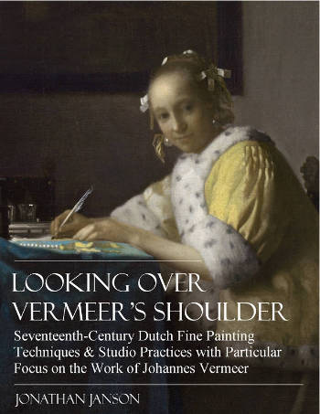
Enhanced by the author's dual expertise as both a seasoned painter and a renowned authority on Vermeer, Looking Over Vermeer's Shoulder offers an in-depth exploration of the artistic techniques and practices that elevated Vermeer to legendary status in the art world. The book meticulously delves into every aspect of 17th-century painting, from the initial canvas preparation to the details of underdrawing, underpainting, finishing touches, and glazing, as well as nuances in palette, brushwork, pigments, and compositional strategy. All of these facets are articulated in an accessible and lucid manner.
Furthermore, the book examines Vermeer's unique approach to various artistic elements and studio practices. These include his innovative use of the camera obscura, the intricacies of his studio setup, and his representation of his favorite motifs subjects, such as wall maps, floor tiles, and "pictures within pictures."
By observing closely the studio practices of Vermeer and his preeminent contemporaries, the reader will acquire a concrete understanding of 17th-century painting methods and materials and gain a fresh view of Vermeer's 35 masterworks, which reveal a seamless unity of craft and poetry.
 While the book is not structured as a step-by-step instructional guide, it serves as an invaluable resource for realist painters seeking to enhance their own craft. The technical insights offered are highly adaptable, offering a wealth of knowledge that can be applied to a broad range of figurative painting styles.

LOOKING OVER VERMEER'S SHOULDER
author: Jonathan Janson
date: 2020 (second edition)
pages: 294
illustrations: 200-plus illustrations and diagrams
formats: PDF
$29.95
CONTENTS
- Vermeer's Training, Technical Background & Ambitions
- An Overview of Vermeer’s Technical & Stylistic Evolution
- Fame, Originality & Subject Matte
- Reality or Illusion: Did Vermeer’s Interiors ever Exist?
- Color
- Composition
- Mimesi & Illusionism
- Perspective
- Camera Obscura Vision
- Light & Modeling
- Studio
- Four Essential Motifs in Vermeer’s Oeuvre
- Drapery
- Painting Flesh
- Canvas
- Grounding
- “Inventing,” or Underdrawing
- “Dead-Coloring,” or Underpainting
- “Working-up,” or Finishing
- Glazing
- Mediums, Binders & Varnishes
- Paint Application & Consistency
- Pigments, Paints & Palettes
- Brushes & Brushwork
Dammar Varnish
Dammar is a type of tree sap from Malaysia, Borneo, Java or Sumatra. This varnish retains its colorless appearance longer than any other common varnish. It is generally composed of a single resin, such as Dammar or a synthetic type. Dammar contains a high percentage of turps or mineral spirits. This means that it does not form a thick layer like normal varnishes and is therefore used for bringing out the full wet appearance of the oil paint on a dry ground before resuming to paint. Dammar varnish does yellow and crack, as all varnishes do, but less so than others. The addition of Dammar to a paint medium adds brilliance and luminosity to color.
Dead-color (Dutch: dood-verf)
Dead-color (in Dutch, dood-verf), which is the equivalent of today's term "underpainting," is a more or less monochrome version of the final painting that gives volume, suggests substance, substantiates the principal compositional elements and distributes darks and lights. The lack of color used in the term probably explains the word "dead." In the seventeenth century, dead-coloring appears in various forms.
Dead-coloring was so important in the painting process that it was mandatory in the early days of Flemish painting. In 1546, one of the 's Hertogenbosch guild rules states, "7. item. All painters will be bound to work with good paints, and they will not make any paintings than on good dry oak planks or wainscot, being each color first dead-colored and this on a double ground…"
It was not uncommon in the busier seventeenth-century studios that assistants worked up numbers of paintings to the dead-coloring stage that only needed to be finished by the master. Maintaining an abundant stock of images on spec may have been an expedient to entice prospective buyers.
Click here for more information on dead color.
As far as it is possible to understand, Vermeer used the dead-coloring methods common among Northern painters.
In the Woman Holding a Balance, the brown (raw umber and/or black) dead-color filled two functions: the broader areas of dark brown paint represented the masses of shadows with the light buff color of the ground serving as the lights. In the early Diana and her Companions, a carefully brushed underdrawing was followed by a monochrome dead-coloring in order to determine the essential forms of the composition. Some of the dead-coloring can be made out here and there through abraded paint layers.
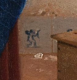
It has been remarked that more than one passage in The Geographer appears unfinished and that this allows us to have a glimpse at Vermeer's underpainting although it is not out of the question that early restoration may be partially responsible for the loss of the uppermost paint layers. The massive wooden window frame and the deeply shadowed area of the carpet correspond rather closely to our idea of Vermeer's underpainting method. Neither of these two areas is defined according to the artist's habitual standard of finish. The darkest parts are all painted with the same semi-transparent dark gray pigment, most likely a mixture of raw umber and black. Here and there on the carpet's fore side we may observe the initial accents of local color. Some of the decorative features have been painted with medium blue paint over the monochrome ground, most likely a mixture of natural ultramarine blue and a touch of lead white. It is probable that the blue areas would have been subsequently glazed with the same ultramarine, this time in a dense, transparent medium in order to deepen and enrich their color. Other parts of the decorative patterns have been brought up with a medium-toned earth color, which compared to the darkest underpaint seems to be a medium-dark yellow ochre. The upper folds of the carpet which catch the incoming light have been depicted with light-toned paint, here with the addition of ochre and there with ultramarine.
Decorative Arts
The decorative arts are arts or crafts concerned with the design and manufacture of beautiful objects that are also functional. It includes interior design, but not usually architecture. The decorative arts are often categorized in opposition to the "fine arts," namely, painting, drawing, photography and sculpture, which generally are thought to have no function other than to be seen. The distinction between the decorative and the fine arts arose from the post-Renaissance art of the West but is much less meaningful when considering the art of other cultures and periods, where the most highly regarded works—or even all works—include those in decorative media.
The promotion of the fine arts over the decorative in European thought can largely be traced to the Renaissance, when Italian theorists such as Giorgio Vasari (1511–1574) promoted artistic values, exemplified by the artists of the High Renaissance who placed little value on the cost of materials or the amount of skilled work required to produce a work, but instead valued artistic imagination and the individual touch of the hand of a supremely gifted master such as Michelangelo (1475–1564), Raphael (1483–1520) or Leonardo da Vinci (1452–1519), reviving to some extent the approach of antiquity. Most European art prior to this period had been produced under a very different set of values, where both expensive materials and virtuoso displays in difficult techniques were highly valued.
Decorum
Decorum (from the Latin: "right, proper") was a principle of classical rhetoric, poetry and theatrical theory that was about the fitness or otherwise of a style to a theatrical subject. The concept of decorum is also applied to prescribed limits of appropriate social behavior within set situations and suitability of subject matter and style in painting. Decorum also determined that a pictorial or sculptural subject was suitable for an architectural setting, such as Vulcan's forge over a fireplace, or that kinds of buildings are fitting in urban or rural contexts or appropriate for persons of certain status. Liturgical functions influenced by decorum dictate the placement of paintings, mosaics and sculpture in religious buildings.
Originally a literary term, it was first used in relation to the visual arts in the Renaissance in the writings of Leonardo da Vinci (1452–1519). According to da Vinci's theory of Decorum, the gestures which a figure makes must not only demonstrate feelings but must be appropriate to age, rank and position. So must also be dress, the setting in which the subject moves and all the other details of the composition. Such thinking greatly influenced academic art, in particular history painting, from the Renaissance through to the nineteenth century. According to his detractors, the cardinal sin of Caravaggio (1571–1610), who refused to study either ancient sculpture or Raphael's (1483–1520) paintings, was the lack of decorum in subject matter and his supposed unfiltered imitation of nature.
Such an unselective imitation became a leitmotif of seventeenth-century art criticism, and Giovanni Pietro Bellori (1613–1696) was its most vocal exponent. In his influential essay "L'ldea" (1664), published as the preface to his Lives of Modern Painters, Sculptors and Architects, Caravaggio was compared to Demetrius for being "too natural," painting men as they appear, with all their defects and individual peculiarities. In his influential Het Groot Schilderboek (The Great Book of Painting) the Dutch painter and art theoretician Gérard de Lairesse (1641–1711) faulted the art of his fellowmen for its too often vulgar subject matter, its lack of decorum in dressing classical figures in contemporary clothes, its lack of composition and sober painting handling, believing that only correct theory could produce good art.
Depth/Deep (color)
A color is deep or has depth when it has low lightness and strong saturation. Opposite to deep colors in both value and saturation are pale colors, such as lead-tin yellow, and white. Some paints are inherently deep, such as natural ultramarine and alizarin crimson.
Dendrochronology
Dendrochronology (or tree-ring dating) is the scientific method of dating tree rings (also called growth rings) to the exact year they were formed in order to analyze atmospheric conditions during different periods in history. Dendrochronology is useful for determining the timing of events and rates of change in the environment (most prominently climate) and also in works of art and architecture, such as old panel paintings on wood, buildings, etc. It is also used in radiocarbon dating to calibrate radiocarbon ages. Dendrochronology has become an important tool for dating panel paintings. However, unlike analysis of samples from buildings, which are typically sent to a laboratory, wooden supports for paintings usually have to be measured in a museum conservation department, which places limitations on the techniques that can be used.
In addition to dating, dendrochronology can also provide information as to the source of the panel. Many Early Netherlandish paintings have turned out to be painted on panels of "Baltic oak" shipped from the Vistula region via ports of the Hanseatic League. Oak panels were used in a number of northern countries such as England, France and Germany. Wooden supports other than oak were rarely used by Netherlandish painters.
The support of Vermeer's Girl with a Flute is a single, vertically grained oak panel with beveled edges on the back. Dendrochronology gives a tree felling date in the early 1650s.
Depth of Field
In photography, the distance between the nearest point and the farthest point in the subject that is perceived as acceptably sharp along a common image plane. For most subjects, it extends one-third of the distance in front of and two-thirds of the distance behind the point focused on.
Although the human eye makes use of a convex lens there is no perception of depth of field because the lens continually changes its shape in order to bring whatever it is looking at into perfect focus. In traditional forms of visual representation, even those which encompass expansive landscapes where the depth of field is very noticeable with a modern camera, there is no true depth of field. However, by the Renaissance, painters began to systematically soften the contours and modeling of objects seen at great distances as a means of enhancing the illusion of depth.
Art historians have made much of what seems to be a deliberate variation in focus in the paintings of Vermeer, presumably because the artist used an optical device called the camera obscura, which makes use of a single convex lens. It is presumed by some that by observing certain aspects of the camera's image, whose field of depth is exceptionally restricted, the artist was inspired and emulated such effects in paintings such as The Art of Painting and The Lacemaker, where the foreground objects are so blurred that they are barely recognizable.
Design
The words "composition" and "design" when applied to the visual arts are often used as if they were interchangeable, but each connotes something rather different. Composition is an arranging or pushing-about of the various parts of a picture—of the items, whether they be figures, architectural features or man-made props, of main interest and of secondary and tertiary interest—in such manner that the narrative picture explains itself and tells a given story. Design, instead is the arranging of an agreeable or significant pattern, a formal framework that complements the composition and its story. Among many other elements of design, is the disposing of the dark masses so that they will balance agreeably with the light masses. In modern commercial art, as is well known, the designer makes great care of to properly relate the dark masses of his poster or advertising placard properly related to the light masses. Strictly speaking, while the function of composition is narrative, that of design is aesthetic.
from Philips Hale, Vermeer, Boston: Small, Maynard, 1937, pp. 80–81.
The design—the pattern, so to say—of certain of Vermeer's works is superlatively beautiful. Such excellence is the more remarkable as it is a quality that does not appear in the work of most of the other Dutch painters. Their pictures are often admirably composed; they convey their motive and their story. They are sometimes composed subtly and elusively. Yet the ablest of these painters were uninterested, as a rule, in the underlying pattern of their compositions.
An exception among them, in this regard, was Carel Fabritius (1622–1654), Vermeer's fellow townsman; and this circumstance gives one reason for supposing that Fabritius may have been intimate with Vermeer. The methods of the two men as designers, however, were not closely alike, and Vermeer excelled in both composition and design. As his subjects were usually of the simplest nature, his compositional problems were not particularly intricate. Whatever story there was to tell, this was of the shortest and simplest; the intrigue required no elaborate working out. The design, on the other hand, of a Vermeer, is often subtle, highly original, and, in his best works, very beautiful. For their qualities of design, one thinks especially of The Music Lesson, formerly in Windsor Castle, the National Gallery Lady at the Virginals, the Pearl Necklace, Berlin Gallery, the Woman at the Casement, Metropolitan Museum, the Reader, Amsterdam Gallery, and the Girl Reading a Letter, Dresden Gallery.
Some of Vermeer's works, withal, which contain his best painting, are not remarkable in design. Thus, the weakly patterned Studio of the Czernin Collection seems to have been painted for the sheer pleasure of the painting. As Vermeer's design and composition are so original and personal, it is strange that his work was ever mistaken for that of other me—Gerrit ter Borch's (1617–1681), Pieter de Hooch (1629–1684), and Gabriel Metsu (1629–1667), for instance, each of whom had his own mode of composition. Ter Borch, as a rule, employed his background merely as a foil for the human figure. He made wonderful little figures which are the whole thing in his pictures; to them the background is entirely subsidiary, delightful as it may be in its manner of staying back. In planning a composition, Ter Borch apparently at first arranged his mannikins agreeably and then bethought himself of a fitting background. De Hooch's plan of composing was quite different from Ter Borch's. A picture presented itself to his mind as an interior composed of beautiful lines and chiaroscuro. His figures look like afterthoughts, as in the one—Dutch Interior with Soldiers—at the National Gallery, London, in which lines of the background can be seen showing through one of the principal figures. De Hooch, in point of fact, did not do the figure at all well. He is a painter of interiors, par excellence.
Detail
A detail is an individual or minute part of an item or particular. The etymology of the word involves cutting, as in nouns like "tailor" and "retail."
In modern art history, the study of detail is not just a specialty investigative tool, but a fundamental part of the discipline. "Just as a mycologist looks at spores, or an ornithologist at the markings on birds' breasts, or a dermatologist at tiny suspicious spots, so an art historian looks at details."Elkins, James. "On the Impossibility of Close Reading: The Case of Alexander Marshack." Current Anthropology 37, no. 2 (April 1996): 185. Accordingly, art historians who concentrate on detail "are only doing what scientists are…doing: they are systematically dissecting or disassembling their objects into component parts..." in order to more fully understand their innermost workings. In the opinion of the art historian James Elkins, this model may also betray art history's desire to "become scientific, a desire that has long infected the humanities."
 The Milkmaid (detail)
 Johannes Vermeer
c. 1657–1661
Oil on canvas, 45.5 x 41 cm.
Rijksmuseum, Amsterdam
Art historians generally work with two types of details. The first regards the details of a painting's narrative, that is, of specific illusory objects or parts of objects which are represented in the pictured scene. Often, such details occupy only a minimum area of the painting's surface, but for the inquiring art historian they have great consequence on the final reading of the work as a whole. For example, a tiny, barely noticeable floor tile with a Cupid scribbled upon it in Vermeer's Milkmaid, a picture which has been traditionally interpreted as a hymn to domestic virtue, may, according to one analysis, suggest covert amorous undertones. In this case, the amorous reading would be presumably strengthened by the nearby footwarmer which, according to one art historian, was at times associated with a lover's desire for constancy and caring but may likewise have carried sexual implication since most Dutchman would have known that the warmth of the coals moved under the skirt upwards towards the lady's private parts.
The second kind of detail regards an isolated area of the painting where the object of attention is not so much an illusory object but the manner or means by which it is depicted. The most frequently analyzed details of this kind are brush handling, peculiar paint or surface qualities and stylistic components which might distinguish the technique of one painter from that of another. Various art historians have argued that "the fragment played a central role in Romantic aesthetics; it was taken to possess a greater immediacy than the whole, as well as a privileged relation to truth. Artworks were understood to have been muted by systems of academic conventions and skills, and by concepts such as balance, symmetry, composition and especially decorum. Details were thought to be outside such systems"Elkins, James. 1996. and thus capable of revealing the artist's innermost nature.
 Portrait of Giovanni Morell
 Franz von Lenbach
1886
Oil on canvas, 125.5 x 90.2 cm.
Accademia Carrara
Giovanni Morelli (1816–1891) was an Italian art critic and political figure who developed the technique of scholarship, identifying through minor details that, revealed artists' scarcely conscious shorthand and conventions for portraying. The Morellian method is based on clues offered by negligible details rather than identities of composition and subject matter or other broad treatments that are more likely to be seized upon by students, copyists and imitators. Morelli's method has its nearest roots in his own discipline of medicine, with its identification of disease through numerous symptoms, each of which may be apparently trivial in itself. Adopting Morelli's approach, one scholar has recently argued that the authorship or Vermeer's early Diana and her Companions and Christ in the House of Martha and Mary is strengthened by the fact that the toes of two females figures are painted in a similar manner. The Morellian method of finding essence and hidden meaning in details not only influenced the course of art history but also had a much wider cultural influence. There are references to his work in the Sherlock Holmes novels by Arthur Conan Doyle and in the works of Sigmund Freud.
Some art historians object to the dangers of considering detail as the key, or "the last word" "that is capable of unlocking and exhausting all the meaning of all that is painted around it."Didi-Huberma, Georges. "The art of not describing: Vermeer—the detail and the patch." History of the Human Sciences 2 (1989): 137. Jenkins postulates that the modern-day "fascination with the detail can be nothing more or less than an attempt, sometimes not fully articulated, to escape the potentially rigid grip of iconographic interpretation"' The French philosopher and art historian Georges Didi-Huberman opines that the painting "is always considered to be a ciphered text, and the cipher, like a treasure chest, or a skeleton hidden in a cupboard, is always there waiting to be found, somehow behind the painting, not enclosed within the material density of the paint: it will be the 'solution' to the enigma posed by the picture, its 'motive', or the 'admission' of its secret meaning. In most cases it will be an emblem, a portrait, or some allusion to the 'events' of narrative history; in short, what the historian will have the duty of making the painted work 'confess' or give up will be a symbol or a referent. This means acting as though the painted work had committed a crime, a single crime (when the fact is that the painted work, pretty as a picture and good as gold, has either committed no crime at all, or, by cunningly exploiting the black magic of sight, is getting away with hundreds of unseen ones)."Didi-Huberma, Georges. 1989: 137.
Diagonal Line
See also, line.
Line, along with color, is considered the most basic elements of drawing. Different lines have different psychological impacts depending on variations in their length, direction and weight.
Diagonal lines suggest a feeling of movement or direction. Diagonal lines create a sensation of instability in relation to gravity, being neither vertical nor horizontal, but also because they are not related in a static way to the edges of the artist's paper or canvas. They seem to tip in space. Since the periphery of the eye is sensitive to movement or to any diagonal, its calls for complete attention from the viewer which is why traffic signs designed to warn of hazards are diamond-shaped use diagonals.
In a two-dimensional composition, diagonal lines are also used to indicate depth, an illusion of perspective that pulls the viewer into the picture, creating an illusion of a space that one could move about within. Thus, if a feeling of movement or speed is desired, or a feeling of activity, diagonal lines can be used. Baroque artists in particular made use of the diagonal line to introduce energy and movement in their works.
Although Vermeer's designs are generally thought of as predominantly rectilinear, the artist made continual use of strong, clear diagonals in order to introduce a visual dynamism and confer the sensation of ongoing narrative development. One of the most effective uses of diagonal lines can be found in the Woman Writing a Letter with her Maid. In this picture, a series of three implied diagonal lines superimpose themselves over the rectilinear compositional structure invigorating the narrative tension, wherein the mistress has cast aside a letter she has just received (see the letter and red wax seal on the floor in front of the table) and hastily writes as her maid patiently waits to deliver the letter as soon as it is finished.
Dilettante
Originally, an admirer or lover of the arts, a connoisseur. Or, a dabbler in an art or a field of knowledge; an amateur. Today, "dilettante" is more likely to be used in the latter sense, and taken by many—by the listener, even if not by the speaker—as an insult. It was more innocent in its original uses, as derived from the Italian word "dilettare," meaning "to delight." In the 18th century, a dilettante was simply a person who delighted in the arts. Later, the term came to refer to an amateur—someone who cultivates an art as a pastime without pursuing it professionally. From this meaning developed the pejorative sense the word carries now: a person who dabbles in an art
but is not truly devoted to it.
Disegno vs. Colorito ("drawing vs. color" debate)
In Florence, disegno ("drawing" or "design") was viewed as the sine qua non of the artistic endeavor, the primary means for making painting approximate nature. Disegno was fundamental for all areas of art in the Renaissance: painting, sculpture and architecture. Although it is believed that the notion of drawing as the foundation for the art of painting and sculpture had been expressed at least as early as Petrarch,Williams, Robert. Art, Theory, and Culture in Sixteenth-Century Italy (Cambridge: Cambridge University Press, 1997) 16. the art historical concept of disegno "originated partly in the workshop of sculptors and had direct reference to the plastic quality of a work. Giorgio Vasari (1511–1574), the foremost art critic of the Renaissance, gave the concept its universal form by lumping together all the visual arts as arti del disegno and by initiating the foundation of the Academy of Design (Accademia del Disegno) in Florence in 1562. In Vasari's usage disegno points to the regular form or idea of things in artist's mind, that is, disegno is understood primarily as the right proportion of the whole to its parts and of the parts to one another."Undusk, Rein. "Disegno e colore: Art Historical Reflections on the Structuring of Space." Accessed [access date if known]. http://www.eki.ee/km/place/pdf/kp5_03_undusk.pdf. Thus, disegno was considered the key to the entire imaginative process, the medium of the painter's thought and its concrete expression.
On the other hand, in Venice, colorito, "coloring" was not only color but the fundamental means by which painted images could be charged with the look of life. Florentine color was frequently more vivid than the palette used in Venetian paintings; typically Venetian, however, was the process of layering and blending colors to achieve a glowing, natural richness. Rather than beginning with careful drawings where contours are fixed with meticulous certainty, Venetian painters often worked out compositions directly on the canvas, using layered patches of colors and visible brushwork, rather than line, to evoke the sense of space and form. Venetian painters paid much closer attention to the effects of light than the Florentines and used this knowledge to create both movement and volume in composition.
This debate, which raged throughout the Early Renaissance (c.1400–1490) and the High Renaissance (c.1490–1530) was argued over by many of the leading exponents of academic art, up until the nineteenth century. The debate between the two positions involved theorists as well as artists and regional rivalries as well as aesthetic concerns.
Roger De Piles (1635–1709), a French art critic who gave an important contribution to aesthetics in his Dialogue sur le coloris ("Dialogue on colours"), broke with tradition and argued strenuously that color was not simply accidental ornamentation, but the main condition of an object's visibility. Thus color, to de Piles, was part of the natural order of painting.
It is an attempt to assess the achievement of the major artists since Raphael (1483–1520), De Piles awarded marks out of twenty for each composition, design or drawing, color and expression, De Piles' evaluations have been denigrated after the decline of Classicism, and his ranking is now considered his "most notorious contribution to criticism" even though his "decomposition of the overall quality of the work into four properties was revolutionary and ambitious at the time." After an examination of the historical correlation (1736–1960) between prices achieved by their works at auction and the De Pile's evaluation of a list of fifty-six major painters in his own time (with whose work he had acquainted himself as a connoisseur during his travels) the professor of economics Kathryn Graddy concluded that the critic's "ratings have held up very well," better than those of other critics or "random judgments." In sum, "His [De Piles'] higher-rated artists achieved a greater return than his lower-rated artists."Graddy, Kathryn. "The Extraordinary Art Critic Roger de Piles (1635–1709): An Empirical Analysis of his Rankings and Sale Prices." Dissertation, Brandeis University, 2012: 7.
De Piles' table of artists is reported below. Each painter was given marks from "0" to "18" in composition, drawing, color and expression which was intended to provide an overview of aesthetic appreciation that hinges upon the balance between color and design. The highest marks went to Raphael, with a slight bias on color for Rubens, a slight bias on drawing for Raphael. Painters who scored very badly in anything but color were Giovanni Bellini, Giorgione (c. 1477/8–1510) and remarkably Caravaggio with "16" on color and "0" (zero) on expression. Painters who fell far behind Rubens and Raphael but whose balance between color and design was perfect were Lucas van Leyden (1494–1533), Sebastian Bourdon (1616–1671), Albrecht Dürer (1471–1528). Rembrandt (1606–1669), who is today considered one of the world's greatest draughtsmen, was given a desultory "6."
Painter |
Composition |
Drawing |
Color |
Expression |
| Andrea del Sarto | 12 | 16 | 9 | 8 |
| Federico Barocci | 14 | 15 | 6 | 10 |
| Jacopo Bassano | 6 | 8 | 17 | 0 |
| Giovanni Bellini | 4 | 6 | 14 | 0 |
| Sebastian Bourdon | 10 | 8 | 8 | 4 |
| Charles Le Brun | 16 | 16 | 8 | 16 |
| I Carracci | 15 | 17 | 13 | 13 |
| Cavalier D'Arpino | 10 | 10 | 6 | 2 |
| Correggio | 13 | 13 | 15 | 12 |
| Daniele da Volterra | 12 | 15 | 5 | 8 |
| Abraham van Diepenbeeck | 11 | 10 | 14 | 6 |
| Il Domenichino | 15 | 17 | 9 | 17 |
| Albrecht Dürer | 8 | 10 | 10 | 8 |
| Giorgione | 8 | 9 | 18 | 4 |
| Giovanni da Udine | 10 | 8 | 16 | 3 |
| Giulio Romano | 15 | 16 | 4 | 14 |
| Guercino | 18 | 10 | 10 | 4 |
| Guido Reni | x | 13 | 9 | 12 |
| Holbein | 9 | 10 | 16 | 3 |
| Jacob Jordaens | 10 | 8 | 16 | 6 |
| Lucas Jordaens | 13 | 12 | 9 | 6 |
| Giovanni Lanfranco | 14 | 13 | 10 | 5 |
| Leonardo da Vinci | 15 | 16 | 4 | 14 |
| Lucas van Leyden | 8 | 6 | 6 | 4 |
| Michelangelo | 8 | 17 | 4 | 8 |
| Caravaggio | 6 | 6 | 16 | O |
| Murillo | 6 | 8 | 15 | 4 |
| Otho Venius | 13 | 14 | 10 | 10 |
| Palma il Vecchio | 5 | 6 | 16 | 0 |
| Palma il Giovane | 12 | 9 | 14 | 6 |
| Il Parmigianino | 10 | 15 | 6 | 6 |
| Gianfrancesco Penni | O | 15 | 8 | 0 |
| Perin del Vaga | 15 | 16 | 7 | 6 |
| Sebastiano del Piombo | 8 | 13 | 16 | 7 |
| Primaticcio | 15 | 14 | 7 | 10 |
| Raphael | 17 | 18 | 12 | 18 |
| Rembrandt | 15 | 6 | 17 | 12 |
| Rubens | 18 | 13 | 17 | 17 |
| Francesco Salviati | 13 | 15 | 8 | 8 |
| Eustache Le Sueur | 15 | 15 | 4 | 15 |
| Teniers | 15 | 12 | 13 | 6 |
| Pietro Testa | 11 | 15 | 0 | 6 |
| Tintoretto | 15 | 14 | 16 | 4 |
| Titian | 12 | 15 | 18 | 6 |
| Van Dyck | 15 | 10 | 17 | 13 |
| Vanius | 15 | 15 | 12 | 13 |
| Veronese | 15 | 10 | 16 | 3 |
| Taddeo Zuccari | 13 | 14 | 10 | 9 |
| Federico Zuccari | 10 | 10 | 8 | 8 |
Disks of Confusion/Halations
See also camera obscura and pointillés.
In optics, a disk of confusion (also referred to as halation, blur circle, circle of confusion and circle of indistinctness) refers to the effect of non-converging, unfocused light rays that have entered a lens. When light waves don't converge after passing through a lens, they produce a larger optical spot, instead of coming together at a single point, as in the case of a specular highlight.
Under normal conditions, disks of confusion are not seen with the human eye because "it quickly shifts focus to the object being momentarily considered so that most persons are unaware that the...eye is focused on a single plane at any given instant. If the eye did not shift focus as quickly as it does one might be able to notice circles of confusion forming on the retina, but experimentation shows that the out-of-focus image formed on the retina is useless for picture-making purposes even if one is aware of its existence."Fink, Daniel A. "Vermeer's Use of the Camera Obscura: A Comparative Study." The Art Bulletin 53 (1971): 495.
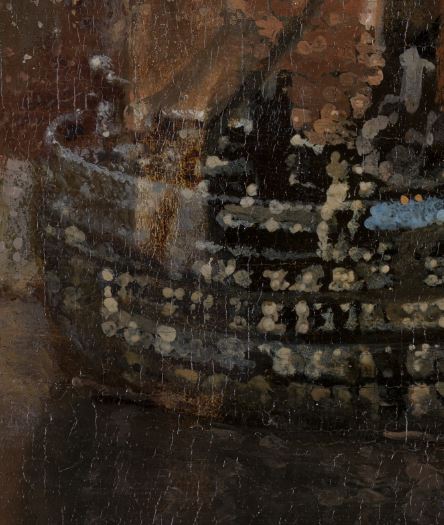 View of Delft (detail)
 Johannes Vermeer
c. 1660–1663by
Oil on canvas, 98.5 x 117.5 cm.
Mauritshuis, The Hague
Art historians have equated certain globular highlights of light-toned paint found in many of Vermeer's paintings with circles of confusion that the artist presumably observed through a camera obscura. These painterly interpretations are called "pointillés." Vermeer made extensive use of pointillés in The Milkmaid although they appear, somewhat rudimental, for the first time scattered in the hair of Girl Reading a Letter at an Open Window, on the satin bodice and the knobby surface of the foreground Turkish carpet. The View of Delft also presents a profusion of pointillés, many of which, however, would not have registered by a real camera obscura in natural conditions, above all, those that occur within deep shadows such as the undersides of the boats moored on the scene's quay. Pointillés are also very noticeable in the late Lacemaker where they shimmer on the foreground still life. It must be assumed that once Vermeer had understood how the disks of confusion are produced by the camera obscura and how to imitate them with paint, he employed them with considerable artistic license to enhance the effect of light as it plays upon natural surfaces.
Although Dutch painters experimented with a number of techniques to represent highlights, which are key to creating the illusion of light conditions (usually intense), on shiny surface textures, only Vermeer adopted circular highlight in a methodical manner. Perhaps the only other instances of such highlights in Dutch painting are those on a pair of slippers in the foreground of Gabriel Metsu's (1629–1667) Woman Reading a Letter, a picture that was likely inspired by Vermeer himself.
This highly peculiar optical phenomenon in Vermeer's painting was systematically investigated Charles Seymour ("Dark Chamber and Light-Filled Room: Vermeer and the Camera Obscura," Art Bulletin 46, 1964) and Daniel A. Fink ("Vermeer's Use of the Camera Obscura: A Comparative Study," The Art Bulletin 53, 1971). Both writers experimented with actual camera obscuras focused on mock-Vermeer still lifes in attempts to replicate the effects seen in Vermeer's paintings.
"Dissolute" Self Portraits by Dutch and Flemish Artists
drawn from the abstract of:
Ingred Cartwright, "Hoe schilder hoe wilder: Dissolute self-portraits in seventeenth-century Dutch and Flemish Art," dissertation, University of Maryland, 2007. http://drum.lib.umd.edu/bitstream/1903/7720/1/umi-umd-4997.pdf
In the seventeenth century, Dutch and Flemish artists presented a strange new face to the public in their self portraits. Rather than assuming the traditional guise of the learned gentleman artist that was fostered by renaissance topoi, many painters presented themselves in a more unseemly light. Dropping the noble robes of the pictor doctus, they smoked, drank and chased women. Dutch and Flemish artists explored a new mode of self-expression in dissolute self-portraits, embracing the many behaviors that art theorists and the culture at large disparaged.
Dissolute self portraits stand apart from what was expected of a conventional self portrait, yet they were nonetheless appreciated and valued in Dutch culture and in the art market.
Dissolute self portraits also reflect and respond to a larger trend regarding artistic identity in the seventeenth century, notably, the stereotype "hoe schilder hoe wilder"["the more of a painter, the wilder he is," a reference that reappears throughout the century, both in print and in paint] that posited Dutch and Flemish artists as intrinsically unruly characters prone to prodigality and dissolution. Artists embraced this special identity, which in turn granted them certain freedoms from social norms and a license to misbehave. In self portraits, artists emphasized their dissolute nature by associating themselves with themes like the Five Senses and the Prodigal Son in the tavern.
Doorkijkje (see-through door)
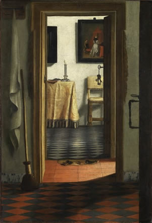
View of an Interior, or The Slippers (traditional title, given in the 19th century)
Samuel van Hoogstraten
Between 1654 and 1662
Oil on canvas, 103 x 70 cm.
Louvre, Paris
One of the most effective manners for seventeenth-century Dutch painters for achieving pictorial depth within domestic settings was the so-called doorkijkje, or "see-through" doorway which permits the spectator to view something outside the pictured room, whether it be another room, a series of rooms, a hallway, a street, a canal, a courtyard or a garden. The doorkijkje offers the painter an opportunity to create a more complicated architectural space and contemporarily expand narrative.
Nicolaes Maes (1634–1693) painted six versions of an idle servant eavesdropping or an encounter between a man and a maidservant glimpsed through an open door. Other examples of the doorkijkje device can be found in Emmanuel De Witte's Interior with a Woman at the Virginals (c. 1660) and Samuel van Hoogstraten's (1627–1678) View of a Corridor (1662) and The Slippers by the same.
However, no Dutch artist made use of this device more than Pieter de Hooch (1629–1684) in both interior and exterior scenes. In the Courtyard of a House in Delft, we see it in the sequence of full light on the foreground bricks, contrasting the quieter shade of the covered tiled passageway, and the open door to the sunlit street beyond. The art historian Martha Hollander found that among more than 160 paintings attributed to De Hooch, only twelve do not exhibit this technique of a doorkijkje revealing secondary and tertiary views to other rooms, courtyards or the street beyond.Hollander, Martha. An Entrance for the Eyes: Space and Meaning in Seventeenth-Century Dutch Art ( Berkeley, CA: University of California Press, 2002) 153.
It has been pointed out that in the twentieth century, the Italian film director Luchino Visconti, somewhat as seventeenth-century Dutch painters were centuries before, was particularly fond of framing his actors through doorways doors in art and film or, on the contrary, by blocking our view onto another character we would like to see; so deliberately withholding information.Blom, Ivo. "Frame, space narrative. Doors, windows, and mobile framing in the work of Luchino Visconti." Acta Universitatis Sapientiae, series Film & Media Studies 2 (2010): 91–106. http://www.acta.sapientia.ro/acta-film/C2/film2-5.pdf.
In all, Vermeer painted three doorkijkje motifs: the early A Maid Asleep, The Love Letter and lost work described in a 1696 auction catalogue as "In which a gentleman is washing his hands in a perspectival room with figures, artful and rare..." The picture fetched 95 guilders, making it one of the highest-priced works of the auction.
It is generally believed that Vermeer drew directly from doorkijkje paintings of Nicolaes Maes for his A Maid Asleep while the complicated compositional structure of his late Love Letter can be traced to Van Hoogstraten's The Slippers or Pieter de Hooch's Couple with a Parrot. Although there is obviously no way to envision the lost doorkijkje, after A Maid Asleep Vermeer never again opened a view on another room beyond that in which the scene is set.
Doorsien
Doorsien is a Dutch word that literally means "plunge through." Dutch painters were particularly interested in views into the distance, which they called doorsien. Doorsiens not only enhance the sense of depth in a picture but also helped the artist structure complex scenes with large numbers of figures, convincingly situating them on different planes. The Dutch painter and art theorist Karel van Mander (1548–1606) even criticized Michelangelo's Last Judgment in the Sistine Chapel because it was lacking in sufficient depth. In his influential Schilder-boeck (Painter book) of 1604, Van Mander wrote:
Our composition should enjoy a fine quality, for the delight of our sense, if we there allow a view [insien] or vista [doorsien] with small background figures and a distant landscape, into which the eyes can plunge. We should take care sometimes to place our figures in the middle of the foreground, and let one see over them for many miles.
"Although Van Mander used the term doorsien to refer to vistas or views in general, he uses perspect to indicate the more specific context of an architectural setting in which, for example, a receding passageway or colonnade is viewed through an archway. He distinguishes perspecten from the natural opening provided by rocks and trees in landscapes but notes that they have the same effect."
Martha Hollander, An Entrance for the Eyes: Space and Meaning in Seventeenth-Century Dutch Art (Berkeley, CA: University of California Press, 2002), 9Double Shadow
In various interiors by Vermeer, evidence exists of another optical phenomenon that reveals the artist's keen interest in capturing the activity of light: the so-called double shadow. These complex shadows are cast on back wall by objects close to it and caused by the light which enters simultaneously from two windows. For example, in The Music Lesson the wider shadow to the right of the black-framed mirror is caused by the near raking light entering from the window closest the background wall. But it is partially weakened—and here the double shadow appears—because light from the second window closer to the spectator enters the room at a less oblique angle and invades the most external part of the wider shadow. In the same picture, the lid of the opened virginal also creates a double shadow. Double shadows are also present in The Concert and A Lady Standing at a Virginal, The Guitar Player and, although more tentatively defined, in some of the artist's earlier interiors. By obscuring one of the two windows all double shadows are avoided.
Curiously, the London architect and Vermeer/camera obscura expert Philip Steadman noted that the widths and angles of the double shadow of the mirror in The Music Lesson are not coherent with the angle of the mirror as it appears in the painting. Since the top of the mirror leans a considerable distance out from the wall, the shadows would have been much wider and more angled and would have appeared as they now do only if the mirror had laid flat against the wall. According to Steadman, the artist evidently wanted to show both the reflection of his own vantage point in the mirror (the painter's easel and canvas can be seen in the reflection) and have the mirror appear to hang in a more normal, near-vertical position, requirements that are obviously incompatible in reality (although they are made to look compatible in the painting).
The double shadow which descends downward from the window sill in A Lady Standing at a Virginal, however, is not caused by the light of two different windows. Although difficult to understand, the profile of the outermost shadow may have been caused by a building outside Vermeer's studio which blocked some of the light entering the studio. The innermost profile is caused by the light of the sky which descends from a higher angle, blocked by the thickness of the wall above the window frame.
In Dutch painting double shadows were avoided as much as possible because they tend to create compositions that seem restless and confused. "It is an evil against which the art experts of Vermeer's time and later were always warning artists. Samuel van Hoogstraten (1627–1678) writes about this in his Inleyding tot de hooge Schoole der Schilderkonst and Gérard de Lairesse (1641–1711) devotes a whole chapter to: 'Van de lichten binnenskamers' (Of Indoor Lighting), which he illustrates with a few examples." Other than those of Vermeer, one of the very few careful portrayals of double shadows in Dutch interior painting can be found in Gabriel Metsu's A Man and a Woman Seated by a Virginal (c. 1665), which, however, is a composite of certain aspects of Vermeer's The Music Lesson and The Concert.
Drapery
Judging from the paucity of period art treaties and modern art historical literature that address the topic, one would never think that the representation of drapery has been one of the primary preoccupations in Western art from Classical time onward. In fact, until 1904, it had not been the exclusive subject of any published work.
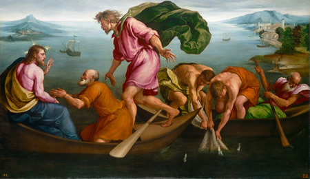 The Miraculous Draught of Fishes
 Jacopo Bassano
1545
Oil on canvas, 143.5 x 243.7 cm.
National Gallery of Art, Washington D.C.
For the painter, the movement of drapery is nearly inexhaustible in its variety and capacity to suggest things other than itself. Drapery can be stretched softly to suggest peace, relaxation or the flow of nature, or taut, to suggest tension or alarm. Folded upon itself, drapery may convey shades of passion, confusion, wealth or sensuality. Vertical folds may convey strength while horizontal may convey repose and diagonal folds, movement. Sometimes, drapery seems able to move by its own will. The high number of Renaissance and Baroque figure drawings that show the lavish attention bestowed to the actions of drapery but only a scarce few lines to define the anatomical features which emerge from them attest to the wealth of aesthetic solutions which helped the painter develop narrative and mood. It is impossible to imagine the splendor of color in European easel painting without drapery. The character of painted drapery is strongly linked to both the age in which it is painted and the individual artist who treats it.
But one of the main attractions of drapery for the painter was technical. In all but the most meticulous forms or realism, the representation of drapery allows freedom in paint handling that other motifs do not, and after the High Renaissance drapery is often painted in a looser stylistic register than that of the figure to which it belongs, without, however, disrupting illusionist verisimilitude. Drapery is, perhaps, more easily imitated with the brush and paint than any other motif. In collaboration with the shape of the brush and the natural flow of paint, the anatomical articulations of the body favor easy, rhythmic back-and-forth movements of the arms and wrist that are particularly adapted for describing the sweeping curves and angular character of drapery's folds and flat planes. For artists who followed Titian's (c. 1488/1490–1576) revolutionary painterly style, drapery provided an opportunity to explore the one-to-one relationship between brush strokes and the thing represented, but it likewise exposed them to the dangers of empty virtuosity.
Members of the French Academy believed that the depictions of different kinds of fabrics could potentially distract from the essence of painting, some praising the sober manner in which Nicolas Poussin (1594–1665) and Charles Le Brun (1619–1690) had depicted drapery. Velvet, satin or taffeta should be avoided in favor of more generic, non-reflective fabrics. Sir Joshua Reynolds (1723–1792), who continued to defend the "grand style" of history painting well into the eighteenth century, wrote, "as the historical painter never enters into the details of colors, so neither does he debase his conceptions with minute attention to the discriminations of drapery. It is the inferior style that marks the variety of stuffs. With him the clothing is neither woolen nor linen, nor silk, satin, nor velvet—it is drapery; it is nothing more."
Drapery was a fundamental part of Vermeer's art. He employed colorful costumes to create mood and define the social standing of his sitters. He hung tapestries in the foreground to force spatial depth and energize his compositions. Anonymous tablecloths bridge differently shaped objects and conceal compositional distractions. Richly patterned imported carpets were thrown over tables to create compositional structures, sometimes geometrically shaped, but more frequently sculpted by deep valleys and tortuous folds to evoke the psychological states of his sitters. Their rich reds vibrate against the cool grays and pure blues which dominate the artist's palette. Marieke de Winkel, an expert in seventeenth-century Dutch fashion, published an interesting study regarding the identity and function of the costumes portrayed in Vermeer's scenes.
It has been long debated if the outward flare of the fur-trimmed morning jackets that appear various times in the interiors of Vermeer is the result of pregnancy or fashion because this would have pivotal importance in assigning meaning to the pictures in which they occur. Some critics have described the colors of Vermeer's costumes, especially those painted with natural ultramarine, and a few have noted how the realistic folds of the works of the 1660s gradually succumb to the heavy stylization of the late works.
Drawing
Drawing is a form of visual art in which an artist uses instruments to mark paper or other two-dimensional surfaces. Drawing instruments include graphite pencils, pen and ink, various kinds of paints, inked brushes, colored pencils, crayons, charcoal, chalk, pastels, erasers, markers, styluses, and metals (such as silverpoint).
A drawing instrument releases a small amount of material onto a surface, leaving a visible mark. The most common support for drawing is paper, although other materials, such as cardboard, wood, plastic, leather, canvas and board, have been used. Temporary drawings may be made on a blackboard or whiteboard. Drawing has been a popular and fundamental means of public expression throughout human history. It is one of the simplest and most efficient means of communicating ideas. The wide availability of drawing instruments makes drawing one of the most common artistic activities.
In addition to its more artistic forms, drawing is frequently used in commercial illustration, animation, architecture, engineering, and technical drawing. A quick, freehand drawing, usually not intended as a finished work, is sometimes called a sketch. An artist who practices or works in technical drawing may be called a drafter, draftsman, or draughtsman
It seems somewhat surprising that not even a single preparatory or finished drawing by Vermeer has survived. One would expect that such meticulously balanced compositions and problematic perspectives could be most efficiently resolved through preparatory drawings which would allow the artist to easily correct any errors. There were many ways to transfer drawings efficiently and accurately to canvas.
Only scant traces have remained of the initial drawing methods on Vermeer's canvases although evidence seems to suggest that it was deliberate and controlled.
It was once thought that Vermeer revealed some of his own working procedures, including his drawing methods, in The Art of Painting. On a toned canvas the artist represented in Vermeer's picture has laid in the contours of the model in white paint or chalk and has begun to paint in various shades of blue the laurel leaves. However, there exist many discrepancies between real working habits seen in representations of painters' studios of the seventeenth century and those illustrated in The Art of Painting. While some of the indications given by The Art of Painting of the painter's technique may be factual, others may have a more symbolic function and, in any case, they do not seem to correspond closely to what were most likely Vermeer's own methods.
Drying Cracks
Curved and wide cracks that occur during the drying stage of the color layers that are a result of the chemical processes and/or physical influences; in the paint layer only. This is one of the major cracks in the paint layer. Also called "alligatoring."
Drying Oil
A drying oil is an oil that hardens to a tough, solid film after a period of exposure to air. The oil hardens through a chemical reaction in which the components crosslink (and hence, polymerize) by the action of oxygen (not through the evaporation of water, turpentine or other solvents). Drying oils are a key component of oil paint and some varnishes. The more drying oil is introduced into paint, the more the paint becomes transparent and glossy. Some commonly used drying oils include linseed oil, sunflower oil, safflower oil, poppy seed oil and walnut oil. Each oil has distinct mixing and drying properties and each creates a different type of film when it dries. The use of drying oils has somewhat declined over the past several decades, as they have been replaced by alkyd resins. Nondrying oils are mineral oils and vegetable oils, such as peanut oil and cottonseed oil that resemble animal fats and, because they do not oxidize naturally and harden, are unsuitable as a binder for paint.
Dummy Board
See also trompe l'oeil.
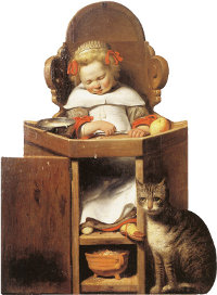
Boy Sleeping in a High Chair
Johannes Verspronck
1654
Oil on panel, 96 x 75.7 cm.
Private collection
Dummy boards (the actual term is a nineteenth-century invention) are life-size flat figures painted on wooden panels and shaped in outline to resemble figures of servants, soldiers, children and animals. On the other side, dummy boards are fitted with a wood support that allows them to stand upright in corners, doorways and on stairways to surprise visitors. The taste for illusionistic painted figures as a form of house decoration probably originated in the trompe-l'œil, or life-like interior scenes painted by Dutch artists in the early seventeenth century. Dummy boards continued to be produced well into the nineteenth century. Many later dummy boards were made by professional sign painters.
Dummy boards belong to a wide range of trompe-l'œil devices that were immensely popular in the seventeenth-century Netherlands. A number or artists tried their hands at these "eye foolers" (oogenbedriegers), and their works were also in great demand abroad. Cornelius Gijsbrechts (c. 1630–c. 1675), who would become one of the most innovative trompe-l'œil painters in Europe moved to Stockholm in 1672, where he lived for a few years, and then went on to seek his fortune again in Germany. In 1675 he probably resided in Breslau (presently Wroclaw in Poland). The painter and art writer Samuel van Hoogstraten (1627–1678) is noted to have kept many such eye foolers strewn around his house. According to Arnold Houbraken (1660–1719), another Dutch art writer, one could find them practically every where one looked:Brusati, Di Celeste. Artifice and Illusion: The Art and Writing of Samuel Van Hoogstraten. (Chicago: University of Chicago Press, 1995) 152.
Here an apple, pear or lemon in a dish rack, three a slipper in the corner of the room or under a chair. There were also dried, salted fish on a nail behind the door, and these were so deceptively painted that one could easily mistake them for the dried plaice.
Houbraken credited Cornelius Bisschop (1630–1674) with being "the first, if not the best, to paint all manners of images on wood in life-like colors and then cut them out so that they would be placed in a corner or doorway. Houbraken thought that Bisschop's were "the most natural and witty and inventive examples" and he claims to have "seen some that, when in position, deceive the eye and cause people to greet them as though they were real." The esteemed portrait painter Johannes Verspronck (between 1600 and 1603–1662) also painted one of the first dummy boards, Boy in his Highchair which is both signed and dated (1654).
Dummy boards are a good resource for understanding costume.
Dynamic Range
Dynamic range describes the ratio between the maximum and minimum measurable light intensities (white and black, respectively). In the real world, one never encounters true white or black—only varying degrees of light source intensity and subject reflectivity. But we can interpret dynamic range as the measurement between the whitest whites and the blackest blacks of an image as captured by a camera, a scanner, a print, a computer display, a painting or the subject itself. Any image created by a device can only record so much detail between the darkest shadows of a scene and the brightest highlights, and eventually will render tones at the end of this scale as an effective black or white simply because there is not enough detail available. Each medium has its own dynamic range, and often the goal is to extend the range of tones in between the maximum and minimum values to create a more full-feeling image, similar to the gradient that runs from pure black to pure white.
Although brightness is typically measured in units called candelas per square meter (cd/m2), one of the most functional units is the so-called f-stop, a dimensionless number that refers to the ratio between the diameter of the aperture in the lens and the focal length of the lens. What is important to know, however, is that with each added f-stop the amount of light that passes through the aperture into the camera is doubled, and with each subtracted f-stop, it is halved.
The human sense of sight is incredibly sensitive to light. It can see objects in bright sunlight or in starlight, even though on a moonless night objects receive 1/1,000,000,000 of the illumination they would on a bright sunny day. Some sources claim that the overall range of brightness that the human eye can see (static range) is equivalent to 20 f-stops while others 24 or even 30, the brightness ratio being roughly 1,000,000:1. In any case, the eyes cannot perform this feat of perception at both extremes of the scale at the same time. They must constantly adapt to higher and lower lighting conditions, altering their sensitivity in order to be responsive at different levels of illumination.
The range of brightness that the eye can see in a given moment and circumstance is called the dynamic range because, unlike the static range, it is always changing. This adaptation, which is highly localized, is so efficient and so rapid that we are rarely aware of it. One of the most important factors in the process of adaption is the pupil, which regulates the amount of light that enters the eye by widening its diameter (to let more light in) or narrowing it (to protect the eye from too much light). For example, when one looks at a bright sky the pupil becomes very small but it instantaneously opens as we shift our gaze down to a group of shadowed trees below allowing us to make out details of contrast in both points of view. However, to adapt from complete darkness to the very strongest light it takes considerable time for the eyes to adjust, as we all know when we are suddenly woken up after a night's sleep to an open window on a sunny morning.
Although the eye can accommodate about 24 f-stops of light over all, it can accommodate only a range of about 1,000:1 at any given moment (i.e., its dynamic range) usually given to be between 10 to 14 f-stops. This range can be calculated when one looks at only one region within a field of view, letting the eyes adjust and not looking anywhere else so that the opening of the eye's pupil remains unchanged. A typical compact digital camera has a dynamic range of about 5 to 7 f-stops while a high-end DSLR camera (Nikon D800) has a dynamic range of about 14.4 f-stops.
Any amateur photographer who has looked at his vacation shots as photographs rather than souvenirs is very familiar with the issue of dynamic range. He finds that in most of his snapshots taken in strong light either the shadowed areas are legible and the lights look washed out, or the contrary, the lights are properly detailed and the shadows are disappointing black splotches. It is usually only by chance the all the objects in his pictures are uniformly detailed in both the lights and shadows. This is not the amateur's fault, it's the camera's. For while the eyes constantly adapt and so give the viewer the experience of being able to perceive nature's full range of brightness, the camera can bracket only a much smaller range of brightness at one moment, that is, its dynamic range. To get a photograph to look approximately like the scene that the photographer actually perceived, he would either have to purchase a sturdy tripod and HDRI software or become a very good painter. For example, the Italianate Landscape (1650–1683) by Nicolaes Beechen (1620–1683) exhibits tonal variety detail in both the lights and the shadows even though the outdoors scene must have had an enormously large range of brightness. Everything looks utterly natural as if we were standing next to the painter immersed in the deep shade of the soaring hillside looking out towards the distant horizon and a wondrously luminous blue sky tainted only with a few fluffy clouds. To approximate the effect of Berchem's landscape in photography it would be necessary to take multiple photographs from Berchem's viewpoint with varying shutter speed/aperture combinations in order to produce a set of images with varying luminosity and depth of field—and then process them with HDRI software.
In any case, one can easily intuit the difficulties faced by a painter who wishes to accommodate the range of natural luminosity in his painting when we think that the dynamic range of a room like that in Vermeer's Music Lesson may be approximately 12 f-stops while that of his paints are only about 5 f-stops. Notwithstanding the limits of their "poor" paints, artists have been able to produce convincing illusions of almost any light found in nature, except for the sun.
Earth Colors
Earth colors are pigments that are obtained by mining; usually metal oxides. Earth colors do not show up on the color wheel. Some earth colors can be created by mixing two complementary colors or combining a pure color with white, black, or gray, but naturally occurring earth pigments produce paints that have specific, highly desirable handling and coloring characteristics that mixtures of bright colors do not. Earth colors are also easy to come by, relatively easy to prepare and thus, inexpensive. Earth colors include yellow ochre, raw sienna, raw umber, green earth, Cassel earth, Van Dyck brown, various shades of black and even blue ochre (Vivianite). When some earth colors are heated appropriately they produce different and highly useful and unmixable colors such as burnt, sienna, burnt umber and red ochre.
While most earth colors can be produced synthetically, naturally occurring iron oxide pigments generally preferred by artists because they are inherently more translucent and offer some warm, rich qualities. Because they are natural they are variable in composition and physical properties, which can result in significant color variances. While this natural modulation is of great allure to artists, natural variability can cause paint makers some concern.
Easel & Easel Painting
An easel is an upright frame for displaying or supporting a canvas while the painter is at work. Easels are made of wood and have various designs. The most common in Vermeer's time was the tripod easel which had three legs. Variations include crossbars to make the easel more stable. The height of the movable front crossbar could be adjusted by means of pegs inserted in regularly staggered hole along the two front legs. This feature allowed the painter to work comfortably with both small and large canvases while seated or standing. Most paintings that represent artists in their studios show them working while seated. In an early painting by Rembrandt (1606–1669) of an artist at work, perhaps a self portrait, the lower, fixed support bar bears two indentations where the artist presumably rests his feet while working. Typically, the tripod easel is fully adjustable to accommodate for different angles. Furthermore, when they are collapsed, this type of easel becomes very slim and can be fit in small spaces around the studio.
It is only around 1600 that the Dutch word ezel, meaning donkey, begins to appear in written sources used in the secondary sense of a stand for supporting paintings. By mid-century, English and German had adopted this use of the Dutch word as well, and the easel painting was well on its way to becoming the quintessential modern work of art.Powell, Amy. "Painting as Blur: Landscapes in Paintings of the Dutch Interior." Oxford Art Journal 33.2 (2010): 146.
An easel painting is a painting that is small enough to be comfortably executed on an easel. Easel painting became pre-eminent in the sixteenth century and has remained so. It is likely that easel paintings were known to the ancient Egyptians, and the first-century-AD Roman scholar Pliny the Elder refers to a large panel placed on an easel; it was not until the thirteenth century, however, that easel paintings became relatively common, finally superseding in popularity the mural or wall painting. The term implies not only physical aspects but also inherent concepts that are very different from those associated with wall paintings or those intended for a fixed position or an architectural scheme.
Easel painting is therefore associated with the increased secular use of art from the sixteenth century and with the identification of paintings as objects of worth in their own right. The rise of easel painting involved a subtle assertion of the independence of the art of painting and the profession of the painter. The status afforded to painting in the writings of, for example, Leonardo da Vinci (1452–1519)and Giorgio Vasari (1511–1574) reflects these developments and anticipates the increased social and intellectual status of the individual artist. Being highly transportable, easel paintings were easy to buy and sell, easel painting facilitated the growth of the art market.
"Almost all our knowledge about the ownership of easel paintings in the seventeenth-century Netherlands comes from information gathered upon death or in anticipation of death in probate inventories. As far as those inventories are concerned, one painting is pretty much like the next and one painting's front is pretty much like its back. That is to say, in the inventories of all but the wealthiest seventeenth-century Dutch collectors, paintings are usually listed without reference even to subject matter—simply as 'a panel', 'a painting', 'two paintings with ebony frames', as if the notary were looking at them from behind. Sometimes minimal indications of genre are given, such as 'a portrait', 'a landscape', or 'a pot of flowers', but attributions to specific artists are very rare.' Work by the dozen [dosijn werk]' is the expression used to designate paintings of especially poor quality. And many of these inventoried paintings were indeed sold by the dozen, i.e., in lots on the auction block."Powell, Amy. 2010: 153–154.
Ekphrasis
"One particular kind of visual description is also the oldest type of writing about art in the West. Called ekphrasis, it was created by the Greeks. The goal of this literary form is to make the reader envision the thing described as if it were physically present. In many cases, however, the subject never actually existed, making the ekphrastic description a demonstration of both the creative imagination and the skill of the writer. For most readers of famous Greek and Latin texts, it did not matter whether the subject was actual or imagined. The texts were studied to form habits of thinking and writing, not as art historical evidence.
"In the second half of the eighteenth century, ekphrastic writing suddenly appeared in a new context. Travelers and would-be travelers provided a growing public eager for vivid descriptions of works of art. Without any way of publishing accurate reproductions, appearances had to be conveyed through words alone. William Hazlitt, John Ruskin, and Walter Pater, to name three great nineteenth-century writers in English, published grand set-pieces of ekphrasis about older as well as contemporary art. For them, the fact that the object existed mattered a great deal. The goal of these Victorian writers was to make the reader feel like a participant in the visual experience. The more convincingly this was done, the more effective the writing was judged to be."Munsterberg, Marjorie. "Ekphrasis." Writing About Art. http://writingaboutart.org/pages/ekphrasis.html.
Ell
The length represented by the Dutch ell was the distance of the inside of the arm (i.e. the distance from the armpit to the tip of the fingers), an easy way to measure length. The Dutch "ell," which varied from town to town (55–75 cm.), was somewhat shorter than the English ell (114.3 cm). A section of measurements is given below:
one Hague ell or standard ell (Haagse of gewone el) = 69.425 cm.
one Amsterdam ell (Amsterdamse el) = 68.78 cm.
one Brabant ell (Brabantse el) = 69.2 cm. or 16 tailles
one Delft ell (Delfsche el) = 68.2 cm.
one Goes ell (Goesche el) = 69 cm.
one Twente ell (Twentse el) = 58.7 cm.
In 1725 the Hague ell was fixed as the national standard for tax purposes and from 1816 to 1869, the word el was used in the Netherlands to refer to the meter. In 1869 the word meter was adopted and the ell disappeared both as a word and as a unit of measurement.
Emblem/Emblematic Literature
A picture associated with a motto, usually moralizing in tone. An example is a popular print showing King Midas, unable to eat because his touch turns everything to gold, accompanied by the words "both rich and poor." For the new subject matter of seventeenth-century realism—landscape, still life and genre—an established metaphorical tradition such as the Bible and classical literature used in history painting was lacking. "To make up for it, artists started to make use of the popular emblematical literature. The first emblems were published in Italy in the early sixteenth century. Their composition was a literary genre among humanists: by finding apt combinations of image and text they could show off their metaphorical inventiveness and wit. The genre spread quickly and became immensely popular. In Holland, it was soon employed by Calvinist moralists like Johan de Brune who realized the didactic value of a concrete image explained by concise text."Fuchs, R. H. Dutch Painting. London: W W Norton & C, 1976: 38.
The Dutch were exceptionally literate and religious and moral commitment was central to their literature. It is said that the works of the didactic poet Jacob Cats were in every Dutch home, alongside the Bible. Essentially, the aim of the emblem was to make morality more attractive. Emblematic meaning,s as well as motifs derived from emblem books, frequently appear in Dutch paintings. However, it must be remembered that even though connections between emblem books and painting are generally accepted, there exist no texts of the period which specifically associates paintings with didactic intention.
The Emblem Project Utrecht website currently includes 27 Dutch love emblem books, religious as well as profane. Each book has a full transcriptions, page facsimiles, indexes and extended search options. Links to sources and parallels, translations and annotation are being added.
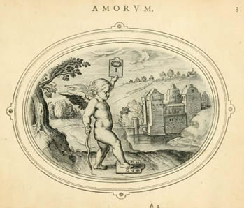 Perfect us Amor Est Nisi ad Unum
 Engraving from Amorum Emblemata
Otto van Veen
1608
Antwerp
Scholars have related various paintings of Vermeer to existing prints in contemporary emblem books which were accompanied by mottoes. While much knowledge has been gained by investigating these associations, important questions remain unanswered. One example of the difficulty in interpreting emblematic meaning may be seen in the Woman Standing at a Virginal. In 1967, Eddy de Jongh ("On Balance" in Vermeer Studies, 1998) proposed an interpretation of the picture in relation to one such emblem with the motto "A lover ought to love only one" in Otto van Veen's emblem book of 1608, Amorum Emblemata. In Vermeer's picture, a painting representing a Cupid holds aloft a card can be closely related to Van Veen's print. However, in Van Veen's print, the Cupid stands with one foot on another card with multiple numbers that are missing in Vermeer's representation. De Jongh wrote: "Although the card of the painted amor is blank and the card with the other ciphers is missing is itself missing, there can be no doubt that Vermeer had been inspired by the very same notion when he painted the woman at the virginal." However, about 20 years later De Jongh readdressed the issue: "I restate the hypothesis that Vermeer was thinking of Van Veen's meaning when he conceived his painting. This hypothesis, however, does not solve very much. For even if the emblematic meaning of any passage may be correctly identified, the crucial question is: how did the painter intend the inserted moral to function?"Gaskell, Ivan. Vermeer's Wager (Essays in Art and Culture) ( London: Reaktion Books, 2000) 44.
Emphasis
Emphasis is any forcefulness that gives importance or dominance (weight) to some feature or features of an artwork; something singled out, stressed, or drawn attention to by means of contrast, anomaly, or counterpoint for aesthetic impact. A way of combining elements to stress the differences between those elements and to create one or more centers of interest in a work. Often, emphasized elements are used to direct and focus attention on the most important parts of a composition—its focal point. Emphasis is one of the principles of design. A design lacking emphasis may result in monotony.
Emulation & Imitation
"The familiar premium that contemporary Western society places on artistic originality is actually a fairly recent phenomenon. Among the concepts renaissance artists most valued were imitation and emulation. Although Renaissance artists did develop unique, recognizable styles, convention, in terms of both subject matter and representational practices, predominated."Gardner, Di Helen, Kleiner, Fred S., and Mamiya, Christin J. Gardner's Art Through The Ages: The Western Perspective, 12th edition. (Belmont California: Cengage Learning, 2006) 431. Imitation and emulation, (Latin; imitatio and aemulatio) both abandoned in modern studio practices, were key concepts in artistic training. Only when the artist had learned to imitate, then emulate, could he finally invent.
Until the mid-eighteenth century, imitation was considered the first, and absolutely indispensable step to becoming a fully developed artist. Imitation was largely based on the concept of classical rhetoric. By imitating (copying) prints, drawings and paintings of the great Italian masters of the Cinquecento (exceedingly little painting had survived from the Greek and Roman times) fledging artists contemporarily stored up knowledge and trained the mind and hand. Emulation was also known to the ancients, Virgil had supposedly emulated Homer "in the race of honour."
Even the greatest artists copied and imitated the work of their colleagues. Leonardo da Vinci (1452–1519) filled his sketchbooks with of well-known sculptures and frescoes while Michelangelo spent days sketching artworks in churches around Florence and Rome. Philip IV gave Rubens (1577–1640) extraordinary permission to make scale copies of Titian (c. 1488/1490–1576) paintings in the Royal collection that had to be taken off the walls and brought to a temporary studio set up for Rubens.
The limits of imitation were often debated. The Dutch art theorist Samuel van Hoogstraten (1627–1678) raccounts that "Rubens was once reproached for borrowing whole figures from the Italians to which he even sent draftsmen to Italy to bring back examples. Rubens supposedly responded to this criticism by saying, 'They are free to do the same, if they see any advantage in it', thereby suggesting that not everyone was capable of benefiting from imitation."Sluijter, Eric Jan. Rembrandt and the Female Nude ( Amsterdam: Amsterdam University Press, 2006:) 263.
The Dutch referred to imitation, both in the sense of stealing and benign borrowing with the same term, rapen. Good rapen consisted in borrowing from various sources—Seneca's oft-quoted phrase recommended artists to draw from numerous sources as bees take honey from a host of flowers—the fusing them together with one's own genius in a manner that none of the borrowings were evident. Karel van Mander (1548–1606), playing upon the double meaning of the word rapen as both "borrowing" and "turnip," wrote that "what is stolen must be welded, molded in the mind as though it were stewed in a pot, and prepared and served with the sauce of ingenuity if it is to prove flavourful."Sluijter, Eric Jan. 2006: 253.
Once the artist in training had acquired sufficient technical means through imitation, he could move on to emulation which was considered improving on the works of established and recognized masters. It was firmly believed that only by knowing the strengths of the previous masters could a painter successfully complete and surpass them. Emulation, therefore, was not the mere slavish imitation of exemplary work of past masters: the artist must strive to emulate their powers of invention. Thus, emulation was considered a key to artistic process progress.
"Tiepolo, for example, was known as a great emulator of Veronese—as was his Venetian predecessor Sebastiano Ricci 1659–1734). What did that mean in terms of his own "original" artistic production? Giovanni Battista Tiepolo (1696–1770) never copied Paolo Veronese (1528–1588) per se, but many compositions of his depend on Veronese for narrative structure, figure types, color, etc. What made him a great emulator, someone never accused of being a mere imitator as was Ricci, was that Veronese was a point of departure, a creative spark that Tiepolo fanned with his own manner and energy. He needed Veronese, in a way, as a place to begin, but it was never where he ended."Mayernik, David. "All Art is Derivative." Emulation website, 12 January 2010. http://emulatio.blogspot.it/2010/01/all-art-is-derivative.html.
However, there was less agreement as to whether one might emulate only one or more masters. "Having first practiced drawing for a while…' Cennino Cellini (c. 1370–1440) recommended young artists to …" take pains and pleasure in constantly copying the best things which you can find done by the hands of the great masters. And if you are in a place where many good masters have been, so much the better for you. But I give you this advice; take the best one every time, and the one who has the greatest reputation." Cennini, however, warned against imitating more than one master because the practitioner's mind would become "distracted"and "you would not get either right."
Today, cutting-edge art institutions discourage both imitation and emulation. Students rarely make copies whether they be by past or contemporary masters. On the other hand, since modern (ambitious) figurative painters, who work in relative isolation, are rarely concerned with complex narratives or compositions, they tend to emulate only the technical features of great artists of the past. The most frequently emulated artists range from John Singer Sargeant (1856–1925), to William-Adolphe Bouguereau (1825–1905), Diego Velázquez (1599–1660) and at times, Rembrandt (1606–1669).
Engraving & Etching
Woodcut, engraving and etching were the principal methods of making prints before the invention of photography. To make an engraving, a plate, usually of copper, is cut with a burin (a sharp gouging tool). The plate is put in a press and ink rolled onto it. The ink is retained in the cuts and transferred to the paper.
Some of the paintings, such as the Netherlandish landscape, are connected with specific engravings by other artists.
The advantage of etching over engraving is that the lines can be made with something of the freedom of drawing.
Not even a single engraving, etching or even drawing by Vermeer's hand has survived nor does there exist any historical evidence that they had ever existed.
En Plein Air
from Wikipedia:
En plein air (Fr.: outdoors) is the act of painting outdoors. This method contrasts with studio painting or academic rules that might create a predetermined look.
Artists had to some extent painted outdoors, but in the mid-nineteenth century, working in natural light became particularly important to the Barbizon school, Hudson River School, and Impressionists. The Newlyn School in England is considered another major proponent of the technique in the later nineteenth century. The popularity of painting en plein air increased in the 1840s with the introduction of paints in tubes (like those for toothpaste). Previously, painters made their own paints by grinding and mixing dry pigment powders with linseed oil.
The act of outdoor painting from observation has been continually popular well into twenty-first century. It was during the mid-nineteenth century that the box easel, typically known as the French box easel or field easel, was invented. It is uncertain who developed it, but these highly portable easels with telescopic legs and built-in paint box and palette made it easier to go into the forest and up the hillsides. Still made today, they remain a popular choice (even for home use) since they fold up to the size of a brief case and thus are easy to store.
The Pochade Box is a compact box that allows the artist to keep all of their supplies and palette within the box and have the work on the inside of the lid. Some designs allow for a larger canvas which can be held by clamps built into the lid. There are designs that can also hold a few wet painting canvases or panels within the lid. These boxes have a rising popularity as while they are mainly used for plein air painting, can also be used in the studio, home, or classroom. Since pochade boxes are mainly used for painting on location, the canvas or work surface may be small, usually not more than 20 inches (50 cm.)
Challenges include the type of paint used to paint outdoors, animals, bugs, onlookers and environmental conditions such as weather. Acrylic paint may harden and dry quickly in warm, sunny weather and it cannot be reused. On the opposite side of the spectrum is the challenge of painting in moist or damp conditions with precipitation. The advent of plein air painting predated the invention of acrylics. The traditional and well-established method of painting en plein air incorporates the use of oil paint.
"Every painter paints himself"
Italian - "Ogni pittore dipinge sè"
Dutch - "zoo de man was, was zyn werk"
"Ogni pittore dipinge sè" is a Tuscan proverb that can be found for the first time in Italian literature between 1477 and 1479. The proverb does not seem to have existed in the Middle Ages although Marsilio Ficino, Thomas Aquinas and Cicero have all addressed the issue of the artist's reflection in his work. In reference to "every painter paints himself" modern scholars employ the term "automimesis."
"Every painter paints himself" refers not to deliberate self-portraiture but to the artist who creates himself involuntarily in his work. At least from the middle of the sixteenth century onwards, it was associated with natural inclination or inborn talent and had implications that were generally positive. The specific proverb is attributed to various figures including Michelangelo and Gerolamo Savonarola. Albrecht Dürer (1471–1528) may well have taken it quite literally, as his portrait of Emperor Maximilian I is said to bear the artist's superimposed features.Campbell, Lorne. Renaissance Portraits: European Portrait Painting in the 14th, 15th and 16th Centuries ( New Haven and London: Yale University Press, 1990) 14–16. Leonardo da Vinci (1452–1519), however, was the most articulate in addressing this proverb: "the soul," wrote Leonardo, "predetermines for the artist's hand the shape of a man on canvas."Jahosky, Michael Thomas. "Some marvelous thing: Leonardo, Caterina, and the Madonna of the rocks" (2010). Graduate School Theses and Dissertations. http://scholarcommons.usf.edu/etd/1666.
Savonarola commented:
And one says that every painter paints himself. He does not indeed paint himself as man because he produces images of lions, horses, men and women which are not identical with himself, but he paints himself as painter, that is according to his concept (concetto). And although there are different fantasies and figures of the painters who are painting, they are nevertheless all [done] according to his concept.
In the Netherlands, the equivalent phrase "zoo de man was, was zyn werk" appears, again, as a positive statement about the artist's natural abilities and is found in the writings of leading Dutch biographers and theorists including Karel van Mander (1548–1606) and Cornelis de Bie (1627–1715). Draughtsman and engraver Jan de Bisschop (1628–1671) echoed the idea when he stated that "each man often times paints his own manners and activities."Cartwright, Ingred. "Hoe schilder hoe wilder: Dissolute self-portraits in seventeenth-century Dutch and Flemish Art." Dissertation, University of Maryland, 2007: 66. http://drum.lib.umd.edu/bitstream/1903/7720/1/umi-umd-4997.pdf.
Likewise, the Dutch Renaissance man and art lover Constantijn Huygens (1596–1687) wrote that a portrait was "a summary of the whole man, of his body as well as his spirit."The concept was even applied to the brushstrokes used to create portraits, something that poet Jan Vos (1610–1667) noted when he wrote of one painter: "But to my distress, as loose as your painting are you."Westermann, Mariët. "Steen's Comic Fictions." In exh. cat. Jan Steen: Painter and Storyteller (Washington: National Gallery of Art, 1996) 61.
Art historians have long remarked that Vermeer is one of the most self-effacing painters of all times. The artist-art historian Lawrence Gowing summarized the problem of comprehending the Vermeer and his work when he wrote: "What kind of man was Vermeer? Here is the ambiguity. We may examine the pictures from corner to corner and still be uncertain. It seems as if he was of a god-like detachment, more balanced, more civilized, more accomplished, and more immune from the infection of his time than any painter before or since"
Exhibition/Art Exhibition
See also, Blockbuster Exhibition and Exhibition Catalogue
An art exhibition is the space in which art objects meet an audience, universally understood to be for a temporary period, making it fundamentally different from an art collection. In American English, exhibitions may be called "exhibit," "exposition" (the French word) or "show." In UK English, they are always called "exhibitions" or "shows" and an individual item in the show is an "exhibit." Art expositions may present pictures, drawings, video, sound, installation, performance, interactive art, new media art or sculptures by individual artists, groups of artists or collections of a specific form of art.
The artworks may be presented in museums, art halls, art clubs or private art galleries, or at some place the principal business of which is not the display or sale of art, such as a coffeehouse. An important distinction is noted between those exhibits where some or all of the works are for sale, normally in private art galleries, and those where they are not, such as public museums. Sometimes the event is organized on a specific occasion, like a birthday, anniversary or commemoration, but often important exhibitions are almost always organized around a historic period, geographical location, artist, group of artists, art movement, theme or a combination of these features. Sometimes exhibitions are simply works from drawn from a private collection or public institution.
Exhibitions often present the occasion to assemble works together that are dispersed throughout the globe and have never been shown together, allowing curators and the public to make more meaningful comparisons between them. Interpretive exhibitions require carefully managed context. They are often accompanied by explanatory panels, illustrated catalogues and, occasionally, interactive displays to aid the visitor's understanding of background and concepts. Major exhibitions are overseen by a curator who, along with other specialists, write illustrated exhibition catalogues, both of which may require considerable expense and years of research and planning.
In ancient Greece and Rome, it is known that artists exhibited their works prior to being installed in public buildings, although the works shown were considered offerings to deities rather than for public enjoyment or education. Later, in the Middle Ages the situation remained the same but by the seventeenth century, artists began to stage rudimentary exhibitions in artistic capitals such as Rome, Venice and Florence in conjunction with
religious celebrations, and it was during this time that artists realized they could use these exhibitions to help establish their own reputations. However, the art exhibition as we know it began to play a crucial part in the market for new art since the eighteenth and nineteenth centuries.
L'Acadèmie de Peinture et de Sculpture in Paris was responsible for the state's educational program in the fine arts held its first exhibition in 1667 for the court society only, but by 1725 the exhibition moved to the Louvre and was open to the general public where it became known simply as the Salon, It rapidly became the key factor in determining the reputation, and so the price, of the works of French artists. The Royal Academy of London soon established a similar influence on the market, and in both countries artists strove to produce artworks that would meet approval, often changing the direction of their style to meet popular or critical taste. The British Institution was added to the London scene in 1805, holding two annual exhibitions, one of new British art for sale. These exhibitions received lengthy and detailed reviews in the press, which were the main vehicle for the art criticism of the day. Among the most important exhibitions are; Paris Salon, 1824, The Salon des Refusés, 1863, The first "Impressionists" show, 1874, The first Salon d'Automne, 1903, the Armory Show, 1913, Degenerate Art, 1937 and The 9th Street Art Exhibition, 1951.
Following Vermeer's rediscovery in the mid-1850s over 320 exhibitions have been staged with one or more of his paintings, the earliest recorded being 1838. Most of these exhibitions featured works of other painters although a few only works by Vermeer. The 1995–1996 exhibit in Washington/The Hague (see image above-left) with 21 paintings by Vermeer remains among the most ambitious—it is highly probable that even during Vermeer's lifetime so many paintings were never on view in the same environment—and visited art exhibitions ever staged (attendance, 327,551). The exhibition drew extraordinary crowds, and free passes were required for admission at all times. Lines for daily passes grew longer each morning. Beginning on November 24, hours were extended until 7 p.m. every Friday, Saturday and Sunday, and from February 1, until 9 p.m. each night.
For a complete list of exhibitions that featured one or more paintings by Vermeer, click here.
For a list of exhibitions by individual pictures, click here.
Exhibition Catalogue
See also, Blockbuster Exhibition and Exhibition/Art Exhibition
An exhibition catalogue documents the contents of an art exhibition, ideally providing a forum for critical dialogue between curators, artists and critics. The notion of a separate catalogue of text and labels dates back to nineteenth-century French Salons. Today, exhibition catalogues printed by major art institutions can be far more detailed than the catalogues of their permanent collections and take the form of substantial books, with hundreds of illustrations and pages becoming comprehensive sources for even rather large subject areas.
Catalogues may range in scale from a single printed sheet to a lavish hardcover "coffee table books." The advent of more economical color printing in the 1960s spawned large-scale catalogues. The largest were produced were in the 1970s, with some that contained over a thousand pages. This trend was led in Britain, and in the United States by the Metropolitan Museum of Art in New York and the National Gallery of Art in Washington. Such catalogues typically require years of research and planning to produce and are often written by more than one art specialist, each one covering different areas of research.
Due to the economic downturns, the fortune of the exhibition catalogue has been seriously redimensioned. For example, rather than a traditional printed catalogue, the Philadelphia Museum of Art posted a digital "gallery guide" for its exhibition Picasso and the Avant-Garde in Paris, allowing online visitors to visit the exhibition remotely. Other museums opted for mini-catalogues, generally for smaller exhibitions. Production costs of a 250–300 page catalogue ranged from $150,000 to $250,000. Thus, while the museums that stage the exhibitions would prefer e-books to traditional paper catalogues for economical reasons, those who lend artworks frequently demand a catalogue and reproduction rights for their pictures—the holders of copyright are reluctant to give permission for digital publishing for fear of high-resolution images being pirated. It is often held that the value of works prominently featured in grand exhibition catalogues may increase their economic value.
False Attachment
False attachment is a term that describes an optical phenomenon whereby a part of one object is juxtaposed near a second object in such a manner that the lines, shapes or tones of the separate objects seem to join up with the result that they appear to occupy the same plane, thereby creating spatial ambiguity. The false attachment is a popular trick practiced by the amateur photographer who manipulates the pose of his friend in his camera's viewfinder so that he will appear to engage an unlikely object in the distant background, such as a Ferris wheel or another large object. But architects and painters are always taught to avoid them because they corrupt three-dimensional spatial reading.
False attachments are found abundantly dispersed throughout Vermeer's oeuvre. Some of the most striking are those found in the Woman with a Lute, Young Woman Holding a Pitcher, The Love Letter and The Art of Painting. There are used with such insistence that they must have been rationally determined so we can reasonably presume that the artist was indeed interested in how flat shapes relate to one another on the picture plane, a consideration that was not a part of a seventeenth-century composition.
Although false attachments appear from time to time in the work of other interior painters, most seem to be casual occurrences. A few, perhaps, were influenced by Vermeer, such as those in Gabriel Metsu's (1629–1667) Man Writing a Letter (c. 1664–1666) and Sick Child (c. 1664–1666), both pictures which have been traditionally linked to Vermeer's single figured works of the 1660s for their evident affinities in compositional organization and light. Another work, Sentimental Conversation (early 1660s) by Quirijn van Brekelenkam ( (1622/29–1669/79), features a carefully composed domestic interior in which the lower corner of a large ebony-framed landscape fits snugly against the gentleman's right-hand profile just as one might have expected from Vermeer.
Fame
Great reputation and recognition; renown. Fame is known to sometimes be a mixed blessing and can be confused with notoriety or clever marketing. Fame has always been considered as one of the fundamental motivations for artists of all types. Since classical times it was understood that great artists brought fame not only to themselves but to their native city and country. Renaissance artists strove to achieve the fame and memory of the great artists of antiquity by creating works that would be admired for their religious piety, classical erudition, beauty and naturalism.
Artistic fame generally suggests being valued in one's own lifetime as well as leaving a significant trace of their art for posterity. Immanuel Kant gave three standards for great art that stand the test of time: 1) originality (the first of its kind in a certain style), 2) exemplarity (others will want to imitate that style) and 3) inimitability (the art is so unique that others won't really be able to imitate it). Sometimes, perhaps more so in modern times, fame has to do as much with the quality of one's artistic production as with the persona of the artist. To offer a notable example, Pablo Picasso (1881–1973).
from the National Gallery website:
The role artists played in enhancing the fame of their homeland and their native city was profoundly appreciated in the Netherlands. This concept, one of the subthemes of Giorgio Vasari' s(1511–1574) influential Lives of the Artists, was given a northern flavor by Karel van Mander (1548–1606) in his Het Schilderboeck (The Book of Painting) of 1604. It also figured in the individual histories of Dutch cities published during the seventeenth century, including Dirck van Bleyswijck's Beschryvinge der Stadt Delft (Description of the City of Delft), published in 1667, the very year that Vermeer executed The Art of Painting painting. It is appropriate that Clio holds her trumpet, a symbol of fame, directly beneath a view of the Hof in The Hague, the seat of government. It is also telling that the artist has begun his painting by depicting Clio's laurel wreath, a symbol of honor and glory.
Bleyswijck commented that artists bring glory and distinction to their respective cities, but he lamented that too often fame comes to them only after death. Bound by convention to limit his praise to artists already deceased, Bleyswijck listed Vermeer only as one of the artists active in Delft; he did not include one word about Vermeer's work. To the reader of this history of Delft, Vermeer remains as indistinguishable from his contemporaries as the artist in this painting. Indeed, while Vermeer probably depicted his artist from the rear to assert the universality of his allegory, he may also have done so to emphasize the anonymity experienced by the artist during his lifetime even as he brings fame and glory to his homeland.
Faux
from Art Glossary of Terms: The Art History Archive:
French for false, artificial, fake. English speakers say "faux" to give a high-toned quality to what is often an imitation of a natural material—leather, fur, metal, or stone for example. Although faux materials are usually less expensive than the real thing, there can be other advantages to them: durability, uniformity, weight, color and availability perhaps. There can be allegorical advantages too (falsity can have its purposes!) particularly when juxtaposed with opulence. Faux finishes are painted simulations of other materials—the look of their colors and textures. Examples include stones (marble, granite, sandstone, malachite, porphyry, serpentine, lapis, etc.), wood (also called faux bois—false wood), masonry, and metal (gold, silver and bronze, along with all of their potential patinas). A faux marble might be a substitute like terrazzo or scagliola, each of which employs marble dust in a plaster binder to result in a hard material that will take a polish. See the article on "marbling" for a discussion of marbling papers as well as faux-marbling as a painting technique.
Various faux finishes appear in Vermeer's paintings, including the black ebony frames—the Dutch were particularly adept at imitating exotic imported woods—and the marble slabs of the virginals of his A Lady Standing at a Virginal and A Lady Seated at a Virginal. What was once considered ermine fur trim of the yellow morning jackets worn by various female protagonists was, in effect, rabbit, cat or mouse.
Female Dutch Painters
from:
Marianne Berardi, "Netherlandish Artists (1600–1800)." In Women's Studies Encyclopedia, ed. Helen Tierney. Greenwood Press, 2002.
Nearly 250 women artists, amateur and professional, were recorded in the Low Countries (present-day Holland and Belgium) between the mid-sixteenth and the late eighteenth centuries. A small number were well known in their native Holland or (Flanders, although they never enjoyed international distinction. These artists include such figures as genre/portrait painter Judith Leyster (1609 –1660) and watercolorist Margaretha de Heer. An even smaller group, including still life specialists Maria van Oosterwyck (1630–1693)and Rachel Ruysch (1664–1750), won international artistic recognition. Their accomplishments were discussed in the major biographies of Netherlandish painters by Arnold Houbraken (1660–1719) and Johan van Gool, and their work attracted the patronage of European nobility.
Unlike Italy, France and Spain, where artwork was almost exclusively made-to-order for the very wealthy, in seventeenth-century Holland, art became a portable commodity affordable to the middle class. This development encouraged a diversity of subjects and techniques, and consequentl,y Dutch painters were the first Europeans to develop fully the genres of still life, seascape, townscape, landscape and scenes from everyday life.
Women artists, however, tended to avoid certain subjects. Unable to study anatomy from the nude, most could not acquire enough proficiency to compose groups of human figures in action, as was necessary for painting successful historical or religious subjects. Seascapes or town views were seldom popular subjects, perhaps because women needed chaperones to study them. With the exception of wax modeling and silhouette cutting, few women produced much sculpture.
Although there were exceptions, the majority of Netherlandish women painters practiced still life and/or portraiture. For women artists of the north, the portrait tradition seems to have peaked not in the golden age of painting but in the century preceding it with Levina Teerlinc (Bruges, c. 1520–1576) and Caterina van Hemessen (1528-after 1587, Antwerp).
Figure
In art discussion the term "figure" indicates the representation of a human being, although it can also have a much more general meaning of an element—abstract or not—which distinguishes itself from those by which it is surrounded (see figure/ground).
Figurative
The term "figurative" is often used simply to mean that an image contains recognizable images (i.e., that it is not abstract or non-objective). Since this usage does not distinguish between literal and figurative, it is considerably less precise.
Figurative art, sometimes written as figurativism, describes artwork—particularly paintings and sculptures—that is clearly derived from real object sources, and is therefore by definition representational. "Figurative art" is often defined in contrast to abstract art: Since the arrival of abstract art, the term "figurative" has been used to refer to any form of modern art that retains strong references to the real world.
Painting and sculpture can therefore be divided into the categories of figurative, representational and abstract, although, strictly speaking, abstract art is derived (or abstracted) from a figurative or other natural sourcse. However, "abstract" is sometimes used as a synonym for non-representational art and non-objective art, i.e. art which has no derivation from figures or objects.
Figurative art is not synonymous with figure painting (art that represents the human figure), although human and animal figures are frequent subjects.
Figure-Ground
The relationship of the picture surface (ground) to the images on the picture plane (figure). The figure is the space occupied by forms (e.g., a person in a portrait) (also known as the "positive" space); the ground is the "empty" or unoccupied space around the person in the portrait (also known as the "negative" space) The ground is also commonly called the "background." In art since the early twentieth century, this division of the picture plane has been seriously challenged, to the point where there is no longer a distinction of figure/ground, but rather one continuous surface and space, with no "positive" or "'negative" space, just one, interwoven space.
Vermeer's awareness of the expressive power of the relationship between figure and ground, positive and negative shape, has no equal in European easel painting. In the single-figure paintings of the mid-1660s he precisely determined the form of negative shapes which surround the standing women in order to restrict any sense of physical movement. The figures are imbued with a sense of stability and permanence which comparative genre painters were rarely even aware of. What perhaps is even more astounding is that the attention which he affords to the formal relationship of figure and ground never interferes with the naturalistic reading of the painting or feels contrived.
Lawrence Gowing ( Vermeer, 1952) certainly had the play of negative and positive shapes in mind when he wrote, "Nothing else evokes the impression, certainly no printed reproduction, nothing but the canvas itself: we see, large and plain, a mosaic of shapes which bear equally on one another. They are clasped together by their nature, holding each other to every other in its natural embrace. We see a surface that has the absolute embedded flatness of inlay, of tarsia. And in an instant we recognize its shapes as emblems which carry in their stillness the force of the real world."
Fijnschilder (Fine Painter)
Although in the seventeenth century the Dutch term fijnschilder was used to differentiate between a painter practicing refined techniques and one who, for instance, is a house painter, in the nineteenth century it became associated with Gerrit Dou (1613–1675), Frans van Mieris (1635–1681, Sr. and Adriaen van der Werff—all among the most successful painters of the Dutch Baroque. These painters were identifiable by their "fine" manner, exquisite techniques, and extreme attention to detail resulting in works with smooth surfaces completely lacking painterly brush strokes. The application of paint contrasts with the textures and style of other Dutch painters, such as Frans Hals (c. 1582–1666) and Dou's teacher Rembrandt (1606–1669) who worked prevalently in the ruwe (rough) mode.
Dou painted in the smooth, precise style that his teacher Rembrandt had employed in his Leiden years. Unlike Rembrandt, however, Dou remained loyal to this exquisite manner of painting. Thanks to influential pupils such as Quirijn Brekelenkamp (1622/29–1669/79, Leiden), Gabriel Metsu (1629–1667, Godfried Schalcken (1643–1706) and Van Mieris, this polished style of painting became a specialty of Leiden artists.
In the style of the fijnschilder—minutely proportioned subjects with bright colors, a shiny finish, and precise attention to detail—Van Mieris painted on wood or copper panels rarely larger than fifteen square inches. He represented common incidents in the lives of the lower working class as well as the habits and customs of the wealthy. His paintings were highly acclaimed in his lifetime and earned Van Mieris a great deal of money. Unfortunately, he wasted his fortune through alcoholism and poor management of his finances. Although contemporaries recognized Van Mieris as one of the leading Dutch artists of the 1600s, his paintings, like those of Gerrit Dou (1613–1675), fell into relative obscurity after the end of the nineteenth century and only on the late twentieth century has his work begun to be reevaluated.
Although Vermeer was certainly influenced by the themes and compositions of the fijnschilderen, his concept of pictorial rendering is fundamentally divergent from theirs. Vermeer never seems to have been seriously lured by the microscopic detail which had made the fijnschilderen work prized throughout Europe. His stark, strictly organized interiors contrast with the essentially picturesque character Dou's and Van Mieris' work and seem almost barren in comparison. Although Vermeer shares their interest in the representation of texture and the activity of light, he subtly suggests rather than describes those qualities. Moreover, Vermeer's use narrative is less defined leaving room for the observer's imagination to come into play. Arthur K. Wheelock Jr. correctly points out that Vermeer's paintings are essentially "poetic" rather than "narrative."
Fine Art
from Wikipedia:
In European academic traditions, fine art is art developed primarily for aesthetics or beauty, distinguishing it from applied art that also has to serve some practical function, such as pottery or most metalwork.
Historically, the five main fine arts were painting, sculpture, architecture, music and poetry, with performing arts including theatre and dance. Today, the fine arts commonly include additional forms, such as film, photography, video production/editing, design, sequential art, conceptual art, and printmaking. However, in some institutes of learning or in museums, fine art and frequently the term fine arts as well, are associated exclusively with visual art forms.
Until the English Arts & Crafts Movement of the late nineteenth century, there was a rigid distinction between fine art (purely aesthetic) and decorative art (functional). During the twentieth century, with the introduction of the category of visual art, this arbitrary distinction has become blurred, and certain crafts or decorative arts (notably ceramics) are now considered to be fine art.
As originally conceived, and as understood for much of the modern era, the perception of aesthetic qualities required a refined judgment usually referred to as having good taste, which differentiated fine art from popular art and entertainment.
The Five Senses
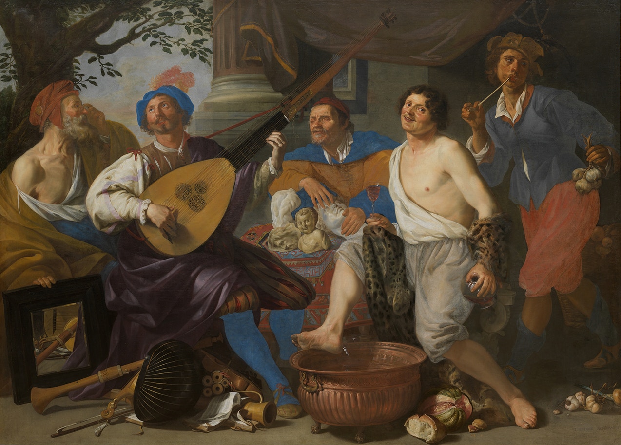
Allegory of the Five Senses
Theodoor Rombout
Oil on canvas, 207 x 288 cm.
Museum of Fine Arts Ghent, Ghent
The five human senses–taste, smell, sight, hearing and touch–belong to one of the most varied and most appealing subjects of European painting. The five senses were initially represented two manners, the first using five different animals for each different sense but later using five different objects holding significant objects–a mirror for Sight, a musical instrument for Hearing, a flower for Smell, a fruit for Taste and a harp for Touch. The third way consisted in the actual depiction of the organs associated with each particular sense. Whereas in Antiquity and the Middle Ages, the senses had negative connotations, being considered deceitful or as a promotion of sin, the perception of the senses changed with the increasing scientification of thought in the 17th century and began to be represented in increasingly diverse modes that ranged from popular low-life genre scenes to haute bourgoise narrative scenes, still lifes and high history painting. For example, each figure of the Flemish master's Theodoor Rombouts +symbolizes one of the five senses. The old man with glasses and a mirror represents Sight. The chitarrone, a type of bass lute, stands for Sound. The blind man is symbolic of the sense of Touch. The jolly man with a glass of wine in his hand portrays Taste, and the elegant young man with a pipe and garlic, Smell. The garlic, wine, music and mirror refer to the fallacy of sensory perception and the transience of life.
Educational prints from the sixteenth century propagated series of systems, such as the Four Elements or the Temperaments, the Four Seasons or the Five Senses. Painters used an endless variety of means to express the different senses, from animals to inert objects and human activities. The allegory of the five senses was perfectly suited to the symbolic intent of 17th-century still lifes. In these emblematic arrangements, one or more objects signify each faculty. The flower arrangement connotes smell; sight pertains to the mirror, and taste to the pomegranate, lemon and cup of wine. An ivory flageolet, or flute, represents hearing, whereas touch is indicated by the playing cards, dice and shaker. At times, a clock or an hourglass were inserted in pictures of the Five Senses both as an admonishment to be moderate in pleasure and as a warning that time is passing. One of the most famous examples of The Five Senses in art is a set of allegorical paintings created at Antwerp in 1617–1618 by two Flemish masters Jan Brueghel the Elder (Dutch painter, 1568–1625) and Peter Paul Rubens (Dutch painter 1577–1640), with Brueghel being responsible for the settings and Rubens for the figures. Gérard de Lairesse, an accomplished history painter and one of the most influential Dutch art writers, also made a picture of The Five Senses, Allegory of the Five Senses.
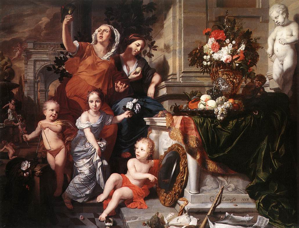 Allegory of the Five Senses
Gérard de Lairesse
1668
Oil on canvas
Kelvingrove Art Gallery, Glasgow
In the defense of painting with regards to so-called il paragone debate, which was waged from Antiquity, the Dutch art writer Philips Angels (Praise of Painting, 1642) argued that since the sense of sight is the noblest of the five senses, so is painting superior to its sister arts.
The sculptors say, for their part, that a painting is sophistic, mere semblance without being, because one cannot find in a painting that which it seems to be. That is not so with the sculptors' art, which is tangible, even though painters imitate the same things as sculptors do, and with more means, namely forms and colors, whereas the sculptors use forms alone. Nevertheless, painters imitate her more truly and faithfully. That this is certain can be deduced from the following. Everyone knows that even though the eye is the noblest of the five senses and that sight has color among its objects it is not the most trustworthy (however true), for we can observe that it is often deceived. The most trustworthy of our senses is therefore touch. Now everyone knows that when one sees a wooden statue one feels a mass, which sight has seen, which is not the case with painting. This is why sculptors believe that their art should take precedence over ours, and that the difference between the two is as great as that between being and seeming. To this I reply that sculptors do not capture nature better by making space-encompassing, three-dimensional objects, and what is more they abuse and plunder the matter which was already as it was in nature. For this reason, all that one finds in it that is round, wide and otherwise is not due to their art, for it already had thickness and height and all those members needed for an integrated body. So in this respect their art does no more than give the contour, which is the surface membrane. For this reason, as has been said, the embraceable and three-dimensional does not come from art but from nature. This answer also applies to what they say about touch, for the reason one finds it tangible is also proved hereby to be not from art but from nature. Yet even though this has all been demonstrated they do not wish to capitulate to us, but wriggle and squirm against it like a snake with a broken head fighting death, and cleave to the lasting durability of their masses. Whereas (they say) our things are not in so much danger from rain, fire and other afflictions as paintings are. To this we say, first of all, this is due not to art but to the object of art, which is real. Secondly, there is nothing upon which the sun shines here on earth that is assured of eternal duration but it is subject to change; nothing has a permanent and unchangeable constant state but the immutable God alone, who is ever one. Even so, paintings can last for hundreds of years, which is sufficient. Thirdly, one can also paint on marble, and in that way paintings are to some extent immortalized. But to bring our case to a close we shall deal the sculptors the final death-blow. We say that the art of painting is far more general because it is capable of imitating nature much more copiously, for in addition to depicting every kind of creature like birds, fishes, worms, flies, spiders and caterpillars it can render every kind of metal and can distinguish between them, such as gold, silver, bronze, copper, pewter, lead and all the rest. It can be used to depict a rainbow, rain, thunder, lightning, clouds, vapor, light, reflections and more of such things, like the rising of the sun, early morning, the decline of the sun, evening, the moon illuminating the night, with her attendant companions, the stars, reflections in the water, human hair, horses foaming at the mouth and so forth, none of which the sculptors can imitate. Moreover, the sculptor's art involves a very laborious, slavish toil, with the result that an old and experienced artist, when he could show himself at his best, is forced to abandon it because of the heavy labor that is required to sculpt, for his greatest powers have usually been eroded by time, which is not the case with painting, even if it is likewise done with the hands. As is clear from all the evidence presented, the aforementioned honor remains with the painters.
Flatness (in painting)
from: "Flatness," The Art Story: Modern Art Insight, by Justin Wolf
Since humankind first began using tools to depict figurative forms in an artistic medium, the greatest challenge has been dealing with the two-dimensional surface. From cave drawings forward, artists have continuously experimented with new ways to create a sense of visual depth and three-dimensionality on something that is naturally flat. In times predating the Impressionists, the ultimate goal for artists was to achieve a visual balance of perspective, volume and three-dimensionality. This began to change when Édouard Manet (1832–1883) and other artists challenged such painterly conventions. However, the idea of flatness as an artistic concept was not a conscious concern until the early twentieth century.
A unique characteristic of all modern art forms, from painting to literature, is the self-consciousness of the artist. In other words, in any particular work, the artist will call direct attention to the fact that what people are viewing (or reading, experiencing, etc.) is a work of art. In contemporary culture, this may seem like an obvious quality, but before the advent of the Modern artistic era (approximately pre-Impressionism), art was not created to call attention to itself, but to celebrate figurative forms and accurately depict things that had some basis in reality.
By deliberately calling attention to the natural flatness of the canvas in a work of art, artists have exercised a uniquely modern phenomenon, wherein the viewer is not meant to appreciate the depiction of anything, but the act of the two-dimensional surface.
Prior to the 20th century, the primary characteristic of paintings had been the depiction of an image on canvas. What makes this a self-conscious act is that the artist is openly acknowledging the mechanical limitations of trying to apply visual depth to the depiction of an image on the canvas. Yet, beginning with the non-objective paintings of Kandinsky and the geometric De Stijl works of Piet Mondrian (1872 1944), Modern artists began consciously drawing viewers' attention to two important factors: the shape of a painting's support (canvas) and the properties of the painting's forms. Thus the painting's flatness became an integral component in the viewer's experience of the artwork. Paintings are flat by the very nature of the canvas. The perception, or the acknowledgment of flatness, is something that abstract art gave to the art world.
Abstract Expressionist painters, such as Jackson Pollock (1912–1956), Mark Rothko (1903–1970) and Barnett Newman (1905–1970), applied paint in such ways that viewers' eyes were not drawn to any particular central point on the canvas, but rather offered multiple perspectives. The flatness of the canvas was for them a surface in which to create an infinite space, seemingly with no discernable beginning or end. This practice was very much in the tradition of their abstractionist predecessors Wassily Kandinsky (1866–1944), Mondrian, Joan Miró (1893–1983), and, particularly for Pollock, the Cubist works of Pablo Picasso (1881–1973) and Georges Braque (1882–1963), wherein multiple perspectives of the same subject were achieved on a two-dimensional surface.
Flat/Flatness (in the painting of shadows)
The content of the following entry is drawn from:
Paul Taylor, "Flatness in Dutch Art: Theory and Practice," Oud Holland, 121 (2008), pp. 153–184.
"Vlak" (in modern Dutch-English dictionaries translated as "flat" or "level") was a key term in the aesthetics of seventeenth-century Holland. However, flatness suggested not a flatness of the paints themselves on the support of the artwork, but rather a visual flatness, an impression that the objects depicted have no or little relief. This kind of flatness is clearly visible in Dutch drawings of the time, where divisions between light and shade are abrupt. The modeling from light to shade is not continuous but minimized to a few essential tones. This technique, usually discussed in Dutch art treatises in relation to drawing rather than painting, lends an immediate force and liveliness to the image.
The history of flatness in Dutch painting can be traced back over a hundred years to Karel van Mander's (1548–1606) Schilder-boeck first published in 1604, but it was also discussed by Samuel van Hoogstraten (1627–1678), Willem Goeree (1635–1711) and Gérard de Lairesse (1641–1711), the latter of whom, deprecated its abuse. The use of the flat shadow technique was not confined to the Netherlands. It stands in contrast with the sfumato developed in the first half of the sixteenth century and perfected by artists such as Leonardo da Vinci (1452–1519), Michelangelo, Raphael (1483–1520), Giorgione (c. 1477/8–1510) and Correggio (1489–1534).
In Van Hoogstraten's Inleyding tot de Hooge Schoole der Schilderkonst of 1678, there is a revealing passage on the use of flat shadows in regards to drawing.
But whether you begin or end with the shadows, you should split them up in your mind into lesser and greater, and depict each in a flat manner, according to its darkness; for by working them too much, and melting them in, all your work would turn to copper; and you would even lose the capacity to judge it. Don't allow yourself to be bothered by small modulations [kantigheden] in a soft shadow, nor by the fact that, when viewed from close by, a darker one can be seen in the middle of it; because the force will be all the greater if you hold it at arm's length, and you will get used to comparing parts with one another; and in the end you will find this method of working of more use than you would ever have dared imagine; whereas otherwise, if you fiddle about with trying to smooth everything sweetly away, you run the risk of getting lost entirely; as has happened to many a noble soul, through a tendency to sweeten and reinforce their work continuously with depths and highlights.
Van Hoogstraten thought drawing should be built out of crisp contrasts, in which light and shade were clearly articulated, both between and within themselves.
Willem Goeree (1635–1711)wrote that one should lay down shadows "uniformly flat, whether through hatchings, shadings…" in order to that one "can clearly see what figure or shape such shadows have as a general mass; and that their sides do not disappear in a hazy smoke or indeterminate sponginess…"
On the other hand, the Dutch painter and art theoretician Gérard de Lairesse (1641–1711), in a chapter of his 's Groot Schilderboek devoted to the topic of light and shade, contends that the most perfect form of lighting in a painting is diffused or indirect light, gemeen licht. The Dutch painter-gone-blind and art writer criticized numerous Dutch painters, which he calls Zonschilders, "Sunpainters," for their practice of painting their subjects as if they were in broad sunlight.
It isn't flat, they say: by which they means that it isn't sunny, nor clear and sharp in the shadows, as it normally is when they depict things in their sunlight. Flat, flat, they say to their pupils, or disciples, in a soft voice, so that strangers cannot hear: as if it were a secret, unknown to art itself. They say that the good Philemon was so enamoured of things that had flat lights and shades, that he only painted pictures with sun or moonshine.
Flesh (the painting of)
Painting flesh, in Dutch "Koleur der Naakten," has always been and, among figurative painters, still is considered one of the most demanding and potentially rewarding tasks for the artist. Gérard de Lairesse (1641–1711), the Dutch artist and theoretician, wrote in his Groot Schilderboek, "Having extensively and carefully studied this matter I find there is so much to say about it [painting flesh] that it is impossible to fit in one chapter." Painting flesh was not only difficult, it was important. Willem Beur, an artist and art writer of Vermeer's time, wrote, "Just as we humans consider ourselves the foremost amongst animals; so too, are we the foremost subject of the art of paintings, and it is in painting human flesh that its highest achievements are to be seen, whenever a painter succeeds in rendering the diversity of colors and strong hues found in human flesh and particularly in the faces, adequately depicting the intricacy of the diversity of people or their different emotions."
Painting flesh is difficult for many reasons. "The appearance of skin to obtain information about age, health or emotional state of another human being. Therefore, flaws in the representation of skin will easily be noticed. Secondly, skin is by its very nature a very complex substance. Skin color seems monochrome, yet is actually composed of many subtle nuances, just like the texture of skin seems even, but at a close look, seamlessly joins soft and rough, wrinkled and smooth zones; skin moreover is neither opaque nor translucent, but both, which creates complex shadows and interreflections. Last but not least, skin can appear different in each individual, depending on gender, race, etc."Ann-Sophie Lehmann, "Fleshing out the body: The 'colours of the naked' in workshop practice and art theory, 1400–1600," in Body and Embodiment in Netherlandish Art, eds. Ann-Sophie Lehmann and Roodenburg (Zwolle, 2008), 88.
The Allegory of Painting
Frans van Mieris
1661
Oil on copper, 5 x 3 1/2 in.
The J. Paul Getty Museum, Los Angles
One of the great difficulties of painting is determining the local color of the flesh, its numerous nuances and the rendering of its natural translucency. The Great Masters learned to describe this translucency using not so much different colored paints set side by side but layers of translucent paint carefully superimposed on one another. Wax museum artists later found that adding a layer of translucent material to the outer layer of mannequins makes them appear more lifelike.
Flesh colors do not seem to belong to the basic color wheel with which contemporary painters sometimes consult and it varies greatly from individual and from area to area of the same individual. Areas that receive more blood, like the cheeks and nose, are likely to be redder and more saturated, while areas that contain veins close to the surface of the skin may be desaturated or take on a blue cast. Painters learned to exploit the optical effect called the turbid medium effect to create the subtle blues and greens of natural flesh by superimposing light translucent pink paint over darker layers of warm brown underpainting.
Nonetheless, the great part of painters of the past used few pigments to render flesh. In Frans van Mieris' (1635–1681) Allegory of Painting, we see that the conspicuously displayed palette shows only seven pigments which might be considered the standard seventeenth-century Dutch palette for depicting a variety of skin tones. Sometimes, not only the basic pigments are represented on palettes, but mixtures of different pigments which will serve to depict various shades of illuminated and shadowed parts of flesh are also represented. Similar, restricted palates are seen in many other paintings. In general, paint mixtures used to represent male flesh contained more yellow while for fair female flesh (the illuminated parts) white lead and a touch of vermilion were sufficient.
"This idea that nature, although it is deficient in every other respect, deserves to be followed by the colo=urist, is an important concept in Gérard de Lairesse's(1641–1711)art theory. Much of his criticism of other painters is based on the claim that their colouring, or their treatment of light and shade, is unnatural. And indeed in the last of the three chapters on flesh painting in the Groot Schilderboek, de Lairesse gives us some interesting criticisms of the unnatural colours of Rubens' (1577–1640) and Rembrandt (1606–1669). He there describes Rubens' style of coloring as 'a coarse gaudiness', 'een rauwe bontigheid', and writes that Rembrandt, while trying to attain mellowness, 'murwheid', had fallen into ripeness and rottenness, 'de ryp en rottigheid'. Whether or not we agree with the value judgments implied in these criticisms, they do make an accurate observation, namely, that the overall hue of Rembrandt's nudes is more uniform than that of Rubens' nudes, and that there is a certain calming, smoky softness to the Dutchman's painted skin which the more energetic, alert flesh painting of the Fleming does not share. De Lairesse was surely right to say that the painters of his time were less interested in 'following nature' than in developing the traditions for depicting skin which they had inherited from their predecessors." Taylor, Paul. "Colouring Nakedness in Flanders and Holland." In The Nude and the Norm in the Early Modern Low Countries, eds. K. De Clippel, K. Van Cauteren, and K. Van der Stighelen. (Turnhout: Brepols, 2011).
In truth, we cannot say that Vermeer assigned the same importance to the rendering of human flesh, or for that matter, human physiognomy as did his fellow genre painters even though none of his paintings can be considered portraits according to the seventeenth-century meaning of the term. Certainly, his flesh colors are technically simpler and far less nuanced than those of the undisputed masters of this facet of painting, Rubens, Anthony van Dyck (1599–1641), and Rembrandt.
Study of a Young Woman (detail)
Johannes Vermeer
c. 1665–1674
Oil on canvas, 44.5 x 40 cm.
Metropolitan Museum of Art, New York
From a technical point of view, Vermeer's faces appear to be adequately depicted in comparison to those of his contemporaries. A few, however, are decidedly are under par. While in the worst cases (Woman with a Lute) this may depend on the degradation of those paint layers most vulnerable to damage such as glazes and final touches applied during the final stages of the painting process, or by overzealous restoration, the artist seemed not to have been allured by the challenge of the complex coloring of flesh tones which was the raison d'etre of Dutch portraitists and for which painters like Rembrandt and Frans Hals (c. 1582–1666) had become the most sought-after painters of their times. Never once do we encounter those healthy, full-blooded youths and fair little faces which populate Dutch genre painting. In most cases, Vermeer's coloring of flesh is conventional with no more indulgence than a bit of extra red in the lips and cheeks. However, Vermeer did later his palette for the flesh tones depending on the intensity of light and the overall coloring of the composition.
Perhaps, the two best renderings of flesh colors in Vermeer's oeuvre can be observed in the Girl with a Red Hat and the Study of a Young Woman in New York. In these two works, the handling of flesh tones is as subtle as it is unobtrusive.
It is likely that the particularly finessed flesh colors of the Study of a Young Woman are preserved far better than the more famous counterpart Girl with a Pearl Earring whose coloring appears slightly "washed-out" from a technical point of view.
Curiously, Vermeer experimented with an unusual technique for painting flesh that had been abandoned for centuries wherein green earth, a dull green, was used as the basic component for the shadows. Unfortunately, the fine warm glazes which once were applied over the underlayers of green in the deepest shadows have degraded or been removed by restorations and now appear quite unnatural (see the Lady Standing a the Virginals). It is likely that the best conserved of this group of late works is the radiant Girl with a Red Hat.
Although Vermeer's women resonate with spirituality, it is conveyed less through how their faces are depicted rather than by their posture and the obsessive care with which the overall composition is crafted.
Floor Tiles
Black and white floor tiles are one of the most characteristic features of Vermeer's interior works, although Dutch genre painting offers many chances to delight in similar motifs. To be sure, tiled floors, many with elaborate multi-colored patterns, had been a leitmotif of history painting with architectural settings following the invention of linear perspective. In Dutch domestic interior painting marble tiles make their debut in the first decades of the seventeenth century. Willemijn Fock, a historian of the decorative arts of the Netherlands, maintains that it is highly improbable that the marble floors that appear so often in Dutch interior painting were painted directly from life. Such a luxury item could be found only in the homes of the rich and, thus, were beyond the reach of both Vermeer and his mother-in-law, Maria Thins, with whom he lived and in whose house he kept his studio. Moreover, there is no historical evidence of marble floors were used above the ground floor second floor (remembering that Vermeer's studio was on the second floor). Period inventories reveal that marble floors in domestic settings were generally restricted to one room, the voorhuis (the main entrance), where they would have most impressed visitors. To see real marble floors Vermeer could have visited the Delft Town Hall or the princely palace at nearby Rijswijk. The painting of marble tiles must have had a three-fold purpose for Dutch interior artists: to intensify the illusion of spatial depth, to showcase the artist's command of perspective and to create richly decorated environments that would appeal to upper-class clients.
 "Adelson's Illusion"
 There are two types of tiles in Vermeer's painting: ceramic and marble. According to Philip Steadman, the minute cracks and chips of the ceramic tiles in The Glass of Wine and The Girl with a Glass of Wine suggest that they were observed and therefore painted from life. Steadman discovered that the side measurement of these tiles is exactly half of that of the larger black and white marble tiles, allowing four ceramic tiles to fit into a single marble tile. This might suggest that Vermeer painted the marble floors in a room which contained cheaper ceramic tiles, exploiting their underlying geometric grid to project the larger tiles. Over this grid, different patterns could be easily generated according to the compositional exigencies of each work. There are essentially three patterns of marble tiles in Vermeer's paintings. In The Music Lesson alone, separate white tiles are framed in a lattice of black stripes. In the Allegory of the Faith alone, a pattern of what can be read as white Maltese crosses, each made from five tiles, is set on a black background. In the six remaining pictures the colors are reversed, to make a pattern of black crosses on a white ground. In one painting only, Woman with a Lute, do the tiles meet the base of the background wall at an intermediate point rather than cutting them in half into two neat triangles. The fact that Vermeer's tiles exhibit no reflections—in reality, they would have been polished—would suggest that they were invented, although he could have easily eliminated the reflections for aesthetic reasons.
Representing the variations of brightness on a checkered floor tile is more complex than with the whitewashed wall because the artist must modify simultaneously the values (and to some degree the hue) of the two differently colored tiles. For every change in tone of a white tile, the adjacent black must be proportionately modified. Owing to the sharp contrast between the black and white pattern, and the mechanism of brightness constancy, it becomes exceptionally problematic for the painter to "see" the broader tonal relationships of the floor. The well-known diagram by Edward Adelson (MIT: see image left) illustrates the difficulties of evaluating the relative values of tones when applied to the checkered floor motif. Even when the viewer is informed that squares "A" and "B" of Aldeson's floor are precisely the same tonal value, the perceptual system "corrects" them to make them look as if they were differently colors, with the result that white tile labeled "A" strikes the viewer as intrinsically darker than tile labeled "B," although in actuality it is not. This is because from a biological standpoint there is nothing to be gained by understanding the absolute tones of the tiles. Instead, understanding brightness in relative terms allows us to construe a plausible picture of a cylinder that projects a shadow on a checkered floor. The perceptual forces at play in brightness constancy are complex and are probably elaborated across different levels of the optical system. The artist, then, must find ways to undo this correction in order to render the tiled floor realistically, otherwise, it will have no particular light.
Flower Painting
from:
Still Life, The National Gallery of Art. (webpage no longer available)
Bouquet of Flowers
Ambrosius Bosschaert
c. 1619–1620
Oil on copper, 27.9. x 22.8 cm.
Los Angeles County Museum of Art, Los AngelesThe Dutch prized flowers and lower paintings; by the early seventeenth century, both were a national passion. Flowers were appreciated for beauty and fragrance and not simply for their value as medicine, herbs, or dyestuffs. Exotic new species from around the globe were avidly sought by botanists and gardeners.
Paintings immortalized these treasures and made them available to study—and they gave sunny pleasure even in winter. Viewers could see—almost touch and smell—the blossoms.
The Dutch were entranced most of all by flowering bulbs, especially tulips. After arriving in the Netherlands, probably in the 1570s, tulips remained a luxurious rarity cheaper varieties turned the urban middle classes into avid collectors. The Dutch interest in tulips was also popularized around Europe, as visitors to the Netherlands were taken with these exotic flowers and with Dutch gardening prowess in general. At the same time, a futures market was established. Buyers contracted to purchase as-yet-ungrown bulbs at a set price, allowing bulbs to be traded at any time of the year.
On paper, the same bulb could quickly change hands many times over. Speculation drove prices upward. The price of a Semper Augustus was 1,000 guilders in 1623, twice that in 1625, and up to 5,000 guilders in 1637. The average price of a bulb that year was 800 guilders, twice what a master carpenter made annually. A single tulip bulb could command as much as a fine house with a garden.
A rising interest in botany and a passion for flowers led to an increase in painted floral still lifes at the end of the 1500s in both the Netherlands and Germany. Ambrosius Bosschaert (1573–1621) was the first great Dutch specialist in fruit and flower painting and the head of a family of artists. He established a tradition that influenced an entire generation of fruit and flower painters in the Netherlands.
With the exception of those of the patterns of the tapestries and furniture upholstery which are featured in his compositions, not even a single flower, the quintessential symbol of the Netherlands, appears in Vermeer's oeuvre.
Focal Point
In two-dimensional images, the center of interest visually and/or subject-wise; tends to be used more in traditional, representational art than in modern and contemporary art, where the picture surface (picture plane) tends to have more of an overall importance, rather than one important area.
Foreground
The area of the picture space nearest to the viewer, immediately behind the picture plane, is known as the foreground. An understanding of perspective developed in the early fifteenth century allowing painters to divide space behind the picture plane into foreground, middleground and background.
In the foreground, the figures and objects appear larger than those in the middle—or background because of their apparent proximity. They are painted with greater detail than things farther away, since only at close range would such detail be visible.
Lawrence Gowing (Vermeer, 1950) was, perhaps, the first to note the importance of the dramatic play between foreground and background elements in Vermeer's compositions. "In only three of the twenty-six interiors that we have is the space between the painter and the sitter at all uninterrupted. In five of the others, the passage is considerably encumbered, in eight more the heavy objects interposed amount to something like a barrier and in the remaining ten they are veritable fortifications."
Foreshortening
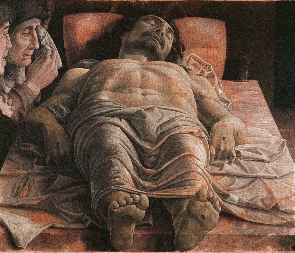 The Lamentation over the Dead Christ
 Andrea Mantegna
c. 1490
Tempera on canvas, 68 x 81 cm.
Pinacoteca di Brera, Brera, Italy
Foreshortening is the diminishing of the dimensions of an object or figure in order to depict it in a correct spatial relationship, creating a very strong, at times uncanny, sense of what might be called "localized depth," because foreshortening is almost invariably used in relation to a single object, or part of an object, rather than to a scene or group of objects.
In realistic depiction, foreshortening is necessary because although lines and planes that are perpendicular to the observer's line of vision (central visual ray), and the extremities of which are equidistant from the eye, will be seen at their full size, when they are revolved away from the observer they will seem increasingly shorter. Thus, for example, a figure's arm outstretched toward the observer must be foreshortened—the dimension of lines, contours and angles adjusted—in order that it not appear hugely out of proportion. The term "foreshortening" is applied to the depiction of a single object, figure or part of an object or figure, whereas the term "perspective" refers to the depiction of an entire scene.
Of the different types of perspective, foreshortening was the first to be mastered: as the vase paintings reveal, the first experiments with the technique were made in the sixth century B.C. in ancient Greece while its principles were fully understood by the fifth. This illusionist technique was rediscovered during the Early Renaissance by Paolo Uccello (1397–1475), and Vincenzo Foppa (c. 1430–1515), many of whose works have been lost.
 Virgin of the Rocks (detail)
 Leonardo da Vince
c. 1483–1485
Oil on canvas (wood added to canvas in 1806), 199 x 122 cm.
Louvre, Paris
One of the great renaissance paintings of the fifteenth century, Lamentation over the Dead Christ (see image upper left) by Andrea Mantegna (1431–1506) is probably the most celebrated example of foreshortening in all renaissance art. It depicts the corpse of Jesus on a marble slab, watched over by the weeping Virgin Mary and Saint John. "A sketcher or painter is likely to shorten objects slightly differently from a camera. This is because, while a camera never lies, an artist may not wish to replicate the full brutal effect of foreshortening. Instead, he will often reduce the relative dimensions of the nearer part of the object (in the case of The Lamentation, the feet) so as to make a slightly less aggressive assault on the viewer's eye and incorporate the truncated image more harmoniously into the overall composition. Indeed, this is exactly what Mantegna did in The Lamentation. He deliberately reduced the size of Jesus's feet so as not to block our view of the body. Whereas, if a photograph was taken from the same angle, the feet would have been so big that they would have obscured our view of the legs and torso.""Foreshortening." The Art of Place website. http://www.visual-arts-cork.com/painting/foreshortening.htm.
Leonardo employed foreshortened hand coming towards the observer with great daring, such as the hand of the Louvre The Virgin of the Rocks (c. 1483–1485; see image left)
Dutch painters such as Rembrandt (1606–1669) and Frans Hals (c. 1582–1666) often took advantage of the dramatic effect of foreshortening to enliven the otherwise static poses of their portraits. Vermeer too applied foreshortening with various degrees of success in his early works although one feels he is not entirely comfortable with its implementation.
One of the most successful examples of foreshortening in Vermeer's work can be, oddly enough, in one of his first compositions, Christ in the House of Martha and Mary. The foreshortening of Mary's slightly tilted head is so effortlessly achieved that it comes as a surprise to see how the artist seems to struggle with the problem of the milkmaid's arm (The Milkmaid) painted some years later. Particularly idiosyncratic treatments of foreshortening can be seen in the artist's bulbous hand in The Art of Painting and the writing hand of the mistress in Woman Writing a Letter with Her Maid. More conventional solutions can be observed in The Geographer and Young Woman with a Water Pitcher.
Form
In relation to art the term "form" has two meanings. The first refers to the overall form taken by the work—its physical nature. The second meaning refers to one of the so-called seven Elements of Art, which are the visual tools artists use to compose a work of art. In painting, form and shape are closely related. The terms "form" and "shape" define objects situated in space. The basic difference between the two is that form describes something three-dimensional while shape is a flat enclosed area of an artwork created with lines, textures and colors or an area enclosed by other shapes. In drawing and painting, the illusion of three-dimensional form is conveyed through the use of light and shadow, and the rendering of tonal value.
While painting consists of the elements of line, color, texture, space, scale and format as well as form, sculpture consists almost exclusively of form.
Formalism
In art theory, formalism is the concept that a work's artistic value is entirely determined by its form—the way it is made, its purely visual aspects, and its medium. Formalism emphasizes compositional elements such as color, line, shape and texture rather than realism, context and content. In visual art, formalism is a concept that posits that everything necessary to comprehending a work of art is contained within the work of art. The context for the work, including the reason for its creation, the historical background, and the life of the artist, is considered to be of secondary importance. Formalism is an approach to understanding art.
In 1890, the Post-impressionist painter Maurice Denis (1870–1943) wrote in his article "Definition of Neo-Traditionalism" that a painting was "essentially a flat surface covered in colors arranged in a certain order." Denis argued that the painting or sculpture or drawing itself, not the subject of the artistic work, gave pleasure to the mind. Denis' emphasis on the form of a work led the Bloomsbury writer Clive Bell to write in his 1914 book, Art, that there was a distinction between a thing's actual form and its "significant form."' For Bell, recognition of a work of art as representational of a thing was less important than capturing the significant form, or true inner nature, of a thing. Bell pushed for an art that used the techniques of an artistic medium to capture the essence of a thing (its "significant form) rather than its mere outward appearance.
In the early twentieth century, the formalist art movement began to see in Vermeer's quietist interiors a comfortable precedent for their own formalist agenda. The artist's subject matter was unceremoniously dispensed with: the bony picture frames, box-like spinets, maps and floor tiles, which had once been taken for what they seemed to be, became so many rectangles, splotches of color and diagonal lines of a formalist discourse, a dry run for Mondrian and handy proof of the universal validity formalist art theory.
In a revolutionary monograph, whose echoes are still heard today, the American painter Philip L. Hale wrote "It may be said that Vermeer's vision was as impersonal as that of any painter who has ever lived." Vermeer, like all great rediscovered painters, was declared to have "anticipated" an art movement of his own. And as other forgotten masters before him, he received the honorary title of "the first modern painter." Since then, Vermeer had become a "painter's painter," and for Hale, "the supreme painter." He wrote that while "were giants...such as Diego Velázquez (1599–1660), Rubens (1577–1640) and Rembrandt (1606–1669), who did very wonderful things,...none of these ever conceived of arriving a tone by an exquisitely just relation of colour values—the essence of contemporary painting that is really good. (...) We of today particularly admire Vermeer because he has attacked what seem to us significant problems or motives, and has solved them, on the whole, as we like to see them solved. (...) By and large, Vermeer has more great painting qualities and fewer defects than any other painter of any time or place."Hale, Philip L. Vermeer ( London: Small, Maynard & Company, 1937) 3.
Vermeer's women, who formerly bespoke of independence and wholesomeness, were transformed into aesthetic components of a "rectangular-arabesque" abstract compositional scheme. The impersonal Vermeer lasted all the way to mid-century when Erich Gombrich wrote in the historic The History of Art that Vermeer painted still lifes with people. Debunked as a maker of l'art pour l'homme, Vermeer was promoted to the stature as a maker of l'art pour l'arte.
One of the weak points of the formalist approach—if one holds that the artist's intentions have something to do with the art he produces—is that there exists not a shred of historical evidence that suggests that Vermeer or, for that matter, Dutch painters in general, though shapes, lines forms and color had per se any value. No one dared disparage subject matter at the expense of pure aesthetics. Painting was discussed uniquely as narrative and/or artful construction. It was essentially a fictive three-dimensional space filled with people and objects: it was not a planimetric organization of formal elements independent from subject matter.
Formal Analysis
"Formal analysis is a specific type of visual description. Unlike ekphrasis, it is not meant to evoke the work in the reader's mind. Instead, it is an explanation of visual structure, of the ways in which certain visual elements have been arranged and function within a composition. Strictly speaking, subject is not considered and neither is historical or cultural context. The purest formal analysis is limited to what the viewer sees. Because it explains how the eye is led through a work this kind of description provides a solid foundation for other types of analysis. It is always a useful exercise, even when it is not intended as an end in itself.
"The British art critic Roger Fry (1866–1934) played an important role in developing the language of formal analysis we use in English today. Inspired by modern art, Fry set out to escape the interpretative writing of Victorians like Ruskin. He wanted to describe what the viewer saw, independent of the subject of the work or its emotional impact. Relying in part upon late nineteenth- and early twentieth-century studies of visual perception, Fry hoped to bring scientific rigor to the analysis of art. If all viewers responded to visual stimuli in the same way, he reasoned, then the essential features of a viewer's response to a work could be analyzed in absolute—rather than subjective or interpretative—terms. This approach reflected Fry's study of the natural sciences as an undergraduate. Even more important were his studies as a painter, which made him especially aware of the importance of how things had been made."Munsterberg, Marjorie. "Formal Analysis." Writing About Art. http://writingaboutart.org/pages/formalanalysis.html.
Frame
 The Adoration of the Golden Calf
 Nicolas Poussin
1633–1634
Oil on canvas, 154 x 214 cm.
National Gallery, London
The impact of a picture (or group of pictures) is enormously affected by how it is framed. Picture frames are generally square or rectangular, though circular and oval frames are not uncommon. Very few pictures in major art collections are still in their original frames, although with altarpieces it is often possible to make an educated guess about the kind of complex framing structure they once had. Throughout most of the modern (that is, postmedieval) era, original frames were discarded whenever a painting changed ownership, and a new frame more suitable to the work of art's new surroundings was provided. Only in the late nineteenth century did museums and private collectors develop an interest in historical authenticity that extended to frames as well as to the objects they contained, by which time frames more than one or two hundred years old had grown exceedingly rare.
Given that a good deal may be known about the original framing, art collections attempt to give pictures appropriate period frames where possible. In some cases, frames are specially bought, or replicas are made.
However, when a painting is in an important frame given to it at a later date this has often been retained as part of the history of the picture. An example of this is Poussin's (1594–1665) Adoration of the Golden Calf, which has one of the most sumptuous and exquisitely detailed early eighteenth-century French frames known, although Poussin (1594–1665) is known to have favored simple frames.
Framing
See also, sub-framing.
In painting, and in the visual arts, framing is the presentation of visual elements in an image. The artist includes what is of interest to his aesthetic and narrative ends and excludes those which are not, delimiting what is to be seen by the spectator. Effective framing will create context, spatial depth and guide the eye towards the focal point of the image. Good framing can not only draw the eye into a picture but that it keeps it there longer. Framing is primarily concerned with the position and perspective of the viewer with respect to the scene which is represented.
The position of the observer has a great impact on the perception of the principal subject matter, both in terms of aesthetics and meaning. If, for example, the viewer is distant from a figure within a given image, the viewer will gather more information about the subjects' surroundings than about the figure himself. If the figure were positioned in middle of an empty plain, the viewer might perceive a sense of loneliness or that the subject is lost. If some foreground elements are put in front of the viewer, partially obscuring the figure, the viewer assumes the role of an unseen observer.
There are as many ways to frame a scene as there are artists, although framing was largely dictated by conventional formulae and narrative necessities. Breaking with tradition, Caravaggio (1571–1610) and his followers habitually framed their scenes by violently cropping of the lateral figures, which creates a sense of impermanence and unbalance, as if something discomforting is about to happen. The viewer is thrust into the pictorial space instead of viewing the scene from a comfortable, but comparatively unchallenging distance.
Framing, however, is subtly different than sub-framing, the latter of which instead, frames a specific object within a scene with other objects that have already been framed by the artist. To illustrate the difference between framing and sub-framing one might say the scene of Vermeer's Woman Holding a Balance frames a woman standing in the corner of a room, in front of a table and large painting. A curtain and mirror hang to the left a few tiles are seen below the table. Instead, the figure of the woman is sub-framed by the picture-within-a-picture which appears to wrap around her protectively.
From Life (painting)
See also, naer het leven and en plein air.
Fugitive Color
Fugitive pigments are non-permanent pigments that lighten in a relatively short time when exposed to light. Fugitive pigments are present in types of paint, markers, inks, etc. that are used for temporary applications. Fugitive inks, which washed away when soaked in water, were sometimes used deliberately to prevent postage stamps being removed from envelopes by soaking, and reused (e.g., the Queen Victoria Lilac and Green Issue).
While permanent pigments are usually used for paintings, painters have created works with wholly or partially fugitive pigments for a number of reasons: ignorance regarding the volatility of the pigments; being more concerned with the appearance of colors available only with fugitive pigments than with permanence, or the desire to have a painting change in appearance over time.
It is believed that the curious bluish tone of the foliage in The Little Street is due to the fact that the yellow lake, which mixed together with a blue creates a natural green tone, has faded with time. One of the names given to a common yellow lake was schijtgeel or "fading yellow" as it is called. As almost every other painters of the time, Vermeer used, red madder, a ruby red pigment noted for its brilliancy and transparency, but fugitive when applied in very thin layers. Madder is an organic pigment derived from the roots of the madder plant. Vermeer glazed (see glaze - glazing and Vermeer's palette for an in-depth study of artist's pigments). The rather dull appearance of some of the flesh tones in Vermeer's faces may be due to the fact that red madder has faded.
Another example of a glaze that has in time faded in Vermeer's painting can be found in the Girl with a Pearl Earring. Presently, the picture's background appears uneven and spotted. During the 1994–1995 restoration, however, it became clear that this defect had been caused by the degraded pigment of a peculiar glaze used by Vermeer. It was ascertained that the background was originally meant to have a deep greenish tone which can no longer be seen. Vermeer had glazed a very transparent layer of indigo mixed with weld over the dark black underpainting. Indigo and weld are both pigments of organic origin. Indigo is a deep blue dyestuff derived from the indigo plant, weld is a natural yellow dyestuff obtained from the flowers of the wouw or woude plant as it was called in Dutch. Mixed together with a rich binding medium (linseed oil) they form a transparent greenish tone that was evidently to add depth and a jewel-like luster to the background. Weld was widely used for dying silk since it was one of the purest and yellow shades available but was equally valuable to the artist. It seems that Vermeer used indigo only rarely.
Garden Party
See buitenpartijen.
Gaze
To see steadily, intently and with fixed attention. Or, any looking done in this way. Artists typically put effort into anticipating the gaze of those who will view their work. Art historians and critics consider how viewers have gazed or will gaze at the various works they study. In any image of people or animals, the qualities of their gaze can be of great importance. Who or what figures are looking at and why, and whether they appear to make eye contact with the viewer or the artist portraying them can be significant to understanding the meaning of a work..
Geometric Form
Wherever the ends of a continuous line meet, a shape is formed. Geometric shapes, which do not typically appear in nature, are those that have regular features and can be easily defined with mathematics. They are typically made with straight lines or shapes from geometry, including circles, ovals, triangles, rectangles, squares and other quadrilaterals, along with such polygons as pentagons, hexagons, etc. Although the great majority of renaissance and baroque paintings are dominated primarily by organic shapes, artists mixed geometric and organic shapes to accentuate one another and create visual excitement. Shapes are particularly important in painting since, more than any other visual attribute, it is by shape that we recognize objects that populate the real world.
Geometric abstraction is present among many cultures throughout history both as decorative motifs and as art pieces themselves. Islamic art, in its prohibition of depicting religious figures, is a prime example of this geometric pattern-based art. Line, shape, form, pattern, symmetry, scale and proportion have always been fundamental building blocks of both art and mathematics, and geometry offers the most obvious connection between the two disciplines.
Throughout thetwentieth century, critics and artists who championed abstraction held that geometric abstraction represents the height of a non-objective art practice, which stresses the inherent two-dimensionality of painting as an artistic medium. Geometric abstraction rejected traditional illusionistic practices of the past while addressing the two-dimensional nature of the picture plane as well as the canvas. The importance of geometric shapes in Vermeer's paintings has always been noted. However, art historians must be cautious when evaluating the use of geometry deliberately as a compositional tool in painting. In his Architecture in the Age of Humanism Rudolf Wittkower, says". . . in trying to prove that a system of proportions has been deliberately applied . . . one is easily misled into finding . . . those ratios which one sets out to find. Compasses in the scholar's hand do not revolt."
Despite speculations on Vermeer's compositio,n there is no clear visual or historical evidence that the artist availed himself of mathematical concepts to compose his pictures, although most would agree that he was attracted to geometrical shapes and that he possessed an unfailing sense of proportion and interval. In Vermeer's paintings shapes are subtly abstracted to their nearest geometrical equivalent, at times to the point of becoming unrecognizable. For example, the block-like gown of the seated mistress of The Love Letter is defined with only a few essential planes, while the carpet-covered table in The Music Lesson has been transformed into nothing less than a geometrical fortress, which may have entailed considerable manipulation given that such carpets were probably not stiff enough to produce such simple, structural folds by themselves. Props and figures are often set perpendicular or at 45 degrees to the picture plane. The limp contours of real satin, which remind the viewer of the fragility of luxury, are "ironed out" into crisp, angular folds with sharp chiaroscural contrasts that can be more easily assimilated by the visual system. The dark blue gown of Young Woman Holding a Water Pitcher, whose inner creases and folds are barely indicated, is transmuted into a pure, bell-like shape which is understood only through its two graceful external contours.
It is probably true that Vermeer's tendency to use imple geometrical forms to organize compositon can explain at least a part of his phenomenal success among savvy art historians and the general public alike.
Genre
The art-historical term "genre" has given rise to confusion. On one hand, the term indicates a class or category of artistic endeavor having a particular form, content or technique, such as: the genre of epic poetry; the genre of symphonic music. The concept of the "hierarchy of genres" was a powerful one in artistic theory, especially between the seventeenth and nineteenth centuries. It was strongest in France, where it was formalized in 1667–1669 by academician André Félibien and remained relatively stable until the early nineteenth century, where it was championed by Académie française which held a central role in academic art. The genres in hierarchical order are:
- History painting, including narrative religious mythological and allegorical subjects
- Portrait painting
- Genre painting or scenes of everyday life
- Landscape (landscapists were the "common footmen in the Army of Art" according to the Dutch theorist Samuel van Hoogstraten) and cityscape
- Animal painting
- Still life
On the other hand "genre painting" is a term for paintings whose main subject features human figures to whom no specific identity is attached, in particular: figures are not portraits, characters from a story, or allegorical personifications. These are distinguished from staffage: incidental figures in what is primarily a landscape or architectural painting. Genre painting may also be used as a wider term covering genre painting proper, and other specialized types of paintings such as still life, landscapes, marine paintings and animal paintings. Genre is a nineteenth-century French term. Thus, a "genre painting" is not a painting that fits into any one of these genres; but a type of scene and in so much is therefore, "a genre" in itself.
.Such pictures were collected in the Netherlands in the seventeenth century and many artists specialized in their production. Genre pictures showed both peasant life (as in the work of Adriaen Brouwer (c. 1605–1638), Adriaen van Ostade (1610–1685) and David Teniers (1610–1690) and bourgeois urban life (as in Gerrit ter Borch (1617–1681), Gabriel Metsu (1629–1667) and Vermeer). "Contemporary writers, who must have witnessed the spectacular rise of genre, did not find a name for it—which testifies the curious inability of classical theory to deal with a new phenomenon when it does not fit into the High Tradition. Only later, when thought was no longer dominated by classical theory, did the word genre come into use; it was probably the eighteenth-century writer and critic Denis Diderot who introduced the word—to designate the paintings of his contemporaries Chardin and Grueze. Earlier writers just called the pictures after what they saw represented: a merry company, a brothel, a peasant scene, or whatever—and invariably classified them as second-rate art."Fuchs, R. H. Dutch Painting. 1976: 42.
Genre paintings generally present a situation, which through the introduction of key symbols, is reversed into a moral example.Fuchs, R. H. Dutch Painting. 1976: 46. "Unlike history painting, a genre picture does not generally refer to a written text. Its relation...is to a different area—to the popular, often crude and simplistic, metaphorical interpretation of the world. Genre pictures, therefore, have a different structure from history painting, and that structure is one of their major characteristics. "Fuchs, R. H. Dutch Painting. 1976: 46. Thus the moral example presented in genre painting was usually more accessible to ordinary people. This comprehensibility was greatly enhanced by the fact that they were often presented in the context of daily life that the public could easily recognize.
During the seventeenth century, genre paintings were occasionally referred to by the general term beeldeken—meaning "painting with little figures"—but were more commonly categorized according to their specific subject matter. Koortegardjes, for example, portray soldiers at rest or play, while conversaties feature fashionable young men and women eating, drinking and playing musical instruments together. In addition to these popular subjects, genre paintings also frequently depict taverns, kitchens, open-air markets, and festive occasions such as weddings, births, or holidays.
In Amsterdam and Delft, the generic term for groups of upper-class ladies and gentlemen in modern dress, was gesehschap (company) while in Antwerp, conversatie (conversation). Other more terms emerged such as moderns beelden (modern figures), geselschap stuck (company piece), kamer or kamergesigt (room, or view into rooms) and signoren en juifrouwen (gentlemen and young ladies) were also used. In the southern Netherlands, along with the generic term conversatie, a la mode stuck and kamer and its diminutive kamerken were not unknown. In both Antwerp and Amsterdam one occasionally encounters dancing scenes (danserij) or dancers. In Delft, conversatie was less common.
from: John Michael Montias, "How Notaries and Other Scribes Recorded Works of Art in Seventeenth-Century Sales and
Inventories," in Simiolus: Netherlands Quarterly for the History of Art, Vol. 30, No. 3/4 (2003), pp. 230–-231.
Most scholars believe that Vermeer derived the majority of his themes and compositions from existing genre models. Lawrence Gowing, the author of one of the most penetrating studies of the artist (Vermeer, London, 1952 and 1970), clearly states: "it would be hard to find a theme of any boldness in his work which is not based on a precedent; inquiry multiplies the evidence that the majority of his figure motifs were directly derivative." Albert Blankert, as well, has furnished ample evidence of the fact that Vermeer derived most of his genre subjects from well-established iconographic traditions. Although Vermeer seems to have systematically drawn upon fellow genre painters such as Gerrit ter Borch (1617–1681), Frans van Mieris (1635–1681), Gerrit Dou (1613–1675), his closest ties are with Pieter de Hooch (1629–1684).
Vermeer, however, was the only genre painter who was able to confer the sense of moral seriousness and dignity associated with history painting. Perhaps he had become aware that genre painting could adequately replace history painting, for in composition and design they posed many the same problems.
Gestalt
the phenomenon that causes images to be perceived as unified wholes before they are perceived as parts. For example, a human face is seen as a whole unit prior to seeing/perceiving the individual components (ear, nose, etc.)
Gesso
from Wikipedia:
"Gesso," also known "glue gesso" or "Italian gesso" is a traditional mix of an animal glue binder (usually rabbit-skin glue), chalk, and white pigment used to coat rigid surfaces such as wooden painting panels as an absorbent primer coat substrate for painting. The color of gesso was usually white or off-white. Its absorbency makes it work with all painting media, including water-based media, different types of tempera, and oil paint. It is also used as a base on three-dimensional surfaces for the application of paint or gold leaf. Mixing and applying it is an art form in itself since it is usually applied in 10 or more extremely thin layers. It is a permanent and brilliant white substrate used on wood, masonite and other surfaces. The standard hide glue mixture is rather brittle and susceptible to cracking, thus making it suitable for rigid surfaces only. For priming flexible canvas, an emulsion of gesso and linseed oil, also called "half-chalk ground," is used In geology, the Italian "gesso" corresponds to the English "gypsum," as it is a calcium sulfate mineral (CaSO4·2H2O).
Modern "acrylic gesso" is a widely used ground that is a combination of calcium carbonate with an acrylic polymer medium latex, a pigment and other chemicals that ensure flexibility, and increase archival life. It is technically not gesso at all and its non-absorbent acrylic polymer base makes it incompatible with media that require traditional gesso such as egg tempera. It is sold premixed for both sizing and priming panels and flexible canvas for painting. While it does contain calcium carbonate (CaCO3) to increase the absorbency of the primer coat, titanium dioxide or "titanium white" is often added as the whitening agent. This allows gesso to remain flexible enough to use on canvas.
Acrylic gesso can be colored, either commercially by replacing the titanium white with another pigment, such as carbon black, or by the artist directly, with the addition of an acrylic paint. Acrylic gesso can be odorous, due to the presence of ammonia and/or formaldehyde, which are added in small amounts as preservatives. Art supply manufacturers market canvases pre-primed with gesso.
Gesture/Gestural
The concept of gesture in drawing or painting is twofold: it describes the visible characteristics of the action of a figure; and it embodies the intangible "essence" of a figure or object. The action line of a figure is often a graphic undulating line, which follows the movement of the entire body of the figure being drawn or painted. The term "gestural" is an extension of this idea to describe a type of painting that is characterized by brushstrokes with a gestural quality, with flowing, curved, undulating lines or forms.
Some great painters of Vermeer's time, including Rembrandt (1606–1669), Diego Velázquez (1599–1660) and Frans Hals (c. 1582–1666), brought brushwork to a level of virtuosity which has, perhaps, never since been rivaled. Although each of these painters possessed a deeply personal manner of handling the paintbrush, in their later years, their works remained solidly naturalistic. The brushwork of these artists seems to evoke in the observer's body the physical presence of the form and gesture of their paintings' subjects well as their optical appearance. "...our reception of these lines and brushstrokes...is influenced by the fact that the movements we observe are... echoed in our own bodies in the sense that we latently participate in these movements. "Ernst van de Wetering. Rembrandt: The Painter at Work ( Berkeley: University of California Press, 2004) 274. However, this kind of brushwork, whose movements seem almost unconsciously executed, was acquired through years of self-discipline and intensive practice in the first part of their careers, years in which they had specialized in a conventional highly finished rendering of reality.
In comparison to the three artists just mentioned, Vermeer cannot be said to have ever explored the venue of gesture brushwork, even in his earlier works where his brushwork was at its loosest. Although Vermeer's is far more evident than the brushwork of the fijnschilderen with whom he shared many compositional, representational and thematic concerns, one never senses that the function of Vermeer's brushwork was intended to be in itself expressive. Rather than reflecting the emotional states of the artist, Vermeer's brushwork aims at suggesting (rather than describing) visual and textural qualities of what is being represented. In his later years, he developed a curious calligraphic style which at times frees itself from a purely descriptive function.
Vermeer's very lack of overt gestural expressiveness has been interpreted by Lawrence Gowing, and others, as "inversely expressive."
The lack of facility in dealing with human issues, which emerges side by side with, the elemental clarity of vision which is its counterpart, is the fundamental factor in the formation of his style. The lack itself is a common one. Vermeer's distinction is that, with the passivity characteristic of his thought, he accepted this part of his nature as a basis of the expressive content of his style. The instinctive seriousness of his assent to the requirements of his temperament is the sign of his genius. The lack of facility corresponds to a depth of feeling; his diffidence in dealing with the aspect of humanity is the measure of the meaning, which he attaches to it. The virtue in an artist is often like a bare nerve; sensitiveness may not only qualify but disable. In this Vermeer's development reveals, in microcosm, a situation in which more than one later painter has found himself.
Gezelschappen
See "Merry Company"
Gheestig
Gheestig, now spelled geestig, is a Dutch word that means "witty," although it has a wide range of possible meanings, such as playful, inventive spirited, ingenious, but also affectionate or charming. The term uyt den gheest (from the mind or spirit), as opposed to nae t'leven (after life), was widely employed in seventeenth century art discussion to denote that which in painting could not be attained by simply imitating nature or following another master's manner. The seventeenth-century painter and art theoretician Karel van Mander (1548–1606) maintained uyt den gheest corresponded to the highest, most ornamented style, while nae t'leven to the lower genres. As the art historian Emil Reznicek observed, these phrases were important terms of art in seventeenth-century Dutch and were used in almost all of the contemporary treatises on painting. Na 't leven appears in the books of Karel van Mander, Philips Angel (1616–1683), Willem Goeree (1635–1711), Cornelis de Bie, Samuel van Hoogstraten (1627–1678) and Gérard de Lairesse (1641–1711), and the less common uit de gheest appears in Van Mander, De Bie, Hoogstraten and de Lairesse.
As the Dutch art historian Anna Tummers observed, Van Mander wrote that gheest "could best be recognized in the depiction of 'leaves, hair, air and draperies' (bladen, hayr, locht, en laken). He specified that draperies, in particular, reflected an artist's inventiveness—presumably because they allowed the painter the greatest freedom of invention and execution, as they can be depicted in an endless variety of shapes, textures and colors." The art theoretician also used the term gheest to refer to the artist's innate talent, something which could not be learned or taught. Van Hoogstraten wrote, "Everything that art displays item for item is an imitation of natural things, but arrangement and composition emerge from the mind (uit den gheest) of the artist, who first confusedly conceives in his imagination the parts which are proposed, until he forms them into a whole, and arranges them together in such a way that they make one image."
The Dutch painters Frans van Mieris (1635–1681) and Jan Steen (c. 1626–1679), ignoring the dignified countenance that marks most self portraits, frequently represented themselves in what could be called gheestig attitudes, in which they laugh, grin or grimace.
for more information, see:
Paul Taylor, "Den gheest leert het maken: painting after life, from the spirit," lecture: Internationale Konferenz des Arbeitskreises Niederländische Kunst- und Kulturgeschichte e.V., 2015)
Gilt Leather (Goudleer)
Dutch interior paintings occasionally represent another type of wall covering called goudleer in Dutch, or gilt leather, which was an alternative to the expensive tapestries. Originating from North Africa goudleer was introduced to Spain as early as the ninth century and reached the Low Countries by the fifteenth or sixteenth century. Though it was produced in several cities (Antwerp, Brussels and Ghent), the major center for gold leather was Mechelen, where it was mentioned as early as 1504. In the Dutch Republic, gold leather-making flourished in the seventeenth century in Amsterdam, The Hague and Middelburg. In Amsterdam, at least eleven gold leather-makers were active. Panels of wet leather were first shaped over wooden molds and then painted, gilded and lacquered. Walls decorated with these luxurious panels create truly spectacular results, especially when they cover the whole walls, as can be seen in various interiors by Pieter de Hooch (1629–1684) and other Dutch interior painters. They offered insulation from the humid walls and were seen as hygienic protection in eating rooms. Tooled leather was also popular for small items such as boxes and dress accessories, as well as for larger objects such as trunks. Gilt wall coverings must have been common in the homes of the rich. Such all-covering gilt panels were particularly fashionable in the sixteenth and seventeenth centuries in the Netherlands.
Vermeer represented single panels of goudleer in the backgrounds of the late The Love Letter and The Allegory of Faith. Seven ells of gilt wall coverings—an ell is the distance of the inside of the arm, in Delft, 68.2 cm.—were described in Vermeer's death inventory of movable goods.
Glaze/Glazing
In the simplest terms, glazing consists of brushing a transparent layer of paint on top of a thoroughly dried layer of opaque paint. The two separate layers of paint are optically not physically mixed. The lower monochromatic layer essentially determines form and distribution of light while the upper layer, the glaze, determines in great part, if not exclusively, its color. The underpainting on which the glaze is applied is normally monochromatic but it may also contain some color. For example, subtle greens may be achieved by glazing a transparent yellow over a blue-based underpainting. The visual effect of glazing is roughly analogous to placing a sheet of colored acetate over a monochrome photograph. Certain glazes can create a striking "shine through," "gem-like" or "stained glass" effect that is not obtainable by direct application of opaque paints, no matter how bright the latter might be. Generally, glazing is most effective with inherently transparent pigments, commonly referred to as lakes. Although glazing was principally used to remedy the painful lack of strong colors, it was also used as a means to economize when working with expensive pigments like natural ultramarine. A blue drapery could be underpainted in cheap smalt and/or black and then glazed with the brilliant ultramarine blue.
Glazing is one of the trickiest techniques to manage in oil painting.
Obviously, the specifics of the glazing technique are much harder to pin down. Moreover, like any other technique, different schools and different painters developed variations in regards to the types of underground, pigments and medium used to achieve specific optical effects and handling characteristics of the glaze paint. There are historical descriptions for some glazing recipes but there must have been many more that did not find their way into writing. Glazing is not always easy to distinguish by direct observation, especially in paintings executed more than 300 years ago that have been subject the effects of time, multiple restorations and in may cases, repainting.
Glazing has had a long history and, before Jan van Eyck (before c. 1390 1441), was used mainly to substitute precious materials with paint. Medieval painters for instance, used glazes on metal foil or leaf to imitate the translucent splendor of gemstones, stained glass windows and enamel. Likewise, written sources provide ample evidence of the importance of glazing in relation to the art of making Ersatz. They show, for example, that oil was specially prepared to make it more translucent and glossy when ground with certain pigments. Varnishes made with drying oils also need to be studied as an important part of this history of imitation. Next to their protective function, they were employed to give the shine and brilliance of enamel and precious stones to objects made out of paint. When yellow colorants were added, varnishes could even be employed to imitate gold on silver leaf or tin foil. From the 1420s onwards, Jan van Eyck and his contemporaries no longer produced works characterized by Ersatz, but instead used glazes and opaque paint to represent, with meticulous skill, translucent glow and reflective luster.R. H. Fuchs, Dutch Painting, London, 62.
According to Max Doerner (The Materials of the Artist and Their Use in Painting, 1934), Rembrandt (1606–1669) had extensively employed glazing. Doerner assumed that the artist first painted a monochrome underpainting that served as a sort of "pictorial skeleton" on which a number of transparent glazes were superimposed to determine the final effect of the painting. Doener's theory had been so popular as to give birth to a "glazing myth" which has survived till today. Through modern scientific analysis, however, it has now been demonstrated that Rembrandt worked principally with opaque and semi-opaque layers of paint glazing only in relatively restricted areas according to general usage.
Most art historians probably tend to overstate Vermeer's use of glazing and do not distinguish between glazing used as a corrective measure—a very light layer of paint meant to alter only slightly the underlying paint layer that for one reason or another had not come up to the painter's expectations—and true glazing which, instead, aims to create a very specific and otherwise unachievable pictorial effect. This difference might not seem a fundamental one but the idea that Vermeer built up his paintings in a series of successive glazes is incorrect. An oil painting cannot be created by a series of successive glazes as if they were watercolor washes. The bulk of painting in the seventeenth century was executed with opaque and semi-opaque layers of pigment.
An excellent, yet conventional, use of glazing may be observed in Vermeer' Girl with a Red Hat. The plumed hat was first modeled in opaque vermilion (a brilliant, opaque red with a strong orange overtone) and black. The shadowed areas of the hat were then deepened by a glaze of red madder (a highly transparent ruby red derived from the madder plant) and a small amount of black after which a small amount of pure red madder was glazed over the illuminated areas giving the hat its exceptional light and its typically glowing red tone.
Glossy
Surfaces that are lustrous, shiny and very smooth. For example, enamel and encaustic paints, satin, polished metals, mirrors and typical glass surfaces are glossy, whereas rougher textures, fabrics, etc., are more matte or dull. Sometimes used to refer to superficiality. Glossy surfaces are particularly challenging to render with paint whether the glossy substance is transparent (i.e., glass)
or opaque (i.e., satin).
Glossy metallic surfaces are not painted with metallic paint, but with regular paints and attentive observation of highlights, shadows and reflections, thinking of them as distinct abstract shapes, each one with its proper tonal values, shapes and colors. As the old adage goes, the painter must "paint what he sees, not what he thinks you sees." During the Golden Age of Dutch painters had reached an almost unsurpassed level of refinement in the representation of glossy surfaces. Of all mediums, oil paint is by far the most adapted for painting glossy surfaces.
Golden Age (Gouden Eeuw)
"Golden Age" is a historical term given by the ancient Greeks (Greek: Χρυσόν Γένος Chryson Genos) and Romans to the earliest period in time when human beings were peaceful and innocent and warfare did not exist. After the Golden Age came the Silver Age when mankind fell into moral decay. The Silver Age was followed by the bronze Age when warfare dominated the whole world. The last age, the Iron Age, was an age of sin and hard labor. By extension, "Golden Age" denotes a period of primordial peace, harmony, stability and prosperity.
The term was later used to describe the flourishing of Spanish literature in the sixteenth and seventeenth century as well as of the Netherlands (Gouden Eeuw) which began in 1580 and ends in 1650, 1680 or 1710, according to different points of view. Some historians spoke of the Golden Age, however, only in reference to the province of Holland. The Dutch cultural historian, Johan Huizinga reserved the term for the eighteenth century when the Dutch upper-class lived on the gold they had inherited from their ancestors. In general, the term referred to a period of unprecedented wealth, political and economic power and exceptional cultural growth.
It is believed that the migration of skilled craftsmen and rich merchants from Bruges, Ghent and Antwerp to the North stimulated the initial growth of the Netherlands, followed by a significant influx of non-native refugees who had previously fled from religious persecution, particularly Sephardi Jews from Portugal and Spain, and later Huguenots from France. Cheap energy sources, from windmills and peat, easily transported by canal to the cities, also contributed to the growth of trade, industry, the arts and the sciences during this period. The invention of the sawmill enabled the construction of a massive fleet of ships for worldwide trading and for military defense of the republic's economic interests.
Although the contemporaries were well aware of a period of bloom, the term Golden Age was first used when Bakhuizen van den Brink, a literary critic, philosopher and historian, gave a lecture about a historical phenomenon in 1823. By the 1990s, the term had lost much of its original meaning and was discarded by many historians.
Today, the term is liberally bestowed when any period in question has ended and is compared with what followed in the specific field discussed, including the "Golden age of Alpinism," "Golden Age of American Animation," "Golden Age of Comics," "Golden Age of Science Fiction," "Golden Age of Hollywood," "Golden Age of Hip Hop" and even "Golden Age of Piracy" or "Golden Age of Pornography."
Golden Ratio/Golden Section
The golden ratio is also called the golden mean or golden section (Latin: sectio aurea). Other names include extreme and mean ratio, medial section, divine proportion, divine section (Latin: sectio divina), golden proportion, golden cut and golden number.
In modern times, many art writers have opined that artists of the past frequently deployed the golden ratio to give structure to their works. Some twentieth-century artists and architects, including Le Corbusier and Dalí, are known to have proportioned their works to approximate the golden ratio—especially in the form of the golden rectangle, in which the ratio of the longer side to the shorter is the golden ratio. Mathematicians since Euclid have studied the properties of the golden ratio, including its appearance in the dimensions of a regular pentagon and in a golden rectangle, which may be cut into a square and a smaller rectangle with the same aspect ratio. The golden ratio has also been used to analyze the proportions of natural objects as well as man-made systems such as financial markets, in some cases based on dubious fits to data.
However, according to Lynn Gamwell (Mathematics and Art: A Cultural History, Princeton University Press, 2015):
...a common misconception holds that artists have used Euclid's ratio since antiquity, but it was not associated with art and beauty until the mid-nineteenth century in Germany. The German mathematician Martin Ohm was the first to call Euclid's ration the "Golden Section" (goldener Schnitt) in the second edition (1835) of his Die reine Elementar-Mathematik (Pure elementary mathematics), and the term was repeated in other mathematical sources and in 1854 e announced that the ration is the key to achieving the harmonious relations of parts within a whole. Zeising declared that the Golden Section underlies the formation of all beauty and wholeness in nature and in the pictorial arts, and from the beginning, it provided the model for all representations and formal relations, whether cosmic or individual, organic or inorganic, acoustical or optical...In other words, according to Zeising, the Golden Section is a law of nature and innate in human beings, and therefore (consciously or unconsciously) artists have used it throughout history... But whether or not artists used the Golden Section, it was used by measuring statues and buildings because one can "find" any ratio in any physical object if, like Zeising, one cherry-picks the data and ignores all evidence to the contrary. There is not a scrap of historical evidence that any artist or architect used the Golden Section before the nineteenth century.
A statistical study on 565 works of art of different great painters, performed in 1999, found that these artists had not used the golden ratio in the size of their canvases. The study concluded that the average ratio of the two sides of the paintings studied is 1.34, with averages for individual artists ranging from 1.04 (Goya) to 1.46 (Bellini).
Grisaille
 A Cavalier at His Dressing Table
 Adriaen van de Venne
1631
Oil on panel, 40 x 33 cm.
Eijk and Rose-Marie van Otterloo Collection
A grisaille (Fr. gray) is a painting that has been executed in monochrome (i.e. one color) or in a very limited range of color, but in which the forms are defined by variations of tone. Grisaille painting was particularly popular for the outsides of the shutters of polyptychs in Northern Europe in the fifteenth and sixteenth centuries. It was also chosen quite deliberately chosen for aesthetic reasons, in order to create a specific visual effect. Traditionally, when part of a large decorative scheme in fresco or oils, or if incorporated into an altarpiece, a grisaille composition was often modeled to resemble sculpture, either relief or statuary.
A grisaille may be executed for its own sake, as underpainting for an oil painting (in preparation for glazing layers of color over it), or as a model for an engraver to work from. "Rubens (1577–1640) and his school sometimes use monochrome techniques in sketching compositions for engravers. Full coloring of a subject makes many more demands of an artist, and working in grisaille was often chosen as being quicker and cheaper, although the effect was sometimes deliberately chosen for aesthetic reasons. Grisaille paintings resemble the drawings, normally in monochrome that artists from the Renaissance on were trained to produce; like drawings, they can also betray the hand of a less talented assistant more easily than a fully colored painting.
From 1620 until his death, the Dutch painter Adriaen van de Venne (1589–1662) made numerous grisailles and engravings of genre subjects, featuring peasants, beggars, thieves and fools as illustrations of current proverbs and sayings, mostly by Jacob Cats. These works were frequently accompanied by painted mottos that provide a humorous or ironic commentary on the scene. Van de Venne was famous during his lifetime and remained popular throughout the eighteenth century after his death.
Ground
A ground is a coating material applied to a support, such as canvas or panel, to make it ready for painting. Grounding, or priming as it is also called today, must produce a smooth surface that can be easily painted upon. It must be hard but not brittle (which causes cracking) and it must be porous enough to allow the oil paint to adhere permanently but not too absorbent as to suck out the oil from the layers of oil paint and cause it to detach. If oil paint is applied directly to canvas with no ground, paint soaks into and spreads on the support. Furthermore, the fabrics of the support are eroded by the acid of oil. Painters generally first sealed the canvas before grounding it with a layer of animal skin glue or casein called "size."
Dutch painters generally used the double ground, a ground prepared with two different layers of material. Double grounds spread from the northern Netherlands and Flanders to France, England and Scandinavia. In the Netherlands, they were more frequent in Utrecht and Amsterdam than in Haarlem, where they never caught on, and light or whitish grounds remained popular much longer. The pigmentation of lower grounds varied, even within the oeuvre of a single painter. Double grounds in the northern Netherlands often consisted of chalk or ochre (red or yellow) which were subsequently covered with a thin coat of light gray producing the so-called Raleigh scattering effect. Artists sometimes scraped up the residue paint that deposited at the bottom of the receptacle that held turpentine for cleaning brushes to use as a cheap alternative to more costly pigments.
Most traditional grounds were colored. Painters were aware that the tone of the ground strongly influences the perception of the tone and hue of the pigments that were applied over it. Thus, the final overall tone of the picture was affected, especially in the shadows where thin layers of transparent paint were generally used. Dark toned canvases greatly aid the rendering of the depiction of shadows but require repeated layers of light-colored paint to represent the illuminated areas, which unfortunately may alter in time due to the fact that the transparency of some paints, including white-lead that was often used in light passages, augments in time.
The landscape painter John Constable (1776–1837) favored beige or mid-brown grounds. In The Valley of the Stour, with Dedham in the Distance, he left the reddish-brown ground uncovered in places such as the banks of the river. A colored ground gives an overall warmer and darker effect than a white ground.
In the first half of the nineteenth century, artists' manuals noted that artists were increasingly using lighter grounds. The Pre-Raphaelites were amongst the artists opting for white-primed canvas and if they reworked a section of a composition they would simply lay over the unsatisfactory passage more white as a local ground. Many Impressionist paintings were done on white grounds in order to maximize color intensity.
Today, most artists employ commercially prepared acrylic gesso works as both a size and a ground whether they will paint with oil or acrylic paint. Acrylic gesso fills in holes of the canvas and creates a strong, flexible barrier between the paint and the canvas. Because acrylics do not affect the integrity of the raw canvas or board, some acrylic painters even eliminate the use of an acrylic gesso ground. However, most acrylic paintings are done on acrylic gesso grounds.
Vermeer generally used light-colored grounds composed of chalk (a filler), linseed oil, white-lead and various combinations of pigments. For example, the ground of the Woman Holding a Balance contains chalk, white-lead, black and an earth pigment, most likely brown umber. The ground mixture was applied with a palette knife in one or two layers. The grounded canvas had a warm buff tone that can be seen in various areas of the painting where little or no paint was applied. Although it would seem that Vermeer prepared his canvas in the conventional manner in his studio, it has been recently advanced that he may have purchased commercially prepared canvases.
Guard Room Scene (Dutch: Koortengardje or Coortengardje)
It has often been pointed out that even though the Dutch had waged war against Spain for generations before peace was finally settled in 1648 (Peace of Münster), Dutch painters seldom represented actual real land battle scenes. However, there was a huge market for the so-called guard room scenes, or, koortegardje. Koortegardje scenes typically represented soldiers drinking, resting and gambling. Officers and men amuse themselves between duties, smoking, gambling and womanizing, with contemporary humor playing an important part. This particular type of genre painting also includes scenes of soldiers in barrack-rooms, sharing their booty, fighting each other or hearing the pleas of or harassing innocent citizens. Dutch Republic, like other nations, relied heavily upon foreign-born mercenaries who were often drawn from the lower echelons of society. Despite the fact that they were poorly paid they played a pivotal role in the later phases of the war against Spain.
The term koortegardje is a bastardizaion of the French phrase corps de garde. Koortegardje enjoyed their greatest popularity during the 1620s and 1630s, perhaps as a result of Dutch preoccupation with the ongoing war with Spain. Most koortegardje were painted between 1628 and 1664 in Amsterdam.
Certain aspects of Dutch koortegardje pictures must have been true to life. Rather than fighting, the overwhelming part of the common soldier's life was spent idling away time in the garrison located along the country's frontier. The profusion of prostitutes in koortegardje scenes must reflect faithfully one of the most ubiquitous aspects of military life. There is no lack of edicts meant to prohibit the entrance to military quarters by prostitutes, who as well, inevitably accompanied moving armies in droves. However, it is likely that the fine garments (during this period soldiers wore their own clothing since uniforms did not exist), the shiny weapons and armor seen in so many koortegardje, could have been affordable the great part of common soldiers who earned paltry wages. According to the art historian Wayne Franits, koortegardje paintings were essentially constructs that exaggerate and distort certain aspects of military life, thus articulating the prejudices of wealthy collectors whose contact with the actual, professional army must have been minimal.Wayne Franits, Dutch Seventeenth-Century Genre Painting: Its Stylistic and Thematic Evolution (New Haven and London: Yale University Press, 2004), 63.
The painters Pieter Codde (1599–1678), Jacob Duck, William Duyster (1599–1635), Simon Kick (1603–1652) and Anthonie Palamedesz (1601–1673) devoted much of their works to this motif. Perhaps Gerrit ter Borch (1617–1681) created the most refined versions of guard room scenes.
Guild/Guild of Saint Luke
Guilds were associations of people engaged in the same trade or business. In Italy, they were known as Arti, and it was necessary to belong to one to obtain work in any town. The guilds had their own chapels and in their devotional activities they often resembled confraternities. The guild of painters was called the Guild of Saint Luke, named after the patron saint of painters. Guilds remained active in some parts of Europe in the seventeenth and eighteenth centuries, but their importance diminished in direct relationship to the rise in importance of other professional associations, such as the Pictura in The Hague in the seventeenth century and, above all, the Academies. The primary aims of the guilds were to regulates the commerce and training of painters and artisans and to provide for their welfare in the latter part of their lives.
As every other Dutch painter, Vermeer was required to undergo a four- or six-year apprenticeship with a master painter who belonged to the Guild of Saint Luke. In these years, the young apprentice was thoroughly instructed in the art and craft of painting with little or no book learning, and upon his admission to the guild, was permitted to sign and sell his own paintings as well as those of his fellow painters. Recently, some scholars have come to believe Vermeer left Delft in order to study either in Amsterdam or Utrecht. Vermeer was required to pay an entrance fee of six guilders when he was admitted to the Guild of Saint Luke in 1653 (December). Normally, new admittees into the guild whose father had been members, as was the case with Vermeer, were required to pay three guilders, provided that they had trained for two years with a master of the guild. According to Van de Veen (1996) the only plausible explanation for the higher admission fee is that Vermeer's training had occurred outside of Delft.
Guilder
"In 1632, Europe was filled with coins of varying values, issued by governments of varying degrees of trustworthiness. To make it worse each system had different ratios of the numbers of coins of one denomination that made up the next. About the only sure thing was that no one used a decimal system. For the modern reader, all this is compounded by the changes in the relative costs of different things.
"Money in the seventeenth century was primarily based on silver coins with gold used for larger transactions and smaller coins minted from copper, brass or tin.
"In addition to the mish-mash of national currencies, there were two international currencies, a gold one and a silver one with a fairly well-defined rate of exchange between them. These were struck to a generally consistent weight by numerous states and coins from different states were thus generally interchangeable."Francis Turner, "Money and exchange rates in 1632." https://1632.org/1632-tech/faqs/money-exchange-rates-1632/
The Dutch guilder (sgn: ƒ or fl.) was the currency of the Netherlands from the seventeenth century until 2002 when it was replaced by the euro. The Dutch name gulden was a Middle Dutch adjective meaning "golden," and the name indicates the coin was originally made of gold. One guilder was equal to 20 stuivers, and 16 pennings were equal to a stuiver. Other currencies were the Leeuwendaalder, which was worth 2 and the Rijksdaalder worth 2.5 Guilders. In the seventeenth century, coins were much softer than they are today and were also clipped by thieves. The real value of a coin was determined by the weight of its precious metal rather than its face value. Thus, a diligent household periodically weighed all its coins (as the woman in Vermeer's Woman Holding a Balance) to establish their effective worth.
Ordinary craftsmen's wages are estimated to have been from 1.2 to 1.5 guilders a day. A registered artist of the St Luke guild might have been able to earn anywhere between 1,000 and 2,250 guilders a year from the sale of his paintings, above or between 2.2 to five times as much as a master carpenter's wage.John Michael Montias, "Estimates of the number of Dutch master-painters, their earnings and their output in 1650," Leidschrift 6, 1990, 66. Painters who did not work within the structure of the guild earned considerably less. A small Dutch house might be worth from 500 to 1,000 guilders. In Amsterdam in 1664, the annual salary of a schoolmaster was 405 guilders, and a clerk 380. Dutch wages were the highest in Europe, some 20% above the equivalent in England, and lured skilled labor from surrounding counties. But while salaries rose for most Dutch works during the seventeenth-century wages for building workers and unskilled workers, stagnated.
Vermeer lived in a time, also known as the silver century, when silver had become available in enormous quantities. All over the globe, business transactions were done in silver. Although the practical use of silver was confined to decorative purposes, silver had become the universal measure of wealth. Principle suppliers of silver were Japan and South America. The Chinese accumulated huge amounts of silver since they were not interested in making transactions with European goods but accepted silver payments for the porcelain, silk clothing and other exotic goods they produced and had become the rage in Europe. Furthermore, in China, one unit of gold could be bought for six units of silver instead of the twelve in Europe.
Although there were some silver mines in Germany and Austria, the great bulk of silver that reached the ports of Amsterdam and London came from Spanish mines in Peru. Much of it came from the desolate boomtown of Petosí. Founded in 1546 as a mining town, it soon produced fabulous wealth, becoming one of the largest cities in the Americas and the world with a population exceeding 200,000 people. In Spanish, there is still a saying, valer un potosí, "to be worth a potosí" (that is, "a fortune"). It is believed that the considerable inflation in the sixteenth century was due to the vast influx of gold and silver from the Spanish looting of the new world.
Money appears two times, once a gold coin that is being flipped into the open palm of a young prostitute by a swashbuckling cavalier in the early Procuress and the second time in the measured Woman Holding a Balance. Using the five coins on the table of Vermeer's Woman Holding a Balance as a starting point, the historian Timothy BrookTimothy Brook, Vermeer's Hat: The Seventeenth Century and the Dawn of the Global World (London: Bloomsbury Press, 2008). opened a window out of Vermeer's painting onto the globalization of the world. Brook has conjectured that the large silver coin near the four stacked gold coins is a ducat and not a guilder. There were various types of silver coins in circulation but the most common was the ducat. In Europe, two silver ducats were worth one gold ducat.
Half-tone
Most simply understood, the halftones are part of the illuminated side of an object neither in the highlight or in the shadow. They are lit side of the shadow edge but only receiving light obliquely rather than directly. Painters always understand half-tones as lighter than anything in the shadow. The correct depiction of half-tones creates a natural sensation of lightfall and volume. Half-tones in the depiction of flesh are particularly demanding. Some painters are believe that half-tones are, as a rule, cool while the warmer colors are in the shadows and to a lesser degree in the lights. However, warm and cool, when modeling a form with a single local color, are so relative that this scheme is generally of little use in actual studio practice.
"The illusion of form is the domain of halftones. The shadows can be simplified and unified, as to some degree the lights, but the half-tones must be gradated in order for the image to be read as a turning form. Unless something is flat, like a piece of paper, there will be some changes in value to indicate its girth. Generally, the smaller the range of half-tones there is in an object the quicker the turn can be described."R. H. Fuchs, 1976, 62.
Hallmark
See also, signature and monogram.
A hallmark is an official mark or series of marks struck on items made of metal, mostly to certify the content of noble metals—such as platinum, gold, silver and in some nations, palladium. In a more general sense, the term "hallmark" can also be used to refer to any distinguishing characteristic.
Hand Grinding Paint
The necessary knowledge to make paint was acquired through the apprentice/master relationship. Grinding paint was one of the apprentice's principal daily chores, and it allowed the master time to devote himself to the creative aspects of painting. In the studio, the raw materials had to be cleansed and properly prepared for making paint. Although the principle of hand grinding paint is fairly simple, the actual practice presents subtleties that can be only mastered through hands-on experience.
from:
Tony Johansen. "Grinding Paints." Website: PaintingMaking.com
To grind pigments some of them must be "predispersed" into a solvent or an oil. Since oil has a natural affinity with many pigments, oil alone is usually enough. A small amount of turpentine can be used to wet those pigment that are "less cooperative. " Water was commonly used to predisperse pigment in earlier centuries and it is sometimes believed that it improves the color and handling qualities as well, but it can also lead to problems if over used. To commence grinding, first, enough oil, but no more, should be added to the pigment with a spatula to create a stiff crumbly paste. If the pigment requires no predispersal it can be piled up in the center of the grinding stone. A small quantity of oil is poured into a "well" made in the center of the pile. The oil and pigments should be mixed with a spatula alone, adding only a little oil at a time. Some pigments absorb more oil than others so only experience can show exactly how much oil is needed, generally much less than it would initially seem. This mixture is then ground with a muller. The muller is held with both hands and moved in a circular motion gradually spreading the paint across the entire surface of the slab or at least until it creates a thin layer. The action of mulling aims at coating every particle of pigment as thoroughly as possible but using the least possible amount of oil. The muller must be periodically lifted up to scrape off the excess paint which gathers at its edge. The mulled paint is then scraped into the center to form a stiff mass that should hold its shape, and not flow or collapse. Experience will tell how many times mulling must be repeated, or if additional pigment or oil is needed.
Haptic
Haptic means "relating to or based on the sense of touch." Since its application in art writing is almost always about space, texture and/or volume, it is most typically used as an adjective for sculpture. It is less often used with regards to painting, most often as a variation of the term "painterly."
Hatching & Crosshatching
from Wikipedia:
Hatching (Fr. hachure) is an artistic technique used to create tonal or shading effects by drawing (or painting or scribing) closely spaced parallel lines. It is also used in monochromatic heraldic representations to indicate what the tincture of a "full-colour" emblazon would be. When lines are placed at an angle to one another, it is called cross-hatching.
Hatching is especially important in essentially linear media, such as drawing, and many forms of printmaking, such as engraving, etching and woodcut. In Western art, hatching originated in the Middle Ages and developed further into cross-hatching, especially in the old master prints of the fifteenth century. Master ES and Martin Schongauer in engraving, and Erhard Reuwich and Michael Wolgemut in woodcut, were pioneers of both techniques. Albrecht Dürer (1471–1528) perfected the technique of crosshatching in both media.
Heldere wyze
A Dutch term that indicates a clear, bright style of painting that emerged at the end of the seventeenth century. The emergence of the heldere wyze was a shift away from Rembrandt's distinctive and dramatic handling of light and dark in favor of clarity and brightness through universal light, as discussed by Arnold Houbraken in his Groote schouburgh der Nederlantsche konstschilders (1718–1721). This change reflected larger artistic fashions across Europe as well as the tastes of art connoisseurs and collectors.
Het wel schicken
In Dutch, a good arrangement, of shadows.
Highlight(s)
See also, Luster, Sparkle, Glimmer, Glitter, Splendor and Highlights, Catchlight and Pointillés
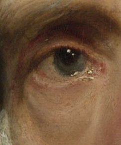
Portrait of Cornelis van der Geest (detail)
Anthony van Dyck
about 1620
Oil on oak, 37.5 x 32.5 cm.
National Gallery, London
A highlight is the bright spot of light that appears on shiny objects when light shines on them. Highlights were as important for painters of the seventeenth century as they are in 3-D computer graphics, as they provide a strong visual cue for the shape of an object and its location with respect to light sources in the scene. The correct understanding of the nature of natural highlights and the techniques for representing them is of utmost importance to the illusionist painter. If a highlight is not painted properly, the observer will be unable to apprehend the material and/or texture of the underlying object and the direction and intensity of light. Many painters can be identified by their handling of highlights alone.
Highlights inform if the direction the light is coming in from and how shiny or dull the surface of the object is. A shiny surface is represented by specular highlights that are very light in comparison to the neighboring values and have sharp, well-defined edges like metal or catchlights in the eyes. A dull object, like cotton fabric, will be represented by highlights that are just a bit lighter in value and it's hard to tell exactly where they blend into the next value of light.
Although highlights can be applied wet-in-wet, the strongest strong highlights are best superimposed over dry paint. Particularly suggestive are strong highlights laid in with heavy impasto and a quick touch. This technique makes the painted highlight "stand up" in relief above the underlying object and seems even brighter than the tone of the highlight itself since it cast a small shadow to one of its sides. This manner of painting highlights is usually employed to render the catchtlights of eyes the highlights of shiny metal and jewels.
Dutch artists had become particularly adept in painting of highlights and had largely codified the color, value and painterly touch for the highlights of every conceivable natural and man-made object. A faint touch of ultramarine added to white lends satin or bird feathers a gossamer softness while a bit of lead-tin yellow was added to the highlights of deep green foliage.
History Painting (Italian: Istoria or Historia)
A history painting is one that has a serious narrative, or includes exemplars of actions intended to have didactic overtones. In this sense the word "history" relates to the Italian istoria, meaning narrative or story (and not the accurate or documentary description of actual events). History paintings are often large in scale. Their subjects can be taken from the Bible, from mythology or other forms of secular literature, from historical events; or they can be allegories. Noble themes are seen as being particularly worthy of depiction.
History painting was viewed as the most important of the genres from about the sixteenth century, and the climax of an academic painter's training. It was the equivalent of Epic or Tragedy in literature.
"In the Netherlands, history painting, which was once the pinnacle of pictorial art, gradually became a minority art. Most young painters opted for a specialist career in one of the categories of painting that were menaced by realism. This was also, of course, a result of the economic situation within which they had to find a living as professional painters."R. H. Fuchs, 1976, 62.
Although history painting had once been the dominant mode in all of Europe, in the Netherlands it was largely replaced, at least numerically, by still life, landscape and genre painting. Nonetheless, art writers and ambitious painters continued to advocate the classicist principles, which were at the foundation of history painting, throughout the seventeenth century until it asserted itself once again as a driving cultural force in the visual arts in the latter decades. Classicist theory, however, was not dogmatically adhered to in the Netherlands even by those who promoted it most strenuously. Karl van Mander (1548–1606) and later Gérard de Lairesse (1641–1711) wrote about history painting extensively.
Van Mander, who had exhorted painters to depict "memorable histories," painted some peasant scenes. Samuel van Hoogstraten (1627–1678), another Dutch theorist and painter, painted genre and trompe l'œil works, the latter of which has more to do with pictorial trickery than the search for uplifting content, even though he was awarded a medal by the Holy Roman Emperor for his efforts. Cesaer van Everdingen (1616/17–1678,, who was sometimes referred to as one of the Haarlem Classicists or Haarlem Academics, repeatedly depicted courtesans playing musical instruments or combing their hair.
De Lairesse, who opposed joint artistic efforts because it demeaned the role of the painter to the status of a mere specialist, is known to have employed Johannes Glauber to fill in landscape background in some of his works. Moreover, de Lairesse, like many figurative Dutch painters, was unable to repress his Dutch colleagues' quintessential fascination for the depictions of specific textures, especially fine satins, practically a hallmark of Dutch painting.
Whether Vermeer's initial impulse to be a history painter was stimulated by his artistic training, his conversion to Catholicism, or the hope of realizing prestigious princely or civic commissions in the nearby Hague, he abruptly altered his subject matter and style of painting a few years after being admitted to the guild. In any case, Vermeer was perhaps the only genre painter who was able to confer the moral seriousness and dignity associated with history painting to his representations of modern life.
Other than the Diana and her Companions and Christ in the House of Martha and Mary, Vermeer is known to have painted a third history painting, the Jupiter, Venus and Mercury and a Visit to the Tomb. The art historian Arthur K. Wheelock Jr. has attributed to Vermeer a youthful copy of a Saint Praxedis originally painted by the Italian painter Felice Ficherelli (1605–1660). This attribution has not been accepted by many in the Dutch art history community.
Houding
"Dutch artists and theorists often used the term houding to encompass the many pictorial tactics that might make a compelling mimetic painting. Vermeer's combination of spatial coherence, pleasing but unobtrusive surface design and harmonious coloring that went into the production of a lifelike pictorial world amounted to good houding."Mariët Westermann, "Vermeer and the Interior Imagination," in exh. cat. Vermeer and the Dutch Interior, ed. Alejandro Vergara (Madrid: Museo Nacional de Prado, 2003) 228.Although the term has bread some confusion among modern scholars, the art historian Paul Taylor describes houding as:
...a means of creating a sense of space in a picture. The artist must be careful not to allow the elements in a painting to be-come "packed together"; depth should be expressed lucidly and spatial relations should be clearly legible. If the artist succeeds in "placing each thing, without confusion, separate and well apart from the objects which are next to and around it," then an illusionistic space will be opened up in which the eye can roam: "as if [each object] were accessible with one's feet." Viewers are given the sense that they can stroll through a picture, walk round the table in some dining-room or saunter off down a riverside path.Paul Taylor, "The Concept of Houding in Dutch Art Theory," Journal of the Warburg and Courtauld Institutes, vol. 55 (1992), 212.
A contemporary definition by the Dutch art writer Willem Goeree (1635–1711) of houding is as follows:
Houding is that which binds everything together in a drawing or a painting, which makes things move to the front or the back, from the foreground to the middle ground and hence to the background to stand in its proper place without appearing farther away or closer, and without seeming lighter or darker than its distance warrants; so that everything stands out, without confusion, from things that adjoin and surround it, and has an unambiguous position through the proper use of size and color, and light and shadow, and so that the eye can naturally perceive the intervening space that distance between bodies which is left open and empty, both near and far, as though one might go there on foot, and everything stands in its proper space therein.
According to the art historian Paul Taylor, "Samuel van Hoogstraten (1627–1678), Gérard de Lairesse (1641–1711) and Joachim von Sandrart (1606–1688) seem to have agreed with Goeree that houding was an art vocabulary of the Golden Age. Hoogstraten and de Lairesse both devoted chapters of their books on painting to the term's elucidation. Sandrart claimed that to bring about proper houding in a work was "a very necessary rule.'"
for further information on houding, consult:
Paul Taylor, "The Concept of Houding in Dutch Art Theory," Journal of the Warburg and Courtauld Institutes, Vol. 55 (1992), pp. 210–232.
Hue
Hue is the first dimension of color. It is the quality by which we can distinguish one color from another. Hue is synonymous with color. The three primary colors (red, yellow and blue) are hues. Black and white are not hues. Primary colors cannot be related to one another on the basis of a common denominator, for this, they are perceived as absolute values.
Theoretically, all hues can be mixed from red, yellow and blue. Some nineteenth-century English watercolorists painted with only these three colors and were able to achieve naturalistic effects. However, even though primary colors in oil paints can be mixed to produce secondary colors, they usually generate hues of inferior brilliance, and it is impossible to recreate some of the most useful colors on the artist's palette, such as raw umber, alizeran crimson, black or burnt sienna. Other than their particular hues, traditional pigments possess physical characteristics that make them extremely desirable for a variety of reasons. The extraordinary depth of common black pigments cannot be approximated by any mixture of primary or secondary colors.
"Some say that the primary colors, seen individually or together, are less expressive than the secondary colors. There may be some element of truth in this, but the whole truth concerning color is never easy to pin down. There are some persons who profess a strong dislike for contrast of primaries and other bright hues. Perhaps the blatant use of colors in the omnipresent signs and advertisements has prejudiced them against straightforward, undiminished hues."Calvin Harlan, Vision & Invention, An Introduction to Art Fundamental (Englewood Cliffs NJ: Prentice Hall, 1986). In Vermeer's time, these exceptionally strong hues were part of the painter's "magic."
The secondary hues are green (blue plus yellow), orange (red plus yellow) and violet (red plus blue). Vermeer based most of his color harmonies on primary and neutral colors. Except in his very early works, oranges and purples are not found. While significant areas of green are more common they generally play a supportive role in the dominant color harmony. Secondary colors derive their character from the fact that they are intuitively perceived as hybrid. They possess a vibrating duality that primary colors do not.
Iconography
Iconographic analysis is used to establish the meaning of a particular work at a particular time. To identify the subject of an altarpiece as a Madonna and Child, however, explains nothing about the use of the altarpiece, how it fits into the surrounding culture, its economic import or what it may reveal about social and political issues of the period. These questions apply most naturally to the study of objects from the past but the same methods can be applied to contemporary art. What matters is the way the context is described and what kinds of relationships are established between it and the work or works being studied. This type of analysis is richest when it creates a web of very specific connections. To juxtapose a few generalizations about a historical context with a work from the period without suggesting any particular relationships between the two does not reveal very much.
Like so many kinds of writing about art, historical analysis became the subject of sustained investigation during the nineteenth century by scholars writing in German. Jacob Burckhardt (1818–1897) wrote the first major studies of art as an aspect of culture in his books about the Italian Renaissance, published during the 1860s. The idea that art should be considered primarily in terms of the economic structure that produced it rather than aesthetics was explored by Karl Marx (1818–1883).
The influence on art on culture, in its broadest definition, including politics, religion and social conventions as well as popular imagery and magical or irrational beliefs, became the subject of systematic study by Aby Warburg (1866–1929) in the late nineteenth and early twentieth centuries. Warburg and his followers Fritz Saxl (1890–1948) and Erwin Panofsky (1892–1968) elaborated the practice of identification and classification of motifs in images to using iconography as a means to understanding meaning. Panofsky codified an influential approach to iconography in his 1939 Studies in Iconology, where he defined it as "the branch of the history of art which concerns itself with the subject matter or meaning of works of art, as opposed to form," although the distinction he and other scholars drew between particular definitions of "iconography" (put simply, the identification of visual content) and "iconology" (the analysis of the meaning of that content), has not been generally accepted, though it is still used by some writers.
In the United States, where Panofsky immigrated in 1931, students such as Frederick Hartt, and Meyer Schapiro continued under his influence in the discipline. In an influential article of 1942, Introduction to an "Iconography of Mediaeval Architecture," Richard Krautheimer, a specialist on early medieval churches and another German émigré, extended iconographical analysis to architectural forms.
The period from 1940 can be seen as one where iconography was especially prominent in art history. Whereas most icongraphical scholarship remains highly dense and specialized, some analyses began to attract a much wider audience, for example, Panofsky's theory (now generally out of favor with specialists) that the writing on the rear wall in the Arnolfini Portrait by Jan van Eyck (before c. 1390 1441) turned the painting into the record of a marriage contract. Holbein's The Ambassadors has been the subject of books for a general market with new theories as to its iconography, and the best-sellers of Dan Brown include theories, disowned by most art historians, on the iconography of works by Leonardo da Vinci (1452–1519).
Although the study of iconography in Dutch art has been a subject that has fascinated scholars for a good part of the twentieth century, there exist a number of controversial points to be resolved. Moreover, there exist no period texts which helps to explain either how or to what degree a painter should employ iconographical meaning. It should be also considered that an artist may have used iconography consciously; probably just as often, in a semi-conscious way.
An artist can be said to have a personal iconography, which is often noted and analyzed by others, including art historians, critics, writers and the public.
Perhaps the simplest explanation for the lack of period writing on iconographical interpretation of Dutch genre paintings is that everyone, including the lower class, already knew their meaning quite well. Thus, what was common knowledge in those times and had no reason to be written became in our time an intricate, but largely uncertain, science.
Any reader who is fairly familiar with modern Vermeer literature has certainly noticed the abundance of iconographic studies of Vermeer's painting. The topic was initially touched on by P.T.A. Swillens (1950) and Lawrence Gowing (1952) in their respective monographs dedicated to the Delft master. From the early sixties onwards, Vermeer's painting were believed to have allusive, allegorical or emblematic character. "In particular Eddy de Jongh—although not the first to do so—believed that many Dutch paintings, including Vermeer's, should be interpreted in the light of "prints in contemporary emblem books that are accompanied by mottoes and verses that together produce a didactic, ethical or proverbial conceit."Calvin Harlan, Vision & Invention, An Introduction to Art Fundamentals ( Englewood Cliffs NJ: Prentice Hall, 1986).
De Jongh ("On Balance," in Vermeer Studies, 1998) pointed out that "even though there exists a remarkable agreement about Vermeer's artistic stature, modern scholars have still have not reached a common stand as to the meaning that Vermeer may have invested in his painting. A methodological battle on the question of form and content in seventeenth-century Dutch art and has been waged for more than a decade, with a partial return to the idea of art for art's sake. Most Vermeer scholars, though, take a different view. They usually do not doubt Vermeer's intention of investing his work with meaning. The question is merely what was that meaning and, above all, whether it can still be deciphered."
In any case, in order to arrive at a full understanding of a painting's iconographical content, it is best to tconsider not only of the supposed iconographical significance but also the general mood of the work which at times may seem contradictory to the initial iconographic reading.
Iconologia
The Iconologia of Cesare Ripa was conceived as a guide to the symbolism in emblem books. It was very influential in the seventeenth century and went through numerous editions. There were 9 Italian editions: 1593, 1603, 1611, 1613, 1618, 1625, 1630, 1645, 1764-7 and 8 non-Italian editions in other languages, 1644 French, 1644 Dutch, 1699 Dutch, 1704 German, 1709 English, 1760 German, 1766 French and 1779 English. Both the text and the emblems included in these editions wary greatly, and later editions use Ripa's idea rather than following his text. Although it does not contain alchemical material as such, it does provide keys to the allegorical symbolism used in the hermetic tradition.
Iconologia was extremely influential in the seventeenth and eighteenth centuries and was quoted extensively in various art forms. In particular, it influenced the painter Pietro da Cortona (1596/7–1669) and his followers. Also, Dutch painters like Gérard de Lairesse (1641–1711), Willem van Mieris (1662–1747) based some of their works on Ripa's emblems. Vermeer used the emblem for the muse Clio for his The Art of Painting, and several others in his The Allegory of Faith. A large part of the work of the Dutch Vondel cannot be understood without consulting this allegorical source. The ornamentation of the Amsterdam townhall by Artus Quellinus the Elder (1609–1668), a sculptor, is totally dependent on Ripa. An English translation appeared in 1709 by Pierce Tempest.
Illusionism
The principal characteristic of an artwork that attempts to convince viewers that they are not looking at a representation but at the thing itself. In other words, illusionism means making an image as "realistic," in the conventional sense of the word, as possible. Especially when accompanied by the word "optical," "illusion" is often used to indicate an image that we recognize as playing a deliberate trick on us, like alternating figures. This is precisely not what is meant by "illusionism," which refers instead to coherent images which pass for the real.
The closest one can get to come to understanding the attitudes towards realism and illusionism in art theory in Vermeer's time is Samuel van Hoogstraten's (1627–1678) Inleyding tot de Hooge Schoole der Schilderkonst (Rotterdam, 1678). Van Hoogstraten was a multi-faceted artist who painted biblical subjects in the style of Rembrandt (1606–1669), genre scenes, portraits and tromp l'œil still lifes. As a consequence, his theoretical treatise, which is an amalgamation of many ideas drawn from the classics, Italian art theory and his own experience, provides a relatively reliable glimpse into the intellectual concerns that must have been shared by many of Hoogestraten's contemporaries.
Van Hoogstraten provided the following ideal for an artist as well as the requirements necessary to achieve that ideal:
I say that a painter, whose work is to fool the sense of sight, also must have so much understanding of the nature of things that he thoroughly understands the means by which the eye is deceived.
According to Hoogstraten, then the artist's work is to fool the eye, to make the viewer believe that the image seen is an entirely different reality. The success of such understanding of the laws of nature and "the means by which the eye is deceived." For Hoogstraten the means explicitly included the workings of vision and the theories of perspective, but also implicitly an understanding of the psychological expectations of a viewer encountering an illusionist image.Ivan Gaskell, Vermeer's Vermeer's Wager (Essays in Art and Culture) ( London: Reaktion Books, 2000) 45.
The notion that a painting should deceive the eye with its illusionism dates back to antiquity. In his Natural History, Pliny described a competition between the artists Parrhasius and Zeuxis, both of whom were intent on creating images that fooled the viewer into believing that the objects depicted were real. Parrhasius won when he painted a curtain so skillfully that Zeuxis tried to lift it to see the image beneath. We are reminded of this story by the large tapestry in Vermeer's painting, which seems to have been drawn aside to reveal the allegorical scene. Its convincing heavy folds, colors and textures, which Vermeer suggests with multicolored highlights accenting the nubs of the weave, urge us to push it back even further to reveal more of the room behind it.
Impasto
Paint applied in outstanding heavy layers or strokes; also, any thickness or roughness of paint or deep brush marks, as distinguished from a flat, smooth surface which enhances the effect of texture or of illumination. Some Dutch fijnschilderer were so taken to the representation of texture that they pressed a piece of cloth to the almost dry area of paint which represented some kind of course fabric in order to mimic its texture. Rembrandt (1606–1669), in particular, is noted for his use of impasto. A critic of the time once remarked that his portraits were painted with such high paint relief that "they could be picked up by their nose."
Vermeer used impasto above all in his early works. For example, in A Maid Asleep, the carpet in the foreground has been reinforced with rough impasto application of paint. He took great care to re-create the interwoven patterns of the fabric and one can almost feel the material presence of the carpet's knotty texture.
Vermeer, like many painters of the time, used impasto for another reason; that of enhancing the effect of light. The most strongly light areas of his compositions are often painted with heavy impasto and so become, literally, the most eye-catching areas.
Vermeer's contemporary Samuel van Hoogstraten (1627–1678), artist and art theoretician, was aware of another important characteristic of textured paint. "I maintain that perceptibility alone makes objects appear closer at hand, and conversely that smoothness makes the withdraw, and I therefore desire that which is to appear in the foreground, be painted roughly and briskly,..." By contrast, shadowed areas were usually more vaguely defined with thin transparent or semi-transparent layers of paint.
Some areas of impasto in Vermeer's works have lost their original relief owing to restorations in which hot irons were employed in the process of relining the original unstable or worn canvas.
Imprimitura
Imprimatura is a term used in painting, meaning an initial stain of color painted on a ground. It provides a painter with a transparent, toned ground, which will allow light falling onto the painting to reflect through the paint layers. The term itself is an Italian word and means "first paint layer." Its use as an underpainting layer can be dated back to the guilds and workshops during the Middle Ages; however, it comes into standard use by painters during the Renaissance, particularly in Italy.
The imprimatura provides not only an overall tonal optical unity in a painting but is also useful in the initial stages of the work since it helps the painter establish value relations from dark to light. It is most useful in the classical approach of indirect painting, where the drawing and underpainting are established ahead of time and allowed to dry. The successive layers of color are then applied in transparent glaze or semi-transparent layers.
Care is taken not to cover the imprimatura completely allowing it to show through the final paint layers, this is effective in particular in the middle to dark shadowed areas of the work. An imprimatura can be generic, not specific to the subject being painted on top of it, or it can be specifically adapted to the subject being painted. The painter should be conscious of how the imprimatura is going to affect later stages in the painting. If an imprimatura is too dark and gray, it will drag down the luminosity of the colors laid on top of it. On the other hand, if it is too light, it will make the depiction of shadows more time-consuming.
Influence
Influence is the capacity or power of persons or things to be a compelling force on or produce effects on the actions, behavior, opinions, etc., of others. The Shorter Oxford Dictionary states that the term "influence" was originally an astrological term, used to signify an emanation from the stars (into a person or thing) of any kind of divine or secret power or principle.
In a sizable part, modern art history is dominated by the study of influences; how artists may be influenced by myriad environmental factors and, in particular, by the works of other artists. However, the task of tracing influence in the arts is not an easy one. Painters may be influenced by styles of painting (past and present) and other arts (past and present), art theory, popular imagery, social conditions or events, religion, state, philosophy, scientific discovery, the requests of patrons and market pressure. Strictly speaking, he may also be influenced by his own social origin, personal relationships, gender and mental conditions such as conscious beliefs, unconscious psychological impulses, greed, desire for fame, love or art or even divine inspiration.
Since they enable and dictate, both the costs and the inherent properties of the materials which the painter employs also influence the results of his production. Even climatic conditions may have had an influence on the painter's ability to realize his goals. For example, the significant number of heavily overcast days in the Netherlands, when light is dim even at midday, may explain why Dutch painters, with respects to painters of other schools of art, were so sensitive to the activities of light. As time passes, more art is produced exposing painters to an ever-increasing amount of possible influences.
When attempting to understand the work of painters, or schools of painters, art historians may contemporarily investigate a variety of influences which he or she might hold particularly relevant to that painter's production although he or she may also choose to investigate a single form of influence in isolation from all the rest. For example, Jeongmu Yang,Jeongmu Yang, "Giovanni Bellini; Experience and Experiment in Venetian Painting, c. 1460 to 1516," Phd dissertation submitted in partial fulfillment of the requirements for the degree of Doctor of Philosophy History of Art University College London, University of London, 1998. http://discovery.ucl.ac.uk/1318058/1/321952.pdf investigated the painting of Venetian painter Giovanni Bellini (c. 1430–1516) in the light of the rise of oil painting and the availability and costs of pigments. John Michael Montias, the American economist turned art historian, investigated the influence of economics on the style of seventeenth-century Dutch painters through "collected evidence on the economic status of the artists…in the Golden Age: the taxes they remitted; the prices they paid for their houses; the gifts their family made to charity after their death."John Michael Montias, "The influence of economic factors on style, De zeventiende eeuw 6," Summer 1 (1990), 49. http://www.dbnl.org/tekst/_zev001199001_01/_zev001199001_01_0007.php
Infrared Reflectography
Woman with a Pearl Necklace (IRR image)
Johannes Vermeer
c. 1662–1665
Oil on canvas, 55 x 45 cm.
Staatliche Museen Preußischer Kulturbesitz, Gemäldegalerie, Berlin
Developed in the late 1960s by Dutch physicist J. R. J. van Asperen de Boer, infrared reflectography (IRR) is a non-destructive imaging technique that is used to study the presence of specific pigments which may lie beneath visible paint layers. IRR can provide important information for art historians since changes in composition can be detected during the different phases of a painting's execution. IRR can also detect paint losses and retouchings, sometimes invisible to the naked eye. Infrared radiation allows us to "see through" paint layers that are impenetrable to the human eye since it passes through paint until it reaches something that absorbs it, or is reflected back to the camera. Infrared light has too long a wavelength to see, but it can however be photographed. IRR can penetrate through most thinly painted oil paints, except carbon black which was often a component of artist's materials such as graphite, charcoal and ink, during the early stages of the painting process and as an additive to darken other pigments. The resulting image, known as an infrared reflectogram, is converted digitally by software, producing a black and white image on the computer monitor. Since IRR detects black materials it is a perfect complement to X-radiography, which typically registers lighter materials, principally lead white ubiquitously employed by seventeenth-century European painters.
Art historians nowadays use this method widely, indeed it turns out to be mandatory to obtain precious information on the author's technique and the graphical means used to draw. Other important data can be found using this technique, among these are: writings, signatures and dates, originally under the paint layer, or covered by restorations done before the reflectography. In other cases, the analysis of the reflectogram reveals significant variations in the composition of the artwork with respect to its final version, or pentimenti of the author, and even sketches of objects without any relation to the painting as it is seen today. Reflectography is often used also by restorers. In many cases, it eases the analysis of the creative genesis of the artwork and reveals previous restoration actions. IR reflectography is performed by using various devices.
A main drawback of IRR is the time consumption necessary for manually mounting many mosaic pictures, using dedicated software. This is particularly true for paintings of great dimension, where scaffolding has to be constructed for the investigation in situ because the camera has to be positioned relatively close to the artwork.
Many alterations that Vermeer made in the course of the painting process painting have come to light with the aid of infrared reflectography. It has been discovered that Vermeer altered his compositions in order to achieve greater balance and at the same time define the work's theme more precisely. One of the most striking examples revealed by infrared reflectography can be found in the Girl with a Pearl Necklace. The composite infrared reflectography image shows that a map similar to the one which hangs in The Art of Painting was initially hung directly behind the standing girl. Some kind of musical instrument, very likely a cittern, was placed on the foreground chair and the dark blue cloth which hangs from the table once revealed more of the floor tiles underneath the table.
Interior Painting
"Between approximately 1650 and 1675, some of the most beautiful scenes of domestic interiors ever painter were produced in the Netherlands. The real capital of this genre was Delft, where Pieter de Hooch and Vermeer represented spaces with startling illusionism and remarkable geometric perfection. These painters translated the genre scenes created by earlier artists into domestic interiors inspired by their own homes, imbuing then with an unprecedented freshness and evocative quality."Arthur K. Wheelock Jr., Vermeer and the Art of Painting (New York and New Haven: Yale University Press, 1995) 14.
"There is a substantial difference between the interiors painted after around 1650 and those of the first half of the century in their treatment of subject matter and pictorial space. The subjects depicted (domestic scenes, amorous subjects and gathering of festive and other types) are no longer defined through their association with religious senses, series of the Four Seasons or the Five Senses, or illustrations of proverbs, but rather have acquired their own identity as a genre. The paintings inevitably continue to act as vehicles for different contents, but these are often these are less specific and present themselves in an ambiguous fashion and less overtly than in earlier works.
 Self-portrait with Saskia in the Scene of the Prodigal Son in the Tavern
 Rembrandt van Rijn
Oil on canvas, 161 x 131 cm.
Gemäldegalerie, Dresden
Most of the genre paintings produced in this period take place in an interior, generally inspired by elegant homes of the middle classes. They reflect concepts that were important to the Dutch culture such as family, privacy, intimacy, comfort and luxury, encouraging the spectator to think about issues relevant to his or her daily life, sometimes with touches of humor. Both from an anthropological and viewpoint as well as an architectural and decorative one, the home acquired an enormous importance in Holland in the second half of the seventeenth century: the physical space of the upper-middle classes expanded as the consequence of their growing wealth, dividing itself up into more spaces and offering to its inhabitants greater comfort and more private areas. The way that genre painting moved indoors undoubtedly reflects this new interest on the part of the Dutch at hits time in then space in which the played out their domestic lives."Alejandro Vergara ed., Vermeer and the Dutch Interior ( Madrid: Museo Nacional Del Prado, 2003) 201.
Even though the most striking as aspect of Dutch genre interiors is their ability to recreate space, texture and light in a realistic way, it should be remembered that they portrayed a modified reality.
Because the splendid marble floors can be seen in most genre pictures from the middle and the third quarter of the seventeenth century, we have been led to believe that they were present in nearly all well-to-do interiors. However, it seems doubtful that genre painters, Vermeer included, could have directly observed and painted this type of marble tile in his own studio.
In fact, C. Willemijn Fock, a historian of the decorative arts, has demonstrated that floors paved with marble tiles were extremely rare in the Dutch seventeenth-century houses and that only in the homes of the very wealthy where floors of this type were sometimes found, they were usually confined to smaller spaces such as voorhuis, corridors and upper story sleeping or storage rooms. Fock reasons that the numerous representations of these floors in Dutch genre painting may be explained by the fact that "artists were attracted by the challenge involved in representing the difficult perspective of receding multicolored marble tiling."
At the time, wooden floors were almost ubiquitous being eminently practical for the long gelid Dutch winters. These floors were so practical that they were found in houses of the very wealthy and can be observed in the paintings. An excellent example of such flooring is found in a portrait of Constantijn Huygens (1596–1687) in which expensive globes and scientific instruments. Another such wooden floor is featured in Gerrit Borch Parental Admonition in the Rijksmuseum. Although other Dutch genre painters had also depicted the black and white marble floors or the smaller warm-toned ceramic tiles of his earlier works, Vermeer may have painted these wooden floors in The Milkmaid, The Geographer and The Maid Asleep. However, they are not rendered with the same degree of accuracy as in Gerrit ter Borch's (1617–1681) work.
Italianists
Throughout Europe, Italy was the art center of the world during the sixteenth century. From the sixteenth century onwards, Dutch artists traveled to Italy regularly to study the works of art from classical antiquity and the Renaissance. Once in Italy, the artists were inspired by the landscape and the Mediterranean light. The works produced by these artists were exceptionally popular in the Netherlands. Known as "Italianists," they had a major influence on the artists who remained in the Netherlands, such as Nicolaes Berchem (1620–1683) and Aelbert Jacobsz Cuyp 1620–1691), who also took to painting Italian landscapes, even though they themselves had never been to Italy.
From approximately 1640 onwards various Dutch artists focused specifically on painting sunny southern landscapes. Chief among the Italianists were Bartholomeus Breenbergh (1598–after 1657), Andries (1612/1613–1642) and Jan Both (1610–1652), Nicolaes Berchem (1620–1683), and Jan Asselijn (c.1610–1652). The Both brothers, of Utrecht, were to some degree rivals of the Haarlem-born Berchem. Andries painted the figures that populated Jan's landscapes. Berchem's own compositions were largely derived from the Arcadian landscapes of the French painter Claude Lorrain (1600–1682); a typical scene would contain shepherds grazing their flocks among Classical ruins, bathed in a golden haze. Upon his return to the Netherlands, Berchem occasionally worked in cooperation with the local painters and is said to have supplied figures in works of both Jacob van Ruisdael (c. 1629–1682) and Meindert Hobbema (1638–1709).
Invention (Italian: invenzione)
Invention is an art-historical term for the development of a composition or, in the case of a history painting, a narrative concept in the broadest sense—the formulation of the artist's creative idea—in the mind of the painter. Invention (invenzione), which presumably issues from the mind was considered inherently superior to imitation (imitazione) which instead, issues from the senses.
Painters produced sketches, studies and cartoons to aid the execution of finished pictures, especially frescoes. In addition to their practical functions, during the Renaissance, drawings were increasingly viewed as a manifestation of the artistic process of invention. Drawings became valued for showing the inner workings of a great artist's mind and were collected and preserved by early connoisseurs.
 or anything else that isn't working as it should be, I'd love to hear it! Please write me at: