The Painter's Studio in the Netherlands
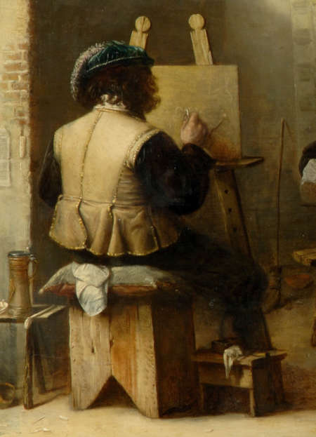
In the seventeenth century, most painters kept their studios in their homes, often in the upper story where dust and noise might be less intrusive. But not all artists' studios were laid out in the same way. The landscape painter had different requirements from the still-life and portrait painter (fig. 1), these were again different from those who painted interiors only. The first always worked from drawings and sketches he had made on his trips by field and path, and therefore a space with only one window was sufficient. If he got enough light on his work he was satisfied; it was not necessary to group anything but a few drawings on the floor nearby his easel. The still-life painter collected the objects of his choice and arranged them on a small table, painting them directly and from close range. He too had need of no more space. The portrait painter, instead, required more space and a larger window to cast light on both his sitter and his easel while remaining at a comfortable distance from the subject, as many representations clearly demonstrate.H. Perry Chapman, "The Imagined Studios of Rembrandt and Vermeer," in Inventions of the Studio: Renaissance to Romanticism, eds. Michael Cole and Mary Pardo (2005), 127.
The painter of interiors needed more space still. If he had the opportunity, he liked to work in an environment with at least two windows, which afforded him the possibility to distance himself from the subject as well as the opportunity to open and close the windows to create compositional alternatives and interesting atmospheres. History painters often found a separate studio (schilderhuys) necessary.

Frans van Mieris
c. 1657
Oil on panel
formerly Gemäldegalerie, Dresden (lost in WWII)
The most important points to consider for an ideal studio were the size of the room and the lighting. The German art historian and painter Joachim von Sandrart (1606–1688) wrote that studios ought to be about 9 meters square and illuminated sufficiently, although direct rays of the sun should be avoided. He wrote:
Many of our forefathers have erred in that too small chambers, everywhere filled with light and sunshine, served them for their work: whereby lacking the space and the necessary distance to walk far enough back and forth from their model or panel, to inspect their work from a distance as well as the strength of the light so that all colors become diminished and confused to them. They would, if they had been in a proper studio, have given their excellent works far more life, force and veracity?
The most advantageous system of illumination was to be obtained in studios with large windows divided into four squares, called "cross-windows" Nonetheless, there are various paintings that show light coming from a window built high up on the wall, for example in The Painter's Studio, by Joost van Craesbeeck (c. 1605/1606–c. 1660; fig. 2). A workshop scene by Jan Miense Molenaer (1610–1668; fig. 3) shows plainly another high-set window of this kind.
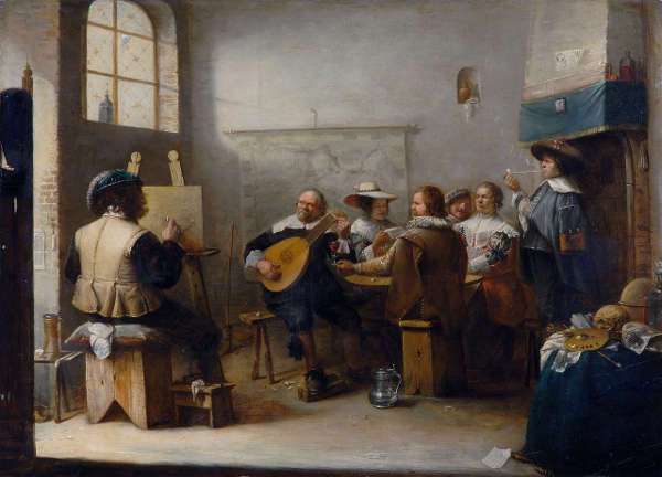
Joos van Craesbeeck
1655
Oil on panel, 48.5 x 66 cm.
Frits Lugt Collection, Paris
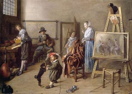
Jan Miense Molenaer
1631
Oil on canvas, 86 x 127 cm.
Staatliche Museen, Berlin
If the incoming light was too bright, it could be mitigated with an additional wooden frame fitted over the window covered with cheesecloth or oiled paper (blaffeturen). One of the few, if not the only, representations of such an article is found in painting by Jacob van Spreeuwen (1611–1658) which is in a private collection in Sweden (fig. 4). The screen is clearly visible in the window, and can by no means be mistaken for a pane of glass, as no panes of that size existed at that period. At best, the Dutch painter had up to fifteen hours of light a day in the summer but only about three or four hours in the winter. Candles and oil lamps could be used as a source of illumination if daylight was unavailable although both create light that is ill-adapted for painting, with the consequence that colors applied under artificial light appeared radically different when viewed in natural light. However, artificial light was ideal for drawing because the shadows it projects are more marked than those produced by filtered studio light. Dust was one of the most insidious enemies of the fine painter. In a painting by Adriaen van Ostade (1610–1685) a piece of linen is suspended under the roof to keep the dust from coming through. A work by Gerrit Dou (1613–1675) show a Japanese umbrella fastened to the top of the easel for the same purpose. It is said that when commencing to paint Dou sat in front of his easel for half and hour to allow the dust to settle.
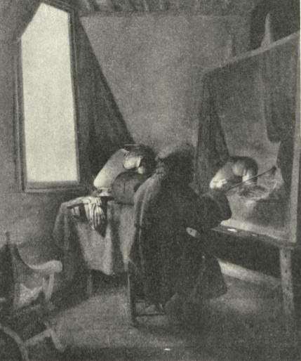
Jacob van Spreeuwen
Collection Braunerhielm, Djursholm
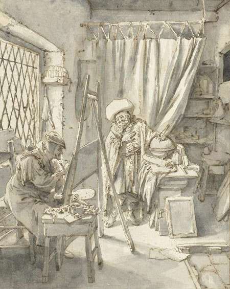
Cornelis Dusart
1690–1700
Paper, 24 x 19 cm.
Rijksmuseum, Amsterdam
The many painting studios (schilder-camer or painting-room) pictured in the Golden Age range in size and decor but often portray common elements. In those of the vast army of artist-artisans who were barely able to make ends meet, no luxury items can be found; nothing but the most elementary utensils and props are visible (fig. 5 & 6). The floor is made of wide wooden planks or paved with simple stones. The walls are whitewashed or constructed with crude wooden planks. Ceilings are supported by precarious-looking wooden beams. In a background room, an apprentice or journeyman is often pictured grinding paint or preparing palettes. Occasionally, the apprentice is seen working in the same room as the master artist. A large grinding stone is never lacking. Not only do such pictures show us this indispensable article repeatedly, but written statements also mention it—one such object was described in a posthumous inventory of movable goods in of Vermeer as "a stone table for grinding paints." The most famous rendition of this inglorious but indispensable tool is featured in an early self-portrait by Rembrandt (Artist in his Studio, c. 1628; fig. 7). From what we can observe, Dutch studios were always lit from the side. Top light, which appears in many scenes of artists' studios of the eighteenth century, was never used. Only Rubens seems to have painted using top lighting.
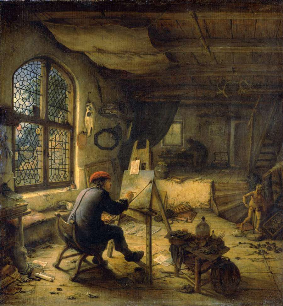
Adriaen van Ostade
1663
Oil on oak wood, 38 x 35.5 cm,
Gemäldegalerie Alte Meister, Dresden
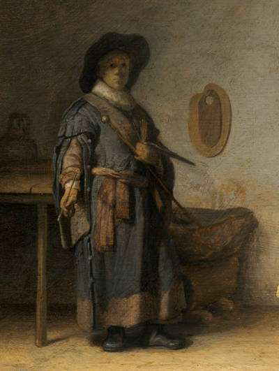
Rembrandt van Rijn
c. 1628
Oil on panel, 24.8 x 31.7 cm.
Museum of Fine Arts, Boston
The contents of the studio depended not only on the character of the painter's work but also on his means, although certain pieces of furniture and equipment were indispensable, such as an easel, a stool, a cabinet for storing brushes, lumps of raw pigment, ground pigments, drying oils, and essences. Plaster casts of classical sculpture were extensively used for instruction and can be seen in almost any portrayal of an artist's studio of the time (fig. 9). Skulls too are constantly pictured and not only in the studios of painters who devoted themselves to Vanitas still-life genre. The artists who were most successful in painting ducks are known to have kept them in their gardens. Otto Marseus (c. 1613–1678), famous as a painter of insects and reptiles, kept his "models" in a building behind his house to study them at his convenience. On the other hand, flower painters worked extensively from prints or sketches, usually in watercolor, that they had done during the blooming seasons, allowing them to create rich but completely impossible flower arrangements throughout the entire year. If they could afford it, figure painters, especially interior painters, usually had a mannequin on which they could arrange fancy costumes. Some painters, like Rembrandt (1606–1669), collected exotic costumes, natural oddities, weapons, etc. The small army of Rembrandt's followers depicted books, globes (fig. 10), musical instruments, swords, and any number of exotic props haphazardly heaped up in a foreground corner of the composition. In Caspar Netscher's (1639–1684) studio various pieces of fine silk and satin fabric were inventoried after the artist's death. Some painters owned the Turkish carpets which appear repeatedly in their works, and occasionally lent them to their colleagues. Inexpensive musical instruments such as flutes, fiddles, citterns and lutes were also common features in artists' studios. However, luxury items such as keyboard instruments, tapestries, and chandeliers would have been borrowed for the occasion. Although it is not exactly clear why, artists seem to have had a particular liking for convex mirrors and crystal balls, perhaps in order to study the bizarre manners in which the world is reflected in them. A few Dutch painters portrayed themselves in the reflections of a glass ball, such as a Vanitas still- life by Pieter Claesz. (1628; fig. 8).
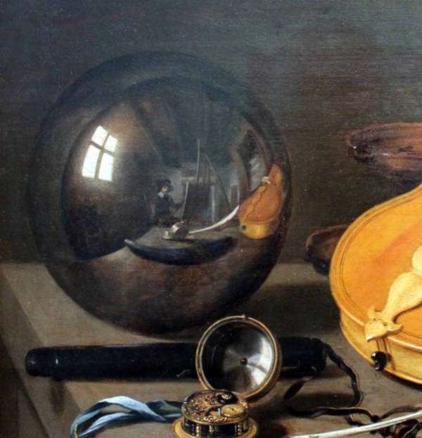
Pieter Claesz.
c. 1628
Oil on oak, 35.9 x 59 cm.
Germanisches Nationalmuseum, Nuremberg
At any rate, some of the more unusual items undoubtedly added to the exotic ambiance, charming visiting connoisseurs and clients alike.
We can assume that the most commonplace objects that we see in a number of Vermeer's interiors, such as the assorted chairs, mirrors, tables, wine jugs, drinking glasses, cushions and tablecloths, were his own. Others may have been borrowed for the sake of variety. Various inventories suggest that a few of the more expensive items, such as the large silver ewer, the Cupid and bordello paintings that hang on the back walls, were those in which he traded or property of his well-to-do mother-in-law, who owned a discreet collection of paintings. However, the most expensive objects, such as the gilt chandelier, woven tapestries, virginals, harpsichord and Turkish carpets, were probably above the living standards of the artist or his mother-in-law and were lent to him by supportive patrons or friendly connoisseurs who were happy to collaborate on the master's next masterpiece. The citterns and lutes, both fairly affordable objects, were the property of the painter, perhaps inherited from his grandfather, who was a professional musician.
We can assume that the most commonplace objects that we see in Vermeer's interiors, such as the assorted chairs, mirrors, tables, wine jugs, drinking glasses, cushions, and tablecloths, were his own. Others may have been borrowed for the sake of variety. The probate inventory of movable goods of 1675 suggest that a few of the more expensive items, such as the large silver ewer, the Cupid, and bordello paintings that hang on the back walls, were those in which he traded or property of his well-to-do mother-in-law, who owned a discreet collection of paintings. However, the most expensive objects, such as the gilt chandelier, woven tapestries, virginals, harpsichord, and Turkish carpets, were probably above the living standards of the artist or his mother-in-law and were lent to him by supportive patrons or friendly connoisseurs who were happy to collaborate in the master's next masterpiece. The citterns and lutes, both fairly affordable objects, were the property of the painter, perhaps inherited from his grandfather, who was a professional musician.
Jan ter Borch
1634
Oil on canvas, 120 x 159 cm.
Rijksmuseum, Amsterdam
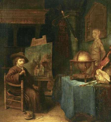
Pieter Corneisz van Egmondt
Oil on panel, 34.6 x 30.6 cm.
Private collection
Vermeer's studio
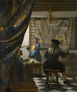
Johannes Vermeer
c. 1662–1668
Oil on canvas, 120 x 100 cm.
Kunsthistorisches Museum, Vienna
How did Vermeer paint? If The Art of Painting (fig. 11) were a literal representation of the artist's studio, we would have a fairly good picture of how he worked. However, the painting is neither an autobiographical statement nor a "painted photograph" of Vermeer at his easel. It is an ideal representation made explicitly to trumpet the painter's elevated social position and learning, as well as to showcase his technical prowess and exceptional pictorial intellect. There exist, in fact, numerous discrepancies between the real working habits of seventeenth-century painters and those illustrated in The Art of Painting. The fact that Vermeer represented the painter beginning with Clio's laurel wreath alone should probably be taken as a measure of the iconographic significance of the wreath rather than literal evidence that, for example, Vermeer painted figures from the top down.Melanie Gifford, "Painting Light: Recent Observationson Vermeer's Technique," in Vermeer Studies, ed. Ivan Gaskell and Michiel Jonker (Washington D.C.: National Gallery of Art; New Haven and London: Yale University, 1998), 198, n.17. While the drawing on the canvas is made with white paint or chalk, microscopic examination of the painting itself proves that the artist used dark brown lines to define the outline of the arms of Clio, the chandelier and the map. The costume worn by the painter is anachronistic; few similar examples can be found in paintings of the same period. In almost every other representation of artists' studios, a small cabinet for the painter's equipment stands close to the painter's easel. It would be hard to imagine that the dandified artist in Vermeer's picture would have found it practical to walk back and forth countless times each day just to clean a dirty brush or lay a bit of paint on his palette. Nonetheless, The Art of Painting provides evidence of one of the most significant aspects of the Vermeer's working habits, and one that differed from those of his contemporaries: he worked largely in the same environment represented in his paintings. Vermeer painted from deliberately and carefully constructed scenes, which we might call mise-en-scènes, although they were not always furnished completely or exactly as we see in his pictures.
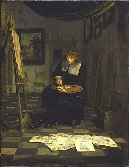 Fig. 12
 Michiel van Musscher
Oil on panel, 47.5 x 37 cm.
Dickinson Gallery, London and New York
In the seventeenth century, in fact, painting directly from nature was not a normal working method. As it has been pointed out, history painters and landscape painters generally created sets of drawings of the figures, background and props, and then combined them into complete compositions. An illustration of this practice can be seen in Michiel van Musscher's (1645–1705) The Artist in His Studio (1679; fig. 12), which portrays a young artist at work on a landscape as he mixes his paints and studies a group of sketches strewn out on the floor. Certainly, the highest-tier interior painters, such as Dou, Gerrit er Borch (1617–1681) and Frans van Mieris (1635–1681, also portrayed complete environments. But in many cases their works betray discrepancies in scale of the objects, lighting and perspective that suggest they were not painted from a single composite scene but artfully composed from objects viewed in different circumstances. Only Vermeer's paintings and Pieter de Hooch's (1629– 1684) finest Delft pieces, despite the sometimes awkward drawing of the latter, give the impression of the spatial unity and coherence of lighting that can be understood only from a concerted study of a single, extant environment from a unique point of view.
Informed specialists maintain that Vermeer probably worked in two or three different studios during his twenty-year career. This hypothesis is based on the differing structures and patterns of the side windows, although it cannot be ruled out that he painted in fewer rooms but introduced variants to make them look different, a practice which is particularly evident in the work of De Hooch. Henk Zantkuijl, former head of the Amsterdam Office of Monuments, suggested that the windows shown in some of Vermeer's earlier paintings might be rooms in Maria Thins' house; but according to Philip Steadman these are pictures dated to the period before Vermeer and his wife moved to Thins' house some time in the late 1650s. There has been speculation that the windows that the windows shown in The Astronomer and The Geographer belonged to the house of the Delft scientist Antony van Leeuwenhoek, although there is no objective evidence in this regard.
The locations of only two of the three proposed studios can be identified with any degree of plausibility. The first is the upper floor of his father's inn, called Mechelen. This conjecture is based on the architectural features of the early The Little Street, which supposedly gives a view of the façades of early Delft houses as seen from an upper floor window at the back of Mechelen across the canal on Voldersgracht. The houses were torn down to make way for the new Guild of Saint Luke soon after the artist depicted them. Some believe that the rustic-looking windows of the Officer and Laughing Girl and The Milkmaid suggest that both works were painted there as well. Tim Jenison has recently speculated that the patterned reflections of the window in the Officer and Laughing Girl reflect the some features of the arched entrance way of the Nieuwe Kerk as seen from a window of Vermeer's studio facing south toward the Markt at Mechelen. The second candidate, more credible than the first, is the Oude Langendijk studio, which is probably represented in The Music Lesson and other paintings with similarly constructed window fittings (fig. 13).
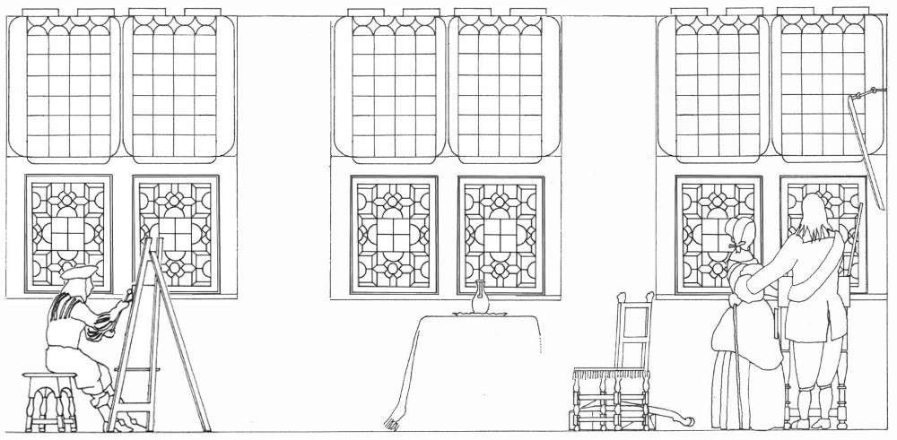
According to Steadman's estimates, this studio was about 6.6 meters deep, 4 meters wide, and about 3 meters high. The raw brick walls were layered with thick coats of whitewash to create a smooth, hygienic and light-reflective surface. Since it was located on the second floor, the brownish coloring of the glass panes of the window nearest to the background wall of The Music Lesson may possibly represent a part of the tower of the Nieuwe Kerk or other buildings nearby.Philip Steadman, Vermeer's Camera: Uncovering the Truth Behind the Masterpieces (Oxford: Oxford University Press, 2001). Vermeer's chief biographer, John Michael Montias, speculated that after his move to Oude Langendijk Vermeer might have maintained a studio in the family inn after this move to Oude Langendijk. In any case, archival evidence proves that Vermeer had a studio in a "front room" of his mother-in-law's house at one time or another, although the year in which he transferred his family to Oude Langendijk is not known precisely.
As is apparent from the information given above, it is generally assumed that Vermeer worked in a studio that was located within his private living quarters. Interestingly, however, it has recently been questioned if two paintings may have been executed outside this context. Huib Zuidervaart, of the History of Science Department of the Huygens Institute for the History of the Netherlands, has advanced an interesting theory on the origin of Vermeer's Glass of Wine and Girl with a Wine Glass, both of which represent the same ceramic floor tiles and an open window that features an identical coat of arms. Zuidervaart asserts that the two works were commissioned as wedding presents for two of the grandchildren of Moijses van Nederveen and Janetge de Vogel. Moijses and Van Nederveen came from a prominent Delft family that was one of the four local producers of gunpowder delivered to the Dutch army. which was one of the four local producers of gunpowder, delivered to the Dutch army. Although historians had previously identified the families to which the coat or arms belonged—the heraldic emblem is a combination of those belonging to the Van Nederveen and De Vogel families—no one had as of yet explained why Vermeer would have chosen to include such conspicuous elements into two ambitious compositions. Zuidervaart points out that the dates given to both paintings by Vermeer experts coincide with the dates of the weddings in question. Moreover, the symbolic implications of the coat of arms (the figure of the female virtue holding a crest) would appear in agreement with the idea as a wedding gift as well as being consistent with the background of Vermeer's presumed clients. Given that both paintings present not only the same window but the same set of ceramic tiles, which Vermeer never painted again, and having reasonably established the circumstances in which two paintings originated, Zuidervaart has cautiously advanced that Vermeer executed both works on the premises of the Van Nederveen/De Vogel residence in Delft, rather than in his private studio. This idea deserves proper consideration in that had the painter not executed his painting in the room where the window was originally located, he would have had to detach it and somehow fit it into the window frame of his own studio. In this event, either the Nederveen/De Vogel window had the same precise measurements of the window frame of Vermeer's own studio, or it would have been necessary to alter it to make it fit. While both solutions are possible, the simplest explanation, to which there seems to be no counter evidence, is that Vermeer painted both works at the Van Nederveen/De Vogel residence as Zuidervaart suggested.
Windows
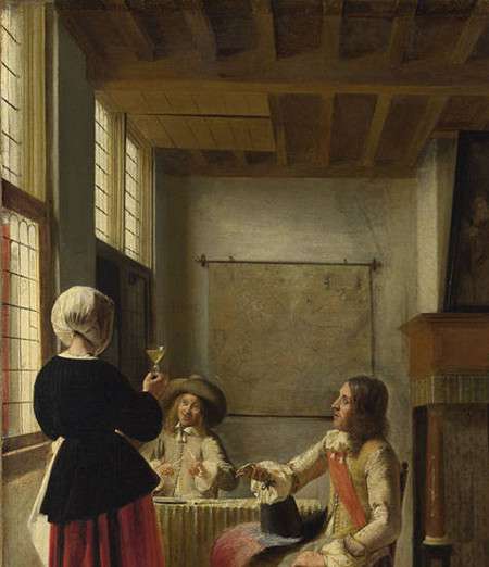
Pieter de Hooch
c. 1658
Oil on canvas, 73.7 x 64.6 cm.
National Gallery, London
The windows that appear in Vermeer's interiors are typical of Delft houses of the period. This type of window is called cross-window (kruisvenster in Dutch). In most cases a lintel, the horizontal separation between two compartments, was placed in the middle of the window so that the light and air compartments are the same size. Each window is divided into four sections, called lights. On the lower half of the frame there are two swinging windows, called casement windows (kloosterkozyn), attached to the frame by two hinges. The two upper lights are fixed. The casement window was divided into small square pieces of glass that is not fully transparent, held together by strips of lead or other metal, called "roede". This kind of window was usually equipped with external shutters over the lower casements only, which can be seen in Vermeer's The Little Street. In order to look outside, you had to open the shutters, which was not comfortable to do in the colder months of the year, although they were necessary for the purpose of security. Some paintings by De Hooch (fig. 14) show internal shutters on the upper lights, but they do not appear in any of Vermeer's paintings. Almost all the casements display decorative patterns formed from the shapes of their panes. The individual panes were held together by lead glazing bars/muntins ("roede" in Dutch). Three types of patterns can be easily distinguished, which, for convenience, Steadman dubbed "lozenge,"hourglass" and "squares and circles." The first type are apparent in the early Girl Reading a Letter by an Open Window<, Officer and Laughing Girl and The Milkmaid. The hourglass type is confined to two paintings: The Astronomer and The Geographer. The squares and circles type is by far the most complicated and can be seen in 8 different paintings. A fourth design of window is to be found uniquely in Lady Standing at the Virginal, which is similar to the lozenge type. In four paintings there are stained-glass panes. The structure and molding of the frames vary within types. Three sets of windows allowed Vermeer to improvise a variety of compositional solutions. Different parts of the windows could be opened and shut to create the interesting patterns of light and shadow, in which the painter obviously relished.
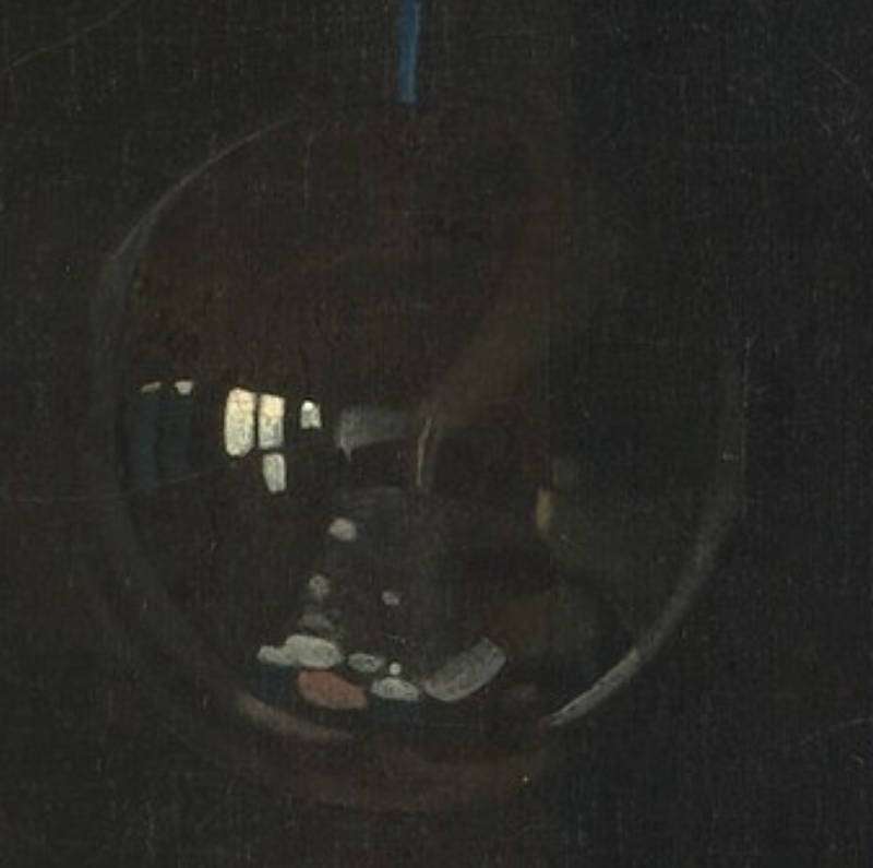
The mysterious glass globe (fig. 15) that hangs from the ceiling in the late Allegory of Faith confirms the three-window hypothesis.Glass globes seen in 17th-century Dutch paintings were often decorative fixtures or light sources that could also carry symbolic meanings. They were made using skilled glassblowing techniques and could be plain or highly decorated with engravings, etchings, or precious materials like gold leaf. The cost of these globes varied, with elaborate designs being quite expensive, signifying luxury and wealth. The process of making these globes was intricate and required skilled craftsmanship.The glass was typically clear, although colored glass was also used on occasion. Some of these globes would have been mouth-blown, while others could have been mold-blown for more complex designs. After the glass was blown and shaped, it would be cooled slowly to relieve internal stresses, a process known as annealing. Although the brushmarks that stand for the globe's reflectionsIn 1975, Eddy de Jongh identified an emblem from the 1636 book "Emblemata sacra de fide, spe, charitate" by Jesuit Guilielmus Hesius that contributes to understanding the symbolism of the reflecting sphere in art. The emblem shows a winged child holding a sphere on a thread, under the sun and in front of a cross, with both the sun and the cross reflected on the sphere's surface. Accompanying the image is a Latin explanation, translated to suggest that although the sphere is physically limited, it can reflect the entire universe, just as human spirit, when faithful to God, can grasp more than it can actually understand. The emblem emphasizes the notion that faith allows the human spirit to grasp the immeasurable. are rather abstracted, it is nonetheless possible to identify some features of the studio in which this picture was painted. The wobbly rectangular gray patch near the center of the globe represents a portion of the dimly lit back wall. According to Steadman, the playful "blurbs of light paint at the bottom of the sphere are most likely reflections of the woman's face, white skirt, and sleeves, and of the Bible on the table. At the center left we see reflections of the three windows of the room, none of which are portrayed in the painting itself. The middle window shows three clearly visible lights which describe an inverted L-shape. The leftmost window, which is the nearest to the background wall, is almost entirely curtained except for the tops of the lights. To the right there is another rectangular patch of light which may be upper light or lights of a third window, at the back of the room, adjacent to the back wall. This third window cannot be seen in any other painting, since it is behind the viewpoint of the painter in every case."
c. 1670–1674
Oil on canvas
114.3 x 88.9 cm.
Metropolitan Museum of Art, New York
The most practical way to paint was to position the easel directly below the second or third window. The broader, multi-figure scenes would have required the painter to sit as far as possible from the background wall, directly under the third window, while single figure arrangements were best viewed from closer up, under the second window. Steadman's analysis supports the idea that the artist sometimes worked under the third window. By means of a procedure called reverse perspective, or reverse geometry, Steadman was able to calculate with sufficient precision the actual viewpoint—the position where the camera obscura's lens or the painter's eye was placed—of six paintings by Vermeer (The Girl with a Wineglass, The Glass of Wine, Lady Writing a Letter with her Maid, Lady Standing at the Virginals, The Music Lesson and The Concert). It turns out that the viewpoint for each of these works was located directly under the third window. Steadman utilized this information as a partial confirmation that Vermeer used the camera obscura as an aid to his painting. The perspectives of the Officer and Laughing Girl and The Milkmaid suggest they were painted beneath the second window.
Floors
While marble was not locally abundant in the Netherlands, the prosperous Dutch trade networks made it possible to import marble from other regions, such as Italy, which had rich marble quarries. Italian marble was especially prized and often used in important public buildings, churches, and the homes of the wealthy. Carrara marble, from Tuscany, was one of the most highly valued types. However, it is important to note that due to the high cost and difficulty in transporting such a heavy material over long distances, marble flooring would likely have been limited to wealthier households and important public or religious edifices.
In many Dutch paintings of domestic interiors from this period, such as those by Vermeer and Pieter de Hooch, floors often appear to be marble, but some scholars suggest that these may actually be painted to imitate marble, a practice known as "scagliola."
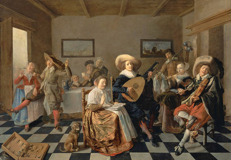
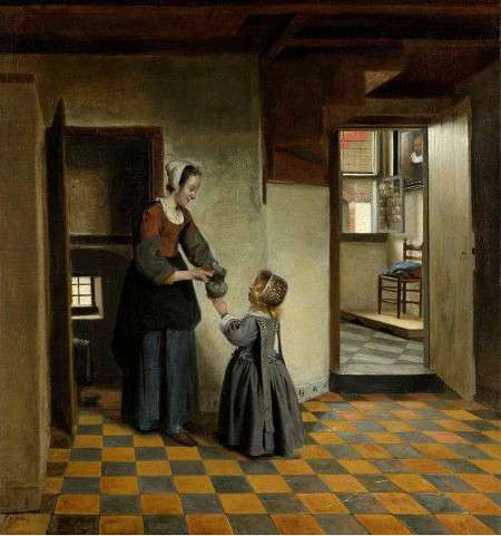
In Vermeer's twenty-six domestic interiors, there are eleven paintings with black and white tile floors, two with ceramic tiles and five with simple unadorned pavements. Never once do we see the large wooden planks represented in so many Dutch paintings of domestic interiors. Unlike most other interior painters of the time (fig. 16) except for De Hooch, Vermeer always set the tiles of his scenes diagonally to the picture plane. The imaginative De Hooch experimented with many different patterns, with some of his scenes featuring tiles set both perpendicularly and diagonally (fig. 17). In any case, Vermeer's foray into tile painting was not without difficulties. The spatial recession created by the small blue and yellow ceramic tiles in the two early s"hoe-box" interiors (The Glass of Wine and The Girl with a Glass of Wine) is problematic, most likely due to the intricacies of three-point perspective and the difficulty of hand-painting the edges of each tile without losing sight of the underlying scheme, especially those in proximity to the background wall, which are very small and significantly distorted. The artist quickly remedied this problem by moving his easel farther from the scene, and by using much larger tiles and by adopting broader, cross-like patterns in which the white tiles are partially isolated from one another. Had the tiles of The Music Lesson (fig. 17) been painted with conventionally alternating white and black tiles, the perspective thrust would have interfered with the overall compositional equilibrium. Jacob Ochtervelt (1634–1682) seems to have understood Vermeer's lesson and painted tiles set in broadly spaced, diagonal patterns. Various measurements would seem to demonstrate that the dimensions of Vermeer's marble floor tiles are relatively consistent in every work that features them.
Jan Miense Molenaer
1631
Oil on panel, 56 x 79 cm.
Private collection
Pieter de Hooch
c. 1656–c. 1660
Oil on canvas, 65 x 60.5 cm.
Rijksmuseum, Amsterdam
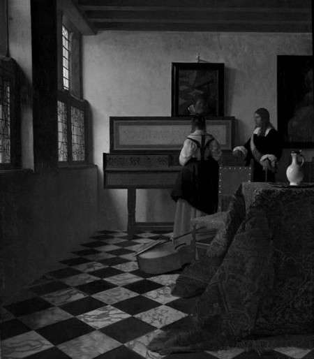
Tiled floor patterns are represented in painting as far back as Roman times. Early Renaissance artists and designers harked back to classical precedents and routinely employed the motif as a means of creating spatial depth and providing sumptuous decor for religious scenes (fig. 19). These early floors, however, appear to tip awkwardly forward creating the sensation of accelerated perspective. Many experiments were necessary to harmonize the perspectives of the floors, architectural features and figures, which had previously been treated as separate problems. With the diffusion of mathematical, one-point perspective the slipping and sliding of tiled floors was eventually tamed, and intricately patterned tile floors became a means for the advanced artist to showcase his technical prowess, unrelated to the narrative content of the painting.
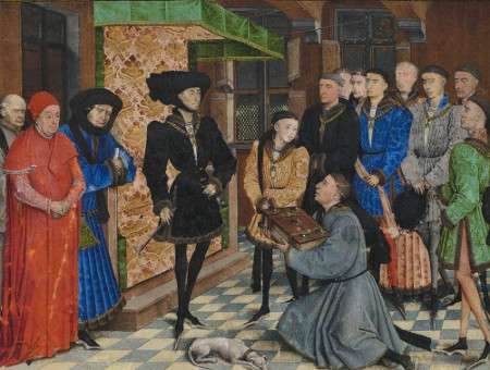
Rogier van der Weyden
1447
Opaque paint, gold, pen and ink on parchment
Royal Library of Belgium
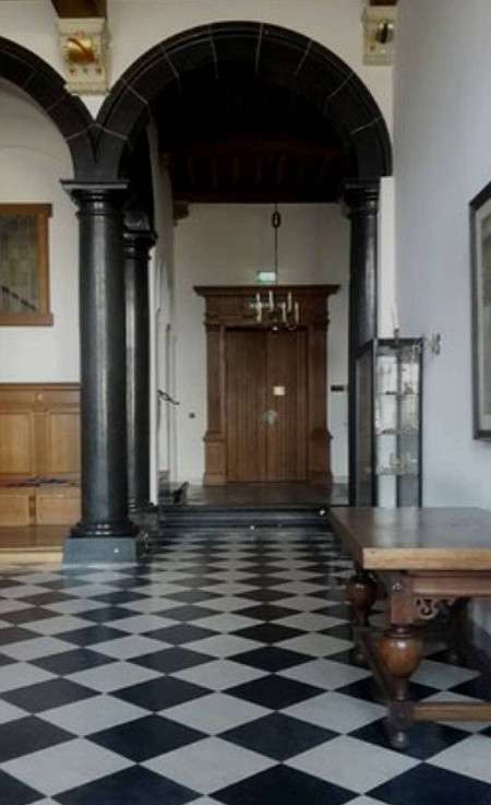
Black and white floor tiles are one of the most characteristic features of Vermeer's interior scenes, although Dutch genre painting offers many chances to delight in similar motifs. Marble tiles made their debut in the Netherlands during first decades of the seventeenth century. Willemijn Fock, a historian of the decorative arts of the Netherlands, maintains that it is highly improbable that the marble floors that appear so often in Dutch interior painting were painted directly from life. Such luxury items could be found only in the homes of the rich and so were beyond reach of either Vermeer or his mother-in-law,, with whom he lived and in whose house he kept his studio. Moreover, there is no historical evidence that marble floors were used above the ground floor (remembering that Vermeer's studio was on the second floor). Period inventories reveal that marble floors in domestic settings were generally restricted to one room, the voorhuis (the main entrance), where they would have most impressed visitors. To see real marble floors Vermeer could have visited the Delft Town Hall (fig. 20) or the palatial Huis ter Nieuwburg at nearby Rijswijk. The painting of marble tiles must have had a three-fold purpose for Dutch interior artists: to intensify the illusion of spatial depth, to showcase the artist's command of perspective and to create richly decorated environments that would appeal to the tastes of discerning upper-class clients.
There are two types of tiles in Vermeer's painting: ceramic and marble. According to Steadman, the minute cracks and chips of the ceramic tiles in The Glass of Wine and The Girl with a Glass of Wine suggest that they were observed and therefore painted from life, even though creating such minor effects would have been easy for any modestly trained painter. More importantly, Steadman discovered that the side measurement of these tiles is exactly half of that of the larger black and white marble tiles, allowing four ceramic tiles to fit into a single marble tile. Steadman suggests that Vermeer may have painted the marble floors in a room that in reality contained cheaper ceramic tiles, exploiting their underlying geometric grid to project the larger tiles with different patterns according to the compositional needs of each work.
There are essentially three patterns of marble tiles in Vermeer's paintings. "In The Music Lesson alone, separate white tiles are framed in a lattice of black stripes. In Allegory of the Faith alone, a pattern of what can be read as white Maltese crosses, each made from five tiles, is set on a black background. In the six remaining pictures the colors are reversed, to make a pattern of black crosses on a white ground.Philip Steadman, Vermeer's Camera: Uncovering the Truth Behind the Masterpieces (Oxford: Oxford University Press, 2001). In one painting only, Woman with a Lute, do the tiles meet the base of the background wall at an arbitrary, intermediate point rather than dividing them into two neat triangles. The fact that Vermeer's tiles exhibit no reflections—in reality they would have been polished, as can be seen in other paintings of the time—would suggest that they were invented, although a skilled painter such as Vermeer could have easily eliminated the reflections for aesthetic reasons.
Art historians have unanimously discounted the possibility that Vermeer's studio was actually fitted with real black and white marble floor tiles. Imported marble flooring was far too expensive for the artist's income—there is no marble native to the Netherlands. Nonetheless, Chris Eckersley, a freelance designer and sculptor, has suggested that Vermeer may have possessed a stock of real marble tiles and laid them out on the floor in these varying patterns for each of his paintings.Chris Eckersley, "Vermeer's tiles," Chris Eckersley: Making Things, (website no longer available). After reading Steadman's calculation that the floor tiles in Vermeer's paintings measured 29.3 cm. (derived by a process of adjusting the entire size of the studio and all its contents to arrive at the best fit to the known sizes of many objects: chairs, tables, virginals, painted paintings, maps, as well as the Delftware skirting tiles), he realized that this size is extremely close to half of a Florentine brachia (29.18 cm.), which was the standard size of seventeenth-century Italian marble tiles (presumably from Carrara). However, it is hardly out of the question that the artist used faux tiles made of colored wood which could be easily arranged in any pattern desired. With the collaboration of the industrial designer Allan Kuiper (based upon reconstruction drawings by Zantkuijl) the Dutch art historian Kees Kaldenbach developed a digital reconstruction of Vermeer's home at the Oude Langendijk.Kees Kaldenbach, Johannes Vermeer, http://kalden.home.xs4all.nl/.
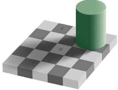
Representing variations in brightness on a checkered floor tile is a particularly complex undertaking due to the fact that the two differently colored tiles must simultaneously be modified in both tone and, to a lesser degree, hue, with respect to the amount of light they receive. For every change in tone of a white tile, the adjacent black tiles must be proportionately modified. Owing to the sharp contrast between the black and white tiles and the perceptual mechanism called brightness constancy, it becomes exceptionally problematic for the painter to "see through" the local contrasts of adjacent tiles to the broader falloff of light on the floor. The well-known diagram by Ted Adelson of MIT (fig. 21) illustrates the vexations of evaluating the relative values of tone when applied to the checkered floor motif. Even when the viewer is informed that squares A and B of Aldeson's floor are precisely the same value, the perceptual system "corrects" them to make them look as if they were differently colored tiles, with the result that white tile labeled "A" strikes the viewer as intrinsically darker than tile labeled "B," although in actuality it is not (if the reader is not convinced he may see Aldeson's demonstration by clicking here). This is because from a biological standpoint there is nothing to be gained by understanding the absolute tones of each separate tile. Instead, understanding brightness in relative terms allows us to construe a plausible picture of a cylinder which projects a shadow on a checkered floor. The perceptual forces at play in brightness constancy are complex and are probably elaborated at different levels of the optical system. The artist, then, must find ways to undo this correction in order to render the tiled floor realistically, otherwise his floor will seem to have no particular light. A phenomenon similar to Adelson's occurs in Vermeer's The Music Lesson and the late Lady Writing a Letter with her Maid. A detail from this painting (fig. 22), which is rendered in black and white to facilitate the reading of tonal value, shows that the value of one of the white tiles near the side wall is only slightly lighter than a black tile near the foot of the carpet, yet, within context we unquestionably understand that the left-hand tile is intrinsically white and the right-hand tile is intrinsically black.
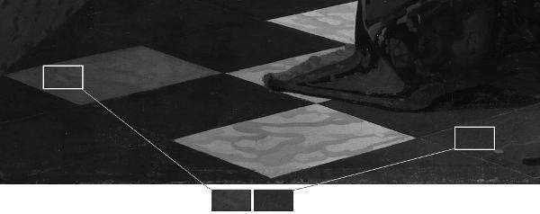
Johannes Vermeer
c. 1670–1671
Oil on canvas, 71.1 x 58.4 cm.
National Gallery of Ireland, Dublin
Location and Weather
The studio in which Vermeer painted some of his finest pieces was a noisy place overlooking the bustling hub of the town's civic life (Markt), only one story above street level. Upstairs was an attic where the artist ground his paints and stored extra equipment. In the streets below carts full of fruit and vegetables began rolling in hours before the artist had enough light to work by. Throughout the day, street peddlers hawked their wares, traders shouted and children played kolf, street musicians sang and played the latest tunes on droning bagpipes and screeching hurdy-gurdies.
The back of the studio faced a narrow alley which connected Oude Langendijk to the noisy cattle market. In front, the studio was just a stone's throw away from the mastodonic tower of the Nieuwe Kerk, which was armed with 32 bronze bells that clanged throughout the day at regular intervals keeping time and lifting the spirit of the town's hard-working citizens. Some foreigners enjoyed the frequent carillon concerts but some were annoyed by their "incessant jangling." Moreover, Vermeer's resilient wife, strong-willed mother-in-law, domestic maid and a slew of children milled around just beneath the timber floor which separated the artist's studio from the living quarters below. Factoring in the already noisy environment and the fact that children are children—it is well known that foreigners thought Dutch parents were intolerably tolerant of their children's misconduct—the silence which exudes from the artist's perfect constructs is all the more perplexing.
In the Netherlands, the amount of effective daylight for painting varies by season due to both the length of the day and meteorological conditions like cloud cover and rain. Winter offers limited and less intense light due to short days and frequent clouds. Spring and autumn provide more moderate conditions, though weather can still be variable. Summer has long daylight hours but can also be cloudy and rainy. The most consistent and favorable light for painting is likely to be in late spring and early autumn. Many seventeenth-century Dutch painters used north-facing studios to maximize the consistency of the natural light, but weather conditions remained a variable factor.
Meteorology also played an important role in Vermeer's studio activities, a fact that is generally ignored by many who look at his paintings. Dutch winters, already inimical to the fine painter, who must remain seated dead-still at his easel for hours on end, were even more merciless in Vermeer's time owing to the so-called Little Ice Age that started during the mid-sixteenth century and ended about 1850. In this period, the average temperature was significantly lower, winters were very much colder and expanses of water would remain frozen over longer periods (fig. 23). Vermeer's biographer, John Montias, discovered that the artist may have bought an ice sled (fig. 24) equipped with a sail, for his children, for eighty guilders to make the best of the stern conditions.The purchase was recorded a year or two before 1660.

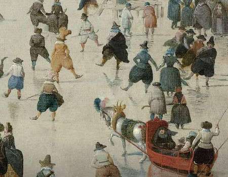
Hendrick Avercamp
c. 1608
Oil on panel, 77.3 x 131.9 cm.
Rijksmuseum, Amsterdam
"In Dutch houses an open fire was the only source of warmth, with peat the usual fuel in most dwellings. An enormous amount of peat was consumed in an effort to keep warm: an estimated 1.6 tons annually for each city resident during the seventeenth century. Even so, people wore several layers of clothing most of the time."Klaske Muizelaar and Derek Phillips, Picturing Men and Women in the Dutch Golden Age: Paintings and People in Historical Perspective (New Haven: Yale University Press, 2003), 56. And so did Vermeer while he was painting. Despite the fact that upper-tier painters enjoyed portraying themselves draped in imported satin Japonese rock (fig. 25) or clothed in historical costumes, there is little documentary evidence about how painters really dressed when at work. Leonardo da Vinci (1452–1519) once commented that painting was superior to sculpture also because painters could work in their finest clothes. But it would seem that "the seventeenth century had no specific occupational costumes in the sense of clothing specifically designed and made for various activities. Most trades involved nothing more than protective clothing like aprons over one's's every-day dress. In other words, painters were likely to have worn their everyday dress with floor-length, loose-fitting protective gown, which were known as a tabbaard or a nachtbaard (nightgown). Such garments were very practical because they gave freedom of movement and could be lined with fur to keep them warm in the winter. There is frequent mention of these items in the inventories of Amsterdam painters. Rembrandt once made a drawing of himself with a tabbaard (fig. 26) which was inscribed with the words. ‘Drawn by Rembrandt van Rijn after his own image/as he was attired in his studio.'"Marieke de Winkel, "Costume in Rembrandt's Self Portraits," in Rembrandt by Himself, eds. Christopher White and Quentin Buvelot (Zwolle, 1999), 65–66. The situation must have been different for the artist's models. Since it is difficult to imagine that the young woman who posed in the Woman with a Pearl Necklace could have stood motionless with arms bared to the bitter cold of the studio, he must have painted from dressed mannequins during the winter months, or during warmer weather.
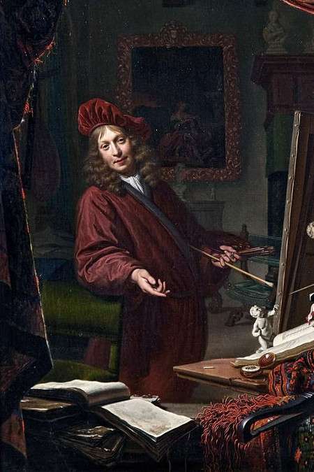
Michiel van Musscher
1679
Oil on panel, 57 x 46.5 cm.
Museum Rotterdam, Rotterdam
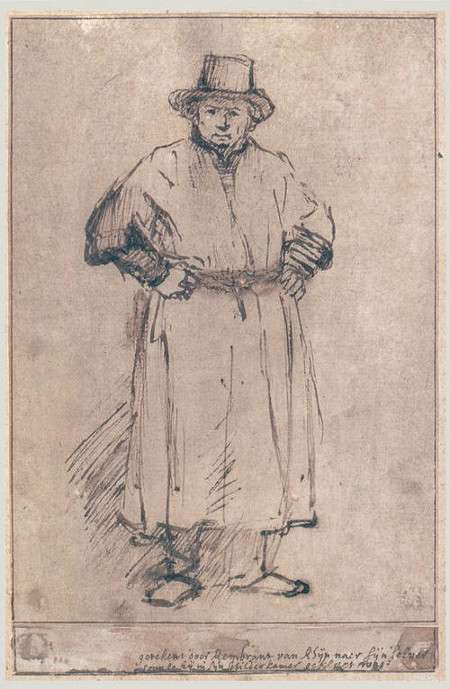
Rembrandt van Rijn
c. 1655
Pen and bistre, 20.3 x 13.4 cm.
Rembrandt Huis, Amsterdam
Studio light
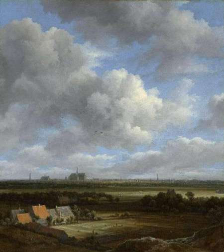
Jacob Isaacksz. van Ruisdael
c. 1650–1682
Oil on canvas, 43 x 38 cm.
Rijksmuseum, Amsterdam
Studio lighting is a most important factor for a painter, and it is closely connected with the architecture of the studio, especially with the source of light. Whether a window faces north, east, south, or west makes a noteworthy difference in the type of light it receives. If one prefers morning sunlight to spray across the breakfast table, the breakfast room window should face east, but if one wants to paint, the window must face north. The direction of direct rays of the sun coming from the east, west and south shift angles from one minute to the next creating fascinating but hopelessly complex patterns. The scene would need to be repainted every half hour. Moreover, for the great part of painting styles, direct sunlight produces such a wide range of lights and darks that they are impossible to capture with the artist's poor reflective paints. For these reasons painters have always preferred a northern exposure because northern light is cooler than southern light, but above all because it is diffused and relatively constant throughout most of the average working day. Thus, the light that falls on any object or model will almost be always the same. Leonardo is believed to be the first to have written about the advantages of northern light for the painter.
On the average, Vermeer had to factor in his working schedule more than 200 days of rain per year with fewer than two hours per day of sunshine in the winter months. In the Netherlands, winter days can be exceptionally gloomy even at midday; rain, intermittent drizzle and cloudy skies were, and still are, the norm. Light is so scarce that windows could fill from two-thirds to three-quarters of an external wall. Various combinations of curtains, shutters, and half-shutters were used to retain warmth or exclude sunlight on bright days.Vermeer's The Little Street.
Although the three large windows of Vermeer's studio let in the cool, constant light of the north adapted for painting, its intensity was often unpredictable, due to the incessant march of low-flying clouds that without warning plunged the studio into a deep penumbra and released it back to brilliance in a matter of seconds (fig. 27). Under such conditions, rendering the rendering of light and shadow, which plays such a crucial role in establishing atmosphere and compositional unity in Vermeer's art, would have been almost maddening. On heavily overcast or rainy days the artist may have found more productive things to do than paint his brightly lit pictures. Perhaps, the brighter works were programmed for the summer months when light was more abundant. In any case, Vermeer's studio was well-lit. Approximately 40% of the wall's area was occupied by windows.
Studio equipment
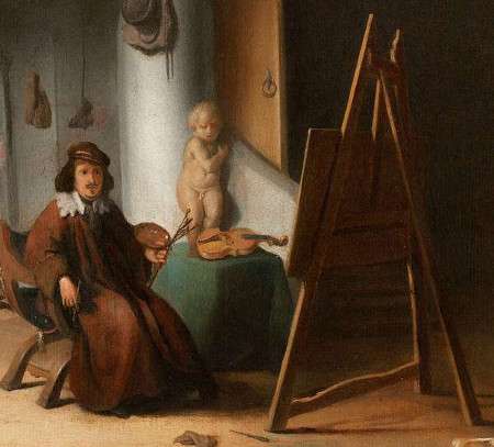
Jacob van Spreeuwen
After 1650
Oil on panel, 30.5 x 36.8 cm.
Private collection, New York
Easel. Easels (a Dutch word for "donkey") were invariably equipped with three legs and made from wood (fig. 28). The forward two legs are angled towards each other at the top, and lean against the third leg hinged at the top, similar to those used in former times for blackboards in schools. The front legs were studded with a series of round holes at regular intervals. Wooden pegs could be inserted into the holes at varying heights to support a horizontal wooden slat on which the painting itself could rest. The canvas was generally positioned at a height so that its middle (where the most important parts of the painting are generally located) could be reached without any effort. When it became necessary to work on the higher or lower parts of the painting, the wooden pegs could be quickly adjusted. The easel was tilted backwards to ensure stability, avoid reflections on the canvas, and facilitate a more natural posture for the painter. Many easels were reinforced with a horizontal slat which connected the two front legs near the bottom, and this was also used to rest the painter's forward foot (some depictions show this slat worn down by continual use).
Mannequin (Please note that the following information regarding mannequins below is drawn largely from the excellent Silent Partners: Artist and Mannequin from Function to Fetish by Jane Munr,Jane Munro, Silent Partners: Artist and Mannequin from Function to Fetish (New Haven and London: Yale University Press, 2014). to accompany an exhibition organized by the Fitzwilliam Museum, Cambridge).
This term is derived from mannekijn, an old Dutch word for "little person." It was absorbed into English usage at about the same time that English speakers took from the Dutch the words "easel" and "landscape." It was sometimes referred to as either "the boy" or a "lay figure."
Dummies, called "dobbles" were used by knights to hang their suits of armor.A pair of lay-figures from the sixteenth century, now in Innsbruck (Chamber of Art and Curiosities, Ambras Castle), are among the oldest that have survived. In 1464, the Florentine architect, writer and sculptor Filarete (Antonio di Pietro Averlino or Averulino, c. 1400-c. 1469) bragged he invented the mannequin when writing about the need to dress sculpted or painted figure in costumes of suitable circumstances, advising artists to draw draperies di naturali by using a figuretta di legname, a "little wooden figure" with "jointed arms, legs and neck." Filarete's mannequins must have been much smaller than life. If the fabric was not of a suitable weight or pliability to hang well, he recommended the mannequin and its drapery be "bathe[d]..well" in melted animal skin glue in order to stiffen the folds into the desired shapes as they dried. This process could be undone by dipping into warm water and reshaping. Most early Italian mannequins were small, typically the height of a braccio (an arm) or "half an ell" (ulna or forearm), measures, which in reality could range between around 18 and 70 centimeters in length. Although small-scale mannequins were convenient for plotting out a composition, a larger, life-size model was considered necessary to obtain the most convincingly naturalistic effects, and more especially when it came to painting clothing or drapery, since most cloth is too bulky to fold correctly on smaller mannequins. In his Vite, Giorgio Vasari (1511–1574) first records the use of a large wooden mannequin by Fra Bartolommeo (1472–1517)—one of his drawings portrays a draped mannequin (fig. 29)—who worked not only with small-scale figures, but also used a jointed wooden model, grande quanto il vivo (life size), specifically in order to paint and draw the folds of drapery, armor "and such like things."By the end of the fifteenth century, it is clear that the practice was also widespread among painters. Notable examples include Piero della Francesca (c. 1415–1492) and those like Leonardo, who had studied in workshops of either sculptors or painter-sculptors, such as Andrea Verrocchio (c. 1435–1488).
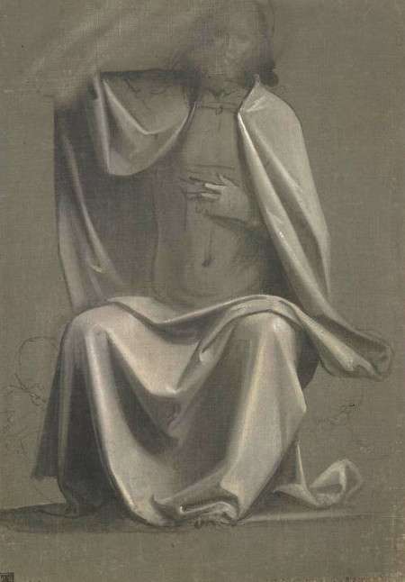
Fra Bartolommeo
1499–1500
Drawing
British Museum, London
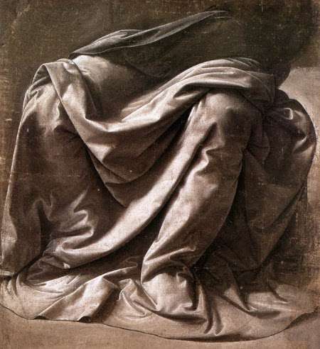
Leonardo da Vinci
c. 147–1484 Drawing
Louvre, Paris
![La prima-[quinta] parte della luce del dipingere et disegnare, ..., Crispijn van de Passe](images-studio/de-passe.jpg)
Crispijn van de Passe
Publication date 1643
Publisher Ghedruckt t' Amsterdam : Ende men vintse te koop by Ian Iantsz…als mede by den
Getty Research Institute, Los Angeles
In the seventeenth century, mannequins began to be noted in Dutch painters' studios. Simon Kick, Michael Sweerts (1618–1664), Van Spreeuwen (fig. 10), Adriaen van Ostade (fig. 6), and Wallerand Vaillant depicted mannequins in paintings (fig. 33) and Ter Borch is known to have owned a relatively large lay figure. Ter Borch's father wrote to his son in London, "Dear child, I am sending you the mannequin, but without a stand because it is too large and too heavy to be put into the trunk. For a small amount of money you can have the stand made there. Use the mannequin and do not let it stand idle, as it has done here, draw a lot: large dynamic compositions." From this letter it appears that mannequins were unknown or unavailable in London. Gabriel Metsu (1629–1667) once exchanged a portrait for a mannequin. Typical examples of these devices appear in engravings by Crispijn van de Passe (1597–c. 1637; fig. 31). De Passe, however, warned they be used only for the study of draping the body, writing that "The Painter ought to avoid all manner of stiffness and hardness of folds, and be careful that they don't smell of the layman (mahhewuin)." Life-size mannequins are featured in studio scenes by Simon Kick (1603–1652; fig. 32) and an obscure Dutch painter D. Witting (active in the second quarter of the seventeenth century). It is likely Vermeer possessed at least one life-size mannequin.
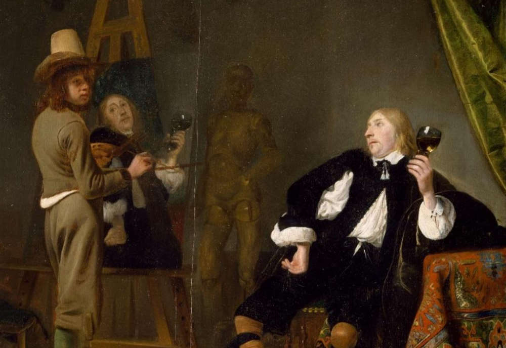
Simon Kick
c. 1645–1650
Oil on panel, 92 x 69.5 cm.
National Gallery of Ireland, Dublin
Over the course of the nineteenth century, the mannequin gradually emerged from the studio to become the artist's subject, at first humorously, then in more complicated ways, playing on the unnerving psychological presence of a figure that was realistic, yet unreal—lifelike, yet lifeless.
Mahlstick. The maulstick, or mahlstick (painter's stick), is a long, round stick that is primarily used for painting detail (fig. 34). The word mahlstick derives from the Dutch maalstok from malen, "to paint." The mahlstick is held (for the right-handed painter) with the left hand and leaned against the upper or right edge of the canvas to steady the hand that holds the brush, preventing contact with the wet paint. It is the difference between writing with the heel of your palm on the table or writing with your whole hand in the air.Julie Caves, "A classic tool: the Mahl stick," Jackson's, http://www.jacksonsart.com/blog/2012/05/29/a-classic-tool-the-mahl-stick/. The mahlstick can also be used to paint straight lines by slowly dragging the lower part of the brush (ferrule) along its length. Mahlsticks are represented frequently in portrayals of European painters at work. In most representations one end of the mahlstick is topped with a leather cover—one with a red cap is proudly displayed in Vermeer's The Art of Painting (fig. 35).
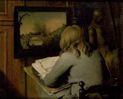
c. 1660
Oil on panel, 31.1 x 39.5 cm.
Guildhall (Samuel Collection), London
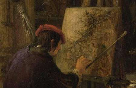
Adriaen van Ostade
c. 1670–1675
Oil on panel, 37 x 36 cm.
Rijksmuseum, Amsterdam
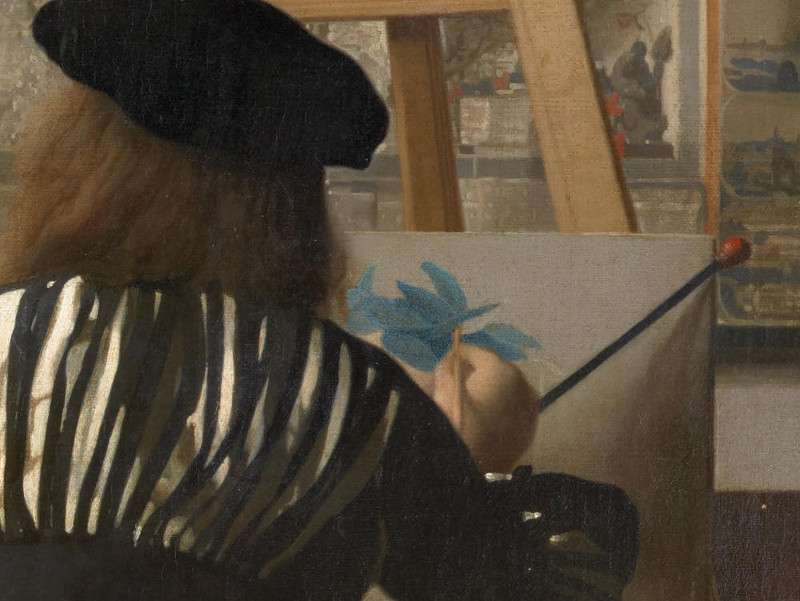
Johannes Vermeer
c. 1662–1668
Oil on canvas, 120 x 100 cm.
Kunsthistorisches Museum, Vienna
Oriental Carpets. By the thirteenth century, merchant travelers like Marco Polo had remarked on the beauty of the Oriental carpets they encountered in their journeys. Soon after, these carpets were imported by Venice and then distributed throughout Europe. While early carpets of this kind are rarely preserved, painted versions provide a good idea of how they looked. European painters, such as Giotto, Ghirlandaio (1449–1494), Hans Holbein (c. 1460–1524), Jan van Eyck (c before 1390–1441), and Lorenzo Lotto (c. 1480–1556/57), frequently depicted carpets originating from Turkey and Iran. Turkish carpets were one of the many exotic imports that appealed to seventeenth-century Dutchmen and can be seen in extraordinary numbers of Dutch genre paintings of the time. However, they rarely appear on the floor, but always on tables, most probably because they were too precious to be soiled. For interior painters their colorful arabesque patterns and plush textures provided a perfect opportunity to show off their abilities and simultaneously create a sense of exotic luxury, which would appeal to upper-class clients. The fact that so many turkse and persiche tapijten appear in Dutch interiors of the time might suggest that they were an integral part of the life of the upper classes. However, they do not occur so frequently in inventories and they are never documented in appreciable quantities on the cargo of Dutch merchant ships. It is known that some painters supplied clients with their own carpets and that the same carpet might be used for generations of artists. Vermeer seems to have used at least one carpet more than once. The carpet most commonly seen in Dutch interior paintings of the time and can be identified with extant types.
It is generally assumed that the carpets featured in Vermeer's paintings were painted from real models, although some liberties were taken with coloring. The level of detail varies considerably as the late renditions are reduced to abstract pattern, without a single knot visible. Carpet expert Onno Ydema has shown that the carpet in The Music Lesson (fig. 36) is a sixteenth-century Medallion Ushak type, from Turkey, and is faithfully described by the artist.Onno Ydema, Carpets and their Datings in Netherlandish Paintings, 1540–1700 (Woodbridge: Walburg Pers, 1991). The carpet of The Procuress is of a similar type. The carpet that appears in the Christ in the House of Martha and Mary seems to be almost identical with the one represented in A Maid Asleep painted a few years later. Both have a broad, light orange border ending in a fringe, but the medallion in the former is yellow, in the latter green, which suggests the artist used one rug as a model and painted imaginary variations of it. Observing the bold but uninspired facture of Vermeer's early carpets (Martha in the House of Martha and Mary, The Procuress and A Maid Asleep), the vitality of those in his later interiors is surprising. Another carpet which appears in Vermeer's painting is the so-called "Lotto" type, whose name is drawn from the carpets portrayed in the works of Lotto. Unlike Dou and the most meticulous Dutch fine painters, Vermeer was not obsessed by the individual knots of the carpets, but the broad patches of color. The patterns were then punctuated with a series of small, roundish splotches (pointillés), which should not be mistaken for literal representations of physical knots but painterly renditions of the camera obscura's disks of confusion.


Gerrit van Honthorst
1623
Oil on canvas, 123.5 x 205 cm.
National Gallery of Art, Washington D.C.
Repoussoir Curtains. The term repoussoir is derived from the French verb meaning to push back. In painting, a repoussoir is a means for achieving (i.e., by forcing) spatial depth by placing a large figure or object, generally dark, in the immediate foreground of the composition. The repoussoir device tends to physically involve the spectator in the pictured scene inasmuch as his instinctive reaction is to "look around" it in order to observe what is taking place behind it. Repoussoir motifs set a dramatic entrance for the painting and help determine a sense of scale, and by tonal contrast accentuate the sensation of light. Caravaggio (1571/2–1610) had become famous for his use of ordinary people as repoussoir devices. In the classical landscapes of Claude Lorraine (1600–1682) the repoussoir element was usually a large, dimly lit tree placed in the left-hand foreground. The Utrecht Caravaggist School frequently used human figures as repoussoir (fig. 37). Dutch landscapists used repoussoir trees, windmills, animals, and buildings to enliven the uneventful Dutch countryside and create innovative compositions. Chairs were frequently employed as repoussoir devices by interior painters, but most of all hanging textiles.
A number of Vermeer's interiors feature repoussoir curtains. Some are quite large, and some occupy only a small portion of the canvas. The larger ones, usually elaborately designed tapestries, are pushed to the left and gathered up at the bottom so that they give the impression of a stage with the curtain drawn back. Such tapestries are present in The Art of Painting, Allegory of Faith, The Love Letter and Lady Writing a Letter with her Maid. In A Lady Seated at a Virginal and The Geographer they occupy only a small part of the upper left-hand corner of the composition, probably in order to alleviate the predominance of the rectangular layout rather to create spatial depth.
A large, green carpet once occupied a large part of the right-hand background of Mistress and Maid. The green pigment used has dramatically degraded over time. Viewed in person or in good reproductions the sweeping folds of the carpet are visible to the naked eye.
Prints. Prints could be found in every studio of the time. No painter, however poor he may have been, was without a little collection. The most popular prints, often arranged in large folio form, contained engravings and woodcuts by Dürer, or prints after the Italian masters—particularly Raphael (1483–1520), Mantegna (c. 1431–1506) and Michelangelo (1475–1564)—which served as compositional models. So many prints and copies were made by earnest pupils that it became impossible to separate the originals from the copies, a problem that would occupy a small army of art historians centuries later. Various "folios" were reported in a posthumous inventory of movable goods in Vermeer's studio. The large volume which lies flat on the table of The Art of Painting is probably an example (fig. 38).
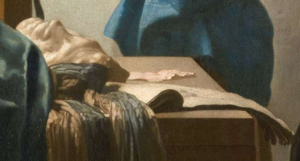
Johannes Vermeer
c. 1662–1668
Oil on canvas, 120 x 100 cm
Kunsthistorisches Museum, Vienna
Plaster casts. "Plaster casts are simultaneously copies and originals. Once they leave the mold that makes them a replica, they take on their own distinctive lives. Yet, cast collections of ancient, mostly Greek and Roman, or European sculpture share a common, if not global history.
"Plaster casts have been formative for many artistic movements such as Renaissance, Baroque, or Neo-Classicism. From the fifteenth century onward, casts were part of private collections of scholars, artists, aristocrats, and royals in Europe. The replicas constituted an early canon of what were considered masterworks of the ancient Greek and Roman world. The latter formed the basis for the establishment of the royal or courtly academies of arts, the first of which were several precursors of the later Académie des Beaux-Arts founded in Paris in the second half of the seventeenth century. Casts enabled artists to study human anatomy and to learn 'the idea of beauty.'""A Short History of Plaster Casts," Cornell Collections of Antiquities: Originals and Reproductions, Cornell University Library, https://antiquities.library.cornell.edu/casts/a-short-history.
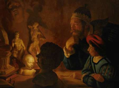
Plaster casts are portrayed in countless depictions of drawing lessons or painters in their studios (fig. 39 & 40). Willem Goeree, a Dutch art theorist who wrote an extensive treatise on drawing in 1668, wrote "that oneshould make drawings after copies in the round [i.e., from a solid 'round' object rather than a 'flat' drawing] and plaster casts of good masters; such as one can come across very easily, some being very common and familiar; many of these can be bought for a modest sum and used to great advantage in the practice of art."
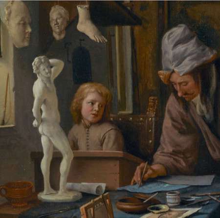
Jan Steen
c. 1665
Oil on panel, 49.2 × 41.2 cm.
John Paul Getty Collection, Los Angeles
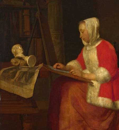
Gabriel Metsu
c. 1655–1660
Oil on oak, 36.3 x 30.7 cm.
National Gallery, London
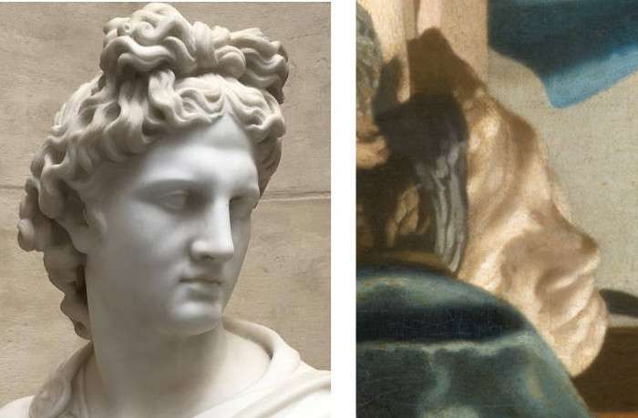
Given their near-ubiquity it is reasonable to suspect that the term "accessories," found in the catalogue description of a now lost self portrait by Vermeer ("a portrait of Vermeer in a room with various accessories, uncommonly beautiful"), might have indicated, along with other common objects, a plaster cast of one kind or another. In any case, The Art of Painting features an oversized plaster cast of a male head turned upward which has in the past been mistakenly called a "mask." In an informative essay dedicated to this picture,Sabine Penòt, "Johannes Vermeer's 'The Art of Painting,' A Picture Marked with Light: Questions on Pictorial Invention," in Vermeer: Die Malkunst (2010). the art historian Sabine Pènot has speculated that the particular features of Vermeer's cast—in her words "a headband runs above the eyebrows, which blends into a diadem-like element, such that the top of the cast is pointed"—suggest it may be a portrayal of Apollo (fig. 41), the Greek god of light and patron of the arts. She believes that such an association is strengthened by the fact that the head is turned away from the viewer toward the unseen window that floods the studio with light, as well as by the most likely iconographic interpretations of this, one of Vermeer's most ambitious paintings, which refer to the role of the art of painting among the liberal arts, il paragone, and the unification of poetry and painting embodied through Apollo and Apelles, a pervasive seventeenth-century topos in the Netherlands.
Grinding Stone. It is generally assumed that the grinding of pigment and drying oil to make paint was done in the studio of the artist or his apprentices, although in depictions of artists' workshops, one sees as many older men, perhaps journeymen (fig. 42), as young men bent over the grinding stone. An amusing pair of drawings by the Dutch painter Andries Both contrast the "successful" painter and the "poor" painter by the fact that the paint of the successful painter is being ground by a gleeful apprentice while the pigment of the poor painter is being ground by his distraught wife. It is known that paint was being mulled on a large scale and commercially prepared in the seventeenth century but painters who particularly cared about the quality and consistency of the paint chose to grind their paints themselves. The inventory taken after the death of Vermeer listed a grinding stone in the attic space above Vermeer's studio.
Grinding is done with two elements: the muller and the grinding slab (fig. 43). The muller was generally a stone rounded at the top and completely flattened at the bottom so that it would be fully in contact with the grinding slab. Sometimes mullers were made of flint or whetstone although both elements were often made of the same hard stone, such as porphyry, so that they would wear evenly. Today, both elements are made of solid glass.
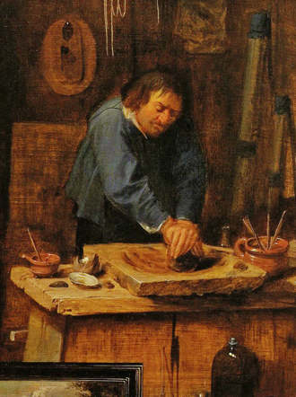
David Ryckaert III
c. 1635–1638
Oil on panel, 42.8 x 31.7 cm
Stadtgeschichtliches Museum "Schabbelhaus," Wismar
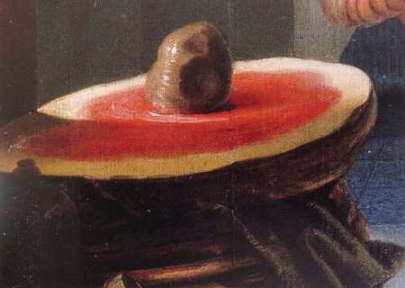
Karel Slabbaert
c. 1645–1654
Oak wood, 64.5 x 50.1 cm.
Gemäldegalerie, Berlin
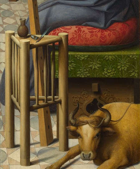
Stools. Unlike how painters work today, almost every early depiction of painters in their workshops show the artist seated. The kinds of chairs they used vary, from formal arm chairs to short-legged chairs with backs, four-legged stools, and box-type stools. A fancy four-legged stool is proudly featured in Vermeer's The Art of Painting (fig. 45) while a more humble version is featured in an informal studio scene by Joos van Craesbeeck (fig. 46). However, the most common was the humble three-legged stool (fig. 44), which can be seen in a great variety of settings.
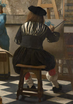
Johannes Vermeer
c. 1662–1668
Oil on canvas, 120 x 100 cm
Kunsthistorisches Museum, Vienna
Joos van Craesbeeck
Oil on panel, 48.5 x 66 cm.
Frits Lugt Collection, Paris
Painting in Vermeer's studio: A Subjective Account
Nothing is more distant from Vermeer's studio environment than that of the hackneyed image of the brooding twentieth-century artist boldly postured in the midst of his white loft strewn with litter, coagulated paint pots, huge unpainted canvases, and assorted paint-encrusted palettes. More than a solitary lair where pent-up emotions are vented, Vermeer's workspace looked like a laboratory.
Although we know nothing of the artist's personality, it is nearly certain that he worked in an orderly manner. This is not because we assume that the subject matter and aesthetic qualities of an artist's work must conform to his persona, for while it is true that the lives and works of painters often appear to relate to each other very closely they sometimes are desperately remote. On one hand, the behavior of the Spaniard Salvador Dalí is almost as bizarre as his surrealist landscapes. On the other, it is difficult to imagine that De Hooch, who fashioned among the most amenable portrayals of domestic peace ever painted, could have died in an Amsterdam insane asylum. However, when creating such meticulously crafted works like those of Vermeer, the demands imposed by the painting process and rebellious materials are nothing short of crushing. It may not be a coincidence that some of the most skilled fine painters in the Netherlands hailed from families of jewel cutters or silverworkers. Vermeer's own father worked in fine caffa (satin). In effect, painting in the fine manner necessitates a rational and systematic approach, which virtually excludes spontaneous expression of the kind associated with twentieth-century art production. Complicated compositions must be planned with precision in order to avoid time-consuming repainting. Rare and costly materials must be meticulously processed and properly conserved. Essences must be filtered, and brushes must be scrupulously cleaned each evening, lest they turn hard and become unusable the next morning. A slip of the hand or an unchecked cough at the easel transforms a one-centimeter smile into a leer. And dust, one of the most insidious enemies of sticky oil paint, must somehow be kept at bay, for even a speck becomes immediately visible on the glass-like surfaces of small paintings. In order to let the dust settle when entering his studio, it is said that Dou sat immobile in front of his easel for half an hour before picking up his brush. The order, method, and mental discipline indispensable for creating fine paintings like those of Vermeer and his colleagues are confirmed by the habits of expert fine realist painters of today.
Vermeer's studio was divided into two functionally distinct but physically communicating spaces. On the farthest end, the west end, he staged his mise-en-scène in proximity to the left-hand window. Here, the model, dressed more or less appropriately, and all the movable furnishings and props were provisionally assembled according to the initial picture that had formed in the artist's mind. In a second area, near the third window, a scant few yards from the scene, Vermeer conducted, as it were, his painted experiments in optics, illusionism, and poetry. Here, the tools of the artist's trade were carefully grouped together: a three-legged easel, a painting cabinet, a small stool, a camera obscura, and a large curtain for controlling the fall of light.
It is probable that in the initial planning stage, Vermeer employed a rather large booth-type camera (as proposed by Philip Steadman) big enough to contain the seated painter, from which he could study the distribution of the elements of his composition and the patterns of light and dark they caused. When closed, the booth shielded the camera's image from the light of the studio's windows so that it would be as clear and bright as possible. The back wall of the booth was set flush against the wall opposite to that of the mise-en-scène. Once the artist had finalized the composition, he would attach a sheet of paper to the back wall and trace the most telling contours of the camera's projection.
Before achieving the final compositional unity of his more complicated settings, Vermeer must have taken considerable pains to optimize the reciprocally influential three-dimensional and two-dimensional orders of the painting. Paintings were taken down from the walls and replaced by others, or by maps. Different chairs with different ornamental material were brought in and moved around. Windows were shut or opened, curtains pulled forward, then again taken away or replaced by those with other colors. The figure's position and pose must have been considered with the utmost attention and adjusted and readjusted many times, as made evident by numerous pentimenti in the artist's work. When all the elements finally congealed into an indissoluble unity, the real figure was substituted with a mannequin, dressed accordingly, and repositioned where it would remain perfectly immobile during the months to come.
In order to actually paint, the cumbersome booth camera had to be dismantled or moved to make space for the artist and his painting equipment, which could have been easily done by equipping it with a simple set of wheels. Once the device was removed, the painter set up his easel, sat on a stool, and set his eye at the same point, which had been previously occupied by the camera's lens. In this manner, any discrepancy between the outline drawing on his canvas and what he was seeing was minimized. Some authors have proposed that for further optical consultations, a small portable box-type camera would have imposed fewer mechanical restrictions than the bulky booth-type camera. But the optics of the small camera produce an image that is somewhat less suitable for painting purposes. Although he could have set up his scenes at the opposite end of his studio, like all painters, Vermeer preferred light, which originated from the left.
Vermeer painted most of his pictures while seated. His bodily movements were confined to the forearm and the fingers of his right hand, his head bobbing back and forth within a foot or two of the canvas. His handiwork was slow but nimble, deliberate but never schematic. The only sign of sloppiness that has ever been detected in the artist's oeuvre is a pair of barely discernible fingerprints embedded in the gray paint along the uppermost edge of The Guitar Player. Rather than painting all over the whole canvas at once with a full range of colors, Vermeer completed his composition in a jigsaw-puzzle fashion, piece by piece. He moved along to the successive passage only when the former was reasonably finished or properly worked up for successive refinement or glazing. His graceful, but firm, brushstrokes mimed the flow of cloth or the glint of light as it grazed across the carved relief of a gilt French frame. At all times, he was attentive to the quality of his brushmarks: no two must be alike.
The time that Vermeer spent gazing at the actual mise-en-scène was probably much less than the time he spent looking at the painting that slowly arose from his handiwork. He occasionally stood up to ease the pain in his back or to delicately reshape a graceless fold of a satin gown with his hand. In his self-contained world, which was tainted with the odor of turpentine and noise coming in from every side except from the attic above, neither of which he noticed, nothing he did was haphazard or compulsive. His movements were deliberate and measured. When he depicted the finest details, he held his breath, as all painters instinctively do, but never notice. He could spend hours depicting the slate-blue hills and valleys of an anonymous tablecloth as it cascades from the top of a massive oak table: the same cloth that three-hundred and fifty years later, even the most meticulous art historians would never once find worthy of a comment. Vermeer, instead, knew that it was absolutely crucial to the compositional balance because it concealed the complicated patterns of the floor tiles and the ornate features of the table in the lower part of the picture, that would have diverted the viewer's eye from the poetic simplicity of the figure above, without minimally upsetting the verisimilitude of the scene.
While painting, Vermeer kept his mind's eye open for possible analogies between visual phenomena and the painting process, which he knew would create a far more convincing illusion of reality than any literal description, however precise it might be. In fact, the only subject matter he could transcribe literally was the occasional strands of text and the lines of the topographical designs on the wall maps. But even these features had to be processed, progressively darkened from left to right, in order to confirm the sensation of the gradual falloff of light. Everything else, be it a white Italian wine jug, a pretty Dutch face, or a Turkish carpet, had to be attentively observed, broken down into essential structural elements, and then reformulated into a specific hue, tone, and shape according to the light it received and the distance from the painter. During a typical work session, he kept only a few paints on his tiny, oval-shaped palette, sometimes as few as three. A mahlstick and various kinds of brushes issued from its thumb-hole. In his other hand, he kept a clean rag to wipe excess paint from his brushes.
Vermeer occasionally leaned back from his easel, curious to see how his current labor related to the whole. Sometimes he was annoyed by the contrast between a patch of bright color and the drab gray ground, or by the glare of freshly applied paint against the matte underpainting. Here and there, the more highly finished passages popped out unnaturally against the vagary of the underpainting. Details were lost amid the overall unevenness of the work. But the artist had taught himself to be patient and even-tempered—he understood that his labor would bear full fruit only in the final stages of the painting process, perhaps during the final week or days. In fact, until the work had reached its mid-point, only a well-practiced painter familiar with fine painting methods would have been able to intuit in this disharmonious ensemble an exceptional work of art. For the moment, the painting had to be executed on faith, according to plan, with patience, and unwavering concentration.
Had a twentieth-century visitor been lucky enough to observe Vermeer at work for a few hours, he would have probably gotten the impression that the great artist had forgotten who he was, and, at moments, even what he was painting. The drag of paint, the spring of the brush, and the constant ballet of oil and pigment seemed to monopolize his attention. Brushes were scrupulously cleaned with turpentine and wiped incessantly. It is likely that he used different brushes for different colors, because certain pigments have such a high tinctorial strength that even repeated cleansing will not keep them from contaminating the lightest paints. He carefully calculated the precise amount of paint to be applied to the surface of the canvas because some passages had to be worked up with grainy impasto while others were scumbled on delicately with a dry brush, barely tinged with paint, according to the visual effect sought by the artist. The painting was sometimes turned on its side or upside down on the easel to facilitate certain movements of the hand. Like many painters today, he occasionally examined his work reflected in a mirror, a trick which allowed him to discern the most defective parts of the composition. If inspiration lurked behind this artisanal process, it never seemed to gush or spurt. At the end of the day, our virtual visitor would have been assailed by the unsettling sensation that what the great Vermeer did, after all, looked much like ordinary work.
But the visitor's eyes tell him only what surfaces reveal. Like the child, who, for the first time,scribbles on a piece of paper and discovers something that was not there before, the Vermeer who paints willfully abandons himself to the painting process. The only difference between the two is that the artist conserves the original excitement throughout his adult life, even as he learns that his gestures must be in great part controlled in deference to the mimetic function of his activity. The picture-making experience is sometimes so strong that it is kinesthetic. The artist not only conjures an image on his canvas, that caused him to paint, he takes possession of it. As the American writer and comic book artist Frank Miller somewhat unglamorously stated, "When you have a brush in your hand, inking a beautiful woman is a lot like running your hands over her." The extraordinary aspect of Vermeer's painting is that these intense picture-making pleasures are caused not by things beautiful in themselves; they can be intuited even in the knots of an Oriental carpet, the mundane head of a nail protruding from the uneven surface of a wall, or the uneventful edge of a window sill.