History Painting: Uncertain Beginnings
At the outset of his career, Vermeer cast himself primarily as a storyteller. While the great part of the young artist's energies was directed at picturing the clue moment of his narrative through the forceful rendering of figures and the appropriateness of their dispositions, the environments in which the stories unfold were purposely minimized. Light is managed somewhat conventionally and, at times, it is incoherent from a strictly optical standpoint.
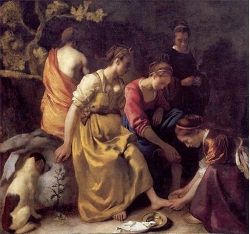
Some Vermeer scholars believe that the budding artist had intended the Diana and her Companions to serve as a passport to gain entrance to the lucrative Hague court where the Diana theme was much in vogue. If so, it is not difficult to understand why his appeal was left unanswered: the large painting, although extraordinarily interesting from an art historical point of view, is, at least by traditional seventeenth-century standards, a compositional disaster.
The narrative and all its components should not only be immediately intelligible to the viewer, but the arrangement of these components and the application of light should serve to elucidate and amplify the story being told.Paul Taylor, "Vermeer, Lairesse and Composition," Hofstede de Groot-lezing, Rijksbureau voor Kunsthistorische Documentatie, The Hague, 2010; and "Composition in Seventeenth-century Dutch Art Theory," in Pictorial Composition from Medieval to Modern Art, ed. Paul Taylor and François Quiviger (London, 2001).

Johannes Vermeer
c. 1653–1656
Oil on canvas, 98.5 x 105 cm.
Mauritshuis, The Hague
Therefore, I recommend you not to mix up lights and shadows too much, but to combine them properly in groups; let your strong lights be gently accompanied by lesser lights, and I assure you that they will shine all the more beautifully; let your deepest darks be surrounded by lighter darks, so that they will make the power of the light stand out all the more powerfully.
Then Hoogstraten adds this as a way of illustrating Rembrandt's intentions specifically:
Rembrandt developed this virtue to a great degree, and he was a master in properly combining related colors.In the Dutch text, Hoogstraten characterizes the "related colors" in fact as colors that are "friends" (bevriend). Hoogstraten's text implies that as a rule the highest lights were placed by Rembrandt in a light surrounding, whereas the darkest tones are flanked by less dark tones. Because of this binding of the dark portions of the compositions on the one hand and the light portions on the other, it appears that the viewer is enabled to grasp the light-dark structure of the composition at a glance as the number of contrasts in a painting is limited drastically this way. Van der Wetering, Ernst. Rembrandt: The Painter at Work (Berkeley: University of California Press, 2009), 252.
Vermeer appears to have notably deviated from two core principles of seventeenth-century history painting.History painting is a genre in art that traditionally depicts a moment in a narrative story, rather than a specific and static subject, as in a portrait. The narrative can be derived from many sources, including histories, literature, scriptures, myths, and allegories. This genre was considered the highest form of Western painting by the academic art community from the Renaissance until the 19th century. Emphasizing high drama and often featuring grandiose compositions with figures in theatrical poses, history paintings were intended to convey moral or didactic messages, imbued with lofty ideals, heroic human actions, or divine events, often on a large scale and in a grand manner.: the proper arrangement of composition, and the proper handling of chiaroscuro, the first being that no one has yet been able to identify the pictured scene in any moment in Ovid's Metamorphoses (book III, 138–252) which recounts the mythological event. Neither the abrupt entrance of Actaeon upon the scene nor Diana's rash character are represented. Nor is there any trace of the bow and arrows and dead game that were the most common attributes of Diana's prowess as a hunter. What we see is essentially an assembly of chaste, fair-skinned young Dutch women who, according to art historians, have assumed poses that Vermeer had drawn from other Dutch pictures of the same subject. The famous Italian Spinario, Rembrandt's Bathsheba and Jacob Van Loo's Diana and her Companions are the most commonly cited visual resources of Vermeer's rendition.
In Vermeer's composition, the heads of the foreground protagonists are positioned so that the faces are cast in a deep shadow making it impossible for the spectator to divine their emotions or character. The redundancy of lighting and pose—four out of five of the figures bend their heads downwards in a frieze-like procession—reiterates the deeply melancholy mood for which the artist provides no psychological relief.Vermeer may have provides some escape from the scene through a see-through landscape recommended strongly to history painters by the influential Dutch painter and art theorists Karl van Mander. The distribution of lights and darks creates a spotty compositional effect which runs counter to period recommendations to group lights and darks together in large, manageable masses.
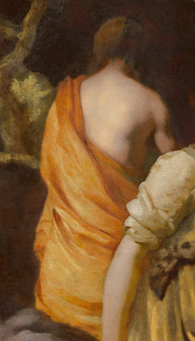
Perhaps the most visible compositional flaw of the Diana and her Companions is represented by the inordinate amount of light that inundates the subsidiary nude figure behind the principal group of nymphs. This nymph is painted so thickly and so boldly that it appears practically attached to the goddess of the hunt. By highlighting this anonymous figure, the viewer's eye is drawn away from the action of the scene accomplishing little more than to showcase the young artist's clumsy treatment of the drapery and the blocky anatomy of the figure whose back possesses a grace comparable to that of the worn-out dog in the lower foreground.Perhaps, Walter Liedtke's description of this weakly painted figure as a "loyal follower," of Diana, "strong and statuesque," would have found scarce consensus among Dutch art connoisseurs. Walter Liedtke, Vermeer: The Complete Works (London: Abrams, 2008), 57.
Incapable of movement, the background nymph has lost her way in both the three-dimensional space and the narrative logic of the picture.
