Dutch Cartography
"Until the mid-sixteenth century, official cartography in the Low Countries was no different from that developing elsewhere in Europe. In the Middle Ages, the use of maps was not yet commonplace, and few of them have been preserved. Primarily produced by artists, most of these maps were not based on systematic measurement. The result was a combination of pictorial and abstract cartographic elements. The development of a cartographic consciousness that began to appear in Europe about 1500 affected the Low Countries, and maps were used more and more in land accounting, water maintenance, jurisprudence, and military operations. During the course of the sixteenth century, surveyors began to occupy themselves with map production. Geographers and fortress builders became adept at measuring terrain. This development expressed itself, among other ways, in one of the characteristic and rejuvenating high points of sixteenth-century cartography in the Low Countries: the creation of manuscript plans of all cities of the Low Countries by geographer Jacob van Deventer. The official cartography of the Low Countries became increasingly rigorous during the course of the sixteenth century. In the Southern Provinces, commercial cartography joined this development at an early stage. For the northern Low Countries, a solid cartographic foundation developed which would result in a worldwide cartographic monopoly in seventeenth-century Amsterdam."Cornelis Koeman and Marco van Egmond, "Surveying and Official Mapping in the Low Countries, 1500–ca. 1670," in The History of Cartography, Volume Three (Part 2): Cartography in the European Renaissance*ù, ed. David Woodward (Chicago: University of Chicago Press, 2007), 1290.
"For roughly a century, from 1570 to 1670, mapmakers working in the Low Countries brought about unprecedented advances in the art of cartography. The maps, charts, and globes issued during this period, at first mainly in Antwerp and later in Amsterdam, are distinguished not only by their accuracy according to the knowledge of the time, but also by their richness of ornamentation, a combination of science and art that has rarely been surpassed in the history of mapmaking."Wikipedia: "Early Modern Netherlandish Cartography"
"Cartography and visual arts were related activities: art and mapmaking interacted with each other: many cartographic elements, such as images, color, and lettering, were shared with art; tools and methods used to produce maps and artistic works were very similar in printmaking and in mapmaking: copperplate engravings, which were hand colored in later, required specific artistic skills; a significant number of both little-known and the most outstanding artists were involved in decorating maps; maps and art works were often performed by the same artists, engravers and publishers who worked for both areas; artists, engravers and mapmakers belonged to the same group of society that determined the development of culture in many areas."James A. Welu, "The Sources and Development of Cartographic Ornamentation in the Netherlands," in Art and Cartography: Six Historical Essays, edited by David Woodward (Chicago: University of Chicago Press, 1987), 147–173.
Maps were made for practical purposes, but for prestige and, more banally, home decoration as well (fig. 1). In Vermeer's time, wall maps were a simple but effective way of embellishing bare white-washed walls, and, obviously, they struck a positive note for all walks of Dutch citizens whose exuberance had permitted their minuscule country to dominate great part of world trade. Large-scale wall maps were usually made up of a number of engraved sheets printed on parchment—often painted (with water colors)—and glued on heavy cloth after which were given a protective coat of varnish.
The demand for decorative maps was so insistent that map publishers had begun to reissue older, and in some cases, outdated ones. Seventeenth-century catalogues employed the "suitable for framing" sales pitch adding that they could be customized with decorative additions (the map in Vermeer's The Art of Painting is one such example). Many were hand painted. Although less discussed by scholars, it is known that craft knowledge about hand-coloring slowly disseminated into European households throughout the early modern period... presumably to encourage a more active engagement with the natural world.Gunther Schilder, "Visscher's Wall Map of the Seventeen Provinces (1636) and Its Counterpart in Vermeer's Art of Painting," in Vermeer: Die Malkunst (2010). Manuals with instructions on how to hand-color maps at home circulated in several countries throughout western Europe. By the eighteenth century, the practice was common, and was considered an alternative to the more pressing demands of oil painting or drawing. In any case, catalogues, inventories and other documents from the period list numerous wall maps of which not a single original has survived, largely due to "dampness, sunlight, smoke and temperature fluctuation as well as their replacement when they became outdated.."Stephanie Elizabeth Stillo, "Putting the World in Its 'Proper Colour': Exploring Hand-Coloring in Early Modern Maps," Journal of Map & Geography Libraries 12, no. 2 (2016): 165, https://doi.org/10.1080/15420353.2016.114. And so, it is largely through Dutch painting that their beauty is known to us.
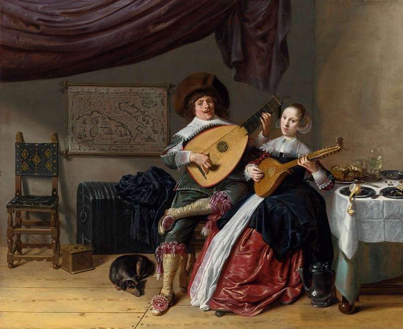
Anyone familiar with Vermeer's oeuvre is aware of the maps which populate the background walls of his interior compositions. He was, however, hardly alone in his fascination for maps; any number of Dutch interiors show some kind of map, small, large, roughly sketched or more finely finished. Frans Hals (1580–1666), Gerrit ter Borch (1617–1681), Pieter de Hooch (1629–1684; (fig. 10), Jan Steen (c. 1626–1679), Jacob Ochtervelt (1634–1682) (fig. 11, 13, 14 & 15), Nicolaes Maes (1634–1693; (fig. 5 & 12) all introduced depictions of real maps which may have had symbolic or allegorical significance.
However, "the first artist to use wall maps as a major motif in scenes of domestic interiors (fig. 2) was the Dutch painter Willem Buytewech (1591–1624). A leading pioneer of genre interior idiom, Buytewech worked at Haarlem from around 1612 to 1617, after which he returned to his native city of Rotterdam, where he spent the rest of his relatively short career. Of the ten paintings given to Buytewech, four include wall maps. Two of his merry company pictures—one painted around 1617–1620, the other around 1620–1622—feature wall maps with the legible title HOLANDIA. These cartographic backgrounds serve to associate both scenes specifically with the province where the pictures were painted."James A. Welu, "The Maps of Willem Buytewech," Hoogsteder-Naumann Mercury 5 (1987): 154–158. Buytewech's maps were lively colored, differently from the overwhelming majority of the monochrome renditions that would follow well into the century.
Jan Miense Molenaer
1635-36
Oil on panel, 42 x 51 cm
Private collection
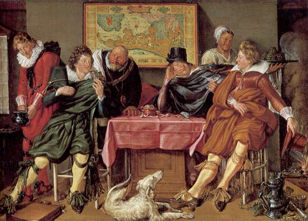
Willem Buytewech
c. 1617–1620
49.3 x 68 cm.
Museum Boijmans Van Beuningen, Rotterdam
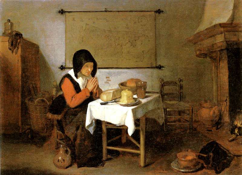
Although the most elaborate, multi-plate wall maps like those seen in Vermeer's paintings were reasonably expensive items—but not a luxury item—printed maps of one kind or another are frequently pictured on the walls of modest homes (fig. 3) and even in humble workshops (fig. 4). Among the affluent, maps were symbols of humanistic education and knowledge. These were usually framed, or more frequently, attached to hanging rods, allowing them to be rolled up for storage. Wood balls were fitted to the extreme of the hanging rods so that the back side on the map was kept at a distance from the humid wall, thereby avoiding the formation of mold. For those of lower social classes maps were simply a way break the monotony of bare plaster walls, fastened unceremoniously to the wall with a few tacks.
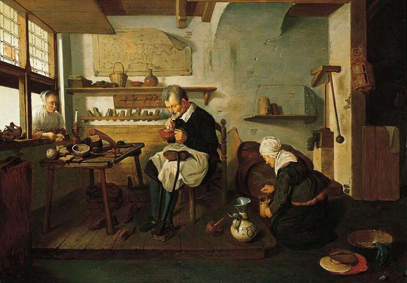
Quiringh van Brekelenkam
Oil on panel, 26 x 35 cm.
Private collection
Quiringh Gerritsz. van Brekelenkam
c. 1660
Oil on panel, 59.4 x 82.6 cm.
Norton Simon Art Foundation
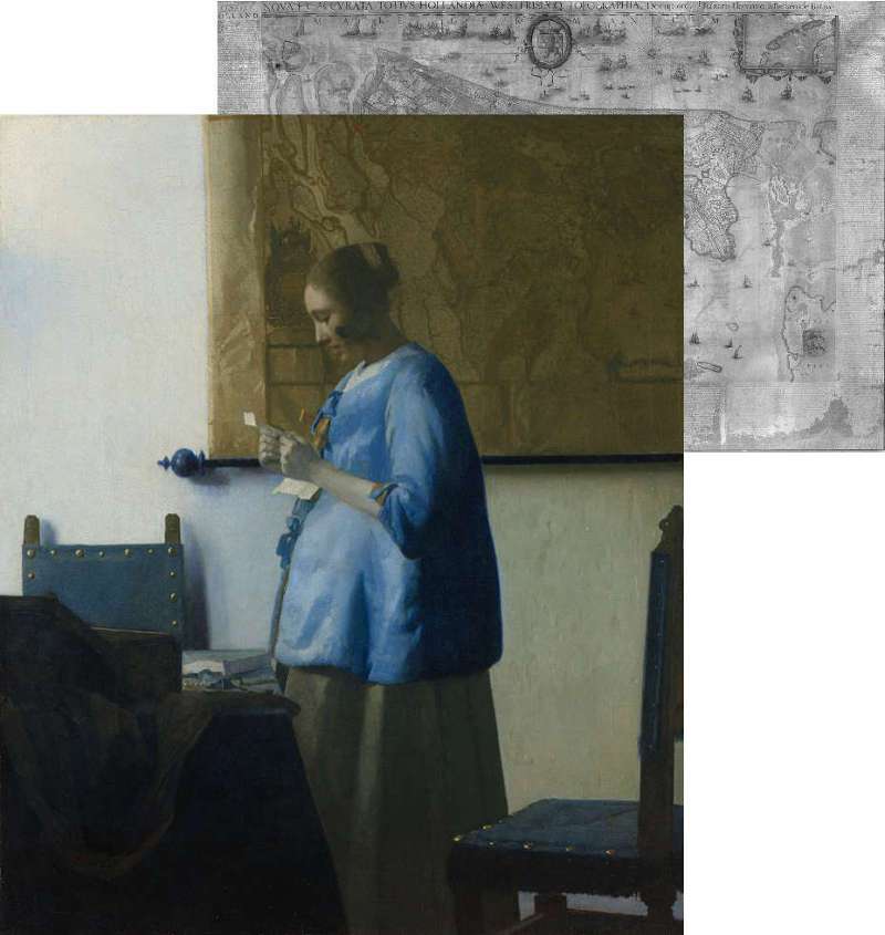
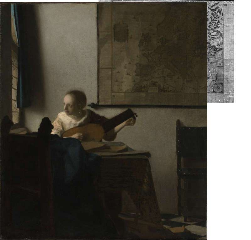
Those unfamiliar with cartography of the sixteenth and seventeenth century may not recognize the geographical contents of the maps of the Netherlands which because they were oriented differently. At this time the designing of maps with north at the top was not yet a standardized practice; a map could be arranged with north at the left, right, or bottom, according to the preference of the cartographer. The only map painted by Vermeer that is oriented according to the modern standard is the map of Europe in Woman with a Lute (fig. 21) .
Vermeer's Maps
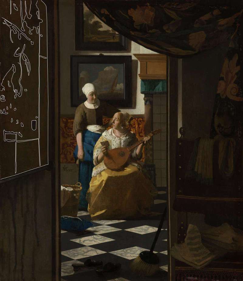
In half a dozen of Vermeer's paintings, A Woman with a Lute, c. 1662–1665; The Art of Painting, c. 1662–1668; The Love Letter, c. 1667–1670; Officer and Laughing Girl, c. 1655–1660; Woman in Blue Reading a Letter, c. 1662–1665; Young Woman with a Water Pitcher, c. 1662–1665. maps can be seen hanging on the white-washed walls (not all are aware that a large wall map had originally been included and subsequently eliminated from the Woman with a Pearl Necklace). Five show the Netherlands and its provinces and two the European continent. Other than being interesting compositional elements and a technical challenge of the first order, maps provided a type of theoretical window to the greater world outside of the quiet intimacy of household environment. The presumed meanings of Vermeer's maps, and those of his colleagues, has been amply debated by Dutch art scholars and historians. Even though some confusion remains as to their precise meanings, the provenance of each of Vermeer's maps has been accurately established by the scholar James A. Welu.
Click here to launch a Youtube lecture by Welu on the maps in Vermeer's paintings.
Painting Technique: How did Vermeer Paint his Maps?
While all of Vermeer's map have been historically identified, matched to extant museum copies and extensively interpreted for their presumed symbolic content, scarce attention has been paid as to how they were actually painted and how they compare to those of his colleagues.
In general, the printed features of the maps of Dutch artists were rendered with thin lines, often barely visible, painted directly over the previously defined color of the wall on which the map is hung (fig. 6). Occasionally, the land masses were lightly shaded with a darker tone of gray to differentiate them from the sea. Afterward, the shadows projected under and to the right of the perimeter of the map—Dutch interior paintings are overwhelming illuminated from the upper left—were depicted in deeper tones of gray to create the illusion that the map stands at a slight distance from the wall. Even a sophisticated painter like Metsu adopted this simple formula.
Nicolaes Maes
1656
oil on canvas, 26 × 21.125 in (66 × 53.7 cm)
Saint Louis Art Museum
Although in such a manner a skilled painter could make quick time of a very challenging motif, the most characterizing features of these magnificent objects were overlooked, and for this reason they appear largely as decorative fillers or intangible backdrops, rather than active compositional participants. In effect, no more than a handful of painters made any attempt to represent the folds and creases that would have naturally developed time after the map was hung against humid walls. Even the maps of Jacob Ochtervelt (1634–1682) (fig. 13, 14 & 15), who clearly attempted to compete with Vermeer on his home ground, are but pale reflections of the Delft master's technical triumphs. Maes painted a few maps with a considerable level of detail, but they are rendered with shades flat gray that make them appear unattractively leaden (fig. 5). Evidently, the challenge of immortalizing with brush and paint the surface characteristics of real wall maps was beyond the capability, or the desire, of any other painter except Vermeer.
Jacob Duck Utrecht
c. 1630s
Oil on panel, 41.3 x 54 cm.
Private collection
Each of Vermeer's maps is painted in a different way. The map of the Officer and Laughing Girl is gaily colored while the same map in the Woman in Blue Reading a Letter is painted with tones of mute brown. The map of The Love Letter is defined with a few perfunctory smudges of dark paint, while the map of The Art of Painting is depicted with the utmost attention and technical sophistication, with truly bizarre calligraphic brushwork (fig. 29).
Of the recurrent objects we see in Vermeer's compositions, wall maps present one of the most technically challenging to paint, and, surprisingly, closely linked to the rendering of the background wall.
There are two fundamental challenges in painting a wall map comparable in verisimilitude to those seen in Vermeer's pictures. The first is accuracy in drawing, and second, attaining proper colors and chiaroscural values (i.e., gradations of light and dark ) necessary to create the sensation of light as it gently rakes across the map's uneven surface. The map must appear flat, coherent with ambient light and nearly but not perfectly adherent to the surface of the wall. This is very difficult. Experienced painters know that in paintings strong linear patterns and legible text seem to disconnect and appear independent from the surface to which they belong. The solution to this latter problem is complex and involves a constant variation in tone and hue of both the underlying object and the text or linear pattern on which it lies. Somewhat counter intuitively, attaining a drawing as precise as those we see in Vermeer's paintings is less vexing than creating the sensation of a flat object caressed by natural light.
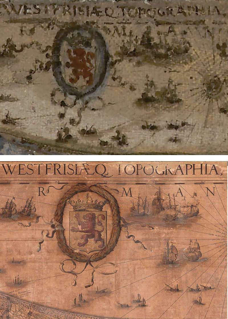
When compared to their real counterparts in museums (fig. 7), the level of topographical accuracy in Vermeer's maps is indeed astounding. In most instances, when tracings of principal lines of Vermeer's maps are superimposed over the original maps (via computer graphic applications) they are closely adherent to the model. True, a few lines stray from the originals and on occasion the textual and decorative elements are slightly misplaced, but one has the sensation that such inaccuracies are caused by the intrinsic difficulties of controlling brush and paint—exacerbated by the multi-layer technique—, which are more rebellious than the hard, fine-tipped drawing tools used by the creators of the maps.
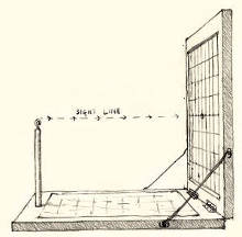
Drawing. It seems highly unlikely that the accuracy of drawing apparent in Vermeer's maps can be attained by what painter's refer to as "eye-balling," or rather, traditional free-hand drawing based uniquely on observation. The complex network of tortured arabesques is virtually impossible for the painter to assimilate and reduce to a simpler, comprehensible schemata. While it is not impossible to draw detail for detail and line for line accurately enough, determining each element's relative size and appropriate position with respect to the map's overall rectangle would require some sort of elaborate measuring system or drawing device.
Two methods were available to Vermeer. The first is the drawing frame (fig. 8), which, in the simplest terms, allows the painter to break down the object into a series of manageable squares by means of crisscrossing strings and then transport what he sees in each square of the drawing frame onto a sheet of paper squared off correspondingly (fig. 9). This method is relatively tedious and requires practice, but the number of times the device is promoted in period art literature assures that it was useful. The drawing could be tidied up and then transferred to the canvas by means or the traditional squaring process, ubiquitously employed to resize drawings to canvas or panel.
Albrecht Dürer
Woodcut, 7.7 x 21.4 cm.
c. 1600
Metropolitan Museum of Art, New York
The second technique, much less laborious and time consuming than the first, was to trace the map directly from the screen of a camera obscura. To do this, the map must be hung in full light near an open window. The camera's lens is set perpendicularly to the map's surface, close enough so the map will fill most of the screen allowing the artist to see and trace fine detail. Period art literature makes frequent mention of oil paper as tracing medium. It is true that the image of the camera is upside down and reversed left-to-right but this defect can be simply remedied by rotating and flipping the oiled paper over to its back side. If the tracing is not clear enough it can be temporarily fixed to an open widow where the incoming light makes the lines on the back side more evident, and retraced to the retro. If the tracing needs to be enlarged or reduced to fit the size of the map on the artist's canvas, the painter would use the squaring method.
Both methods require practice and time, but once mastered, are considerably more accurate and far less taxing than traditional drawing methods.
Color and Chiaroscuro. The base tone of Vermeer’s maps is almost in all cases plainly darker than the tone of the wall behind it. It cannot be determined, however, if the artist intended to describe the effect of aged paper against white plaster or to increase the map’s compositional impact via contrast.
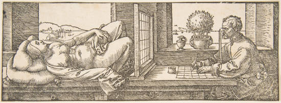
What is rarely considered is that the tonal values of the base paint of the map, like those of the whitewashed walls, must to be greatly varied. In order create the perfect illusion of the gradual falloff of light on the surface of the map, the tonal value (i.e., the degree of lightness and darkness) of the paint used to render of the more intensely illuminated left-hand side must be gradually darkened when approaching the right-hand side. This light-to-dark falloff must be proportional to the falloff of light of the wall, even if the overall tone of the map is darker, as is clearly the case with the maps of Vermeer's Woman with a Lute. Moreover, the topographical features themselves must also be varied; lighter to the left and somewhat darker to the right, in order to maintain consistent contrast. In some cases the base tone of the right-hand side of the map is so dark that the topographical features on that side would be lost had they been painted with the tone used for the same purpose on the left. The raised, light-catching areas of the folds must be lightened with respect to the surrounding base tone while the shadow they project to the right must be subtly darkened. Moreover, the base tone of the map cannot be simply lightened with white or muddied with a single dark pigment in order to create the effects of light and shadow. This is what we see in The Sleeping Account by Maes (fig. 4). Both the color of the parchemnt and the play of natural light can only be achieved by alternating not only tone, but hue, a technical scheme which is exceptionally successful in map of The Art of Painting.
It is probable that the mute grays of Vermeer’s maps are mixtures of lead white, raw umber and black pigments, which, if true, would be the same pigments reserved for the walls, but in different proportions. Only the map of the Young Woman Holding a Water Pitcher seems to have been given a specific local color, probably using yellow ochre as the base pigment.
By direct observation alone, it is difficult to determine if the artist first defined the broader shifts in lights and shadow and then painted the topographical features wet-over-dry during subsequent painting sessions, or if both the base tone and the topographical features were worked up simultaneously, wet-in-wet. The wet-over-dry technique, which saves much time and permits the artist to define the topographical patterns with utmost precision, was widely adopted for painting patterned cloth. If Vermeer used this approach, once the base colors of the map’s surface had been brought to completion and allowed to dry, the artist drew the printed features over the dry paint beneath using a fine-tip brush. By painting the printed features wet-over-dry, it is possible to maintain complete control of the varying thicknesses and tonal values of the drawing lines because they not physically blend into the wet layer of paint beneath, which would quickly contaminate them. Furthermore, if the painter spotted imperfections in drawing or in color, which must have occurred frequently when depicting such complicated motifs, he could wipe them off with a little turpentine and a soft rag and start afresh without minimally disturbing the base tones below.
Much of the following technical information was derived from James Welu's seminal "Vermeer: His Cartographic Sources," The Art Bulletin, Vol. 57, No. 4 (Dec., 1975), pp. 529–547.
Holland and West Friesland
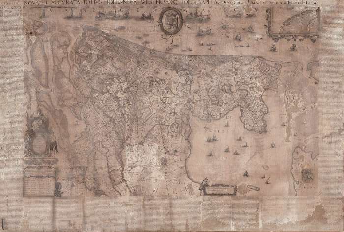
- mapmaker: Balthasar Florisz. van Berckenrode (c. 1591–1645)
- publisher: Willem Jansz. Blaeu (1571–1638)
- orientation: west on top
- date: 1620
- dimensions: 22 sections printed from 17 copperplates measuring in all, 93 x 143 cm., actual size, 116 x 172 cm. Only a few traces of coloring remain on the original map from Hoorn. Welu speculates that at one time this map was probably as brilliantly colored as the one in Vermeer's Officer and Laughing Girl. During the 17th century, maps were each hand-colored separately by artists known as kaartafsetters.
- inscription(s): NOVA ET ACCVRATA TOTIVS HOLLANDIAE WESTFRISIAEQ.(VE) TOPOGRAPHIA (New and accurate description of the topography of the whole Holland and of West Friesland)
- painting(s): Officer and Laughing Girl (c. 1657–1660), Woman in Blue Reading a Letter (c. 1662–1665), The Love Letter (c. 1667–1670)
Seventeen Provinces of the Netherlands
- mapmaker: According to Welu the copper plates for Allart's map were by an unknown source, probably first engraved around the beginning of the seventeenth century.
- publisher: Huyck Allart (fl. ca. 1650–1675)
- orientation: north to the right
- date: 1671
- dimensions: four sheets, 72.4 x 90.4 cm.
- inscription(s): Germani Inferior
- painting(s): Young Woman Holding a Water Pitcher (c. 1662–1665)
- note: given the date 1671 on this map Welu believes that a previous version was published before Vermeer's painting
Europe
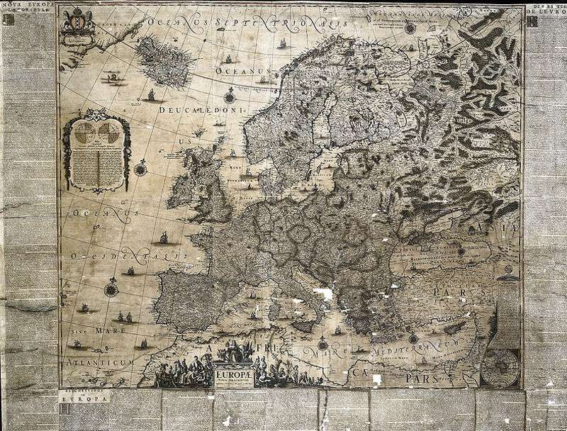
- mapmaker: Jodocus Hondius (1563–1612)
- publisher: Jodocus Hondius; followed by Joan Blaeu (1571–1638)
- orientation: north to top
- publishing date: c. 1613 under the name of Jodocus Hondius; 1659 by Joan Blaeu
- dimensions: six sheets, 104 x 126 cm.
- inscription(s): EUROPAE/ Nova Descriptio
- painting(s): Woman with a Lute (c. 1662–1665)
- alternative image: EUROPAE from the Klencke Atlas ( 1660) <https://www.bl.uk/picturing-places/articles/the-klencke-atlas>
- note: According to Welu, the map in Vermeer's painting is either the first state issued under Hondius's name or the second, issued by Blaeu.
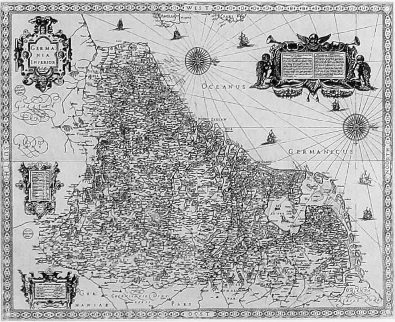
Seventeen Provinces of the Netherlands (Germania Inferior)
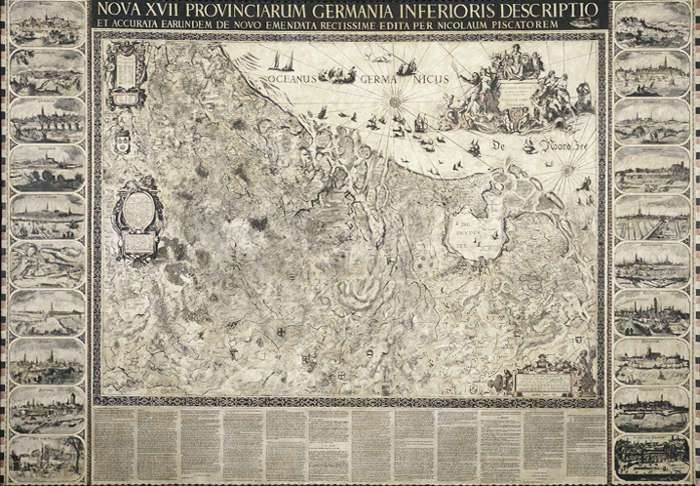
George Deem
1982
Acrylic and oil on cotton canvas ducking, watercolor, India ink, wool yarn, metal rods, wood finials, 152.4 x 213.4 cm.
Private Collection, Great Falls, Virginia
- mapmaker: Although published by Nicolaus Visscher, like so many Dutch maps, Visscher's Germania Inferior was printed from copper plates that were originally engraved and printed much earlier, including those of Jan van Deutecum (died c. 1605) and Balthasar Florisz. van Berckenrode (1591–1644) and Willem Jansz. Blaeu (1571–1638).
- publisher: Nicolaus Visscher (Nicolaus Piscator) (1618–1679)
- orientation: north to right
- date: sometime after 1652
- dimensions: The central part of the map is made from 9 copper plates; the map includes also title band, marginal text, and series of town views, which were printed separately.
- inscription(s): NOVA XVII PROV[IN]CIARUM [GERMAINIAE INF]ERI-[O]RIS DESCRIPTIO/ ET ACCURATA EARUNDEM... DE NO[VO] EM[EN]D[ATA]... REC[TISS]-IME EDIT[A P]ER NICOLAUM PISCATOREM
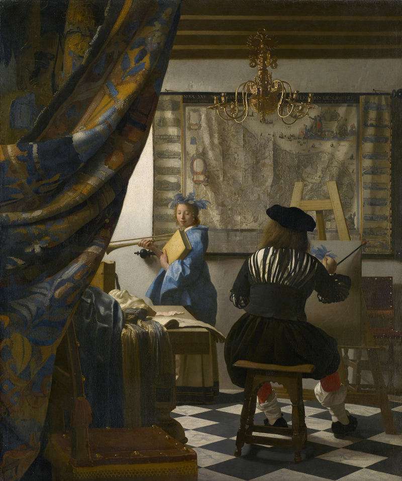
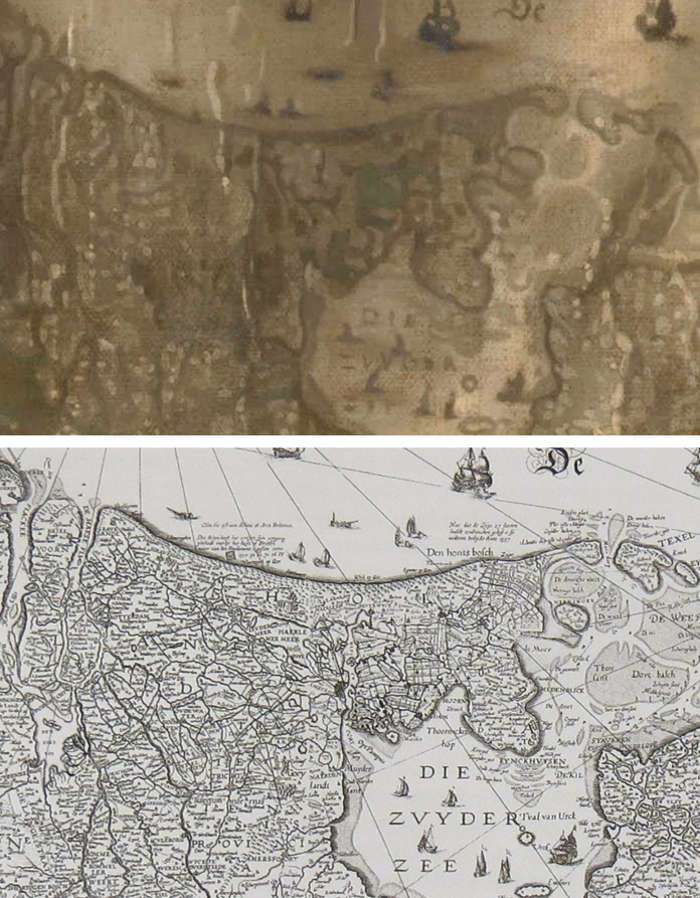
- painting(s): The Art of Painting (c. 1662–1668) [Woman with a Pearl Necklace (c. 1662–1665)/ painted out by the artists]
- note: Welu opines that although the map was originally revised and edited by the elder Nicolaus Visscher, it is possible that it was published by his son, Claes Janszoon Visscher (1587–1652).
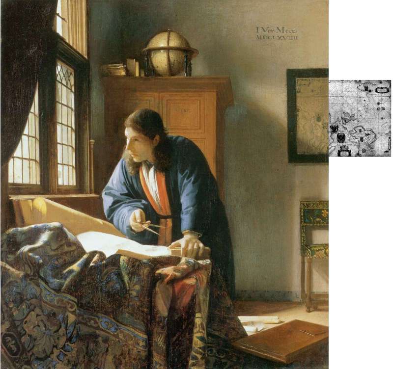
Nautical Chart of Europe
- mapmaker: Willem Jansz. Blaeu (1571–1638)
- publisher: Willem Jansz. Blaeu
- orientation: north to the right
- date: 1600–1699
- dimensions: engraved on parchment, 99.5 x 72 cm.
- inscription(s): PASCAARTE/ van alle de Zacusten van/ EVROPA
- painting(s): The Geographer (c. 1668–1669)
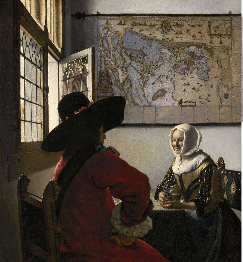
Officer and Laughing Girl
Technique. The map of the Officer and Laughing Girl appears to have been initially worked up with neutral grays, probably based on combinations of white, raw umber and black, and successively repainted with semi-translucent mixtures of white and ultramarine (and other pigments?), especially over the land masses. Some of the topographical lines are done with mute brown but some seem to have been worked over with cooler tones of ultramarine. The lion of the stem is done with a dull red, perhaps red ochre.
Curiously, the pale blue areas of the map do not correspond to the sea, but to the land masses. It is likely that Vermeer had intended them to be a natural greenJohn Smith, "Of the Practice of Colouring Maps," in The Art of Painting, London, 1701. composed of a yellow and a blue pigment. As in other paintings, the yellow component (i.e., a yellow lake) faded leaving only the blue pigment visible—see the bluish vegetation in The Little Street) and in many Dutch still lifes of the time
Woman in Blue Reading a Letter
According to Welu, the maps featured in Officer and Laughing Girl (fig. 16), Woman in Blue Reading a Letter (fig. 17) and the late Love Letter (fig. 18) are one and the same. "It is possible that this particular map was in Vermeer's possession for a prolonged period. We cannot be sure that Vermeer actually owned this map, however, or for that matter any others, since the inventory of the artist's house made shortly after his death makes no mention of cartographic material. Nevertheless, Vermeer, who was recorded as an art dealer, probably bought and sold maps, which during the seventeenth century were considered works of art in their own right."James A. Welu, "The Maps of Willem Buytewech," Hoogsteder-Naumann Mercury 5, 1987.
Here, despite the fact that the contrast in coloring of the Blaeu map pictured in Officer and Laughing Girl and the Woman in Blue is so striking, Welu points out that various small folds appear in identical places on both maps.
Technique. Starkly different than the same map which stars in Vermeer's Officer and Laughing Girl, the map of Woman in Blue Reading a Letter is painted in somber tones of brown and greenish brown paint, most likely composed of the pigments lead white, raw umber and perhaps some natural ultramarine. The outlines and decorative elements are defined with darker shades of the raw umber/natural ultramarine base color of the map, although a few are rendered with more neutral, greenish gray, again most likely composed of raw umber and small amounts of natural ultramarine.
In its current state, no other color can be detected.
The Love Letter
Technique. In The Love Letter a portion of the extreme right-hand part of the map, deeply distorted in perspective, is in deep shadow on a wall in the left foreground. Although not obvious, Welu believes that the identification of the map can be verified by comparing it with the right portion of the Holland and West Friesland map by Blaeu.
Only in The Love Letter, where the map is hung against the dank wall in the foreground room, did Vermeer use the abbreviated technique seen in the works of his colleagues, although the map’s local color is slightly warmer than that of the wall below. This map was probably depicted with such cursory brushwork in order avoid drawing the spectator’s attention away from the background where the scene's action takes place, as well as to enforce spatial depth by contrasting the drab vagaries of the foreground with the crystal clear precision and strong colors of the background.
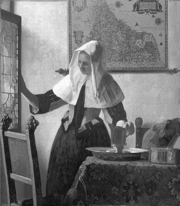
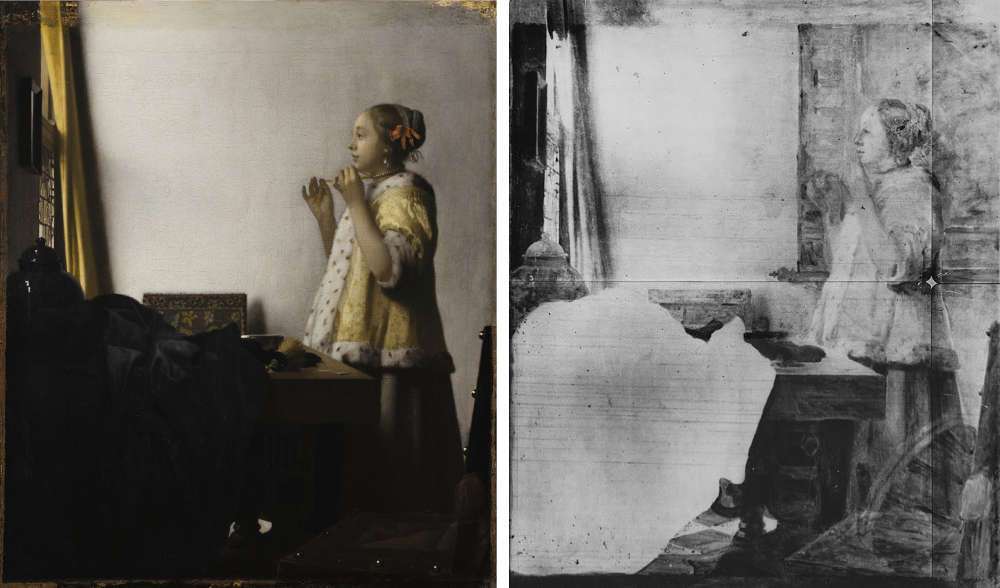
Young Woman Holding a Water Pitcher
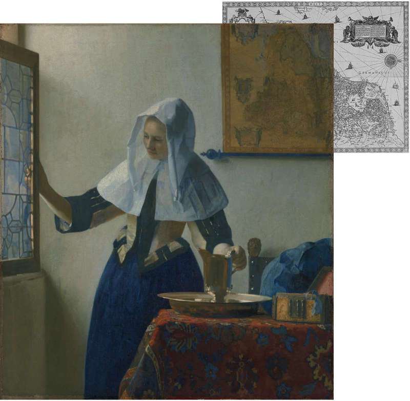
Technique. Technical analysis (infrared reflectography, IRR) reveals that the background wall map of the Young Woman with a Water Pitcher (fig. 19) originally extended to the left behind the woman (fig. 20). In addition, the back of a chair set on an angle was placed in the left foreground and partly overlapped the window. The original position of the map would have exposed the right-hand edge of the map, which is currently cropped off as well as the two balls attached to the hanging rod. The upper hanging rod is absent in both versions as well as in the Woman with a Lute. It is likely that the exclusion of the chair and the re-positioning of the map were motivated by compositional exigencies.
The changes in Vermeer's composition may have been made during the early phases of the painting procedure, called underpainting, before color and detail had been introduced, even though the some parts foreground chair seem to have been brought to a high degree of finish. The underpainting allows the painter to envision his pictorial idea with a minimum expenditure of time and effort while maintaining control over pictorial unity, one of the principal requisites Baroque painting. The parts of the underpainting that did not live up to the artist's expectations could be immediately observed and corrected with relative ease before moving on to complex problems of color and fine detail. By comparing the reconstructed to the final version, it is possible to intuit how the artist thought through his pictures.
On close inspection, a few of the uppermost areas of the map of the Young Woman Holding a Water Pitcher reveal vestiges of a translucent layer of light ultramarine paint over the ochre base. Since these cool glazes (scumbles?) extend themselves over only a few areas of the map, it is difficult to divine the artist’s intention, but is probable that the map would have looked rather different than it does today, perhaps more in keeping with the brighter color scheme of the map of the Officer and Laughing Girl.
Woman with a Lute
Technique. The map of Europe is painted with somber tones of brown. Although at first glance, it would appear to have been executed in strict monochrome, traces of a very dull red can be seen in the title cartouche on the map's lower center. What appears to be a very dull green may be barely noticed covering some of the land masses, in a tenuous contrast with the slightly warmer brown of the map's base color.
The meandering contour lines of the geographical elements are somewhat thicker that the fine lines of the original map, and they are executed with a relatively free, painterly touch, at times in strict brown tones, at times in tones slightly more neutral. Many parts of the map are punctuated with dots of lighter paint, perhaps imitations of the so-called "disks of confusion" that sometimes appear on the screen of an optical device called the camera obscura, although the dim lighting represented in the present picture would have not been sufficient to produce them on the camera's screen. Like the rest of the painting, the map does not appear in pristine condition, but worn and seriously abraded. For this reason it is hard to imagine the original coloring of the painting or its map, although even in such condition the map functions as an extraordinary compositional element that locks in the fig ure into a scene that seems perfectly balanced. Most of the scripts are so warn that they can be barely made out.
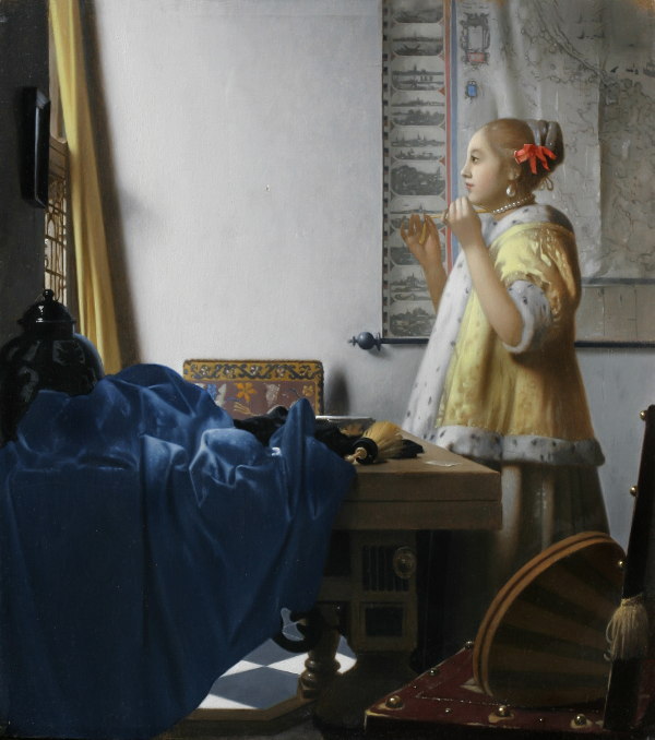
Woman with a Pearl Necklace
The essential composition we now see was not Vermeer's original concept. Neutron autoradiography (IRR) has revealed that the artist made critical changes in the composition (fig. 22 & 23) . The initial composition included not only a musical instrument (very likely a cittern) placed on the foreground chair, but a large wall map of the Netherlands which subframed the figure, similar to the one in The Art of Painting. Vermeer may have decide to remove the map because it distracted the poetic presence of the young lady presence and obfuscated the line of her gaze towards the mirror. Both objects were completely painted out. In the same painting, a larger area under the table was also exposed to sight allowing visual access to a number of illuminated floor tiles.
Some critics believe that the artist canceled the lute and map not only to simplify the composition. For example, Arthur K. Wheelock Jr. wrote "...it may also be related to thematic reasons. The map, representing the physical world, and the musical instrument, referring to sensual love, would have given a context for interpreting the mirror and the pearls negatively rather than positively. Indeed, the sensual, earthy connotations are similar to those associated with images of Vrouw Wereld (Lady World: the allegorical figure of worldly nature). By removing the map and lute he transformed the character of the image into a poetic one evoking the ideals of a life lived with purity and truth."Arthur K. Wheelock Jr. and Ben Broos, Johannes Vermeer (London and New Haven: Yale University Press, 1995),154.
Technique. Although it cannot be said for certain, the painting of the map and lute had not advanced further than the underpainting stage, in which the essential form and fall of light on objects are defined with monochrome paint. Contrary to what one might expect, the IRR images underpainting was executed with quick, sketchy strokes done with a rather broad brush. During subsequent the restoration of the painting, only black under paint was observed underneath the white wall.
The Art of Painting
The map in Vermeer's Art of Painting is composed of many plates. The central part, the map, published by Visscher, is composed of 9 plates. Although one exemplar has survived (Paris) none have survived that includes the same title band, marginal text and town views seen in Vermeer's rendition. Welu points out that this is hardly an anomaly as additional elements were generally printed separate from the maps themselves. Period catalogues advertise that maps could be had "with or without ornamentation." "This 'ornamentation' included a wide selection of engraved and printed matter that could be added to a map in various combinations. A single wall map, therefore, could be made up in several different ways—in effect, a made-to-order work of art."James A. Welu, "Vermeer: His Cartographic Sources," The Art Bulletin, Vol. 57, No. 4 (Dec., 1975), 538.
Curiously, in the grandiose map of The Art of Painting (fig. 24) the buildings and ships of the vertically stacked town views on the left-hand side are rendered, as would be expected, with shades of dark gray, while to the right with deep blue. The decorative elements are punctuated with dots and dabs of red and light blue, is an apparently random manner (fig. 25). These minor irregularities do not, however, affect the map’s overall appearance.
c. 1662–1668
Oil on canvas
120 x 100 cm.
Kunsthistorisches Museum, Vienna
Technique. Of all of Vermeer's depictions of maps, the Visscher map of The Art of Painting remains the most ambitious in concept and a triumph of painting technique. The execution exudes confidence and displays an absolute control of means. The cannot but viewer sense the flow of natural light as it skims left to right over the surface, lessening as it distances itself from the source of light, all the while revealing the brittle surface cracks, gentle undulations and vertical folds formed after years of hanging.
Vermeer's trade-mark pointillés, which are associated with camera obscura vision, punctuate the entire of the surface giving it a subdued sparkle.
The base color of the map is a light brown, which is slightly more grayish that what appears in almost every reproduction. Curiously, while the left-hand town views are painted in strict monochrome, the areas occupied by water of those to the right are tinted with shades of blue. The brushwork is extraordinarily calligraphic when viewed at close range. The geographic lines are painted much thicker than those of the original with a slightly darker tone of the base color, subtly varying in hue. A few splotches of mute red and medium blue enliven the decorative cartouches and the title cartouche in the upper right-hand corner. Vertical strips of dull orange divide the stacks of lateral town views from the map itself. Although the overall effect of the map is extraordinarily realistic, no other map by Vermeer is painted with such originality and painterly touch.
c. 1662–1668
Oil on canvas
120 x 100 cm.
Kunsthistorisches Museum, Vienna
The Geographer